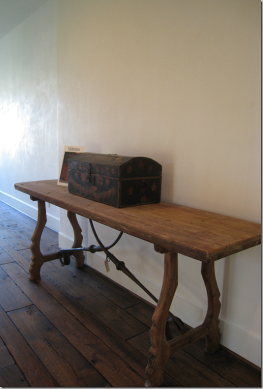
COTE DE TEXAS

The Conservatory House

64 comments

image The third and final house in the West University Festival of New Homes 2009 Series is the Conservatory House.   Lest you think that the festival is pathetically small with just three houses, you would be mistaken.  There were actually eight houses in the showcase, but I was taught if you can’t say something nice…….  And even that sounds overly harsh.  My mother, the famous Southern tastemaker Betty Rae, called to say how beautiful the Octagon and Provence houses were.   “So many houses with white walls, so much seagrass, so many slipcovers!   I had no idea how popular that look is!”   Well, not exactly Betty Rae.  You see of the eight houses, only three actually fit that bill.  The other five weren’t white or linen, or with a slipcover and seagrass style.  They were more the chenille and silk, oriental rugs, murals and lots of crown molding kind of houses.  Though in all honesty, one was a craftsman style house – all black and white high contrast with a bright lime green glass chandelier in the dining room.   It’s all personal – I’m sure many of you would have preferred  the other five houses to my three picks.   There wasn’t anything wrong with them, they were all actually quite lovely – they just weren’t Cote de Texas houses.    These three houses were.


westu 108


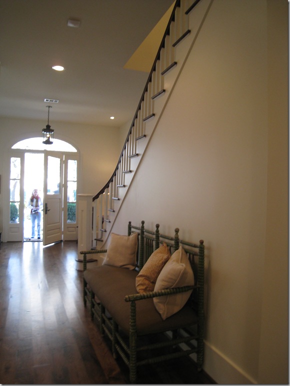
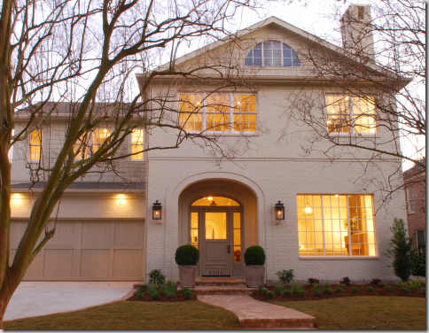
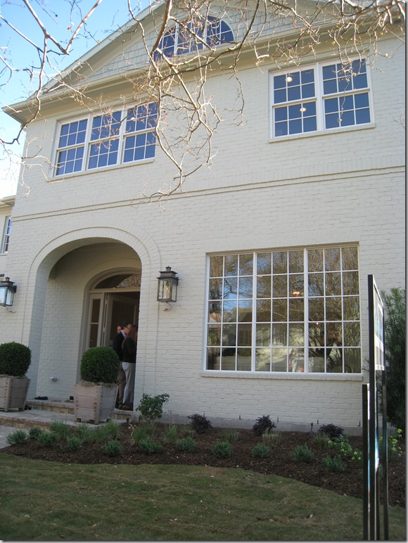
The third house, The Conservatory House, was different than the Octagon or Provence house.   It was smaller than both by over 2,000 sq. ft – so it seemed more “realistic,” more attainable.  It was less expensive (though I suffered sticker stock when I casually asked the builder what he was asking!)   It was more “normal” – it wasn’t breathtakingly, achingly beautiful.   You wouldn’t go through this house and just die if you couldn’t own it, or go home and give your husband grief over it, but still – it was special - with several areas that made you notice it and think - “Wow – what a great house this is.”   And though its lot is typical for West U, it is just a bit wider than standard, allowing extra space to offer a little bit more than most.   Its facade is deceiving.   At first glace it appears to be an old house that has been renovated and, in fact, it fooled even me for a few minutes.   Its brick has been painted a soft taupe – something you see done to vintage houses usually to cover up a deep, almost burgundy colored brick.  The arch over the front door seems reminiscent of a house built here in 40s.  In other words, the Conservatory House blended into the street – a street where many of the original two story houses still stand.   And so, though the Octagon House almost caused a suicide, and the Provence house was the stuff of dreams, the Conservatory House seemed like home.   It also didn’t hurt that the builder chose  Ginger Barber to help with the selections and furnish it for the show.    btw – that’s my friend Jordanna at the front door with her husband!


westu 113

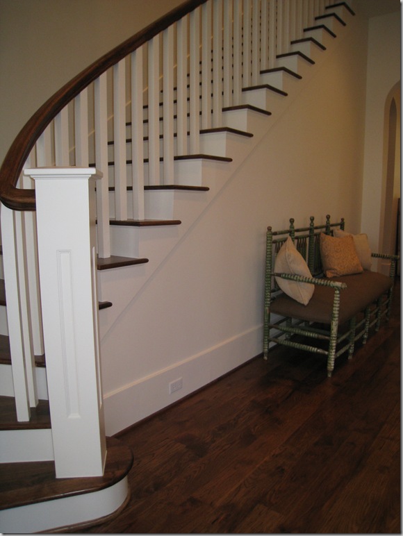
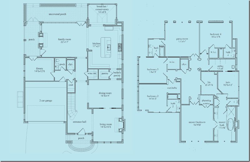
The floor plan starts off like a typical West University floor plan with a front loading garage:   long entry hall with stairs, living room on the right, then dining room, then kitchen along the back sharing the space with the family room.   The wood floors flow throughout the downstairs and upstairs, which is really nice – no carpeting at all!    (Full floor plans are at the end of this post.)


westu 114

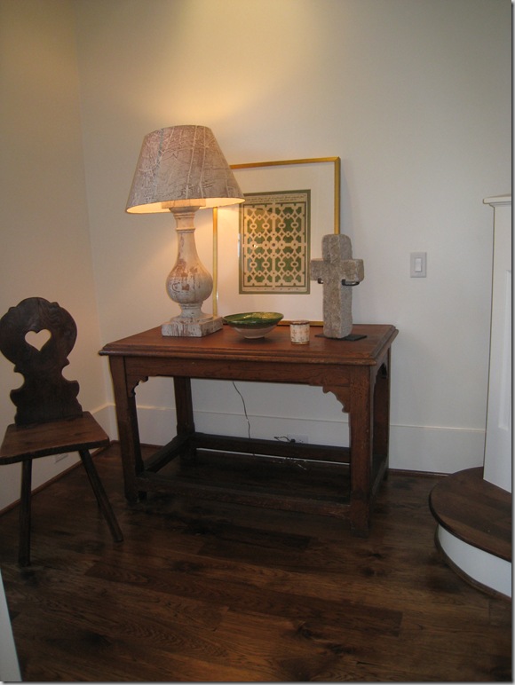
To the immediate left of the front door, Ginger used this table with a rustic lamp and the wonderful paper shades with the map of Paris.  Watkins Culver in Houston carries these.


westu 152

The view looking back towards the front door – the front porch, and door are both arched, as are most of the passageways downstairs.


image

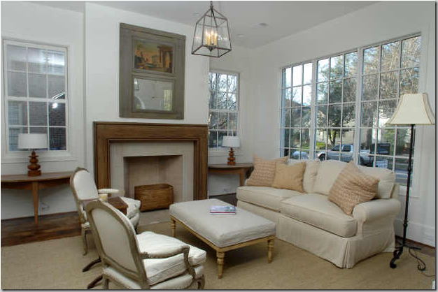
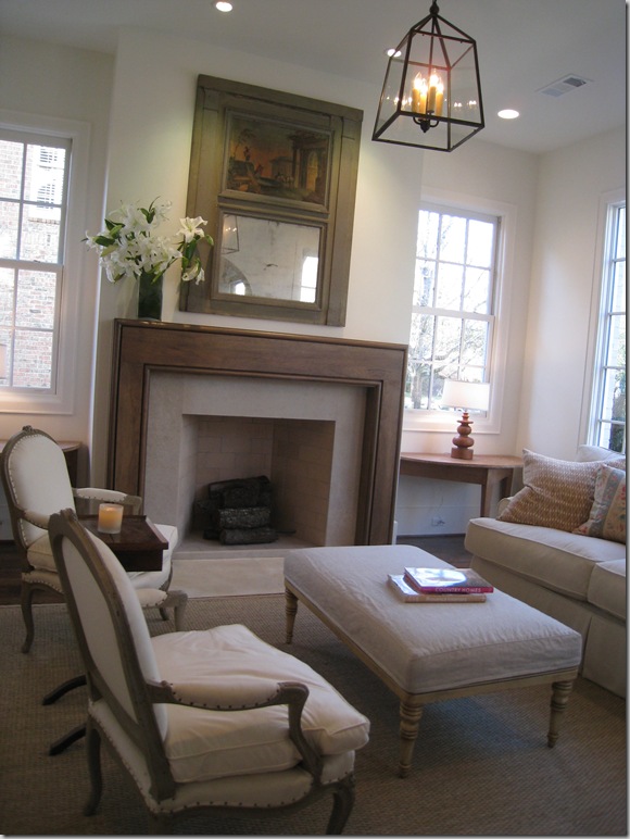
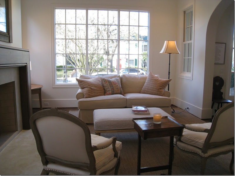
To the immediate right of the front door is the formal living area, but with Ginger Barber, nothing is ever too formal.  Here she used a lantern and slipcovered sofa.  Demi lunes flank the wood mantel fireplace.  The trumeau was particularly effective.  If this was mine, there would be curtains, of course, and taller lamps in the window, and I do think I would elect for full length windows in this house – most are not.


westu 112

Close up of the fireplace – clean lines, very simple.


westu 158

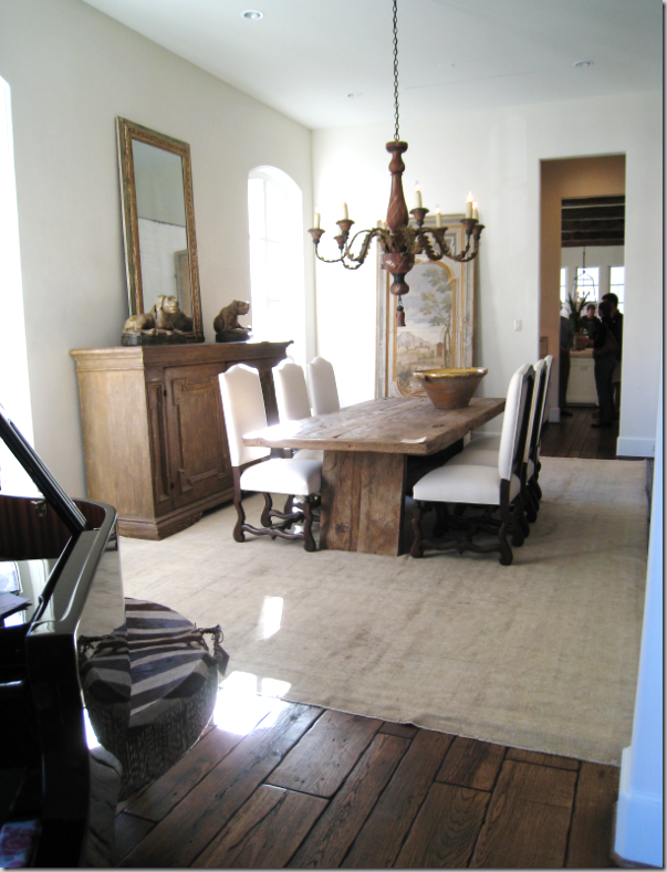
Looking from the dining room – you can see the large arch that separates this room from the entry hall.


image

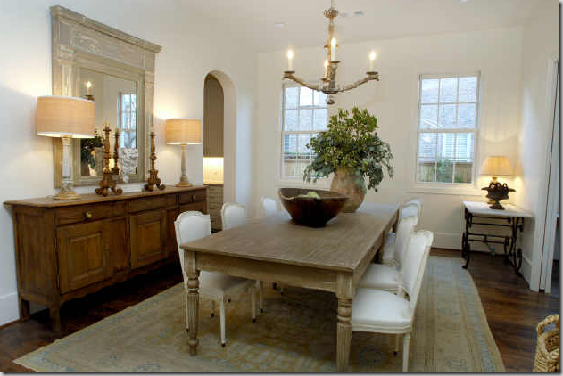
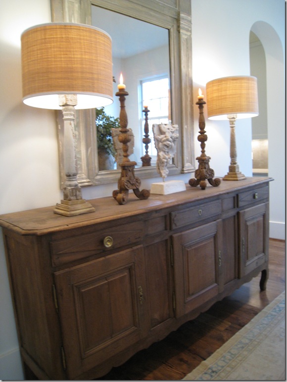
 The next room – through the living room is the dining room.  Carol Piper supplied the area rugs in the house.  Ginger matched fancy French chairs with a more rustic table.  I really like the long buffet with, again, a wood trumeau mirror.  As is now obvious from this house and the Provence house, Barber likes to use mirrors more than art and  I couldn’t agree more.   I love old Italian oils and they are so pricey – it’s just cheaper to substitute antique mirrors for fine art!


westu 162 

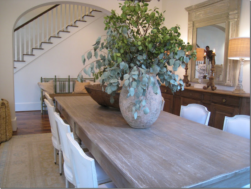
A close up of the dining room, showing the arch that separates it from the stair hall.


 westu 163

And looking back towards the living room – this was one door way which wasn’t arched because I believe there is a pocket door here – why I can’t imagine.


westu 116

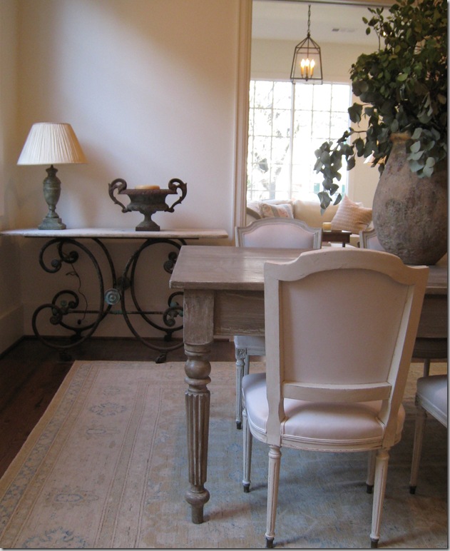
Dining room close up:  typical Barber accessorizing – large and spare.  To the right, you can see the arch that leads to the butler’s panty and onto the kitchen.     I really like the drum shades on the lamps.  Drum shades really are an updated look.   If you are looking to freshen up a room, consider changing out your old lampshades to drums.   


image

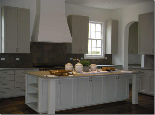
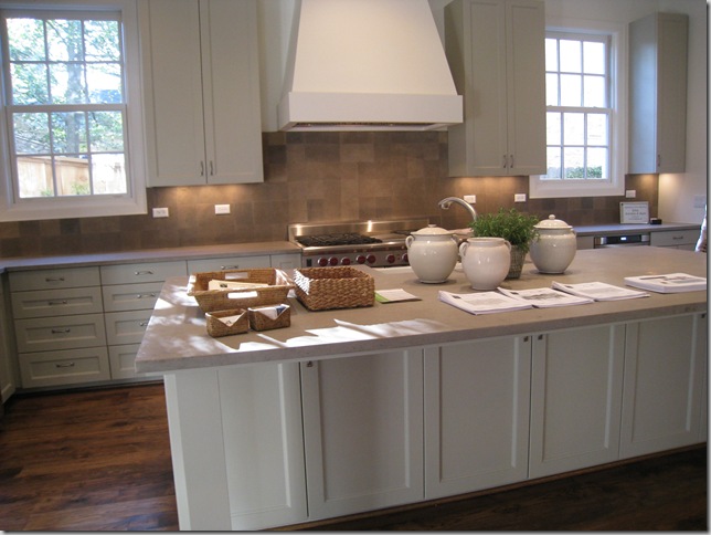
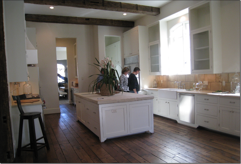
The kitchen is very large and has a contemporary feel to it.  Very clean lined.  the countertops were soapstone. 


westu 153

Another view – so much storage!  I would have not put the upper cabinets along the back wall if this was mine.  That way, you could have put more windows along that wall.  In fact, I would probably have moved the range to the side wall and left this for the sink and a large expanse of windows.   But, alas, no one asked my opinion!


westu 121

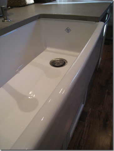
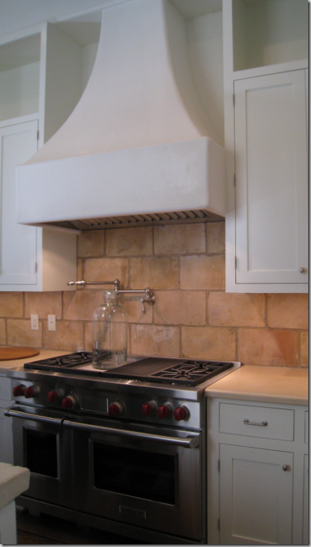
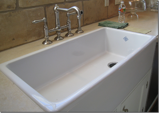
Another Shaws farm sink – best sink in the world!


image

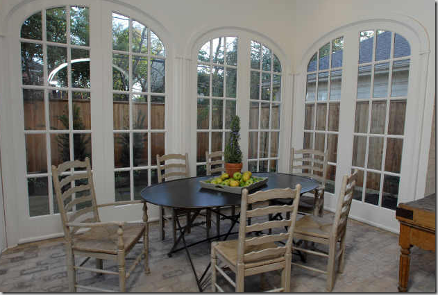
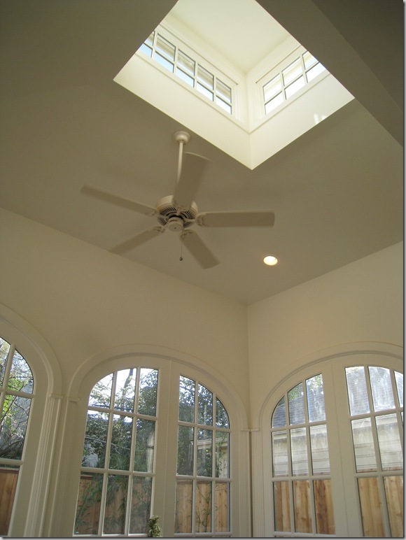
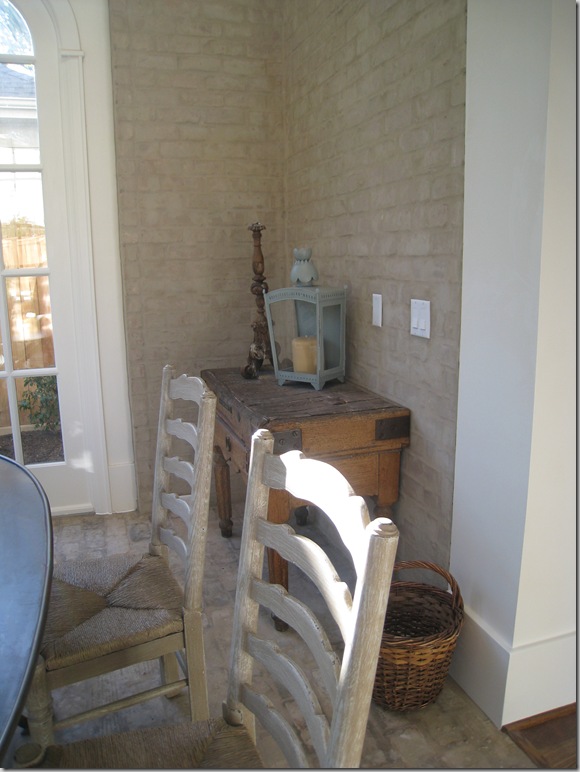
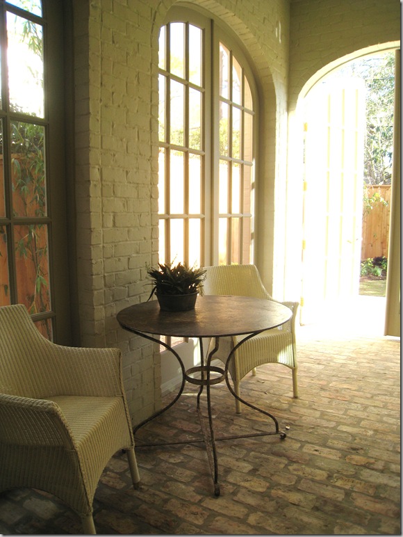
What makes this house special:   off the kitchen is this breakfast room – a true self-contained room with a clerestory window on the ceiling.  To further give this room a conservatory feel, antique bricks were used on the floor.  The walls of the room are brick – and it really makes it seem that this room was added on to the house – continuing the illusion that this is actually an older house instead of a new one.


westu 123 

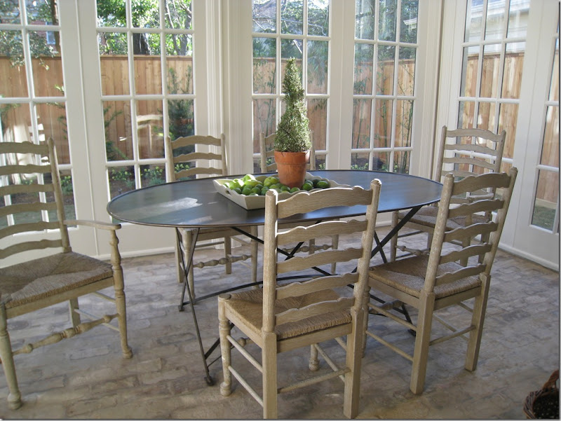
Ginger chose a trendy metal table paired with painted rush seats.   Elliptical French doors made up three sides of the room.  This space is a true show stopper – it was gorgeous!  So unexpected!   I have never seen a new, typical West U home with this type of breakfast room – but it makes my wonder – why not?   I would love to do this to my house. It was just beautiful.  After the show I spoke with several people about the different homes and so many named this room as their favorite of the show!  It was just that great!


westu 124

A view of the elliptical doors with the clerestory window.  That ceiling fan would be coming down so fast if this was mine!


westu 127

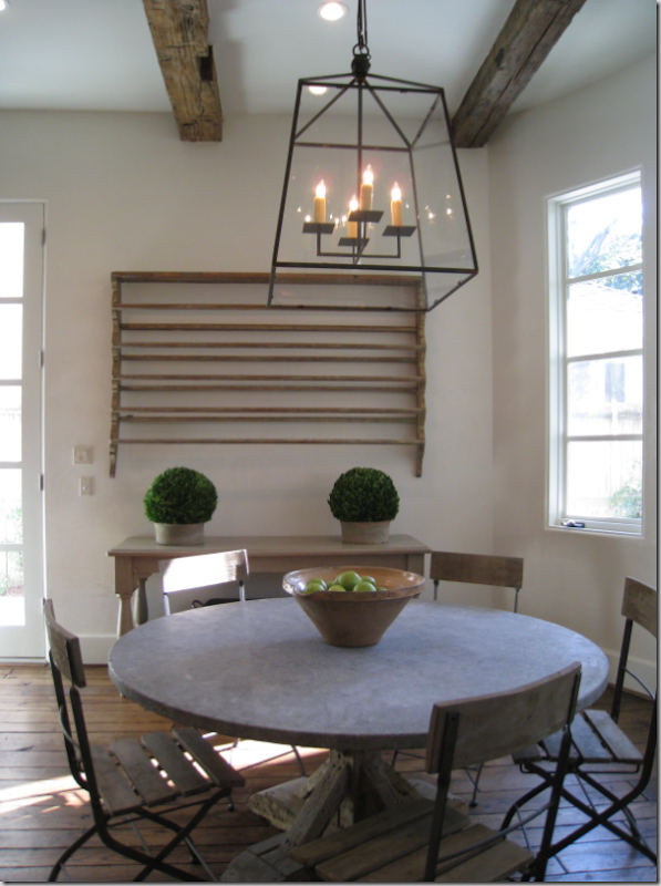
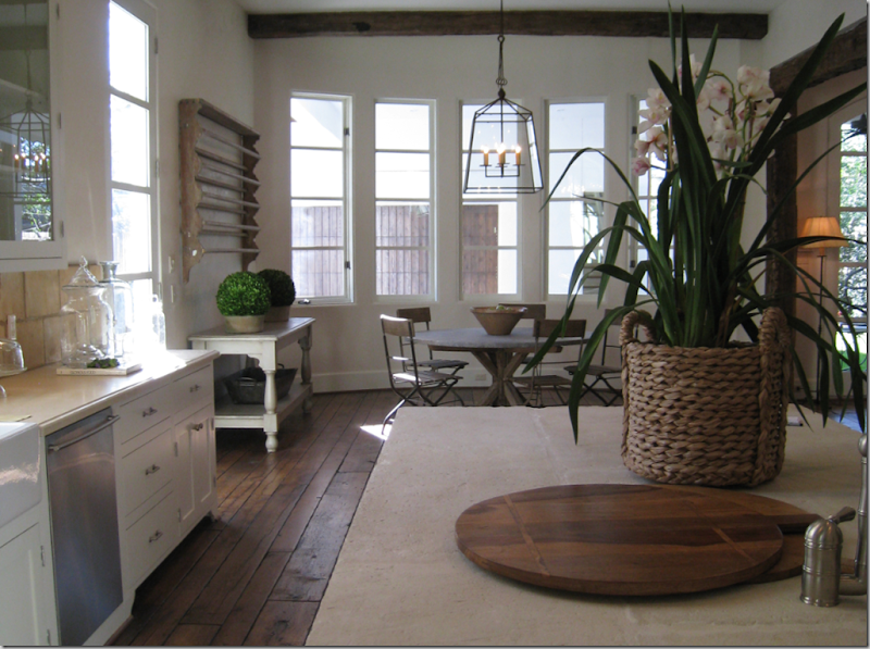
Ginger used an antique butcher’s table and lantern.  Notice the brick walls which make the room look added on.


image

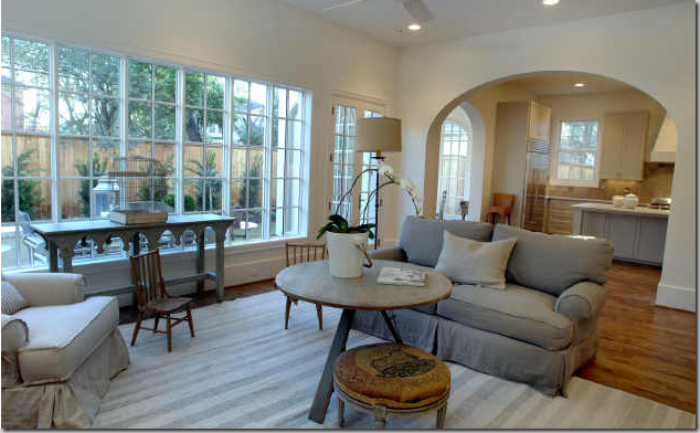
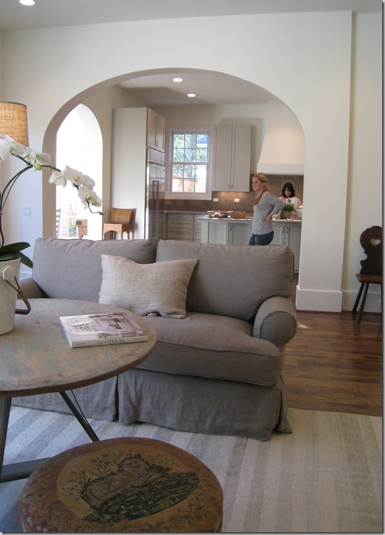
Through a large arch is the family room.  You can see the breakfast conservatory through the left side of the kitchen. 


westu 130

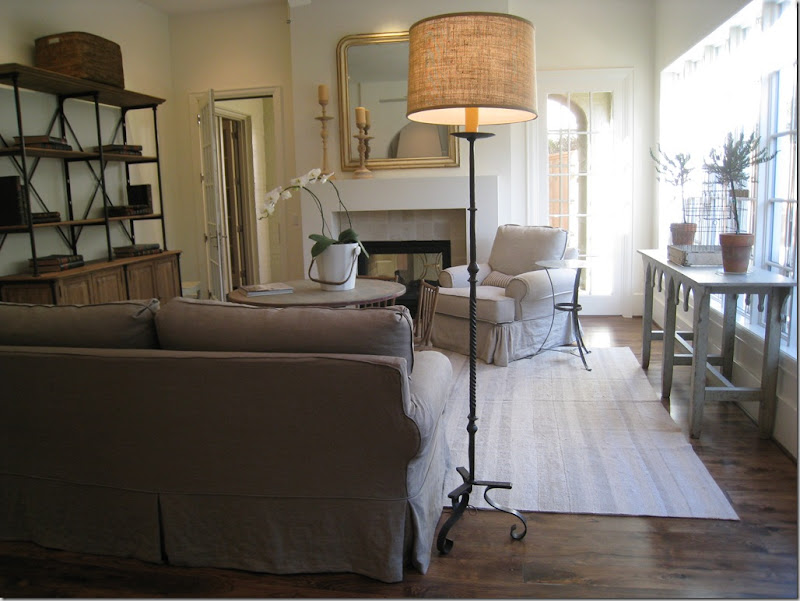
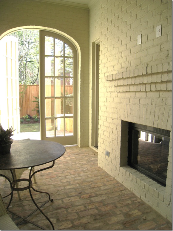
Slipcovers and mirrors, candlesticks and wrought iron, painted woods and baskets:   Ginger’s style.  The simple lined fireplace is actually two sided – it adjoins a screened in porch, another great surprise to the house. 


westu 134

I am crazy about this muted striped flat weave rug that Barber chose to use here.  The coffee table is great too.   The shelving unit is a style that I keep seeing more and more of – rustic wood and iron married together.   I suppose this could be the Belgium influence.  Through the open door is the screened porch which leads to the outside. 


westu 136

In this picture you can really see how the builder handled the trim – very sparingly.   No fancy crown molding, something I am loving more and more these days.  Just a great, tall, plain baseboard.  The entire house was trimmed out this same way.     And,  I love this stool Ginger used – a dressy French piece upholstered in antique petit point. 


westu 137

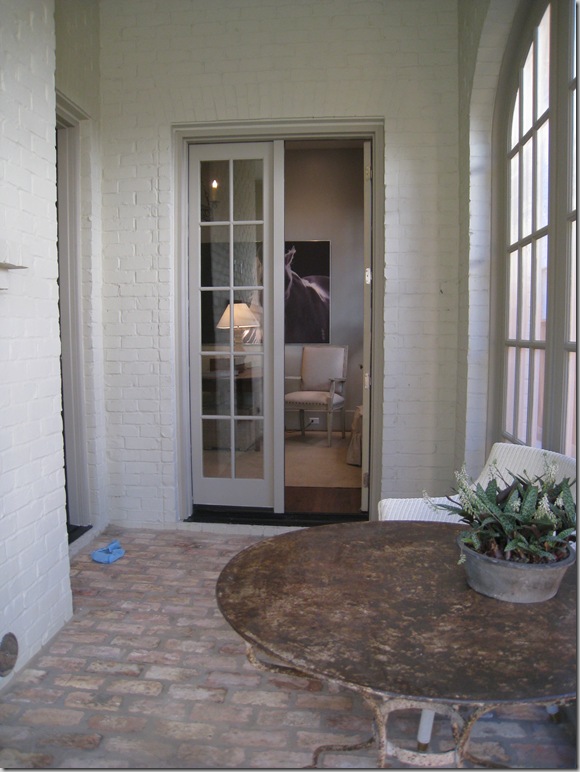
Owning to the somewhat wider lot, the extra footage allowed for this wonderful screened porch with the painted brick walls and antique brick floor.  Again, this porch adds to the illusion of the house’s age.   Through the door is the wide back yard.


westu 138

The fireplace that is shared with the family room. 


image

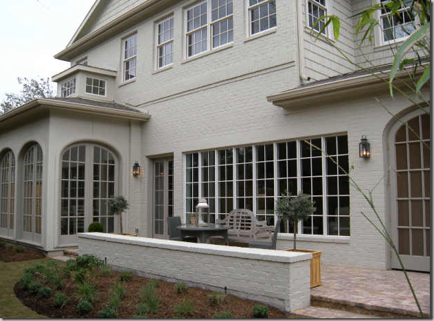
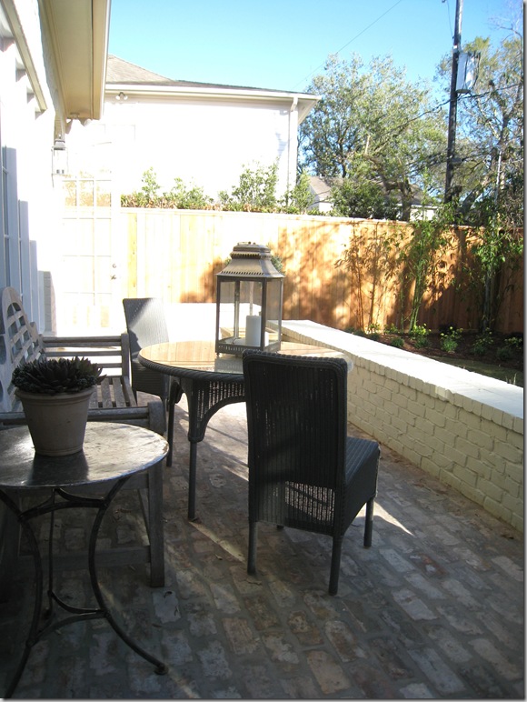
With the family room in the middle  - here you can really see the breakfast room/conservatory with the clerestory window on top.    Doesn’t it look added on?    And I love the short brick wall which separates the terrace from the yard. 


image

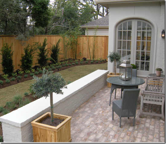
A closer view of the conservatory.  I love how Ginger decorated this terrace with loom chairs and a teak bench.   The yard is actually deeper than it looks here and I suspect the owners will be putting in a long lap pool.


westu 140

Looking from the other side – again – the perils of  town living in West University:  close by neighbors!


westu 141

Going back into the screen porch – through the French doors is the study, which is off the main stair hall.  Love the blue bootie that someone lost along the way.  The builders make you put them on during the tours!


image

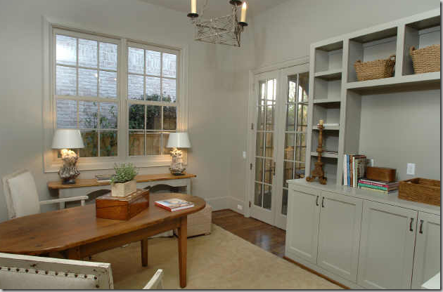
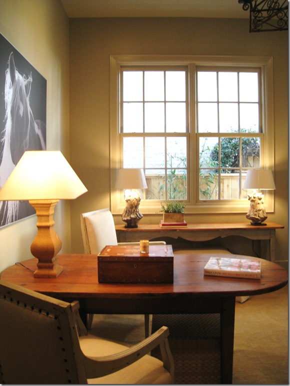
The study is another surprise in the house – a great space for an office.  I love how Ginger used a table instead of a desk, something that I think is so practical and much prettier!   The walls and all the trim are all painted in the same shade.  Also – notice on the built-in how thick the shelves are – giving it a more updated look. 


westu 148

So pretty!   Just needs a simple window treatment, imo!


westu 170

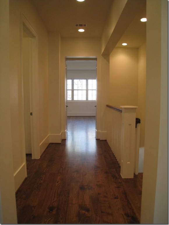
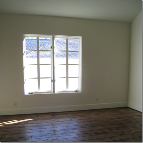
Going upstairs, the dark, wide planked wood floors are continued throughout.  As with the Provence house, these rooms weren’t furnished, not even the master bedroom – which was a huge disappointment.   There are four bedrooms here, along with a large media room/playroom.


westu 171

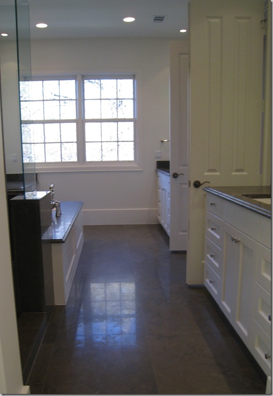
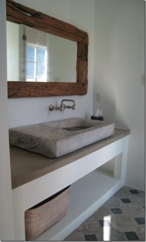
The master bathroom – two separate vanities.


westu 173

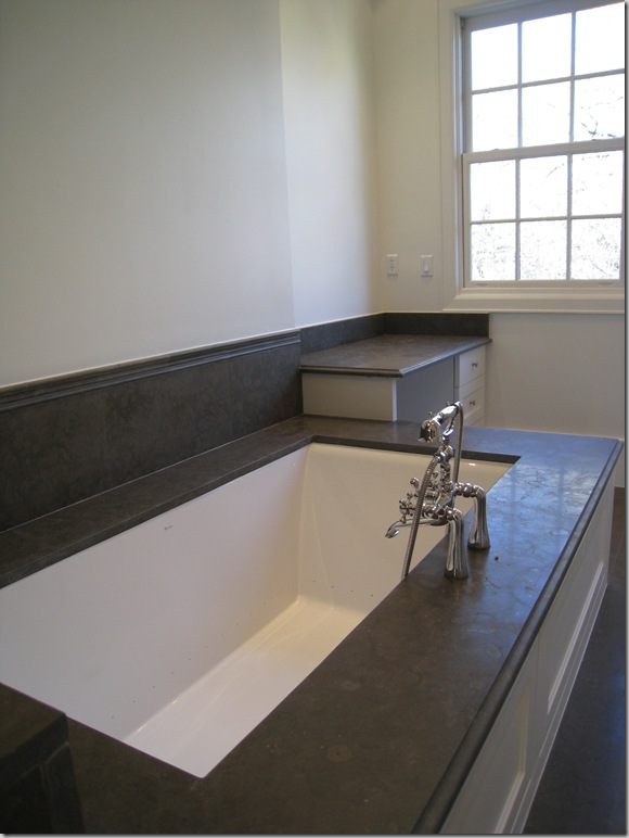
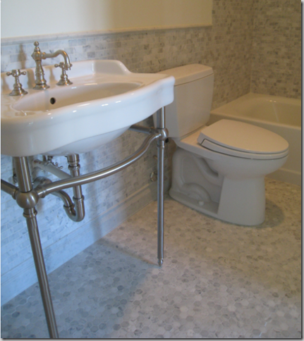
And a beautiful tub.


westu 175

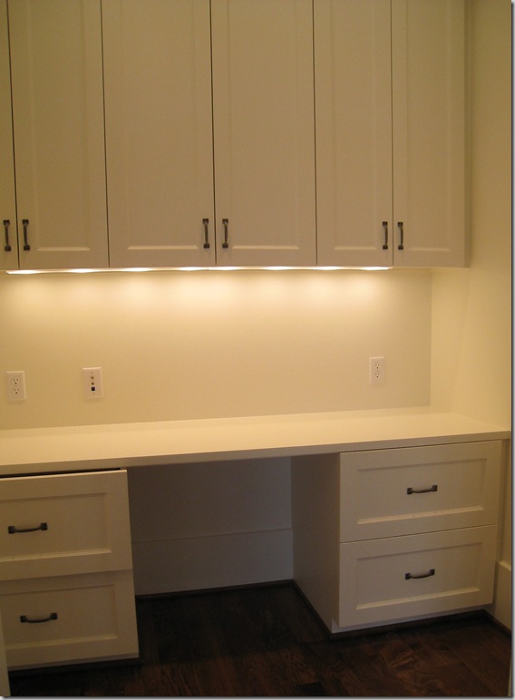
Behind closed doors in the master bedroom was a surprising office.


westu 176

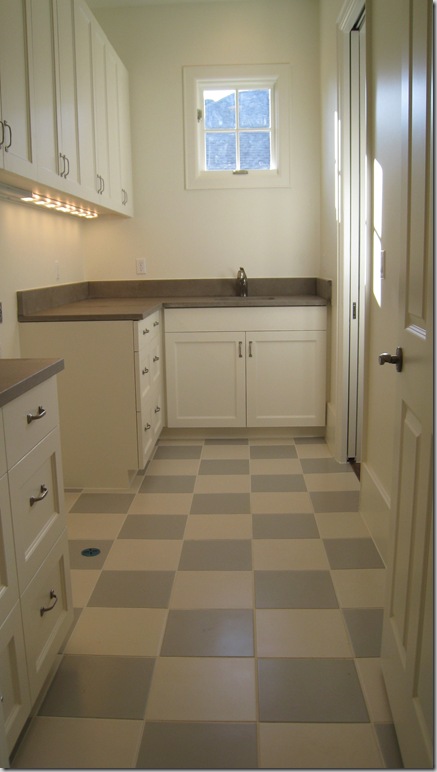
And finally, the upstairs laundry room had this adorable checker floor.


image

And for the architects and interior designers and especially Stefan, the floor plans.


And so, it’s the end of the West University Festival of New Homes until next year.  I  hope you’ve enjoyed seeing the three houses that really spoke to me.  With each house I toured – I came away thinking “This is the ONE!” – how fickle I am.   You see, I visited a open  house this weekend and let me tell you – boy, was it beautiful.   I’m thinking the open house I toured this weekend was the ONE!!!    Does anyone know the name of a good psychiatrist in Houston?   Specializing in new-house-itis?    I’ve been struggling with this disease for a long time now and my husband is insisting that I get cured, quick.

The Provence House

86 comments

 image

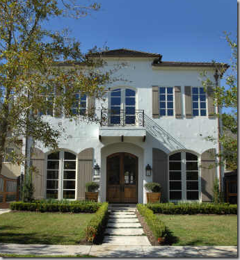
The second house on the West University New Home Tour that I really loved is a more typical “West U” home than the Octagon House.  The Octagon House had the advantage of being on a curving corner lot – which allowed for a wide, spread out floor plan.   By contrast, the Provence House is on a typical 50’ wide town lot.  But, this lot is special in that it is a double lot – meaning, instead of being the usual 50 x 100, it measures 50 x 200 or 10,000 sq. ft.    This makes Provence House a very long, yet not very wide house.   No matter – the architect used the length to his advantage – creating large open rooms that flow into each other beautifully.  I had walked through this house while it was still in the construction phase and fell in love with it –desperately!    The sheer size of it is very appealing (it has a total of 6,600 sq. ft.) and the finishes were wonderful.   Again, just as with Octagon House, this home is special.   The architecture and decor is pure French – so you know it really spoke to me.  Just the facade alone was enough to make me stop my car and poke around – the white stucco, the true French planked-wood shutters,  the slate roof, the symmetry.    Of course if this house was really in Provence, it would be turned on its side, with a long row of arched windows, upstairs and down, and the front door smack in the middle.   But, alas, we are not in Provence, we are in Houston.   Ginger Barber was the designer in charge.  She chose all the finishes and the architectural elements, such as the 200 year old beams and the 100 year old reclaimed oak wood floors.   Ancient marble sinks were chosen for the bathrooms and the kitchen island countertop is limestone  - all unusual choices for a neighborhood house – but – oh so lovely!   It was hard not to fall in love, the open space makes Provence House feel so grand, yet it is not dressy in any sense of the word.   Truly, you could plop it down in the countryside of Provence and it would blend in perfectly!   Enjoy!


image

Entering the front door, you can get a sense of the grand depth of the house.  A center hall bisects the house – with rooms on the left and right of it.  At the end of the center hall, above, is the large family room.  The floors are gorgeous deep brown, 100 year old reclaimed oak.   The walls are plaster.   Chateau Domingue provided the aged architectural elements here.   The front part of the center hall has a groined ceiling, highlighted by lanterns.  At the left is a music room, then a dining room, then the kitchen.  To the right is a study, the stair hall, the living room, and it all ends with the family room. 


image

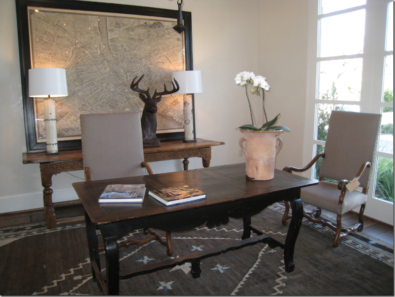
Walking in the front door – to the right is the study.  Ginger furnished the house with fine antiques from a variety of the best stores in Houston:  Carl Moore, Shabby Slips, Neal and Co., Watkins Culver, Thompson Hansen, BROWN, and her own shop The Sitting Room.   Some of the new upholstery pieces came from Quatrine.    Barber furnished all this very simply – there is no fanciness to this house.  Here she used a rustic French desk with two large French Os de Mouton chairs.    The rug came from Carol Piper who specializes in antiques and reproductions.   I especially love the way Ginger accessorizes – one large wood deer, one confit pot.  And notice the oversized antique map, probably of Paris.


image

A close up of the three-armed iron light fixture that is from Carl Moore Antiques.  


image

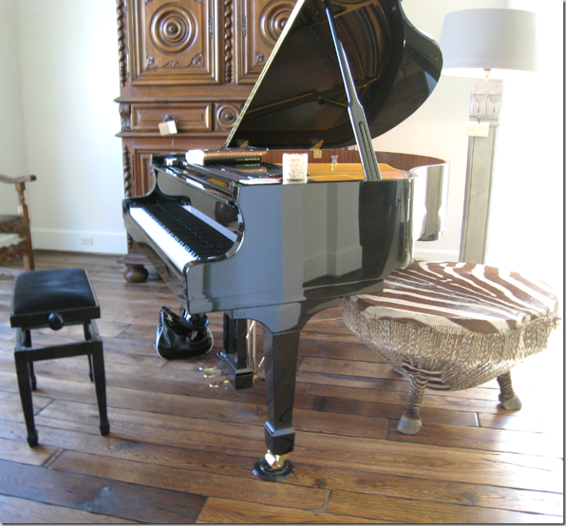
Walking in the front door – to the immediate left – is the music room.  The dining room is off to the right of the picture.   The African drum, covered in zebra skin with hoofs is a piece I have seen around town – first at Shabby Slips.  A large, early French armoire is the other piece in the room.  Something tells me that the new shiny piano was not put here by Ginger – could be wrong about this, but….


image

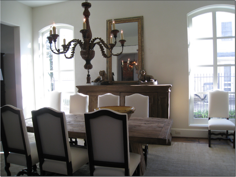
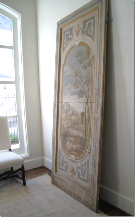
Through the music room is the dining room.  Notice the large scale of this area (20x14)  – each room is airy like this!   The ceilings are 12’ high downstairs which adds to the spacious feel of the house.    Barber chose a rustic wood table with large French Os-de-Mouton chairs.  The buffet is oversized, tall.  Leaning against one wall is a tall painted board.  Notice how there are no fancy moldings, none around the doors, only a tall base molding.  The flat weave, muted rug is from Carol Piper.    The painted candlestick chandelier (from Carl Moore) is huge – but just the right size.    Any other interior designer would have cluttered up this room (me included probably) with furniture and paintings.   Barber keeps it simple – everything is the right scale and matches the tone of the house. 


image

Looking from the center hall into the dining room.  Again, notice the simple, but highly effective accessorizing:   The mirror, leaning against the wall, the two large dogs and a wide, yellow confit bowl.    In the windows – beautiful arched casements – Barber placed two chairs.    Here you can see one drawback from living in West University:  with 50’ wide lots, the neighbors are extra close by!   I’ve had to live with this situation for 15 years now.  You get used to it – but you better know how to be a good neighbor!!!


image

The painted wood panel, which looks like a former door – I love this piece. 


 image

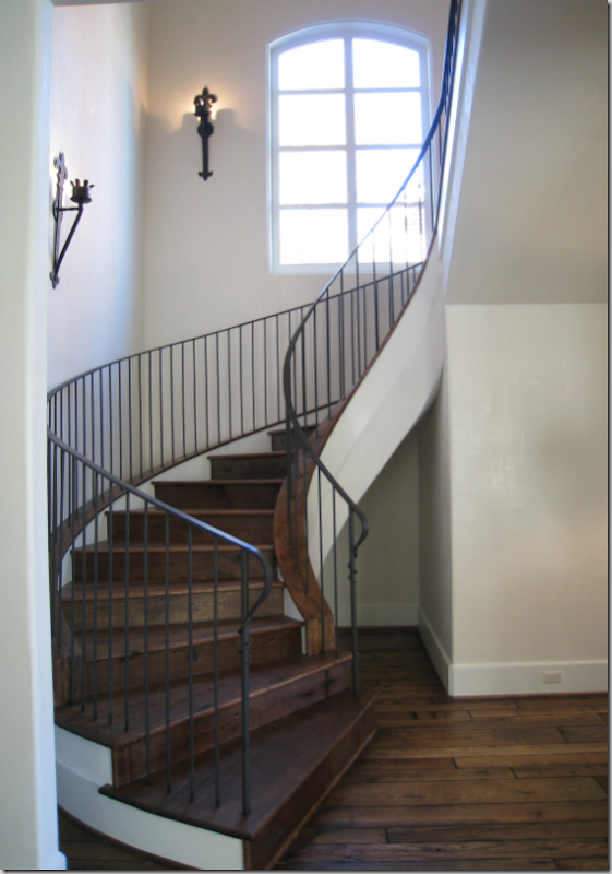
Across the center hall from the dining room is the stairwell.   Simple, again, yet elegant – with iron sconces on the walls. 


image

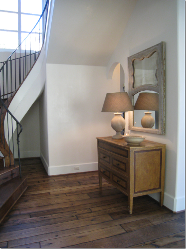
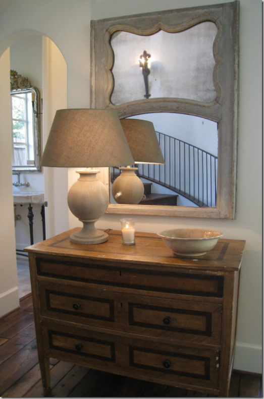
Across from the stairs, Barber put this wood chest, with a French trumeau above and a simple wood lamp.  A round bowl and candle are the only accessories.  Behind the lamp, through the archway is the powder room.  


image

Close up the vignette in the stair hall. 


image

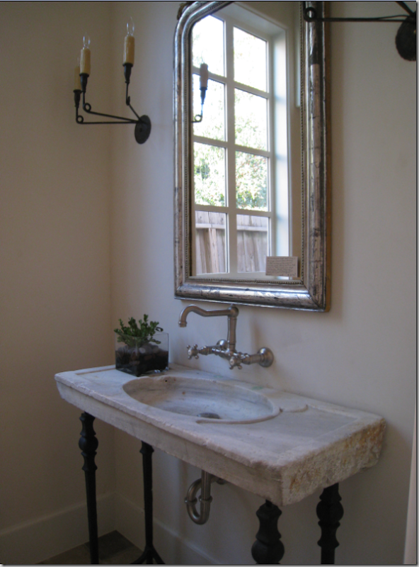
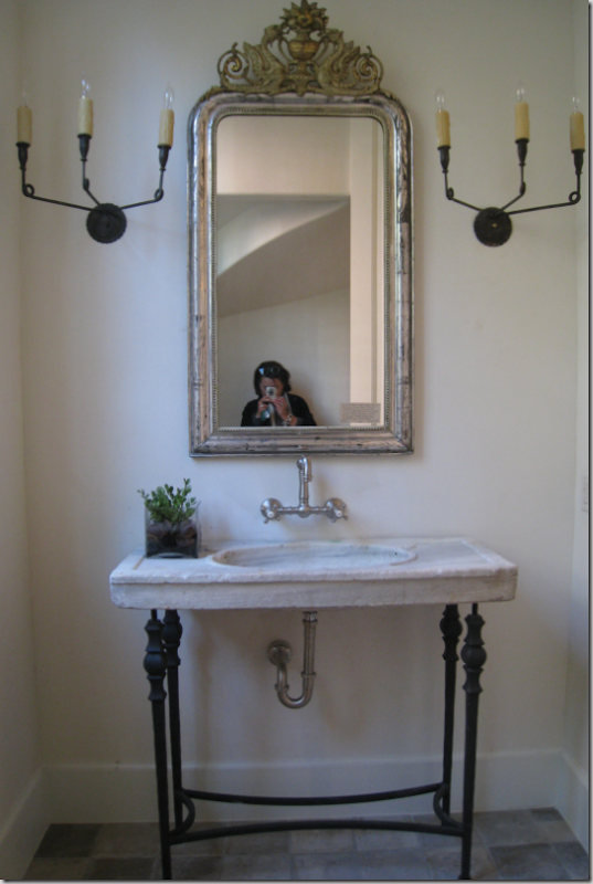
The powder room has an antique sink on iron legs with wall hung fixtures.  Simple three armed black iron sconces flank the silver leafed Louis Phillipe mirror.


image

Hello!!!  The Louis Phillipe mirror (from Carl Moore) is so beautiful – as is the sink, a 19th century Italian marble piece.   The floor tiles are also 19th century:  both came from Chateau Domingue which specializes in antique architectural elements. 


image

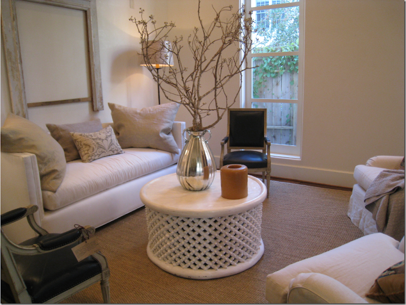
Past the stair hall, on the right side of the house, is the “formal” living room.   Again, simply decorated – yet tastefully decorated – a trademark of Ginger Barber.  Here she used a seagrass matting rug, with down sofa and two club chairs – slipped.  The large pillows are wonderful – probably 26”.  Two beautiful French chairs, upholstered in black leather are almost accents in the room.  The large round coffee table is the perfect choice here – and I love the mercury glass jar!!!    Branches instead of flowers – so Ginger!


image

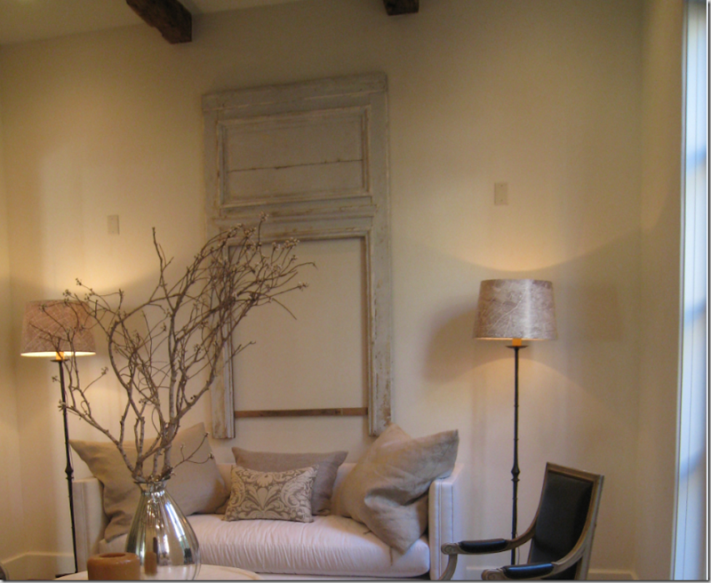
Close up:  the trumeau over the sofa is missing the mirrors!  Love that!    Notice the lampshades – they are paper and are illustrated with the antique map of Paris.  I have these too and love them!  The effect is subtle but very French.  Watkins Culver carries these shades in all sizes.  

image 

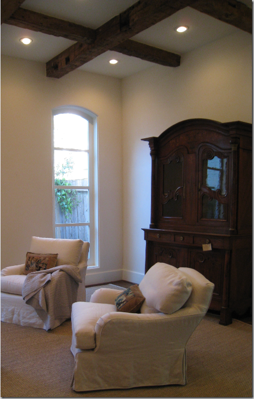
The ceiling in the living room is box beamed with 200 year old timber.  With 12 ft. ceilings, the armoire has to be really tall to be effective.   ok – I would put curtains in the house.   Oh well.    I love these chairs, slipped in natural linen – another trademark of Ginger’s.    The pillows are lumbar sized and are made of velvet and antique Belgium tapestry pieces.


westu 033

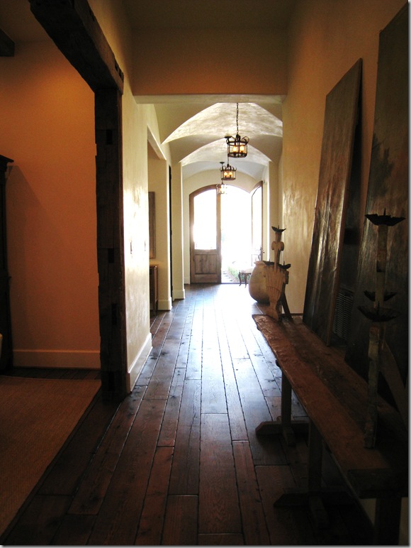
Leaving the living room  - looking back towards the front door – notice how the entry to the living room is framed in the same wood beams as its ceiling is - fabulous.   Also you can see the groined ceiling in the front part of the central hall.   The walls are Venetian plaster. 


image

Right across from the living room, Ginger arranged this vignette with a rustic console and two, unframed oils.   The faux painted candlesticks are charming! 


image

At the end of the long center hall is the family room on the right and the breakfast room/kitchen on the left.   Another trumeau mirror highlights the 18th century "cheminee” taken from a country house in France.   Here Barber paired a  barley twist settee with a brown velvet sofa.   Two matching wood consoles with pedestal lamps flank the fireplace.  The family room is a huge 19 x 19 and could handle a lot more furniture!   Antique wood beams run from here into the kitchen.


image

Close up of the family room.  This room leads to a covered porch and the large back yard.


image

The expansive breakfast room with a zinc topped table and French park chairs.  A rustic console is paired with a fabulous antique plate rack.  The breakfast room overlooks the garage area.  I love this!  The lantern is in perfect scale as are the large pieces of furniture.
 

image

Close-up showing the ceiling beams.   Barber designed this house almost exactly as what one might find in a country house in Provence. 


image

The kitchen with white cabinets and limestone topped island with granite on the countertops.    Saltillo pavers are used for a backsplash.  Through the door you can see the back into the Butler’s pantry, the dining room, and into the Music room.   Next to the refrigerator is the mud room.   The kitchen, like the rest of the house, is large, airy, and full of textures between the smooth plaster walls and the rough beams and floors.  All the black iron fixtures around the house add to the textures and contrasts.


image

 Looking from the kitchen into the breakfast room.   The limestone on the island is an unusual but wonderful choice.   All matte finishes – nothing shiny for Ginger ever!


image

The Wolf range with its plaster hood.


image

The best sink in the world:  Shaws!


image

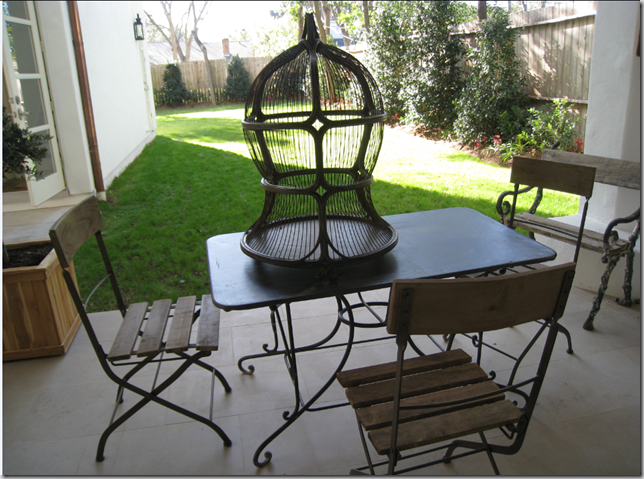
Let’s go outside:   the covered porch has a charming iron table with French park chairs – and a birdcage.  The garage is to the left with an apartment upstairs.  The yard is double length – it goes behind the garage, enough for a large pool.


image

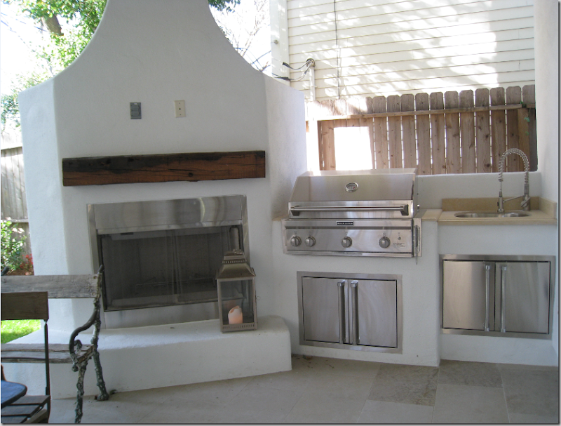
The covered porch has a summer kitchen and a fireplace!


image

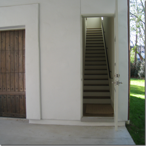
OK – let’s go upstairs!   The house has three staircases:   the large spiral staircase, a back stairs by the family room, and these stairs outside to the garage apartment.  Upstairs, the large, complete apartment connects through to the master bedroom closet. 


image

The garage apartment’s kitchen connects to the master bedroom closet allowing the owners to use it for coffee and midnight snacks.


image

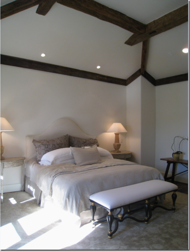
The master bedroom is 18 x18 with the antique beamed  pitched ceiling.  Barber decorated the room in linens and linen colors. 


image

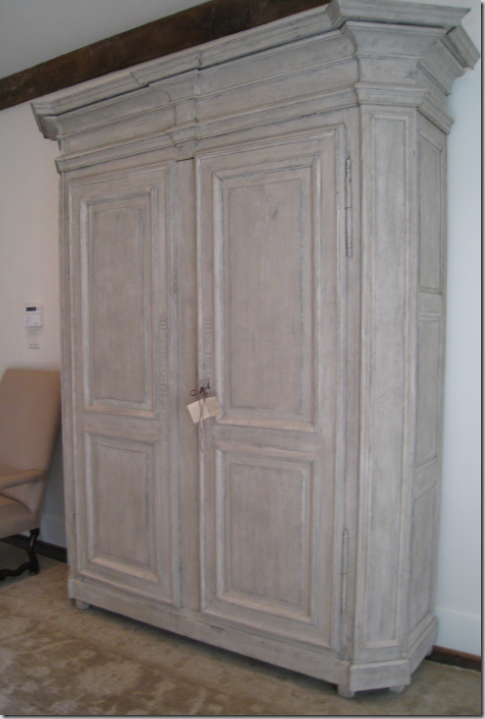
The bleached wood armoire is across from the bed.


image

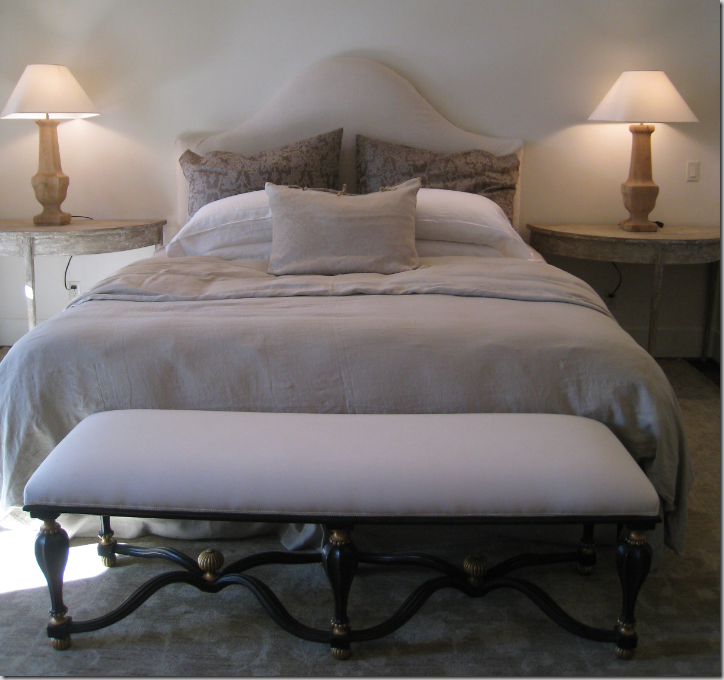
Close up of the bed.   I love the two demi lune night stands. 


image

Outside the master bedroom is a covered porch.


 image

The porch is charming with its wrought iron balcony.  It overlooks the back yard.


image

The upstairs porch even has a built in fireplace. 


image

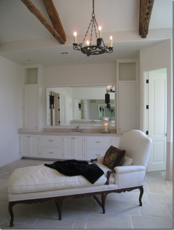
The master bathroom has one vanity on each side with the shower and tub in between them.  The floor is limestone.  


image

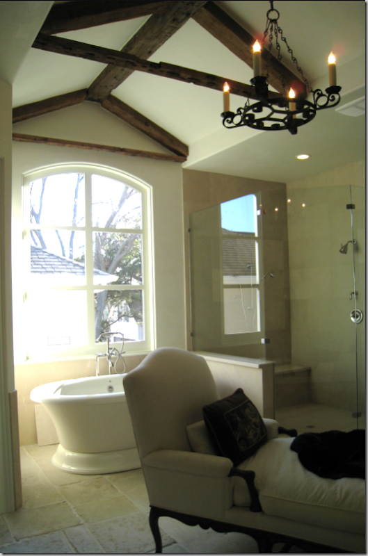
Barber placed this beautiful long antique chaise in the middle of the bathroom.   A black wrought iron chandelier hangs from the pitched beamed ceiling. 


image

The bathroom, with the raised roof is just gorgeous.  I really loved the bedroom suite.


image

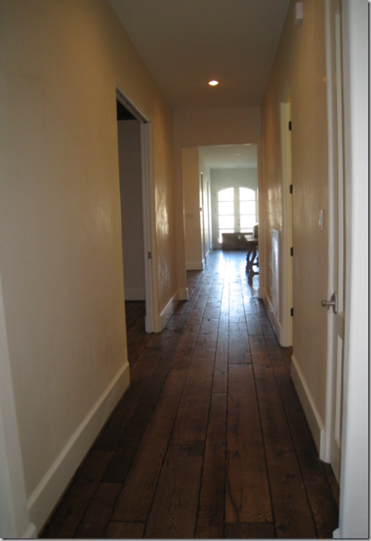
Leaving the master bedroom suite – the center hall upstairs continues with the 100 year old plank oak floors which lead into the media room.  The bedrooms have wall to wall seagrass.  Additionally – the plaster walls are upstairs too – a nice extra touch.  


image

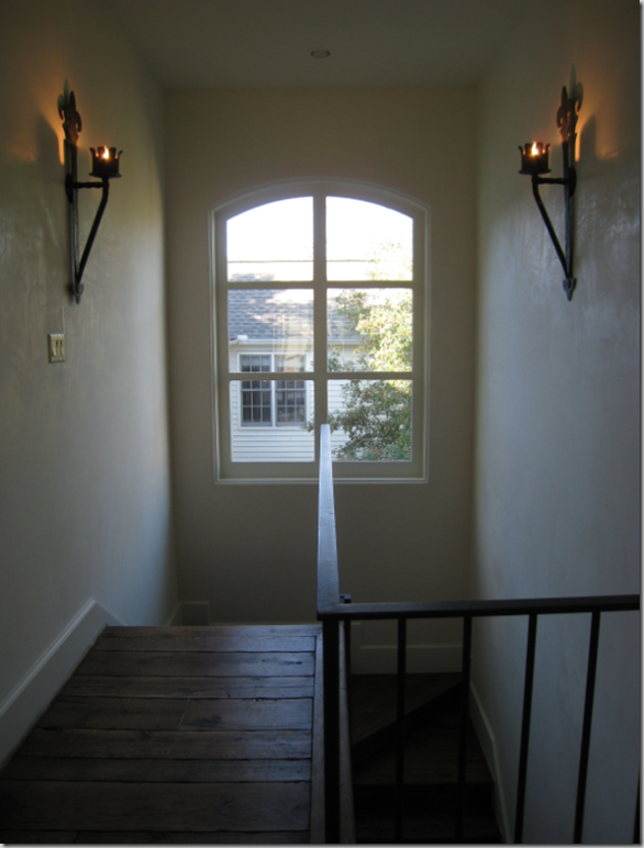
To the left is the back staircase – with the iron sconces that are so much preferable to harsh overhead lighting.   Even the back stairs have the wood treads and iron railings.


image

The upstairs media room has a pitched roof and casement windows with the oak floors.  Unfortunately – none of the upstairs rooms, save the master bedroom suite, were decorated!   Unlike the Octagon House which is for sale, this home has already been sold, therefore the need to go “all out” with furniture just isn’t there.    


image

Stunning upstairs bathroom with antique marble sink from Chateau Domingue and old marble tiled floor.  The cabinet is pure Ginger Barber – reminiscent of the one in her own bathroom.


image

This was another great bathroom with a vanity and marble tiled walls.


image

It’s bath was housed in a beautifully arched niche – tiled to the ceiling.


image

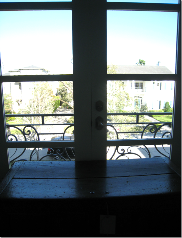
At the end of the upstairs center hall is this balcony that overlooks the front yard.  Barber put an oriental chest in front of it.


image

And she set this vignette along the long upstairs hall.   OK, time to leave – let’s go downstairs:


image

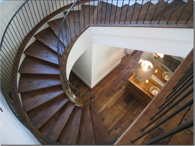
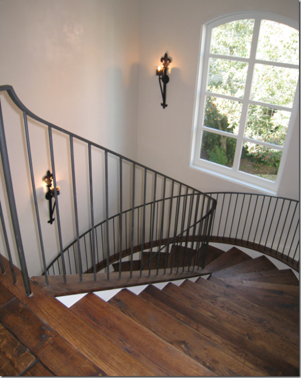
Looking down the stunning staircase – what a view!  I love the rails – why go all fancy when the simplest is so gorgeous?


image

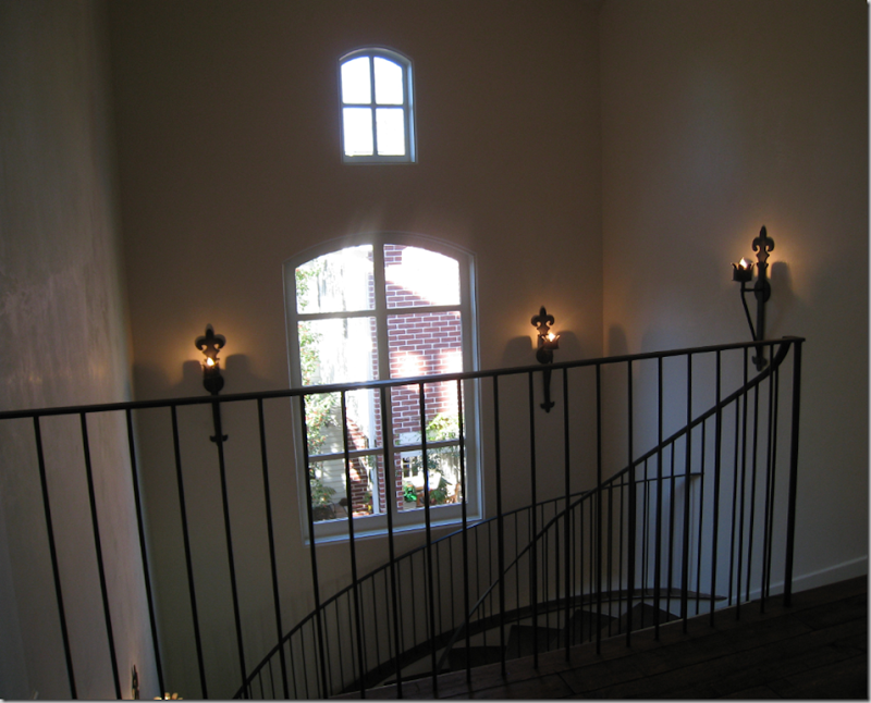
The main staircase is just so beautiful!  I love the sconces and the tiny upper window.  


image

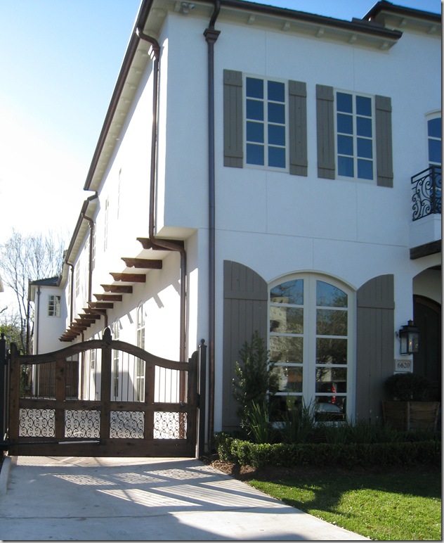
OK – let’s go downstairs – I want you to see the driveway gate.


westu 105

The side of the house with the iron and wood gate.     The home was built by Heritage Home Builders, the designer was Ginger Barber


Question time:  which house do you like better:  Octagon House or Provence House or neither??!   Provence House comes in at $2,395,000 and 6,600 sq. ft.  Octagon House is $3,299,000. and  6,948 sq. ft.   The lot for Octagon house is wide and long – much more private.  Provence House is long and narrow – with neighbors on both sides!    OR…….would you prefer something smaller, more cozy, less money, but still beautiful?   Check back in for that one!!!!