Notice the brick paver driveway and the attractive garage door. Antique shutters surround the front window, while an old bench sits out front. I love the copper gutters! To the right is the side garden which leads to the hidden front door.
Now that the West University Home Tour benefiting WU Elementary is over, for those who don’t live in Houston, homeowner Heidi Dugan is graciously letting us see these pictures of her beautiful house first published in Houston House and Home magazine. Dugan is a well known real estate agent in Houston, working for Greenwood King. She built this house several years ago using inspiration she got after traveling to France and Italy. The house is filled with antique architectural elements brought over from Europe which give the house its special feel. Interior Designer Ginger Barber sourced old and antique beams, flooring, shutters, and furniture from Houston dealers and also directly from Europe. While the house itself is outstanding, the outdoors really set it apart. There are two courtyards – one for dining and one that surrounds a small swimming pool. The front door, with its side entrance, is reached through antique iron gates, creating a third outdoor space.
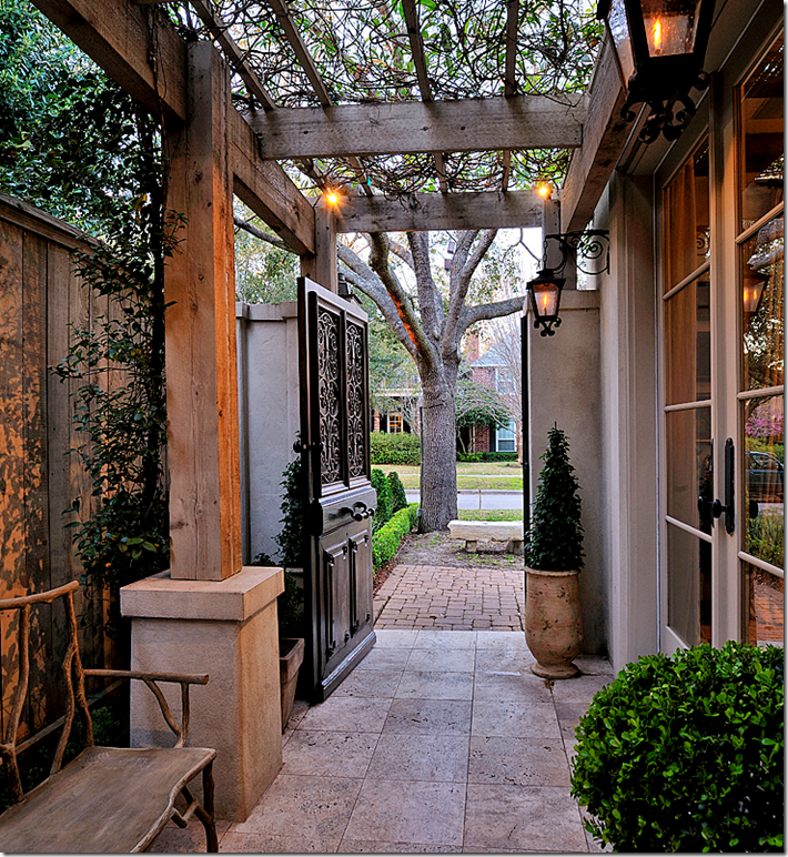
The side garden behind a wood and iron door, leads to the front door. The pergola gives this space a room like feel.
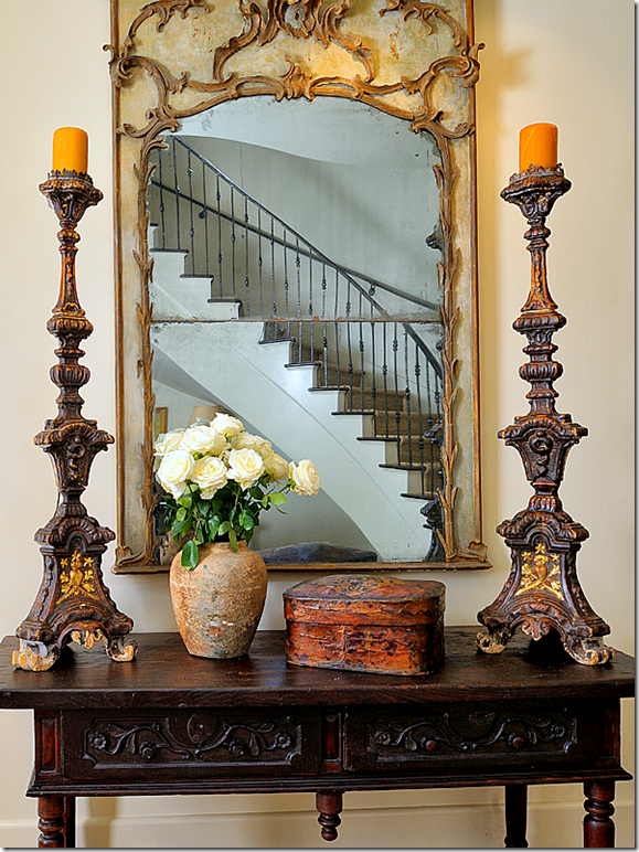
In this picture of the foyer, you can see the iron railing on the gracefully curved staircase. Antique trumeau and candlesticks sit on a French console.
The living room, across form the entry, faces out to the front yard seen through the large arched window. Linen was used for the curtains and slipcovers. The contemporary coffee table is juxtaposed against a trio of antique chairs. Notice the gorgeous ceiling beams that came from France. The rug is the only bright pattern found downstairs which is mostly cream, ivory, and white.
The dining room has a beyond fabulous antique French chandelier. The table is Italian and the fabric on the chairs is Fortuny. Just gorgeous!
In the kitchen, antique beams were used for the crown molding. The island is an antique shop counter. The countertops are 17th century stones! Amazing! The floor is Portuguese tile.
Slipcovers and seagrass, a popular Houston look which Ginger Barber helped define. The star of the family room is the 17th century mantel. The antique beams found throughout are from Chateau Domingue. Out the doors is the “swimming pool courtyard” – one of two courtyards found on the property.
In the powder room, a stone trough becomes the sink. The trumeau and sconces are both French antiques.
The upstairs landing features a vignette with an antique console and a pair of balustrade lamps. What a great idea – blow up one family picture instead of having framed pictures spread throughout. Love that!
Heidi’s bedroom is all linen in beiges and sages. Hey - that rhymes! The desk is an antique. Notice the pair of lamps taken from old vases. I love the slipcovered bench at the end of the bed and the candelabra in the corner. The ceiling is vaulted and lined with beams.
The dining courtyard features a large limestone table and a mirror made out of an 19th century zinc French window. The landscaping is all green, mostly from box, bamboo, and vines.
The same space – here you can see the 18th century fountain set up on a wall made of 19th century stone blocks. I really love the pair of stone columns and finial. So pretty!
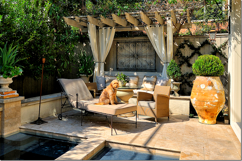
The second courtyard, off the family room, is where the swimming pool is. To one side is a draped pergola that creates an outside room.
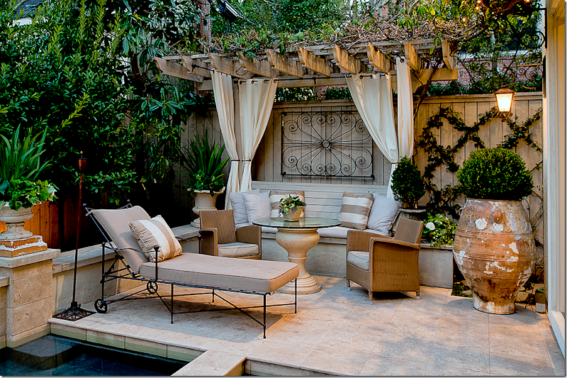
Without the pet dog, you can see the courtyard better. I love the table and the draped banquette under the pergola.
Heidi Dugan, an real estate expert on West University and surrounding neighborhoods, works at Greenwood King and can be reached HERE. To read more about this house see the article in Houston House and Home HERE. All these beautiful photographs were taken by Miro Dvorscak. Visit his web site HERE.
The builders were Overstreet Builders. Helping with the plans was architect Travis Mattingly. Ginger Barber did the interiors and Thompson Hanson did the landscaping.
If you are going to be in Houston this weekend, its Urban Market time again! For more information, go HERE.
House with Two Courtyards
Two In Houston
If you live in Houston, you may have seen these two homes already – both were featured in a local magazine – Houston Lifestyles & Homes – but, since many who read the blog aren’t from Houston, I thought I would share them with you. Both houses are quite beautiful and reflective of the “Houston look,” although one house is dressier than the other. Enjoy!
House #1
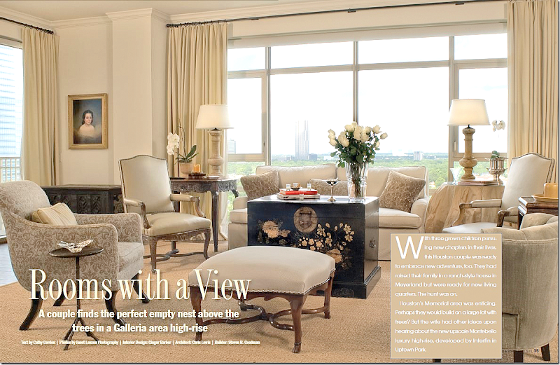
The first house, decorated by Ginger Barber, is located in the Montebello – a rather new Houston highrise. This project is around five years old and I’ve loved it since first seeing it on Ginger’s web site. Most highrise apartments in Houston are either contemporary or dowdy. This, is neither. It’s warm and cozy and youthful – something not usually associated with living in a newly built penthouse. Though empty nesters, the owners are much younger than typical highrise dwellers in Houston. For this project, they bought two units and combined them for a total of 5,000 sq. ft. – which is quite large for a condo. The owners left most of their furnishings in their old suburban house, bringing only a few inherited antiques. How nice must it be to hire Ginger and get all new furnishings too?!! I love Ginger’s easy going style and she certainly brought that feel to this condo. Everything is so perfectly designed, the décor stands as a textbook on how to furnish a condo filled with French and Swedish antiques that is not stuffy or pretentious.
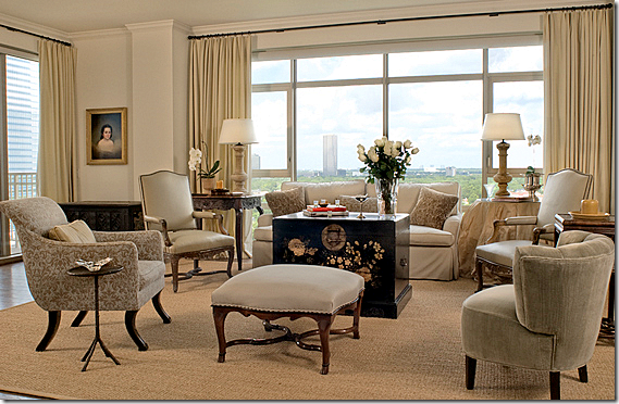
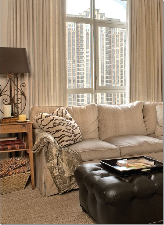
In the living room above, Ginger used soothing neutrals. The large black painted chest serves as the only accent color. Cream drapes add softness – so many people don’t use curtains in highrises, which is a shame. The fabric goes a long way to warm up all the cold glass, without covering up the view. I love the skirted table in champagne taffeta – it’s so full and luscious. And I love the French ottoman with its trendy nailheads. But it’s the oriental styled chest that really stands out – its beyond fabulous! The seagrass really helps to keep it all young and fresh looking. Just beautiful!!!!!
A smaller picture – without all the writing over it!!
The dining room is a favorite of mine, a mixture of French and Swedish furnishings. The table had to be dismantled to fit into the elevator – a concern when planning a high rise. Creamy damask covers the large French chairs and an antique mirror hangs above the French enfilade. The chandelier is also antique. The big surprise is the Swedish sofa that Ginger placed in front of the window.
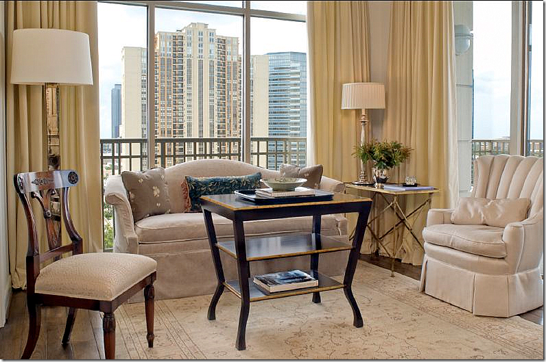
Again, not your grandmother’s penthouse! A painted Swedish sofa sits between two fluted columns topped by urns. Sooooo charming!!!!!
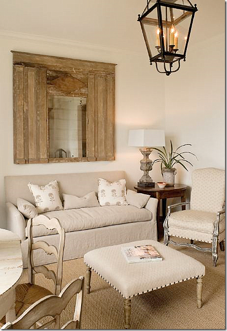
Off the living room, the music room is filled with inherited furniture which Ginger recovered. The traditional sofa got a youthful slipcover.
The breakfast/sitting room off the kitchen is adorable. I love this room!!! Meals are taken at the painted table with its painted chairs.
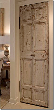
In the kitchen, an antique door closes off the pantry. Seriously, have you ever seen a rustic antique door in a penthouse? Touches like this really help cozy up the home.
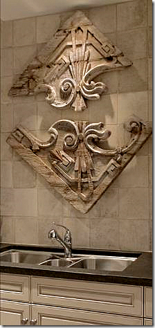
In the kitchen, the piece above the sink came from Round Top. The backsplash is made of tiles from Chateau Domingue.
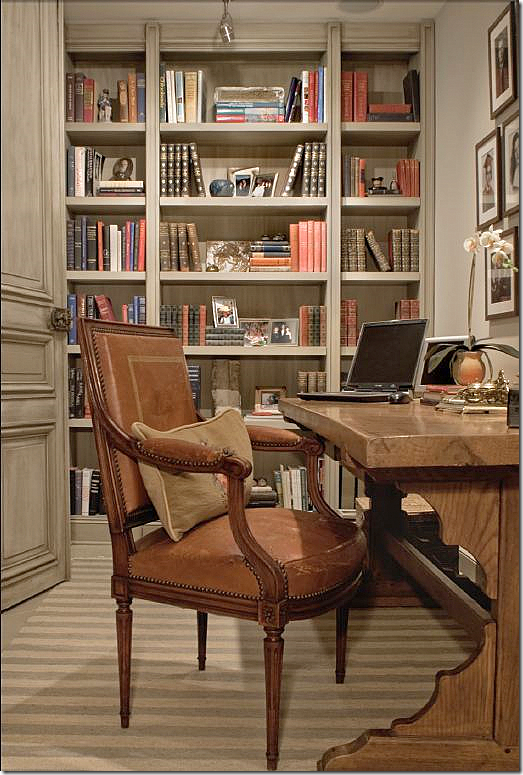
The wife’s office has a muted striped dhurri rug along with antique doors from Chateau Domingue. Shelves are filled with the sentimental photos too precious not to display. I love that desk!
The “media” room is where the couple relax, watching a TV that is hidden in a French armoire.
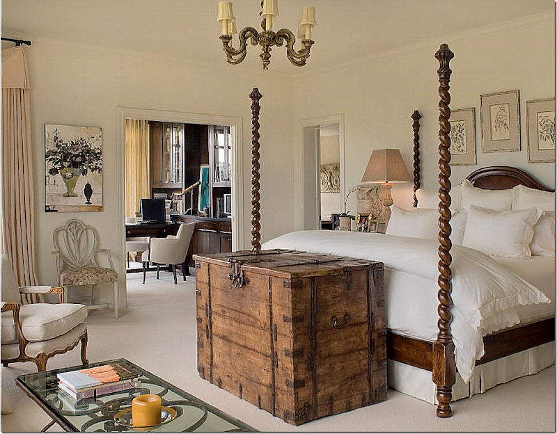
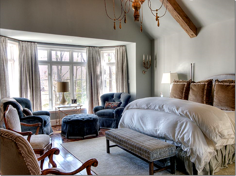
I’m wild over the master bedroom – which is so Ginger. The barley twist bed piled with white linens anchors the room. The bed was custom ordered from Brian Stringer Antiques which is now closed. The rustic chest, a Ginger trademark, is fitted with a hidden TV. The room is large enough for a sitting area. By filling up the space with furniture, the room seems cozy instead of cavernous. A secret to successful oversized rooms is to fill them up with furniture! A mistake many people make with today’s extra large spaces is not using enough chairs, sofas, and tables. The husband’s office adjoins the bedroom.
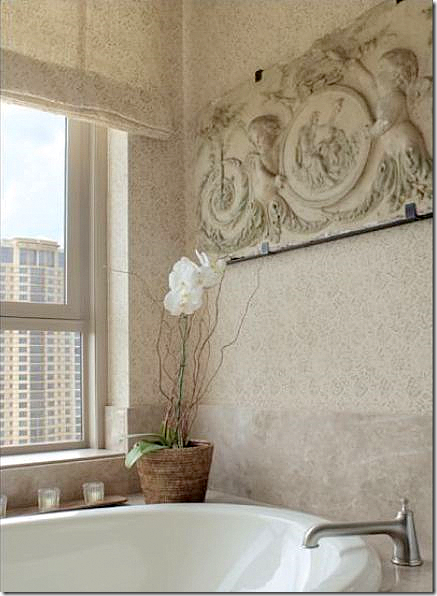
The master bathroom appears to be covered in a Rose Tarlow print, but it’s not credited. The piece above the tub is romantic and again, typical Ginger. She loves to mix concrete and stone with wicker and linen.
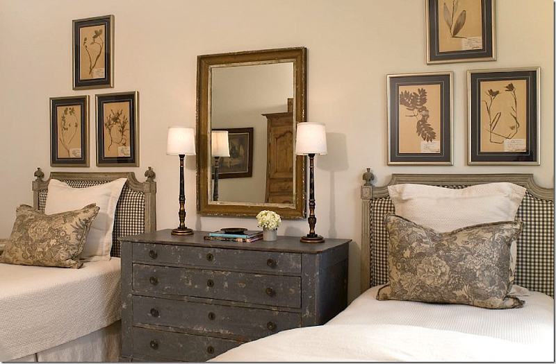
The guest room is beyond adorable with its gray painted French headboards and chest. Framed antique botanicals hang from the wall. I love the crisp check fabric mixed with the gray toile on the pillows. The adorable matching chinoiserie lamps are from Ginger’s shop: www.gingerbarber.com
I hope you enjoyed this peek at Ginger Barber’s foray into slick highrise living. As you can see, highrise living doesn’t have to be cold, dowdy, or contemporary. Instead it can be warm, inviting, interesting and cozy! Photographs by Janet Lenzen. To read the original article, go HERE.
House #2
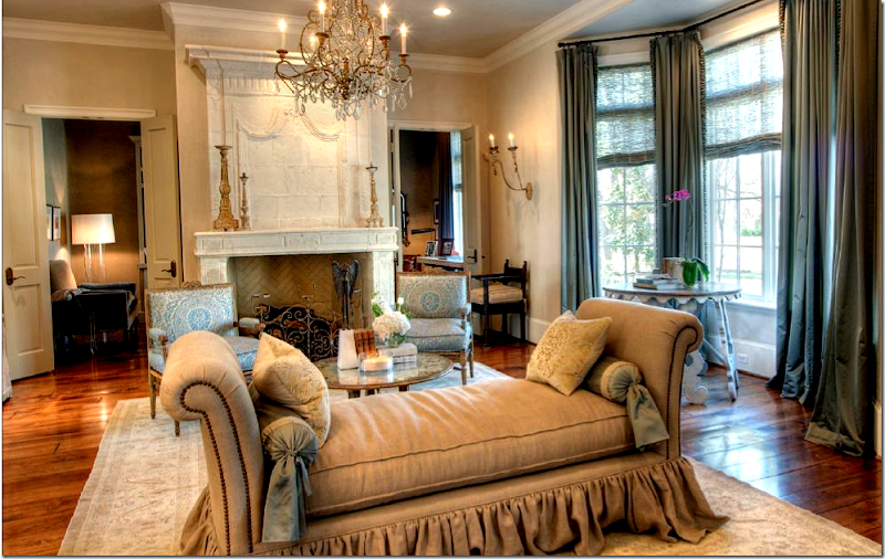
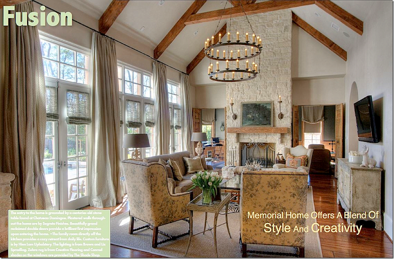
Next is a large custom built house in the Memorial area. The builder was Parker House Inc. and Sarah West was the architectural consultant who tweaked the plans for the homeowners. Cindy Witmer designed the interiors along with the homeowner. Together they went to the Round Top Antiques Fair and bought furniture that anchored the expansive rooms. The walls were plastered by Leslie Sinclair of Segretro Finishes. Leslie’s wall treatments are unparalleled – the subtle texture adds a depth to the walls that adds a quality that is hard to define. I would love for Leslie to do my entire house – her plaster is just that gorgeous!!!! The rugs and carpets came from Creative Flooring. Lighting came from BROWN, AREA, and Tara Shaw. The window treatments were designed by Linda Falk and all upholstered furniture was custom designed by Cindy and made by Hein Lam Upholstery. All these beautiful photos are by Wade Blissard HERE. To read the original story, go HERE.
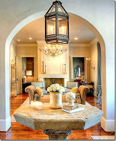
An antique stone table from Chateau Domingue stands in the entry hall under a lantern. Love that! The living room is straight ahead.
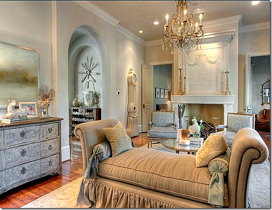
Love!!! I love the floating day bed – by Hein Lam. They make the prettiest skirts and flourishes. Love the fireplace from Chateau Domingue. The room is dressy, yet approachable at the same time. The beautiful chandelier is from Tara Shaw and the chairs are covered in Fortuny.
In this view, you can see the chest and into the next room on the left. There’s that lamb again!!! I have it and so did another house I showed last month! It’s soo cute.
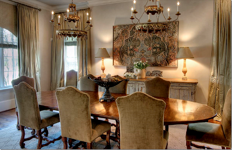
So pretty! The house is dressier than many like it because rugs were used as opposed to the seagrass that Houston so loves. Here, two fixtures from Round Top hang over the large wood table. Instead of slipped chairs – they are upholstered in a chenille. The sideboard is antique from Belgium. The silk curtains are fabulous!!!!!!
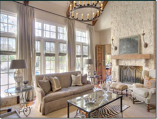
The family room is wonderful. I love the lush curtains and the chairs covered in Bennison! So pretty. These chairs are from Hein Lam and I just love them The large fixture is from BROWN. I like that they resisted putting the TV on the fireplace. Well, it looks like seagrass did make it to this room! A zebra is layered over it.
A closer look at the sofa and stone fireplace. The media/billiard room is through the doors next to the fireplace.
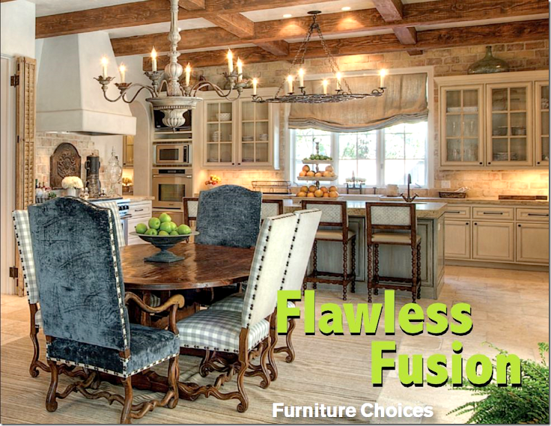
Off the family room is the large kitchen and breakfast room. The back wall has reclaimed brick and stone from Chateau Domingue. Segreto did the walls and the cabinet finish.
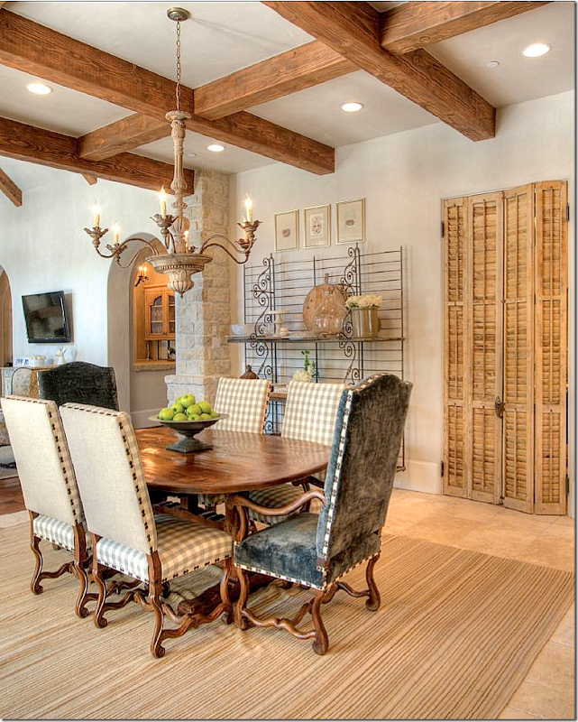
This shows the breakfast table with the chairs in velvet and check fabric with nailheads. The light is from AREA.
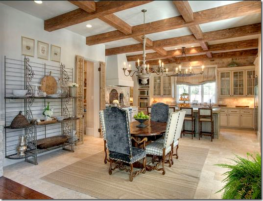
The bakers rack and antique shutters are from Chateau Domingue. Hidden behind the shutters is the office. You can see the family room on the left and how it leads into the kitchen. And you can see the large bar at its right.
And looking from the family room into the kitchen.
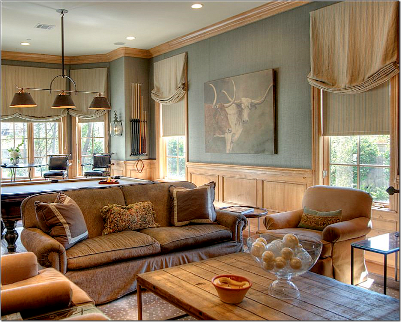
The media/billiard room’s light fixture is from BROWN. Great rug! The painting and coffee table are from AREA.
I love the velvet that is found throughout the house. It makes everything just a little dressier. The tufted chairs and ottoman are wonderful – so soft and cozy loooking. The soft blue walls are by Segreto.
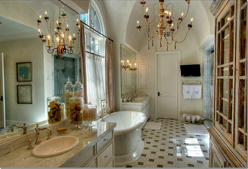
So pretty! The floor just looks old – its really new. The chandelier is from Tara Shaw. I love the shell filled with towels. Cute idea.
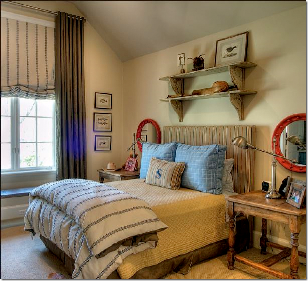
The son’s room.
The daughter’s room is especially cute in pinks and purples. Cute dress hanging up on the wall.
I hope you’ve like these two Houston homes. The Ginger Barber highrise is a good lesson on how to decorate a condo for a young couple and make it look trendy and cozy. The second house shows that not all Houston is just seagrass and slipcovers. The house is more dressy than most, but it still is fitting for a younger couple with small children.
The Conservatory House

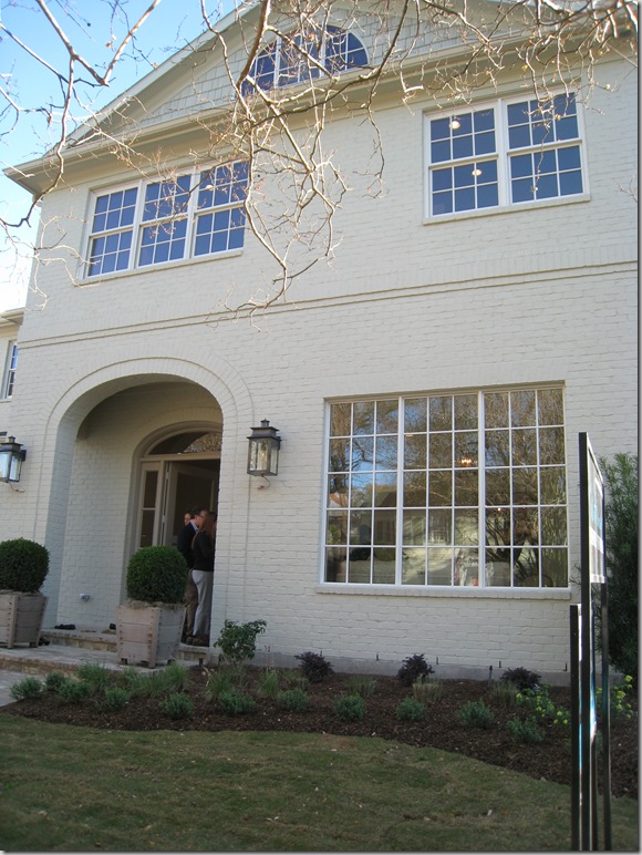
The third house, The Conservatory House, was different than the Octagon or Provence house. It was smaller than both by over 2,000 sq. ft – so it seemed more “realistic,” more attainable. It was less expensive (though I suffered sticker stock when I casually asked the builder what he was asking!) It was more “normal” – it wasn’t breathtakingly, achingly beautiful. You wouldn’t go through this house and just die if you couldn’t own it, or go home and give your husband grief over it, but still – it was special - with several areas that made you notice it and think - “Wow – what a great house this is.” And though its lot is typical for West U, it is just a bit wider than standard, allowing extra space to offer a little bit more than most. Its facade is deceiving. At first glace it appears to be an old house that has been renovated and, in fact, it fooled even me for a few minutes. Its brick has been painted a soft taupe – something you see done to vintage houses usually to cover up a deep, almost burgundy colored brick. The arch over the front door seems reminiscent of a house built here in 40s. In other words, the Conservatory House blended into the street – a street where many of the original two story houses still stand. And so, though the Octagon House almost caused a suicide, and the Provence house was the stuff of dreams, the Conservatory House seemed like home. It also didn’t hurt that the builder chose Ginger Barber to help with the selections and furnish it for the show. btw – that’s my friend Jordanna at the front door with her husband!
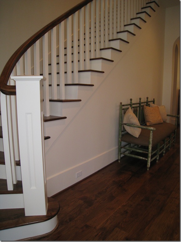
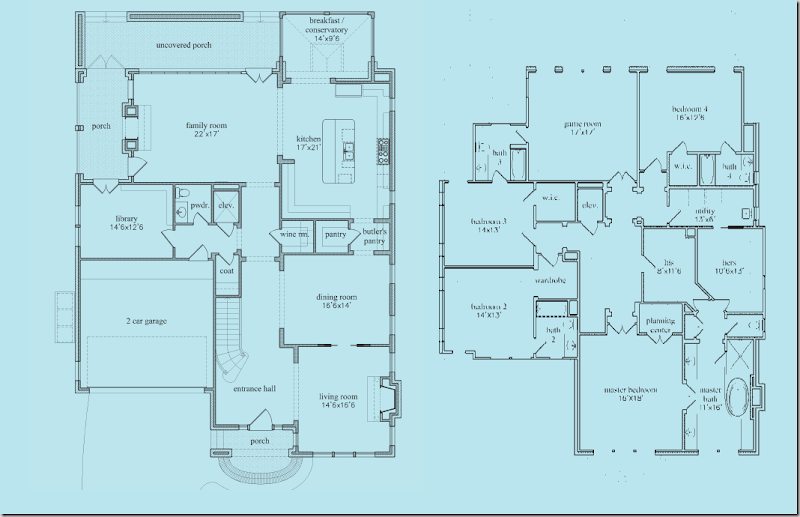
The floor plan starts off like a typical West University floor plan with a front loading garage: long entry hall with stairs, living room on the right, then dining room, then kitchen along the back sharing the space with the family room. The wood floors flow throughout the downstairs and upstairs, which is really nice – no carpeting at all! (Full floor plans are at the end of this post.)
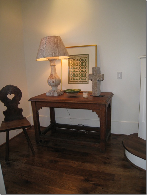
To the immediate left of the front door, Ginger used this table with a rustic lamp and the wonderful paper shades with the map of Paris. Watkins Culver in Houston carries these.
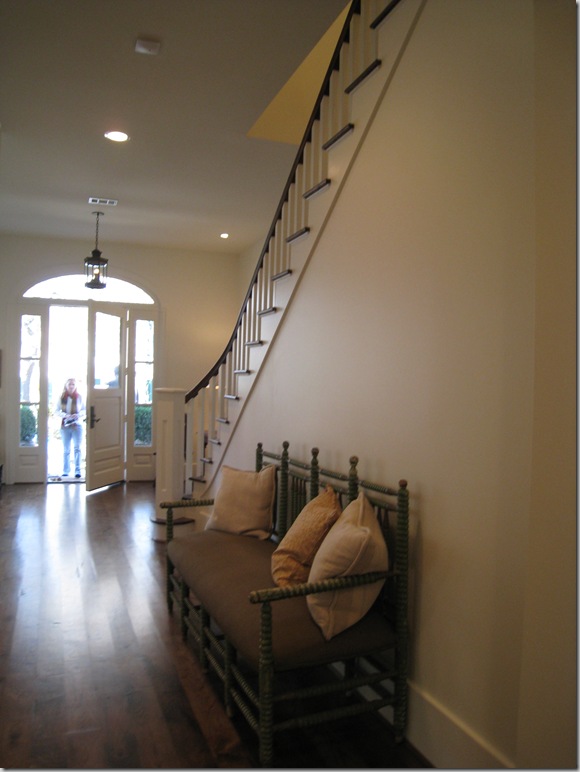
The view looking back towards the front door – the front porch, and door are both arched, as are most of the passageways downstairs.
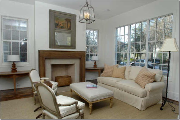
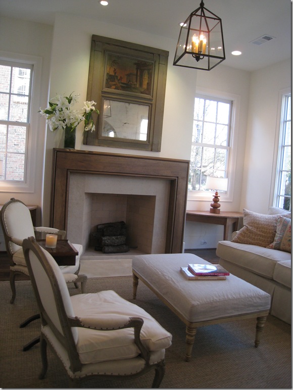
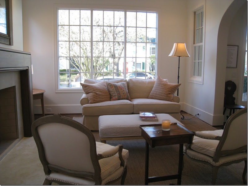
To the immediate right of the front door is the formal living area, but with Ginger Barber, nothing is ever too formal. Here she used a lantern and slipcovered sofa. Demi lunes flank the wood mantel fireplace. The trumeau was particularly effective. If this was mine, there would be curtains, of course, and taller lamps in the window, and I do think I would elect for full length windows in this house – most are not.
Close up of the fireplace – clean lines, very simple.
Looking from the dining room – you can see the large arch that separates this room from the entry hall.
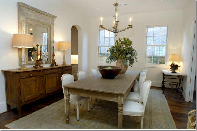
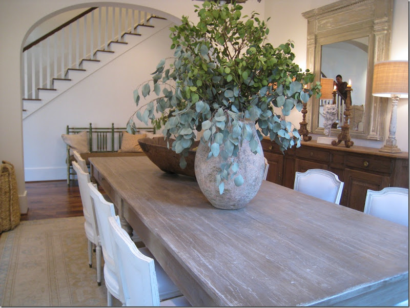
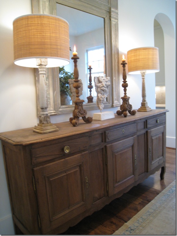
The next room – through the living room is the dining room. Carol Piper supplied the area rugs in the house. Ginger matched fancy French chairs with a more rustic table. I really like the long buffet with, again, a wood trumeau mirror. As is now obvious from this house and the Provence house, Barber likes to use mirrors more than art and I couldn’t agree more. I love old Italian oils and they are so pricey – it’s just cheaper to substitute antique mirrors for fine art!
A close up of the dining room, showing the arch that separates it from the stair hall.
And looking back towards the living room – this was one door way which wasn’t arched because I believe there is a pocket door here – why I can’t imagine.
Dining room close up: typical Barber accessorizing – large and spare. To the right, you can see the arch that leads to the butler’s panty and onto the kitchen. I really like the drum shades on the lamps. Drum shades really are an updated look. If you are looking to freshen up a room, consider changing out your old lampshades to drums.
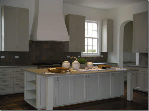
The kitchen is very large and has a contemporary feel to it. Very clean lined. the countertops were soapstone.
Another view – so much storage! I would have not put the upper cabinets along the back wall if this was mine. That way, you could have put more windows along that wall. In fact, I would probably have moved the range to the side wall and left this for the sink and a large expanse of windows. But, alas, no one asked my opinion!
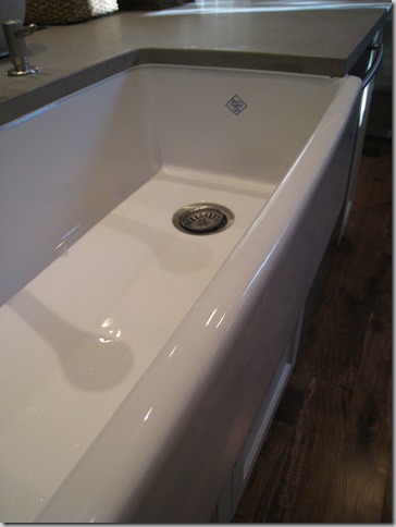
Another Shaws farm sink – best sink in the world!
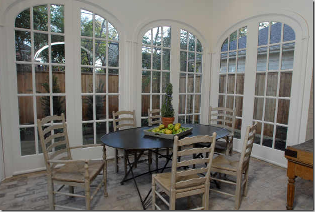
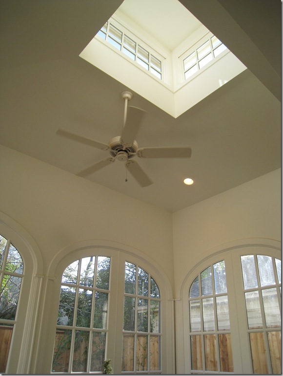
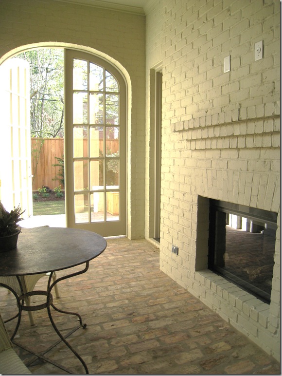
What makes this house special: off the kitchen is this breakfast room – a true self-contained room with a clerestory window on the ceiling. To further give this room a conservatory feel, antique bricks were used on the floor. The walls of the room are brick – and it really makes it seem that this room was added on to the house – continuing the illusion that this is actually an older house instead of a new one.
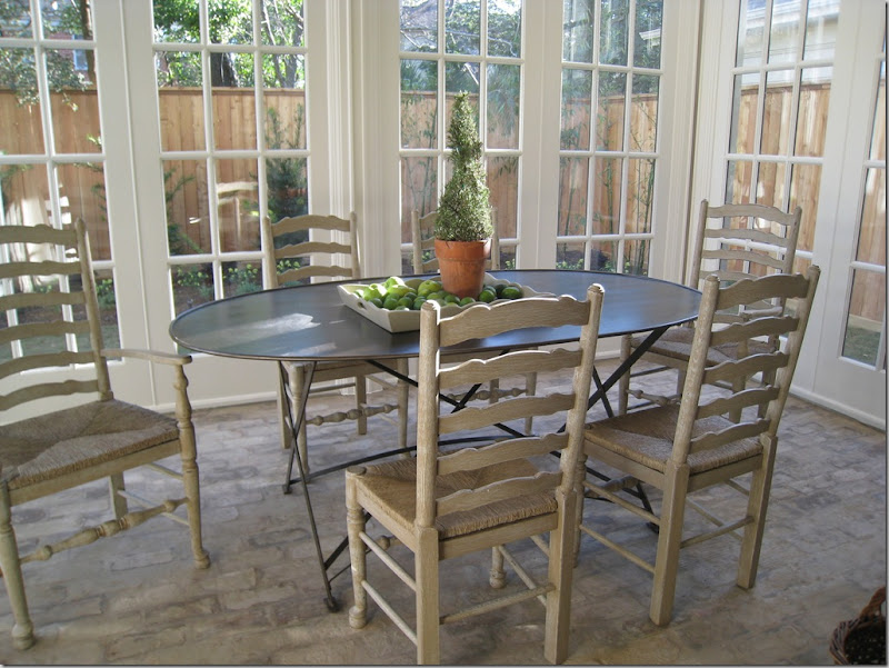
Ginger chose a trendy metal table paired with painted rush seats. Elliptical French doors made up three sides of the room. This space is a true show stopper – it was gorgeous! So unexpected! I have never seen a new, typical West U home with this type of breakfast room – but it makes my wonder – why not? I would love to do this to my house. It was just beautiful. After the show I spoke with several people about the different homes and so many named this room as their favorite of the show! It was just that great!
A view of the elliptical doors with the clerestory window. That ceiling fan would be coming down so fast if this was mine!
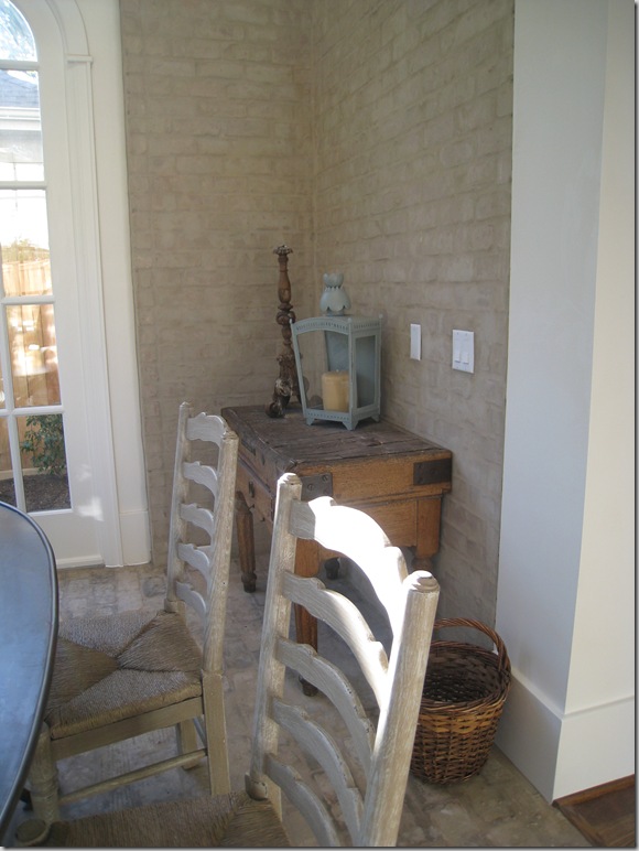
Ginger used an antique butcher’s table and lantern. Notice the brick walls which make the room look added on.
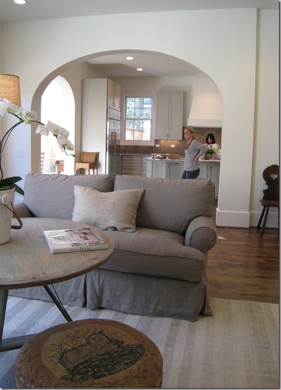
Through a large arch is the family room. You can see the breakfast conservatory through the left side of the kitchen.
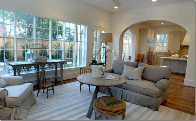
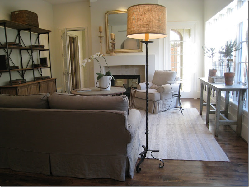
Slipcovers and mirrors, candlesticks and wrought iron, painted woods and baskets: Ginger’s style. The simple lined fireplace is actually two sided – it adjoins a screened in porch, another great surprise to the house.
I am crazy about this muted striped flat weave rug that Barber chose to use here. The coffee table is great too. The shelving unit is a style that I keep seeing more and more of – rustic wood and iron married together. I suppose this could be the Belgium influence. Through the open door is the screened porch which leads to the outside.
In this picture you can really see how the builder handled the trim – very sparingly. No fancy crown molding, something I am loving more and more these days. Just a great, tall, plain baseboard. The entire house was trimmed out this same way. And, I love this stool Ginger used – a dressy French piece upholstered in antique petit point.
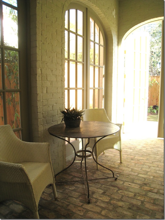
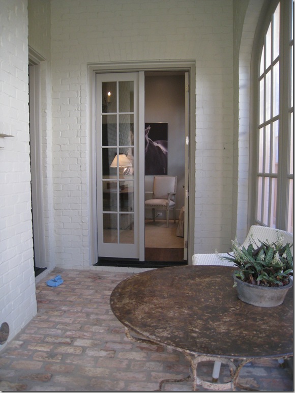
Owning to the somewhat wider lot, the extra footage allowed for this wonderful screened porch with the painted brick walls and antique brick floor. Again, this porch adds to the illusion of the house’s age. Through the door is the wide back yard.
The fireplace that is shared with the family room.
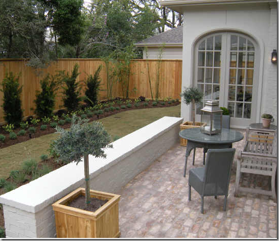
With the family room in the middle - here you can really see the breakfast room/conservatory with the clerestory window on top. Doesn’t it look added on? And I love the short brick wall which separates the terrace from the yard.
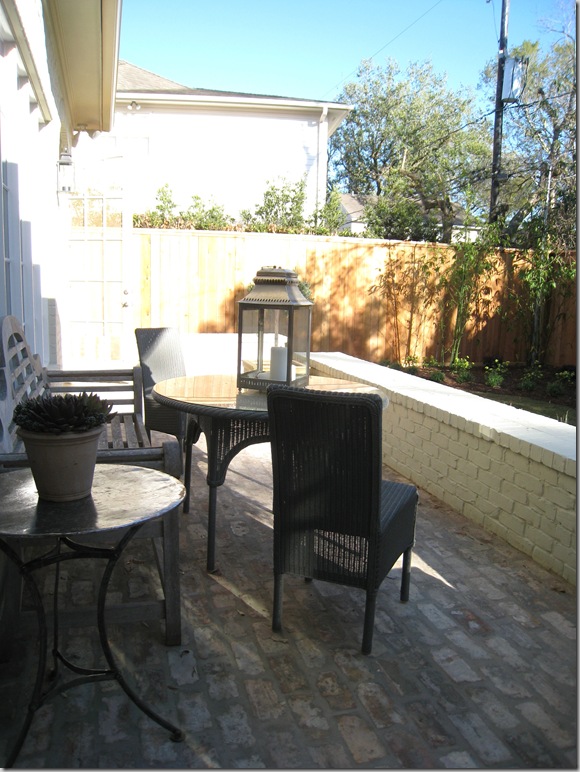
A closer view of the conservatory. I love how Ginger decorated this terrace with loom chairs and a teak bench. The yard is actually deeper than it looks here and I suspect the owners will be putting in a long lap pool.
Looking from the other side – again – the perils of town living in West University: close by neighbors!
Going back into the screen porch – through the French doors is the study, which is off the main stair hall. Love the blue bootie that someone lost along the way. The builders make you put them on during the tours!
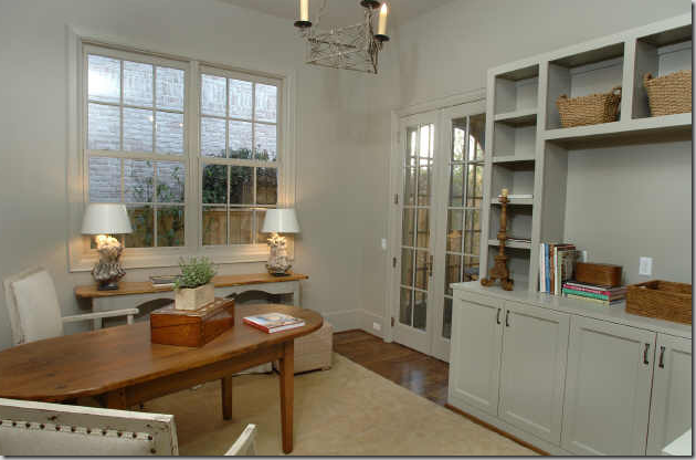
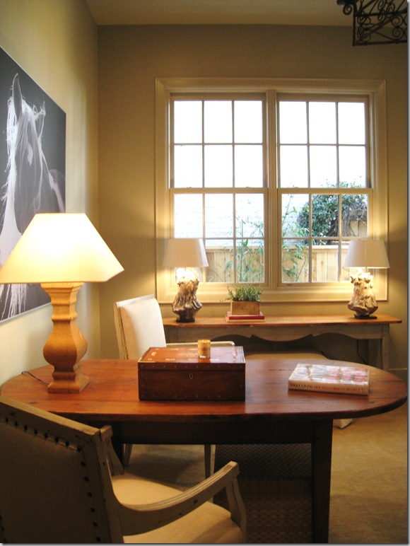
The study is another surprise in the house – a great space for an office. I love how Ginger used a table instead of a desk, something that I think is so practical and much prettier! The walls and all the trim are all painted in the same shade. Also – notice on the built-in how thick the shelves are – giving it a more updated look.
So pretty! Just needs a simple window treatment, imo!
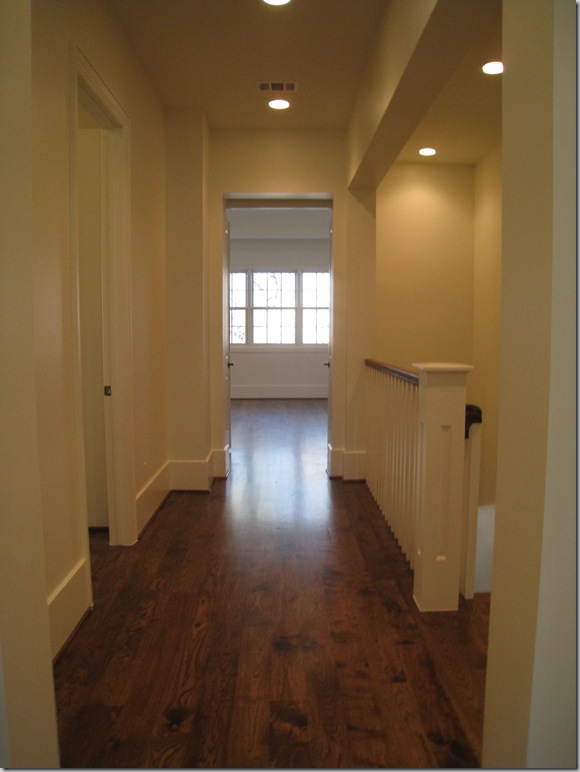
Going upstairs, the dark, wide planked wood floors are continued throughout. As with the Provence house, these rooms weren’t furnished, not even the master bedroom – which was a huge disappointment. There are four bedrooms here, along with a large media room/playroom.
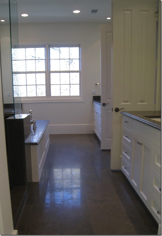
The master bathroom – two separate vanities.
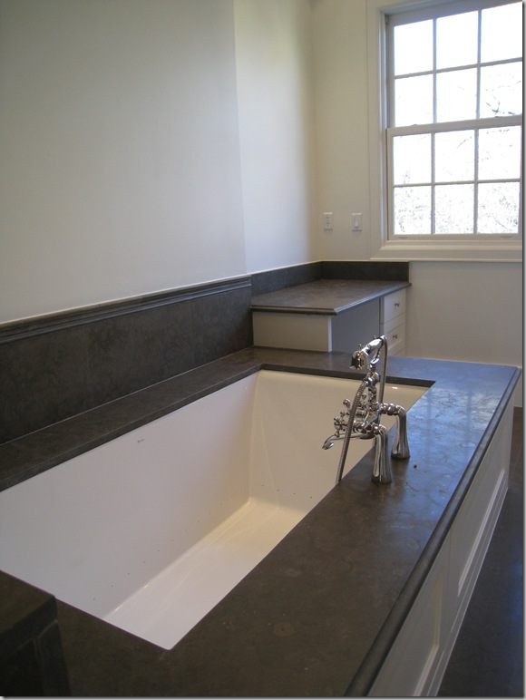
And a beautiful tub.
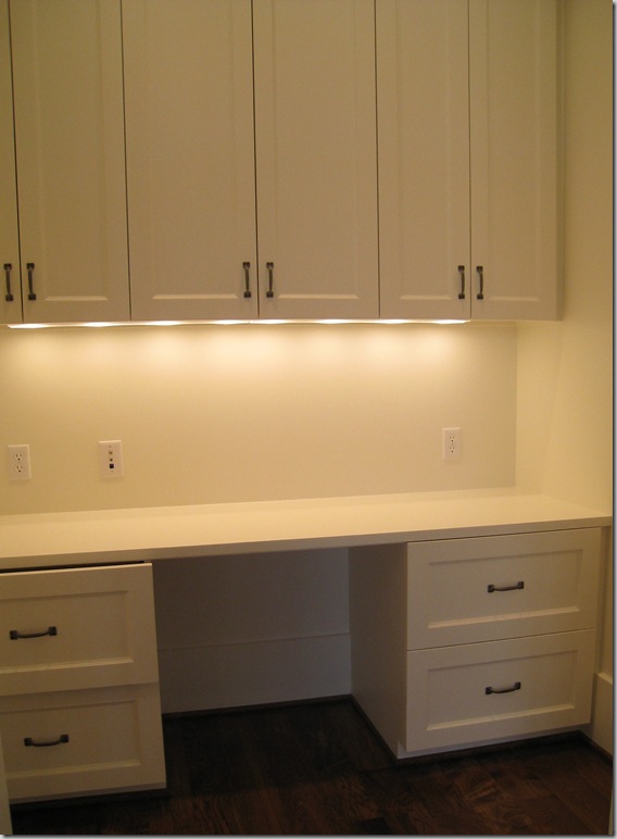
Behind closed doors in the master bedroom was a surprising office.
And finally, the upstairs laundry room had this adorable checker floor.
And for the architects and interior designers and especially Stefan, the floor plans.
And so, it’s the end of the West University Festival of New Homes until next year. I hope you’ve enjoyed seeing the three houses that really spoke to me. With each house I toured – I came away thinking “This is the ONE!” – how fickle I am. You see, I visited a open house this weekend and let me tell you – boy, was it beautiful. I’m thinking the open house I toured this weekend was the ONE!!! Does anyone know the name of a good psychiatrist in Houston? Specializing in new-house-itis? I’ve been struggling with this disease for a long time now and my husband is insisting that I get cured, quick.


