
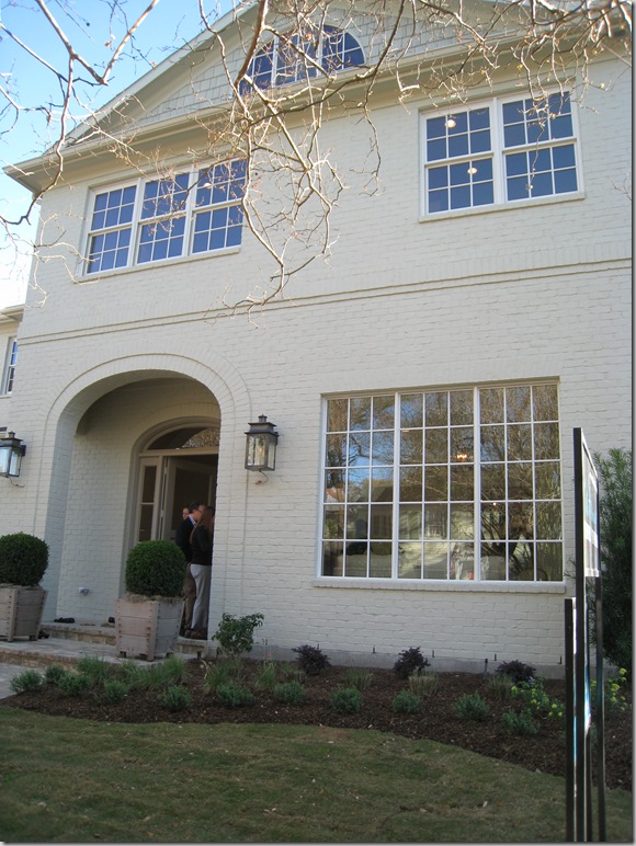
The third house, The Conservatory House, was different than the Octagon or Provence house. It was smaller than both by over 2,000 sq. ft – so it seemed more “realistic,” more attainable. It was less expensive (though I suffered sticker stock when I casually asked the builder what he was asking!) It was more “normal” – it wasn’t breathtakingly, achingly beautiful. You wouldn’t go through this house and just die if you couldn’t own it, or go home and give your husband grief over it, but still – it was special - with several areas that made you notice it and think - “Wow – what a great house this is.” And though its lot is typical for West U, it is just a bit wider than standard, allowing extra space to offer a little bit more than most. Its facade is deceiving. At first glace it appears to be an old house that has been renovated and, in fact, it fooled even me for a few minutes. Its brick has been painted a soft taupe – something you see done to vintage houses usually to cover up a deep, almost burgundy colored brick. The arch over the front door seems reminiscent of a house built here in 40s. In other words, the Conservatory House blended into the street – a street where many of the original two story houses still stand. And so, though the Octagon House almost caused a suicide, and the Provence house was the stuff of dreams, the Conservatory House seemed like home. It also didn’t hurt that the builder chose Ginger Barber to help with the selections and furnish it for the show. btw – that’s my friend Jordanna at the front door with her husband!
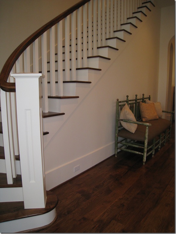
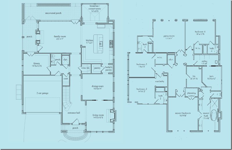
The floor plan starts off like a typical West University floor plan with a front loading garage: long entry hall with stairs, living room on the right, then dining room, then kitchen along the back sharing the space with the family room. The wood floors flow throughout the downstairs and upstairs, which is really nice – no carpeting at all! (Full floor plans are at the end of this post.)
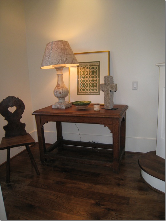
To the immediate left of the front door, Ginger used this table with a rustic lamp and the wonderful paper shades with the map of Paris. Watkins Culver in Houston carries these.
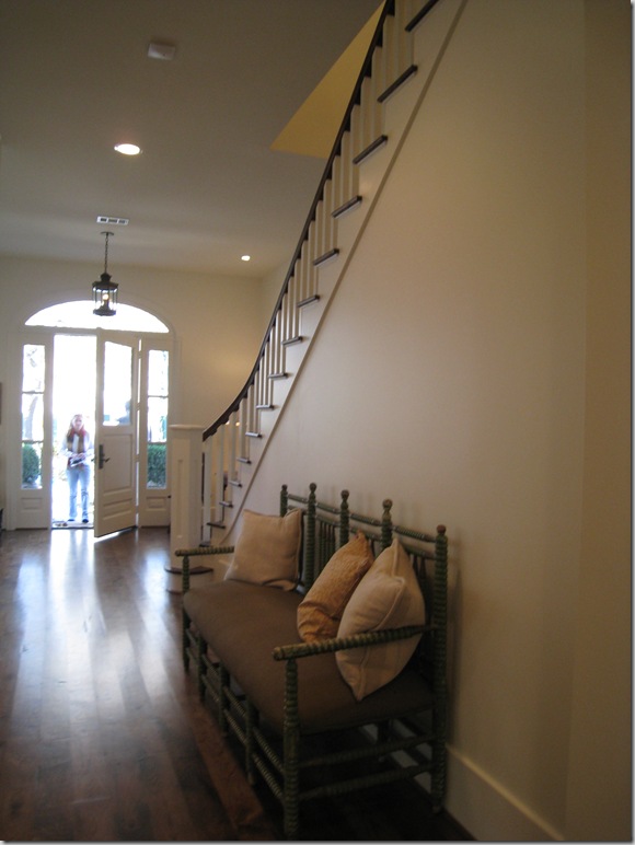
The view looking back towards the front door – the front porch, and door are both arched, as are most of the passageways downstairs.
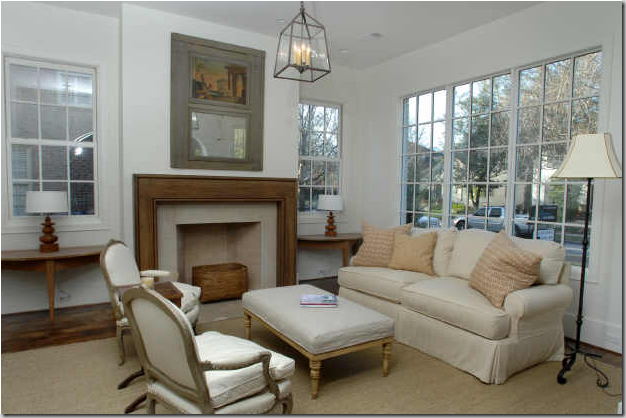
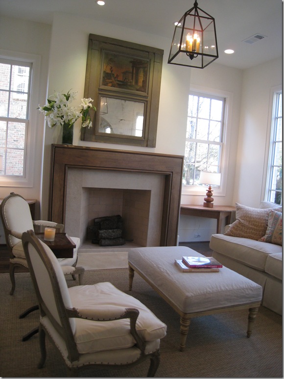
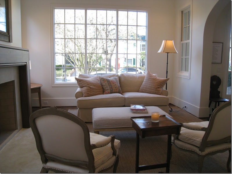
To the immediate right of the front door is the formal living area, but with Ginger Barber, nothing is ever too formal. Here she used a lantern and slipcovered sofa. Demi lunes flank the wood mantel fireplace. The trumeau was particularly effective. If this was mine, there would be curtains, of course, and taller lamps in the window, and I do think I would elect for full length windows in this house – most are not.
Close up of the fireplace – clean lines, very simple.
Looking from the dining room – you can see the large arch that separates this room from the entry hall.
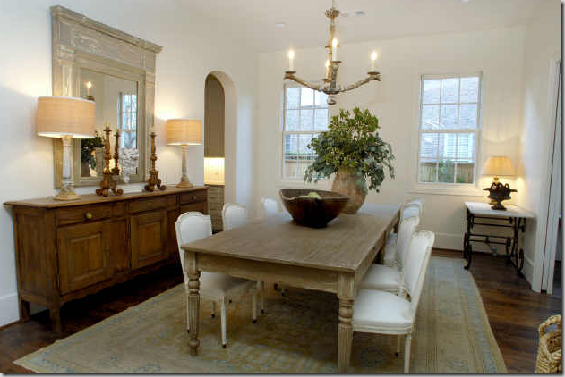
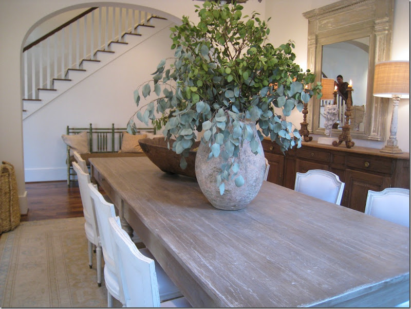
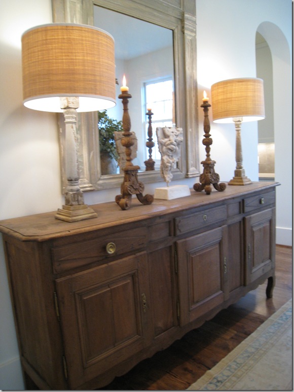
The next room – through the living room is the dining room. Carol Piper supplied the area rugs in the house. Ginger matched fancy French chairs with a more rustic table. I really like the long buffet with, again, a wood trumeau mirror. As is now obvious from this house and the Provence house, Barber likes to use mirrors more than art and I couldn’t agree more. I love old Italian oils and they are so pricey – it’s just cheaper to substitute antique mirrors for fine art!
A close up of the dining room, showing the arch that separates it from the stair hall.
And looking back towards the living room – this was one door way which wasn’t arched because I believe there is a pocket door here – why I can’t imagine.
Dining room close up: typical Barber accessorizing – large and spare. To the right, you can see the arch that leads to the butler’s panty and onto the kitchen. I really like the drum shades on the lamps. Drum shades really are an updated look. If you are looking to freshen up a room, consider changing out your old lampshades to drums.
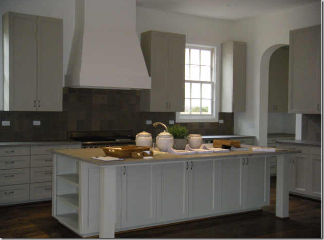
The kitchen is very large and has a contemporary feel to it. Very clean lined. the countertops were soapstone.
Another view – so much storage! I would have not put the upper cabinets along the back wall if this was mine. That way, you could have put more windows along that wall. In fact, I would probably have moved the range to the side wall and left this for the sink and a large expanse of windows. But, alas, no one asked my opinion!
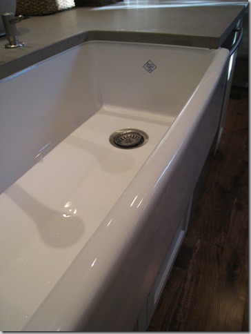
Another Shaws farm sink – best sink in the world!
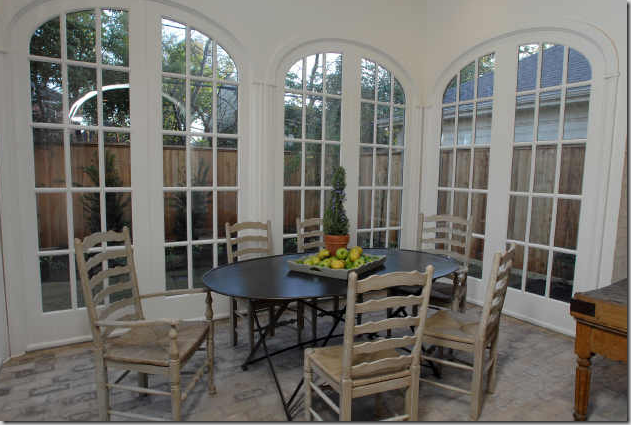
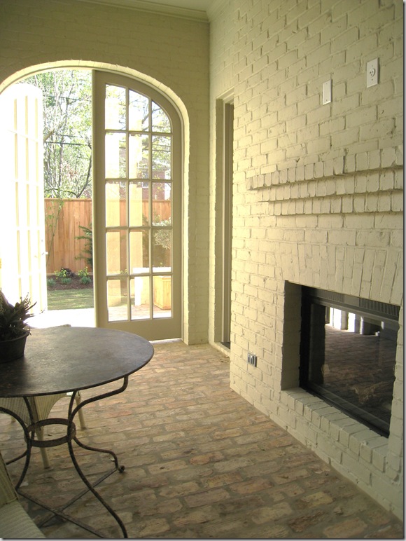
What makes this house special: off the kitchen is this breakfast room – a true self-contained room with a clerestory window on the ceiling. To further give this room a conservatory feel, antique bricks were used on the floor. The walls of the room are brick – and it really makes it seem that this room was added on to the house – continuing the illusion that this is actually an older house instead of a new one.
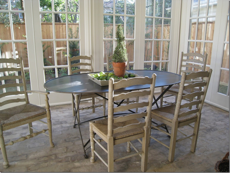
Ginger chose a trendy metal table paired with painted rush seats. Elliptical French doors made up three sides of the room. This space is a true show stopper – it was gorgeous! So unexpected! I have never seen a new, typical West U home with this type of breakfast room – but it makes my wonder – why not? I would love to do this to my house. It was just beautiful. After the show I spoke with several people about the different homes and so many named this room as their favorite of the show! It was just that great!
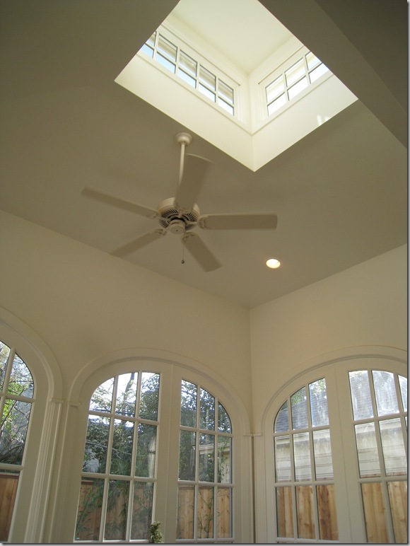
A view of the elliptical doors with the clerestory window. That ceiling fan would be coming down so fast if this was mine!
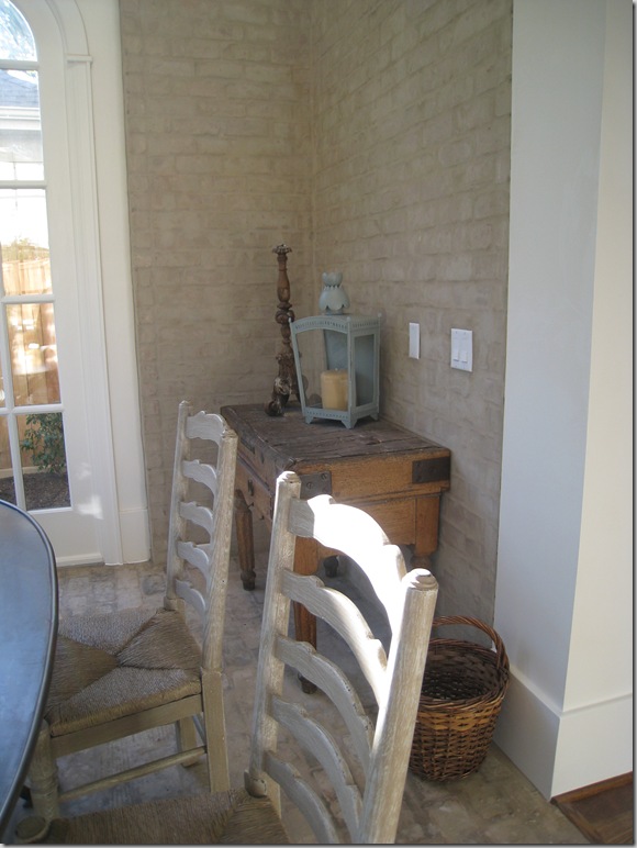
Ginger used an antique butcher’s table and lantern. Notice the brick walls which make the room look added on.
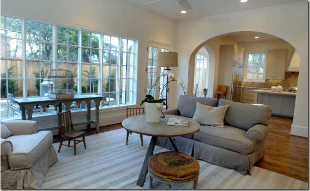
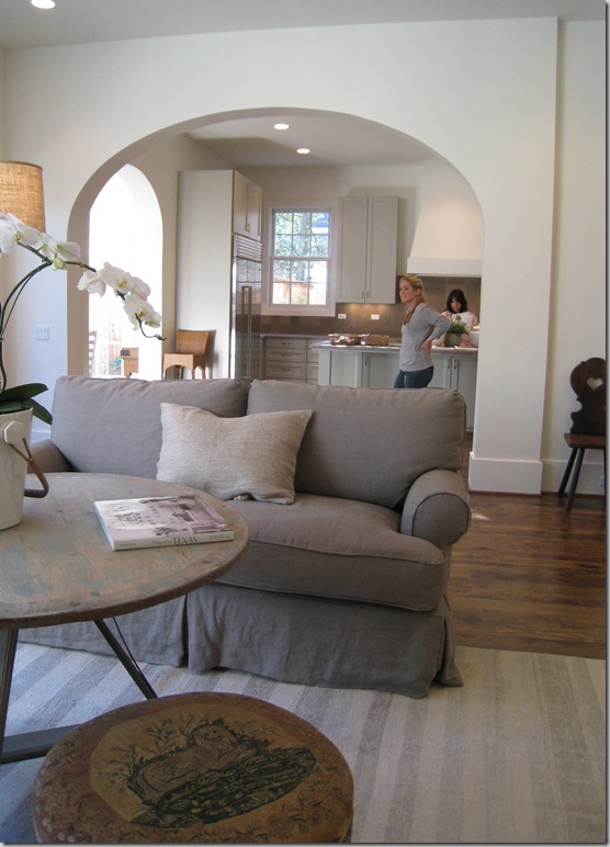
Through a large arch is the family room. You can see the breakfast conservatory through the left side of the kitchen.
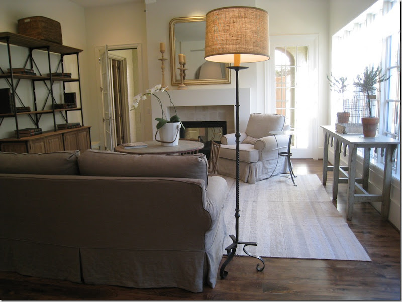
Slipcovers and mirrors, candlesticks and wrought iron, painted woods and baskets: Ginger’s style. The simple lined fireplace is actually two sided – it adjoins a screened in porch, another great surprise to the house.
I am crazy about this muted striped flat weave rug that Barber chose to use here. The coffee table is great too. The shelving unit is a style that I keep seeing more and more of – rustic wood and iron married together. I suppose this could be the Belgium influence. Through the open door is the screened porch which leads to the outside.
In this picture you can really see how the builder handled the trim – very sparingly. No fancy crown molding, something I am loving more and more these days. Just a great, tall, plain baseboard. The entire house was trimmed out this same way. And, I love this stool Ginger used – a dressy French piece upholstered in antique petit point.
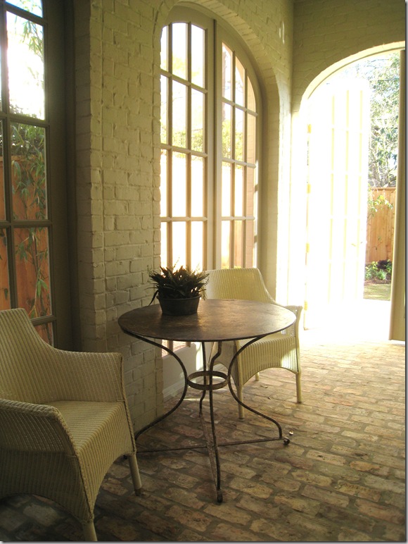
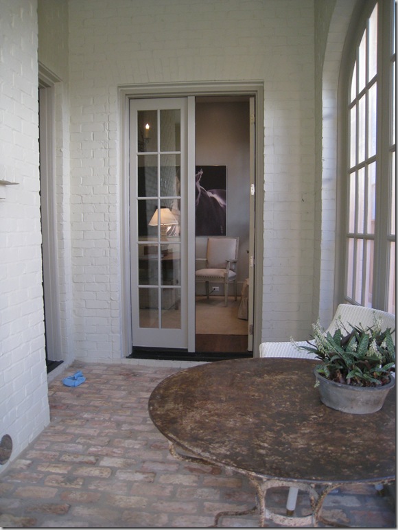
Owning to the somewhat wider lot, the extra footage allowed for this wonderful screened porch with the painted brick walls and antique brick floor. Again, this porch adds to the illusion of the house’s age. Through the door is the wide back yard.
The fireplace that is shared with the family room.
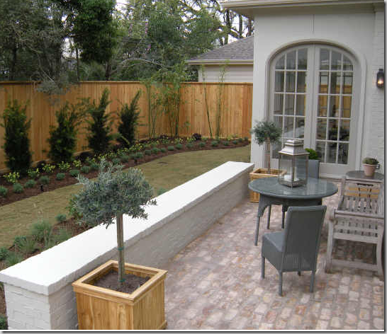
With the family room in the middle - here you can really see the breakfast room/conservatory with the clerestory window on top. Doesn’t it look added on? And I love the short brick wall which separates the terrace from the yard.
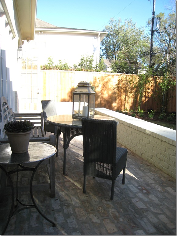
A closer view of the conservatory. I love how Ginger decorated this terrace with loom chairs and a teak bench. The yard is actually deeper than it looks here and I suspect the owners will be putting in a long lap pool.
Looking from the other side – again – the perils of town living in West University: close by neighbors!
Going back into the screen porch – through the French doors is the study, which is off the main stair hall. Love the blue bootie that someone lost along the way. The builders make you put them on during the tours!
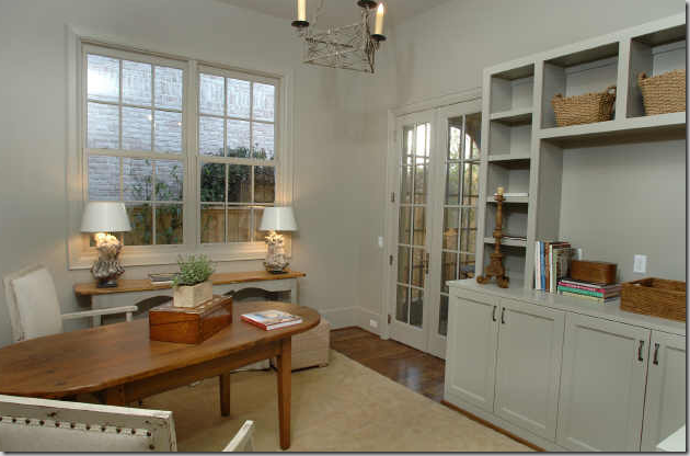
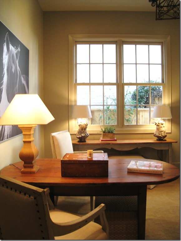
The study is another surprise in the house – a great space for an office. I love how Ginger used a table instead of a desk, something that I think is so practical and much prettier! The walls and all the trim are all painted in the same shade. Also – notice on the built-in how thick the shelves are – giving it a more updated look.
So pretty! Just needs a simple window treatment, imo!
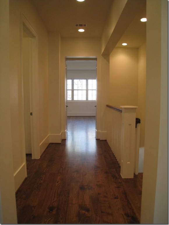
Going upstairs, the dark, wide planked wood floors are continued throughout. As with the Provence house, these rooms weren’t furnished, not even the master bedroom – which was a huge disappointment. There are four bedrooms here, along with a large media room/playroom.
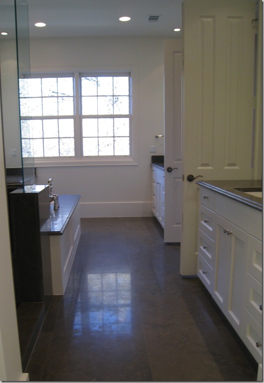
The master bathroom – two separate vanities.
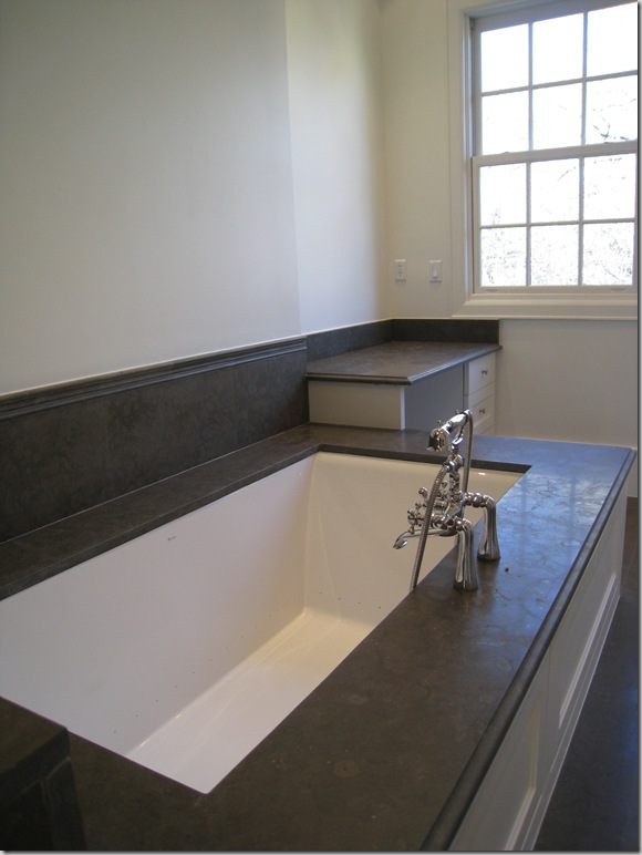
And a beautiful tub.
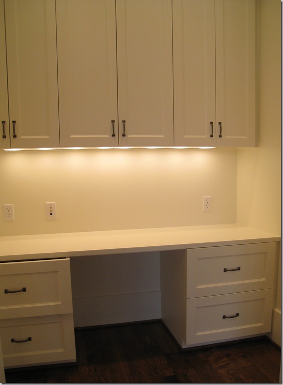
Behind closed doors in the master bedroom was a surprising office.
And finally, the upstairs laundry room had this adorable checker floor.
And for the architects and interior designers and especially Stefan, the floor plans.
And so, it’s the end of the West University Festival of New Homes until next year. I hope you’ve enjoyed seeing the three houses that really spoke to me. With each house I toured – I came away thinking “This is the ONE!” – how fickle I am. You see, I visited a open house this weekend and let me tell you – boy, was it beautiful. I’m thinking the open house I toured this weekend was the ONE!!! Does anyone know the name of a good psychiatrist in Houston? Specializing in new-house-itis? I’ve been struggling with this disease for a long time now and my husband is insisting that I get cured, quick.






HI
ReplyDeleteDO YOU KNOW THE NAME OF THE BRICK COLOR USED ON THIS HOUSE?? AS WE SPEAK I AM TRYING TO PICK OUT MY EXTERIOR BRICK COLORS AND I AM IN LOVE WITH THESE!!! I HAVE A MILLION DIFFERENT WHITES ON MY WALLS AND I AM SO CONFUSED!! PLEASE HELP ME!!! THANKS SO MUCH! BY THE WAY, I AM A LONGTIME FAN OF YOUR BLOG, KEEP UP THE AWESOME INSPIRING WORK - YOU ROCK!!!!
KELLI
Thanx for the tours!
ReplyDeleteThe breakfast area is a very special space indeed.
Am curious as to the material used on the bathroom floor, vanity, shower and tub areas.
These are all great, Joni! I loved the simplicity of the Provence house, I think, & add the breakfast room from the Conservatory house! Great ideas & commentary, as always. Thanks!
ReplyDeleteWell you did it again another lovely house tour. I agree with all your comments i.e. taking out the fan, changing the kitchen and all..
ReplyDeleteEither we are sisters or 'great minds' think alike, I too keep thinking this is the 'One' ,,, only to discover yet another 'gem', my family and friends think I need to find the right piece of property/location and build my dream home using all my favorites pieces from other homes, I just hope it doesn't wind up looking like the Winchester House.. Thanks a bunch, love them all! Joanny
What amazing windows and light this house has!
ReplyDeleteI like it just as much as the others, I can't even rank them because they are all slightly different in wonderful ways.
Again, great materials were used... I love the aged brick floors!
I love this house...ceiling fan and all. LOL I really think it was my favorite! Thanks Joni.
ReplyDeleteI like the architectural style of this home, Joni.
ReplyDeleteI'm with you about those kitchen cabinets. I would have put a bank of windows on that wall!!
I've thoroughly enjoyed the tours!
On a side note; we believe we've solved the condo coffee table dilemma. The table we brought home will stay in the living room, at home. I'll write something about the "new table" for the condo in the coming weeks.
This house was my favorite. More my speed. Loved the muted colors and the simple and casual style. It looks like a house that I would feel comfortable in. Beautiful!
ReplyDeleteAll the tours have been wonderful, definitely some gorgeous homes. Hugs, Marty
ReplyDeleteI need to go back and review the three homes! My first impression is that I like the exterior of the Provence House; the interior of the Octagon House; and I must admit, this house was my least favorite although there are architectural aspects that I really liked. I think I related to this house because I have my eye on an older house (renovation prospect) whose floor plan has some similarities to this house.
ReplyDeleteI thoroughly enjoyed these posts! I definitely have new house-itis, but luckily Atlanta does not seem to have these new house tour of homes (I think they are much more common in the suburbs as there are more new homes). However, Atlanta does have showhouses, which are all decorated so beautifully, and they cause their own set of problems; they make me not only want a new house, but they make me want to redecorate!
How is our most prestigious Bathroom Diva doing today!? ;)
ReplyDeleteOh, Joni, I guess I'm more of the simple down to earth girl - I love this house the best! After seeing the breakfast room, I was hooked. Sigh... Although, I just might need a stool to climb into that lovely bathtub!
Be a sweetie,
Shelia;)
Eenie, meenie, miniee, moe -- oh, I think I shall take one of each please. :)
ReplyDeleteLove the idea of the 'upstairs laundry room' and 'separate Master Bedroom basins'; as both make so much sense. Ironic how the Breakfast Room was built to specifically appear to be an Addition when years ago one would take great pains to do otherwise. Also, I like the fact that the exterior of the window frames are not a distracting stark white which you see so often in new homes.
When browsing the Provence House, I neglected to mention the 'single' Shaw Farmhouse sink as I noticed the drain was offset, thinking to myself 'very clever'. :o
Thank you again Joni, for the wonderful tour of these three magnificent homes. -Brenda-
Just so darn lovely - all of them! I feel like I've just had some sort of therapy session with all those beautifully-muted colors. Aaaaahhh....
ReplyDeleteYum...But NOT as yum as the octagon house...though I loved the provence house too. Well...I wouldn't sneeze at any if offered.
ReplyDeleteWhat's a girl to do???
Thanks for the visual feast...and certainly hoping you took pics of the open house this weekend.
And as for hubs...tell him to dawn his snuggli and aretha hat, and Just. Get. Over. It.
A master is at work here. Geeeez!
i loved this house, all the white on white is beautiful and relaxed. I really like how it is not over accessorized, just enough for the look. It really inspired me to par down some of my accessories ande simplfy life. Really great house tour.
ReplyDeleteHey Miss Joni,
ReplyDeleteWhile I don't care for the front exterior of this home, the back is nice, the Provence is my favorite exterior. I agree with you on the window coverings...my guess is whoever buys it will put their own stamp on it and the windows will have coverings....it's like putting your makeup on and forgetting your lipstick! On the ceiling fan, the one up there isn't particularly nice, but to me living in the south, I gotta have a fan, I cannot stand a "still" room. Even in the dead of winter, I like to have air swirling around me! Crazy I am sure. Probably because this home is smaller, it does have a seemingly more intimate feel...I like the brick in the breakfast area and the dining room table and chairs, and the chandelier!
I like a little color on the walls, to me it brings a warmth and not a museum like feel. I am not sure how I feel about a totally "moulding-less" style. It's different, but I do like beautiful wood work.
Blessings....
This house is my favorite! I am not a big house girl, so this one feels more real and livable to me. Love the breakfast room too. And I think this house showed Ginger's magic! I'm so bummed they didn't do the master- I would have loved to see what she would have done in there.
ReplyDeleteThanks for the great tour Joni! It's been fun!
j.
I love all the flooring throughout. And, I also love that laundry room..I have such a thing about laundry. I don't know what it is...it's the one chore I really love. Lavender, starch, sunlight, water...what is it??
ReplyDeleteYou are so right about that ceiling fan, by the way.
I LOVE the clean lined fireplaces! beautiful!
ReplyDeleteThis house is lovely - I love that it looks like it's been there for years and I love, love, love the windows!
ReplyDeleteVictoria from EdinDesigns @ DesignTies
Joni, you are too funny-"new house itis"! When we first married, my husband thought I should go into real estate. When I explained that we'd be moving a minimum of once a year if I was looking at houses all of the time, he quickly changed his mind about that! I've enjoyed this tour so much. You are such a wonderful tour guide, and you always have such great observations to point out. Thanks for the tours. laurie
ReplyDeleteI agree with you about the kitchen Joni - it would be much better with more windows and less overhead cupboards. I think all 'interior junkies' suffer from houseitis - maybe we can start our own program... 'My name is vicki and it has been 2 minutes since I thought about a house'! xv
ReplyDeleteLove the post....after building many houses through the years, new housitis is an occupational hazard!
ReplyDeleteOf the three homes on this house tour, I like this one the most even though it is not the biggest or the fanciest. I like that it has the unexpected (added-on) feeling of an older home. I agree with your suggestions, too, full length windows and a wall of windows in the kitchen. Great tour!
ReplyDeleteLoved the conservatory! I think what made it work was the brick walls butting against the trim - the constrast of texture and color was stunning. I think my favorite architecture was the octagon house, but Ginger Barber does a beautiful job on the interiors.
ReplyDeleteThe only thing I ever worry about with all these beatiful neutrals is what children can do to them ...
Having four kids myself, with their friends, I have to say it's these guys that manage to spill Dr. Pepper on the linen covered entry hall, drip red wax on the sisal, and manage to drop kick a sculpture sitting on the floor. Sigh.... However, I soldier on. And yes, in case you are wondering, I have boys.
Seriously, though, this look is so tranquil, serence, gracious, and unassuming, that everytime I read one of Joni's posts, it's like a mental vacation.
I'm in love with this house. So livable. Thanks so much for the tour.
ReplyDeleteThank You again for the tour!
ReplyDeleteI like this.... the details are great, love the colors and the lighthearted feeling of the home.
Leslie
lamaisonfou blog
I absolutely love the architecture of this house.
ReplyDeleteWhat a great post! though I got in on the last of the 3- it is lovely. I think realistic square footage is on the uptick-though some families will continue to build monsters and either huddle together in the Kitchen OR never see each other. This designer made the house seem lived in already. the painted brick inspired for the "new House" and all the paint colors are soothing, surfaces subtle.(tell me about the shade-source-love it)
ReplyDeleteI love your house tours. Such good voyeuristic fun.
ReplyDelete**** Thanks again for another interesting tour! (And, your proposed changes were right-on!). While preferring the other two homes, there WERE some very attractive points about this one~~~ I just CAN'T help, tho, having those plusses diminished considerably, just due to the proximity of the houses, Joni~~~ Is is ME, or did anyone else feel they didn't have any "breathing space" in this charming, comfy n' cozy home? (BTW, I picked up two different, wood "Bavarian chairs", much like the one you showed here, at a flea market in Germany mannny years ago... they've been in a storage garage for years now & I'd forgotten how delightful they are~~ they're VERY old, hand-painted pieces. And NOW I'm thinkin' my Sweetie just may have a "trip to the storage garage" in store for him this weekend, if I can convince him to GO there &sift thru all that terriffic "stuff"! Thanks as always, for the great, interesting write-up & thoughts, as WELL as pics~~~ Appreciate it! Warmly, Linda
ReplyDelete(P.S. How come sometimes the "B"/Blogger comes on, & sometimes NOT? (Am SURE it is something I'm obviously not dong correctly, tho! AARGH n' grins!!!)~
ReplyDeleteI do love it!Mirrors are beautiful, I would like to see some fabulous art on the walls. Note to showhouse designers: Call your area galleries and ask them to provide art for the duration of the homes tour.
ReplyDeleteI really enjoyed this. This kitchen is the best, except for the points you made. This kitchen has none of those fake columns that don't hold anything up. But I think their utility bills will be lower without the full length windows you suggest, and know you could camouflage these windows with a bamboo shade above and some nice linen drapes with fabric by rogers and goffigon. I like ceiling fans, but that fan you showed was not well integrated in the scheme. I wish there were more nice funtions like this in my city.
ReplyDeleteOK - I like this house but much prefer the other two. I do like the brick walls in the breakfast room and think the brick adds a nice touch. But I agree with most that we could do with out the upper cabinets in the kitchen. I like the bavarian chairs - I have set and you rarely see them, but they are so sturdy and comfortable! Wish I lived further south as I love this look and its hard to duplicate in Boston!
ReplyDeleteYipee! When I saw you had another house to show, I filled up my coffee to really enjoy the presentation. I reallly love that breakfast room with the brick floors!
ReplyDeleteI am really beginning to see and appreciate Ginger Barber's style because of your blog. It's terrible because it makes me want to paint every wall in my house white!
I too feel like this one was more realistic, however it is still large! I love West U and the mix of old and new. This seems to be the best of both worlds!
ReplyDeleteHi Joni, As a Northerner (Canada) I am wondering if you could share the Real Estate value of the Octagon, Provenance and Conservatiory Homes. Also do they have a basement? IF so, is it included in the quoted "square footage" figure? (In Canada even if basements are a finished living space they are not included; however when it comes to Property Taxes they are.)
ReplyDeleteThe differentials of global Real Estate can be mind-boggling at times!
SMILES.....-Brenda-
There are very definite things I love about this house. It reminds me of some of the houses built in the 1940s in Highland and University Park suburbs of Dallas (where Dubya moved :-( They should have used more expensive windows in my opinion. Those are spindly. Need some shutters on the exterior too, and some Ivy would be great in the future. LOVE the sunroom, and like you I like that it looks like a family added it on as their fortunes grew better. That tub kills! Kitchen is ok, but could be better, and will be with accessories. I'd be in that sunroom from breakfast to dinner!
ReplyDeleteI so LOVE living the H-town life thru you, keeping me posted on the old 'hood goings on!!! You keep me going, girly!!!
ReplyDeleteWell, another lovely Ginger B styling.
ReplyDeleteAnd I don't want to be a picky b*tch -
but that girl needs to learn about taping wires!
So how much IS this one? I think it may well be my favorite although I like utility rooms on the main floor instead of 2nd floor (I'm always washing kitchen linens and wouldn't want to cart them up every day).
ReplyDeleteI love the painted brick, the arches and the conservatory - oh, the conservatory! I'll have to email you photos of ours in London when we lived there. It was also our breakfast room and we loved it! So many aspects of this house reminds me of Brown Gables, our place in Surrey...which was built in the 30's, added on to in the late 40's, again in the 70's and again in 2000. It was a typical, fun, hodge-podge English house with creaks, different levels, add-ons, etc. but still had so many charming original features.
I like that this house has an elevator too - wish we'd put that in our house here. Not because I'm lazy about to-ing and fro-ing but we move things (furniture and stuff) back and forth all the time and an elevator would make that so much easier on my legs and our walls!
Other than the garage door being on the front (a pet peeve of mine but guess one can't get around that when the lots are so narrow - I prefer side entries with windows on the front), this is my favorite hands down.
Joni!
ReplyDeleteYou are lucky to have Street of Dreams house that are actually beautiful! I especially liked the exteriors of the first tow you showed (esp. the Provence House!) I like this one too, but there is something off about the windows. I love the interior though and see why moving in immediately is a must for you! I love getting the virtual tour. We have Street of Dreams in Sacramento area too, and I haven't gone to one in years. I suppose I should just to see if anything has improved. Although I think they are a thing of the past in this economy for awhile at least. Sigh. But I can enjoy your posts anyway! Thanks!!!!!
I would be as happy as a bug in a rug with either home. I love your tours! Thanks
ReplyDeleteanother pretty place in West U. While I find whites and grays peaceful and classic, the business side of me sure would like to see more color. Soft colors...blues with grays and sages even. cheers, -susan
ReplyDeleteWow, the pictures look great! But it would be better if we had the great opportunity of a personal tour. I always love getting new ideas from other homes (I may be a commercial interior designer by profession, but I do the designing at my place).
ReplyDeleteThese homes are amazing! Thanks for the very informative tours. There are features in all of them I love, so it would be hard to pick. I would probably pick a smaller version of them, tho. One of my favorite things were those fabulous sinks in the Provence House. Loved them! Thank you again for the walk through and great pics!
ReplyDeletemarcie
Ok, this one is my favorite. I just love everything about it (especially the breakfast room!!!) it's just beautiful. thanks for the tour & insights.
ReplyDeletexoxo
Hi Joni!
ReplyDeleteThanks so much for continuing the wonderful house tour for us all to see. Ginger Barbers use of restrained simplicity is beautiful - every piece is special. I thought the wood and iron shelving unit in the Family Room would be very useful to display pillows in my new shop. Any idea if it is old or new and where it is from?
Thanks again -
Nancy
I'll take this one please. But I have to warn you that I'll fill it with the colors and artifacts of Provence and the California Wine Country. I don't want you to be mad when you come over for coffee! Great series, Joni.
ReplyDeleteI definitely preferred the first two to this one. This one seemed very ordinary to me. The backyard was nice though. I think your disease is very common though, lol, you are so funny Joni!
ReplyDeleteThanks so much for showcasing these three homes - so full of ideas. Love the soapstone countertops in this kitchen, and like you I love decorating with mirrors instead of artwork.
ReplyDeleteLove your blog and thanks so much for visiting my little blog!
Since I missed the real one---I have thoroughly enjoyed your virtual tour. I get such a kick out of seeing your write so accurately about West U (we lived there for 10 years). These are all great houses. GREAT job Joni!
ReplyDeleteI have almost the exact same dining chairs as the ones in this house---from Foxglove. Just got them in fact.
Kim
please please please move on from Miss Barber.....Joni take a trip or something girl! There is a whole big world out there
ReplyDeleteJoni,
ReplyDeleteThanks for featuring some of the houses in the West U Home Tour. Not all of us were able to attend, so it was nice of you to "replay" it for us. Also, I appreciate that you showcase the work of our great Houston designers, Ginger Barber being one of the best. I have to say, though, I'd LOVE to see what you would have done with these homes! I'm sure it would have wowed us since you are always so right on with your taste. (I couldn't agree more with your comment about the ceiling fan. Such a pretty ceiling without it!) Thanks again for the three interesting posts!
Mrs Ben - Brenda - email me !!!
ReplyDeletec'est tres jolie.
ReplyDeletepve
I'm MAD about this house! It's FANTASTIC! Thanks for sharing.
ReplyDeleteI love your home tours! I could never decide on one!
ReplyDeleteI hadn't been over her lately and I've missed so much!
:)
oxox.
Cathleen
great post, looks amazing
ReplyDeleteThe way the home conservatory is used to make best designed interior as well the best possible space usage.
ReplyDeleteThere certainly are a amount of methods to acquire affordable coach products at coach factory outlet,it could possibly the most effective options.the most vital cause may be the reality that you simply can purchase genuine coach products at there.It is believed that you will like the products on the coach factory online. There are spacious sizes and different colors, styles and so on.in the market you definitely can find various colorways that are designed in as well as the high quality that applied in. For most of you would like to come. So just come to our coach factory outlet online store to choose one.
ReplyDeleteThe Coach bag is from the latest release of Coach Bags. Its crisp, scribble material, leather handle, perfectly complements the relaxed shape of this stylish pouch. All the items of coach outlet online Store fit all of your essentials and more.Bright colors, exquisite workmanship, durable material and up-to-date style all lead to the great fame of the goods in coach outlet.As a fashion and modern lady, you can never have too many bags but Coach, Coach is a great leather handbags brand. coach outlet store online have different look according to different designer concept.
ReplyDeleteThanks for sharing this really interesting article. I love the color of your conservatory which really compliments the house. If any of your readers want to know everything they can about conservatories, our site is a great resource for them. click here and visit our site.
ReplyDelete-SH