Yes, he is an attorney working for the Louisiana Recovery Authority and no, he's not a model, though he does know how to strike a pose. He's just one of a million attorneys, except, this attorney is different: he's also a practicing interior designer. Ty Larkins is based in Baton Rouge, Louisiana, where he practices law by day and interior design by day too. Not sure how he works that out - but he does, and quite effectively. So effectively, that HGTV took notice of him and followed him around for a year while he designed a home for their series Dream House. Married, with twin daughters to boot, Larkins has no formal interior design education, but judging from his portfolio, he doesn't need any! His designs are young and fresh - contemporary with New Orleans styled French antiques thrown int0 the gumbo. An online buddy of mine (more about her in a minute!) emailed me Larkins' web site and told me to check him out. Hmmmm....who wouldn't?! I'm not sure how long he's going to be able to keep practicing law when his interior design career takes off. And it will - it's already growing daily. Here's why:
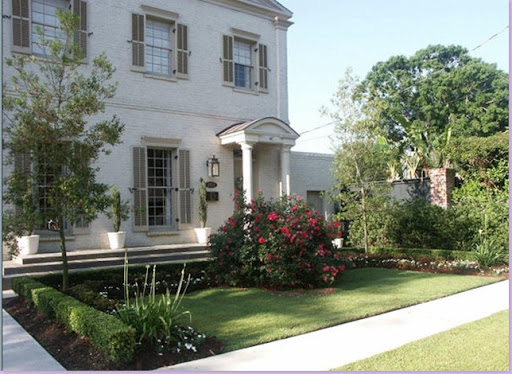
This Baton Rouge stunner was completely remodeled and rehabed by Larkins, who just happens to live here with his family. Can't say that I blame him - I'd loved to live here too. Note the elegant terraced front porch and painted white brick.
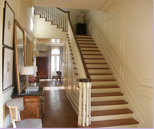
The entrance hall in grand, Louisiana style. I love this - I'm a sucker for gorgeous entry halls. Also, I love the mirror casually leaning against the wall on the left. Larkins mixes a French chest with Swedish side chairs .
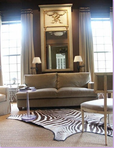
The library, painted a soft brown, mixes the contemporary and the antique. Antique french trumeau, velvet tailored sofa, Swedish side chairs, zebra skin, and seagrass all blend together to create a cool respite from the hot Louisiana sun.
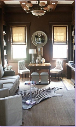
Another shot of the library. Notice his strong symmetrical design throughout the room.
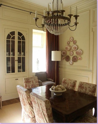
The molding in the house is exquisite - in the dining room, an antique crystal chandelier dresses up the room despite its relaxed toile slipcovered chairs. Notice how Larkins runs the drapery rod across the wall.
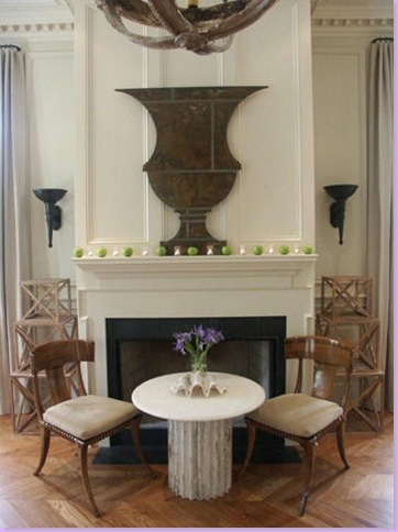
The living room - great urn figure over the mantel. More gorgeous molding - here it's dentil. I love how Larkins stacked side tables for an architectural effect on each side of the mantel.
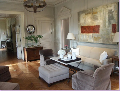
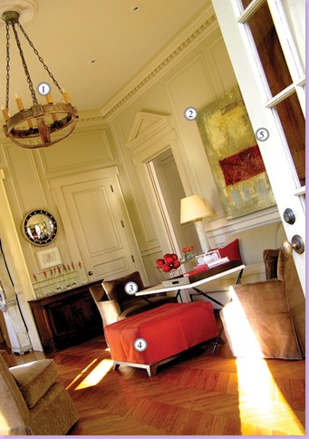
Another shot of the living room. The contemporary painting by local artist Tony Mose brings in the only color to the room. A Swedish Mora clock is just outside the room to the left.
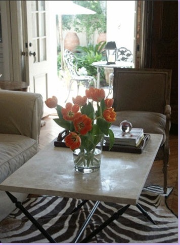
Another shot of the living room, with the zebra rug placed here instead of in the library. Also, Larkins has used a French antique chair in place of the upholstered ones in the previous photograph.
And one last view of the living room - this time the ottoman and pillows wear orange accent colors. The light fixture is a gorgeous French antique.
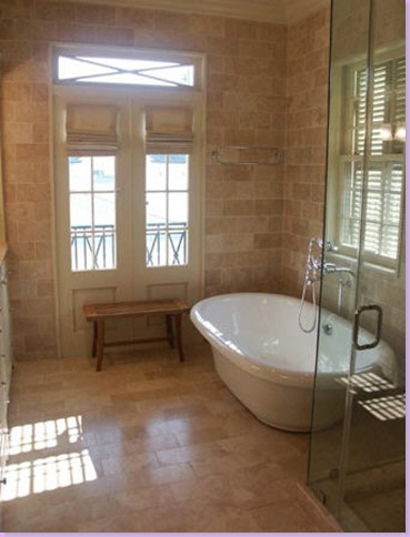
The master bath - beautiful simplicity! Note how Larkins uses tile up to the molding on his walls.
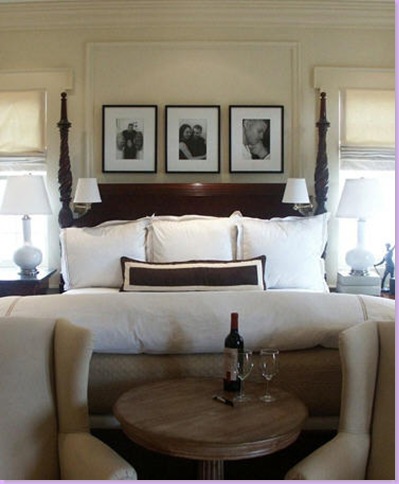
The master bedroom, Larkins keeps it traditional.
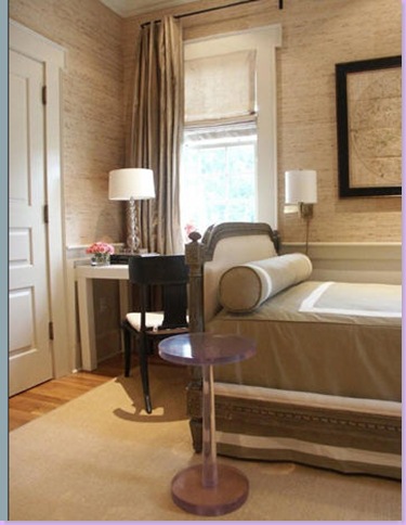
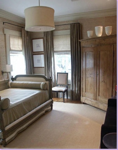
The guest room - note the French day bed wears more contemporary bed coverings. Grasscloth wallcovering.
Another view of the guest room. Note the contemporary light fixture in this mostly traditional setting.
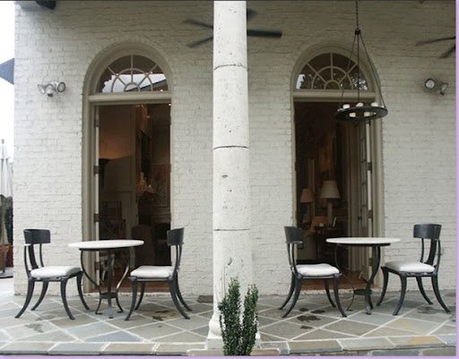
The back terrace runs the length of the house. The living room opens up to here through french doors.
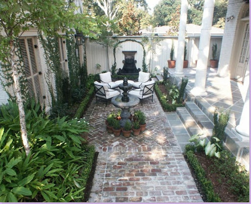
The backyard is typical of the New Orleans courtyard style of landscaping. Notice the louvered doors set into the back wall. I could be very happy sharing a mint julep here with Ty and his wife.
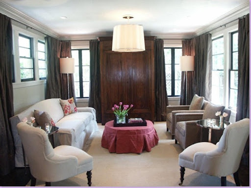
Here's a bungalow that Larkins completely remodeled for a client. The pink ottoman is the only touch of color in a room filled with white upholstery and slips. Again, he uses a very contemporary light fixture mixed with French antiques. The windows wear wrap around draperies which provide a strong contrast to all the white.
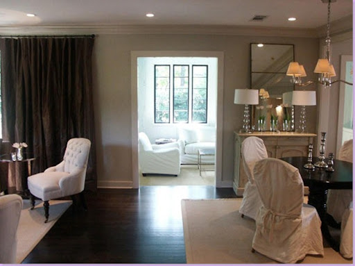
The bungalow's main room is divided between the living area and the dining area. Dark ebony floors pop the white slips and sisal rugs.
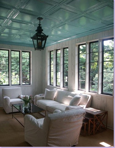
In the sun room, Larkins installed French blue tiles on the ceiling - a strong contrast with the black lantern. The room is paneled in famous Louisiana pecky cypress.
In the kitchen Larkins uses subway tile up to the molding giving the room a very clean appearance.
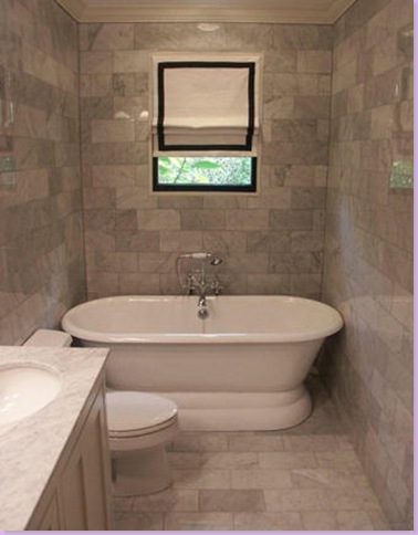
In the bathroom, Larkins again uses marble tiles up to the ceiling. This must be his signature look!
To contact Ty Larkins, email him at info@tylarkins.com or telephone him at 225-281-8060.
So - you're probably just dying to know who told me about Ty Larkins. When I first started blogging last year, I got an email from a young, a very, very, young lady living in Lafayette, Louisiana. She was just starting out on her own in the design business and was full of questions about how to go about doing this. Now, I'm not the world's best businesswoman, to say the least. The business aspect of Webb Design is my least favorite part of it all. I can barely figure out profit margins and I still have trouble with the concept of net vs. list. Despite my less than stellar business abilities, Andrea Veron, the young designer, seemed to think I had all the answers. Over the past year we've exchanged multitudes of emails and phone calls where I, the elder statesman (ha!), attempted to guide her along. OK, - those who know me in real life, you quit cracking up right now -- Andrea has faith in my business acumen! Andrea and her husband recently purchased a two story house that came with an extra structure in the back - and this is where she'll base her new business. She has been keeping busy with clients, but like anyone starting out, she's always looking for new ones. If you live in Lafayette or close by, consider giving Andrea a call. After all, she's had great business training!
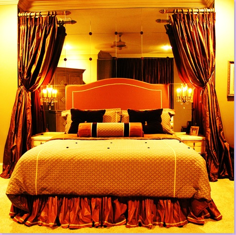
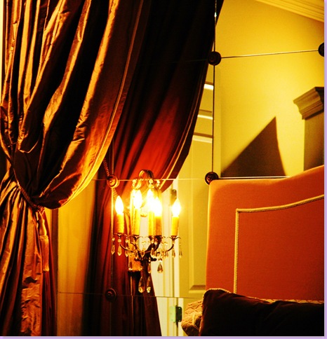
Andrea Veron's designs for a master bedroom. I love how she mirrored the back wall of the niche and softened it with silk draperies.
Andrea loves to add dressmaker details - here she added braided trim to the velvet headboard.
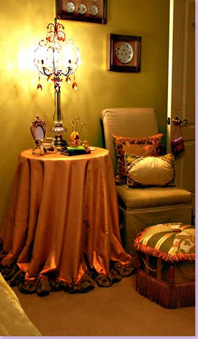
At this vignette - Andrea added trim to a skirted table.
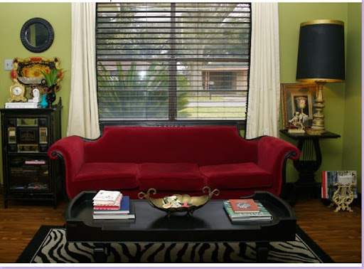
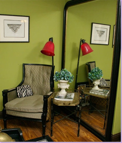
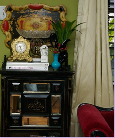
For this job, Andrea used a wonderful green paint on the walls to set off the antique red velvet sofa. I love the touch of zebra she added!
A vignette in the same room.
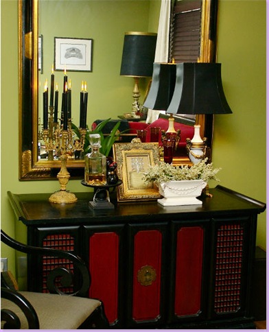
Against a wall, a large mirror makes the room seem more spacious.
Close up of another vignette.
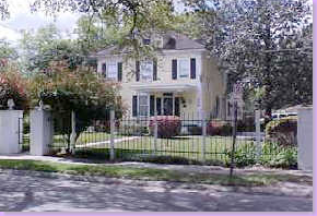
Andrea's new gracious southern home in Lafayette, Louisiana. Her interior design office will be based here. Isn't it romantic looking with it's front gate? To contact Andrea about hiring her, please email her at amveron@cox.net or telephone her at 337-962-1244.


I object.
ReplyDeleteGood morning, Joni! What a treat. I'll be back with a cup of coffee and take a closer look! What I've seen so far is fabulous!
ReplyDeleteThanks so much!
Pat
Thanks for profiling two great talents!
ReplyDeleteObjection over-ruled! I love that lush Louisiana style... I spent a lot of time close to Lafayette and saw some of the most gorgeous houses.
ReplyDeleteWhat a beautiful post! I work part time in a law office after spending years as a designer. I'll hav to share this with the attorneys.
ReplyDeleteMarion from Kentucky
Oh Cote, you have outdone yourself on this post. It is wonderful! You must do a book. PLEASE!!!
ReplyDeleteAttorney/Interior Designer... who would have thought it?? Could you imagine being married to such a man?? Mmm, on second thought, I'd have to have the last say!
ReplyDeleteLoved looking at his home. though!
Karrie and Karla
That first bathroom is stunning. So's the outside of the house. The arrangement of the garden and interiors are mostly too super symmetrical for me, but I appreciate that everyone has a different needs or cravings for imposing order on their surroundings. The color schemes are really lovely. Thanks for sharing!
ReplyDeleteThese spaces are simply stunners.
ReplyDeleteThe use1 of color, the fabrics...all are a huge wow.
Beautiful post! I went through it 3 times to really see each detail!
Hugs,
Sue
This comment has been removed by a blog administrator.
ReplyDeleteHi - y'all - thanks for the comments! Andrea is so excited and I appreciate all your kind thoughts about both designers. I've tried to email Mr. Larkins, but his mailbox is full!! - I'll try later.
ReplyDeleteJoni - the chest is from Furniture Classics - it is great isn't it??
ReplyDeleteWhat color are Larkins living room walls? Is it a soft white or is that just my computer? The room is perfect!
ReplyDeleteIt looks like a soft cream to me. Not white at all, not yellow. cream. I think!
ReplyDeleteWow love your blog. The small garden photo its so romantic,it just inspired me to get out and get my garden gloves on!!
ReplyDeleteTake Care Lorie :D
Great discovery! I love Larkins' style. Definitely the layered European look that I gravitate to. I think his own home is the most beautiful example of his work.
ReplyDeleteThanks so much for bringing more attention to Ty's work. He really has that youthful, sophisticated take on Southern classics.
ReplyDeleteI keep coming back for more. It's just too good. I love the sculpture at the top of Ty's steps. There are so many wonderful details to take in. Wow!
ReplyDeleteThe bedroom with the mirrors is stunning. P.S. and he is hot!
ReplyDeleteTy Larkins was profiled in Oct. 2007 in the Baton Rouge Business Report.
ReplyDeleteYou can view the article here.
Joni,
ReplyDeleteThis is a great piece on two talented designers. I absolutely love Ty Larkins fresh elegant Southern Style. I also love your talent for promoting designers' work and bringing new talent out.
Julie
Thank you everyone for your incredibly gracious compliments, they mean the world to me!!
ReplyDeleteI must say that I was shocked/nervous when Joni first told me that she wanted to do a write up on my work. My first thought was "why?" then my next million and a half thoughts were omg, omg, those pics are too stylized, I wish I would have had more time to get nicer pieces for my old house (the green/red room) I wish there weren't blinds in there, I took pics of the mirrored bedroom before accessorizing the bedside tables,
blahblityblahblityblah.....then I told myself to chill out. Or, well, Joni helped a wee bit with that..heehheee ;)
At any rate, I'm beaming at the notion that I've been acknowledged by so many of you whose aesthetics and talent I truly,truly admire and derive much inspiration from! Thanks a million!
Sincerely,
Andrea V.
Love his house, he's done a fab job!
ReplyDeleteWhat a fun, fun post! I love Ty's work, that house is fab & he really is good.
ReplyDeleteAndrea does a wonderful job too, so I imagine her business will take off now. I'd love to know the green color she used.
Love the style & decor of both homes!
Rhoda
I can always count on you for fabulous eye candy :)
ReplyDeleteBoth designers do beautiful work, but my taste leans more towards your friend Andrea. The master bedroom is fantastic!
Have a great day,
rue :)
How nice to hear from Andrea. This is your best post ever!!!! Love both designers. Thanks for bringing them to us.
ReplyDeleteBTW, what is that wonderful green? Is Andrea telling?
ReplyDeletePlease give some information on Andrea's hanging tray. It is quite a showpiece. I too would love to know the paint color of the green room. Thanks!
ReplyDeleteThat is so cool - he can sue his own clients when they don't pay him!!!!
ReplyDeleteHello again!
ReplyDeleteJoni has let me know that you all have a few questions.
The tray: That tray literally made my heart skip a beat when I saw it. It was expensive. I was young(er) and broke. But I HAD to have it!! Luckily the dealer and I knew each other and she allowed me to pay it off over a few installments.
They are papier mache trays from Occupied Japan c.1940's and I have about 4 of them, although the other three small pieces. This one is quite rare b/c of it's size, shape, and color combination. I think it's 15Lx10w and the detailing is really quite exquisite in person :)
The color on the walls: Another case of heart skipping a beat.
The scene: Me 21/22 years old design student. I walk into my fave bar that one of my other design student friends worked at. I saw the color on the back wall and knew I HAD to have it. I asked him what color it was and we searched all over that joint trying to find a paint can. We finally did.
What I love about it so much is that the saturation is so intense that it looks like a rich silk velvet when on the walls. It's a real jewelbox type of tone.
The color is Benjamin Moore # 531 ( it didn't have a name back then, but now I *think* it's called Ponderosa Pine :) **disclaimer** the color is NOT for the faint of heart!! It's very strong and not as acidy in real life, but it's surprisingly versatile and works with many color schemes!!
Thank you all again for the words of encouragement!! I appreciate it greatly!
Andrea V.
This comment has been removed by the author.
ReplyDeleteHoly Schnitzel that was a long comment. Sorry! I'm just a wordy broad ;)
ReplyDeleteThank you so much Andrea. It was great hearing from you and about all the goodies. Your business should be booming, you are so talented!
ReplyDeleteJoni, I love everything about Ty's house, especially the old french looking pavers on the walls and floors, the pale color scheme of the outside, the garden and especially the woodwork with makes me swoon. I am a long time proponent of grasscloth. For me, it never goes out of style. Great piece, and excellent heads up about Andrea's great style. Excellent detais.
ReplyDeleteThose Ty Larkin photos are HOT. Every room is really yummy. Not to mention, the kitchen, which you know is *exactly* the kind we love. Yum.
ReplyDeleteWhat an interesting post Joni! Who would have thought? A practicing lawyer and interior designer all at once lol. Awesome post! I also really loved the green color and mirrors/silk in the bedroom that Andrea used. Very glam and I love bold colors when the right hue is chosen.
ReplyDeleteKaren :)
FYI: What a coincidence! Check out another attorney who has not missed his true calling: Darryl Carter of Washington, D.C., left the law to practice interior design. He is the epitome of good taste. And, I must say, Mr. Larkin is not far behind: WOW!
ReplyDelete(Sorry I can't post the link to Darryl's website but google Darryl Carter and enjoy!)
Gorgeous stuff...
ReplyDeleteWhen I started to look at the picture and read your first words , I said to myself ..( I have to confess) Is this guy single ? It seems so perfect ..well few words later I read not but anyway his style is perfect , it is timeless , chic .I LOVE IT
ReplyDeleteAnd Andrea's home is so gorgeous ..
Joni, thanks for introducing me to yet another great new design talent! I love Ty Larkins' style! It's very timeless and chic. I love the library with the zebra rug...and that outdoor patio is so perfect. Wonderful post!
ReplyDeleteEnjoyable eye candy. I find the green walls enchanting too, and have a strong green not unlike this one on the walls in my study. Keeps me energized with a luxe feel. Great post!
ReplyDeleteI love the blog! I visit at least once a week.
ReplyDeleteCan you please help me? I've been looking high and low for curtain rods exactly like the ones in the guest room. Do you happen to know where they can be found?
Joni, can you pick em or what? I just heard of this guy in HB this past month, and he is 2 years old for you.. I'll have to add this to my post tomorrow..:-)
ReplyDeleteVitania
I am very glad to see such information which I was searching for a long time.
ReplyDeletebottle opener keyrings
Quite worthwhile piece of writing, thanks for the article.
ReplyDeleteThis is one of my favorite web blog, Awesome thanks for your share.
ReplyDeletebuy youtube likes
This is such a great resource that you are providing and you give it away for free. web design baton rouge
ReplyDeleteI have to let you know I concur on several of the points you make here and others may require some further review,
ReplyDeletesemi truck accident attorney