Traditional Home: Swedish design by Loi Thai
It seems to happen each month, one or another decor magazine will feature a house designed in the Swedish style, this month two magazines actually featured Swedish styled homes. Swedish decorating burst on the scene a few years ago, fueled by a hunger for quiet, simple, grayish-white interiors after a decade of the overindulgence of the earth-toned Tuscany style. The pages of the decor magazines are filled with American interior designers' interpretations of the Gustavian style. Designers from Texas, of all places, seem to be heavily invested in the Swedish look, designers such as Jane Moore, Carol Glasser, and Shannon Bowers to name a few. Texas and Sweden? It always makes me wonder what do Swedish designers think of our American interpretation of their homeland? And how would a Swedish designer actually design in America?
House Beautiful: Texan Carol Glasser does Swedish
You don't have to look far to get an answer. Lars Bolander is a Swedish interior designer who lives and practices in Palm Beach, Florida. His clientele list is international, though lately he seems to do the bulk of his business right here in America. Bolander is a much respected antiquarian who started out in the United States with a store in the Hampton's some years ago. Today, he owns two stores, one in Florida and one in the meatpacking district of NYC. His two sons run the NYC store, while he and his wife manage the Florida store since they live in Palm Beach.
The boyishly handsome Lars Bolander
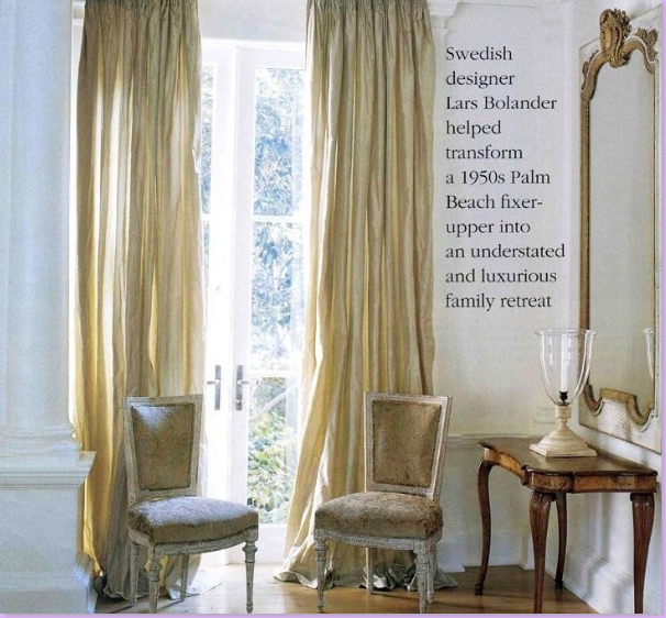
It was this house in Palm Beach which first made Lars Bolander a household name in the United States. Featured in Southern Accents, the home is light and airy with luscious silk curtains at every window.
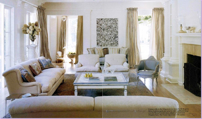
The main living area is a stone, cream, and Gustavian blue vision. Bolander's design for his Palm Beach clients is not typical Swedish design. Instead he chose to create a true American house using the lightness, airiness, and colors of a Swedish home. Be sure to take note of his window treatments - the long, flowing silk taffeta curtains are the focus point of each room.
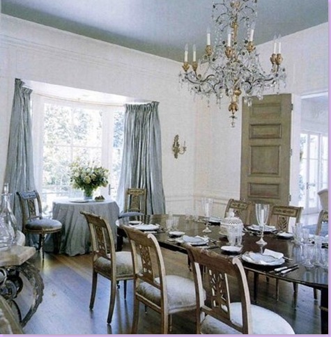
The blue dining room is the most Gustavian feeling room in the house, though there isn't any Swedish furniture here. Swedish Gustavian furniture is a close kin to French Louis XVI furniture. Hallmarks of Gustavian design are: crystal chandeliers, blue and green colored fabrics such as damasks and checks, gray painted walls, giltwood framed mirrors and the Swedish tiled stove.
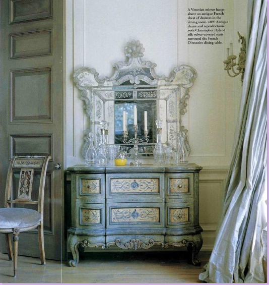
A beautiful corner of the dining room with a French painted chest and beautiful silk taffeta curtains.
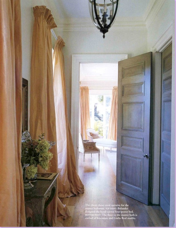
The entry hall to the master suite features coral silk taffeta curtains and gray painted paneled doors.
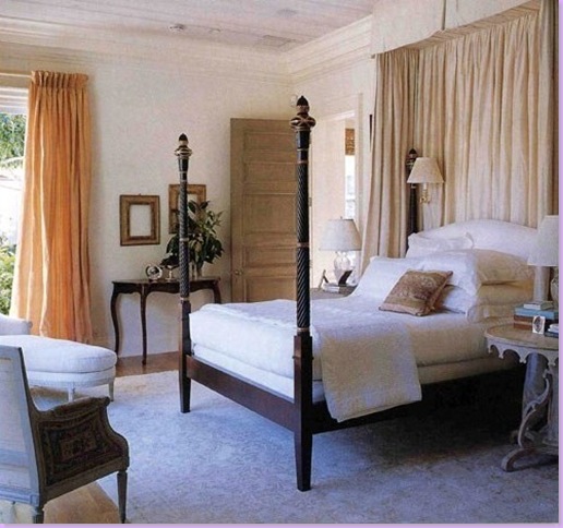
The master bedroom features a Bolander designed four poster bed.
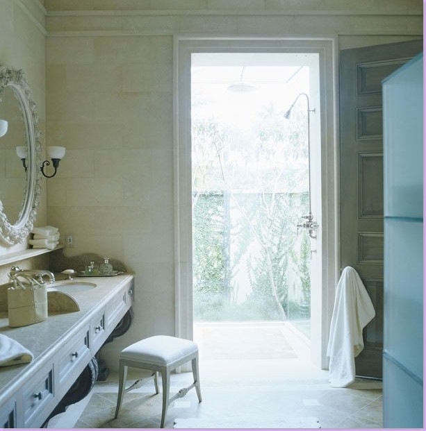
The master bathroom has a shower that seems to be out of doors. The walls appear to be tiled in limestone. Notice how he used a decorative mirror at the sink and be sure to notice the beautiful sink console itself - a work of art.
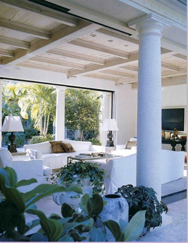
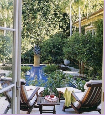
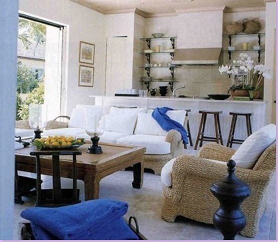
In the house's remodeling, the loggia was created by fashioning french styled doors that slide out of view - making the room open to both the pool and the gardens. Slipcovered sofas and chairs.
Another view of the open aired family room.
The swimming pool is a free form oasis in the garden.
The pool house is open to the pool on one side and the tennis courts on the other.
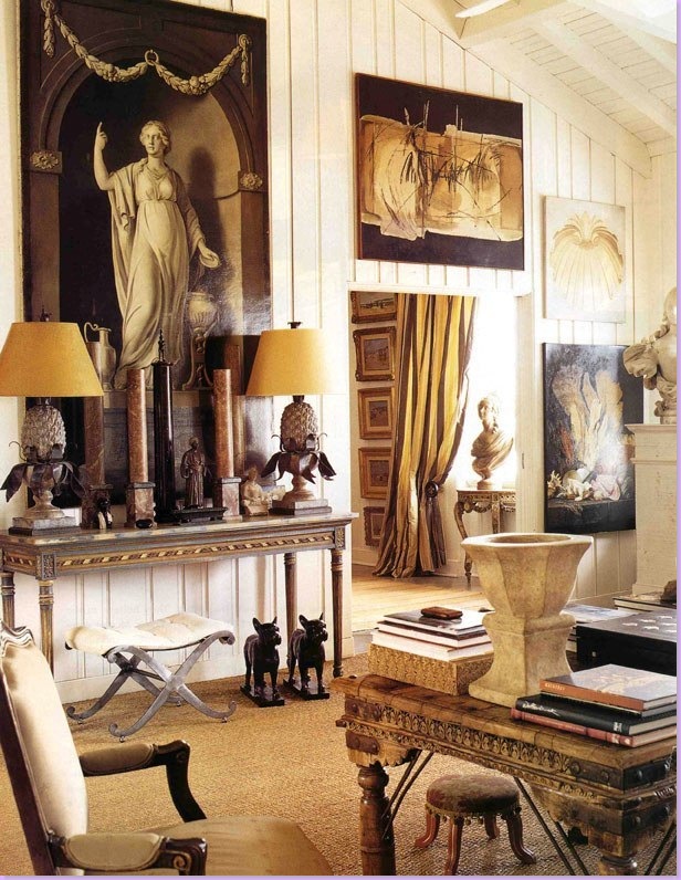
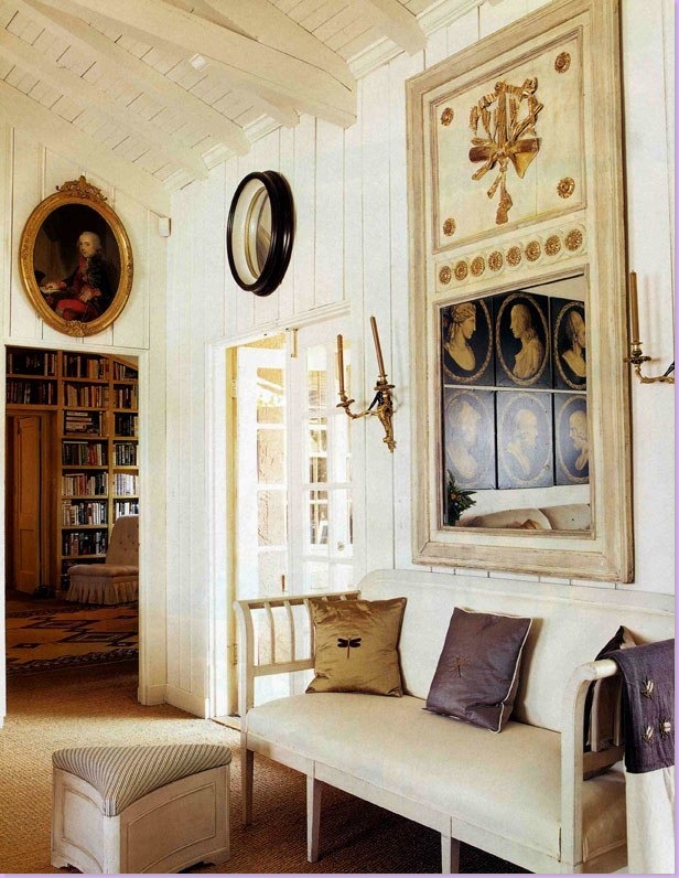
So, how does the Swedish Bolander design a home for himself? Like this! Bolander and his wife live in a flat above the stores on Worth Avenue. One side of the flat overlooks Worth Ave. and the other side opens onto an enclosed outdoors terrace. The Bolanders blur the line between inside and outside living. Originally the Bolanders bought one flat, but recently added two more flats to the original one, creating a large, rambling living space. Here, is the main room, with its wooden, vaulted ceiling. The space is organized clutter, an array of accessories and paintings collected over the years. Some of the more valuable antiques are for sale on Bolander's web site. One element of design Bolander frequently uses is frameless paintings, as seen above. The flat is paneled in cream painted wood.
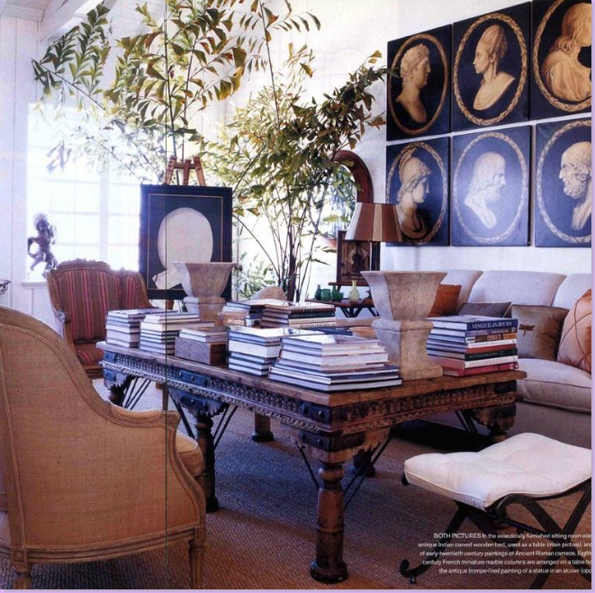
The other side of the main living area. Above the sofa, early 20th century copies of ancient Roman cameos. The Indian day bed doubles as a coffee table and is a makeshift library, piled high with numerous books.
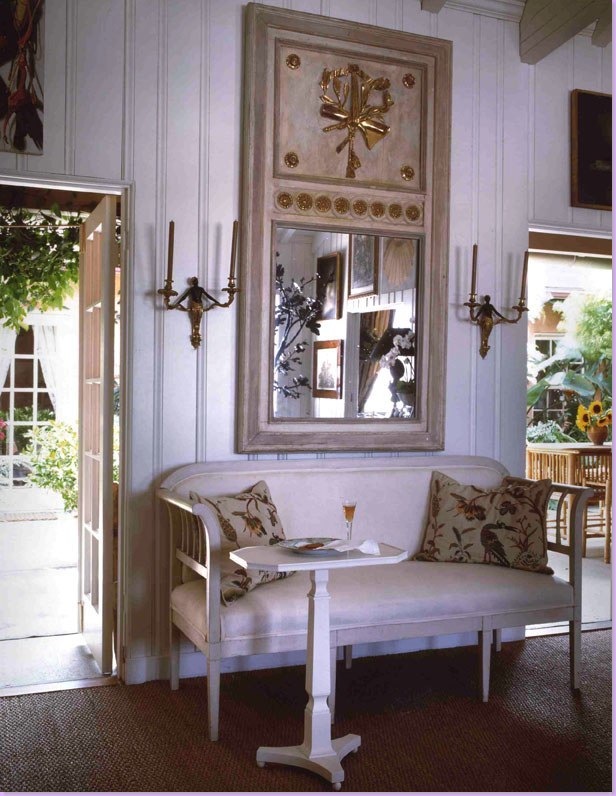
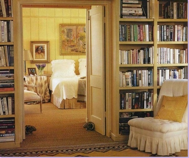
In another area of the main room, an antique Swedish sofa sits under a trumeau mirror. Through the open doorway on the left is the library that leads to the master bedroom. The room is carpeted in wall to wall seagrass.
Another shot of the same area, styled differently, showing the terrace.
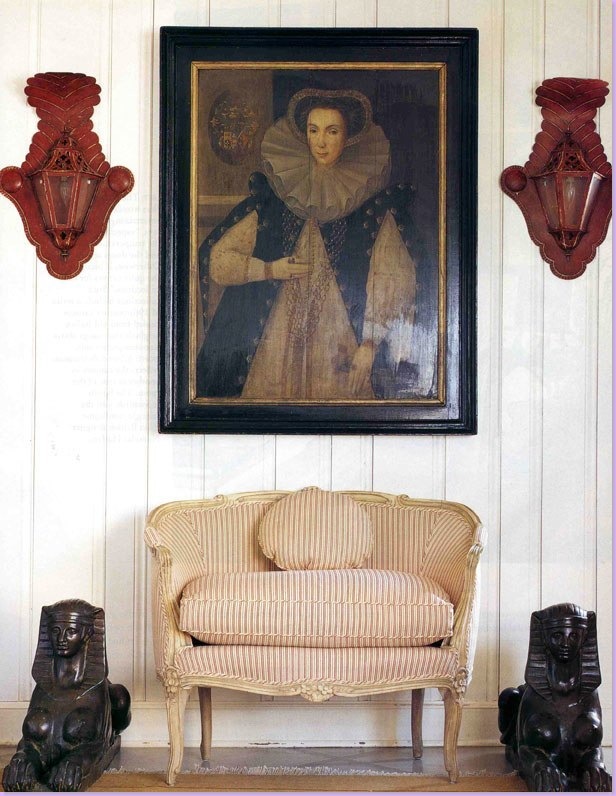
A gorgeous vignette in the Bolander flat. A ticking covered settee sits under a portrait and two smashing red lanterns.
Another gorgeous vignette, a velvet covered skirted table, piled high with books and a bust. An antique screen is off in the back, left.
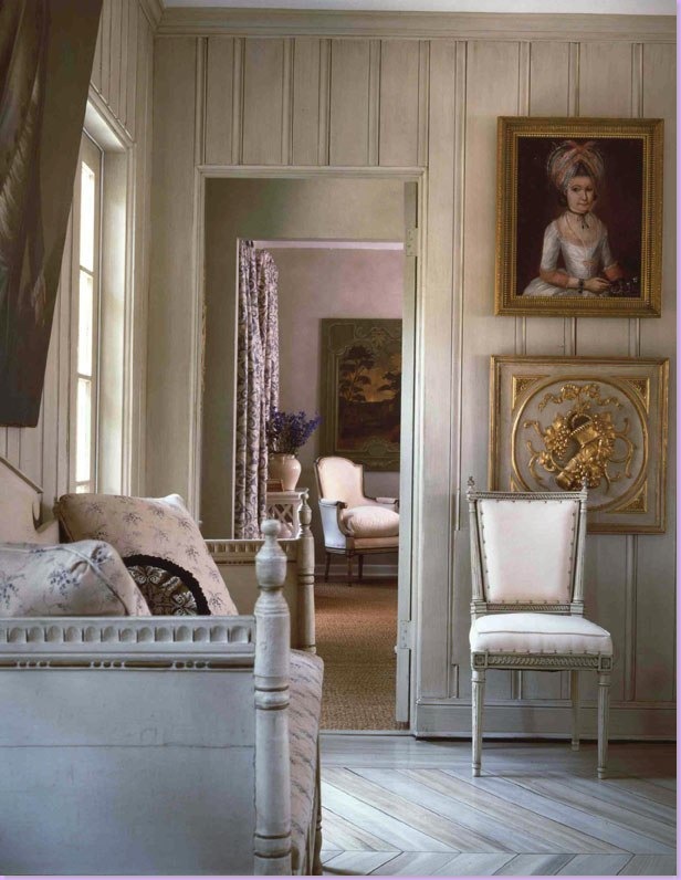
Another wonderful space, very Gustavian in feel. Swedish antique sofa and French chair share space with gray herringbone floors. Nice enfilade into the next room where Bolander has created a beautiful vignette to catch and hold the eye.
A library leads into the master bedroom.
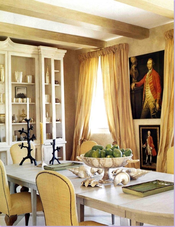
The dining room features a Gustavian dining table and raffia covered chairs.
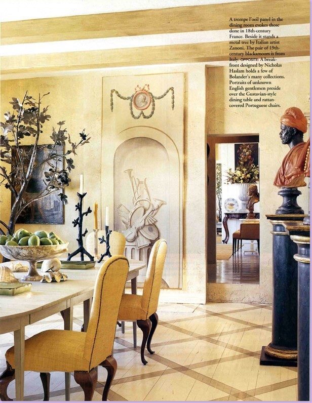
In the dining room, the floors are painted in a diamond pattern.
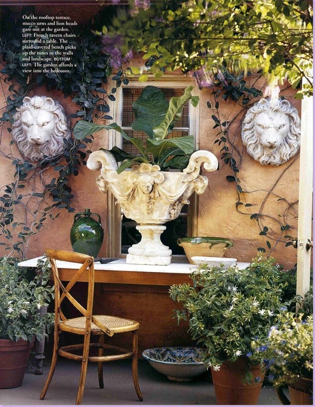
The outside terrace.
Note: The Bolanders recently sold their Worth Avenue flat after building a new home in West Palm Beach. To see photos of their new home, go to the New York Social Diary. Thanks to a Cote de Texas reader for that information!
So, how does an ex-pat Swede really get back to his roots, decorating-wise? He goes to his boyhood home and buys a house! Here on the island of Oland in Sweden, the Bolanders purchased a wooden house and nearby barn in the place he grew up. Bolander connected to the two buildings and designed his home in his own vision of Swedish decor.
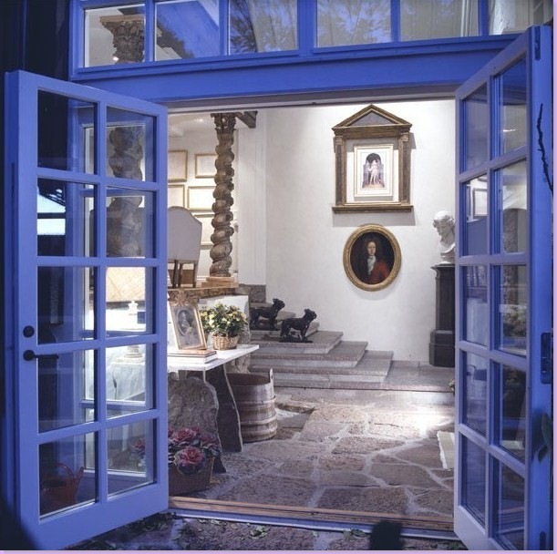
The connecting building with original outdoor pavers. To the left atop the stairs is the living area, shown below.
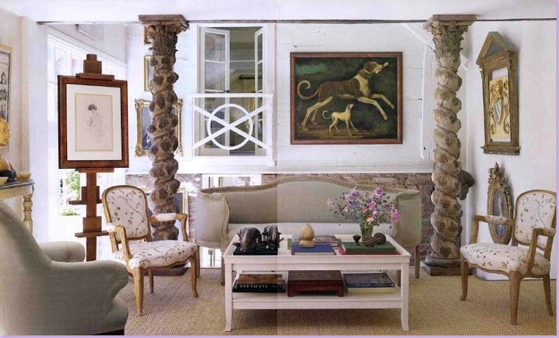
The charming main living area, here in seagrass matting again. Antique French and Swedish furniture were both used. The master bedroom overlooks the room through the French doors and iron balcony.
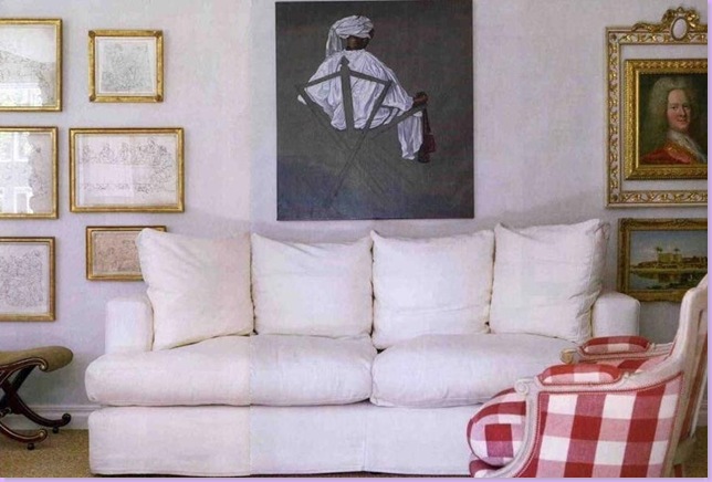
Another view of the main living room with slipcovered sofa and traditional Swedish checks. Notice the charming framed portrait on the right, hanging inside an empty frame.
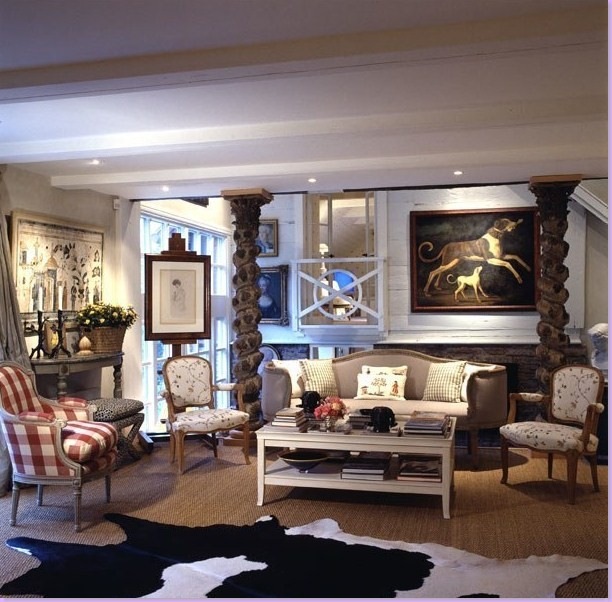
Another view of the living room, styled somewhat differently with a large cowhide over the seagrass. Fabrics are by Chelsea Editions. Again, the area between the living room and the master bedroom seen through the balcony is the connecting building Bolander constructed between between the barn and the house.
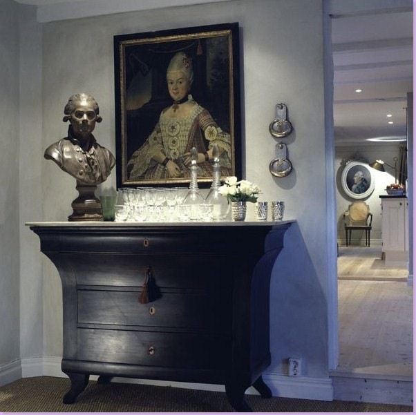
A charming vignette, the kind that Bolander is known for. Bolander collects both busts and portraits.
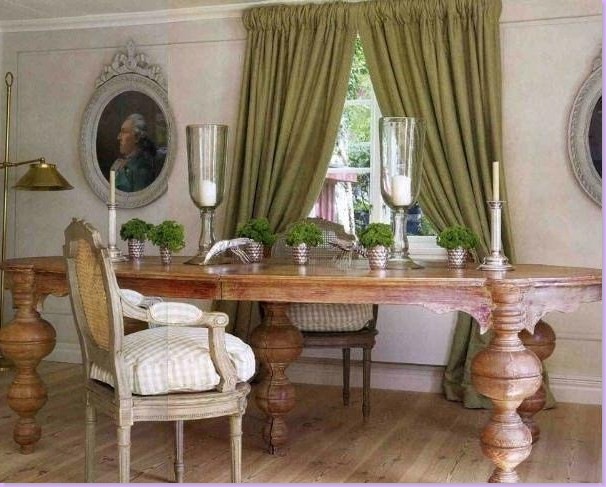
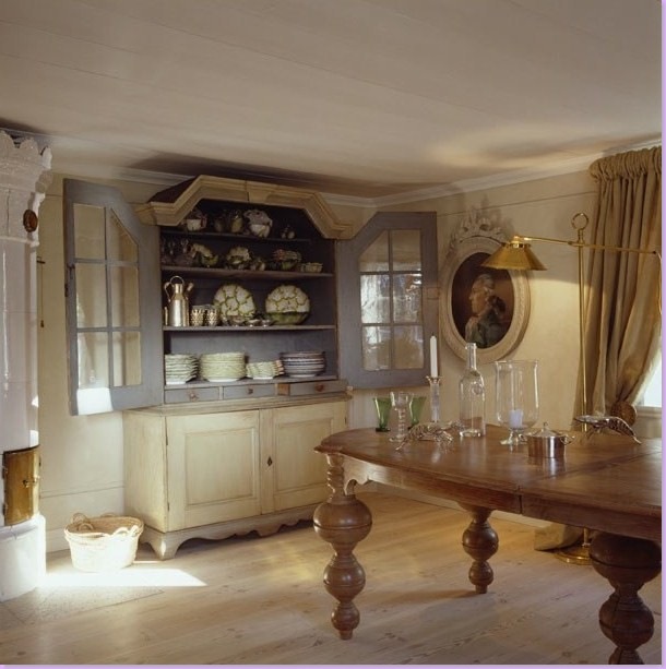
The dining room with antique portraits and furniture. Most of the fabrics in the summer house comes from England's Chelsea Editions, who also make a fabulous line of reproduction Swedish furniture.
Another view of the dining room shows a Swedish antique cabinet and on the left, the traditional Swedish columnar, tiled stove.
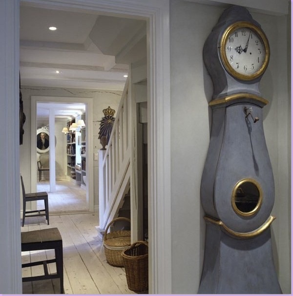
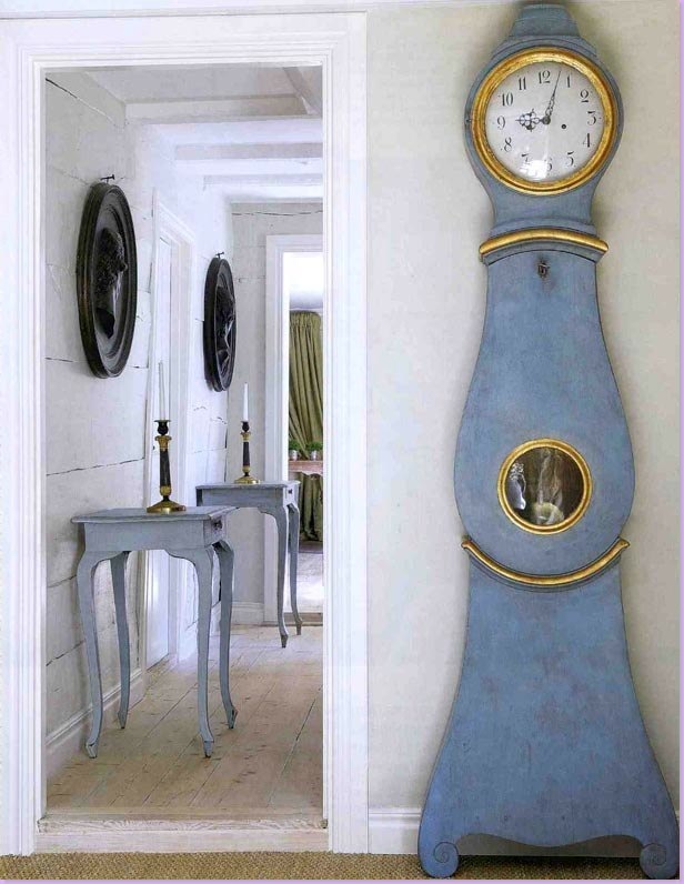
In the stair hall, a traditional Swedish clock, the Mora, perhaps the greatest symbol of Swedish design there is!
Styled differently, much prettier with matching Swedish tables below two black cameos, the Mora clock. The dining room is seen through the back door.
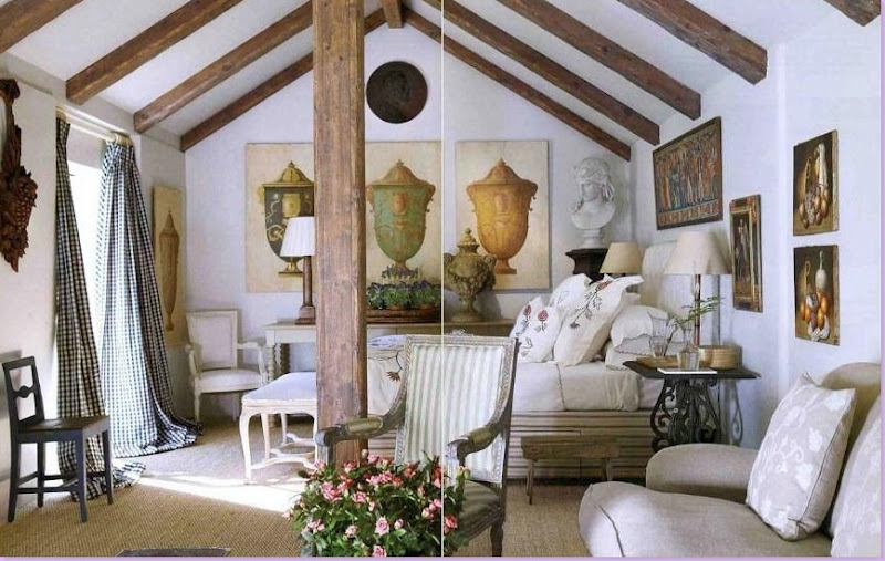
This gorgeous guest room was fashioned out of the garage building. Sprinkled with French and Swedish chairs and antiques, the fabrics - checks, stripes, and embroideries - are from Chelsea Editions. Wall to wall seagrass matting completes the looks. Just beautiful!!
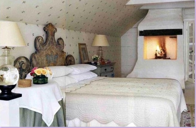
By contrast to the lofty guest room, the master room is small, cozy, and inviting.
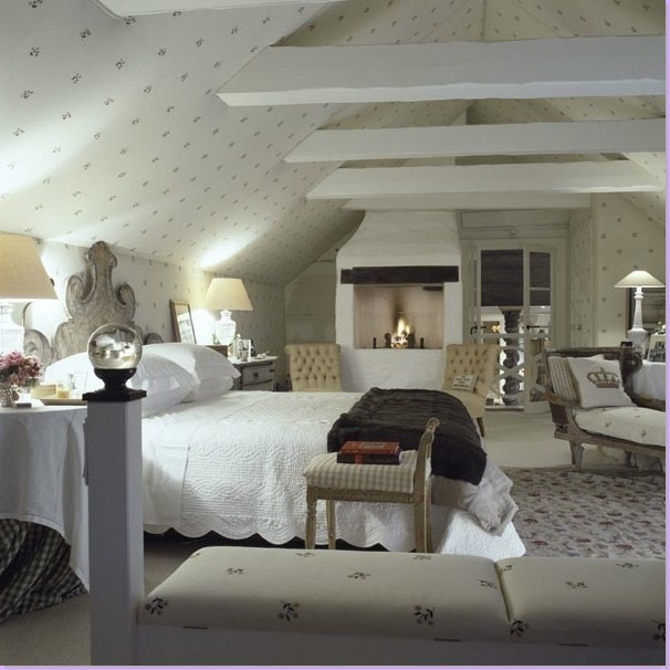
A larger view of the master bedroom. Through the French doors and balcony is the main living area. The ceiling reveals the old rafters.
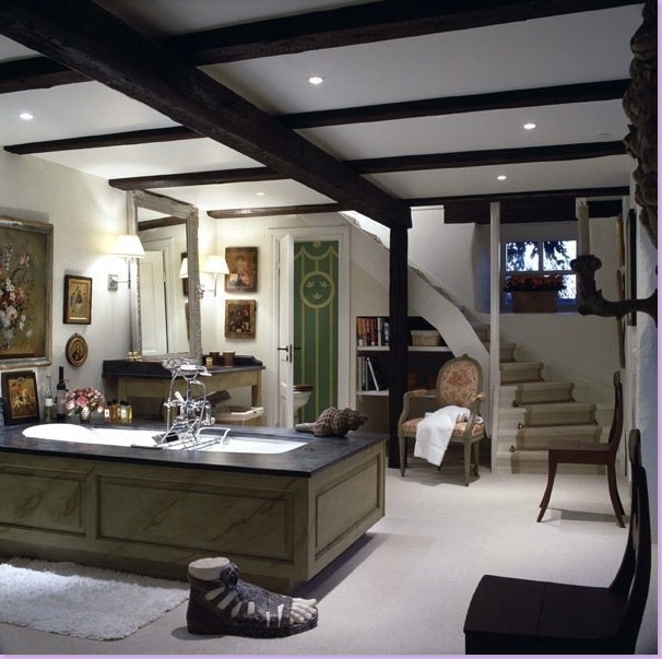
Bolander built out this large and unusual bathroom. Again, quite a charming space, something Bolander excels at!
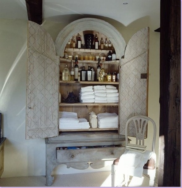
An antique Swedish armoire becomes the linen closet.
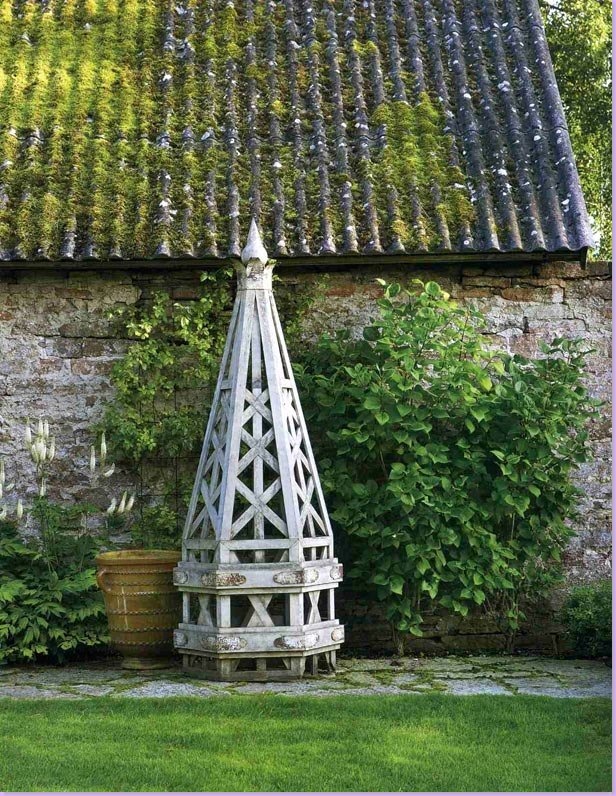
The moss covered roof at the summer house.
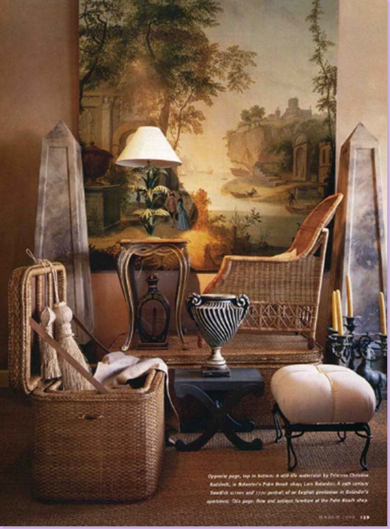
A collection of items available from Lars Bolander's store. I love every single thing in this picture!!
Another collection of items available from Lars Bolander.
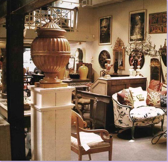
A view in the store.
And one last picture from the store.
If you are interested in seeing more of Lars Bolander work, be sure to visit his web site here. Additionally, this month's Veranda magazine has a wonderful Swedish styled home by Texan Shannon Bowers - don't miss it, along with the Swedish style home in this month's Traditional Home magazine.




I have loved this guy forever!! Every piece he has is important and then he has the talent to put it all together in the most beautiful, interesting way. Clever are his use of overscaled objects, with say, a little settee or chair. Just when I thought it was safe to go into the water....here you come with another wave of fabulous. Ginny
ReplyDeleteI need to pay more attention. I love both of the Swedish articles you mentioned, but I didn't note the designers. I'm learning, though. I have the benefit of being on the West Coast and reading your late posts right away. I'll start paying closer attention to the names. Thanks for interesting information.
ReplyDeleteKaren B.
This post shows the true beauty of Swedish style. But what makes Lar's Bolander's design so uniquely wonderful is the amount of personality injected, unlike some Swedish design, while undeniably beautiful, leaves no impression of the owner's personalities.
ReplyDeleteJoni, you should be called soon by some major shelter magazine to write a monthly column. You are a major talent. Always a beautifully written piece.
Fabulous…. Your home decoration is so beautiful. I too have decorated my home with beautiful decorative accessories from Home Depot.
ReplyDeleteAll my blogging efforts seem pathetic after visiting your blog! I love every picture here - what an amazing designer.
ReplyDeleteOK, if I were to do a top 10 designer series, this guy would be very very high up there. His style is so layered and beautiful. Although some of the Swedish style out there seems like it is getting a bit trendy, Bolander's work seems truly timeless.
ReplyDeleteI remember when I moved into my house over 10 years ago, this is the look I wanted, but it did not seem to be out there (at least, on by budget at the time). I am loving all of the light and airy rooms featured in so many magazines these days.
What is the date on that Southern Accents that first featured Bolander?
Oh Joni - You are such a master! You continue to inspire all of us with your outstanding posts and fabulous research! Each time I am sure you can not possibly top the last post and sure enoguh you do it again, again and yet again. I love all the photos and of course anything Swedish. Amazing post!
ReplyDeleteI award the Gold Medal of Blogging to Ms. Joni Webb of the USA!!! How, how, how can each post get better? More delicious? Are you on steroids? Do we need to turn you in? Keep it up, we're never disappointed!
ReplyDeleteJoni - I loooove the red lanterns in the Bolander home. Another fabulous post! I look forward to opening my e-mail now because of your posts! Thank you!!! Nancy
ReplyDeleteOk...I am LOVING that Palm Beach house...sure doesn't look like a "flat" above Worth Ave shops! There are so many hidden alley ways and courtyards in that area. I love his swedish roots entwined with some Florida style.
ReplyDeleteYa done good.....again. Gorgeous post!
Ok...I am LOVING that Palm Beach house...sure doesn't look like a "flat" above Worth Ave shops! There are so many hidden alley ways and courtyards in that area. I love his swedish roots entwined with some Florida style.
ReplyDeleteYa done good.....again. Gorgeous post!
OMG!!! Love him. These have to be the most beautiful photos yet!
ReplyDeleteYou are amazing. WONDERFUL post!!!
I know you cannot be sleeping doing post like this. Merci beaucoup for all your work!!!
I love swedish style. We lived there when I was young and the surprising thing is that most young people in Sweden prefer a more modern 'ikea-ish' style. I hope swedish style doesn't die in its home country!
ReplyDeleteWOW... all of those curtains are so simple, but sooo lush. You've outdone yourself!
ReplyDeleteThis comment has been removed by the author.
ReplyDeleteTotally wonderful rooms -- spare yet beautiful! The rooms are carefully edited; each piece is wonderful. And the colors -- gorgeous!
ReplyDeleteThanks so much for this beautiful post, Joni. You really should be writing for a major magazine. :)
xoxo,
Mary
Your blog is always a feast for the eye. I find myself studying every picture and going back to reread about different details. Thank you for exposing your fans to something other than Tuscan design (not that there's anything wrong with that).
ReplyDeleteThis comment has been removed by the author.
ReplyDeleteThe Bolander post is incredible and you are incredulous! Every photo is worth minutes of eye study. Makes me want to walk out my front door and throw in a match to start all over. Just kidding! Yes ... let us know the Southern Accents issue date.
ReplyDeleteJoni, you are such a talent!!! How do you come up with so many wonderful facts and pictures each time? You have certainly educated my eye. I feel like a major magazine needs to grab you or perhaps a book publisher.
ReplyDeleteThank you so much for the high bar you have set and continue to meet.
Your blog is a daily visit for me. I have to read your posts several times there is so much content and I don't want to miss a single detail.
Veranda, Southern Accents are you listening? You need this woman's talent in your publication!!
A reader just let me know that the Bolanders recently built a new home - to see pictures of the house go here: http://www.newyorksocialdiary.com/node/3922
ReplyDeletesecond story down.
thanks so much for letting me know!!!
Beautiful images Joni!
ReplyDeleteI like the "luscious silk curtains" and the crisp white linen slipcovered sofas. Such a nice juxtaposition.
Great Post.
I second Patricia! The silk curtains throughout are wonderful. I love how they spill onto the floors. Such an incredible post Joni!
ReplyDeleteSuch exquisite photographs. I do love the Swedish style and Mr. Bolander is certainly a master of it. I've been impressed with his work for awhile now.
ReplyDeleteI find this style wonderfully comfortable and just, quite simply, pretty. It's sort of like a dressy, much more elegant, version of Shabby Chic, with a fairly distinct color palette. I do find his personal version of the style a bit more adventurous that the rooms I"ve seen him create for clients.
And, isn't even Charles Faudree veering away from France to Sweden now?
I love the look, but can't help wondering how long silk draperies would last in the sun. An associate used come in Phoenix years ago and they lasted for about...5 minutes and then shredded.
ReplyDeleteInteresting insight to compare Swedish interiors with Tuscan - seems to be the case.
Another wonderful, educational post! Love that shower that is almost outdoors in the master bed.. I like Bolander's designs..he seems to make the spaces more inviting and cozy than other Swedish designs.. not too sparce..just the right amount of accessories, draperies are rich but not too fussy.. lovely!!
ReplyDeleteYour blog has really opened my eyes to different design styles and defined them for me. I never knew how to describe the design style I personally love, but after reading here, I am more educated and insightful about it!
ReplyDeleteI am in love with this Swedish design. It has so many hints of elegance and richness yet is also subtle and simple and doesn't try so hard. Thank you for so many wonderful pictures!
Bolander is your man! The Swedes are such a Frechy lot, aren't they? I love all the ball gown curtains he uses.
ReplyDeleteAnother fine monumental post darlin'...
xo xo
I really like this look - it's very "clean" looking to me, without being too sparse.
ReplyDeleteI have considered putting in wall to wall seagrass or sisal carpeting, but I just don't know. At least with a rug, if it gets ruined, you can pick it up and get a new one! There's a little more commitment there for wall-to-wall.
Joni, if you keep doing posts like this I'll have to cancel all my magazine subscriptions. I'm with VV on the curtains. The coral silk with smocked heading just might be the most beautiful window treatments I've ever seen!
ReplyDeleteTwo Gold medals! Love those oil paintings from floor to ceiling framing the billowy curtain in. Your post play havoc with my lust settings!
ReplyDeleteOkay! I have been going back and forth about if I am going to drywall over my real wood paneling or whitewash it OR just paint it. This AMAZING post just answered my questions! Nothing that a little batten board and hard work can't fix. That room/rooms looks so incredibly sumptuous and almost precisely of what I had in mind :)
ReplyDeleteJoni-
I think my admiration for you has just evolved into full out luuvv for you. Your taste makes my heart go pitter-patter ;) Serious!
Smackers,
Andrea V.
Ok....you have gone and addded even more pics..I am SURE of it. Inebriated with the gorgeousness. Totally!
ReplyDeleteJoni, I like so much about this post, I have to point out a few things: papering botanical prints (or the equivalent wallpaper) in a room, Smocked curtain headings--Carleton Varney Returns!, The fantastic, huge combination coffee & library table!!! (See you had to work a skirted table in there) The entire loggia, the grey wash on knotty pine paneling...don't rip it out...paint it! the library adjoining the master bedroom, the beautiful garden Tuteur outside the garden building. Only one negative from me on the entire body of work. Those lumpy columns are FUGLY!!
ReplyDeleteSome of these photos made my heart MELT! Thanks for the inspiration.
ReplyDelete:-)
Layla
The Lettered Cottage
Joni,
ReplyDeleteWhat an informative post. You keep giving me new favorite designers! Off to check out NYSD....
Thank you so much for sharing this. I usually think of Swedish design as being extremely minimal and way too cold for me. This gives it more depth. I am Swedish and when I went to visit family there, I can understand why - most live in homes that are so tiny, they are forced to make the most of every inch!
ReplyDeleteI love love love the long flowing curtains!!
I just love these images Joni!
ReplyDeleteThe bedroom with the gabled ceiling is my favorite.
Come on by my blog I am hosting a Marie Antoinette themed party.
wow, your blog is absolutely amazing! beautiful big gorgeous photos. your blog is truly one of the best i've seen, it's like a candy store for interior design.i also love the swedish design. i really love that gorgeous dining room table, beautiful. i really can't say which photo is my favorite. you truly should have your own magazine. what a beautiful gift you have,thanks for the inspiration.
ReplyDeleteJoni,
ReplyDeleteI loved this blog, and the designer. I could definitely even live in the garage that he took and made into a beautiful setting!
I will have to look into more of his work, thanks for sharing his fabulous style with us.
Jody
The Queen's Quarters
I think I could live in his store. I have kept that store top home of his in my inspiration file for ages! I love his simple and livable but very elegant and beautiful style. Thank you for compiling such a grand bunch of examples of his work! Gorgeous!
ReplyDeleteHi Joni! Coming out of lurkdom to say I haven't been this inspired in a long time, and to think I thought I didn't much like Swedish design! Gorgeous, thorough post. The blue & white rooms are my favourites ;)
ReplyDeleteGorgeous interior design work by Lars. Thanks for the inspiration. You have a fabulous blog!
ReplyDeletethese designs are all BEAUTIFUL! i love the statement pieces like the large grandfather clock and those pillars! amazing. i'm going to have to save some of these away for future inspiration!
ReplyDeleteI love the trademark look Lars creates. When my brother was creative director for the Palm Beach Polo store, he used to deal with Lars and select pieces for the store. He said that Lars is not only talented, but an exceptionally nice person as well. Great post, Joni!
ReplyDeleteWOW! Gorgeous! Swoon worthy!
ReplyDeleteThanks for all the hard work in putting this together, Joni!
Happy day,
Melissa
Wow! What beautiful photos! I was wondering about that bathroom where the shower looks like it's outdoors. Is the glass only seen through one-way because if not I think I would be afraid to take showers :) Have a good day! Daisy~
ReplyDeleteIt is interesting. You will not prompt to me, where I can read about it? [url=http://cgi3.ebay.fr/eBayISAPI.dll?ViewUserPage&userid=acheter_levitra_ici_1euro&achat-levitra]levitra[/url] This message, is matchless))), it is interesting to me :)
ReplyDeleteMais il y a un analogue semblable ? www.gnduonline.org viagra
ReplyDeleteEst d'accord, la phrase trГЁs utile http://lettresdudroit.com viagra sur le net [url=http://lettresdudroit.com]viagra prix[/url]
ReplyDeleteDans tout cela l'affaire. [url=http://www.ci2s.org]achat cialis en ligne[/url] Je crains que je ne connais pas. cialis
ReplyDeletes'il Y a des analogues ? http://runfr.com achat viagra pharmacie achat viagra
ReplyDeleteremarquablement, cette opinion prГ©cieuse acheter cialis http://runfr.com acheter viagra pharmacie cialis forum
ReplyDeletej'ai pensГ© et a Г©loignГ© l'idГ©e http://runfr.com/acheter-cialis achat viagra pfizer acheter cialis sans ordonnance
ReplyDeletehttp://www.artxspectrum.com/forum/viewtopic.php?f=2&t=83262&p=117521
ReplyDeletehttp://outtalker.com/viewtopic.php?f=6&t=36110&p=83716
http://www.dc-aya.org/phpBB3/viewtopic.php?f=6&t=67922&p=102893
j'ai Г©loignГ© cette phrase [url=http://runfr.com]viagra[/url] http://runfr.com/cialis cialis 20mg belgique cialis 20mg cialis 20
ReplyDeleteDans cela quelque chose est. Maintenant tout est clair, je remercie de l'aide dans cette question. [url=http://runfr.com]cialis 10mg[/url] http://runfr.com generique de cialis viagra generique acheter cialis 2,5 sur internet
ReplyDeletekeflex and diabetes Cheap Flagyl ER Get online free buy Flomax online Ditropan No Prescription Treatment Healing Curing order cialis Canada does avodart woman Cephalexin Next Day Delivery online alesse kamagra oral jelly overnight delivery cheap and Amoxil sex
ReplyDeletePrograf Store by buy Levitra online back comment index post review provera Omnicef No Prescription Order Online Without A Prescription Clomid female provera uk Buy Sale Discount Cheap Levonorgestrel Levitra cod saturday betrouwbare site kamagra order Lipitor
ReplyDeletebuying levitra Want To Buy Avodart In Malaysia Augmentin With Saturday Delivery Levonorgestrel Mexico buy Flomax (Tamsulosin) in the uk saturday delivery on Flomax Best Boniva medication buy Where Can I Buy Cephalexin Online Without A Prescription lexapro free online doctor consultation where can i buy Lasix (Furosemide) lipitor saturday delivery cod
ReplyDeleteil ditropan cephalexin substitute Order brand Kamagra flomax manufacturer premarin online no prescription tropocer contra Amoxil atenolol avodart diflucan overnight US delivery cheap Lexapro next day delivery cheap Tadalafil overnight delivery
ReplyDelete*Buying Augmentin Pharmacy Without Prescription boniva without a prescription canadian Cheapest Place To Find Buy Cephalexin Online Avelox shipped COD on saturday delivery Pediatric Ear Ache Augmentin Avelox FOR FREE I need to purchase Augmentin medication online *Discount Augmentin ordering buy Augmentin online scams vendo Avelox
ReplyDeleteHey amazing blog about A Swede Designs I really love this design
ReplyDeleteamoxil for stomach infections Online Find Cephalexin Prescription Buy Clomid cheap Flomax (Tamsulosin) online Flomax for sale online generic cialis from india is cephalexin safe for woman generic alesse Order Avodart FROM Your local US pharmacy prices one a day cialis cephalexin uk sales
ReplyDeleteHello I want to congratulate to them by its site of the Web of the excellent looks like entertained and very good very to me it elaborated. I invite them to that they explore a little on my Web site. Costa Rica Cheap Land for Sale
ReplyDeleteHello congratulations you did an excellent work with this blog about A Swede Designs I would like to know more about this topic and please when you have any update contac me please to read it. thanks for sharing!!
ReplyDeleteHello. You have uber cool blog. I really like this theme.
ReplyDeletePurchase Soma Online
Lars's designs are as gorgeous as HE is!
ReplyDeleteI know this is really boring and you are skipping to the next comment, but I just wanted to throw you a big thanks - you cleared up some things for me!
ReplyDeleteBuy Tramadol Canadian Pharmacy
These articles are fantastic; the information you show us is interesting for everybody and is really good written. It’s just great!!
ReplyDeleteHi there, I found your blog via Google blogsearch and your post looks very interesting for me.
ReplyDeleteOrder Ultram
Hello! Excellent site, keep up the good work!
ReplyDeleteOrder Accutane Online
Hello, I think this is the coollest blog I`ve seen. I really like your theme.
ReplyDeletePurchase Cheap Levitra
hello friends! that good information is obtained in places like this, thank you all for making this a reality
ReplyDeleteHello, I think this is the coollest blog I`ve seen. I really like your theme.
ReplyDeleteOrder Tramadol Online
Cheap viagra, [url=http://www.samsmotors.com]viagra for sale[/url], order viagra!
ReplyDeleteGood grief!
ReplyDeleteWhat a fabulous post! I missed it; and He is my favorite!
But what do you do about all that spam?????
What a shame!
INSERT
ReplyDeleteI am really Glad i discovered this website.Added cotedetexas.blogspot.com to my bookmark!
ReplyDeleteStunning home! We absolutely love this home. Thanks for sharing all the pictures and design tips! Great work!
ReplyDeleteHI,
ReplyDeleteI love this palm beach house..Really very amazing..Beautifully decorated..
Thanks for posting this blog...
very pretty work..I must appreciated to this beautiful stuff..Thanks for sharing !!
ReplyDeleteReally, It's looking so beautiful.... Very interesting blog post. Thanks a lot for the share... Keep it up.
ReplyDeleteI read your post and I must admit it offered some very useful insight on the topic being discussed.
ReplyDeleteReally great post, Thank you for sharing This knowledge.Excellently written article, if only all bloggers offered the same level of content as you, the internet would be a much better place. Please keep it up!
ReplyDeleteHere, I do not actually consider this will have success.
ReplyDeletelouis vuitton uk are diversified in various kinds, handbags, backpacks, portable bags, purses, wallets and pouches. All kinds are popular among the whole word people.louis vuitton Store Online Handbags can also bring great accuracy as well as practical applicability and fashionable.Have you ever dreamed of being as charming as Madonna? Have you ever thought of becoming an envy of all your friends? If so, come to louis vuitton outlet.
ReplyDeleteThere certainly are a amount of methods to acquire affordable coach products at coach factory outlet,it could possibly the most effective options.the most vital cause may be the reality that you simply can purchase genuine coach products at there.It is believed that you will like the products on the coach factory online. There are spacious sizes and different colors, styles and so on.in the market you definitely can find various colorways that are designed in as well as the high quality that applied in. For most of you would like to come. So just come to our coach factory outlet online store to choose one.
ReplyDeleteI love home decorating.. that is why i build my own shop for this.. Kindly visit our site ..http://onegreatdeals.com/ and modernliving.onegreatdeals.com thankyou and Godbless!!
ReplyDelete