Traditional Home: Swedish design by Loi Thai
It seems to happen each month, one or another decor magazine will feature a house designed in the Swedish style, this month two magazines actually featured Swedish styled homes. Swedish decorating burst on the scene a few years ago, fueled by a hunger for quiet, simple, grayish-white interiors after a decade of the overindulgence of the earth-toned Tuscany style. The pages of the decor magazines are filled with American interior designers' interpretations of the Gustavian style. Designers from Texas, of all places, seem to be heavily invested in the Swedish look, designers such as Jane Moore, Carol Glasser, and Shannon Bowers to name a few. Texas and Sweden? It always makes me wonder what do Swedish designers think of our American interpretation of their homeland? And how would a Swedish designer actually design in America?
House Beautiful: Texan Carol Glasser does Swedish
You don't have to look far to get an answer. Lars Bolander is a Swedish interior designer who lives and practices in Palm Beach, Florida. His clientele list is international, though lately he seems to do the bulk of his business right here in America. Bolander is a much respected antiquarian who started out in the United States with a store in the Hampton's some years ago. Today, he owns two stores, one in Florida and one in the meatpacking district of NYC. His two sons run the NYC store, while he and his wife manage the Florida store since they live in Palm Beach.
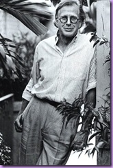
The boyishly handsome Lars Bolander
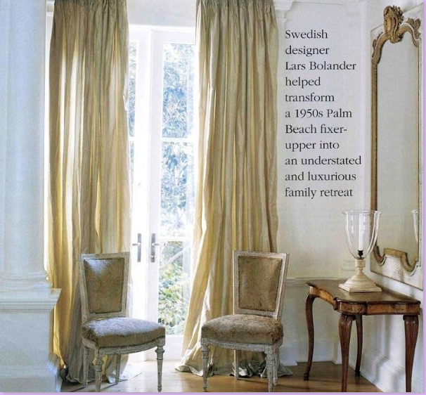
It was this house in Palm Beach which first made Lars Bolander a household name in the United States. Featured in Southern Accents, the home is light and airy with luscious silk curtains at every window.
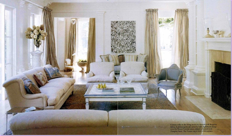
The main living area is a stone, cream, and Gustavian blue vision. Bolander's design for his Palm Beach clients is not typical Swedish design. Instead he chose to create a true American house using the lightness, airiness, and colors of a Swedish home. Be sure to take note of his window treatments - the long, flowing silk taffeta curtains are the focus point of each room.
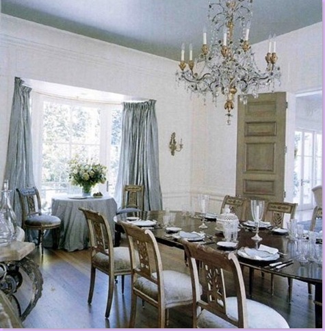
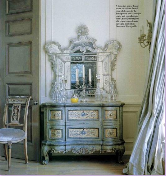
The blue dining room is the most Gustavian feeling room in the house, though there isn't any Swedish furniture here. Swedish Gustavian furniture is a close kin to French Louis XVI furniture. Hallmarks of Gustavian design are: crystal chandeliers, blue and green colored fabrics such as damasks and checks, gray painted walls, giltwood framed mirrors and the Swedish tiled stove.
A beautiful corner of the dining room with a French painted chest and beautiful silk taffeta curtains.
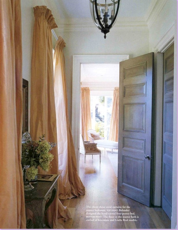
The entry hall to the master suite features coral silk taffeta curtains and gray painted paneled doors.
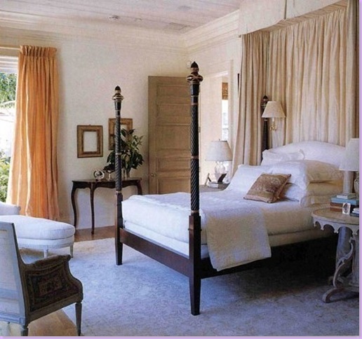
The master bedroom features a Bolander designed four poster bed.
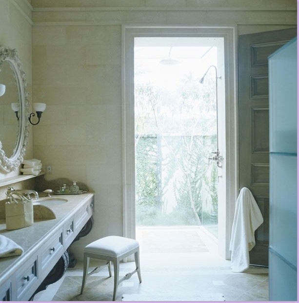
The master bathroom has a shower that seems to be out of doors. The walls appear to be tiled in limestone. Notice how he used a decorative mirror at the sink and be sure to notice the beautiful sink console itself - a work of art.
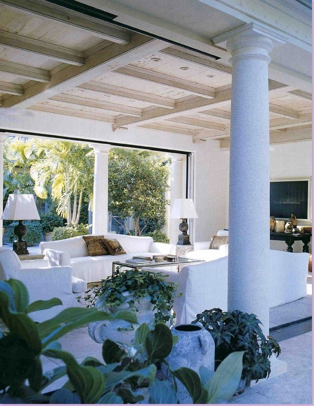
In the house's remodeling, the loggia was created by fashioning french styled doors that slide out of view - making the room open to both the pool and the gardens. Slipcovered sofas and chairs.
Another view of the open aired family room.
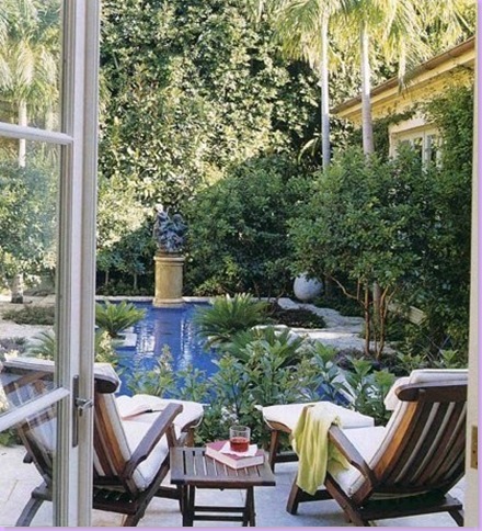
The swimming pool is a free form oasis in the garden.
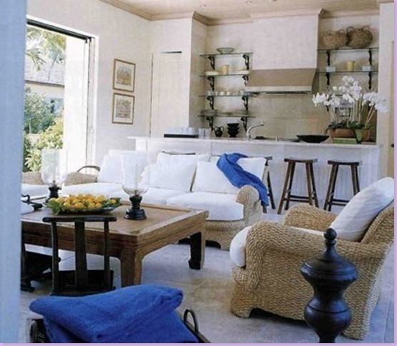
The pool house is open to the pool on one side and the tennis courts on the other.
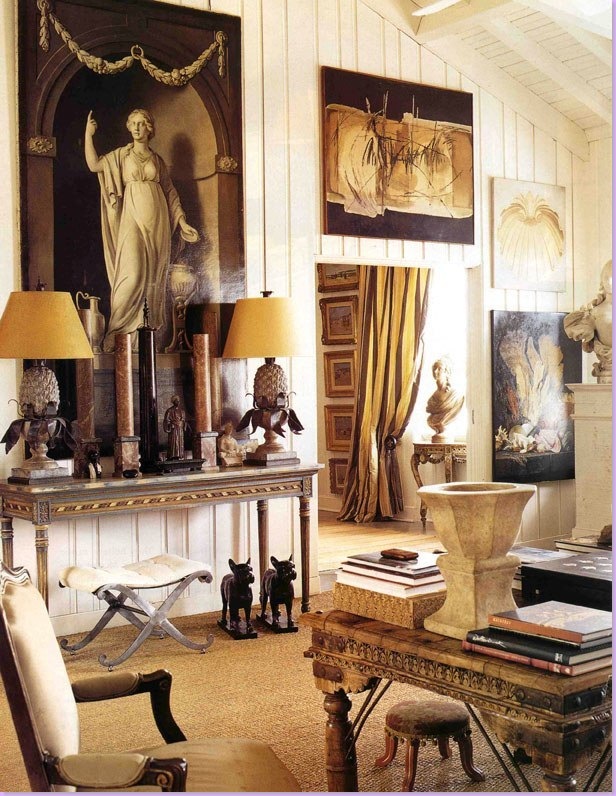
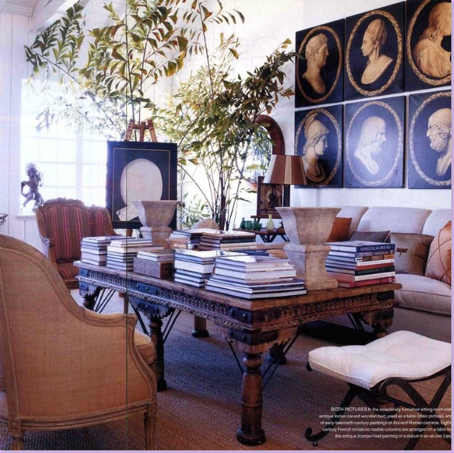
So, how does the Swedish Bolander design a home for himself? Like this! Bolander and his wife live in a flat above the stores on Worth Avenue. One side of the flat overlooks Worth Ave. and the other side opens onto an enclosed outdoors terrace. The Bolanders blur the line between inside and outside living. Originally the Bolanders bought one flat, but recently added two more flats to the original one, creating a large, rambling living space. Here, is the main room, with its wooden, vaulted ceiling. The space is organized clutter, an array of accessories and paintings collected over the years. Some of the more valuable antiques are for sale on Bolander's web site. One element of design Bolander frequently uses is frameless paintings, as seen above. The flat is paneled in cream painted wood.
The other side of the main living area. Above the sofa, early 20th century copies of ancient Roman cameos. The Indian day bed doubles as a coffee table and is a makeshift library, piled high with numerous books.
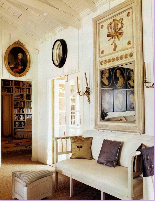
In another area of the main room, an antique Swedish sofa sits under a trumeau mirror. Through the open doorway on the left is the library that leads to the master bedroom. The room is carpeted in wall to wall seagrass.
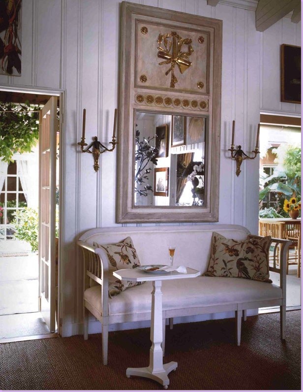
Another shot of the same area, styled differently, showing the terrace.
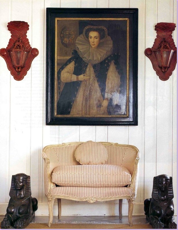
A gorgeous vignette in the Bolander flat. A ticking covered settee sits under a portrait and two smashing red lanterns.
Another gorgeous vignette, a velvet covered skirted table, piled high with books and a bust. An antique screen is off in the back, left.
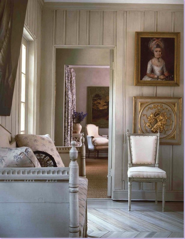
Another wonderful space, very Gustavian in feel. Swedish antique sofa and French chair share space with gray herringbone floors. Nice enfilade into the next room where Bolander has created a beautiful vignette to catch and hold the eye.
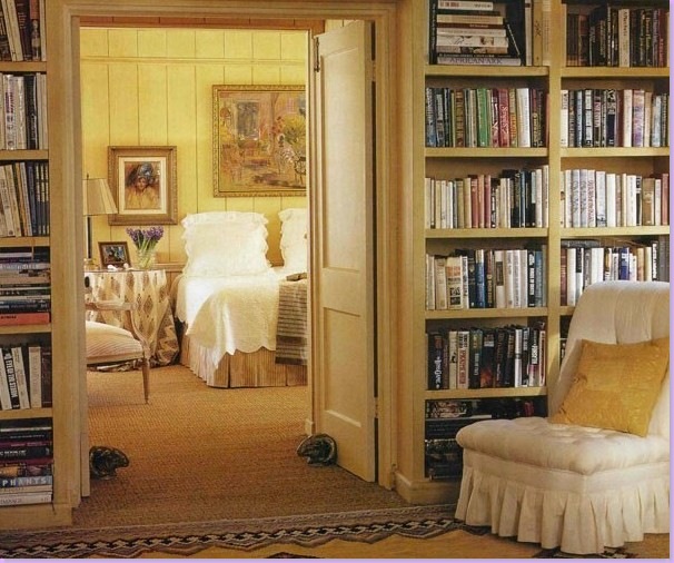
A library leads into the master bedroom.
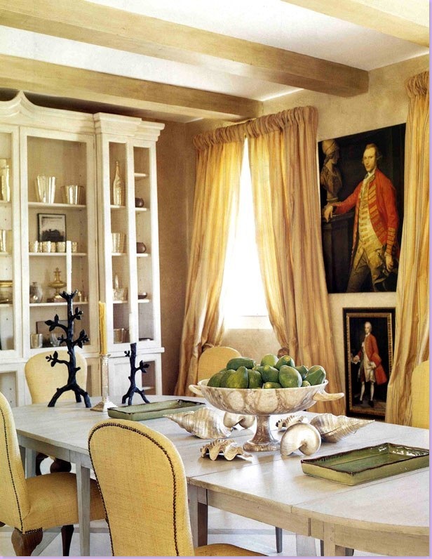
The dining room features a Gustavian dining table and raffia covered chairs.
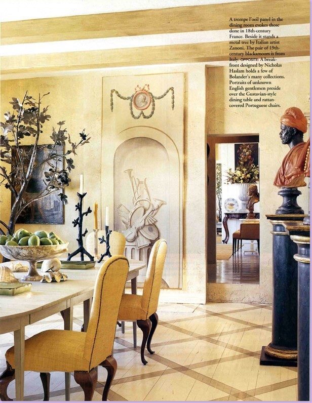
In the dining room, the floors are painted in a diamond pattern.
The outside terrace.
Note: The Bolanders recently sold their Worth Avenue flat after building a new home in West Palm Beach. To see photos of their new home, go to the New York Social Diary. Thanks to a Cote de Texas reader for that information!
So, how does an ex-pat Swede really get back to his roots, decorating-wise? He goes to his boyhood home and buys a house! Here on the island of Oland in Sweden, the Bolanders purchased a wooden house and nearby barn in the place he grew up. Bolander connected to the two buildings and designed his home in his own vision of Swedish decor.
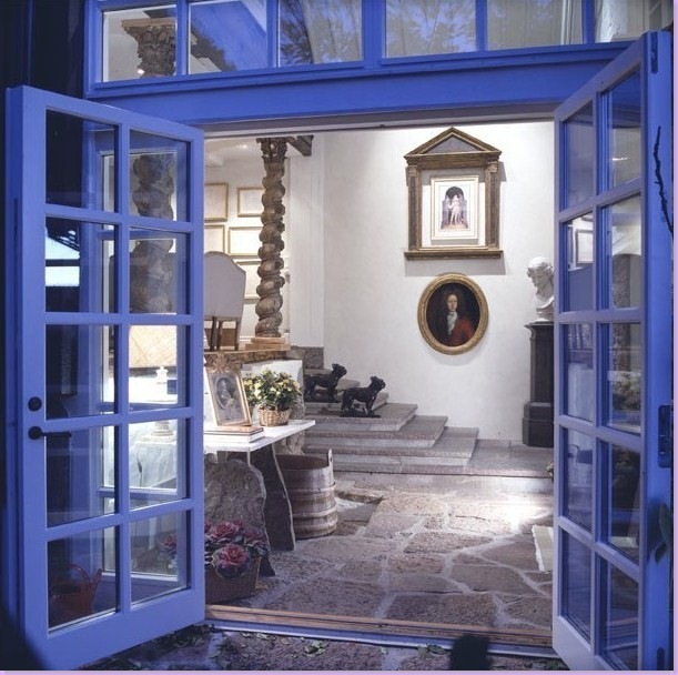
The connecting building with original outdoor pavers. To the left atop the stairs is the living area, shown below.
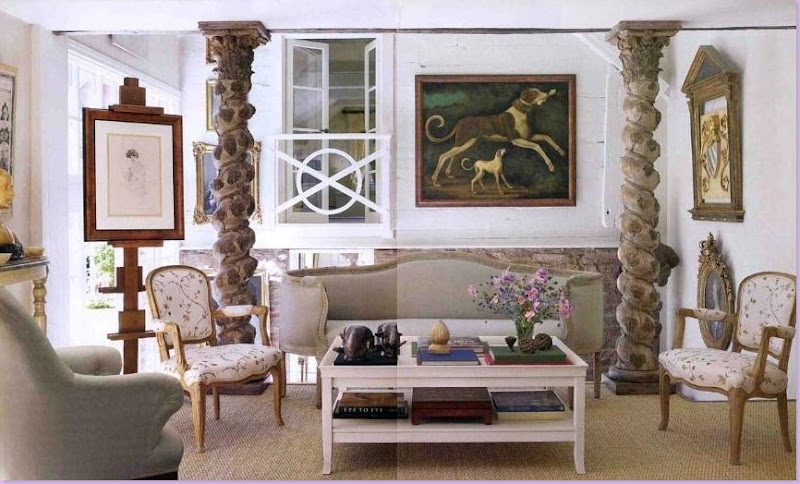
The charming main living area, here in seagrass matting again. Antique French and Swedish furniture were both used. The master bedroom overlooks the room through the French doors and iron balcony.
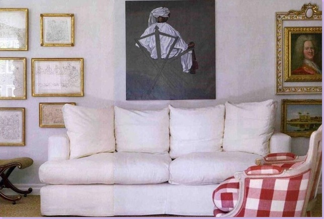
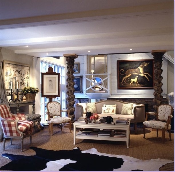
Another view of the main living room with slipcovered sofa and traditional Swedish checks. Notice the charming framed portrait on the right, hanging inside an empty frame.
Another view of the living room, styled somewhat differently with a large cowhide over the seagrass. Fabrics are by Chelsea Editions. Again, the area between the living room and the master bedroom seen through the balcony is the connecting building Bolander constructed between between the barn and the house.
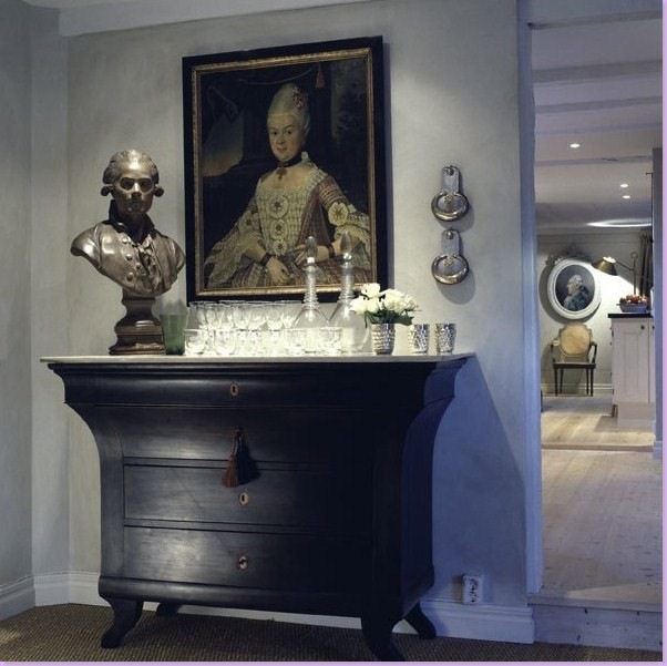
A charming vignette, the kind that Bolander is known for. Bolander collects both busts and portraits.
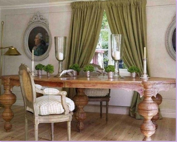
The dining room with antique portraits and furniture. Most of the fabrics in the summer house comes from England's Chelsea Editions, who also make a fabulous line of reproduction Swedish furniture.
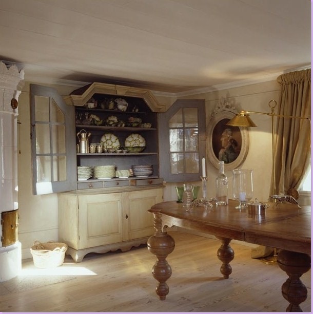
Another view of the dining room shows a Swedish antique cabinet and on the left, the traditional Swedish columnar, tiled stove.
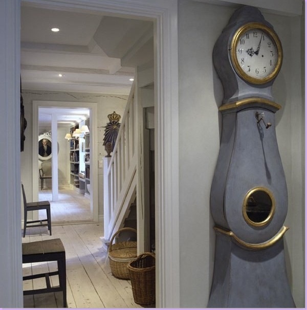
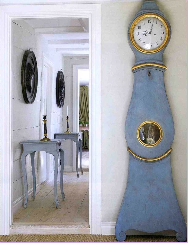
In the stair hall, a traditional Swedish clock, the Mora, perhaps the greatest symbol of Swedish design there is!
Styled differently, much prettier with matching Swedish tables below two black cameos, the Mora clock. The dining room is seen through the back door.
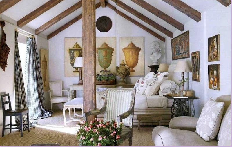
This gorgeous guest room was fashioned out of the garage building. Sprinkled with French and Swedish chairs and antiques, the fabrics - checks, stripes, and embroideries - are from Chelsea Editions. Wall to wall seagrass matting completes the looks. Just beautiful!!
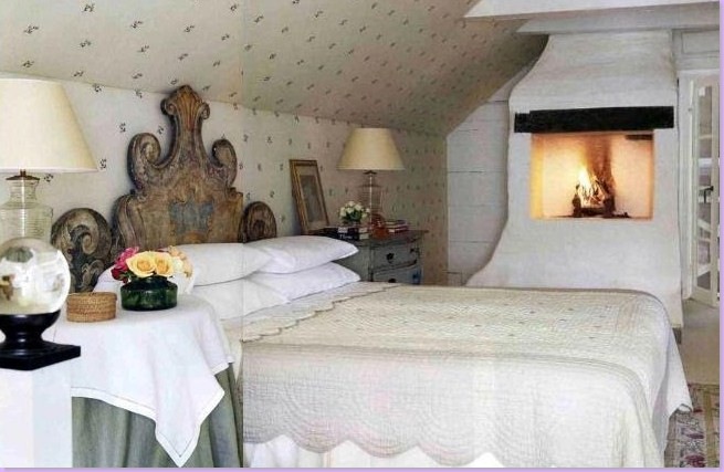
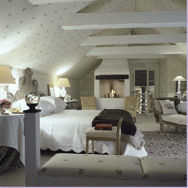
By contrast to the lofty guest room, the master room is small, cozy, and inviting.
A larger view of the master bedroom. Through the French doors and balcony is the main living area. The ceiling reveals the old rafters.
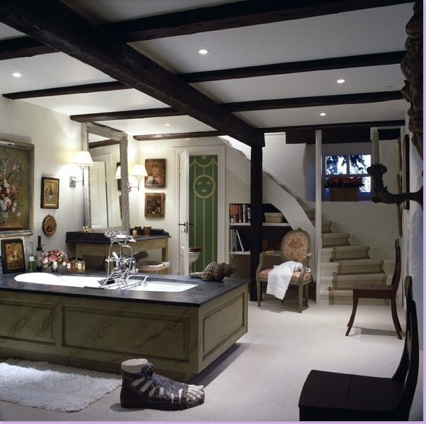
Bolander built out this large and unusual bathroom. Again, quite a charming space, something Bolander excels at!
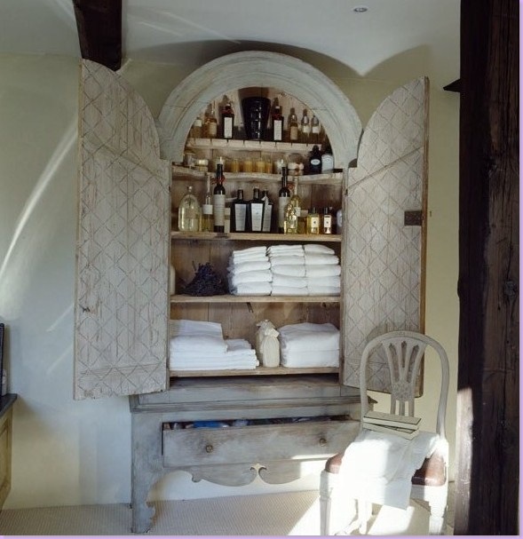
An antique Swedish armoire becomes the linen closet.
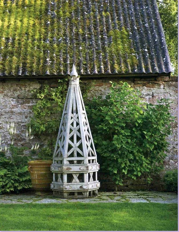
The moss covered roof at the summer house.
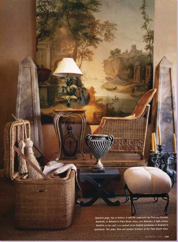
A collection of items available from Lars Bolander's store. I love every single thing in this picture!!
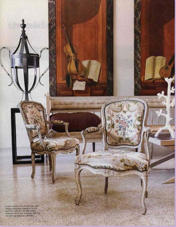
Another collection of items available from Lars Bolander.
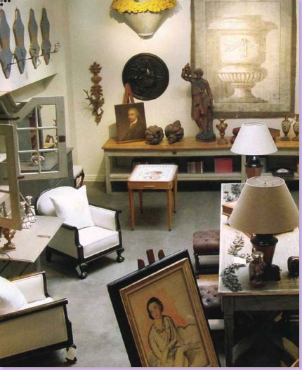
A view in the store.
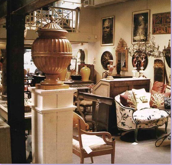
And one last picture from the store.
If you are interested in seeing more of Lars Bolander work, be sure to visit his web site here. Additionally, this month's Veranda magazine has a wonderful Swedish styled home by Texan Shannon Bowers - don't miss it, along with the Swedish style home in this month's Traditional Home magazine.

