 She’s on the move again. I swear, this girl moves more times than anyone I don’t know (because I don’t really KNOW her – I just admire her from afar). The nomad is Ginger Barber, one of Houston’s top interior designers and a personal favorite of mine. Barber likes to pick up stakes and move every other year, or so it seems. Her office too. A lot. I get a kick out of stalking her because it’s a sport keeping up with all her moves. Actually her last house was on my Starbucks Route. Oh, and the one before that one, too. The last house was really cool because she had installed these tall, antique shutters on her tall, antique front door. They actually functioned, too – antique wood shutters that totally closed off her front doors. Her last house was beautiful, all taupe facade, landscaped with boxwoods. Barber had redone it and spent quite some time getting the landscaping just perfect – very simple, just the sculpted box. Boxwoods, always boxwoods. I’m familiar with her former house – I was actually in it, not invited of course, but it was on the West University house tour. Shortly after that, it went on the market and she moved somewhere else, off my Starbucks route.
So, it wasn’t a huge surprise to see her current house on HAR this weekend, there it was - another one bites the dust. I would love to move into one of her ex’s. I love her personal style and share some of her trademarks – I only wish I shared her talent! When designing for herself, Barber favors seagrass rugs, white walls, linen slipcovers, muted colors, pine furniture, natural fibers, spare, large accessories, and rustic antiques. Her houses are all about textures – sisal, wicker, and concrete play important roles. Nothing is superfluous – everything is edited and then, edited again. Her homes are a calm haven, a refuge from the cacophony of colors and patterns she works with at the office.
And don’t think for a minute that her office has stayed in one place either. She recently bought a permanent place on West Alabama – a few doors down from the first Sitting Room – years and years ago. Between those two spaces – she’s been in Rice Village then Montrose then downtown West University. I’ve loved all her work spaces - her shop is more like a cozy home than a place of business and it’s hard to walk out the door empty handed. She culls the best of best from Round Top and jaunts to England and there is always something to buy – Kenneth Turner candles, baskets, trays, dreamy “Fresh Butter” platters, down-filled sofas and chairs, antique mirrors, white ironstone, pine tables, chinoiserie lamp bases and wicker shades. I’ve yet to leave The Sitting Room without a package of goodies – ever!
Over the years, Ginger Barber’s star has risen and today, she’s at the top. She’s decorated houses all over the country – ski lodges and country farmhouses are mixed in with city townhomes and tony mansions. She’s done it all and then some. She’s been published in the best of magazines, many, many times and her wanderlust life has been chronicled in the press. A Barber-decorated house on the market is always noted, often without any mention of the architect. She recently decorated, along with her friend, Houstonian interior designer Pam Pierce, a health spa and resort in the Hill Country. Another important recent project was published in House Beautiful, here. She’s friends with all the great Houston’s designers, a small group of the most talented in our town. And with good reason – she has the talent and the personality to hang with the best.
Today – let’s examine the house Barber has up for sale and compare it to her previously sold house. It’s interesting to see how she utilizes her furniture from house to house. By designing with a quiet background, her possessions move easily from place to place. There’s no wallpaper to match, no loud colors that clash, instead – both houses are cozy, warm, and perfectly Ginger!
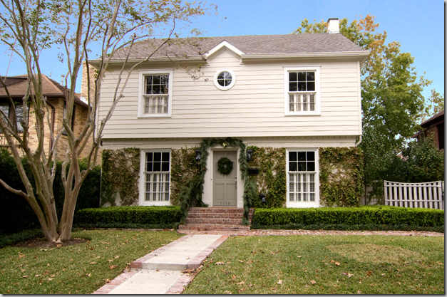
If you are a Ginger Barber fan, here’s your chance to live in one of her houses. Located in picturesque Southgate, near the charming Rice Village, this two story classic was recently remodeled by the popular interior designer. At 2,251 sq. ft, the 3 bedroom, 2 1/2 bath house is perfect for a young family starting out, or even empty nesters looking for a close location to downtown’s entertainment venues or the Medical Center. The serene facade gives a hint to lies inside.
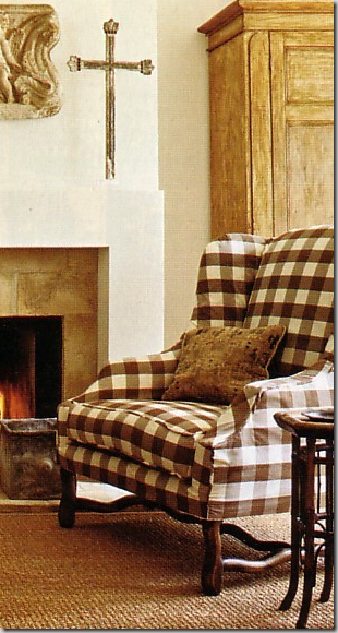
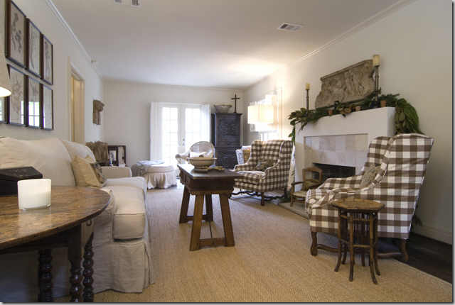
The living room runs from the length of the house from front to back. The plaster look fireplace was redesigned by Barber using an antique concrete tile surround. Once, Barber lived with a more cluttered look – decorating with red paisleys and red upholstery fabrics and kilim rugs – but with each move (most of which are documented in magazine spreads) Barber’s personal look has grown quieter and more peaceful. The two Os de Mouton chairs moved from the previous home, slipped in a wonderful brown and white large linen check. White walls are matched with the beautifully custom cut seagrass matting – two details Barber uses time and again. Her down-filled sofas are always slipped in a neutral linen. An array of dark wood antique tables provide the contrast. Above the fireplace – a large relief has followed Barber from house to house to house.
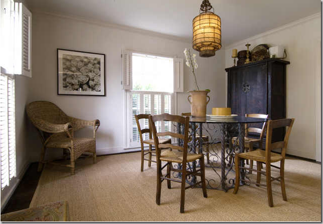
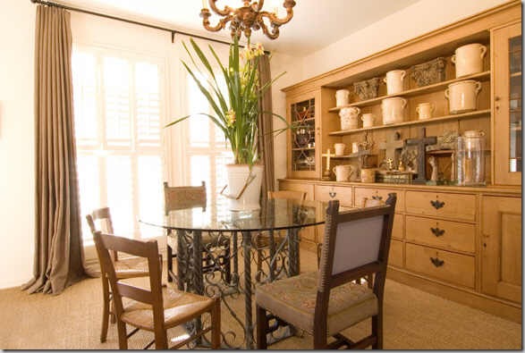
The dining room is simple, no frou-frou crystal for Barber, ever. Wicker is a favorite texture and the table adds yet another tactile surface - iron.
The kitchen has wonderful vintage styled cabinetry, marble countertops, farm sink, and open shelving. A pine dresser is here with a Pure Lard platter - which Barber sells in her shop, The Sitting Room. She prefers the pine furniture mixed in with dark wood tables and bamboo accent pieces.
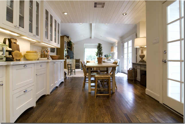
Adjacent to the kitchen is the breakfast room with more of the wonderful cabinetry, paneled ceiling, and pine table. This room connects with the large family room addition. Barber added the French doors when she remodeled the house.
The large family room addition is bright and airy. Barber raised the roof in this room which gives it its wonderful atmosphere. The surprise here is the rug! No seagrass! Another Barber trademark is the large, down-filled sofa and comfortable arm chairs – always slipped in cottons and linens, either plain or a ticking stripe. The oversize antique pine cupboard has followed Barber through all her moves – this piece has been showcased in the numerous magazine shoots of her former houses. The blanket chest, used here as a coffee table, is another favorite and oft used piece.
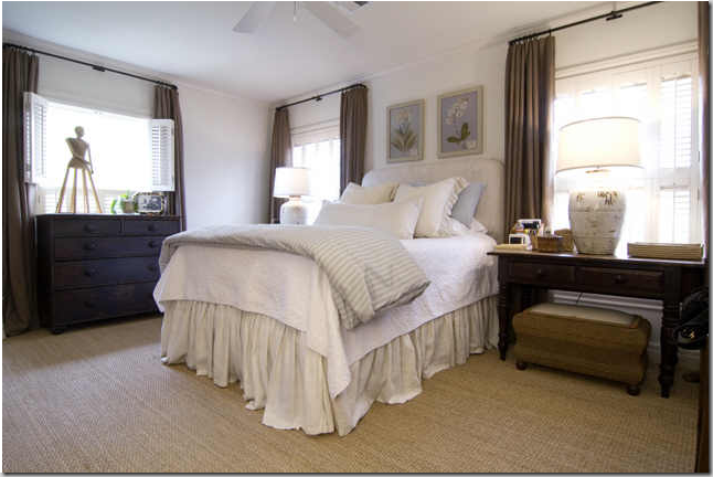
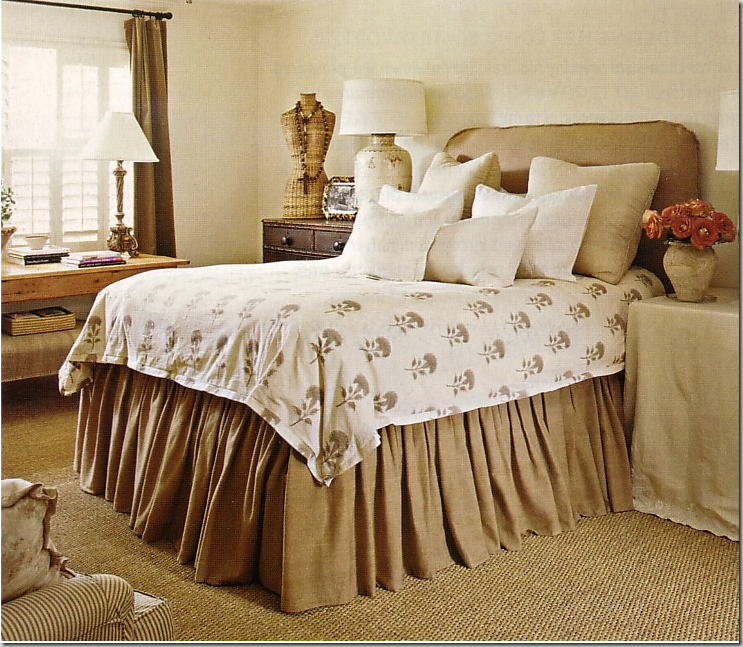
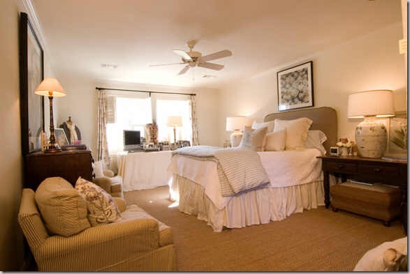
The inviting master bedroom continues the feel from downstairs with its white walls, shutters, and custom cut seagrass. The slipcovered bed and dust ruffle are lighter than that in her previous home and the curtains appear to have been used in the prior living areas. Simple, dark wood, antique furniture pops against the white walls. The lamps are wonderful oriental vases with just a hint of brown.
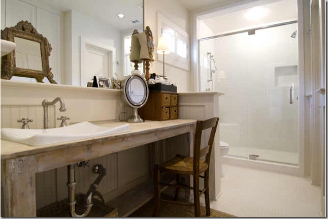
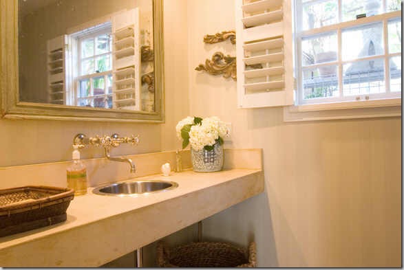
The bathroom has Barber’s touch – it looks like she added a rustic, old table in lieu of a built in cabinet. The shower is the only modern touch in the house.
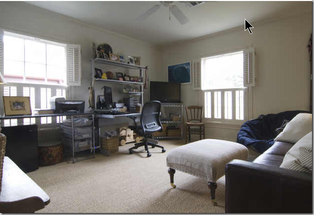
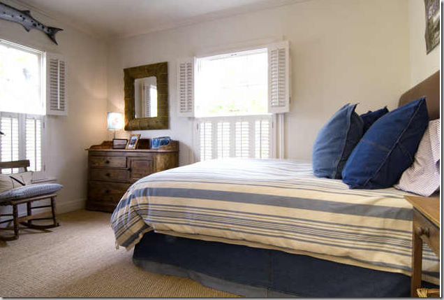
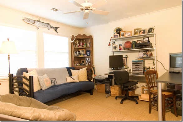
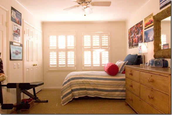
Barber’s teenaged son always gets two rooms – a study and a bedroom.
Denim and ticking bedding – perfect for a boy! Shutters and wall to wall seagrass throughout.
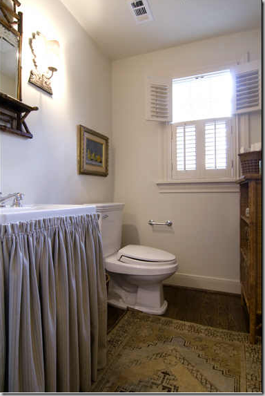
The powder room - simple and straightforward. A linen skirt on the sink. Antique rug, bamboo shelves and mirror add an English touch.
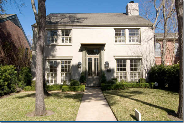
Now – take a look at the former house, sold by Barber, it is located in West University, straight on my Starbuck’s route. Perfectly symmetrical, with boxwoods and lanterns – the large wood and iron antique door is the focal point. It’s hard to see the shutters on the outside, which when closed – completely block off the front door.
Barber remodeled this house, first painting it white. She then opened the staircase to the living room. She installed the antique front door and added traditional white shutters throughout. The two check chairs used here, are also in her new living room and this chest is in the new family room. These drapes, here and in the dining room, are in her new master bedroom. Using a neutral background, the furniture moves easily from room to room and house to house. With no wallpaper, colored walls or patterned fabrics to contend it, the nomadic Barber can reuse her possessions, over and over again – which is a wonderful lesson to take from her.
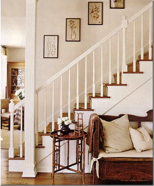
The close up view of the stairs – styled for a photo shoot. Bamboo accent tables are a Barber trademark, as are all the muted linen pillows piled on the rustic antique bench.
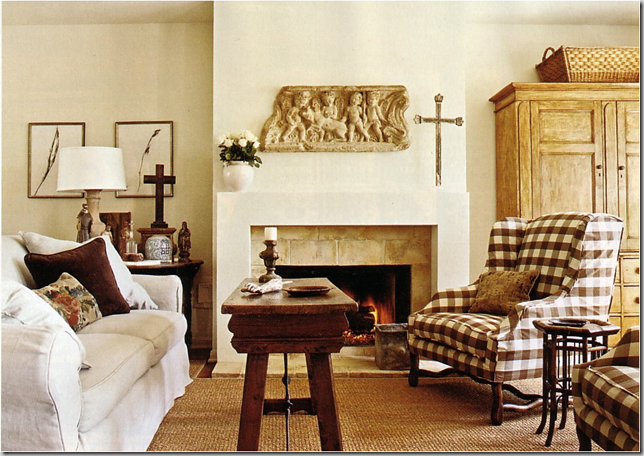
The living room styled for the photo shoot – the same coffee table in the new home’s living room shows up in this picture. Barber replaced the traditional mantel with a more contemporary one fashioned out of stucco and surround by antique roof tiles. The large pine armoire adds the simple, rustic look that Barber prefers. The concrete relief above the fireplace has followed her from home to home. Barber collects the framed herbiers for their lack of color, she says. The pillows are a mix of antique tapestries and velvet and linen (sound familiar?)
And styled by the realtor photographer – here the roaming blanket chest returns. Again, this picture highlights the often asked question – why do realtors take such bad pictures? Out of focus, totally uninspiring – contrast this view of the living room with the above professionally styled photo.
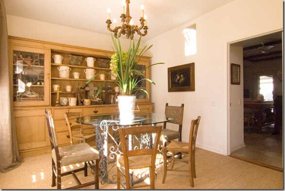
In Barber’s current house, this large pine bookcase is in the family room. Here, it fits the dining room wall perfectly. The wood chandelier here is much dressier than Barber’s current dining room fixture.
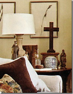
Another view of the dining room – the bookcase holds a large collection of French yellow ware, wood crosses, and capitals – things she gathers for her home and The Sitting Room.
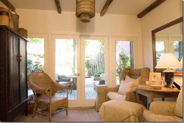
The small sitting room off the living room – the wicker chairs and toile down-filled chair are mixed with a pine table and oriental armoire. Baskets and chinoiserie lamp are from The Sitting Room, Barber’s shop. The current dining room fixture shows up here. Barber added the wood rafters, for more texture, of course. The armoire and wicker chair are used in her current dining room. The seagrass is wall to wall in this room, again a Barber trademark.
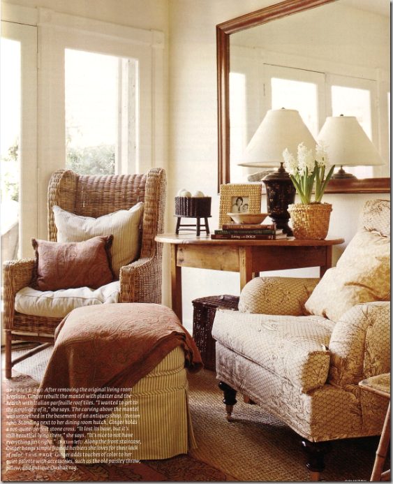
And styled for the photo shoot. For the magazine – Barber brought out the antique Oushak rug and paisley, though she clearly lives her every day life without the red!
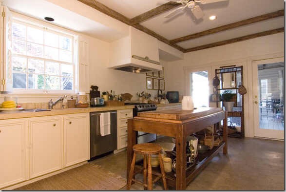
This kitchen in her former house featured concrete floors and countertops and a large antique butcher’s table. Barber totally remodeled this kitchen, stripping it bare, and then added wood rafters. Notice though – no farm sink this time and no beautiful plumbing fixture as she has in her current house. Bamboo hall stand has moved from house to house, along with her wonderful collection of pine stools and miniature chairs.
The bedroom styled for the magazine shoot. The printed bedspread is a highly unusual touch for Barber’s personal life. This bedroom appears more decorated than the usual Barber master bedroom. The ticking armchairs appear in the new house’s family room. She uses the same wonderful lamps here. So pretty!
The bedroom unstyled, seems more Ginger to me. The slipcovered vanity in front of the window is a surprisingly feminine touch. The dark wood furniture is the same as used in her current master bedroom. Here, the headboard is still covered in the darker fabric – in the new house, it is in the lighter linen, matching the creamy dust ruffle.
Master bathroom seems very similar to her current bathroom. Again, Barber totally redid this room, using a rustic antique console, rather than a built in cabinet. The bathtub was fashioned out of concrete.
Her son’s study in the former house.
And his bedroom – with the same denims and linens. This pine chest of drawers ended up in the new house’s kitchen.
The powder room with a few embellishments for Barber: beautiful nickel faucet and blue and white porcelain.
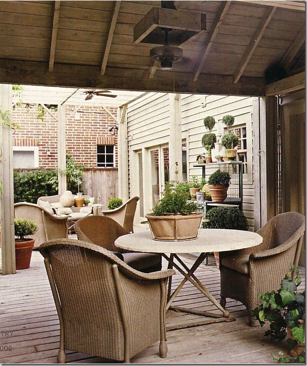
In the former house, shown in the magazine, the back yard was quite a showpiece. Here is the deck with the wood pergola and wonderful wicker chairs and iron based tables.
The deck with faux bois table and wicker chairs. Evergreen wisteria grows on the pergola.
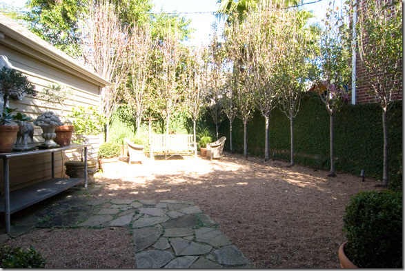
The back yard, looking towards the house – the grass was removed, and gravel takes it’s place – totally maintenance free.
Looking from the house towards the backyard with the allee of fruit trees Barber planted. This small lot is typical of West University, where backyards actually become courtyards. This yard in this former house was very French in feel and quite pretty. As there are no pictures of her new house’s backyard – I can’t compare the two.
It’s interesting to see how similar the two houses are, stylistically. Her wonderful assortment of pine and dark wood furniture, down-filled upholstered pieces covered in linen slips, and all her textural wicker, seagrass, and stone moves from house to house almost seamlessly. I wonder where she is moving to – will she continue with the same style, or is she changing? And don’t think that Barber’s personal decorating style, shown here in her two houses, is typical of her work, far from it. Below – is a small example of two of my favorite jobs of Ginger’s:
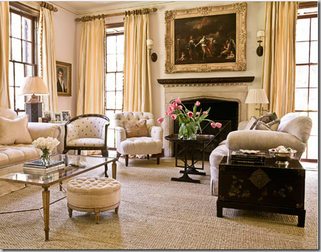
Published this past year in House Beautiful, this River Oaks mansion shows Barber at her dressiest. While she repeats her light walls (though assuredly these were not just painted!) and though the rug appears to be her usual seagrass, it is actually Tibetan jute – this room is a more upscale version of Barber’s casual style. The pedigree of the antiques here is far finer than Barber’s beloved rustic pine pieces. Listen to how Barber describes her design process for this room:
“I felt strongly that the house needed simple casual linen upholstery on chairs and sofas to balance out the amazing English fringes and all the silks and the taffetas the couple wanted to use…..There's something that happens in my head. I have this beautiful big gold mirror and this drop-dead Renaissance painting, and I know I've got to stay down with the fabrics and the rug or else things will get too-too.”
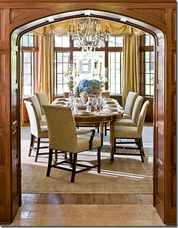
The dining room with its wood paneling, crystal chandelier, and Dessin Fournir chairs.
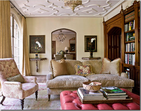
The family room, yes the family room – this couple has teenagers - with its Beaumont and Fletcher furniture. The red leather ottoman was added for “fun.”
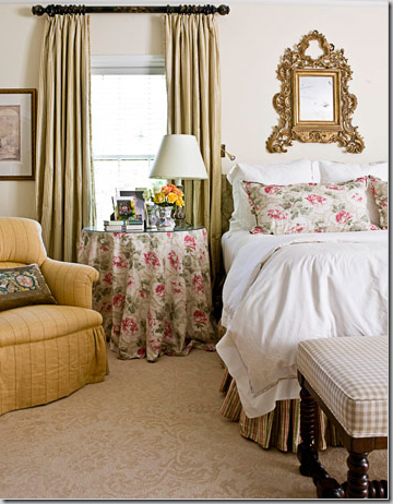
The master bedroom is all Bennison silk Roses, checks and taffeta stripes. The carpet was custom created to resemble an upscale hotel. I love the small mirror highlighting the bed.
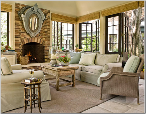
The conservatory/pool house’s sofas are covered in outdoor fabrics.
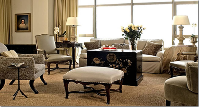
My favorite commission of Barber’s is this high rise apartment. Barber has managed to turn a contemporary space into an English country home. Using a neutral palette and antique tables with wood-framed chairs, the look is sophisticated, yet inviting.
The dining room is my favorite space – white walls and seagrass – mixed with a French table and large mouton leg chairs. The sconces and chandelier mixed with the antique trumeau and altar candlesticks turn this large room into something more cozy.
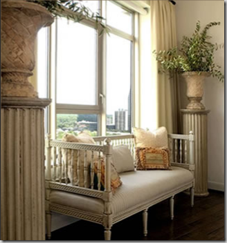
A surprise in the dining room is the Swedish sofa flanked by columns and urns – lovely!
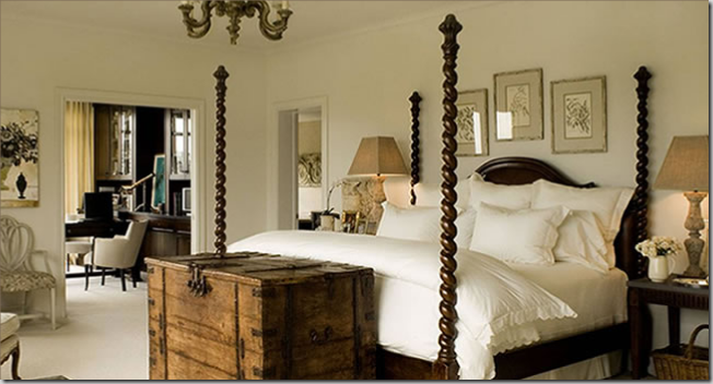
The master bedroom has a wonderful barley twist four poster bed, mixed with antique styled lamps and herbiers. The large chest at the foot of the bed adds rustic texture. I wonder if the TV pops out of the chest.
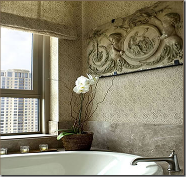
And finally, the bathroom is wallpapered in a beautiful Rose Tarlow print. The relief is similar to the one found in Barber’s own house – yet this one is more dressy.
The modern day nomad, Ginger Barber, at her beach house, photographed by Coastal Living. I love this picture of her, I think it reflects her style so perfectly. But, below, she is dressed for success!
So, which Ginger Barber do you prefer? Her personal, pared down style, full of texture and linens? Or her more dressy style – the side her clients see? And which house of hers did you prefer – the new one with the large, airy family room and vintage styled kitchen, or the former one, with the antique front doors and wonderful back yard?
Barber has a web site, full of her published works. Go here to see more of her designs. Also, if you are in Houston, be sure to visit her shop in its new location, The Sitting Room, located at 2025 West Alabama. And, if you are interested in purchasing the house for sale in Southgate, find the MLS here. Be sure to let us know if you buy it!!!!!











oh, oh, I'm first! I love her personal style the best. I wish I could pare down like that. It's so calm and serene. I do, however, LOVE the barley twist four poster bed she used. Wow. That's beautiful.
ReplyDeleteI forgot to say this, but I love how she reuses her possessions in different ways. It's obviously her talent to have very flexible furniture. It's a good example to set, we don't have to have NEW STUFF.
ReplyDeleteI stumbled upon your blog some time this past fall,and I am hooked.I too search houses on HAR, and knew about Ginger's house. I love her work; she is one of my absolute favorites. I have also seen all of her homes since the North/South residence either on the West U home tour or during an open house while on the market. Her style is timeless.Thanks for all of the good work. Also, before I forget, your kitchen is beautiful; I can see why your husband enjoys showing it off to guests.
ReplyDeleteWow! She is a major talent. I very much like her mix of materials and textures so dear to us all (sisal, linen, crystal) although she uses such restraint in her own homes. Hmm, I can't say which I like best as I like them both. Especially loving the brown check slipcovers.
ReplyDeleteAnd me, too, Joni, I LOVE your kitchen. I have even set it as my desktop background! I think you epitomize the direction I would like to see kitchens go- using high end materials but not going insane. It makes for a much more personable feeling.
The queen of restraint!! Loved this look/see into her homes. No one does neutrals better.
ReplyDeleteHmm...it's nice, but I think your decorating skills trump hers.
ReplyDeleteShe does do good work. I'm surprised she can still flip a house in this economy. I guess Houston isn't doing too badly.
ReplyDeleteas usual, you are right on the mark.
ReplyDeletei enjoyed every bit of this post.
i can see why you are so crazy about her work .
i love the idea of 2 rooms for the son.
i liked the very primitive / casual bathroom, with the wood table as a counter.
hug
I do like elements of each. I love the master with the four poster and large trunk. She is very good!
ReplyDeleteI like both and if I had a spare $800k lying around, I'd take a look at buying myself! :)
ReplyDeleteThanks for the visual feast!! Judy
ReplyDeleteHow beautiful -i'd move into any of them anyday. My favorite activity though is to spot pieces of furniture or artwork in transition between different homes - it's like the designer's 'where's waldo'!
ReplyDeleteI like her older home better than the latest one. Ginger's a talented designer, but you're as good, if not more talented, than she is. Seriously.
ReplyDeleteThank you for the lovely tour. Great inspiration, I loved both styles.
ReplyDeleteKathleen
I do like her former house much better. How could she leave that?? I also think I prefer her dressier client driven style. I would have to have a wee bit more colour to be truly happy, though! And, of course, I love her spaniel!
ReplyDeletealthough pleasing it's sad to see the lack of at least a few well chosen color accents!
ReplyDeleteI think I like her dressier rooms better. They have more contrast, which I like. I agree with some previous posters, though. While I admire your humility, I think you play in this league just fine! Carol
ReplyDeleteOh this was the perfect post to sink into this morning...have a lot on my plate and this was a good diversion!
ReplyDeleteI love her casual, textural style. Didn't realize she was so young, either.
I like parts of both homes...like her current kitchen better, but the outside and the old door of her last. She is certainly true to her style!
Good stalk...errr...sleuthing Joni!
Joni! You post so wonderfully!!! I love the more casual design that Barber uses in her personal home. Especially the beautiful Master Bedroom images. All the natural fibers throughout here home, very pretty, I consider myself a bit of both worlds, probably because I am more formal myself and I love color!!! Thanks! ~Miss Kris~
ReplyDeleteLove the rustic table/counter in the bathroom. I just found the inspiration for my kid's bathroom redo. Thanks!
ReplyDeleteI like the style of Ms. Barber's own homes more so than her clients' homes because it's something I can relate to. She seems to have a budget when decorating her own homes where the "sky is the limit" with the highly decorated homes featured in design magazines. It's refreshing to see beautiful taste and talent achieved with fairly modest furnishings and fabrics. Also, I agree with the previous poster who said you are certainly in the same league as Ms. Barber. Your blog is so inspiring to me. It is a resource I turn to for new ideas in my own home! Deborah
ReplyDeleteI love your blog. I'm from Houston and moved almost three years ago. I don't miss many things about Houston, but I do miss the design scene. I really miss the shopping...antiques, accessories, the Dec center...and the restaurants. Great post. I think I prefer her "client" look.
ReplyDeleteFound you through the Inspired Room - what eye candy you have given us all. I definitely like the pared down Ginger Barber...we have enough "dress for success" designers out there. It's wonderful to see someone down to earth. :)
ReplyDeleteGreat eagle eye - I love your real estate scoop posts! It is wonderful to see the home where a designer lives, and I can understand why she moves so frequently - to be constantly surrounded by so much inspiration, it must be tempting to shake things up every few years.
ReplyDeleteHmmm....she is not in your top 10 designers, but then again, you have only revealed 4-10.
I like her original house better than the one for sale, and I like her client style the best! That dressy living room with the formal curtains and seagrass is perfection.
Hands down the personal, pared down home. So cozy and welcoming...Once again, thanks for Ms. Barber 101! :)
ReplyDeleteI like the second house, the staircase next to the living room. It's an organic and natural, beige on beige look that's for sure. Always fascinating to read your posts.
ReplyDeleteI love her personal style.
ReplyDeleteIs that seagrass in the master bath in the West U house?
Love Ms. Barber's former home just a tad more than the one now for sale. I appreciate her "re-using" pieces. And, I love wicker and a touch of Asian. Great post, Ms. Joni.
ReplyDeleteGreat post! I like her former home more than the one that is currently on market. I think it has more curb appeal, and LOVE the back yard space..(personal preference).. I too appreciate that she re-uses her furniture and accessories rather than totally buying all new each time she moves. I am sure she cherishes most of the pieces and they convey what she is all about in her surroundings!
ReplyDeleteShe can do no wrong!! I love it all. thanks vickydarnell
ReplyDeleteThis post makes me want to buy sisal rugs so badly, but I can't get them- I have cats, and they would think I installed giant scratching mats just for them.
ReplyDeleteLove your new kitchen, too!
First, I didn't comment on how I LOVE your kitchen! I think it is so, so well done and am happy for you and Ben! Also, I have followed Ginger Barber for years and years, and have magazine pages that are yellowing they are so old - it continues to amaze me how many things we have both liked for years...and never knew it! Kinda spooky.......of course, I am a house stalker, too, but that is pretty common among us design addicts.
ReplyDeleteShe's so good. WOW. I like her more paired down personal style & her newest house better. I can't get over all the nuances of texture & I'm loving her seagrass rugs & the rustic tables on the bathrooms. (incredible!!! --- and am so doing that when I have a house of my own!!) Thanks so much for sharing her with us!! :)
ReplyDeleteBoy can I ever relate on moving every couple of years...being married to the military for 30 years always produced a challenge of making our new digs "home". It is fun though, to see how each home, although furnished with the same things takes on a different personality.
ReplyDeleteI really liked the FR with the red leather ottoman..very cool... I doubt the teenagers really hung out there much!
Her design is clean and I do like the jute rugs...considering them myself...you have them, how hard are they to keep clean?
I agree wholeheartedly with the previous posts...I think your style is more "homey" and inviting.
Blessings...
ha! doubtful on that t.v. popping out of the chest, but can we talk about that four poster bed? I love it. Architectural, Classic, beautiful.
ReplyDeleteLove the old table (or new old table) used for the bathroom vanity! Way Cool! Beautiful outdoor areas too!
ReplyDeleteI think I'm going to have to keep coming back here for inspiration!
Looks like you put a ton of time into your posts. Thanks for the effort!
Remodeling Guy
I discovered your wonderful post only recently, and am floored by your breadth of knowledge, and your talent for breaking down for your loyal readers the design elements that make a room work.
ReplyDeleteO'kay, which style do I prefer? I'm not certain that I have seen this yet in the comments, but I prefer her own personal style, but I must say that I prefer the stylists take on it. It appears that the deeper color of the stylists bed skirt anchors the bed, and while the slipcovered vanity is lovely, the unadorned table draws the eye in beyond the bed and to the window beyond. Likewise, while I loved the living room in the old house, I must say that I preferred the vignette on the mantel and side table after the stylist put his or her own print on it, and the brown pillow was a quiet yet welcomed addition to the overstuffed sofa.
Having said all that, the River Oaks mansion is lovely, and I could spend the better part of the day reading your wonderful blog in that family room!
By the way, Barclay Butera (who over designs for my taste... I know that sounds awful, and I don't mean it to) has used boxwoods just brilliantly in his traditional bungalow in Orange County, CA, and in a very similar fashion to Ginger Barbers curent home, varying heights of the shrubs to create a tier, and he did so to great effect.
Was wondering where you snagged your Pure Butter platters! I thought they were an urban legend ;)
ReplyDeleteI like the former home better, too. The later one is WAY too Shaker-like, for my taste! I mean, look at the video of decorator Michael Smith"s house on DOMINO. HE works with colors and patterns all day long, and he uses them beautifully in his home...it is cozy, welcoming, pretty colors, restrained-pure genius. Ginger does the same thing-over and over and over. She has great taste, but the lack of color and all of the browns are a big downer ,in my book. Even a desert has more going on.
ReplyDeleteJoni, this is wonderful. LOVE her work. LOVE your writing!!!
ReplyDeleteJoni, you just keep stalking her! Her homes are fabulous. I have a couple of antique Irish pine pieces and I so loved seeing her decorate with pine treasures.
ReplyDeleteDonna
WOW! What an amazing post! Every image more beautiful than the last. It's so hard to choose a favorite room so I'm picking them all! Thank you for sharing I just loved and devoured every letter of this post!
ReplyDeletexoxo
Judith~
Joni, her home and talent is amazing. I love the mix of the hardscapes with the softness of the fabrics. I wish her lots of luck in the sale and move.. Thanks for sharing...hugs ~lynne~
ReplyDeleteomg, I love LOVE that oriental armoire she has. I need something exactly like that for my kitchen! I'm sure its a true antique and costs thousands, but I can dream about having it it one day :)
ReplyDeleteGlorious Post - Classic Joni!
ReplyDeleteYour notes and comparisons are ever astute. ...... . love G. Barber's style. Well edited warmth.
She really knows the importance of scale and textural variation.
Judith
Glorious Post - Classic Joni!
ReplyDeleteYour notes and comparisons are ever astute. ...... . love G. Barber's style. Well edited warmth.
She really knows the importance of scale and textural variation.
Judith
Joni, another outstanding post!! Ginger is my kinda gal!! Love your clean, chic style!!! I can now understand why she is your fave! Great, great post!
ReplyDeleteP.s. I prefer Ginger's pared down style.....you just can beat it!
I love her obvious signature colour palette. What paint colour do you think the bedroom just above is?
ReplyDeleteBoth of Ginger's styles are very well-executed and tasteful, but I think, personally, I like the pared-down, simpler, more textural style.
ReplyDeleteLove this post Joni! I have always been a huge fan of Ginger's. Way back when her first small cottage was published (remember that one? it was my all time favorite!)I spent hours studying why it was so inviting and learned so much about texture in the process. I love how all of her rooms feel so calm and clean, and yet never sparse. That huge pine bookcase has always been a favorite of mine.
ReplyDeleteCompletely jealous. Writhing with it, in fact! That ceiling with the decorative molding detail??? Hello!
ReplyDeleteI need to move south, where real estate is more affordable and I could move all the time! :)
Hey Joni,
ReplyDeleteI much prefer Ginger's personal style, and I adore her sinks in both homes. Just incredible juxtaposition of texture and style.
Thank you for these images. Gorgeous! My husband "gets" it now why I want to repaint everything in pale colors.
ReplyDeleteThis comment has been removed by the author.
ReplyDeleteI think she does a great job of moving her furnishings and style from one place to the other. the previous home has a ton more character, and it will be exciting to see where she ends up next!
ReplyDeleteLove her style, it's classic, but I love yours even more! :-)
ReplyDeleteXO,
Sheila
What a fun post! Really enjoyed it.
ReplyDeleteHi there Joni!
ReplyDeleteI personally love her personal pared-down style so much better than the dressier one! It's beautiful.
As far as her houses - I'll take her first one (the one with the shutters for the front door!), but insert her newer kitchen and master bath!! Am I allowed to do that?
And by the way, I'd rather have seagrass or sisal any day over jute!!! I think any of them can be dressy or casual - and jute just doesn't wear as well. Plus - it's like a sponge and absorbs everything. Not good for those of us with pets....
I really like the more dressed up version of her design. That issue of House Beautiful was one of my favorites. Great post.
ReplyDeleteHi Joni!
ReplyDeleteI ADORE your blog and constantly read it for ideas and inspiration. We have chatted back and forth a few times...I live in Houston as well. I always wonder if I will see you around town at decor stores. I feel like a stalker, ha! I promise I'm not. =) I was at Boxwood Interiors yesterday and thought of you.
Anyway, on to my question. I love the look of custom slipcovered chairs like you often show. Are they truly slips and can you wash them/dry clean them easily?? I have two young boys and they would work so well for me!
Kindly,
Christi
pisforparty@att.net
hi, its very informative, texas moving , thanks
ReplyDeleteUseful and informing to know. If it wasn't for this post I would have never guessed. Thank you for the effort in putting everything so neetly.
ReplyDeleteAt the coach outlet online you have the largest selection of the day. If you touch the item and like it, keep it in your possession until you make your final decision.The coach factory outlet has been in business for many years. You can log in to find more information about its products and services.You know, Coach items are so perfect and fascinating. Now I grow up, and find coach outlet on the Internet offering affordable products with reliable quality.
ReplyDeleteThere certainly are a amount of methods to acquire affordable coach products at coach factory outlet,it could possibly the most effective options.the most vital cause may be the reality that you simply can purchase genuine coach products at there.All people give the good comments for the coach factory online, and now the Coach outlet store provides many discount goods online.Coach bags enjoy high popularity throughout the world. I would like to share the coach factory outlet online with you. What are you waiting for? Just come to visit.
ReplyDeleteThere certainly are a amount of methods to acquire affordable coach products at coach factory outlet,it could possibly the most effective options.the most vital cause may be the reality that you simply can purchase genuine coach products at there.It is believed that you will like the products on the coach factory online. There are spacious sizes and different colors, styles and so on.in the market you definitely can find various colorways that are designed in as well as the high quality that applied in. For most of you would like to come. So just come to our coach factory outlet online store to choose one.
ReplyDeleteIT'S REALLY WONDERFUL BLOG ALSO " I LIKE IT "
ReplyDeleteTHANKS FOR SHARING VERY GOOD INFO.
That was a good representation on how to use the old shutters for interior decoration.I love the color and how it goes with the pots and the succulents just give it that perfect mediterranean feeling.The decoration was simple but looks pretty nice.
ReplyDeleteblinds galveston