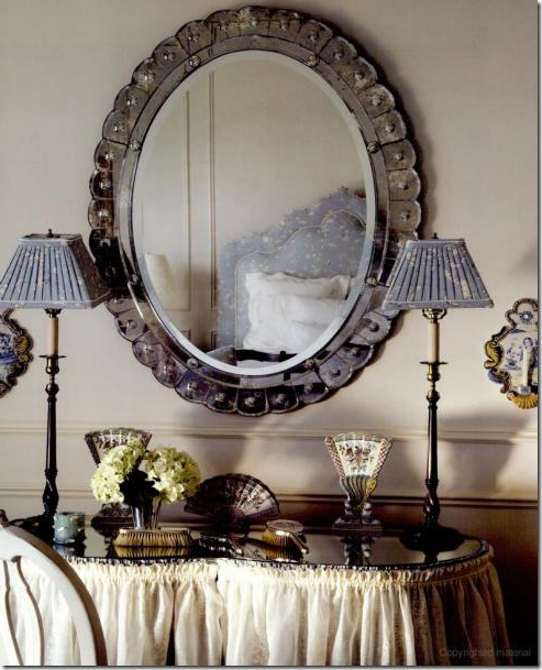
A skirted vanity table, Venetian mirror, silver toiletries – a femininely designed master bedroom shared by a husband wife.
OK, I am going to say it. Like it or not. Here goes. I would much rather design a house for and with a woman than a man. I just prefer feminine decorating over masculine decorating. Even the male interior designers I most admire design in a feminine way - Saladino and Carithers come to mind immediately. Yes, I know there are exceptions and right now I am thinking of a few couples I have worked with whose projects ended up being very successful. But, given the choice, I PREFER the design project where the wife takes the lead and makes all the decisions. Usually when the husband gets involved, it’s not a good sign: he’s not happy with the wallpaper, he doesn’t like linen, he hates curtains, he doesn’t like seagrass, and he loathes four poster canopy beds. You know, all the things I love. Some woman love designing for men. They like masculine things and appreciate dark colors and chenille, leather and plush carpet – I just don’t. For myself, I know a project is going to be good when the husband leaves the room, and the wife rolls her eyes and says to me – “don’t listen to him.” Even better is when the first time I actually meet the husband is at the installation. Now, that’s a great client!
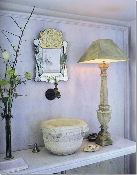 John Saladino’s powder room. A male interior designer not afraid to show his softer feminine side.
Testosterone-driven designing is just not my thing. To illustrate my point, I have found two extreme examples – one where the husband had a huge impact on the project, often leaving me to wonder if he was even married. The second house is the result of a woman designing for a woman. It’s a house where the husband said - “Honey, if you are happy, I am happy. I know interior design matters more to you than it does to me, so you do whatever you want to the house. I trust your taste.” That is a husband who is secure in his masculinity and doesn’t need to live in a house which proclaims he is the boss. Both houses shown today are about the same size, though the lot sizes are quite different. They both have many bedrooms and both are obscenely expensive. Look at these two houses and decide: Do you prefer a masculine design or a feminine design. Have fun!
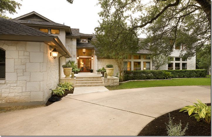
House #1 is located in Austin, across the street from the lake. It was built in the early 80s and has been remodeled three times. Clad in native Austin limestone, it’s typical of the contemporary Mac Mansions built in Austin by the all the dot com executives and by the real estate agents who got successful serving them.
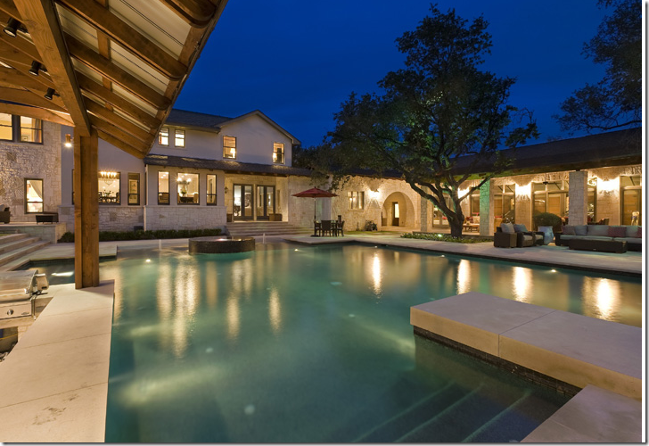
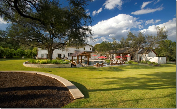
The huge swimming pool was only added last year, replacing a much smaller one. The first major remodeling was done in 2004. In 2007 a massive four car garage was added – the garage is the large wing on the right side of the house with glass doors overlooking the pool area. Now tell me, what woman would build a four car garage before a swimming pool? And what woman would actually WANT a four car garage? And honestly, what woman would even WANT a pool this big? This complex actually looks like a hotel. Woman don’t decorate this big. We’re happy with smaller, cozier, warmer, quainter. Men want it BIG. The bigger the better. It’s a testosterone thing.
The back yard complex during the day. The massive four car garage is to the right of the main house. The landscaping is really sparse – no beds of lavender blowing in the breeze. No roses or hydrangeas either, in fact, not many flowers at all.
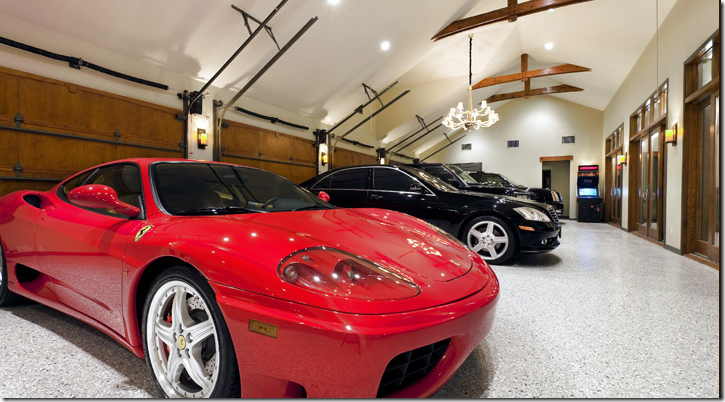
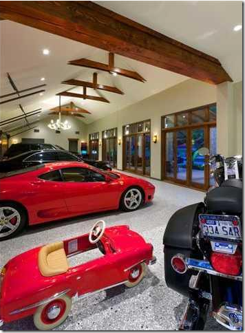
The famous garage that doubles as a party room. OK. Wait – it DOES have a chandelier in here, along with a video arcade game. The glass doors overlook the pool. I suppose it’s nice to have a pool view while you’re working on your cars! Ladies, I ask you – would you EVER want a garage like this? This size? This BIG?
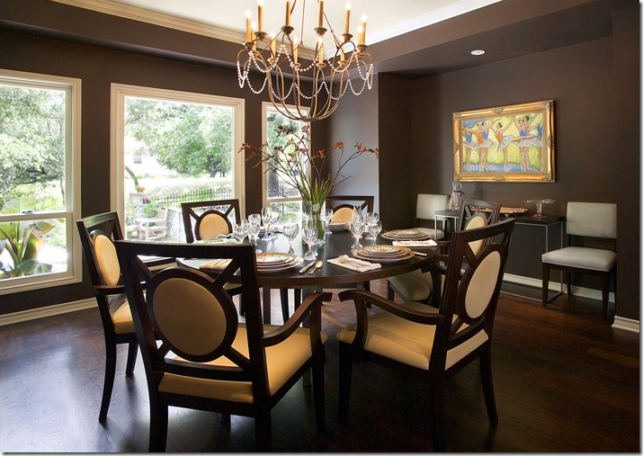
The most feminine room in the house is the dining room – there are actually crystals on the chandelier! The real estate brochure includes pictures before and after the remodeling which are interesting to look at. Here, there is no rug.
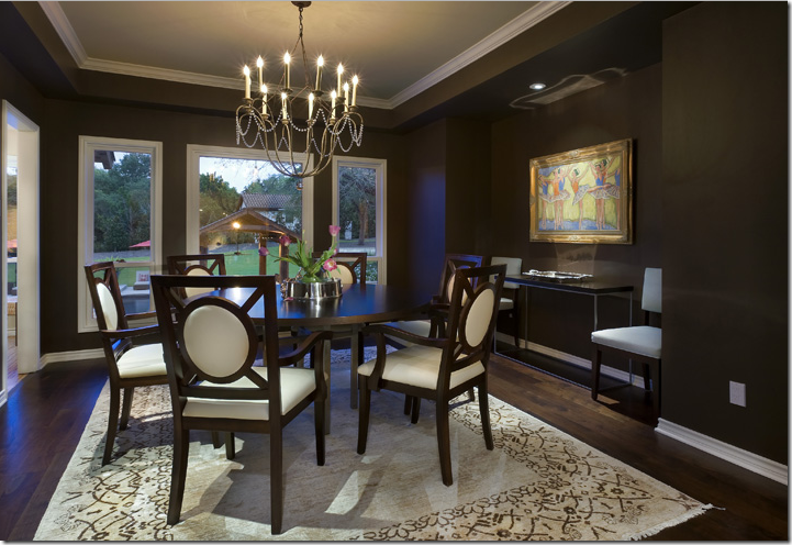
And here, with the addition of the back yard pool, the dining room gained a rug which brightens up the space considerably. Notice the ballet art on the wall – the husband threw the wife a bone here. Just kidding! Maybe it’s even the wife’s own art work? The dining room overlooks the beautiful backyard - the kitchen is through the open door to the left. Although it’s not my personal style, I do think this room is very pretty and well designed for soft contemporary.
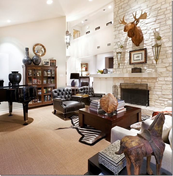
The main living room. Masculine or feminine? A huge moose head, leather chairs, and seagrass – wow, that’s a first for a male!!! This room would be great as a man’s study, not a main living room – especially for a feminine wife. Is there even one feminine touch in here? This room faces the front yard. It’s a shame there’s no view to the back yard, but the house does face the lake – so there may be a lake view.
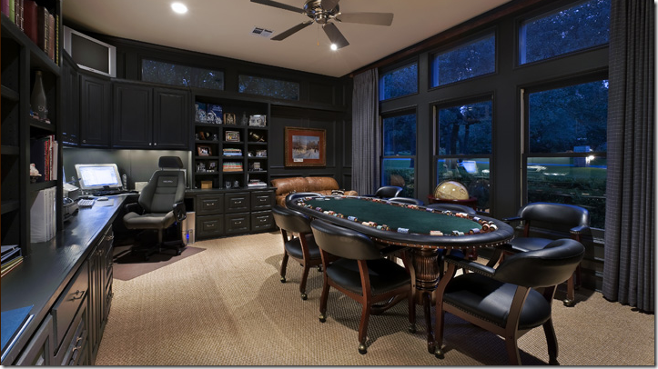
The King’s domain. What an office and what an extravagance: a poker table all set up and ready to go. This is a man who knows what he likes and gets it. He doesn’t hear “no” too often. He’s used to getting his way. Notice the flat screen in the upper left corner, just for poker nights! This office is to the right of the living room and also faces the front yard.
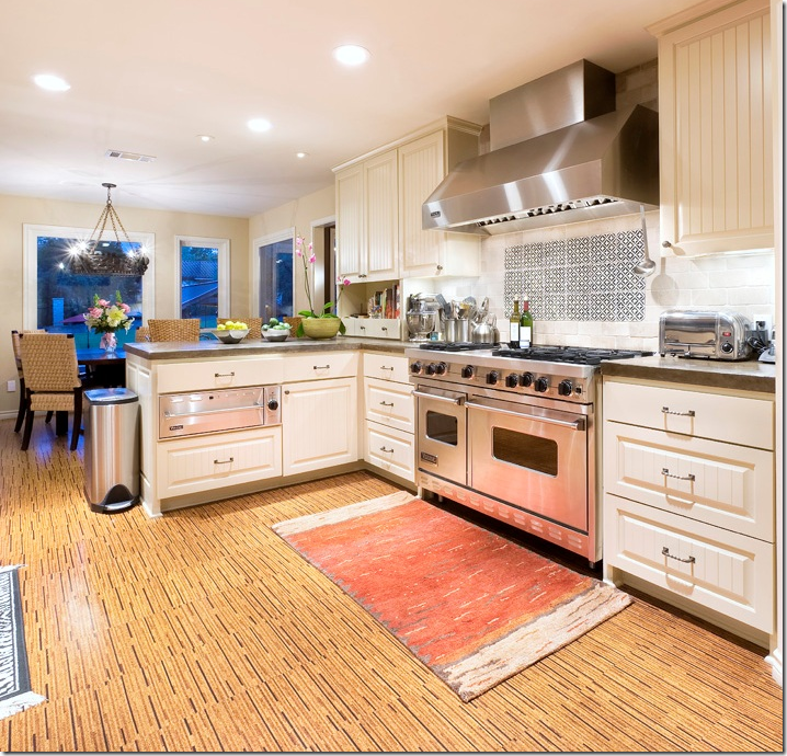
Now THAT’s a range for cooking up some steak and potatoes. But being as this is Austin, it’s probably used more for grilling fish and vegetables.
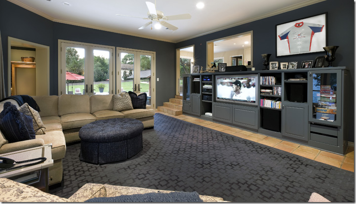
The area to the left of the kitchen (just down the steps) is the family room, complete with all the male necessities: a sectional in suede, an ottoman for his tootsies, a large screen TV and a built in media center. AND included here is every woman’s favorite decorating item: a sports jersey won at a charity auction! And look – the room was even decorated in gray to match the jersey! Now, this is a sweet wife! She already gave up her living room to her husband, her back yard, and now her family room!
This picture is included in the real estate brochure, but I am going to say this is same family room before the recent remodeling. Notice the furniture.
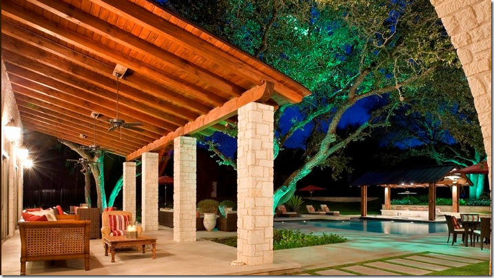
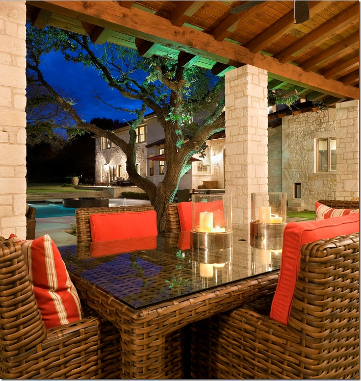
Yep. The furniture was moved outside to the patio in front of the garage. What a beautiful backyard – a playground fit for a King! The lit trees are incredible at night.
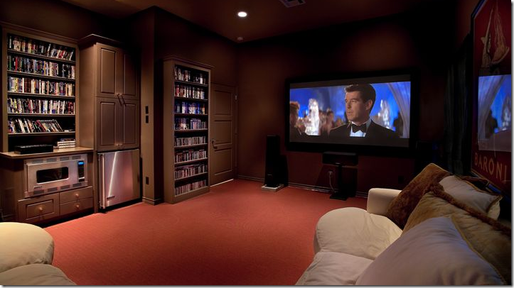
OF COURSE there is a giant media room, complete with a small kitchenette and a plush, lush, squishy ultrasuede sectional! You didn’t think the husband would be forced to watch TV just in the family room, or in his poker room/office now did you? Of course not! And you knew there would be another sectional somewhere, right? No man is happy without a couple of leather or suede sectionals spread throughout his palace. And that’s not just a TV there, there is also a powerful surround sound set up. What man can’t live without surround sound or brown paint and orange carpet, too? Remember this is Austin, home of the burnt orange UT longhorns! I am going to guess that this is the former garage – that was at the front of the house before the remodeling. Now that the new four car garage was built, the former garage was turned into a media room. Just a guess.
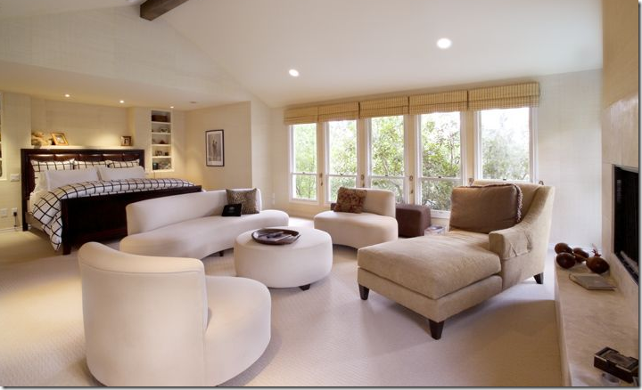
The master bedroom – newly decorated. The former bedroom is pictured below. I’m not sure why both the before and after pictures are presented in the real estate brochure, but I love seeing how the house was upgraded. The decorator did a good job – all kidding aside – decorating for a male. In this picture – there is new carpeting and a new bench which I love. The decorator also added draperies (probably because the husband couldn’t get the room dark enough with just the shades – so they added black out curtains for him – I’ll lay odds on that guess!) Also, the soffit over the bed was removed in the remodeling and windows were added next to the bed, along with grasscloth wall covering – all so masculine. The two windows were added to gain a view of the back yard – there wasn’t one before – smart decision! Of course there is a wood and leather headboard – no tufted velvet upholstered jobs for this man. Men love big, heavy beds. And never a canopy for them, thank you very much! More suede on the chair and a half (natch – the bigger the better!) One more thought - how much more masculine could the duvet be? Brown and white windowpane.
The room before (I think this negative was reversed here) – notice the dropped ceiling over the bed which is now removed. Windows were added to the sides of the bed, along with the new carpet and wallpaper. Hubby loved his windowpane brown and white duvet, so that stayed. But all the white ultra modern furniture went bye-bye. I like the new bedroom so much better!! No curtains here either which was too much sun for the King’s eyes.
The King’s private store – a walk in closet to rival any boutique! He is married – I can see his wedding pictures where his bride in her white gown is clinging to him on his motorcycle. This truly is a Type–A personality living here. And he also rides horses – check out his boots and riding hat. All the photographs are in neatly matching brown frames – which is a perfect idea, excellently executed! And he has a little daughter! Hmmm – there sure didn’t seem to be any signs of a child living here. The carpet is really attractive, in a masculine way, of course!
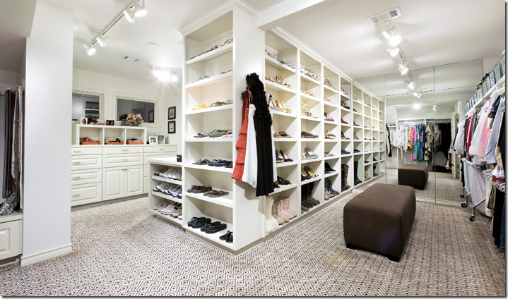
Her side – her closet was expanded, there were before shots of the closets too. If this was MY closet, it would be so frou-frou! I would have vanities and Venetian mirrors, and white marble, and sconces and a chandelier or two! I would have an antique chaise lounge in my closet area – certainly not a brown contemporary stool, but then again, Mr. Slippers Socks Man surely isn’t in control of OUR decor! He knows better than to even offer a suggestion! The Queen does like her shoes. This is one neat, organized couple – I have to hand it to them! What a dream it would be to have all this storage space.
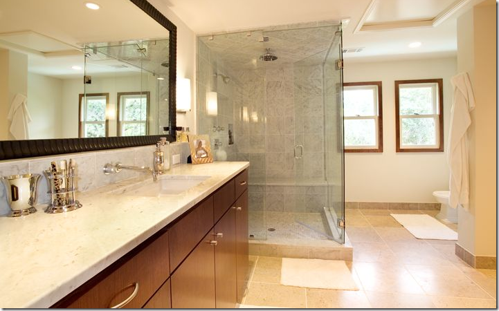
Now, the question is – is this the master bathroom before remodeling, or just one of two bathrooms? If they have two bathroom, this would be his.
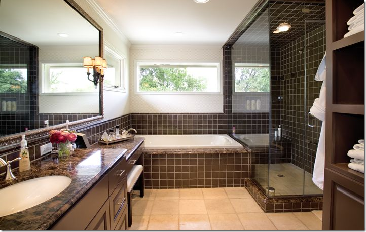
And this would be hers. But if this is the same bathroom remodeled - there is a vanity now and a bathtub added. This does look updated and it has the same mirror. It’s hard to say if this is a separate bathroom or the same one remodeled. Can’t see them sharing this bathroom with just one sink. But why is her bathroom decorated with the dark brown marble – so masculine, while his is light limestone? Rather or not its two bathrooms, or the same remodeled - look! Fresh flowers! Wow!!!!!! And a sconce!!!!! A few feminine touches even with all the brown marble and tile which happens to perfectly match the window pane duvet!
All kidding aside, despite being a Type A personality and always getting what he wants, it’s obvious he is a real softie: look to the right of the picture, under the window – there is a dog door – with STEPS! AWWWWW, too cute!!!! He added steps for his little dog to get in and out! Now that’s a thoughtful man!
And proof there IS a baby around! A toy car is parked right next to her daddy’s wedding get-away motorcycle! Too sweet!
So – what do you think? Could you be happy living in a male dominated environment – with every concession made to please the man of the house and the woman’s femininity totally pushed to the background? If I hadn’t seen her closet, I would have doubted a woman even lived here, save for the ballet picture and crystal chandelier in the dining room. This is a man’s playground to be sure! I wonder where they are moving to? Next up, below, is the example of feminine decorating.
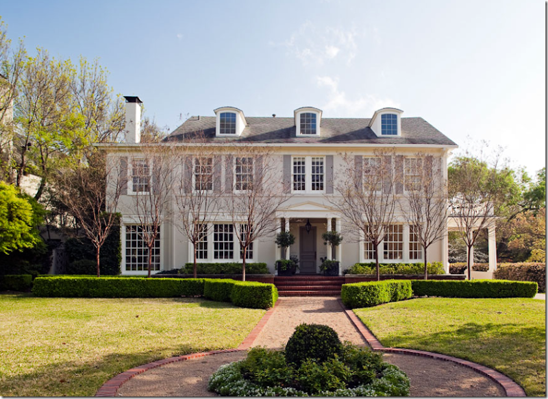
Located in the heart of Dallas’ Highland Park – a classy, old neighborhood, this is MY idea of a dream house: yes, it is huge, but it seems manageable. I could be really happy in this house! I love the classic facade with the beautiful windows and the porte cochere with the terrace above it. And what pretty landscaping – even in the winter – it’s still lush green with its welcoming center flowerbed. I also really like all the box that curves out and frames the front steps. Charming! Even the paint color gives off an air of femininity – a soft grey with darker gray shutters. This house is oozing in curve appeal and softly saws – I am woman! (Albeit with a wealthy, quiet, understanding and obliging husband.)
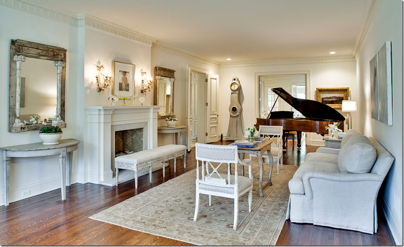
The living room says it all – this was decorated by a woman for a woman. Does a man even LIVE in this house?????? It’s a vision in Gustavian – so beautiful! I love all the painted gray and white-washed furniture – the two Swedish chairs in plain linen, the French bench in front of the fireplace with its dainty crystal sconces. And where did she find two antique matching mirrors? Amazing! I love the way the demi lunes and mirrors are flanking the fireplace. There’s a plush, down filled sofa in a pale gray linen with a subtle tape on the hem. The coffee table is so feminine – but nothing is more feminine than a Moro clock! Look at it – it looks like a curvy woman in a long dress standing there! Notice the lacy crown molding and the fluted mantel trim, even the bricks inside look white washed. Just beautiful. I have only one comment/complaint. I noticed that in Dallas, not as many people use seagrass as they do in Houston. This room is crying out for seagrass with the rug layered on top of it. Just my opinion! You knew I would say that!
Looking the other direction– in the front window is more antique furniture – a Swedish sofa and two French side chairs. I love the curtains too – nice and full. Through the double doors on each side of the fireplace is the sun porch. Notice this detail: I love how the owner kept the original nails in the chairs next to the sofa – she could have used a beautiful gimp trim to hide them– but she chose to keep it original.
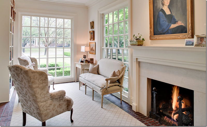
The sun porch has a charming brick floor – you just don’t get these details and small rooms in new Mac Mansions. The scale of the rooms in older houses is so much more human – so much more cozy and warmer. Here she pairs a French settee with two wing chairs covered in a feminine embroidered fabric. I would have morning coffee in here and light the fire each winter day. I love how the fireplaces were updated with the white stone – so soft looking. Again, I would have chosen seagrass. Don’t you think the texture and color of the seagrass would be better? Hard to imagine making these rooms any better, though.
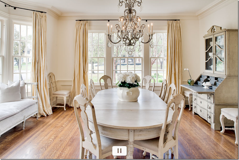
OMG! A vision!!!!!!!! First, I love all the pale painted furniture - the table and Swedish chairs. The chandelier is so beautiful, iron and crystal. It’s so curvy and feminine. In the bay window, another Swedish sofa is used, again in plain linen. And the desk! A Swedish secretary with its dark gray interior that picks up the pewter color of the iron chandelier. The creamy, dreamy, silk taffeta curtains are perfection. Notice how the wainscoting is painted cream against the white walls – and how the curtains blend with the wainscot – that very subtle difference in color keeps the room from going icy. This decorator knew what she was doing. Oh help me!!!! I WANT this room!!!!!! It’s all so feminine and wonderful and soft and romantic. I would love to see this room at night with the chandelier dimmed (and trust me – this owner has all her lights on dimmers, I just know she does!) What a beautiful room!!! The wife is so lucky that her husband lets her decorate the way she wants to! That doesn’t always happen, believe me – it doesn’t. She is truly lucky he trusts her taste – and he should. She has beautiful taste! Again, you know, you know – the seagrass! I almost feel guilty pointing it out.
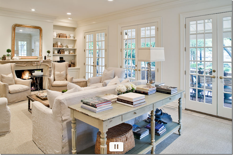
Will someone please just kill me and put me out of my misery?????????? Please! I can’t stand all this beauty! I am two shades of green now. OK – sisal ???? But it’s better than nothing. Let’s dissect: The slips on the furniture is so perfect! I love the color, not white, not gray, just linen. The two wing chairs are a darker shade which is such a great choice and what a cute steel table between them. The fireplace is so pretty – the curvy Louis XV mantel with a Louis Philippe mirror above. I adore how she accessorized her shelves with white ironstone and antique books. And the sofa table – nice and deep! Piled with decor books – Michael Smith’s first book is right on top – good choice! Here’s another square linen lamp shade, love those. Could you improve on this room? Maybe. Maybe with a light fixture and curtains. Maybe not. Hard to say. It’s just so pretty as is. Just beautiful. Whoever owns this – has great taste and style. I wonder if she decorated it herself? If not who was the designer? I am just dying to know!
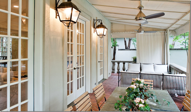
The brick floored terrace outside the family room – cute of course, with an awning covering the space. French garden chairs surround a slate top table, French lanterns light the space. Notice the balustrade - gorgeous. And I love how she can make the neighbors disappear with the curtains!
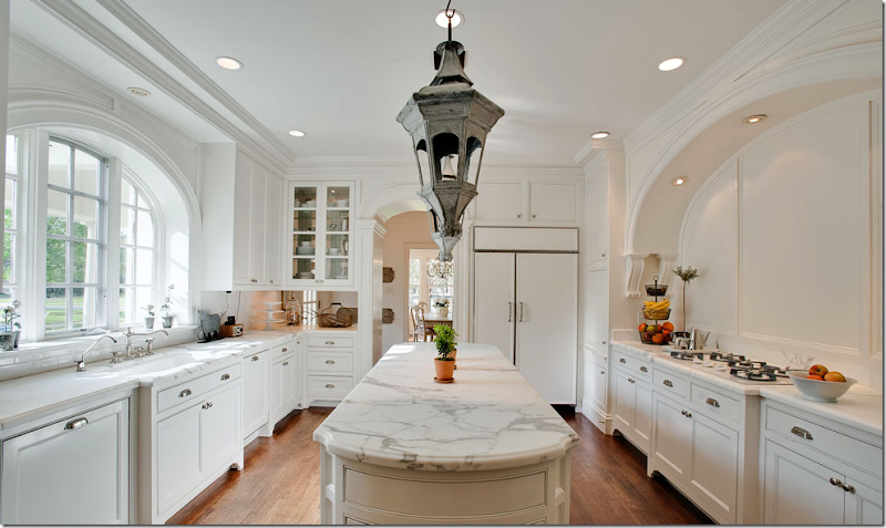
Well, at least the kitchen is ugly! Yeah, in my dreams! First, the Carrara marble is gorgeous – or it could be Calacutta marble, hard to tell. Notice how the arched window is repeated in the arch over the cooktop and the doorway. Charming. The cabinetry is beautiful – I love how it’s all footed. The island is so long – what a great space to spread out a buffet. And the matching lanterns - adorable! The door that leads to the porte cochere is located in that area between the kitchen and the dining room.
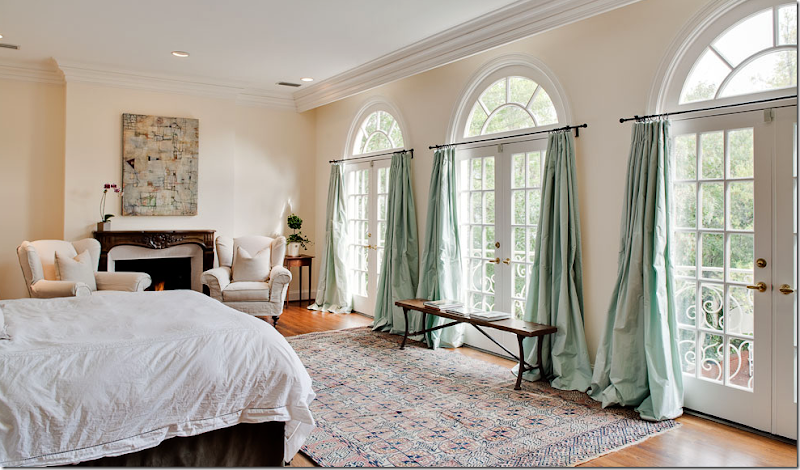
The master bedroom looks surprisingly a little unfinished, but hey – who can blame her?!! She’s exhausted from getting the rest of the house so perfect. I do love the silk taffeta curtains in mint. Again, so feminine – mint taffeta! And the French doors are beautiful – look at the scrolled iron balconies overlooking the back yard.
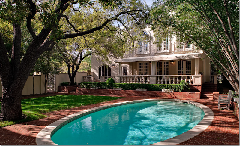
In this picture you can see the beautiful back porch with its balustrade and awning. Above it is the master bedroom with the scrolled iron Juliet balconies. And the arched window on the left must be another arch in the kitchen – most likely the breakfast room. I love the romantic iron gate on the left side. The landscaping is simple and neat – just box with small pots of blooming flowers.
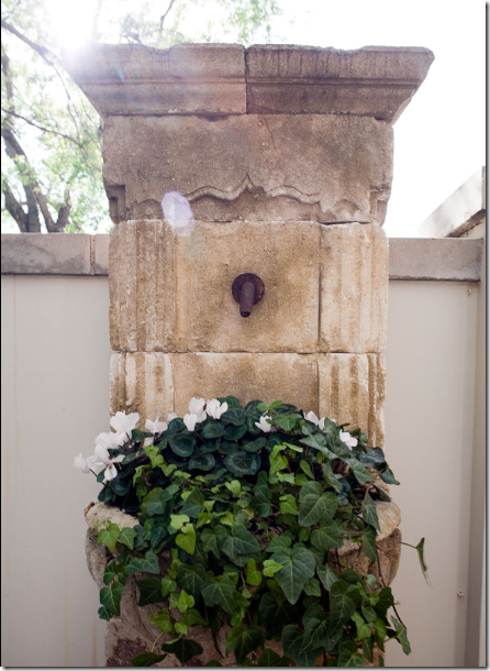
On the porch – outside the arched kitchen window is this antique fountain, filled with ivy and winter cyclamens instead of water.
The tale of the tape: both houses are just under 6,000 sq. ft. The Dallas home has a basement with a media room and gym – not pictured, plus a two bedroom/two bath cabana. The master bedroom is a 5 room suite. The Austin house has 6 bedrooms and 5 baths, and both houses have 4 living areas. The Dallas house is $5 million and the Austin house – the masculine resort - is just 3.5 million – seems like a bargain in comparison! The Dallas house was built in 1925 – the Austin house was built in 1982. Both have been extensively remodeled. The Austin house covers 1.35 acres, the Dallas lot is 90 x a deep 225.
These two houses are both examples of decorating in the extreme. A masculine escape – a soft contemporary, filled with two media rooms, a dedicated office/poker room, a four car garage with a chandelier and glass doors VS a light, air, feminine Swedish styled classic house with rooms scaled to human beings, not elephants or Type A masculine egos! Which do you prefer? What is your style? Are you a feminine designer or a masculine designer? Are you more contemporary or do you favor antiques? Do you need large, comfy, squishy sectionals or could you be happy with wood framed antique Swedish sofas? Do you need large chairs & 1/2 or will a French bergere be fine for you? Could one designer have decorated both houses? Or more importantly – would one designer have WANTED to do both styles? Can you guess which one I would have loved to have designed?




i personally think house #2 is way to heavy on the theme decor. i love gustavian thoughtfully done - this is overkill.
ReplyDeleteI don't like the Austen house. I love the facade of the Dallas house and like some rooms better than others. It doesn't seem overly feminine to me.
ReplyDeleteHomes and families run on woman's rules. Big mistake to forget that, even for a man living alone. Speaking for many men: I think we'd prefer a decor that makes our wives and daughters the happiest.
Absolutely Dallas. Would add chandelier,specifically a nice antique Italian one, in the living room (very long room that needs a center?). Maybe some big woven chunky baskets under the consoles...see alot of legs. Bedroom drapes...why do I want to lift those up to the molding? Limestone fireplace and a trumeau? Oh...what am I saying...I would love to live there just as it is. I do think it's fun to do "man-tiques" for husbands and son's. Militaria. Antique sport equipment. Thank you for all the dreamy photos. XO Trish
ReplyDeleteFREAKING OUT over #2's kitchen. This is exactly the kitchen that I have in my head for this place. Unreal. And that is by far the most beautiful slab of carrara/calcutta I have ever seen. I think that #2 is gorgeous, comfortable and tasteful.
ReplyDelete#1........too "yuppie-country-club-I-live-on-the-lake" for me. Boring. I think that he and the wife got married after the 1st remodel was done to tiptop testosterone fantasy and after they married and had a baby, decided "to hell with it...let's just move instead of doing this all over again"
Thank you for posting :)
Andrea V.
I loved House #2. It was simply perfection! The dining room was divine!
ReplyDeleteI would love to see a home that meets these two styles in the middle. A little modern, a little antique. Masculine bones with Feminine flair!
Thank You for sharing such amazing stories and beautiful images. Your blog is my morning coffee retreat and my late night snack!
Not even close. I know which one you would like to decorate. MB
ReplyDeleteThey both are more about the vulgarity of Texas than about gender.
ReplyDeleteThe second house is also vulgar in its own way: like a Disney-fied Sweden. It's screaming "See how understated and tasteful and European I am y'all?!!"
Hmmm, anon 11:14
ReplyDeleteI think it is understated and tasteful. Is that bad? Since when? I'd live there in a hot second!
Janet
since when is buying tasteful and understanted antiques a bad thing anon? I think you must be one very very unhappy person. If you think house #2 says something about Texas I really don't know what to say about that - Why not go read someone elses blog that you like. I am begging you!!!!
ReplyDeleteWhich house do I prefer???? Number 2 of course. Number 1 is a beautiful contempory home but somewhat too masculine for my tastes. However, the dining room was nice looking.
ReplyDeleteWhat is my style(?) ... Eclectic. I'm a feminine designer but not a real foo foo type. I'm not too contemporary; some pieces are okay but I prefer numerous styles synchronized with each other. Hmmm ... I have to admit that I do have a large leather sectional sofa (soft gold leather) in our entertainment room. The floor is tile offset with 2 off-white wool sheepskin rugs for softness and a large oval ottoman (soft gold material to offset the leather sectional). There is also a slipper chair (same fabric and color as ottoman). The remaining sofas in the home are more feminine.
I like large chairs as well as French bergeres. Yes, one designer could have decorated both houses. I don't know if one designer would have wanted to do both styles ... I guess it could be possible.
I would say that you would have liked to have designed the #2 house. I think that answered all of the questions that were posted.
Thanks for a wonderful read. I look forward to your blogs.
An interesting post and observations about gender differences; as always, a visual feast!
ReplyDeleteWell, reading through the post I have to say I wanted to like the first house more, if only to feel I was making my own decision rather than be guided by your opinion!
ReplyDeleteAnd while I like many things about the first house...and would actually enjoy having a larger garage than I currently do (to have more room to work on projects), once I started to scroll through house two...I just had to say "shoot"!! I do like it more.
Janell
I'm not a big fan of Swedish decor, or any decor that's too girly, but I am most definitely a fan of the Dallas house's architecture. What a beautiful home. And the pool is oval! Whoever thought to do that instead of plopping a big ol' rectangle in the yard is a genius! And to answer your actual question: I like a look that's somewhere in between but always leaning toward more feminine than masculine. I don't like the decor of the Austin house AT ALL. Too hard and crisp and heavy and full of testosterone. I agree with you Joni... that the woman of the house should have more say-so decor wise. I think it makes for a cozier, comfier home for the whole family. Would you want to be the little girl growing up in that gigantic man lair in Austin? No, me neither.
ReplyDeleteI would love to have a 4 car garage. I like my cars parked inside, plus I'd like a space to do projects and have extra storage. I don't, however, want to look at the inside of the garage while I'm swimming.
ReplyDeleteI don't like overly masculine or feminine decorating. I like house #2 because it feminine without being over the top (I'm sure house #1 has much better closets, though). I like a mix of antiques and contemporary. I also like things to be stylish and comfortable.
As far as seagrass goes, I love how it looks, but it definitely isn't foot-friendly.
Michelle
I've never been to Texas, but when I see some of the homes in your posts, I really want to visit.
ReplyDeleteI always say that if I had to live in Texas, I could only live in Austin! However, I love the Houston homes that you post and I really love the Dallas home in this post.
I'm a guy, but if I had to pick a house to live in from this post, it would probably be #2. There are some things I like in #1, but I don't know if it's appropriate for me to go into the ins and outs in your comment space!
I have to say, I normally like a little color in my design, but that house is beautiful. I don't think it's overly feminine though. Maybe I'm weird?
Hi Joni,
ReplyDeleteThanks for this post. I've decided I'm going to show it to my husband tonight, it should provoke some lively discussion!!! You know I loathe mission brown so no good asking me what I think about house no. #1. That colour I can honestly say completely depresses me. Yuck. (Personally speaking, hate modern and contemporary furnishings and architecture). House no. #2 is like a breathe of fresh air, and I know you would have liked to have designed it. On my homefront, my husband and I make the major decisions together, which sometimes, I think, can be hard. Hope you are having a great day and please tell me it won't be too long before you tell us the next in the series of the top ten list. Waiting in anticipation!!!!!
Take Care
Love Janine
XXOO
Tasmania, Australia
Hi Joni,
ReplyDeleteOnly me, I'm back again....when I saw what you were writing about I knew it would provoke discussion. (smile) Today, you have shown us two sides, but in showing us that- there can be a middle ground, where both the husband and wife have equal input and the interiors reflect both of them. Someone that comes to mind is Brooke and Steve from Velvet and Linen. A couple who work together and their interiors always look wonderful. I wonder if they are like a well oiled machine where they agree on everything because they each know what the other likes or do they have disagreements and have to find a middle ground!!! How does that go when they are working on someone elses home as opposed to their own????
Thanks again Joni - always a good indepth story.
Janine
XXOO
Tasmania, Australia
Interesting...I like parts of both houses...and dislike other parts of both. I don't like either really masculine OR really foofy feminine. I like a combo of contemp and antique. I DO, however need furniture you can sink into, curl your legs up in...feel hugged to actually sit in...but like seeing the finer lines across the room.I NEED art...real art, not art for the sake of matching a room.
ReplyDeleteCan you tell I'm a Libra? {yeeesch}.
Joni,
ReplyDeleteThis is one of my most favorite posts on your blog!!!
The describing of both houses is so well done of you!!
And yes the second house is the house we(I might think almost all women)dream of!
In my career I have experienced same as you did!
Only a few men want to show their feminine side!
And you are right, the good husbands are those who believe in their wife's taste of decorating!
I do love the second house with the Swedish furniture and French bergères!
It is so my style!
Thank you for this amazing post and images!
Greet
Joni, I love your writing! This post had me chuckling! You ended the "Masculine House" just in time for me.....I was beginning to feel the testosterone levels rise to near flooding height through the computer! Tee hee
ReplyDeleteThe fem house.....aaahhhh! LOVE that kitchen along with the cozy sitting areas.
I'd take either house! :)
ReplyDeleteI can certainly understand both design perspectives and I've known women who would take house #1 over #2 any day because it suits them as well (their design sensibilities just aren't toward that of house #2).
I think too often in my own history of decorating our homes, I have not really considered that a man lived there (the opposite of your premise with house #1). My hubby being so sweet and allowing me to do whatever I'd like, he has lived often with probably far more flower prints than he would typically care to. :)
I think that if a husband wants a say in the decor (and some do), he should have it. I've thumbed through magazines with my husband before and had him remark "How does her husband stand living there with all that pink?!"
I do think that too often we ladies forget our men when considering a renovation and so often our hubbies indulge us... :)
It's all good and again, personally, I would take either home in a heartbeat! What's not to love? Either home is far & away higher end than most live.
Great post!! :)
Ruth
House #1, oh the frustration I feel as a landscape designer. Disconnect of interior/exterior. No vanishing threshold. Simplicity seen inside the foyer. Why all the junk outside the frontdoor?
ReplyDeleteFirst hint of trouble? Coiled garden hose. Would they place a toilet next to a couch?
Order in the closets and disorder at the steps. What's with all the urns and statues? Couldn't make up their mind at the garden center?
OMG, the foundation planting. How quaint is that notion? Its pruning is gruesome. Builder special track housing landscape design circa 1970. What's it doing here?
The landscape is nonexistent in several places allowing mud to splash up on the house.
The driveway? A stain would be nice.
PUPPET BARBUDA is barking.
Garden & Be Well, XO Tara
House #1 feels tense to me...and cold... don't like it...
ReplyDeleteHouse #2...feels so comfortable,cozy ..yet oh so elegant at the same time!!
Love the feminine touch!
House #2 for me too, please! I thikn there can always be a line where beauty and comfort meet. That first house was semi-dreadful (but in a tasteful way!) while the second house is so totally beautiful and had a few comfy couches as well! I also love the way it looks filled with light while the first house has the lighting of, excuse me, a wal-mart or some store at a mall.
ReplyDeleteas I started reading, I was thinking maybe I will like the masculine house more. I didn't. Some of the rooms where terrible and a waste of space {family room, theater room, etc}. i did like the pool and yard. I am convinced this couple lives between 2 towns, and the wife is rarely at this house. But, as a real estate person, maybe they de-personalized the pictures and kid stuff in the house for the listing pictures???
ReplyDeleteThe second house is beautiful. I do like the older features like the brick floors. I vote for this one. My husband used to fight me on decor, but now that I broke him down and got my way, he is really loving and appreciating his once batchelor pad much more!!
House #1 does not appeal to me at all and I do try to decorate with the comfort of the males in my family in mind. But, this house is just plain cold, brown, and I feel, unwelcoming.
ReplyDeleteI love House #2 but I worry because it is very trendy and I hate to think I am following the masses. Yet, it is very much to my taste, although I do like more texture thrown in (perhaps, sea-grass?!)
Well, I lean more towards feminine than masculine decor. I really do not like house number one. It looks just like any other big decorated McMansion to me. NO personality. Just overly done. House number 2 is beautiful! Maybe a little bit more Swedish than I would do if it was my own home, but I love it! I am lucky to be one of those ladies that has a husband that lets me do pretty much anything I want to to our home. My husband has never complained about the way I have decorated, and lets me make all the decisions, completely trusting my judgment. I am also lucky to have a husband that doesn't mind sort of feminine decor. I actually used to decorate with a more masculine feel. You know, the dark woods, and dark colors, and not many girly touches. Very traditional. Now I am decorating with more of a coastal, cottage, or country feel, and my husband actually likes it better! So glad, cause I would not be happy if he insisted on our house looking like house number one!
ReplyDeleteHey Joni,
ReplyDeleteWe are so lucky that the men we live with let us decorate the way we like.
Each of the two houses could stand a little mixing it up.
The size of Texas homes is amazing!
I think you would have loved to have done up #2, but the savvy business woman would take on #1 and find the perfect mix.
xo xo
I am somewhere in the middle. Not too girly frilly decorating & not too masculine. I like color also. House #2 lacks warmth & color to me. House #1 is too stark, but big & grand . I like the architecture of house #2 but would prefer more color...white looks like it would be hard to keep & I am not a Swedish fan either. The winters where I live call for warmth in decor. So it is different strokes for different folks as they say. Beautiful homes, both of them though!
ReplyDeleteBonnie
I think they both represent the personality of the client. Great post on the discussion though of does it represent both of the couples personality. Which can be difficult when one is more dominant than the other when it comes to the design.
ReplyDeleteDallas... YES - be still my heart. My best guess is that Lisa Luby Ryan had a hand in this - Vintage Living, Dallas, Texas. www.lisalubyryan.com - check it out. Judy H.
ReplyDeleteyour post reminded me of my husbands marriage proposal. Right after he asked me to marry him and I accepted he looked at me and very seriously announced.... " and I want you to know that I will never interfere with decorating the house... you have 100% say in that" ....I was SOLD!... and he has kept his word for over 20 years!
ReplyDeleteI would prefer to live in Austin, but I actually like the Dallas house better; probably for alot of the same reasons you like it. However, I would prefer a house about half the size and I have a large family. Just like smaller spaces.... and 3000 SF is not small actually. Another great post girl!
Wow! Both house are in over-kill with super inflated egos flying all over the place! Please take my away to a modern French interior with lots of character and depth and the wonderful French mix. I do love elements of each of these homes, but the homes and over-all design are so superficial. Thanks for letting me voice my thoughts.
ReplyDeletejoni;
ReplyDeleteyour queries were interesting with frankness and humor. my thoughts;
house #1; he made it big, new trophy wife, she has not found her voice yet, he is too overbearing. he would throw great parties, lots of back slapping with every type of drink, overflowing
house #2
lovely and very tasteful. slightly uptight, parties would be elegant
affairs. take your shoes off, would only serve white wine, have to be on my best behavior :-)
debra
I live in Austin and know alot of antiques dealers, and know that Austin has a reputation as a town with zero taste, and that is well documented here in this post. I knew instantly that the house shown was in Austin, but it doesn't even rate as a MacMansion on our scale. An by the way, the supply of old houses in Austin is nil, so it's not like there is much choice either. I don't care for that faux rustic stained wood on the outside, and we have way too much of those white rocks. Like the big garage, though. We only have room for the race car in our 1940 vintage garage. Can you believe that brown paint and that chinese horse, leather chairs? Moose not bad but not in the living room. We have many retired ath-a-leets living here, and I suspect one in this house. The Dallas house was very pretty but where is the basket of magazines? where are the real books that are read? I would have that place baldwin-ified in a week with some prints, I love prints.
ReplyDeleteHouse #1---I would divorce him :)
ReplyDeleteHands down, I prefer house #2 to house #1. Also, I fear being driven to distraction over the white paint color on the walls of house #2. The color is so perfect and so creamy. Why is it so difficult to find the right white?? Thanks for sharing the gorgeous photos. Deborah
ReplyDeleteI think both houses have their merits. In the first house, I like the styling of the architecture in it's take, albeit overlarge, on Frank Lloyd Wright meets Spanish Colonial. I especially like the transitional style of the dining room, the main living room, though I would rather it were the family room, and the walk-in closet. Oh, and the stove I need a stove like that! Hate the brown tile in the bathroom and the pool is too big for my tastes.
ReplyDeleteI need a four car garage! With four adult drivers in my household and a fifth car, because, well, just because.
The architecture of the Dallas house is one of my favorites. It is a beautiful example of early twentieth century architecture with some elements of Italian Renaissance Revival and Colonial Revival that combine in a lovely "Leave it to Beaver" looking house. I love the living room, kitchen and the pool and rear veranda with its colonial style lanterns, I could use those shades, though not fond of the airplane propeller ceiling fans. But I think that the decor needs some punch, a zebra pillow, more soft coral geraniums, some color somewhere, just something to enliven the all white classical-cold-climate-lack-of-natural-light Gustavian style. I might have panic attacks and alienate all my guests over serving red wine anywhere near that marble!
Thank you, Joni, for bringing us these beautiful pictures!
LOVE the feminie house!! Thanks for sharing - I'll have to steal some ideas. I posted a few more pics on my blog today of my sister's house im B'ham - a few of the courtyard. Take a peek. Thanks!
ReplyDeleteI think they both have good and bad points, TBH, mostly good points! Yes the first is more masculine, but not ugly, and compared to where I live now, it's lovely!!! haha
ReplyDeleteLoving your blog, I hope you keep up with your standards you have set!!
House #2 definitely, with a maybe touch of some masculinity. (But not from house #1):)
ReplyDeleteI LOVE house #2 but feel the pain of the woman in house #1. Each and every room in my tiny home oozes the power struggle between man and woman, complete with autographed hockey jerseys in our 'man cave' sunroom. Little by little I'm taking over though. Yes, I do have white linen slip covered chairs with a Swedish finish and feminine wood arms/legs right next to our boxy, brown leather sofa. There's not stopping me now!
ReplyDeleteI love House #2! It's so light and airy and a little un-polished. I think maybe that's one thing I didn't like about the first house - it was a little too pulled together and perfect. House #2 looks more liveable and comfortable.
ReplyDeleteDifferent as they are in mood, both dwellings are impersonal showhouses. But at least that second house has a few graceful features! It's too bad that the master bedroom in House # 2 was ruined by those curtains. It was an object lesson in how NOT to treat arched windows.
ReplyDeleteFirst, in answer to your question, I think it's a good bet that Shannon Bowers did the interior design on the Dallas house. It's very much her style and vibe. And just achingly lovely. I do not think that this house is that overtly feminine - no lace, ruffles, pale pastels. It's just balanced and serene and neutral. I think that my husband, 3 sons, and male dog could be as happy in this space as my daughter and me. I am not sure how grungy it would look after a few months, though!!
ReplyDeleteFirst house is absolutely NOT my cup of tea. I won't be tacky about it, so enough said.
I do love the looks of the more feminine house, but with two boys and a husband all I can think about is, "Ooh! That wouldn't last long!" and, "Ouch! That just got dirty..." I do keep them in check and we have a no shoes on the carpet policy and only eat at the table rule, but they're kind of like that little guy on Charlie Brown. I think Pigpen was his name. Dirt and dust just swirls around them like a magnetic field waiting to land on the pretty I've tried to create. And I know they would be so happy in the masculine house that I would love it, too. Watching happy boys and a happy husband play together in a gigantic pool or a huge poker table or whatever other wonderful boys toys is pure delight for a woman with no other estrogen to cling to.
ReplyDeleteMaybe House #2 husband let the wife do everything But the Seagrass. That is my husband’s only demand, "NO SEAGRASS"; I am trying so hard to get him to accept it. I just had visitors at my home and the Husband LOVED my upright Gustavian armchair for making his back feel better! So this style is worth more than its looks. House #1 Living Room is quite nice. The Baby Grand, what could be more feminine than someone playing that beauty? Maybe the wife is a pianist...Or maybe she is Lillian from Frasier and loves this style. And I don't think that guy is working in that Showroom of a garage.
ReplyDeleteTara
House #1 was obviously first done by the man before his later-in-life marriage and birth of child. Wife tried to soften it up and he tried to make a few concessions for her, but it's still "his" house. Would def. be interesting to see what "their" next house will look like. I actually like the idea of the garage being convertible to a party room and having the big pool, but I have teenagers.
ReplyDeleteHouse #2 is beautiful, but looks too much like a textbook on Swedish design. Maybe it was cleaned up too much for the shoot, but definitely needs some livening up. I like the calm feeling I get from it, though. As a man, I could live there easily, with a few modifications. But as an empty-nester, not with kids.
Joni... you crack me up constantly! "It's a size thing!" OMG....too funny! Great slant on looking at home decorating. Only you would have caught that doggie door with the steps! :)
ReplyDeleteJoni you're stirring the pot again...I think these two are like comparing apples to oranges. My taste leans toward one the second one,but the other has it's good points. The question is aren't there two kinds of designers??? One kind that develops their own look and is sought after for that. There are others who design for the clients taste and do steerage...The end result in either case should be a deliriously happy client..BECAUSE in the end they are the ones who are getting up and seeing it every day. Nice provocative post.
ReplyDeleteGreat post, I just loved the pool and backyard (4th picture down)
ReplyDeleteLove both houses, I always try to add both masculine and feminine feelings in my room design...and where I work from that can be a challange most days, but I think my rooms turn out better for it...
I think I could handle the garage full of cars, hehe
Mines always dust dirty from being parked beside the laneway of our downtown condo...not good for a black car, her names Coco and she wears a Chanel bracelet over the rearview mirror...anyway any garage would be good. Have a great week, look forward to your blog posts, your the greatest!
Regards, Carol Ann x
Agree with Judy - think #2 is a Lisa Luby Ryan!
ReplyDeleteWell, the pot is really moving 'round and 'round now isn't? You Texas Longhorn Blogger You!!! First off, I think you'd love to move into #2, but I think you would have loved the challenge of feminizing (is that a word?) #1. For me, the answer is quite simple: I want half and half. I am a lover of 'French Eclectic' so you would have to give me a bit of both...or I'd have to stomp my Canadian foot in protest. Love Ya Joni!!! xoxox
ReplyDeleteHi there.
ReplyDeleteLove the second house and the way it is beautifully decorated. I'm thinking it looks like a house on Beverly Drive.
As always I enjoyed reading your post.
Brook
I love the second house, except for the bedroom, which almost looks as though it were decorated by someone else. I would probably add a few more masculine elements to the second house, though. I definitely would not want seagrass or rugs on the floors. I could never understand why someone would go to the expense of installing beautiful hardwood floors and then cover them up with rugs! It just doesn't make sense!
ReplyDeleteHopefully, the owner of the first house won't read your blog. You aren't exactly kind in your description of him.
Not a fan of the first house at all. I think the architecture of the home in Dallas is beautiful, but the interior design is overdone. Like someone else said--it's too much of a theme. It's devoid of personality of the homeowners---I can't look at that home and know anything about the people that live there. And I think this is sad.
ReplyDeleteSeagrass hurts my feet too. And I'm very tired of seeing it everywhere.
I'm somewhere in between decorating both masculine and feminine---I like the warm look of broken-in leather, saturated jewel-toned Persian carpets, deep velvets, iron and a few antiques. I want my husband to be comfortable in our home too!!
Great post---always entertaining and thought-provoking! You go, Joni!
Joni,
ReplyDeleteI have to say that when I saw the second house, my heart skipped a beat! Gorgeous. Although, would love to have a closet like the wife in the first house, with a few more feminine details.
Great post!
Adrienne
I like the modern, clean lines of the Austin house and the warmth/slipcover/seagrass vibe from the the other house. Honestly, I couldn't live in either one b/c they are both "too much" in different ways. Both my husband and I like a good blend of vintage and modern. We have a sectional because of limited space, but it is slipcovered and not ultrasuede. I definitely do not like frou-frou decorating, and all those girly curtains with big puddles on the floor would drive me nuts!
ReplyDeleteWhat an obnoxious post. Shouldn't designers try to meet the needs and tastes of BOTH the man and the woman of the household? Unfavoriting your blog today. Ugh.
ReplyDeleteJoni:
ReplyDeleteYou mean you didn't decorate House #2 yourself? It perfectly reflects your casually elegant taste.
I think it's the sheer number of televisions in House #1 that bothers me the most. (That and the fact that the husbands' sectionals are all pushed up against walls as if they're under arrest.) My husband is a football-loving American male, but he's happy to have our one television in his mancave - along with his foosball table and mini Keg refrigerator. The rest of our tiny manse is up to me to decorate but provides enjoyment for both of us. Where is the big table for the family in House #1 to play games of cards and monopoly? Where are the couches and chairs clustered for a rainy day of reading by the fire? House #1 doesn't seem like a place for the kind of family living you can do in House #2...
Hi Joni-
ReplyDeleteI haven't commented in ages as I am up to my eyebrows in my own remodel! But, I have to say that I wouldn't choose either house. There are aspects of each that appeal but they are too extreme, each in their own way. The first one is very cold but I feel that way most of the time with contemporary design so no surprises there. The second one I also find slightly cold because of the lack of any color at all, although I prefer the style of furnishings in this one.
The other thing I wonder about when I see a home that is overwhelmingly done for one of the people and not the other is what their life is like. Do they compromise in other areas of their life or is it "their way or the highway?"
Although I pretty much have the final say I also take into consideration my husbands likes and dislikes. For instance he is tall and I am quite short so our sofas are long and deep. As for our chairs we have some of each so we can both get comfy. He is also slightly color blind so I tend to stay away from colors that he doesn't see in their actual true form. How sad for him otherwise.
I guess what I am saying is one person needs to take the lead but I don't think we should forget that two people live there in partnership.
Once again, it was a terrific, thought provoking post.
House #1-Comfortable-walk in and sit living room.
ReplyDeleteHouse #2-Walk by-Oooh and ahh living room.
House #1 Kitchen-Easy-livable.If I left something on the counter-or if someone else did- I wouldn't need to follow and pick up after.
House #2-Pretty-pretty-pretty-and prissy-in a good way. I wouldn't want anyone to mess it up if it were mine.
I like both but,House #1 is my preference. Sort of like a man or how I relate to men-easier to be around-low maintenance, comfortable, sturdy. Second house is like some women-high maintenance, pretty, breakable.
Joni, I would take either of those closets. I promise, if I had either one I would always hang up my clothing, I would never leave clothes dumped on my bed that I decided I didn't want to wear and stand there with my hands on my hips and complain that I hate everything I have in my closet, I would never leave my shoes strewn all over the living room, and I would always do my laundry on time. and even my husband's. I'd do laundry for the entire neighborhood if I had either one of those closets. I'm drawn to the male one more, I think, because I love the b/w family photos on the wall.
ReplyDeleteBy the way, what is that flooring in the male kitchen?
I don't think I want to be married to #1. Of course, I'm a little too vocal to be married to him. My guess is that the wife is definitely not the first Mrs. whoever. The first wife is probably nestled in something that resembles #2...and tickled to death :).
ReplyDeleteAnon- do you think house #1 was decorated with both the woman AND man in mind? I don't think so and I didn't decorate it so what you mad at me for? And do you think #2 was done for the man? I doubt it. Usually I have found that rarely is a couple involved - it is usually the wife or the husband. But one gets his way I have found in my business. Rarely is there a big compromise. Little comprimises, but one partner takes the lead. I'd rather dance with the woman so to speak. Why be angry over that - I should two examples - get mad at them!
ReplyDeleteChatter: I was careful about what I said. I actually know who owns that house (not personally though) and I think he will proudly say he is a type A personality used to getting his way. Highly successful and highy motivated. And like I showed - a softie at the core - worrying about his dog getting down the steps and buying his little girl a car to share his hobby with him. I can't imagine he would be angry - over what?
house #2 is to die for. just LOVE everything about it. For me though (or our family)- personally we're a bit more casual & I do try to do a blend of masculine & feminine since we're a couple...
ReplyDeleteI actually really loved the masculine house great room.. if only it were a den or some other type of room like you said. call it sexist, but I like LRs a bit more feminine and sort of consider them the defining room of the lady of the house's taste. i know that might be wrong/ get me in trouble, but if i lived in that house I'd be sad I had no "pretty" spaces..
i actually love doing masculine rooms for (single) clients... I have a lot of fun & get to do things I'd never do in my own house.. Also would love to do a really fem room for a client but haven't really gotten many as it's usually a couple a& hubby doesn't want that!!! hahahahaha
great post to get us thinking...
xoxoo
hahah oh wait!!! ps- I would love that garage & the cars in it!!!!!! (although i think i'd fill it up with furniture to be painted/ refininshed/ DIY'd!!! ;) ooohh a nice workshop, yes??
ReplyDeleteI am laughing out loud at this, as I can 100% imagine my husband lobbying for some of the things in the Austin house! I'm still trying to come up with a good masc-fem blend, and he's giving me more and more control as he sees that I'm capable of putting a room together. that said, he did sucessfully choose a paint color for the office, after my two choices were total busts!
ReplyDeleteWOW! I'm kind of speechless on the feminist tone of this posting. As an advid male reader of yours, I'm taken back at your hostility towards males and masculine design. Good design is good design no matter if it's maculine or feminine. And by the way, the husband usually is the one paying for the project! You might want to keep that in mind!
ReplyDeleteJon
Joni- Thanks for this post. I always learn so much from you. I absolutely adore house number tow, I'm always incline to contemporary spaces but always with a mix of traditional.
ReplyDeleteWell, it's kind of hard for me. The problem is that some of the luxury design is not all that bad. I think somewhere in the middle of the feminine and masculine styles would be a style I would strive for.
ReplyDeleteNicolette
http://www.furnitureanddesignideas.com/
LOVE the Dallas house....it is gorgeous. The only thing I did not like is how the Master drapes are hung. I think they look silly that way. Love the mint silk but not he way the hang below the arch. I know a professional like you would have found a simpler ad cleaner way of working with those windows....but that is just my humble opinion.\
ReplyDeleteI think Highland Park in Dallas is one of the dreamiest neighborhoods ever!!!! Certainly a plus in choosing #2 as my favorite!
ReplyDeletei sooooo loved this post as i'm trying to design with a man in mind for the first time in my life and i am going CRAZY! that said - there are aspects of that first home that i love. i even love the bedding! the garage, not so much. the living room i could definitely deal with. and if my husband gave me a closet that big and a credit card to fill it? he can do whatever he damn well wants. just give me one room for my own!
ReplyDeleteHi Joni,
ReplyDeleteWell, I'm torn, because I like parts of both homes. I wish #1 was smaller, and #2 was larger. But I agree, #1 was decorated for him, not her, and I wonder how much say she actually had in it...or was she an addition to his life later?
If I could mix both styles, that would be my style. I'm lucky...my husband just wants what I want...he just doesn't LOVE design the way I do, and just wants to see me happy. As long as there are outlets in the right places for all of his computer thingies, he's fine...amen.
When dealing with married clients, I insist on a point person; one who makes the decisions, and writes the checks.
ReplyDeleteGreat post!!!!!
Best,
Michelle
Hi, Joni, what a great post today! I love and read all your posts, but today was just too funny. When you showed us that "Labrador" of an Austin home compared to the Highland Park "Poodle", well, I am still laughing! I think it was the room decorated around the football jersey that nearly spilled my morning coffee! Then my "slipper-socks-man" wanted to know what was so funny and looked at my computer and exclaimed, "Wow, what a great house!" Well, I'm still laughing....Thank you, thank you for a great way to start the week!
ReplyDeleteJudy
Could there really be anyone who would prefer the first house?? If they say so, I still don't believe them...
ReplyDeleteI normally lean more towards the masculine when it comes to decorating. maybe its because I dress so girly. After seeing these though I am thinking more feminine is the way to go, That home is STUNNING!
ReplyDeleteI've enjoyed reading your posts before and this one was hilarious! I loved all your observations on the first house. You sure got a fire under some folks though with this! I guess gender topics can certainly stir things up. I did like the second house better, just a little too much white though for me. And I'm sorry but I'm not a seagrass fan, too uncomfortable! I agreed with most everything else though.
ReplyDeleteHi there Joni,
ReplyDeleteWell, someone may have already said this in a previous post...lovely house # 2 may have been decorated by Lisa Luby Ryan, owner of Vintage Living in Snider Plaza, Dallas. I bought some of the same pieces of furniture in the house for my sweet home. I have seen some of the lovely lamps shown in the house at her shop. Don't know the shop? Climb on Southwest Air and visit us in big D.
I never thought about it being a size thing but you're right lol. I like parts of both houses. To me if a house looks to much like a man's house or a women's house I feel out of balance.
ReplyDeleteI must admit it has been a struggle in my own home finding the balance where everyone feels comfortable and represented
Ooh Joni this has been fun! I'm surrounded by males in my life - Mr. Serial Renovator & the 5 sons, only blokes @ work & 90%+ of my clients are males. So I reckon if I had to come home to Home #1 that would be the end of me! I crave for some girly stuff around me at home, however I need to tread that line of compromise in decorating. I would hate MOTH & the boys to feel uncomfortable in our house, perching on the edge of a Louis chair, too scared to use the snowy white towels in the bathrooms etc. etc.
ReplyDeleteI try & encourage input from all parties, but have recently had to draw the line on a request for a bespoke, whole of wall inbuilt tropical fish tank with lights blazing 24/7!!!
Millie ^_^
Miss J!
ReplyDeleteI am not fond of house #1. I am not opposed to some masculine decorating, but this is not to my taste at all.
The 2nd home is beautiful but needs a bit more color again for my taste. I love the Gustavian furniture to look at, but how comfy is it to sit in?
Good thought provoking post.
Augghh! What a wonderfully fun post! I wish I could stay up reading all the comments..but I have to go to bed! I am truly in love with feminine interiors,exteriors...you name it.
ReplyDeleteI don't KNOW a husband that wouldn't LOVE a fancy/big garage/amazing theatre room. It's like just a PART of them I think!
That said, I would DEF. be picking house number 2, although my personal taste includes lots of clear wonderful colors, likes pinks,turquoises,greens,etc.
I will say that the more I read your blog...all this seagrass and neutral stuff is starting to rub off on me! It makes me want to try it out a bit! =) I LOVE all the antiques of course!
#2 by far is one of my most fav of your posts ever (although i say that so often). i sooo get you joni. don't get me wrong- #1 is not a shack by any means! however, there's just a simple elegance to #2 that is inviting and appealing. thanks for letting us tour with yoU!
ReplyDeleteThere was a time when real men wore lace and velvets, jewels, fillagree, carried purses and perfumed hankies. It was the Protestant religious movement that put an end to such things, not a war of the sexes but a religious war. The rebellion that changed design was a war against the pomp and ceremony of the Catholic church. No more lace, no more embroidery for men or for women. No fancy home furnishings with carvings, gilding and swooping legs. Thus the minimalist era was born.
ReplyDeleteSomehow current society has now stereotyped what is feminine and what is masculine. More is the pity. I feel no constraints in my life on such things, I refuse to be put into a box with a label that say because I like power tools I am not feminine. A four car garage would be more useful in my life than a frilly bedroom so if I had my choice it would be the garage versus lace.
Personally prefer house no. 2 but really enjoyed looking at house no. 1.
ReplyDeleteJoni, I love getting to look at pictures of how other people live (especially people who live like these people live), and I always learn so much from your observations. I do think the garage in the first house is a great idea. If it had been merely a 5 car garage, I would have thought it was indulgent, but I love that they can pull the cars out and use it as a party room. What a wonderful party room, with all of that space, a chandelier, (I assume it is heated and air conditioned), and opening to the pool! My husband could convince me to have a big garage if it looked like that and could be utilized as another room when needed. I'm sure if I had it, it would be filled with boxes, furniture, etc. though. The kitchen in the 2nd house took my breath away, and I loved those lanterns! Thank you for always giving me such great images to view, and so much to think about. Great post, as always. laurie
ReplyDeleteI get a real kick out of your posts, Joni, and this was an exceptionally good one. In House #1, the only thing I loved seeing was Pierce Brosnan on the flatscreen ;-) Well, I lied, I did love something else, that dressing room (and all those shoes!!), but I'm with you all the way - mine would have gilt mirrors, a Bergere, crystal chandelier, sconces, the works! But I have to say it's entirely possible that the wife actually did have a say, not all women like 'feminine' decorating, so I have to stick up for her in case she's not being mowed over by her Type A hubby!
ReplyDeleteThat being said, house #2 is much more to my liking, I love curves and crystal and antiques (sigh) although I'd have decorated with more color, all that white leaves me a little cold. I take issue with the critics of the master bedroom drapery hung just above the French doors. Although the "rule" is to not divide the window, in this case, I think it works fine, and it's functional. Can't you just see yourself (or your lady in waiting - hey, we're fantasizing here) flinging back the beautiful silk drapery in the morning? Can't do that with drapery that hangs from the ceiling! I think it's charming as is.
Also, I believe you said these homes are on the market, so presumably they've been staged and the owners' personalities stripped. Thanks again for a fun post! xox
I will admit that I love designing for men. Some of my best clients are men, I love that they are direct, I do not need to take them shopping, and i usually have more free rein. They trust my designs, understand the budgets and are quick decision makers. It must help that my Showroom in Tribeca, NY is very masculine with heavy industrial pieces that I find in mines, factories etc...my "men" clients immediately feel that I can see their "masculine side". I do have wonderful female clients as well, either single or married with quite a bit of decision power.... and I can design spaces for them that are softer, warmer but still....no frills, no bows, no chintz.... I may need to work on my frilly side... Love the 4th image, I would however plant lavender, sage, grasses and rosemary
ReplyDeleteGreat post, francine
I agree with Kathy's comment - I like a little of both masculine and feminine. It's the contrast that appeals to me. I love the poker room (minus the poker table - I just like the dark cabinetry)in the masculine house but HATE the family room and the living room. The closets are wonderful, but I prefer his over hers. At least his has personality. Hers is just bland. Now...the feminine home...I much prefer the actual house, but I need more masculine decorating (darker colors, etc.). I agree, seagrass would warm it up. Love the smaller spaces and the fireplaces. I get bored when a home is all masculine or all feminine. Balance.
ReplyDeleteI've been to a couple parties here and they definitely let everyone wear shoes! The photos make the house seem paler than it really is... The owners have colorful paintings on the walls and the toys of their young children discretely stored around the house. I know the owner consulted two or three designers but managed most of the work herself.
ReplyDeleteI do actual prefer House #1. There are things about it that are a bit too masculine, and, yes, it's designed more for masculine taste than feminine. But, I am not a girly-girl. I like functionality, and I love to entertain. The garage/party room is genius and the pool looks like a resort! What fun.
ReplyDeleteHouse #2 seems stuffy and like a true showplace. It's beautiful, but not liveable. It's very Dallas indeed. Austin is much more casual and real, IMO.
House #2 please. The designer and wife had little or rather no control over #1. I need the lightness and feminine touches. Bigger is not ALWAYS better! Ex:
ReplyDeleteMy son just gave me a gorgeous chandelier he and Robin were not using. He thought I would put it in my living or dining room. I installed it in my small den/ office, love it, and he had a fit!!
Joni, your blog is just divine! I love your thoughts, pictures and especially your words. I died laughing on the verbiage of house #1. I live in Dallas and just think Highland Park is such a dreamland. I would just die to live in house #2...that kitchen makes me drool. Love that you gave Dallas some attention today. Keep up the great work!
ReplyDeleteLindsey
where is the first couple moving? how about divorce court ... at least that's where I would be going.
ReplyDeleteGreat post as usual!
House #1 fits well in the category known as Texas vulgar. It is big, imposing, showy, and is a monument to conspicuous consumption. I did not see a single book is the entire household. Too busy playing poker, I suppose. House #2 is far superior. It is older, imbued with character, and is somewhat cozy. House #2 needs some color. Nothing strong, but light grays, pinks, and soft peaches would give it some life, which it needs.
ReplyDeleteHi Joni,
ReplyDeleteThis is my first comment on your blog although I've been reading and enjoying for a long time! I admire you very much and love your style. I'm not sure if you meant this kind of tongue-in-cheek, haha, it's fun to laugh at stereotypes, cuz sometimes they're true. lol. (My husband was horrified about seagrass, too.) And I can understand that it's easier to work with one client than two, whether they're male or female. This post, however, seems to suggest that "husbands" lack good taste. I just have to stick up for mine, who insisted on our hand-scraped chocolate oak floors which have garnered more complements than anything else we've done. I've actually had similar conversations with my sisters because most of their spouses don't care about decor, while mine does (although I am much more invested in it). It makes things much more difficult sometimes! Sometimes -gasp- I don't get my way! But there is a partnership there and it does feel good to accomplish something together that is a reflection of both people. It's his house, too... It would probably kind of bug me if he didn't care about it. ...Would you say turnabout is fair play, then, and is there an area that the "wives" should just stay out of? That's what's a little disconcerting about it, to me.
btw @jon: Don't want to put words in your mouth, but I think maybe you meant "sexist", not "feminist"?
Wow, Joni, lots of interesting posts on this topic! Good job, Professor Webb!
ReplyDeleteYou are right on about male vs. female design differences!
ReplyDeleteMy personal favorite is the Dallas home. It speaks to my soul. Lovely and calming. Definitely my style!
I think they're both over the top, albeit in different ways. Of course, I really don't think the comparison was exactly fair- this isn't "male vs female," it's vulgar vs. feminine. While the second house has its flaws, the first is not a fair example of masculine decor, it's a bachelor pad.
ReplyDeleteThere are plenty of examples of serene, tasteful, masculine-leaning homes out there, just as there are many female-decorated houses that overflow with tacky florals and eighty-layer drapes. It's just not a fair comparison.
Joni,
ReplyDeleteAnother great thought provoking blog....loved it. I liked the family room and the "kings" master closet. It's the sort of closet I dream of. However, the second home was just so beautiful even if it did look like a magazine spread. I'd still move in. Thanks for having the confidance to be so honest about your preference!
Joni, do you know what kind of chandelier that is in the #1 house's dining room? I would die for the #2 house, but really love that chandelier! It's understated yet makes a beautiful statement at the same time. Does that make sense? Please tell if you know anything about that!
ReplyDeleteWow, the white-on white in the second home is gorgeous. It is so artfully done...yummy. Thanks for sharing the beautiful pics with us. I feel like I went on a house tour on the comfort of my sofa.
ReplyDeleteDefinitely the Dallas house gets my vote. Thanks for sharing. This was a fun post to read. ~ Sarah
ReplyDeleteLove the controversy. I thought this was a very entertaining post. I especially love those who are getting their panties(or boxers) in a wad. I like elements in both spaces. I like to do "man caves" for clients but I also enjoy doing feminine rooms too. I use to think I was more masculine, but I've just finished doing my new house and... Holy Crap I think it is more feminine. Huh?
ReplyDeleteOne major issue: why does it need seagrass? It is beautiful without it! Not all houses need to be cookie cutter ~ linen, slipcovers, seagrass and puddled drapes. No...diversity is the name of the game. Mix it up, add some new element, be ORIGINAL. Now that's true design.
ReplyDelete#1 reminds me of Lance Armstrong's Austin home that was featured in AD about a year or two ago. Huge and impersonal, like a conference hotel.
ReplyDeleteThe chandelier in #1 - I dont know who made that particular one - but there are so many copies of it out there. Can someone give a source. I am drawing a blank!!
ReplyDeleteJOni
Dear Joni, interesting post, none of the houses are very appealing to me, the first too much grandezza and a bit sterile, the second too styled, too perfect in one direction, more like a stage set...
ReplyDeleteBut my idea of designing for the sexes is this: both should feel comfortable and represented, most of the male halfs of couples I have worked with wanted some say, not just the bills.
Either a man-room, some place of their own, not only the garage or home office.
Women have often more concrete ideas when it comes to decorating, but modern relationships should not deal with all the stereotypes of male and female. And so do I feel as a decorator too. I hate stereotypes and putting man and women in corners, boxes or what else. There are plenty of women who do not want light, french or swedish styled rooms and there are men who love some frills around.
So many possibilities and I want to be open minded and try to do my best to make everybody happy.
If you are talking over dining table it is Niermann Weeks a copy is Currey MB
ReplyDeleteIn response to your question-- give me a decent bergere anyday! I just had one of my grandmother's recovered in a natural colored linen and I love it. The cushion is all down and it's more comfortable and supportive than a big ole chair and a half you can't sit in properly. That House #2 is just gorgeous-- it is my fantasy house! And I am glad to hear from one commenter that family photos, etc are scattered throughout. How could you not feel comfortable in such a place? LOVE IT. THANKS!
ReplyDeleteJoni,
ReplyDeleteYou go, girl!!! I love that you have a point of view and are willing to mix it up. Great post!!
Here's my take on this subject--
The type of interiors that one can have depends on the number and gender of one's children and the personality/interests of one's husband.
I agree that for a design job, my favorite situation is where I have a woman for a client and there is no husband who might weigh in midstream but doesn't have the time/attention to make the journey with us. Just plain easier and more fun
However, from a personal point of view, my home's interiors are designed to be aesthetically pleasing and comfortable for the whole family. And, I have raised my two boys (now young men) and my daughter to have an aesthetic and all three kids and my husband get as enthusiastic as I do about plans and new acquisitions for our home. I would not want to deny them the pleasure of the process or the chance to share their point of view which is often different from mine.
Thanks for your fabulous blog. It is one of the highlights of my day.
xo, Anne
While I like a good amount of masculine things, I like them in small doses with an overall feminine feel. I totally agree about designing for a man. Just listen to this - my boyfriend of almost four years has learned to live with (not actually because we don't live together, but I never shut up about decorating) my design style. But, he still has his own place. Last week we went to find him a cheap mirror at target and there was a really cheap one with a simple sliver base and a small round white shade. He says to me, "I don't know, it's cheap, but isn't the round shade too feminine?" I was shocked. If he thinks THAT is too feminine what does he think of all the stuff I am always drooling over with much more feminine aspects? I just thought it was funny. He bought it anyway! :P
ReplyDeleteThanks for your take on this - it's very interesting to see how people feel about the decorating gender divide. :)
ah, i have had this masculine/feminine discussion so many times with my husband...i want him to feel comfortable in his own home, and i want to include things he likes but...honestly, everything that i have let him choose i wind up hating later on! dark, heavy, wood, black.... i think that if a man could care less about decorating, it seems only fair that the woman should get to make the big decisions about the interior.
ReplyDeleteThe first house is as sad as the second house’s master bedroom. As a guy, even I know to spray my sheets with Downy Wrinkle Releaser if I don’t have time to have them ironed! Fun post...
ReplyDelete+Spencer
The Architectural Antique Review
Joni,
ReplyDeleteCurrey has a chandy almost identical and Visual Comforts has one simliar too.
This post is great! Its so fun to look at different spaces, masculine and feminine. I LOVE the closet in the first house but I think I would be more comfortable in the second house, there is just something much warmer and friendly about it.
ReplyDeleteBut as an apartment living girl I'd take either place, ahh all that space- I can only dream :)
Wendy - thanks for the comment
ReplyDeleteAND Thanks to everyone!!! great comments!
but Wendy = I said specifically there are exceptions to everything. It's just been my experience that the husband usually messes it all up. YOu're lucky - just like Brooke Giannetti is lucky. I wish I was so lucky to have a husband who had good taste! count your blessings!
Joni
JON - excuse me? the husband is usually the one paying the bills? how do you know? most women work these days. I know I do. What makes you think the husband is the one who pays the bills? Is that stereotyping yourself there?
ReplyDeleteAND - believe me, I knew that some people would be appalled at what I said. I was just speaking MY truth! that's all. I like feminine decorating. from a man or a woman.
ReplyDeleteI was born and raised in Dallas and miss beautiful homes like the ones above!!
ReplyDeleteThanks for painting such a vivid picture of the possible (prevalent?) prejudices of the interior design community. And I dont mean house #1 vs. house #2. I substantially agree with your taste, but I am repelled by your attitude.
ReplyDeleteWell, like my southern Grandmother says, "I do declare"! This was the best blog reading I have done in a while... almost a real "Texas brawl"! How exciting.
ReplyDeleteThought I would throw in my two cents, so here goes nothing.
Both houses are extreme. If I were single with no children definitly #2. Not family user friendly... a little snooty but georgous non the less.
#1 What a showoff, well bigger in Texas, not necesarily better, could he be insecure? Maybe his wife has horrible taste... hello!That might be the flip side.
I like a balance and I like a real manly man, the ones that aren't whooped, but love to spoil their woman.
In my Texan opinion... all American Ralph Lauren understands the balance in most of his designs, from sleek modern penthouse, to garden houses, to French Chateau's or a beach house, or rustic Ranch...he gets my vote everytime. Of course he is slightly successful as a designer. Creating a warm, inviting, romantic, chic and user friendly rooms.
Tally the votes. I would be interested to know. Of course in all honesty some may just side with you out of respect for your excellent work and popularity? Just my guess. Thanks for the fun!!!
Lee @ Inspired Comblogulations
Ps. I dream of living in Dallas on Beverly Ave. with my manly man (not to be confused with a redneck)!
#2 is absolutely amazing, takes my breath away. Although I cannot imagine living in a nearly 6,000 sq ft home when my 2,900 sq ft house is never as clean as I would like it to be!
ReplyDeleteNormally I sigh and drool over each and every picture that you post. But, after 3 pictures of the first house I just zoomed past until I got to the good stuff.
ReplyDeleteI know you will forgive me for this. :)
hey,
ReplyDeleteExcellent blogs!!!!!I am impressed by your this information & mostly impressed your home decorating.
Longhorn Large Oval Tub Two Tone
I really enjoyed this post. I live in New Orleans (not Texas), and am in the process of decorating my townhome. My wife currently lives abroad so she has left the decorating up to me. I find that I prefer feminine decor over traditionally masculine decor and want our home to reflect this. My wife knows me and has said she doesn't want the home to look like a single woman's house. So I'm trying to kinda mix and match, and do it somewhat eclectic. I painted the powder room lavender and I've bought a bunch of accents at Anthropologie. So far she likes it, just doesn't want me to go too far...lol!!!
ReplyDelete