In Houston, there have been many architects who have left their mark on the city. Perhaps the one most associated with Houston is John Staub, who designed some of the original houses in exclusive River Oaks. There were others, greats, like Philip Johnson whose soaring buildings certainly changed our landscape. Today, there is a new crop of younger talents who have risen up along with all the custom houses built, many on lots where the older ones have been torn down. One of my personal favorite of today’s residential architects is Kurt Aichler. So many of the houses I admire are ones he designed for clients – each is different, each unique. Over the years his reputation has grown along with his portfolio. Any house designed by him is always proudly identified as such in real estate brochures and on neighborhood tours. My own dream house was built by Aichler and every time I drive by it, I slow to a crawl and look at it longingly – as if one day it might truly be mine.
While Aichler has mostly designed custom houses for clients from the ground up – there are some that he tastefully and sensitively renovated. One of the houses shown here today is a true addition, made to a house built in the 1930s. The other house shows an addition to a house he originally designed. These two houses are vastly different – which certainly shows the range of the man. I hope you enjoy them!
Kurt Aichler House #1
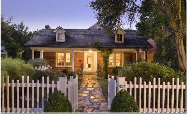
An eagle-eyed Cote de Texas reader emailed me about a house that was just listed for sale in Houston: “Quick – go look, you are going to love it!” Of course I did – what is not to love about a charming cottage with cute as can be dormer windows? But really got my attention was that Kurt Aichler had designed its addition. Addition? What addition? All you can really see is how adorable the house is – a small cottage with a picket fence and a cobblestone walkway. Once the house had truly revealed itself, I was wondering if I could afford it and how fast could I move in? The facade is an illusion - Aichler left it untouched so that it would blend in with the neighborhood. His goal was certainly reached: from the front it is virtually impossible to see how large the addition is. It is also impossible to see from the street that this house was designed by Aichler.
Once inside the picket fence – an English styled garden is revealed with flowerbeds on all sides.
The house for sale is located in one of Houston’s older and more beautiful neighborhoods, Southampton, the one area I would truly love to move to. House after house is just as charming as this. Unlike in my neighborhood, West University, many houses here have been restored instead of torn down. Even the newly built houses in Southampton are special – most avoid that cookie-cutter red brick faux Georgian style that plagues my area. But, without a doubt, what really makes this neighborhood special (besides all the towering oak trees and lush landscaping) is the alleys! Alleys mean there are no front loading garages overshadowing the houses. And alleys mean there are no driveways up and down the street. Instead, without all the excess concrete, Southamptons’ front yards meld into one another with large expanses of grass and flowerbeds. The current trend against alleys is certainly regrettable especially in areas where the lots are so tiny that all you see are garages on top of garages.
The Front Living Room.
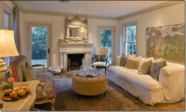
Ready to go inside? To the left of the front door is the living area – are you drooling right now? I am, for sure. The white walls are highlighted by gray painted moldings. Newly installed doors on both sides of the fireplace lead to the side yard. A wonderful, worn antique rug in pinks and greens blends with the French settee which is covered in a pink and cream antique textile. A large canvas behind the sofa is in perfect proportion – almost as if it was painted to fill that space. I love this type of designing – where each piece was purchased because someone loved it – as opposed to because they needed it. Nothing here screams decorator or interior designer – instead it looks like the house is owned by someone who knows herself, her style, someone who doesn’t need any help with her house, someone who is probably as chic as her interiors!
The Formal Dining Room.
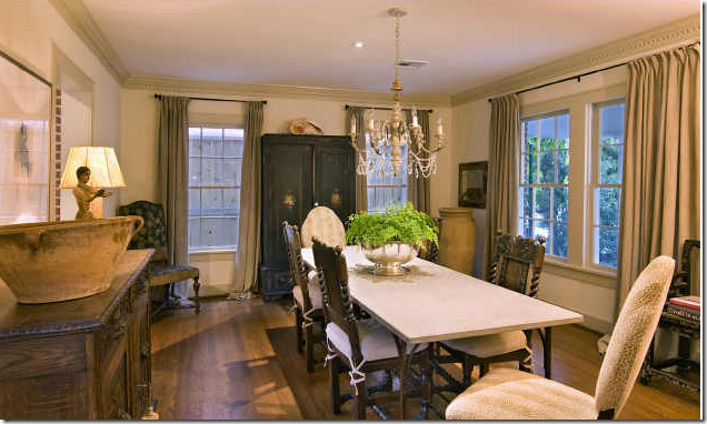
Across from the front living room is the dining room with its mixture of antique furniture. Simply hung linen curtains soften the look. A trendy Italian styled candlestick fixture lights the room, while a large armoire anchors it. Two different styles of chairs surround the stone topped table creating extra interest.
The Kitchen/Breakfast Room.
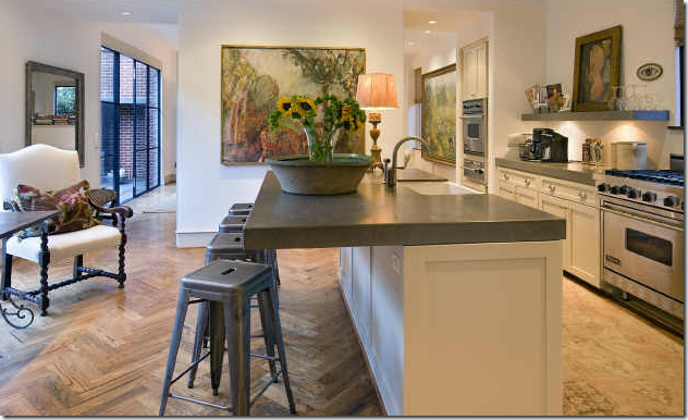
Once past the living room and dining room – you enter into the two story addition where the drama of the Aichler addition begins. Here, the flooring changes from wood planks to a wonderful herringbone pattern which has a very Belgian look to it. In the kitchen, thick countertops and no overhead cabinets sets the mood - saying this is no ordinary kitchen. Instead of being a utilitarian space, it almost looks as if it is an art gallery with all the paintings. I wonder if the owner is an artist? Notice the worn antique runner in the long galley area: using decorative items such as the rug and the lamp in a kitchen is a great way to warm up the space and humanize it. The bar stools are fabulous and add an industrial touch - all the different styles make the space eclectic and interesting.
The Breakfast Area.
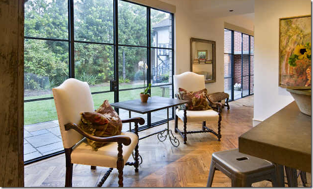
Looking from the kitchen sink out towards the breakfast area and the side courtyard. Notice the wonderful wooden shelf holding all the dishes, glasses and cookbooks. Two antique chairs surround a small iron table. But, to be sure, it’s the huge steel door that steals the show here. How glorious it is!!!!! Of course there are no curtains here – the windows are a work of art! These steel beauties, along with the wood floor further the Belgian vibe that runs through this space.
Kitchen and Breakfast Room.
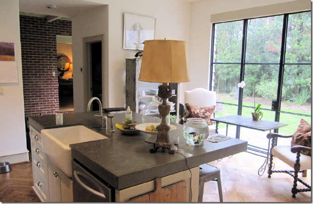
In this view of the kitchen – you can the wonderful farm sink – I just love these large sinks! And to the left – is the brick wall from the original house, left exposed. Through this opening – you can see into the front living room.
One last view of the kitchen/breakfast room – showing the opening that leads to the family room and music room beyond it.
Family Room.
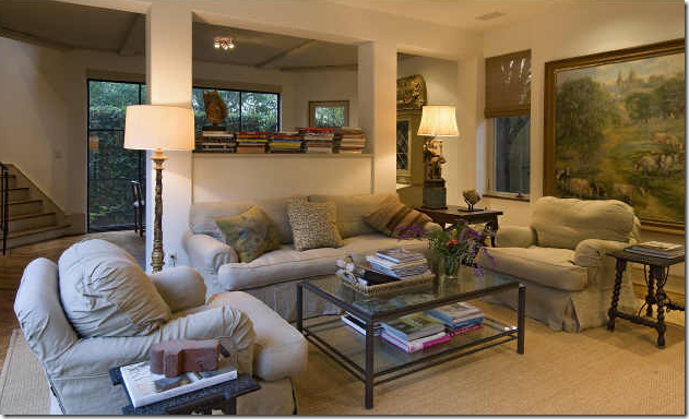
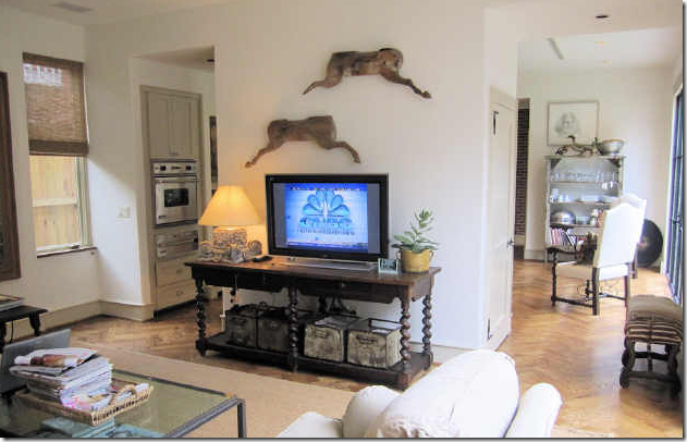
Walking past the kitchen and breakfast room is a large family room. The space is furnished with comfy, cushy slipcovered furniture in linen along with an assortment of wood antique tables mixed with a contemporary glass coffee table. Another huge canvas provides the color. A pass through divides the family room from the music room on the other side of the wall. Seagrass completes the room – of course seagrass, this is Houston after all, the seagrass capitol of the world!
The view from the family room into the kitchen/breakfast room. A large barley twist console holds the TV.
The Music Room.
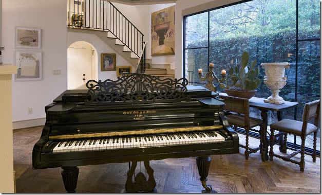
The music room, at the back of the house overlooks the rear of the property with its vine covered fence. I love the Spanish table surrounded by chairs and deftly accessorized with just an urn, a cactus, and an Italian candlestick. Again large steel windows add that something special here. The beautiful and graceful stairs leads to the bedrooms upstairs. The stairs – something so simple – yet there is something so perfect about these. What is it? I’m not sure, but they are definitely designed by someone who knows exactly what he is doing and is doing it expertly. Which is exactly why you would hire Kurt Aichler to design your home. Just wonderful!!!!!
The Master Bedroom/Bathroom
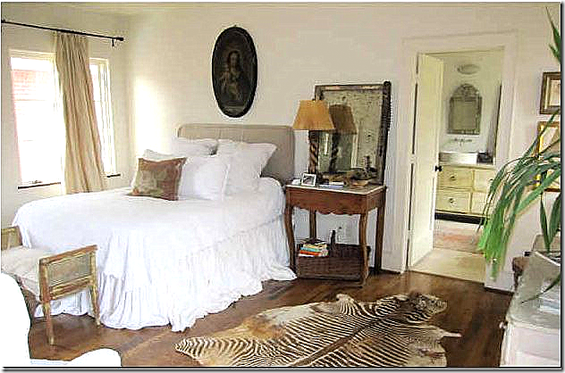
Upstairs, the master bedroom is furnished with more antiques and a slipcovered headboard with dreamy white linens. A vintage zebra skin adds an exotic touch, I love the brown tones in the zebra. This room is so romantic – I halfway expect Karen Blixen to waltz in! Again, this room has that undecorated look that is so hard to capture. Very few people can do this look “right” – and this homeowner has it in spades. Through the door you can see the bathroom with the vanity made from a piece of furniture, a Venetian mirror, and a vessel sink with wall mounted faucet. It looks like there is an antique rug in here too.
The Master Bedroom
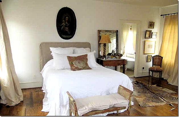
I just love this room – the beige taffeta curtains, the oval religious portrait, the simple bed, the French antique nightstand with its aged mirror. Through the door – you can see the vintage tub that overlooks a window in the bathroom.
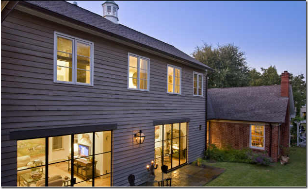
And finally, a view of the original house with the addition. It’s almost impossible to see the addition from the street – thus the house still fits in the neighborhood with all its small cottages. The cupola was taken off the original house and put here on top of the addition. The side yard is huge and there is definitely room for a pool – I wonder if the new owners will add one? Through the steel windows here – you can see the family room, then the kitchen/breakfast room and there appears to be another steel window where the brick house connects to the addition. The formal living room is seen in the brick house, where the window is. The three bedrooms are all upstairs.
Kurt Aichler House #2
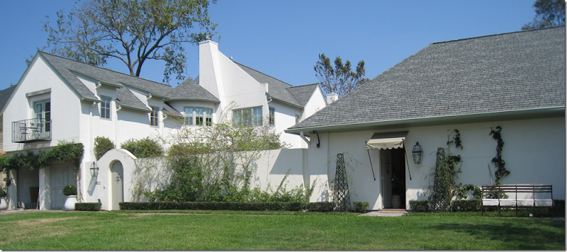
Readers of Cote de Texas may remember that the house where The Fabulous Flea is located was also built by Kurt Aichler. The house was built first, and then a few years later, the adjoining lot was purchased and the fabulous showroom space to the right of the house was added along with a pool house. With the addition, Aichler gave the walled compound a country-like atmosphere in the middle of the city. This is one of my favorite Aichler properties – The Fabulous Flea house.

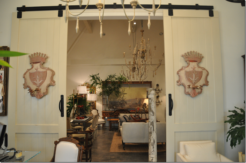
The Fabulous Flea antique business was moved into the Aichler addition – a large space divided into two rooms. The carriage door designed by Aichler is so charming, as is the awning that marks the proper entrance into the shop. The Fabulous Flea sells fabulous, of course! antiques mostly from France, procured on trips taken several times a year. To visit the Fabulous Flea, go HERE and make an appointment. Don’t be shy! They love appointments! And, if you don’t live in Houston – you can still shop there on the web site.
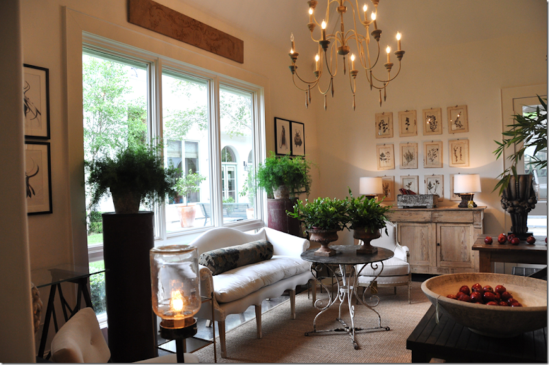
The addition to the Fab Flea house is divided into two areas, the studio with its soaring ceiling is on one side. OMG – it’s too beautiful for words in there!!!!
The left side is the “showroom.” I took these pictures a few months ago and that table with the scrolled base in now in my daughter’s room! I couldn’t resist it! I love that settee too with its scalloped top and bottom – just beautiful. Through the window you can see the main house. Between the Fab Flea addition and the main house is the swimming pool and pool house designed by Aichler. If you have never been to the Fab Flea – I really recommend going – if only just to see this space. I can’t think of many antique stores that are prettier.
 The Swimming Pool between the main house and the pool house.
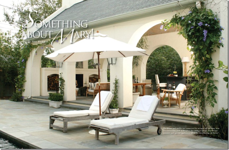
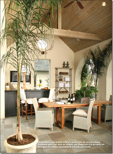
The Fab Flea house and shop were featured in the newest issue of Antique Stores and Designers from which these pictures were taken. Here is the pool house – thick stucco arches lead into the open space where there is a large outdoor fireplace, a bar, and a kitchen. The Fab Flea Shop is set on an axis with the Pool House – all designed to perfection by Aichler.
On this side of the pool house is an outdoor kitchen, bar and dining table. Through the doorway is the Fab Flea shop. Is this Houston or Belgium? Hard to tell!
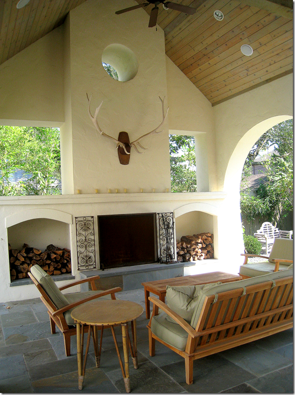
I took this picture of the pool house last year. The horns are wonderful above the fireplace. I love how Aichler designed the open windows above the niches holding firewood. Notice the play between the arched openings and the straight openings with the circular window topping it all.
The Living Room.
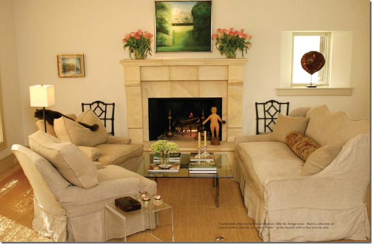
Inside the main house, in the living room – slipcovered furniture in linen is child and pet friendly. The sofa has wonderful lines – I love its tall, scalloped back. The house is almost Spartan in feel – there are no fancy moldings or built ins. The trim is very restrained. The walls are painted white. Everything is calming – there are no jarring colors or patterns. Linen is found everywhere. It would be a very peaceful and quiet house – if it wasn’t filled with a lively family and lots of pets!
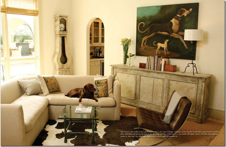
Through arched doors is the family room with its linen sofa and cream colored console. Contemporary pieces blend with antiques. Through this window you can see the pool house.
The Kitchen
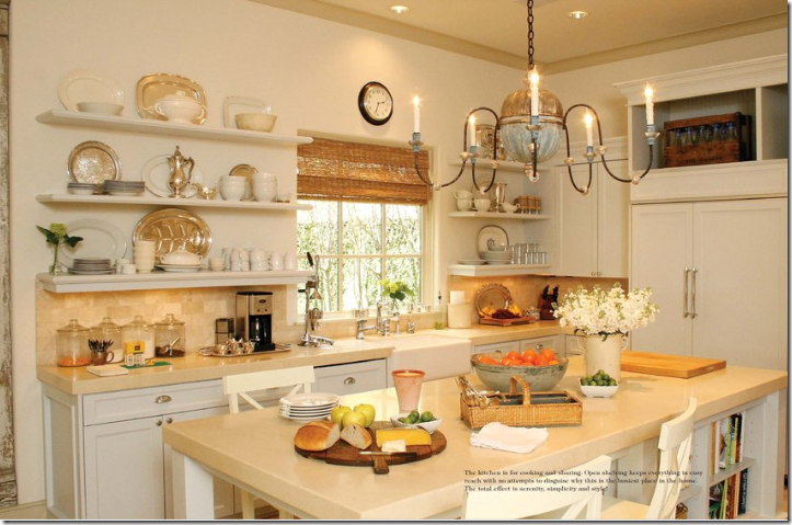
I love the Fab Flea’s kitchen! The light fixture is wonderful – and I really like open shelves. She has a mix of ironstone and silver, which is so attractive together. And of course, there is a farm sink.
The Master Bedroom
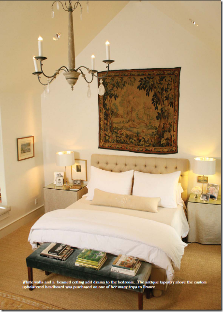
And finally, the master bedroom has a tall vaulted ceiling with an antique light fixture. The end tables are slip covered in linen, and the headboard is tufted. Wall to wall seagrass, of course! The large tapestry brings in the color – as does the bench with its silk velvet fabric. The owner of the Fab Flea is another woman with great style and an instinctive sense of how to put it all together. She is another chic woman who chose Kurt Aichler to design her house. Is there a theme here?
Pictures of the Fabulous Flea were taken from the magazine Antiques Shops and Designers HERE. Photographer: James Farmer HERE.
If you are interested in buying the house designed by Kurt Aichler in Southampton, go HERE for more information.


Both are fabulous and I love the works of art in both homes! Kurt is a great architect!
ReplyDeleteJoni,
ReplyDeletePromise us to show more of the houses of Kurt! They are wonderful! Honest!
I discover some Belgian influence in the interior of the houses as for instance the kitchen part in the first house! The 2 armchairs in front of that steel window.
As always a stunning post Joni!
You're the best!
Greet
I've just found your blog and am impressed, it is wonderful, I love design and art.
ReplyDeleteThanks for a good blog that I will follow
Greetings from Denmark
Inge
really love both of those houses!! Wish I had visited the fab flea when I was down there!
ReplyDeleteVery interesting mix of window frames in the first house and oh lordy, wouldn't I just love having the pool house at the second home! Janell
ReplyDeleteJoni, Both houses are amazing but the first one captured my heart with its cottage front and liveable interior. I loved the way each piece looked as if it had a story to tell. It was a house that looked as if it evolved over time.Comfortable,well appointed and full of interest and texture, what a great mix, kathysue
ReplyDeleteWow, Joni! You always manage to find such wonderful places and things to share with us. Additions can be tricky. I only like them when they blend seamlessly with the rest of the house and don't look like an after-thought. He certainly accomplished that. Thanks for this! :-)
ReplyDeleteShannon
Ummm.......YES!!!!!!
ReplyDeleteI am going to have to come back and pour over every detail, but for now......what a fantastic job he has done on both houses!!!!!!
xoxo,
Andrea
Both houses are remarkable, but the first house captures my heart. So inviting! I love the way the house's front facade was not changed with the addition. The inside is just as fabulous as the outside.
ReplyDeleteKurt does a stunning new construction. But to aspire to the rarified sphere of architects who create timeless works of art in Houston such as Staub, Curtis-Wyndam,Bute-King an architect MUST respect the original structure when adding additions. The addition must be seamless - both in structure and adherence to existing scale.(ceiling heights, trim, windows, and yes even doors)Kurt's addition could stand on it's own as an individual structure - and should. To tack it on to the charming cottage is tantamount to design suicide.
ReplyDeleteIf Kurt's clients demanded an addition such as the one he designed he should have skillfully steered them in the other direction. Given them the option of selling the cottage and building new or adding an addition that blended seamlessly into the original. The decorating goes a long way in an attempt to achieve some kind of coherence from 30's cottage to modern urban.( Empty that structure of all decoration and I'm afraid you will have an unwanted stepchild clinging desperately to that tiny,beloved old lady of a house.) Your blog absolutely makes those of us who love design really open our eyes and look beyond the obvious.
ReplyDeleteBoth are beautiful homes...I have to say though that the pool house is my fave spot!
ReplyDeleteI looked it up (yes, I too look at HCAD) and realized that Kurt & his wife actually own the renovated house in Southampton! No wonder it is so wonderful!!
ReplyDeleteI'm with you on the Southampton neighborhood Joni, once my daughter is done with elementary school I'd love to move over there! That first house is absolutely incredible. I'm saving those photos for my design files for sure.
ReplyDeleteI'm hyperventilating! LOVE. Your posts always make me want to move to Texas. :) (And we might actually do it one day if I can find a radio job down there!) Our real estate listings never seem to look this good.
ReplyDeleteHi Joni,
ReplyDeleteGreat photos and a great post as usual! Thank you for sharing. I like the second house the best!
Best,
Coco
Cococozy
http://www.cococozy.com
I have to completely agree with the first two "anonymous" posters. This cottage would have looked far better to have retain its architectual integrity rather than throwing in something you think is beautiful because you happen to like it. The artwork is lovely for sure, but I just don't understand all the "gaga" over the frumpy decorating. The master bedroom is awful. It looks like a failed attempt at duplicating Ina Garten's NYC apt. bedroom on the cheap. I don't mean to be unkind here but I just don't get the undecorated look (or said better the flea market look).
ReplyDeleteI like House #1's un-intimidating old part. Then they built a mansion out back. No problem by me. I don't agree 100% with anonymous "...architect MUST respect the original structure when adding additions. The addition must be seamless..." Certainly it can be done well, badly, or mediocre, but seamless can be boring. I enjoy houses that (appear to) have rambling additions added over the years in different eras, for different generations.
ReplyDeleteNice touch stacking books on the pass thru in home #1 and the artwork gallery style kitchen is simply fabulously chic. For sure, will be going over this post again and again!
ReplyDeleteok, STOP! I love love love these two houses. I'm wondering if my husband can relocate from San Francisco to Houston so we can live in one of these homes. I don't care which one! I noticed the pool house with the antlers. Hey, I did that too! Check out my pool house post! -Delores
ReplyDeleteOh my goodness, that first house is just beyond gorgeous! I absolutely love it.
ReplyDeleteTo Terry,
ReplyDelete"...rambling additions added over the years by different generations .."is one thing on a 17thC Cotswold cottage or a Mas in provence - quite a different matter all together when you are incorporating an addition on a small home constructed to blend in spatially with suburban neighbors on either side. Put yourself in the home of the next door neighbor - you now have a wall of windows on what resembles a warehouse or art studio towering over your small home - dwarfing your yard. These "new" additions challenge the integrity of this old neighborhood.
The first house is lovely, but with nothing the slightest bit out of place, it just screams "staged" to me. I can't imagine anyone ever lived in it like that.
ReplyDeleteI really like the way the interiors of these two homes are decorated. Just beautiful! Thanks for posting the pics.
ReplyDeleteThanks for all the great comments. To the anons there is no doubt that kurt could have built a seamless addition if he chose to -obviously that isn't what he wanted. And the homeowner could certainly have decor fitting a NYC designer if she wanted. These were their very personal choices - neither wrong or right -just personal. I happen to love the decor and the addition. I just wish I had access to his portfolio to show more of his work. One comment though If I lived here I would raise the ceiliing to the rafters in the front part of the house and I would put steel windows in throughout. It's possible that there were budget concerns too which drove the design. Either way -I adore the first house (and the second too) and would be thrilled to live out my life there.
ReplyDeleteThank you for the lovely post. While neither are my "style" of decorating, they are both beautiful spaces and I would be quite comforatble in either. I am not sure why we cannot just appreicate something that is lovely and obviously special to someone else, yet is different from what we enjoy or live with on a daily basis. I enjoy seeing what others do and while it may not be "correct" according to some, it doesn't make me appreciate it any less. Thanks again for the wonderful inspiration you provide.
ReplyDeletejoni you inspire me on many accounts, one is to put houston on my travel "must-see" list. want to go to fab flea, brown, round top....see YOU!
ReplyDeleteanother great in-depth post. love both homes and in particular number 1.
love surprises, and the add-on is certainly a surprise. one cannot determine from the street what the lay out might be. here in chicago we watch helplessly as historic and original homes are torn down to be replaced with cookie cutter mega mansions. so, with delight, i marveled on how the integrity of the neighborhood was sought over individual grandeur. kudos!
a curious observation: why do those with a critical and often times demeaning comment remain anon?
debra
www.5thandstate.blogspot.com
Questions: After reading this blog for a couple of months now, I have come to the conclusion that no one in your sphere of influence uses upholstery but rather these shabby looking linen slips? They also routinely use them in the same color? Surely, this cannot be Houston. Is this a result of price point decorating or is this some hot style in Houston that hasn't hit another part of the country. I live in a suburban area with many fine homes, custom designed by architects and the interiors of which are done beautifully by interior decorators. None of them, and I mean NONE, look as shabby as some of the ones on this site which you just go bonkers over as the epitome of chic. What am I missing? Do you honestly believe that these rooms are beautiful? Also are you touting a particular architect because of some local cult following? These posts are approaching amusing.
ReplyDeleteAnother great Tour de Joni!
ReplyDeleteI must second your vote on neighborhoods with alleys. One of the reasons I chose my neighborhood here in Santa Fe was ... . . I LOVE my alley. It really keeps the front streetscape clean to eliminate those garages & driveways.
I agree that Kurt did a lovely job of "hiding" the presence of the addition.
How refreshing to keep the integrity of the neighborhood , rather than do another in-your-face-
Bigger is Better statement.
Judith
Anon 7:55
ReplyDeleteWell - no, I REALLY do like slipcovers! And no, it's not a "houston" thing seeing as Rachel Ashwell is from California. It might be a southern thing - or something that is done more in areas close to the beach or coast?
I would NEVER have upholstered furniture - I think it's dirty. I mean, would you never wash your jeans? Why sit and lounge on something for five years and never be able to wash it. shudder.
And yes, I must say I do agree with you on one point - slips can get too shabby looking after a while. they can lose there stiffness and become a wrinkled mess. Some people get a slipcover and never change it. After a few years - it doesn't look too great. That's why i do tend to redo my slips after a few years. I just redid my family rooms last year actually.
I also tend to like very tailored slips - ones that are hard to tell if they are a slip.
As far as touting slips because of a price point - slipcovering furniture tends to be more expensive than upholstering furniture - because you have to first upholster the furniture in muslin, then pay for the slipcover - the costs can quickly escalate - there's nothing inexpensive about custom slipcovers.
And no - I am not a member of any cult. If you read my blog, truly, you would have read the top ten design elements I love: #1 was linen, #2 was slipcovers #3 was seagrass. Those are the elements I like. I don't have to apology for my taste. There are plenty of other blogs that would have listed instead:
#1 - Chenille, #2 Decorative Trim, #3 - Oriental Rugs
That just isn't me. If it is you - you would probably enjoy their blogs more instead of trying to make yourself like mine. That's the beauty of blogs - there is one for almost every single style. You should try to find the one that suits your style! Good luck!!!
Joni
Most people with really fine upholstery i.e., silk, wool/velvet, cotton-linen damask, to name a few don't "lounge" and get their furniture dirty unless of course the dogs of the house are loungers and the family hasn't a dining room in which to eat and just "perch' wherever. Once you have the slips cleaned they shrink so that your legs of the furniture show - oh perhaps that's chic in Houston as well. I guess that little ditty you showcased a few days ago - the coffee table with the ruffled slipcover - is that Houston chic. Oh dear Lord, bring back the oil barons.
ReplyDeleteJoni,
ReplyDeleteIt is always such a pleasure to read the complimentary things you write in your blogs. My heart sighed in ecstasy when I saw those steel windows.
Once again, when I took a break from the insanity that was my day, I was given a moment to forget all the flotsam that remained and simply vanish into your blog post.
Thank you for taking the time to compile these images & thoughts to share with all of us.
Jane
Oh, my heart aches! We are looking to move out of our beloved 1880s hunting lodge (our work is done here & too small) and wish that house #1 was in our area. It is perfect in every way! Love love love but the commute from TX to NYC would be horrific.
ReplyDeleteThanks for raising the bar with those profiles, really gorgeous.
Um. Yes. Two please.
ReplyDeleteI am adoring that first kitchen...and those windows...oh the windows!
Hi, Joni :) How much would you be willing to be that the owner of the first home has lived in France? Or actually is French? Her style just looks completely effortless. Her sense of restraint, too, is incredible.
ReplyDeleteI'd love to know the names of the white and gray she used :)
Noticed you gave the photographer's name. You're such a doll.
Jacci
On regional styles - yes, it seems that Houston does have a certain "look" that isn't really nationwide. I've never seen a single house in Ohio with seagrass. Or linen slips.
ReplyDeleteOur area has it's own "look" as well... a very masculine, Craftsman-driven style because much of the homes in the city were built between 1905 and 1930. There's a lot of dark wood, dark leather, earth tones. I love the Craftsman architecture, but I can't stand the area's interior design. Most local designers mix this masculine Arts & Crafts vibe with a global feel that makes me cringe. They also have a habit of using entirely *new* designer pieces. Nothing vintage. Nothing antique. I think most locals consider rooms with vintage pieces to be too "shabby" (like a few commenters). I think rooms without them look stuffy and prescriptive. Like Joni said, it's a matter of preference. But, it's not at all unusual for an area to have a somehwat unique and widespread style.
Homes like these are for living in...I am so relieved that we have finally reached a compromise where we can sit, live, relax and yes even lounge on our sofas, couches, chaises and easy chairs {even if we live in mega million dollar mansions designed by celebrated architects} and leave what is fine, rare and never meant to be laundered on display or on the walls. And in this case, I absolutely love the paintings in the living and family rooms as well as the kitchen of house #1. They infuse the perfect amount of tranquil color, texture and refinement. ~Jermaine~
ReplyDeleteWhile I appeciate the blog I think some of the comments are a little disingenuous - the first home is owned by the architect profiled and his wife is a designer with a well known antique shop - doesn't take away from the home but "nothing screams interior decorator or designer" - shouldn't it be that way for a pro?
ReplyDeleteAnother awesome post. Thanks for starting my day with inspiration and beauty. I wish you had a coffee table book!!!!!!!
ReplyDeleteSome readers may not realize how very eclectic our twentieth century subdivisions in Texas cities already are. So why not the houses? And it is very chic to add a contemporary addition to a traditional house, rather than tearing down and building a macmansion. Period additions are faux! When the addition isn’t obvious from the street, most neighbors are very happy, except in cases where a neighbors tomato plot has to be moved due to a newly cast shadow. Neighborhoods change overtime, and the desire for a neighborhood to be static is like saying all 20th AKC breeds are sufficient, and no one should breed labradoodles. To that point, if I had to recover my furniture every time my little dog put his muddy little paw print on that linen, I would have to give up my day job. And I thank goodness I didn’t marry that oil baron. Where is the Texanist when you need him Joni? Thanks again for a pretty post.
ReplyDeleteSo I finally get to see inside that precious home! As I expected, it's just beautiful!!!!
ReplyDeletelove the Karen Blixen reference;;
ReplyDeleteThe stone countertop in that kitchen! How is that supported, I could not see that, it was half is long as the island! Wow! Always love to see the inside of tasteful homes!
ReplyDeleteI have spent a lot of time in the first house, and it always looks like that- no staging at all. My wife and I have been fortunate enough to have Kurt design three homes for us, and each one has been better than its predecessor. He is a truly gifted architect, and every home that he designs is a reflection of the owner's desires and lifestyle, not his own ego. That is rare in the upper-end residential architect world. The home that he and Dana have created for themselves is both beautiful and welcoming, and I feel very blessed to have been able to spend time there.
ReplyDeleteAnon 8:48
ReplyDeleteslips should NOT shrink if they are prewashed before. Actually - I had that problem before too - the fabric wasn't prewashed though it was supposed to be. I had to replace them because they shrank too much after the first washing.
Slips are not perfect. but upholstery isn't either. Both look bad after five years. Chenille rubs away - you can see where someone sits on it after a few years. Nothing lasts forever.
To see designers that I admire - and their type of decorating - none are big slip devotees that I can remember off hand - search
"Top Ten Designers" - in the search engine on my blog. I think you will find plenty of "regular" interior design there that you will love!!!! Let me know, ok??? I'll be curious if you like any of those designers.
And btw - that house with the ruffled coffeetable was not in Texas but she did copy a coffeetable I had done just like it ----- so I guess it might as well be in Texas. :)
take care!\
Joni
Thank you for inspiring interesting debate with this house! And thank you to those whose comments, while not in agreement, were posted with polite respect. At any rate, Joni, thanks for bringing so much to all your readers.
ReplyDeleteThere is a view of House #1 from the rear. Can you honestly say to your readers that you believe this is good design. The upper portion of the house appears to be some sort of "siding" material with standard size windows that fit flush with the outside wall- no molding, trim, window sil, etc. These windows may even be made of aluminum. Then suddenly the eye falls to the first floor and you see these giant steel windows and they are absolutely out of sync with the rest of the house. One is free to design whatever additions they want for their home, but this is poor architecture at best. Many young women read this blog and to tout this as design one should aspire to is not giving your readers the best advice.
ReplyDeleteAnon - let me say this, ok?
ReplyDeletemaybe, just maybe - and I don't know, but maybe there were severe budgetary constraints. Perhaps they chose to add the back part - thinking maybe one day they would redo the front part more in keeping with the addition when more funds were available. I HAVE NO CLUE - I AM JUST RESPONDING TO YOU!!! Ok? but it's possible that is why the architect chose to build it this way. Aichler is a fabulous architect - period. there is a house across the street from this that he remodeled that is more the kind of remodel you are talking about - more seamless. here is the link to it:
http://www.gunn.net/archichat/june%20archichat.htm
the ONLY reason I showed this house was it was for sale!!! But, I do adore it - I'm not saying it's the most perfect house ever built - but I really like it - and could be very happy living here and would be very PROUD to live here.
IMHO, the new barn-scale, and barn-detailed portion is an interesting and reasonably successful addition to the original house, a nice 1930's bungalow scale federal-esque style. Taking a cue from the federal era, barns were very important and often larger and grander than the houses. (The addition also provides a reasonable yard on a very small lot.)
ReplyDeleteHmmm... interesting Anon posts, huh??
ReplyDeleteFor the record, I'd rather NOT live in a house where I can't LOUNGE on the furniture, or sit on while I munch in front of the TV. Also, my dogs enjoy the couch about as much as I do. For those reasons - I LOVE SLIPCOVERS!! I'm with you - upholstered furniture is for your granny who can cover it in plastic.
You know, it's a real shame that I don't live in Houston, nor do I have the money required to buy that first house... because it's perfect just as it is! Especially that kitchen! I could go on and on about the windows, the herringbone wooden floors, and the exposed brick portion....
And I love the addition, just as it is. It's not really meant to "match" - and I like it that it doesn't. It's kind of like putting a Barcelona chair on an antique rug - it works, even though they don't really "match" or come from the same era.
Maybe one day I'll become successful, move to Houston, and that house will be for sale again!
* Wow, Joni!!! Lots of differences of opinion expressed here... and you, my friend, are ALWAYS a most GRACIOUS southern hostess, no matter what! (I'm just SO GRATEFUL that we live in a country where we C*A*N SPEAK OUR MINDS, aren't y'all?)~
ReplyDeletePersonally, I enjoyed the "tour" immensely~~~ then I always do when I come here!
BTW, we live in the hills of the desert~ the style is more leathers/suedes, beautiful woods, LOTS of glass, stone/rock & fab views... It is NOT "kokapellis (sp?), "Indian dolls", little metal or ceramic pots, & corals n' turquoise (except for the jewelry, of course!) like SOME people just "assume".... nope, not a chance in a cactus!!! (Smiles!)...
I think GOOD taste is just "GOOD taste"~ period. It needs no "special labels" other than pleasant "beautifully done" when deserved... Just my opinion, of course.
Thanks, dear Joni!
XO,
Linda in AZ *
It's just another person's taste. Get over yourselves, anons. You don't like? Then don't look. You don't agree? Have the b*lls to sign your name to it or at least have enough decorum to inspire an intelligent debate vs. such a dogmatic, flippant and bitter comment....as if you are the absolute authority.
ReplyDeleteI always have to laugh at the anons b/c all I can ever imagine about them is some complete wimp that would never have the confidence to 1. Put themselves out there like Joni does 2. Wouldn't dare say these in real life, but behind that computer......whew, big ballbuster. It makes my heart heavy that people are so sad and lonely inside that they must insist on berating and attempting to knock down others to make themselves feel superior. So pathetic.
OMG! Just when I think you can't do a better post, YOU DO. This posting rocks. It makes me want to throw everything I have in the world in an editing pile and start from scratch putting things back into my home. I LOVED THE TWO HOUSES and I would love to see what you would do with one of his houses if you ever got it!!!!!
ReplyDeletenancy www.rivieraboardwalk.blogspot.com
To those who don't understand the use of "anonymous" as a post. I can certainly post a name, but then do you really know who I am? I can say that I am Mark Hampton's daughter and would any of you know the difference - NO. My identity is not the issue here. The issue is promoting bad archtectual design and bad interior design because "sluppy clients" who cannot afford better choose slipcovers rather than fine upholstery for the formal areas of their homes. Not everyone shops at IKEA and not everyone buys ill fitting, wrinkled, nasty looking slips and attempts to call it "high style". This is "price point decorating" not taste. This is what people do without the help of talented decoraters. I cannot believe that either Charlotte Moss (highly tauted on this blog) or Susan Kasler (also highly tauted) would sign their respective names to any of the junk decorating exemplified by House No. 1. I am sorry, fellow bloggers but go for
ReplyDeleteit. I don't have to identify myself to any of you to prove a point because I can easily use an assumed name. Do your own research of some of the top designers in the country or internationally and ask yourself if they would sign off on this design.
Wow Joni!! Thanks so much for sharing both these incredible homes....the remodel is wonderful; love the new windows/doors & THAT kitchen!!!!
ReplyDelete2nd house, be still my heart! I could move right in ,as is, if it were for sale!(and money no object) The poolhouse is amazing also.
Wow, can't believe the anonymous letter on this post..
In my opinion, these houses are lovely & full of comfy, beautiful design.
Thx for sharing again Joni!
Just wanted to drop in and tell you (and you probably already know), but you are mentioned in the new House Beautiful as one of the go-to blogs for the "Ruralist" design category. Congrats! Love your blog and was happy for you!
ReplyDeleteSomeone pick me up off the floor! Beautiful, beautiful!
ReplyDeleteRuthie
"Ruralist" - well there you go. House Beautiful took the words right out of my mouth. Thank you Stephen Drucker!
ReplyDeleteWell,
ReplyDeleteI wouldn't turn down either house. There must be tons of new sub-divisions there by now, I haven't been back for a long time. Love Flea Markets too. IF the weather is cool. Beautiful post.
yvonne
Gosh, I take back my comment about "polite." Joni, there must be hundreds of us Anons out here who look forward to your blog stories, your point of view, and your writing. You are definitely a go-to blog for those of us who love the subject of interior design. Thanks again. Anonymous Fan.
ReplyDeleteJoni!
ReplyDeleteI love the steel doors and the chevron patterned wood floors in the first home. I'm not crazy about some of the decor but as you said, "it's personal". We all have different tastes and that's what makes the world go round.
I was reading the Wheat house review....loved the post and I especially adore the long unlined linen drapes that are tied at the top! Hmmm...I think that would look great in my bedroom...am in the middle of a re-do!
xx
As always...a beautiful post! I have looked up Kurt Aichler's website in the past after you have mentioned him in previous posts and I love everything he has designed.
ReplyDeleteYour blog is the best!
"...challenge the integrity of this old neighborhood..." is a frequent refrain around my place. And if you can count on anything it's that photographers don't show a house's neighbors.
ReplyDeleteOne of our best neighborhoods seems able to absorb almost every style and a wide range of sizes. Houses are cheek to jowl. How? I don't know. I enjoy driving through every time. Another neighborhood of terrific homes allows no changes to anything you can see from the street. It's frozen in time with all good intentions: afraid something will challenge the integrity. I don't even look anymore.
Joni, I love your blog--you have pointed out so many details and things that I never would have noticed. I look forward to all the houses and books and design issues you address. No matter how elegant or expensive a house, I can always find some ideas for my home.
ReplyDeleteSuch a classy and entertaining lady. Thanks for sharing so much with us.
Gretchen
Anon I am going to sell the sconces to my client, most likely. waiting until closer until the installation. if they don't work out- i'll let you know!!!!
ReplyDeleteSeagrass, sisal and/or slipcovers have graced the pages of shelter mags from Architectural Digest to House Beautiful to Elle Decor to Veranda. They've also appeared in the designs of John Saladino, Bunny Williams, Mario Buatta and David Easton, just to name a few.
ReplyDeleteYou're in good company! I appreciate personal style vs. pretentious style in any form.
Ooooh - it's just so HARD to not defend you, Joni! :) I am so impressed with the way you handle critical comments... ever gracious.
ReplyDeleteI am all for free speech, I'm just also for tact and courtesy. Surely we can soften our words some to remain thoughtful of others, even while expressing our own - sometimes strong - opinions.
A lot of the designers around here are really struggling for work and it's not just the economy. I think a large part of the issue is that the local design community is resistant to change. They're still wanting to decorate living rooms that are only used when entertaining and ultra formal dining rooms where children are not welcome. They aren't acknowledging that there's been a shift in what clients want design to accomplish. Domino's huge success reflected that shift. Design is not just *visual* anymore - it's practical and real. For many these days, interiors have to be **personal**.
There will always be a small percentage of the nation that prefers and can afford the silk upholstered antique pieces that are only used every so often. Rooms like that are beautiful. But they are not the ONLY type of room that is so. Excellent design is not **always** Albert Hadley and Charles Faudree. Just as excellent art is not all da Vinci and Michaelangelo.
Mmmm, I love #1. The very first exterior pic makes my heart sing. How cozy and welcoming can a house be? It's perfect to me.
ReplyDeleteI don't love all of the interior decor, but so what. I don't live there with it. It's still fun to look at, and get inspiration from what I do like.
I think the comments here are interesting, and more debate-style than being rude (as some are accusing the anonymous posters of being). It's fascinating to read such differing opinions, but I do agree with you, Joni, that if someone can't stand the styles you feature here, find another blog.
Back to the houses: I'm not crazy about #2. The exterior leaves me a bit cold, but I do like some of the interior design elements.
Thank you for sharing!
Love the diverse comments concerning this article. It shows that Joni has an intelligent and diverse fan base. Why attack anons? They may simply not have the time nor interest to go thru all the steps necessary to open a blog. Every single anon post curiously makes a valid point. The only blogger who should be banned for life is Miss Andrea V. with her foul mouth. She spews venom without making a single intelligent point. Remember you're in the USA Ms. Andrea - and EVERYONE has a right to their opinion. Even - sigh...yawn ... YOU. Keep up the great work Joni! A visual delight!!!
ReplyDeleteTo All That is Pie:
ReplyDelete"Period additions are faux??" Uhm...what?! Who says that neighborhoods that adhere to architectural integrity have to be static? Visit a home in River Oaks.(which by the way FIGHTS against the encroaching McMansions with an owners Board - and doesn't always win)Some of the most glorious homes in the city are anything but static and they have a seamless flow of harmonious architectural elements that create timeless masterpieces that have withstood your so- called "trends". You need to visually educate your self before ranting on topics you know nothing about.
Well, let me stand up for Miss Andrea V - she is a friend of mine and I think she is just having my back here.
ReplyDeleteI am obsessed with the flooring in the kitchen/ eating area of the first house!!
ReplyDeleteOmigosh Joni! You do spark debate! I thought this post was excellent! I love seeing a home that isn't "staged" - a home that looks like someone lives there - a home that invites me to sit down and enjoy myself. Thank you for always providing wonderful inspiration. laurie
ReplyDeleteHi Joni,
ReplyDeleteI was looking for your email (i have three addresses, and I don't know where yours is. ugh.) So, I'm here at your site and I got sidetracked looking at these pictures. Gorgeous, gorgeous!! Love the flea kitchen; it just gave me an idea. So, thanks. OK, anyway....I was searching for your email to give you directions on how to use polyvore, in case you'd like to have them. Instead of posting here, visit my site, if you like, and look under the comment area, since someone else asked as well. see ya -s
Whatever you think about this post at least it is a lively debate about something other than the daily nonsense we have to listen to over and over.
ReplyDeleteBe comfortable, enjoy your space and love where you live.
Just to clarify: I wasn't insinuating that a dissenting opinion is not welcome.......that is the best part of a dialogue within a community such as this one. A good, respectful heady debate is always fascinating.
ReplyDeleteWhat I have a real problem with is ad hominem attacks vetted against Joni.
It's one thing to not agree with her point of view and state an opinion, but quite another to attack her personally; claim that she is solely steering countless generations of poor, innocent, tasteless young women into bad design, etc. That is ludicrous to me, not to mention highly offensive.
So when I read things like the below, I have no choice but to become incensed over someone's lack of respect towards Joni not to mention get rustled over the dogmatic manner that they are phrased in.
Like this:
The issue is promoting bad archtectual design and bad interior design because "sluppy clients" who cannot afford better choose slipcovers rather than fine upholstery for the formal areas of their homes. Not everyone shops at IKEA and not everyone buys ill fitting, wrinkled, nasty looking slips and attempts to call it "high style". This is "price point decorating" not taste. This is what people do without the help of talented decoraters.
(Mispellings of the anon, not mine)
And this:
These posts are approaching amusing
And this:
Many young women read this blog and to tout this as design one should aspire to is not giving your readers the best advice.
.....................................
So, yeah. My comment may have been a tad spirited. I don't take it back, nor apologize for it. If these opinions were constructive, or added anything more than vitriol and negativity, then I probably would have laughed and moved on. It's the mean spirited nature that has no room anywhere. Not here, not anywhere. So by saying: You don't like? Don't look. What I should have said is: If you don't like this blog/Joni's taste, then don't read it. If all you have to add is some ugly attack on the blog author, then how pathetic and sad a world you have created for yourself.
And Grimaud: Your comment was the most hilarious of all! To say: This is the USA (free speech) and that I should be "banned for life" because I said "ballbuster" is to most wonderfully contradictory thing I've heard in ages! You really made my day!
I think Kurt has lost his touch. When doing renovations, he should consider how an addition will blend in with the original home. In my case, a reno job, he did not do that at all. Communication was sketchy at best. I could not get him to listen at all. We didn't fire him, we let him finish the job, but we were miserable and we should have cut our losses sooner and moved on to a different contractor. I could have sub-contracted the job out better than how he did for us. That pains me to say, but it's true. He lost his touch.
ReplyDeleteI was just noticing what Andrea V. wrote on Nov. 18 ... it is interesting that she thinks the "anons" are just blasting and saying bad things. Maybe some of the "anons" want to stay anonymous because they know Kurt Aichler and don't want to hurt his feelings by revealing who they are. But yet, we have a right to warn people that they shouldn't be completely entranced with him without doing their homework. He is a good architect, but when it comes to being a builder and contractor forget it. I know more about this than you do, Miss Andrea V. so stop being so sensitive, you have no idea what you're talking about.
ReplyDeleteAt the coach outlet online you have the largest selection of the day. If you touch the item and like it, keep it in your possession until you make your final decision.The coach factory outlet has been in business for many years. You can log in to find more information about its products and services.You know, Coach items are so perfect and fascinating. Now I grow up, and find coach outlet on the Internet offering affordable products with reliable quality.
ReplyDeleteThere certainly are a amount of methods to acquire affordable coach products at coach factory outlet,it could possibly the most effective options.the most vital cause may be the reality that you simply can purchase genuine coach products at there.All people give the good comments for the coach factory online, and now the Coach outlet store provides many discount goods online.Coach bags enjoy high popularity throughout the world. I would like to share the coach factory outlet online with you. What are you waiting for? Just come to visit.
ReplyDeleteThere certainly are a amount of methods to acquire affordable coach products at coach factory outlet,it could possibly the most effective options.the most vital cause may be the reality that you simply can purchase genuine coach products at there.It is believed that you will like the products on the coach factory online. There are spacious sizes and different colors, styles and so on.in the market you definitely can find various colorways that are designed in as well as the high quality that applied in. For most of you would like to come. So just come to our coach factory outlet online store to choose one.
ReplyDeleteMichael Kors Outlet Online
ReplyDeleteCoach Factory Outlet
Ralph Lauren Outlet
Kate Spade Outlet
MCM Backpack Outlet,
MCM Backpack
UGG Boot Clearance
Oakley Sunglasses Outlet
North Face Outlet Online
Marc by Marc Jacobs