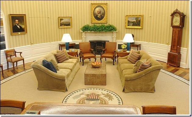
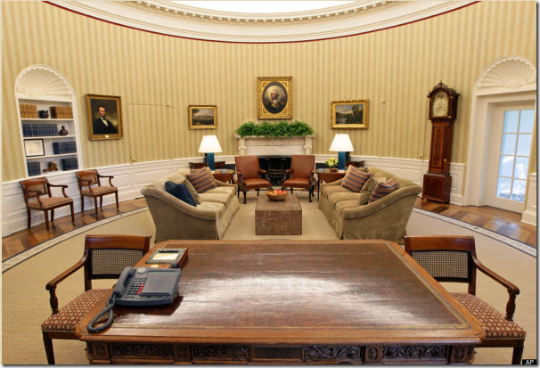
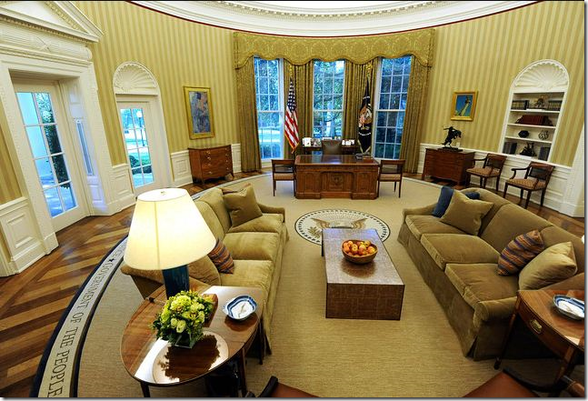
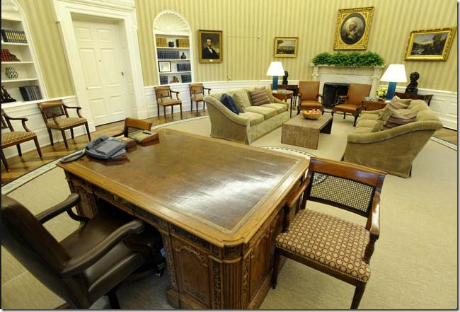
 The newly designed White House Oval Office was announced this Tuesday. The biggest decorative changes are the addition of the gold striped wallpaper and the new wheat colored rug. Michael S. Smith is rumored to have been the interior designer responsible for the changes. The portrait of George Washington remains where George W. Bush had him – right above the marble fireplace. The new design for Obama is less formal, less elegant than it was under Bush.
We finally got a SMALL glimpse of what uber-talented Michael S. Smith has been doing for the Obamas at the White House. With much blog excitement, Smith was hired as their interior designer before the big move in. Rumors of a $100,000 budget caused most to scoff at the reality of using Smith and staying within such an impossibly small budget. Unfortunately, not one picture of his work on the private quarters has been leaked to the press. But, on Tuesday, the announcement came that the President’s Oval Office was recently redecorated while he was on vacation and pictures are flooding the internet. The White House did not disclose the designer, but it is widely assumed to be Smith – especially after his good friend, Architectural Digest editor, Margaret Russell commented on the decor. At first glimpse, the redecorating is a bit of a disappointment. Gone is George Bush’s magnificent sunburst rug and the elegant cream walls and upholstery. The beautiful Bush rug has been replaced with a rather bland, wheat colored rug – sporting a band of famous quotations around its perimeter. While the quotes are inspiring – the former sunburst rug was especially fitting for the office since it enhanced the wagon wheel pattern of the wood floor. Through the years, the floor in the Oval Office has changed from cork to linoleum to a wagon wheel patterned pine and oak floor installed by Ronald Reagan. George W. Bush replaced the Oval Office floor with new hardwoods, but kept the same Reagan pattern. His oval rug beautifully offset the floor’s pattern and showed it to its advantage. Unfortunately, Obama’s rug looks somewhat plain when compared to the Bush rug, which Laura Bush designed as a symbol of optimism. Of course, Smith had a choice – either go with a striped wallpaper and a plain rug, or go with a striped rug and plain walls. He made his choice and the newly installed wallpaper is the most striking aspects of the new design.
There is one big difference between the decor of the Bush and Obama offices. The Bush Oval Office was elegant and dressy with all its creamy damask fabrics and ivory walls. Obama’s decor looks more upscale family room with its comfy chenille like upholstery on the sofas and leather on the armchairs. Some say it looks more like a hotel lobby than a presidential office.
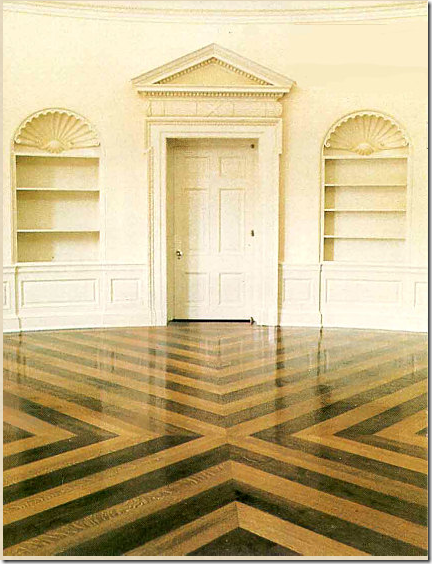
How would YOU decorate a room with a busy floor like this?
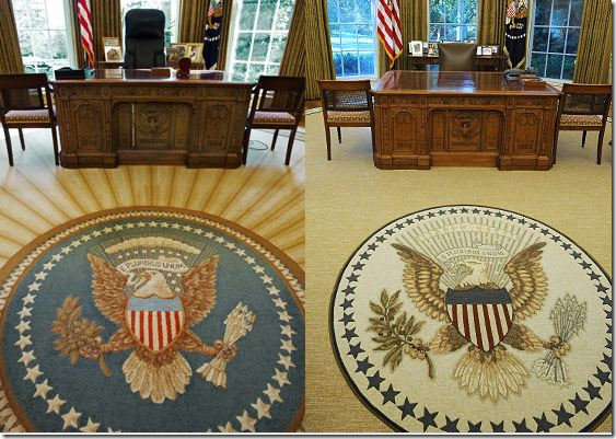
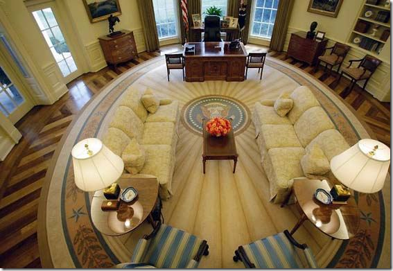
Here you can the Bush rug in all its glory. The seal has spokes leading out from it. Notice how the spokes repeat the design element of the hardwood floor. The rug is smaller than Obama’s. This smaller size allows a large border of the wood floor to show. The Bush rug remains one of the prettiest of Oval Office rugs to date. Obama did keep on using the office as Bush left it for 18 months, but the decor was replaced this week.
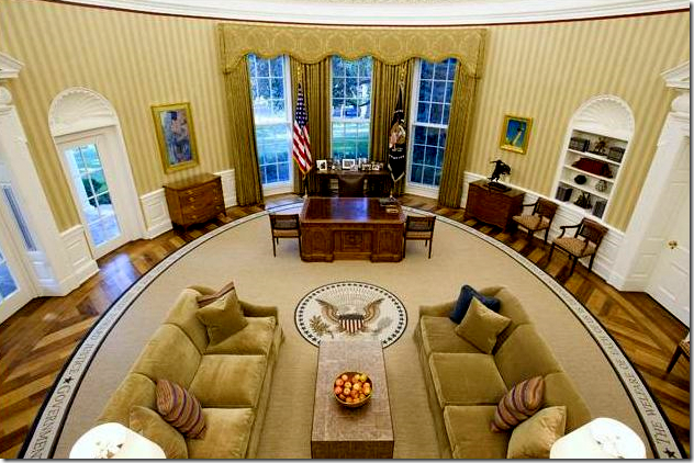
The quotes on Obama’s rug (on the right, above) are sewn around the perimeter of the rug and are non-partisan. Two are from democratic presidents, two from republican presidents and one is from a non-politician, the Reverend Martin L. King, Jr.
The quotes are:
"The Only Thing We Have to Fear Is Fear Itself” —President Franklin D. Roosevelt
“The Arc of the Moral Universe Is Long, But It Bends Towards Justice” —Martin Luther King Jr.
“Government of the People, By the People, For the People” —President Abraham Lincoln
“No Problem of Human Destiny Is Beyond Human Beings” —President John F. Kennedy
“The Welfare of Each of Us Is Dependent Fundamentally Upon the Welfare of All of Us” —President Theodore Roosevelt
Obama’s newly decorated Oval Office with its warm, family room feel.
Reviews of the new design have been mixed, but Margaret Russell, a personal friend of Michael Smith, called it: “Very American and very appropriate.” Russell's favorite addition is the rug: "It just seems right for this time." Margaret, I love you, but I could not agree less about the rug. Russell’s replacement at Elle Decor, Michael Boodro, weighed in with this: "These sofas look like you could have a lot of long talks. They're good for diplomacy. And that coffee table — it looks sturdier. You could put your feet up. I mean, I'm not sure anyone ever gets too comfortable in the Oval Office, other than the president, but this looks like an effort to put people at ease." Yes exactly. Comfy. Certainly not elegant. But shouldn’t the President’s office be elegant? Bush had a policy of never entering his office with a suit jacket on. He expected his staff to follow his lead, which they did. On weekends, if someone came in shirt sleeves, they were made to wait outside the door, not allowed to enter the office of the President. Obama has relaxed this policy – he appears without his jacket on occasion. Perhaps he is just a less formal man than Bush and wants his office to appear more relaxed than it did under Bush.
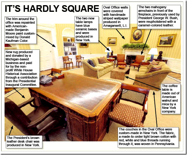
Whoever did design the office made sure that everything was made in the good old US of A. Updates to the Oval Office include, the rug, made by the Scott Group out of Grand Rapids, Michigan, the gold and beige wallpaper, produced in Amagansett, NY and the new coffee table made of American walnut. The two sofas, custom made in New York, wear darker, plain upholstery with red, white and blue threads running through it. This fabric was woven in Pennsylvania. The sofas are said to be “fluffier” – no doubt extra down cushions were insisted upon by the designer. There are several striped pillows, plus one in navy that picks up the new lamps’ color. Obama’s new brown leather desk chair was also made in New York.
Two arm chairs stayed, but were recovered in a caramel leather. Other smaller caned, arm chairs also stayed untouched – including the fabric. Perhaps the biggest item that remained the same are the curtains – a damask fabric. The famous Resolute desk used by so many presidents also remains in the office, as does the painting of George Washington.
Small details that changed before the major remodeling included the addition of a bust of Martin L. King, which replaced one of Winston Churchill. Obama also hung a a copy of the Emancipation Proclamation, borrowed from the Smithsonian Museum, until it was moved to the Lincoln bedroom. I love how the President has included touches of his ethnic heritage in the White House.
Of course, taxpayers did not pay for the refurbishing. The funds came from the nonprofit White House Historical Association.
A graphic showing the changes in detail.
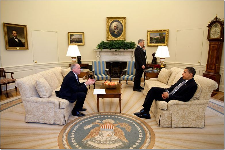
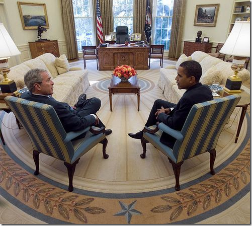 When Obama took over the office, he said that he liked the rug and was in no hurry to change it. But, most Presidents do choose their own Oval Office rug and Obama is no different. Here, at an initial meeting between Bush and Obama, you can see the blue striped chairs that add just a touch of color to the otherwise cream and ivory office.
NOW AND THEN – BEFORE AND AFTER:
BEFORE: George W. Bush’s Oval Office – elegant and sophisticated in creams, ivories and touches of light blues. The Bushes liked to have fresh flowers on the coffee table.
AFTER: Barak Obama’s Oval Office: Golds and caramel OR is the color scheme browns and wheats? The color scheme of the Oval Office looks remarkably different in photographs. Here the office appears to be very gold toned. In this photograph, the color of the rug seems “off,” – it should be a warmer tone. The Obamas also replaced the coffee table flowers with a bowl of fresh apples.
BEFORE: Looking at the other side of the room – towards the fireplace. The sofas in both offices appear very similar, except for the arms. Both have tight backs and three seat cushions. Bush’s damask is very pretty and subdued.
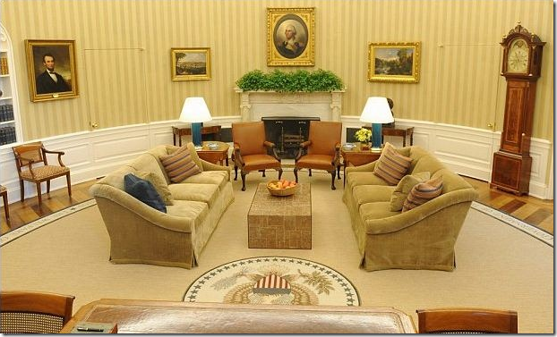 AFTER: Obama’s office: Another photograph showing the office in the gold and caramel tone. Here the rug looks warmer and it appears to match well. The sofas have a beautiful curved arm with the fabric draping in a waterfall. The coffee table and the lamps are surprisingly modern! I am really not liking the coffee table AT ALL! Sorry! The modern touch seems oddly out of place here and lends a hotel lobby look to the room.
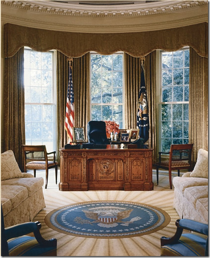
BEFORE: Bush’s curtains and the Resolute desk.
AFTER: Obama’s curtains and the Resolute desk. I am assuming these are the exact same curtains. Yet, they seem so much more gold in this photograph. They blend perfectly with the sofas and the wallpaper. Below are photographs showing Obama’s office looking much less gold.
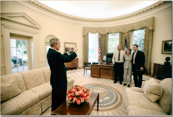 BUSH: Bush’s office, all creams and ivories and light blues – so elegant! Although, I must say, I wish someone would paint the ceiling a deeper shade! It’s so old fashioned white-white. Notice the curtains looking very taupe in this photograph.

BEFORE: The Oval Office as it was under George W. Bush. Notice that the coffee table and end tables look like bad hotel furniture. Beautiful lamps.
AFTER: The same view – in this photograph the office has the gold tone again. Notice how large the quotes on the rug are – you can easily read them. And notice while the new modern coffee table was added – the two end table were reused. The modern blue lamps bring out the blues in the pillow and the rug.
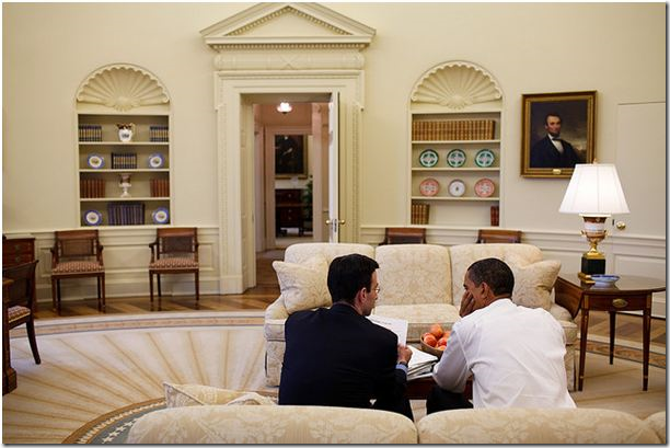 BEFORE: A rare view through the hall door. The shelves are so pretty shown from this angle.
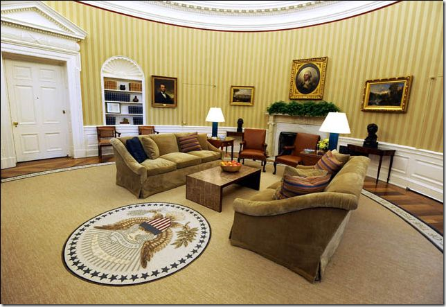
AFTER: More gold toned photographs. In this picture, the office looks so inviting and warm.
THE RESOLUTE DESK AND CHAIR:
BUSH: In this early photograph, Obama is still using Bush’s God awful desk chair! Abomination!!! Makes me wonder where the ceiling fan is???
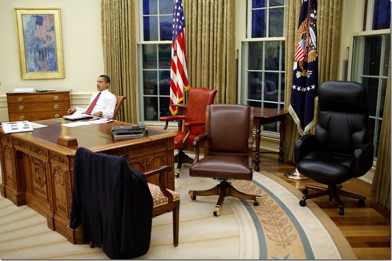 Here he tries out different, more traditional chairs.
AFTER: A dark brown leather traditional desk chair now sits behind the Resolute desk.
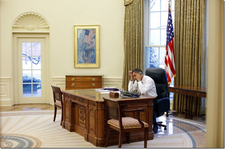
A photograph from Wednesday showing Obama at work in the newly decorated office. His office chair is especially attractive compared with Bush’s modern chair.
The famous photograph of President John F. Kennedy with his son John F. Kennedy, Jr. peering through the trap door of the Resolute desk. This desk was made from wood taken from the ship HMS Resolute and was given to President Rutherford Hayes by Queen Victoria of England in 1880. Most Presidents since Kennedy have chosen to use the Resolute desk.
Stanley Tretick took the original photograph of John Kennedy with his son, John F. Kennedy, Jr. peering through the trap door of the Resolute desk. The photo became a symbol of the President’s youthfulness – the Kennedy children were the first toddler White House residents in a long time. When Caroline Kennedy visited President Obama, she noted he was using the same desk as her father had. Obama bent down and tried to go through the trap door, but alas, no one had the key to open it up. Notice that the fabric on the side chairs is a famous Scalamandre pattern. (I actually once used this same exact fabric in the same colorway for a client of mine!)
RECENT OVAL OFFICES THROUGH THE YEARS:
.The Oval Office was designed by architect Nathan C. Wyeth during the time of President William Howard Taft in 1909. It was damaged by fire in 1929 and rebuilt by President Herbert C. Hoover, and later enlarged to the Oval office known today by Eric Gulfer under President Franklin D. Roosevelt.
President D.D. Eisenhower’s Oval Office was rather plain and inspired by the times, the 1950’s. The curtains were used from Truman through Kennedy.
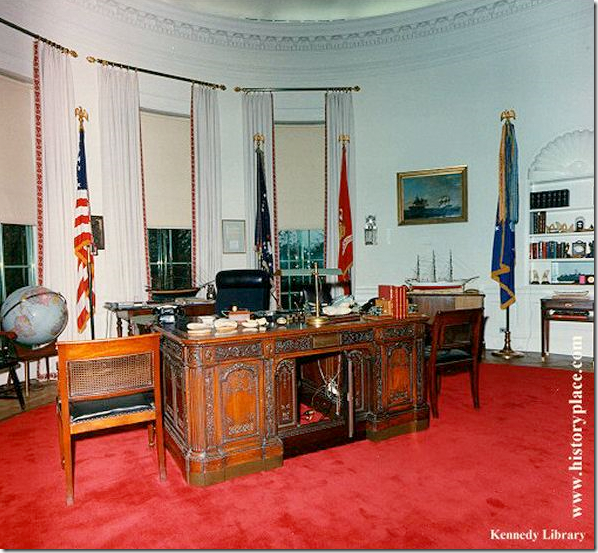 While the Kennedy’s were on their fateful trip to Dallas, his office was finally remodeled. The Resolute desk is shown here, as is the vivid red rug. Notice the chic curtains with the rods and the trim! Amazing! He never used his finished office. Later, Lyndon B. Johnson changed out the rug and the trim on the curtains to blue.
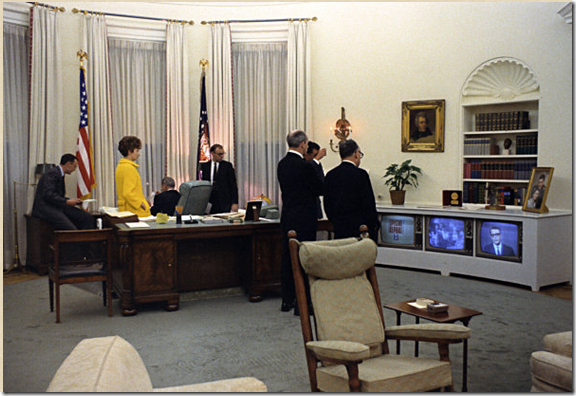 Hard to see in this picture, but the trim on the curtains was blue during Johnson and Richard M. Nixon’s time. That TV is such a crack up! This was back when the three major networks really mattered, because that was all there was to watch!
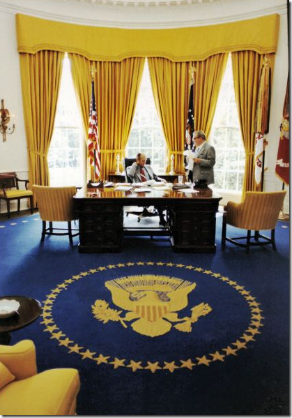 Nixon changed his Oval Office to this decor and Gerald Ford used it for a while.
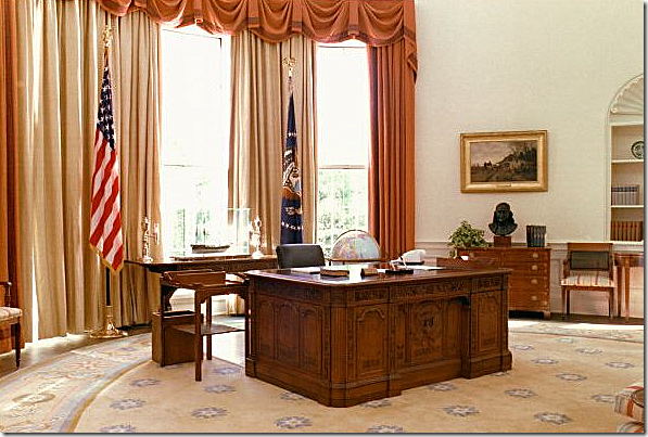 Gerald Ford changed his decor to this and the ever frugal Jimmy Carter kept it, as is. This might be a favorite decor of mine, but the peaches and blues seem so unpresidential. That rug is so cute, certainly not for a president!

 Eventually Reagan changed to this decor, including his own sunburst style area rug. He also changed the floor from linoleum to wood in the famous wagon wheel pattern.
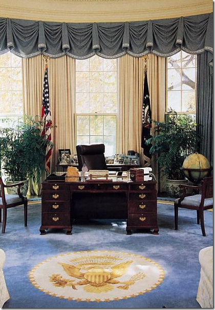 George H.W. Bush’s Oval Office is similar to his son’s in the colors they used. His desk looks so small compared to the Resolute desk.

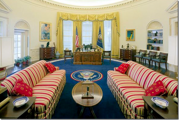 The absolute worst ever: The Clinton Oval Office. In the NY Times, Maureen Dowd called this the “Belle Watling” era. OMG! That is so hysterical and soooo true. Indeed. Red, White and Blue + Yellow = ugly. This is so unpresidential. Indeed the entire White House decorated under the Clintons was atrocious. I won’t name the decorator, I’m sure she’s done much better work in her career. She must cringe when she sees Bush and Obama’s elegant offices.
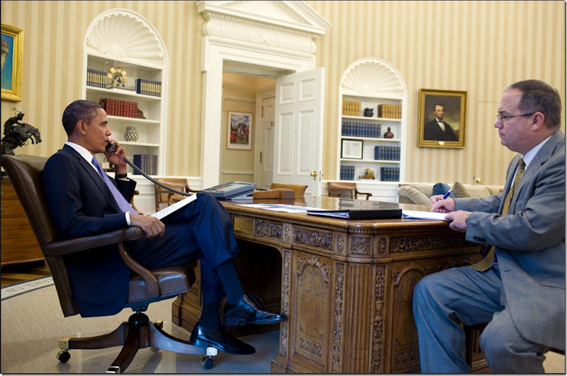
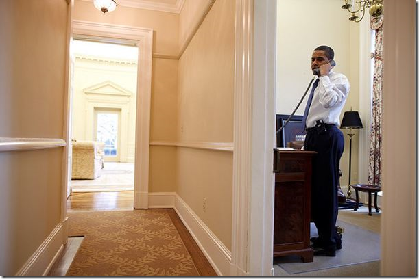 And speaking of the devil, Bill Clinton, here Obama answers the phone in his “private” study off the Oval Office (seen through the door way in the center.) I wonder if this is the private office where Clinton showed Monica how to “smoke” his cigar. OY! OK, OK, I actually liked the man as President. Whew! Back to design – notice the runner in the hall – like it!
Whose Oval Office do YOU like better? George W. Bush or Barak Obama? And TRY to keep politics out of your decision, if possible. My choice goes against my own politics.
Most of the vintage photographs came from HERE. The luscious current photographs of the Oval Office came from The White House on Flickr.com.






Hi Joni,
ReplyDeleteLong time reader, first time commenter...I loved your tour of the Oval Offices through the years, but I can't figure out which one, Bush's or Obama's, YOU like better. You say nice things about both, and offer criticism about both. Tell us!
Love,
Michiganhome
Ariana Huffington said it best: "The Audacity of Taupe". I like the newly decorated office best out of all the others, especially for what it is--an office--and nearly a public space. It's not meant to be a show place.
ReplyDeleteI think I like Ford's the best, then Regan's, then Obama's. I can't wait to see the living spaces.
ReplyDeleteJoni, another yeoperson's job with this great post. What I find interesting is how much the First Ladies are represented in the decor of their husbands. Can't you just see Laura's polished suits and Michelle's elegant J. Crew-esque wardrobes in these interiors? Clearly the President's office is no easy design task, with lots of hits and misses over the years. I do think Obama's wallpaper makes the room look more finished and brings the room together better than any of the predecessors. Obama's coffee table looks more serviceable than the smaller one in Bush's office. I would say Obama's is my favorite office overall and suits the times and reflects the occupant well. I like the easy, warm, modern, elegance of the whole room and I love the quotes in the rug that will be surrounding the conversations in that room.
ReplyDeleteI like Obama's decor the best since it's calm and like other readers have said it is an office. I think the wheat colored rug is great with the saynig around the edges, looks cleaner.
ReplyDeleteokay, here goes ...
ReplyDeletehands down the Scalamandre is good.
the new floor covering ... check
the updated lamps ... icky .. looks like "home goods"
Bush coffee table completely out of scale, legs look like match sticks
I love the creamy white-ness of the before sofas, rich!
pardon me being just a little freelance designer from the Midwest, but is anyone else thinking the coffee tables, both of them ... look dwarfed ...why not an oversized oval or round mirroring the shape of the room ... keeping with the American walnut of course ... both choices seem REALLY under sized and the rectangle really fights the round room ... help me out here, Joni
my eye can hardly stand looking at either.
am I being too critical...
You'd think, using MS, if they did ... this room would WOW us ... it certainly looks ho-hum to my eye
I vote Bush, but I have a soft spot for demask, and agree that his rug was just amazing. I am sure in person the quality of the new couches look finer, but in photos, the couch fabric looks really tawdry to me. I do like the new wallpaper, though.
ReplyDeleteWhat a wonderfully researched post. I love design and history, so it's right up my alley. I did a little post of my own, but nothing as in-depth as yours. Here's my take (which I didn't include on my post), although I want the Obama couches for my living room, I wish that it was a tad more elegant/presidental since so many foreign dignitaries come through there. I understand the need for comfort though, but I wish it had a little more punch of something.
ReplyDeleteAs always, great post.
Hands down it's Bush's! While Obama's Oval Office is very pretty it just doesn't have that subtle WOW! factor of before.
ReplyDeleteWhoever designed Bush's office really knew how to make a lot of impact yet keep it simple and relaxing. I think comparing the new office to a "hotel lobby" is a good comparison. It's just too drab.
And I must say I prefer to see flowers on the coffee table. Soft, cheerful, relaxing and so nice to bring the outdoors inside. Is anyone ever really going to sit down and pick up an apple and take a bite? I don't think so.
The Oval Office is not just a place for the every day business carried on at the White House, but it is a place where the President greets foreign dignitaries. With that in mind, the Bush Oval Office is by far the most elegant and presidential. I agree that the Bush coffee table looked under scaled, but the colors were restful and clear. The Obama decor is muddy and looks more like a color one might use with paneled walls in a library. The bad news is that the quote by MLK on the rug is not MLK's quote. It is one he used, but he is not the original author of those words. OOPS! A very costly, stupid and embarrassing mistake on the part of the President or of the designer.
ReplyDeleteThe quote by Martin Luther King is actually a quote he borrowed from the 19th century Unitarian Minister by the name of Theodore Parker. Just another misstep by the White House I suppose.
ReplyDeleteYou have to wonder how many people's opinions had to be considered, because this doesn't look like what I would expect from Michael Smith. At an attempt to make it more "today" and more relaxed, at best it is totally bland.
ReplyDeleteI'm sure the sofas were custom built... so why not have them curved rather than straight? The coffee table is scaled a little better, but the style is not complimentary. If you want to make the space look more relaxed... why not have a custom huge ottoman/table in a combination of leather and wood?
If you are going to be spending a lot of time in that room, I also think the stripes would be a little too much...
Over all, I think the design is a big disappointment.
And what's with all the greenery on the fireplace mantle?
ReplyDeleteI never would have replaced that rug, it was fabulous!
ReplyDeleteGreat post! Definitely without a doubt Bush's. The new one is terri! My term for terrible. I saw the oval office when Bush was in term and wasn't design savvy back then and don't remember the rug...I'm pissed! It's so pretty.
ReplyDeleteVery interesting post!
ReplyDeleteBush's office has my vote.
I look at Obama's and think BORING & DRAB, DRAB, DRAB!!!
I'd add Obama's wallpaper to Reagan's whole design and it would be perfect. :) Great post, thoroughly enjoyed it.
ReplyDeleteRe: your question, I like Bush's better. I also don't agree with people who cast the Oval Office as a private office. Considering it's use and history, it's quasi-private at best.
ReplyDeleteOverall I think this makeover is a surprising miss.
I like Bush's more than Obama's - but like the Reagan office the best. And bravo to Reagan for putting in the gorgeous wood floor.
ReplyDeleteNone of the above.
ReplyDeleteWhat a missed opportunity!
Prior to leaving office, Bush invited Obama and all the other living Presidents to a meeting and lunch at the White House. A photograph was taken and in the news story, Bill Clinton is heard on tape while pointing to the rug saying how much he liked it. This new decor was a waste of money even if the taxpayers don't pay for it. It is only slightly better than what the oval office looked like under Bill Clinton when a decorator from Little Rock made the place look like "early Oregon Trail".
ReplyDeleteFor me it is difficult to leave politics out of my decision. I don't like the new office! It doesn't look like a presidential office. it looks like someones great room.
ReplyDeleteTeresa
Wonderful post Joni. I have to say I would have kept Bush's rug (the only think I would have kept from GB) It was great. I would have liked to have see those curtains changed though. They look very gold now. Otherwise I like the look a lot more. Love the couches.
ReplyDeleteHi Dear Joni! OH, this was a great post! How nice to be able to see the different styles of the Oval Office! I liked some of the aspects of Obama's office - the striped wallpaper warms the room up and his rug is very nice! I liked G.W.'s sofas and I guess they kept the same greens on the mantle? I do believe I liked Reagan's the best. Just so elegant!
ReplyDeleteNow you live in Texas - HOT Texas! :) Do you really not have any ceiling fans? We couldn't live without them. I'd just die without my little breezes! :)
Be a sweetie,
Shelia ;)
Bush, Bush, Bush!
ReplyDeleteAm I too naive or too spartan to be totally shocked that each President redecorates the oval office? I love redecorating as much as the next guy but what a waste of money of the American public by ALL of the presidents!
ReplyDeleteTo me the only word that describes the new design under Obama is disappointing. In an effort to go more modern and welcoming the designer ended up with bland, boring, unpresidential, and midwest mcmansion living room. Also, I am surprised by how much I like the designs under Ford and Reagan given my general dislike of the style at that time.
ReplyDeleteI like the Reagan version best -it seems stylish and a bit glamorous. LOVE those white couches then.
ReplyDeleteObamas looks like a boring upscale hotel -certainly M.S.could do better? However, I prefer it MUCH MORE than Bush's, with the exception of that carpet. I think Obama's furniture is much more elegant than under Bush, less dated looking. The new rug is sort of blah, I agree with you there.
Very interesting post...I can't decide which one I like best though!
ReplyDeleteKristen
I was waiting for somebody in decor blogland to do a post in this, and I am so glad it is you!
ReplyDeleteYou should send this to the Huffington Post. They need to be schooled on what a well written and well researched design think piece should look like.
Thanks for taking on all the hard work that you do for our edification and enjoyment.
xo xo
Joni;
ReplyDeleteI think that I have been back and forth several times and to me I do like the rug and the overall color / design scheme of the new office.
I have to agree with Ms. Russell as the entire look is one of now and the times we are living in.As a nation we are in ever changing times, lives are so prescious and time is such a valuable commodity. I see the new office as a place to really sit, discuss and feel at home while discussing pertinent matters of state.I like the fact of a more intimate space where a more relaxed mood is setting the tone for discussing important topics. Perhaps sinking into a more engaging seat may expediate diplomatic ties and expectations.
Home is a reflection of lifestyle and there are so many varied ways which Americans and foreign dignitaries adorn them.I do myself admire a beautiful and refined designed room, but is it for me? Probably not.
My point;
I suppose that I can see the beauty in designing for a mood or setting, I think the Obama's are reaching out not only to the public but to their most secured visitors as well. I like the feel of a neutral, a bit masculine but not overdone setting where the mood is one of comfort and the focus on important issues.
People are looking for leadership, trust is an issue and even the word political I have to say makes me cringe these days......
So, that is my objective opinion.
In regards to the oval office renovations of the past, each one does seem to reflect the President, his agenda and the times in which we were living.
Hopefully America is on the way to being not only a stronger nation but one of family, trust and taking care of our virtues while not compromising our values.
I am sure that the change will be one that will be photographed for our children to look back on for design. Bloggers of the future may look to our words as well, but in the end each administration seems to have a master plan and I am sure the feel of such an important place is highly scrutinized when in the planning stages. If Michael Smith was behind the design, I would love to read his take on the design and why it was executed in the manner it was.Hello Michael, if you are reading this hoe about a one on one interview? I would love to read that one, the decorating of the most important offices in the world.
Thanks for writing this Joni, I have seen and heard some buzz on the subject in the past few days, seeing it as only you compare and contrast spaces makes it visually understandable for me.
Love the Bush office...except for his desk chair. Yikes! Te room was more formal and fitting for the office of President.That much comfort ( the Obama office) belongs in the private quarters. I especially like Bush's rug better. My favorite thing about Obama's office is the wallpaper... it does give a finished look. overall i am surprised at the decor...expected more from M Smith.
ReplyDelete...much prefer the bush office...however the perfect rug would be the bush rug with the obama quotes ...i love the idea of the quotations...also would love that red chair...you always need and unexpected element...(on second thought... we already have had too many unexpected elements in the past two years...)
ReplyDeleteI will have to go back and look at all the pictures again. I sent a link of this post to my husband... while he is not into decorating... he loves history and government and I think he will enjoy this!!
ReplyDeleteSuch a history lesson, I love it.
I really preferred the Starburst rug that Bush had prior to Obama... Why would you get rid of it? It was perfection!
Bush hands down....just lovely !!! Love that rug.
ReplyDeleteClinton's looked like the circus was coming to town no ????
I have to add though that I don't care for either coffee table ( Bush or Obama) ???
Kathy :)
I like the new office. I think it is much warmer and much more interesting and modern. Perhaps if people are more comfortable they can get more done!
ReplyDeleteI've noticed that Michael Smith uses a lot of brown in his rooms. So I'm not surprised to see it in the oval office. Love the wallpaper. And your observation that the new decor may induce a feeling of relaxation and friendliness seems about right.
ReplyDeleteMarion
I must agree with you. Not a fan of the "Oval Office & Suites" look. Much as I understand the added familiarity, and I would adore those couches in my own home, it seems to casual and busy for the formal office of a head of state. The Bush version was much more appropriate: elegant, understated and dignified, letting the sunburst rug and the gorgeous floor pack the punch. (Although I have to say, I rather liked some of the earlier curtains that treated the windows as separate and not a single unit. It made them seem lighter and more approachable that a solid cornice.)
ReplyDeleteMy first thought was that the Obama couches could withstand children playing on them. I know that they are old enough to 'act like ladies", but it would be nice for them to be able to spend time where their father is working and not worry about white sofas.
ReplyDeleteI did appreciate the comment that reminded us that this is where he does business.
Thank you for the trip through time. i've never seen them in one article to see how the room changed with each president (or his wife).
Have a dislike of anything very formal looking I prefer the Obama decor.
ReplyDeleteI guess the manufacturer of the rug and the wallpaper etc. do not consider this a waste of money.
I loved this post! So informative as always.
ReplyDeleteI am mixed about the new office design as well. It does look cozier than Bushes. Love the new sofas, leather chairs. The rug is okay. Not sure about the wallpaper. I would also have gone w a more elegant glass coffee table.
xo,
cristin
" The absolute worst ever: The Clinton Oval Office. In the NY Times, Maureen Dowd called this the “Belle Watling” era. OMG! That is so hysterical and soooo true."
ReplyDeleteThat made me laugh so hard!!
I have to go with the majority and say, I prefer the Bush oval office.
I have a hard time seeing anything other than the beautiful "Fifth Avenue in the Rain" painting........
ReplyDeleteI love the new office, but when are they going to get rid of those horrible mantle greens?
ReplyDeleteI had forgotten about he re-designing of JFK's office while he was in Dallas.
Your posts are just the best.
OMG, I did a spit take when I read that Maureen Dowd column. Too funny!
ReplyDeleteKeeping in mind that you probably have to be actually IN the office to evaluate the decor best, I have to agree with you. I'm going with W -- yes on decor, no on politics. ;)
Wonderful post Joni.....xv
ReplyDeleteOh, and I'm wondering what they did with the Bush rug -- did it go to the SMithsonian?
ReplyDeleteGreat great comments. Y'all are always the best, your comments add so much more to the story.
ReplyDeleteGlad the scale of the coffee table was mentioned. I thought it looked way too small too. Also, I am thinking now that the quotes may be too kitchy????
IMO they should have gotten new couches, updated, and new end and coffee tables --- beautiful antiques with character-- and called it a day.
This is a public space too. Disappointment from smith. I hate to think what the private quarters look like now.
interesting! i like the old rug better, but i like the new striped wallpaper, too. obviously they wouldn't work together! i prefer the new couches- the damask wasn't my favorite. i don't like either of those coffee tables... surely they could have come up with something more solid than the old one & more attractive than the new one??
ReplyDeleteI can assure you this is a surprise to many Washingtonians. Especially those who have served under more than one President.
ReplyDeleteFrom a design perspective, I don't love it, but MS is known afterall for his casual, livable albeit uber expensive interiors.
However, I think it is appropriate to have a more formal flair regardless of the status of the economy. Formal does not have to equate extravagance.
And, I certainly don't think anyone should be eating apples in the oval office, let alone on "that" coffee table!!!
So, the Bush 43rd Oval was "elegant," despite featuring a "godawful" desk chair and tables that looked like "cheap hotel furniture"? Makes that "elegant" characterization sound more like a generous dose of Texas Republican bias than an actual aesthetic judgement.
ReplyDeleteAnd the condescending bigotry of how you "love" that the President has included "touches of his ethnic heritage in the White House," because he had the text of the Emancipation Proclamation hung in the building? Obama's "ethnic heritage" is Nigerian and Hawaiian. I'm assuming you're suggesting that because he is a person of color he must be the descendant of American slaves (the only people who could possibly be interested in the Emancipation Proclamation, apparently). Even if so, slavery is not an ethnicity. You embarrass yourself.
ah well, my friend, great minds... I did this post too! Am running a poll on mine for people's favorites, going back to Roosevelt and so far, Bush and Obama are running neck and neck. However, I added TV's The West Wing oval office as an added bonus, and he's coming in third!
ReplyDeleteRe: the side tables, I disagree, I don't think they look cheap at all, but the Bush cocktail table does look it, mainly because it's too small. But, they need to leave room for people to walk around. Don't like the new cocktail table at all, I'm with you there. The rug is bland, as with everything else. In general, Obama's is all too casual looking and it's simply not a casual place. The Pres has a separate "jackets off" private office as you mention. The Oval is a public, formal space, which is why I respected Bush for his jacket's on rule and don't respect Obama's for his shirtsleeves policy. To me, it sends the message that he doesn't value, or doesn't understand, the huge historical significance of that room, the world over.
It's interesting how some of the artwork is maintained, such as the painting with the Flag to the left of the window treatments as you're facing the desk - it was in the same place in Bush's and Clinton's offices. It looks Monet-ish - anyone know whose it is?
Finally, I think I heard once that the "trap door" on the Resolute desk was added by Roosevelt to hide his leg braces, which makes sense because usually "modesty panels" are on women's desks. And, of course, no one considered the possibility of a woman using that desk... even Queen Victoria, apparently.
So, a question I have is, if we had a woman president, would we want or expect to see the decorating look any different?
I like Ronald Reagan's oval office the best then George W Bush. The rug was a real statement piece. Pres Obama's office looks too casual for the President-
ReplyDeleteLOVE the post and pictures, very interesting for this Dutch girl :)
ReplyDeleteI personally adore the Obama rug with the quotes. For the rest it is a tie between Bush and Obama, some of Bush some of Obama
The George H.W. Bush office is my pick. It has "weight" going for it. The resplendent color of the rug against the white walls with the dark desk framed by the plants at the window. There is a completeness in the photograph itself that makes me feel the importance of the President.
ReplyDeleteAs usual, you have done a superlative job of pulling together the oval office pictures. You are just amazing and I so appreciate the time and trouble it takes to what you do. My gratitude. Ann
Obamas office is now competing with Pottery Barn and has some ugly pillows. Even when Kennedy had tots in the room they still retained the dignity of the office. All the past offices were a better representation of their present time. And if Meredith meant we are in hard times right now, then should we decorate like we're struggling but party like it's 1999. Bush office wins!
ReplyDeleteLook at the type on the photo "New rug..donated by..and paid for by the non-profit White House His..." which was it? donated or paid for? Hummmm...
I am undecided about the rug and wallpaper. That wood floor is lovely but oh so busy. I liked the less gold photos of the new decor and I love the curved arms on the new couches. I definitely like those caramel chairs and the new desk chair is a big improvement. My favorite picture though is John-John under the desk. The coffee tables of Bush and Obama are both meh. I really liked the Bush the Elder'splants by the windows!
ReplyDeleteI love people who decorate their offices to suit their tastes, styles and purposes.
ReplyDeleteIt shows confidence, maturity, and convictions, and that's why I voted for Barack Obama to be the president.
Our country has had enough of symbolism, and it is in dire need of substance.
God bless the USA.
Love the rolled arm/style of the couches, but the gold photographs vintage, and not in a good way. The whole place already looks dated, tired and has so spatial energy.
ReplyDeleteMaybe it was meant to be soothing and looks better in person? It doesn't photograph well, in any case.
Bush's looked crisp, and I wonder what they did w/ that beautiful rug.
Agree w/ poster above about the greenery on the mantle...Although it probably isn't, it looks like old silk flowers.
Overall, disappointing.
Linda, the flag painting is one of Childe Hassam's. He did a zillion of them, but the earliest are the best. And Joni, I'm with you on the quotes on the rug. I don't like sayings on walls a la those wall decal things, or on pillows (Elsie de Wolfe notwithstanding) and I like them even less on rugs. Face it, no one is going to stop to do a circuit of the room to read them all, anyway, so the quotes end up unread, reduced to random patterning & an empty gesture. As for the rug's seal, I think it was Teddy Roosevelt who nixed McKim, Mead & White's plan to inlay the Presidential Seal in the marble floor outside the Blue Room & made them put it up on the wall above the door instead, saying it was inappropriate for people to be walking on the seal. These days, of course, anything goes. In general though, the Bush rug was better, although it wouldn't have worked with the new wallpaper.
ReplyDeleteOK, lets talk about the curtains. Yes, I know they're a remnant of the Bush scheme, but of all the components of that decor, these were the one thing that really needed attention. What's with the total lack of relation between the valance's lower edge & the pattern in the damask? With some seaming, some careful centering--and may be the addition of some trumpets or jabots at strategic spots--those motifs could have made to align with the valance's overall shape. If all that was too much effort, they should have avoided the problem and gone with a simple unshaped box pelmet. As it is, the whole valance looks like it was made by an amateur.
Overall, I think the whole room reads as drab & lifeless. Neutral doesn't have to mean bland. I was never a big fan of the Crate & Barrel dark-wood-&-pale-upholstery look, but at least there was plenty of value contrast to compensate for the lack of color. Jean-Michel Frank did handsome neutral rooms without a spot of color in them eighty years ago, and Barbara Barry did it well in the early 90s, so it's not like it's a lost art. Here, everything's medium tone is too much of a muchness. Of course, as people say, this is supposed to be a comfortable working office, not a showplace, and, yes, it looks comfortable enough, in an upper-middle class suburban way, if, that is, we're only talking 'comfort' in the the context of upholstery & not the distance between the comfy corner of the sofa & that blocky coffee table, or, at least, that bowl of fruit. Even if one of the Joint Chiefs wanted one of those apples during a meeting, I bet he wouldn't crawl over somebody else to get to it. If the whole idea was to be more casual & contemporary than the veddy proper Bush scheme, then somebody's suggestion above of an oversized ottoman would have been perfect--especially on chunky mahogany legs with brass feet-- but this table doesn't look contemorary, it merely looks--along with the generic lamps--like a leftover from the Seventies.
I do like the wallpaper.
Sorry, folks, that's what happens when you get older: not only do you start complaining about everything, you start repeating yourself.
ReplyDeleteVery interesting to be able to compare the two side by side. I'm not sure which one I like the best...I like different aspects of both really! Thanks for sharing :o)
ReplyDelete~Des
Hi Joni -
ReplyDeleteI think this room must be very difficult to design by the looks of things! It does look updated now with the large sofas and neutral tones. However all those small scaled pieces lined up around the walls is odd, as is the absence of lamps, etc. on the famous desk. Bad choice for side tables as the lamp wire is visible dangling down the back as you enter the room. Yes, it is a more relaxed, comfortable room - but should the office of the President of the United States look like you can kick back and eat a bowl of popcorn? This office should demand your undivided attention and respect when entering. Thanks Joni for an unusual post - I never thought I would be thinking about the design of the Oval Office!
Nancy
I have to say Bush's. In my opinion, Reagan's was the best overall--the color scheme and furniture were the best fit for the architecture, natural lighting, and historical importance of the room. The Obama room is just, well, bland. Way too casual for what is truly a public room. The sofas, pillows, and coffee table are, to put it kindly, a disppointment.
ReplyDeleteMagnaverde - thanks for the info on the Hassam painting - makes sense!
ReplyDelete(a) I like the shape of the sofa's in Obama's office-- beautiful lines--I echo what another commenter said about them being custom, so why not choose a conversational frame for them? Just a slight curve would do wonders.
ReplyDeleteQuotes=gimmicky. Like huge monograms plastered all over one's home. The lack of creativity bugs me--but perhaps this was the clients idea (I'd imagine it was)
Wallpaper: I am a HUGE fan of striped wallpaper, but in this case my 1st thought was: it looks c.1989 and should have a fruit basket border and the room would smell like Kirkland's--you know, that mulberry scent that lingers in your nose for days after you've been in there for 3 minutes.
Reagan, hands down, had the sharpest looking office, IMO. To me, it felt welcoming yet regal and presidential--I'm also partial to ivory, salmon/rust and dark woods.
I'd love to see the tape/braid that was used on Kennedy's panels more closely, looked crisp :)
**I know that Mr.Smith may catch some heat for this, and that makes me feel badly for him. As designers, I think it's important to always remain cognizant that not 'all' clients are as receptive to our ideas and some jobs are extraordinarily client driven (most of mine are) Sometimes the client has an idea in their head and merely need a facilitator to execute their ideas. Perhaps that was the case here.
Did you know that Linda from Surroundings is doing an Oval Office redesign contest?? I thought that was a great idea :)
Thanks for the great read :)
Neither. (LOL) I think My favorite was the Regan decor. Classic, commanding, and beautiful.
ReplyDeletexo Isa
I loathe Bush and love Obama but I have to give the thumbs up to Dubbya's office. I agree with comments stating that the new Obama decor is like a mid-price furniture salesroom display. The whole thing looks nicotine-stained and no-one will convince me that Michael Smith was behind it. The wallpaper is depressing and just plain wrong for that room.
ReplyDeleteCould those be the same cane backed chairs by the President's desk that appear in each of the pictures from Dwight D. Eisenhower to today's Oval Office? And did you notice that the Scalamandre fabric on those chairs appear to be from George W. Bush's office? I thought it was interesting that Michael Smith didn't change the fabric.
ReplyDeleteThe other thing that was interesting to me was that the decor and appearance of the Oval Office did not seem to be important until after Kennedy. The furniture up to that point looked pretty beat up and very functional as opposed to beautiful or meaningful. Even wires were exposed under the desk. I can guarantee a mess of wires like that would never be in today's White House.
I vote for Reagan's office. It was beautiful. I think it represented the importance and formality of the Office of the President. On top of that, I think it was a good reflection of Ronald Reagan.
Diana
This is the only positive thing you'll ever hear me say about Obama... I like the arms on his office couch.
ReplyDeleteThis comment has been removed by the author.
ReplyDeleteI don't know. I think wallpaper is exactly what those walls needed in order to get rid of the stark look on the fireplace side of the room but I would have used a different stripe in a blue-grey. The upholstery (too bland), modern lamps (undersized and bring nothing to the room)and table (just plain ugly) isn't quite right. I'd like to see a little more blue brought into the mix and the ceiling painted. Bush's rug was clearly the nicest oval office rug, I would have reused it.
ReplyDeleteHave to say I prefer the office of No. 43. That striped wallpaper just looks too hotel-ish to me. I'm a little disappointed, too, coming from such a great designer.
ReplyDeleteYou are Cote de Texas because you write the most thorough and current commentary. I strive for your excellence in decor reporting! I agree, the rug is too big, and should show the trim, but I like everything else. Come visit us. Your comments are like famous autographs to little us!
ReplyDeletecheers,
Liz
I enjoyed this issue of your blog. It shows that decor really does matter and fashion, tells so much. Do have to like one more that the other? I admire the decorator for finding a solution to those awkward doors that were just painted over in previous versions. With the stripped wallpaper, I guess the patterned rug had to go although I did like it. All in all, I guess I prefer the Obama version because it is more up-to-date and hopefully more comfortable for some very heavy conversations.
ReplyDeleteLet's see:
ReplyDelete-Too bland and like a hotel!
-Rug is way too big and the quotes are wasted. Keep it strong and simple. Let more of that gorgeous floor show!
-Love Magnaverde's ideas for the curtains -- should be a much stronger line with a dark simple brown border.
-Desk is lovely but needs lamps! Maybe two?
-Would love to see curved sofas and a much larger, curved coffee table (I wonder if two tables would work -- maybe created to be adjoining organic shapes?) in rich dark brown -- accented with a series of American artisan bowls on the top. Could be changed out with the seasons -- maybe glass or even metal?
-Would love to see more American artisan works on the mantel -- maybe ceramics or glass works filled with seasonal fresh florals?
-Elegant updated wing chairs in creamy leather.
I wonder how Barbara Barry would have designed the Oval Office?
Jan at Rosemary Cottage
I guess I think a Presidential office should look well...presidential and no a spot for popcorn and soda and the game on a flat screen. I live in a small town in NC. I have a term for this kind of look, "country come to town." hee,hee,hee.
ReplyDeleteI think it should be more elegant.
I do agree that the Clinton's design was the absolute worst! Looks like they were high on crack at a burlesque show! Oh dear...will the secret service be after me for this comment? ;)
xx, shell
Hi Joni: I love your blog, you are always so thorough and I really enjoyed this. I have to say, regardless of politics, Bush's office is clearly the winner in terms of decoration. The Obama office is just too bland and as you point out, hotel-like. I too loved that sunburst rug! so unique and really added some much needed 'oomph' to the office!! thanks for the post Joni!
ReplyDelete:))
Let's face it, the decor is nothing more than a reflection of the current administration - mediocre at best. Pride in America would have dictated slightly more refinement, quality and perhaps a touch of glamor. This is the reason so many have chosen Reagan's office because he tastefully incorporated all three elements. Americans want the Oval Office to reflect the American spirit and one cannot ignore color in that reflection. All in all, the oval office disappoints. The White House is a repository of some of the finest American antiques in the country. Why not use them as a showcase to our history and heritage in the decorative arts.
ReplyDeleteWhen I saw the first picture I said "dreadful" then slowly, looking at different angles and mostly at different rendering of colors, so difficult on paper, more difficult on computer screens, I started to like this new version a lot. More sober, elegant and yes, also reflecting this time in history. I believe the decorator made wonderful choices, personally I would have changed the curtains, put a gorgeous lamp on the desk and arranged differently the fireplace mantel... but who am I?
ReplyDeleteJoni, I love your blog! and please ignore Lynn's nasty comment. Now, as far as the Oval office, is it just me, or does the new office look like it could be the lobby for a new Hampton Inn? Just my opinion. I like Bush's, its very elegant and refined, but I would love to see that style more updated, after eight years, the office was looking a little tired. Maybe just replace the desk chair, get new side tables, and recover the chairs in a fabric a little more current, and it would be by far the best!
ReplyDeleteBut, I have to admit I do like the wall paper in Obama's office. It helps to hide the "secret" doors that were very obvious before.
ReplyDeleteBut, I have to admit I do like the wall paper in Obama's office. It helps to hide the "secret" doors that were very obvious before.
ReplyDeleteTo Lynne:
ReplyDeleteObama is Nigerian and hawaiian?????? I think YOU embarrass yourself. Obama's mother chose to live in hawaii but she was not an ethnic hawaiian by any stretch. Obama is a black american despite where his father was born. Hitler would have killed me as a Jew even though I was adopted and not biologically Jewish. Should Obama not revere m.l. King because he is half Nigerian?
And yes the gw bush office was elegant despite his awful desk chair. IMO
Great comments just keep coming in. Thanks to everyone for dropping in. Not too many are liking the new office I'm afraid.
ReplyDeleteThe Obama office looks like an ad for Rooms to Go. The wallpaper seems like it came from a clearance bin at Home Depot.
ReplyDeleteI do appreciate the use of American made items. Two thumbs up for that.
Bush over Obama for sure. The elegance is gone, I'm quite disappointed in Smith's design. I think the sofas are horrible and the pillow are worse. Don't like the brown's and it does look like a very mediocre family room. Not fond of the wallpaper either. Did you notice that the 'hotel looking end tables' in Bush's office are the same in Obama's? Also, I noticed the horrible chair of Bush's you were talking about is not there in the picture with Obama and Clinton. Did you notice too that all the accent tables around the room are in the same place as is the artwork?
ReplyDeleteLike I said over at Linda's, "I'm not famous and I could do a heck of a better job than this".
Good post Miss Joni!
xx
Well, I think I like Bush's better, but I'm not sure I like any of them. What's with all the puffiness of those sofas, Dub?
ReplyDeleteAs for the new design - Restoration Hardware mail order, anyone? Sorry RH, it's not you,it's them - actually,you could have done better. The scale seems all wrong, the is seating awkward, the coffee table looks like a bad "before" from design*sponge - don't get me started on that maw-maw rug and hotel drapes, I guess to compliment that Waverly builder grade throwback wallpaper c.1988?...and the lamps - no,no,no.
I don't have a problem with a private fund sponsoring the redesign of a Pres office, it's nice actually. But non-committal seriously depressing dullness? Talk about dumbed down. If for no other reason than politics, could we not have at least recycled a little? I can't image the stash of really good pieces (probably a couple hundred of those red rugs you love so much, Joni) that could have made up the finished product of this usually brilliant designer. Come on, people. That WAS a waste. Except for the desk chair. That plays.
you didnt like clinton's forest green private office???
ReplyDeleteand that yellow room (name?) with the art glass on the piano...there was a lot of modern american art in the clinton white house..i didnt realize it was atrocious..
love the bush rug..obama's design so dissapointing;(
Boring with a capital B as far as the new office goes, and I'm so disappointed with the lack of formality. If the US is a world leader, that title is completely lost in the looks of this room! Who should ever feel they can put their feet up on the coffee table in the Oval Office? Bush's rug was gorgeous. I'm falling asleep looking at Obahma's. Great, great post, Joni. Thank you.
ReplyDeleteThe photo you pointed out as probably getting the colors the truest in the Obama scheme shows the room to its best advantage and it looks pretty pulled together, if not inspiring. Coffee table is the least successful detail. We'll never know how many great ideas the designer may have had that were rejected . . .
ReplyDeleteThe photo you pointed out as probably getting the colors the truest in the Obama scheme shows the room to its best advantage and it looks pretty pulled together, if not inspiring. Coffee table is the least successful detail. We'll never know how many great ideas the designer may have had that were rejected . . .
ReplyDeleteThe photo you pointed out as probably getting the colors the truest in the Obama scheme shows the room to its best advantage and it looks pretty pulled together, if not inspiring. Coffee table is the least successful detail. We'll never know how many great ideas the designer may have had that were rejected . . .
ReplyDeleteThe photo you pointed out as probably getting the colors the truest in the Obama scheme shows the room to its best advantage and it looks pretty pulled together, if not inspiring. Coffee table is the least successful detail. We'll never know how many great ideas the designer may have had that were rejected . . .
ReplyDeleteThe photo you pointed out as probably getting the colors the truest in the Obama scheme shows the room to its best advantage and it looks pretty pulled together, if not inspiring. Coffee table is the least successful detail. We'll never know how many great ideas the designer may have had that were rejected . . .
ReplyDeleteClearly I cannot click properly. Apologies.
ReplyDeleteEisenhower - Plain Jane
ReplyDeleteJFK - Hodge Podge
Ford - Cute
Reagan - Old Hollywood
Geo HW Bush - Blues Brothers
Clinton - Ringling Brothers
Geo W Bush - Stuffy
Obama - Nice Sofas
Hi Joni, fabulous post (as always). I prefer Obama's office although different shots and different lighting can make some photos ordinary when in reality they are beautiful. That being said, I am truly astounded that the balance of the pictures is all wrong. The painting of over the mantle although lovely is far too small for the space and the others side by side are too small too. It would have looked better if there were paintings (the same or others - other plainer framed sketches or paintings) one on top of the other - the space can take it as the ceiling is so high I think Obamas lounge suite is more updated - Bush's is a little old fashioned now - perhaps not when he was in office though so I think this is a good change. Thanks Joni.
ReplyDeleteI love the Bush and Reagan offices. OMG, Reagan replaced LINOLEUM?
ReplyDeleteThe Bush office needed some updating, but that rug was really a winner. The new rug with the sayings are tacky, especially the socialist one, but at least it wasn't written around the crown molding!
Obama's office does not look like a historical presidential office, but couldn't we all have predicted that?
It looks like a Macy's showroom, with microfiber sofas that leave butt prints where you sat.
Great post, as usual!
If you ask me, I just love this new look! Although I have to admit that I don't recognize the hand of Michael Smith.
ReplyDeleteHave a wonderful weekend Joni!
xx
Greet
I love Reagan's and both Bush Oval Offices because they are elegant and classic. I hate the sofas in the Obama Oval Office, they belong in a cheap bachelor pad! I do love the new striped wall-paper.
ReplyDeleteActually Joni, you embarrassed yourself as well. In the first sentence of your response to Lynn, you chide her for implying that Obama is part Nigerian and part Hawaiian. Then you go on to refer to him in the last sentence of your response as half Nigerian when you pose the question: "Should Obama not revere M.L. King because he is half Nigerian"? Obama's father was from Kenya, not Nigeria.
ReplyDelete100 % agree with you!!!!
ReplyDeleteWhat a superb post, Joni. I don't think I could appreciate or like anything Obama does but this office is just plain boring. The Bush office was lovely & presidential at the same time. The Real Estalker said "what is that fruit for? does anything think a head of state will pick up a banana?" With all the spending going on to come up with a change like this makes me think they are all silly; and scared to make any decision that isn't "beige." xx's
ReplyDeleteWould love to know how much MS charged the clients for the "custom" pieces. After the Merrill Lynch fiasco I was surprised that he got this job considering our current economic state. Bush's office was much more "Presidential" and gave honor to the office of the President. This decor looks like something one might whip up for a "child friendly" family room.....
ReplyDeleteWhere are all of the old rugs? Can we auction them off to repay some of our spiraling debt?
This comment has been removed by the author.
ReplyDeleteI like the new design very much indeed, and think the new carpet is better actually. The GWB one is not easy on the eye, which could account for something...! (Cock-eyed decisions etc etc).
ReplyDeleteJoni, I have to be honest here and say that the new decor is very bland. The room reminds me of a 1970's hotel lobby.
ReplyDeleteUuuuggghhhh! It looks like the Rent to Own truck dumped it's contents at the door. Bllllech!
ReplyDeleteI like the Obama office but it leaves you wanting something.
ReplyDeleteThat ONE blue pillow on the sofa intrigues me. I would love to see blue bringing it all to life. I do really like the quotes on the rug, wish the medallion had been a bit larger. The sofa fabric was really a missed opportunity.
That Kennedy redo surprised me, that red rug doesn't look like something Jackie would have done. Like you Joni, I liked the windows.
Great post!
great post again, Joni!
ReplyDeletehard to say which i prefer bc really i think i like a combo of both...love the wallpaper, love the new sofas (not the pillows though). LOVED bush's rug, but not sure it would have worked with the wallpaper...but i would have chosen to keep the rug over the additional of that particular wallpaper. Love the greenery on the mantle. Dont like either coffee table. Prefer Obama's lamps. Would have used a patterned fabric on the arm chairs instead of leather. So, seems like i like more of the new additions, but i really liked the Bush rug!
Happy Labor Day!
Not overly thrilled with the beige-on-beige room personally. And the rug looks pinky beige to me although it could be it's not photographing well as you said.
ReplyDeleteI prefer the Bush decor because I like the blue in the room, it feels more presidential to me.
Great post Joni, you always get the scoop on these things, there's a reason your blog is number 1!
x
Maria
Good grief - why are people so ugly? It's a room for pete's sake. And I agree w/Joni, politics need to be left out of it. I love the Bush oval office. It does look presidential. I love the new sofas in Obama's office, but think they would look better in my den :). Hate the wall paper, although I think a warmer color of paint would be nice. Draperies need to be changed out, too out of date. More like what was in the new Kennedy oval office (contradiction I know, but hang onto it long enough and it comes back in style!)
ReplyDeleteThanks again for a wonderful post.
Kathy in Mississippi
Well, I had linked to the HuffPo article on the Oval Office makeover in my weekly roundup, but then I saw this post and changed it to send my readers over here instead. Wow, Joni, you cover it all! Love it.
ReplyDeleteNot loving the new Oval Office look, however. It's okay, but not knocking my socks off. Fun to see how it's changed over the years--thanks!
Well, not much to rave about on the Obama oval office. But, I do think the striped wallcovering was an improvement over the bland walls of George W. The sofas and table are just cheesy looking. And the new rug has not enough impact.
ReplyDeleteThis doesn't look like it should have cost very much - even though the taxpayers didn't pay for it.
As for people thinking it a waste of money to redo the office for every President - This room gets so much traffic every WEEK. Think about the wear and tear in a year.
The Oval Office is more than just an office - it's a symbol and needs to be decorated with great thought, taste, and reverence for it's history.
I am not really thrilled with the muted colors of the redecorated oval office, but it is what it is. I think that the coffee table doesn't really work, but it is functional and that is important. I personally think that anyone who gets a chance to even step foot into the oval office is not going to really think "hmm...this just doesn't look presidential".
ReplyDeleteAnyway, thank you Joni for the great post on the changes to the oval office through the years. It is also nice that most of the comments have been about the room design, and not about politics. This is not the case in another blog, MyNottinghill, which also did a post on the oval office. Unfortunately many of the comments (all nasty) were getting too political. I had to stop reading them.
How very interesting! Great article! Love all the photos. So interesting to see the differences.
ReplyDeleteHi Joni, politics aside...What is up with the fruit on the coffee table...fruit!! Just what everyone wants when they sit on Mr Obama's new couch...fruit!
ReplyDeleteLoved all the photos! I'm going with Ronnie...kelley
Anon. 9:56, I checked out the comments at MyNottinghill and not one of them is political. However almost 100% of them thinks the design scheme is less than inspiring which seems to be the overwhelming opinion here. After spending some time at Michael Smith's website, we should be grateful that he didn't bring in pieces from his own furniture line other than the hideous fabric on the sofas and coffee table. There are so many designers who would have completed this work with more grandeur and historical perspective than Smith has accomplished here. A thorough knowledge of the past offices with a leaning toward the classic might have been a good beginning. The wallcovering alone could have been a bit more elegant. What a shame for the White House to have paid for such mediocre design for such an important place.
ReplyDeleteI love this post, Joni. You have really done your homework.
ReplyDeleteBush's room gets points for being lovely and polished. So does Reagan's.
As a dignitary sitting in Obama's office, I'd be listening for the "ding" of the hotel lobby's elevator.
Lynne, your post was too harsh. It sounds like you assume joni is a Republican because she is from Texas. I think your prejudice is showing. Politics aside I like the new office. Love the wallpaper. Not a fan of the quotes, but I am a big fan of Cote De Texas and Joni!
ReplyDeleteI have to say I loved your post and all the photo's from past presidents. It was fascinating. Plus, all your pictures were amazing. I love the recap. It was interesting looking back at all of them - I think Busch (1st) had ficus trees and I loved them behind the desk it actually warmed the place up. The more and more I look at the new room it's growing on me - but I think the coffee table should have been larger, the lamps, etc. Everything looks off. I love the leather chairs but feel like they needed a print or a strip to bring the room to life and that one blue pillow is bugging me. It's like they ran out of fabric - ran to the other room and grabbed a bunch of pillows. I just think when you have all beige like that you need your curtains, chairs, lamps, and accessories to bring the room to life and I feel like that's what's missing. The rug doesn't bother me but I do like Busch's rug how it popped. I love reading everyones opinions. Michael Smith is an amazing talent and if he did do the room - I'm sure there were constraints.
ReplyDeleteI love the floor that Reagan had installed...one of the best features of the room. My favorite designs are between Reagan/Bush as they seem the most applicable for a President's office.
ReplyDeleteI loved the large real plants by the windows in Reagan's decor...and I hate the fake plants on the fireplace mantle in the Bush and Obama look. Can't they decorate the mantle? I think Obama's office could look better with some real plants and a different coffee table.
I think the new decor was based on creating better background colors for photo ops. In older administrations, the people seem washed out in the photos, but I think people will photograph well in the new room.
ReplyDeletePainful to see the picture of the two Kennedy's at the resolute desk who are both no longer alive. Sad.
Joni-I can't tell you how much I enjoyed this post. I feel as if I got an "inside" tour. The Obama office is a little more casual than I think is befitting for the office. The coffee table looks as if it belongs in a fraternity basement. I wish someone would change what is on the mantel too--two administrations with that greenery??? Loved the Ford oval office! Thanks again for a great post!
ReplyDeleteSo hard to keep the politics out of it but I am sure the idea of creating a bland and boring room such as this was to remind us the he is just one of the guys. Frankly I dont want my president to be one of the guys (would someone tell him to unroll his shirt sleeves and keep his jacket on please!) and I dont want my oval office to look like my family room. My vote goes to Bush (in more ways than one) Thanks for the informative post...it is fun to look at history through the eyes of a simple room design.
ReplyDeletethanks for all the great comments. there are so many opinions - one likes the plants on the mantels, one hates them. most don't like the apples - stupid, can you imagine someone eating one? are they dusty? someone said even the wallpaper could have been a more elegant stripe - agreed!!!
ReplyDeleteI really want to see what Smith has done to the private quarters now. show it already! there is obviously so much interest in it. I can't remember this much interest shown in previous oval offices - was it?
I'm sure the Bush rug will end up in Dallas at SMU. W lives in Dallas now even though he has strong ties to Houston too. He could have picked Baylor at Waco which is down the road from his ranch, but SMU is the perfect choice since he actually lives in Dallas now.
GHWB's office is at Texas A&M which many felt was a poor choice - many Texans thought it should have been Rice U. for his connections to Houston and his connections to Rice U. He had no connections to A&M that I know of.
and I laugh at the speculation about my politics. I have never hid my politics before...but one commenter today was way off base.
hehe.
You did a great job on this post, Joni. I think Clinton had the best draperies, too bad the sofas clashed ! I wish they had left Bush's rug and replaced the draperies instead.
ReplyDeleteI think Bush's was more elegant. That's just my opinion!
ReplyDeleteHave a great weekend
I prefer the Obama design over Bush. Not a fan of the sofas or coffee table, but the wallpaper (wish it was paint instead) actually bring the walls to life. You finally notice all of the beautiful molding!! The white walls with Bush started to look dingy and the overall feel of the room screamed DUSTY. Can we say hotel liquidators? No, nursing home would be better. You can have traditional without stuffiness. I would have to say overall Reagan had the best design.
ReplyDeleteIt might have been an interesting exercise to have us vote on our favorite version of the Oval Office without identifying which one belonged to which president. Maybe that way we would have been able to be more objective.
ReplyDeleteJoni, it's always so fun to read your posts. And, mostly it's fun to read the readers' comments afterwords. Some people really add to the conversation with interesting perspectives and opinions. But I'm amazed at how downright mean and nasty some people can be! Honestly, take a nice little break with a cup of coffee or whatever might get you out of that crabby mood before you hit the send button. Most of us prefer to read critiques that are civil and polite.
Here's to a happy Labor Day weekend! (It sounds like some people could really use one.)
Joni,
ReplyDeleteFor the most part, I prefer the recent redecorated Oval Office. I like the comfort of the sofas and the mute color palate. My only disappointment is that I think there could have been a few more pops of color. Maybe in adding even more pillows or in having done the two chairs by the fireplace in a complimentary colored fabric rather than a brown toned leather. I like the look of the leather but would have preferred that those chairs have a color that related to the throw pillows on the sofas.
I like Jimmy Carter's decor the best because he was frugal and kept what Gerald Ford had done. Good for him!
ReplyDeleteBush had a policy of never entering his office with a suit jacket on.
ReplyDeleteYou mean "suit jacket OFF."
Disagree with Linda Merrill: I don't care what they wear: I care about what they do. Policies, decisions, solutions to big, nasty problems. Screw the dress code. Look at all the good Bush's jacket rule did.
Joni? Love ya, but this post could have been half as long and made all the same points. Some pictures look gold, others tan. Got it. Two pics would have made the point.
Anon. 7:56, look at all the good the Obama rolled up sleeves accomplished in 18 months - 9.5% unemployment. The statistic means it's not likely you are redoing your home any time soon. Wake up and drink a little less koolaid.
ReplyDeleteBOTH OFFICES ARE PRETTY ... JUST DIFFERENT FROM EACH OTHER. WHAT IS MORE AMAZING TO ME IS WHY ALL OF A SUDDEN DURING THIS PRESIDENTIAL TERM DOES THE DECORATING OF THE OVAL OFFICE COME INTO PUBLIC SCRUNITY. IS IT ALL DUE TO MICHAEL SMITH BEING CHOSEN AS THE DECORATOR? ANY OTHER TIME IT WOULD NOT HAVE ARISEN TO THAT SIGNIFICANT OF A LEVEL OF CONVERSATION. FOR THIS DAY AND AGE, I THINK OBAMA'S OVAL OFFICE FITS THE BILL. EVERYTHING IS LESS FORMAL THESE DAYS AND TIMES.
ReplyDeleteLate to the party, however if this Is Smith's work I do find it disappointing.
ReplyDeleteThe Bush decor I think is the best, and for some reason I think you may agree Joni!!
Karena
Art by Karena
It should have been a spectacular design, but its not even close. How disappointing. The President and First Lady probably arent happy with it either, but to late to do the right thing now. In short it is DESIGN GONE WRONG. Example of what NOT to do. The stripes, the color, the sofa, the fruit...the list just goes on. How embarassing.
ReplyDeleteUnfortunately I am old enough to have seen this "design style/look" before...it didnt work then and it still doesnt. Looks tired and dated right out of the box it came in. The wallpaper and sofa makes it look a giant powder room lounge. In a word "pittiful'. How dsappointing. The designer had so much to work with and from...and ended up with this for the President. This is exactly why there are so many people still AFRAID to use a designer......spend a lot of money and end up with something that makes you want to cry.
ReplyDeleteOne post commented the look was reflective of the economic times we live in. I must respectfully disagree. Good design is not all about money/econmy. A lot of time and money was put into this design for it to be so dreadful. If the objective was to reflect the economy as suggested, then why spend money to redecorate? I dont think the economy entered into the equation at all. It obviously was just the wrong design for the room.
ReplyDeleteWell, there are things to like in both offices. There are also some things that could be done better in each. I like the wallpaper in Obama's office, the ivory walls seemed a bit stark and the golds look more refined. The sofas probably wouldn't look so bad if they had used different pillows. Looks like cabana stripes. I don't care for the coffee table in either office. I like Obama's rug, but prefer Bush's. The blue lamps in Obama's office I think were meant to be a pop of color, but they are a bit jarring to me. Certain aspects of Bush's office are a bit outdated now, but the overall effect of the office was more elegant.
ReplyDeleteI think most people's opinions on the decor of the president's office reflect their view of the position. Some see it as an honorable, dignified position worthy of respect and they want to see a more formal, elegant office. Others see the position as one who gets things accomplished and mediates between nations and they prefer a more comfortable and utilitarian style. This office represents all of us as a nation. It is truly not an office belonging to one man, even the president.
As for all the interest in the new design of the Oval Office, I think that so many things have changed in the past 18 mos., that many people are worn out with change of any sort and so have a stronger emotional reaction to any change that comes along, even the redecoration of the Oval Office.
I really enjoyed this post. Thanks so much for all the effort you put into this post, Joni!
I would like Obama's best if it had just a pop of color somewhere. I hate that coffee table. He needs something bigger. I think I like the wallpaper. And I'd love the rug if it had a very light starburst pattern like Bushes but subtle. That would have been nice. I'm not crazy about the lamps. I know where they were going but...they didn't quite get there.
ReplyDeleteAnd what is up with the plants on the fireplace....can't they think of something better? They kept that?
It's hard to decide; some photos of one look nicer but then another photo looks worse...I will say though that Bush's formality seems more suited to the Oval Office than a comfortable feeling room. I mean, it is the Oval Office.
ReplyDeleteBut anyway, I like the new desk chair a lot, and the rug not so much at all.
I had to go back and look at these again....I knew something didn't seem right. Obama's desk and all the recent others seem strangely empty....no computer! You'd think the President would need a computer on his desk. Weird.
ReplyDeleteI think the new couches look like they belong in my grandma's basement. The coffee table is uber ugly but I like the leather chairs. I like the old rug better. This one is ok but I think it was better making it smaller so you could see more of the cool wood floors. Those curtains are ugly either place. I definitely like the Bush walls better. The stripes are not my fave either. I think the Bush office was classier overall, it should be a little fancier seeing who goes in there. It is fun to see them and compare them!
ReplyDeleteAs always, such a well done post, Joni! This was so interesting that I summoned my husband to join me in reading.
ReplyDeleteBoy I am really biting my tongue without mentioning politics on this comment...
I am a little disappointed in Obama's redo. Very blase and in my opinion the sofas missed the mark. They don't seem presidential enough. And the red rug during Kennedy's administration was so intense...was that Sister Parish? Given his unspeakable tragedy, the the color almost seems haunting.
As much as it pains me to say it, I definitely prefer the Bush Oval Office. There's no comparison. I don't like the wallpaper idea, I don't like the fabric on the couches, whatever on the rug, and there are no great details anywhere in the entire room. That green fur on the mantle is nutty, why would anyone leave that on there? Where's the personality? A big disappointment. Totally like a bad conference waiting room. Thank God they left the fantastic "Fifth Avenue" painting, my favorite thing in the office.
ReplyDeleteI love this post, Joni! Great deconstruction of current and past decor.
ReplyDeleteI have to say I like the Bush office better, although the walls do look a little plain. They could have used some punch.
The things I like about Obama's office: the sofas - beautiful lines and color - and the desk chair, so much better than Bush's.
I don't like the gold striped wallpaper. I know wallpaper's back, but the gold stripes don't seem to fit with the more casual look of the sofas. I detest the coffee table. It just doesn't go. And the blue in the lamps seems a little Bush41 to me (like the rug he had) or like Clinton's rug. The color doesn't seem fresh.
The office does seem more comfortable, which I think fits Obama's style, but it doesn't feel 2010, you know?
Love all of the old photos and your comments about them, too!
Kelly@40isthenew30
I would venture to say that this scheme is probably more thoroughly thought out than most of us would think. While we tend to be judging it from a more decorative point of view, I would bet that a lot of thought was put into the restraint in regards to the changes and or additions to the room. I would bet that there was much discussion about how the room should look given the tough economic times we are in. It seems very appropriate to me that the President and his office should reflect some restraint in that regard. With this in mind, I think restraint might be a better description as opposed to boing.
ReplyDeleteLoved this post. Thank you so much for the opportunity to see all the offices.
ReplyDeleteSorry though...I loved the Clinton Oval Office! But then, I L-O-V-E color. It always interests me when decorators criticize the decorating of other decorators. Aren't we all individuals with taste that is unique to ourselves, and....doesn't the taste of our clients matter the most? It was, obviously where Clinton would be spending his time, not the decorators.
Bush or Obama? Well, I really have to say REAGAN! I love the ivory walls and trim with rusty red curtains. And I love the creamy rug; also with that great optimistic sunburst. The leather desk chair and Resolute desk, and finally...the white sofas with a timeless boxy, yet slim line. Yep. The best.
ReplyDelete-Jennie
As some one else pointed out, the MLK quote is incorrectly attributed. The Washington Post has the full story.
ReplyDeletehttp://www.washingtonpost.com/wp-dyn/content/article/2010/09/03/AR2010090305100.html
Boring, Beige, Embassy Suites mid level business executive....not the most powerful office in the world. For M. Smith, I really hope this wasn't you - first thing I've never liked in your portfolio.
Wow fantastic post..gotta say I love the wall paper in the Obama camp, it is a very warm and comfy not stuffy place to do business.
ReplyDeleteWow, as much as I hate to say it, this definitely reflects the Presidents race, and not in a good way. All that's missing is some rhinestone bling and to gold-plate that desk - and maybe add some 22" chrome wheels...
ReplyDeleteMuch prefer Bush's office. Maybe viewing in person would make me feel differently,,but the new office appears drab and boring...like a bad flashback to the 70's. And i prefer the idea that the oval office, or office of any person of magnitude, exude respect and seriousness of the postition. Humor, comfort, etc can be expressed by the inhabitants of the office...it doesn't have to be in the decor.
ReplyDeleteVery enjoyable piece. And I prefer Reagan and Bush offices. Our country needs to have respect and expect respect from others. And looking so common doesn't do the job.
ReplyDeleteBush ! Bush ! Bush !
ReplyDeleteObama's sofas look as if they come from IKEA.
Striped waalpaper looks from the 80's
Bush ! Bush ! Bush !
ReplyDeleteObama's sofas look as if they come from IKEA.
Striped waalpaper looks from the 80's
Neither interior really lights my fire, to be honest. I saw the office in person 4 years ago and did notice that the Hassam flag painting to the left of the desk used to hang right outside the door of the office during the Bush occupation and has been moved inside.
ReplyDeleteMy question is .. how do they get away with a ONE HUNDRED THOUSAND DOLLAR BUDGET to re-do this office when the furniture placement etc is exactly the same.. they could have had a contest with some of our wonderful design bloggers ... really... are you KIDDING ME..100,000 bucks to change the wallpaper, sofas( which are almost the same just different fabric, accent chairs.. and window treatments..all to become more "plain jane".. this is the oval office... not the lobby of J. Crew.. even that (headquarters) I am told is much nicer!
ReplyDeleteMy question is .. how do they get away with a ONE HUNDRED THOUSAND DOLLAR BUDGET to re-do this office when the furniture placement etc is exactly the same.. they could have had a contest with some of our wonderful design bloggers ... really... are you KIDDING ME..100,000 bucks to change the wallpaper, sofas( which are almost the same just different fabric, accent chairs.. and window treatments..all to become more "plain jane".. this is the oval office... not the lobby of J. Crew.. even that (headquarters) I am told is much nicer!
ReplyDeleteThis one is nice but bland.
ReplyDeleteCan't believe I'm the only one who likes the Clinton office the best. It was colorful and spicy. The Obama office could do with a bit of red!
Great post, Joni. Love to see the changes in style through the years. My first thought on seeing the new office was: finally, the Texas tacky Bush rug is gone! I think Obama's new office is soothing, a little boringm and I'm not a fan of that color. I can't help but wonder if it looks better - more elegant in person. I would like to hear comments from people who have actually seen it. Bush's office was elegant, but who can't decorate around ivory damask? I like the idea of the wallpaper, but I would have liked a gray and cream color theme. And for heaven's sake, get rid of that coffee table!
ReplyDeleteMost important is the man in the oval office. I am thankful everyday for that change!
Jan (Dallas)
It's all just impossibly gold. I do applaud the use of the wallpaper, and getting rid of King George's Office Depot chair. The rug is a hot mess. I do love the quotes, but it looks like it was made for a hotel conference room. The walnut coffee table looks like a formica sample.
ReplyDeleteThis is the office of the most important man in the free world. Where's the color, the drama of the red or green room?
If it were my oval office, it would have the same Zuber scenic america paper that is under the scrimmed silk in the dining room, and in the Diplomatic reception Room. Scenic America. the woodwork would stay white. I'd use a dark blue rug or the Bush rug. The diadem ray pattern was beautiful. I agree with you Joni, the ceiling needs some color. Perhaps a pale blue. Nothing has ever looked as good as the curved matching sofas from the Kennedy/Johnson years. The straight sofas just don't do it.
Finally...would someone take that damn fake greenery off the mantle?
I do approve of Obama's use of the Childe Hassam's classic flag painting.
I just think it's sad with all the countless treasures in the GAO's warehouses that there are no ship's models or important historical artifacts on display.
Here is another good source for photos of the White House in General, but also the Oval Office through the years.
ReplyDeletehttp://www.whitehousemuseum.org/west-wing/oval-office-history.htm
I loved this post! It was especially fun looking at the Oval Office decors of yore. Don't they remind you of how your parents' and grandparents' homes were decorated and furnished in those times? (I don't know about you, but we had a lot of Americana in the houses in my family in the 70's.)
ReplyDeleteI overwhelmingly prefer Bush's Oval Office to Obama's but then I'm all about elegance and dignity. I think the room's hardwood floors are beautiful and love how Bush's sunburst rug complemented them so well. Obama's sofas look a little too corduroy to me and his coffee table a little too Hemingway/Pier One. Obama's desk chair is a huge improvement, though. Love love love the desk and the history behind it.
What do you hear from Lizzy? I hope she is doing well at school and making some nice new friends. Will seems to like TCU so far. I don't hear a lot from him other than an occasional response to my texts, but I take that as a good sign even though it kills me not to know more!
I've been a little down this fall - I think a combination of coming down from the drama of the summer with Vivian and the emptiness I feel with Will gone. I need a cash infusion so I can redecorate my den and master bedroom. I'm quite sure that would lift my spirits! Not much "discretionary money" left in the budget, though, after writing that tuition check and paying fraternity dues!
Take care. Let's visit soon.
Joni, you create the most interesting posts! So enjoyed looking at all the oval office deccors. I'm a little sad with the Obama oval office decor. I was hoping it would be a little bit more interesting. So for your question, I like the decor of the Dub-ya's office office better. But I guess with eating all those bags of bugers eating apples in the oval office, the sofa fabrics work better than the cream damasks. But it's sad that the oval office has to look like a boring, bland government office. I prefer a ltitle bit more regalness to our highest office. I remember as a child watching Jackie Kennedy give a first ever televised tour of the White House. So beautiful and elegant and it made us proud. Wonder what the private quarters look like? Surely our First Lady Michelle Obama could offer a bit more elegance and pizazz to it? I'm not much into politics. More into decor. But this oval office bores me about as much as politics does. I will say that it looks comfortable and I wouldn't be concerned about eating apples while sitting on those sofas.
ReplyDeleteOh, and to your first poster, it's very easy to know which decor Joni likes better. If you've been following her for very long, you even know who she and Mr. Slippersocks voted for.
Still love your stuff, Joni! And on a personal note, MY Mr. Slippersocks and I finally ordered our new slipcovered sofas! Cannot wait to see them in our almost redecorating space!
If the coffee table was twice as big and the sofas were curved, and the rug a bit smaller, this could be a winner.
ReplyDeleteWait. No, it would still need new curtains.
What happened to all the youthful energy and Michelle's style sense we've heard so much about?
None of this was paid for with tax dollars: I wish they had spread the money around for a few artists, celebrated American artisans and craftsmen, and not created an anonymous tribute to beige.
Great post Joni, I had no idea there was so much going on in the Oval Office.
ReplyDeleteEven with the changes, to me they all look like the Mariott!
I do love Ike's Curtains, they look like grey silk!
good presidential post.
ReplyDeleteWhatever his qualities as president, Obama's Oval Office bespeaks a painfully unsophisticated eye. Very little goes with anything else, and the overall effect is depressingly common. The first time I saw a picture of it I was stunned -- the White House looks like that? Walmart meets Williamsburg? Bush II's Oval Office, despite a few false notes (that coffee table of ersatz "Colonial" style, for one), leaves this in the dust.
ReplyDeleteDefinitely George W. Bush's was preferable. I agree with Anonymous' comment right above mine.
ReplyDeleteAnd, Ronald Reagan's was even better than Bush's!
Nice post dear. Thanks for sharing it buy office furniture & office reception furniture
ReplyDeleteHi Joni, Well, I'm a LITTLE late for the party! haha! But I'm doing research because I'm doing a post on Michael s Smith. Okay. hmmm... Love M. smith. long-time fan, for at least 20 years! There is nothing and I mean nothing about this room that even remotely reminds me of his other work. I agree with your every point. When you said hotel lobby, you took the words right outta my hand! It's bland. Not only is it an office, but it's also a room where the president receives guests. Have to say... W. wins hands down. LOVE his rug. The new rug, again is just plain wrong. It's a big sea of beigey-gold between that and the sofas. What could've made it work, would've been an elegant pattern that Michael is so capable of designing. This room looks an intern put it together. Maybe. best, Laurel
ReplyDeleteWhat a fantabulous post this has been. Never seen this kind of useful post. I am grateful to you and expect more number of posts like these. Thank you very much.
ReplyDeleteinterior glass office partitions