We’re back! The Skirted Roundtable took a long Christmas break, but just before we left we welcomed Suzanne Rheinstein as our guest. Yes! THE Suzanne Rheinstein. She was in NYC at the time, visiting her daughter and staying in her fabulous apartment that is featured on the cover of her new book: At Home. What a way to start the new year with a guest like Suzanne. She’s such a southern lady – born and raised in New Orleans - she is all about genteel manners and living a wonderful, full life surrounded by family and friends and beautiful things. And believe me, she knows beautiful things. Her NYC apartment and her Los Angeles house are both gorgeous, filled with beautiful 18th century antiques and wonderful art and accessories. She believes in buying good things one at a time rather than just filling up a space with cheap copies. Her houses certainly reflect this philosophy. She and her husband have spent a lifetime collecting, editing, and upgrading. Each piece is exquisite, not an ashtray out of place. It’s all so lovely, yet tastefully understated. Her house in L.A. is welcoming and inviting, not stuffy or precious, while her NYC apartment is sophisticated cool and calm, an oasis above the noisy city.
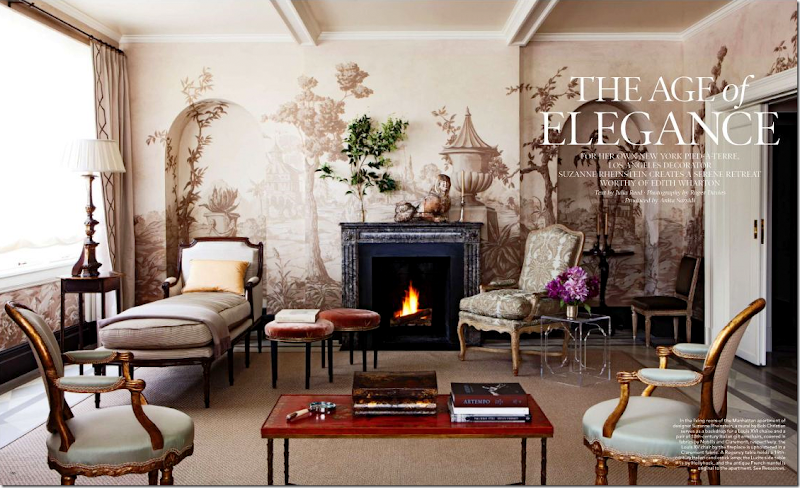
I’ve been in love with Suzanne’s aesthetic for years and years. Her L.A. house appeals to me – in all its versions. Over the years it has changed and evolved and at each stage it just gets better and better. On the Roundtable, we talked with Suzanne about her homes, both of which are featured in her newly released book. For me, At Home is one of the better décor books released this season. It’s filled with her best projects, some of which have never been seen before. Some of the houses that have been previously published are shown recently updated, including her own L.A. house and the Virginian farm whose publication first put Suzanne on the map. But, it’s her NYC apartment that is the standout of the book. Seriously, it is the most gorgeous place I’ve seen in a long time. The luscious grisaille mural in the living room, which was painted by Bob Christian is nothing if not mouthwatering. During the interview, Suzanne talks about that mural and Bob’s work and the apartment in general. Without a doubt, it’s her finest work to date.
If you have the time, be sure to click over to the Skirted Roundtable HERE and listen to the discussion!
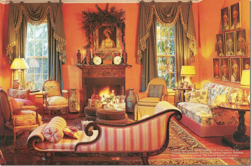
I love watching the evolution of Suzanne’s L.A. house. For instance, in the early 80s, her living room had persimmon walls and green curtains with pink striped upholstery.
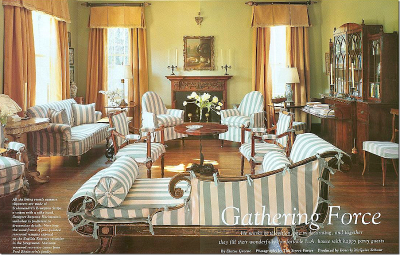
Today, wearing its summer slips in blue and white stripes, the room is now painted a soft green. All the furniture is the same, moved from room to room. Much came from her and her husband’s family. Design is generational in both families. Suzanne learned about decorating and gardening from her mother and grandmother. Her husband shares her love of art and antiques and their vacations are spent looking at both. (Sorry this is such a poor scan!)
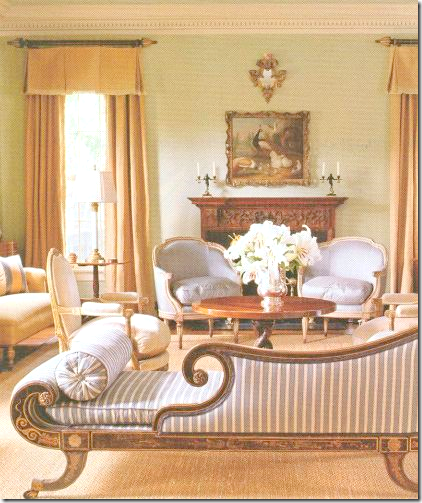
And here, without the slips.
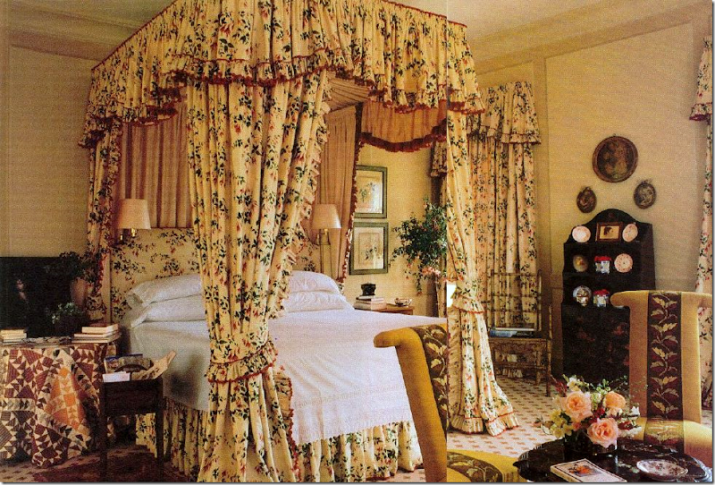
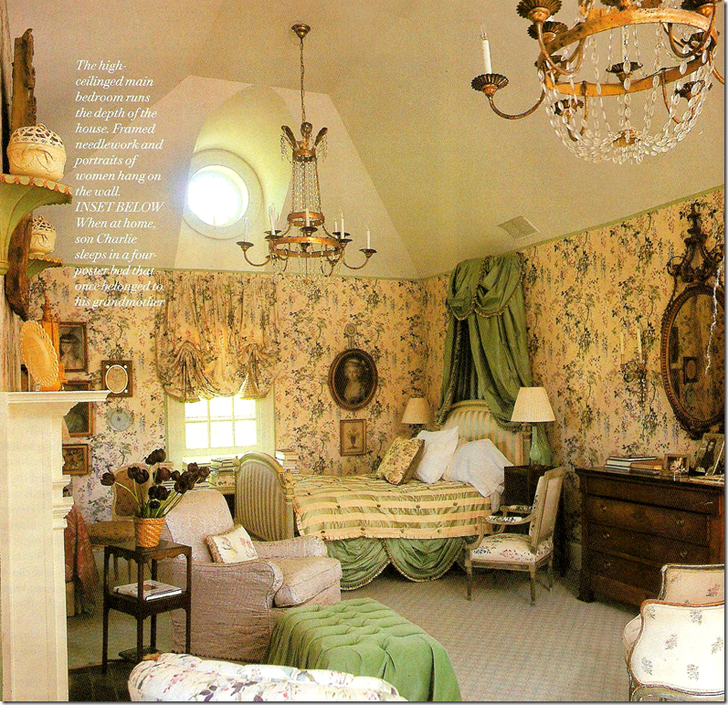
Another big change is in her bedroom – here in the 80s and 90s, her bedroom was all English chintz to perfection.
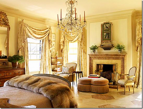
As it is today shown in At Home: it’s more French, soft and romantic with a painted floor by Bob Christian.
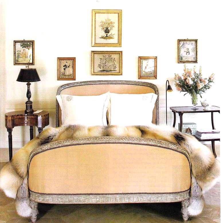
Another view of her bedroom today. Something tells me that fur is not from Pottery Barn!!!! It’s gorgeous.
The Virginian farm: over the years Suzanne has remodeled the house, but the master bedroom always remained the same. Why mess with perfection? So, it was a surprise to see the room completely redone in At Home.
The newly refurnished master bedroom with twin canopies.
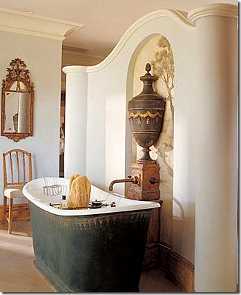
Another surprise in At Home: the Virginian master bathroom, never seen before. Notice the Bob Christian mural behind the gorgeous urn. And notice the faucet coming out of the pedestal. That tub!!!
In At Home, another never seen before interior: The “Garden Office” located in a small cottage on the Virginian property. Notice the striped floors. And I love how Suzanne put the urns on the table and not on the columns. I love the French library ladder. Doesn’t every garden office need one?
The living room in Suzanne’s NYC new apartment – seen both in At Home and Elle Décor. The heart stopping grisaille mural was painted by Bob Christian. Isn’t it beautiful???? You will never find anything trendy in Suzanne’s decorating. I love this quote of hers, talking about Axel Vervoordt: “The man has the most amazing sense of art and style. I believe his influence will endure long after the flood of China-made Belgian-esque furniture has ruined that look for many people.” Hear that Restoration Hardware?
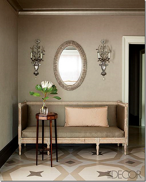
Christian also painted the floor in the foyer. The Swedish sofa is to die for! I love the blush peach pillow against the taupe fabric. Those sconces!!!!
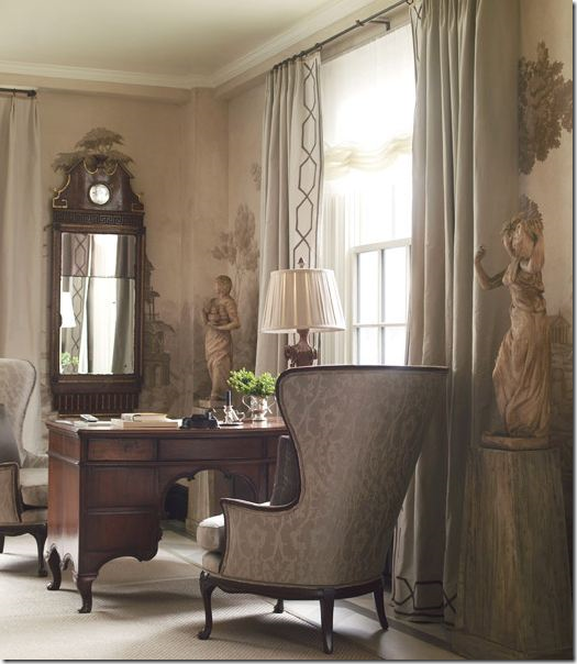
A corner of the living room with inherited chairs.
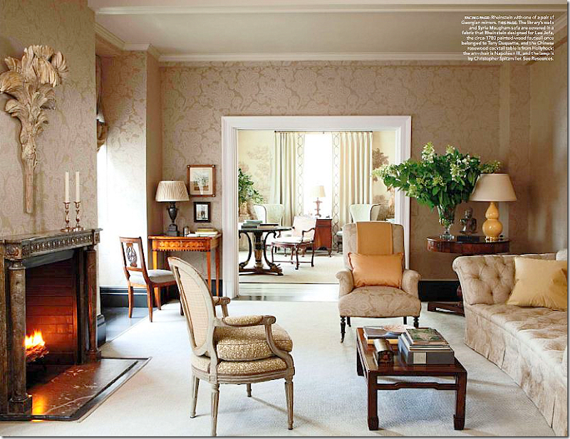
The library. Notice how beautiful the fireplace mantel is! I love the touch of peach.
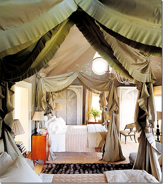
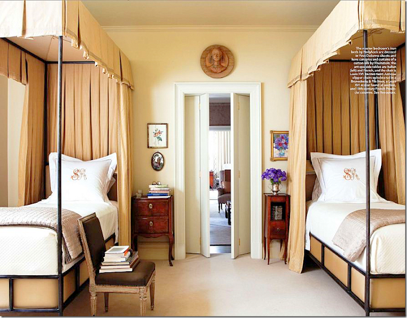
Twin canopy beds are the focal point in the master bedroom which moves from the mushroom color to peach. I love how she uses the French chair as a book stand!
To listen to the Suzanne Rheinstein interview on The Skirted Roundtable, go HERE.
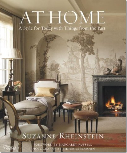
To purchase At Home, click on the book’s title below:



Am I dreaming??? This is so pretty! It is wonderful, I love reading this post and the pictures are so inspiring!
ReplyDeleteThank you for sharing it!!!!
xo
Have a great weekend!
Luciane at HomeBunch.com
Post of the day: A Rustic Villa.
Joni, I have always loved Suzanne Rheinstein's design aesthetic. I cannot tell you how many times I have looked at that first picture of her living room (I still adore her 80's version!), and to get to see these other photos is such a treat. Thank you! I love how she changes things with slipcovers, too, and how she has such beautiful family pieces that she enjoys in her home.
ReplyDeleteI am wildly in love with her NYC apartment. It is perfection. But so is her home in California. Oh, this really is a treat. If I can somehow get to a computer who's audio is working well, I am going to go listen to this Roundtable. You never, ever disappoint!
Many thanks to you and Ms. Rheinstein both...
XO,
Sheila :-)
"whose audio" ;-)
ReplyDeleteOf all the design books I bought this year (and there were a lot of them!), I think Ms. Rheinstein's is my favourite. I love her little glimpses of gorgeous "off" colours like apricot, sage, peach, mint and blush in an otherwise predominantly neutral colour scheme. And the Louis XVI chairs. And the fireplaces. And the mural. Heavy sigh.
ReplyDeleteOMG, I die for her ( as Rachel Zoe would say)!!!! She is sooooo talented.
ReplyDelete-linda, ny
BIG, you included Suzanne learning GARDENING from her mother & grandmother.
ReplyDeleteGardens are not separate from interiors or life.
Have you noticed all the best interior decorators have fabulous gardens flowing from their rooms.
In that order.
Landscape design begins INSIDE a home.
Can't wait to listen this weekend.
Garden & Be Well, XO Tara
I enjoyed the skirted roundtable podcast with Suzanne. Her work is traditional done right. I'll have to pick up her book. Thanks.
ReplyDeleteYou have tweaked my interest...and I am off to listen to the podcast...don't you love Friday afternoons? Love the new blog template BTW...
ReplyDeleteI could seriously swoon! Suzanne Rheinstein's rooms have long been at the top of my favorites list. I love everything she does! Vanna
ReplyDeleteI have always wondered how to descripe my style and, well, this is it! understated, elegant, and eclecic, It's amazing! Why two beds in the master bedroom though?
ReplyDeleteWhy two beds in the master bedroom you ask? Well, after you have been married for 60 years to the same person....you might just want to stretch out too!!!!!! Hehe. At least they share a bedroom. I know so many couples who don't even sleep in the same room
ReplyDeleteIt is all very striking, and in very good taste, but I don't think there is anything wrong with Chinese made Pottery Barn knockoff furniture. Well, it would be nice if the cheap (or cheaper) catalogue stuff were made here . .but for many, many Americans purchasing from Potter Barn is doable, although it may still be a splurge. Achieving this authenticity just is not.
ReplyDeleteI think I just get tired of what seems to me to be a certain element of snobbery by people with large decorating budgets.
Another great post, Joni! Also, really enjoyed the interview!!!
ReplyDeleteKaren T.
It is important to realize that not everyone can afford very expensive original furniture--fine antiques or bench made pieces. We can all admire them and learn from the aesthetics of those who have not only great taste, but unlimited budgets.
ReplyDeletePottery Barn and Restoration Hardware fulfill a need in the furniture/decorating market and make it possible for many to furnish their homes in a pleasing manner.
I, too, have admired Suzanne for years! Can not wait hear her interview. I download interviews to my ipod and listen on car trips- makes the drive fly by!!
ReplyDeletehappy weekend!
joan
LOVE her, the book and the fabulous interview!! One of my all time favorites - she is gracious, smart, talented timeless and elegant! Doesn't get any better!!
ReplyDeleteHer book is one of my new favorites. Her L.A. home is so gorgeous and shows living with fine antiques in such a fresh way, no trends attached. Cant wait to head over and listen to the interview!
ReplyDeleteKudos to the "painter" who seems to "always" get the "nod"...but, how about the seamstress, etc. who "create?" Rarely do "they" get mentioned. The quality of workmanship seems impeccable! franki
ReplyDeleteOmgosh, amazing elegance!!! I have to come back and study each room again when I have more time. Also looking forward to a cup of coffee and listening to the round table discussion.
ReplyDeleteI cracked up at your Pottery Barn reference on the throw, I practically gasped when I saw it and I agree with your humorous remark, it was not a slam it was just funny. I love pottery barn, but lets face it if I could afford her throw, I would purchase it, hands down!! Kathysue
Jni, I adore Suzanne's design work and especially someof the changes she has made. Christians works of art and the floor are fabulous!
ReplyDeleteto brighten your day....
xoxo
Karena
Art by Karena
The master bath is amazing with the tub, faucet and murel! How elegant.
ReplyDeleteMary Ann
Poor Joni! You can't even make a humorous remark without ruffling some feathers. I think most of us know you weren't slamming Pottery Barn, you were merely stating a fact. The chances of that being a Pottery Barn throw are remote to nil.
ReplyDeleteIt's wonderful that there are items in several different price ranges so we can all make beautiful homes. People like Ms. Rheinstein can afford the more expensive version and people like us can afford the Pottery Barn version.
I absolutely loved that comment (as I'm sure most of us did), so please don't change your writing style because a couple of people somehow managed to be offended by it.
Can't we love Joni and her amazing blog posts without agreeing with her every word or opinion? I think so.
ReplyDeleteShe has a right to express her disdain for Restoration Hardware and a right to make a "joke" about Pottery Barn but their merchandise is all that many of us can afford.
In fact, Restoration Hardware is viewed as pricey by a number of my friends and they consider me way less than frugal even to consider shopping there.
Suzanne Rheinstein is one of the wealthy and privileged in this country and, thankfully, she has great taste. She owns more than one home--each furnished in the finest antiques, fabrics, and accessories... How many of us can aspire to that way of living?
I can dream and I can look but, other than the rare item, I could never afford anything more expensive than Pottery Barn and Restoration Hardware. Sorry!
Oh my, the pictures kept getting better and better and even better! I love that bathroom with the tole ware bath, and the urn for the water. Amazing! And I am with you, I adore the French library ladder... But my favourite piece? The antique french bed with the fur. Whilst I appreciate the fur, it is the bed that I was drawn to. Thanks for a great post, as usual! Have a good week, Tammy
ReplyDeleteI also want to say that, while Pottery Barn's fur throws may not begin to compete aesthetically with the magnificence of Suzanne's fur throw, PB's throws are faux and thus no animals must sacrifice their sacred lives for another's wanton stylistic whims. There is much to be said for faux when it contributes to saving the life of another sentient, precious being.
ReplyDeleteMaybe what Joni and Suzanne are trying to say about Restoration is that b/c the ENTIRE catalogue is an endless stream of Belgian reproductions, that the look will forever be stuck in these years, even discounted as an important style of decorating. Anything that is available to the masses is at risk of being pigeon-holed.
ReplyDeleteI am definitely of the opinion that Pottery Barn is where trends go to die. Once it hits Pottery Barn, it's over. Same for Restoration Hardware, which another reader pointed out is not inexpensive, but it's still mass produced. I don't like my house to look like everyone else's. If you can walk in a room and identify where it came from, that's a problem. I think the Belgium trend is just that - a trend that will one day be over. I was also thinking about this when you were considering the indoor wicker chairs for your kitchen. If it's available everywhere, from high end to Cost Plus, why do you want it? Stick with the classics and you will never go wrong!
ReplyDeleteI think the "take away" is not a slam at PB or RH, it's that the best interiors are filled with items collected over a lifetime. Of course, Suzanne can afford the best and most of the rest of us can't. However, we can all afford to be selective in our purchases and choose the best we can afford, even if it means only one purchase a year (which was Suzanne's suggestion on the podcast). Avoiding trends when it comes to major purchases and mixing in vintage with new will go a lot longer and be more stylish.
ReplyDeleteOkay, I am going to have to be the one to say "The Emperor has no clothes". I find Suzanne's decor stuffy, dated and boring. The most interesting rooms I've seen have a mix of modern, antique, personal items and above all comfort. I think her rooms are very uptight in appearance. At least Restoration Hardware has a mix ( I would much prefer to sit on one of their luxurious sofas that a straight backed Swedish one) and FYI it is a very expensive store for a vast majority of people. Remember it doesnt matter where it comes from or the price tag as long as it is good design.
ReplyDeleteThank you Linda Merrill . . . you took the words out of my mouth! Some are missing the point . . . Suzanne stated in the SRT interview that she recommends people buy one fine piece a year. Collect over a lifetime. Not every piece, certainly - most of us can't afford to do that - - but the investment in a finer (antique or otherwise) furniture will last a lifetime.
ReplyDeleteMay I also point out that many antiques and vintage pieces cost LESS than mass-produced ones? For example, I recently purchased a beautiful antique bed for my daughter's room and it cost far less than anything available at Pottery Barn Kids (a store I happen to love) . . .
Jennifer
Personally, I see a collaborative blend of style which gives extreme attention to detail, uses exquisite fabrics, applies a flair of originality and a perfection of fit ... all of which some might describe as equal to that of of a Haute Couture garment. In other words, how much more fortunte can pieces of furniture or architectural elements get! I wouldn't mind Suzanne choosing my wardrobe.
ReplyDelete-Brenda-
(Disclaimer: The reader of this comment, assumes all responsibility of interpretation.)
Oh, I sooo wish I didn't have houseguests right now so I could go hole up and listen!
ReplyDeleteI have been in love with Suzanne Rheinstein's style since I first stumbled into Hollyhock. Adore anything she does, it is so beautiful. And her house! (Swoon.)
Joni, if I had to pick a pair of separated at birth designers, it would be you and SR. Such style and graciousness!
Loving your blog! I just started my own blog with my fantastic crystal and shell bottle art. I'd love it if you could stop by, and if you like them, follow! :) Off to read more! xoxo, The Crystal Crate.
ReplyDeleteThis blog is fantastic and I can see you guys put a lot of work into it. So, first off, kudos for that.
ReplyDeleteI saw the NYC apartment in the magazine and, while it is unusual and interesting, and it has a very sophisticated color palette, the rooms are not comfortable. There are no places for books or snacks or a glass or a pair of glasses on the coffee tables (and the tables are not situated near the furniture), the nightstands are not usable either.
It would have been far more instructive to have seen the apartment as it is when people actually live in it and use it.
On the plus side, much of the apartment is the color of dirt, which is perfect for NYC. The decorator did a good job, as her colors are very beautiful but still excellent at masking the ubiquitous dirt and dust of Manhattan.
I'm not sure if the house in L.A. is usable and comfortable; I'd have to look more closely. What jumps out is the incredible abundance of fabric, and I wonder how on earth one would even approach a Spring cleaning.
I love the tied-on slipcovers as antiques can take only so many recoverings without eating away the frames.
ReplyDeleteUnbelievable beauty. Looking at the images and listening to the interview. What a gift!
ReplyDeleteSo interesting and enjoyable to listen to Suzanne Rheinstein. And such good advice too about investing in quality furnishings. Even estate sales and auctions have well made 20th century furniture that looks great and is affordable. Thank you all, ladies!
ReplyDeleteI like the idea of that home office space near the kitchen. Never thought of that, but I think it's quite unique. I wonder if my girlfriend will love it for apartment in Reston, VA since we're just starting to decorate. The Garden Office is inspiring, too. Looks refreshing.
ReplyDeleteThere certainly are a amount of methods to acquire affordable coach products at coach factory outlet,it could possibly the most effective options.the most vital cause may be the reality that you simply can purchase genuine coach products at there.All people give the good comments for the coach factory online, and now the Coach outlet store provides many discount goods online.Coach bags enjoy high popularity throughout the world. I would like to share the coach factory outlet online with you. What are you waiting for? Just come to visit.
ReplyDeleteThere certainly are a amount of methods to acquire affordable coach products at coach factory outlet,it could possibly the most effective options.the most vital cause may be the reality that you simply can purchase genuine coach products at there.It is believed that you will like the products on the coach factory online. There are spacious sizes and different colors, styles and so on.in the market you definitely can find various colorways that are designed in as well as the high quality that applied in. For most of you would like to come. So just come to our coach factory outlet online store to choose one.
ReplyDeleteThe colors are so warm in that first picture.
ReplyDelete