If you live in Houston, you may have seen these two homes already – both were featured in a local magazine – Houston Lifestyles & Homes – but, since many who read the blog aren’t from Houston, I thought I would share them with you. Both houses are quite beautiful and reflective of the “Houston look,” although one house is dressier than the other. Enjoy!
House #1
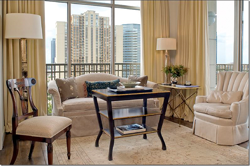
The first house, decorated by Ginger Barber, is located in the Montebello – a rather new Houston highrise. This project is around five years old and I’ve loved it since first seeing it on Ginger’s web site. Most highrise apartments in Houston are either contemporary or dowdy. This, is neither. It’s warm and cozy and youthful – something not usually associated with living in a newly built penthouse. Though empty nesters, the owners are much younger than typical highrise dwellers in Houston. For this project, they bought two units and combined them for a total of 5,000 sq. ft. – which is quite large for a condo. The owners left most of their furnishings in their old suburban house, bringing only a few inherited antiques. How nice must it be to hire Ginger and get all new furnishings too?!! I love Ginger’s easy going style and she certainly brought that feel to this condo. Everything is so perfectly designed, the décor stands as a textbook on how to furnish a condo filled with French and Swedish antiques that is not stuffy or pretentious.
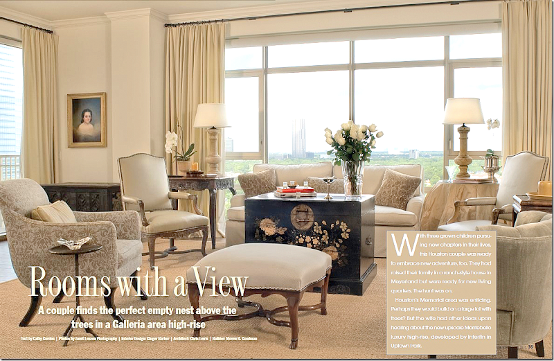
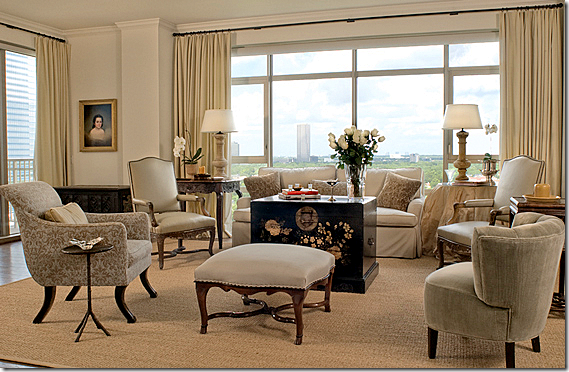
In the living room above, Ginger used soothing neutrals. The large black painted chest serves as the only accent color. Cream drapes add softness – so many people don’t use curtains in highrises, which is a shame. The fabric goes a long way to warm up all the cold glass, without covering up the view. I love the skirted table in champagne taffeta – it’s so full and luscious. And I love the French ottoman with its trendy nailheads. But it’s the oriental styled chest that really stands out – its beyond fabulous! The seagrass really helps to keep it all young and fresh looking. Just beautiful!!!!!
A smaller picture – without all the writing over it!!
The dining room is a favorite of mine, a mixture of French and Swedish furnishings. The table had to be dismantled to fit into the elevator – a concern when planning a high rise. Creamy damask covers the large French chairs and an antique mirror hangs above the French enfilade. The chandelier is also antique. The big surprise is the Swedish sofa that Ginger placed in front of the window.
Again, not your grandmother’s penthouse! A painted Swedish sofa sits between two fluted columns topped by urns. Sooooo charming!!!!!
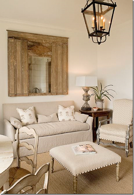
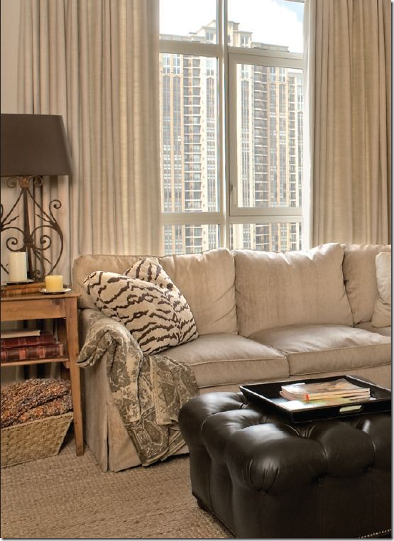
Off the living room, the music room is filled with inherited furniture which Ginger recovered. The traditional sofa got a youthful slipcover.
The breakfast/sitting room off the kitchen is adorable. I love this room!!! Meals are taken at the painted table with its painted chairs.
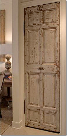
In the kitchen, an antique door closes off the pantry. Seriously, have you ever seen a rustic antique door in a penthouse? Touches like this really help cozy up the home.
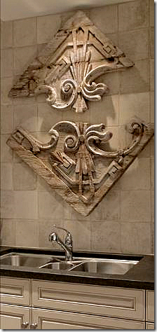
In the kitchen, the piece above the sink came from Round Top. The backsplash is made of tiles from Chateau Domingue.
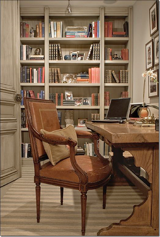
The wife’s office has a muted striped dhurri rug along with antique doors from Chateau Domingue. Shelves are filled with the sentimental photos too precious not to display. I love that desk!
The “media” room is where the couple relax, watching a TV that is hidden in a French armoire.
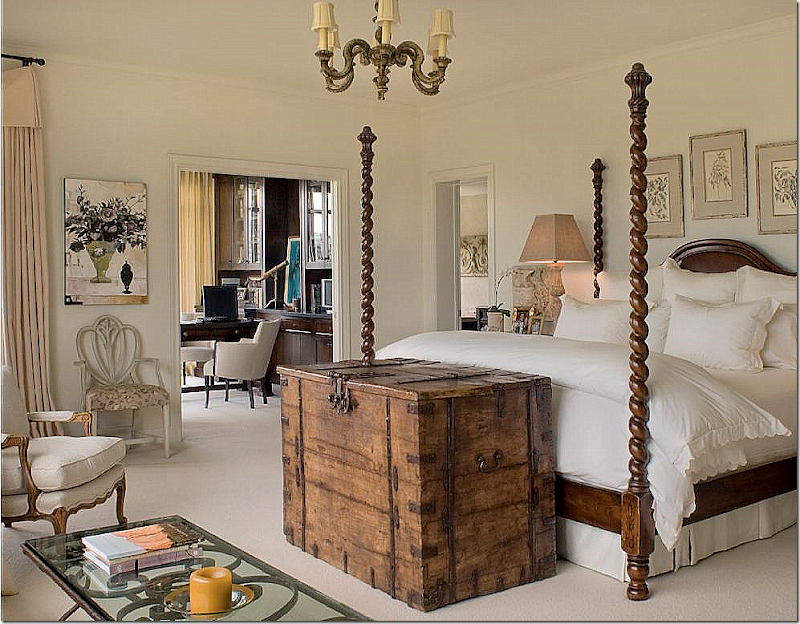
I’m wild over the master bedroom – which is so Ginger. The barley twist bed piled with white linens anchors the room. The bed was custom ordered from Brian Stringer Antiques which is now closed. The rustic chest, a Ginger trademark, is fitted with a hidden TV. The room is large enough for a sitting area. By filling up the space with furniture, the room seems cozy instead of cavernous. A secret to successful oversized rooms is to fill them up with furniture! A mistake many people make with today’s extra large spaces is not using enough chairs, sofas, and tables. The husband’s office adjoins the bedroom.
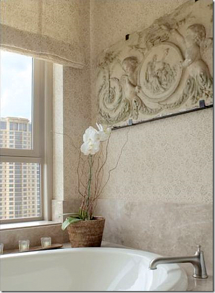
The master bathroom appears to be covered in a Rose Tarlow print, but it’s not credited. The piece above the tub is romantic and again, typical Ginger. She loves to mix concrete and stone with wicker and linen.
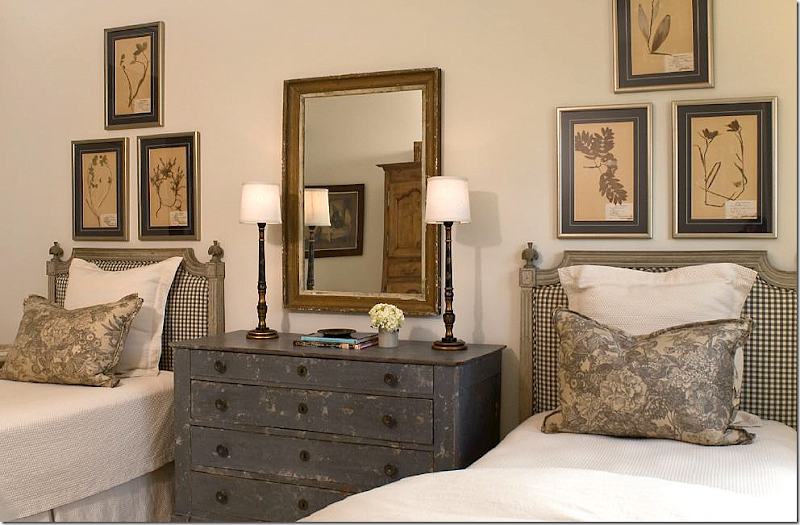
The guest room is beyond adorable with its gray painted French headboards and chest. Framed antique botanicals hang from the wall. I love the crisp check fabric mixed with the gray toile on the pillows. The adorable matching chinoiserie lamps are from Ginger’s shop: www.gingerbarber.com
I hope you enjoyed this peek at Ginger Barber’s foray into slick highrise living. As you can see, highrise living doesn’t have to be cold, dowdy, or contemporary. Instead it can be warm, inviting, interesting and cozy! Photographs by Janet Lenzen. To read the original article, go HERE.
House #2
Next is a large custom built house in the Memorial area. The builder was Parker House Inc. and Sarah West was the architectural consultant who tweaked the plans for the homeowners. Cindy Witmer designed the interiors along with the homeowner. Together they went to the Round Top Antiques Fair and bought furniture that anchored the expansive rooms. The walls were plastered by Leslie Sinclair of Segretro Finishes. Leslie’s wall treatments are unparalleled – the subtle texture adds a depth to the walls that adds a quality that is hard to define. I would love for Leslie to do my entire house – her plaster is just that gorgeous!!!! The rugs and carpets came from Creative Flooring. Lighting came from BROWN, AREA, and Tara Shaw. The window treatments were designed by Linda Falk and all upholstered furniture was custom designed by Cindy and made by Hein Lam Upholstery. All these beautiful photos are by Wade Blissard HERE. To read the original story, go HERE.
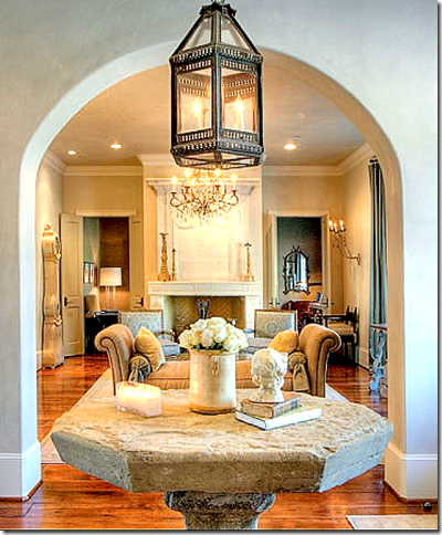
An antique stone table from Chateau Domingue stands in the entry hall under a lantern. Love that! The living room is straight ahead.
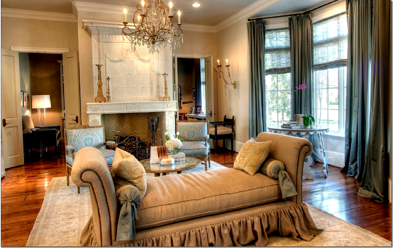
Love!!! I love the floating day bed – by Hein Lam. They make the prettiest skirts and flourishes. Love the fireplace from Chateau Domingue. The room is dressy, yet approachable at the same time. The beautiful chandelier is from Tara Shaw and the chairs are covered in Fortuny.
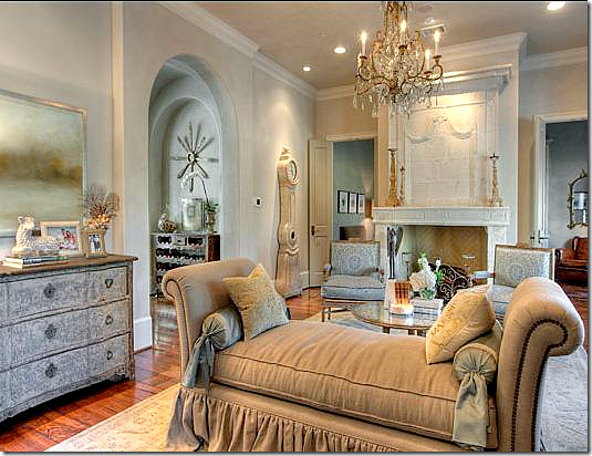
In this view, you can see the chest and into the next room on the left. There’s that lamb again!!! I have it and so did another house I showed last month! It’s soo cute.
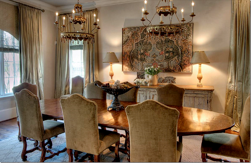
So pretty! The house is dressier than many like it because rugs were used as opposed to the seagrass that Houston so loves. Here, two fixtures from Round Top hang over the large wood table. Instead of slipped chairs – they are upholstered in a chenille. The sideboard is antique from Belgium. The silk curtains are fabulous!!!!!!
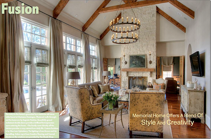
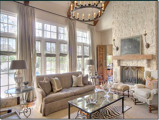
The family room is wonderful. I love the lush curtains and the chairs covered in Bennison! So pretty. These chairs are from Hein Lam and I just love them The large fixture is from BROWN. I like that they resisted putting the TV on the fireplace. Well, it looks like seagrass did make it to this room! A zebra is layered over it.
A closer look at the sofa and stone fireplace. The media/billiard room is through the doors next to the fireplace.
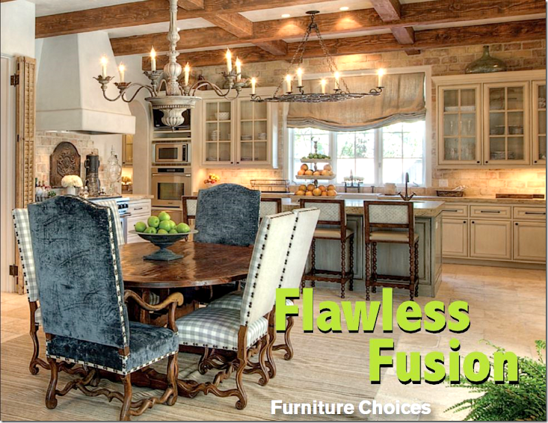
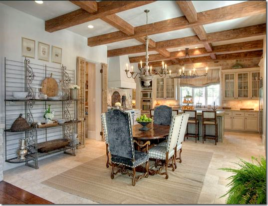
Off the family room is the large kitchen and breakfast room. The back wall has reclaimed brick and stone from Chateau Domingue. Segreto did the walls and the cabinet finish.
This shows the breakfast table with the chairs in velvet and check fabric with nailheads. The light is from AREA.
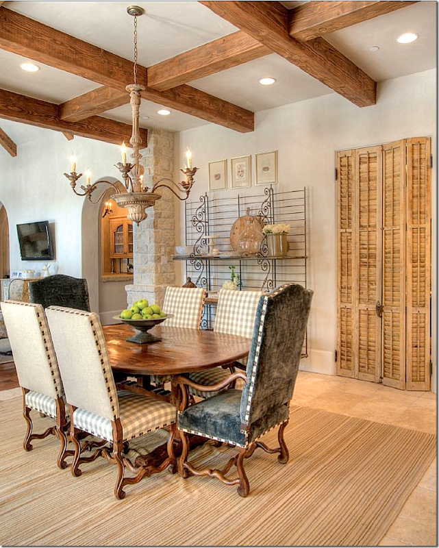
The bakers rack and antique shutters are from Chateau Domingue. Hidden behind the shutters is the office. You can see the family room on the left and how it leads into the kitchen. And you can see the large bar at its right.
And looking from the family room into the kitchen.
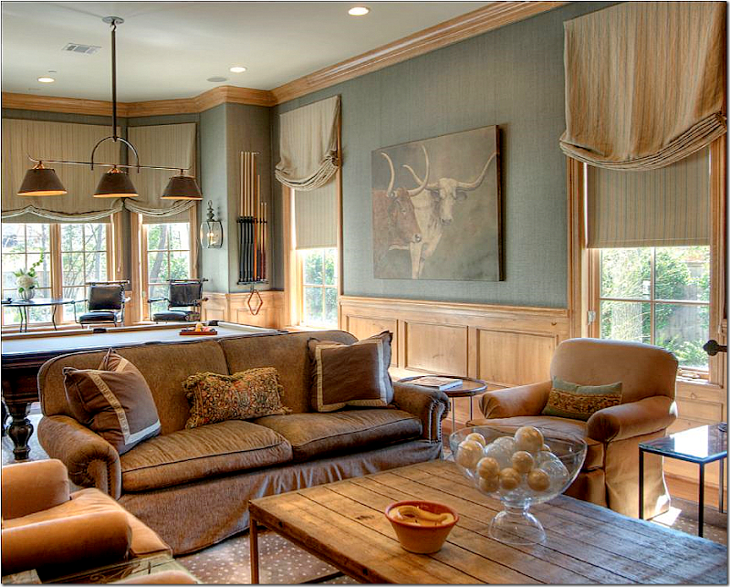
The media/billiard room’s light fixture is from BROWN. Great rug! The painting and coffee table are from AREA.
I love the velvet that is found throughout the house. It makes everything just a little dressier. The tufted chairs and ottoman are wonderful – so soft and cozy loooking. The soft blue walls are by Segreto.
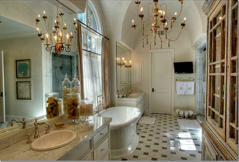
So pretty! The floor just looks old – its really new. The chandelier is from Tara Shaw. I love the shell filled with towels. Cute idea.
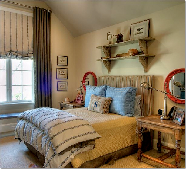
The son’s room.
The daughter’s room is especially cute in pinks and purples. Cute dress hanging up on the wall.
I hope you’ve like these two Houston homes. The Ginger Barber highrise is a good lesson on how to decorate a condo for a young couple and make it look trendy and cozy. The second house shows that not all Houston is just seagrass and slipcovers. The house is more dressy than most, but it still is fitting for a younger couple with small children.





Wow, I love everything Ginger Barber does. She is a master. The other house is lovely, as well.
ReplyDeleteLovely homes! Thank you for sharing!
ReplyDeleteJoanie!
ReplyDeleteThis is so cool!!! I love seeing how unique they are. Gee.. it seems to be fun living in Houston, you know??? :-)
I love this blog! You rocK EVERY TIME!
Please, come take a look at my DREAM HOME. It's the most well design house I've ever seen. You will NOT be disappointed!
xo
Luciane at HomeBunch.com
Hi Joni!
ReplyDeleteI love to see the decorating vernacular in other parts of the country. I could definitely learn to love living in Houston (except for the heat). I especially like the condo by Ginger Barber. There are so many touches I'm swooning over.
Thank you for featuring these two homes.
Thanks for showing these beautiful homes! I love the lantern style light fixture in the sitting/breakfast room of the first home! And I love the comfortable elegance of the second home. I am a new decor blogger, and I have truly enjoyed seeing such wonderful blogs! Thanks!
ReplyDeleteJoni, this was so much fun to get to see, and I have fallen madly in love with those chinoiserie lamps from Ginger Barber! I tried to click over to her website, but I didn't see her shop listed there. Look what you started! LOL!
ReplyDeleteAnd I adore that chandelier in the master bath in the second house by Tara Shaw, and what a bathroom! I love everything from the English bathtub to the wonderful antique cabinet and that giant clam shell holding the towels. Speaking of which, I am also crazy over the use of the antique doors that Ginger used in condo number one. I am going to the link you provided to see more.
Oh, I have been staring at sea grass rugs lately because I have to replace the two sisal ones that were ruined during the open house, and I like the way the ones look in Ginger's condo. My sisal rug held up like a champ!
Thanks so much for sharing all of this. So much eye candy that I'm going back for another look. Please thank the designers for us, too, as I very much enjoyed seeing these spaces.
XO,
Sheila :-)
P.S. I know the chandelier is from Tara Shaw, not the condo. Didn't want you to think I read that wrong. It sounded funny the way I typed it.
ReplyDeletejoni, i just want you to know i really appreciate the detail you put into your posts!
ReplyDeletethank you for these tours. i really like some of the elements of house #2.
Another great post! I particularly love the bathroom in the large house and the fact that the condo looks like a real home--not just some sleek space in a high rise.
ReplyDeleteThanks for again providing some really pretty pictures to study over and over!
Nancy W.
Both homes are beautiful but I think the first one would be my pick. I think it's the cleaner lines without being stuffy. Love the living room in the second home. Both homes have amazing table lamps, I need more light in my home so I'm looking at lamps.
ReplyDeleteSo much to see here. The Ginger Barber designed home is my favorite. That small sofa in the breakfast room is perfect. I need that sofa...
ReplyDeleteReading other people's comments leaves me at a loss for words. This is a great way to get introduced to my new Houston location. I LOVED the second home. Using the antique doors was one of my favorites. The beamed kitchen is a dream of mine. The personalized light fixtures really adds so much to any home. This is certainly fun. Thank you!
ReplyDeleteYour posts on Texas are my favorite Joni...and I love Ginger Barber.
ReplyDeleteI just wonder if there are some new looks out there that you are seeing that might be changing the scene a bit. Not a trend but maybe someone twisting the "look"?
Please share some when you see them...you will have the scoop for sure!
xo kelley
LOVE the view!
ReplyDeleteI really love the wrought iron piece used as a chandelier over the second house's kitchen island. Beautiful and unusual!
ReplyDeleteThanks, Joni!
Martha
Another awesome post. I love the first interior despite being in a high rise. Houston has gained several high rises in the last decade or so but I couldn't live in one. Yet this example looks quite homey. I love the Memorial kitchen as well. Thanks for sharing these great photos.
ReplyDeleteJoni,
ReplyDeleteYou have NO IDEA how THANKFUL I am for your info about that gorgeous house. I saw it for sale before and wondered who was the designer. So, thank you for letting me know and even give me the link! I love "Velvet and Linen", Brooke is so good, but I don't know her for that long, so maybe that's why I missed on this.
Living and learning, right? :-)
It's always a "gift" for me seeing your comments on my blog! Wise woman! ;-)
xo
Luciane at HomeBunch.com
These homes were so fun to drool over! I love Ginger Barber's style, thanks for showing them off to us Joni.
ReplyDeleteThese homes were so fun to drool over! I love Ginger Barber's style, thanks for showing them off to us Joni.
ReplyDeleteJoni--thanks for such a yummy helping of designer porn on this cold, gray winter day in Atlanta. I think Houston design sensibility is similar to Atlanta's.
ReplyDeleteThe two blue chairs with the tufted ottoman take my breath. I want to sit there and go through all my old magazines. Want to join me..for old time's sake...no blogging for one afternoon! PFXO
ReplyDeleteLovely homes. If you have money to spend, there's no limit to the gorgeousness you can find in Houston's shops. We've got some good ones! Personally, I like to spend less and make it look like I spent more (which you can also do in Houston), but some of the sources featured here are the best in town!
ReplyDeleteMy favorite detail: the pantry door in the high rise.
love,love,love!
ReplyDelete-linda
I definitely would choose for house N°1! Very light and chic!
ReplyDeletexx
Greet
I'm absolutely lovin the 2nd one....the kitchen is wonderful!!
ReplyDeleteI love that marble bathroom floor in the second home. A nice alternative to beige tile.
ReplyDeleteDaybeds are pretty to look at in a living or sitting room, but it's been my experience that they never really get used except for overflow seating at a party, and then only after the comfortable seating with backs and arms has already been taken.
Thank you, Joni! I love Ginger Barber's style. That condo is beautiful.
ReplyDeleteHi Joanie
ReplyDeleteWhat a treat! I love the apartment - thanks for always putting so much effort into your posts - you have a large blogging crowd following you. Dont ever think of giving up
Beautiful houses! The second one is my favorite of the two!
ReplyDeleteBeautiful homes. Thanks so much for sharing. I especially love the second home. I love the use of all the different textures throughout the interiors of each room.
ReplyDeleteBoth are beautiful but I have to mention that I've always loved, loved anything that Cindi Witmer does. House #2 is even better in person. Thanks for the posts. What a great way to start the day...
ReplyDeleteThanks Joni...love both of these and the design, but the condo really stands out to me as looking not like a condo at all! So chic and warm! love Ginger Barber's style! The house is lovely too and looks more like a chateau in France I think...:))
ReplyDeleteJoni I adore the large antique trunk at the end of the Master bed!
ReplyDeleteXoxo
Karena
Art by Karena
I'm mystified by the need to make negative comments. Don't read the blog if it is not to your taste. I so appreciate the effort and detail you put into your posts. Nothing is always to one's particular taste and it is so interesting to see other points of view and other regions of the country. Thank you for your detailed posts and you are always my first stop.
ReplyDeleteLove those homes! Both are beautiful and inspiring. I agree with Melanie... I don't get the need to make negative comments. Makes you wonder what's going on with those people. Anyway, thanks for a great post. I, too, love your detail.
ReplyDeleteJoni,
ReplyDeleteOnce again a wonderfully posted blog! I don't know how you do it....even people who don't like it read your blog ~wink~
What more is there to say than "WOW"! Absolutely gorgeous homes.
ReplyDeleteI'm interested in their placement of the sofa in the family room. (Mostly for selfish reasons.;) How does the rest of this room look? I'm guessing they could have faced the sofa to the fireplace and created two seating areas. I wonder how they decided to resist the traditional placement of the sofa, and what the key to making this work is.
ReplyDeleteGreat post!
Beautiful pictures and such stately homes. I must admit I am not fond of the grey tones that i see all around Houston. I wonder if this is just a design fad. And, since it's now used so often, perhaps it will become dated. Just a thought, but I DO love your blog and I, absolutely, look forward to each and everytime I get the chance to peek in on your design life. Thank you for the inspiration.
ReplyDeleteAngela
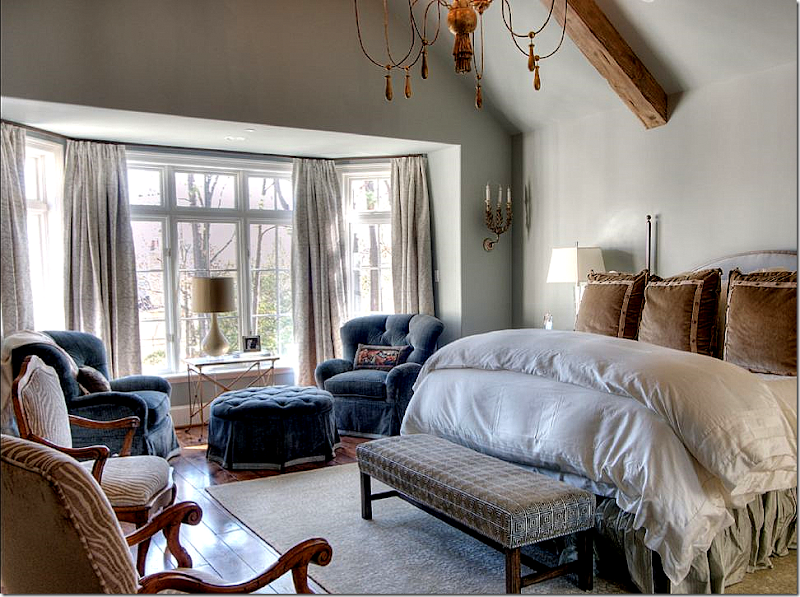
I love how the second master bedroom looks so comfy - you could just sink into that comforter or a velvet chair.
ReplyDeleteLove the post. Curious about the lamb. Info?
ReplyDeleteLove the post. Curious about the lamb. Info?
ReplyDeleteWow! Everything is just wonderful and stunning! You sure have great style and passion for home decorating.
ReplyDeleteAnother great post, Joni! I'm always anxiously awaiting your next one. I always learn so much. Please don't ever think of quitting! You have so much design knowledge. Honestly, you should consider writing a book.
ReplyDeleteKaren T.
I commented earlier but I want to add after looking at the post again, I love, love, love the guest room in the high rise. It injects a little color without interrrupting the flow of the rooms.
ReplyDeleteNancy W
There are a few items you listed as being from "AREA", can you give more info? Is that a Houston resource and do they have a website?
ReplyDeleteBeige, beige, beige.
ReplyDeleteSue
yes! it's beige! your point is???? if it was red and blue, you would say red and blue. point?
ReplyDeleteAREA is a shop in Houston on Kirby. no web site that i know of.
thanks for all your kind words about both houses.
oh - the lamb? it was something i found and bought and since then, i've seen the same lamb pop up ina few houses that have been on the blog. it just cracks me up. a lamb?
Lovely post, lovely homes. I especially love the highrise. I want to see more of that lamb. Madame de Pompadour, the mistress of Louis XV, kept sheep in her gardens at what is now the Elysee Palace, the sheep with big bows tied around their necks. One day Mme decided to bring the sheep in to show some guests and the sheep got scared and sacked the drawing room. Very pastorale and XVIIIC of you to have a sheep in your decor, Joni!
ReplyDeleteIn House #1, the antique door in the wife's office appears to be painted. Do you know if it is? I have been trying to achieve this look on my painted furniture. Do you know of any resources that explain this paint technique?
ReplyDeleteIf anyone has a Dallas area source for extra long drapery rods similar to those used in both homes (with the smaller diameter and small finials), I would surely appreciate it.
ReplyDeleteJoni, you have an amazing attention to detail! How on earth do you do it? Thanks so much for your posts!
ReplyDeleteI love the boy's room. Playful yet sophisticated and not to rustic.
ReplyDeletei need to live in Houston! Love these two homes!!
ReplyDeleteBeautiful homes! I could see myself in house #2 !!!!!!
ReplyDeleteSo nice to see interiors from another part of the country! Upholstered headboards in the guest room (house #1) are sweet - great detail!
ReplyDeleteJust love the use of the English fabrics - in the family room (House # 2) . Very calm palette - just lovely!
Well, at the risk of getting my head bit off by Joni, I still feel the need to comment.
ReplyDeleteI saw the word "unique" used somewhere in the gushing up above. I had to chuckle. "Unique"? Definitely not a word I'd use here.
Pretty? In my opinion, yes. But so monotonous. All the griege, all the same materials, all the same accessories, etc, etc. I honestly feel like I'm looking at a Restoration Hardward catalog. All the typical elements and looks are well represented: greige everywhere, the token girl/boy room that looks like no child has ever stepped foot in it, marble counters, leather, beams, distressed finishes, seagrass, slipcovers, huge lanterns, apothocary jars, and on and on.
I know this is your blog, and a look you love, and are devoted to, so I have no right to complain. I can simply click off after having had my fill (more than full) of this very tired and overly trendy look.
Jill in Ft. Worth
I would be very happy in either home, but the 2nd one is my favorite. AS for beige, beige, beige... keep up the good work! I love this type of post.
ReplyDeletejill:
ReplyDeletewhat if a person likes gray? should they not use it? what if a person likes a neutral look? should they not decorate that way?
honestly, i don't go on blogs that show personal homes with highly contrasted decor, bright colors, etc. and give them a lecture saying it looks like Calico Corners. It's just rude abd u wouldn't insult a homeowner because they like bright colors when i don't. a guest room that looks like no child ever slept there? well, if you had read the story, you would see that the couple had 3 children all grown and had moved there as empty nesters. what's the point of decorating for a child when there isn't any? i don't see any connection to rh except maybe the neutral colors. whatever.
Hmmm, the images looked really great. It's very nice, vintage and classy but i have to agree with Anonymous. It's a bit monotonous that it becomes somehow boring.
ReplyDeleteWow, these places are HUGE (writes the woman in NYC). I'm envious of the space.
ReplyDeleteHomeowner of House #1
ReplyDeleteAfter living in a home with "color" for 30 years I was so ready for beige, beige and more beige. I wanted something soothing, classic, sophisticated, and a look I won't grow tired of. We have no kids or pets at home now so it was time for a grownup home in light colors and BEIGE!!! I do get color from pillows, art work, the beautiful trees and sunsets I see outside my windows and the fresh flowers I like to have around. I do confess I do like white flowers a lot!!! Ginger was fantastic to work with and everyday I pinch myself that I really live here!!! Compliments to House #2 which is beautiful also!!!
Wow, Lovely thing to enjoy life.
ReplyDeleteSeattle Real Estate
Just loved looking at these two beautiful homes and reading your comments, Joni. I always learn so much from you.
ReplyDeleteJulie in Fort Worth
Ok, for all of you who are still in suspense........the LAMB in House #2 is from Wisteria.com. Wisteria has many neat accessories which look unique and expensive but are actually very reasonable and cute! BTW, this house was built by Dan Parker, (Parker House), a WONDERFUL Builder.
ReplyDeleteThere certainly are a amount of methods to acquire affordable coach products at coach factory outlet,it could possibly the most effective options.the most vital cause may be the reality that you simply can purchase genuine coach products at there.All people give the good comments for the coach factory online, and now the Coach outlet store provides many discount goods online.Coach bags enjoy high popularity throughout the world. I would like to share the coach factory outlet online with you. What are you waiting for? Just come to visit.
ReplyDeleteHouse #2!
ReplyDelete