Going to the book store these days to look for décor magazines is soooo depressing! There is so little available now! Since it seems like the economy is getting better, perhaps we can hope for some new titles in the future or maybe some old titles returning. That would be nice. Imagine Southern Accents being published again. If you do happen to be looking for a new magazine to read, the French language Campagne is an interesting one. Campagne tends to get overshadowed by the slicker Cote Sud and Cote Quest and that’s a shame. Most of the foreign décor magazines are so different than ours. The houses are not styled for the photoshoot, which can be either refreshing or off putting, depending on your personal preference. Campagne’s houses tend to be really not prepared, as if the photographer just showed up one morning, camera in tow, totally unexpected. But, it’s this easy approach to décor that is part of the appeal of the magazine. They have a great web site too – the best part being you can read the articles translated into English on your computer. The computerized translations are not perfect, but at least you can get the basic meaning of the stories. Here are a few houses from the magazine that caught my eye. Enjoy!
HOUSE #1:
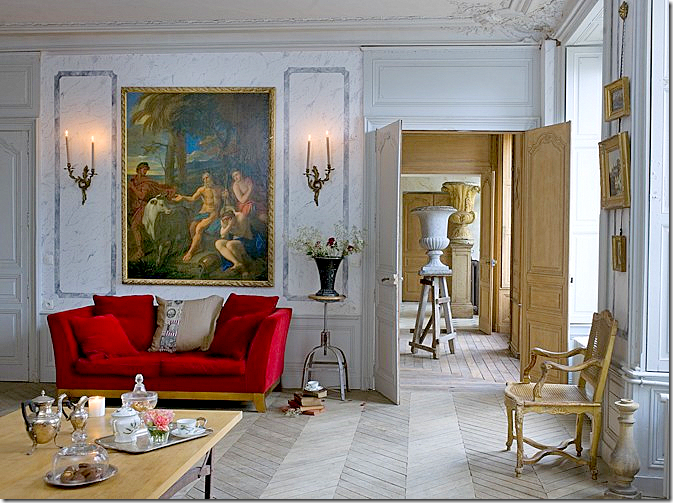
This hotel particulier, a Napoleon III styled mansion, was until recently used as a rehab hospital. It was purchased by a couple who are antique dealers. Together they restored the house to its once former glamour. Here, the main living area shows how the rooms are laid out on an enfilade. Notice the urns that are enfilade too: small, medium, then large. I love the shock of the red amidst all the blue and I love the lone urn standing on a rustic ladder.
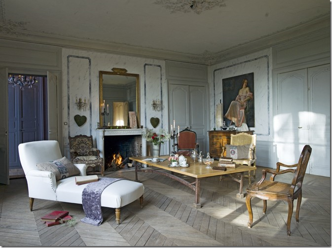
The same room, opposite view. The house, built in 1860, came with historical documents which the owners used to recreate the original furnishings. When the house was bought, the original ceiling was hidden by a false one, which the new owners removed. They also faux marbled the walls in this room.
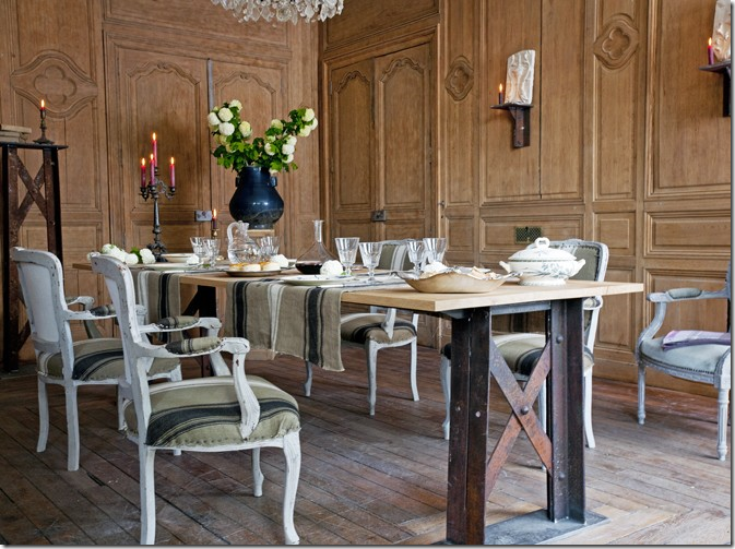
The floors are oak and were pickled and scraped using a brushed steel wool. The walls were stripped too. The owners mixed an industrial styled table with antique chairs covered in ticking.
The kitchen. I would love to see what is through that door!
Gorgeous red velvet fabric is used for curtains in this bedroom and the fabric’s color becomes the focal point.
So original – you won’t see another bathroom like this, ever! The shower was made out old cement tiles.
HOUSE #2:
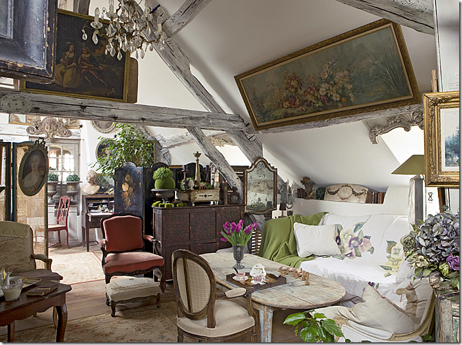
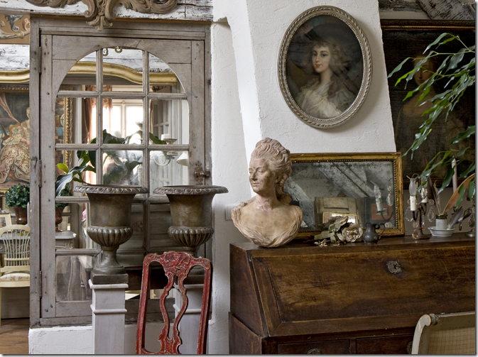
This house is in a village, one hour from Paris – part country and part city. The house is connected to the barn. Like the previous owners, these owners are in the decorating business. This house is magical – a complete utter mess of clutter – and it lures you trying to discover what is hiding in the corners. This living room sits in the barn part of the house.
The barn was sold off separately from the house over 50 years ago. Today, the new owners bought both the barn and house and reconnected them. Here, leaving the barn and entering the house.
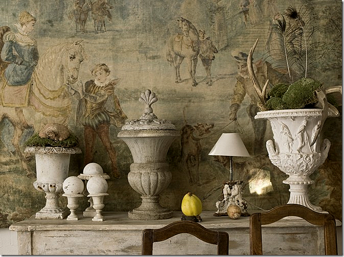
My favorite picture from this house. In the dining room, such a beautiful backdrop to a collection of urns.
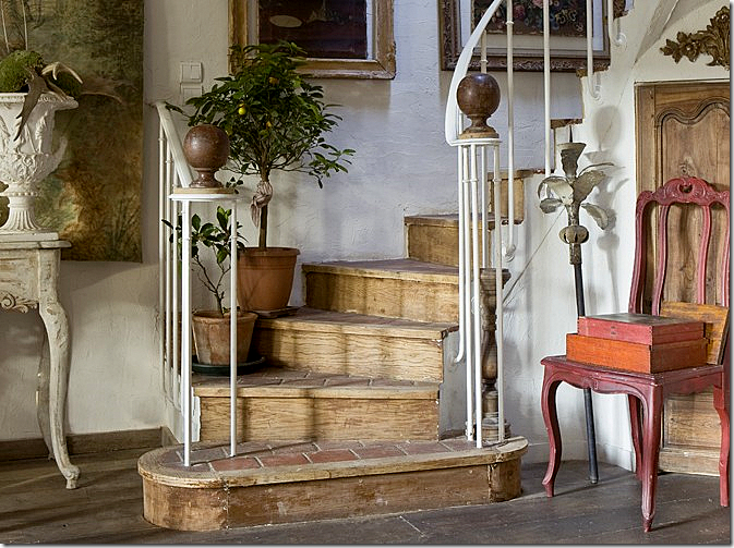
Rustic stairs – made of tile treads, wood and iron – topped with two antique bronze finials.
There is just so much clutter everywhere! You could look and look and still not see it all.
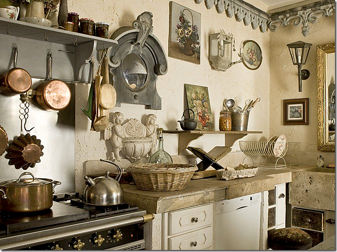
The kitchen with thick concrete countertops. Notice the “crown molding.”
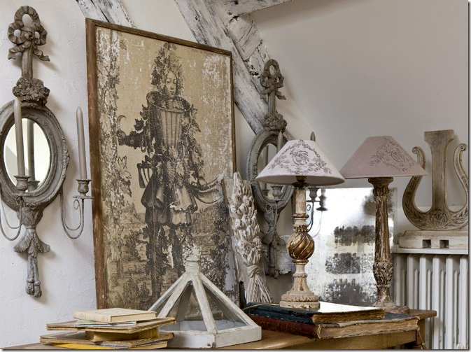
Vignettes are everywhere. I love those sconces and lamps.
The dining room almost seems quiet compared to the rest of the house.
You could take 1/10th of what they own and totally furnish a house with it.
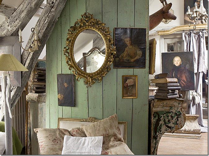
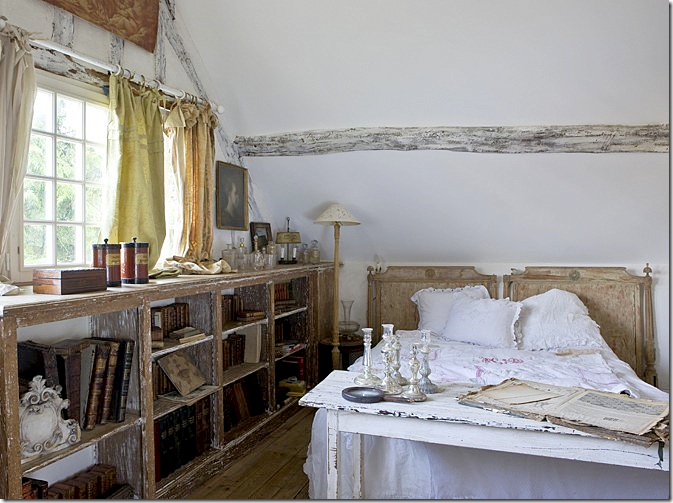
They stripped and limed the shelves – turning the library into a bedroom.
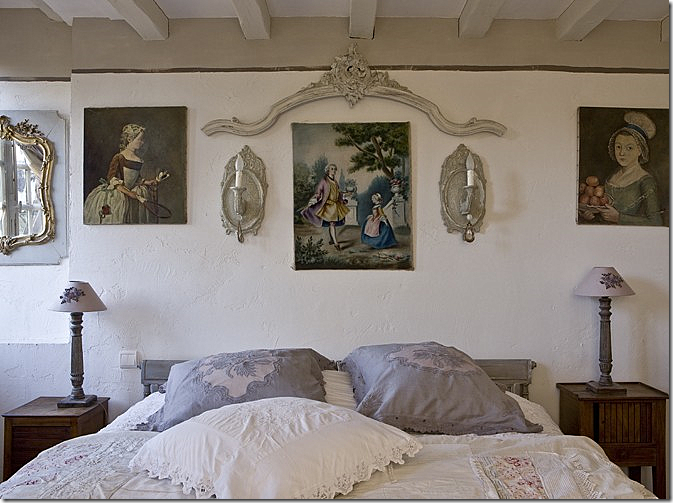
Another bedroom. I love those portraits – both of them!!
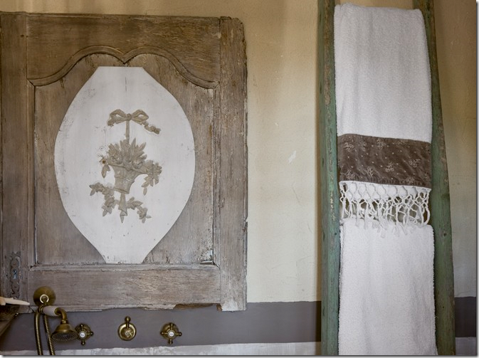
They made a medicine chest out of an old door.
HOUSE #3
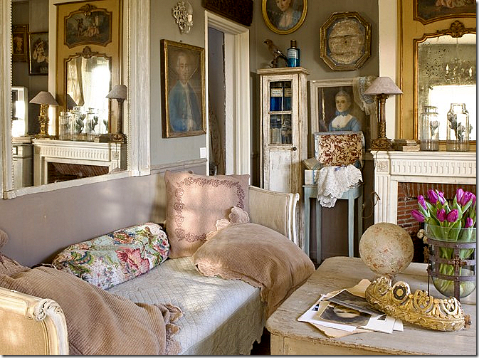
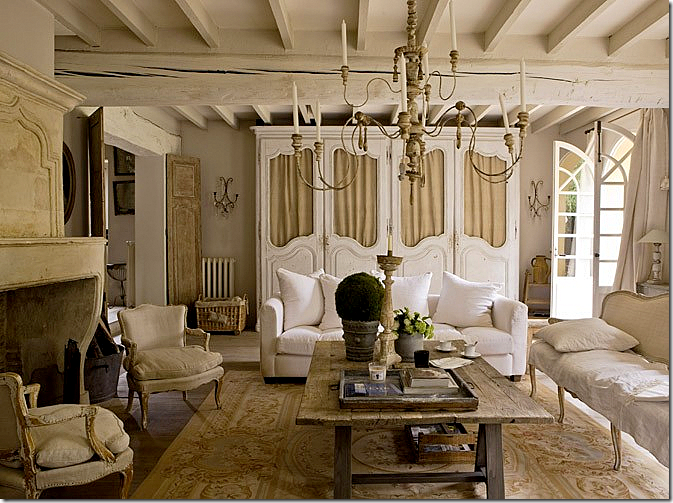
The owners of this house waited 10 years to buy it! Antique dealers and horse traders, their property caters to both sets of customers. I am so crazy about this living room! You could try for ages to get your house in the U.S. to look authentic like this, but you can never get it exactly right!
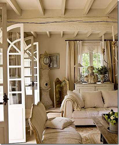
The décor is a mix of French and Swedish. A Swedish Mora clock stands in the corner.
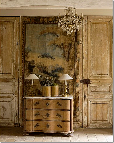
That door! That boiserie! That tapestry! That chandelier!
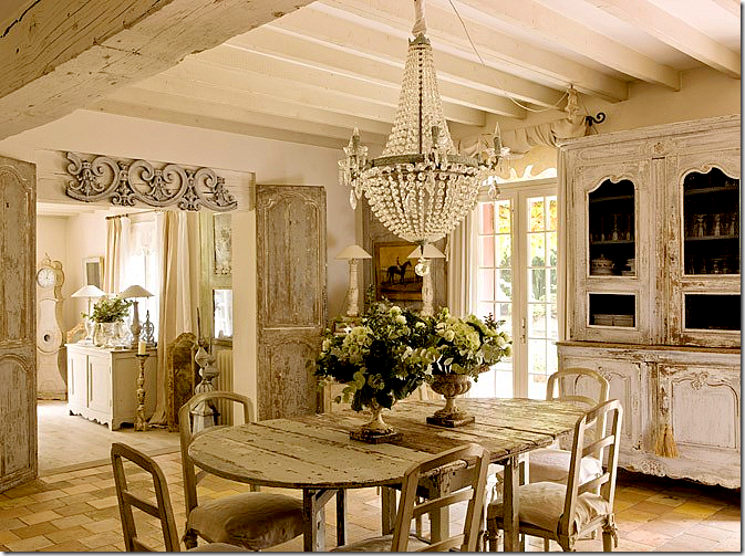
Past the living room is the dining room – all French and Swedish in whites and creams. Gorgeous!!!! Notice those doors leading from the living room.
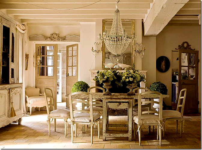
The other side of the dining room showing the gorgeous fireplace, mirror and chandelier. Perfection – this picture makes me cry it’s so beautiful.
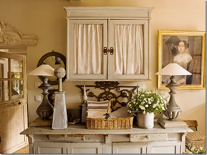
A vignette by the dining room. Great lamps.
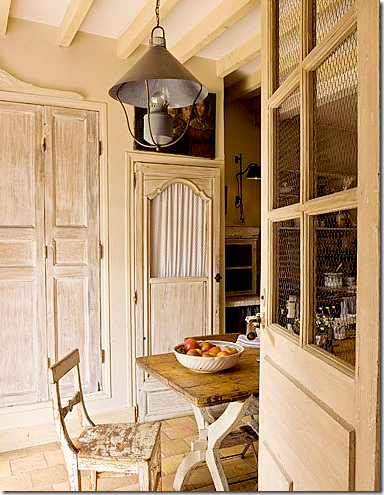
A view into the breakfast room and kitchen through the wired door. Notice the pantry doors.
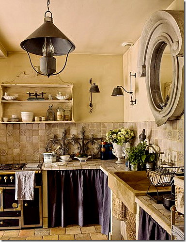
The kitchen. Love the light fixtures. Unfortunately – no pictures of bedrooms!!!!
As you can see, Campagne is no Southern Accents or Veranda. It’s houses aren’t styled in the way we are used to in America. And the French don’t live like we do – where every paper and scrap of mail is tidily put away the minute it’s discarded. They are much more relaxed about their houses than we are. If you like this look, check out the magazine – you’ll love it. If these types of interiors don’t appeal – run to the nearest Architectural Digest. Myself – I like a little of both and I suspect you do too????
THREE GIVEAWAYS ARE COMING!! WATCH FOR DETAILS!!




Why does clutter in Europe look so much prettier than clutter anywhere else? Maybe it's a sign to embrace where we live, so we can appreciate the other.
ReplyDeleteBeautiful photos, and I love that the same couple bought both spaces...they should be together!
It is interesting--the carefree look that these homes have and they are pretty. About the bedroom in house #2 with the portraits--the one on the left above the bed is a reproduction. I have the exact same one! The original is in a museum. Too funny.
ReplyDeleteHow can everything look so messy and yet so clean at the same time? Amazing taste the French have, oui?
ReplyDeleteThese pictures are wonderful, thank you!
I think the reason they look better is because their homes have so much more architecture, character, age and quality than ours do here. You don't notice the clutter so much because your eyes are drawn to the bones of the house. Rindy
ReplyDeleteOMG, I love #2 and #3 both! I have to agree -- the character and age of the buildings definitely call for a more relaxed, cluttered style... I could definitely live in #2 -- I guess I'm not a minimalist! lol
ReplyDeleteI did a post last summer about a house I visited as part of garden conservancy tour -- the owners were designers, the home was an old barn, and the rooms were FILLED with old things. It was a little dark, and a little crowded, but I loved it... however, some of my readers found it too old, too shabby (and not shabby chic!) and just too... well... strange. You can read it here:
http://dearlittleredhouse.blogspot.com/2010/06/architects-garden-interiors.html
Beautiful! You are right, no matter how hard anyone tried, it would be impossible to get a new home to look so charming. I love how casual the photos are, but I also am a subscriber to Architectural Digest, so I guessi'm with tyou in the middle. Great post!
ReplyDelete-David-
Joanie,
ReplyDeleteThanks for the heads up with this magazine, I actually like the look of "unstyled". It seems so much more attainable and real to me than the houses where everything is perfect.
Makes me think of women's magazines where everyone is "airbrushed" so that you don't know what's really real....:)
I'll check out this magazine next time I'm at B&N, and I agree, it is really depressing as to the lack of magazines available anymore.....:(.
I guess there are worse things, right?
Joni,
ReplyDeleteI agree with you in wanting Southern Accents back! It was always my favorite and I never missed one.
These are beautiful homes. Thank you for sharing.
Teresa
xoxo
"And the French don’t live like we do – where every paper and scrap of mail is tidily put away the minute it’s discarded."
ReplyDeleteYou must live in some parallel universe far from the one I messily reside in.
I had the depressing experience of looking for a new home recently. It's amazing to me how charmless the typical American home is compared to their European counterparts, and these places weren't cheap! Small windows, choppy floor plans, lack of character -- most of the homes looked as if you'd be sentenced to live there. Thanks for the look at the outside world.
I miss all the gone by magazines so much- maybe some new ones will appear.
ReplyDeleteLoved every image- such beauty would be a thrill to last a lifetime.
I have always enjoyed home decor magazines from France - also, the British mags. We are much more uptight and "on trend" here in America - mainstream design work (still!) seems to be desired overall. So many clients ask me "What is "in"? Also, clients, while seeming to care about antiques, don't really want any part of their home's structure to appear too old - I've seen perfectly good plaster tore dowm because clients could not handle the slight imperfections - this drives me mad - I adore old structures. I'm in Southern IL...is this thinking regional or what?!
ReplyDeleteFirst let me say I'm still mourning the loss of Southern Accents. Why oh why did they have to disco my FAVORITE magazine??!!
ReplyDelete2nd that #2 house is my French dream come true!! I'm swooning!! This is where more is more really works! And I'm a MIM gal *winks* The other two are also fabulous but that second one took my breath away! So needless to say I WILL be checking out Campagne Decoration again.*smiles* Vanna
Amazing and beautiful! I love how you put it, with a part of the stuff you could furnish another house! You could say this about my house too I guess!!!
ReplyDeleteLOL!
Great post!
This is timely..as I got in a box just today of 31 issues of Southern Issues..I am in all my glory! I already have so many but can't seem to stockpile enough and funny becasue just today in my post talk about the very magazine as one of my favortie things! This looks like a lovely magazine but more reflective of that cottage-y, rustic, shabby chic look...I love the grandeur and old world elegance of Southern Accents..but there is no denying these rooms are dreamy and enchanted looking, each and every one. The 2nd is my personal favorite!
ReplyDeleteJonie..come by my blog, doing a phenomenal giveaway, a gorgeous pair of Murano handblown glass lamps from Swank lighting!!
www.theenchantedhome.blogspot.com
Have a great night:)
OMG I'm in heaven with these homes! And if that is what their idea is of being unprepared I'll take it. I can't stand clutter but I have to tell you that second home is really my favorite. If you keep looking at the pictures you see all kinds of amazing pieces and the furniture is fabulous. Thank you Joni for introducing this magazine since I had never heard of it before. I'm off to drool some more!
ReplyDeleteYou are so right. Although I have never been there myself, I am convinced that Europe just doesn't look like America. We are so culturally different, and it is reflected in our homes. Also, the sheer age must have something to do with it. The audacity of the decaying finishes on the woodwork and furniture is just way over the edge compared to our American aesthetic. But....we are certainly drawn to it, aren't we?! I will pursue Campagne. Thanks for this informative post! My thirst has been quenched momentarily!
ReplyDeletetopaz - actually my house is very cluttered. but i do think that the houses in america, as seen in magazines, as so pristine. it just looks less like that in foreign magazines. that's what i meant.
ReplyDeleteLove the look of this magazine. This is why we all want to holiday in France! So chic, comfortable, and historical. I think one of the reasons we live so differently is that we don't have the years of built history in this country. They are living with charming old architecture, streets, homes,etc. There's not much charm in a 1970's suburban builder's special. We want to tear that down and build something perfect.
ReplyDeleteComing from someone who is totally attracted to and inspired by color, I am in awe of these rooms and how charming and fresh they are with little to no color! I literally am pulled in by colors and purchase things because i have to have that color in my life. I adore these photos and could move right in to any of these rooms. Cozy, warm, charming and french - LOVE it!!
ReplyDeleteThank you for sharing the magazine. I love the feel of the relaxed rooms. And while I wouldn't want to live with it I find the clutter charming. I also think there is much to be learned from each vignette. To me the main difference is that they use real antiques. I don't mean "precious" antiques, just things with real age.... if these homes were in America everything would be from Restoration Hardware/Wisteria/Home Goods and painted to look old;)
ReplyDeletejoan
inspiring, but nothing can beat The World Of Interiors, issue after issue, year after year
ReplyDeleteHouse #3 is truly enchanting. I am very keen on the mirror above the sink.
ReplyDeleteThe authenticity of these french homes seduces me. The pictures alone compell me to stare and learn their secrets. I can only imagine my accelerated pulse from an in person viewing. I seek order and symmetry in my own home but also have that desire for the curiousisty cabinet aesthetic. Two distictively different styles. I confirm many of the comments above in that the architecture of these homes set the tone for these amazing interiors. Because almost everything in these homes is old and thus one-of-a-kind, it's an aesthetic that can not be easily duplicated. Keep these interesting posts coming...I could read this post many times and still enjoy. The comments are equally as interesting.
ReplyDeleteI agree whith you on the magazine outlook. I lost Country Home, Cottage Living and Home Companion all at once. I love to go to the bookstore, but the "Home Design" section has become noticeably smaller.
ReplyDeleteI loved Southern Accents as well. And I have read this online - it's lovely - have to remember to visit more often!!
ReplyDeleteJust beautiful!! there's so much inspiration online unfortunately there are fewer magazines. the problem is it's pretty hard to cozy up with your laptop..!
ReplyDeleteThank you for sharing this magazine with us, I will be picking it up. House #2 makes me swoon. It reminds me of a muesem, where you never know what you are going to see next. I could look at that house for weeks!
ReplyDeleteLexi
What a sublimely lovely way to start my Friday morning. Beautiful homes, not just houses. I think the authenticity has to do with time, mostly. Rather than assembling pieces and staging them in a room, the French accumulate quality finds over time, both in their decor and in fashion. (For example, French women don't dress up as much for parties, weddings, and such, and aren't afraid to wear a treasured, well made dress more than once.) I believe that in general, Europeans aren't seduced into buying the plastic junk that clutters our stores, enticing impulse buyers. It's not how we're taught to shop. Or design. (Or eat, for that matter.) Something that's slightly worn with age, but of high quality is much better than a mass-produced shiny new trinket any day.
ReplyDeleteCall me crazy, but I love all of the clutter in house #2!! It still looks clean and like a well loved and lived in home. I'm heading back to study all three homes more carefully now.
ReplyDeleteHappy Friday Joni!
xo~
T
A beautiful post and I especially loved the industrial/rustic dining table in the first house! I agree with you on European magazines not being as perfectly staged...I think it's much more realistic and therefore more livable! I love the Spanish "El Mueble" - it's another European magazine that is great!
ReplyDeletehttp://bjdhausdesign.blogspot.com/
Lovely homes, with lots of inspiring ideas. I don't think I'd like to live with quite so much peeling paint, but the relaxed look is refreshing. I also live with a fair amount of clutter. The pristine and sterile homes that are often featured in magazines don't appeal to me. They look like nobody lives in them, no matter how perfectly decorated and accessorized. Imagine trying to sell your house in US with that rustic kitchen in it!
ReplyDeletethe magazine addict in me is currently on overload; everywhere i look is a new and interesting design magazine; then i have to tell myself stop this is too many, how will i get all of these home! am i delusional?
ReplyDeleteno, i am in england, OMG! and.....i am spending a fortune on them. the april 'elle decoration' is a particular favorite and april is killer!
loved the tour joni......now i wonder if that is here?
xx
debra
Joni...What a treat this posting is
ReplyDeletefor me. As a stylist/producer of
stories for magazines, the first
thing I am told is "edit"...which
is "take away the charm" to me.
I miss Domino mag so much for their
look of collections, etc. I love
"moments" in a home, where you can
look and see somethinig different
each time. Could live in any one
of these cluttered, charming,
messy homes. More is More for
me. Bonnie
Hello, my dear Joni!
ReplyDeleteYes, I love both styles; AD is great, but Campagne has something really special that, as you've said, we don't find on our magazines here. It's definitely more relaxed and even more "real".
You've chosen amazing pictures. But that's how your posts always are... inspiring!
Have a great weekend, my friend!
xo
Luciane at HomeBunch.com
PS: Come take a look at my "Cool or Fool Fridays: Would you live in a "Auto House"? :-)
Joni, I have to admit I am a bit of a neat freak so the last home is the most appealing to me, but with that being said I can enjoy and appreciate each image for its wonderful eye candy and patina. The brick floors and the stairs that were a mix of brick and wood was wonderful!! KS
ReplyDeleteJoni leave it to you to find a magazine as truly fabulous as this!! I cannot get enough of it and so natural and unstyled!
ReplyDeleteDo come and enter my Artful Offering!
xoxo
Karena
Art by Karena
Oh, I understood perfectly, Madame. Couldn't resist a gentle ribbing. Thanks again for all your efforts in producing such a great blog.
ReplyDeleteBeing a stylist in another life, I love the way the foreign mag.appear. I think the age of the home, (all the great details)across the pond has everything to do with it. Great blog and I will continue to appreciate each new posting. xxpeggybraswelldesign.com
ReplyDeleteJoni:
ReplyDeleteLove the European house magazines. Have several in my stash! Thank you for a glimpse into this edition of Campagne - with these beautiful houses and for info on translation. Must go to the web site then book store!! Learn so much from you. The homes are filled with so many beautiful antiques and articles it really doesn't matter where they are placed - they still please the eye. And the architecture of the rooms by itself is so charming!! Love this - another great post - thank you Joni!!!
Janice
Pemaquid
Hello Joni,
ReplyDeleteAs you I like a bit of the two kinds of interiors.
But I have to say that I am enchanted by the last issues of Campagne.
Wish you a wonderful weekend!
xx
Greet
I guess I'm just different than most others that posted. I hate clutter. lol Maybe its the fact that I have 3 children, one being a 2 yr old and its hard to keep clutter from creeping into my house. I like a clean neat look probably because I rarely get to see it here. I do agree that the architecture is more pleasing than in most American homes. They don't put that kind of unique detail into homes now. I also have the protective Mommy instinct going on that says all that raw wood and such would leave my baby with splinters all over her hands and the pealing paint bothers me as well. These houses are not meant for a 2 yr old I know but you just always picture your family in them I think and so it affects me this way. But I do love the architecture for sure!
ReplyDeleteThis magazine has been sitting on my desk top for some time. I have been translating the articles into English. I would like to get this magazine, but I think they don't deliver to the US. I will have to check it out again, because this magazine is FAR better than anything that we get here.
ReplyDeleteHere is the link
ReplyDelete47 dollars for 6 months.
WOW! 8 dollars an issue.
http://www.amazon.com/Campagne-Decoration/dp/B0009GIRVO/ref=sr_1_1?ie=UTF8&qid=1299262962&sr=8-1
Love the stairs in House #2 and the doors in House #3, but think the Gorgeous red velvet drapes need a bit more length.
ReplyDeleteI adore your blog! Thank you for the Campagne info!
ReplyDeleteI, too, mourn the loss of Southern Accents...please bring it back in the form of an "e magazine!"
Je aime #3, tres, tres, tres bonne! C'est moi!
...loved this...joni do you read the french real estate blog "mistral estates services"...i could eat those homes up...
ReplyDeleteBeautiful post!!! By far, house #3 is the front runner. The character of the home is fabulous with great interiors that seal the deal.
ReplyDeleteJoni,
ReplyDeleteI love these houses, too, but I'm not sure how authentically cluttered/unstyled they are. Where are the dirty socks, the stack of newspapers, the pile of mail on the counter, the mound of unfolded laundry, the dirty breakfast dishes still on the counter?? All the "clutter" in these homes seems to be carefully chosen and artfully arranged to look beautiful (not that I mind--it is house porn, after all). ;-)
Love you!!--Jane
Swoon! This is me to a tee.
ReplyDeleteJoni, these pictures are amazing, thank you for sharing... I need to save this post forever.
ReplyDeleteJoni, if those are unstyled photos, then apparently I have no idea what a styled photo is. They look completely styled to me. The perfect stack of books beside the couch, the teapot set just so - I know I don't live that way. I love the old architecture, but there is way too much going on in these homes for me - I would feel claustrophobic to have so many little things sitting everywhere. I love beauty, but functionality is just as important to me. But I would kill to have those floors, walls, ceilings, doors and other architectural features that we are sorely missing here in the US. Thanks for the post.
ReplyDeleteJoni, you continue to please the reader that loves and appreciates design. Good For You. You remain the best!
ReplyDeleteWow, thoses houses are stunning. But I think getgrounded is right - they are styled, those pictures, but in an artful way. Nobody really lives without a certain amount of mess amidst the wonderfulness, do they? Really (sigh)?
ReplyDeleteHouse # 3 is the home of my dreams! I am working on recreating a kitchen like that one right now. my 230 year old farm house now has a gutted kitchen. Some of our friends and family haven't a clue to understanding what I want. they say I am killing a resale. I'm not m oving and when i do it will be for the descriminating buyer. Love it!!
ReplyDeleteLove these! Certainly can't find anything that looks like that here. Europeans built for the ages. Americans always want new (or their new to look old). I live in a 1920's house and I love the imperfect plaster and the worn treads on the stairs - the kinds of things buyers look askance at. Why can't Americans let things (or people!) age gracefully as the French do?
ReplyDeleteJoni, these shots are beautiful and very reminiscent of some New Orleans homes I know, including my own (although I'm not sure that if a photographer would show up unannounced at my doorstep, the photos would come out as beautiful!). 3 dogs and 2 kids put a damper on that! Thank you for sharing with us. I always love to see what wonderful things you have in store.
ReplyDeleteYours,
Karina Gentinetta
www.disegnokarinagentinetta.1stdibs.com
The reason things look better is that the buildings are solidly built and old. They are architecturally true.
ReplyDeleteIt's impossible to get drywall to look like an authentic wall, and every attempt to emulate a foreign style in this country is hampered by the very shoddily built buildings.
I grew up in Mexico. The French style was popular in the late 19th and early 20th centuries, but the buildings just aren't authentic next to Aztec tombs.
The Mexican Colonial style works wonderfully and, frankly, one can live in a shack as long as it's the real thing and solidly built.
So it is in France. The building is genuine, and that is reflected in the total look, which, you are correct in pointing out, just cannot be emulated in the United States.
My two cents.
WOW, Joni! I'm going back right now to enjoy these houses all over again! Thanks for sharing!
ReplyDeleteKaren T.
Love house #2, everything soft and cozy, unique and comfortable........all beautiful images.....thanks.
ReplyDeleteI agree with the previous posters--architectural elements (fragments, beams, fireplaces),light, high ceilings, windows--all combine for an appealing look. And white pulls it all together. My fave!
ReplyDeleteJoni
ReplyDeleteAhhh. What fun! thanks for this adventure.... am going back to see all the things I missed the first time around... love #2,#3....agree with all the above coomments re' "old" and character ...
and just because I didn't have time to comment on a previous post in which you included your daughter's gorgeously re-done bedroom, I'll take this opportunity to say I loved everything about it.. it will be one of my all time favorites.Bella, Bella!
Enchante!
Pardon my profoundly broken French, but it was the best of the best in your post of French bedrooms.
Alice A.
Love these homes Joni, especially the kitchens and the last living room...my Barnes & Noble is running out mags, though I do LOVE the UK's Ideal Home and House Beautiful. I will check out this one today, if they have it! :))
ReplyDeletewww.UnderSpanishMoss.com
ReplyDeleteloved the BLOG so much we used Joni Webb to discuss European Character within todays American Homes. Architectural details of European Homes are the bones that give you a solid foundation for fabulous designs! Thank you Joni for a great post...
Kindest Regards, Angela and Renee
Oooh la la... a foreign magazine... purchase that would be FUN on my NEW site dedicated to the LOVE reading! I'm doing an Interior Design book GIVEAWAY today... come take a peek...
ReplyDeletehttp://ReadingisFashiionable.com
ENJOY!
Fifi
When I sometimes put my feet up on furniture, my mom used to say "Stop that. Do you think we live in a barn?"
ReplyDeleteWell I think that my mom would really, really LIKE that french country barn!
Beautiful, beautiful pictures - I love getting a peek into authentic French homes. I am paying particular attention to the color of the wood floors - but I have come to the conclusion that these beautiful finishes are the result of years of patina, not any particular stain!
ReplyDeleteAbsolutely divine post! I have found so much inspiration for our own ancient home I just don't know how to thank you!
ReplyDeleteAbsolutely divine post! I have found so much inspiration for our own ancient home I just don't know how to thank you!
ReplyDeleteHi! We have so many decoration and homestyle magazines here in France that it becomes hard to chose one in a bookshop... You can also have a look to their website : marieclairemaison.com , elle deco...
ReplyDeleteBy the way your blog is really nice
House number two with all of it's stunning antiques and the way they've used them was just beautiful. Love it!
ReplyDeletexo J~
Hi Joni,
ReplyDeleteCan I ask you to take a look at my recent post and see if you know where I can get a coffee table like the one in the pic? My daughter wants it really bad and we can't find one. Hope you can help!
Joni,
ReplyDeleteHow are you doing? I hope you had a wonderful weekend.
Remember I told you I was preparing a post and this post made me think about you? Well, it's done.. go take a look. I think you'll love this French Chateau.
Have a blessed week!
xo
Luciane at HomeBunch.com
There certainly are a amount of methods to acquire affordable coach products at coach factory outlet,it could possibly the most effective options.the most vital cause may be the reality that you simply can purchase genuine coach products at there.It is believed that you will like the products on the coach factory online. There are spacious sizes and different colors, styles and so on.in the market you definitely can find various colorways that are designed in as well as the high quality that applied in. For most of you would like to come. So just come to our coach factory outlet online store to choose one.
ReplyDeletecoach outlet has always been simple,durable style features to win consumers.The products are more flexible,with easy bleaching,wear characteristics,and simply use a damp cloth.Where there are women, there are bags. Where there are bags, there are coach outlet store online. Coach products are the direction indicator of the latest fashion and trend.At the coach outlet online you have the largest selection of the day. If you touch the item and like it, keep it in your possession until you make your final decision.
ReplyDeleteThe Coach bag is from the latest release of Coach Bags. Its crisp, scribble material, leather handle, perfectly complements the relaxed shape of this stylish pouch. All the items of coach outlet online Store fit all of your essentials and more.Bright colors, exquisite workmanship, durable material and up-to-date style all lead to the great fame of the goods in coach outlet.As a fashion and modern lady, you can never have too many bags but Coach, Coach is a great leather handbags brand. coach outlet store online have different look according to different designer concept.
ReplyDeleteHouse 1!
ReplyDelete