A special thanks to my blogging friend, Artie, of Color Outside the Lines, for sharing this story with me!
Meredith Corporation which publishes such magazines as Traditional Home and Better Homes and Gardens also keeps the racks full with their special edition issues such as – Country French, Kitchen and Bath Ideas and Makeovers, Renovation Style, Elegant Homes and Décor. Another popular title is Tuscan Style. Word of warning though, Meredith has a sneaky way of publishing the same magazine twice – several years apart. Be sure you check the cover to see that it doesn’t say “Back By Special Demand” or you might be buying something you previously bought before. One such reissued magazine was Tuscan Style which first came out in 2007 and then was repeated again in 2010. This particular issue featured the beautiful Spanish styled Los Feliz house of Michelle Niday, an interior designer. The story is a little out date as over five years ago, Michelle sold the house and moved to a loft in downtown, while her Los Feliz house sold and then sold again. Here are the three versions! Enjoy!!!
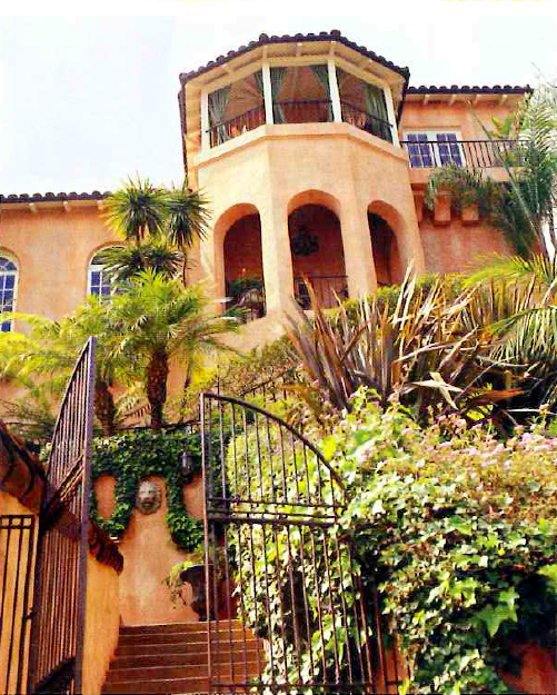
The Los Feliz house was built in the 1931, with 3 bedrooms and 3 baths, and surprisingly a 3 car garage. The views are amazing from the turret’s balcony.
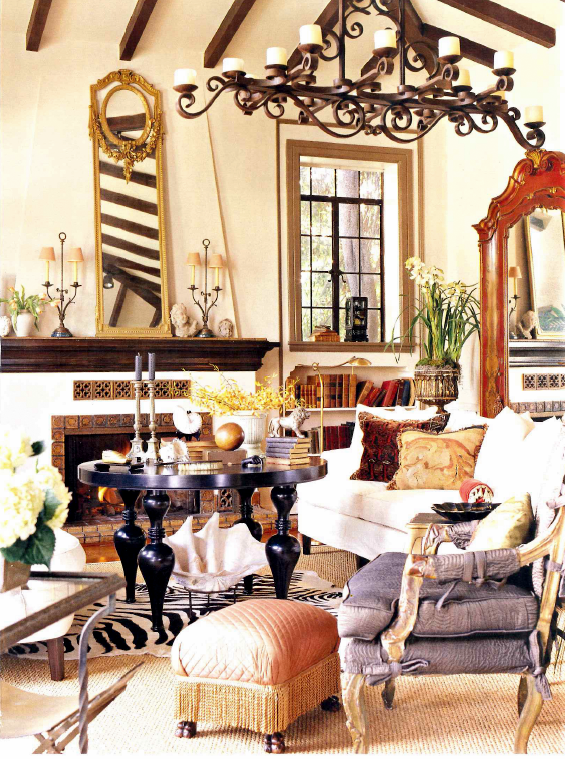
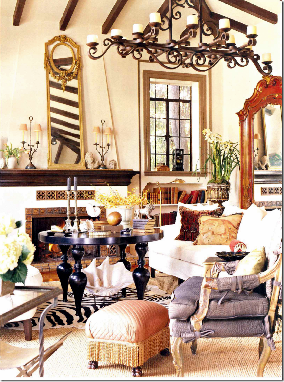
The living room furnished by owner, interior designer Michelle Niday, is an eclectic collection of antiques and accessories. Michelle says she likes every room to have something a little “off.” She doesn’t like her interiors to be taken too seriously. She doesn’t like any printed fabrics, except for striped ones. She likes flea market shopping as much as high brow antique shopping. Textures play an important role in her designs. Here, her slipcovered white sofas are separated by a tall coffee table. These pictures are from the early 2000s.
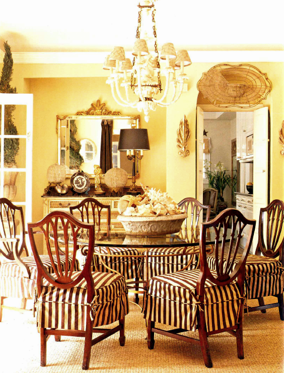
Seagrass lies underneath a glass table, surrounded by boldly striped slipcovers. Shells are found everywhere throughout the house.
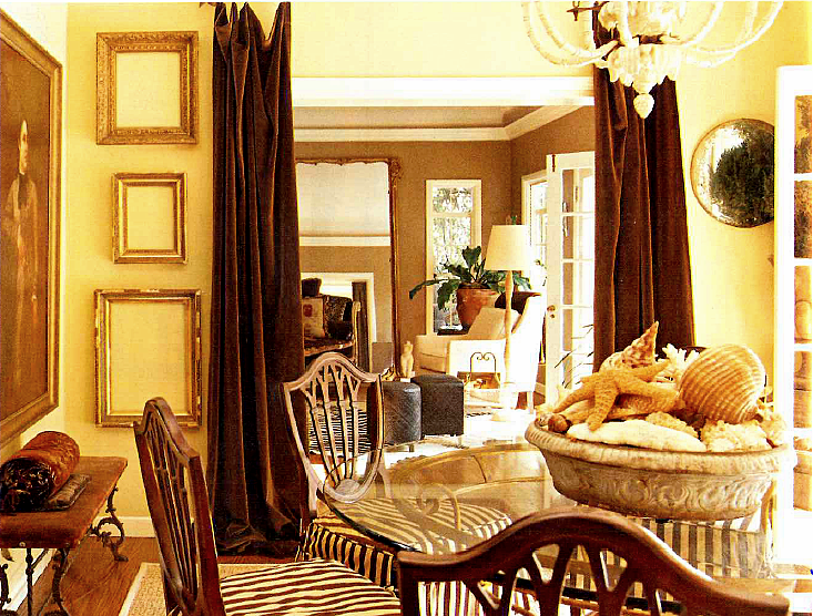
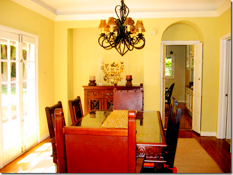
Another view of the dining room shows a collection of empty hanging frames. Velvet portieres divide the dining room from the sitting room.
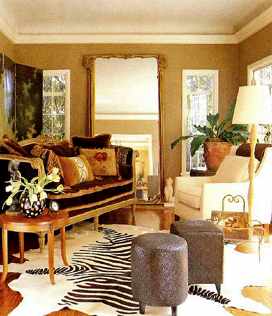
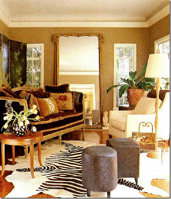
In the small sitting room, a faux zebra provides the much loved stripes. A French daybed serves as the sofa and a large antique mirror doubles the visual space.
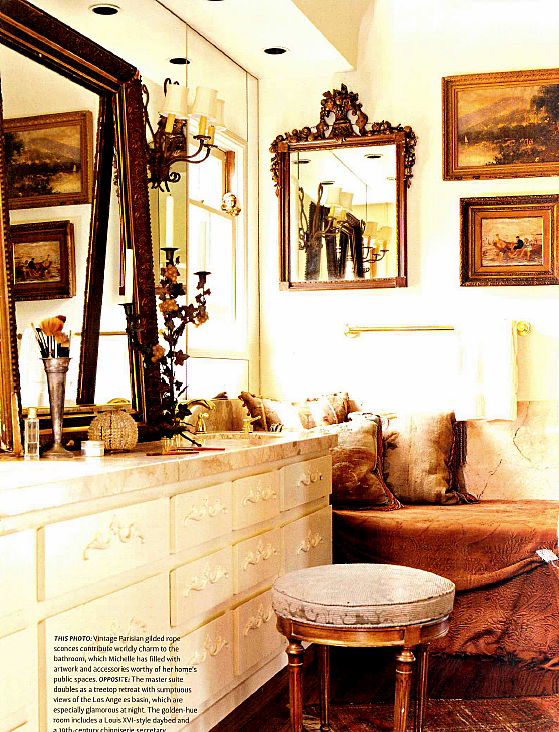
With pillows and bedspreads, Michelle turns the bathroom into a sitting space.
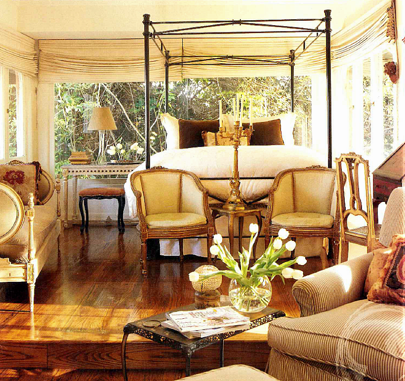
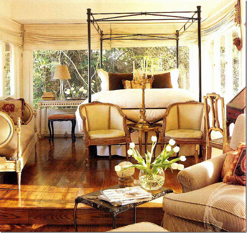
The master bedroom is like a treehouse – with endless views of L.A. Dressy antique furniture mixes with striped upholstered couches and chairs. Right after these pictures of Michelle’s house were first published, she sold it to move downtown into the Toy Factory Lofts:
Built in 1924, this warehouse was most recently a toy factory, hence its name.
Today, the building looks like this – with 119 lofts plus first floor retail spaces.
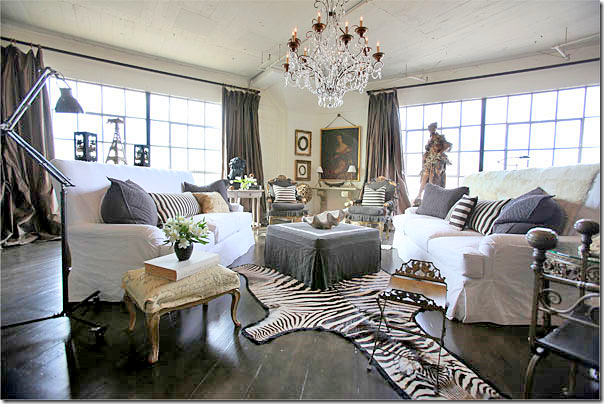
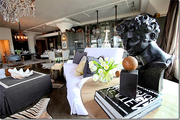
Wow!!! Today, Michelle lives in this open loft space at the Toy Factory Lofts. She says when she moved in, it looked like an empty garage. Even her own mother doubted her abilities to turn the blank space into a beautiful home. I have to say that I love how Michelle’s taste has evolved over the years. It’s more streamlined and less cluttered. It’s more “decorated.” Of course I love the white slipped sofas – but I also love the striped pillows and the way the two zzebra rugs mimic the stripes. The grays look wonderful against the white, as do the brown silk taffeta curtains. Michelle says the curtains and the wide plank wood flooring were two of three must haves. The third? The crystal chandelier. I just wish these pictures were bigger!!!!!
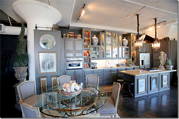
Looking the other direction, you can see the ottoman has white trim on its top and the French chairs are slipped in the same Belgian gray linen. Notice she uses two zebra rugs in this large space. The kitchen and dining area are on the right, back. The sleeping area is behind the dining room area on the left side. Hanging over the living area is a great chandelier found in the famous Paris flea market, the Marche aux Puces. Niday says she wanted this loft to resemble a Parisian apartment. Do you think it does?
A close up of the side table next to the sofa. I love the high backs of her sofas.
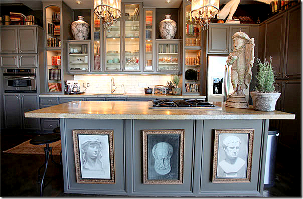
The kitchen was designed by Michelle and her contractor who is also her fiancé. Stripes cover the French dining room chairs. Trying to make the kitchen look less like a kitchen, Michelle added books and accessories to the open painted gray cabinetry.
A close up of the shelves with books and accessories along with plates and glasses. Michelle loves statues and concrete urns and pots.
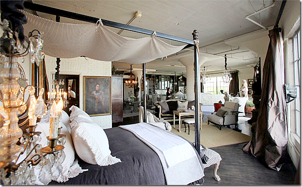
In the bedroom area, a large four poster iron bed looks similar to the one used in her Los Feliz house – but it’s different. The curtain were made with extra lining so they would be full and luscious. The rods are simple industrial ones. A second seating area is between the kitchen and the bed, it’s “walls” marked by the seagrass rug.
The sink was once a fountain, found in a L.A. shop, while the floors came from Country Floors.
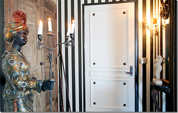
And finally, the entrance to the loft has a rare female blackamoor, along with wood antique doors. After living here awhile, Niday added more stripes to the entrance area.
The beautiful 1932 Los Feliz house was put up for sale again after Niday first sold it. Here, you can see the listing pictures and how different the house looks under the new owners. Out front, the living area is where the three French doors are.
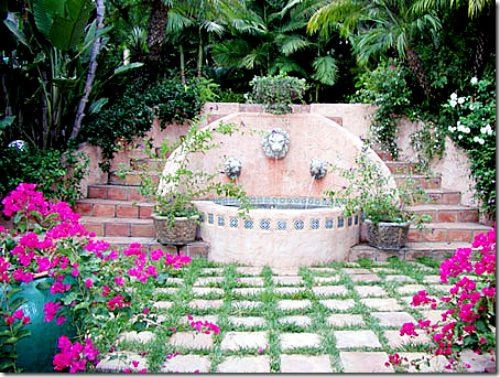
What a gorgeous setting!!!! Just gorgeous!!!!! The property is amazing.
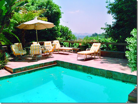
The swimming pool with its stunning views.
The view of the valley – incredible!!!
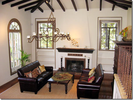
The living room under the new owners looks totally different. The chandelier remained. Even the bookcases were left bare. Remember what it used to look like?
The same room, under Michelle. What a difference! So warm!
The dining room today – looks like the paint color remained. Here’s how it was under Michelle’s ownership:
The chandelier is different – as is all the furniture. It really looks so different today!
The sitting room as it is today retains the caramel wall color, but that is all that remains the same:
I prefer Michelle’s décor to how this room looks today – I like the large mirror between the two windows. Michelle likes to put furniture on an angle – do you? I rarely use that arrangement, but many people love the drama it creates.
The bedroom today. The shades remain. I like that the bed is centered here. Michelle’s was off centered.
I wish we could see the other side of the room, I wonder if it is the turret room? I just adore this room – I love all the antiques and the soft muted colors. As beautiful as the Los Feliz house is, I think if I had to choose between the décor of this house and the décor of the loft – I would pick the loft! I just love the way Michelle Niday decorated it!!! It really does look like a Parisian apartment – in the middle of downtown Los Angeles:
The Parisian styled loft!!! So beautiful. If I owned a loft – this is exactly how I would decorate it – with lots of white slips, grays, browns, antiques everywhere, chandeliers, and antique books and shells. I think this room is gorgeous. Unfortunately, Michelle Niday does not have a web site that I can find if you would like to contact her. I couldn’t even find an email address for her BUT – I’m sure Google White pages could help you in your search.
To read the L.A. Times story about the loft, go HERE.
Please, welcome a new Cote de Texas sponsor:
GREIGE – who sell everything from furniture to accessories to fabric. Go HERE to see their shop.
And, highlighting another CdT Sponsor: The Bella Cottage HERE who recently received new merchandise, including this beautiful pair of antique gilt French chairs.
One Designer, Two Houses, Three Looks
Subscribe to:
Post Comments
(
Atom
)













There is a lot of stuff in those rooms, but she does it well and it all looks great together. She is fearless.
ReplyDeleteThe 2nd owners are a bit too minimalistic for me. :-) And I LOVE that you used the word portieres. Reminds me of GWTW. Have you seen Gone With the Wind? xoxo
ReplyDeleteDont know if you know this or not but your batch of pics are showing up twice.
ReplyDeleteI remember my grandmother had portieres in her living room from the hall. She also had a black chihuahua "Pedro" which she chased through the house when he angered her. Each time Pedro passed through the portieres, he would lift his leg in defiance!
ReplyDeleteJoni, thank you for these lovely rooms. Simply stunning.
And, please...I am waiting for one of your top 10s. You are cruel to make us wait so long!
Dear Joni: I love to gawk at Tuscan Style, I'll have to check to see if I bought the same issue twice. The houses in that magazine are among the most elegant in the series..Cottage Style they are not.
ReplyDeleteI would say that this loft was a good version of Parisian apartment style. While it doesn't have the architectural details that a Parisian apartment would have, the big pillars sort of stand in for them. It is very chic and sophisticated, yet looks comfortable. A loft is a good alternative to a house if you need lots of space in the city.
Her style of putting furniture on an angle works perfectly in this case to see individual "rooms" in the big space. I love the bed off-center in the house. Probably works best if no one has to get in and out of the bed near the wall. I like furniture on an angle. Too much symmetry is boring to me. Unfortunately TV and stereo are are very important in my house so right angles are the rule.
I sold my first house last year...I had spent 5 years pinching pennies and getting "creative" to make it look great. I almost cried when the moving van pulled away and it was left bare--it looked so different. And I DID cry a few months later when the new owners posted pictures on Facebook of what they had done to it, but that's another story.
ReplyDeleteI wouldnt have even guessed that Michelle's wall colors remained in the "after" if you hadn't pointed it out...its so different.
I love Michelle's loft! And yes it resembles a Paris loft, a high end Paris loft. I loved seeing the before and after pictures of Michelle's former home, looked much better under her care, as if someone did care. Another great post Joni! Now Im going back to drool over the pictures again.
ReplyDeleteI'm afraid the loft doesn't do it for me - no sense of privacy or a room to retreat to (unless you live alone). I'm not a fan of black and white stripes and zebra rugs (I know I'm probably in the minority here) - it's like op-art graphics to me and not soothing at all. How could one give up that house - the architecture, the space, the gardens, the view??? And the old version is beautifully decorated (though could probably use some editing and fewer frills for a more current look). Under the different owners, it's just pitiful and shows how design can really create a mood and feeling.
ReplyDeleteI think the loft looked as good as you can make a loft look. Loved the decor but there is absolutely no way I'd leave that house up in the hills with that view. A bedroom that feels like a treehouse and all the lovely architecture and the grounds of the first house. A loft or that house...there is no choice for me....the house!
ReplyDeleteI just have to say that this post exemplifies how profoundly a talented person can impact a space. Michelle has what it takes. The befores and afters of when she lived in the house and after the new owners bought it just shows that a great designer's work cannot be underestimated. (And a good photographer, too). I don't mean to be unkind, but my guess is the new owners probably cannot see the difference. This is kind of a reverse before and after! I believe that the loft DID look like a garage before. She transformed it, but obviously, not everybody could.
ReplyDeleteLove all the photos-really beautiful! Scanning thru your blog made me inspire more.
ReplyDeletebedside cabinets UK
Love all the photos-really beautiful! Scanning thru your blog made me inspire more.
ReplyDeletebedside cabinets UK
I actually prefer her former home but they're both stunning! And I'd be a VERY happy camper in either of them! Talk about the right person for a house...it's so sad now. A shadow of it's former self. Vanna
ReplyDeleteMichelle is a master at creating atmosphere. All of her rooms have such character and personality -- something that we don't always see in professionally decorated homes. The loft looks like a wonderful place to kick back with friends. Really interesting post!
ReplyDeleteLove these! Your images always inspire.
ReplyDeleteI had a little fun on my blog with one from your last post.
Anyone else want to play "In My Mind"?
These rooms look as good today as when the photos were taken. I very much prefer the "before" shots. Lack of "stuff" in a home, lacks personality.
ReplyDeleteSuch an interesting post! There is a lot to learn in comparing the before and after photos. Including the importance of great photography/lighting!
ReplyDeleteI would never have left that house - - the master bedroom was heaven!
I agree with Carolyn . . . I'm not a fan of the black and white stripes.
Jennifer
Love the first house and again, loft is as pretty as any one could make it...I guess, I'm just to old to like that open style! LOL.
ReplyDeleteIt's a great study of how she used the same furniture in two totally different envirnoments AS WELL, as how lovely that first house looked when a true decorator designs it. It looks so sad and cold now:(
So enjoyed your post today!
ReplyDeleteI agree with you! What a beautiful space!
Greige and white is so elegant!
Come and visit again one day!
xoxo Victoria
Really wanted to move in myself...with the first home. So warm... elegant and eclectic...my style for sure.
ReplyDeleteThe loft I wasn't crazy about... looked so over done and quite cluttered.
Thank you for sharing...I get so many ideas from your blog...and also love your writing style and sense of humor!
You rock!
Victoria@feminineliving.com
That loft is fabulous!!!!!I loved everything about it.....Nice post JNoni! As usual!!!!Maryannexo
ReplyDeleteI think the home has been staged for sale in the second set of pics rather than the owners actually living that way. Looks like somebody moved out and took most of the furniture with them and whoever remained supplemented it with rentals.
ReplyDeleteInteresting post, though. Thanks for sharing, Joni.
Joni,
ReplyDeleteVery interesting! I really liked the house. The apartment is not my style. Too much, to dark, to dramatic. I like to see it, but to live it would feel too busy and dark. I like serenity... :-)
Have a great day, my dear friend!
xo
Luciane at HomeBunch.com
gorgeous photos!!!!
ReplyDeletetake care,
Rosa
Joni, every time I intend to visit your blog I know that I will be surprised! Time after time!! You are an incredible lady!! You always inspire us with the most uncommun posts! Love this post! I always have to look twice your posts because I always find something I didn't saw the first time! Thank you so much for your time, work and energy you put in all of your posts!
ReplyDeletexx
Greet
I prefer the house as well, but to tell the truth, they are really so different that it's hard to compare them fairly. I'd happily live in either - and I just adore that grey cabinetry in the loft!
ReplyDeleteI think the loft would look a lot more like a Parisian apartment if she'd covered the plumbing on the ceiling, though. That exposed industrial innards look is fine, but just does nothing at all for the rest of the decor and vice versa.
The photos of the house under the two owners really illustrates well the difference a talented designer can make in a space, though.
Wendy
Your posts are always intriguing to me and inspiring as well. I love the house, the loft is not my style or taste at all. The master bedroom in the house was a slice of heaven to me! I also loved that the bed was off center, but know it wouldn't be practical for 2. Thanks again for your incredible posts. XO, Pinky
ReplyDeleteI assume the later images were of the house staged for sale. It certainly lacks the charm that Michelle had infused.
ReplyDeleteLove the kitchen in the loft.
Cheers,
Claudia
I too agree with Carolyn on the zebra stripe thing - so over animal prints *sigh*.
ReplyDeleteI love the loft and the only thing I would change is the height of the sofa backs, just too high for me.
Michelle is correct in that the 3 most important things are the chandelier, floor and those fantastic drapes, so luscious!!
Thank you Joni for a great post!
Never thought I'd like a loft, but this one is fantastic! Still, I'd want to put up walls but then it wouldn't be a loft anymore. I actually love the "clutter" of the house. It says a lot about her personal sense of style. The only thing I don't like is the stripes on the dining room chairs. I like stripes, but for some reason it just looks like too much here. Somewhat dizzying. The zebra rugs? Hey, you just gotta love real zebra skin rugs! And, I don't think they'll ever go out of style like some of this other animal stuff that's so popular now. I like the look of furniture placed on the diagonal, but have never been able to successfully pull it off myself. Seems like you'd need a large room for this arrangement, because it seems to require more space. If pressed to choose, I'd like the house but decorated like the loft.
ReplyDeleteKaren T.
Amazing how the same house can look so different with different owners. I wonder if Michelle is disappointed with what it looks like now? I would love to see what Michelle would have done with it had she stayed and updated it....
ReplyDeleteJoni:
ReplyDeleteThis older Tuscan style magazine has always been one of my favorites mostly because of Michelle Niday's home. Almost picked it up again when it was "back by popular demand", but her home is too distinct to forget. Love what she did to the loft - putting energy and charm into a big blank open space, surely demonstrates her innate talents. Love her use of antiques, furniture placement, use of light and consistence in color and theme.
Prefer the house because it has lots of beautiful architectural details that add punch to her great style. It looks like the new owners furniture and placement is devoid of personality. The only charm left is the beautiful architectural bones of the house.
Thank you Joni for all the research you do and knowledge you bring. Love you and your posts!!!
Janice
Pemaquid
I really enjoyed looking at the Spanish Colonial home. It seemed warm and a place where you would find many rooms full of details, as the photos show.
ReplyDeleteNow for the loft...just Ok... not great. It looks a bit like a furniture store. I think she missed the mark by not utilizing the fact that it is a loft space and those large expanses of openness are what makes a loft space so interesting. I would have liked to see some of the Paris "flea" mixed with hip urban downtown LA finds.
Fun post Joni
xo kelley
STUNNING! LOVE all the grey, white & black and wonderful use of space!
ReplyDelete:D Lynda
I love your sight so much one of my all time favs but your photos are too large and you post way too much stuff on a page. It blows out my computer. I've been waiting 20 minutes for the page to download and 1/2 the photos never open.
ReplyDeleteI've pretty much given up on visiting your sight anymore. Makes me sad.
I just love reading your researched stories of houses under different design influences. Michelle is so talented! As for the new owners....no comments.
ReplyDeleteHer loft is fabulous but i am not sure that I would have given up such a house.
As always, thanks for thepostt and have a great week end, Francine
Love your posts about before and after the decorator!! This was so much fun! I also LOVE the loft. Another great post!
ReplyDeletexx-Gina
Some pretty rooms though the whole sea grass thing to me is really played out as are the zebra rugs, never was a big fan. Don't know if you know but several of these pictures repeated themselves....fyi.
ReplyDeleteSome nice rooms though.
Great post Joni, as I love houses in Hollywood and Los Feliz is fabulous. I really like that Nita put her furniture on the diagonal in that sitting room, it really looks more interesting than the new owners. Also, her bedroom looked larger with her bed off center than the bedroom with the bed in the center. I don't know, it would be hard for me to give up the views and the pool!!! But, her loft really does look 'oh so Parisian' -!! :0
ReplyDeleteyou always provide us with the best posts joni, so in-depth and insightful!
ReplyDeletethe tuscan was hard to bear however michelle's placement was perfect. the loft is amazing. one detail that i loved was the framed art on the exposed side of the island......creative!
when much younger and not very knowledgeable, i was told by a local scout that she was bringing in a scout from better homes and gardens. very nervous, they arrived and instantly her hand extended to me; all she said was MEREDITH. responding with "hello meredith, come look around". the local was in the background doing the 'slicing of the throat' motion.
needless to say nothing came of it.
best
debra
you always provide us with the best posts joni, so in-depth and insightful!
ReplyDeletethe tuscan was hard to bear however michelle's placement was perfect. the loft is amazing. one detail that i loved was the framed art on the exposed side of the island......creative!
when much younger and not very knowledgeable, i was told by a local scout that she was bringing in a scout from better homes and gardens. very nervous, they arrived and instantly her hand extended to me; all she said was MEREDITH. responding with "hello meredith, come look around". the local was in the background doing the 'slicing of the throat' motion.
needless to say nothing came of it.
best
debra
Wow this was such a great post!! I loved looking at all of the rooms but I think my favorite was that awesome pool with the gorgeous view!!
ReplyDeleteI will pack immediately if I get to live in that loft. Oh my.
ReplyDeleteStunning! this house is so great to live with. Everything is so perfect. Wish i can also have a house like that someday. Thanks for sharing.
ReplyDelete-pia-
Doesn't it just totally prove......(.if ever there were a question)?
ReplyDeleteDecorating with things you love makes magic!!!
And a great decorator knows how to do that.
(I loved the comment that the present owner doesn't see the difference between the pictures. I bet that is true. isn't it astonishing?)
Your blog is fascinating....I am .always learning something from you!
No magic in the second incarnation of that poor house! Hope someone with love and imagination swept those godawful black leather sofas out of there.....and put stuff back that made magic again!
Wow. What a lesson.
ps My house was in one of the "Bookazines" by Meredith three times.......(.I think) The title was "Country French"! And they used different photos from the same photo shoot! I knew only because I got more phone calls about fabrics! I guess it is a good idea......Meredith is able to keep those magazines profitable.....and my house (and my decorating) got more exposure! No complaints from here!
Fabulous blog!!! Thanks!!!
Joni,
ReplyDeleteThat observation about Meredith Corp is so true! I used to love their special interest magazine Elegant Homes (which costs a lot to buy at the store). But the last issue I bought just reproduced pictures from Traditional Home without the stories. Such a disappointment.
Love your site! Thanks so much for your insights.
wow that loft is amazing !!! the kitchen is stunning !
ReplyDeletexxLily
goldandgray.blogspot.com
Beautiful house! Enjoyed this post, Joni and loved reading your commentary. :)
ReplyDeleteSusan
Perfectly fit for royalty! I wish to have those kinds of houses, but right now, I am so much in love with my lovely house. But who knows, maybe I'll live in that kind of house someday.. Hihi!
ReplyDeletelouis vuitton uk are diversified in various kinds, handbags, backpacks, portable bags, purses, wallets and pouches. All kinds are popular among the whole word people.louis vuitton Store Online Handbags can also bring great accuracy as well as practical applicability and fashionable.Have you ever dreamed of being as charming as Madonna? Have you ever thought of becoming an envy of all your friends? If so, come to louis vuitton outlet.
ReplyDeleteThere certainly are a amount of methods to acquire affordable coach products at coach factory outlet,it could possibly the most effective options.the most vital cause may be the reality that you simply can purchase genuine coach products at there.All people give the good comments for the coach factory online, and now the Coach outlet store provides many discount goods online.Coach bags enjoy high popularity throughout the world. I would like to share the coach factory outlet online with you. What are you waiting for? Just come to visit.
ReplyDeleteThere certainly are a amount of methods to acquire affordable coach products at coach factory outlet,it could possibly the most effective options.the most vital cause may be the reality that you simply can purchase genuine coach products at there.It is believed that you will like the products on the coach factory online. There are spacious sizes and different colors, styles and so on.in the market you definitely can find various colorways that are designed in as well as the high quality that applied in. For most of you would like to come. So just come to our coach factory outlet online store to choose one.
ReplyDeleteI truly appreciate you taking the time to share this informative post, I'll definitely be back for more! Thank you!
ReplyDeleteZebra is great.
ReplyDeleteontario cottage rentals
ReplyDeleteThank you for sharing this article. I love it. Keep on writing this type of great stuff.