The cover was the first clue that this Veranda was going to be special. I was crazed by the cover picture and by the promise of “Romantic Decorating Returns.” Yes! Finally! This is the Veranda issue we’ve all been waiting for. Might this bedroom be the prettiest one ever seen? There’s that blue again – blue is everywhere it seems. In fact, this entire issue is filled with all different shades of beautiful blues. I’m loving the bench, the bed, the gilt, and the Hodsoll fabric on the gorgeous curtains.
Dear Dara,
I’ve been harsh, I’ve been a little mean, but Dara, I am asking for your forgiveness. You see, Dara, I haven’t given you a proper chance as the new editor of Veranda. I was still missing Southern Accents and I took it out on Veranda – expecting your magazine to take up the slack and keep serving up gorgeous images month after month. And then, Veranda goes and has a changing of the guards and Lisa Newsom was gone after all these years. And, Dara, I know her shoes were hard to fill. I’ve nitpicked and complained about every issue – loudly - and I’m terribly sorry for that. Because, Dara, this month, you happened to have produced the best magazine issue I’ve seen in a long, long time. Each story is fresh and new and utterly gorgeous. “Romantic Decorating Returns” – I’ll say! My mother warned me. She called a few nights ago asking if I had seen the new Veranda yet. That early warning phone call hasn’t happened in ages. She said, “just wait, you’re going to die over it.” And Dara, she was right. You did good this month. You’ve proved that romance isn’t dead, that decorating is alive, and we can still have pretty. So, Dara, I’m asking your forgiveness. If you never produce another issue this good, it wouldn’t matter to me. This one will be remembered for years and years.
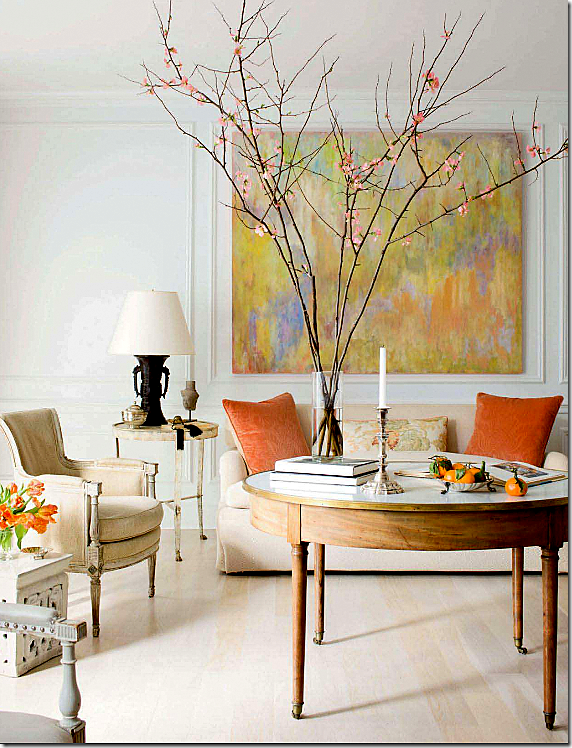
The first story shows a Georgetown townhouse designed by Frank Babb Randolph, done in French antiques, monochromatic fabrics and splashes of persimmon. So refined, so simple, so elegant. Randolph is becoming a favorite of mine. His interiors are always quiet and spare, he rarely disappoints. The owner is an attorney and artist and his canvases are the spark behind the tranquility Randolph created. Max Kim-Bee photography.
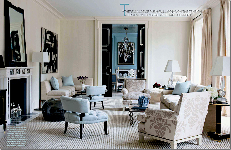
The next story is a stunning NYC apartment by David Kleinberg. Done in blues and creams with black accents, the space is a smart mix of traditional and classic. It has a grown up glamour vibe that reminds one of a Hollywood movie from the 30s and 40s. That’s a Franz Kline over the banquette on the left. Simon Upton is the photographer.
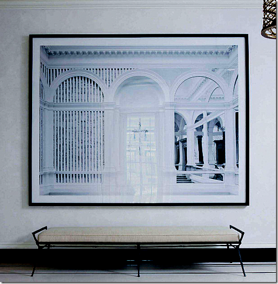
In the same apartment, a large photograph by Candida Hofer is found in the entry hall. See HERE for a story I wrote about her works.
The next house is in Florida, designed by James Howard, partner to the famous Mrs. Howard. Two of the busiest designers around, their work is consistently pretty and consistently perfect. What a gorgeous room! Those windows, that fireplace! I’ve always found back to back sofas to be somewhat awkward but not here! I could stare at this room forever. Again, the house is filled with blues and creams. The cover story bedroom is found in this house, of course. I’m waiting for these two to produce something horrid! They can’t keep up this winning streak forever, can they????? Miguel Flores Vianna photographed the house.
The next story is all about pink and Paris and made me think of House Beautiful’s pink issue. Oh well. I’m sure I’ll be writing a mea culpa to HB soon too. What a darling pied a terre, owned and designed by Roberto Bergero. All bubblegum and black stripes with limes and lilacs thrown in. Photographed by the incomparable Rene Stoeltie and written by his wife, Barbara, it comes from their newest book, Parisian Interiors.
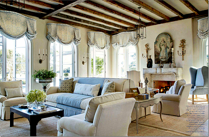
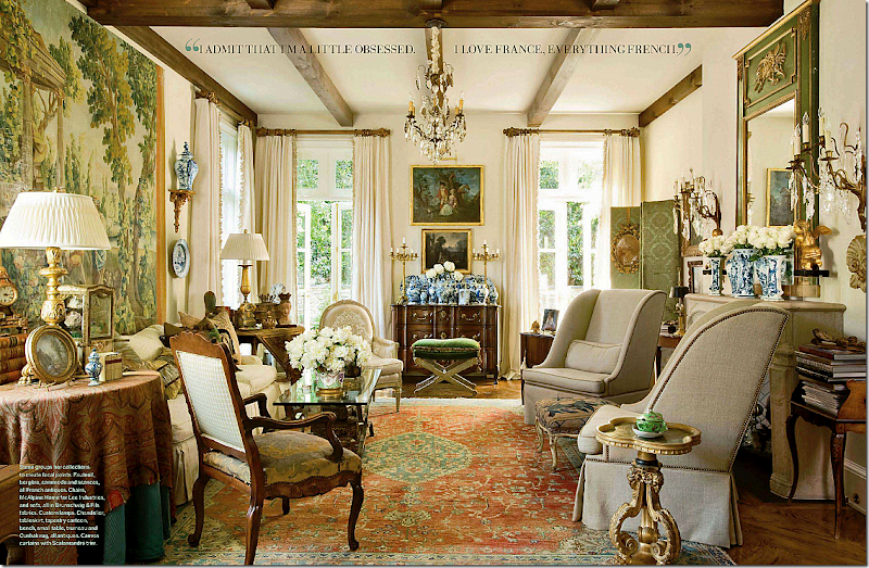
And then there is this house – a French mas found in Atlanta. Designed by Peggy Stone who lives here, and photographed by Peter Vitale. All I can say is I want to move here! The house looks like it is located in the south of France. In fact, at first glance I thought it was a restored mas in Provence. But no, it’s American and it’s new and it’s beautiful. Again, lots of blues – this time of the more aquamarine tones. And skirted tables are back! I counted several skirted dining room tables in this issue, including this house. Belgian who?????
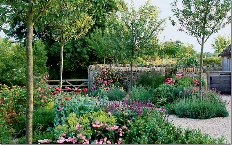
Even if you aren’t a gardener, you will still love the romantic Cotswold garden designed by Jinny Blom. Charming.
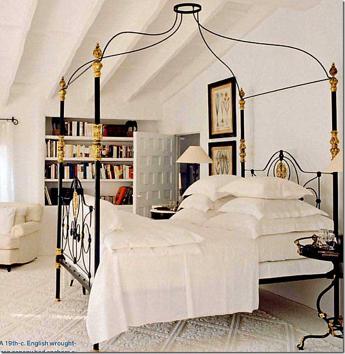
And finally, even the filler articles are great this month. A catalogue on canopy beds includes this antique beauty by Mimmi O’Connell, featured HERE. There’s an article on charm bracelets and turquoise. And back to House Beautiful’s pink issue, there’s a story about five iconic living rooms – all done in pink!
So, Dara, do you forgive me? I’m back in love with Veranda and can’t wait for the next issue!
Dear Dara:
Subscribe to:
Post Comments
(
Atom
)



Bravo Joni! Finally a great magazine edition and I can't wait to go buy an issue of my own. Love the blues and creams.
ReplyDeleteThis was funny...and you could probably sign your letter from thousands who feel the same exact way. I wasn't a big Veranda fan but have to admit they are getting better and better and this one, as you so well pointed out, is the best yet! Like you, I was (and still am) in mourning over the loss of Southern Accents, the irreplaceable Southern Accents but I get the feeling that Veranda has a new mission, a new goal and that is to marry its old look/vibe with a new one..and I am loving the union! Great and beautiful pictures....and like you said, it restores our faith in both good design, beautiful things in beautiful dreamy rooms is back with a vengeance. Love it......
ReplyDeleteHi Joni! I am a sucker for romantic decorating and I have been walking around the house with the Veranda issue since it came. I am in love with the cover story house. The Howards are my heroes. I thought I was tired of custom drapes that have valances (and I make them in my business) but this house showed me that full blown custom can still be current and pretty. Didn't you just love that ceiling in the bedroom?
ReplyDeleteThat ceiling is so beautiful!!
ReplyDeleteReally pretty pictures...I love all the creamy neutrals, yet all of these rooms have enough subtle color accents that I would never think of them as neutral rooms. Know what I mean?
I haven't picked up a Veranda in forever, but will grab this one today. Thanks Joni!
Again, it was Peter Vitale's photogrphs which captured my heart.
ReplyDeleteI felt the same way, as I carried the new issue from my post box into the bedroom to sit back, brethe and take it all in!
ReplyDeleteDelish.
L.
Ha! That's was so interesting, Joni! Funny, really!
ReplyDeleteWow... I'm going crazy over the cover! :-) It's my dream bedroom. Isn't it stunning?
I need to get buy this magazine.
Have a wonderful day!
xo
Luciane at HomeBunch.com
I would have to say YOU had a lot to do with this return to my beautiful VERANDA!! LOVE IT AGAIN!!
ReplyDeleteOh, I have been so looking forward to this post and just "knew" it was coming..... I loved this issue of Veranda, too, especially after the crushing disappointment from this month's House Beautiful and Elle Decor. I actually threw the House Beautiful on the floor in disgust. And, then, to see house after beautiful house in this issue of Veranda. Yes, it will go into the "Keeper" pile that hasn't grown in a long time.
ReplyDeleteThanks so much for your thoughts! Brilliant and funny as usual.
xo AnneHH
Hi Joni, loved your letter to Veranda+how brave, but then that is why everyone adores you. xxpeggybraswelldesign.com
ReplyDeleteThanks for the Thursday morning chuckles.
ReplyDeleteAs soon as I saw this cover, I knew it was only a matter of time before it graced your blog :)
ReplyDeleteWhat a cute approach to this subject, Joni! I absolutely cannot wait for my copy of Veranda to arrive - where is it?????
ReplyDeleteYour blog post promises some fabulous hours with the upcoming issue - YAY!
Joni,
ReplyDeleteI mostly agree with all your comments, but I have to say when I flipped through this issue and came to the photo of the ballons/londons in the living room I couldn't believe anyone would make that choice for those beautiful windows . I am a window treatment designer and felt that it was a very unflattering solution. Seems to fight with the room/window shape in my opinion. too bedroomy.
I'm a sucker for the Frank Babb Randolph room. For me, the combination of traditional or antique furnishings combined with unexpected colors and contemporary art really give a room soul.
ReplyDeleteJoni, we love how real you are and your blog is INTERESTING because you know how to inject your personality into it. That is why it's at the top!
ReplyDeleteAwesome post, and I loved this issue too!
xo
Maria
Agreed Joni!
ReplyDeleteWhat strikes me this morning is that I have been pouring over my issue for three days but seeing the photos online makes such a different impact.
Can it be that I am getting hooked on the online format? Have blogging and viewing the new online magazines dulled my interest in print? OMG!!!! Never thought I would be saying this....
Joni, Forget about apologizing. I say that this issue of Veranda deserves a "Finally! It was about time!". I've been considering cancelling my subscription to Veranda since Dara took over. I've recycled all the issues I've received since then, and this is the first one worth saving. If they don't keep it up, I'll just have to content myself with looking at your beautiful, awesome blog. As far as I'm concerned, you'd be the best editor-in-chief for Veranda.
ReplyDeleteAmen!!! I was sooo excited when I saw this months issue that I bought it right then and there knowing full well my issue would come in the mail sometime that week. but I didnt care I want it NOW! So I now have two copies. One for my bedside table and one for my coffee table!
ReplyDeleteanother one of your..."time stops still while I read one of Joni Webb's detailed design posts"! this is what you do best...thanks!!!!
ReplyDeleteps so happy Veranda is back on track...we all have a soft place in our hearts for Veranda and do not need another great magazine going under!!!
ReplyDeleteI just received my issue of Veranda and haven’t had time to read it yet so I quickly scrolled down your post without reading it on purpose. I did read your opening letter to Dara, very kind of you, I think she’ll forgive you. What little I saw of the images you posted I can’t wait to sit down and enjoy my latest issue of Veranda!
ReplyDeleteJoni the interior on the cover makes me think it is chalk paint-- not chalk board paint the technique with chalk paint what ever that is is seems to me a perfect match for this romantic look please tell s more about this chalk paint what how and I know why it is fantastic
ReplyDeleteAmen SIsta!!!! This is the first issue in a long time that won't be recycled.
ReplyDeleteHi Joni, I just received my copy of Veranda and I am in love with the bedroom on the cover. I loved, and laughed, at your letter to Dara.
ReplyDeletexo,
Sherry
Joni, you are hilarious! I too enjoyed the latest Veranda, a lot. I will confess that I am not probably the biggest fan of "romantic" decorating because it can be too prissy and too predictable. But...the Howards got it right in the cover house. I think the grayed and icy blues are fabulous. Two years ago I would have said I would never use that palette, but seeing some really well done spaces in it have changed me.
ReplyDeleteI agree!! I was thrilled with this issue and knew you wouldnt pass on the chance to share. THANK YOU Veranda!!
ReplyDeleteI have every copy of Verandah and (sigh) Southern Accents.. Some wonderful, some not so much.. I think I should have been born in the South.. This one is my absolute favorite! Yay:)
ReplyDeleteWhat's with the window tretments in Jim Howard's Living Room. Everything else is perfection
ReplyDelete!
Me too- loved this issue! Will renew my subscription that I was about to let go.
ReplyDelete-linda,ny
Looks to be the issue I've been waiting for as well!!
ReplyDeleteThe Howards! They can do no wrong. And I've been in that Atlanta French mas! You would just lay down and die!!
I so agree, it is wonderful to see such amazing interiors. Interiors that inspire that we might glean just one or two elements, but interiors that make us want to do better to find better pieces. Yes, Joni I do agree!! Great post as always,Kathysue
ReplyDeleteI'm loving your letter, but I'm DYING over the Howard-designed Florida house. That may find it's way into my Top 10 favorite magazine shots.
ReplyDeleteEnjoy this BEAUTIFUL day, neighbor!
Linsey
I saw it a few days ago and started drooling......
ReplyDeleteBeautiful indeed!
I saw it a few days ago and started drooling......
ReplyDeleteBeautiful indeed!
Thanks for posting about this wonderful issue! It was GORGEOUS!!! And count me in as another HB reader who threw the magazine on the floor in disgust!
ReplyDeleteThanks Heavens for Romantic Decor! And Thanks Heavens for this month's Veranda!
P.S. The new Charlotte Moss decor book just came in the door too! :)
Jan at Rosemary Cottage
Loved the post! Drop by to see our fabulous imported French Basketeer Giveaway. To quote Andrea plastic bags are “so passé!”
ReplyDeleteBest,
Liz
Finally, I have been waiting for at least six years for the return of sumptuous design filled with antiques and only sprinkled with modern pieces --when will California catch up with the rest of the world? Mary
ReplyDeleteGood for you Joni! This shows you are open minded and that you continue following also magazines that lately you did not like much. See? miracles happen for believers and Veranda (as AD American) is back big time. Love colors and I am enchanted by that fuchsia room.
ReplyDeleteHaving lived in Atlanta for 12 years and actually working with both magazines on photoshoots, I have to say I am so proud of Dara and Veranda! I always loved both magazines so much and this is such a beautiful issue! Lisa and her staff were so lovely to work with and I will miss the great gals from Southern Accents, but I've kept every issue! Dara is the greatest!
ReplyDeleteI love what competition and talent have done to the latest publications.
ReplyDeleteVeranda has always been one of my favorites, and you are on the money! It is a great issue! Every page.
Great post. Have a great weekend, Joni.
Teresa
xoxo
Love this post, Joni! I'm rushing out to buy the magazine today! I previously subscribed to Veranda, but did not renew. Maybe I should reconsider. Still miss Southern Accents.
ReplyDeleteKaren T.
Oh, My, God, do I love that French mas in Atlanta! That living room is exactly what I have always loved, and still do. The paisley on the skirted table. Yep, I've always collected them and am glad to see they are being used still. The trumeau! The tapestry! I agree, Belgian who? It's about time color came back. This is real decorating by real people with real talent! You are too funny apologing to Dara! Maybe all you said made a difference! Thanks for the preview. I can't wait to buy my new Veranda. Going to NYC in a few days and I'm buying it at the airport so I can savor every page on the plane!~Delores
ReplyDeleteI agree Joni, its a good issue...though HB ran a story about a house in Maine and the living room is hideous - I posted about it a few days ago...the other rooms are pretty in the house, but the living room just doesn't work for me. Anyway, Veranda is looking better and better!!!
ReplyDeletecould not agree more. and dara is so nice to work with on shoots. so talented. i have never ever been a fan of veranda. i am quickly becoming one. it is so fresh.
ReplyDeletewhat are we thinking about HB this month?? rough cover. whoa.
I totally concur.
ReplyDeleteTotal agreement. This issue makes my heart race. I love it!!! Yeah! We have not lost great design published in Shelter magazines!!!!
ReplyDeleteIn order of appearance...Very pretty!....nice...40's glam....Yowser bowser!...Ok whatever if you're into that kind of PINK thing.....And then there IT was!! BE STILL MY HEART!! Now this one is worth the magazine alone! That tapestry! The truemau! The sedan vitrine! I could cry from all the beau-tay! Makes me think Belgian schmelgian....Bring on the FABULOUS MUCHNESS! *winks* Sorry I went over the top there for a moment Joni, couldn't help myself. Vanna
ReplyDeleteI liked HB and Elle Decor this month better. And I preferred the old Verandas to the recent ones, including this April. And oh my, all that gushing---"might this bedroom be the prettiest one ever seen?".
ReplyDeleteNo.
Wow- that was one kick ass letter to Dara Joni! I have some old teachers I still owe letters to if you could lend a girl a hand sometime!
ReplyDeleteI stopped buying Veranda years ago- I must take another pass- it's looking good!
I always love how BIG your posts are :)
Best, S.P.
House Beautiful and Elle Decor were such a disappointment this month. And House Beautiful is going downhill so quickly, it's scary. So it was a great relief to see such a gorgeous offering from Veranda. AD is looking pretty terrific, too.
ReplyDeleteA huge turnaround, I subcribed to Veranda for yesrs!!
ReplyDeleteThis issue is indeed a keeper!!
xoxo
Karena
Art by Karena
This issue has restored my faith !
ReplyDeleteJoni, we were all hungry for a beautiful issue. I was getting tired of the weird exotic look-at-me-I-travel-the-world-and-buy-elephant-tusks chic of Elle Decor. And House Beautiful has just been cluttered and weird. In fact, I have been rereading old Stephen Drucker issues.
ReplyDeleteWe were all feeling parched and desperate for something beautiful and pretty and consistent. Loved this issue as much as you did.
xo Terri
Such a beautiful issue, it was great to soak it up. You are so funny, writing a letter!
ReplyDeleteI totally AGREE!!!!! I LOVE this Veranda issue!!!!!!!!! But, I've always been a big Veranda fan.
ReplyDeleteFrank Babb Randolph has officially captured my heart. There is not one room that I've seen from him that I am not over the moon about.
ReplyDeleteNot a fan of those balloon shades (am I ever?) but this in particular made me wince. Quite honestly then only room I've ever seen from Mr.Howard et al that is not absolute perfection (my opinion only).
Been soooooo in love with Mimmi O'Connell since you did that blog post so long ago. That bed is sublimeeeeeeeeee. For realzies.
Fabby post, as usual!
xoxo,
Andrea
Windlost took the words right out of my mouth! Thank you Terri and thank you Joni for another insightful post.
ReplyDeleteI love it when you do these as I always go back and appreciate the stories even more after your comments.
Oh and don't forget the flowers and gardens. Veranda does it so well....again!
Xo Lisa
oh Joni, most agreed. thanks for pointing this out. can't wait to get home and thumb through the issue!!!
ReplyDeletehaha I hope someone sent a link to Dara .. with your post LOL
ReplyDeletewell written ;)
desiree
I too have been carrying that issue with me and reading it cover to cover. This issue has been so refreshing - and to think I was considering letting my subscription go!
ReplyDeleteHi Joni, I haven't bought Verandah for a while now - there were just too many ads. But I gotta tell you, I will be getting this one. Thank you so much - I love EVERY image. Hope it comes out in Australia soon. Will go and order the express version now. Thank you. xxx
ReplyDeleteYou are SO right!!! on so many levels!!! Their timing was perfect, I had just thrown my renewal invoice in the garbage......the next day this issue came out....so I pulled that invoice out of the garbage!! They are back on track!!
ReplyDeleteIts always nice when a subscriber enjoys an issue, but why should Dara be so thrilled with your approval? Get over your self.
ReplyDeletei am telling you...
ReplyDeleteveranda's rooms and settings beat the heck out of the rest of the design rags.
xxx
Love the blue and creamy room i saw my self there with my most beloved jewelry and my unique and beautiful black dress...
ReplyDeletelouis vuitton uk are diversified in various kinds, handbags, backpacks, portable bags, purses, wallets and pouches. All kinds are popular among the whole word people.louis vuitton Store Online Handbags can also bring great accuracy as well as practical applicability and fashionable.Have you ever dreamed of being as charming as Madonna? Have you ever thought of becoming an envy of all your friends? If so, come to louis vuitton outlet.
ReplyDeleteAt the coach outlet online you have the largest selection of the day. If you touch the item and like it, keep it in your possession until you make your final decision.The coach factory outlet has been in business for many years. You can log in to find more information about its products and services.You know, Coach items are so perfect and fascinating. Now I grow up, and find coach outlet on the Internet offering affordable products with reliable quality.
ReplyDeletethe Cotswold garden is awesome, good job on their part!
ReplyDeleteomega speedmaster watches labels have won hands down when it comes to handbags, flash one picture of any best christmas gifts and women are going to drool over it, ask the question why? I am a woman myself and I love just the same thing, cheap rolex watches is a luxury to own, just the way men flash their fancy cars women flash their miu miu hobo. The primary reason being that different women have different tastes and they try to it in different kinds of items into the cheap chanel shopping
ReplyDelete