Email, we get email! Oy! I love to get emails from readers with leads on stories and pictures of houses they either live in, know, or saw somewhere. Recently two readers sent in pictures of cute houses they saw in real estate online listings. One is from Dallas, which is pretty fair game for this blog. But the other house is in Tennessee! A first here! It’s located in Franklin, Tennessee to be exact and I have NO idea where that is! But, the house is really cute as you will see. So, here are two from readers, and one from me and one from the WTH department. Enjoy!!!
HOUSE #1:
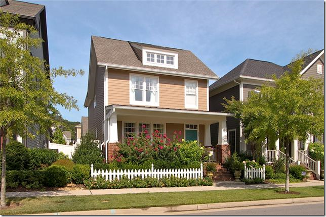
The house in Franklin, Tennessee has a really cute exterior with a picket fence. It looks like this might be some kind of planned community. The house was recently reduced to $389,000. and is 2,030 sq. ft. Built in 2006, it was renovated in 2008 with new hardwoods. It’s 3 bedrooms and 2 1/2 bathrooms. One thing that is great about new planned communities is that a lot of them have rear loading garages (garages on back alleys.) This keeps the street free of unsightly garage doors. I have no idea why America gave up on alleys because our streets are so much more charming without all the driveways, garages, and cars everywhere. At least the planned communities are bringing alleys back into favor.
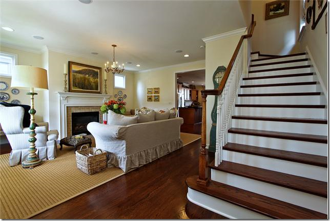
The stairs are right up front, living room to the left. Hardwoods on stairs really make a difference over carpeting. It just always looks so crisp and nice.
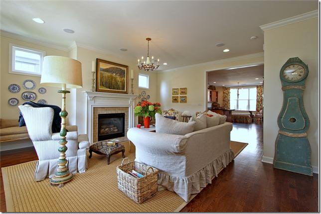
Cute Mora clock! What room doesn’t look great with a Mora clock in it? Slipcovered sofa, textured area rug, and window seats flank the fireplace. This room looks monochromatic, right? Well…….
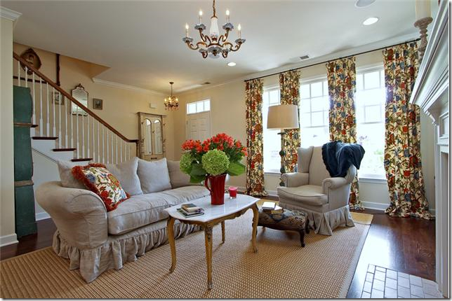
Here, you can the room is NOT monochromatic at all! Don’t the curtains make a huge difference? I’ve gotten to where I really like pattern fabrics mostly on curtains and pillows. These curtains change a room that seemed to be monochromatic into something very bright and cheery.
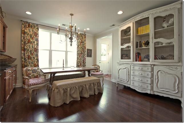
It looks like they used the same fabric in the breakfast room, but I can’t be 100% for sure. This is so cute with the linen slipcovered benches and French chairs for the host and hostess. I keep seeing slipped benches instead of chairs and I really do like this look. Not sure how practical or comfortable this is though! Great antique piece on the right.
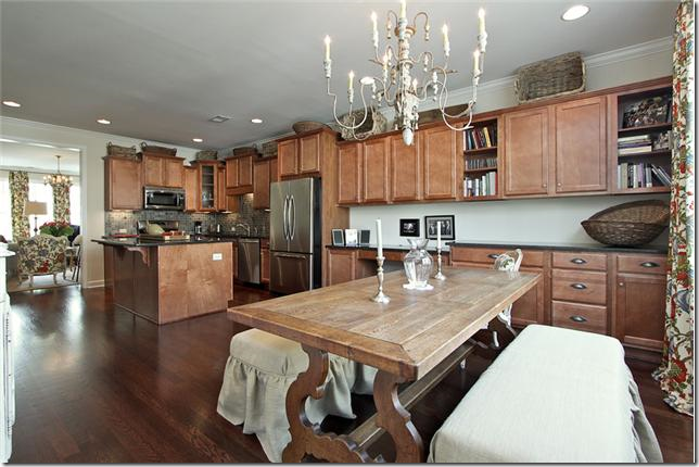
Looking the other way, pretty light fixture and dining room table. This must be the dining room too. I would probably paint the cabinets if I lived here.
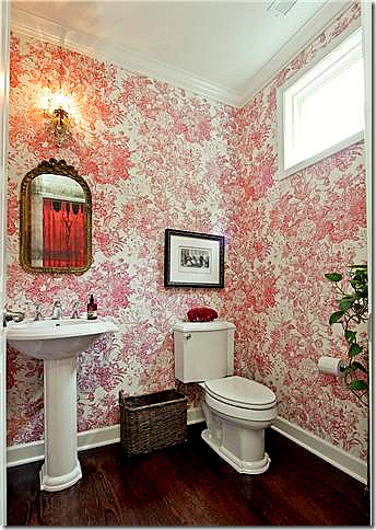
The powder room is wallpapered in a cheery red and white pattern which picks up the reds found in the curtain fabric in the living room. If you like wallpaper but are scared of using it, the powder room is a small enough space to try it out.
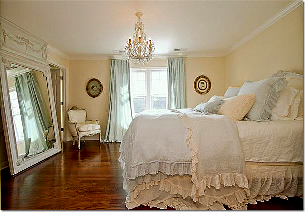
The master bedroom with touches of blue. I keep seeing rooms with just touches of blue and I really love that color combination (although the walls are too creamy – should be painted a little more white than yellow with the blue.) The hardwoods were a great investment. They look so pretty.
The master bathroom replaced the big plate glass mirrors with two small round shell mirrors – which makes such a huge difference. Also, it looks like they fauxed the cabinets – again, a big difference. The blue walls in the bathroom pick up the blue curtain fabric in the bedroom.
Cute, cute fabrics in the guest room – all grays and blacks and white. And blue! The new accent color. Really cute. Love the long dust ruffle.
The link to the listing for this house is HERE.
HOUSE #2:
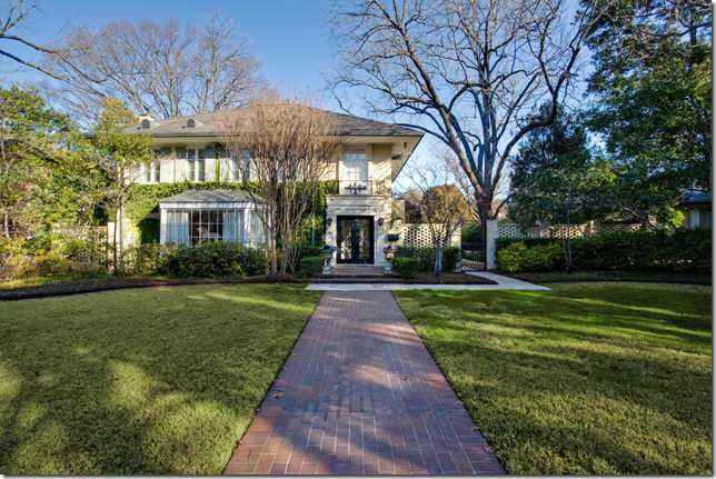
The second house that a reader found is located in Dallas, Texas and is at the opposite end of the spectrum. It goes for $3,995,000.00 and is 5 bedrooms and 5 1/2 baths! It was built in 1917 which really surprised me – houses that old are very rare in Texas.
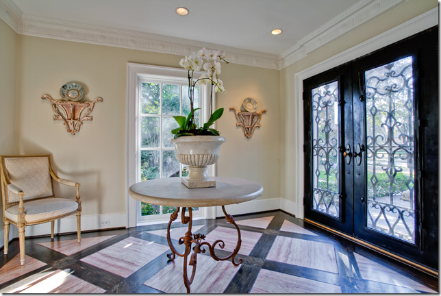
Mixed wood floor and a center table in the entry hall.
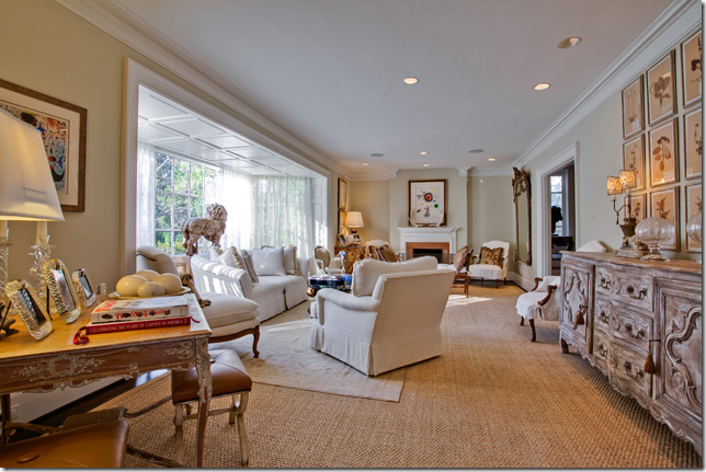
Of course I like the living room with the white furniture and seagrass rug. The big bumped out front window is so interesting. And I love the botanical set over the enfilade.
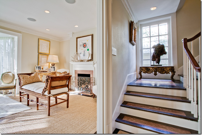
In the living room, there is an antique French bench in front of the fireplace. Notice the mixed wood stain on the stairway treads. Unusual.
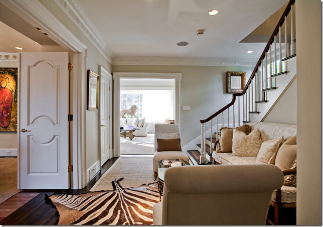
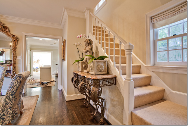
This small area next to the staircase is so cute! Love the sofa and the zebra rug. I still love zebra rugs – I don’t think I’ll ever tire of them even if they are so trendy now.
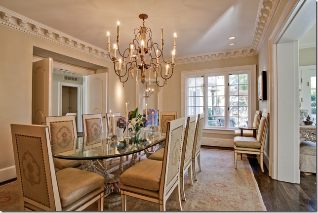
And off that stair landing room is the dining room, with the trendy Italian chandelier that seems to be everywhere today. Again – yes it’s trendy, but I still love this kind of fixture.
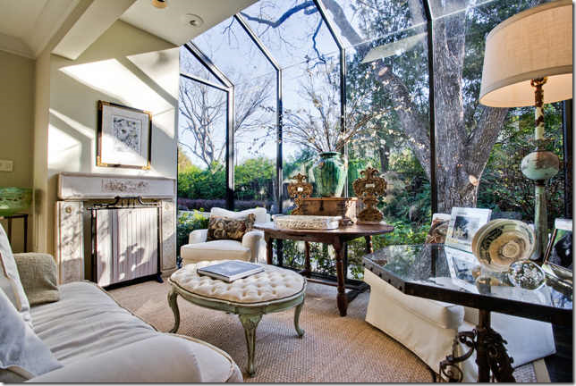
An added study space in a greenhouse type room. Pretty antique accessories and furniture. I love that ottoman.
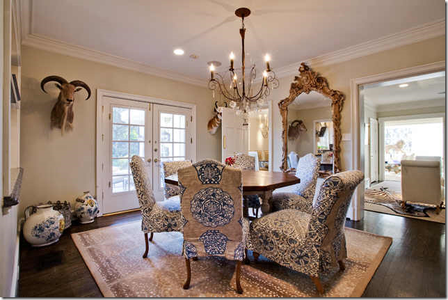
The breakfast room is very dressy and could double as a dining room! Slipcovered chairs in two fabrics and an antelope area rug. Love the oversized mirror and the chandelier. Doesn’t it look pretty next to the stair landing room with the view to the front living room?
And, a second staircase off the breakfast room. Remember, the house is from 1917 – so there are a lot of changes in the original floorplan I’m sure. I would guess this whole back section is an add on. I like what she put on the buffet – a concrete statue and two planters. Nothing expensive, but it looks like a million.
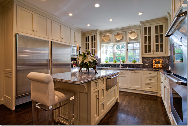
The kitchen is all new – I love the three plates hanging above the sink.
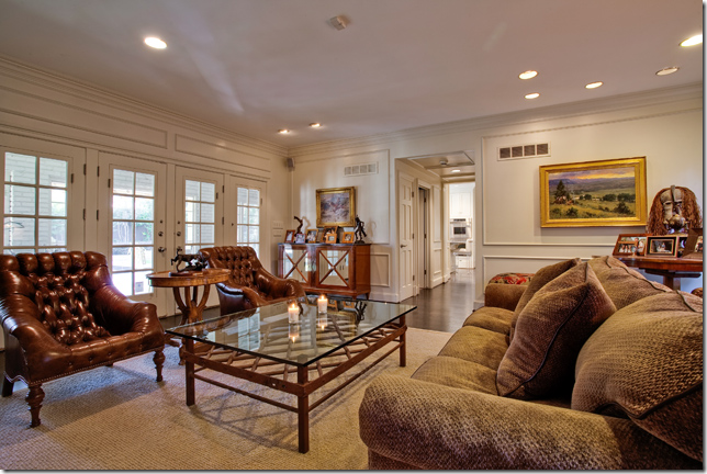
The family room, off the kitchen.
Blue, again! Pretty linens. Thanks to the reader for sending this house in! The listing is HERE.
HOUSE #3:
And, my listing from Houston, is a small house in Briargrove, a neighborhood filled with young families just starting out who buy these houses from older empty nesters. Built in 1961, it has 3 bedrooms and 2 baths and is $600,000 – high for the house, but you are paying for the close in location.
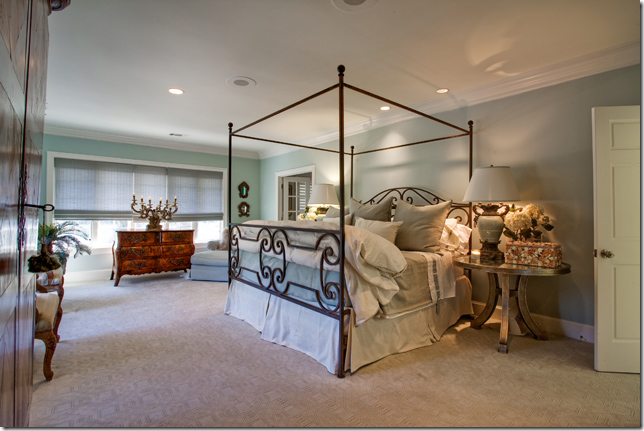
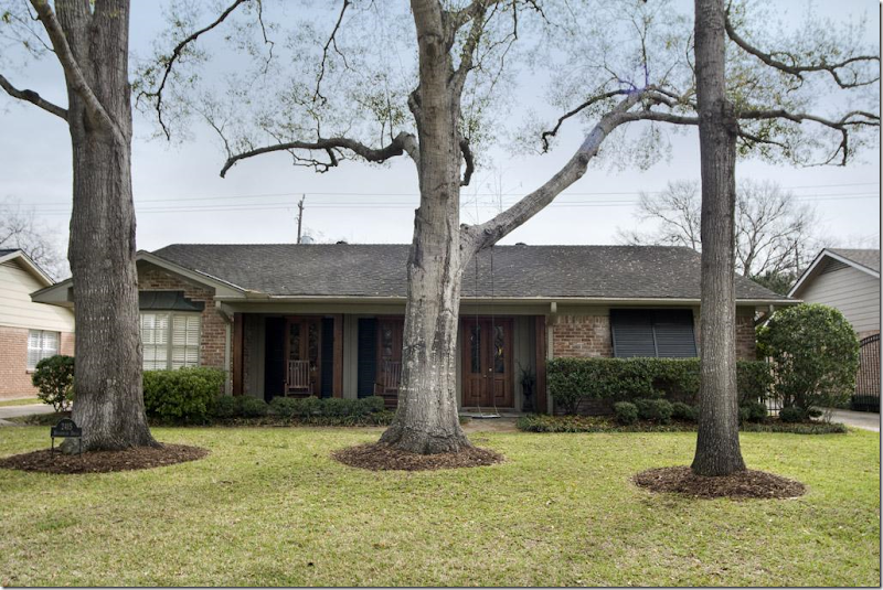
This particular house caught my eye because of the updates that have been done – like these beautiful wood French doors that replaced small aluminum windows. They make such a difference. The doors open to a front porch. And to those who think all Houston homes are white slipcovers, here you can see they aren’t! I love those toile covered chairs and ottoman – the furniture is overscaled and really fills up the room nicely – makes it warm and cozy. In new houses, the rooms are always so large and there is never enough furniture in them – making the rooms seem cold and empty. Always try to fill up your rooms with furniture if you want that cozy environment.
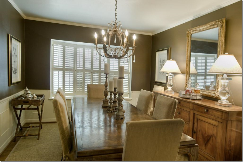
The adjoining dining room is painted darker for effect. Restoration Hardware lamps.
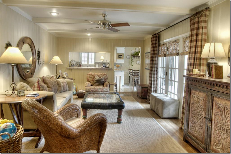
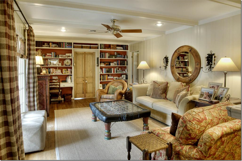
The paneled family room was painted light – which is a great way to update dated paneling from the 60s. Notice how much the curtains add to this room. They really brighten up the space and provide warmth and interest.
Looking the other way – I love how they painted the bookcases the persimmon color, which comes from the chair fabric. I do think they should have removed the baby proofing from the coffee table for these pictures! hehe!!!! And notice the wood doors here – this one small change adds so much to the space, creating architectural interest where there really isn’t any. Great idea! Great family room.
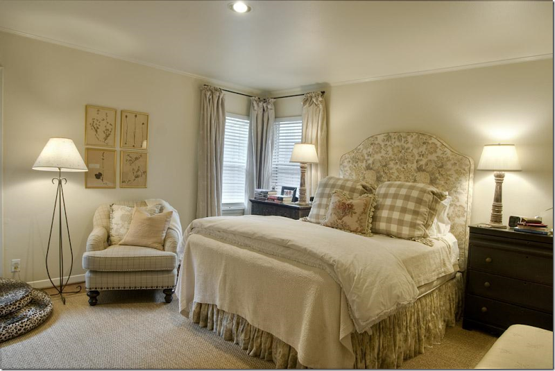
More checks. The use of checks in each room is another nice way to visually tie the house together – creating a flow of a design element. The owner has checks and plaids in the living room, the family room and the master bedroom. Cute headboard.
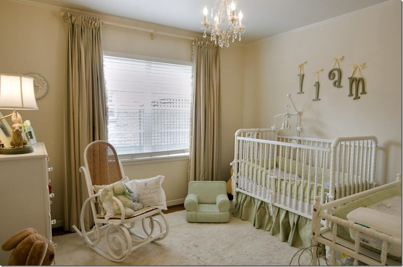
Nursery – more curtains which soften the room. Again, the room might have seemed bare with just the shades and no curtains. Always go for curtains if possible.
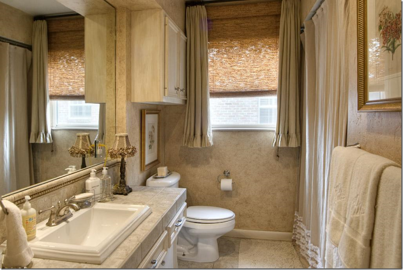
And a redone 1960s bathroom with new countertop and sink. I like the window treatment – good idea for an awkward shaped window. To see the listing go HERE.
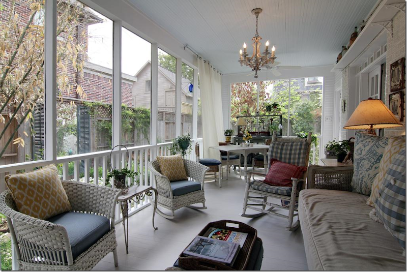
PORCH #1
I found this screened in porch from a HAR listing in West University. I would LOVE to have a porch like this!!
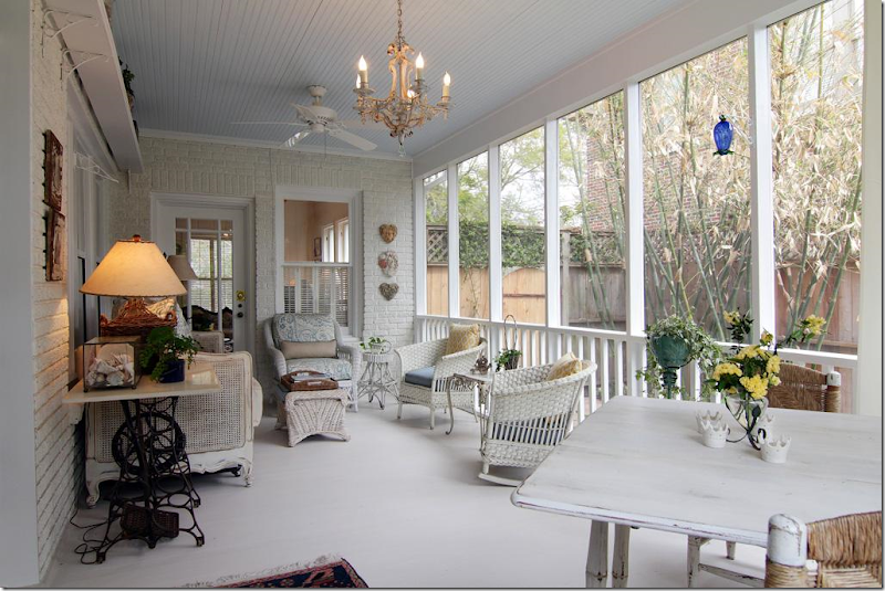
And looking the other way. Houston has so many mosquitos that screen porches are almost a necessity if you want to sit outside.
Kudos to HAR.com for coming online with these new super large images. So great!!!
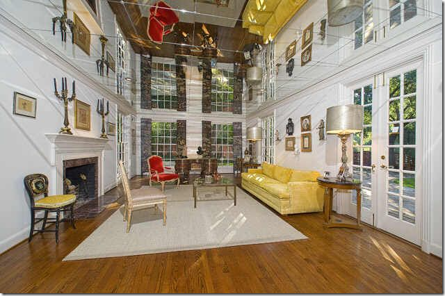
And finally, in the WTH is this department???????
I found this living room in a house for sale in Dallas. It took me a while to figure out exactly what the heck it was. Is this a two story living room with double windows???? No! If you look closely, you can see that the ceiling is mirrored tiles! OMG – this would give me such headaches. I suppose this was done to make the low ceiling appear taller – which it certainly does, but at the same time, it makes it look like there is a chair and sofa hanging upside down in the room. Crazy!!!!
Thank you to the readers for sending in these houses today. If you see a listing you think we would like to see here, please, please send it in!!!!!
AND FINALLY – HOUSTON WELCOMES BUNNY WILLIAMS THIS THURSDAY!!!!!
SOOOO Exciting!!!!!! Come see Bunny Williams at Greenwood King’s for a Discussion at the Lobby!!!
Readers Picks: Two Houses
Subscribe to:
Post Comments
(
Atom
)




Wow. Some beautiful homes, but that last room in Dallas is going to give me a headache for days. Who could ever be comfortable in that room?
ReplyDeleteBunny Williams' appearance anywhere is big news. She is becoming my all time favorite designer. A peak into her own comfortable and easy NYC apartment with its marvelous collection of antiques and art collection is a sight to behold. I adore her relaxed, collected style and her approachable personality. Those in Texas who have a chance to meet her will not be disappointed. I hope you have an opportunity to interview Bunny and perhaps get an interview for the SRT.
ReplyDeleteGreat homes especially the cute one in Franklin my favorite charming town. Franklin is right outside Nashville. Has some of the cutest shops!
ReplyDeleteOMG, the "WTH" pic is like something out of "Inception"!
ReplyDeleteFun post Joni, I really enjoyed seeing inside each of these homes. I had to giggle a bit because of how you kept calling them cute. You have to read my post to see what I am talking about:
ReplyDeletehttp://goodlifeofdesign.blogspot.com/2011/03/i-think-i-am-too-old-to-be-cute.html
I just recieved Bunny Williams new book signed by her today. I won it on a giveaway and I am thrilled to have such a treasure. I only hope someday to meet her. YOu are lucky to be able to see her again.
Kathysue
The first house is my favorite of the three. I so agree with your comments about alleys with garages built behind houses - they really do make a huge difference in the appearance of a neighborhood. I wish more communities would build with this asthetic.
ReplyDeleteHoping you will discuss the design and decor features of the very pretty home on pages 116-123 of the April issue of Veranda!! :)
ReplyDeleteJan at Rosemary Cottage
The decorator of House #1 has some seriously fine skills. I am so impressed. Really nice work.
ReplyDeleteThank you, Joni, for bringing so much to all of us all the time. You simply amaze me.
What soft and pretty houses. It does show that good design can make any of these houses very desirable. The first house is very attractive to me as an empty nester. The garage in the back really does make a difference.
ReplyDeleteI also really liked the '60s house because it's a lot like mine. It isn't necessary to ripe out everything and start over to have an attractive house. Who wants or can afford to follow every trend? It would be exhausting. Better to create something more timeless.
Have fun with Bunny Williams.
Joni, I love the decor of the 1st home. The other homes are beautiful (with the exception of the mirrored ceiling!) but the 1st home is so calm and dreamy. Thanks for sharing.
ReplyDeleteI love your taste. I hope to have you redecorate my home one day!!
ReplyDeleteI'm a huge fan of Franklin, but it's hard to find listings with great interiors there. (They need a huge dose of Cote de Texas!) BUT...this one you shared is a great exception! So charming! I love the kitchen table and benches (thought I'd prefer a chair back if it's a long, lingering kind of meal).
ReplyDeleteXo,
Linsey
My favorite thing in this post is the screened porch. I'm with you Joni. A big screened porch is the way to go. Wouldn't it be fabulous to sit out there while it's raining? I think this kind of space could just about double the livability of a house.
ReplyDeleteI just love these home comparison posts of yours Joni! That first house is really nicely done. I'd like to steal that hutch right out of their kitchen it's so cute and frenchy *winks* And I really liked the use of a pier glass table under the window on the stairwell of house #2. A good way to use one creatively if you don't want to use the mirror with it. And OY YEY! That mirrored ceiling is hideous!...It gots ta go! Vanna
ReplyDeleteAll three great, and proof that beautiful interiors can be had in even smaller home (like the first) they are all tastefully and beautifully done. I especially loved the interiors of the Dallas home.....spectacular!
ReplyDeleteThanks for sharing....
My favorite is housen°2! A gorgeous living room!!!
ReplyDeletexx
Greet
Oh that greenhouse/sunroom in the second home is wonderful! I would be so happy in there with my books. The pretty breakfast room is lovely as well.
ReplyDeleteBut there is just something more cozy about the 3rd house. Love grows best in little houses.
Thanks Joni!
My favorite was the screened in porch. It's just so lovely.
ReplyDeleteGorgeous interior! Nice furniture, wall colors and the screened porch. Very cozy, crisp and spacious house! Lovely post, check out 3D Rendering
ReplyDeleteHouse number two would be my pick but not my checkbooks…sigh, a girl can dream! I smiled at that porch you want but did you notice how it looks directly into the neighbors’ house? You could sit out there in your pajamas and wave to your neighbors each morning…lol. What were those people thinking putting tile mirror on the ceiling? CRAZY!
ReplyDeleteDear Joni!
ReplyDeleteI especially love the guestroom in house Nr.1!
And here are my plates I told you in February. Do you have an idea what the one on top served for? We can't figur it out...
Have a good day!
Rebecca
http://wachsenlassen.blogspot.com/
22.03.2011
Joni, do you know who was the designer of House#3?
ReplyDeleteHi Joni! House #3 is a friend of mine! It was decorated by Cathy Chapman. I have a story on this house too if you want to send me a message.
ReplyDeleteI always love when you showcase real homes, especially ranch styles. I'm in Briargrove too and yes, we pay out the wazoo for homes here! Ridic
Hi Joni! House #3 is a friend of mine! It was decorated by Cathy Chapman. I have a story on this house too if you want to send me a message.
ReplyDeleteI always love when you showcase real homes, especially ranch styles. I'm in Briargrove too and yes, we pay out the wazoo for homes here! Ridic
Love them all, they are all so gorgeous and so unique. I love the one with the porch!
ReplyDeleteNancy
Franklin is a lovely historic town just south of Nashville. Great antiques & wonderful shops in a quaint old-fashioned main street area. Big music area too, and just a hop, skip, and a jump from the most amazing countryside you'll ever see!
ReplyDeleteMeant to say; I really love that Franklin house. The second one is too..too... Love the third as well.
ReplyDeleteWhat a GREAT post, as usual. I can always count on you to make my day a happy day. This post just proves that homes can look fabulous no matter what the price range, all it takes is stellar taste and style. xo Lidy
ReplyDeletebtw...I'm emailing you re something, pls. check.
Joni,
ReplyDeleteI don't know how to email you, but here is a Sally Wheat-inspired West U kitchen that is a sleeker modern take using BM fieldstone.
http://search.har.com/engine/6421-Mercer-St-Houston-TX-77005_HAR61680354.htm
Really beautiful homes, but #3 is my favorite. Feels very cozy and comfortable with just enough sophistication. On another note, I would be afraid those ceiling tiles would fall and slice something off of me.... yikes!
ReplyDeleteIt makes me want to move to Franklin, TN when I see what you can buy for less than $400,000! You can't buy a dog house in Chicago for that price.
ReplyDeleteBeautiful, livable spaces. Love the room with all that nature on the other side of the glass. I want to wake up like that!
ReplyDeleteBeautiful homes featured! Franklin is a cute town a very short drive from Nashville, TN and has some of the neatest antiques shops. If you're ever in the area, it's worth it to visit both Nashville & Franklin. There are many great real estate buys in the South where you get more bang for your buck (and I mean great homes with more square footage in great locations!).
ReplyDeleteKaren T.
Sweet houses. Love that last porch. Thanks.
ReplyDeleteoh very beautiful house :)
ReplyDeletehttp://ecceguzellik.blogspot.com/
Love house #2. That clean lined solarium with the antique table and fragments looks just splendid.
ReplyDeleteLOVE the screen porch. Actually love the furniture/accessories in the WTH, room...but those mirrored tiles on the ceiling are atrocious! And I'd be nervous that one would come crashing down on my head ;)
SO jeal that you get to meet the Grande Dame herself! Gah! Lucky!
xoxo,
Andrea
Beautiful homes . . . loads of ideas! Does anyone know about the bed linens in the first homes master bedroom?
ReplyDeleteA great post, the porch would be one of my favorite spots I think. #1 utilised the space very well.
ReplyDeleteI'm a new follower.
Mimi
WTH house is so not right! Love the benches (slipped or upholstered) mixed with chairs for dining. I, too, am really liking the patterned curtains now - it is about time! I do adore Bunny Williams - have all her books and learned so much. Should not complain, I know, but I found her latest book to be rather a rehash - it felt kind of slapped together and skimmed over topics. I did not care for all the tiny photo collages. Oh well, sorry Bunny!
ReplyDeleteOne more thing - I would LOVE to hear Bunny on the SRT - yes, I still (her latest book aside) adore her!
ReplyDeleteSo glad to have found your blog!!! Holly over at "Things that Inspire" told me about you! I am an artist and am doing a "giveaway" on my blog right now. Thought you might be interested!
ReplyDeletewww.kendallboggsfineart.blogspot.com
Thanks and will put you on my "faves" list!
Loving the first house featured! It's so charming the way it is furnished. Love to see a house decorated in the same style as the exterior. Very fitting! Thanks for sharing so many great pics. I always look forward to posts like this!!
ReplyDeleteLooks like house #1 is in McKay's Mill. It is a master planned community between Franklin and Nashville/Brentwood. Very cute with a 1950's village feel.
ReplyDeleteThanks for all these great examples, Joni! And I agree: WTF with the mirrored ceiling??? And what, no disco ball?
Joni a great assortment you've found. I love the way from the least to the most expensive it is the decor that make the home shine!!
ReplyDeleteAll in the details! I too wish more alleyways were used instead of seeing 3 car garages smack in front of the house!
xoxo
Karena
Art by Karena
Nice homes. Number one is my favorite, followed by number three. Number two seems extremely overpriced. Nice kitchen, but if I were paying upwards of three million dollars, I don't think I'd be happy with the blandly carpeted stairs and bedrooms. Why didn't they continue the hardwoods? Number one is both stunning and accessible. I love it!
ReplyDeleteAmy
Hello Joni!
ReplyDeleteOf all the houses, I loved the 1st one better! It feels really welcoming, homey, comfy.. so sweet!
Have a wonderful day!
xo
Luciane at HomeBunch.com
Great homes. That mirrored ceiling though is a bit distracting! fyi- wish I could make the Bunny Williams talk- love her!
ReplyDeleteThe first home is the one that made my heart pound faster...and I know EXACTLY where it is! My mom's best friends (IN TN) have a daughter living near by. It IS a great house and I am tickled to see inside it!
ReplyDeleteLove,
Sue
House 3 is a good friend of mine. It is gorgeous! The inside is lovely, but the front yard is really special. The trees and double front doors are so beautiful and really welcome you home. This is a perfect house for whatever family ends up here. I know the neighbors and they are fantastic, too. They've taken such great care of this house! Yesterday they posted a few new pictures including one of the entry:
ReplyDeletehttp://search.har.com/engine/2415-Briarmead-Dr-Houston-TX-77057_HAR69511065.htm
Love reading your beautiful blog! you had me at the first house~:) chris
ReplyDeleteHow exciting to see the post on my hometown of Franklin! Living in Sugar Land now, so thanks for sharing a dose of home. Alot of new construction is going up to similate the Victorian and Colonial styles of the Civil War era.
ReplyDeleteI just love these posts! Keep em coming! I can find something I adore in each of them!! So fun to peak in "real" homes!
ReplyDeleteTessa
Add me to the list of Franklin, TN, lovers.
ReplyDeleteA Houstonite now, I would love to transplant to Tennessee (I imagine NC would be just as fine). The mountains, the weather, the sweet country charm mixed with some refinement. When I hear the name of the state, the image that pops into my head is stone mountain sides peaking out of lush, uncontrollable greenery. Usually with a baby waterfall somewhere in the image.
Joni, maybe you should road trip with me some time! I make fairly frequent trips 'home'.
Love your blog, but it causes me to spend so much time with my head in the clouds!
Love Mr. Howard's two tone treatment on the back to back sofas.
ReplyDeleteLOL - furniture hanging upside down effect with the mirrored ceiling. That is a find!
Lisa
At the coach outlet online you have the largest selection of the day. If you touch the item and like it, keep it in your possession until you make your final decision.The coach factory outlet has been in business for many years. You can log in to find more information about its products and services.You know, Coach items are so perfect and fascinating. Now I grow up, and find coach outlet on the Internet offering affordable products with reliable quality.
ReplyDeleteThere certainly are a amount of methods to acquire affordable coach products at coach factory outlet,it could possibly the most effective options.the most vital cause may be the reality that you simply can purchase genuine coach products at there.All people give the good comments for the coach factory online, and now the Coach outlet store provides many discount goods online.Coach bags enjoy high popularity throughout the world. I would like to share the coach factory outlet online with you. What are you waiting for? Just come to visit.
ReplyDeleteThere certainly are a amount of methods to acquire affordable coach products at coach factory outlet,it could possibly the most effective options.the most vital cause may be the reality that you simply can purchase genuine coach products at there.It is believed that you will like the products on the coach factory online. There are spacious sizes and different colors, styles and so on.in the market you definitely can find various colorways that are designed in as well as the high quality that applied in. For most of you would like to come. So just come to our coach factory outlet online store to choose one.
ReplyDeleteThe Coach bag is from the latest release of Coach Bags. Its crisp, scribble material, leather handle, perfectly complements the relaxed shape of this stylish pouch. All the items of coach outlet online Store fit all of your essentials and more.Bright colors, exquisite workmanship, durable material and up-to-date style all lead to the great fame of the goods in coach outlet.As a fashion and modern lady, you can never have too many bags but Coach, Coach is a great leather handbags brand. coach outlet store online have different look according to different designer concept.
ReplyDeleteHouse 3!
ReplyDelete