Bingo. Looking at HAR this week I got a lucky hit. A lucky hit is where everything just comes together – wonderful architecture, beautiful interior design, lots of French antiques, and just a bit of a mystery to drive me INSANE!!! A lucky hit like this is very rare and hardly ever happens which makes it all the more special. So…here’s the story. Get your coffee, pull up a chair, and sit back. It’s a little wonderful and a little bit crazy. Here goes:
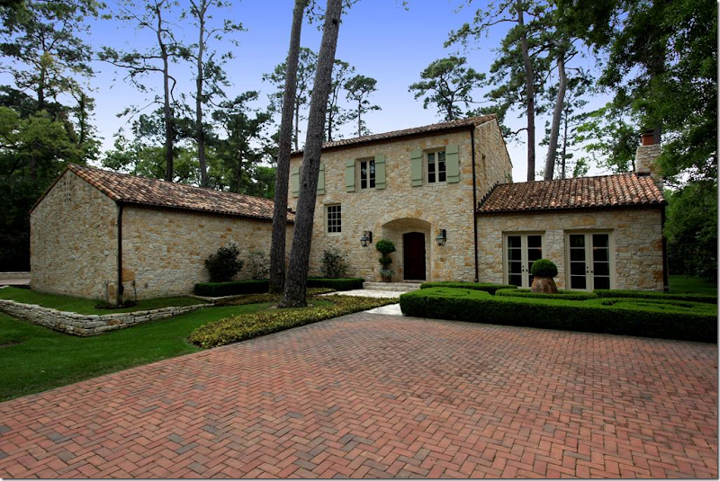
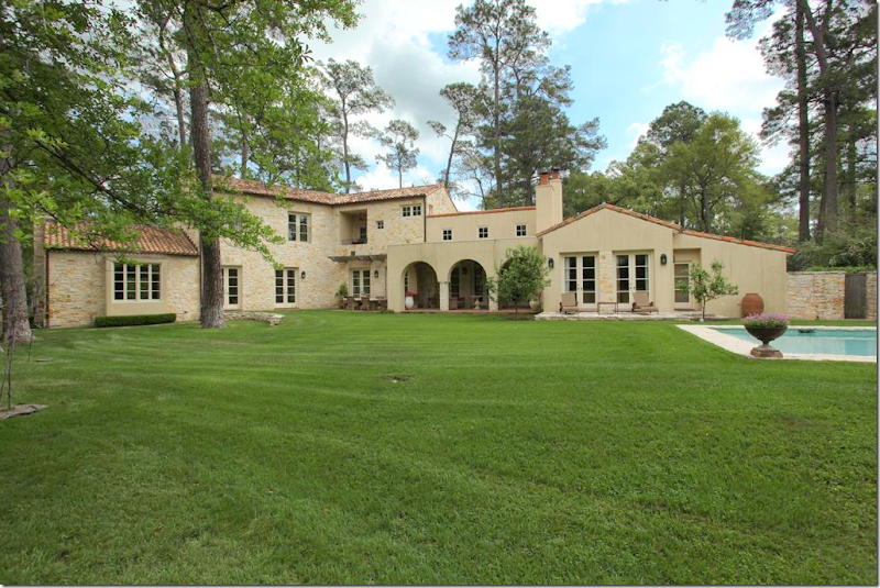
Wow. This gorgeous house caught me eye. I had been surfing HAR for a few days looking for anything interesting, and of course, nothing for sale right now is interesting, at all – just a bunch of oversized, poorly designed houses filled with poufy leather sofas and, well….shivers. What a waste of time. Just as I was about to give up, this beauty pops up. Whoa. Is this Houston??? Of course it is, the towering pine trees give it away, but take those pine trees out and insert plane trees, and it could be Provence or Majorca. I’m loving the exterior with the authentic green shutters, tile roof, limestone walls. Just gorgeous. There is just no way the inside is going to be great, right? I couldn’t be that lucky, could I?
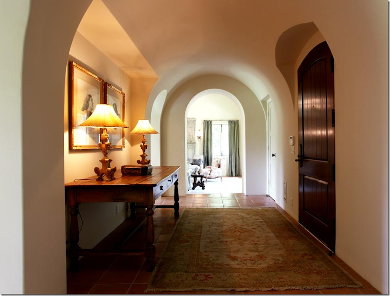
Wrong. Inside, things are starting to look very good. Great lamps and prints are in the entrance hall, with its beautiful ceiling and arched doorways.
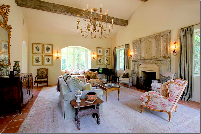
The living room is filled with French antiques, a large muted rug, and an unusual trumeau – dating from the 1700s. The chandelier is divine. Something about this room seems familiar and I just can’t place it. I know I’ve never seen this house before…but still, it seems like I have. I notice the Kenneth Turner candle on the side table – the one in the terra cotta bowl with its wicker sleeve that’s been discontinued. It makes me smile and think of Carol Glasser for a brief moment. And then…those prints on the back wall remind me of her too, for some reason.
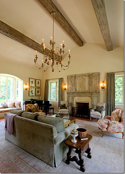
Another view of the fireplace with the antique trumeau.
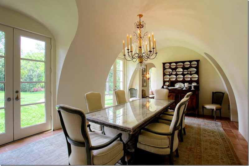
The dining room is beautiful – the walls and ceiling are a work of art. The chairs and table are so pretty and unique. And no seagrass – instead another faded antique Oushak rug sits underfoot. My eye goes to the large collection of creamware and the utterly gorgeous chandelier. Someone has exquisite taste, very, very exquisite taste.
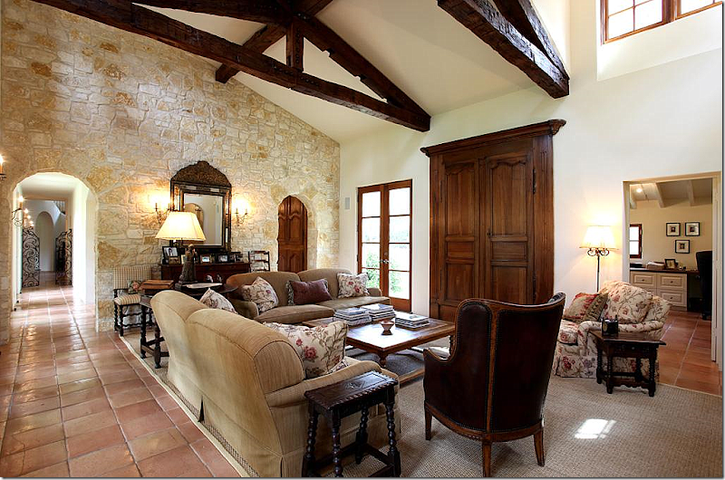
The family room is comfortably furnished, with Bennison printed fabric. I love that pattern and even once used it for my dining room skirted table. The TV is hidden behind 18th century Armoire doors that are mounted on the walls. The mirror on the stone wall is incredible. I’m loving all the small, Spanish style side tables and that chair! Notice on the left, down the hall, the gates with the staircase behind it. To the right through the arch is the kitchen/breakfast room. And at the right of this picture is the study/office.
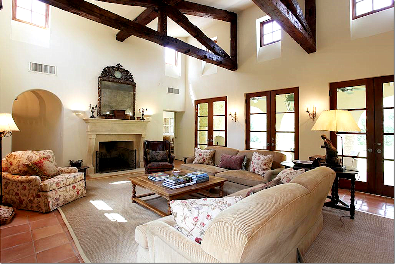
And looking the other direction, towards the fireplace with its limestone mantle. Another stunning mirror. In this room, seagrass makes an appearance. This is Houston, after all. The master bedroom is off to the left of the fireplace and the playroom is to the right.
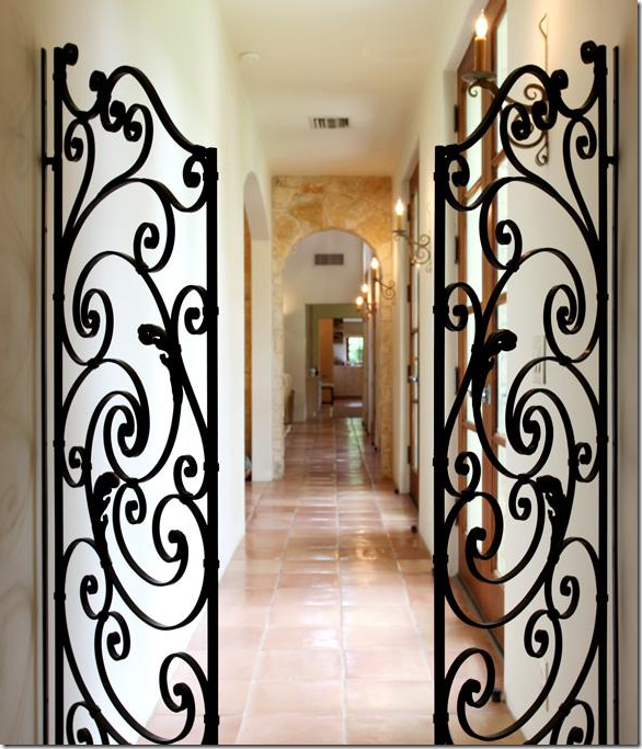
From the entry hall and the staircase, these iron gates lead to the family room and through to the playroom. The arch on the left is the breakfast room and the kitchen.
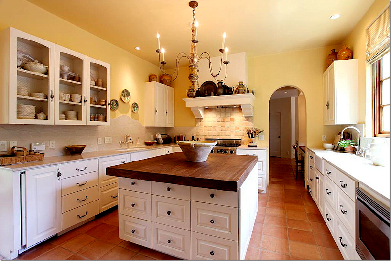
The kitchen has wire fronted cabinets. Notice the curved travertine backsplash behind the sink on the left side. A farm sink is on the right side. The island top is cypress wood. Through the arch is a kitchen desk area which leads to both the foyer and stair hall and to the mud room and garage.
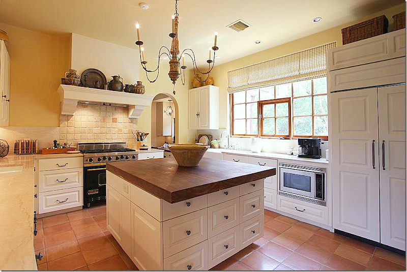
Another view of the kitchen with its charming range hood that resembles a fireplace mantel. The chandelier is perfect for the space.
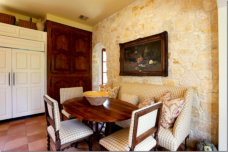
At the end of the kitchen is the breakfast area with its Austin limestone wall. The pantry is hidden behind 18th century Armoire doors that are fitted into the wall. I love the check fabric with more of the Bennison fabric that is found in the adjoining family room. Beautiful antique chairs, sofa, and French wine tasting table.
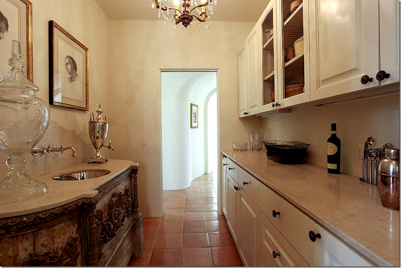
Between the foyer and the kitchen office is the wet bar. Just look at the antique cabinet with its inset polished nickel sink and curved travertine backsplash. Beyond gorgeous! The arched hallway leads to the front dining room and living room.
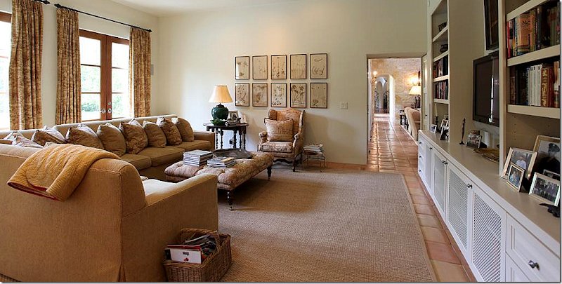
The playroom, off the family room has a large sectional. The antique styled ottoman and French chair, along with the gate leg table add warmth to the room, as do the curtains and the collection of botanicals.
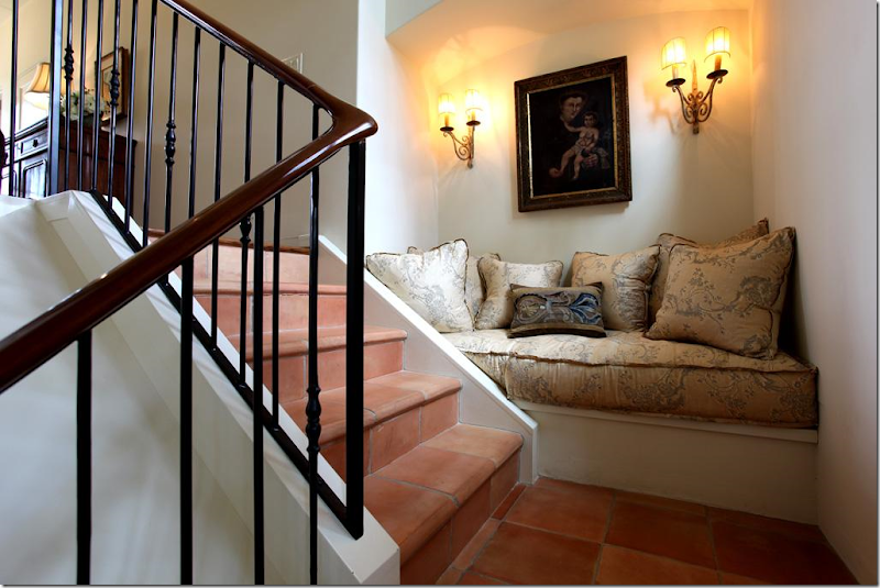
Up this stairs, on the landing, this vignette sends off signals to me. Where have I seen this before? I KNOW I have, but where? The house is starting to get under my skin.
It’s this picture that starts the bells really ringing loudly. Call me crazy, but I KNOW that mirror! I could swear on my child’s life that this mirror was on the cover of a Veranda years and years ago. It was over a bed in a house that was once my favorite house ever. I know this isn’t the same house, but it seems so similar. It’s all coming together. That chaise with its distinctive arms – it’s familiar too. At this point, I have to go do research, which means digging through piles of old Veranda’s to find the magazine with that mirror on its cover. It doesn’t take me long before I have it in my hands. And yes, it’s the same mirror – exactly. So is the chaise. So are a lot of things that have seemed familiar. Does anyone remember that cover, that story?
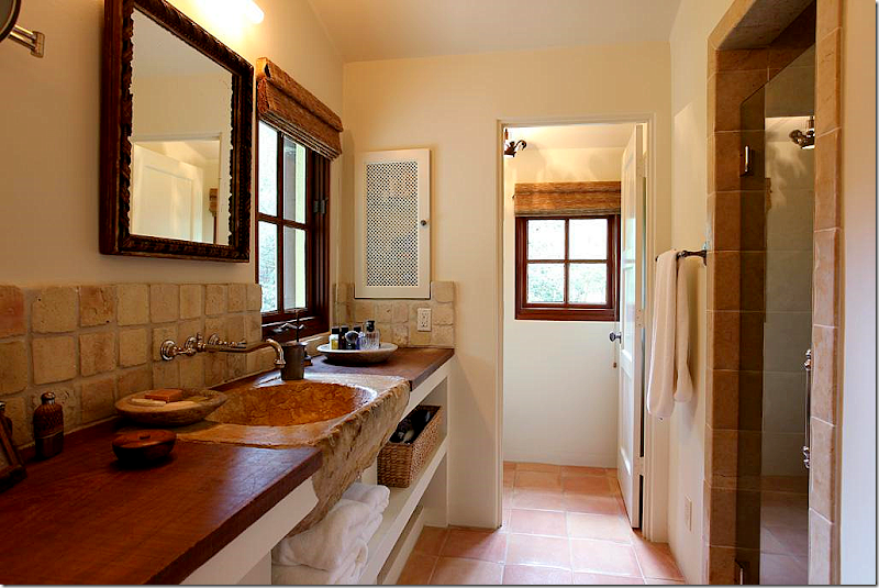
That sink! This is the man’s side of the master bathroom.
The woman’s side. Love the tub and the mirror – gorgeous!! And notice the triple vanity mirror – sooo great.
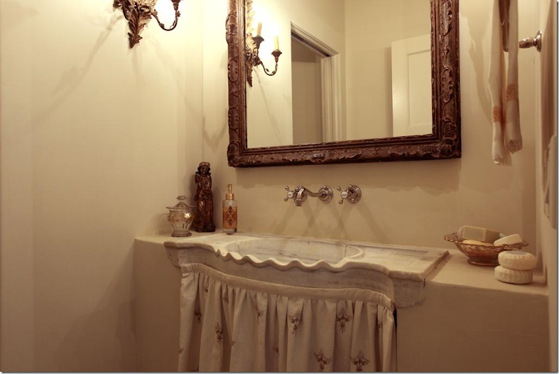
Charming powder room – just charming.
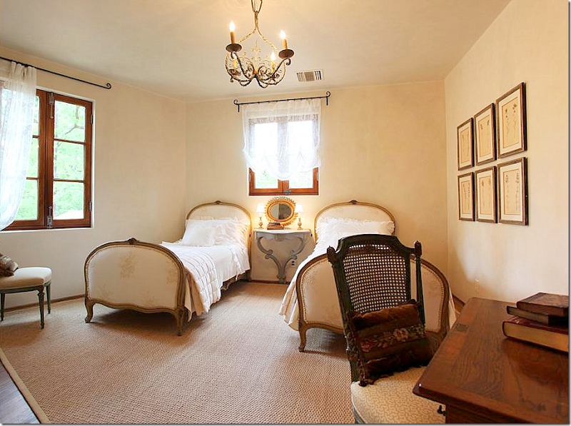
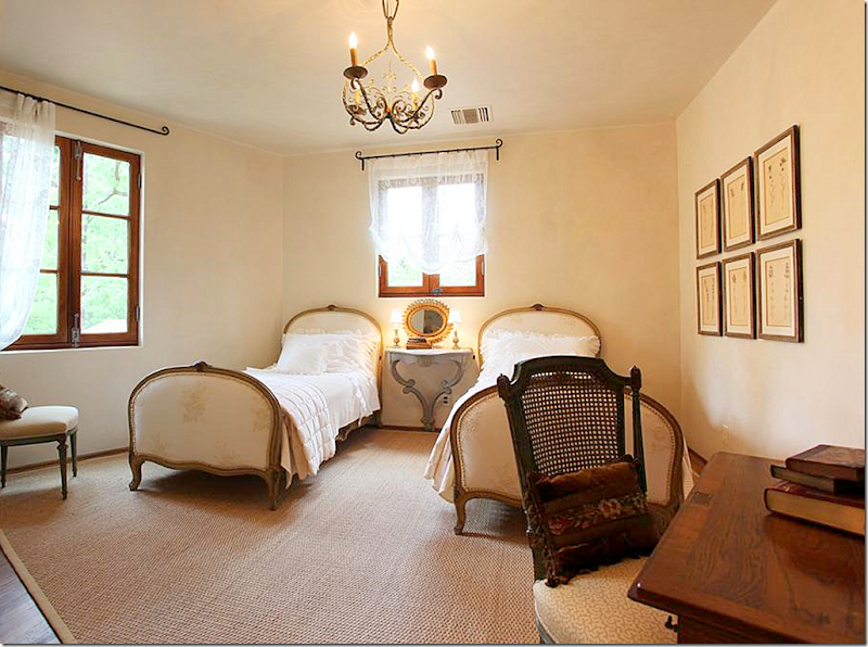
The guest room – I could move right in. Those beds are wonderful. And notice the hanging console between them. All the windows and the hardware are incredible = mahogany wood throughout.
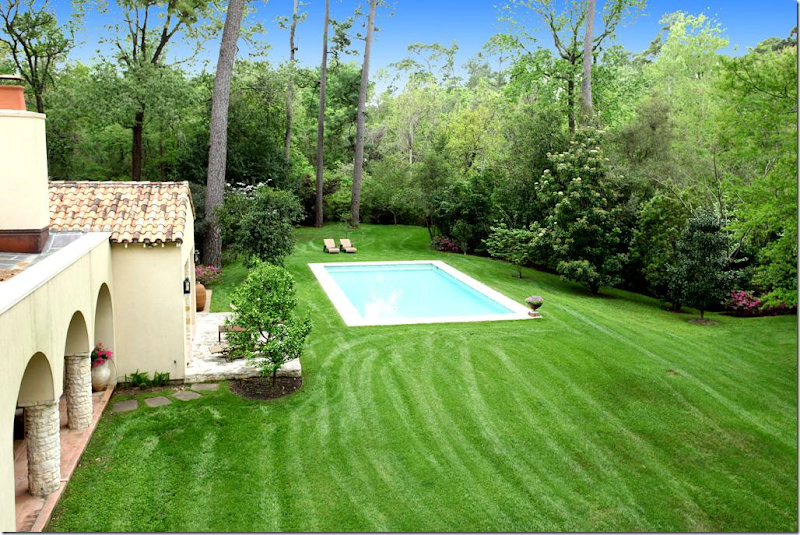
The back of the house – to the left is is the living room, then the dining room, then the kitchen and family room, which is behind the covered terrace, then the playroom, with the master bedroom in front of it. I like how they sited the pool off to the right of the house, away from it. It’s more European that way.
A view from behind the pool.
And here, you can see how isolated the pool is and just how utterly beautiful the property is. It’s located on one of the most isolated streets in a very small but terribly exclusive neighborhood more country living than city living.
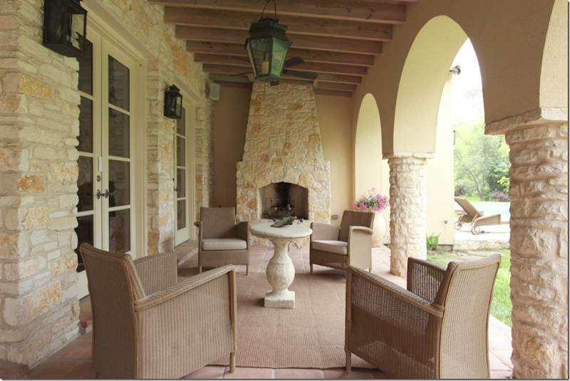
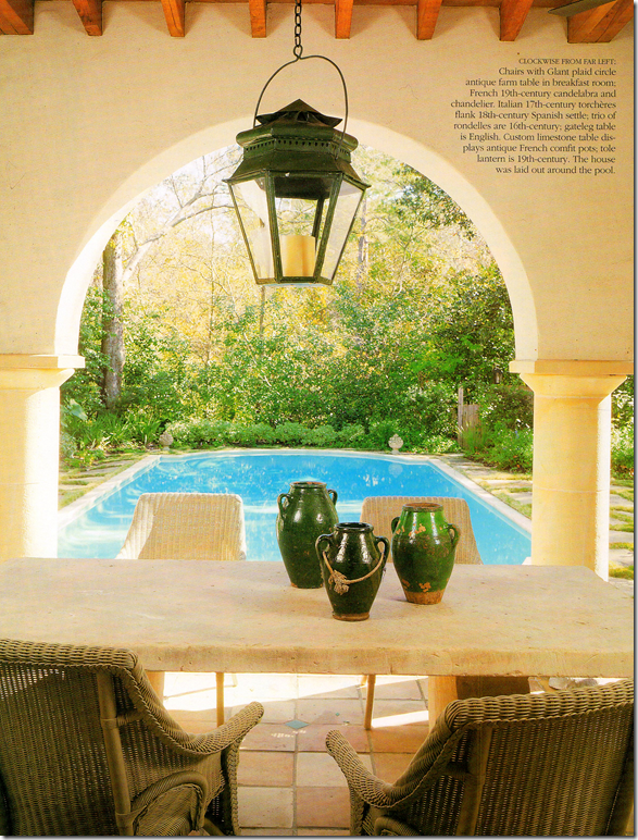
The porch off the family room. There is a floor plan and an itemized account of each room with the HAR listing.
After I saw the HAR listing and thoroughly confused myself, I looked up this story in the old Veranda, from February 2001. Now, the HAR house was built in 2004, so it can’t be the same house. After looking again at the captions of the HAR listing pictures, I noticed something I had missed before: Architect Kirby Mears of Murphy Mears and Interior Designer Carol Glasser. This is the same exact team who were responsible for the Veranda house. What gives? Two similar houses with the same team and mostly the same furniture?
Above, in the 2001 story, is the same mirror found above the bed in the HAR house. The HAR house has matching Swedish styled nightstands, while the Veranda house has smaller, French styled ones, as seen above.
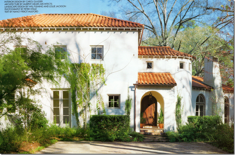
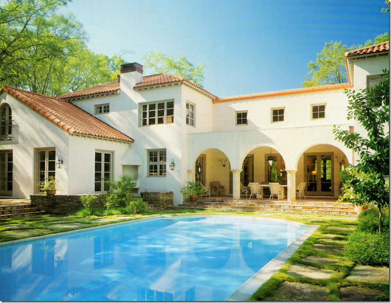
Here is the Veranda house, also located in the same general area as the HAR house, but not the same neighborhood. If you notice, the layout is very similar, with the living room to the right of the front door, looking like it was added on to the house – with its lower roofline. The HAR house has a similar elevation – see below.
Notice the HAR house again – the living room is off to the right of the front door, looking like an addition, with a lower roof line. But, while this house looks Provencal with its stone walls and tiled roof, the Veranda house of 2001 looks more Mediterranean or Spanish with its white stucco façade.
The back of the Veranda house has a similar back covered dining terrace. The swimming pool is sited up against the house as opposed to the HAR house.
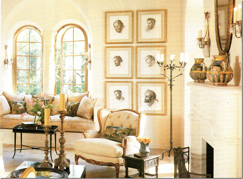
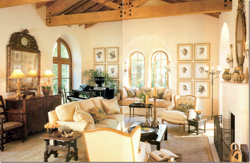
The living room in the Veranda house. Now, here I must confess. For years and years I absolutely loved this house. It was one of my favorites – ever. Now, ten years later, I still feel very attracted to it. It amazes me how current this house looks today – it really could have been designed this year. What a testament to the classic style of Mears and Glasser. Do you notice any similarities in this room to the HAR house? This room is seems smaller and cozier, more romantic I think with its arched windows and creamy fabrics. Notice the framed prints – they are one thing that immediately seemed familiar to me. The window seat is another.
Here’s a close up of the window seat. For years, this seat served as a personal inspiration to me. I loved the thickness of the cushion – something that you usually don’t see that often. Whenever I make a cushion for a client, I always have this exact one in my mind to emulate. I’ve always admired the Niermann Weeks sconces found here and next to the fireplace. And I’ve always loved the pillows Glasser had made out of old Dutch tapestries. I still love to use those today.
And from the landing in the newer HAR house – this has to be the same exact cushion. When I saw this, I was like, huh???? Where have I seen this cushion before?
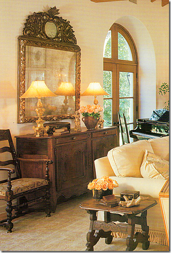
A close up of the Veranda house – I love Carol’s taste – the way she accessorizes, the furniture she picks out for her clients. Notice those lamps – they seem to be same ones as found in the entry hall of the HAR house. And that mirror – it’s the same one over the family room fireplace in the HAR house.
(Forgive the terrible scan!) And to compare the living room – here the Veranda house with the…
The newer HAR house. It might be the same rug, hard to tell. The sofa has different fabric, as do the two French chairs. The chairs next to the fireplace are a new addition. The coffee table is different, but the side table is the same. The same framed prints are here, as are the same four sconces. The chandelier is an beautiful addition. The piano returns, but the French buffet and the mirror are newer and grander. The room seems larger and dressier. Which one do you prefer? The newer HAR or the older Veranda house?
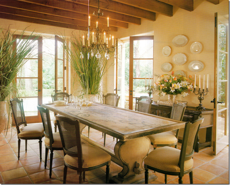
I used to think this was the prettiest dining room I had ever seen! I still love it to this day. At that time, 10 years ago, the painted table was so fresh looking - not many people were using painted pieces like this. Nor were they using biots in the house like this. I adored these chairs. I just loved everything about this room when this Veranda came out.
Compare it with the HAR dining room, which is really hard to beat – the architecture is stunning with the arching walls and ceiling. Notice though the table is the same, although a glass top was added. The chairs were changed, but I do see two of the old cane backed chairs in the back of the room. The rug is an addition. Notice that both houses have Saltillo tile. The stunning chandelier is a new addition. Which dining room do you prefer? I have to go with this one!
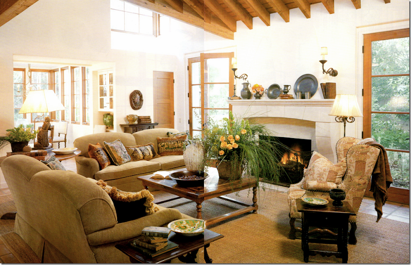
The Veranda family room. This reminds me of the HAR room, just smaller and less expansive. When I saw the HAR house, I noticed the similarity here too. The French chair looks like it ended up in the HAR house playroom.
The furnishings in HAR family room are almost exactly the same with the exception of the two chairs. The pillows were changed out, as were the fabrics, but the beautiful lamps remains. The mirror above the fireplace is the one from the Veranda living room (not seen in this photo.) The gateleg lamp table is different – in the Veranda house it’s a wine tasting table. These colors look cooler here, and warmer in the Veranda house. Again, the HAR house seems larger and more expansive, but I believe the Veranda house is actually a little bit bigger square footage wise.
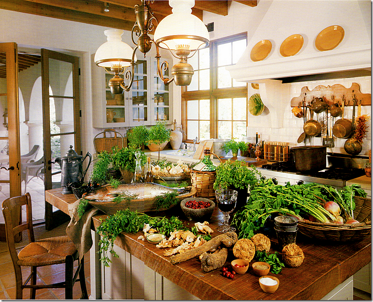
The kitchen in the Veranda house. I will say this – styling has changed in the past ten years. This seems overkill – if styled today, the island would remain clean. The fixture over the island is gone from the HAR house – and good riddance! I just don’t care for it as much as the one in the HAR house.
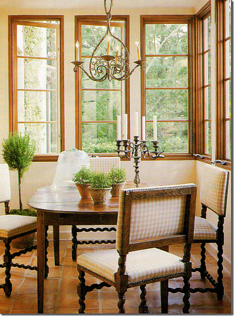
The breakfast room in the Veranda house. Same chairs, different table. This sweet light fixture seems to have ended up in the HAR guest room, along with a few of the caned dining room chairs.
The HAR house: this is so much better with the sofa and the Bennison pillows added. I love this table too. So beautiful
The HAR house with the light fixture from the Veranda breakfast room and a few of the Veranda house dining room chairs.
The upstairs landing in the Veranda house. I used to think this was so gorgeous. Gorgeous! I still love this picture with the trio of round portraits, the ancient bench, the candlesticks. I’ve said it before and I’ll say it again, Carol Glasser has THE most fabulous taste.
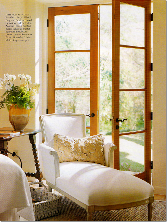
The master bedroom in the Veranda house wasn’t really shown, except for this chaise and the mirror, both found in the HAR house.
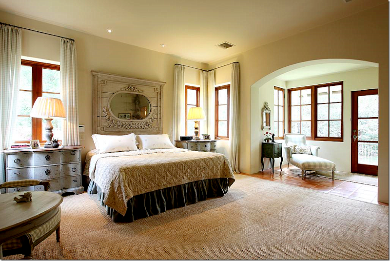
The HAR house: the chaise was pretty in white, but Glasser used all Chelsea Edition fabrics for the HAR house. She added the Swedish styled end tables with wood lamps. And the headboard mirror – the one on the Veranda cover - remains the same. The mirror first caught my attention that something about the HAR house was very familiar.
And finally, the Veranda house – terrace. It looks like the same chairs were used.
Now, I have NO idea who owns the HAR or the Veranda house. I have a feeling it’s the same couple. And I have a hunch why they might have moved and built a somewhat similar house, using the same team. The property in the HAR is stunning – it’s huge and secluded and quiet. The Veranda house is also very secluded and wooden, but hiding nearby behind all the trees on the Veranda property – is a very nearby freeway. It’s just a total guess that the couple was seeking quiet and more seclusion when they moved. I don’t know this for sure, but I’ll wager many in Houston do know and someone will probably email me or leave a comment explaining it all. I really don’t care to know the specifics. What does interest me is I think it’s fascinating to see how two houses designed by the same architect and interior designer resemble each other – and how different they are, at the same time! I love seeing how the furnishings were changed with new fabrics and accessories – like new chandeliers and rugs – to make it all look different, yet retain its original beauty. I loved comparing each house and each room – to see what was kept, what was changed, what was added. Kirby Mears, the architect, is becoming a real favorite of mine. It seems that every time there’s a great house – it has his stamp on it. And I don’t have to say how much I admire Carol Glasser. She’s a master – each piece is hand picked for the client, slowly and over time. There isn’t a rush to buy everything at once – she waits for the perfect piece for the perfect spot, and it shows.
I hope you enjoyed this look at these two houses, as much as I did!!!
To see the HAR house listing, go HERE.
To visit Murphy Mears web site, go HERE.
Remember Houstonians, the Urban Market is today and tomorrow – Saturday and Sunday! Courtney Barton, will be there at Sally Wheat’s booth with goodies and a line of fabrics she bought in India that are sold exclusively in France!!! It sounds fabulous.
A Tale of Two Houses (by the same designer and architect)
Subscribe to:
Post Comments
(
Atom
)















You fooled me! II was convinces this house was in France, my part of France. I even have the same stone and flooring in my Connecticut house (of course, inspired by my family's home in france)
ReplyDeleteGreat post! my husband is threatening to move to Texas as Connecticut is one of the most taxed state , he just may have a point, i could move right in
I absolutely love your blog. Your taste is impeccable. I anticipate your posts! Thank you!
ReplyDeleteJoni...you and your super sleuthing skills are SO. MUCH. FUN!
ReplyDeleteBeautiful, both. And amazing how timeless the decorating is...
the wet bar is 'to die for!!'
ReplyDeletexx
the wet bar is 'to die for!!'
ReplyDeletexx
the wet bar is 'to die for!!'
ReplyDeletexx
the wet bar is 'to die for!!'
ReplyDeletexx
Oh I would love to hear the specifics. I can't believe someone would put this much effort into re-creating a house only to put it up for sale. I would also love to see where they go after this house. Maybe they are downsizing and I can get my hands on some of the beautiful pieces. MB
ReplyDeleteLove it when you do this Joni. You are the best!
ReplyDeleteNow show us the changes in your own home. :)
I love this post, and I have a crush on this house - well, both houses. I have always loved clay tile floors, a strong preference for them over wood, this just confirms it in spades. So pretty, and something appropriately Euro-Texas-y about it, it doesn't feel contrived. Those faded rugs are making my heart hurt. sigh
ReplyDeleteGreat work - you know your books backward and forward - I can't keep track of my car keys, much less 2001 magazines. Thanks again for sharing such good stuff!
Amazing absolutely amazing everything about this post the homes, the design team and the author you knock my socks off Joni and you are right Carol Glasser is really in a league all her own.
ReplyDeleteMagnificent homes, you have written a wonderful article!
ReplyDeleteWhat a fun tour, Joni. It really is a beautiful home! Hope you find out if it's the same family...has to be with so many of the same furnishings.
ReplyDeleteJoni, my compliments to you - what a wonderful, wonderful post and your exquisite eye has done it again. You are the decor detective - you must have a photographic memory. I love the way you interspersed the two homes and so amazing that the HAR listing already started to feel familiar even before you noticed that mirror. Incredible work. I could pore over these photos for hours. Glasser is an artist. I can look at one of these big houses and find it too much, and then in Glasser's hands, these large homes become so inviting. She strikes all the right notes. I have to review also, as there is something about her look that I can't place, not being as familiar as you, but her work does have a certain warmth.
ReplyDeleteLove the HAR house most - the property, that pool, the crisp lovely dining room. Must be the same people who hired their favorite team again.
Great work Sherlock!! xo Terri
Your visual recall is amazing! Fascinating post. Love both homes although I think the dining room in the first is a real stand out.
ReplyDeleteI remember the beautiful mirror from a Varanda magazine also! I am going to dig through my old magazines and find that issue! Thank you for your wonderful blog!
ReplyDeleteThis is the kind of post that only Joni can do! Super sleuthing...and as always, a great eye that connects the dots through the years.
ReplyDeleteI have a client who lives near that house (on the same street)...a lovely area indeed. I can only imagine what look I'd create if I had that kind of budget. Actually, if I had that kind of budget, I'd live modestly here for half a year and spend the other half in Provence! ;)
Hope you're doing well!
Linsey
Photographic memory, Joni! Isn't it amazing how the mind and I might better say the heart works! When things speak to you, you remember them for a long time, and they are etched on your heart! Of course, you are better at that than most of us! I like the cleaner look somewhat in the HAR house, but maybe it's just me, but I think the Veranda house is more soulful. It just seems to have more architectural personality. Both are wonderful, though.
ReplyDeleteSuper Sleuth Joni!
ReplyDeleteWow, what a team ! Beautiful both times. I prefer the older home, I love the cozy feel of it. But I would be very happy in either. Another great post by the queen.
ReplyDeleteGreat eye Joni! Love your detective skills, another wonderful find right here in Houston.
ReplyDeleteI'm STILL waiting for your book...think about it!! franki
ReplyDeleteoh my gosh your eye is amazing! i read your comment about the mirror over the bed and went back and took a closer look and instantly knew the Veranda cover you were talking about! i don't keep my magazines forever, unless there is something in it i LOVE and i still have that Veranda issue.
ReplyDeletethanks as always for a fascinating post
Love both homes. The Veranda one seems cozier, but this is probably due to the professional photos. Real estate photos rarely do a home justice. Wonderful comparison, Joni.
ReplyDeleteJoni I never know where to begin! There is so much to comment on! I adore the cozy breakfast room in The Veranda home and would say all in all like this home the best!
ReplyDeleteYou are Wonder Woman!
I have a New Giveaway from Serena and Lily you will love!
xoxo
Karena
Art by Karena
love both home! you are a super slueth catching all those details.. I love how both homes are similar, yet not... I think having all that beautiful clay tile under foot would be divine! I am going to check out more on Carol Glasser!
ReplyDeleteHave a Great Day!!!
OMG! Just a FABULOUS post! Must go back through and find my old Veranda! AMAZING! Thank you, Joni, for ALL your hard work on this one!
ReplyDeleteJoni, I must meet you one day. For us both to live in Houston we must! This is one of the most amazing posts I've ever seen, I've read every single word twice. I know exactly where this home is which makes it even more special, I think. A truly beautiful gracious home situated in a beautiful area. One of the largest homes in Houston (read: palace) is being built just around the corner, you must drive over to see it. Take Carnarvon off Memorial, then curve to the right. Sending love, Marsha
ReplyDeleteJoni,
ReplyDeleteWhat a great post! Carol is fabulous! Love her taste
and yours! You need to pop into the Gray Door again
and see us!
I truly enjoy every one of your postings! Glad I am in
Texas!
Kathy
I enjoyed every minute. Hands down these are my favorite posts. I love the comparisons. There are things to love about both of them. Personally I like the old dining room better, just add the new chandelier. My very favorite spot is the new breakfast nook and those fabulous doors that conceal the pantry. that image really makes my heart beat fast.
ReplyDeleteWatson you’ve done it again! I love your detective work Joni, you’re the best at finding secret design work. I can also tell you were excited about this post and loved the rooms, look at the size of your images on this post. I am simply mad, MAD over that antique wet bar it’s stunning as is both homes. Fabulous work and post once again Joni, bravo!
ReplyDeleteOmigosh!
ReplyDeleteMy favorite post ever! You do have a photographic memory; which is very unusual. I do too; and it is sure helpful in my business!
When I was first published in Trad Home in 2002; the biggest compliment was from a reader who saw an article on our house in Pasadena in 1987 and remembered the furniture!! She was in the "Letters to the editor the following month!
Can you believe it? Yes, you can!
Are you sure it isn't the decorator's own house? I have never even been to Houston; but that would be my guess!!
Fantastic job......and wonderful houses both of them!!! Saving that for future reference!!!!
I, too, will recognize things in magazine photos and have to go dig it up in my files, but most of the time it's either the same house, different photo but taken from same shoot, or same photo reused in another publication. What fun to see the same furniture reused and re-covered (and to use the window seat cushion and pillows in a different nook). Both houses are beyond fabulous. I love the stone and the barrel vaulting in the second one, and the lighter wood tones and the arched windows in the Veranda one, which looks more Californian to me (but what do I know, I'm on the east coast). I also love the furniture with its combination of Spanish, French, and Swedish (a newer element to the mix). The architecture is unbelievable.
ReplyDeleteJoni, Again you are a super sleuth! Love both houses.
ReplyDeletePenny, I can do one better- I remeber your featured house when I lived on the Upper East Side of NYC as a newlywed in the mid 80's it was a one special issue of Tiffany's magazine. ( Your Pasadena house, not the Montecito one....both so beautiful too.)
-linda,ny
Linda!
ReplyDeleteOh my Lord! REALLY? Well; that was the magazine, the woman remembered! It is the only time "Tiffany Magazine" was ever published, I think. It was 1987!
I don't even know how many were printed! I had to go back and look at it to see what she was talking about!
Did you write the letter to the editor of Traditional Home?
I can't believe two people would remember!
Blogs are wonderful! It is great being published in a magazine, and I love our design magazines, but one never knows who thinks what; feedback is so much fun!!
Penny
I just did a post last week about two homes by one designer. I must admit yours is much more impressive :)
ReplyDelete-Stacy
What a small world. The economy is tight and even folks in swanky digs are repourposing, recycling their favorite furniture. Could the HAR listing be staged for sell this house-- and the Veranda article the house was staged for a photo shoot? staged by the same designer with the same tools/tricks of her trade the furniture to rent for a photo shoot-- what a great business venture rent to own rent my furniture to seel your house to own a new one that you buy!!!!
ReplyDeleteMost of us( decorators) always "repurpose" our furniture. Nothing "smelled like stage" in these houses. Half of my things were my mother's and grandmother's.
ReplyDeleteNot possible "staged"!!
Just my opinion!!!!
The HAR house is owned by Cynthia and Edward Blizzard. He is one of the most prominent pharmaceutical litigation and personal injury litigation attorneys in the country. He founded the law firm Blizzard, McCarthy & Nabers.
ReplyDeleteThey clearly have stunning taste in homes. I can't imagine why they would ever move!
Great post and great detective work. Your recall is phenomenal. I prefer the second house's stunning stone and architecture but the decor of the first is more charming to me.
ReplyDeleteAll the best
cherill w
Adelaide, South Australia
How interesting! I have been a decorator for 41 years (Lordy!)..and virtually 95 per cent of my clients have been attorneys!
ReplyDeleteI asked several of them why that is!?!
Their answers were kind of unanimous: " We know we need to delegate; we know how to delegate and we know to whom to delegate" That was their answer in every case......said a bit differently; but that was their answer.
They have been very good attorneys; not always practicing law at the time......but trained in the law; and lucky me!
What do you all think of that?
These two houses are among the very best new houses I have ever seen!
And I applaud and respect Joni immensely!
I thank her for showing us what a great team of client, architect and decorator (or designer) can do together to create a wonderful ,comfortable and warm space!
Bravo to all of you!
And that was a present with a bow on it, Joni!!
PEnny
ps (sorry, me again!)
ReplyDeleteBritish people say, quite sincerely, "We don't buy furniture; we have furniture!" By that they mean they use their aunts, uncles, cousins, grandparents and what they find in the attic of the house they bought.
That is the "collected" look I love!
Penny
Another great post Joni. Both homes are gorgeous and decorated beautifully similar by Carol Glasser. Goes to show great decorating and antiques never go out of style. I have gone over and over the pictures several times and I love both homes, but the older pictures in Veranda are my favorite. After reviewing so many times, I decided it was the plants that brought life into the rooms and made it feel warmer. The kitchen in the older home may be overdone with herbs and vegetables, but it does add a vibrant lived in look. The newer house has no plants and flowers. Fewer plants are being used by decorators to create the updated uncluttered look, but some greenery adds life I think. Sure enjoyed this post. Thank you again.
ReplyDeleteJanice
Another great post, Joni!
ReplyDeleteKaren T.
I think even the very well to do often recycle for just the same reasons we do - attachment to beloved objects that we have accumulated over time!
ReplyDeleteI find it reassuring that I am not the only one obsessed with these details. Nothing is more fun than tracking objects from one project to another - in my case I recently noticed furniture from a beloved house in the Hudson Valley that was from a magazine in the 90s when it reappeared in Ojai California in a different magazine spread. It had been tweaked and reupholstered, but many of the pieces and collections were the same, just translated for a new environment.
Great post Joni!
Seeing houses like these makes you think... "ahhh... If I only lived in a place with THAT kitchen.. wow, what about this bathroom? Okay.. I wanna it!" ;-)
ReplyDeleteFabulous spaces!
Have a blessed week!
xo
Luciane at HomeBunch.com
Penny, I didn't write in to Traditional Home, letter to the editor- but I still have that magazine! It's in pretty pristine condition...I can send it to you if you don't still have yours!
ReplyDelete-linda, manhasset, ny
You are something else my friend. Love the newer home a bit more but am overwhelmed with all of it. Such a fun post. ;)
ReplyDeleteHugs~
T
Every photo of a house in a shelter magazine is staged don't you know that. A Google search of Houston area home staging business listings --one finds you stage your home to sell a lifestyle. Fresh cut flowers in your home well, I guess you have a cutting garden. Or a business expense account . I would suppose if an architect tweaks an existing blueprint that is time/money saved on his end but a client doesn't know this when the bill arrives. More power to him or her. What you see is what you get. Both are beautiful homes. both can provide a pleasurable lifestyle on a clear day in houston when the prevailing winds are right I guess.
ReplyDeleteI go with the outside of the newer home but inside of the older home except for the eating nook. Well really both are so beyond my budget that I would happily take either if offered.
ReplyDeleteMama always said "things either wear out or ugly out. Your job is to not live with ugly." This post just goes to prove her point. So much of what we see today will ugly out; the older home could be moved into today.
Joni, I love the sofas in the HAR house. Do you think they are chenille or antique velvet or something else?
ReplyDeleteI just cruised through that post wayyyy to fast to take it all in so I can't WAIT to get coffee or wine this evening and come back and linger... But the one thing, although so small, that I will absolutely do is go back and snag the picture of that window seat cushion. I agree on the loft but also I swear it had a tiny tiny ruffle to finish it off. I'm in love. Thank you, thank you. I always find gems and love your tours and all your effort. I feel like I'm taking my favorite class from my favorite professor and a college of my dreams when I sit down to read your blog. Thank you, thank you.
ReplyDeleteI agree! very well put Kristi!!!!
ReplyDeleteDear Anonymous 10:23 am.
ReplyDeleteLots of houses in "Shelter magazines" may be staged; but I guarantee you not all of them.
You can go to my website, if you want to, and click on Press......double click on the magazine covers and scroll down for the articles. Not one thing was "staged" ; unless you call picking every rose on the property and filling my vases with them "staging"!
I'm at http:mccormickinteriors.com
Brand new.
Penny
so nice of Linda to offer me the magazine! I lost it; but finally found one on ebay!!
ReplyDeletePenny
Joni, I can't tell you my surprise when I had about 10 women mentioning they "read about these linens online" at Urban Market. I had no idea what they were referring to until I just had a chance to sit down and catch up on my weekend blog reads! A million thank yous, hugs, and kisses to you, sweet friend. Thank you and hope to see you soon. Amazing post, as always.
ReplyDeleteSuperb. Absolutely European. I'm living in Italy right now and the one thing that keeps coming to my mind in reference to the interiors here is the concept of COLLECTIONS...not just a collection of one type of item like copious glorious globes (love yours!), though they incorporate specifics like that, too, but the concept of FAMILY COLLECTIONS, pieces collected from various facets of the family/in-laws, presents or inherited. Family and the home are integral to European life and that's lived out in their interior design paradigm. I think that's also what the key to their immense appeal is:
ReplyDeleteIt's the convergence of elegance with a livability and comfort from the patina of time-tested pieces LOVED GENERATIONALLY. These two houses evoke that same sensibility, so European, so REAL despite the obvious upper echelon design elements. They're glamorous AND accessible. Obviously the divine (yet so subtle!!) architecture creates an incredible backdrop and context, but the furnishings that traveled from house to house really define the appeal to these places.
LOVE. LOVE. LOVE
You are amazing,
Lana In Italy
This comment has been removed by the author.
ReplyDeleteDoesn't staged mean that a home has been set up to show it in the best light possible? Wouldn't this mean putting out fresh flowers, setting up vignettes that would indicate breakfast was going to be served or someone had been sitting in a chair reading a book and drinking a cup of tea? I don't think this makes the beautiful design we see any less real but instead simply makes for better pictures. I know that some magazines rearrange some of the furniture for a shoot because there is only so much a camera can capture and they want the opportunity to focus on specific design elements.
ReplyDeleteSince half the photos here are from a real estate listing and not a magazine, I think it's pretty clear that the same beautiful design permeates both homes.
This comment has been removed by the author.
ReplyDeleteThis comment has been removed by the author.
ReplyDeleteAnd you were right that both houses were owned by the same people. They built the Veranda house in 1994 but owned the property several years before that. (I'm assuming there was a different house there that was torn down.)
ReplyDeleteThe owners clearly work well with their architect and interior decorator and the results are breathtaking.
Wouldn't you love to know where they're moving next and what they'll create next time?
Do you know who makes those breakfast room chairs with the twisted legs? Or are they old? I would love them in my breakfast room!
ReplyDeletethe clear plastic rods on the towel bars are such a good idea they will not pit from wet towels or damp towels -- or do you throw a towel in the dryer right after the shower --- help me step into the 21st century.
ReplyDeleteJust beautiful! If your posts were food.. I would surely be obese!
ReplyDeleteQuestion for you.. I need a recommendation for a book on French Country designs inside and out. I know you are a design book collector.. which or which ones are worth buying?
Oh my Lord I have to come back and read this on my desk top. Not all of these magnificent photos are loading onto my iPad and I'm left drooling over the wet bar!!!!
ReplyDeleteJoni you do know how fortunate you are to live in such a gorgeous city don't you?
I'm starting to think that the best of the best are all hunkered down around Your neck of the woods. That's how it was when my folks lived there. River Oaks was just new $$$$$ and new oil! The elegant big and little homes on the quiet streets were always my favorite. Just like yours! Xoxo Lisa
just so lovely indeed!!!
ReplyDeleteJoni, your memory and eye for detail is amazing. I love that kitchen island.
ReplyDeleteBravo!! There is just no other design blogger that comes close to the perfection of your posts. What an education!! You have taught me so much. I am in awe of your photographic memory and the way that you explain what the photos show so that I see the details with your educated eye. Wow!!!!
ReplyDeleteWow! Stunning interior! Very contempory! The seating is very lovely! Nice post, check out also 3D Rendering
ReplyDeleteJust wanted to let you know that I am passing on the Versatile Blogger Award to you!
ReplyDeleteTeresa
xoxo
My heart skipped a beat when I saw your wallpapered room. It is so beautiful. You must be thrilled! xx
ReplyDeletewhere is the wallpapered room? on this post?
ReplyDeleteI love the shades in your bedroom, what kind are they specifically, I don't like what I've been finding locally. Thanks! shawn@janetjones.com
ReplyDeletelouis vuitton uk are diversified in various kinds, handbags, backpacks, portable bags, purses, wallets and pouches. All kinds are popular among the whole word people.louis vuitton Store Online Handbags can also bring great accuracy as well as practical applicability and fashionable.Have you ever dreamed of being as charming as Madonna? Have you ever thought of becoming an envy of all your friends? If so, come to louis vuitton outlet.
ReplyDeletelouis vuitton uk are diversified in various kinds, handbags, backpacks, portable bags, purses, wallets and pouches. All kinds are popular among the whole word people.louis vuitton Store Online Handbags can also bring great accuracy as well as practical applicability and fashionable.Have you ever dreamed of being as charming as Madonna? Have you ever thought of becoming an envy of all your friends? If so, come to louis vuitton outlet.
ReplyDeleteThere certainly are a amount of methods to acquire affordable coach products at coach factory outlet,it could possibly the most effective options.the most vital cause may be the reality that you simply can purchase genuine coach products at there.It is believed that you will like the products on the coach factory online. There are spacious sizes and different colors, styles and so on.in the market you definitely can find various colorways that are designed in as well as the high quality that applied in. For most of you would like to come. So just come to our coach factory outlet online store to choose one.
ReplyDeleteThe inside matches the outside, and it's wonderful.
ReplyDeleteOh......John took the words out of my mouth! except he said it in one sentence........beautifully. Mine would have been a couple of paragraphs...... !
ReplyDeleteLove his comment!
Too bad these ads are getting through! YUCK! Makes me never want to buy anything from Coach again!! Nor Vuitton! EEEK!!!
great designs and work......... Today I came across a new alliance offer from a big brand GROHE for Designer and Architect, you should must check out the GROHE Designer Alliance.
ReplyDeleteTriple and strong scented candles
ReplyDeleteluxury scented candles
The playroom, off the family room has a large sectional. The antique styled ottoman and French chair, along with the gate leg table add warmth to the room, as do the curtains and the collection of botanicals.
Awesome Article... For house elevation houston is very important
ReplyDeleteThank you for your post. This is excellent information. It is amazing and wonderful to visit your site.
ReplyDeletestaging companies