Bingo. Looking at HAR this week I got a lucky hit. A lucky hit is where everything just comes together – wonderful architecture, beautiful interior design, lots of French antiques, and just a bit of a mystery to drive me INSANE!!! A lucky hit like this is very rare and hardly ever happens which makes it all the more special. So…here’s the story. Get your coffee, pull up a chair, and sit back. It’s a little wonderful and a little bit crazy. Here goes:
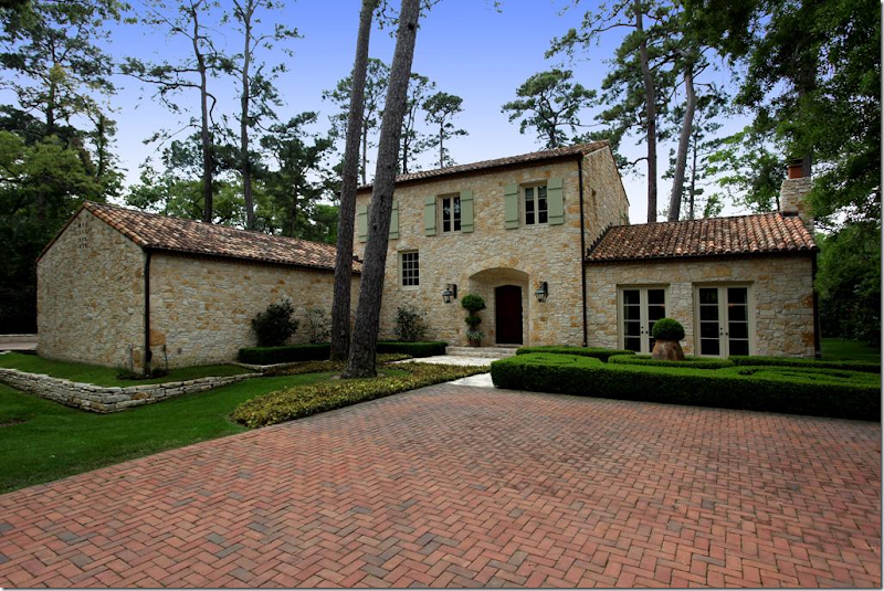
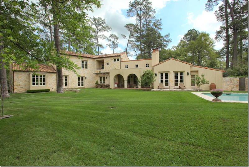
Wow. This gorgeous house caught me eye. I had been surfing HAR for a few days looking for anything interesting, and of course, nothing for sale right now is interesting, at all – just a bunch of oversized, poorly designed houses filled with poufy leather sofas and, well….shivers. What a waste of time. Just as I was about to give up, this beauty pops up. Whoa. Is this Houston??? Of course it is, the towering pine trees give it away, but take those pine trees out and insert plane trees, and it could be Provence or Majorca. I’m loving the exterior with the authentic green shutters, tile roof, limestone walls. Just gorgeous. There is just no way the inside is going to be great, right? I couldn’t be that lucky, could I?
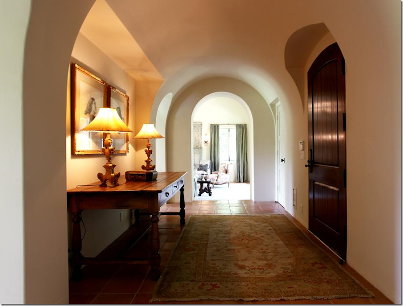
Wrong. Inside, things are starting to look very good. Great lamps and prints are in the entrance hall, with its beautiful ceiling and arched doorways.
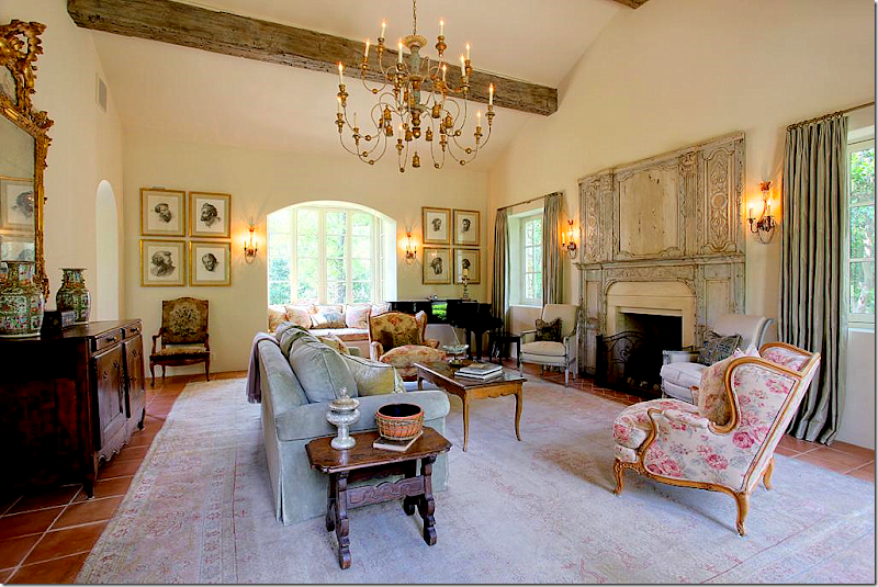
The living room is filled with French antiques, a large muted rug, and an unusual trumeau – dating from the 1700s. The chandelier is divine. Something about this room seems familiar and I just can’t place it. I know I’ve never seen this house before…but still, it seems like I have. I notice the Kenneth Turner candle on the side table – the one in the terra cotta bowl with its wicker sleeve that’s been discontinued. It makes me smile and think of Carol Glasser for a brief moment. And then…those prints on the back wall remind me of her too, for some reason.
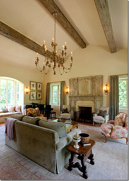
Another view of the fireplace with the antique trumeau.
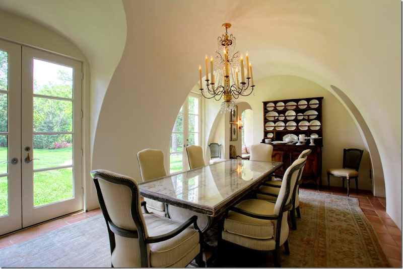
The dining room is beautiful – the walls and ceiling are a work of art. The chairs and table are so pretty and unique. And no seagrass – instead another faded antique Oushak rug sits underfoot. My eye goes to the large collection of creamware and the utterly gorgeous chandelier. Someone has exquisite taste, very, very exquisite taste.
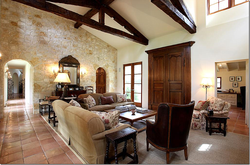
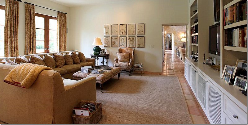
The family room is comfortably furnished, with Bennison printed fabric. I love that pattern and even once used it for my dining room skirted table. The TV is hidden behind 18th century Armoire doors that are mounted on the walls. The mirror on the stone wall is incredible. I’m loving all the small, Spanish style side tables and that chair! Notice on the left, down the hall, the gates with the staircase behind it. To the right through the arch is the kitchen/breakfast room. And at the right of this picture is the study/office.
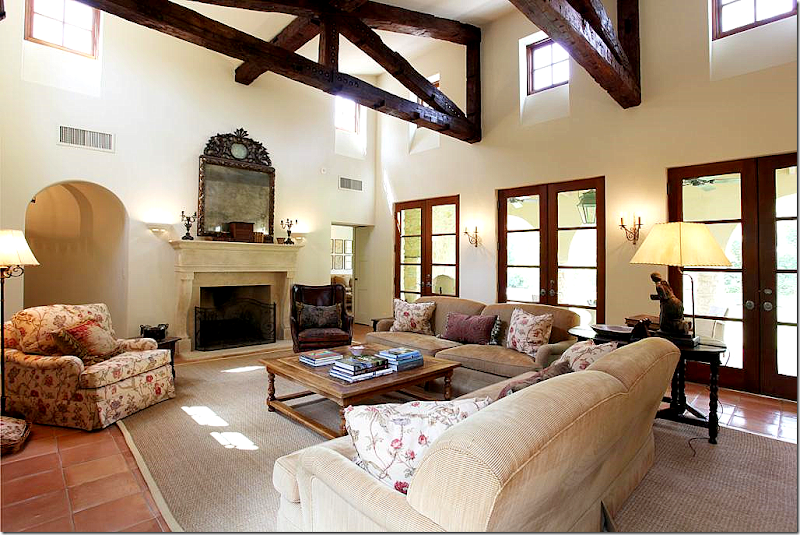
And looking the other direction, towards the fireplace with its limestone mantle. Another stunning mirror. In this room, seagrass makes an appearance. This is Houston, after all. The master bedroom is off to the left of the fireplace and the playroom is to the right.
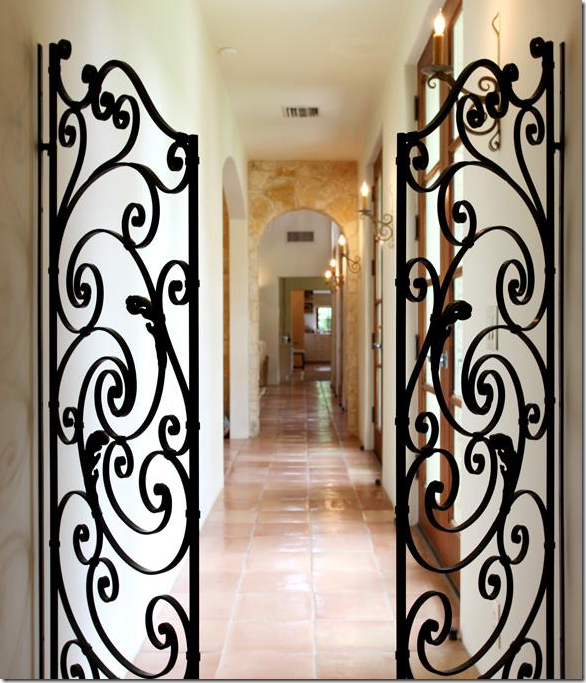
From the entry hall and the staircase, these iron gates lead to the family room and through to the playroom. The arch on the left is the breakfast room and the kitchen.
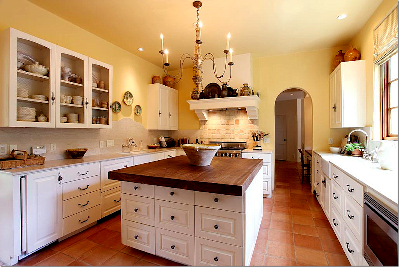
The kitchen has wire fronted cabinets. Notice the curved travertine backsplash behind the sink on the left side. A farm sink is on the right side. The island top is cypress wood. Through the arch is a kitchen desk area which leads to both the foyer and stair hall and to the mud room and garage.
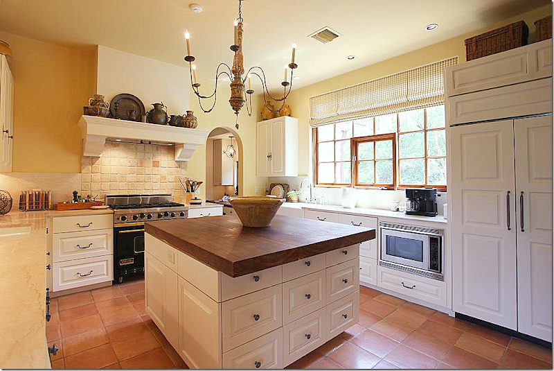
Another view of the kitchen with its charming range hood that resembles a fireplace mantel. The chandelier is perfect for the space.
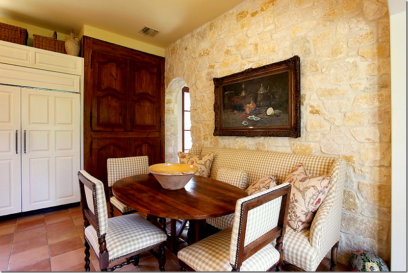
At the end of the kitchen is the breakfast area with its Austin limestone wall. The pantry is hidden behind 18th century Armoire doors that are fitted into the wall. I love the check fabric with more of the Bennison fabric that is found in the adjoining family room. Beautiful antique chairs, sofa, and French wine tasting table.
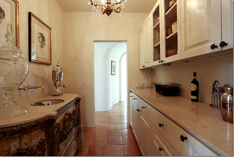
Between the foyer and the kitchen office is the wet bar. Just look at the antique cabinet with its inset polished nickel sink and curved travertine backsplash. Beyond gorgeous! The arched hallway leads to the front dining room and living room.
The playroom, off the family room has a large sectional. The antique styled ottoman and French chair, along with the gate leg table add warmth to the room, as do the curtains and the collection of botanicals.
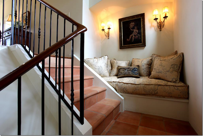
Up this stairs, on the landing, this vignette sends off signals to me. Where have I seen this before? I KNOW I have, but where? The house is starting to get under my skin.
It’s this picture that starts the bells really ringing loudly. Call me crazy, but I KNOW that mirror! I could swear on my child’s life that this mirror was on the cover of a Veranda years and years ago. It was over a bed in a house that was once my favorite house ever. I know this isn’t the same house, but it seems so similar. It’s all coming together. That chaise with its distinctive arms – it’s familiar too. At this point, I have to go do research, which means digging through piles of old Veranda’s to find the magazine with that mirror on its cover. It doesn’t take me long before I have it in my hands. And yes, it’s the same mirror – exactly. So is the chaise. So are a lot of things that have seemed familiar. Does anyone remember that cover, that story?
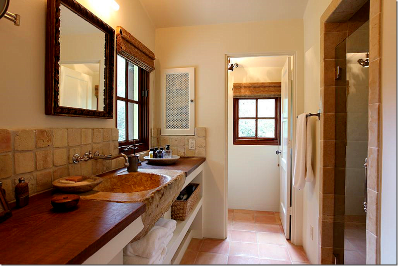
That sink! This is the man’s side of the master bathroom.
The woman’s side. Love the tub and the mirror – gorgeous!! And notice the triple vanity mirror – sooo great.
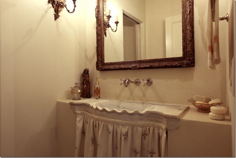
Charming powder room – just charming.
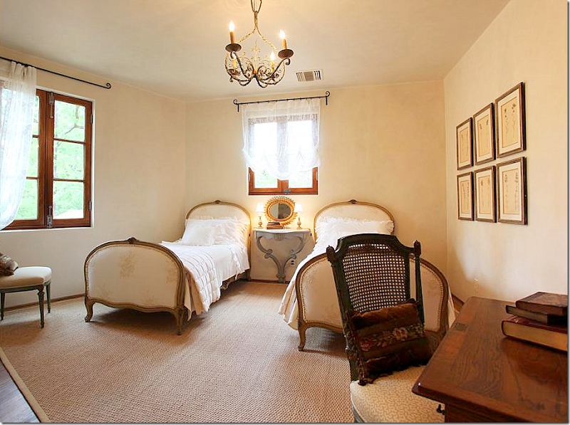
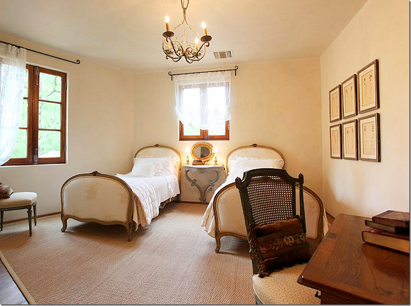
The guest room – I could move right in. Those beds are wonderful. And notice the hanging console between them. All the windows and the hardware are incredible = mahogany wood throughout.
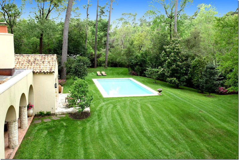
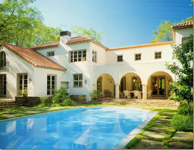
The back of the house – to the left is is the living room, then the dining room, then the kitchen and family room, which is behind the covered terrace, then the playroom, with the master bedroom in front of it. I like how they sited the pool off to the right of the house, away from it. It’s more European that way.
A view from behind the pool.
And here, you can see how isolated the pool is and just how utterly beautiful the property is. It’s located on one of the most isolated streets in a very small but terribly exclusive neighborhood more country living than city living.
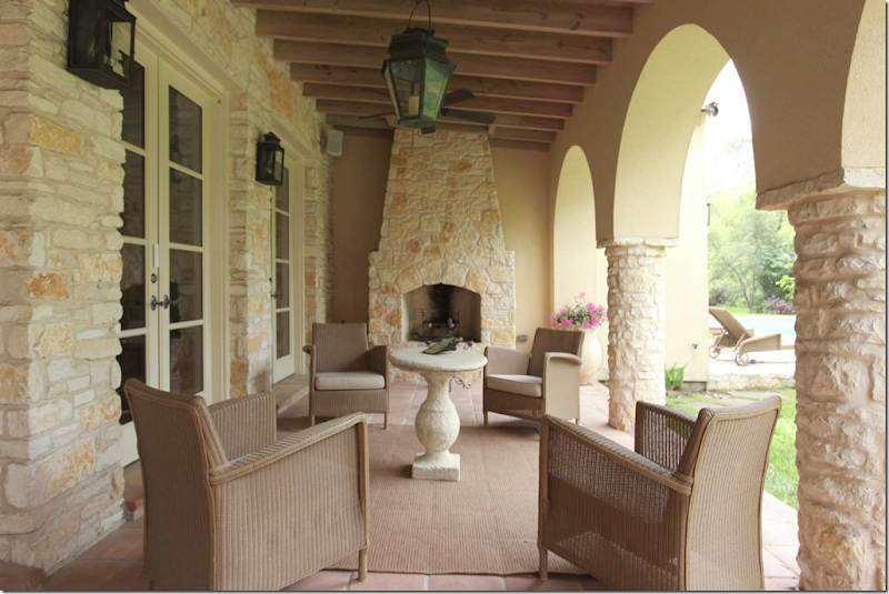
The porch off the family room. There is a floor plan and an itemized account of each room with the HAR listing.
After I saw the HAR listing and thoroughly confused myself, I looked up this story in the old Veranda, from February 2001. Now, the HAR house was built in 2004, so it can’t be the same house. After looking again at the captions of the HAR listing pictures, I noticed something I had missed before: Architect Kirby Mears of Murphy Mears and Interior Designer Carol Glasser. This is the same exact team who were responsible for the Veranda house. What gives? Two similar houses with the same team and mostly the same furniture?
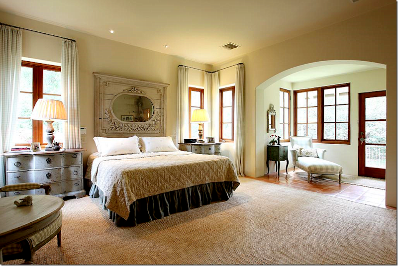
Above, in the 2001 story, is the same mirror found above the bed in the HAR house. The HAR house has matching Swedish styled nightstands, while the Veranda house has smaller, French styled ones, as seen above.
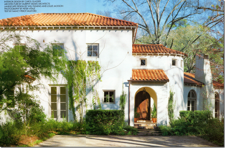
Here is the Veranda house, also located in the same general area as the HAR house, but not the same neighborhood. If you notice, the layout is very similar, with the living room to the right of the front door, looking like it was added on to the house – with its lower roofline. The HAR house has a similar elevation – see below.
Notice the HAR house again – the living room is off to the right of the front door, looking like an addition, with a lower roof line. But, while this house looks Provencal with its stone walls and tiled roof, the Veranda house of 2001 looks more Mediterranean or Spanish with its white stucco façade.
The back of the Veranda house has a similar back covered dining terrace. The swimming pool is sited up against the house as opposed to the HAR house.
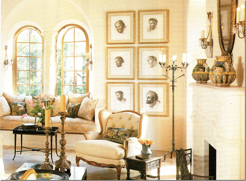
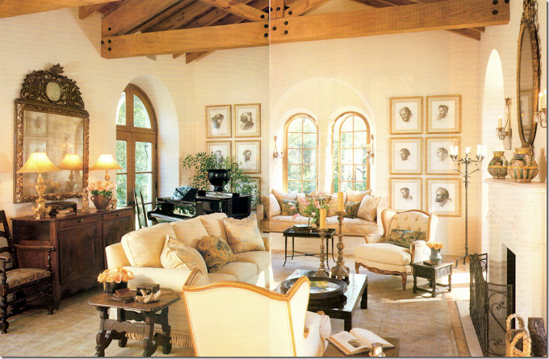
The living room in the Veranda house. Now, here I must confess. For years and years I absolutely loved this house. It was one of my favorites – ever. Now, ten years later, I still feel very attracted to it. It amazes me how current this house looks today – it really could have been designed this year. What a testament to the classic style of Mears and Glasser. Do you notice any similarities in this room to the HAR house? This room is seems smaller and cozier, more romantic I think with its arched windows and creamy fabrics. Notice the framed prints – they are one thing that immediately seemed familiar to me. The window seat is another.
Here’s a close up of the window seat. For years, this seat served as a personal inspiration to me. I loved the thickness of the cushion – something that you usually don’t see that often. Whenever I make a cushion for a client, I always have this exact one in my mind to emulate. I’ve always admired the Niermann Weeks sconces found here and next to the fireplace. And I’ve always loved the pillows Glasser had made out of old Dutch tapestries. I still love to use those today.
And from the landing in the newer HAR house – this has to be the same exact cushion. When I saw this, I was like, huh???? Where have I seen this cushion before?
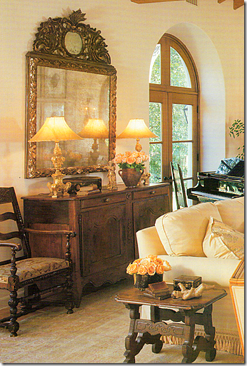
A close up of the Veranda house – I love Carol’s taste – the way she accessorizes, the furniture she picks out for her clients. Notice those lamps – they seem to be same ones as found in the entry hall of the HAR house. And that mirror – it’s the same one over the family room fireplace in the HAR house.
(Forgive the terrible scan!) And to compare the living room – here the Veranda house with the…
The newer HAR house. It might be the same rug, hard to tell. The sofa has different fabric, as do the two French chairs. The chairs next to the fireplace are a new addition. The coffee table is different, but the side table is the same. The same framed prints are here, as are the same four sconces. The chandelier is an beautiful addition. The piano returns, but the French buffet and the mirror are newer and grander. The room seems larger and dressier. Which one do you prefer? The newer HAR or the older Veranda house?
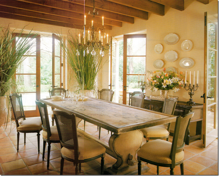
I used to think this was the prettiest dining room I had ever seen! I still love it to this day. At that time, 10 years ago, the painted table was so fresh looking - not many people were using painted pieces like this. Nor were they using biots in the house like this. I adored these chairs. I just loved everything about this room when this Veranda came out.
Compare it with the HAR dining room, which is really hard to beat – the architecture is stunning with the arching walls and ceiling. Notice though the table is the same, although a glass top was added. The chairs were changed, but I do see two of the old cane backed chairs in the back of the room. The rug is an addition. Notice that both houses have Saltillo tile. The stunning chandelier is a new addition. Which dining room do you prefer? I have to go with this one!
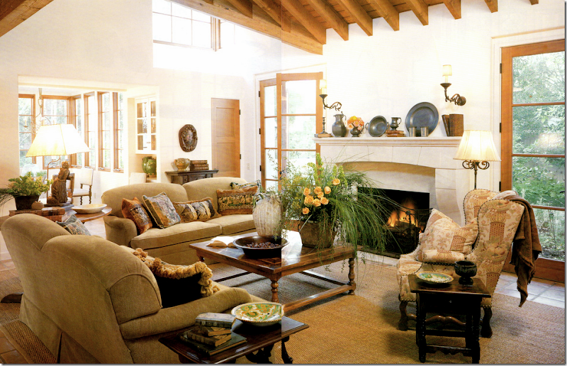
The Veranda family room. This reminds me of the HAR room, just smaller and less expansive. When I saw the HAR house, I noticed the similarity here too. The French chair looks like it ended up in the HAR house playroom.
The furnishings in HAR family room are almost exactly the same with the exception of the two chairs. The pillows were changed out, as were the fabrics, but the beautiful lamps remains. The mirror above the fireplace is the one from the Veranda living room (not seen in this photo.) The gateleg lamp table is different – in the Veranda house it’s a wine tasting table. These colors look cooler here, and warmer in the Veranda house. Again, the HAR house seems larger and more expansive, but I believe the Veranda house is actually a little bit bigger square footage wise.
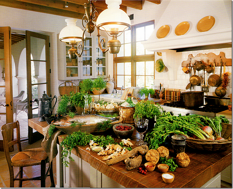
The kitchen in the Veranda house. I will say this – styling has changed in the past ten years. This seems overkill – if styled today, the island would remain clean. The fixture over the island is gone from the HAR house – and good riddance! I just don’t care for it as much as the one in the HAR house.
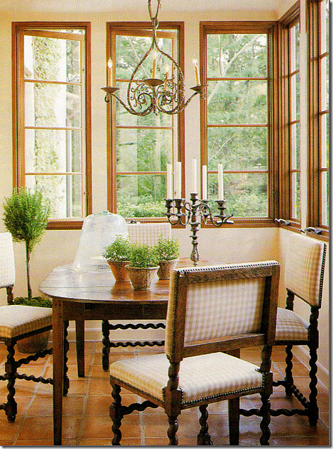
The breakfast room in the Veranda house. Same chairs, different table. This sweet light fixture seems to have ended up in the HAR guest room, along with a few of the caned dining room chairs.
The HAR house: this is so much better with the sofa and the Bennison pillows added. I love this table too. So beautiful
The HAR house with the light fixture from the Veranda breakfast room and a few of the Veranda house dining room chairs.
The upstairs landing in the Veranda house. I used to think this was so gorgeous. Gorgeous! I still love this picture with the trio of round portraits, the ancient bench, the candlesticks. I’ve said it before and I’ll say it again, Carol Glasser has THE most fabulous taste.
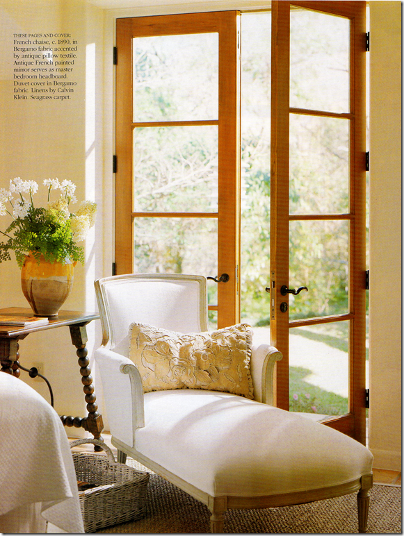
The master bedroom in the Veranda house wasn’t really shown, except for this chaise and the mirror, both found in the HAR house.
The HAR house: the chaise was pretty in white, but Glasser used all Chelsea Edition fabrics for the HAR house. She added the Swedish styled end tables with wood lamps. And the headboard mirror – the one on the Veranda cover - remains the same. The mirror first caught my attention that something about the HAR house was very familiar.
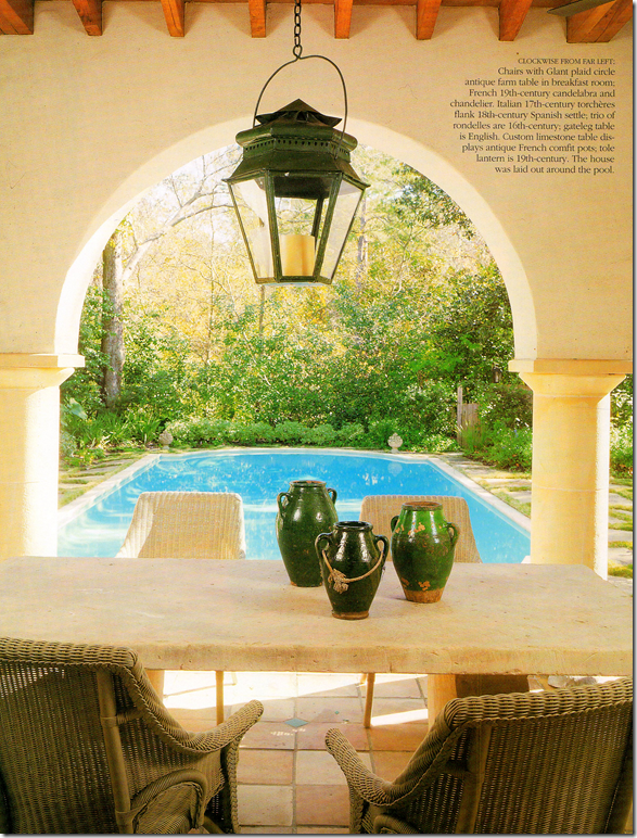
And finally, the Veranda house – terrace. It looks like the same chairs were used.
Now, I have NO idea who owns the HAR or the Veranda house. I have a feeling it’s the same couple. And I have a hunch why they might have moved and built a somewhat similar house, using the same team. The property in the HAR is stunning – it’s huge and secluded and quiet. The Veranda house is also very secluded and wooden, but hiding nearby behind all the trees on the Veranda property – is a very nearby freeway. It’s just a total guess that the couple was seeking quiet and more seclusion when they moved. I don’t know this for sure, but I’ll wager many in Houston do know and someone will probably email me or leave a comment explaining it all. I really don’t care to know the specifics. What does interest me is I think it’s fascinating to see how two houses designed by the same architect and interior designer resemble each other – and how different they are, at the same time! I love seeing how the furnishings were changed with new fabrics and accessories – like new chandeliers and rugs – to make it all look different, yet retain its original beauty. I loved comparing each house and each room – to see what was kept, what was changed, what was added. Kirby Mears, the architect, is becoming a real favorite of mine. It seems that every time there’s a great house – it has his stamp on it. And I don’t have to say how much I admire Carol Glasser. She’s a master – each piece is hand picked for the client, slowly and over time. There isn’t a rush to buy everything at once – she waits for the perfect piece for the perfect spot, and it shows.
I hope you enjoyed this look at these two houses, as much as I did!!!
To see the HAR house listing, go HERE.
To visit Murphy Mears web site, go HERE.
Remember Houstonians, the Urban Market is today and tomorrow – Saturday and Sunday! Courtney Barton, will be there at Sally Wheat’s booth with goodies and a line of fabrics she bought in India that are sold exclusively in France!!! It sounds fabulous.
A Tale of Two Houses (by the same designer and architect)
The Bennison House
PLEASE FORGIVE THIS!!! I WAS UPDATING SOME OLD STORIES AND THIS ONE ACCIDENTLY PUBLISHED AGAIN.
IT WAS FIRST PUBLISHED IN 2009. IT'S STILL A BEAUTIFUL HOUSE. THE DESIGNER NOW LIVES FULL TIME IN HOUSTON.
AND I NEED TO STOP TRYING TO FIX OLD BLOG STORIES!
I received an email a few months ago from an interior designer that lives in Ann Arbor Michigan. Uh…where? She started her career in Houston, and besides one year in 2006 spent here, she has been living out of state for the past ten years. Yet, she informed me, she still designs in a “Texan” way – and judging from the photos she sent me, I knew immediately what she meant: seagrass and slipcovers, linen and wicker. She had been working long distance on a house in Houston and planned to be here in June - would I be interested in seeing it? Well of course I would – especially when she told me that she had spent time working for Jerry Jeanmard and his partner, Houston icon Mr. Herbert Wells. I know that Jeanmard and Wells don’t hire just anybody, so accepting the invitation was a no brainer. But still. I’ve been burned too many times to count with promises of decor that is “so you!” and “you will love this!” that I approached the tour with some trepidation. Once the front door opened – all my hesitation vanished straight out with the wind, the house was “so me” and yes, I did “love this” with a capital L.
Jane Wood, the Michigan based designer with her heart still in Texas, explained the house to me as this: the owner, a single woman was downsizing from a nearby larger River Oaks abode that was filled with wonderful antiques and furniture all designed by my favorite Houston interior decorator, Carol Glasser. The homeowner bought the two story house four years ago and hired Wood to help guide her through the gut job, taking it from 3 bedrooms, 1 1/2 baths to 2 bedrooms, 2 1/2 baths. The furniture needed to edited, the fabrics all changed, new pieces needed to be bought, and the upstairs decor was to be all new. The homeowner herself is quite a talent – she designed all the landscaping and the pond in the back courtyard and in fact does garden designing for others. The two of them, both quite beautiful, very well mannered and very genteelly Southern – were delightful as they eagerly finished each other sentences - describing to me what the house looked like before the gut job. I had a wonderful time touring it and stayed way too long, oohing and aahing over it’s quiet elegance and cozy atmosphere. Of course, I left there and came straight home wanting to purge, edit, paint, and redo my entire house. But, the kind of design that Jane Wood and Carol Glasser does – has that effect on me. So, let’s tour the house - I hope you enjoy this as much as I did!!!!
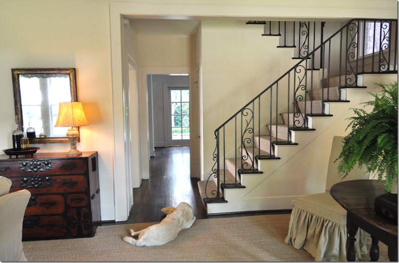
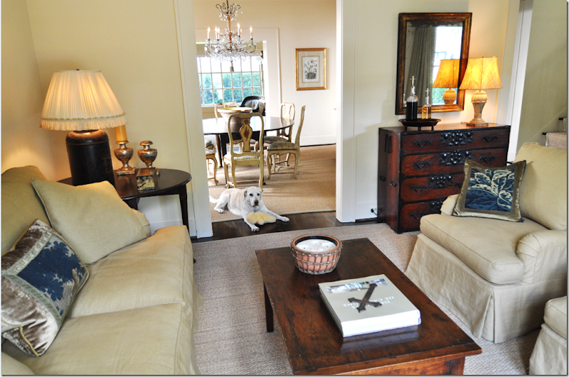
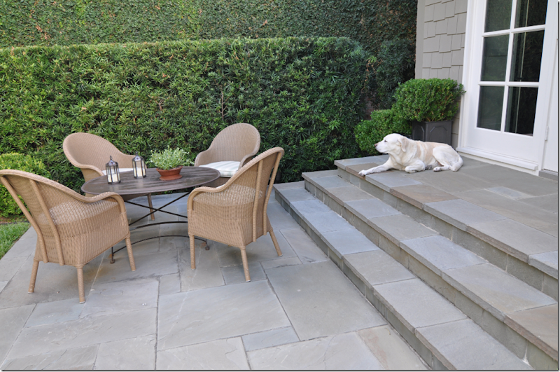
The front part of the two story house is one long room – divided by the front door. To the left is the seating area, to the right is a dining area/library where the fireplace is. By opening a wall, the staircase was exposed, and an iron railing was added. In the middle of the house a hall runs straight through to where a new vista was created, allowing light from the back yard to filter through to the front room. The family dog, Sophie, joined in all the fun – notice how wonderfully her blonde fur matches the walls and seagrass!
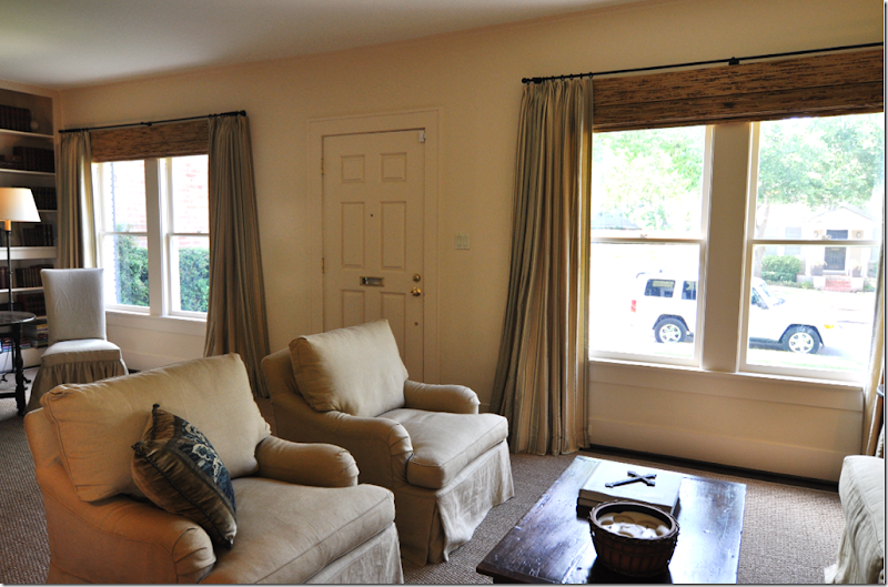
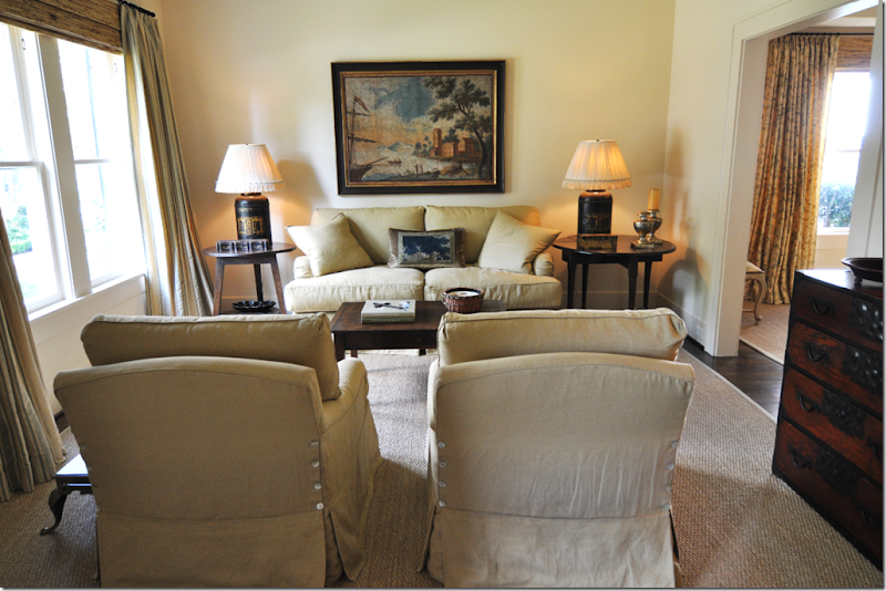
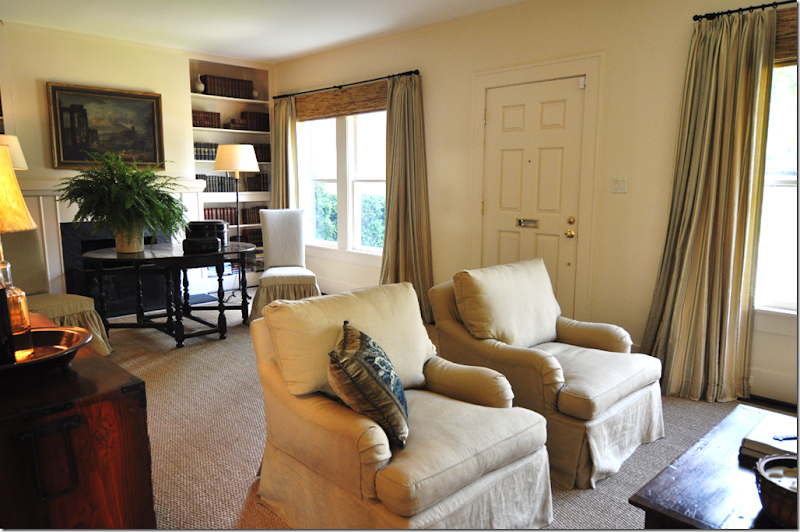
To the left is the main living area – simply furnished with two arm chairs and a small sofa – the perfect scale for the space. The entire house is covered in custom cut seagrass downstairs and wall to wall seagrass upstairs. The walls are a perfect shade of cream - “Linen” by Martin Senour, a favorite upscale paint of Houston interior designers. To get a true idea of the color – notice the white ceiling against the wall paint. All the upholstery was designed by Jane Wood and made by Hien Lam, another Houston favorite. Notice the row of buttons on the back of the chairs. And notice the length of the hems – just barely draping on the floor – not too short, not too long – just perfect! To the right is the dining room. The art work in the house is spare – but adds the right touch to enhance the mood. The best part of the house are the curtains – all Bennison – and yes, another Houston designer favorite.
Looking towards the front door – with the library/dining area to the left and the seating area to the right, you can see the wonderful curtain treatments. Carol Glasser designed the curtains and they were moved to the new house. The curtains here are the Bennison Stripe – a faded green on beige linen. Bennison is not a linen to ever be thrown away, and Wood refashioned the curtains so they look like they were made for this house. Nothing, nothing, nothing, except perhaps Kime fabrics, replicates Bennison. The fabric is so special – hand screened in England – that the luxury of curtains made out of the dense linen can set the entire tone of a room, as these curtains did. Very simple iron rods were chosen to not draw attention to themselves. And traditional tortoiseshell blinds were paired with the curtains – another favorite way that the best in Houston dress their windows. The attraction of a room like this – with all the seagrass and linen and Bennison – is there is no sheen, no shine, everything is matte and calming. There is no fancy wall treatment, no venetian plaster, no faux – just matte Martin Senour Linen. Together all these elements create the mood that Jane Wood, Carol Glasser, Ginger Barber, Pam Pierce and others from Houston have all become famous for. It might look easy to do – but it takes a deft hand, an ability to edit, and the willingness and ability to use the best fabrics available.
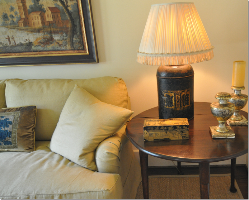
The tables are English – a cricket table on the left and an oval gate leg table on the right. The throw pillows are made from antique Dutch tapestry, velvet and gold trim. The lamps are antique tea canisters with custom made fabric shades. The accessories are sparse – but that is a very deliberate choice. Editing is never easy, especially when downsizing from a larger home. But this look requires strict editing to achieve it’s quiet, calming mood.
A close up of the smalls. Every piece is antique and carefully chosen for its place.
Notice the throw pillows – constructed of velvet and tapestry pieces. A vintage Kenneth Turner candle – another much loved Houston product – sits in its wicker and clay pot. Unfortunately Turner no longer makes this classic. Why? Why? The vignette with the mirror and chest includes a lamp with a shade made out of rawhide. Need I say that rawhide lampshades is another favorite of Houston interior designers? The furniture is constructed with down cushions – the finest material in upholstery. It’s all about comfort and coziness in this type of decor. And nothing is cozier or more comfy than down.
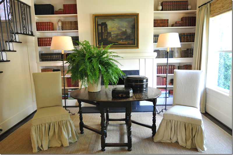
Though there is a dedicated dining room, the owner and Wood chose to make that side of the room into an extra dining room and library. In the winter, the fireplace is an added attraction for meals taken in the front room. A large English gate leg table was placed in front of the mantel, flanked by simple slipcovered chairs.
The iron railing becomes a major design element in the room – something that is matched by the curtain rods and two floor lamps.
Above the mantel is another Italian landscape, dark and moody. Two simple floor lamps flank the table. Notice that in this large room – only two fabrics were used – the beige linen and the Bennison stripe. This lack of pattern further contributes to the quiet mood of the room. The shelves are filled with sets of antique books – some black, some red, some brown. The tablescape is again highly edited with a chinoiserie tea caddy and a French confit pot. The slips on the chairs are double ruffled for extra detailing.
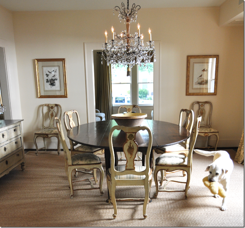
Through the living room is the dedicated dining room, a large space, which is without a doubt, the fanciest and prettiest room in the house! Here the curtains are Bennison again – Roses, in a shade of faded teal on beige that can only be custom ordered. To see it in use was the highlight of the tour for me. The Roses fabric in this colorway is so soft, so luscious, so special – it may be the only time I will ever see it person! The Mona Lisa wouldn’t mean as much to me! Again, the room is painted in Linen, which blends into the custom cut seagrass – creating the sedate backdrop to the furnishings. The table is a large English gate leg paired with a set of ivory and gilt painted chairs that are absolutely beautiful. I can only imagine that the search for this set of chairs took quite some time. They are exquisite to say the least. A set of botanicals is placed in all the corners, and a crystal chandelier – the shiniest object in the house – bathes the room in a soft light.
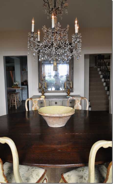
Across from the window is a gray painted chest paired with an antique mirror. Two doors lead to the hall through which is the kitchen and stairway. A simple French yellow ware bowl sits on the table. The antique chandelier is quite a beauty, another piece that I am sure was hard to find and well worth the hunt. And notice – a small tassel hangs down from the chandelier instead of a crystal!
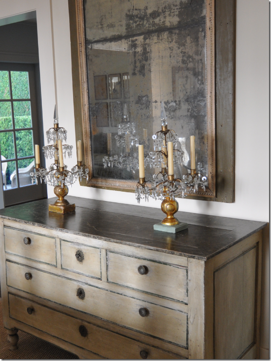
A close up of the painted chest – accented by antique girandoles.
Looking at the dining room from the adjacent sitting room at the back of the house. Sophie!!!!!!!
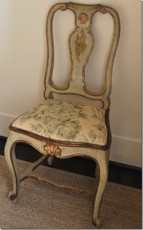
A close up of one of the gorgeous painted chairs with a closer look of the gorgeous fabric, Roses.
And looking towards the side window and front living room. Absolutely beautiful!
Next to the dining room is a small sitting room also furnished in the English style found throughout the house.
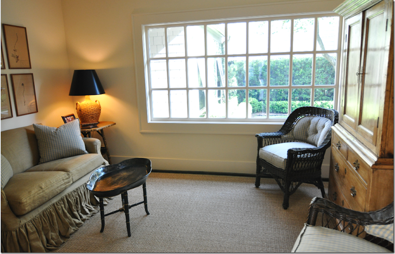
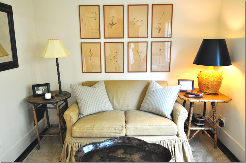
The small sitting room was once a porch which was completely gutted during the renovations. A small sofa was slipcovered in the linen and paired with a blue checked Claremont fabric. Bamboo tables flank the sofa and a tole tray becomes a coffee table.
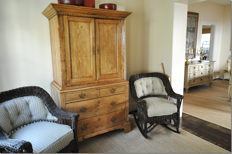
Dark brown wicker chairs upholstered in the blue check are paired with a pine cupboard that hides the TV. Oriental red pieces on top provide extra pops of color.
And through the wonderful paned window in the sitting room is the first glimpse of the oasis like back yard.
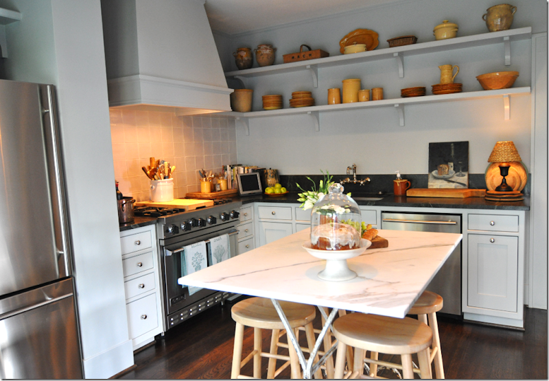
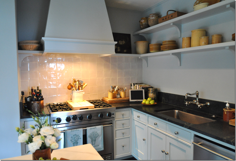
The kitchen is another room that was completely gutted and redesigned by Jane Wood. Stainless appliances and soapstone form the basis of the room. Long open shelves take the place of upper cabinetry.
Windows were removed to make an alcove for the range and its hood – set against a white tile backsplash.
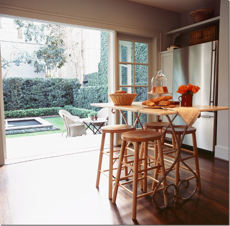
A bank of French doors were added to the kitchen to access the back yard. The table is an antique, marble topped French piece – and here you can see the one thing that is still unfinished in the house – chairs! These chairs are temporary until the “real” ones are chosen!
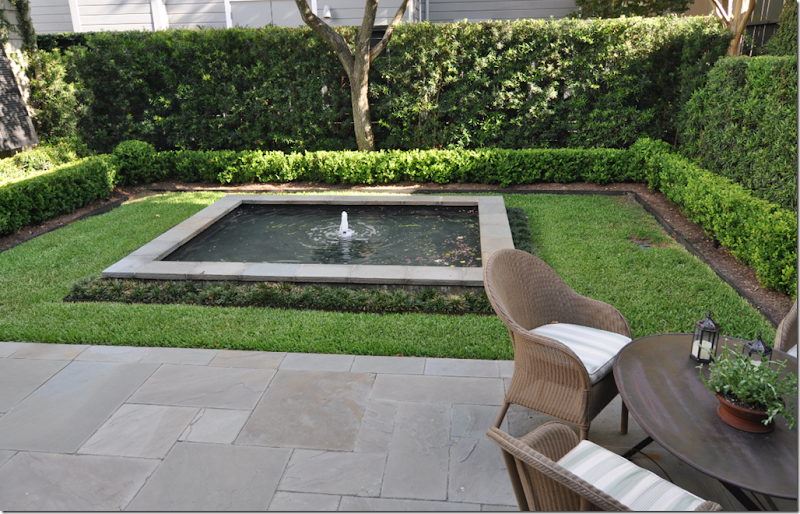
The back space is a large courtyard, designed by the homeowner. The main focal point is the square fountain which looked mighty tempting on this hot afternoon. The landscaping is all green - yew hedges and box mainly.
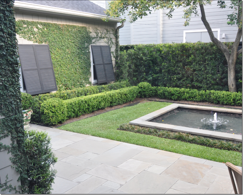
On one side is the garage which instantly becomes a charming pool house with the addition of windows and shutters, thanks to Jane Wood.
A metal table and chairs sit on the slate patio which leads back up the steps into the kitchen. Surrounded by walls of ivy, the courtyard is truly a greenscape in the middle of the city.
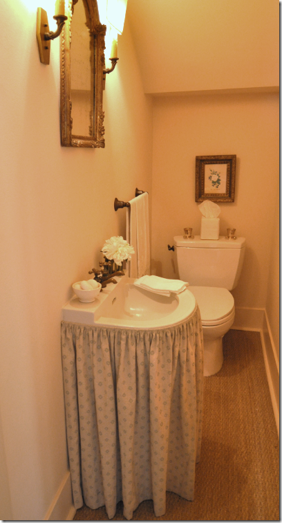
Off the hall, under the staircase, the original sink with faucet was skirted in a Rogers and Goffigon print.
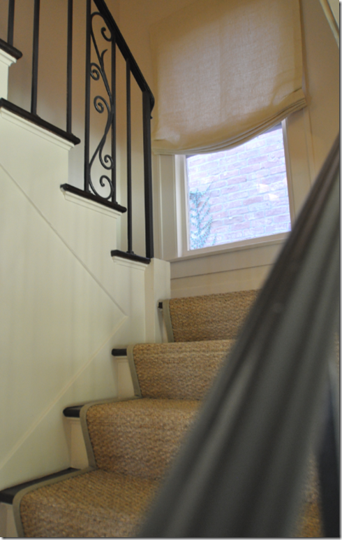
Ready to go upstairs? The window in the stairhall is treated as all windows upstairs are – with simple white linen shades.
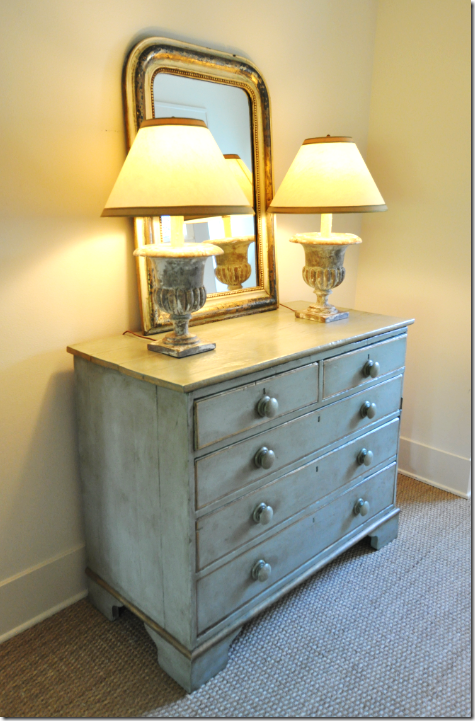
On the landing, a painted chest in aqua and gilt outline holds a pair of urn lamps and an antique Louis Philippe mirror.
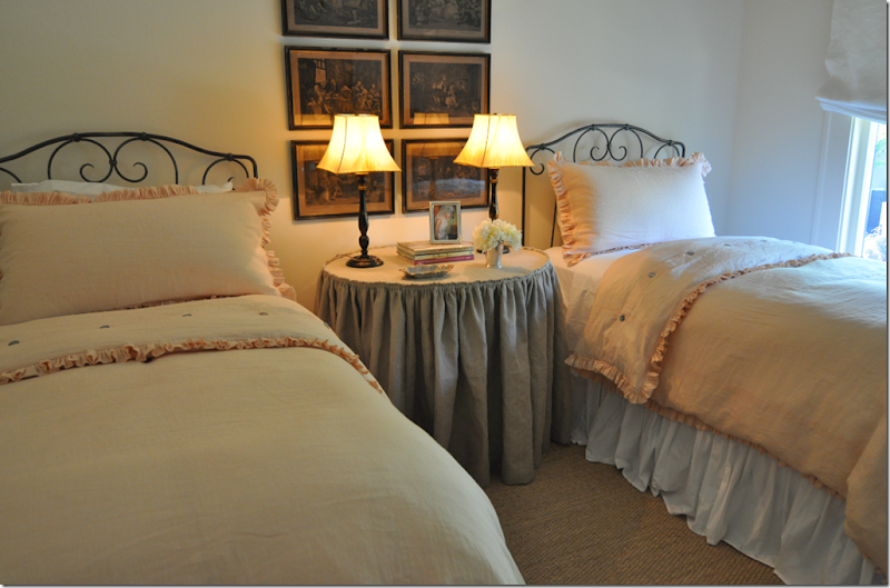
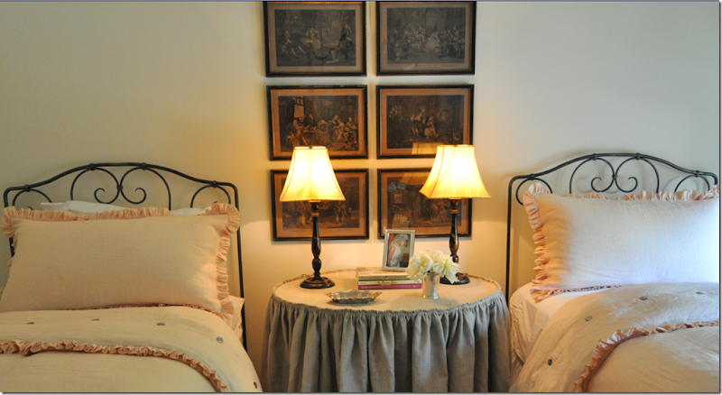
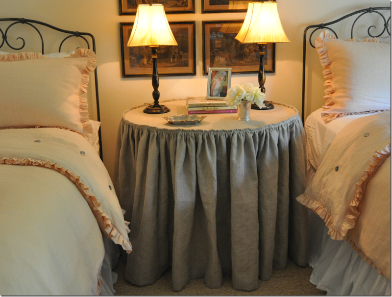
The guest room/office is a vision in peach linen from Rose Tarlow. The color is to die for! Jane designed the bedding and had Hien Lam make it. Notice the mini ruffles everywhere – so darling. Jane also designed the iron scrolled bed frames and had them custom made.
Six dark etchings hang between the beds.
And a skirted table – in an oval shape – with the a small gathered ruffle – is too cute!
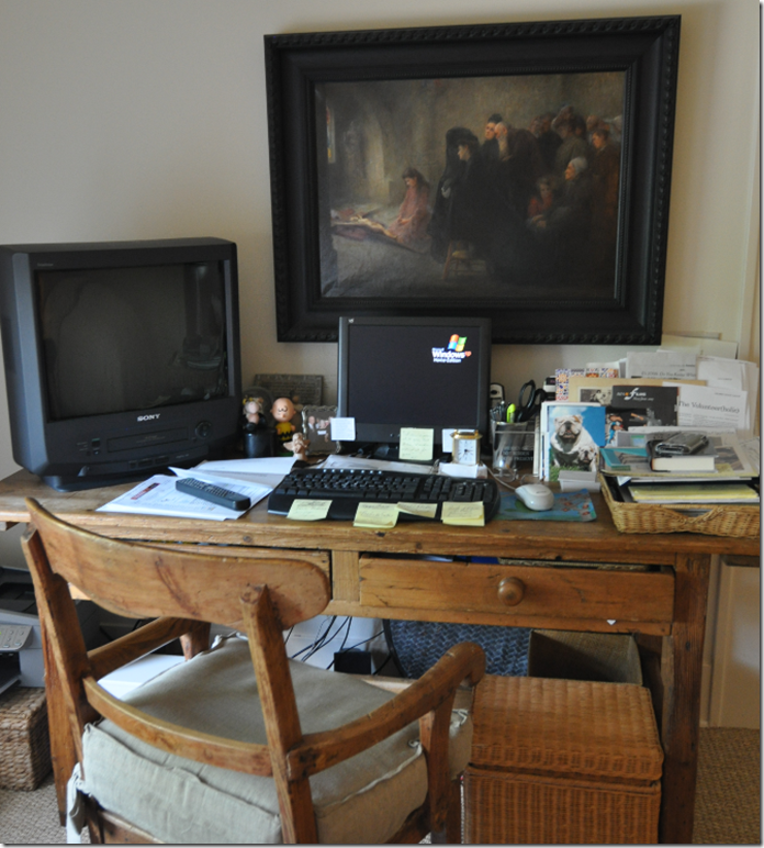
The guest room doubles as a working office for the homeowner. The desk is antique pine as is the chair. And above it is another moody dark painting. Definitely not styled for the photograph!!!
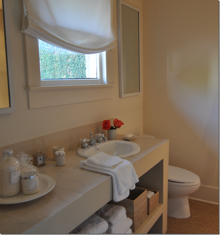
The original bath upstairs serves the guest room. The entire upstairs was reconfigured from 3 bedrooms and 1 bath to 2 bedrooms and 2 bathrooms. Here a large vanity was created with open shelving below.
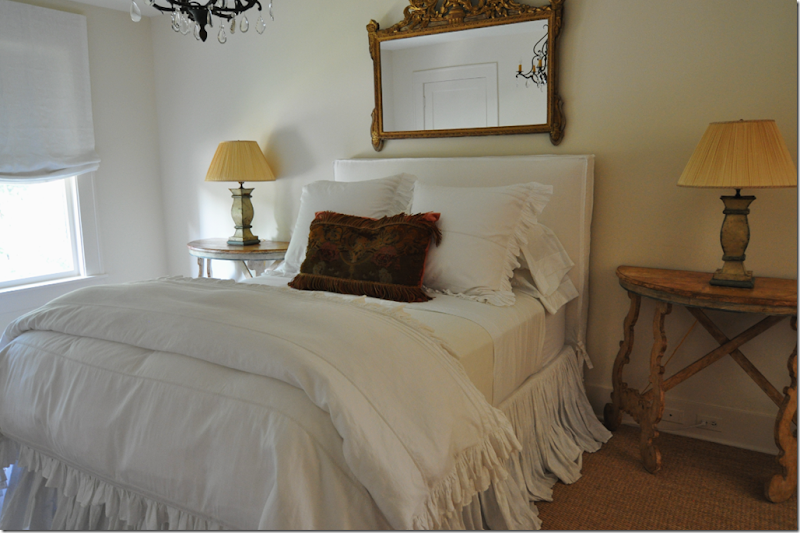
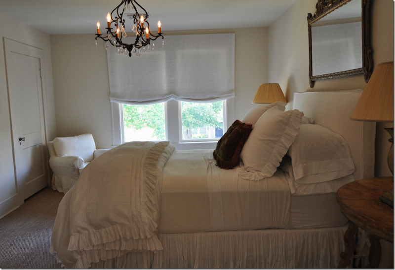
The master bedroom’s bed is the focal point of the room. Two Spanish styled consoles sit besides the high, slipcovered bed – all in white linens. The antique tapestry pillow is the only color in the room.
A gold mirror tops the bed and an iron and crystal chandelier lights the room. The windows are treated like all windows are upstairs – simple linen blinds.
And across from the bed is another Italian styled piece of art work – I loved all the art work in the house. There was a similar feel to the canvases throughout which helped further create the peaceful atmosphere found here.
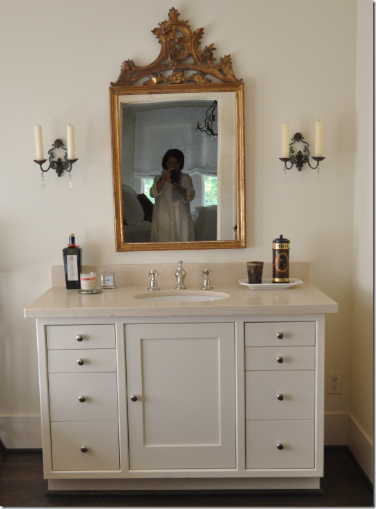
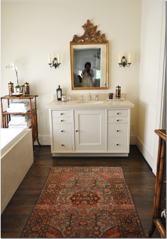
Hello!!! The large adjoining bath and closet were created out of the extra bedroom. The vanity is topped with another gorgeous gold mirror and flanked with sconces which resemble the chandelier from the bedroom.
The wood floor warms up the bathroom, accented by the area rug, and bamboo shelves hold towels and toiletries.
And the large window above the tub is shaded by white linen, of course!
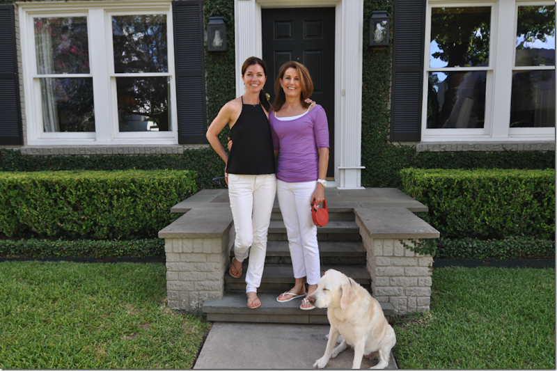
I hope you enjoyed The Bennison House and have gotten more familiar with the look that the best and the most popular Houston interior designers so love – Bennison, seagrass, linen, Martin Senour, Kenneth Turner, boxwoods, white jean and flip-flops!! Jane Wood, on the left, has a web site that will launch in a few weeks – I’ll let you know when and where! And on the right is the homeowner who designed all the landscaping. If you would like to get in touch with Jane to talk to her – her email is janewoodinteriors@yahoo.com. To contact the homeowner, please email me for the information!
Oh, yes, I almost forgot – the shutters are coming down! And Sophie, wake up!!!!!!!

