It’s been a while since I’ve updated my list of the top ten design elements in an interior that I love. These are the ten things that make a room speak to me. But, take it all with a grain of salt, obviously, because the list is very personal. There’s no reason why if someone hates linen and designs mostly with chenilles – their room isn’t as nice as mine. No, of course not. But I just know that – for me - if that room was designed using linens instead of chenilles, I would like it better. Don’t know why, and can barely even explain why one fabric appeals so much more than another. But it does. My list so far has contained the following elements, starting with that all important fabric, to me, linen:
Linen
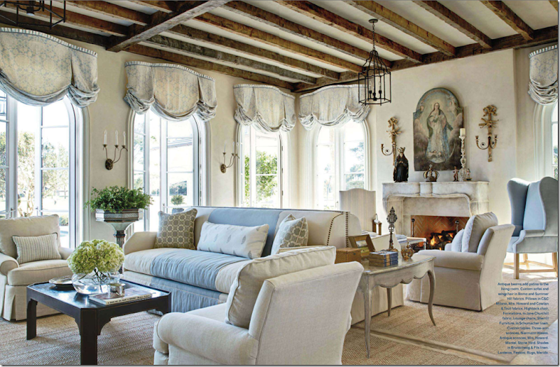
This room by James Howard is done in a mixture of Romo, Summer Hill and Schumacher linens. For this house on the water, the linen is a perfect choice. And note, just because you use linen, doesn’t mean you have to use slipcovers! The two are not synonymous.
Slipcovers
The caption states that slipcovers here tone down the formality. Yes! That’s exactly why I love slipcovers so much – they are casual. But, also, they are so user friendly. I say – would you not wash your jeans after wearing them for five years? Well, think about that sofa you sit on day after day. A slipcover is easily removed, washed, and put back on – clean. I love them for children and pets especially. Now, if this was my living room – I would have slipped the fauteuils too, but that’s just me.
Seagrass
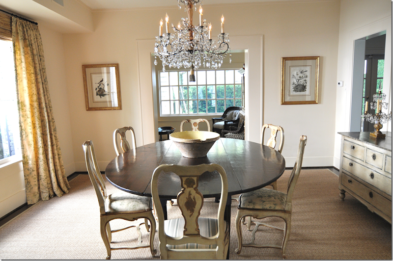
If you read this blog with any frequency, you know that my favorite floor covering is seagrass. And I love linen, slipcovers and seagrass together. I wonder if I will ever get tired of that look? Hard to imagine, but ask me in another five years. This dining room was designed by Jane Wood Interiors.
Curtains
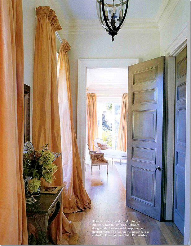
If I could, I would put curtains on every window! I am a sucker for silk taffeta curtains and printed linen ones. Either one. I know sheers are in, but I’ve just never been a sheer fan. I have a formula for curtain making, so be sure to read the original Top Ten Favorites – Curtains if you want to copy my formula.
Light fixtures
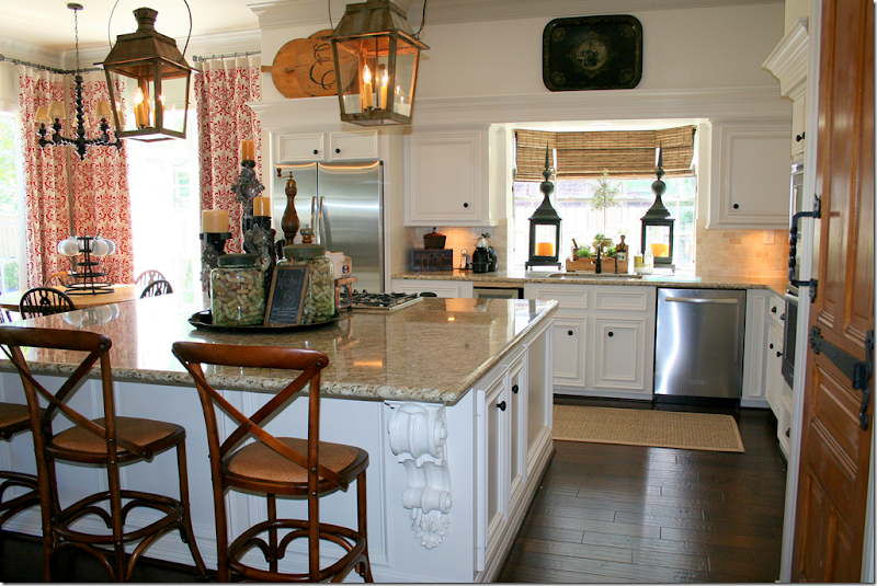
I love light fixtures in every room – especially crystal chandeliers and lanterns. This kitchen has two antique lanterns which really dress up the room. The story of this house – a complete and total renovation that took 20 days to complete - was one of the highest commented stories ever. I just sat there and watched the comments pour in, one after another. It was amazing! To read this story again, go HERE. By the way, this house is going to be published in a magazine!
Wall décor
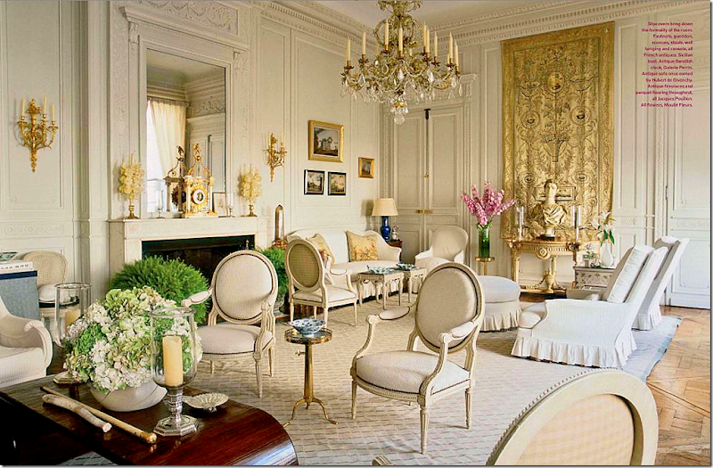
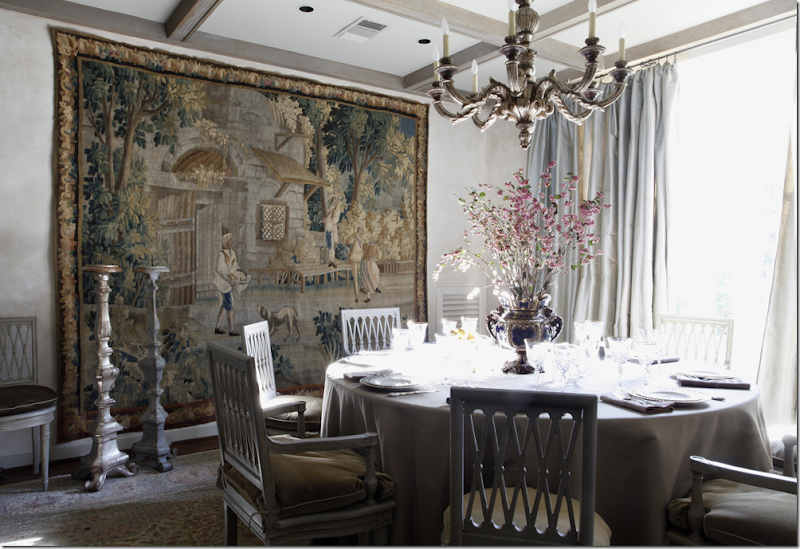
Wall décor doesn’t have to mean fine art work, antique or contemporary. It can mean mirrors, plates, sconces, clocks, or medallions. Here a beautiful tapestry becomes the focal point.
Antiques
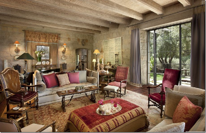
Antiques make a room. They don’t have to be dressy and forbidding, antiques can also be casual and welcoming. Imagine this space, John Saladino’s living room, furnished instead with new furniture with no patina, or a rather poorly fauxed one. Nothing gives a room texture like an antique. If you are just starting out – try to save and buy one piece of antique furniture for each public room. This will anchor your room and give you something to work around with different decors –for the rest of your life.
Top Ten Design Elements #8 – Symmetry
Today, I am adding the element, symmetry to the list. According to the dictionary, symmetry means: beauty based on or characterized by such excellence of proportion. OK, but what is proportion: symmetry, harmony, or balance. Sounds like a circle. To me, symmetry means placing a pair of chairs flanking a fireplace mantel, a chest, an armoire, or a desk. It is the balance of what is on the left equaling what is on the right. Simply, matching pairs: matching lamps on matching night stands or end tables. Symmetry means not placing things on a angle like a sofa or a bed. Everything is on a 90 degree angle, nice, sharp and clean. Symmetry means no asymmetry! Asymmetry: lack or absence of symmetry in spatial arrangements or in mathematical or logical relations. Well, lets take math and 90 degree angles out of it. I never did good in math, but I do know what is symmetrical. It’s two vases on the mantel, not one on the left side and a stack of books on the right. No. That would never do. Asymmetry makes me feel funny, unbalanced. It makes me want to pull things together in a more orderly way.
To some symmetry is boring. I suppose it can be overdone if there are pairs of different things everywhere – notice I said suppose, because nothing pleases me more than pairs of things everywhere! I just like balanced interiors. I like one sofa and two side chairs, that match. I like symmetry in my pillows. Two or four, your pick. Symmetry extends to architecture. In my own house there is one main wall that is not 90 degrees. It’s slanted and I hate it to death. I’ve obsessed over that wall for 17 years now. I like houses with a central hallway and rooms that lead off it. I like living rooms and dining rooms that face each other with mirror dimensions. Of course – my own house couldn’t be more different, unfortunately. When working with clients, I don’t add symmetry purposely – it reveals itself naturally without much thought. I don’t ever say, ok. now I need to add symmetry. It just is always there in the floor plan or in the accessories I buy. If I buy one vase for a client – I’ll usually buy two. I will rarely look for two night stands that aren’t matching. It’s not that I don’t like unmatched night stands, it just wouldn’t occur to me to say – lets break all this symmetry up!!! Bring in some element of surprise! And saying that makes me think that maybe I just don’t understand when designers say “I like to add that element of surprise in my design. I like to add fun or folly.” I just don’t understand that thinking. I like interiors to be pretty, soothing, welcoming, calming. Fun and surprise are two adjectives I just wouldn’t use when telling a client what look I am going for. Not that one way is better or not – like I said. It’s all so personal. But, look at the pictures below and see if you prefer symmetry over asymmetry:
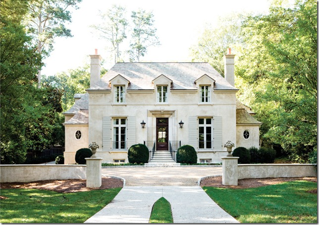
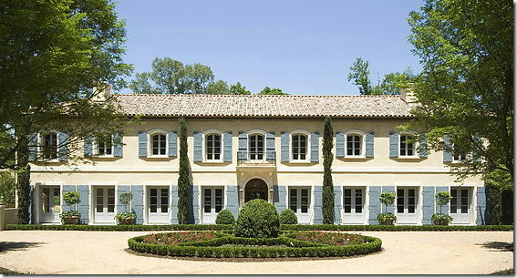
The beautiful house is perfectly symmetrical – the left side mirrors the right. It’s so pleasing and balanced.
I’ve always been attracted to the French mas – long facades with matching windows and door. This house is actually in Atlanta, designed by William T. Baker
Both houses from Things That Inspire
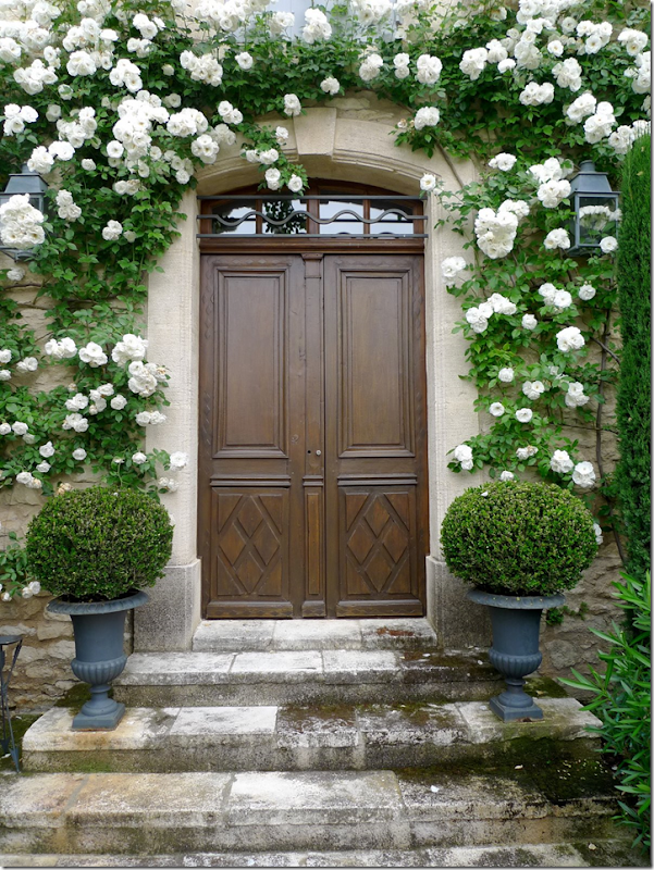
Symmetry starts at the front porch with matching urns and lanterns.
An entry hall with perfect symmetry – two matching staircases with flanking consoles and sconces.
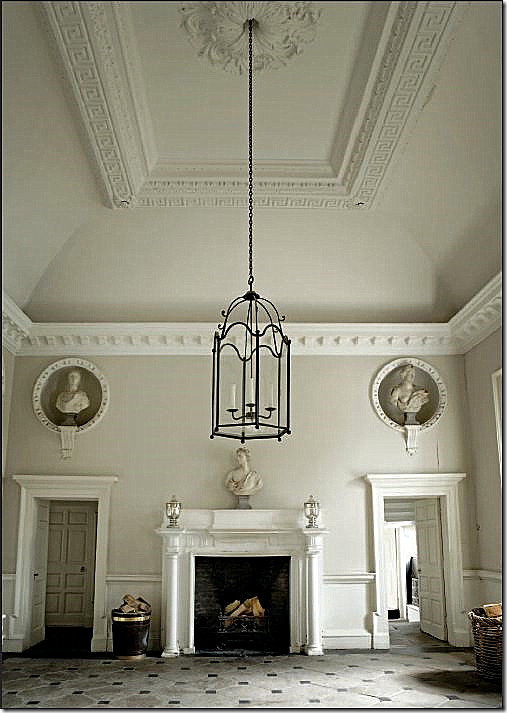
A large entry in an Irish house. Matching niches with sculptures flank the welcoming fireplace.
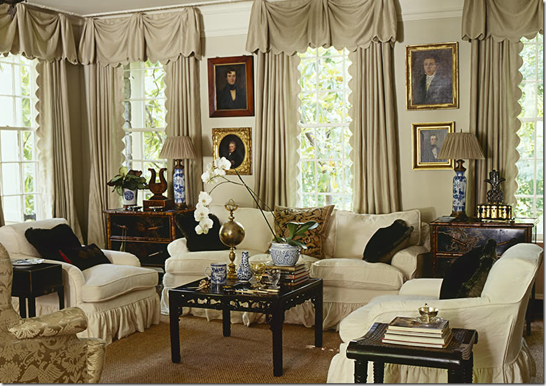
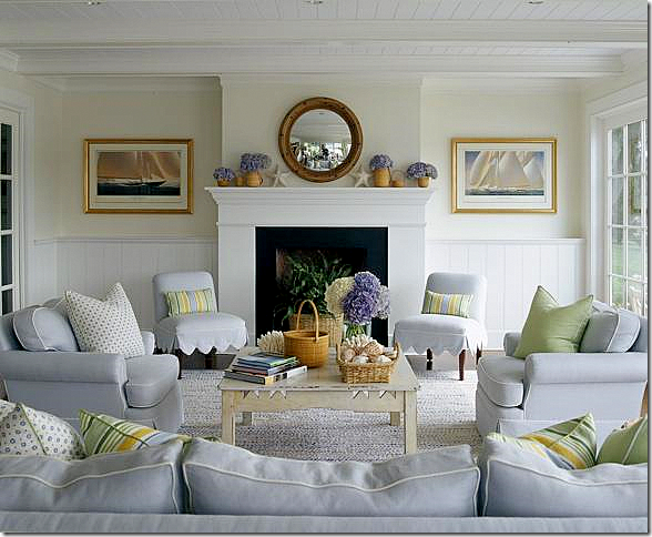
This beautiful living room is furnished symmetrically – sofa, matching side chairs. The bay window is treated as a separate sitting area. This room shows that symmetry doesn’t have to be uptight.
A favorite living room – matching seating with matching end tables and lamps. Everything is balanced and serene, inviting. Isn’t this what a home should be?
A simply furnished living room – the fireplace is the focal point and all is placed around it symmetrically.
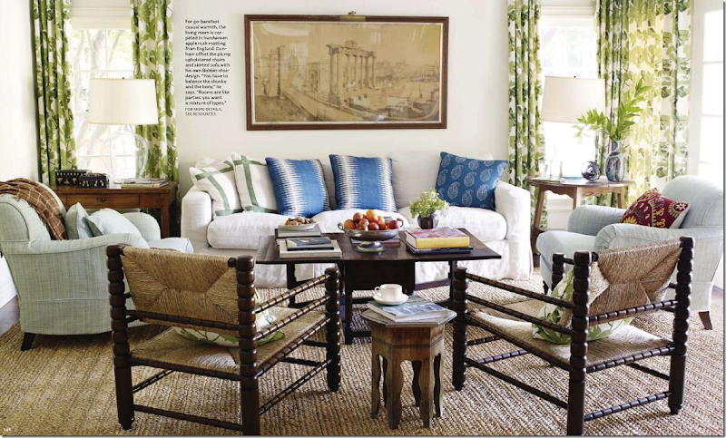
I love Peter Dunham’s aesthetic. So many elements here – linen, slipcovers, seagrass (apple matting actually,) curtains, wall décor! No wonder I love this room. I just love the man!
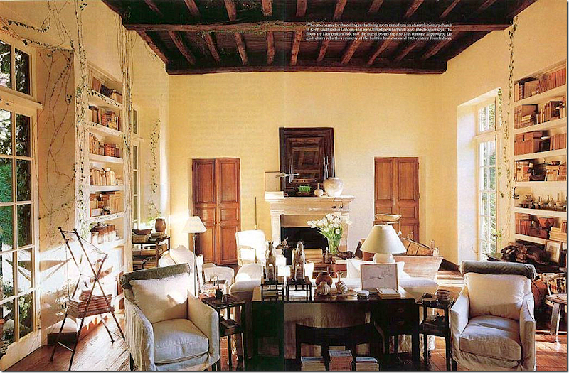
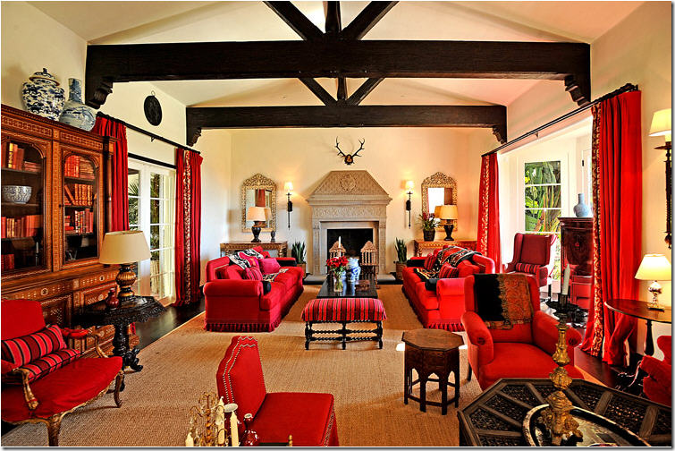
Here, at Rose Tarlow’s house, the room itself is symmetrical. This large space mirrors itself on each end with a fireplace and two flanking wood doors. The windows and bookshelves are mirrored across from each other also. The room is divided into two living areas. I would love to see this house in person.
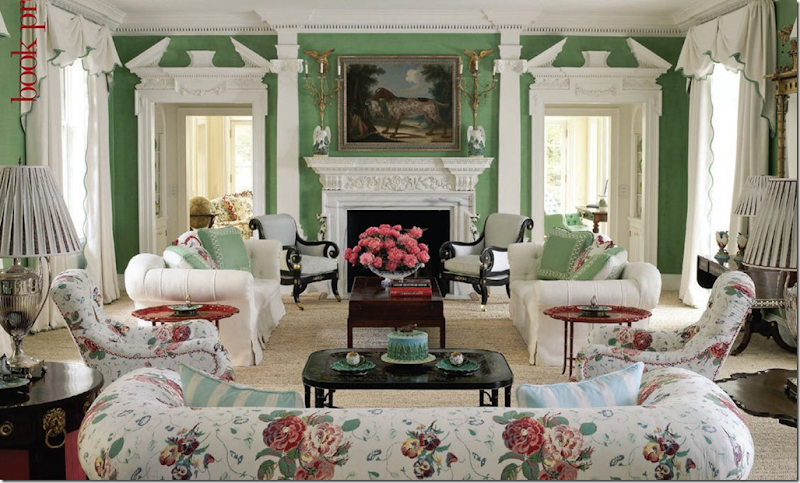
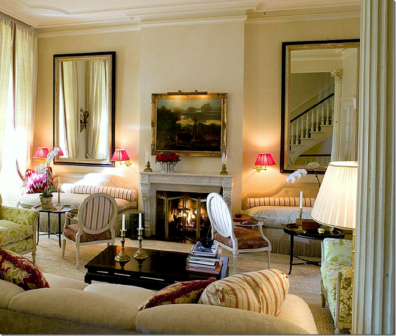
In this classic living room – everything symmetrically flanks the fireplace. I think this room is so gorgeous. It matches the dressiness of the architecture without being stodgy.
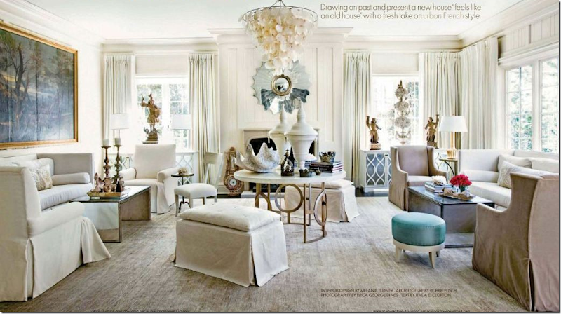
This large living room is divided into two seating areas by a large center table. The painting balances out the space that the window occupies on the right side.
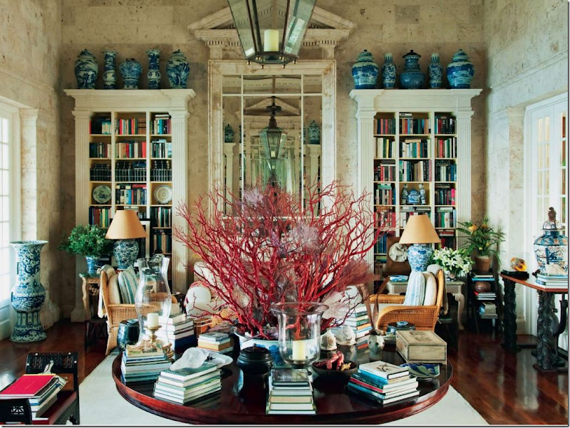
Another large living room with mirror images on both sides. Here, in Oscar de la Renta’s beach house, a large wood table divides the room into two seating areas. In the mirror you can can see the bookshelves and mirror on the opposite side. This room with its native stone walls is so gorgeous, so classic – perfection!!
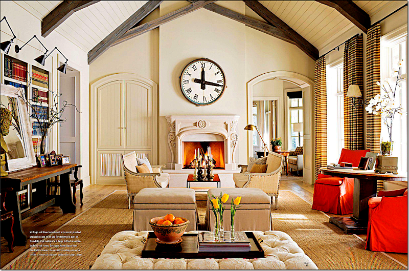
In this room – to maintain symmetry and to trick the eye, the left side of the fireplace mimics the door on the right side. The large round clock is the perfect shape to break up all the straight lines. The furniture around the fireplace is symmetrically placed – everything is balanced, yet not strictly so giving it a more interesting look.
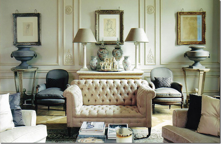
Strict symmetry, yet to me its pleasing, not boring. The interest comes from the juxtaposition of the materials used – heavy zinc urns next to fragile antique porcelains and silver. I’d love to see the rest of this room!
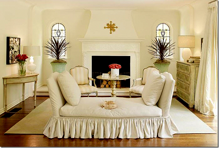
Symmetry that seems relaxed, not stiff. Perhaps it’s the airiness of the room, the leggy furniture, the lack of a grounding rug – despite being filled with fine antiques, the room seems like a wonderful space to entertain.
In this popular image, the symmetry extends to the back of the sofa with perfectly matched pedestals and urns. Wouldn’t this room seem boring with just a painting behind it?
Another popular way to achieve symmetry is to flank a sofa with built in bookcases. The bookcases feel as enveloping as a warm pair of arms.
Without a pair of built ins, you can still achieve the same symmetrically enveloping look with a pair of bookshelves.
While I love the interior design here, the asymmetry of this room drives me crazy! It looks like Faudree tried to correct this by installing the wood paneling behind the fireplace, but the room still looks off balanced to me.
I’ve used this living room in every element story so far: linen, slipcovers, seagrass, curtains, light fixture, wall décor and antiques. Trying to see if it will make all 10 elements. It is a symmetrical room, both architecturally and in the way the furniture is placed.
Soothing and calming, this room is just so relaxing. The symmetry of the furniture placement ensures nothing is jarring or out of place – perfect for a family tv watching room.
Mary McDonald loves symmetry and most of her designs are balanced with strong linear lines. This showhouse with its extra large living room is divided into several seating areas, each symmetric.
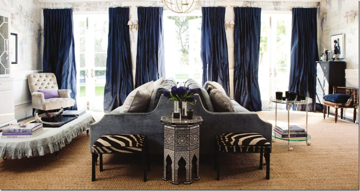
A back to back sofa is another way to divide a large room into two seating area – each side the same size as the other. Windsor Smith. I love the way Windsor is using blues lately, along with printed wallpapers.
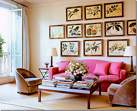
Perfectly symmetrically hung collection. Notice that although the sizes are different, it is still balanced.
A beautiful corner of a room, perfectly balanced.
The symmetry of the mirrors, the consoles, the side tables and lamps – and the two pink pillows make this vignette. The curtains behind it and the chandelier ground it all. Gerrie Bremermann.
Alessandra Branca is another interior designer who designs very symmetrically. Her tables and lamps often match. Everything is always in its place.
In her own living room, Branca plays up the symmetry that the windows create. Flanking the fireplace are two matching banquettes – a tool she often employs.
Looking the opposite way at Branca’s living room – you can see the matching banquettes. Boring? Never!
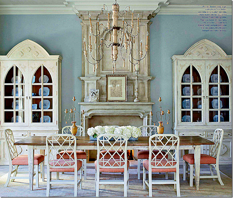
Dining rooms are a natural place for symmetry. Here matching bookcases flank a fireplace in this Florida house by James Howard.
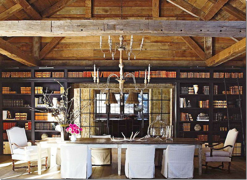
Gorgeous. In a large barn where strict symmetry wouldn’t be expected, here the furniture and bookcases create a nice balanced look.
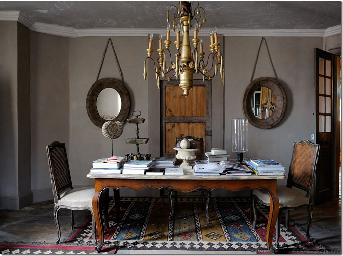
A pair of round mirrors flanking a door create balance in this dining room/library.
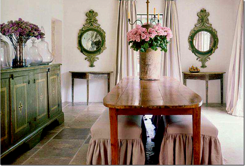
Again, a round pair of mirrors, matching consoles and matching benches create symmetry. Pam Pierce.
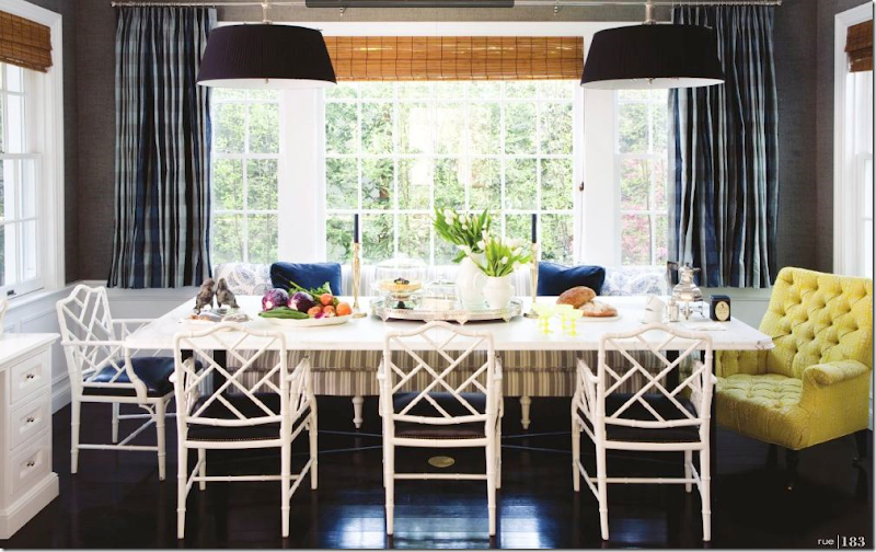
Does the yellow chair throw you off balance or do you like the unexpected touch? Would it be too boring for you to be all symmetrical, or do you like the surprise? Myself, I would probably have added two yellow chairs instead of just one – but truthfully, I think this looks perfect as it is.
This fireplace with its asymmetrical design leaves me feeling unbalanced but…
This fireplace, with its asymmetrical design has just enough symmetry to be perfectly balanced in my mind. Perfecting asymmetry is so much harder than strict symmetry.
I love the chaises with their open arms, but slanted walls just don’t do it for me, despite the fact that I have to live with one myself!!!!
I’ve always loved this symmetrically pleasing vignette – with the two lamps, the balanced pillows, the one table, the one statute. Just perfect.
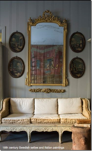
Another pleasing vignette – the oval paintings perfectly balance the antique mirror. Notice the carving below the mirror that adds to the symmetry.
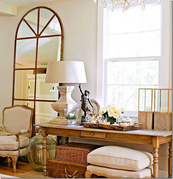
While I love this arrangement, I would never leave it so asymmetric. This vignette is perfectly designed, but I just need more balance. It’s obviously a very personal choice.
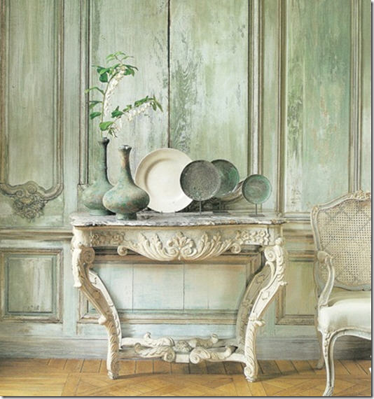
This popular image is asymmetrically designed. It’s perfect and actually is quite balanced looking. Would I have arranged the objects like this? Maybe. But, I’m not sure it would look better symmetrically!
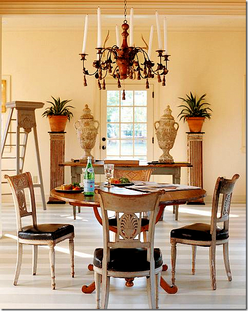
Suzanne Rheinstein designed this space. Here, the ladder is the off center “surprise.” Better with, or without??
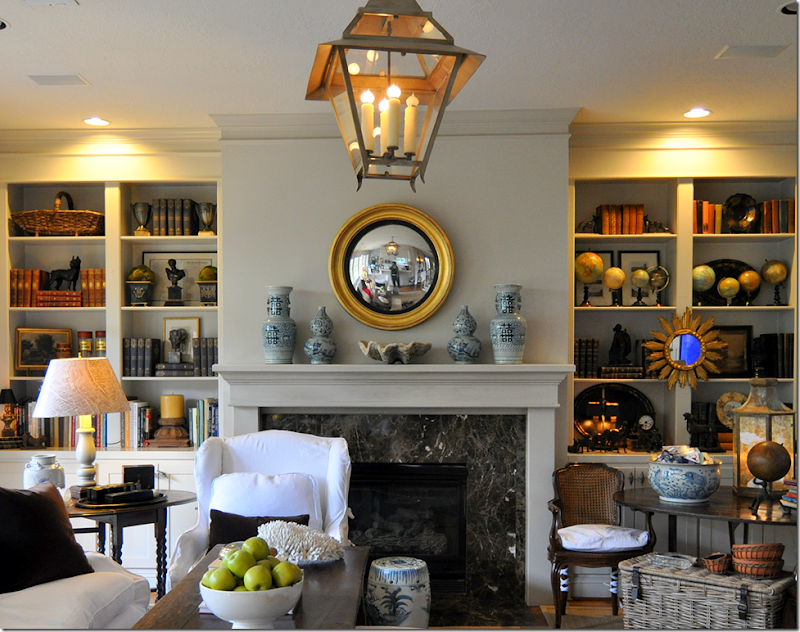
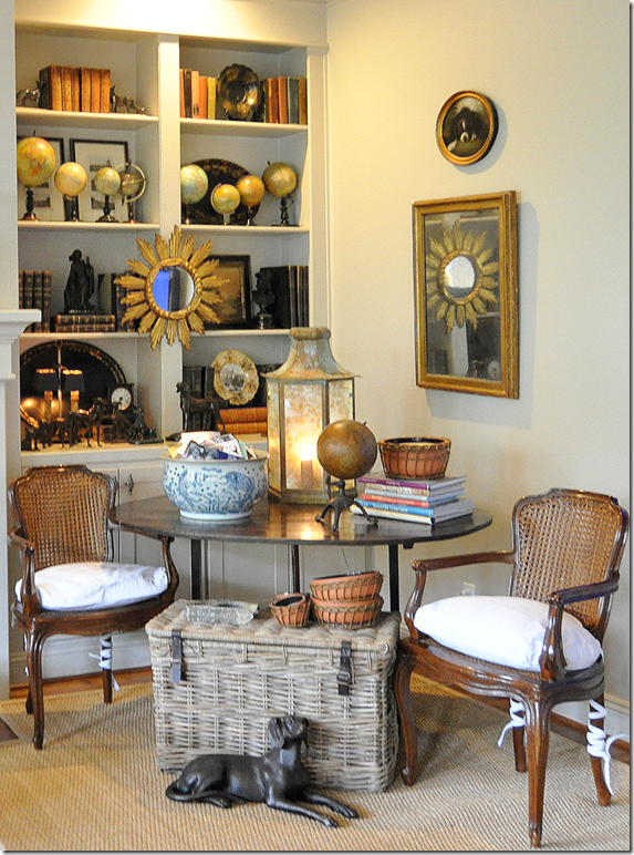
In my own living room, my fireplace is totally symmetrical. I try to keep my shelves balanced too. But, while I love my globe collection…..
I just can never make them look balanced! It drives me crazy – they never look good. I’ve tried them in all sorts of configurations but they just never look good. Hints anyone?
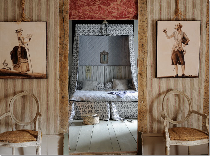
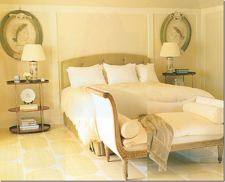
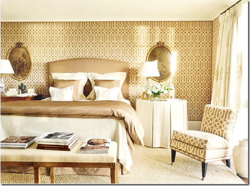
In this bedroom – everything is framed leading into the bed, including a pair of chairs and paintings.
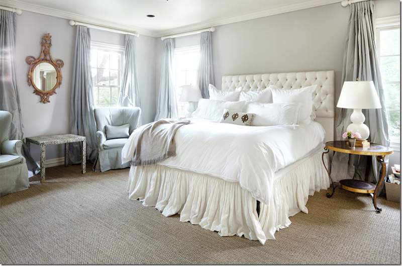
Matching nightstands and lamps frame a bed between two matching windows. Across the room, two matching chairs flank an oval mirror. Balanced, symmetrical, so pretty.
One tool many designers use in bedrooms is to frame the bed with oval or round mirrors or paintings. Here Suzanne Rheinstein used two beautiful medallions to frame the bed.
Suzanne Kasler used the same tool with beautiful oval paintings.
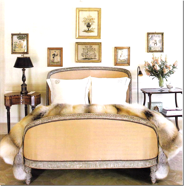
In Suzanne’s own bedroom, which I love, she used different end tables and lamps. Somehow, I think I would prefer matching stands, but that’s me. What do you think?
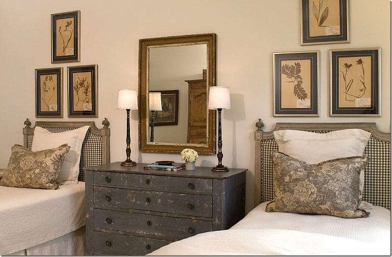
In this Houston guest room, Ginger Barber used a totally symmetrical design with matching lamps, pillows, and botanicals. It’s so pleasing and cozy looking. Love, love this room!
In this guest room in a beach house, Phoebe Howard used matching boats, bedding and lamps to create symmetry. The oval mirror anchors the design.
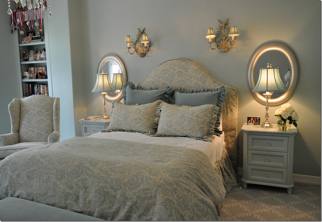
For this teenager, I used oval mirrors to frame her bed.
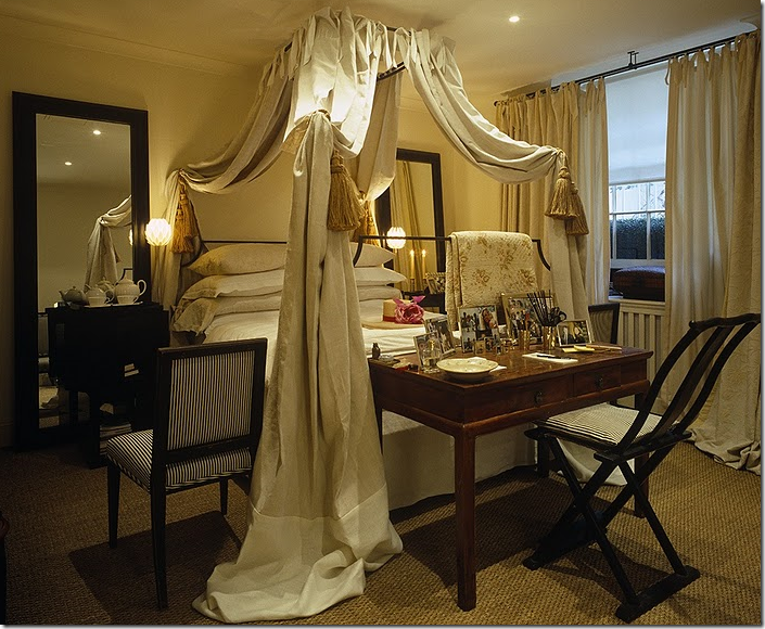
Another lover of symmetry is Mimmi O’Connell – here her bedroom has matching mirrors and lamps. She also uses chairs to frame her beds – which is such a cute idea. She loves ticking stripes – with their linear quality which fits right into her need for straight lines – as opposed to asymmetry.
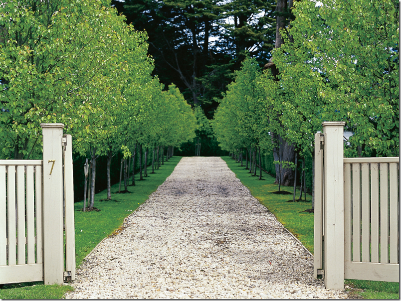
Symmetry extends from the house to the landscaping – what is prettier than an allee of trees? Picture from French Essence.
Of course, straight lines of trees do not come naturally but are designed. These trees from Oak Alley, a centuries old plantation in Louisiana, are some of the most gorgeous oaks. The allee perfectly frames the house – in another nod to symmetry.
These young trees – will they one day resemble the ones at Oak Alley?
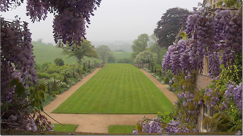
Even just a rectangle of grass, lined with flower beds, is stunning.
No room for an allee of trees? Try pots of blooming plants – here, hydrangeas. Oh, I wish I had the land to do this!!!
I hope you’ve enjoyed this study in symmetry. I’m thinking of designers that I love who rarely design symmetrically – and I like them as much as those that do. But, for myself, I need those straight lines, I need those pairs, I need the tidy ends to match up.
To read all the other Top Ten Design Elements, go HERE.
Top Ten Design Elements: #8
Subscribe to:
Post Comments
(
Atom
)



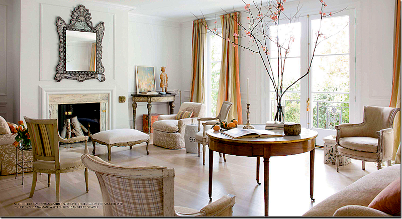
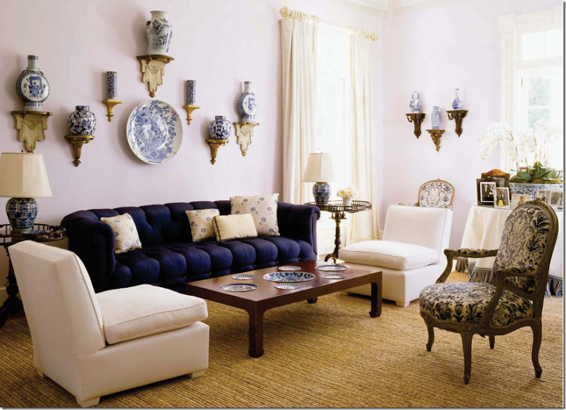


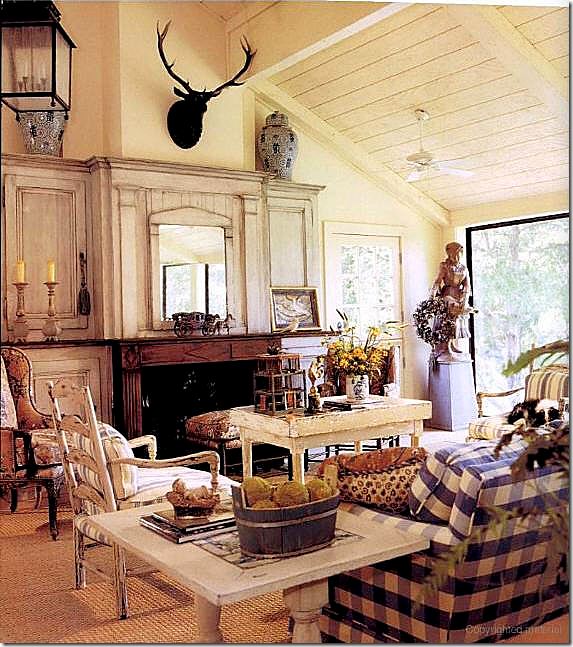
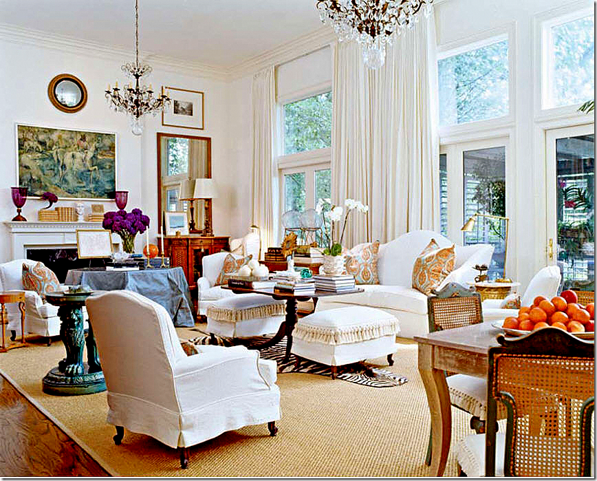






LOVE! I am following your elements pretty closely Joni, and have saved tons of the pictures you've use as inspiration of my own.
ReplyDeleteI am in love with that Jim Howard space you showed in the first photo. If only had I had millions of dollars ...
The symmetry of my house is always bothering me. It's so "off" as most Colonial Revivals were. That's left or right foyer with the enfilade of rooms down the side of the house probably was great when raging against the center entrance formality - but it really sucks when you're trying to make spaces formal ... or informal for that matter.
Great post! As usual!
P.S.: Check your email - I need advice.
Wow what beautiful inspiration you brought us today!!
ReplyDeleteI love symmetry and your post has made me realize that lack of symmetry is the reason I struggle so with my living room. The fireplace is offset and I cannot seem to come up with a way to arrange that is pleasing to my eye.
Are there ways or rules for furniture placement when a room is not symmetrical?
When I look at the rooms you really love, I see a lot less accessories in them than in your own living room. Perhaps you should edit some of your cherished globe collection to a few favorites. I would also want the sofa facing the fireplace but that's just my own compulsive need for symmetry talking. My problem is a gigantic grand piano that throws off all attempts at balance or symmetry. Any ideas?
ReplyDeleteI forgot to mention how much I enjoy reading your blog. I know you must put in an enormous amount of time preparing each post. Thank you for inviting me in to some of the most beautiful rooms across the globe.
ReplyDeleteJoni,
ReplyDeleteLoved this post. Fascinating! I always learn so much from your blog and really appreciate all the terrific time, energy, and attention you give.
I think the room (was it by Faudree?) that you said drove you nuts... well, look at it again... I think it IS (at least mostly) symmetrical. I think it's just the angle of the photo and the way certain pieces block others (in the photo) that make it appear to be asymmetrical. Seriously. Look again. There are two matching chairs, one to either side of the fireplace. Two matching chairs essentially flanking the sofa... Et cetera.
In fact, I think the LEAST symmetrically designed room in this whole post may be your own! If it is symmetry you love, you may want to make some changes. Personally, I think you've done a nice job of balancing your design. And balance works for me.
Although, like you, I also LOVE symmetry!
OK, I just did a post on my obsession with your globes and actually copied your globe from Bonny Neiman!!
ReplyDeleteSo, as far as making this space more symmetrical... what about separating them... it will mean moving a few things around... which can be disastrous... but...
EXAMPLE: Move first 2 globes (in the row of 8) to the far top left shelf (first section), where the basket is... the second pair of globes to the second section, third shelf down from top. Then move the third pair of globes next door to the third section where the first pair are now, and move the last pair down a shelf...
Like I said, I know this will take a lot of moving around... and I see that you do love symmetry in each section and shelf! But, the globes must be separated in order to keep symmetry in this room and on these shelves! Don't you think?
OR! This might be better...
Just swap the second section, third shelf down (with 4 books on either side and the bust in the middle) with the last section second shelf down with the 4 globes and oval tray... that will not be perfectly symmetrical, but it will be more "balanced" with a set of 4 globes on either side of the fireplace...
Good luck!
I hear ya, sister! I love a symmetrical setting too. Something calming about symmetry. I look forward to #9.
ReplyDeleteJennifer xx
I love a bit of symmetry myself Joni....thanks for including my front door as well as the lavender driveway...great post as ever...xv
ReplyDeleteI love symmetry too! I had no intentions of my living room being so symmetrical when I started it but it just told me it had to be. It just does not look good without the furniture centered from the fireplace and chandelier. The thing that bothers me the most about my living room is that I am still searching for the perfect piece to mimic the french desk on one side. I have matching mirrors on either side of the opening to the dining room. On one side is a white french desk on the other a wood finish french chest. It's too small....I want something similar in size to the desk....and for it to be white too. I am sure one day I will come across the perfect thing.
ReplyDeleteTo me symmetry looks more expensive. Like you loved this thing so much...you bought two of them. Most of my friends do not have symmetrical rooms in their houses. I love them and I also love a square room I feel very comfortable in a square room. My center hall meets in a square between the rooms and I love that so much about the floor plan of my house. Some would think its a waste of space. I don't think of it as a waste at all...it feels open and comfortable and I use it as a dressing area.
Love your top 10. I need drapes in my living room so bad! I just haven't come across the perfect ones yet. I do have lace cafe curtains but want drapes too.
Oh...I think your globe collection looks pretty darn good!
ReplyDeleteJoni-
ReplyDeleteThank you so much for sharing. This post is not only gorgeous, it is extremely helpful.
Love your choices as usual. I am happy to find someone who is as strict about symmetry as I am.
Have a wonderful week.
Teresa
xoxo
Well thanks to you Joni, I have been so engrossed into your post, that I am now late for work!! We must live parallel lives..at least design wise... as i follow the same 10 design commandments, especially symmetry. Cannot start any projects without a floor plan whose symmetry allows every piece of furniture to stand out.
ReplyDeleteYour illustrations are as always beautiful and to the point, but you outdid yourself with the landscaping photos!! spectacular.I am planting yet another boxwood mini garden by my kitchen window, and am drooling over your choices of gardens. Unfortunately, my land is not flat which makes a symmetrical garden rather a difficult task, but i never give up trying.
I get it....but my home is all about asymmetry.
ReplyDeleteI fight it, but it is actually very freeing to be a bit off balance. Symmetry is over rated. Please do a post on asymmetry - you will surprise yourself!!!
pve
I'm with you. Picture-perfect symmetry is dulling to the senses.
DeleteWell, this is where we have to draw a line. I am an asymmetry gal for sure. I do like symmetry in the architectural elements of a room, but the strict symmetry drives me crazy. I am left wondering where the creative side of their brain went...I love the element of surprise in a space it will always be my favorite part, it is the "something to talk about", it is what I will remember and admire. That being said, so gald you added to your list. I loved it. Don't keep us wait so long for the next two!
ReplyDeleteJoni,
ReplyDeleteI've been reading your blog for about a year now and you already know how much I admire not only what your write here and your caring personality, but I also have a huge respect for your knowledge. I'm the kind of person that's always open to learn. I'm not afraid of that, in fact I'm proud of being like that. I love leaning and I think I will never stop being like that.
This post was the most interesting post I've read here because I felt I was there with you, just talking and you explaining things in your terms. This made me open my eyes even more and feel a bit more in love with interior design. What a fantastic and well written post! Thank you for this.
Have a beautiful day!
xo
Luciane at HomeBunch.com
I think a decorator's brain tends to either go towards symmetry or the other way. This was an interesting post because I don't like perfect symmetrical furniture placement. As I was reading your post I was thinking, you can have balance with asymmetrical design...and finally, you showed the fireplace with the chaise diagonally across. Yes, that is perfectly balanced design in my mind. There is something that seems to predictable when things are even on each side. I have to have balance, but I don't tend to choose matching mirror images for a room. I did buy a pair of matching lamps for my living room recently, and I think that helped balance out the different end tables. I also appreciated a room that puts oneself at ease, and strive to have that in my design. But I don't think in terms of symmetry, I think in terms of balance. Does that make sense?
ReplyDeleteLove your posts Joni, they are so good!!
Love these design element posts as they are bookmark keepers for me that I go back to and enjoy for inspiration.
ReplyDeleteAs a Libra, I THRIVE on symmetry and fret about having a bit too much of it in my home! I have this unreasonable urge to purchase two of everything LOL
Can't wait to see 9 and 10.....
Hi Joni,
ReplyDeleteA very interesting post to read! As you, I love the combination of linen, slipcovers and seagrass. I have always loved that picture of the dining room by Jane Wood.
My father learned me to use symmetry as much as possible in my desings. He told me that you would always achive the best design by using symmetrie and the right proportions.
We don't need to place objects symmetrical on a console table or in a bookcase or as a cabinet display. I love the symmetrie in the background, but prefer objects assymmtrical placed in a group, otherwise the environment or room will look too monotone and borring, if you understand what I mean. As if no one ever enter this place, as if things are placed there for ever and ever at the same place.
Thank you again for all the work you put in your blogposts Joni!
xx
Greet
Your taste is so French but so much more "tidy" us French are depending on random beauty of an organized mess . :)
ReplyDeleteYour taste is so French but so much more "tidy" us French are depending on random beauty of an organized mess . :)
ReplyDeleteI'm a balanced sort of person too! For your globes, you might try elevating one or two of the small ones on an object like a book to see if that makes them feel more balanced.
ReplyDeleteI, too, am in the asymmetrical category. I appreciate two or three symmetrical elements in a room for balance; after that, I can only see a Noah's Ark School of Design theme and I start humming to myself "the vases came in, two by two . . ." But differences are what make the world visually interesting -- you have to go with what makes you feel comfortable in your space.
ReplyDeleteExquisite post! Clearly you worked your tail off on this one! Absolutely sublime! Love your design elements! BTW: Faudree has a new book coming out Sept 1st:
ReplyDeleteDETAILS! Perfect title for him!
Symmetry is breathtaking in these photos!
THE CORNER FIREPLACE needs YOU! How would Joni create balance and symmetry with a CF in her home?
ReplyDeleteI would love a post on "the corner fireplace" as it challenges us to work with balance, symmetry and asymmetry. Esp the corner fireplace that is "not" the focal point in the room; thus, the sofa across from the fireplace and two flanking chairs does not work. Like your slanted wall that you struggle with and try to work with,for some of us "the corner fireplace" is a given. Very few creative and insightful online posts on this corner challenge.
Informative plus insights and observations on symmetry, Joni.
Thank you!
I'm with you on needing a lot of symmetry and balance in ones decor to feel a sense of peace...
ReplyDeleteamazing collection of images...
and yes, linen and seagrass rugs..may they never go out of style..
maureen
I love balance, achieved by asymmetrical elements in a room. I am bookmarking many of your photographs for inspiration down the road........Your information in decorating very informative and helps those of us without these skills...........These rooms make want wish I had deep pockets.........
ReplyDelete~Emily
The French Hutch
As I was reading this I was like "yes, yes, & yes!!!" I too love ALL those elements!! LOVE all the pictures on symmetry. Im a symmetrical gal myself. Its that "inner peace" of balance! LOL or something like that.
ReplyDeleteStill waiting with bated breath for the West U. home tour pics! I had so much fun Sunday but have already forgotten in my head what some of the homes looked like! :-)
Have a great day!!
I think there's a place for asymmetrical but I appreciate balance as well. The fireplace in my living room is in the corner, completely not balanced, however the leaning mirror with 2 flanking lamps create a very pleasing symmetrical feel which creates the balance.
ReplyDeleteGreat post Joni I loved this thorough journey on symmetrical spaces, just great!
x
Maria
Your posts are better than any design magazine, ever! I love each and every one. Thank you.
ReplyDeleteJoni I am so with you on this one. I have to have symmetry in my life. I feel unsettled without it. It definitely gives peace and continuity to a room. I actually wrote a post on this very subject also. I use to fight the urge to do symmetry because I thought it would be more interesting, but it just goes against my grain so now I do what I love just like you!! Great post and I loved looking at all the beautiful examples. Thank you for all your hard work in writing such wonderful post for us to read,Kathysue
ReplyDeleteJoni, you "knocked it outta the park" again with this awesome post. I too love a balanced room. And now I don't feel so square and out of it knowing I like it that way. !!
ReplyDeleteBeth
Joni, fabulous post! I will bookmark it and refer to it often. I'm looking forward to reading the preceeding ones in the series. Brava!!!
ReplyDeleteRegarding the globes: My advice is to arrange the two bookcases as symmetrically as possible, which will clarify and strengthen their function as frames for the fireplace.
So try distrbuting and weighting the globes on the same shelves, left and right of the fireplace, as equally and symmetrically as possible. Love to see if that works!
Tess
Joni, you tickle me so much (you have the best way of getting your point across), and I agree with your elements. I like them all, too.
ReplyDeleteNow, as far as symmetry, I like it, but I kind of like to bend zt times and go for asymmetrical balance. I can handle it, but it has to not throw me for a loop.
I like three pillows on a small sofa and five on a large one, but I like pairs to match. The odd man out (or the pillow in the middle) better be matching something on the other side of the room. ;-)
That might be one reason that the chairs near my mantle are kind of driving me nuts. One is a wingback and one a French style arm chair. But I plan to put matching pairs of loveseats (when I get them slipcovered) and a pair of arms in there, too. I do like pairs of lamps and other things. It quiets a room.
XO,
Sheila (sorry, I've been MIA but I am battling an old injury again. Hence blogging is sporadic right now, but I wanted to drop to say that I hope you had a lovely Passover and got to spend time with Elisabeth!)
Loved this post!!
ReplyDeleteGood reminders... however some symmetry reminds me of hotel rooms.
I want the 'lived in' feeling, with balance that is less glaring.
I would keep the ladder...
Your bookcases are very nicely balanced and interesting... very well done... your globes do not bother me, I like the variations.
If they bothered me though, (you did ask for ideas) I would have some simple bases made to make most of them the same height... similar to the bases on your trophies, but painted or stained to match the pedestal. Then you could pair them according to height and size... or even more simple use stacks of small books to adjust their height... would that do? Only Joni Webb would know...
Great post... now I will be walking around looking at all my unbalanced blunders. I can always improve on what I have... just a little tweaking...
Thanks for the post.
Lee
Love this post, as I do all of your "elements" posts!
ReplyDeleteI totally agree that it is very personal. I used to by "very" symmetrical in my decorating, but now I am wild and crazy:) and am more about asymmetrical 'balance'! For me, balance is softer, more relaxed and makes me "feel" happier. I think the example photos above are gorgeous, but, unless the house if truly formal, I prefer the asymmetrical!
I would suggest dividing the gorgeous globes between the two cases and then balance them!
best,
joan
I am a Libra. Balance is in my DNA. However as others have mentioned I have moved into the asymmetrical to achieve balance mode. I have to admit at first I had to fight my needs for "perfect order". Now it just happens. As for your globe problem. More is too much. I suggest you achieve balance by sending me at least two of them.
ReplyDeleteSu list es mi list, Joni! I have some of those same photos in my tear sheet binder. Nobody does it better, Joni (cue Carly Simon...)
ReplyDeleteHi Joni!
ReplyDeleteI love balance, but I don't necessarily like symmetry. I find rooms in which the two halves are mirror images of one another quite boring. Give me a room full of unique items arranged in a balanced manner and I'm in heaven. That said, I believe there has to be some symmetry in a room - for example, a sofa in front of a fireplace flanked by two chairs. And then ... go crazy! End tables in several different styles, similar but not necessarily matching lamps, unique accessories ... yummy!
There's a practical reason for my dislike of symmetry - I have a hard enough time finding one item that I like (chair, table, chest of drawers, etc.), let alone two! So for me, asymmetry reigns!
A perfectly executed post, Joni! And I'm with you...symmetry is just so soothing and pleasing to my eyes and restful to m spirit.
ReplyDeleteI'd try breaking your globe collection up...some on the right, some on the left.
Hope you're enjoying this knockout weather!
Linsey
Joni,
ReplyDeleteWhat a lovely post! I too live and design by symmetry. Thank you for the beautiful examples of this classic design principle.
I was so excited to see your post this morning, and followed along to the post about curtains. For my birthday I was promised a trip to High Fashion Home to buy material for curtains, and have been just agonizing over what to get! I am a big fan of beige linen, but am a medical student and that gets sooo expensive! How do you feel about ticking for curtains? Thank you again for posting!
ReplyDeleteWOW!!!
ReplyDeleteJoni, I love how thoughtful and full of beautiful images your posts always are. I am completly with you... I need all of the major elements in balance and in order in my own space. One place I like to play around with asymetry is with accessories - then when they start bugging they are easy to rearrange!
Also, love that you included Tammy Connor's living room in your images. She is so talented! (I should know since she is my boss!) I have always thought you would like her work.
Thank you! Megan
Brillant posting -- and a wonderful addition to your Top Ten list!
ReplyDeleteAnd -- of course -- I am STILL waiting for the entire List to be published in a gorgeous hardcover book! :) When will some clever soul in the publishing world realize that your "Top Ten" book would be a Best Seller? :)
Really! Yes ... I am still whining about your book after all these years! :)
P.S. Have you seen the latest Veranda magazine? :)
Jan at Rosemary Cottage
Fantastic post! I love symmetry, even in the smallest vignettes. It makes me feel happy and a little smug :) I'm always drawn to it.
ReplyDeleteLove your posts. Always so informative! When I was first interested in design I was more into symmetrical design. But as I've learned more I love balanced asymmetry. I agree - its much harder to do, which is maybe why I appreciate it more. But I need the balance to be there with the asymmetrical design, or will be off for me.
ReplyDeleteAs far as your globes go, have you tried placing the ones that arent exactly the same size on books? So the one far right could be on books, so it is on the same height level as the one on the far left. The other option would be to take one group of four (like the whole left group), and move it over to the left of the fireplace. (On the left side, 2nd to top shelf, to mirror the globes on the right side of the fireplace.) That way they will be symmetrical when looking at the wall as a whole, and the minute differences in sizes of the globes will not be as noticeable when they are placed that far apart.
Let us know what you end up doing! ;-)
Joni dear -
ReplyDeleteThanks for speaking up for
SYMMETRY !!
I find it so disturbing when I see
so many of the Hipper Than Thou
group of young designers who make sure that nothing in a room matches or even relates.
Balance in our spaces truly supports Balance in our lives.
Your images for this post were
especially yummy -
judith
Wow Joni, this is another post so full of images and information, a great way of describing your aesthetics. I like symmetry most of the time, but sometimes an unexpected "balanced" unbalance speaks loud about the personality of the people. Every house is different fortunately and that makes our job more exciting!
ReplyDeleteI like balance in size and or shape/color, but not totally symmetrical, Thinking about it, as you have made me do, I am the same with acrchitecture, I like winding type cottages with unexpected little nooks and crannies, and spaces that look added on (or were added on many years after the building was first built) I do not like formality and I think perfect symmetry looks very formal to me, even if the other elements in the room are more casual.
ReplyDeleteGreat post Joni! I could not agree with you more. For me, it has to balance.
ReplyDeleteHi Joni! Oh, my jaw is on the floor! What gorgeous rooms, you're certainly included. About your globes, have you considered putting one on a stack of books and graduating the height of three? Maybe spreading them out in your built ins? I know folks say to keep collections together but your globes are large enough they would still say 'Here we are!' I know nothing! :)
ReplyDeleteBe a sweetie,
Shelia ;)
You do such a bang up job. Thanks so much. Ann
ReplyDeleteJoni first let me say again how much I appreciate all the effort you put into your posts. It shows.
ReplyDeleteSecondly you've got me really thinking about which elements (when I really try to dissect them) are on my most important elements list? So far I agree with all of those on yours (no surprise *winks*) I do think having large scale classical statuary in a room tends to "get" me every time. Could be that only large beautiful rooms tend to lend themselves to them in the first place???
Third...I think your globes look great. You're being too hard on yourself about them.
Fourth ditto on Suzanne's bed tables. ...But really how fabulous is that bed and fur coverlet?! Soooo luscious!
As always Joni I feel my eyes have opened a little more after visiting you. Vanna
As always we have another winner, love this post. I love that you added the symmetrical balance element to your post and such beautiful examples. I only do touches of being symmetrical since it can be a bit formal for my home but you need the balance.
ReplyDeleteI love your globe collection too but you’re right they need a little mixing up. Try the tallest one closest to the wall and stagger down. Maybe move four over to the other side so your collection looks more balanced together. I know you’re supposed to group collection together but why when they make a statement like yours?
Love this post and it shows how much you love blogging by your efforts!
Thanks!
Debra
I tend to go against symmmetrical balance in my own home but loved seeing all these examples of symmetry. Your pictures are always so beautiful and I sit and stair at every detail. Fun to read all the comments too!
ReplyDeleteMaybe you should remove the objects from behind the globes. It's sort of distracting for the eye to try to focus on the globes and then discern what's behind them. I do like them grouped together however.
ReplyDeleteI am all about symmetry, so I love this post. I don't like too many matched pairs in a room and I think an element of surprise can be refreshing, but that's more in the mix or the details of the furnishings. Furniture placement that is just off is never right. I also think that when planning a home from the ground up you should not only pay close attention to symmetry but to visual vistas as you go from room to room. Pleasing vistas at the end of hallways or as you look from one space to another are so important. I think that they go hand in hand with symmetry. Once you've trained your eye to look for both of these elements it all seem lacking without them. Loved your post as always, Joni.
ReplyDeleteYou've helped my marriage! I am married to Mr Symmetry. He doesn't care about balance, only exact symmetry every time. I can go either way as long as it looks good. I feel like I understand him better after reading your post.
ReplyDeleteAnyway, regarding the globes, perhaps they need to be one big, happy family dancing on a table somewhere.
Joanna N, Houston
Joni - I've been a reader for quite a while and loved this post! You are such a treasure trove of knowledge. I could sit, read and learn from you all day:) Great pictures as well.
ReplyDeleteJoni,
ReplyDeleteI'm right there with ya on the appeal of symmetry. I always want to like asymmetrical designs, but somehow, no matter how many design tricks I pull out or how hard I try, it just never looks quite right to me. I love how you have broken down your favorite design elements for your readers~I always learn so much when I can "see" through someone elses eyes. Glad you continued the series : )
Suzanne
It's funny, looking around my dorm room, I noticed that I only have ONE almost-symmetrical arrangement of two white plates behind a white pitcher (where I hide my silverware!)Everything else is asymmetric, including my bed pillows!
ReplyDeleteI don't think of asymetric arrangements as surprising so much as private- you have to spend twice as much time in the room to know everything.Symmetric rooms seemed designed for public use. Though I might someday have a fairly symmetric living room, I can't immagine being comfortable in a symmetrical bedroom.
As for the globes, have you considered taking out two globes (so you have two groupings of three)and then treating these two sets like a pair?
I love & appreciate symmetry, but don't want to see it literally everywhere (not so "in your face", so to speak). Now I do like & need balance or things will seem a little off to me. As far as your globes, they look fine to me. But if they are bothering you, you could swap the order of the 5th and 8th ones. Then, it appears that the new 8th globe would still be somewhat shorter than globe #1. So, you could elevate #8 on a wooden plateau. If you don't already have one the right diameter, color & height you could get an unfinished one somewhere like Hobby Lobby or Michael's & stain or paint it yourself. Just a suggestion. Another great post!
ReplyDeleteSorry, I forgot to sign the 3:44AM post on May 5, 2011.
ReplyDeleteKaren T.
Shouldn't the globes be in odd numbered groups like flowers etc.?
ReplyDeleteFab blog, the most sophisticated fun.
Those globes have to go! lol I have nightmares of a decorator telling me that my duck decoys, paper weights, numerous framed photos, have to go. This is an awesome post Joni. Just beautiful.
ReplyDeleteAnother beautiful and thorough post! There is so much to see here. I also love linen, to live with and to wear. I prefer balance to symmetry, appreciate how you presented the ideas. My grown children all demand rigid symmetry in their living spaces, wherever they can.
ReplyDeleteMust be from growing up with an asymmetrical Mother!
Great post today Joni! The globes are fine - maybe if you put them on something (small stacks of books or riser) to make the heights more uniform at the ends you'd feel better about their lack of symmetry. BTW, I can't seem to find seagrass carpet out here in North San Diego county. There are seagrass rugs, but no carpeting. :(
ReplyDeleteThis comment has been removed by the author.
ReplyDeletePERFECT timing on the post!! I purchased a bedside lamp on Tuesday. Yesterday I ran back and got a second one.
ReplyDeleteI did agonize over fireplace placement in a room I am building, opted for centering it with a window on each side, vs. placement in a corner. I didn't realize why I was doing that, after reading your post, it was the symettry.
In another bedroom, I had two different heights of lamps. I placed the shorter one on a stack of leather books. It solved the need for order, and looks wonderful. I can see a globe on a couple of books....
Love. I love this because for most of us, having chaotic if not semi-chaotic, lives... there is something very restful about our subconscious knowing "everything is in its place." Symmetry in design does this. Sometimes we don't even recognize why it feels so "finished" and "complete." We just know our brain likes it. I am a creative soul so I like things off-kilter. I love to play with scale in unexpected ways as an expression of design. But I find many of my customers are more type-a and it stresses them out. Remembering the trick of symmetry is an element most people value. I love that it hit your top 10 design elements. For what its worth, I'd put linen up at number 1 also!!! :) Thanks. Enjoyed your photos and comments and appreciate your hard work and insight.
ReplyDeleteThis was a monumental post! One of my favorite images is the room w/the urn with red branches. Beautiful.
ReplyDeleteRe: your globes. i wonder if it would look more symmetrical if what is behind the globes is more balanced. Now there's 2 rectangular paintings on one shelf and an oval tray on the other - maybe changing that would create more balance?
Joni,
ReplyDeleteTHANK YOU!!!!!!!!!
I absolutely LOVE your Top Ten Design Elements Posts and have learned so much from them and have benefitted over and over again in making decisions in my own house and for clients!!
You are the greatest!!!!
You asked about a couple of rooms where the designer had chosen basically a symmetrical approach but with a piece deviating from that as a "surprise." I would have preferred the symmetry in each of those cases.
But, I also agree with you that it is a personal decision and there is no right or wrong. I just feel that the prettiest design is quiet and part of what makes it quiet is symmetry. To me, life is lived so much more calmly and happily in a quiet/serene environment. I don't mean without bright colors but in space that is put together in a way that makes sense to the heart and mind.
xoxoxo, AnneHH
Hi there, Joni -
ReplyDeleteHere's the mark of a memorable post - since I first read it about 24 hours ago, I've revisited it 3 more times. I keep thinking about all of those beautiful images and find myself sitting back down in front of my computer for "just a moment" to study these rooms. Needless to say, 1/2 an hour later, I'm still there. This post is now permanently bookmarked! Thanks for all the beauty and excellent advice, Joni. Debra
Joni
ReplyDeleteGreat post. I love this series and read the older ones over and over soaking it all in.
I also need symmetry to feel comfortable (alas I can't always afford two matching pieces). But then I also think a room needs just something a little off centre to throw it and show that it does not take itself too seriously.
All the best
Cherill W (Adelaide, South Australia)
THANK YOU, THANK YOU, THANK YOU, Joni, for your wonderful blog! Every day when I turn on my computer I check to see if you've posted something new - you're a great read. Your posts, especially your top ten lists, have become an interior design textbook for me.
ReplyDeleteGreat post on symmetry showing fantastic examples using it well. I'm partial to symmetry, but I think that balance can be achieved asymmetrically as well.
RE globes: I agree with Eliza that 2 groups of three could look better - the similar sizes and numbers of your globes within their spaces all in a row seem to create a visual tension. They might just need more negative space around them.
Have fun with it!
Sandy (White Rock, BC)
Re: The Globe Collection
ReplyDeleteTry scattering them throughout the bookcases on both sides of the fireplace. Just a thought.
Best,
Alycia
I love symmetrically designed rooms and get what you are saying. Having said that my place is asymmetrical and this suits me. I think I am scared of going too symmetrical in case I make it boring.
ReplyDeleteLoved the continuation of elements of design.
PS. The globes look great - what's wrong with them?
Oh, yes!
ReplyDeleteI love symmetry---I chalk it up to being so furiously A.D.D., therefore a well scaled and balanced room creates a sense of calm for me.
LOVE the Bolander room....have had that file for years. The Bremermann room, the O'Connell....all three....mmmmmmm. I think it's also why I obsess over Drysdale so much---perfectly proportioned and symmetrical.
@Studio Judith: YES! SO glad someone said it. And I'm a young gal..... but I completely agree with you. Symmetry does not have to be boring, either. Not at all. It can be and usually is: riveting, impressive, mature and declares confidence.
Thanks for the treasure trove of new style files, Joni--this post is amazing :)
Oh, is the last image Carolyn Roehm? So gorgeous....and I'm not a fan of blue and white, but she pulls it off so adeptly and sassily.
Andrea
OH!
ReplyDeleteAnd I'm totally ready to be your date at Oak Alley. Glad you posted it b/c you reminded me that I have a standing invitation for a 'private tour' there which I seriously need to line up :)
Andrea
As usual a wonderful post. Adore all of your top design elements. Totally agree...symmetry is key for balance. So pleasing to the eye, at least our eyes!
ReplyDeleteAngela and Renee
I love this post!!! These top ten are my favorites. I do love symmetry, but only in landscaping. In the home, I like symmetry with something a little off. The rooms that have perfect symmetry, matched chairs, lamps, accessories, they seem wrong to me. I've read that in colonial times, when girls were making their needlepoint samplers, they would do them almost, but not quite, perfectly. They would intentionally make a mistake (like drop a letter or number). They were instructed to do this to remind themselves that only God is perfect. This reminds me of these perfectly symmetrical rooms: then need something unbalance to truly make them perfect. As you stated in the post, the perfect unbalance is very difficult, much harder than symmetry, which is actually (given the right room and doubles of everything) very easy to achieve.
ReplyDeleteI'm looking forward to the next two...
all these pictures are so inspiring!
ReplyDeletei recently purchased a french style house built in 1972, and i am trying to decide on all the paint colors for the interior....i love all the gray tones, but i really need at least 3 different colors. floors are pine, some walls are pine.
my painter wants to use glidden paint.
any suggestions anyone?
Joni,
ReplyDeleteI too have read this post more than once. It made me feel like I was sitting in one of my Art History and Architecture classes back in college: studying each room intently; looking at beautiful inspiring photos. I too am in the asymmetrical camp, but do love buying lamps in pairs. I was more drawn to the kitchen with the yellow chair, or the asymmetrical arrangement of plates and vases (on the console) as they are grouped in like items, varying heights in groups of three. I like "asymmetrical balance" is what I had realized after reading this post. In some of the photos above, you've shown this - that balance can be achieved within asymmetry. I also noticed how, while you like pairs, things in 2s and 4s - that a lot of the symmetry (in images you chose) are based around odd numbers 3s, 5s (I'm paying attention to this more than ever) i.e. the facades of the symmetrical homes: while I'm in agreement, that they ARE totally symmetrical, I thought it was interesting that the William T. Baker house has 9 windows (allowing the symmetry with 4 sets of windows on each side of the main entrance), or the home above with 3 windows. I think that odd numbers create the focal point for which the symmetry balances off of. The Irish house - the two doors flanking the center fireplace (3 architechtural elements - 2 symmetrical doors with the fireplace as the focal point). I'm sure this can be argued, but regardless, this was such a thought provoking post, which I'd love to see discussed more!
To Teresa G:
ReplyDeleteIt's hard to advise on paint colors, not knowing your likes or color schemes, but look at
Benjamin Moore:
Coastal Fog
Muslin
Old Prarie
Manchester Tan
I've used all of these in the past, but am moving towards an entirely new palate of greys.
Thanks so much! I really need help!
ReplyDeletepainters want colors in 2 days, and i need to move there in 4 weeks.
still need to paint, do counters ( marble, heavy veining, calacutta), floors ( dark pine, stone?) , seagrass, plumbing, tile, hardware, lights etc. no g/c, just me.
i like lots of colors. i have been thinking gray owl or revere pewter, and i like the muslin. maybe light colors cause of 8 foot ceilings, maybe just one color for everything....
love same things as joni! thanks!
teresa g
Teresa G,
ReplyDeleteI love Gray Owl and my 2 new favorite colors (they're not new to B.Moore - just my new faves) are Light Pewter and Nimbus.
what do you think about painting the entire house one color? different kind of paint on the walls versus the wood work of course...but same color. do you think that makes a low ceiling house look taller?
ReplyDeleteand house is somewhat dark, not too much light coming thru windows.
Teresa G,
ReplyDeleteMe personally, I like different colors in different rooms - you can keep the same tone or monochromatic scheme, but me personally, I like the transition - and some rooms, depending on the lighting and ceiling height, I like to paint the ceilings a different color as well. The trim and woodwork I usually like crisp - B.Moore White, or Dove White (sometimes Decorator's White) - In the case with Light Pewter, it's pretty to paint the trim the same color but taken down 50% and in a semi-gloss or high-gloss. Again, for me, I like to see the space. It would be interesting to hear other comments as well. Some just do all white or various shades of white on all walls. I know you need to make a call soon (like in the next 24 hours), so I'm not sure if I'm helping.
Love your blog....as for your globes, take most everything out of the bookshelves except the globes. This will give them more space and attention. You can then add a "few" accessories back to achieve symmetry.
ReplyDeleteJoni, I have spent such a LONG time on your blog this afternoon (s-h-h-h,I'm at my office & supposed to be working). I have jumped around from post-to-post, just gathering beautiful inspiration. I came back to read this post again, because I LOVE symmetry, even though I really don't like things that match each other. I guess what I really like is balance. I feel so uncomfortable if a room is furnished in an unbalanced design. Wonderful post, and so are the many others I viewed today! Thanks! laurie
ReplyDeletececilia, you are totally helping me!
ReplyDeletenone of my friends or sisters want to hear another word from me about paint! I have never done a house in just one color, so I can't seem to get there with this one either. I have already marked dove white to look at tomorrow ( while painters wait on me) for cabinets and trim. the walls need a little more pop though, something creamy. I tried 50% linen weave, but it seems to be so yellow/green in that house. and i tried 25%, and it became yellow/white.
B moore has a nice off white fan deck, easy to see all those beautiful colors.
the blogs are so informative. wished i had seen all this great info a year ago. now i am determined to incorporate all of it in 4 weeks.
i saw lots of great marble today. those tones in the marble are making me want to warm up the walls. have to decide if i like the busy veining or the mostly white/little veining slabs.
thanks again, and i welcome all suggestions! I need a village!
I came a little late to the "Design Elements" party & thought for months I had missed #s 8, 9 & 10!! I LIVE for your fabulous posts. Thanks, Joni!
ReplyDeleteI, too, have a hateful corner fireplace. After reading this post on symmetry, I've decided to treat mine symmetrically, w/ all things symmetrical on the mantel, the hearth, the wall above the mantel, as if it were a little sitting area in the corner of a room. I suppose I'm lucky that the fp opening is centered in brick facade even though it's all pushed into a corner.
Thank you for a great post. :D
ReplyDeleteGreat choice of mirror!
ReplyDeleteSymmetry is incredibly important, one of those vital things that is so subtle when all is done properly, and so jarring when it isn't.
ReplyDeleteI loved all the landscaping pictures - truly magnificent!
I'm fairly new to this FABULOUS blog. Joni, you're the bomb! I've howled out loud once or twice (not on this post) at some of your comments. I'm catching up on the top 10 and so far I've loved what you've posted most especially that one room that keeps finding its way into every post. As to symmetry, I actually prefer the perfect, and difficult to achieve, artistry of non-symmetrical, perfect balance. I think that the most successful homes have some of each so the decor is not too matchy-matchy and not too much like an art installation.
ReplyDeletePresumably you have solved your globe dilemma by now, after-all it's been 3 years. Most of my ideas have been mentioned, but just for the record: first I thought put a few here and few there, then I thought, no! group them all together and vary the heights and maybe twine some greenery around the stands and add something taller like a big bird cage or some undulating vine trailing out of an urn. Suzanne R's room with a ladder was not her best work. Her nightstands are more personal. It is like decorating for someone with a split personality; maybe what she was doing was giving her husband his sturdy lamp and table on the left and for herself the whimsical lamp and table on the right. No compromise needed!
All the best to you Joni and thanks for all you excellent work! ~Ana