Continuing on the theme with tales from IKEA, I want to show you a kitchen that was completely updated, all in IKEA appliances! Did you even know that IKEA sold appliances? I didn’t. But apparently, they are Whirlpool product, which is quite a reputable firm, plus they have a 5 year warranty. The homeowner Christy writes a blog Beach Brights HERE where she detailed the remodeling of her entire house. The couple and their child moved to Houston just one year ago when they bought this older home in need of much cosmetic updating. Beside all the surface renovations, the kitchen and one bathroom needed major updating. I was going to only show her kitchen for the Readers Kitchen Series, but I really thought you would love to see her decorating. She obviously loves black and white as you will soon see. Enjoy!
Here is how the owners found the house, hiding behind overgrown bushes!
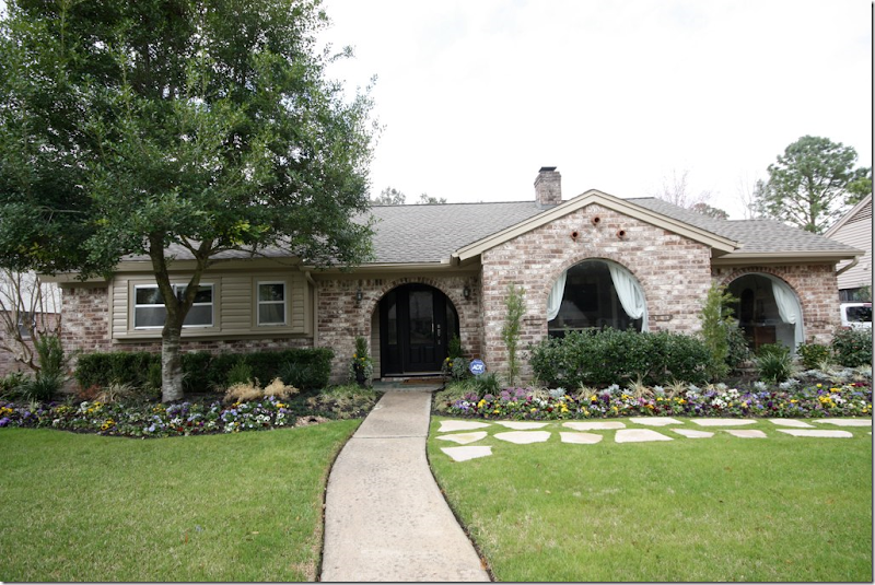
And today – the house looks completely different with the windows and front porch exposed. All new landscaping was installed, as was the stone walkway.
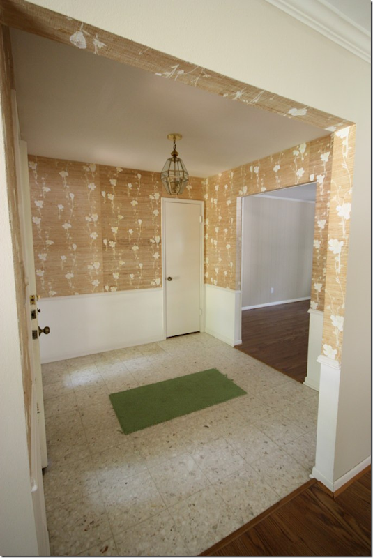
BEFORE: The entry hall was pretty dreary with the wallpaper, chandelier, and dated flooring.
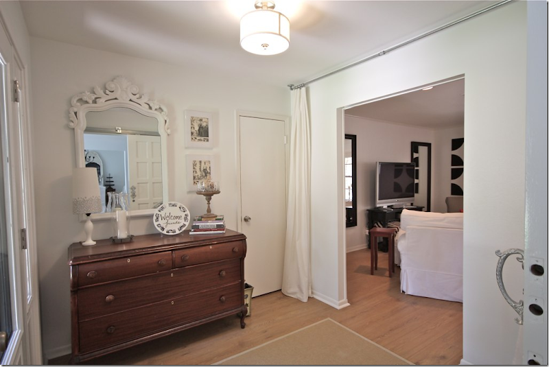
AFTER: The wallpaper is now gone and so is the tile floor – hardwoods now lead into the adjacent rooms. I love the curtain – it softens the room and is a great inexpensive way to add drama. The light fixture was also updated.
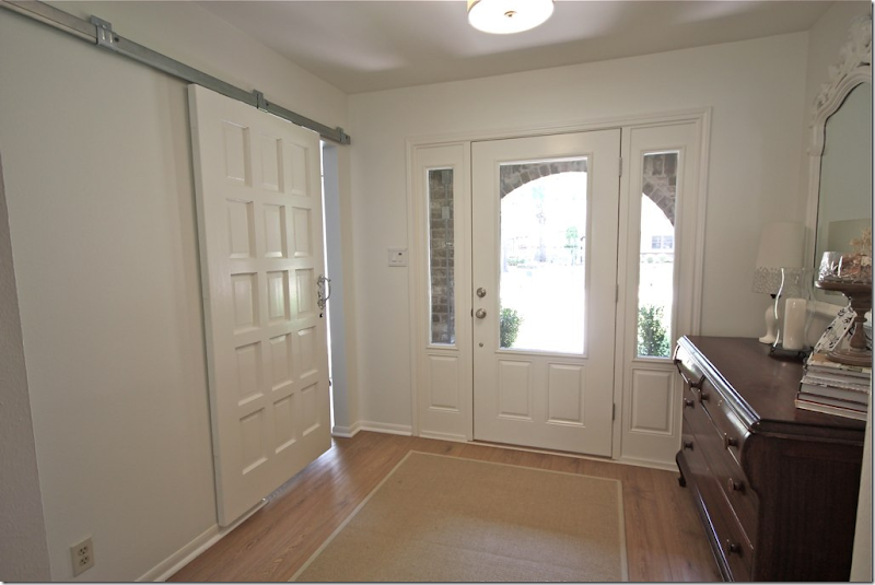
Looking the other way, the owner added new front doors and a barn style door to close off the hobby room.
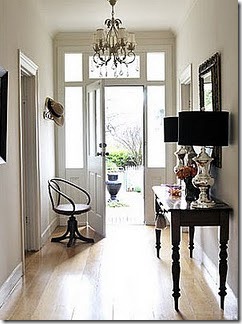
What I love about Christy’s blog is she gives you her inspiration pictures. Here is one of her pictures of a dream entry. It really does look like what she ended up with! With the Pinterest craze – there are so many images on the web that can give you a direction to go on. With a little imagination, you can take those dreamy pictures and change your own house!
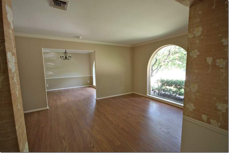
BEFORE: There was a living room/dining room combination which is a typical floor plan for Houston houses built in the 50s –70s. I’ll bet 90% of houses built in Houston during this time frame have this same exact layout. Today, many people are turning the unused living room into the dining room – and turning the smaller dining room into a library/study. This homeowner did something different:
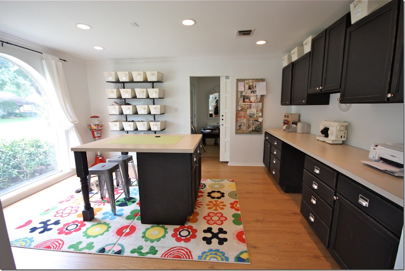
AFTER: Instead of a wasted living room, the owner opted to make this her craft room/office.
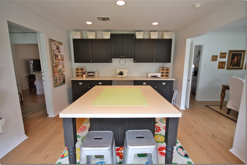
Here’s another view of the craft room. What a great space to spread out and sew in. It’s all so organized and neat with the built in cabinetry. I would love a space like this for my design office!
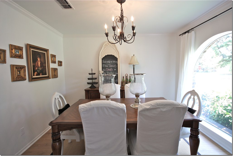
AFTER: The dining room is off the craft room and the kitchen.
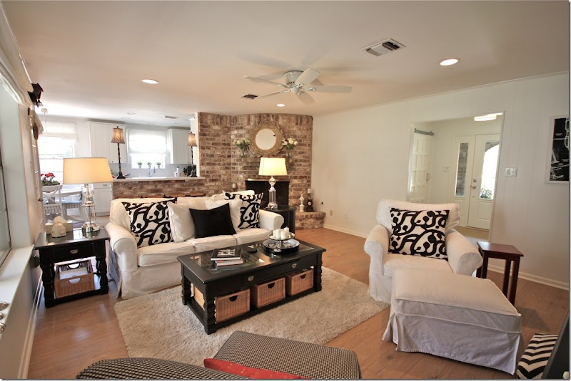
The family room is off the entry way. The kitchen is past the fireplace. I’ll show the kitchen last. As you can see, the homeowner really loves black and white and she used these two colors throughout the house with helps to unify the rooms and create a strong design theme.
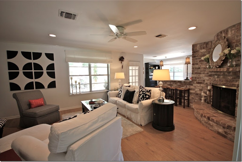
Curved fireplaces like this are dated and hard to work with. The homeowner chose to ignore it rather than place her furniture around it. This helps to make it disappear. Notice the art work on the wall.
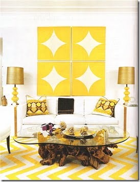
The homeowner created the art work herself after seeing this picture – again, a great way to get real inspiration from a magazine – and use that inspiration!
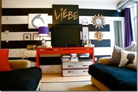
Another inspiration picture. The homeowner loves stripes and wanted to incorporate them into her new home.
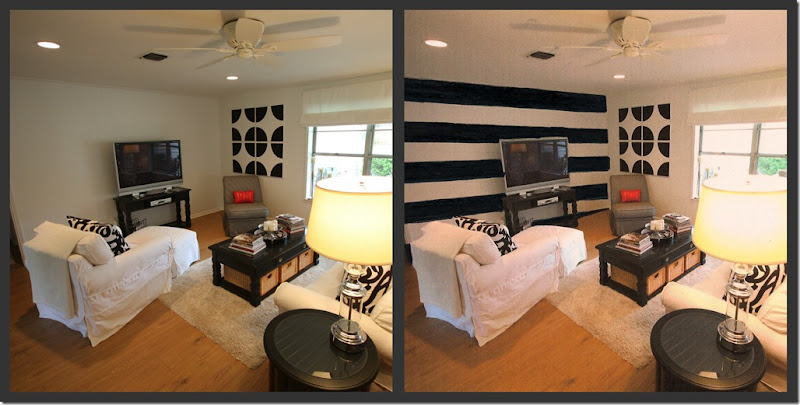
First, she considered painting an accent wall with stripes. She created a mockup image on her computer and asked her readers for their opinion. In the end, she used the striped walls in another area of her house, see below:
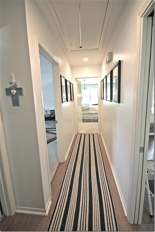
BEFORE: The hall leading off the bedrooms looks fresh with the striped black and white rug.
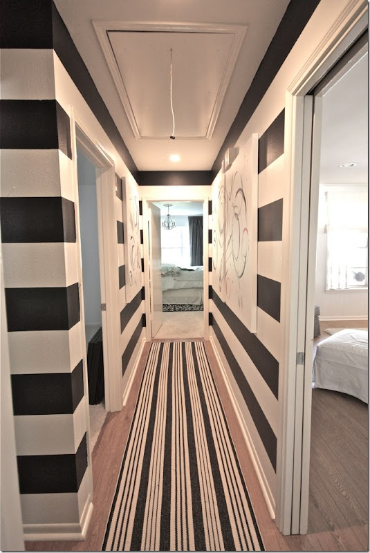
AFTER: But, after painting the hall with the black and white stripes, it becomes a fabulous decorative space. The family room – through the door on the right – looks out on the striped walls.
And looking the other direction. Large contemporary canvases line the walls and break up the stripes. The homeowner created the canvases herself – I think she did such a great job. This looks like a house that could be in domino or Lonny!!
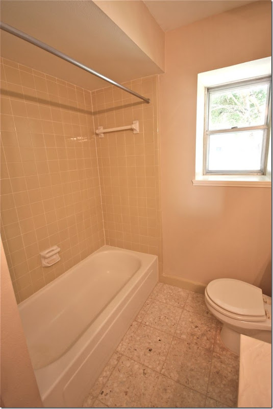
BEFORE: The children’s bathroom needed total gutting to update it.
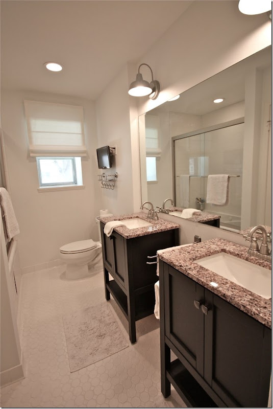
AFTER: Look how cute!!! I love those light fixtures and the sink consoles. Christy doesn’t say where she got the sinks but they really make the room! Before there was just one sink – now they have two which is so much better. Love the tile floor and the small flat screen too.
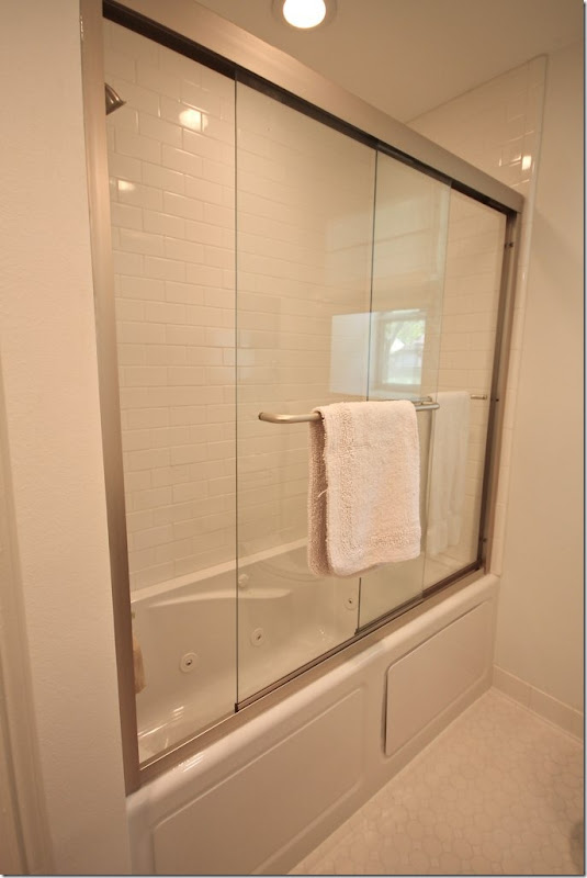
Here is the new tub. Great door.
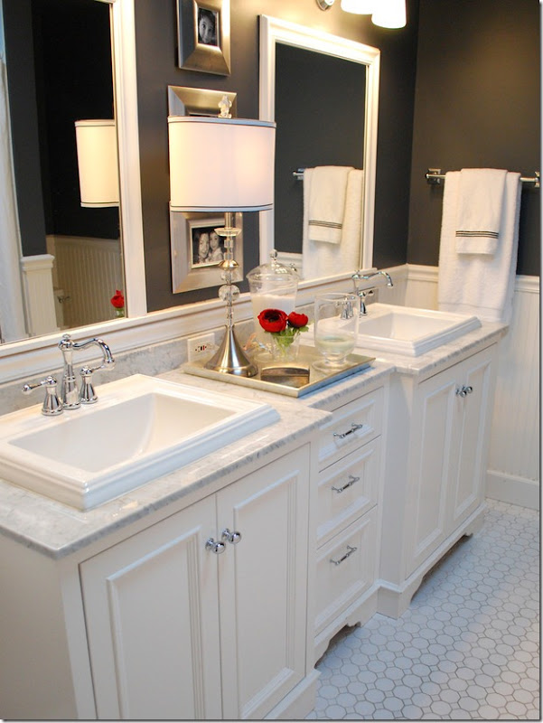
The inspiration picture. While the homeowner went light, not dark, the tile floor is the same.
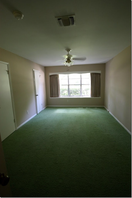
BEFORE: The master bedroom was a sea of green carpet.
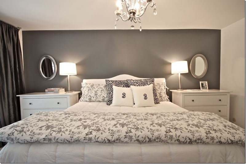
AFTER: Now, the master bedroom is sophisticated with a dark gray accent wall. Love that. The chests and bedding came from IKEA. I think that using chests is a great idea instead of small nightstands, plus they are so practical. But, besides that, they just look better – nice and big and tall like that!
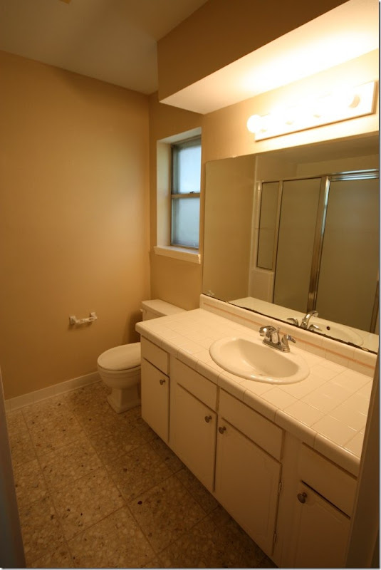
BEFORE: The master bathroom.
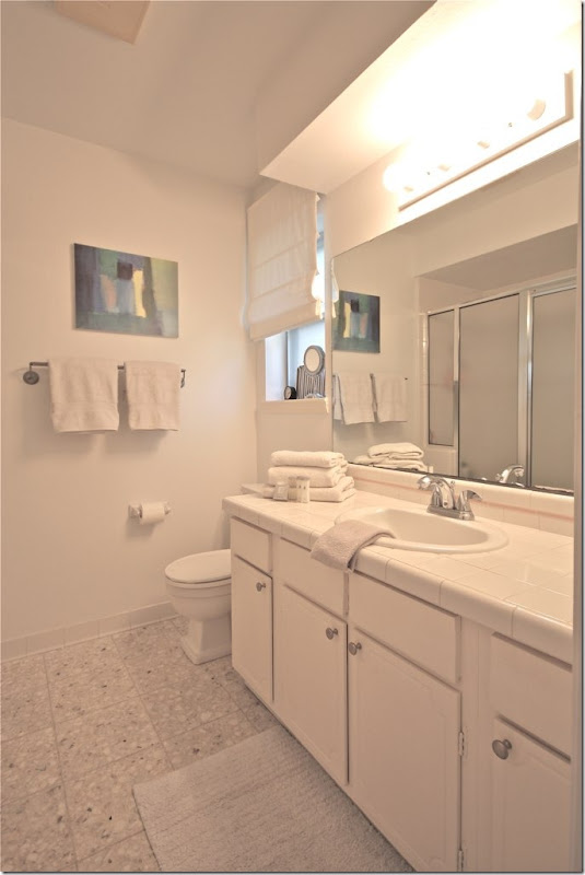
AFTER: The homeowners didn’t do much more than paint and add white shades – but doesn’t it look different?! Amazing what paint will do to a room. At first glance, I had thought this was completely updated.
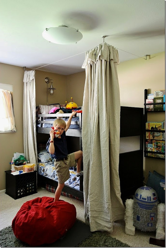
The son’s room is so cute – IKEA bunk beds and drop cloth canopy or “fort” as he says. Love the light over the top bunk.
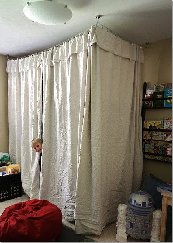
Look how cute it is closed! No hemming or sewing was done – just hanging!
THE IKEA KITCHEN:
ok, ok, I know this is what you really want to see:
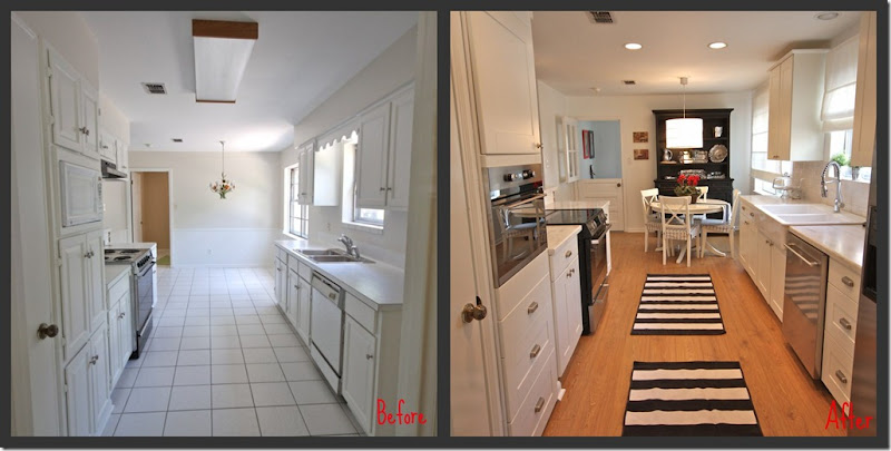
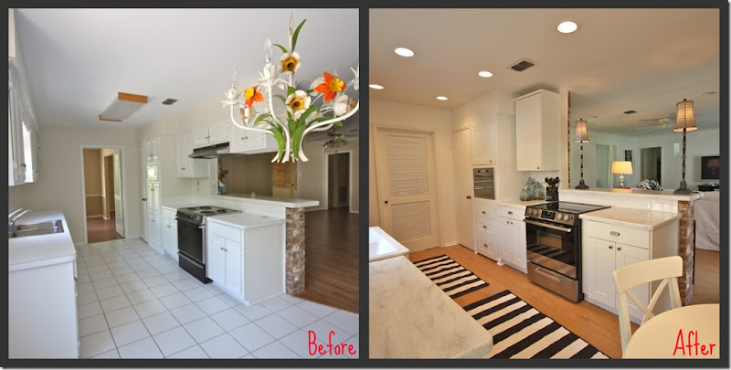
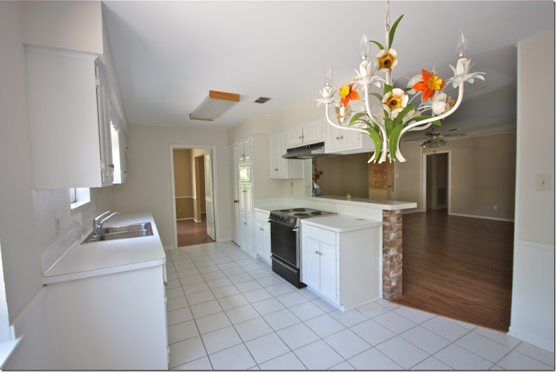
Here is the kitchen that IKEA built. Before and after. The entire kitchen was gutted. New floors, new cabinets, new lighting, new appliances. The owners did most of the work, the installing, etc. Here is the cost breakdown per the homeowner: The cabinets & appliances cost $6,200 (tax & delivery). The counter top was around $62 linear ft. The flooring was around $4-5 sq. ft.
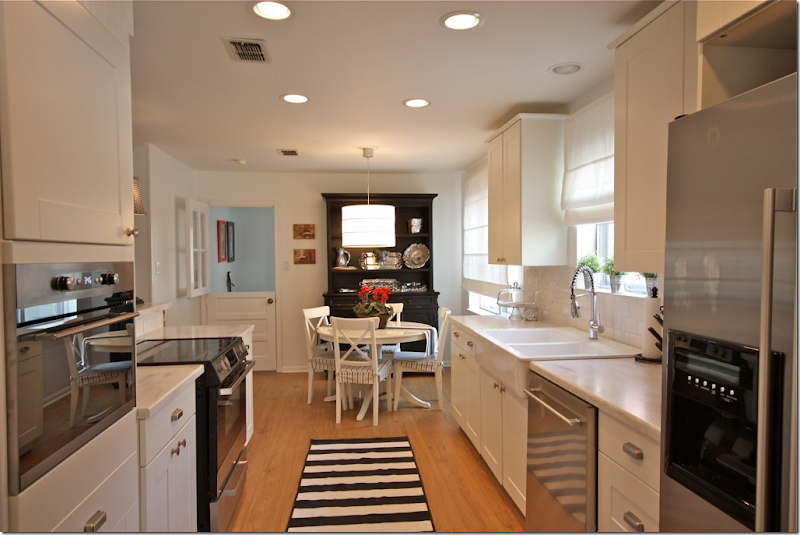
The black hutch and striped rug continue the design scheme.
Before and After
Here is how the homeowner ended up at IKEA in her own words No one wanted to take her money:
It started with my appointment with Lowes. I told Ben, my kitchen designer, that I was not crazy about Kraftmaid cabinets. The price is a little high and the finish for what I want is not great. So, what does Ben price out for me? Kraftmaid. When I ask him to re-do the quote, I received a lame attempt of re-working my design and quote. He also would not help me with appliances. So, I left frustrated, rushed and without a firm quote.
So next up is Home Depot. I call my nearest Home Depot to make an appointment with a kitchen designer and I am told by the person answering the phone that they can't make me an appointment. I was like, "What?" I just want to make an appointment...for you know, a future date, to design my kitchen and spend my money. He told me that the kitchen designer was not in today and he did not know when he would return or how to make an appointment. Really? So, I tweeted Home Depot, got a response to the effect that they were sorry and would make the appointment for me. I never heard another word.
Ok, 0-2. Next up is Best Buy. I thought that surely with all the advertising dollars being spent by Best Buy to describe their stellar appliance knowledge and customer service, that I would at least be able to get my appliances ordered. That was a huge debacle. Let's just say that the kid working in cameras who covers appliances doesn't know squat.
This leaves me with Ikea. Not because I want to save money but because I am better off just doing this myself.
BEFORE: The view towards the family room and the dining room.
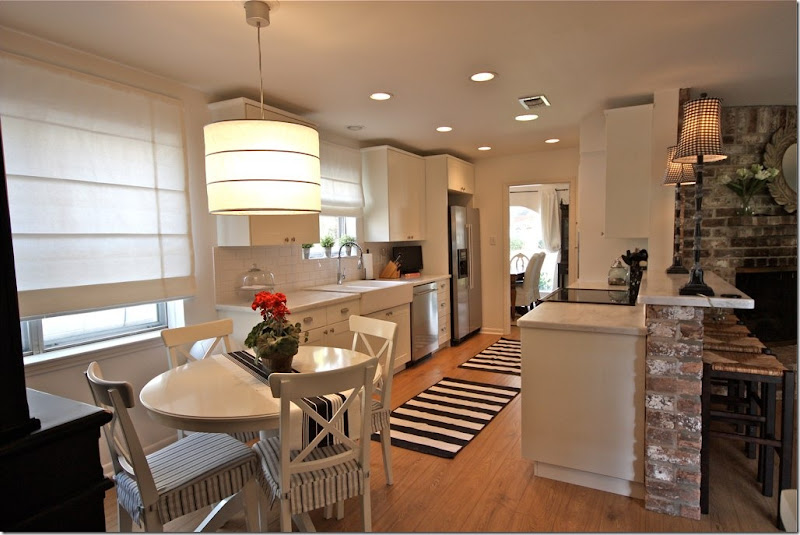
AFTER: I love the light fixture and the white shades! The light fixture, table and chairs and rugs all came from IKEA. The shades throughout the house are from Payless Décor.
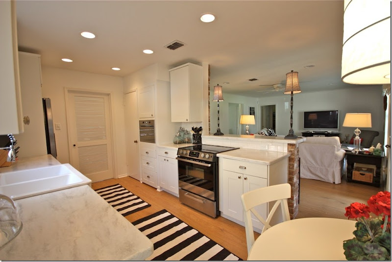
AFTER: The view overlooking the family room.
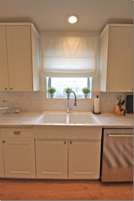
I really love the sink and faucet! The faucet is from Overstock and the sink is from IKEA: (not on internet, it's called DOMSJO) @ $299.
DETAILS – in the homeowner’s own words:
When I was appliance shopping I went to Home Depot, Lowes, Sears & Best Buy. Home Depot & Lowes sometimes have great prices on appliances that have been returned or when a special order goes wrong etc. So, I was shopping the bargains. I found several great deals but then it was always a hassle. They would not load or deliver etc. etc. So I gave up and ventured over to Sears. I felt that the prices were high and delivery was going to cost me around $500. Really. Also, several of the appliances I was interested in had to be special ordered. The salesmen work on commission and one day "my guy" would be there, the other day he would not. It was just a pain. This led me to Best Buy. WHAT. A. JOKE. I don't know how these places stay in business. I waited around for a full hour for someone to help me. Then the manager sent the kid from cameras to help me. Yes, you guessed it. I walked out of there vowing to never return.
Enter IKEA. It was easy. It was fast. Everything is in stock. Delivery was $30 (including all the cabinets). It was priced right. After about a 15 minute wait, I had the BEST sales person in the world helping me pick my appliances. (Note from Joni: so glad her experience at IKEA was easier than mine! Don’t judge IKEA by me!!)
(And one other NOTE from Joni: I ordered all my appliances from Best Buy – but online. No hassle. Except that they didn’t tell me that in Texas they don’t install, just deliver. So, that night I had an oven, a dishwasher and a refrigerator just sitting in my kitchen. I wanted to cry! I had to find an installer fast – which I did, online, – and thankfully he came out that night and did the deed.)
More IKEA details from the homeowner, in her own words:
1. What's online is in the stores. In-stock. Can you say "same day!!!"?
2. Ikea appliance are made by Whirlpool.
3. Ikea appliances come with a 5 year warranty.
4. I did have an issue with my stove. The clock was not keeping time correctly. I called the 800 number that came with my paperwork (it was actually Whirlpool). They sent A&E appliance repair to my house within 2 days. The repair man had to order a part that arrived at my house within 2 days and he came back on the third day and replaced the clock. It cost me nada.
5. It has been six months and my refrigerator water filter needs to be replaced (at least that is what the indicator light tells me). I am not sure where to buy one. I will have to research it but I am not worried.
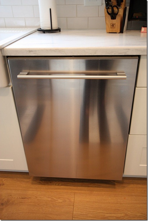
“Dishwasher $649: I am telling you, you can fit anything and everything in this baby. I have never owned a dishwasher that can take this many dishes. My only complaints for the money, I would expect it to be quieter and the silverware basket could be taller.”
NOTE from Joni: I love the handle on this dishwasher, along with the hidden dials. I am attracted to the handles on appliances and use that as a reason to buy one appliance over another. Stupid, I know! But this is really a pretty dishwasher, IMHO.
“Refrigerator $1399: This is counter depth. I dare you to find a refrigerator that is counter depth for this price.”
Another Note from Joni: Great handles again! I would have ordered one without the water dispenser to keep a cleaner line. But then of course, you have to have that awful looking water dispenser from Ozarka like we do!!
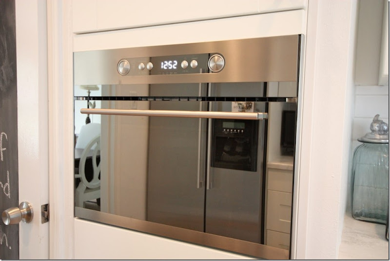
“Built in microwave: $649: I love the look of this little beauty. It's a little complicated to use. I have to post a cheat sheet inside the cabinet door above.”
Note from Joni – another pretty handle. And notice, recently the pantry door got a coat of blackboard paint. Great idea, plus it adds just one more touch of black and white.
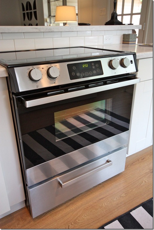
“Ceramic Glass Top Slide-in Range $799: I think the oven cooks a little high. But then again I tend to over cook everything anyway. But this is my story & I am sticking to it ;)”
Note from Joni: I’m not even going to mention the good looking handle.
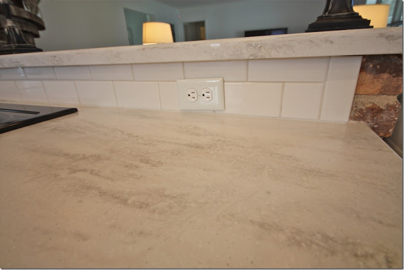
“Countertop: Corian (Home Depot, includes installation)”
Note from Joni: I love the countertop – this is a great alternative to white marble – especially for those scared of marble!
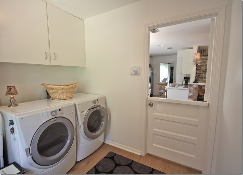
The laundry room, behind the cute Dutch doors.
MORE Sources:
Cabinet Hardware: Ikea, ANTIK & GREJ
Flooring: Armstrong
Breakfast Light Fixture: Ikea
Breakfast Table: Ikea, Table, Chairs, Chair Pads
Rugs: Ikea (older, not available)
Cordless Roman Shades: Payless Decor
Appliances: Ikea (Micro, Fridge, Dish, Stove)
Cabinets: Ikea
WOW! I love what they did with their kitchen and house. A huge thank you to Christy for sharing this story of their renovation. It’s amazing to realize they have only lived in this house for one year!
If you live in Houston and surrounding areas, be sure to visit her blog HERE to see all the tradesmen who worked on the house – the landscaper, the painters, the electricians, the plumbers and more! It’s a great list to have if you are getting ready to remodel in this area. To see more pictures of her house, be sure to visit Christy’s blog Beach Brights.
MORE Ikea Tales, Part Three
Subscribe to:
Post Comments
(
Atom
)




What a great redo. I am sure that it will be seen on Pinterest as an inspiration!
ReplyDeleteKaren
The kitchen is great. I have wanted that sink since we redid our kitchen to sell our house. We opted out of the Ikea stuff but now I want it.
ReplyDeleteDid she give a total cost for the kitchen?
what a fabulous redo..what I love about the space is it's so livable and kid friendly...you can see yourself having company over and entertaining or having a big slumber party for kids and it's all good..
ReplyDeletethe kitchen turned out beautifully..
and what a deal on the appliances...
best,
maureen
the windows are to die for.
ReplyDeletehmmmmm......
do you think i continue the floor stripes at the showroom up the walls?
just kiddingXXXXXX
great sneak peek into a RE-DO
xx come back!!!!
Joni a great redo!! I love it all her black and white theme is amazing. I would add bright splashes of art, however of course that is just ME!! Her black and white graphic and abstract art looks perfect.
ReplyDeleteCome and join my new fashion Giveaway from Fresh Produce!
xoxo
Karena
Art by Karena
What an amazing re-do on so many levels! I love her ambition and persistence when she hit road blocks! She created a great looking house with her own style! I love that.
ReplyDeleteBRAVO!.....smiles
ReplyDeleteWhile I don't personally care for the living room nor the stripes going down the hallway which would give me a headache every day, the new kitchen and baths are an impressive redo by the homeowner. Great job! I would be interested in hearing from the owner about the time it took to pull her redo together - whether it was done in stages over time or whether she tackled this job all at once. The big box stores are very frustrating and essentially one must consider them "self service" if interested in a purchase. Employees are trained to ring up sales only.
ReplyDeleteBibi
Love her creativity and talent. I thought that horrendous wallpaper in Before foyer was spackling!
ReplyDeleteThanks, Joni, these before and after stories are always fascinating. And I especially love '60s ranch redos, as it reminds me of a house I did once myself. I think the trick with a house like this is not to overdo and overspend, which the homeowners seem to have accomplished with their judicious remodeling. And yeah, they'll probably redo the master bath at some point, but until then, they did a marvelous job of freshening it up.
ReplyDeletePure "Yankee ingenuity!" It was wonderful...I especially liked the lamp on the kitchen counter pass throughl. JOB WELL DONE!!! franki
ReplyDeleteGoodness, the house like amazing! This post was so informative, especially for people on a budget. I am showing this to my husband tonight. I'm feeling inspired! Thanks for sharing.
ReplyDeleteWow, Ikea? I get so confused there. The lighting with only one way out! Yikes.. I guess I need to give it another try. Amazing... She did a good job and the money she saved. The Corian looks just like marble.
ReplyDeleteSeriously, why did you bother to write this post? It is not attractive, and can only appeal to the taste of the young 30 somethings who in general have no taste except bad taste.
ReplyDeleteGAGging over this mess.
I did not intend for this comment to be mean, just truthful.
Love the redo. And the Corian is so much more attractive than the old stuff. Very inspirational as to how to get the most bang for your buck. Thanks for sharing.
ReplyDeleteLoved seeing all the great choices this gal made!
ReplyDeleteWhen we were building our house, 3 years ago, I went to Lowe's to look at countertop choices. I wandered around and could not find anyone to help me. Same thing at Dixieline. I found a small family owned business called "the countertop company" and got tons of help and personal service and got my kitchen countertops as well as bathroom counters through them.
I can't believe that I have an Ikea here in Charlotte and I've never been. The only thing my handy husband is not really handy with is spending money...so you'd think we'd live there...after this 2nd post, I'm GOING to check it out!
ReplyDelete1st: I too have one of those living room craft/office rooms. Doesn't look like that...mine spells divorce potential and I won't be showing handy husband that tidy gig going on in this redo! 2nd: The homeowner's black and white circle painted artwork is better than the yellow one she copied 3rd: Kate-Spade-In-The-HOUSE! I personally love her stripes. The whole house is too black and white for my personal taste, but it is really cute and this girl did it well. 4th I too wiggled back and forth on the before and after pics of the master trying to figure out what she did...paint...wow... 5th Great kitchen sink for the $! and 6th See those little thingies holding up the "fort" curtains? A fun idea for those is to put a giant empty frame on a 2x4 square, of course you can use smaller wood for smaller frames you have to hide it behind your frame, but paint the wood and frame to match black, attach those thingies inside to the wood in a few rows and clip kids artwork, photos, christmas cards whatever to the cords. It's cool and a fun diy.
Loved this post Joni! and your daughter's Ikea post! She's a lucky girl!
Maybe the owner could answer a couple of obvious questions: 1. Why was so much space given to a hobby room? Does the owner work out of her home? 2. Why the unattractive barn door with its ugly metal track to close off the hobby room when a frame could have been built in the space for a simple attractive door to be hung? It is certainly not the best impression when walking into the foyer given some of the nice changes which have been accomplished in the house.
ReplyDeleteThis is incredible!!!! Congratulations to Christy!!! She deserves an award!!!!
ReplyDeletexx
Greet
Wow, what a fun remodel! It's like a totally, COMPLETELY different home. What an amazing transformation. It's a lot of black/white room after room -- BUT -- it is unifying, it's fresh and hip, and isn't going to date like the latest color trends will. She could easily add some colorful throw pillows or accessories over time if she gets tired of the black and white. I love how the horizontal striped throw rugs in the kitchen visually work to widen the narrow space; it would have been great to find a rug for that hallway with horizontal stripes to get the same effect there. Overall, just a fun, sassy project. What else? I am in love with the Dutch door into the laundry room -- and, believe it or not, I'm crushing on the vintage chandelier from the "before" picture of the kitchen. Yes, the new look for this kitchen is a HUGE improvement, but that retro chandelier would be amazing for a little girl's bedroom that I'm working on right now. One person's trash is another's treasure! Joni, thanks for sharing this lovely home, and Christy, congratulations on a job well done!
ReplyDeleteWow, what a fun remodel! It's like a totally, COMPLETELY different home. What an amazing transformation. It's a lot of black/white room after room -- BUT -- it is unifying, it's fresh and hip, and isn't going to date like the latest color trends will. She could easily add some colorful throw pillows or accessories over time if she gets tired of the black and white. I love how the horizontal striped throw rugs in the kitchen visually work to widen the narrow space; it would have been great to find a rug for that hallway with horizontal stripes to get the same effect there. Overall, just a fun, sassy project. What else? I am in love with the Dutch door into the laundry room -- and, believe it or not, I'm crushing on the vintage chandelier from the "before" picture of the kitchen. Yes, the new look for this kitchen is a HUGE improvement, but that retro chandelier would be amazing for a little girl's bedroom that I'm working on right now. One person's trash is another's treasure! Joni, thanks for sharing this lovely home, and Christy, congratulations on a job well done!
ReplyDeleteVery nice redo Christy. You can just feel the "youth" all through the house and that's the way it should be. A young couple with young kids, a DIY budget and a creative homeowner who made the most of her space and appointed those spaces with what suits her family. I'm sure the home will evolve as the family grows and ages, and this is only the beginning as she continues to add to her home.
ReplyDeleteA craft room that would make even Martha Stewart drool. Thanks for sharing, Joni. Best wishes!
ReplyDeleteI enjoyed looking at the before and after pictures, it really gives you a sense of all the hard work and changes that took place. Christy did a very nice job of taking this older home and updating it in such a short amount of time. That chest is perfect in the entryway, and her use of black and white accents was very tastefully done. My daughter would flip for a flat screen in her bathroom!
ReplyDeleteI love the makeover to the outside, what a difference! Not into the black and white stripes on the walls. I am impressed that the homeowner tackled all this on a budget. The narrow space above the upper cabinets is driving me nuts! Too narrow to store anything and too narrow to clean easily.
ReplyDeleteI think the update does look tons better than the before pics. It's not my taste but to each their own. The only thing that doesn't really work is the living room area. The seating is kinda strange looking with the one chair facing the couch and the other facing the tv. Seems like some rearranging could be done to make that space look more inviting and have the seating set up better is all.
ReplyDeleteWhat a fabulous, informative, entertaining post. That fridge must be the deal of a lifetime...I'm so glad to know about Ikea appliances!
ReplyDeleteStacy @ www.conspicuousstyle.com
Clearly I'm the only one who kinda dug the wallpaper before...I'll go hide in a hole now.
ReplyDeleteI too wish the cabinets went all the way to the ceiling (but I wish mine did too, hmmph)! I think the appliances are fab and why have I never thought about a built in microwave? I hate the dangling above the stove look that I have. Super nice work on a budget! Thanks for sharing. :-)
This house is currently for sale. Good timing for your post as it should bring in some interested parties.
ReplyDeleteGreat job on a budget! I think she will see a 150% return on her investment.I'm with you Joni, I don't care for the water dispensers on the door either but I know Moms with kids love them. Would a heavy crown on the cabinets hide that dead space? More money, I know, but I think it would polish the whole room.
ReplyDeleteMD
Great affordable and inspirational redo! And I wonder why the former owners chose to keep the big bushes blocking those big wonderful windows? I think removing them was the best idea of all. Vanna
ReplyDeleteWhat a fun post Joni. Her kitchen really turned out beautifully and those countertops are a good non-marble option.
ReplyDeleteI do love Ikea, even though I get a headache just thinking about parking in the lot and walking into the store, ugh.
xo~
T
I am crazy about this post. She is right to be confident and the results are very nice. there is a flor rug with a big black and white pattern that would be cute in there, and if I had time i would just paint out that fireplace. It's correct to ignore within the arrangment, but I think it needs paint also. I love the counter tops, and the reports about the ikea appliances. I wondered if they were OK. Thanks for the great post.
ReplyDeleteChristy and her husband did a wonderful job of remodeling the whole house, what an undertaking and their home is beautiful. I’m very impressed how she used pinterest as a source file for the updating.
ReplyDeleteThey did a great job - I'm a sucker for black & white, too - it is a good starting point and they could add color when and if they ever want. I went to Ikea in Cincinnati with my daughter for baby things - WOW - new experience in shopping for me. I was overall impressed by the prices and the upholstered/slipcovered pieces and Ikea has a very good selection for babies room. I think, for anyone who has not been to Ikea - get a hold of their catalog first, look it over, take some notes, and then go - it can be overwhelming - I was a goof at checkout - it is kind of weird, take someone with you!
ReplyDeleteI wish CORIAN had had the selections they now do when i was building my house 3 years ago. "Sandalwood" is my new fav Corian.
ReplyDeleteGreat post as always! We bought a Meyerland house circa 1960, 3 years ago and I'm just done decorating and of course we have the same dining-living combination, love the idea of having the crafts room, but we use the living room.
ReplyDeleteI would trim out the kitchen with a simple molding in order to cover the dead space between the top of the cabinets and the ceiling. I am wondering if that was a measuring mishap. I would also make a horizontal panel to cover up the vacant space above the fridge so it has a more built in finish. I agree painting the brick of the fireplace would render the living area a little dressier. If the house is for sale, prospective buyers will see that this should be done.
ReplyDeleteI'm in love with that barn door! I've been wanting one, except use a door with reclaimed wood for a real barn effect. It adds some nice character more than just a plain door. Good idea.
ReplyDeleteBarn doors have their place but not necessarily appropriate for a 60s ranch. Industrial spaces where they can be effectively used as sliding walls is an interesting way to use them. In a traditional 60s ranch they tend to look like gimmick decorating. This would have never been used in the 60s. So to use it now only magnifies the period of the house. Remodeling older homes is tricky and careful attention should be made to achieving freshness and modernity without going trendy. I think the owners have achieved this is most respects with this house. I don't believe the barn door, however, was the right choice. Also for resale, making the living room into a hobby space may be a turn off to some buyers, but perhaps they can salvage the nice cabinetry that was installed there for use in another area and reclaim the living room.
ReplyDeleteI loved this post because this house is so similar to my current one built in the 70's and the house I grew up in here in Houston. Unfortunately mine resembles the before pictures more than the updated ones, lol. Unlike some of the comments, I loved the barn door. They are so space efficient and I think they have a fun, hip look to them. I've been looking for more blogs from Houston so I'll definitely check hers out. Oh, and I love your daughter's apartment.
ReplyDeleteDo you know the source for the foyer ceiling mount fixture? Love it!!
ReplyDeleteJoni,
ReplyDeleteI am really enjoying all the IKEA posts. I just visited IKEA for the first time a few weeks ago. I went back the very next day and bought two pillows for my swing. You know the one...THE Ikea pillow that you see everywhere. lol I also bought three Billy bookcases for my Sewcroff. They solved my book storage problem...at least for now. :) You can see them in this post: http://betweennapsontheporch.blogspot.com/2011/08/pottery-barn-office-meets-ikea-welcome.html
hi- thanks for all the comments. I think the barn door got the most. I like it - because it just is so cool looking, who cares if it wouldn't be in a tract home. Martin L. Bullard put one in Ozzy's fancy fancy house!! anyway - i would paint the fireplace too. that is my only comment. i didn't know the house was for sale. it is? good for them. i hope they make a bundle on it. i need to find the msl listing and put it on here just in case anyone wants to buy it!!! thanks again Christy. When you move, show us what you do that house too.
ReplyDeleteJoni
*** THIS COUPLE HAS TALENT!!! ***
ReplyDeleteWhat a DEEEEELIGHTFUL read... What a bang-up job they did (in the most "FABULOUS WAY", of course!)...
Soooo glad y'all shared! I just loved seeng this!!! MANY THANKS!
Linda in AZ *
bellesmom1234@comcast.net
What a nice transformation! I have to ask though ... do you think the family room should be situated the other direction? The fireplace is in an awkward spot over in the corner by the kitchen, but perhaps if the couches and chairs faced the kitchen & fireplace, the space would feel more cohesive and open and then you could enjoy the fireplace instead of it being at your back. The little boys room is oh for darling, what fun!
ReplyDeleteYes -- another vote to have painted the brick fireplace in the family room in fresh white -- and hung the TV on the wall to the right. Then flip the room decor to face the fireplace/focal point! Use the back wall (where the TV is now located) for a row of Ikea Billy bookcases in black with glass doors.
ReplyDeleteI love the transformation, the before and after photos.
ReplyDeleteCassy from Acoustic Guitar Lessons
I loved it! to make it perfect I think the fireplace should be painted grey also.
ReplyDeleteI have both of the Domsjo sinks in my staging area, waiting to be installed. They really look fabulous. Also the Ikea butcher block tops, very cheap and easy. I did go with a local cabinet place here in New Hampshire, and their quote (for unfinished cabinets I will paint myself) was quite reasonable, since business is so slow. I have always had a good experience with Ikea. I think the trick is to focus on things that are made of solid wood, and to go there during the weekday, not at lunch, evenings, or weekends. Also, you need to rent a U-Haul truck or the Enterprise large van (which is more comfortable than the truck) and buy everything you need at once. It would be best to unpack and inspect everything at once, when you get home, so you can take back damaged goods the same day, saving another day's vehicle rental. You could also get a specialist Ikea installer to do all this for you, or dare I say it, a designer!
ReplyDeleteWow, great redo! - and yes you are right .. that house (before) did look like the typical Bellaire or Myerland 50's house!
ReplyDeleteHey Joni, I know you are super busy, but when you have time drop by my Equus Villa blog and take a peek at the house we are working on. French Country all the way.. Just starting to prep the land right now .. but as this woman has done, we are collecting inspirational pictures.
Your blog is one of my all time favorites!! Thank you for taking the time to do such involved and informative posts!!
Christy has "creative genetics" in spades! Her house is a true gem inside and out - especially the craft/office conversion! Thanks so much, Christy & Joni for sharing. xoxo
ReplyDeleteBest time to visit the Ikea in my area is about 4:30 to
ReplyDelete6 p.m. & only during the week. The crowds go home for dinner and the evening shoppers mostly do not start arriving until about 6 or 6:30 p.m.
Just bought a 6 month old Ektorp Ikea slipcovered sofa for $175 on Craigslist. Great way to save $$ on first apartment. Yes, this house is on MLS.
ReplyDeleteThere are a lot of "cool looking" design elements that are not appropriate for a particular space. These barn doors are fine, they are, however, not appropriate for the space. This is why you are not an architect/designer, Joni. You would know that had you studied architecture and had acquired your degree in design (although having studied for a while at U of Tx. This is not to demean, but to point out that as "cool" as something might be, it's not appropriate for every environment if one attempts to stay true to the architecture they are working with. I would not for instance take a Texas ranch and try to turn it into an Italian Villa. It simply doesn't work. Magnify the beauty of what's at hand and you have a much more esthetically pleasing outcome.
ReplyDeleteI agree that the sliding "barn" door works better with a loft or more industrial space. The door itself looks like it might have been the old front door, painted. The rest of the house is clean and I imagine would appeal to many. I cannot get past so much going on in the entry. The nice dresser, curtains covering the opening to the family room, the glass front door, and that barn slider. Less is more.
ReplyDeleteI talked with the owner and she said she might be commenting. she also said she has absolutely no design experience and wished she had heard some of the comments before - about the kitchen cabinets, etc. i think for someone with no training, she did a remarkable job. plus, she has a real sense of design - what she likes and goes with it. I hope she does comment.
ReplyDeleteI look forward to the owner's comments. I hope she explains the use of curtains between the entry way and the living room/den. Large openings exists in homes everywhere but I have never seen this technique used. Perhaps she has a business she operates out of her hobby room and uses the curtains for privacy to the rest of the house when guests arrive. It's hard to believe someone would hang white curtains against a white wall just for the softening effect.
ReplyDeleteI hope the owner comments too, Joni.
ReplyDeleteI think she did a remarkable job and I don't know about anyone else but it's so easy when you look at pictures but entirely different when you are actually facing doing a room. Just thinking about EVERYTHING (!!) and even details like what size curtain rods, what fabric, furniture placement, exposed legs verus covered, the height, length, width of furniture is enough to do your head in. I think when you look at photo's it;s easy to think yeah I could do that but when it all boils down to the nitty gritty it can be so daunting. I guess like everything the good ones make it all look so easy.
Take care
Janine
XXOO
Tasmania, Australia
Thanks to the homeowner and yourself Joni for sharing.
Another great post Joni! Really good job on the part of the homeowner "thinking outside the box". I LOVE the craft room. Especially since I am not fond of formal living rooms; particularly for young families. The height of the upper cabs has been mentioned...I am going to speculate she let the height of the backsplash drive the placement of the uppers. My other question has to do with the lack of ventilation for the oven/cooktop. Has she had any issues with that?
ReplyDeleteLove the job she did! She should feel so proud!
ReplyDelete-linda,ny
One thing often overlooked in remodels is the landscaping. I almost missed this until I took another look and saw the great improvement to the curb appeal of this home. The plant sizes are perfect unlike the overgrown and heavy ones which were removed. That adds a lot of value to the home already.
ReplyDeleteThe comments by a trained architec/designer bother me. The owner obviouisly isn't one, many people who love to remodel or even just decorate their home are not, and I persnoally don't think the barn door is a mistake. Of course, I am not a designer nor an architect. I like the barn door, it is a little quirky, but that is a plus for me. I don't think it can compare AT ALL to the overdone faux Italian look. When it comes to the kitchen I think we have to remember that many people have quite significant budgests, and everything can't look or be custom all the time. I think the kitchen looks great. I am a tad bothered by the fireplace, like many others I think if it were painted white that would make it disappear much more effectively than facing the furniture away from it. Paint it white, put a great peice of art above and face teh furniture towards it, don't try and pretend it isn't there. But that is just what I would do, and they are very quick and inexpensive "fixes" if so desired.
ReplyDeleteJoni, I LOVE your blog but I can not even enjoy it because it runs soooo SLOW..It's so frustrating!!
ReplyDeleteI don't mind the barn door in this remodel but a few weeks ago Joni posted photos of a Santa Fe kitchen remodel & a barn door was used for the pantry
ReplyDelete[ I believe ] and I liked THAT barn door much better. Like someone posted earlier, there are a zillion decisions that go into remodeling or building and you can't help but make a mistake or two or end up with one or two things you wish you'd done differently. I am quite impressed with what this couple achieved!
Love the lamp in the bathroom with the dark grey walls? Would she tell us where she got it?
ReplyDeleteGreat interior..liked it..
ReplyDeleteOh I have loved your Ikea Tales (or perhaps "TAILS") series.
ReplyDeleteThat little Lucy is just wonderful.
I have had both good and bad experiences with IKEA. Like why have the grey wicker baskets been out of stock for over 6 months now??? :)
On the other hand I am in the midst of once again redecorating my living room and the 7 year old IKEA couches are still going strong.
These gorgeous pictures and your funny comments made my day. Creative ppl all have schizophrenia because the ideas just keep on coming! Adore your blog and often pin your images on Pintrest. Thanks for bringing so much style and beauty to your readers, know it takes up a lot of your time to pull all this together.
ReplyDeleteIs the house for the owner or the design professional? the owner or prospective owner, of course, and if I took my architect's advice about decorating my house would look like s%$#. He is all into wood and mid century. Great architect, fellow AIA and so on. I recall the houses in the historic district in savannah with contemporary additions on the back. They are renowned, and they have that nice contrast of style. I wouldn't call it appropriate. Does mr or ms professional know that you have got to put salt in your dessert, so you can taste the sweet? Contrast is O K.
ReplyDeleteI sense some Ikea here!
ReplyDeleteWhere did you get the black hutch??
ReplyDeleteThere are a lot of professional washing organizations that are trying to create their washing items as fresh as possible. I think that it is excellent when organizations try to keep the surroundings fresh. Thanks for the excellent article! Appliance Repair Houston . Call us at (281) 764-6293.
ReplyDeleteI thought Ikea only sell their own brand of products.
ReplyDelete