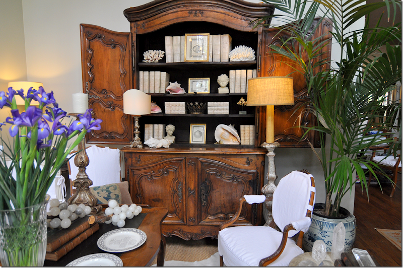
My so-called attempt at less clutter – no colorful Masonware in favor of white books and white shells.
I wrote about this a few years ago HERE, but it doesn’t seem to get any better. Design Schizophrenia. Last time out, I fretted over clutter versus no clutter. What do you do when you love the cluttered look of an old English manor, but you also love the uncluttered look of a Belgian estate? Unless you can afford two houses, you’re out of luck. So, here, several years later, nothing is solved, nothing has changed. Which look do I prefer – lots of accessories or no accessories? When I started slowly redecorating my house last year, I really tried to unclutter. I wanted to get rid of all my accessories and just go bare. It didn’t happen. Yes, I got rid of some things – I put away my blue and white, red and white, black and white, and purple and white transferware – but replaced it with a collection of plain creamware. Not as cluttered looking, but still – a collection. I put away my colorful Masonware and replaced it with white books and white shells. Hmm – still anxious over that one.
Chinese altar fruit collection came out of storage, despite my attempts at de-cluttering.
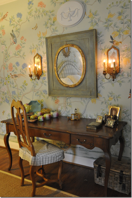
I put away my beautiful collection of Asian altar fruit, but then pulled it out again and moved it to my bedroom to go with my new Oriental hand painted wallpaper. Oh, and my blue opaline is there too, hiding in the bedroom. Shoot me now. I want to go bare, naked as a jaybird (are jaybirds more naked than bluebirds?) but I can’t do it. Why????? I look to my guru, Pamela Pierce, and she has it down, cold. No collections. No little accessories everywhere. Just one or two antiques or a confit pot filled with white roses. Of course her French pots are all gloriously rustic white, while mine are yellow – at least I’ve sold most of them. Whenever I move something around in my house, I hear this little voice, what would Pam Pierce do? Yes, what WOULD Pam Pierce do if she came to my house? HORRORS! A nightmare! Stay away!!! Too embarrassing! Nasty anons who post comments about my house say it’s so boring with just white slipcovers. I take it as a compliment, boring. I want it to be quiet and flowing and restful. It’s not. I’m working on it, though. I wish I were Pam Pierce, the queen of editing. The queen of gorgeous slipcovers. The queen of fabulous antiques that you never see in a shop. Yes, what would PP do?
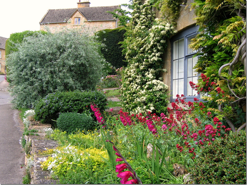
I love a glorious English garden with roses and flox and wildflowers all in a mess. But….
But then I look at Pam Pierce’s garden. Just box and French jardinières and more box and a few gorgeous antique lanterns. And a simple French iron table. Sometimes simple is much, much prettier. How would you love to walk into this front door each day????
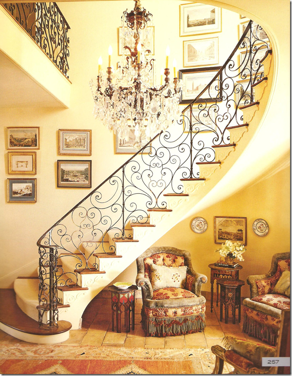
I adore this entry from Lynn Von Kersting – such a beautiful railing with sensuous lines. But….
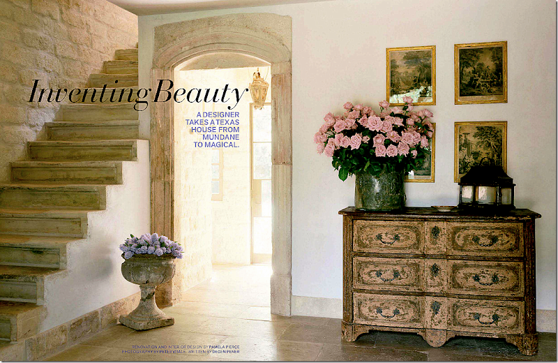
But…then I see this entry from Pam Pierce – no railing at all. A simple outdoor concrete pot filled with flowers. There are only 2 accessories, plus two pots of flowers. Heavenly.
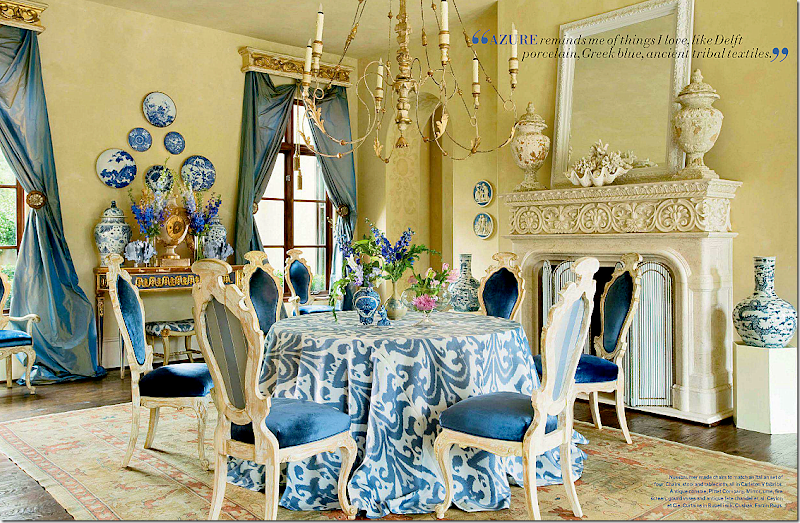
I did a backflip over this dining room by Michelle Nussbaumer. We must be alike, she also likes skirted tables, and I have those same pots flanking the fireplace and a clam shell is on my mantel too. Laughing – we are SO alike! not! I wish though. This dining room is so vibrant and happy. It makes me smile. It’s cluttered in an orderly fashion. It’s soo Michelle.
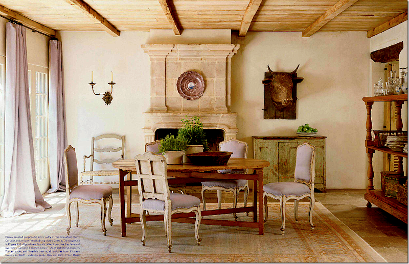
And then I see this dining room by Pierce. Quiet with touches of pale lavender linen. Such a subtle hint of color. Very few accessories. The trolley is actually used to hold dishes and glasses – which become a decorative statement. No accessories that aren’t really used. Lesson to be learned.
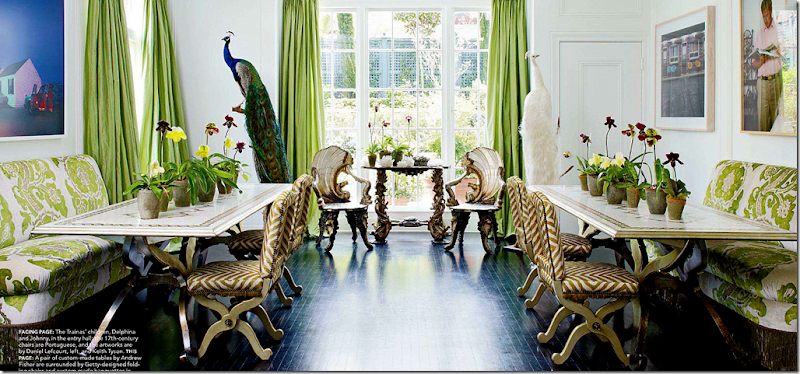
I liked this dining room recently seen in Elle Décor. It’s youthful and fun and creative. Friendly and vivacious.
But would it ever replace this quietly elegant dining room by Jane Moore, another Houston great? One accessory, well two if you count the ironstone pot’s top. The clock and chandelier become the decorative elements – they speak so much louder than a mass of transferware. You appreciate their beauty without having to fight to see it. Lesson learned.
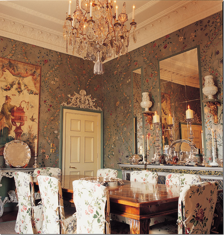
Such a beautiful, classic dining room by Nicholas Haslam. All the chinoiserie elements work together instead of fighting each other. So perfect really – this would be hard to emulate. I love this look until….
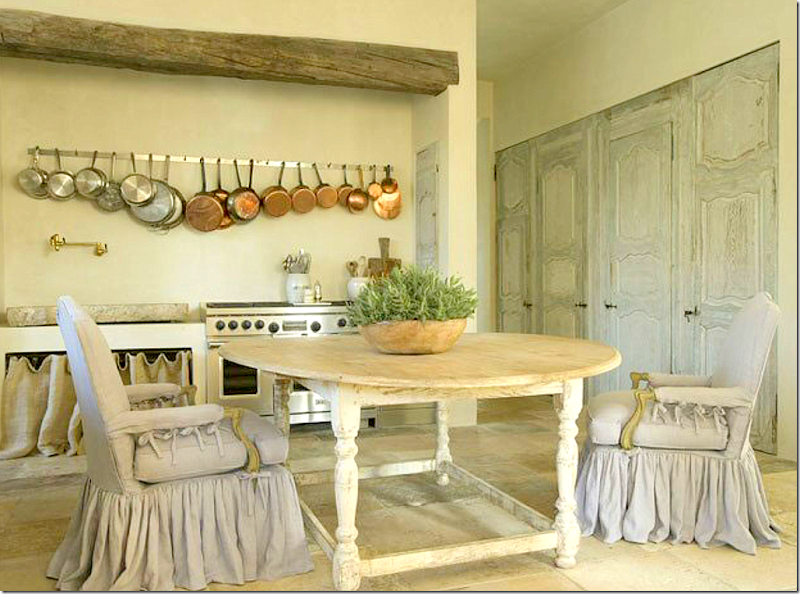
Until, I see this breakfast room by Pam Pierce – and drool. A light –is that lilac or gray linen? colored slipcover becomes the star, along with a set of painted antique doors. The table is a knockout too. No one does slips as pretty as Pierce. I’ve tried to copy them, but it’s hard to copy perfection. Notice how they just slightly drape the floor and how they are gathered in double pleats – or are those triple pleats? Notice the sink on the back wall. And the pots – something utilitarian - becomes a decorative element.
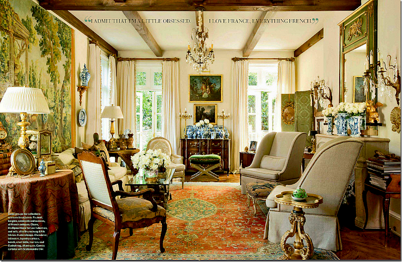
A beautiful French living room, seen recently in Veranda. Makes your heart flutter. That mass of blue and white vases, the collection of English smalls on every table top. Elegant – a collection gathered over a lifetime.
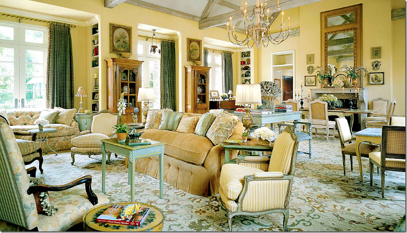
Or this living room by Charles Faudree – the interior designer who invented American French design with his layers of accessories and tables and chairs. so beautiful! Who can resist this? I can’t.
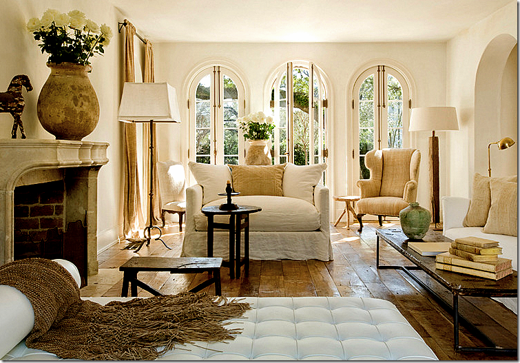
Or this living room, with its mixture of contemporary and antique. Well balanced and interesting, subtle yet cluttered. Loving the mix of the Barcelona chaise with the French antiques. I love this look…
But then I see this living room from Pierce, with its own version of a mix of contemporary and antique. The Barcelona chaise looks perfectly at home with the white linen slipped sofas. There’s even a trendy bricklayer table mixed in with rustic antique tables. The accessories are so subtle, you don’t even notice them – except for the confits filled with white roses. The rough, wide planked floor is left uncovered – adding another subtle decorative element.
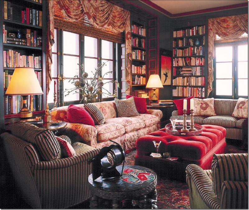
I adore Alessandra Branca’s style. She is one of a kind. Born in Rome she brings a unique European sensibility to her U.S. designs. She loves the cluttered look – enough is never enough. Here she mixes fabrics upon fabrics to create interest and texture. Je’adore!
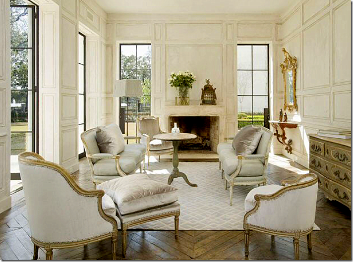
But then, talking of European sensibility. Whoa. Gorgeous. Is this Houston? Looks like France to me. Love how Pierce separated the French Duchesse en Brisee into two areas. Notice how high and deep her down cushions are! Love the tall Swedish table in the middle of it all and the subtle gray and white rug. The architecture – the walls, the windows, and the floors add to the perfection.
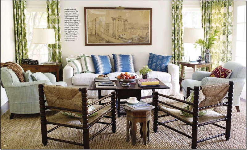
I love this busy family room by Peter Dunham. Love his fabrics, his mix of patterns, his apple matting – love it all. Cluttered, yet interesting, comfy and warm.
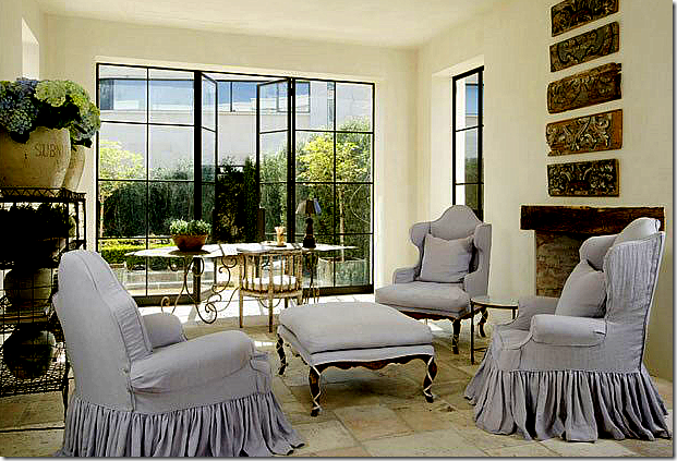
But, then I see this sitting room by Pierce – with more beautiful slipcovers – again, double pleated, slightly draping on the floor. She takes four different pieces and creates a set with the matching slips. The steel windows are left uncovered, as are the floors – each adding important texture. Her bakers rack is filled with confits and flowers – that’s all. I love how Pierce never uses patterned fabrics. Just linens and sometimes a touch of silk velvet. Love that.
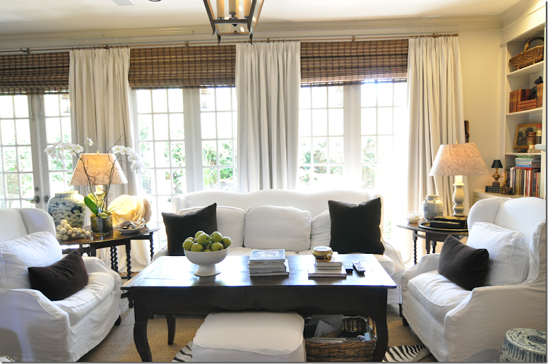
I mean, I try. This is my coffee table EDITED. Too funny!!! The more I edit, the more things grow and multiply. I can’t seem to give anything up. The more I put away, the more I seem to have. I need Pierce’s touch. WWPPD?
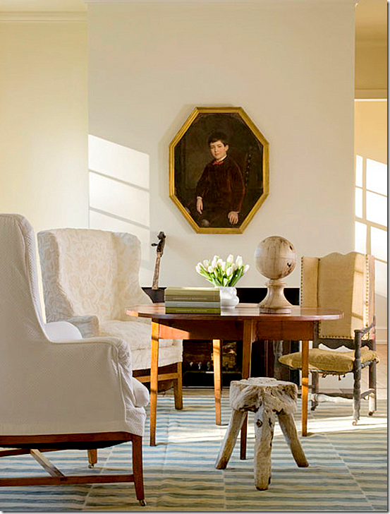
Here’s how Pierce does a coffee table, interesting, simple. This room has a masculine vibe – as if it’s a man’s study perhaps.
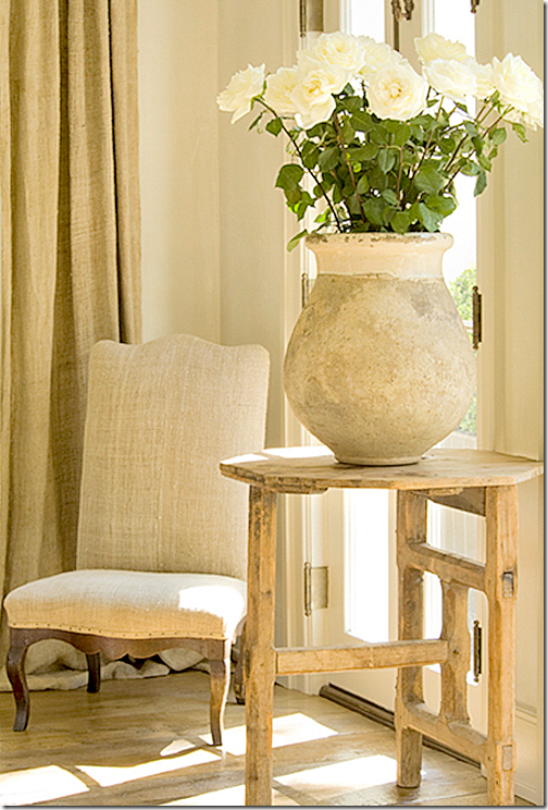
Or a side table, with just one perfect pot and twelve white roses.
Or here, with one sconce and a few pots. I’ve never seen a sconce this beautiful in my neighborhood antique stores. Where does Pierce find such perfect things? Such a perfect vignette.
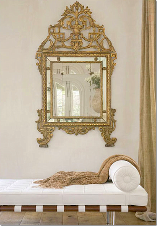
Makes me want to go get the Barcelona chaise in white. And that mirror too, if I could find it. All photos of Pierce’s work are by Peter Vitale, author of that great book The Divine Home, HERE. Vitale also does interior design, very similar in feel to Pierce’s work – uncluttered and peaceful with a mix of beautiful antiques. Vitale’s web site is HERE. Pam Pierce’s new web site is HERE where you can see many more pictures of her work. I could stare at her web site for hours on end and sometimes do, just hoping to soak up some of her talent.
Well, I am thoroughly depressed now. I get that way when I see pictures of a designer whose work I greatly admire! I want to be that talented! I guess I should be thankful I’m not competitive by nature or I would have an ulcer by now. What is your design schizophrenia? Are there two looks you love that contradict themselves? Or do you just like one style and stick with it (much better if you are like that.) Is there a designer you really admire? Would you be embarrassed to have them to your house? I have a whole long list of Houston designers that aren’t allowed anywhere near my house! Not even counting the national ones like Buatta, Easton, Moss, et al. Forget them! If they want to come over for tea, we’ll just have to meet at the Four Seasons. Period. No exceptions.
The last blog story featured a barn door in the foyer. Here I wanted to show you this barn door by Martyn Lawrence Bullard that he put in the family room leading into the kitchen in Ozzy Osbourne’s house. Isn’t it great? Love it!! Featured in Architectural Digest.
And finally…..
Houstonian Leslie Sinclair, of Segreto Finishes, has recently completed her first book! Probably most of the better houses in Houston that I've featured had walls done by Leslie’s company. Segreto specializes in gorgeous plasters and fauxs on wood. Their work is all very subtle – adding a layer of texture and a sophistication to the house. The book is filled with page after page of some of the most beautiful houses. To preorder, go HERE. Be sure to look at the schedule of book signings. Congratulations Leslie! You’re the best!!!
Design Schizophrenia: WWPPD?
Subscribe to:
Post Comments
(
Atom
)








Beautiful post, I love the cluttered and collected rooms, but in the end, the simplicity wins me over~
ReplyDeleteOh, Joni, I feel your pain! My whole mantra this year has been Simplify, simplify, simplify ... but like you, I keep noticing things multiplying on my coffee table.... my sofa table...
ReplyDeleteBoth Pam Pierce and John Saladino make my heart race. The Pierce photos you show here are just so dreamy - but with a teenage boy with friends always here and 2 huskies in the house, both the pale linen and the simplified beauty is challenging here in Museville. For now. =)
xo isa
Joni, if you love lots of stuff, don't stress, just be yourself!!! Some folks are minimalists and others just can't be. Editing is good, but only when it means that you keep the stuff you really,really love. Remember what Suzanne R says, "fewer things but better things". I think that's the best way to look at it.
ReplyDeleteThe common theme that runs through your post is a single word "architecture".
ReplyDeleteOne must not try to replicate the space of show rooms taken from design magazines, but the four walls that wrap the design space. Are the ceilings, 8, 9 10 feet? How large is the actual floor space, how many windows which view actually bring into the room an additional design element.
You have attempted to copy spaces rather than read correctly the ones you live in. That's your mistake and frustration. You have collected lovely pieces and want to showcase them, but the urge to do it all within one room has confused your design objective.
Empty the entire room. Walk one piece in at a time and place that piece in a place of prominence based on its importance to you personally. Walk out, take a look and repeat the process until you have created the balance you are looking for. It isn't necessary to showcase all that we own or love, but to showcase our possessions in a way that compliments them.
Every season will give you an opportunity to change it up a bit as you have enough to choose from that you will never grow tired of anything.
The Anon you Hate
I love them both, but I'm a wildflower garden I'm afraid!
ReplyDeleteI think you can have both, really. My "public spaces" are very spare, utilitarian, regulated, but our private spaces are piles of books and clothes and things of personal interest. It took me a long time to sort that out, that I could have a private space that I didn't "design" it was just my stuff. And it works in a dorky organic way, and admittedly a bookworm and found natural curiosity sort of way. I think you can have Belgium and France in one home. C'est l'Americaine, n'est pas?
ReplyDeleteI struggle with this daily. I love clean, Georgian antiques- but then have a love affair with crusty vintage. Almost like Mr. Darcy winds up in wine country. (?)
ReplyDeleteI keep telling myself that if I was consistent, this would be much easier. Instead, I've got a kitchen table without any chairs, and dining room chairs without a table. Seriously.
I am definitely a minimalist and don't like clutter. I presume this comes from following my husband around in the military for a zillion years. Too much to look at is...well...too much. I think what you have is lovely, your armoire in your LR doesn't reflect you though. You could mix some of your transferware (which is what you love) in with some of the books. Suzanne Kasler says our homes should look 'collected, not decorated'. I love that. Magazines are 'decorated' for photo shoots, but they don't reflect the people that live there. You have done so many lovely things to your home, time to enjoy it!
ReplyDeleteHow is MR. Slipper Socks?
xx
I absolutely loved this post to death, and oh how i can relate with wanting to put out pretty things. It was wonderful the way you showed Pamela's style next to other amazing and beautiful decorators rooms. I found that each time, as soon as the photo of Pamela's design came up i wanted to sigh... and fell in love all over again... her style is so perfectly beautiful and calming. Makes me want to go purge everything in my house... but i just don't think i could pull it off...
ReplyDeleteWhat a great lesson you have given us here.
And I think your bookcases with the white and the shells looks absolutely breathtaking... couldn't be any prettier.
Cindy
It appears that you could be trying too hard to duplicate LOOKS that you love without consideration for your personal collected treasures and what works best for your home. It is one thing to be inspired by a picture in a magazine and quite another to implement that look into your lifestyle. Thank you for including the barn door from the Osbourne's home. Perfect example. Looks wonderful in that expansive, unique space as a focal point. Fails in the small entry in a ranch home. Repeating the drapery at the opening to her den would've been easier on the eyes.
ReplyDeleteI am afflicted with the same disease! One day its lots of color and stuff the next I want it all white and creams and bare. I mean really both are beautiful. But like you I can't stop collecting. I couldn't give up my blue and white collection or stop collecting dish ware ( a disease I inherited from my Grandmother! ) . Your right we do need two houses, or four... ha ha! :)
ReplyDeleteJennifer
O.M.G... You are describing me! I go through this same dilemma. I don't just need two houses for two different looks, I need about four houses. I cant seem to make up my mind. Great post Joni, we feel your pain.
ReplyDeletePam Pierce all the way.
ReplyDeleteI love looking at the houses with all the stuff but I could never live with that much clutter. Who would move it all to dust? MB
What a great post and Pamela's style is gorgeous but I love accessories! Charles Faudree is one of my favorite designers, I just love his style and Joni I LOVE yours too! Your antique armoire looks gorgeous with all the white books and shells! Martina
ReplyDeleteI am a huge Pamela Pierce fan, as well. Everything she does is simply beautiful. Every object is so carefully considered.
ReplyDeleteThat being said, I think a room like Pierce creates calls for a very selective eye which almost always calls for an equally huge ban account. Quality does not come cheap. Those rooms, as understated as they are, undoubtedly are incredibly expensive. But, oh so gorgeous!
I'm glad to see I'm in good company-a lot of tortured people out there. So many beautiful looks. What a great post. Thank you!
ReplyDeleteInteresting post and yes I think you are probably in good company with a lot of us who follow your blog. Loved Pamela Terry's remarks choosing a more spare look in the public spaces and in our private more cluttered for lack of a better word. I also agree that the single accessory that stands alone so beautifully in Pamela's designs are probably in the luxury wallet lane...
ReplyDeletehowever Joni, honey you do just you can mosey over to my place anytime.
Wow, I am shocked. Anions, what happened to you? Negative BUT constructive, exactly how it should be. Love it and thanks for just being honest and real, not snarky. I am dying to know, the anon I hate , you are the one that hated the small sinks in Paris, right? You.re the man, the I,d., right? Wish you would just make up a name and sign it so I can keep you straight.
ReplyDeleteI would love to empty everything and just start over, but who would move all of it? And I need to do that to my family room shelves. Really badly.
I got such a lift from your comment, I can't even tell you.
And, yes, to the anon about the barn door, you are probably right. Two drapes would have been softer and more meaningful. I see what u mean.
I, too, think Pam Pierce's rooms are gorgeous and I have lots of pictures of her work that I've torn out of magazines over the years. But, they all have architectural details that are probably found in less than 1% of the houses in this country. And no one could live in those rooms - no place to put down a drink and a couple don't even have lamps. Eye candy for sure but living spaces, not so much.
ReplyDeleteMy inspiration file is filled with rooms simple and yet, I too, cannot seem to accomplish simplicity in my home. I think we can adore a look but it not be us. It is sort of like some of the great looks a friend of mine has in putting her wardrobe together. I love it on her but it would look silly on this body of mine.
ReplyDeleteI love the idea of reversing the doors on your piece of furniture so the detailed side is showing when the door are opened.
bee blessed
mary
More, anon I hate. You know I have struggled for years if the buffet a deux should be on the wall where the daybed is. I thnk it shou,d, but then that side wall would look bare with the daybed. Ugggh. Now I'll be up all night thinking of it. Thanks.. And that is what my house lacks, beautiful architecture. To do it all over again. I was a child back then.
ReplyDeleteI think there is style that you love, admire and long to try, but for some reason just doesn't work in your own home. Sometimes lots of little details or lack thereof make a home a home. I love the simple palette of Belgian style but I still have to have some color in my home. I think we always just end up going with what works for us in our own homes. Yours is lovely whichever direction you take it!
ReplyDeleteI really wonder if you might be the first look - the layered style w/the wonderful collections and abundance. I absolutely love the work of Pam Pierce as you've shown it but I think it would be much more fun to spend time in your rooms, the way they are.
ReplyDeleteYou are a person with depth of personality, wit and humor and your home, the way you've created it, captures that.
I too think you have done a fine job on your home. Charles Faudree is one of my favorite designers. I think the spare look comes from the times we are living in. Even if we have the money to upkeep and display our things it seems ostentatious in times when others are struggling. In spite of that, if you love it enough to clean it, move it aside when you need the space for something else, and it makes you happy just looking at it--then it should stay.
ReplyDeleteWhen I'm looking around at my house I'm always saying WWJD (what would Joni do)! All kidding aside, I love your home and the way you decorate!
ReplyDeleteWhy are we never satisfied with our own spaces? It drives me crazy (but that's a short drive anyway!)
XOXO!
Judy
Call me schizophrenic too!! xv
ReplyDeleteOk here’s my two-cents…STOP TRYING TO BE SOMETHING YOU’RE NOT! That said you like stuff plain and simple and there’s nothing wrong with it. You will always be a more is less sort of kind of gal so stop fighting it. You admire less cluttered designs but that’s it, you admire it. Stop questioning and fighting your personal style that includes stuff. You like stuff, you have stuff, you like your stuff out and to be seen deal with it and appreciate it! Phew this tough love is brutal….lol.
ReplyDeleteI can't agree with Anon 8.33 more. Good constructive advice. So easy to lose sight of this when looking at magazines.
ReplyDeleteLet's be honest, how many times has someone tried to emulate something they have seen and that special something is missing, like the french fireplace and the 12 foot ceilings with the arched windows.
I need to remember this advice for myself. There are so many things I love. I would like to think I don't like clutter and periodically I like to re-arrange more accessories than furniture if I'm honest as our rooms here at home just aren't large enough
for different furniture arrangements.....I wish!!!
Still, doesn's stop me dreaming of all the architectural details I am crazy about and will hopefully one day be able to have!
For now I am like a lot of you and torture myself constantly over what I love, what I see and if it will all 'go together' and forever being mindful of clutter!
Take care
Janine
XXOO
Tasmania, Australia
I believe it was Chanel who said, "remove one thing before you leave the house" and it is true, I think we are all feeling that living more simply requires restraint and in the end the subtlety is so soothing.
ReplyDeleteWonderful post. Try taking all the clutter out, edit and re-edit and then style.
pve
I'm a less is more gal! But you have to have more than 4 walls to do the PP look! It's the architecture of the space that allows a vase of flowers only. For most sadly we would have rooms that looked like we ran out of money. I loved this post!
ReplyDeleteI see lots of things I love to in different styles and I want it all~I know I will never stop fiddling with my stuff. I just have to accept it! Now if I were you, I would invite all the biggie designers over for a WWTBSD (what would these big shots do) tea party and give them a clipboard and let them have at it..then after they leave, you go over their recommendations and announce the winner! How fun would that be?
ReplyDeleteFirst of all, sorry to your husband is you get a 'big head' from this but I LOVE your style!! I think you have the perfect mix of both that you showed examples of...beautiful layers of stuff and things, but all the white slipcovers and restrained patterns keep it from getting too dizzying.
ReplyDeleteI personally think the rooms without all the stuff and things look staged for a magazine (nice) but don't have the soul that makes them comfortable and welcoming.
Just my 2 cents because before I pick up a new piece, I always think 'WJA'?...would Joni approve? :)
Joni, your home is beautiful and real,it reflects you perfectly. Every post I learn something from you. I think if you had me over for a drink we could sit and visit and I would learn more about you just by sitting in your home. Your home reflects someone with and open heart willing to share. Not something staged. Embrace your Schizophrenia!
ReplyDeleteMy perspective is why choose? Ever since coming to blogland 7 months ago, I have been riveted, inspired and awed by so much stimulation on a daily basis from this blog and countless others. So much so, that my design style has actually started taking little unexpected twists and turns, evolving and no longer am I the purist I thought I was!
ReplyDeleteI embrace both of these styles (that Veranda French living room being the best example of my peronal style) but I am at the same time drawn to those dusty, cool hues and washed woods and soft linens seen often in Belgian and French design. I LOVE IT ALL! A problem, yes and no.
I think you can modify both looks to create your very own signature look. You have done this without even realizing it. I LOVE what you have done in that first picture, and its not Pamela Pierce or Charles Faudree or David Easton, its the "Joni look" and a beautiful one I might add.
So you have somewhat anwered your own question and have come up with a crafty solution...you have combined both of these looks that you love and cherish to create your own, and I for one am really liking it! You can stay true to what you love and implement several styles into your home as you have already done quite successfully. Enjoyed this post.
Hi Joni,
ReplyDeleteI too did a post on two different styles. I contrasted pantia style with Bunny Williams. I feel the same there are times I just want a simple calm look and times when I want cozy and warm with my things all around me. I have tried to create both. My family room has warm colors and more of a study feel, while I try to simplfy the rest of our home. I am still working on it and still have somes rooms to edit too. Thanks for sahring your thoughts, I am not alone!
Joni, I am starting to dislike clutter also. Before reading this post I was browsing living rooms at Houzz.com and thinking that most of them are way too cluttered.
ReplyDeleteBut I still love a warm room, so if a room does not have clutter for warmth then it needs color or texture or something. I am not in love with tone-on-tone grey everywhere, which is the Begian look.
This was SUCH a fun post Joni! And, great photos and ideas.
ReplyDeleteI agree with the[ posters who commented that the gorgeous edited rooms had spectacular architecture and the highest of quality furnishings and antiques. AND, they probably belonged to clients who started from scratch. VERY heady stuff for sure, but not what most of us can have.
I also agree with the posters that you, deep down, fit the cluttered look better. That's the real you--and your personality. Go with it! Your bedroom with its gorgeous wallpaper is a good example. I smile when I see that room.
Thank you for your instructive and funny blog. YOU are the treasure because of the way you write, what you see, and what you can express.
Surrender to schizophrenia. One's environment shouldn't provide more angst especially when it's as lovely as yours. Consider it a playground where you are allowed to change tablescapes with your moods and the seasons. One notices and appreciates one's collections if they ARE put away for a period and then brought out for' airing' and seen differently when arranged with some variation. About twice a year, the paintings in my house are re-arranged. Against different wall colours and in different lights and near different fabrics, they feel new again. Objects on table surface change WAY more often! Allow yourself the freedom of not deciding. While Pam PIerce's interiors are exquisite, yours actually look like someone lives there. A warm, funny human being with a real family. (I SO identified with your feelings about shopping at Ikea for a daughter off to university and laughed out loud, thankful it wasn't me there this year!) A standout post today, thank you!!
ReplyDeleteFabulous post! I have adored your blog for sometime now. This is my first comment. What I like most about YOUR style is due to your "schizophrenia" you have actually comprised to style all your own - One that is casually elegant and livable. Thank you for sharing your wit and charm.
ReplyDeleteI so understand your dilemma..for I too love so many styles that contradict each other as well.. and I love accessories and accent pieces too much to put them in storage in favor of a sparse design..when you figure out a solution, please share with the rest of us... :)
ReplyDeleteyour home is gorgeous btw,..but wouldn't it be great to have it "staged" by Pamela Pierce?.. just to see what she would do..?
best,
maureen
Damn you, Joanie. I can usually read your blog and, as much as I can appreciate the interiors you love, I don't usually want to redo everything in my house. But I'm in awe of the Pam Pierce interiors. (I also love the Jane Moore dining room.) I think what she does, as simple as it is, is exponentially more difficult to achieve. The vocabulary that each of the items brought in to the room must be spot on.
ReplyDeleteSo, in addition to Frank Babb Randolph, thank you for introducing me to Pam Pierce. I think.
i have the same dillemma- i enjoy different aesthetics & decor styles, but i always come back to the same thing when it comes to my home. i don't think it falls into a specific category- cheap rusty stuff?
ReplyDeletewould it work to have a few rooms that are home to your rotating beautiful collections, and a few that are simple & calm. you obviously love your collections... and they are gorgeous. maybe you need 2 houses??!!
I love the way you decorate! I struggle with "design schizophrenia", too, but I think it is what keeps me interested and excited about my house - I'm always moving things around and repainting. I think your "bi-polar" disorder makes your look unique and reflective of you!
ReplyDeleteJoni,
ReplyDeleteLoved this post. I can so relate - sometimes I think I need three or four houses to accommodate the different styles I love. Just this week I bought a vintage photograph of some boats. When I showed it to my husband he asked "are we now going for a nautical style? As others have stated I think the most interesting homes are filled with interesting objects acquired over time that reflect the personality. Your home is so beautiful and warm. I love the clean uncluttered look but sometimes it looks like those spaces have no soul.
I have been a collector of things that I love for years. I have bought things from all over the Europe, including rugs form the middle east, and it brings me pain to not have these things around me! However, I love it when I de-clutter! I recently de-cluttered my library and it is now my favorite room in the house. I have found the best way to de-clutter is to take all the knick-knack, clutter items and items with a lot of color, out of the room. THEN start bringing the items that you think will work slowly back in, reassessing at each step. Try this - you find that it works like a charm and you will have de-cluttered and decorated like a pro...
ReplyDeleteJoni, the reference to "architecture" was not meant in a negative way, it was used as a way to define the delineated space only. Every design space is architecture no matter size, style, period.
ReplyDeleteYou have a lot of height in your living room and you have played up that design element very well with the the buffet a deux and the large mirror and plate collection over your sofa.
In looking at your living room as it is now, you have two chairs with their backs to the entrance of the room and a table between them. It almost reads "you can look here but you can't come in" which is not what you wanted to achieve. Moving the buffet to the back wall still gives you a beautiful focal point but may serve to open up the room making it more inviting. If you have too many chairs in the room to make it work, perhaps a small seating area by your windows with a table would create another focal point. Do this on paper first to see if it scales out nicely.
The Anon you Hate
I love all those styles too- and throw in Mario Buatta too! OY!
ReplyDelete-linda,ny
Joni, forgot to address side wall where the buffet a deux currently resides. If you move it to the back wall as suggested, you would move the entire sofa ensemble to the wall where the buffet was. That way you walk into the room unobstructed by the chairs, the sofa is on the right, tall windows on left with small seating area, and two chairs flanking your sofa and tea table. I think it would open up the room and make it more welcoming.
ReplyDeleteJoni I have this feeling that if you removed all of your treasured objects' and collections, you would be one very unhappy woman!!
ReplyDeleteTry it though, if you want and live with it a week of two or more (if you can, ha!!)
Have Pam come over and walk you through her version of your gorgeous home!
Myself I love a a controlled clutter and layered look. I will, as you pull things out, pack them away, generally if something new comes in, something goes into storage or to a friend who has coveted it.
Come and join my Fashion Giveaway from Fresh Produce
xoxo
Karena
Art by Karena
Oh Pam Pierce's designs are so lovely. I think why they work so well is that the few elements she includes are the best of the best in terms of quality and loveliness and that makes them a standout, the focal point.
ReplyDeleteOn the other hand, while the rooms are lovely, they do not tell a story about who lives there.
Has the person never loved? Traveled? Experienced life?
Just like a catalog, the rooms seem as if they are waiting for the home owner to tell their story.
Joni, tell your story.
Pam's work is beautiful but I NEVER get the sense that someone actually lives in it.
ReplyDeleteYour work is beautiful and I love the shot of your family room and that you kept the remotes on the coffee table. It is real, as if you had just said, "honey, please move, I have to take a picture of the coffee table."
I like personal details and have plenty of them. I don't like to see all of them all of the time so only about half are out on display at any given time. The bonus is when I go to change things I've usually forgotten what I put away and it is like I just went shopping...
another beautiful post.
ReplyDeletethe elle dining room with the banquette seating is fab!!!
i flipped over it.
and the dining room with the chinoiserie paper was to die for.
how about the gorgeous blue sliding barn/style doors.
love !!!!
Hi, Joni,
ReplyDeleteI love both ends of the spectrum as well, so I say follow your bliss.
Best, Victoria
WWPPD? she would tell you to follow your heart and create a home that represents you and your family. Your collections obviously give you pleasure so display them proudly! I personally prefer an uncluttered look but that does not mean I cant appreciate and enjoy those other beautiful rooms as well.
ReplyDeleteBTW...we have been hacked on our wordpress blog and are down for about two weeks..any such problems on your end? Our blog posts can be seenon our facebook page though.
Joni, I love your English look, I don't find it cluttered because you have everything placed beautifully. I go for a more edited look, but I have to have color so I guess I have a bit of both. I read an article by Mary Englebret years ago and she had just moved to a beach house that she was not going to put all of her collections in. She wanted a clean slate for her new beach house and within 6mos her collections slowly came out of the boxes!! We all have a design personality and I think if we stick with what we TRULY love it will become our own signature style. I love your blue and white and your collections, it is the Cote de Texas look!!!! Enjoy your home it is lovely!! Kathysue
ReplyDeleteOh Lord, I feel your pain. Being a collector of stuff is not a style, but a personality trait! Leopards don't change there's spots, at least not easily, so there's your problem. I'm the same way. I like my stuff. It reminds me of all the years that handy husband and I have piddled around in shops collecting. I've decided I'll never be able to get rid of it and am going to get my minimalist alter ego out in PrettyStuff's apartment. She doesn't have anything, it'll be easy! :D
ReplyDeleteMy natural tendencies in decorating lean towards the masculine and sparse and I fight that constantly. It's an effort for me to add the accessories that finish a room. I think the Swedish inspired sparse look is very trendy and nice to look at in pictures but they never feel quite right to live in. There's a sweet spot between that sparseness you like and cluttered (which I can't stand either) and I think you achieve it perfectly in your own rooms. I don't think you need to edit, removing those things that you love will take the character and the *you* out of your rooms.
ReplyDeleteI love this post! I think we all like more than one decorating style and struggle to adopt just one for our home. It's expensive to decorate your home and unlike our clothing (where we can change our outfits daily) we have to live with what we've chosen.....every....day! That's why we get bored with it. It would be like eating the same meals every day. I think that's why people get so excited when the seasons change and then they suddenly bring out the seasonal decor and change things up a bit. I say go with your gut. Only YOU know what your home feels like to live in it and how it looks throughout day and night. Pick out the elements of your favorites and combine them. Everyone's home is unique to themselves and the sooner we don't try to copy something exactly from a picture the sooner we'll be happy with our own decisions about our decor. Besides, decor is ever changing just like technology and fashion. It will never stay the same. Just have fun with it. I personally LOVE your home decor and would gladly take some pieces off your hands if you're wanting to unclutter! Ha!
ReplyDeleteGreat post! I love your white books and shells. I think your home looks comfy and inviting. I love Pam Pierce's work as far as photos but it doesn't speak 'home' to me.
ReplyDeleteJoni, you're not alone -- when you're immersed in design professionally and appreciate many different aesthetics, it's hard to pin down just one look for your own home.
ReplyDeleteFirst, I must ask you to consider leaving me that gorgeous armoire in your will, despite the fact that we're not related and have never met. I promise I would take very good care of it and love it as if were one of my children. :-)
Personally, I love the look you have going on. Many of those pared-down, ultra-edited interiors you admire probably don't look like that in real life with people living in them -- think of how much editing and styling went on in your own kitchen in preparation for the photo shoot. The pared-down look is great for young people just starting out, who don't have any collections or artwork aned who are starting pretty much from scratch. I prefer homes that have evolved over time, with treasures that the inhabitants have collected gradually on their travels, each piece with a story behind it. One person's "clutter" is another person's autobiographical artifacts. Your beloved stuff is what makes your house a home, unique to you, impossible to duplicate -- and since your taste is fabulous, it really does work.
I am also lusting after your chinoiserie wallpaper, the chairs in Lynne Von Kusting's entry, and Michelle Nussbaumer's fabulous, whimsical dining room. As for that entryway where the stairs have no railing -- is that even to code? I would be worried that someone would break their neck falling down the stairs and sue me!
In style, out of style, back in style; more is more, less is more, more is becoming more again and the cycle will continue. The key is finding your own place with style and sentiment and not being swayed by the In's and the Out's. Tiresome. Reverance to past, respect to present/future all in the frame of good design will never be out of style. Trendy: OUT.
ReplyDeleteOh Joni, it is hard. I'm more a Saladino & McAlpine person & have an architect for a husband with a more austere sensibility. My clients homes are lovely & serene, ours looks like we run a very eclectic antiques store. I, too, won't let any designers I respect nor my client near the fruit-basket-turnover place we call home & office. This is the year to declutter, will see how we do.
ReplyDelete3 things on Pam Pierce's perfection: a stair with no rail may be elegant but it's not code & very dangerous, those drapey slipcover skirts would be a nightmare to keep clean, and one would bark their shins daily on the cross-bars of that breakfast table. So relax, she's not perfect either.
Well Joni, this post certainly generated tons of comments! Just as they are tons of personal styles. "To thy self,be true" says it all. My house, home if your prefer, is all what I am passionate about for myself within my socio-economic constraints. And I love what my lifetime as a designer is seen within my walls. I am so grateful for the lifetime of buying beautiful furnishings contained within my house. I love your style too as I love Greet's. But I couldn't live in the ultra edited style, just as now I couldn't watch TV or read sitting in a Barcelona chair. (So glad my "phase" 35 years ago passed and someone else bought all that Knoll furniture)
ReplyDeleteWE can be trendsetters, or we can be comfortable in our authentic style. There is no reason for you to choose to edit and hide away all that is you! Your readers would be crushed if you switched gears. Cote de Texas is fabulous just the way it is!
How comforting to know this is something so many of us struggle with. I CONstantly vascillate between the cluttered vs. uncluttered look. I love the way a non cluttered space helps you take the proverbial deep breath but I love being surrounded by my things because they remind me of places I've been, people I've loved and they reflect my/our family's personality. I like what Laura, I think, said when she said that our homes tell a story about us. I, too, have tried to put my things away but slowly but surely, I find myself pulling them back out. In fact, I've been mulling over doing a post on this very thing for a while. I like the way your home looks and it looks like your handling your design dilemma quite well!
ReplyDeleteOh, joni, Joni....you are just going through empty nest syndrome!!!
ReplyDelete:))
Hi Joni, long time lurker, some time poster...I agree with your dilemma, I love the look of decluttered, but find myself with a cluttered home. I regularly go through the house on a determined declutter spree, only to turn around and find that the clutter has magically reappeared. Its as if there are 2 sides warring for dominance. I think the cluttered side is winning.
ReplyDeleteI wonder... if one really wanted to achieve that decluttered look, perhaps one might ask the master of declutter to come for a visit and tell us how they do it? (hint hint, the round table???)
Wether you like charming cluttered vignettes or simplicity. I have one plea for all the designers and home decorators in the world - Please leave room to put a darn drink down!! Nothing makes me more crazy seeing these coffee tables and side tables with collections, collections, collections!!!! Where does one put a drink or a coffee cup. Edit so you can truly live in your space!!!
ReplyDelete...words mean everything...choose one word to describe who you are...and you have the vision for your home...if you are exuberant...then the home that reflects that will be where you (and others who come to your home)...will be most happy...if you are serene...then a home that is peaceful... with space to breathe... is where your heart will beat the happiest...choose your word...create your home...be courageous (now there is a very good word!) enough to be you...everyone else is taken...
ReplyDeleteLove that Laney! AMEN!
ReplyDeleteJoni: You have done a great job of showing your personality and taste, with minimal clutter ("clutter" just has a bad connotation, doesn't it?). By the way, a big tray would look nice on your family room coffee table to organized things. I love that your home is a reflection of you and we are always changing and growing.
ReplyDeleteJoni-You make me smile :). You should have been twins (or maybe triplets)! I too find that I am often drawn to polar opposite styles--what's a girl with one house to do? As in life, moderation :)
ReplyDeleteWonderful post Joni
ReplyDeleteDo you remember the movie "The Holiday"?
We got to see hip serene and minimal in the LA house and then cozy English in the country house. And did we not love them both?
I find your home to be a combination of those styles which is probably what your style really is. I would suspect that anyone who walked into your living room would say...wow this is sooooo Joni!
There is a big difference between clutter and collections. Take a look at the work of Karin Blake who is definitely a minimalist but uses collections in most of her houses.
I found a way to fix my decorating problems....sell your house and everything in it and start all over. It is actually sort of like therapy.
Love your posts....
xo kelley
Laney, wow, sage advice. I especially love the last phrase.
ReplyDeleteThose Pamela Pierce rooms ARE beautiful, but why can't you admire her and still love your house?! It's you. And it's lovely.
ReplyDeleteHi Joni!
ReplyDeleteI'm definitely a "more is more" kind of girl. I love to live surrounded by my things - they make me so happy. I don't particularly like Pamela Pierce's style. When I see rooms she's designed, I keep thinking, "It's okay, but it'll look nicer when she finishes decorating."
When a trend comes along that I like (which is about every third or fourth trend), I examine it closely to see what it is I like about it. Then I incorporate the elements I truly love with the things I already have. For example, although I love the Belgian trend in general, I don't want "Belgian-style" rooms. What I like best about it are the raw wood (or cerused or limed wood) finishes, so I'm incorporating a couple of pieces of furniture in these finishes with what I already own.
I'm very lucky - I seldom lust after spare, minimally designed rooms. So I never suffer from design schizophrenia!
Enjoyed all the pics. I think I like things more simple. You asked what would PP do to your room. I don't know. But here's what I'd do - remove the basket beneath the coffee table so more of the zebra rug shows. Remove one item from each of the end tables. I'd take off the cluster of white grapes from one and the little white jar/vase from the other. Not much editing at all. But I think you'd be pleased with the result.
ReplyDeleteI only stalk here once in a while. And I rarely get up the courage to comment. :) But I just wanted to say that I think you can go on admiring PP, but should stop asking what she would do. Her interiors are a bazillion times more rustic than your home. And that's just fine. Your home is beautiful. I admire lots of things in nearly every photo you posted. Clearly, I am a fellow schitzoid, too!
ReplyDeleteI tend to view one's life as a sort of existential continuum, with no meaning at one extreme, and great meaning at the other. The more big and little things we vest with importance in our lives, the further we travel on the continuum toward meaningful lives. From my way of thinking, it is a distinctly good thing to surround ourselves with beautiful things that we love, delighting in the search, as well as the placement in our homes. Of course, we must exercise discretion, lest our possessions become too numerous, and begin to own us, rather than the reverse. While I appreciate the aesthetic of a more stark environment, I prefer the warmth and delight that come from layering a discriminating collection of beautiful things. If one gathers too many things, or the collection becomes too "eclectic", one can do as museums and galleries do, and have a rotating show.
ReplyDeleteWhy?? Joni, why would you want to replace beautiful objects that were collected over the years with care and preference with a few behemoth jars?
ReplyDeleteI think Pam Pierce's style, which I call "Monastery Chic," works best for singles or young couples that are so busy working and socializing that they are not often home. Although this style may seem soothing at first, it could quickly morph into something melancholy and downright depressing. I can't see it working for someone with a life that revolves around home and hearth.
Ann echos may view of possessions. We invest them with our own energy, and if we hang on to them long enough, they begin to give that energy back.
I love the mix + editing here + collections there. Nothing too trendy, retire one look only to find it pop up once more years later. I advise clients-buy good pieces that will last and can afford. You(the client) will thank me later. Joni, you are sooo brave + this is a wonderful post and that is why we all love you so & your home!-so there. xxoeggybraswelldesign.com
ReplyDeleteI'm a new anonymous!
ReplyDeleteI love Pam Pierce's look, but I'm afraid I might get tired of it before too long, living in it every day.
I'm decorating a smallish colonial-style house and I don't have the architecture to do so many of the looks I wish I could---I wanted to go British Colonial all the way but lack the sprawling porches and verandas. I love the French look, but don't have high ceilings or fancy arched doorways. It's just a normal home.
So I suppose what we love and what is realistic are two different things---but I don't see why we can't take SOME elements from every designer that we love. For example, I'm now thinking of getting one of those pots and filling it with white roses! They're lovely.
I personally like your home more than the Pam Pierce designs... your home is more warm and welcoming. I think that maybe you would be able to get more of the "feel" of her rooms if you brought in a few more rustic pieces than you're currently using, perhaps.
But still, I think you have loads of talent!
Wow! I am right there with you - the struggle of limiting the accessories. Last weekend I removed all of my blue & white transfer ware in my dining room and replaced it all with cream plates. I changed out most of my decorative accents, but Im still playing with it all. Today, I read your blog, so I went back in my dining room and removed some of the accessories and it does look better. Then I proceeded to edit the living room and family room. Can I part with those items I just removed? Probably not. I have a large stock of accessories that I like to rotate or move to different, rooms, etc.
ReplyDeleteI have always been very fond of neutrals and then adding an accent of color with flowers or accessories as they are so easy to change. I REALLY ADMIRE PAM PIERCE and have studied her photos. Her antique pieces are so fabulous - they really hold their own. I also find that photos can be deceiving as LESS IS MORE ESPECIALLY IN PHOTOS. But in real life and walking into a room, I have to say that I admire your rooms as they feel more like a real home and it looks like someone actually lives there. I have a great appreciation for Pam's work - she has an eye for the most fabulous antiques and knows just how to place them. However, your rooms in these photos are FABULOUS and show your own personality and style.
Ok, while I talk about having way too many accessories guess where I am headed next week? Brimfield.
Patti
great story.
ReplyDeleteok joanie here goes
torn between 2 loves.
one kind you date.
the other you marry.
or fancy foot wear
or slipper socks.
Great post, as always. I'm a PP girl myself. One other comment: what's up with those birds in the Elle Decor dining room?
ReplyDeleteFor a second there I thought you had found a pill (WWPPD) to cure our design schitzo tendancies. But alas, Pfizer is still only concerned with nuvaring and viagara. LOL!
ReplyDeleteLoved this post, and all the snapshots of your house. LOVE your new bedroom!
Joni,
ReplyDeleteHi, I am new to your blog and have been reading for a couple of months but just had to comment this time! I struggle with such the same thing. I love both looks (as you do) but I have realized that although we may say we love both, truly, one is your true love. I think you are a collector at heart and that the more "collected", lived-in look is more you. Think of designers you love that are more middle of the road: Charlotte Moss, Suzanne Kasler, Carol Glassman. They are not so extreme either way (and your photos really are the two extremes). You can be Joni, and not be as busy as a Charles Faudree OR as spare as a Pam Pierce! Also, I like your coffee table "edited", but your armoire doesn't look like you anymore! I think you should add back in a little transferware, just some, and see where that gets you. My favorite thing I read in the comments above was the quote from Suzanne Kasler, "Our houses should look collected, not decorated." That is it. In a nutshell. When you display your collections (the ones you put your heart and soul into collecting), your house looks more like "you." Just do it a little sparer (at least that's what I am trying to do!)
By the way, I've never done anything like this before (like I said, I've never even followed a blog before!) but I am dying to send you pictures of my house! There are such dilemmas here... and I know you would have answers!
Lastly, and then I will let you go... I want to move to Houston! Your stores are so amazing.. we don't have anything like that in LA. Everything here is contemporary... so NOT me.
Anyway, thank you so much for sharing and for posting such beautiful photos. You have inspired me and helped me so much. I have a renewed desire to finish my house and it's all because of you! Thanks so much... and take care...
Best,
Sheila Irwin
Pam's featured rooms are beautiful but not necessarily practical and the beauty is mainly created by the architecture. If you REALLY want to declutter empty the room and only put back what you cannot live without! If you favour one or more look you could always change with the seasons, white and bare is not so appealing when it snows and you will love your ornaments more if they have been hidden for a while! My opinion: I would feel welcome, comfortable and at ease in your home more than any of the other rooms, your inner warmth shows everywhere in your home!
ReplyDeleteHere is the struggle....spending now, on things we SORT of love, to fill a void (or an empty wall)...or saving up, to spend on something that we really, really love. LOVE! And having the patience, self-reflection, and discipline to figure out the difference between the two.
ReplyDeleteThose times that I have managed to discipline my impulsive urges, and really save up for something that hits on all 4 cylinders...have resulted in collecting objects, furniture, fabrics, that mean something to me, and that transcend time and fashion. When I have failed, and have succumbed to buying something to "fill the space"...well, it shows in the long run. Pam Pierce's interiors exemplify discipline, and I think that is why they appeal to us. Quality triumphs over quantity. Long-term triumphs over short-term. And Joni, your interiors are truly beautiful. They show thought, and thoughtfulness. And care.
I do think though, that the Houston "formula"--seagrass, slipcovers, antiques--while timeless, is a bit formulaic, and really truly only works if it is a true reflection of the owner's asthetic. Great post, Joni. You are one of the three blogs I check daily...my own daily dose of blogland discipline!
Oh, what do we do when the collection has outlived the decor that inspired it? So much time and effort went into the collection but it no longer goes with the decor and I'm craving for something new anyway. I guess the answer is to pack it up and pull it out when I decorate the next time. Or create a vignette with it in another room.
ReplyDeleteAnon I hate - that's the one way the room would work. I just need the muscles to try it one day!
ReplyDeleteJoni, great post as always! Comments are also fun. I love the PP look for a mag it is so calming and I think was that is lovely. But really the colorful accessorized rooms fill my heart.
ReplyDeleteYour living room is so great, but I was so intrigued by what "Anon I hate" suggested with your living room layout. Will you try it?
Have to know where you got the grape clusters in your living room? My grandma used to make those and I want one desperately to remind me of her.
What is the bedroom wall paper? LOVE IT? PP would never do that and it's perfect.
Do you realize how many people say "WWJWD?"
leviheart@aol.com
thanks for all the great kind comments. I think some misunderstand. over the years, different decorators have whispered in my ears and for the past few ones, it's been PP. I just think she is a great talent, a great editor, a great picker. anyone can walk into an antique store with a bundle of cash, but she seems to be able to pick the best of the lot. i've never seen ONE thing off in her decor. she and Babs Watkins started this pared down, edited look in Houston and I can't tell you how many here aspire to her design aesthetic. It might be just one "pot" with roses, but what a pot, what a table. Her kitchens are always fabulous. Her own is drool worthy. my point was - and I tried to say in a humorous way, is that I admire her work and her eye greatly. Her rooms makes my heart stop. Her use of fabrics - keeping it too just a few, not a mishmash of patterns, instead, she sticks with plain where you see the beauty - linen, tafetta, velvet. If she ever does use a pattern, it's a simple check or stripe. I'm serious when I say I hear her voice and mostly it makes me cringe because I am so in awe of her talent. I look at Lonny and Rue and I don't get it. I dont' get all that glam look with pattern upon pattern where nothing matches and it's all so superfluous. The Trad Homes Lonny, there wasn't one house in that issue that I understood. I just don't get it. Maybe I'm too old. I lived through that era growing up and I don't want to live through it again. I look at what PP is doing, what her daughter is doing, what others here are doing and I just don't think they can compare to those Wearstler like designers. I don't "get" them. I would take the pared down, look any day, it's more honest. I look at those glam designs and see all that Tuscany crap of 10 years ago.
ReplyDeleteHire Pam Pierce to come over and rearrange your room. I think it is hard to stick to one style. I have three houses that I refer back to constantly. The house Sara Sciaglione's designed for a Austin family published in House Beautiful, Pinky Peter's Charleston house in Romantic Homes and the French House you wrote about in Dreaming on a snowy day. I try to edit my house based on these three houses. Add the Georgian in Georgia house. I drive myself crazy if I don't. You can see what a great influence you have been, most of the houses have been discussed on your blog.
ReplyDeleteGreat post and you can see you are not alone.
Joni you have great style! I LOVE PP,too. I have a collection of photos that have been published of her work in a notebook! I also know that I have a predestination for "saving" things and I guess beautiful antique accessories are part of my mission. You may be wired like me! I am attempting to edit, or should I say "upgrade"? Don't fight it. Go with it. (I, too, ask WWJD. Jerry Twetten, my friend, mentor and ASID member for 40 years.)
ReplyDeleteHi Joni,
ReplyDeleteafter reading your blog for some time and following all recent comments I feel encouraged to give my owne twopence ...
Beeing from Germany I find it very interesting to read that you and others are craving to 'copy' looks from bespoke designers into your home.
I believe the comments given today by several Anons are inspiring and encourageing to go for one's own style. Best advice is to stick to your favorites and show and display your own life - not that of others, i.e. books you've read or will read instead of feaux vieux white books with no significant messsage or artifacts - old or new - you have collected and you are very fond of. This way your room would 'talk' to you and your visitors and it will 'draw' you inside. I would prefer to display things which one can touch and talk about instead of piled up or displayed 'nicely' into your big armoire.
My first reaction to those pics of your redecorated living room was: uninviting because of those chairs showing 'a cold shoulder'. As said by others before an opening up of the room by removing those chairs would be a great chance.
Joni, I hope you don't feel I'm rude, simply wanted to state another point of view. There really have been more than enough of Ahhs and Ohhs :-)
Angie
I just want to know what's wrong with stuff, clutter has been the sign of wealth for centuries. Look at the great homes of England and France. It makes a room. Thanks for your imput, but, I'll stick to clutter. Richard at My Old Historic House.
ReplyDeleteI wonder if an anonymous could be PP?
ReplyDeleteDear Joni,
ReplyDeleteIf you have your heart set on the PP look, knock yourself out. But when you "declutter," consider selling your unwanted things on Ebay. I, for one, would bid.
Hi Joni,
ReplyDeleteI just wanted to say thanks for stopping by my site. I felt so privileged to know that you came by and took a look around! I love your postings and ideas and the rooms you share both yours and those of designers.
Thanks again,
Chlvie
Joni, I feel your pain!!!!! I have no problem in making a decision in my clients homes and I have to say I love my home however, anyone in this business has the same thoughts and feelings about loving many different looks and appreciating the different styles. We just can not bring them all home. That is why we live through our projects! Great Post! Thanks
ReplyDeletePam Kelley
I'm a big fan of Vicente Wolf. His work is pretty pared down, quite often in plain drywall boxes with no architecture at all. He rarely uses prints, and his accessories tend to be modest. But the results are comfortable, serene, calming. Stuff exhausts me visually, and I hate the thought of all the time, money, and energy spent.
ReplyDeleteI love the look of the PP rooms, but I feel the same way about them as I do when I visit a museum: it may be art but it's not something I'm going to live with.
ReplyDeleteEnjoy her talent, Joni, but live the way YOU want. It's always struck me as completely charming.
BTW: I really disagree with Anon's concept of shifting your LR sofa to the side and putting the large cabinet front and center. What's the point of a living room? Living, which means sitting and enjoying the space, not focusing on casegoods.
Oh, it's such a relief to know I'm not the only one who suffers from this design affliction! I sometimes wonder if I have multiple personalities.
ReplyDeleteElizabeth
I also love the PP rooms but the houses themselves seem more fitting to her very uncluttered style, that room with the stone stairs for one, would a room with carpet on the stairs or even lovely wood stairs work with her furniture and simple accesories so well? To me, the architecture is what speaks most loudly in th PP rooms, very, very beautiful simple rustic textural architecture. I think for most homes in the USA (and if I might say it, your home Joni) a few more things about the place work better. I don't lots of knick knacks, but when collections are lovely there is something sad about having them in storage. I am glad your fruit is in your lovely bedroom and miss your transferware.
ReplyDeleteI agree with you Joni that we are on Tuscany overload and not too far away from Belgian as well.
ReplyDeleteI think you are looking for a sense of serenity that comes with the simplicity of pared down room. I know you are not a minimalist by any means, but you feel the need to declutter and use only your most prized possessions. You will achieve it I'm sure. Give yourself time to play house and it will come together.
I enjoyed reading this post and the comments!
ReplyDeleteI also struggle with this issue. When I look at a room in my home I think it need more ... stuff. So, over the years I have had several designers in my house and they load up my rooms with picture frames, potted plants etc. When I walk in to see the finished room, I love the way it looks! Then quickly tell them to remove it all. For me it all comes down to the way I feel in the room. It can look really good but all that stuff makes me crazy, nervous. Like I can't relax. If my house is cluttered than my mind is cluttered. So the final decision is usually based on two questions. Do I like the way it looks and Do I like the way it makes me feel. I have to have a Yes for both or it just won't work.
Joni, you have great style and your personality shine through in your own home. I love when you share pictures of your house. I do like your living room transformation, but prefered it better the other way. I love to see your transferware and collected items. The white books appear staged, the family room is perfect right now. Don't mess wit it. You hav a wonderful personallity that is obvious once one sees pictures of your home. It's Joni's Style and I love it and follow it. The PP design is more antiques, velvet and linen and ONLY works in the right home with the type of architechtural details that make her sparity stand out. It would NOT look good in a basic brick ranch home. I love Charles Faudree and Charlotte MOss, Bunny Williams, etc. I used to pop in on the Nester's blg, but then she changed completely and it' so far from the lovely country french that she inpired so many with. I don't read her blog anymore because it's too far fetched from what a middle age person who has a bit of money would do to her house. I miss it but it's jut not my style....to hip....too young....to scattered. You have great style joni!
ReplyDeleteHi Joni, I stumbled upon your blog and am hooked. I enjoy reading/seeing all the different designs/photos from yourself, designers, and other individuals sharing their ideas. I need some advice on my son's bedroom. He has outgrown what I have put together for him and is need of something more "teenage" appropriate. He likes modern, I like traditional/antique. We cannot come to agreement when it comes to purchasing furniture. Our problem, he has a beautiful antique bed that is 34 inches tall. We cannot find a nightstand that "fits" this tall bed --that is modern. Should we work together and finish the room after a years time or should I give everything away and let him design his own room? Do you have any ideas for us? Thanks for all your ideas in the past !!
ReplyDeleteLove the post. I can really relate to your clutter/declutter dilemma, and PP is one of my design icons.
ReplyDeleteWWPPD to your living room? She might shut the doors on your buffet à deux corps (i.e. two piece buffet). PP's armoires are usually closed, and like yours, are works of beauty in of themselves. I'd also remove the plates surrounding your sofa mirror, as they've always reminded me of a juggler with balls in mid-air and my eyes stop on them. If the mirror no longer works for the space, it could be replaced with a group of prints that read as one piece. I think that if the buffet and over-sofa space were streamlined, you might be more tempted to remove a few objects from your tabletops, as they'd now seem busy in comparison. Just a suggestion (forwarded with the utmost of respect). Then, during times when you feel like seeing more of more, you could open your buffet doors and enjoy your collections, giving you the best of both worlds.
Once again, thanks for a thought-provoking post and gorgeous photos.
I really enjoy your blog and the I love the way that you think like so many of us. You are adorable and your home is beautiful!
ReplyDeleteI believe your home is a reflection of you and the life you have led. All the momentos and collections tell your story to those who enter your home. I love Pam's work and always keep anything that she is published in.
Maybe, if I had a third or fourth home I could decorate in a more simplistic style, like Pam. But, I know that I could never do that! What would I do for fun on the weekends? Not go to antique stores, not rearrange accessories or furniture from room to room, or not get a rapid heart beat when new decor magazines arrive in the mail or when one catches my eye at the check out counter? How boring is one pot on a table? I say why not 3 with a stack of books! HAHA!!!
I have to say that collecting, like decorating is in my blood. I'm an addict! I just hope that my kids don't turn out to be minimalists!
I've enjoyed reading all of these comments, mainly because they have been written in a convivial and cordial tone. Haven't seen one mean-spirited comment, even from the snarky anons. Very refreshing.
ReplyDeleteBut let's get on to more important matters. Enough about cluttered versus streamlined, Pam Pierce versus Charles Faudree. What I want to know is this: Did little Lucy Webb stay in Florida or did she return to Houston? Your readers want to know!
I definitely sympathize with this conflict... One accessory/form of clutter you don't seem to have much of at all is trays!
ReplyDeleteTrays are a great way to add geometry to clutter. I have trays sitting on top of trays, but then the 3-5 things on the smaller one seem super intentional! I think your Chinese altar fruit in particular would look great on a tray.
This is not a fix to the fundamental dilemma. :) But it is a decent excuse to keep shopping for more new/fun things....
Hi Joni,
ReplyDeleteLove your post. It is like talking to a girl friend. Thanks for being so real.
I have read that the Chineese/Japaneese (I forget which) in high society had "treasure rooms/closets". The "treasures" were stored and taken out to display on a rotating basis.
I have attempt this, but I forget to take things out of my "treasure closet".
Love your postings. Keep in up : )Don't change who you are.
I love this post as I have also spent time studying PP and Shannon Bowers work. Thank goodness for this Tx talent! And thank goodness for CDT!
ReplyDeleteI am assistant to designer Lacy Phillips who was Shannon Bowers assistant. What is the term, 6 degrees of separation I think? In the design world it must be a bit smaller.
Thanks Joni for a great, thought provoking post.
I'm feeling the urge to edit my accessories, this post was great motivation to do so :)
Joni, as always you've posted a great thought provoking post. I love the spare look and I feel claustrophobic with too much clutter. How I wish I'd had the discipline to not buy "little things" to decorate with and saved the money to put architectural detail into my tract home. Homes with that kind of character don't need accessorizing; that's the key. It's just too easy to pick up some chotzky at the store and never buy the new windows with window casings and new doors that I desperately want/need. So that will always leave me discontented. I think you crave architectural interest also; builder's homes just don't have it.
ReplyDeleteAbout your living room: I love the slips, but agree that the chairs with their backs to the room are offputting and cluttered. I believe your daybed is backless, isn't it? Put it where the two chairs are that back up to the entry, so you can see "through" it into the room. Then rearrange your other chairs to accomodate and see how that works.
Also, I know you love symmetry, but I also think that a bit of asymmetry - like Pamela - will help you to like it a bit better.
Just my two cents worth. BTW, the anon's comments this time were inordinately helpful and insightful and a pleasure to read. That's what comments are for!
The darling grandchildren could not come safely down the stairs with no railing! And what about grandmother or great-grandmother trying to go UP the stairs with no railing? Some things just don't work.
ReplyDeleteAll these comments are fascinating and I know we ALL want to see the room re-arranged as was suggested by one of you Anon's.
Get some big strong person and go for it!
Suzanne the fan on St. Simons
I think you need to do my patented "squint" test. Stand back, squint your eyes and anything that stands out is off.
ReplyDeleteIf you look at PP rooms and squint nothing is popping by itself. Thats what makes them so relaxing visually.I myself would have a major headache living in the B&W house you just blogged about.
When I squint at your living room all I see are those dark, dark pillows. Rearrange the furniture ( I do it all the time by myself with the moving man pads) and find different fabrics for the pillows.
Joni, I share your dilemma. I go from one extreme to the other and "never the twain shall meet". YOU are my guru/inspiration. Keep up the great work.
ReplyDeleteJoni:
ReplyDeleteReally enjoyed this post. You have the most fabulous designers in Houston. Pam Pierce is an all time favorite and I just purchased a Country French magazine with Donna Temple Brown's home featured in it- it's stunning!! I think of Kay O'Toole's home and rooms by Jane Moore, Katie Stassi and Ginger Barber. Their work is inspirational. You are inspired by Pam Pierce and the great designers, and they are inspired by other designers I'm sure. And Joni,many are inspired by you. You have taken your inspiration and created your style that is also fabulous. Don't doubt yourself!! Your home is gorgeous and will change and progress just as Pam Pierce's will. You are truly doing something wonderful with your decorating and this blog. Truly talented people always strive to do better and that's you. I am sure Pam Pierce and others have doubts as well. Just keep being inspired and doing beautiful work.
Thanks again for your hard work and talent.
Janice
Joni, I know what you mean! For the past two years all I've done is try to lighten and brighten every room but the streamline look still makes me crazy! Everytime I walk into a room I wonder "something's missing"???I guess the seashells and white plates don't have the punch of my old gold and black accessories!Hahaha
ReplyDeleteI've decided the only way I'm going to get that punch I love is to paint my walls in chocolate, black or navy! Then I bet those white accessories will show up!?!ha
Thanks so much for your blog! I know it must be a lot of work but it's such a treat!
Thank you Joni for your informative and amusing blog. Not to mention inspirational.
ReplyDeleteYOU are amazing--as others have stated-- because of the way you write, what you see &
show to us and what you express.
Maybe this was discussed years ago but reading about moving around accessories and collections, I remembered
seeing Barbra Striesand on Oprah talking about her "street of shops" - in her basement! Wow-talk about
wretched excess!
http://www.harpersbazaar.com/fashion/fashion-articles/barbra-streisand-house-photos
"Instead of just storing my things in the basement, I can make a street of shops and display them," Streisand says
Read more: Barbra Streisand's House Photos- Pictures of Barbra Streisand's House - Harper's BAZAAR
I am a minimalist, and cannot stand clutter in my home. So, PP's rooms do appeal to me in that sense. However, they're really impractical and the architecture, styling, budget, and purpose of her rooms (i.e. magazine shoot) make a difference, as many have already stated.
ReplyDeleteI have said before, and I will say again that you have a lovely home and you are very blessed. I think that it's a shame that you are still agonizing over your living room, and not enjoying this area of your home. You stated previously that you liked the fact that if Obama ever came to visit, then you had a room that was clean and ready to receive him (paraphrased). How did you go from "ready for the Prez" to "do not enter, designers!?";-)
You have already gotten some great suggestions for your living room from this post, as well as your previous posts. Why not implement them, and then share the results? I'm sure that many readers would love to see pictures of a welcoming living room that is being ENJOYED by you. So enough of this talk about schizophrenia, and other self-deprecating comments! Enjoy your blessings, and live your life to the fullest! :-) And remember:
"Own your stuff. Don't let your stuff own you."
- Bargain shopper I met at a discount store, who overcame addiction and went on to land a full time job, own her house and buy her car outright. She looked polished and put together in her thrift store finds, and had a spirit of peace about her that was convicting and inspiring.
"Do you!"
- taken from Russell Simmons' book title.
Perhaps, Anon You Hate is going through a bit of empty nest syndrome herself. S/he has offered some truly constructive criticism. Joni, I think there's a great experiment -- and future post -- to be found in his/her suggestions on how to reconfigure your living room. It's lovely now but aren't you just a little curious to see what it would look like with the changes? I know I am!
ReplyDeleteDon't do fake stuff, like Ye Olde Bookes covered in white, etc.
ReplyDeleteYour rule should be:
Only stuff that you LOVE. Not stuff that "goes with" other stuff.
Limit yourself to things you'd grab in a fire.
Come on Joni--half of that stuff is there just because it's tasteful filler. You could find it at a thousand model homes.
ONLY. STUFF. YOU. LOVE.
Joni, this post proves a point on several of the suggestions that I offered for possible subjects for you to tackle on your blog. I was never specific about the post at hand, but did indicate that knowledge sharing was what drew me to blogs and that my first exposure to you was in a very thorough and educational post you did on window treatments.
ReplyDeleteYour readers have really resonated with this post. It's not really about how perfect someone else did their home, nor how perfect we feel one or the other designer may be, but how do we all deal with common design problems, objectives and obstacles in our own environment that are not the four walls so often depicted on design blogs showcasing the work of highly successful and published designers.
I think this was a great post and everyone, including me, your most hated Anon, really enjoyed and found worthwhile. Congratulations. It was a stimulating conversation.
Don't forget the wisdom from this Decorating Genius:
ReplyDeleteA ROOM WITHOUT ACCESSORIES REMINDS ME OF A WOMAN WHO GOT DRESSED AND FORGOT TO PUT ON HER JEWELRY! - HEATHER CLAWSON AKA HABITUALLY CHIC
Hi Joni -
ReplyDeleteFirst, I'd like to say that it is likely that ALL designers (except the sociopaths) suffer from the same self-doubt you are expressing. I know I do. And that makes me my own worst enemy. My tactic to manage this these days, is to just plow ahead - with an idea of what I want to do - and just see what unfolds. Most of the time, I've created something unique to me - little touches of this guy or that guy - but pretty much my own. I try hard not to think in terms of style - cluttered vs spare,etc. - and just edit as I go, finding a balance that gives me that ka-chunk in my belly. We've seen a b-jillion shots of your work, Joni - you're good - real good. You can go head to head with anyone. Your talent is real and you can be proud. Best, Debra
The confident woman wears only a simple black dress and her best piece of jewelry,never would she wear patterns and every piece of jewelry she owns. But most of all she does not care what anyone else
ReplyDeletethinks.
This would also apply to her home.
This comment has been removed by the author.
ReplyDeleteThis comment has been removed by the author.
ReplyDeleteThe confident woman wears only a simple black dress and her best piece of jewelry
ReplyDeleteNot really. That "simple black dress with one piece of jewelry" can become stale, just like any other formula.
The fashion world exists because simple-black-dress just doesn't cut it for every woman on every occasion.
You missed the point-A confident
ReplyDeletewoman does as she pleases and does not care-nor does she ask others
opinion.
To thine ownself be true.
Trust your own instincts Joni.
Pam Pierce has incredible taste--I've spent hours on her website and also admire her talent. But I wonder how one would LIVE in those rooms rather than just LOOK at them. I wonder how many people with personality, family, pets and lives to live actually live that way? That Jane Moore dining room is my all time favorite. It's a room I would use all the time.
ReplyDeleteHi Joni: I like your living room and I am totally with you when it comes to clutter...my 81 year old father has a house full of STUFF and I keep telling him to do one room at a time to get rid of it! I think your style is fine and if you want to do what PP does, then go for it!! Why not? Give it a try for a week and see how you like it. If you don't like it, switch back! Have a great Labor Day Joni! ;-)
ReplyDeleteJoni! All these photos are beautiful! I, also, struggle with this daily. I read and re-read and drool over the shelter magazines with simple, clean, uncluttered rooms. But at the end of the day, I come home and feel so warm and happy with my nutmeg walls! The rooms you have created in your home are beautiful and what's most important is they reflect "you"!!
ReplyDeleteMy daughter got married last night, and here I am reading your comments instead of looking at wedding pics! You wrote about PP like I would have if I would actually take the time to blog! Sure enjoy reading yours! Now our secret website is out! Wonder how many hits she got?
ReplyDeleteTina Ramer
I am definitely a design schizo!!! I can't decide between lots of color or softness. Clean or English nick nacks. I yi yi. I just spent a few hundred dollars last year getting our two story living room walls painted, and now I go back and look at all my inspiration pics and realize I always pull creamy white wall photos. (well, maybe a few colored walls....) I don't know. such a balance. great post, as always!
ReplyDeleteThis is a hear hear to the Anonymous comment about the practical problems with a couple of PP's design elements. I too saw the staircase without rails. Perhaps it is a sign of age that functionality in some ways defines beauty. How pretty would that stair case be with a person on crutches from a stair disaster ascending and descending? I live in Houston. I don't want to welcome bugs or dust or mold. So too much folded linen hitting the floor just looks, dare I say? Dirty.
ReplyDeleteThis is exactly why me must always be allowed (by ourselves and others) to change it up, out, add, subtract, paint, reupholster. Just as we're not the same people at 20 as we are at 60, we're also a mixture of people and tastes and loves. What a wonderful post. And keep the Asian altar fruit!
ReplyDeleteI totally struggle! I love simple, straight lines, homey linens and accessories with humble roots. Things that were made by hand, things we found while hiking, and furniture that shows an attention to detail and great craftsmanship. You could call me earthy...
ReplyDeleteBUT, I also love glam. I grew up in Boca Raton Florida, what was supposed to happen to my design sense but to love the rich surroundings of my father's clients? I saw opulence and luxury every single day. Mirrored furnishings, lucite, 24 carat gold foil on crown molding, carpeting so padded it felt like walking on down pillows...
So yes, I get it! It's quite difficult to reconcile these sides of yourself and get them to play nicely together, isn't it?
I'm right there with ya. Totally schizo. Absolutely love Pam Pierce's style mostly because it looks ancient and European, but how many of us have houses with bones like that? The architecture is important, and I'm not sure you could carry off that look in a standard American home without importing tons of old stone and artifacts at tremendous expense (as in Ruth Gay's home pictured). As others have noted above, it's gorgeous but doesn't look like anyone lives there - it's a set shot. I think your home should reflect your life and loves, so I tend to have stuff collected or passed down. I also love the feeling of rooms with lots of old paintings on the walls, bookcases filled to overflowing, and interesting *objets* scattered about like the home of an inveterate art collector and world traveler (which is rather what the Victorians were about). Though I wouldn't go that far with all the bibelots and tchotchkes, I can appreciate that look too. Maybe what I'm after is a sense of history - either spare or cluttered. And, like your comment above, I just don't get the current style trends reflected in Lonny, Rue, and other contemporary blogs, e-zines, and publications. The jarring mix of (mostly) geometric pattern and garish colors and ugly 50's - 60's forms just doesn't appeal to me at all. Maybe it's because I can remember the 60's - LOL. Thanks for voicing your angst, Joni. It's what makes your blog so relatable.
ReplyDeleteJoni, I've never had a clear thought on "less is more" or "more is more" until I read your post. This is my assessment: small rooms feel happier with more accessories while I feel like large rooms start to look and feel like a furniture store with many accessories and many pieces of furniture. For instance, I LOVE Charles Faudree, but the room of his you showed made me feel nervous and crazy....too many things for my eye to see. The large Pamela Pierce rooms are FABULOUS...restful. BUT you take a small room or a small house with small rooms and try Pamela's style throughout, and I think you end up feeling cold and lifeless. I think it's cottage vs. chateau...English vs. Belgian as you said. So, unless your rooms have 10-12 foot ceilings and are big enough for BIG parties, I go with a paired down English look...exactly what you have!!!
ReplyDeleteLeigh B.
Love, love the rooms you have chosen here. Always so much inspiration here, Jone.
ReplyDeletehave a wonderful week.
Teresa
xoxo
so - you need five houses to satisfy those personalities......get over it - so do I.
ReplyDeleteJoni!!! Our prayers have been answered!!! PP finally has a website?!?! And here I thought I was going to bed early tonight. Hah! Fat chance. THANK YOU for the head's up!
ReplyDeleteI am like you Joni...love them all and so glad I am an Interior decorator, at least I can change style in other people's homes!
ReplyDeleteHi, I like to look at pictures of Pamela Pierce rooms but I could never live in these rooms - I had to laugh at the "Monastery Chic" comment - this is about right. To me, her designs are so perfectly executed that in the end, it seems somewhat boring. I tend toward an uncluttered look and I like to change things every so often. I love looking at pictures of your home! What makes your home so interesting IS your collections - the display and the livability - very elegant and comfortable. I think, we all do our best work when we feel free about it and are true to ourselves! Great topic, thanks!
ReplyDeleteAlso...I was looking at the Pamela Pierce rooms again...so very "perfect" - yes - so what, to me, is the problem... what is it? Then I thought about a conversation I had recently about design and the person I was talking to enlightened me about "Wabi Sabi"- having something "off", something not so perfect, something that just mixes it up - it does not have to be a major statement, in fact it should be subtle - maybe something personal, maybe one modern piece - this is what the Pamela Pierce designs are missing for me.
ReplyDeleteThis comment has been removed by the author.
ReplyDeletethe other thing pam pierce's designs are missing are lighting. did anyone else notice that their are no ceiling lights visible and almost no lamps. the only lighting seen in the first dining room is one sconce (that I can't tell if it's electrified). how are you supposed to see to eat. in the living rooms, their are no side tables and almost no lamps--how can you read or put and drink down. And that breakfast room, besides trailing slipcovers on a floor that needs at least occasional mopping, notice that the chairs, which are rather deep for dining, couldn't be pulled underneath the table because of it's stretchers--you'd have to perch on the edge of the seat and lean forward to avoid spilling on that pale linen. The rooms are obviously heavily staged for the shoot, and with the lack of chandeliers and lamp lighting, i'm assuming that recessed lights have been photoshopped out. my point: brooding over being unable to maintin minimalist interiors that are at least partially fake is like being upset that your skin doesn't look as good as Julia Robert's in the Lancome ad that Britain just banned---these rooms are not real.
ReplyDeletelady b
I have always loved Pam Pierce's style ever since I first saw it in Veranda. However, a major part of her look involves massive amounts of flowers and for the average person is not achievable. Those pots and jars sitting empty would be very boring without the flowers! Collections such as you have provide year round interest when you don't have the access to flowers. Having said all this, I am a florist and I think that flowers and plants are indispensable to creating interesting rooms and without them any room is boring.
ReplyDelete"A house should mirror your soul. It shouldn't be just what you see in a showroom". Words spoken by interior designer Catherine Bailly Dunne.
ReplyDeletePP rooms can overwhelming shout "look but don't touch" all the while hauntingly whispering "this room is for show" from my perspective. PP's work on the Hepper's Houston home which appeared in the Nov/Dec 2006 issue of Veranda does reflect the "soul" of the owners with beautiful artwork, colors and a moderate dose of spiritual objects which were more than likely Kellie Hepper's contribution to the design aesthetic. It is the singular PP designed home in which I can envision as a family home ... children, pets and entertaining.
PP's designs are for the rare few who want visitors to "ooh and ah" all the while stiffly feeling confused as to where to sit down and dare not touch. Guests more than likely "white knuckle" their glass of red wine moving from room to room. The rooms oft seem sterile without giving one a tactile presence to experience, again from my perspective. Indeed, PP and her clientele will abundantly differ.
Joni - what appeals to the majority of us is your home is "real" and indeed tactile not showroom glitz. It is refreshing to see your collections as they reflect your "soul".
P.S. - Sorry PP if you are indeed "lurking" Joni's blog. Just sayin' a little more of "a family lives here" would lend more to realism. Otherwise, it's just another "show house" in the magazines and on the next tour.
On the Border, good points!
ReplyDeleteYou point out what is one the most egregious flaws of professional design and that is the people who dwell within the four walls being decorated left out of the design objective.
Any designer who first and foremost decorates for the real needs of those paying the bill will indeed come up with a warm, comfortable and inviting design that embraces the lifestyle of the individual client's family. We probably don't see enough of these designers published because they don't often have the comfort combined with the glitz. Your points are well stated and so true.
Very tough call. I love the spare look too, but I have too much stuff! And I kinda like my stuff....there are memories attached after all.
ReplyDeleteSuch a refreshing post, Joni! And some great comments! I think so many of us can relate. I'm trying to be more of a "buy only what I love" girl. I used to bring home way too many small things (because it's what I could afford), but so much of it just feels like "stuff" now, so I'm slowly getting rid of anything I don't love or anything that doesn't help to tell the story of who I am and what's important to me. You strike me as someone who likes layers and details, so I'd encourage you to stay true to that vs. over simplifying and over editing. The process creating and and editing our homes is both agonizing and gratifying, isn't it?!?!
ReplyDeletexo,
Linsey
That breakfast room by Pam Pierce....how can a room with so little say so much?!! Love it!!
ReplyDeleteI struggle with a balance myself. I love the bare belgian, simple, elegant look yet I like my home to feel lived in and show personalty. It truly is a talent to find the perfect balance.
Beautiful pictures as always Joni.
I am so much more drawn to the simple spaces {love the examples}, except when it comes to the gardens. More is more in a garden to me, as long as it has great structure.
ReplyDelete~S
Great post and fantastic comments! My first thought was to just go with what *you* love...then your loves, heart, and soul will be a welcoming gift to all who enter your home, and mostly to you, who has to live there.
ReplyDeleteThe house we tore down to build 24C was a 50's shoebox rambler with exposed pipes, no switch plates with layers of half torn off wall paper in the living room, old linoleum, bad carpet...and zero charm. Needless to say, I cluttered it up with my favorite things to hide it all...and when people walked in, they commented on how cozy and pretty it was, they didn't see the yuck underneath it all, even the pipes. Now, I love the bones of 24C so much that I'm having a difficult time putting anything out, I don't want to cover up the architectural details.
I know you feel somewhat the same and are trying to cozy up your home and add interestng details where there are just plain ones...and you're doing a beautiful job of it too! You have an amazing *style gut* Joni, so trust it and all will be well, your choices for inspiration are always lovely, no matter what style they are.
xo J~
I wonder if you could have used another word besides "schizophrenia?" to describe your current design angst? I know individuals with this diagnosis and they are used to people using this term loosely without understanding the big picture. I would send a private message but not sure how to do this.
ReplyDeleteAnon 1:02, I am sure Joni meant no disrespect in using the term schizophrenia and would not have used it if she thought her real point of the article would be misinterpreted. I think anyone reading here would have a sensitivity to the seriousness of the issue and would not in a flippant or jeering way use the term.
ReplyDeleteanon sept 3 10:15
ReplyDeleteI love your comments about what Pam might do to my living room. close the doors, get rid of the plates, etc. hmmmm...now i"m really thinking. oy! loved it!
Joni, this is my dream house. Of all the blogs I receive, and there are plenty, this is IT. Is there anyway to find out the source for the concrete sink in the powder room? I'm getting ready to work on ours and that is exactly what I'm looking for!
ReplyDeleteThank you so much for sharing this. I shall file it in my design file and use it to make my dreams come true! Love it!
Katharine - Lucy WEbb is in Florida and has been doing well with her housetraining. She's had a hard time adjusting, but i think she is finally settled in. boo. we wanted her back home with US! we're soooo lonely. :(
ReplyDeleteANONS - loved the dress black with one accessory. you know in winter i wear black, in summer i wear white linen. i have no patterns etc. i like a few oversized pieces of jewelry - a ring, a bracelet.
BUT - when i saw Mary McDonald's clothes, wow, I was just blown away at chic she looked. Her jewelry, all of it. Of course she has the body and youthful looks to pull it off, but she really looks spectacular in something other just plain black or white. incredible.
And yes, these have been some of the best comments ever. No snark, well just a little bit, but really, it's been constructive and helpful to anyone who struggles with liking two types of design. still thinking about just closing those damn armoire doors! great idea. Yeah, Pam would do that for sure. no doubt. look at the dining room on her web site - closed doors. so simple and elegant.
About the word schizophrenia. The term is used for a mental illness, but in the dictionary, the second definition is this:
: contradictory or antagonistic qualities or attitudes <both parties … have exhibited schizophrenia over the desired outcome —
there was no intended disrespect to those suffering from mental illness. I was just using the word as described by the second definition.
thanks for all your comments - this was a great discussion.
Many great rooms and many fascinating angles of design. However....instead of obsessing so much about arrangements, why don't you study the rooms of Pierce or Moore and follow your instincts from there. It appears you feel obligated to arrange objects in a decorated way, rather than developing a carefully crafted, thoughtful collection that speaks of your individuality.
ReplyDeleteTrust your "inner design voice" Jodi, and stop trying so hard to arrange everything in designer mode! It's obvious you have a good "eye", start putting some thought behind it.
I could live in that breakfast room and never come out!
ReplyDeleteI want to echo several of the comments above in that this post is a perfect example of why we read your blog...it is informative and thought-provoking as well as giving us a sense of knowing and understanding YOU! anyone that can laugh at themselves and be honest about the yin and yang of competing styles/loves/aspirations shows themselves to be a warm, funny and thoughtful person that we all feel we know and relate to as well as wanting to know you better with each post. As for me, I can edit for my clients much easier than I can edit for my own home, LOL so many things I love fall into the more is more side of things, but I look at the spare, serene and calm interiors you show with a real affinity as well....sigh
ReplyDeletethanks so much for opening the conversation and making us think as well as showing us all the beautiful spaces ( including your own!)
Cheers!
Meredith
Joni I laughed almost the whole way through your lovely post because I could relate to every word! I know exactly how contradicted you feel as I feel exactly the same way. As a decorator living in Dubai, I source and shop for a living and it takes all of my self control not to take home the new "finds"I source for clients.....I could change my decor on a weekly , if not daily basis and instead of getting frustrated about it (and /or broke!), I try and use it as a positive and be creative with it to come up with new ideas and solutions.
ReplyDeleteI often look at those gorgeous serene and minimalist interiors and wonder how I would ever be able to live like that...the answer is very simple....I am not able to..some people can but I am not one of them!
I think as designers and creative people, we really should be constantly evolving and stretching ourselves, otherwise our designs would become static and ultimately boring...so embrace your indecision...its the only way to go!Your home is absolutely beautiful, so clearly whatever you are doing is working for you........
Wow thanks for the huge post, it's beautiful! I loooove the breakfast room!
ReplyDeletePamela Pierce's work gives me heart palpitations - this look wins it for me, it's just so european, monastic but lush and luxurious at the same time for all its sparse minimalism. My all time favourite magazine issue is the Veranda issue with the four white armchairs on the cover. I wish she'd bring out her own book.
ReplyDeleteI am spending some time going through older posts heer that I missed and I LOVE the discussions in the comments on this post. I personally prefer a less cluttered look and PP has an amazing talent for creating beauty with just a few signature pieces. There is no doubt about that. Her rooms are beautiful to look at. They are ethereal. But as others have said..they are almost too beautiful for daily living.
ReplyDeleteMy house really is a reflection of what I love. I find that if one simply follows the design "trends" one hates their stuff in 5-10 years. But if one slowly and carefully collects things they love and periodically updates with pillows and fabrics etc, they stay current without being trendy.
But you know all this Joni which is probably why you love your collections. You are a fabulous designer and I f I ever needed/wanted one I'd hire you!!!! Thank you for what you do. I have always loved your blog.
Kim
Joni, I always thought those who decorate only in neutrals were afraid to work with colour...it is after all, more challenging.
ReplyDeleteI could never live in one of those colourless rooms you show here.. they all look too sparse & convent like.(not that I have ever been in a convent)
Put your masonware back out..the white books are so...boring!
Joni, I love your style! While I admire PP's work, I couldn't actually live in it. I liked almost all the contrasting photos better.
ReplyDeleteI know you don't celebrate Christmas, but here's something I do that might appeal to you, done at a different time to suit you. I take almost all of my clutter down before Thanksgiving. At Thanksgiving, we focus on our blessings - not our clutter. We live plainly for a while (and the house gets thoroughly dusted). After Thanksgiving, we don't bring back the clutter - we bring out Christmas clutter. We take that down on January 6th and live cleanly again. My daughter has a birthday in January, so there's usually some decorating for her party theme. House gets thoroughly dusted again. Then I bring back the favorite clutter. I try not to look at photos of what I've done before. I rotate my favorites - some I haven't seen for a year and I've missed. Some I've seen all year and am weary of, but still love. There's such a joy to rediscovering my favorites! And the break from November through January is refreshing.
When I say clutter, of course I don't mean clutter. I mean our treasures. I have two teenagers and two large inside dogs. I have a little extra money now but didn't at the beginning. So almost none of our stuff is expensive. I just don't want to care more about my stuff than my family. If something breaks, I don't want to grieve the stuff before I comfort the child (my children are great - very respectful of my property as I am of theirs - I believe only one thing has actually been broken). We use our whole house, so every room needs to be comfortable. Our large furniture pieces are more expensive.
Anyway, I enjoy your collections. Editing what you display is the key, I think. Rotate them like a fine museum would.
Love your blog - thanks so much!
Libby
I love the busts in the first picture.
ReplyDeleteI have a similar issue with design - i love english country AND french country AND nantucket/new england! Eeek! It's really hard for me to pull together a cohesive look on my own, and I end up wanting to stay in luxury boutique hotels where they have a look that i don't, so i can get my "fix":)
ReplyDeleteThis was a really great contest and hopefully I can attend the next one. It was alot of fun and I really enjoyed myself..
ReplyDeleteNautical decorations