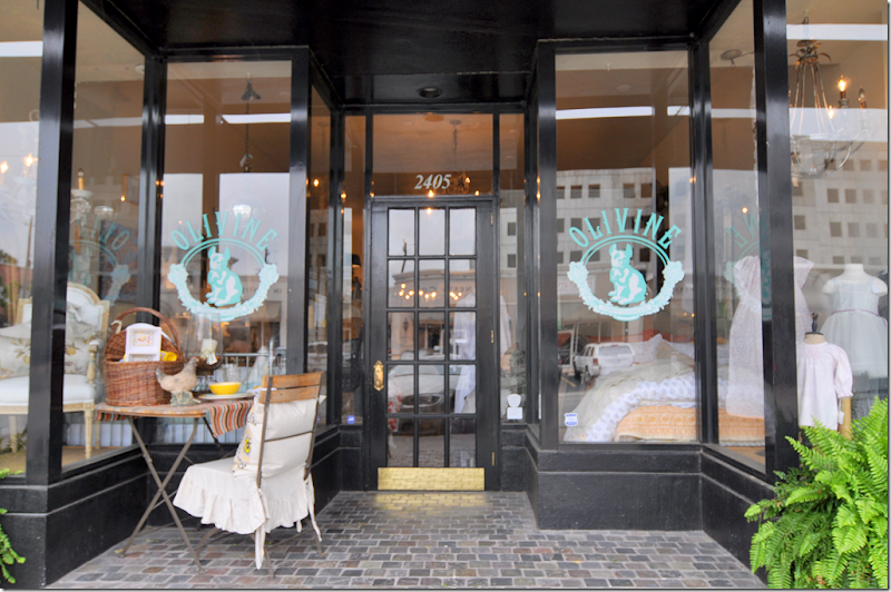
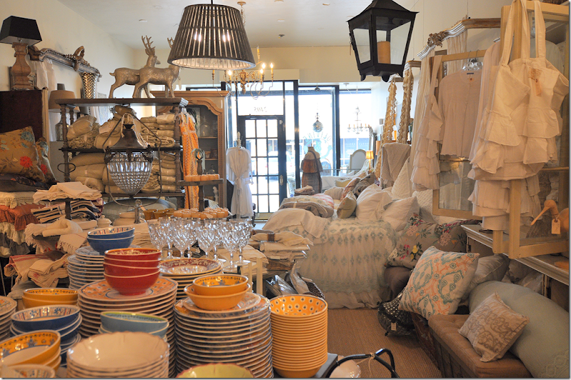
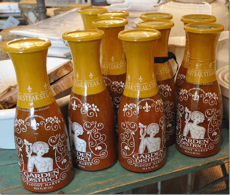
I stopped by Olivine the other day looking for accessories and lamps for a client. I love Olivine – with its overflowing and layered displays. You have to go around the store two or three times just to see everything – so much merchandise is hiding about. I found some great sconces from Aidan Gray and a white female bust for my client – along with tiny glasses in rattan shelves just for me! And, not stopping after a few glasses, I bought some new candles too. But… what really caught my eye was a big display of Bloody Mary mix! WHAT????
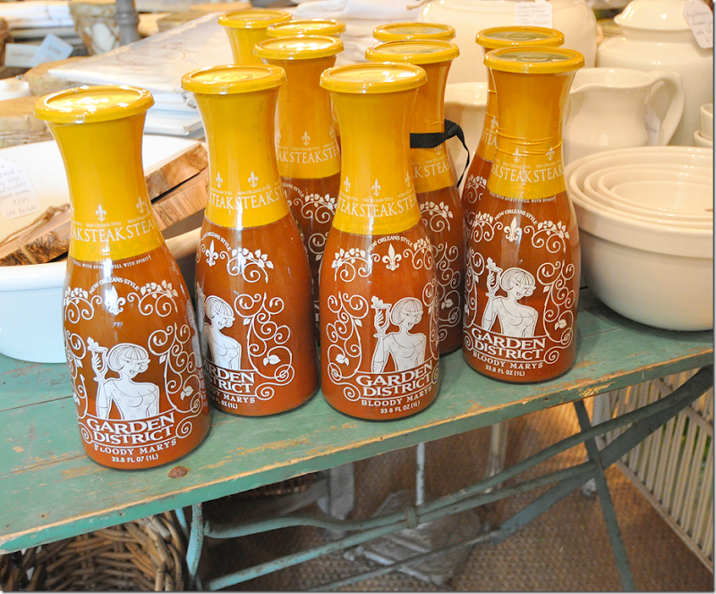
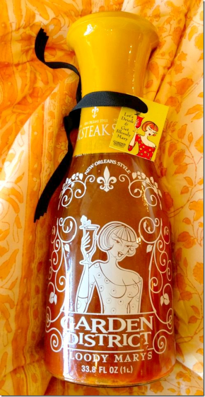
The mix is called Garden District Bloody Marys and it’s been gaining fame after it was recently featured on Marlo Thomas’ Huffington Post blog HERE. It’s such a great story about how the mix came to be. Naturally, it features a flamboyant Great Aunt Gladys from New Orleans whose mix was quite popular in the Garden District. Fast forward several decades and Aunt Gladys's great niece Stephanie Sonoja found herself out of work after toiling away in the advertising and marketing business. Her mother had somehow finagled from Aunt Gladys the super secret recipe with its 21 ingredients. The long trip from idea to grocers shelves took several years. Stephanie learned that there are 8 ingredients in a Bloody Mary mix that when mixed with vodka causes it to burn and turn bitter. Once Stephanie’s chemist was able to overcome that hurdle (Garden District Bloody Marys is one of the few mixes that does NOT turn bitter!) the next roadblock came from the bottler. A large order from Costco had to be turned down when the bottler wanted to put the mix in a typical decanter. Of course, the marketer Stephanie had other ideas. In the end, she designed a beautiful carafe for the mix that is as useful empty as full. It even has a illustration of the infamous Great Aunt Gladys.
Since Olivine’s owner, Helen, is from Louisiana, she was naturally drawn to the mix, which she drinks while visiting her restored historic Galveston house. What a perfect place to drink Bloody Marys since the architecture of Galveston’s historical districts is so similar to New Orleans's Garden District. AND being such a huge fan, this Friday, the 20th, Helen is hosting a party at Olivine to introduce the mix to Houston. The event is open to the public, so please drop by for a taste of what is promised to be the best Bloody Mary you will ever have!! Along with the Bloody Mary mix, Olivine is also hosting a trunk show for Petite Bohemians jewelry.
The invite to the party this Friday!
Now, if you can’t make it to Olivine, Garden District Bloody Marys and Petite Bohemian jewels will also be at the Gypsy Market the following Friday, April 27th. The Gypsy Market is Houston’s newest antique/decor market hosted by 2620 at 2620 Joanel. Ideally, you should probably make it to both events. Go Houston!
And here is the invite for the Gypsy Market at 2620 Joanel – NEXT Friday, April 27.
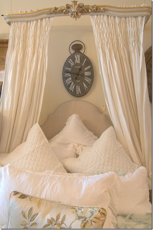
Of course, I want to show a few of my favorites in store right now at Olivine. They have so many headboards and these great coronas. Some are old and some are new. Too cute!
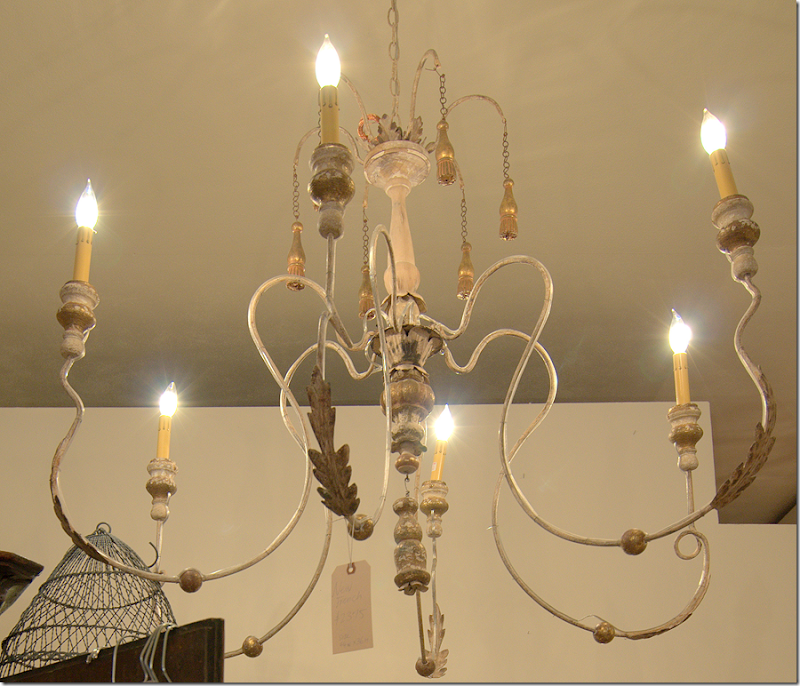
Great chandeliers – like this Italian style that is so popular right now.
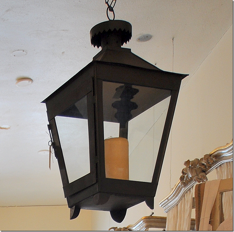
These lanterns are great for the tabletop or outside. BUT BUT BUT – if I were looking for an electric lantern, I would buy this for under $300, and take it to a lamp man and have him electrify it. For under $500 – you could have a fabulous lantern. And if you didn’t want it black – paint it! This is a great buy.
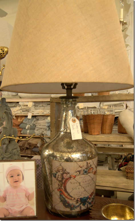
I liked this pair of lamps.
This gray gate leg table would be great in an entry hall piled with books, or as an end table next to a sofa. It would also make a cute high coffee table.
There is so much to see – this isn’t even 1/2 of the store!!
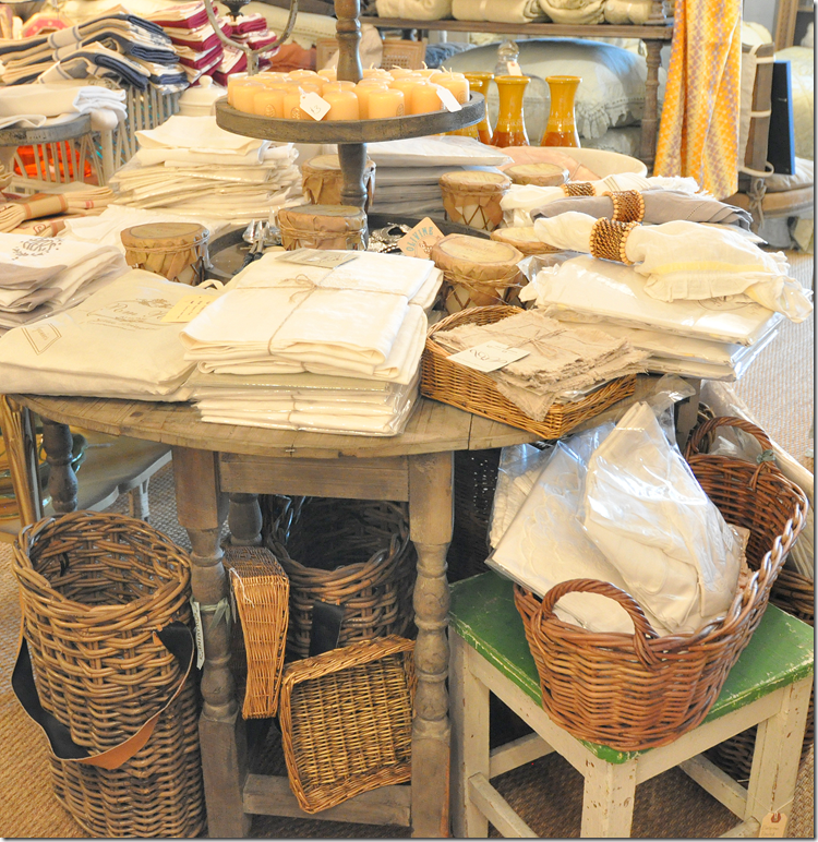
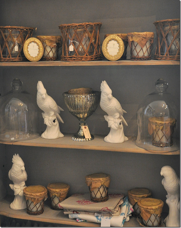
Cloches and birds and rattan wrapped candles.
Vintage kidney styled dressing table. I wish I was doing a bedroom now.
I bought the prettiest angel there awhile ago. Now, she has a Joseph in stock. At least I THINK this is Joseph!
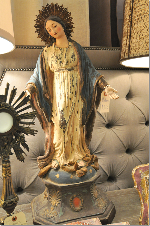
And the prettiest Madonna. Look at the base and her crown.
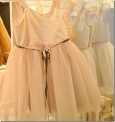
I wish my baby was still a baby! This tulle and silk dress in blush pink is to die for. It also comes in blue.
NOW, don’t forget to join Helen at Olivine for a taste of Garden District Bloody Marys this Friday, from 4 to 7 pm at 2405 Rice Boulevard. For more information, see Olivine’s web site HERE.
Leon Max in England by Henrietta Spencer Churchill. Minimalist? NEVER!!
A little news from the publishing world. Have you seen the new May issue of Architectural Digest? What is going on with this magazine? It keeps getting better and better and better. Margaret Russell has really turned this once tired publication around and made it so elegant with the most outstanding houses and photography. The pictures are big and clear – no more small, boring pics. Russell is a genius. If you have ever doubted the importance of the Editor in Chief – the new Architectural Digest should settle it for you. There is a world of difference between the last editor and Margaret and boy, does it ever show.
The master bedroom sitting room at Easton Neston! Must be nice. Notice the desk with the attached clock. Photography by Oberto Gili – a master with the camera. His own recent book is gorgeous HERE.
This month’s Architectural Digest issue is called “Grand Tour – Ravishing Homes Around the World.” If you are a minimalist, don’t bother. The interiors are filled with clutter and antiques of the best kind. The cover story – Easton Neston by Mitchell Owens is drop dead gorgeous. OMG! Talk about just bring a toothbrush and move in, I’m ready!!! I loved this sentence from Leon Max, the owner of Easton Neston: “All the tables should be old and the chairs should be new if one can help it.” Spoken like a man. Men HATE antique chairs because man is so much bigger today than man was a few hundred years ago. (Which is so weird when you think about it. Why are we so much bigger today? I mean, I know why I am bigger – too much candy and cheeseburgers, but why is man – the species – so much taller than man was just a century ago?)
Interior designer May Daouk’s Beirut Villa – photography by Simon Watson. Notice the console on the left piled high with blue and white porcelains.
There are EIGHT houses featured this month. EIGHT. When was the last time you saw a magazine that featured EIGHT houses? The funniest thing is at first I counted seven and thought that was incredible. But I went back and recounted and was stunned to discover it was EIGHT! Now, if only they would change the font, I’d never say a bitchy word about AD again.
Timothy Whealon in Monte Carlo. Simon Watson.
And on top of all this – there is a new AD web site with huge photographs. Hear that House Beautiful? Vogue and Architectural Digest (both Conde Nast) have finally embraced the digital age and have given us these beautiful images online. Thank you!
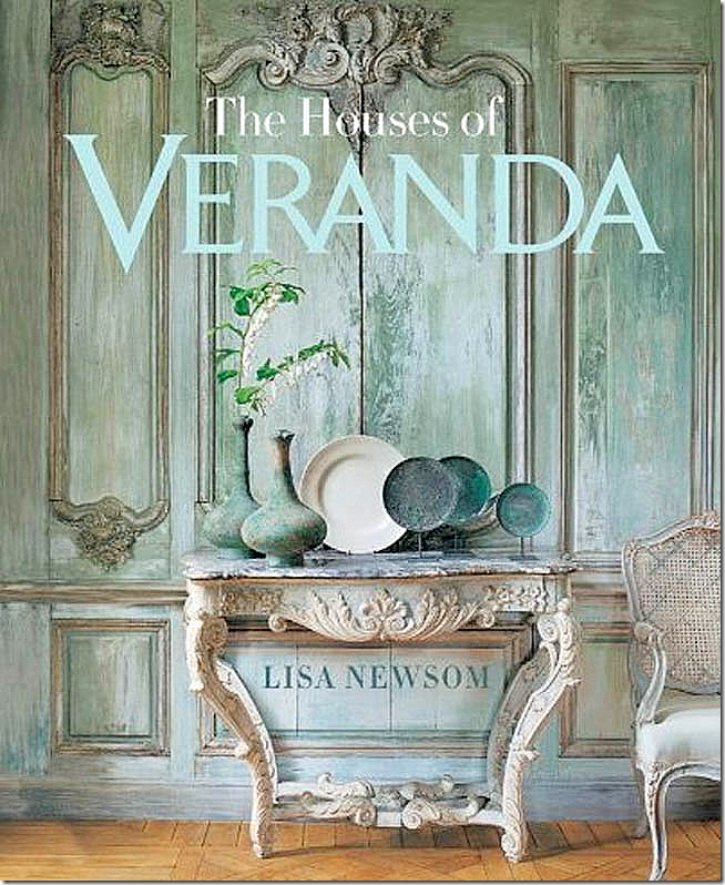
And finally, I received the best package in my mail yesterday. From Amazon. The new book by Lisa Newsom: THE HOUSES OF VERANDA.
Pick me up off the floor, I’ve died and gone to heaven. Drool is collecting on my chin. My eyes are in bugged out so far they may never recover. I look like I have Graves disease.
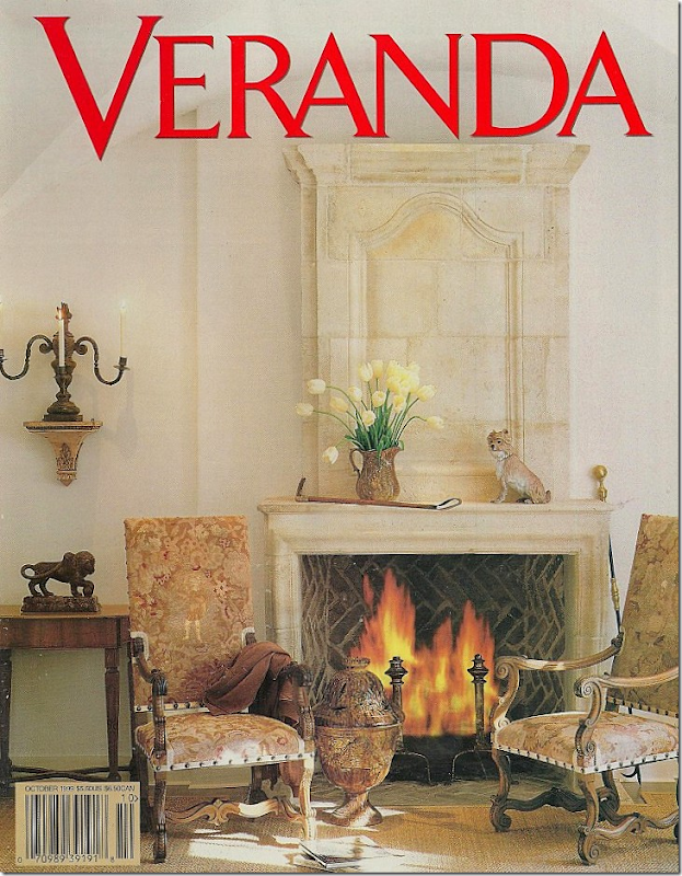
OK – people, listen. I’ve told you about some of my favorite books this year – Phoebe Howard’s and Segreto’s – both gorgeous. AND now, add a third one to the list. If you like Veranda, get this book. That’s all I will say. RUN. There’s nothing really new here. It’s all your favorite houses from past issues. But that’s the point, isn’t it? To have all your FAVORITE Veranda houses together in one HUGE book – with extra large photographs, without all the writing over the pictures like it happens in the magazine. Just clean, huge, beautiful photographs of your favorite houses.
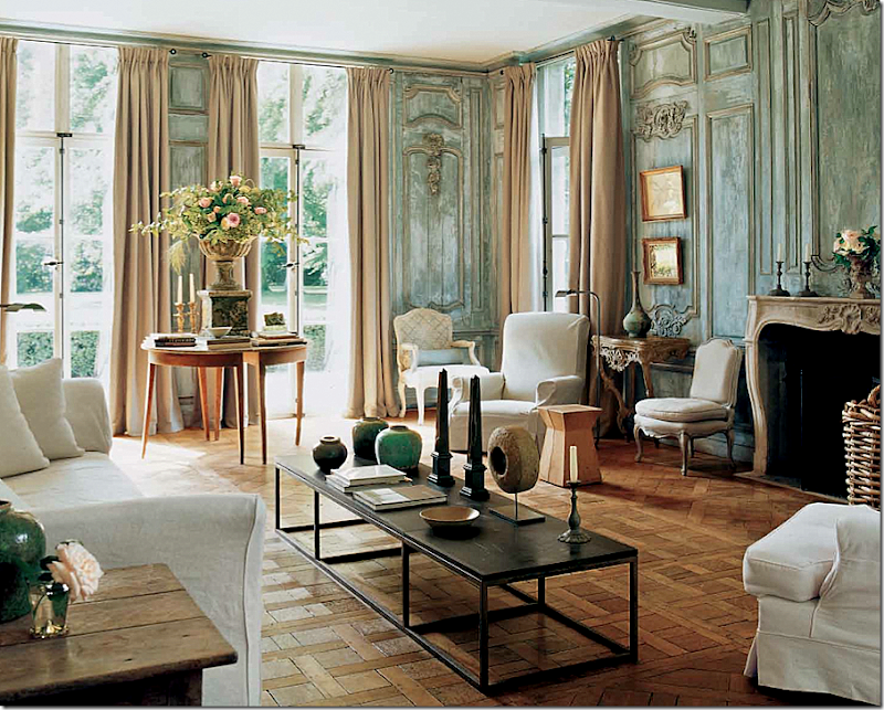
Like this. The most beloved cover story ever – it is the cover of the book and the first house featured. This house is the home of clothier Edourard Vermeulen. From Belgian (naturally) – it is a stunner. I’ve always loved that urn filled with roses. And that table – so hot right now in America, but this house was designed years ago.
The photographs are so much bigger than they are in the magazine! I LOVE IT!!!!!!!!!!! Each house featured – almost each single house in the book was a favorite of mine. Did I edit this book? I was wondering??? Ha! Seriously, Newsom picked out each house that I myself would have picked out for the book. There are tons of houses, 30 in all, and I think there were only two that weren’t absolute favorites over the years. And even those are beautiful.
The next house is a classic by Dan Carithers (my favorite of all his houses – well one of them!) I’ve always loved the curve of the sconce – it looks like sculpture.
The next is a house by John Saladino. Oh my. And on and on it goes. It’s a feast for the eyes.
You can throw out all those dog eared, yellowing and torn clips from Veranda. It’s all here in one place now – in this book. Some of the pictures were fresh again – it had been a long time since I’d seen them. Others were more well known. A real bonus - there are two gorgeous houses by the Houston great Babs Watkins, including the first house I saw of hers that made me fall hopelessly in love with her aesthetic. Such great memories. And that is what this book represents – memories. Memories of falling in love with design and designers. Remembering the first time you saw Bobby McAlpine’s work. Or those gorgeous aqua beach houses. A reader emailed me saying “I wish you lived here so we could sit and look at the book together.” Yes – I understand what she meant. If you do too – this is the book for you.
Babs Watkins – the first house of hers that I had seen – Love at First Sight!
My only complaint? At 288 pages, it’s still not enough. Do it again, Lisa, come on, one more please!!! Volume II.
AND hint, hint, someone at Southern Living should do the same thing with all the great Southern Accents houses. If that would only happen….
To order the book click on the picture!










Regarding why man is taller, I was told by a professor that it is because of increased access to protein. Don't know if that's true or not, but my 6'5" husband is a definite carnivore! Agree about the turn around with AD. I used to think it was a corpse on life supports!
ReplyDeletehmm. i had always heard it was the steroids - but protein sounds more reasonable?
DeleteAs I understand it, it is an increased access to a more balanced diet altogether. Our bodies require an array of vitamins and minerals to grow healthy muscles and bones. Society's ability to transport fresh produce from warmer climate zones to cooler ones during the colder months has afforded humanity the ability to maintain a healthy diet throughout the year. Sadly, our food supply isn't what it used to be in the 1940's-1970's, due to industrialized agriculture, but organic farming will become the norm again in the future, soon I hope. Thank you for the lovely post Joni, equally beautiful and informative as always!
DeleteThat statue is St. Francis of Assisi, not Joseph. St. Francis is the patron saint of animals, and he is always holding a bird in his hand.
ReplyDeleteLovely post, thank you!
oh thanks!!! yes, I know that St. Francis loved animals, but I didn't know that about the bird. you learn something every day.
DeleteMs. Cote de Texas this is a fabulous post, as always. AD did revive from the dead and I can't wait to get my Veranda book! I really like that Madonna statue at Olivine's.
ReplyDeleteHappy to see the new look for Architectural Digest. I cancelled my subsription several years ago because it was boring. On top of that they featured too many socialist celebrity's lavish homes.
ReplyDeleteNow Traditional Home needs to get its act together. The most current issue features a lot of "hot" colors - bright green, bright turquois and hot orange. I like a bit of color but these rooms are very jarring. The rooms do not look very "traditional" to me.
not a huge fan of the magazine. never see anything in there i particularly love, sorry to say.
DeleteThe more I think about it, I should save my money and not subscribe to Traditional Home again. Veranda, on the other hand, is a magazine that I ADORE! Have NEVER seen a home featured in that magazine that I did not love, love,love!
DeleteA fab article! Where do you find these amazing items that can just add so much character in one's living room? Yes, the lanterns are pretty interesting. Converting them for electric use would the best way to go. Same thing with the lamps. Pretty. Those houses featured in Architectural Digest are amazing. Although, I will not live in some of them as they are too gorgeous for real living. Cheers!
ReplyDeleteYou can't design a room around a cat. Margaret Russell
ReplyDeleteThanks for sharing this valuable post.Nice blog. I like it. Good information about all stuff, which posted by you ...
ReplyDeleteCottage Furniture
And here I was just getting ready to write a post about how nobody is talking about how great Architectural Digest has gotten!!! Great post Joni!!!
ReplyDeleteThe (almost) pair of demi lunes with the huge vase of flowers in the home of clothier Edourard Vermeulen looks as though it might collapse, judging by the legs; it's wonderful!
ReplyDeleteThat Bloody Mary mix could make me change my drinking habits. What a neat story. Olivine has some interesting and eclectic offerings for Houston's shoppers. It was fun window shopping with you. Please do it again.
ReplyDeleteAnother wonderful post...The statue is St. Francis...the patron of animals...and you are right he is wonderful...
ReplyDeleteLeon Max seems to be doing an amazing job of reinstating the interiors at Easton Neston. The fact that he is Russian makes it even more tantalizing as he´s breaking every stereotypical, preconcieved idea about Russians being gauche in their interior design taste. How very fortunate for Easton Neston to have found such an owner. I shall definitely be hunting down a copy of AD. Thanks for a great post.
ReplyDelete//Sarah
I think Henrietta Spencer-Churchill is probably a huge influence on keeping the house English.
DeleteShivers...actual shivers! What beautiful objets de art!! franki
ReplyDeleteSome people call it menopause???
DeleteA girl after my own heart--can't resist a stong and spicy bloody mary. The shop looks fantastic--a great spot to shop for clients.
ReplyDelete"...but why is man – the species – so much taller than man was just a century ago?" Much more protein on average. Modern ranching, fishing, and chicken farming has made protein foods more available.
ReplyDeleteBeautiful - yet another store I could live in. BTW - the statue is St Francis - not Joseph.
ReplyDeleteyep, so everyone is saying. What do you excpect from a Jewish girl? We don't do saints!!! The only saint I know is Valentine. ok, i'm just kidding!!!!
DeleteJoni so very much to take in I will have to come back, Olivine s, oh I wish I lived closer.
ReplyDeleteWe would be running around all the time!! Oh and the Veranda book, luscious images!!
The statue is of St Francis known for his love of animals...
I have a $100 Giveaway from Soft Surroundings on my site if you would like to enter!!
Xoxo
Karena
Art by Karena
Karena,
DeleteWould you please STOP with your awful, tasteless, depressing "giveaways"? And quit spamming up blogs with these desperate ads.
Wanna bet she has posted on at least 25 other blogs today and nearly all of them, the first comment. The woman never sleeps. I would say the ultimate high fructose corn syrup in blogland.
DeleteOh this store is beautiful! I wish someone from Texas would come to boston and open some gorgeous stores like this!
ReplyDeleteJoni, I think you drank a Bloody Mary before writing this! You are hilarious. I laughed out loud at the "why is man bigger" section. I read that article in the AD and thought it was a great idea too. My husband is 6'9" and I've never been able to get antique chairs that suit him (or his gigantic family), unless of course they are antique thrones. Thanks for all the pretty pictures.
ReplyDeleteWhat a beautiful storefront. And for those of you who are not Catholic. . . the statue is of St. Francis of Aussie - because there is a bird on his shoulder and the Madonna is the Virgen Mary as depicted by the moon at the base of her feet with the stars. It is her halo/aura that is represented by what you call a crown. Later during the Renaissance the halos on saints were replaced with actual crowns which symbolized halos. St. Joseph would have the Christ child in his arms. Every saint is depicted with their attributes so that they can be identified. Great blog.
ReplyDeleteYour spell checker is in evil mode. G'day mate.
Deleteso interesting~!!!i never knew the crowns were halos.
DeleteAll this talk about New Orleans brings back great memories. Now I am craving a delicious praline from that famous old restaurant off Jackson Square that also chickory coffee. I do not drink alcohol but that Bloody Mary mix sounds divine. Might it make a great base for Tomato Aspic? Has anyone ever tried it as a sauce for Shrimp cocktail? How about mixed with mayo for a spicey French Dressing?
ReplyDeleteWoman does not live by decor alone!
Your description of yourself reading the new Veranda book had me cackling. I think I have the magazine clippings for the majority of the houses selected for the Veranda book, too. The illustration for the book cover was tacked above my desk in my work cubicle for years. Love the look, but don't have the house or pocketbook to carry it off. Beautiful fantasy, though.
ReplyDeleteNo darlin', in reference to Leon Max's comment about old tables and new chairs, and being a man, I must point out that it is not our increased size that requires new chairs made in a larger scale, but the inherent brittleness of the construction of old chairs. Chairs, especially delicate dining chairs with their gossamer or non-existent stretchers, are, as a construct, fragile affairs to begin with, even when new. Add age to these delicate items, and even a tiny bit of male avoirdupois and you have the recipe for disaster...
ReplyDeleteTrue, but have you ever seen a 6 ft man sit in an 18th century dining room chair? I had a friend who bought a set of gorgeous antique leather chairs that her husband made her return when he sat in them. he just didn't fit. and he's not fat at all,
DeleteAre you related to to a "close" consort of Reggie Darling? Sure sounds like it.
DeleteLove Reggie!
Sorry, my reply landed in the wrong spot. It should read:
DeleteAre you related to or a "close consort" of Reggie Darling?
Too many "bloodies" and I haven't even ordered the mix.
Wow, what a gorgeous shop! I'm going to send my husband by there for some anniversary gift ideas on his next business trip to Houston! HA! Amazing story about the Blody Mary mix too, so neat. Can't wait to try it!! Also, that lovely old statue is actually St. Francis, not Joseph (Art History major aka nerd). Hope you have the lovliest day!! Thanks for all of your gorgeous posts!!
ReplyDeleteBe still my heart at last AD has gotten their @#$%^ together + Thank you MR & Joni. Veranda has to be my favorite publication-will get that book + the Bloodymary mix looks delicious, can't beat NOLA. xxpeggybraswelldesign.com
ReplyDeleteI love love your posts. What a gorgeous store. Will visit next time I come to Houston. Thank you again Joni for your time.
ReplyDeleteIt is too bad that the woman who works at Olivine is such a disaster to work with because that store has such beautiful things. I've had two horrible experiences with her and just can't continue to do business with her. Such a shame, especially because the owner seems so pleasant but the other woman does her best to keep customers far away from the owner, likely to prevent the owner from knowing how she is treating customers. I keep hoping that the owner will get some new employees so that I can shop there again!
ReplyDeleteWhoa!!!!!!!!!!!1 Cathy? she has worked for Helen for decades now. she was the nanny for Helen's five kids. I've never been treated in any way but nicely by her! give her a second chance. She just had a precious baby - maybe she was hormonal or maybe it wasn't even Cathy. Give her a second (or third I should say) chance!!!!
DeleteHello Anonymous! I am sorry that you have had such dismal experiences at Olivine.....Until your comment I have only had compliments on my salespeople!It is a one-salesperson shop, so sometime things get a little hectic in there, I admit! Would you please tell me what happened, specifically? Thank you, Helen Stroud
DeleteHi Helen!
DeleteI think the chances of Anonymous contacting you to tell you what happened at your store are remote to nil! She's probably not interested in straightening things out. I suspect she just wants to humiliate your employee and you in print. If she really wanted to talk to you about what happened and fix the problem, she would have done so by now.
Joni
ReplyDeleteWe love it when you take us along on your shopping trips! Can't wait to get to my mailbox for the Veranda Book. I agree re: Southern Accents! I am still waiting for your book about Houston Designers and your starbucks stalking!!
We have all gotten taller, but i grew up the the 1970's and lothe really big seating. If it's too deep or too tall, your feet don't rest on the floor, the circulation is cut of, and you look like a ninny. I'll take and antiques chair over that, or an upholstered chair from the mid 20th.
ReplyDeleteLovely post, I want to get my hands on that bloody mary mix! Also, that's St. Francis the patron saint of animals.
ReplyDeleteOlivine store is full of treasures, I like that beautiful Madonna. What you said about Architectural Digest is so true, it gets better and better and I love also archdigest.com where you can read even more interesting articles. Veranda book? A must! Joni... I appreciate so much your knowledge and the amount of time you spend writing for us! Grazie!
ReplyDeleteI have to order my "Houses of Veranda". I didn't think it came out until May!
ReplyDeleteI also loved the new AD - love those grand, sprawling, cluttered, sometimes slightly dog-eared estates. I think "man" is larger today due to better nutrition, better childhood nutrition.
xo Terri
This really is wonderful article ! I simply love’d it !
ReplyDeleteWhat about Pamela Pierce? Is her work featured in the new book? Can't imagine you (or me) loving this book unless she's there!
ReplyDeleteAnne
I have had this pre-ordered for ages -- so I hope my copy is imminent! You wouldn't believe the old magazines in my garage...
ReplyDeleteJoni- You had me up too late last night reading all the comments on your Ask Miss Cote de Texas( wonderful idea, and Loved it)Sooo interesting to read all the comments- some very thoughtfuland insightful- others just a tad bit judgemental... could almost hear the 'sniff" which surely accompanied the writers words.
ReplyDeleteI will look forward to more of these, and have a new appreciation for your reason, as you explained it, not to
censor/edit even the most insipid of comments. Like you, I do wish people would be mindful that our homes are our castles, and reflect who we are, but sometimes, sudden life changes are often traumatic, and the challenges we face in re -doing our interiors can be both physically and mentally overwhelming.
I do appreciate your kindness in taking more of your time to give even MORE to us as your readers.Your blog is greatly appreciated by this one , and oh, about this post- my husband will be thrilled if I do buy that Veranda book, and get rid of the boxes and stacks of all the issues I can not bring myself to part with. (My mother hoarded recipe clippings and I hoard pictures of beautiful interiors! aHHH. IT'S GREAT TO LAUGH AT OURSELVES, AND YOU ARE SO MUCH FUN TO LAUGH WITH!
Alice A
It's St. Francis of Assisi. He's not an Aussie. Ha! He founded the order of the Franciscans and was committed to a life of poverty, hence the rough robe. He loved animals so he is usually pictured with a bird on his shoulder or sometimes with more animals. Many churches have the blessing of the animals every year and mention will be made of him there with prayers.
ReplyDeleteSincerely,
Your Lapsed Catholic Reader Who Went To Catholic School All My Life and Still Knows All This Stuff
OK. One more note on "Saint" statues and paintings. If you ever find a "Madonna" with a red robe, that is not The Virgin Mary, that is Mary Magdelaine. Long story, not needed for this discussion, but the Catholic Church cast Mary Magdelaine as a reformed harlot, hence the red robe. Just an FYI so there is no future confusion.
ReplyDeleteHello Charlotte! You do know that Mary Magdalaine was NOT the prostitute ,though, but one of the disciples closest to Jesus, and one of the few that didn't run away at the end...so cool.
DeleteYES, I agree. There is no real evidence that Mary Magdelaine was a prostitute. Just sayin.., that is what the early Chruch Fathers said to suppress her importance. Take a good, close look at "The Last Supper" by Da Vinci (who, by the way was a Mason /Templar). The person on Jesus' left (on HIS right hand side) is very feminine looking. In fact, that person is the only one in the room who has a necklace AND eyelashes. The "V" between Jesus and the person to his right is the medieval representation of "woman". Furthermore, the person on Jesus's right hand is wearing a blue robe - symbolic of loyalty, strength and steadfastness. That same person's cloak is red, the color of passion. Red (rightly or wrongly) the color associated with Mary Magdelaine.
DeleteYou had me at Bloody Marys... ;-)
ReplyDeleteI agree; Margaret Russel has given AD just the facelift that it desperately needed. But please don't stop making snarky comments about the shelter magazines -- I enjoy your snide remarks! ;-) I have been thinking for awhile that they should rename Architectural Digest something like Celebrity Cribs, since the celebrity status of the homeowner (which, sadly, is key for sales) sometimes seems more important than the architecture or design work featured. I'm not naming names (but we all remember the issue they put out JUST LAST YEAR showing Elizabeth Taylor's private home, plush purple wall-to-wall carpeting and all, to capitalize on her recent passing!). Thank God celebrities have scads of money, and that enough of them hire designers who know what they are doing!
Its all fabulous! Olivine, those gorgeous rooms, thanks for the eye candy!
ReplyDeleteGorgeous rooms and the color palettes makes the room more appealing. Nice post!
ReplyDeleteLoved looking at this, especially while I was supposed to be working.
ReplyDeleteI started looking at AD very young. Young enough to feel very important looking at every page, along with my Vogues.
Fast forward, a couple of my daughters have spent their modest earnings over the years on AD, never throwing an issue away. When we are at each other's homes and apartments someone always says, "You done with that? Can I take it?"
The answer is usually no! It has been a fun ride. Yes they did get boring for a long time. The last one I really hung on to and wrestled back from the girls featured horse barns, unlike any barns we hung out in!
Now they are back to being a treat.
Love Veranda, too. Veranda suddenly has new meaning as I am about to leave New England for Florida, with mixed feelings. Best part is going to be finding my way through a whole different regional style!
I now buy Architectural Digest religiously - I was really upset when Margaret Russell left Elle Decor but she has gradually taken AD by the scruff of the neck and pulled it into the 20th Century.
ReplyDeleteI too hope Pamela Pierce is in the new Veranda book. I'm pre-ordering it.
Later today I'm heading to IKEA to get replacement shelves for my long suffering Billy bookcases. Some of the shelves have bent and warped because the design books are so heavy. Can't stop buying these big heavy books but I treasure them all and will keep them forever.
DON'T YOU LOVE THE BAROQUE, FRENCH CONSOLE TABLE ON THE COVER OF THE NEW "HOUSES OF VERANDA"? Well, check out the website for Savoia Chairs out of Toronto, Canada. They have several consoles that are almost identical. They are unfinished so you can choose your color. I haven't priced them, but given that most of their chair frames are less than $600, the consoles probably cost around $1,000. Savoia is a major source for designers.
ReplyDeleteHome Decorators website (from Home Depot) has a French Baroque console for around $300. It is not as detailed as the ones from Savoia, but for the money, wow!
Well, Joni, you did it again! another great post! I do think I will pick up the new Veranda book - I HOPE it shows that gorgeous townhouse by Pam Pierce that I went GAGA for - the kitchen that doesn't look like a kitchen! brilliant! ;-))
ReplyDeleteLove your posts so much. This one was especially fun and informative.
ReplyDeletePhenomenal Blog! I may want to thank for the endeavors you have produced in composing this post. I'm trusting the exact same best work from you afterwards too.rectal surgery Houston
ReplyDelete