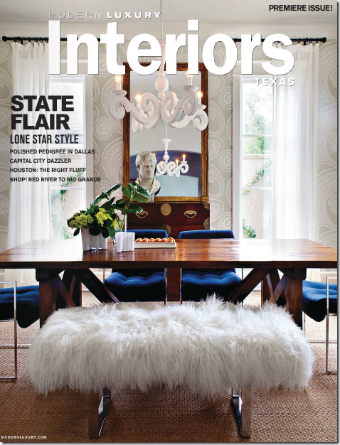
In April of 2008, I wrote a story, HERE, that became one of the most popular stories on Cote de Texas. Called “Stalking the Wheats,” it was about my stalking a cute, French styled stucco house in West University. From my car, I peeked into their windows during dusk hours trying to see inside, and finally I gained entrance to take pictures for the blog. At the time, I had no idea how well received interior designer Sally Wheat’s house would be. But over time, after countless comments and emails, it became apparent that many readers loved her house, especially her gray kitchen. Her kitchen became so popular it inspired some readers to copy it: I’ve even shown a few of the “Wheat kitchens” HERE and HERE. Since that first story, Sally has been published in several magazines, most notably as the cover story of the premier issue of Modern Luxury Interiors - Texas magazine, a new magazine which features more contemporary decor.
When I first Sally, her house was a more typical “Houston Look” house with seagrass and linen slipcovers, very Belgian inspired. Yet, even back then, there were more hip elements that Sally brought to her design. Since Sally uses her house as a living laboratory, she changes her rooms endlessly and pieces move from one space to another and then back again. Many pieces are sold to clients or at her recently opened, fabulous booth at Memorial Antiques and Interiors (MAI.)
It took Sally a few years to transform her house from Belgian to Eclectic – each time I visited there was more and more color and less and less beige. It was all about following her heart. Her aesthetic leans more to the modern and she wanted her house to reflect that. Still, while her newer look may be more lean and less neutral, her pieces have provenance – Milo Baughman and Ward Bennett chairs, David Hicks fabrics, and Jonathan Adler lamps. And, most importantly, mixed in with all the 60s glam are antiques that lend elegance and warmth.
What was the final death knell to Sally’s seagrass and slipcovers? She told Modern Luxury Interiors that everything changed the day the new Restoration Hardware catalogue came in the mail. She was “done” with the Belgian look in that one afternoon. I’m not surprised. I could see pieces of moderne peeking out of the corners long before she fully embraced the look. The total change was made easier on the pocketbook now that she had a booth where she could sell things and a list of clients and friends who clamored for bits of her old “look.” I know because I was one of them. I had Sally schlep her gorgeous French settee over to my house, hoping I could use in my breakfast room. But, it’s size was so much bigger in my house than in hers and I had to return it. Tearfully, of course. It was such a gorgeous piece.
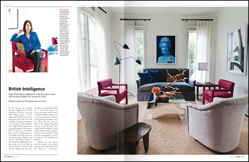
A year or two after that fateful Restoration Hardware day, after moving things around and reupholstering furniture, finally all the beige slipcovers are now gone, replaced with bright velvets and textured fabrics – some shiny python, some Mongolian fur. The aesthetic is more modern British than anything found here in the states. There’s even a pop art portrait of Queen Elizabeth in the dining room. Sally admitted to Modern Luxury Interiors that her favorite magazine is Living Etc, based out of London, where bright colors and a mix of styles follow no rules – something that she has long aspired to.
I thought it would be fun to take a look at Sally’s changing house from Before to After. I’ve been accused of only showing the Houston Look to the point of boredom, but I promise you, the Wheat house will not bore. It’s exciting and vibrant. Your eye travels from piece to piece and back again taking it all in. It’s all very inspiring – it makes you want to take another look at velvet in bright colors or cruise by a resale shop in hopes of scoring a perfect lamp from the 60s.
I will say this in advance. Sally was nervous about doing this story because she knows so many Cote de Texas readers were fans of her Belgian interiors and might not be as receptive to her new look. Sally is so sweet and humble and totally unpretentious. She worries people might be negative or mean. My readers – mean??? Nah. I think some of you will like the new rooms more than the old and some will like the old rooms more than the new. Others may like a combination of the old and new. But, with all the changes, there is one room that has remained constant – and that’s her beautiful gray kitchen – something we all can agree on: we love it!!! So, are you ready? Put your seat belts on……
The Wheat House: Before and After the Restoration Hardware Catalogue
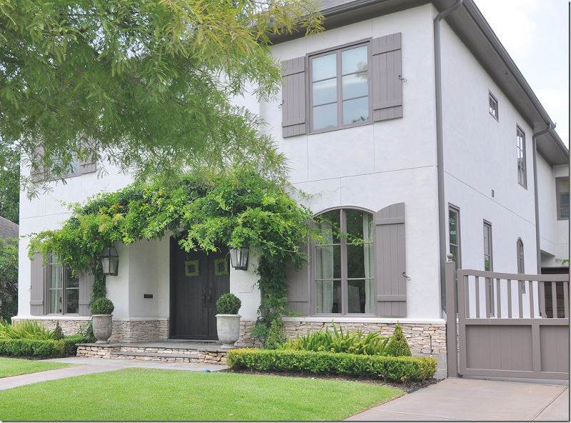
The Wheat house is a two story stucco with French inspired shutters and an English styled gate. I particularly love the stacked stone base. Double wood doors are set dead center. Sally lives across the street from my sister-in-law’s sister, so I would cruise by at all hours trying to get a glimpse inside. It was seeing her antique English screen through her windows that initially sparked my interest.
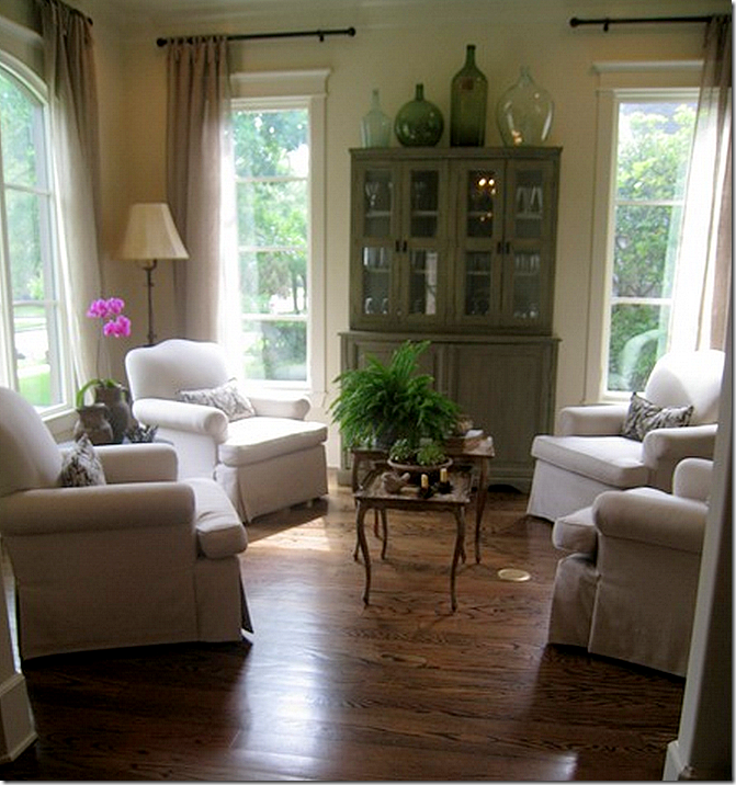
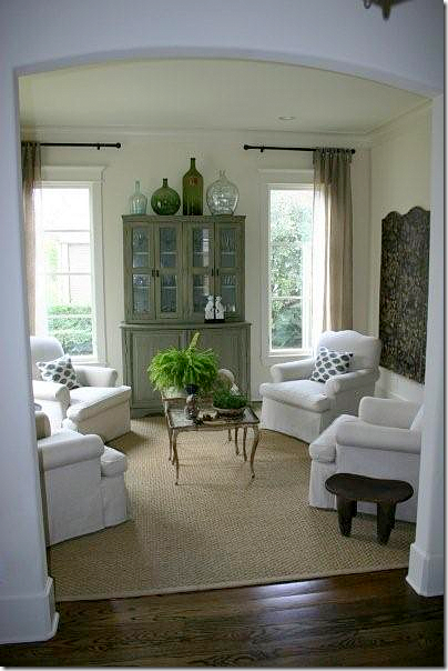
THEN: The first Stalking the Wheats story was written in April, 2008 HERE. Wow – four years ago, almost to the day. They had just moved in a year or so prior, after customizing the house which had been already been under construction. At the time, Sally had four club chairs in the living room with a green painted chest. The seagrass rug hadn’t yet arrived when I took these pictures for the first blog story. Her curtains were sheer linen, unlined, a look that was just taking hold.
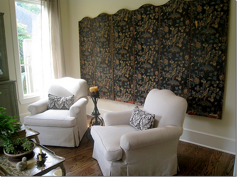
Across the back wall – was the six paneled antique screen that had grabbed my attention while stalking their house.
A few months later, the seagrass had arrived, as did a pair of Madeline Weinrib pillows – a hint of Sally’s true love of modern.
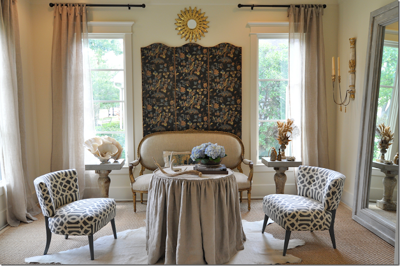
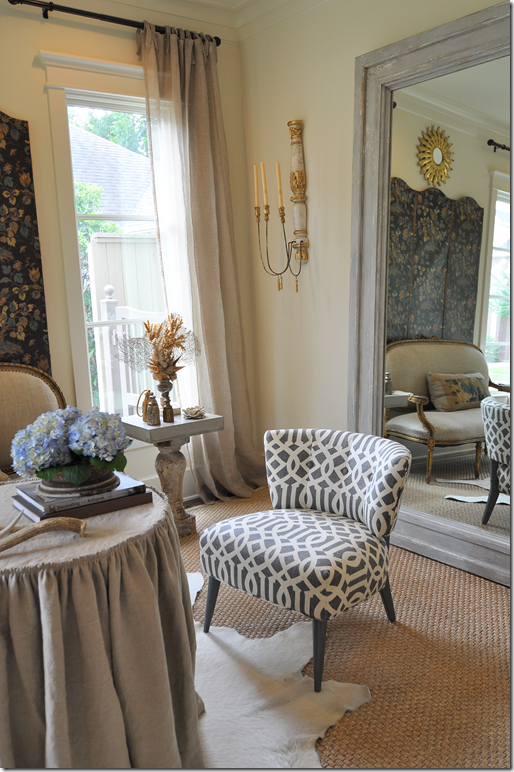
In August, 2009, – a year later – Sally’s house was photographed for the cover of a Houston magazine HERE. I went over to take pictures along with the professionals. Things around the house had changed somewhat – but Sally was still rocking the Houston Look. Here, her living room was very different. The four club chairs were gone – instead there was now the antique French settee sitting under the screen, minus 3 of its panels. Two vintage chairs were covered in the popular Kelly Wearstler Imperial Trellis fabric. There was now seagrass with a cowhide layered over it and a skirted table – all symmetrically placed between two concrete tables. Her big mirror was moved from the dining room.
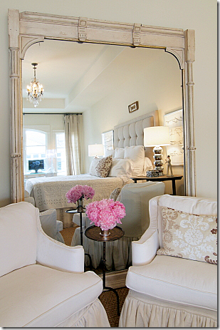
And the living room reflected in the large mirror.
It wasn’t long after the photoshoot that Sally began experimenting with adding more modern touches to her house. Here was an early change that didn’t work out.
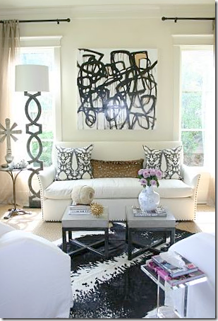
Here was her first serious change. A new sofa and a painting by Amanda Talley turned the room into a graphic vision. I absolutely adored this design!
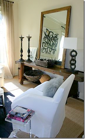
And the reflection. Two new cleaned line contemporary slipped chairs were used along with a rustic console table.
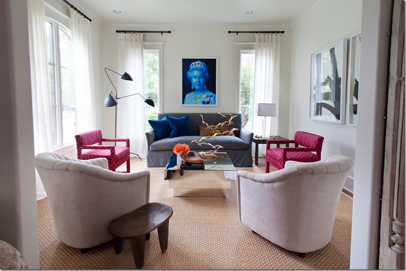
As Sally’s love for the British look grew, her living room changed to reflect it. The sofa was recovered in a gray blue velvet and two chairs wore David Hick’s famous graphic fabric. The Serge Mouille lamp added a touch of classic provenance, while the pop portrait of Queen Elizabeth gave that touch of whimsy which Sally loves in her interiors. This was how the living room looked for the West University Elementary School home tour last year. This really does look like a room straight out of Living Etc. Photography by Laurieperez.com
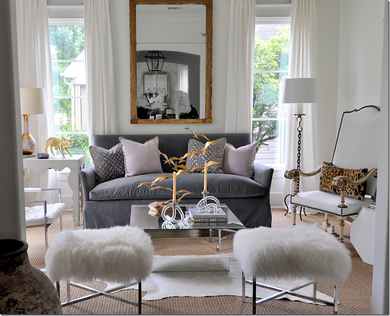
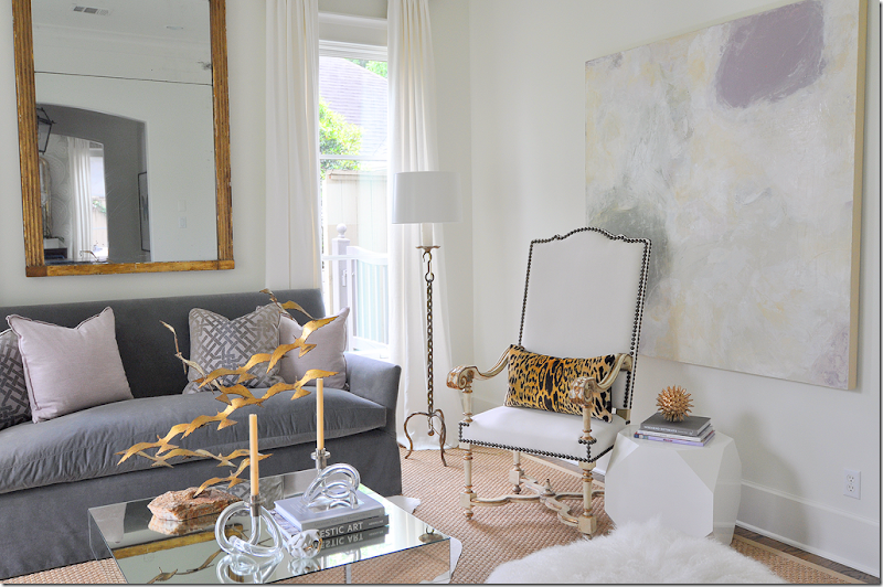
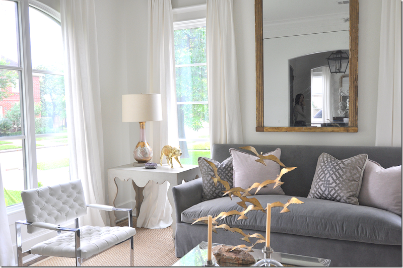
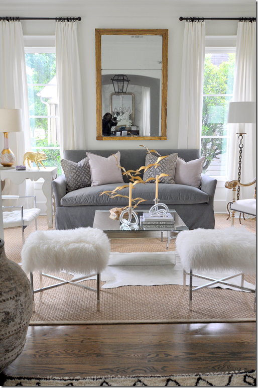
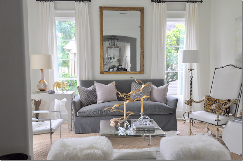
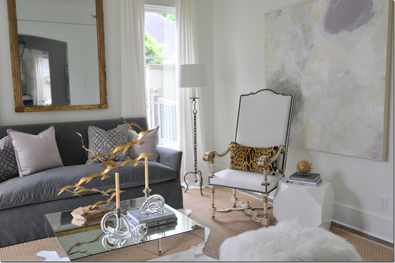
TODAY: The living room today is a vision of elegance and femininity. When I visited the house this week, I was awe struck by how beautiful the room had become. After all the changes and shuffling around of furniture, Sally finally created, for me, the perfect look for her room and house. The colors – the whites and lilacs and touches of gold - are so soft and pretty. The Mongolian fur stools add texture and the 18th century French antique mirror gives that important mix of new and old. The curtains now are a lined white – the sheer Belgian linen is gone.
The colors for the room came from the beautiful canvas by Houstonian Kirsten McLean. McLean shows here work at Segreto’s Art Gallery. (To see her own house and more of her work, go HERE.) The art work adds so much to the room. It is luminous and so very pretty. The chair is by Tara Shaw, as is the antique mirror.
The scalloped table is also by Tara Shaw.
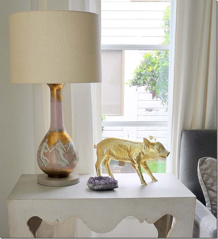
The vintage lamp with its gold and lilac coloring looks fabulous on the side table.
And, finally, the Mongolian fur benches add just a touch whimsy to the room – something that Sally thinks every room should have.
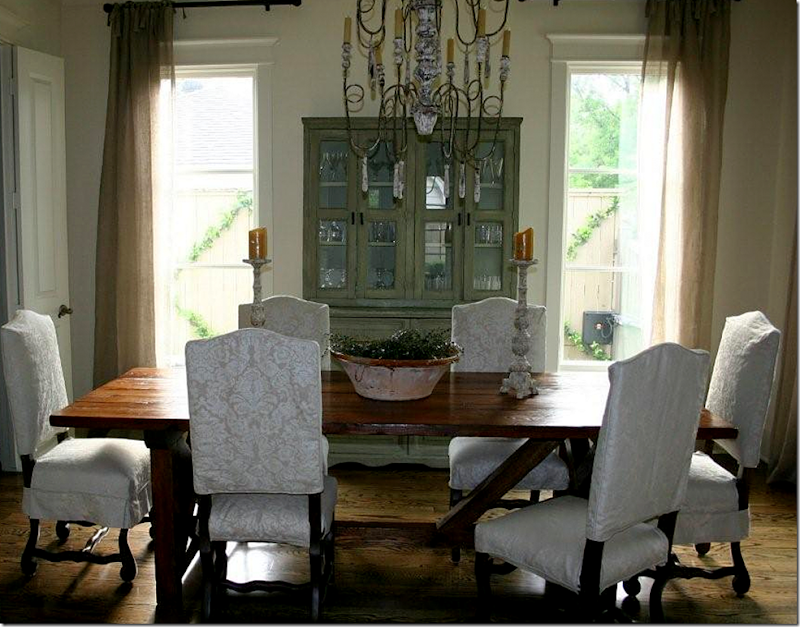
THEN: Leading off the entry hall is the dining room as it looked back in 2008. The large mirror is here, along with French chairs and a custom made wood table.
The chandelier was a wood Italian styled piece. The slips were beige with a slightly visible pattern.
For the 2009 photoshoot, the green piece in the living room and the large mirror in the dining room changed places. The curtains were the same as those in the living room, unlined Belgian linen.
Here, a softer tablescape and a large cross made of leaves.
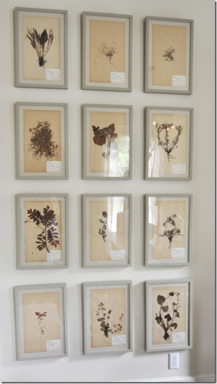
Along the left wall was a large set of herbariums.
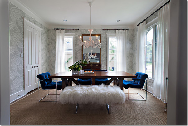
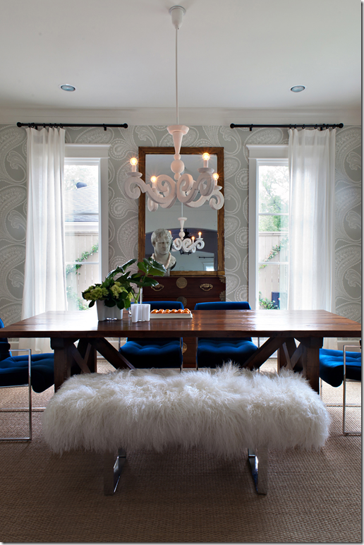
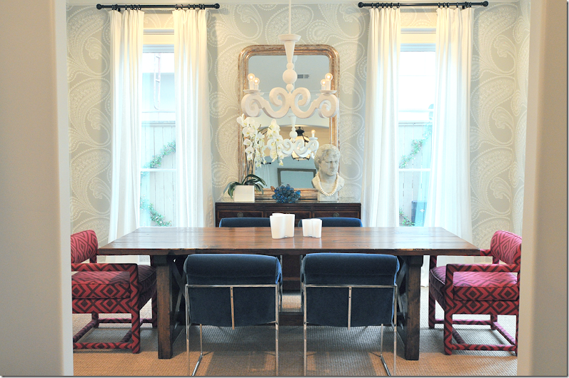
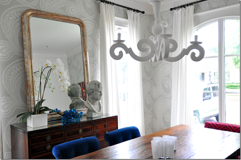
The biggest change came for the WU home tour last year. Sally covered the walls in a Cole and Son paisley paper and vintage chairs were done in an electric blue. The curtains were a sheer white. At one side was a bench with Mongolian fur and a French plaster chandelier provided her touch of whimsy. An antique chest and mirror finished the look – mixing the antique with the new.
The wood table remains. Both pictures by Laurieperez.com
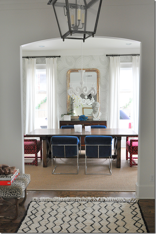
TODAY: with the living room changes – some things in the dining room changed too. The David Hicks chairs were moved here and the bench was sold.
I love how the grapes pick up the blue velvet on the Milo Baughman chairs.
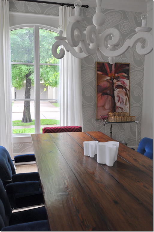
Along the front wall is a bar and an abstract that picks up the dark pink.
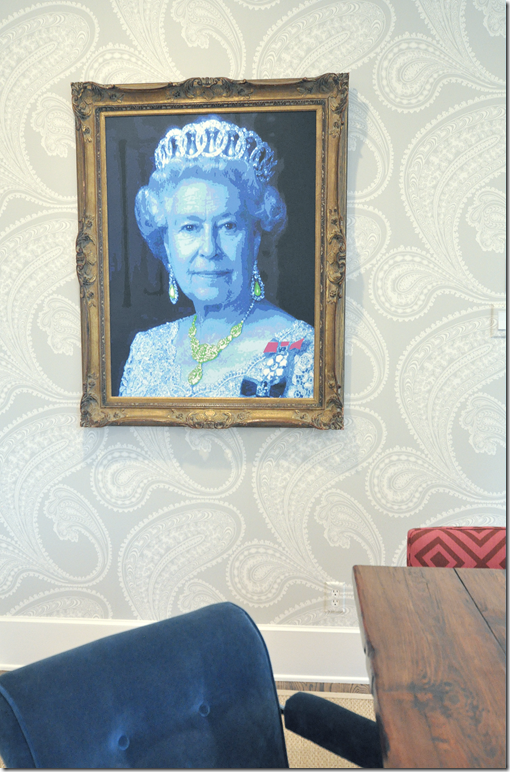
And, moved from the living room, Queen Elizabeth now has a fancy wood frame that really makes her pop. Again, the deep blues pick up the velvet fabric.
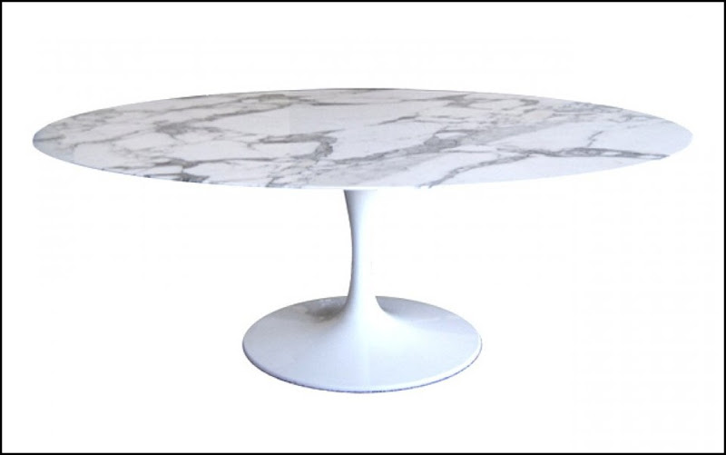
Sally will probably be mad at me for saying this – but I keep pestering her to get this marble topped Eero Saarinen tulip table for her dining room. For some reason I think it would look fabulous in there – but what do I know? I’m stuck in the land of seagrass and slipcovers!!
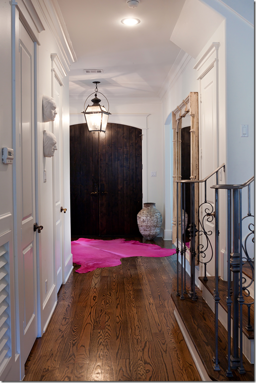
THEN: Looking at the entry – at the time of the home tour last year, Sally had a hot pink cowhide rug. Picture by LauriePerez.com
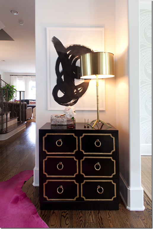
And the Dorothy Draper inspired chest paired with a graphic black and white print.
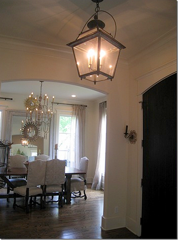
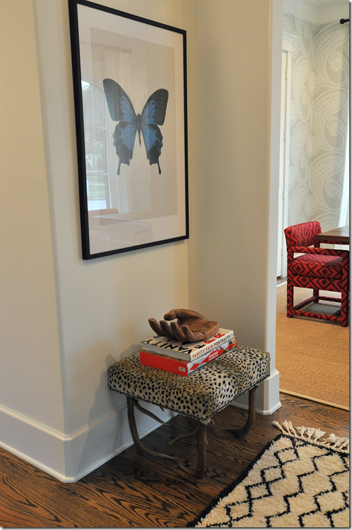
TODAY: Instead, today there is a traditional Moroccan rug in the entry, which I have to say I like so much better! It is much more elegant than the vivid pink cowhide. And it’s graphic quality really goes well with the dining room and living room. To order the Beni Ourain rugs, contact Maryam at My Marrakesh. Sally actually bought her rug directly from the charming Maryam!
The entry is much simpler now, with just a leopard covered bench and a butterfly print that picks up the blues of the nearby dining room.
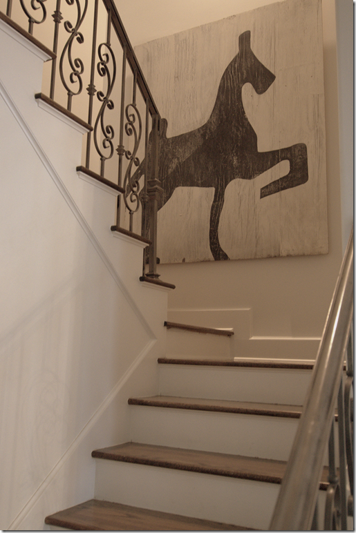
In the staircase, this great painting of a stylized horse is by Houstonian James Farmer, who also painted Sally’s shutters.
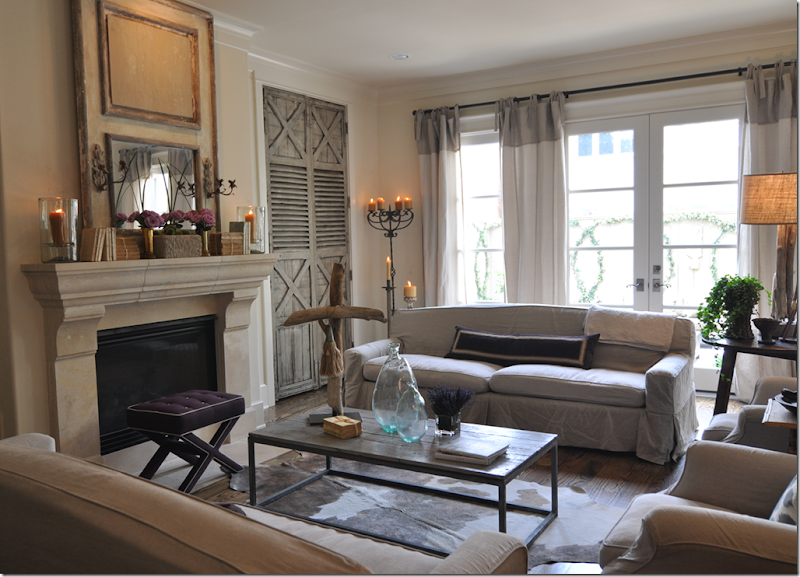
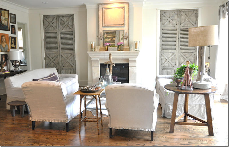
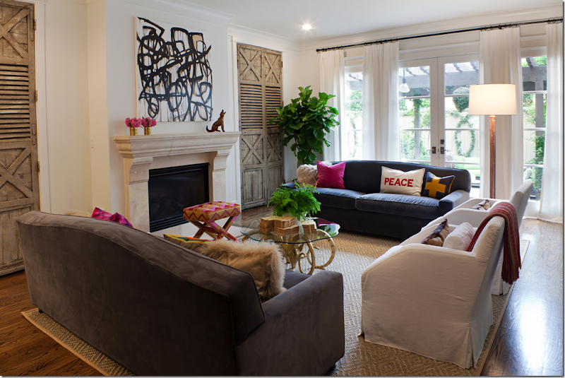
THEN: In 2008, Sally’s family room had twin slipcovered sofas in linen. There was a bricklayer’s coffee table and a bench covered in purple. The curtains were the same as those seen up front – unlined Belgian linen. The focal point of her room is the beautiful fireplace mantel and the antique shutters that hide shelves. The shutters were painted by Houstonian James Farmer HERE.
A year later at the photoshoot, it was much the same, I just took better pictures by then! Sally makes the crosses out of driftwood she collects.
Looking from the kitchen into the family room – the doors are really stunning.
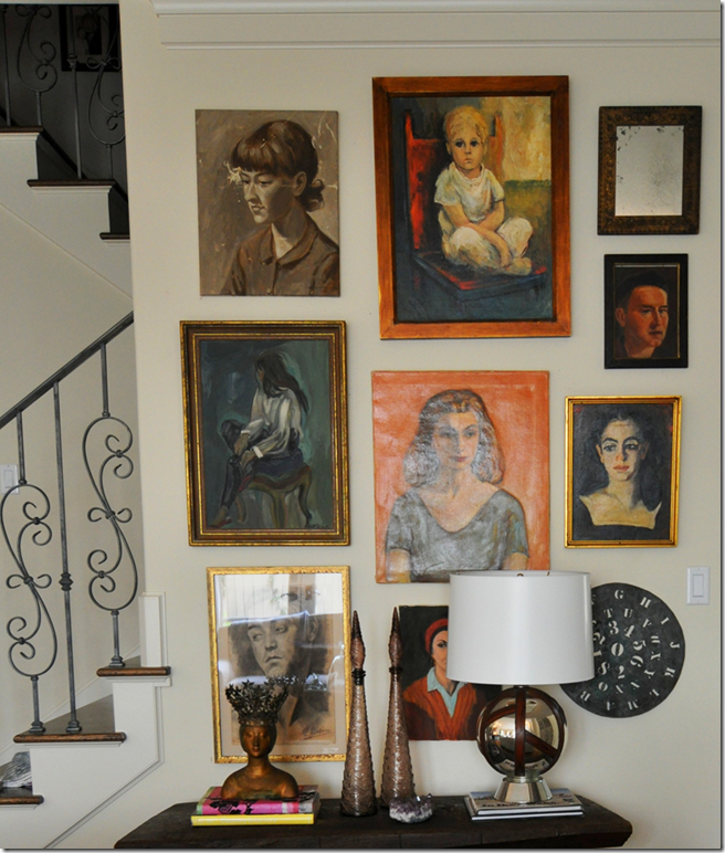
Along the stair wall, Sally collected portraits.
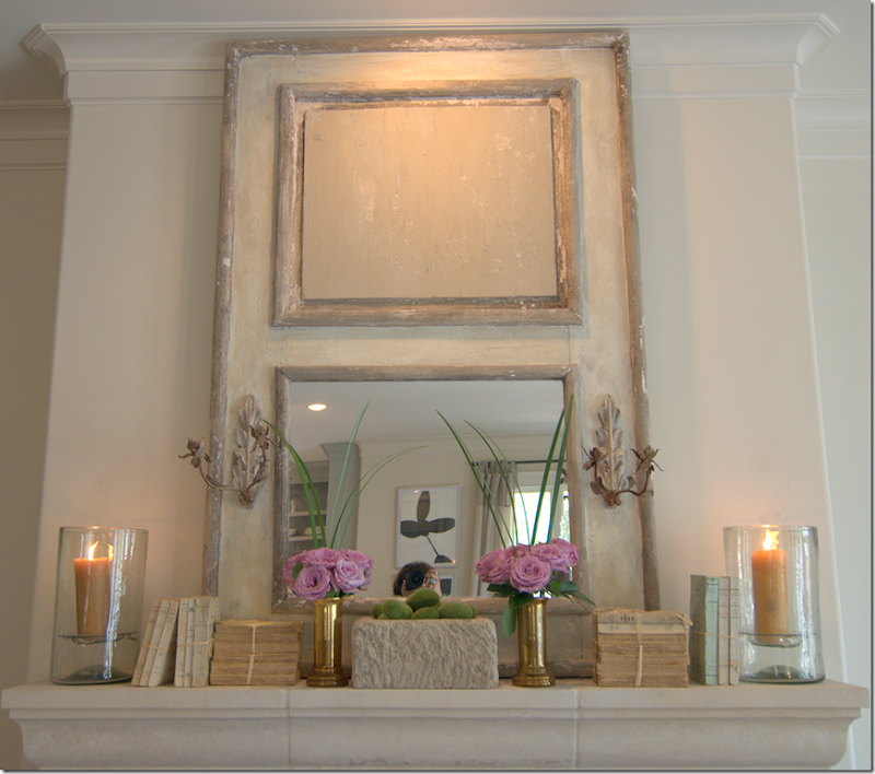
My favorite photo – I love the mirror, the pink roses, the green limes, the stone, the books, the candles, me in the mirror. So beautiful! This photograph inspired Artie from Color Outside the Lines to recreate his own mirror HERE.
For the West U home tour last year, Sally had the slipcovered sofas covered in a grayish blue velvet. The two white slipped chairs that were once in the living room were used here. A smaller glass topped coffee table is used and the bench is recovered in a bright pink fabric. The curtains are white. The focal point is the Amanda Talley painted that was once in the living room.
Looking towards the front, the portrait wall has been heavily edited. Both photographs by Laurieperez.com
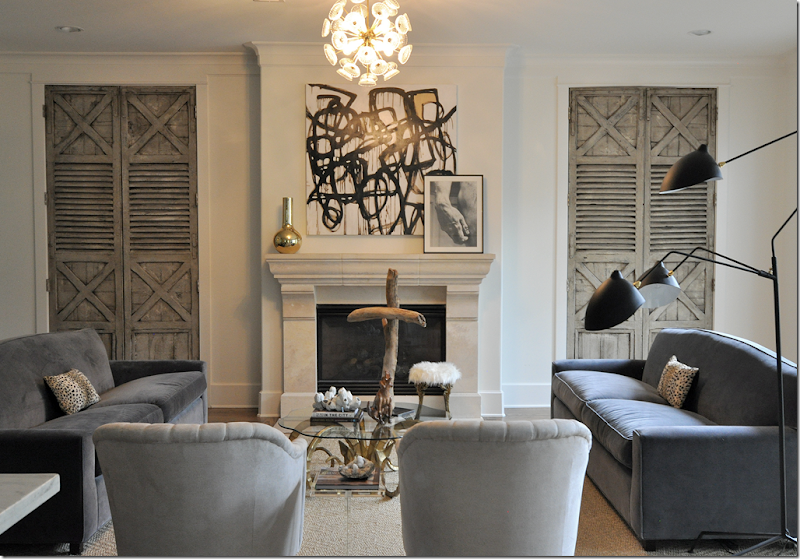
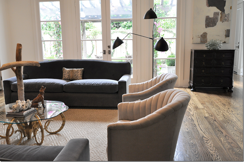
TODAY: the family room has been edited down from last year’s home tour. All the pillows except one are gone. The Amanda Talley remains the focal point along with Serge Mouille lamp moved here from the living room. The slipped chairs have been changed out with these vintage Ward Bennett channel chairs in a faux suede. Notice the chandelier. I love this view from the kitchen – the juxtaposition between the antique shutters and the modern art is really striking.
I think all the new interiors look so much more “grown up” and more elegant than the Belgian look of before.
Instead of the upholstered stool, Sally now has a smaller piece covered in Mongolian fur.
The French lamp is more than a lamp – it’s a piece of sculpture. There’s a different chest, to the right, instead of the rustic piece that was once here.
The edited down wall of art. Hidden behind, is a small computer room for the kids.
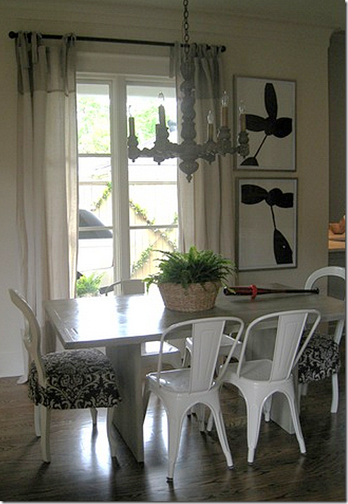
THEN: In breakfast area, the first visit in 2008 showed a mixture of chairs – French and industrial looking Tolix chairs. A wooden chandelier mixed with graphic art work.
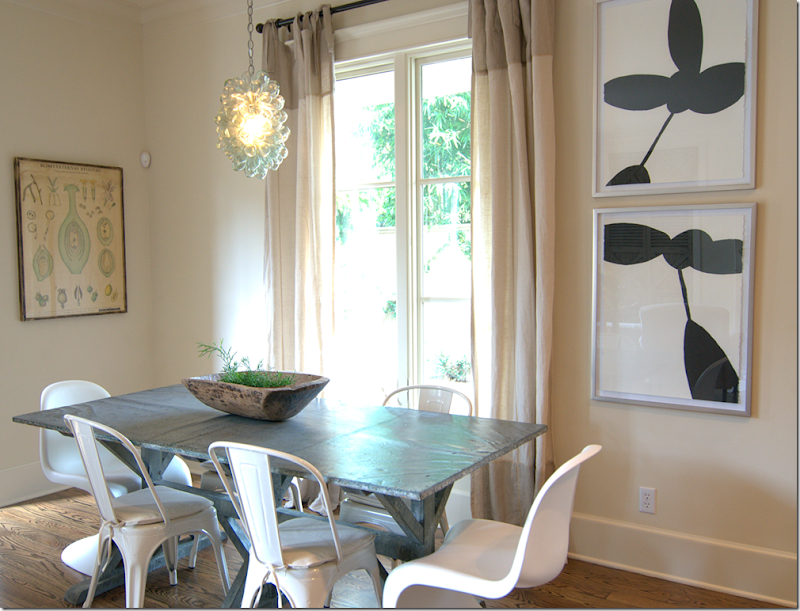
For the 2009 magazine photoshoot, two Panton chairs were added, along with the light fixture. The table is from France.
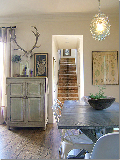
Back in 2009, a rustic painted cabinet stood between the family room and breakfast area.
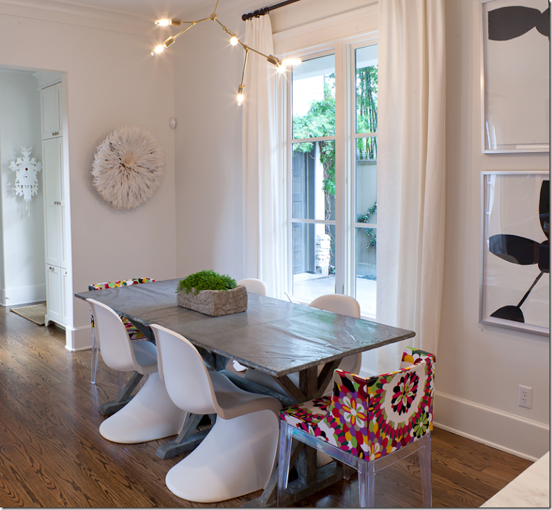
TODAY: four Panton and two classic Starck Mademoiselle chairs surround the table. Photo by Laurieperez.com
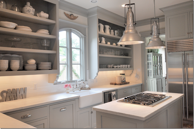
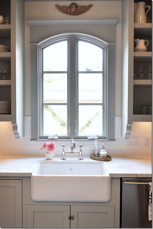
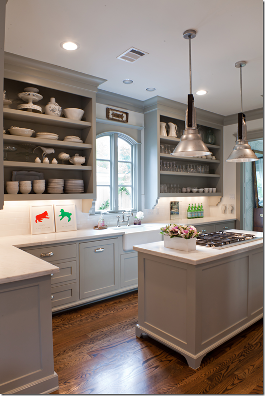
THEN: From the first visit in 2008, Sally’s kitchen still looks the same with the exception of a few accessories. Something about the kitchen really struck a chord with readers and I can’t tell you how many emails and comments I’ve received over the years about it. One question asked over and over again: The paint color is Benjamin Moore’s Fieldstone!
Sally’s farm sink with its bridge faucet and the casement window inspired me to add these elements to my own kitchen.
TODAY: Styled for the 2011 WU home show. Photo by Laurieperez.com
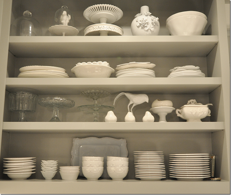
I snapped her shelves because I love the way they are styled with a mixture of white and glass.
THEN: The backyard as it was in 2009.
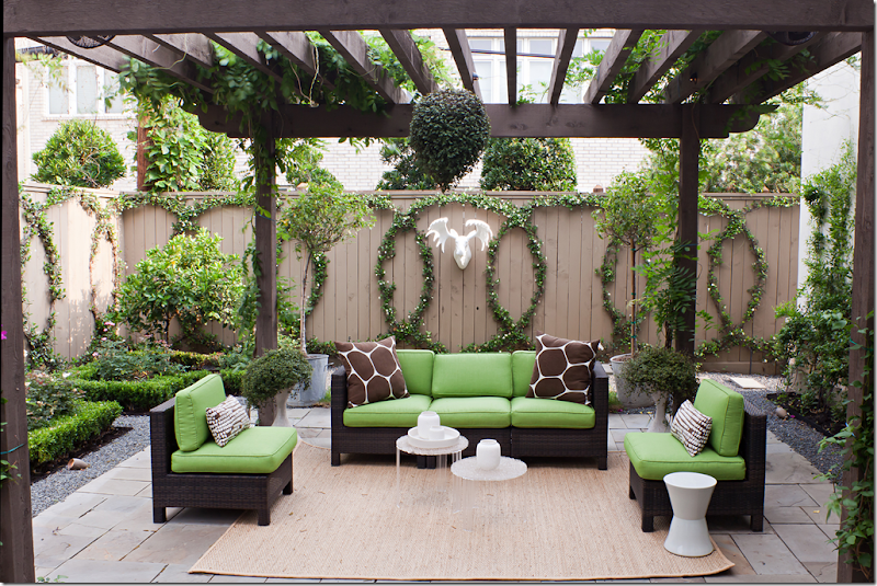
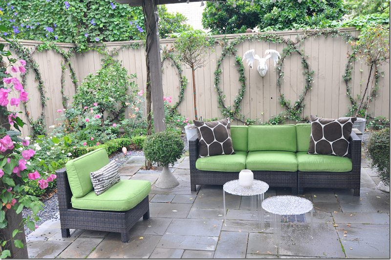
TODAY: Laurieperez.com shot the backyard on a pretty, sunny day. The new pergola adds so much to the courtyard. The vines have really filled out now and the pattern is easily seen. So pretty!
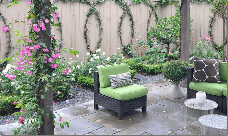
When I visited, it was a rainy day – but the flowers were blooming!!
Laurieperez.com’s photographs are so beautiful compared to mine, that she inspired me to try a new lens. I’ll get it in a few days and I can’t wait to try it. Hopefully my pictures will look better from now on.
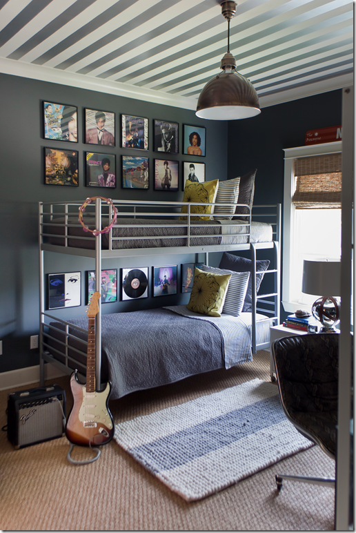
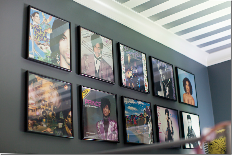
TODAY: Upstairs, the son’s room is so darling. A dark, dark gray, Farrow and Ball Down Pipe in on the walls and the ceiling is painted in stripes. Love the light fixture from Visual Comfort, too. Ikea bunk beds. I think Sally has a real talent for children’s rooms. I’ve seen so many that she has done and they are all great, like this one! Notice the tambourine. Sally’s husband is a huge fan of Prince and he caught this tambourine at the 1984 Purple Rain concert. Notice the wall art?
Framed albums of Prince’s hang next to the top and bottom bunk. Framed albums makes such great wall art. Both photos by Laurieperez.com
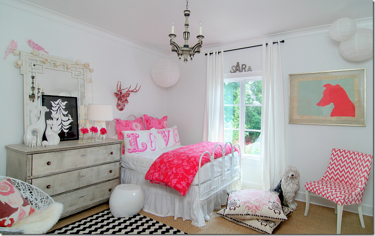
Sally’s daughter’s room is hot pink and white, mixed in with an antique Swedish chest. I love her room!!
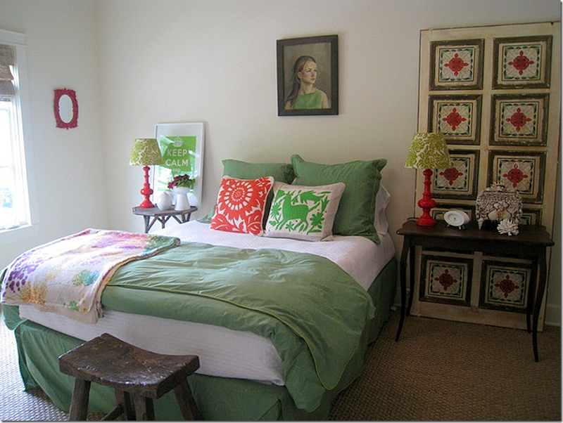
THEN: In 2008, the guest room was warm and casual and a bit boho. This room has really changed!
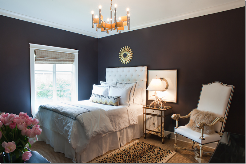
TODAY: For the WU home tour, the guest room is now a sophisticated space with dark walls and a white tufted headboard. Notice that the Tara Shaw chair eventually was moved down to the living room. Which leads me to say – while rooms change at the Wheat house, mostly it’s just furniture moving around. In the pictures you can see chairs, art work, and accessories that have been used in different spaces. Sally tells the magazine that if you keep the background neutral, changing the interiors from room to room is a lot easier. In person, this room is a knockout. Sally also uses it as her office – her desk is against the right wall. I’m crazy about the horn lamp on the mirrored night stand.
THEN: On my first visit in 2008, the master bedroom looked like this.
For the photoshoot in 2009, this was the picture used. Today, this oversized mirror is in Sally’s entryway, next to the staircase.
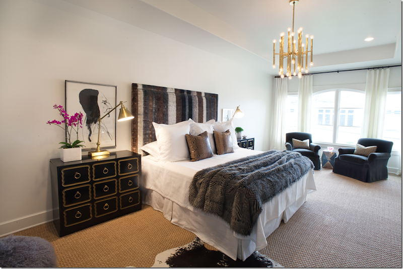
TODAY: the master bedroom headboard is now covered in a Designer Guild fabric. The Dorothy Draper inspired chest moved from the entry to up here when a twin was found for the other side of the bed. Contemporary brass lamps and light fixture mix with python pillows and faux fur throw. Again, this room is now more elegant and dressier than it was before.
Get Modern Luxury Interiors – Texas online HERE to read the article in its entirety. There are all kinds of wonderful stories about Houston and Texas designers in this premier issue.
One last word, while I do like the living room as featured above on the cover of the magazine – I prefer the way it looks today with its lilacs and golds and whites. I think it’s so elegant and feminine. It’s also a lesson in mixing fine antiques with classic modern pieces. Contemporary doesn’t have to be cold and minimalist, this room is layered with many wonderful accessories.
While I liked the Wheat house when it was all Belgian seagrass and slips, I have to say this décor is more exciting and vibrant. And, it’s more elegant, without a doubt. It fits Sally’s personality and represents her true design aesthetic, something that everyone should strive for when decorating their house. Instead of following what your neighbors have, make your house reflect your true love.
To visit Sally Wheat’s web site and peruse her large portfolio, please go HERE.
And, La Dolce Vita has a story on Sally’s latest magazine article HERE.
FINALLY, a note about the Gypsy Market in Houston coming this next weekend:
I posted inaccurate information about the market. While there is an early buying day on Friday afternoon, the true date for the market is this Saturday, the 28th- 9am until 6pm.
Note the difference in entry prices.
Another GYPSY MARKET!
April 27th and 28th
Bigger and better ... more dealers!
more variety of great antiques, jewelry and clothes ...
TWENTY SIX TWENTY
2620 Joanel
713 840 - 9877
Friday, April 27th 4pm - 8pm EARLY SHOPPING
$25 per person ... early buying, wine and little bites.Saturday, April 28th 9am - 6pm...$5 entry
...dogs get in free
BE THERE!
STALKING THE WHEATS–PART III
Subscribe to:
Post Comments
(
Atom
)











Wow, I am almost in a state of shock. This article is a great way to show that there are some pieces of furniture that are both beautiful and functional and then there are others that are sheer art. Sally has found a marriage of both. How interesting that a designer can embrace such totally different looks and achieve both at different design phases of their profession. Such an interesting article. There were times I would have thought that Valerie Hart had a hand in some of these rooms if you had not tipped us off that it was Sally. Such a remarkable transformation and totally fresh and hip. I would wager that you have started another craze among your readers with this post. Very thought provoking to say the least.
ReplyDeleteLove it. Clearly it's been a progression but as it is now, her home is elegant and likely reflects her family than in the past. I don't know, I think a home should reflect the lives of those in it. I can't understand how adopting the Belgian (or any other) look achieves that. So, I think it was a move in the right direction and the end result is absolutely gorgeous!
ReplyDeleteThanks Joni, your posts are so interesting and I love your writing style (I can't get through most articles in Elle Decor or AD but I hang on your every word and often re-read your posts once or twice).
Gorgeous! I love it all. Her house is always one of my favorites that you feature. I think we all love to cyber stalk it. Thanks for sharing with us how it has evolved and transformed. Sally is so talented. Would the British say it's brilliant!?! I think so!
ReplyDeleteOnly those who don't dig Americans. I think they would find it a cheap copy. While not literally cheap, it looks it in some respects. Sometimes a professional needs a professional to give them guidance. If Sally wanted a modern look, she should have sought out the best designer of modern interiors in Houston to achieve that goal. Then instead of golden pigs on end tables, we might actually see some significant sculpture.
DeleteCall me what you will but I do love the golden pig.
Deleteyou are right... her rooms are exciting... soft still but exciting. Sally is da bomb!
ReplyDeleteBig fan of Sally's work, then and now. I wish I would have known she was getting rid of that mirror in her family room though, I would have bought it!! :) Her living room, as you shot it, with the gray, whites, and lilacs, is really making me think that I might be changing things around here! Thanks for giving us an update on the Wheats! Next time you see Sally - try to convince her to get her own blog - she'd be a big hit!
ReplyDeletexoxo,
A
P.S., thanks for the shout out.
Joni,
ReplyDeleteThank you for a wonderful post, the work you put into your posts are amazing.
Although there are some of the after shots that I like I still prefer most of the before shots.
Ms. Wheat is very talented.
I like it! What I appreciate most is that she is following her heart in her decor - the new space has so many unusual and unique elements. I love modern art, so I find this very fresh and exciting. I loved her old house also but I think everyone has more than one style in them! So what is happening to seagrass and slipcovers now? Oh dear...
ReplyDeleteShe is great with colour, isn't she? I love the softness of some of the new rooms. I guess I am in good company since just yesterday I blogged about re-doing my office in gray walls and white curtains...
:)
xo Terri
Wow, another wonderful post. You put so much thought and time into your posts, and this one is great. Sally is such a nice person to work with, and we love her here at MAI (thanks for the mention of our store!).
ReplyDeleteThank you Joni for the time and effort you put into your posts. They are always a feast for the eyes. Love seeing the evolution of the rooms. Truly gorgeous. That outdoor space is no exception. I love the pattern on the wood fencing. Do you happen to know the name of that vine growing on those circles? I can't get over how much I love them!
ReplyDeletelove her Amanda Talley pieces....perfect with Ms. Wheat's decor
ReplyDeleteWhat fun seeing the transformation. It looks more international now than ever before. I wonder what it will look like in four more years! Keep us all posted.
ReplyDeleteKaren
Love the evolution her house has gone through...I absolutely die for the front living room. It's my favorite room and though I've loved every incarnation, this one is the best! Thanks for all the photos! -Lauren Haskett, Material Girls
ReplyDeleteVery interesting transformation. Much to think about.
ReplyDeleteLove the new living room with its sophisticated and subtle palette and textures. Better, I think, than the previous versions which were slightly stark (modern Queen) or flea markety (Houston look). I also like the new dining room, although I'm not feeling the David Hicks chairs. Amazing how the new dining room makes the old one (Houston look) seem staid.
I loved the old family room, especially in Joni's "year later" snapshot. Something about the subtle play of colors. The middle version (colored pillows) seems like it's trying too hard to be hip. The raspberry curtains in the latest version keep the grays from being boring. Nice edit of portraits/clutter.
Fabulous Starck chairs in the breakfast nook. Perhaps this could be the place for Joni's Saarinen table? A lighter table would allow the chairs to shine.
Thanks, Sally, for sharing your evolution. You've given us a lot (color, style, proportion) to consider and learn from.
Sally. Sally, Sally, Sallly. Sally. Sally. Oy.
ReplyDeleteI loved it then and I love it now. Sally is clearly a very talented woman with fabulous taste. This look is very sophisticated and I adore it! Thanks for sharing Sally and Joni!!!
ReplyDeleteSally's house just gets better and better. Today it is the BEST yet. Thank you for sharing it Sally. I am one of the ones with a fieldstone kitchen! :)
ReplyDeleteThis is the BEST story! I had the exact same reaction when I received the RH catalog and has been turning my showroom around ever since. her new sryle is strong, clean, fun and attractive. The only piece i could do without might be the Queen's portrait!!
ReplyDeleteReally? I actually LOVE that!!! Its funny what some love and others don't.
DeleteThe queen looks utterly ridiculous and diminished handing in this house. The portrait was done for effect, not out of respect or homage.
DeleteNo kidding? That must be a newsflash to Sally! I'm guessing she hung that piece because she's a blue blooded Royalist and wanted to indicate as much through her new decor. Good grief!
DeleteSally Wheat is super talented, and I love every version of her house!
ReplyDelete-linda,ny
It seems that Sally ran out of steam in the bedrooms. That is not so unusual that the focus of design carries more weight in public rooms of a home rather than private rooms. I would have expected a bit more glam in the master bedroom, but there is still an opportunity to do that. There is an over abundance of gray. Love the living room especially the rustic mirror over the sofa which creates a nice juxtaposition of texture for the room. The portrait of the Queen is a bit much. I would opt for a fantastic modern piece. If it wasn't done by Andy Warhol, portraits of famous contemporaries look a bit contrived.
ReplyDeleteWow, anonymous. Would love to see your house.
DeleteI'm sure you would drool
Delete...anything warhol inspired is contrived...including warhol himself...ducking before the lightning hits me...
ReplyDeleteNo lightning strikes here. The idea here is to simply own a Warhol for its commercial value rather than intrinsic value. His fame is derived from his paintings of famous contemporaries. Anything similar by other artists looks like a cheap copy. The portrait of the Queen looks a bit silly here. I adore Winston Churchill but I wouldn't hang him in my dining room and pretend he's my great-grandfather (not that Sally is pretending anything here). It would beg the question why.
DeleteAgain, i love it! so, now - only pop art by warhol is acceptable. interesting.
DeleteSomehow Warhol's paintings don't look as silly as this one does partially because of his artistic style. The queen is to close to reality and not close enough to caricature as were Warhol's. Pop art is an effective decorating tool in many cases. In my opinion, this one falls short.
DeleteA LONG time ago, I wrote a story about annie l's portrait of the queen and discussed a lot of the pop art versions. the queens face has long been painted in all types of genres. read it - if you are interested. remember, i wrote it probably 4 years ago. haha http://cotedetexas.blogspot.com/2008/03/annie-and-queen.html
DeletePerhaps it is my untrained eye, but I am having a hard time getting into this new decor--it seem such a juxtaposition to the home's exterior and to the home's interior architecture. Even that great kitchen seems out of step with the new decor. Keep educating me, Joni.
ReplyDeleteI totally agree.
DeleteWell, in London - there are rows and rows of gorgeous white townhouses, all classic architecture. but behind the facade, the interiors are quite different. so what - she should paint her house electric blue outside to match the interiors? don't forget, she has many wonderful antiques in here starting with the two mirrors in the front rooms. i don't see how these interiors call for a modern house. the whole point is it is eclectic.
DeleteWarhol is just simply amazing and really inspiring.
ReplyDeleteWhat is good about this post is showing how our design aesthetic changes with who we are and our experiences. Glad to see this post. I agree, I love the living room with the Mongolian stools. I'm glad to see that even top designers perhaps sometimes are not satisfied, and keep redoing until they find the right fit. Thanks so much for a great post once again! PS I love the modern mixed with the traditional. Keeps it fresh.
ReplyDeleteSally’s home takes my breath away I love it! I’m not sure what she was afraid of but her home now looks more family friendly and suited for guys too not just females. I would have been surprised had her look not changed since she is a designer and I knew she used her home as her lab. You can tell she still has a touch of the old look with the lines of certain pieces but she’s given her home a breath of fresh air. Bravo Sally your home is stunning!
ReplyDeleteXX
Debra~
I am going to be kind because obvioulsy she likes it and thats all that matters but this style I just "don't get". I think its going to be dated very very soon and she might be missing her old look which is the kind of look that stands the test of time. To each his own, I am not a fan of all that mixed color and pattern and style with seemingly no ryhme or reason. Sorry just my honest take. The kitchen is very sweet though.
ReplyDeleteWow what a change. I have to admit I loved the old look but the new look is admittedly a lot more fun, more spirited and very happy feeling. You know what they say that a home is reflection of where you are in life...so she is I am guessing at a very good point in her life and thats a beautiful thing!
ReplyDeleteLove the outdoor seating, such an inviting space.
What a brilliant post!
ReplyDeleteI am from the UK and whilst I love the Houston/Belgian/Neutral look I have to say that this whole interior is inspired. How wonderful to be able to continually reinvent your home in this way and with such skill and taste. One of the reasons interiors (and people) become dated is because they fail to evolve and develop and stay stuck in one period of time - no danger of that happening here where even subtle changes (such as those in the kitchen) have immediately updated the look.
ReplyDeleteWhat I also love is how pieces reappear in other rooms, looking totally reinvented - a lesson for us all in only buying quality things you really love! I was looking for some ideas to redecorate my tweenage son's bedroom - I've just found a whole scheme that I'm going to shamelessly copy! For me, this is a complete lesson in interior design and I'm going home from work tonight via the DIY store!!
Sue Lenton
Sue, I'm with you all the way! My husband chuckles every time I ask him to help me move furniture, but I swear it freshens every room! I'm not a designer (heck, I'm an accountant!) using my home as a lab, so I don't purchase nearly as much, so mine are usually small changes. Furniture groupings and accessories.
DeleteI'm going to a get a new haircut tomorrow - and a new color. I'm evolving too.
Isn't it fun??
Joni, thanks again for another incredible post. I love to see evolutions!
Libby
go look at sallys portfolio. you will see many of her old pieces at her client's houses! it all gets recycled. nothing goes to waste. sally is very frugal. if she can't place a piece of hers, she sells it at the booth. me? my garage is filled with my waste. sometimes i do get to sell things at sally's booth, if she lets me!! i adore sally, she is the sweetest person.
DeleteUm ... I'm not sure this is the best endorsement. Shouldn't a designer be creating the best room possible for her client (which I'm sure Sally does), rather than offloading her cast-offs? :^)
DeleteThe older I get the more I love the mix of modern and antique like Sally's. It is more visually exciting and edgy to mix the two. Thanks for the wonderful and thorough illustration of this type of design.
ReplyDeletePS Who gives a hoot about anyone else's opinion, anyway, Sally? Live true to yourself!
Love this post! I am also getting tired (snore...) of the slipcovers and the linen and the seagrass and the slipcovers and the linen..... It's beautiful but so formal (un-fun?). I'd rather see a 'miss' in a room occasionally than be put to sleep by it. Go Sally!!
ReplyDeleteSlipcovers, linen and seagrass have becoming boring and over done. I would not characterize it as formal, however. I would call it dressy casual.
DeleteWell....I loved the house in 2008/2009 . I don't get it now. Sorry. I don't think there will be as many copy cats of Sally's design this time. I bet she could have one heck of a garage sale though when she switches out furniture!
ReplyDeleteI agree. The older look was more timeless. The new look is the "en Vogue" now and soon Sally will tire of it and change it yet again! I only liked the new living room "sans le Mongolian bench" Totally and completely in love with that bird sculpture - where can I get one? The old family room was great. Love those shutter cabinet doors. Liked the new guest room and masterbedroom. I am sure we will see yet another new interior for this home - guaranteed this one will look outdated very soon!
DeleteJoni I am swooning over this Living Room and the art collection is amazing!!
ReplyDeleteSally's new design style is definitely what I love!!
xoxo
Karena
Art by Karena
Whew! That was quite a ride! Change is good. franki
ReplyDeleteObviously, Sally is a very talented designer., and as a designer, she needs to mix things up. Experimentation is helpful in figuring out what works for you and, perhaps, what will work for your clients. Personally, I like where she started and, for the most part, like where she is now. The middle parts not so much, perhaps because I am old enough to have lived with all these 1960s elements when they first were popular. I love Milo Baughman chairs. I have two of them from my mother's home, but I prefer them with subtle fabrics. While I still love her kitchen, I agree with one of the comments that it now looks a little out of place with the new look. The one thing I would not have changed, however, is the portrait wall. I also collect portraits -- my son is an artist specializing in portraiture -- and I loved the collection on her wall. It did not need to be pared down, in my humble opinion. I love what she did with the espaliered plants on the walls of her garden and the pergola.
ReplyDeleteThanks again, Joni, for all the wonderful and educational detail you provide in your posts. This one was no exception.
All the best...Victoria
Agree with all of the above. I thought the same thing about the portrait collection.
Deletei agree with one thing, when you grow up with something, you are less likely to want to repeat it. ala i grew up in the 60s and don't want to go back there. i think sally missed that era by 10 years. same with all the younger people who love the 60s - they didn't grow up with it.
DeleteWOW!!! Great post! Although, like many, I loved her original look, I find the newest incarnation of her home absolutely fabulous. Her living room in particular really appeals to me with it's elegant, almost ethereal quality. I love the contemporary art in that space- it is gorgeous. Amazing job Sally...
ReplyDeleteI think both renditions of Sally's house are great. Both give lots of inspirations to all of her design admirers. And, I DO think the interior of a house should absolutely reflect the personalities and desires of the people who live there. That being said, MOST people do not have the means to totally change their decor anytime they choose. I don't think non design professionals would have ready buyers for their older things and the wherewithal to obtain new furnishings at an affordable cost. But, that's just the real world--and we all come here to read about and see the fun stuff.
ReplyDeleteGreat post Joni. Your blog is just getting better and better.
I absolutely love watching Sally's home morph into its various incarnations. It truly is a laboratory that puts us right on Sally's style pulse of the moment.
ReplyDeleteIt's also a testament to her home's fine bones and to her vision that each look "works" in context, regardless of what the readers' personal decor preferences may be.
I don't think this is the last we'll be seeing of Sally's home and I for one, look forward to the journey.
Cheers, Alcira
nerochronicles.com
I do love her new rooms, they are elegant and certainly show more personality than the befores. I am glad to see more of her personality in the rooms. Love them all.. and so stealing/borrowing the circle idea in our side yard! xo marlis
ReplyDeleteI'm stealing the circle idea as well...pinning to Pinterest now....
DeleteGreat Post. I love the couch in the living room. Can you tell me where she purchased this? I am looking for one just like it!
ReplyDeleteI think Hien Lam made it in Houston. I'm pretty sure about that. it was custom though.
DeleteI love it. I don't understand the "Huston look". Can someone educate me as to how the watered down "Belgian" aesthetic came to be adopted so wholeheartedly but the Hustonian middle/upper classes. Joni, could you do a post about this?
ReplyDeleteFrom what I've seen from the listings and houses Joni's featured over the years is that this look is supposed to signify "class" but to my eye it's the equivalent of Ikea - ill-fitted slips, throw down a seagrass rug, some distressed furniture and call it a day. No though, no reflection of the family that lives there, bland, and often not very attractive. Obviously there are exceptions and even I know enough to realize that Belgian design and furniture at it's best is striking in the right context but perhaps a few pieces instead of a whole house full? No wonder RH came out with the catalog it did, there's seems to be a huge market of people who will just plonk down cash for an entire look?
Sally's home as it is looks like it reflects her family and their interests, it has some lovely pieces and it's very sophisticated (much more than the original version). I'm sure it will continue to evolve, just as all of our homes will as we grow, our ideas change, our experiences and acquisitions increase etc.
Love it! So nice to see someone doing what something unexpected. I'm guessing Huston is not the type of place that encourages people to do something other than the done thing, so good for her for following her guts..
I wholeheartedly agree. What IS that "Houston look"? We have friends and family in Houston, who are upper middle class, but I've never seen those boring white-washed rooms in their houses. What else is strike a wrong chord is amass of useless accessories that neither beautiful nor useful (except GORGEOUS mirrors, I'll give them that), but otherwise rooms are full of objects that are pricey and ugly.
DeleteActually, I call it the Houston Look to explain to the readers the look i like. Basically, it's seagrass with slipcovers mixed with Swedish and French antiques. It's a very neutral scheme with gold or gilt accents. I showed a picture on the last blog of an early Houston look - the Babs Watkins house that is featured in the new Veranda book. The look evolved from that kind of house. Shabby Slips was another big influence on this look. Go back and google cote de texas and houston houses and you will see the kind of look that I am talking about. certainly not everybody does this look, at all, but there is a certain group of girls that have embraced it.
DeleteOh Lord, I'm mortified. I meant "Houston" not "Huston". I'm not American, I promise (not that that's an excuse). Blushing...
DeleteFascinating! I applaud Sally's journey to make her home a place where she renews her energy and her inspiration. I thought the son's room was a terrific blend of hip and focus. I also like that she moves things around introducing different guests to her party. I loved the artwork and the energy that art that speaks to one's heart sparks a room. I like her choice of furniture that is sculptural and unique yet can mix and meld.
ReplyDeleteI am very curious what lies ahead for the "Belgium" look as it morphs, and surely it will morph, into the next big wave. I'm always wondering what trends in decorating reveal about the times in which they were created—like a mix of history and anthropology! My take away from Sally Wheat's new vision: optimism, confidence and spunk. I like that!
Joni, you really outdid yourself with this post. Fabulous!!! I loved seeing the transformation of Sally's home and think its current version is wonderfully gorgeous. I too am horribly tired of the "Belgian formula" look. Sally's home seems to have evolved from predictable Belgian elements to a very interesting home that reflects her unique personality and interests, as well as those of her family. A good lesson learned here is that although Sally, as a designer, can make some significant changes with fabrics and furniture, ALL of us can mix up our homes; re-arrange what we have, take a piece out of the hall and use it as a bedside table, re-hang pictures, buy a new can of paint, get new accent pillows..... Sometimes the only time people do this is when they move! But, as shown in this post, a person can have a "new house" by mixing things up. Thank you Joni for all the time you put into guiding us through Sally's adventure. I can't wait to see what's next!
ReplyDeleteI will preface this by saying that I think the purpose of decorating is to bring comfort and happiness to a home's owners, and if Ms. Wheat and her family love it, that is ALL that matters. However, it's been put out on a public forum for comment, so I will give my opinion. Although I, too, am a fan of "color" and have not embraced the seagrass/slipcover look, I thought her prior interiors were absolutely gorgeous and consistent with the exterior style of her home. Her new interiors look like they perhaps belong in a NY-style loft--or anywhere but an old-world charming "villa" style home such as hers. I also wonder if she will regret making the change, but looking at the transformation, unlike the rest of us "regular" folk, she obviously has vast amounts of money and time to invest in reinventing her interiors again and again and again, so if she wants to go back to her "old" style, or even another new direction, I'm sure it won't be a problem.
ReplyDeleteAnd on point with this reader's comment, I too made the observation that Ms. Wheat has spent an awful lot of energy and money in a very short time reinventing her interiors. It is ironic that she has embraced the vintage/re-purpose/reuse design style, with such an obscenely wasteful disregard for the principle behind it.
DeleteNot that Sally needs any defense, but i'm sure she sells the pieces she outgrew in her antique shop (and not at a garage sale prices, mind you), and also being a designer, has her trade discounts, which helps her to fund her redecoration. After all, we all chose where exactly to put our pennies, don't we?
DeleteI addressed this earlier. But, let me say this. Sally is a very frugal person who does not have a carte blanche to buy whatever, whenever. She is in the business. If you look at her portfolio, you will see that a lot of what she once owned is now in client's homes. And a lot of what she once owned was sold in her booth. There is no wasteful spending going on. Her husband built the new pergola himself and he also made the light fixture in the breakfast room, among other things. The portrait wall is now in her master bedroom. Everthing in her living room from the home show is now either in the dining room or the family room. Everything gets recylced. The chair in the living room came from the guest room. At one time it was in the living room before, too. I dont like people judging people about how much money they do or don't have. There is always someone richer and someone poorer. always. Instead of looking at this as a waste of energy or money, look at it as a way to reuse furniture in other rooms, recycle. Truthfully I wish I was a frugal as Sally and as good at selling things as she is. Remember, she is not only a designer, but she also sells furniture and accessories, some that was in her house and some that she bought for resale.
DeleteHonestly, I think the new look is a hideous hot mess of insecurity. Sorry to be so blunt. Just as the blue chairs were so wrong in her first machination, the whole look still seems so contrived like she is trying too hard to be in fashion.
ReplyDeleteWow, a hideous hot mess of insecurity? lol! The old look fit that description well. In middle looked like trial and error, but not the final and current look. The old looked like any other Belgian bland keeping up with the Jones's decor. Nothing in the old look reflects growth or the beauty of living and enjoying the art of life. Life is not all beige, gray, or white. Color lifts the spirits and makes the beige, grey, white safety (insecurity) zone become alive. Beige, grey, white, and distressed interiors are beautiful! But somehow color (even little subtle hues) is a fabulous addition to lift the spirit of a home.
DeleteInteresting post, Joni. I admire Sally's creativity and energy. She's changed her house more times in four years than I have in twenty! (It helps to have the means and the opportunity to use her house as a lab for her business.) She's certainly not going to be pigeon-holed into one type of look. While I'm more comfortable with her Belgian look with its mix of older, more rustic pieces, I like her final version, which looks softer and more romantic, better than the in-between one. I like to see a change from the total monochromatic Belgian look, but I'm still traditional, and don't personally care for the stark modern pieces or a total mix as in the current dining room. Funny, though, my first sofa out of college was a Milo Baughman by Thayer Coggin, when I was in my contemporary period, before I became enamored of the English country look. Oh, how tastes and styles evolve and, when you're old enough to realize it, revolve! I think that screen in the earlier pictures was fabulous - I guess it went on to another life?
ReplyDeleteYes, the screen was sold to someone whom I wrote about!!! HERE is the link to see the screen in its new home in Santa Fe: http://cotedetexas.blogspot.com/2011/08/readers-kitchen-series-3.html
DeleteYour blog makes my days start off sweet! I like the changes she made in her home. Very grown up and indeed a great mixture of modern with antigues. I love that she kept the white walls and wood floors with the changes. A fabulous combination throughout the entire house!
ReplyDeleteUh, that is "antiques" a horrible error lol!
DeleteThough I am not a modernist, I really to prefer the new look. It has so much more personality.
ReplyDeleteLove it! I found the Belgian incarnation of her home gorgeous, but the new version is an inspiration. Not such a fan of the "in-between" versions. Those brass bedside table lamps in the master bedroom are perfect. Noticing a theme here: the rooms I most appreciate in both the Belgian and current versions are Grey + Gold + cream+ hint of black/dark for contrast. The newer versions add black & white graphic art or a contemporary muted painting and a brass light fixture or fixtures.
ReplyDeleteJoni, I love seeing the transformation and I think the home is much more interesting in its design. I also love the idea that this seems to reflect the owners true design aesthetic. This post showed, so well I might add, the direction she was going and finally ended up arriving too. There are so many things I love about this design, but overall it is just Good design!! Whether or not it is my taste it inspires me to think out of the box and that is great design in my opinion. Congratulations to Sally for a beautifully executed home that is now uniquely HER!! Kathysue
ReplyDeleteSally can do no wrong. I don't like the David Hicks chairs anywhere, but other than that... magic.
ReplyDelete"Sally can do no wrong" - what a dumb statement. Obviously, you don't know much about magic either.
DeleteSally is amazingly talented but just how much money does she have for decorating?....apparently it's unlimited! I don't mean that in a bad way either, I'm jealous. What does she do with the stuff that didn't work by the way? Can I get on some list for her next garage sale? I had her kitchen bookmarked for my future kitchen remodel but at this rate I should just wait and see what she does with her kitchen....it's sure to change! You Go Sally!
ReplyDeleteThe kitchen has to change unfortunately. It is totally out of context with the rest of the house.
DeleteAnon - I answered this question twice before - go read what I wrote. It helps explain how all the changes are made!!!
DeleteI don't agree about the kitchen At ALL!!! I think it looks perfect the way it is. I don't see why she has to have a modern kitchen when her house isn't modern, jsut a few pieces of furniture are = the Serge lamp, the QE picture, accessories, Milo chairs. But I could name just as many antiques - the mirrors, the chest in the dining room, the chest in the family room, the mirror in the entry hall, the beni rug - etc. The sofas are classic, not mod. It's a mix.
DeleteJoni - so happy to see your post after I saw the Wheat house changes on La Dolce Vita. I love seeing Sally's transformations - so fun and inspiring!! Thanks Sally and Joni!! (I agree on the Saarinen table too).
ReplyDeleteJoni - so happy to see your post after I saw the Wheat house changes on La Dolce Vita. I love seeing Sally's transformations - so fun and inspiring!! Thanks Sally and Joni!! (I agree on the Saarinen table too).
ReplyDeleteJoni,
ReplyDeleteThank you for such a detailed account of Sally's house progression! Thank you to Sally for opening her beautiful home to all of us to see!
I wish I possessed the talent that Sally has - sadly, I do not. I do struggle because I like so many different styles and never know what I truly want in my home!
I admire Sally and her ability to constantly change her home to reflect her changing/different tastes. I certainly wish I had the ability and resources (not financial, but access to merchandise) to follow in her footsteps!
Best wishes to Sally and to Joni! You both inspire me!
AB
Joni, I love you and read your blog faithfully, even though the "Houston aesthetic" is really not my thing. I don't know where to start with how amazing this blog entry was, so I will just rave in no particular order. Ms. Wheat's latest choices produce the look I strive for in my own home and everything totally resonated with me, and your photos were the most comprehensive and thoughtful representation, so very valuable to me. Even more, the detailed documentation of each room's evolution, so painstakingly curated by you, was so interesting and informative! And, even more importantly, made me feel not so indecisive and profligate when I am feeling I want to change things up yet again. Joni, you are the best!
ReplyDeleteSue in RI
Please keep stalking...you know it will all change again! Love it.
ReplyDeleteIt's really refreshing to see a designer's process in her quest to embrace a new vision. I love the color, the artwork, and the textures. One thing holding this look back are the floors. Staining them a very dark color (so the grain isn't evident) will sharpen this look enormously. I wouldn't be surprised if that's on her "to-do" list.
ReplyDeleteWonderful changes! I liked the old look but I LOVE this new, fresh, "mixed" look so much better. You hit the nail on the head when you said the house now looks more grown up! It seems our tastes change over time, at least mine have. I do what I love, I have a "collected over time" look in my home that really speaks to me. Thank you, Joni for the time you put into each post. XO, Pinky
ReplyDeleteIt really dose seem more English, a LITTLE more perfect than "true" English in my opinion, but the personality and funkyness is there. I LOVE the Belgian look (or the Houston look?) but it always seems so perfect in magazines and blogs (when done in the USA) in Belgian it would not be that perfect. Perfect always looks so decorated to me, and I prefer a slightly less decorated. As pretty (PRETTY) as I find all the Belgian stuff out there, and all the grey . . . it is time for some fresh new ideas . . .this post brought that idea soaringly home to me. So refreshing.
ReplyDeleteLouise
Isn't wonderful that we all do not have the "same taste" + this designer has done what she loves to do-design. More power to her! Wonderful post,Joni xxpeggybraswelldesign.com
ReplyDeleteHi Joni,
ReplyDeleteI enjoyed the comments more than the transformations. Therefore, I will throw in my two cents...which I have only done one other time, but that is what the comment section is for, right? ... a large part of your blogs popularity is controversy. This should be a huge hitter. Here is a trendy saying "put on your big girl panties".
The original version of Sally's home, trendy blogland, but beautiful, tasteful and sophisticated.
2nd transformation... This design is as fresh as the words "groovy baby" ... I could hear Austin Powers’s music in every room... expensive whimsical trends? I guess if you could afford to keep enough gas in your tank you could do a garage sale version on a normal budget.
The last version was an improvement. Keep the landscape dear Sally... tone down the trends or start a line and mass produce at Wal-Mart. I just don't want to be that trendy nor can most of American in this current economy. It may be their cup of tea over the pond but even so I'll quote the Brit Austin Powers "That's not my bag baby"! My opinion ... worth two cents.
Joni, fun post! Sorry Sally, move on... some of us have been there and done that...It's funny to look back but I for one don't want to live there. I think the privileged clients have sometimes lost their minds chasing trends and fads...shallow puddles...if they would like to dive deep, feed a hungry child instead, you will find yourself and that's a shortcut to great style... the beauty of that should over flow into your home.
Joni... I truly enjoy your blog and have learned so much, GREAT BIG THANKS!
Lee
The groovy baby Austin Powers cracked me up. But come on, would you say that with a straight face about the living room or the family toom as they are today? No. Because they are so pretty and classic.
DeleteBig girl panties, indeed. too funny
!!!
Thanks Joni for sharing this. It's very interesting to see the "before" and "after". Who doesn't love a good before and after? I can't say I really care for either one, however. But's that's me, not Ms. Wheat. I'm not a designer, I just enjoy looking at pretty homes. And while I may never ask a designer to make my house look like Ms. Wheat's doesn't mean I don't appreciate what she's doing. If what she has done is create a look that she and her family enjoy, isn't that all that really matters? Have a lovely day.
ReplyDeleteInteresting transformation. I can't say that I would have the confidence to make some of her changes. I love, love, love the living room, especially the McLean art. Is anyone else seeing the increased use of lavender/lilac in interiors? I think its fab. The guest room transformation is amazing.
ReplyDeleteThanks for another great post!
I totally agree with Sally's take on the RH catalogue. I usually love their stuff and look through it for inspiration but this latest one convinced me OUT of going with a more Belgian look in my own home. Although I do like the look, the catalogue is just overkill! I got the feeling that I could go to Winners and get much the same look for much less money-so rather than being a trendsetting style, it felt like they were just following the trend. So dull and flat. Love the current living room and guest bedroom as well as the courtyard and of course, the kitchen!
ReplyDeleteJoni, Thank you for such an interesting post! I guess the Restoration Hardware catalogs inspire people in different ways! I was at an antique fair this weekend and only saw one piece of "deconstructed" furniture -- no one was even looking at it! Sally has the best of both worlds -- she can have pieces in her home for a while and when she wants a change, she can swap out from new items from her shop. BTW, I love the courtyard!
ReplyDeleteI'm not always a fan of modern but I have to say I love her house exactly as it is now. It's beautiful and sophisticated and I would have her help me decorate any day!
ReplyDelete...it really really really is true...if one just lives long enought one will have seen it all...nothing is new under the sun...i feel as if i have gone back throught the looking glass...and it is the day after i graduated from college...in 1970...i loved this look then... we all tried to have it...not so sure about today...but it is a joyful look...and we can always use that...blessings...laney
ReplyDelete...it really really really is true...if one just lives long enought one will have seen it all...nothing is new under the sun...i feel as if i have gone back throught the looking glass...and it is the day after i graduated from college...in 1970...i loved this look then... we all tried to have it...not so sure about today...but it is a joyful look...and we can always use that...blessings...laney
ReplyDeletehi joni ~ i'm so glad you posted this! i have to admit, as much as i adore { and i truly adore} very neutral interiors with seagrass and slips, they sometimes feel like they are missing something. a little too predictable maybe. i'm not a designer so i don't quite know how to explain it properly. i like to see a little color and pattern and personality mixed in even if sally's current home is too modern for me. home is a true reflection of the owner and i applaud her for taking risks and being herself in her design. i also like seeing that designers too can swing between different such styles. very interesting. i'm curious what the next evolution will bring....
ReplyDeletetessa
The most startling observation in this post was Joni's comment that the Wheat's house "looks grown up".
ReplyDeleteHaving seen Joni's home and a multitude of others done in the "Houston/Belgian" style it begs the question whether the author believes those homes look like contrived playhouses without provenance.
Oh boy. NO! The answer is NO! There is no way I would say that about some of the houses done in sea/slip with french and swedish antiques. Jeez. some of those houses in houston are the most gorgeous i have even seen. ever. the antiques alone are stunning. i was mainly comparing sally's old look with her new look. maybe it seems that way because sally's heart was never into the belgian look, really. it was a short phase in her life that she got over quickly.
DeleteSo we are to assume that in your opinion Sally's home did not live up to the level of some of the houses in Houston done in the "Houston" style? Sally's was not grown up. Others were. What about yours?
DeleteNo...She was saying (I think) that while the original style was beautiful, (and Joni is coming from a place of KNOWING Sally personally)...that Sally's personality is coming through in this decor, more so than it did in the very well done previous version. Talented designers can design one of many looks, for themselves or for their clients, but it doesn't mean that it reflects their personality. That she is becoming more daring, and baring more of her soul into the 'soul' of the home.
DeleteAnd this new layer is showing Sally's design aesthetic.
Any gardeners out there? What plants has Sally trained? Names, I need names!!
ReplyDeleteThanks,
Libby
The most likely plant used on the circular trellises is Creeping Fig (Ficus pumila). It has a very small heart-shaped leaf and is evergreen. The variety "Minima" has smaller leaves than the species. Because it will attach itself to a wall just as ivy does, it is best to have the trellis an inch or so away from the wall to prevent damage to the wall. It grows at a moderate rate but requires trimming, because over time, it can envelop an entire house!
DeleteAnother possibility would be a small leafed ivy. Two varieties of English Ivy (Hedera Helix) come to mind. The variety "Gnome" or "Spetchley" has leaves that are only 1/4 to 1/2 in size. Leaves turn from dark green to bronze purple in winter. A nice punch of winter color, perhaps? The variety "Minima" also has small leaves - 1/2 to 1 inch across. It is a medium green color and is cold hardy. (This is probably NOT the plant used in Ms. Wheat's yard but could work for those of you who live in the North.)
All vines that grow on a trellis, especially when the trellis is so ornamental, require regular pruning to keep them neat. Possibly every month in the South.
Just noticed that in some of Joni's pictures, the circular trellises have white flowers on them That elminates the creeping fig and ivy. (Good plants to consider anyway if you don't want flowers - bees, etc!) My thought now is that these are probably a variety of Jasmine, a quintessential southern flowering plant.
DeletePossible varieties are: South African Jasmine (J. angulare), Privet-leafed Jasmine (j. leratii), Poet's Jasmine (j. officinale), and Wax Jasmine (j.volubile). All are evergreen and have white flowers with a light to heavy scent depending on the variety. Suggest you contact your local garden center to see what they carry or can order for you.
In Houston and Central Texas, the small white flowering vine is called Confederate Jasmine or Star Jasmine. It is evergreen, with an amazing scent when those flowers bloom. You would definitely have to stay on top of it to keep it as tidy as in this post, but it would make those circles pretty quickly. Fig Ivy would look better, but take longer and you can lose it in hard freezes. Asian Jasmine would be evergreen and cold hardy and grow quickly, with no bloom.
DeleteYUCK!!! I might have gone for this if I was in my early 20's. Not timeless at all!
ReplyDeleteWould love to see your house.....
DeleteAnon. you don't have to see someone else's home to justify whether they have a right to an opinion. It seems this is your second such comment. How about showing us your doublewide.
DeleteHow interesting to see the same space done so differently. Loved to courtyard area! Thanks for sharing all this and all the links.
ReplyDeleteSandy
que cantidad de buenas imagenes de interiores hay hermosas
ReplyDeleteWell finally someone had the nerve to say what we in the business have all been thinking for the past year at least: RH totally ruined a beautiful style that he is incorrectly referring to as the "Belgian Style".
ReplyDeleteI cannot even imagine what the Belgian people have been saying about all this - I am sure they have been cringing watching all this garbage being pumped out of India and China. Axel Vervoordt is elegant Belgian Style NOT Restoration Hardware. Pity, because it was so different and now sadly ruined. So, we move on...gutsy Sally!
Thanks for the post
I can't see how people are criticizing her for adopting "modernism". Actually, her house now seems so much more personal than before, with quite a few antique/rustic pieces, contemporary, and "modern" - I think that's how many people decorate and aspire to decorate. I love the work of someone like David Easton who is able to effortlessly mix pieces and styles. That's the kind of home I would want to live in and that is how they do live in London (as Joni said), Milan, Rome (I learned this from my very chic Roman MIL who effortlessly combines priceless rustic antiques with Wasily Chairs, books, art from all eras, tolomeo lamps etc. Often in the same room and it is stunning).
ReplyDeleteThank you. great comment. lucky to have a mil from Rome!!! Alessandra Branca comes to mind when I think of that look.
DeleteI LOVE checking out Sally's new looks in her home!!! Each one is fresh and gorgeous! My favorite look is the Belgian style with the soft neutrals, but really, it is all just beautiful. She has a true talent in being able to do many different styles in decorating. Any of the mean comments on this post are truly unnecessary.
ReplyDeleteKat
She has just swapped one set of clichés for another. This newest is a weak, dated domino homage.
ReplyDeleteDoes Ms. Wheat have any original ideas? Hicks La Fiorentina? Kelly Wearstler Imperial Trellis? Cliche after cliche after cliche.
Wow, Joni! What a fascinating post! As someone with no vision for anything other than how I first encounter it, I am amazed at Sally and her ability to reinvent each room in so many different ways time and again. I especially enjoyed seeing her children's rooms.
ReplyDeleteThank you so much for the time and effort you put into posts like this. Hope you're doing well!
I have to admit that the transformation left me a little disappointed and shocked. Not exactly the transformation I would expect from S. Wheat. She has taken the fads and tried to make them a heirloom. I think she will look back on some of these designs in the future years and be quite shocked at how whimsical the designs seem to be. I love her original 2008 designs and only slightly appreciate her style today.
ReplyDeleteBonnie
I love all the updates! I am in the process of doing the same thing. I have it done in my minds eye but can't get started. The in-between will be hard to live with - but I am so inspired by her home - I think I am going to do it!!!!!!
ReplyDeletePay more attention to the bedrooms than Sally did.
DeleteI feel like I am watching a pendulum swinging from the "Belgian"/Houston look to (what I like to call) "California Mod." While the in between pictures may have been too trend-saturated with Cal-Modernism, the most current photos showcase such a lovely and surprisingly harmonious blend of the various styles that Sally loves so much. The juxtaposition between the graphic print next to the antique shutters you pointed out Joni is perfection. Also, this is case in point why seagrass rugs are the best rugs ever! It is the one element that remained constant throughout all the changes. I think the seagrass helps soften some of the jarring edginess of some of the more pieces. Thanks to Sally for allowing us in her home once again.
ReplyDeleteSally is one talented person in addition to being very nice. I sure hope she kept that fabulous antelope carpet on the stairway ( seen in one of your images) and upstairs. I really liked that from her earlier design.
ReplyDeleteThe final outcome, while not my cup of tea, is certainly well done! I am sure she and her family enjoy it.
she did. it's stll on the back staircase.
DeleteJoni,
ReplyDeleteGreat post. While I'm more partial to the Houston style, I can certainly understand how one's style can change and the need to mix it up. My style has certainly changed over the years and I'm just coming into the whole Houston/Belgian design style and love it but I also know that I tend to get bored and will probably find myself changing my home style again in the future sometime. Although the current home design is not my style, I can still pick out key concepts that I can appreciate and wouldn't mind incorporating into my own home. That's the beauty of design, it totally is in the eye of the beholder.
I am not a modern person, but I love her home in its present state. I detest cowhide rugs, but that is just me. I am in love with the blue that she used in the dining room. Gorgeous.
ReplyDeleteThank you for sharing, Joni.
Happy Monday.
Teresa
xoxo
Joni,
ReplyDeleteWow! That was fun. While I didn't love some of the incarnations, they were all so beautifully designed and it was so interesting to see the transitions and I liked the "where's Waldo" game of finding various pieces of furniture Sally had moved to use in other rooms. As always, great post. Thank you for all of your hard work and research all for US, your loyal readers.
Karen
Great post Joni! I too love how Sally's style has evolved and yet she still incorporates some of her early pieces. Thanks for highlighting talented designers like Sally Wheat and for providing us readers with fabulous posts! I definitely appreciate the thought and effort you put into each post and look forward to reading all the time!
ReplyDeleteMy hubby's ex-wife hasn't changed her decor in 40 years! All she needs to do now is paint a few of her mid-century modern tables the new Tangerine Tango (cremecicle orange to the rest of us) and she will be right back in style. Changing styles is what keeps money circulating. Designers have to continuously create "new" looks to encourage the impressionable masses to fork over their money. Decorating magazines must have something new on their covers every month. Paint companies come out with new colors every year not because the old ones were bad, but because "new" is the most inticing word in marketing.
ReplyDeleteMs. Wheat makes her money as a designer and "recycler" of perfectly good cast-off icons of last season's trends. Smart woman. She knows how to work the system.
I really don't think a person of Sally's caliber is out to "work the system." I truly believe she is sharing her passion. Stores such as Target, Restoration Hardware, and Pottery Barn (to name a few) are the ones making the money -- making money off of something that Sally and other very creative people (Joni included) created and that caught on. To me, passion and design go hand in hand. I think you may be coming from a more practical perspective. From what you wrote, I wonder why you even are reading a design blog.
DeleteThank you so much for this posting. I was a brand new Houstonian last year and attended the West U Home Tour (thanks to you posting it in your blog!) and loved it. The part that was unexpected was Sally's home (I too, had stalked her after your postings.) and now I understand the modern touches. Can I say that I love both styles? What I really love the most is the idea that we don't have to stay stagnate and that we can reinvent a piece by moving it to another room or adding a frame. I love the "Houston look" but what I love the most is individuality--something Sally has in spades. Thank you so much for sharing!
ReplyDeleteSally, thank you for sharing your home with all of us. I love the transformation. Simply beautiful!!!!!! I love your sense of style!!!
ReplyDeleteJoni, thank you for bringing us into Sally's home. It was well worth the tour. LOVE IT!!!!
All the best~
Hugs
LOVE it, love it, love it! This house is beautiful and proof that not everything in modern design has to be beige, neutral, and/or faux "crusty" patina or limed wood. Finally, a house with some LIFE. Color, shape, style, modernity -- and most of all, HUMOR! This is such a great mixture of styles - old and new, high and low, antique and pop art. You can really see how the basic elements of her former design (eg, the dark wood plank table in the dining room, the deep blue velvet chairs) took on new life in this design. Just shows that trends come and go. There is truly no such thing as "TIMELESS." Get the best pieces you can afford, and periodically take stock and breathe new life into it. Most of all, have FUN! It's your home -- not a pottery barn catalog.
ReplyDeleteInteresting. I totally get the Living, Etc. reference - that put it into context for me. I found it perkier but then when I scrolled to the older pictures, my eyes still said, "ahhh...". I think I'd still like to come home to the old looks, but I'm glad she's experimenting. I just don't like all the Restoration Hardware bashing - just as I don't like any designer bashing. Thanks for all the details, Joni - as usual, an excellent job.
ReplyDeleteJoni,
ReplyDeleteI love & look forward to all of your posts! I too am very drawn to what you refer to as the "Houston" style...it is my favorite look. Your blog has inspired me to start my own blog & I would be honored if you would stop by & visit. It's brand new so I still need to tweak it & figure out how to navigate my way around blog land ...but nevertheless.....
www.nuburylane.com
Thanks so much for all the inspiration!
At the risk of repeating someone I am not reading all of these comments before I comment! I love it all…well…almost all of it! Of course we will never all agree on everything but we can certainly agree that she has a wonderful eye for design even if it's not our particular taste! I definitely gravitate to the original Houston look…the more traditional…but I absolutely love a piece here and there that is eclectic and "thrown in"! Otherwise, it would be boring! I also admire her for changing her interiors…I so wish I would do that! I'm always so mentally worn out I can't seem to do that at my own house let alone keep up with it at the shop!
ReplyDeleteThanks for this wonderful, inspiring post! I think I'm going to rummage through some attics and Estate Sales!
Carolyn
I LOVE both looks - she's so talented! The biggest thing that stood out to me, my "take-away" if you will, is the fact that she took risks. That pink cowhide screams "risk" to me - and Sally did it. That was bold. And I really respect her for that. Sally - thanks for setting such an awesome example! You're giving me the boost I need to step up and take some risks!
ReplyDeleteAu contraire! Never did I say that Ms. Wheat is not a "good designer". I simply observed that she has found a way to make a living following her passion. Brava!
ReplyDeleteNot merely a voyeur, I read design blogs to educate my eye and to learn about new sources for furniture, accessories and the like. Too practical, perhaps, for your sensibilities?
Hi Joni... not sure if you are ever able to read all of your comments... but I HAVE to say that this blog is immensely comprehensive, compelling and beautifully written. You have an amazing ability of drawing the reader in and sharing as if one were an old friend. I am so impressed with your blog and it's size and quality. Well done to you ! Jenny (Australia)
ReplyDeleteThank you Jenny, so much!! I truly appreciate it!
DeleteThanks for the thorough article, Joni. Sally is such a talented, creative force and is so fortunate to be able to live in her design laboratory. No doubt she wanted to run from the Belgian look when Restoration Hardware usurped it from you Houstonians and turned it into such a trend. Her new pieces are fabulous and have helped to create a fun, happy and welcoming home where nothing seems too precious. I'd love to be a guest.
ReplyDeleteWell done, Sally! The best of the bests, in my opinion, are those who---while keeping to their natural design aesthetic, do grow/evolve/ and change. Keeping everything beige and slip-covered year after year, especially for a designer, isn't just boring. It lacks bravery. Because as a designer, isn't that the struggle? The never-being-done. The never-wanting-to-be-done. The fear that you can't afford to change.
ReplyDeleteI think you are so lucky. To be born with good taste, bravery and foresight, and industrious enough to be able to move forward in your design. Brava!
If this isn't a study in good design, then I don't know what is! Her style is spot on! I am crazy about her new look and I find myself migrating to this look now, too. She is definitely a decorating inspiration. Thanks so much for this post. Everyone interested in interior design needs to read this. And, yes, one should follow their own true design aesthetic.
ReplyDeleteWow, thank you all so much for your sweet comments. I knew when Joni asked me to do this that it wouldn't necessarily be well received by everyone. And that's ok, everyone has their own unique style and tastes. That's what makes the world go round! I do want to say though that I still absolutely love the "Houston Look", I think it's absolutely beautiful!! Some of the designers here in Houston have it down to a fine art! It's just that for me, I chose something different for my home. Anyone who knows me knows I like to change it up all the time. I am so lucky that I have friends and clients who want to buy my stuff! And yes, there will most likely be more changes. As for the QUEEN, she was never meant to be anything but FUN. I saw her one day in a great shop here in town and snatched her up without a second thought. She just makes me laugh, my kids' friends call her Avatar. (I already have a friend who has first dibs on her when I'm ready for something else!) I just wanted each room to have fun and playful elements, nothing fancy or serious. It suits us. Thanks again Joni!
ReplyDeleteNice comment. Change is good for all of us to get out of our predictable look as designers. Can't wait to see how you translate this for your clients. As to the Queen - well, Simon Cowell would really make me laugh. If your children enjoy her, that's all that matters.
DeleteBeautiful, interesting,and so much fun to see. One of the best posts I've seen. I'm envious that you are able to change things up. I would certainly do that if I could. Thank you, thank you for allowing us to see the process, all the different looks. I feel privileged. I love the fact that you have a bit of fun in your decorating. I have to have that myself...keeps life interesting. Houses are personal and don't have to adhere to anyone else's ideas. To me, decorating is not a contest, a destination, it's a journey.....if you're lucky. What I can't do, I can enjoy by seeing what other talented people are doing. Vicarious living is a wonderful thing!
DeleteA lot of the nay-sayers will be 'getting' your current look in about five or ten years, when you've refined and changed it even further. You'll always be ahead of the curve!
DeleteI Think "British London Flat" has always been very chic. Anytime you change your "look" it takes sometime to mesh what you see in a magazine and how you want to interpret it. Good for swheat for stepping out and becoming more of who she "is". Laurie'
ReplyDeletejoni and sally thank you for sharing with us.
ReplyDeletei am stunned at the beauty of which i could go on and on but i cannot move my gapped jaw off the computer keyboard......WOW!
xo
debra
Great post- about the evolution of one's style, and how staying true to what you love brings it all together. I do find it especially interesting that her children's rooms seem to be where she first showed her heart. For me, the evolution of the formals seems to eventually migrate to where her children's rooms were all along- kind of like the Clash coming over for formal tea. LOVE!
ReplyDeleteSally, if your daughter ever wants to do her room over, my kid would swoon over that vintage iron bed. xxoo-
I love that Sally is fearless in decorating her home and embracing what feels true to her sense of style right now. The new look is full of personality and life! I love it!
ReplyDeleteWell, everything is a fad, right? Personally I'm not a blue person so the blue and fuchsia just don't appeal to me and I can't think why anyone would want to look at a a portrait of Queen Elizabeth, but thank goodness someone has had the courage to come right out and say they are tired of the gray, beige, greige, white thing.
ReplyDeleteI quickly browsed the comments, so this may have been mentioned already...I have to be honest, this is not design. I find this new scheme to lack serious imagination. She has installed every trend from the past couple of years into her home and it looks very contrived. Let's go through the checklist, shall we?
ReplyDeleteDraper Chest - check
Lucite table - check
La Fiorentina - check
Serge Mouilee Light - check
Mongolian Fur - check
Saaranin Table - check
Hide - check
Panton & Tolix chairs - check, check!
Starck chair - check
Beni Ourain Rug - check!
I'm sure she is happy with this design, and honestly, that is all that matters...that she is comfortable in her "new" home. But, please do not call this design. This is not design. If I gave my 10 year old a stack of Lonny and Domino magazines, she would have come up with something like this. I think back to something I read from Thomas O'Brien (on his blog I think) about good design being about the big picture and a "point of view". I believe that to be true...just assembling a bunch of overused trends into a home, does not make for good design. What worries me the most are that there are people out there that look up to so called "designers" like this and consider them style makers. What Sally is doing is really no different than what she abhors about Restoration Hardware...latching onto trends and throwing them together. Sorry to be negative, but if you are looking for design - go see Mr. O'Brien, Jeffrey Bilhuber, Bunny Williams, Steven Gambrel, etc...these are "designers".
I have to say this is the most snobby comments! so, only the million dollar designers are allowed to be called "designers" now? I promise you, if you gave me or sally 5 million dollars to decorate a house where we could hire someone to redo every surface, you would call us designers. it's not rocket science. in fact, i would say that none of those you named are true originals on a par with someone like saladino.
Deleteto say that if someone uses trends, they aren't a designer is hogwash. i happen to like trendy things. i think it's a great way to update a look without spending a fortune, something that many can't afford to do. instead of concentrating on the trendy in sally's house, think of all in her house that isn't trendy or well known - the paintings, the upholstery, the side tables, the side chairs, the lamps, the light fixtures, the accessories, the fabrics, her shutters, her mirrors, the antique chests, the dining room table, the kitchen table - i could go on and on. there is so much that is original mixed in with a some well known items.
so bilhuber uses checks all the time, is that not trendy? and he uses hand painted wallpaper - how trendy. i could do a check list of the things in Bunny's designs that she uses over and over again to create her 'undecorated' look. it's all a formula. designers have their go-to pieces that they use all the time. it's just their go-to pieces are usually too pricey for most of us. tortoise shell boxes, check. antique host chairs - check. wall tapestry - check. rare textile on the bed - check. lacquered dining room or library - check. scalamandre trim - check. custom stark rugs - check, Brunschwig leopard - check, Loro piana throw - check, Venetian plaster living room walls - check, Pratesi bedding - check, George Smith sofa - check, Fortuny fabric - check, Spitzmiller lamps - check.
There is nothing new under the sun. To say that someone isn't a designer because they use trendy things is ridiculous.
By the way, I know that your comment on another blog was deleted. Be glad you got your ten cents worth here because I really should have erased this too. Some things are really just rude.
DeleteWell said.
DeleteSo Jersey girl gets deleted by another blogger - probably someone who wants only mind-numbed sugar dispensers to show up and spoon feed their egos. Pathetic!
DeleteBad manners are inexcusable. Please do not spoil this for the rest of us who enjoy seeing all these posts. No one asks readers to like everything they see. This is not an invitation to put down the generous people who let us take a peek into their private homes and into their creative minds. That's how we all learn.
DeleteI am dismayed by the posts that are unkind.
Jersey girl didn't show bad manner. The problems is the author didn't agree with her. If you are going to write opinion pieces essentially which is what this design blog is then be prepared for your readers to take issue with your opinions. Otherwise, stop writing. Your principle seems to be "if you don't agree with the post", you are somehow rude". Grow a pair!
DeleteI can have my own opinion about comments too.
DeleteJersey Girl was really insulting - "But, please do not call this design. This is not design. If I gave my 10 year old a stack of Lonny and Domino magazines, she would have come up with something like this"
not only did she insult Sally, who doesn't deserve it, but she also insulted the magazine (a very beautiful one, btw) because obviously they found her house and her dining room - design worthy, as they put it on their cover. Not design? Then what?
And then to add insult onto insult to say her 10 year old could have done the same thing. I"m sure she thinks her 10 year old could paint just like Picasso too. Heard that before, a million times. Try it.
Let us see how well she does.
To say a 10 year old could put together Sally's living room or dining room like she did, as artfully as Sally did, is just plain rude. Sorry, it is. and no, I'm not going to delete her comment because we can learn from it, in many unintended ways. But it seems like she posted this exactly "check, check, check" on another blog, who deleted it, and then tried it over here too.
And I stand by what I said. Each designer has their own check list of go-tos they use over and over again. Everyone does.
Ugggh. I should not come back here, it just aggravates me all over again. When Charlotte Moss uses 18th century French bergeres in every living room, should we say, check, check, and check? Or when Michael Smith uses suzani's on beds, check, check and check? Or when Miles Redd uses hand painted wallpaper, over and over again - do we say, check, check and check? I doubt it.
It's the VERY items on Jersey girl's check list that read modern. Plus, there is no Saarinen table. That was just MY suggestion!
Show me a dining room where they used the over sized Cole and Son paisley wallpaper with Milo chairs in deep blue velvet with an antique chest and mirror and a French plaster chandelier mixed with an abstract painting, and a pop portrait of Queen Elizabeth and then I might say, ok. she copied this. I'll wait for that picture. Meantime, I'll be check, check, and checking every "so called" design I see in magazines.
The "million dollar designers" often studied design, interned and worked under the direction of successful design firms. Show us your credentials??? Any Henrietta Homemaker can call herself a designer these days by obtaining a tax identification number, a business address and credit. No training required. To compare the likes of S. Wheat with the designers enumerated above is ludicrous.
DeleteThe reference to a 10 year old was done for effect and was not meant to be taken literally. The one blindspot you have Joni is that you under estimate the sophistication of your readers and when they don't agree with you, you become defensive.
DeleteI think that while Jersey Girl has a right to her opinion, and may even have some who agree with her, it is the WAY she stated it.
DeleteNo need to bring up the ten year old comment. It is condescending and insulting.
I live in NJ, though I'm not from here-- and have met so many brilliant, witty and talented people, some born and raised here, and plenty of transplants like myself-- there are people that give NJ the notorious bad rap. Rude people live everywhere, but I cringe when I see NJ attached to the rudest post on this page.
This IS about manners. Joni didn't comment on other posters who wrote that they liked the Belgian look better. She commented on the the condescension. The previous posters did it politely. Sally W. sees was kind enough to let us 'in' so we can have enough class to be polite about our comments, even if they lean to the before look.
It is so easy to throw insults around on the internet. But why? It sounds like some posters get to copy the trend of: leave a snarky comment? Check. Ugh. Snarky is so 2008.
Wow, what a transformation. Although, I love the "Houston look" the new version feels younger and more hip. Another great post Joni!
ReplyDeleteA few months ago on The Skirted Round Table or either in one of your posts, you made the comment that you just "didn't get" the Domino look. So glad to know you "get it now", but have to wonder if being friends with the homeowner makes the difference in your opinion.
ReplyDeleteJersey girl was not rude. She actually seems to have codified what so many others were saying in their comments. Sorry to hear your take on Bunny Williams and others not being true originals like John Saladino. The last post you did featuring Saladino, (his home in California), the interior looked like the morning after a bad opera. You need to grow a thicker skin. Bunny's own personal decor style is truly one of undecorated comfort living with stylish and collected accessories and fine antiques. She does not have "a look" if you really take the time to study her portfolio. One thing she does have is talent having studied under some of the finest interior designers in the country at Parish Hadley.
I cannot understand the need to be rude, to critique someone else's taste, decisions about how to furnish and decorate a house for herself. Is a blog an opportunity to criticize someone else? I don't see it that way at all. I think it is a wonderful opportunity to learn, enjoy seeing the creative process by someone who is willing to share with us. Like it, don't like it, learn what you don't like, or get some hints about how to make your own decorating decisions. If you don't like the posts on Cote de Texas, don't read them. Find another one to see. What pleasure do you take in taking such a critical attitude?
DeleteI am so grateful for those who are willing to share their ideas, much less allow us into their personal spaces. I think that privlege calls for some good manners.
Thank you Sally and thank you Joni from a grateful guest in your homes!
Is my house decorated in the domino look? NO. Obviously it's not my personal style. But I dont' think Sally's living room is domino. I find it elegant and modern, not domino in any respect - Tara Shaw mirror and chair and table?
Deleteand ALL decorators have stinkers in their portfolio. But to say Saladino is not a brilliant decorator because you don't like his last project is fool hardy, imo. The man is a genius and a true original. His designs from 30 and 40 years ago still stand today and look just as fresh as they did back then. again, imo.
And bunny has had a few stinkers too. That showroom she did was not her finest hour. Michael Smith's house featured in Veranda's book - was not his finest either. and trust me I have studied Bunny's portfolio. I love her style - when did I say I didn't? But she has a check list like everyone else. And no, I don't think she is on the same level as Saladino.
To say Jersey Girl was not rude, when she said = this house is something my 10 year old could do, I think that is rude and I challenge her on that. Sorry, it's rude. If the house was so undesign worthy, what is it doing on the cover of a magazine. Sally's work has been in many magazines - are all those editors insane?
If you are referring to her showroom in High Point, she received the Best of the Show award last April 2011 so a lot of people seemed to like the look. If you have misspoken and are speaking of the Kips Bay Showhouse of 2010, you have a right to your opinion, but she did put together a very electic look using pieces from her Beeline Home Line in a large room that was both living and dining room. I remember a lot of conversation on the SRT about this. I agree, it was not typical Bunny, but that is because she was showcasing every piece from her line. Perhaps you didn't like the brilliant blue walls nor the large botanicals, the moss green sofas, etc., I thought it was interesting perhaps despite the use of an off beat wall color. If given the opportunity to have either Sally or Bunny decorate my living room, it would be no contest nor with you.
DeleteYES, i was talking about the kips bay fiasco. and it was a fiasco. just an advertisement for a line of furniture. nothing went together. there were two color schemes going at the same time. i thought it was not her finest hour. she's done much better before and after. like i said, everyone's had a stinker before.
DeleteI don't believe people have been rude about this post relative to others. I think that if a homeowner opts to allow pictures of their decor to be published on a design blog, they should essentially be prepared for not only praise but criticism. I think the designer understands this, not the author. To be critical is not necessarily to be rude. There are a lot of lovely elements in this design. There are also a lot of elements that looked like thatthey were purchased yesterday rather than evolved and collected over time - case in point the Tara Shaw chair in the living room - totally ugly. There are any number of antique chairs that would have worked here. The bedrooms are lackluster to put it mildly - bland, lack elegance which modern design gives such great opportunity for. I really believe that this is S. Wheat's first entre into modern design. Her talent here will evolve, but for her first try, it is not bad at all. I look forward to seeing how she grows as a designer with this first effort in her own home.
ReplyDeleteHow absolutely patronizing! It only matters if she and her family like their home. Besides that, many of us love seeing it and are so glad Joni posted about it.
DeleteThis is not her first foray either. She has a long portfolio of houses in this style. So, now we are insulting Tara Shaw too? Nice!
DeleteI understood there would be criticism. Trust me. I did. I do. I get it. There's a before and an after - a chance to say, I liked it before, but not now. I get that. But to say this is something a child could design, no, that's beyond criticism. That's just mean and silly. Again, Iask you, what elements in her living room came from domino that a child could pick and choose? a hide rug? please. the living room has EVOLVED over time - I don't get where you say that it hasn't. It's not like she went to a furniture store and bought it all at once. the mirror came from her dining room, the sofa has been there for a few years. the chair came from her guest room. the lamp came from a vintage store. the stools were her custom design. the art work came from a gallery. together from a plethora of resources, she pulled it all together and created an ethereal space that is absolutely lovely. nothing was purchased yesterday. or in one day or in one place. it was designed. despite what JG said. this room was a truly designed space. I could see Suzanne Kasler doing something similar to this.
I knew as the day went on the comments would get more nitpicky. I realize this. But i have every right to stick up for a house that i chose to show on my blog. If i didn't like it, or appreciate it, or see a lesson in it, I wouldn't have put it on the blog. Sally didn't even WANT me to do it to tell you the truth. She was hesitant because she was worried people would say they liked it before. And honestly, she is very sought out as a decorator in Houston. she has no lack of clients who want similar looks in their own homes.
So now you are insulting Suzanne Kasler who would never put her name on this place. Yes her rooms have an eclectic quality which is very appealing but never would they turn out with some of the contrived pieces seen in this home. You owe Suzanne an apology and since you are not likely to do it, I will for you. Sorry Suzanne, some times people are just over wrought. Benches that look like she skinned her cats and stole the fur??? Seriously. Not Suzanne at all.
DeleteHave we seen any golden pigs sitting next to Greco/Roman inspired lamps in SK's work? Probably not.
DeleteI have seen no attacks on Tara Shaw, only that silly looking chair in the living room. I suppose if you have a picture of the Queen, you can have a chair for Henry VIII.
Deleteok discuss this. did you see the latest veranda with the house by kasler that is a rip off of m.castaing, down to the blue walls and the carpet and all the antiques. yet not one word was mentioned about this in the article. she did mention that the library was a knockoff of another house she had seen. i was really shocked that she didn't mention the living room was a homage to m.c.
Deleteit just proves my point that i was trying to make that nothing is new, everything is derivative of something else done before, some ages and ages ago from italy and greece. to say only a few select are "true designers" while others aren't is foolhardy. everyone gets inspiration from someone else, including all the higher priced designers. and notice the trendy model of the stair in kasler's design, along with the trendy hermes blanket. and did you notice her old orange leather chair is now in the client's house family room? hmmmm.
Patronizing???? Obviously she and her family like it. I too enjoyed it. It is not great design, however, it is lovely.
ReplyDeletePlease go to Visual Vamp and google her design of a New Orleans home where she mixed French antiques with very modern elements - many of which have been used here. Sally didn't have to sell her lovely French pieces, but could have so cleverly used them within the modern scheme. She did not. Valerie Hart did a magnificent job of marrying these two looks in her clients New Orleans home and it was dynamite. I think Sally missed a great opportunity here to achieve that same marriage. If you are able to find Valerie post, you may not like the color scheme, etc., but pay attention to the overall mix. It was beautifully executed.
You mean Valorie. Her name is Valorie. I agree about the rest
DeleteThanks, not paying attention to the spelling of her name even though I read her blog weekly. She has a unique and clever eye for style, both historically and whimsically. What she accomplishes for clients is entirely different than her own unique style in her home. She is really quite talented drawing from her travels and experiences.
DeleteI love that house that valorie did. i've showed it here.
DeleteOh really, when?
Deletehttp://cotedetexas.blogspot.com/2011/12/cote-de-texas-top-ten-design-elements-9.html
Delete"By the way, I know that your comment on another blog was deleted. Be glad you got your ten cents worth here because I really should have erased this too. Some things are really just rude." - Cote de Texas.
ReplyDeleteYes you could have and you would have been just like the other ass kiss seeking design bloggers who don't have the guts to be challenged. Which would you prefer. If you want a discussion, have one. If you want lap dogs, delete. The choice is yours.
Dear Anonymous, wow, your vitriol is excessive. It seems hiding behind an Anonymous facade is a license to be condescending and just nasty. Just because we are in an online forum does not mean that manners can be discarded. We are all entitled to our opinions and biases (goodness know I have my fair share), but part of being a good and productive member of society is to share those opinions in a respectful and open way. To quote another blog I regularly go to that garners hundreds of different opinions on it everyday;
Delete"Imagine this is a dinner party. Differences of opinion are welcome but keep it respectful or the host will show you the door. We have zero tolerance for any abuse of our writers or other commenters. So if you're rude, your comment will be deleted (so will any replies to the original comment - so save your breath). And if you’re offensive, you’ll be banned. Remember what Fonzie was like? Cool. That's how we're going to be - cool. Have fun and thanks for adding to the conversation..."
Ruthie, you work in one of those sugar factories it seems. What one deems "rude" is subjective. Banning adults for having an opinion that disagrees with the host is pure childishness. This isn't grammar school. I don't believe there was a deliberate attempt to hurt the feelings of others here. As stated many time, if you can't take the heat, get out of the kitchen. Don't let your ego cause you to put your home on a blog and then gripe when some write less than complimentary comments about it. It's really that simple.
DeleteCrikey, I wish blogspot could create a filter removing all "Anonymous" contributors. If you really want a "discussion" (which I don't remember Joni asking for), please have the common courtesy to use your own handle.
ReplyDeleteActually, I DO encourage discussion. I find that many people do appreciate hearing from both sides, plus it's a learning experience. I just wish it could be done with the name calling that sometimes happens. I have to say - and I told Sally this - that I think the majority of comments have been very complimentary. I was honestly surprised that as many people embraced the new look as they did. I thought more of my readers would like the old look better. I have to say, that I like the new living room and dining room more than the old. I"m on the fence about the family room. I loved the old one so much. The new one isn't that much different - and I do love the serge lamp in there. So, I'm on the fence! I also love the talley painting, but i loved the trumeau too.
DeleteI will never erase comments, even though i want to sometimes. i want people to know that they can have a voice here, even if i vehemently disagree. but i suppose there will be those that will agree when i disagree.
but yes, I have always said i wanted an open discussion, as long as the homeowner's feelings weren't hurt. i can take it, it's the homeowners that i feel bad for sometimes.
Kristen, open your eyes. Joni changed her format to facilitate a discussion. Do you see the "reply" indicator?
DeleteSo beautiful post i am so impressed here can you more share here i will be back to you as soon as possible.
ReplyDeleteThanks for sharing...
Woodies Garden Centre
My comment was never intended to be one about money. I truly believe that good design does not have to be pricey. I have read several posts by DIY bloggers where I literally have my jaw on the floor at the creativity and imagination used by some of these people. These people are doing things on a small budget and it is amazing!
ReplyDeleteI cited the work by Bunny et al...because it makes me cringe to read comments by your readers calling someone a "top designer" when they are not. I'm troubled when readers look at this work and start to believe it is "top design". If you want top design, go see the portfolio's of those I mentioned...and there are many more out there.
I have to mention the more troubling comments you made in your response. While I agree interior design is not rocket science, by making that statement you are degrading the work designers do and implying that it is easy. It is not. And the comments about Bunny Williams using a "formula" in her work is just ludicrous. You do not get to her level of success by having a one size fits all check list that you use on each and every job. And most troubling is the comment that there is nothing new in design. I'm stunned by such negativity - These comments really further the misconception about the industry. There is a ton of new design all around us...just because it is not to your taste, does not mean it doesn't exist.
And Suzanne Kasler doing a house like this? Now that's just crazy talk...never ever would she want her name attached to a jumble of overplayed trends. Sorry...
And...by the way, yes I did make this same comment on another blog (La Dolce Vita) and it was deleted. However, what she failed to mention to you is that she created a blog post as a result of my comment about trendy design: ("Which Trends Should Go and Which Trends Should Stay"). Funny how that wasn't mentioned...
What's most troubling is that Joni calls herself a designer. She is the queen of copycat design.
DeleteIf you think she is only a copycat, why would you bother to read her blog? There are many of us who really enjoy Cote de Texas, learn from it, and like Joni for her wonderful down to earth manner. I think she handles criticism with aplomb, which is more than I can say for some of the people who have said mean, insulting things. Good manners are good manners, no matter the setting. Would you go to someone's home, have them show you around, and say the kinds of things some of you have written here?
DeleteJust my opinion.
A bonus.....she always entertains me, makes me laugh. So thanks for that, Joni, as well as sharing so much with us. And thanks to those who are willing to put their houses out there and endure the insults. Disagreement is another thing entirely.
Wow! I really like the interiors. Nice blog.
ReplyDeleteWhat a change! We went from Restoration Hardware to Z-Gallerie.
ReplyDeleteAns seriously, what's up with the "houston" look? I used to cringe when driving by a neighborhood where all of the exteriors looked the same. Now the people of Houston made a joint decision to make all of their interiors look alike? Does anyone in Houston have an original thought?
Also, I like this quote from Joni:
"Instead of following what your neighbors have, make your house reflect your true love."
What?!? Your entire blog is based on following what your neighbor has.