I am thrilled to be able to show these pictures today of the Pink Ribbon House – 2012. A huge thank you goes to Leslie Sinclair of Segreto Finishes who was gracious enough to share the these gorgeous photographs (photographer is Wade Blissard at http://www.shooterwade.com) with me. Leslie has been a huge presence at the Pink Ribbon House, which is a collaborative philanthropic endeavor dedicated to raising both funds and awareness for breast cancer research AND patient care at the Lester and Sue Smith Breast Center at Baylor College of Medicine, located in Houston, Texas. Established in 2003 by the Lester and Sue Smith Breast Center Advisory Council, the Pink Ribbon House project has raised nearly $2.5 million for the Smith Breast Center.
Leslie, a wife and mother of three children, who also runs her own decorative paint business, Segreto Finishes, tells why she has been so active with the Pink Ribbon House:
When I was pregnant with my third child, Samantha, now 18, a lump was discovered in my breast. Since one of my grandmothers had gotten a double mastectomy, I was definitely scared. I immediately rushed in to get an ultrasound that day and then a biopsy the following day, which I knew meant bad news. Rather than receiving treatment and having it removed right away as suggested, I decided to continue the pregnancy, watch the tumor and have it taken out after the first trimester when the surgery was safer for the baby. After the operation, I was extremely lucky that the tumor turned out to be benign. The research for breast cancer is such an important cause for so many women - it effects our daughters, our mothers, and ourselves. The Pink Ribbon House not only raises money for the cause, but also provides one of Houston's best designer showcases.
Every other year, a team of interior designers partner up with an architect and builder to create the Pink Ribbon House. This year, the builder is Levitt Partnership and the architect is Hollenbeck Architects. This is the first year that the Pink Ribbon House was not built on spec, but rather it was built for the family who is now living in it. Located in Memorial’s Hunters Creek Village, the original house that stood on the property was donated to Habitat For Humanity.
The house is over 5,000 sq. feet, with five bedrooms and 5 1/2 bathrooms, 2 studies, and three fireplaces. The tour took place earlier this month – so if you were unable to attend or live out of town, you can now enjoy seeing the showcase here.
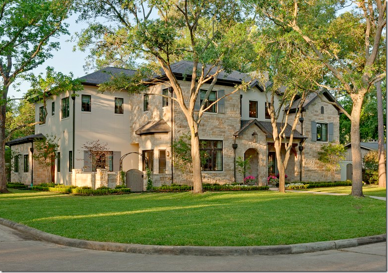
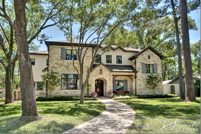
The façade is a combination of stone and stucco with French styled shutters in gray. To the far left is a side courtyard that leads to the dining room.
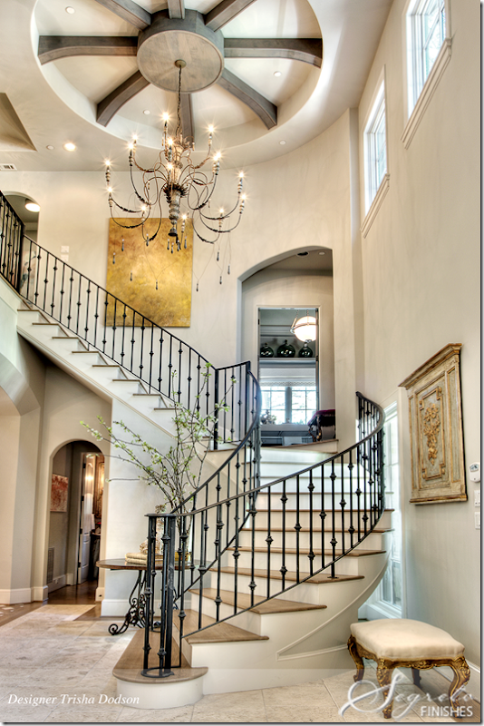
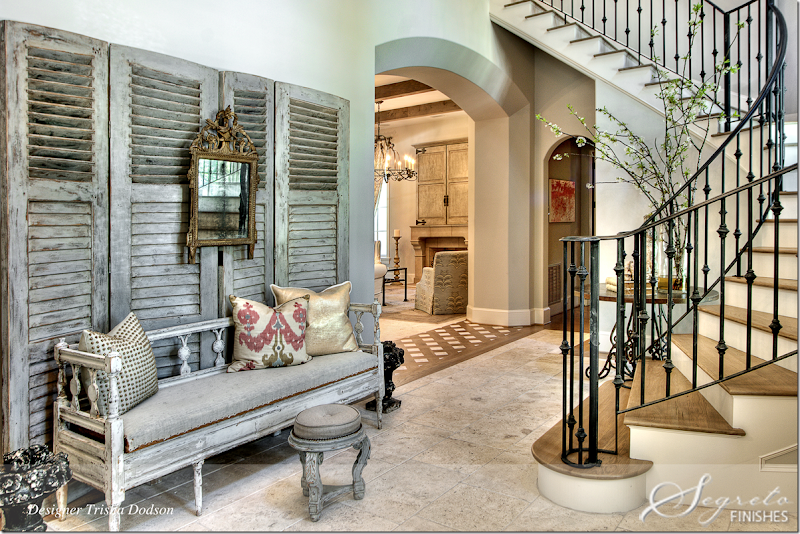
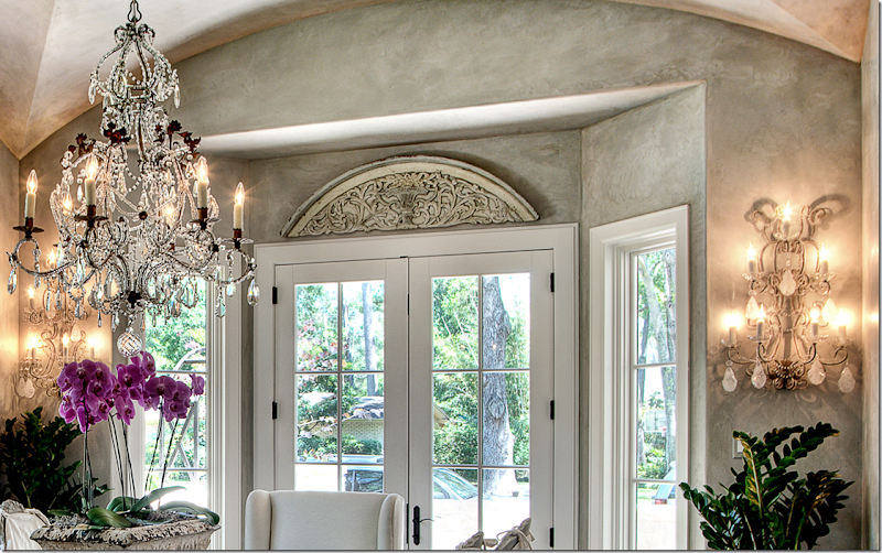
The two story entrance is dominated by the winding staircase. Decorator for this room is Trisha Dodson. The stairs lead to a study that is between the first and second floors. The chandelier is the homeowners.
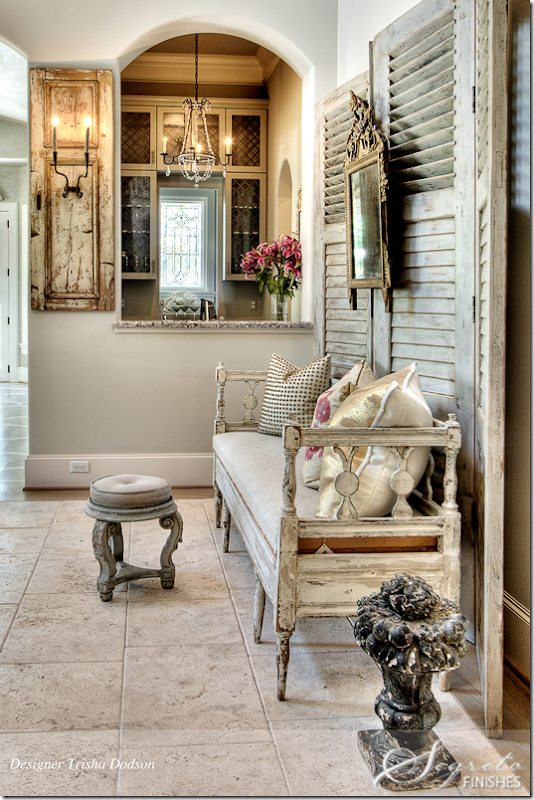
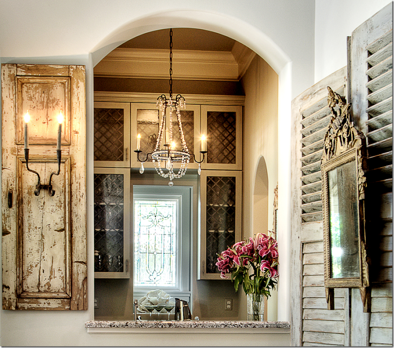
I love antique shutters used as a backdrop. Such a pretty chandelier in the wet bar.
A close of the wet bar with its leaded glass window. Such a pretty picture!
Furnishings include an antique settee, wood carved panel and mirror from Joyce Horn and shutters, pillows, and stool from Vieux. Painting from MAI. Past the entry is the family room and kitchen. Notice the wood and stone threshold between the family room and entry hall.
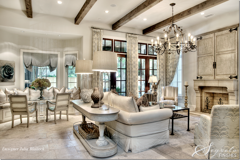
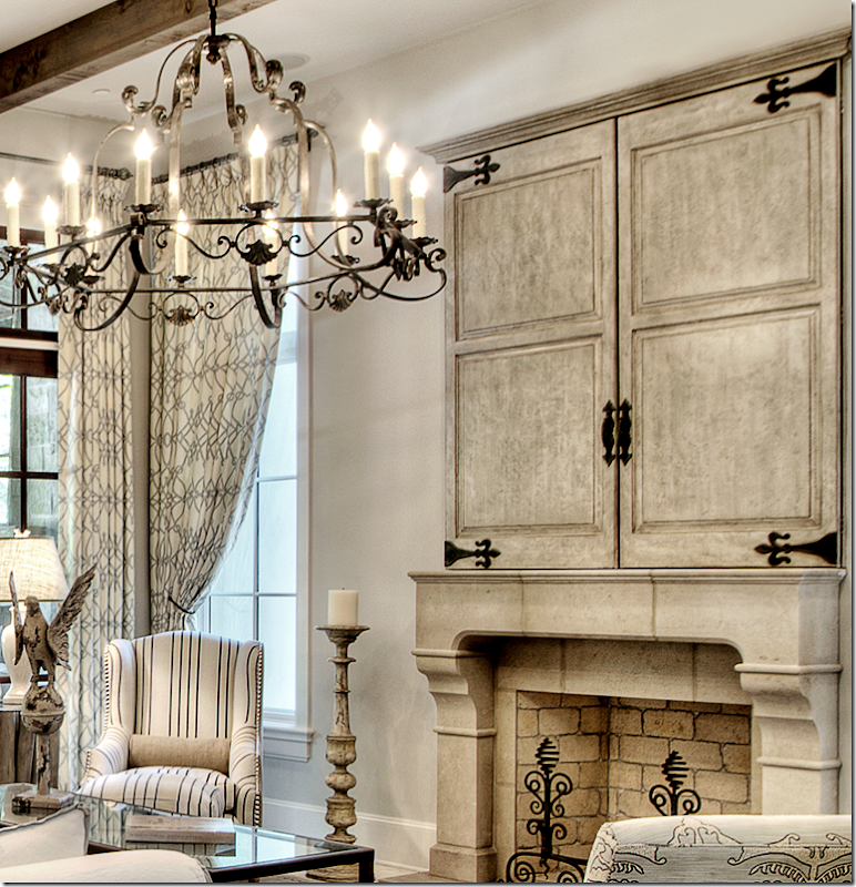
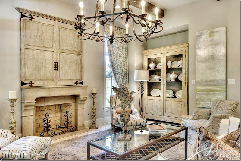
The family room and kitchen and back patio were all designed by Julie Blailock. Between the two spaces is a window seat and and dining table. A large console behind the sofa divides the two areas. A focal point is the fireplace with large wood doors that hide the flatscreen. Segreto Finishes added a gesso textured finish to the doors, then followed it up with layers of glaze.
Close up of the doors that Segreto created. Love that black and white chair.
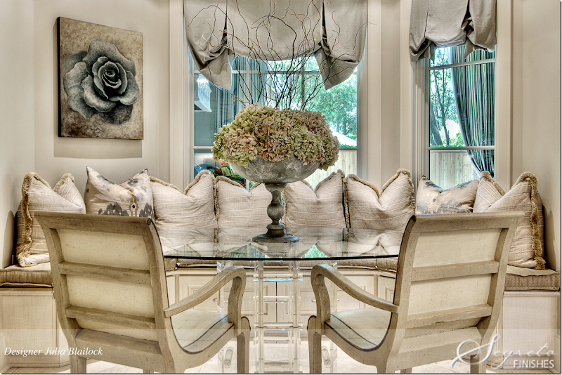
The breakfast table is glass topped and sits in front of the window seat. The rose painting is from Segreto Art Gallery.
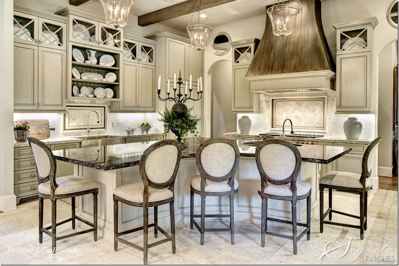
Looking from the kitchen back into the family room. Through the arches on the right is the entry hall. Additional seating is available around the curved counter.
Julie Blailock didn’t have the working budget for a metal hood, so she had one built out of wood, which Segreto painted, first black, then they added layers of metallic paint to achieve a worn metal patina. The cabinets were painted a custom color then glazed by Segreto to give them a furniture quality finished look. And I can attest - Leslie’s cabinet treatments really do look like expensive furniture! Gorgeous! The countertop is Luna Nero and the island is Bianco Romano. The backsplash is tumbled travertine and Ken Mason handpainted ceramic tile with polished sable mosaic accent all from Materials Marketing.
Closeup of the cabinets – love those Xs!!
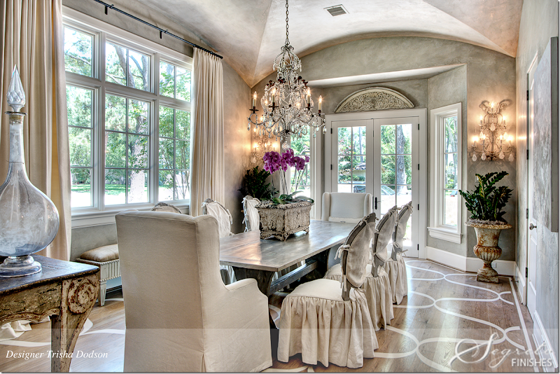
To the right of the front entry hall is the formal dining room, which overlooks a private, side courtyard that is surrounded by a short stone wall. Trisha Dodson, who created the entry hall also designed the dining room. Notice the beautiful ceiling. The table is from Vieux and the darling slipcovered chairs are from Joseph Company. I love the way Dodson designed the slips on these chairs! Painting, chandelier, sconces, and accessories all came from MAI. The buffet is from Joyce Horn Antiques. Curtains are made of Kravet silk by Heines Custom Draperies. The beautiful wall and ceiling treatment is plaster – applied by Segreto.
.
Both the chandelier and sconces are beautiful!!
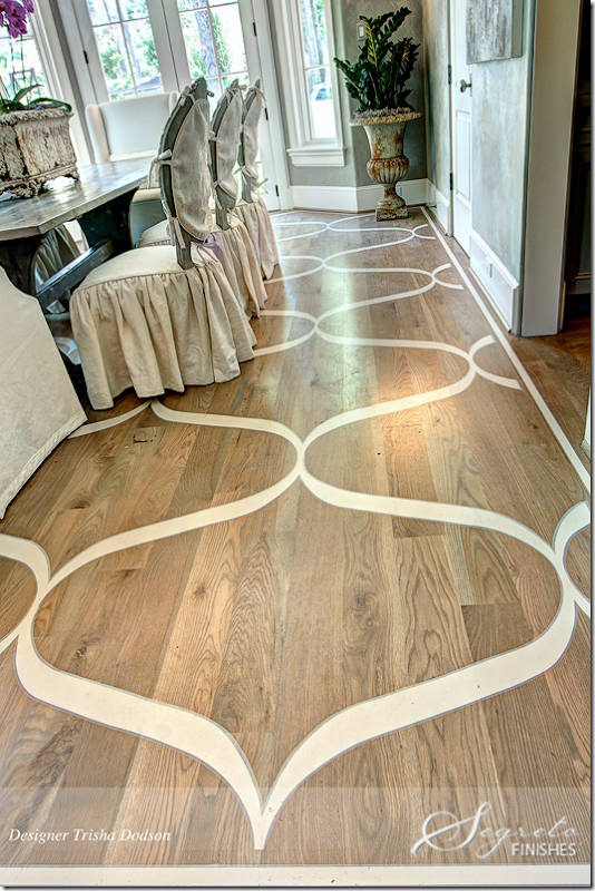
The homeowner has three young children and wanted the look of a rug without a rug. Floors were first stained then Segreto painted the design with Sherwin Williams acrylic floor paint, which was then coated with two layers of polyurethane.
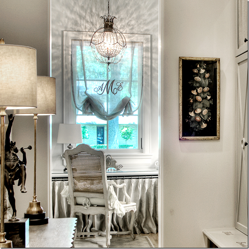
Molly Oshman designed the mudroom and lady’s home office. I love this space with its linen covered cabinets! So cute!! The office has a chandelier and the window shade is monogrammed. In the mud room, Segreto painted each person’s name in car enamel paint – the names can be seen under each of their lockers. Baskets in the cubbies are for their shoes. What a great idea!!
Close up of the office behind the mud room. Love the shade with the monogrammed.
The second office is located between the first and second floors. Notice the wood cabinet doors which are made from old barn wood – and designed by Julie Dodson. Dodson also custom designed the lacquered desk which was made by Joseph Company who also made the chairs. The fuchsia pillow fabric is Manuel Canovas. Curtains by Heines Draperies are made of Donghia fabric. Accessories are from MAI, Vieux and Watkins Culver and the rug came from Creative Flooring.
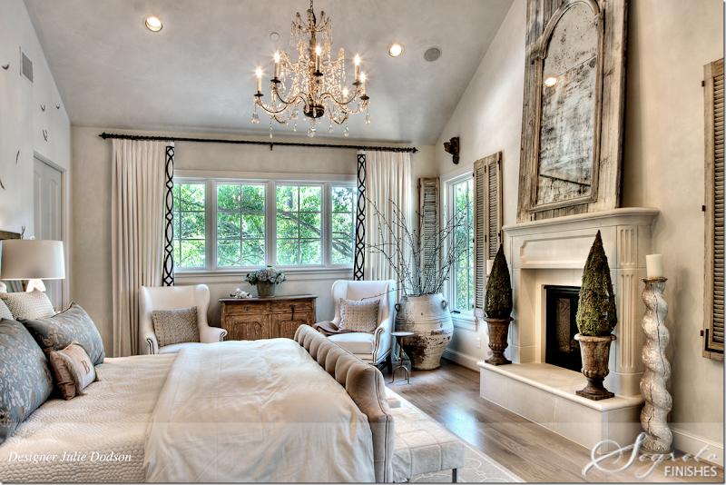
The master bedroom suite was designed by Julie Dodson. The focal point of the room is the bed – with Plush Home bedding. The accent pillows wear George Cameron Nash fabric. The wallpaper behind the bed is Fromental at David Sutherland Showrooms. Joseph Company custom made the chairs and the nightstands. Curtains were made by Heines Custom Draperies and embroidered by Michael Savoia of Villa Savoia, who donated his time to the Pink Ribbon House. Creative Flooring provided the rug. Accessories are from Chateau Domingue (shutters) and Watkins Culver. Mirror from Joyce Horn. Julie found the chandelier and lamps at Round Top. The chest is from MAI.
Another view of the bedroom – I love the shutters on the windows. Segreto plastered the walls in a smooth finish diamond plaster to blend with the silk wallpaper. This treatment gives the walls a finish that looks like silk.
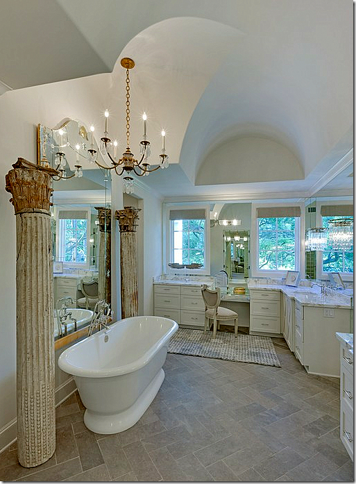
In the master bath, Julie added columns from Joyce Horn and the rug came from Creative Flooring.
Here’s another view of the bathroom – you can see the beautiful ceiling and chandelier here.
Christine Ho of Cho Interiors designed the baby’s room. The rocker is the baby’s great grandfather’s! The paint is SW Hinting Blue. The chandelier came from Restoration Hardware and the hot air balloons are from Doodles. Drapery fabrication is by DJ Drapery. Behind the bed, Segreto painted the wall to look like quilted fabric.
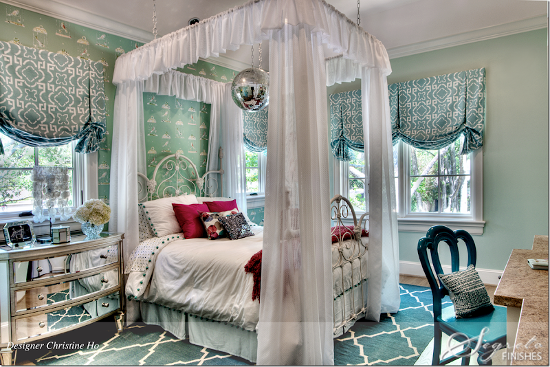
Christine Ho also designed the eldest girl’s bedroom – with its white iron bed from her great great grandmother!!! The bedding is Pottery Barn Kids. The wall is painted SW Slow Green and the wallpaper is from Wallcoverings International. Drapery fabric and sheers is Duralee and fabrication is by DJ Drapery. Notice the disco ball!!!
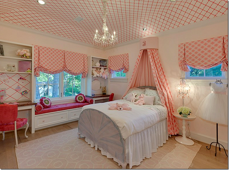
This daughter’s room is in hot pink – with a wallpapered ceiling. Darling!! I love her fancy dress on the wire dress form.
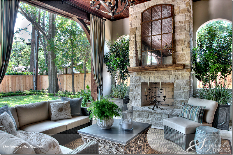
And finally, the back patio was designed by Julia Blailock to tie in with the family room and kitchen. All weather wicker sectional surround a zinc topped coffee table. And, there’s a beautiful stone fireplace – one of three in the house. Julia added a rug to make it more cozy. I’d be out here with a fire going all night long, it’s so romantic. Notice the curtains that make it even more romantic. So beautiful!!!
Here is a complete roster of the interior designers who worked on the Pink Ribbon House this year: Valerie Cook of Valerie Cook Design Inc.; Julia Blailock and Rachel Reppond of Blailock Design; Belinda Bennett, Lauren Amber Prestenbach and Amy Vonderau of Bennett Design Group; Cho Interiors’ Christine Ho; Julie Dodson and Trisha Dodson of Dodson & Daughter; Mollie and Molly Interior Design’s Mollie Oshman and the late Molly Sullivan Levitt, wife of Zach Levitt, partner in the cause's construction company and of course Leslie Sinclair of Segreto Finishes.
A HUGE thank you to Leslie for providing these beautiful photographs. On her blog, Leslie has written extensively about the other Pink Ribbon Houses through the years – to read those blog stories, go here:








Your photos are just amazing! I am so in love with them!
ReplyDeleteThere is not one part of this house that I don't love and it is even more beautiful knowing the cause it supports.
ReplyDeleteLoved the outdoor space with all weather wicker and the mudroom and office. For a show house, it would have made sense to have the designers coordinate their designs so that the house had a better flow from room to room. Specialty finishes work wonders in a home but become less special when used in over abundance as seen in this house.
ReplyDeleteI have noticed that most of the Houston homes shown here have wooden fences around the backyard that look like they came from Home Depot. Do people in Houston not construct brick, stucco or iron fences. The treated lumber looking fences look so cheap compared to the prices often reflected in the cost of housing.
Deletemost do have wood fences, just like this. i dont' know why - i guess it's cheaper and since everyone has one, you don't have to keep up with the jones'. but == in the nicest neighborhoods, some have gorgeous brick fences with gates, etc. gorgeous ones.
DeleteIn most of the homes you show, what is the average lot size. Maybe privacy is the issue.
DeleteI like wood fences. I think brick and stucco often look too heavy. I live in another Texas city, where some can certainly afford brick, but do not often choose that.
DeleteAlso, we have expansive clay soils, which means a masonry fence must have a very deep footing, or will crack in no time. Masonry fences are almost impractical.
DeleteJoni The Pink Ribbon House is simply stunning!! I will be pinning away! Gorgeous images!
ReplyDeleteLeslie is an amazing woman of talent an accomplishment, with a big heart.
Do come and see my interview with Leslie of Segreto Finishes and enter to win her Fabulous Book!
xoxo
Karena
Art by Karena
What a beautiful home. I love so many things about it. The wall treatments are amazing and the dining room floor is beautiful. There are so many wood pieces that are perfect for the look as well as the chandeliers. The doors over the fireplace to hide the TV are a great idea. I also love the monogrammed shade on the window in the mudroom. I have pinned a lot of the images from your blog to my reno inspirations board on pinterest.
ReplyDeleteFor those of you who like the idea of the doors over the fireplace, you can buy the decorative straps and handles on line. http://www.vandykes.com/search.aspx?query=straps
DeleteWe added decorative handles to our plain Jane garage doors. For less than $30 per door, the style impact was amazing!
Van Dykes Restorers is a "Candy Store" of decorative details. I can get lost in their website for hours.
Lovely in many respects, but over all the spaces have a Restoration Hardware feel.
ReplyDeleteWhat an amazing home. So often with show homes there isn't flow between rooms. This is so not the case here. I can't even put into words how gorgeous this house is. Love every room. I love the fact the designers decorated the kids bedrooms in the style of the home yet they still look like kids rooms- fun, stylish and functional. I also love the fact this house is for such a great cause. Thanks so much Joni for showing such an awesome space!
ReplyDeleteJoni!!Thank you so much for such a beautiful post on the home that's cause is so near and dear to my heart!! It is always so fun to work on and I love hearing your take on things always!! Xo Leslie
ReplyDeleteThis home is perfection at it's best! I would love to know the paint color used in the family room.
ReplyDeleteIn the house they used different strengths of SW 7016 Mindful gray and SW 7015 Repose Gray. The family room was a version of sw 7015. Hope this helps! Leslie
ReplyDeleteI could kick myself for not going !! I knew about it and got lazy. Thank you Joni for such a great post and all the fantastic pictures. That kitchen is to die for - well every room is! Yum, yum. Beth
ReplyDeleteYou have the BEST posts! It's like unwrapping a wee little present when I see COTE DE TEXAS pop up on my email!
ReplyDeleteHi Joni, Gorgeous!! When can I move in?
ReplyDeleteHi Joni, I love the architecture, the furnishings and the finishes. However, I have questions about the overall color of the photos. Is that what the house looks like in real life? It appears that the photos were taken with a lens to filter out yellow. Then, the saturation was cranked up a bit.
ReplyDeleteThis is especially noticeable in the photos that show exterior foliage. The colors in the windows should be soft green. However, on my monitor, at least, the colors in the windows are aqua. I have been to Houston many times and have never seen aqua shining through my windows.
Did anyone else notice this or is it just moi?
Going back to look more closely I see what you mean. Many of the photos on my monitor look perfectly normal but several windows do in fact give off an aqua hue. Double pane windows which have been treated to filter UV rays often give off a color in certain kinds of light. This is seen mostly from the outside, but not the inside unless the double pane seal is breaking down. One of the most noticeable on my monitor is the window with the monogram sheer.
DeleteI just went to another computer. The colors are MUCH better. Still a few windows show an aqua tint but not nearly as much as before. The whites actually look white and the hot pink room is hot pink. It must have been the monitor settings. I will have to change them! Apologies to Segreto!
DeleteThe two pictures of the master bathroom almost look like different rooms on my monitor.
DeleteI don't know if it my computer or what, but most of the pictures have a sepia tone to them. Still gorgeous though.
DeleteI think this particular photographer uses a method of putting two images together. Blayne once explained it me before. Maybe it's even 3 images all taken at different either speeds or settings. I can't explain it. But I do think this particular photographer does that I could be wrong though. His photographs do have a very distinctive look to them.
DeleteI have heard of photographers who do what Joni describes. The idea is to achieve sharp focus on both near images and far images. This makes a more realistic image. In real life, our eyes focus on near objects and can switch to far objects almost instantaneously without our noticing it. If you look at the photo of the outside living space, you will see that even the knots in the wood fence are visable!
DeleteThis is such a dreamy house! I am so glad that you were able to feature it in full. I've seen thise house in bits and pieces throughout blogland, but kept waiting to see your feature since it was in Houston. I just KNEW you would do a post on it at some point. It did not disappoint. Just beautiful! Knew you would have all the "info" to go along with the house too. Thanks for sharing it!
ReplyDeleteYou know, it's really beautiful...except....all that grey, grey, grey. I don't know, isn't this the harvest gold and avocado green of the current era? It's exhausting to see it so much.
ReplyDeleteIt should be called "death by gray". Even if the walls were mostly a neutral gray tone, wouldn't the rooms be more interesting if a splash of color was thrown in occasionally? So predictable for copy cat Houston design.
DeleteEverything is Just Right in this one! Great Photographs!
ReplyDeleteHi Joni!
ReplyDeleteThis is, without a doubt, one of the most beautiful homes you've ever shown. I saw at least four pieces of furniture I'm going to have a hard time living without!
Thank you and Leslie for sharing it with us!
I am in love with this house! It strikes the perfect balance of patina, rough-luxe, a tad glam, feminine/masculine.
ReplyDeleteAnd very soothing. The rooms and layout also look so liveable, I'll bet in person it has even more of an emotional
impact on the soul. Layer upon layer of nuetral texture with occasional jolts of color. White marble countertops/island would make it perfection for me.
Thanks for sharing Joni! Mela
I hope the homeowner said "leave it as it is" because this home is stunning! The furnishings, the details, everything is impeccable. That dining room and what they did to the floor is heaven.
ReplyDeleteI hope you're enjoying your long weekend!
XX
Debra~
Beautiful, beautiful, B E A U T I F U L!!! franki
ReplyDeleteI agree with commenter above... this IS the avocado green of another era! These houses are lovely and a lot of work has gone into them, but they are so boring. This house and every other like it seem like "model homes" that no one really lives in. No personal character, definitely not enough antiques.... Grey everywhere. I'm sorry to say that it seems every house you post now looks the same. In a few years these are going to look soooo dated!!!
ReplyDelete"Not enough antiques" - good observation.
DeleteUnfortunately a lot of stuff artificially aged and beaten up to look old. There is definitely an abundance of grey and then the upstairs bedrooms are nearly blinding with color. As commented above, I suspect much of the inspiration here as well as some of the furnishings are straight out of RH.
I am a huge fan of all the Pink Ribbon Houses, not just because they are always so beautiful, but because they represent the work of so many people fighting for such a worthwhile cause. My favorite "room" happens to be the back porch. I was wondering if was screened in. Even on the most beautiful days in Houston, mosquitoes can be a nuisance.
ReplyDeleteThe porch isn't screened in--that would be awesome though!! Love the drapes she did on the patio--Wonder if that helps? Leslie
DeleteI do wonder if the owner kept any of these furnishings? most show houses = the furniture goes back. it would be interesting to see what it looks like with her own furniture. I suspect the children's rooms are as they are.
DeleteThis is not a "design" answer, but rather a "science" answer. Mosquitos and other blood sucking insects are very sensitive to smell. That is why citronella candles are used to mask the smell of humans. Another REALLY good tactic is to take B Vitamins. Blood sucking insects hate the smell of B Vitamins. They may stop for a quick sniff, but won't bite.
DeleteI know that overhead fans are considered to be declasse by most decorators. However, exterior fans help to discourage insects and will make a humid environment much more comfortable for people.
Website advertising in Houston is not one of those things that can be brushed off. Without effective advertising your business runs the risk of failure. The question is do you understand what website advertising in Houston entails? For many people they feel that putting up a website is all that has to be done. While having a website is a great thing there is so much more that has to be done.
Deletehttp://actualseomedia.com/website-advertising-houston/
This is the first neutral decor I could see myself living in. Lots of texture and eye candy. Love it.
ReplyDeleteI love Showcase houses because they provide an opportunity for designers to think outside the box. I love to see interesting color combinations, new artists, and innovative ideas. There are some great ideas here: The paint on the Dining Room floor, the Living Room lamps, the office, and the kids' rooms. Overall, I think it is a pretty house, but not something I would call innovative or new. I am sorry to see a lack of color, as other commenters have noted. And the overall style is not one I am drawn too personally. However, while a Showcase is an opportunity to show off innovation, the purpose is also to appeal to an audience in order to raise money for a very worthy cause. I bet it did just that! (I also think the photography is off somehow. Composition is good, but contrast and color a bit off?)
ReplyDeleteHi Katie!! When we shot the house it was on one of those Houston oh so rainy days, so he did have to overcompensate with the photography so you are right not exactly true to color. The most evident are the walls in the dining room which had very little variation to them in real life. Showcase homes are so fast and we didn't have time to re-shoot. Mainly because of my too much to do too little time schedule. So sorry about that!! Leslie
DeleteHi Leslie!
DeleteI totally understand! Many times the showcases here are shot in a very narrow time slot....sometimes only 2 hours! Again, I thought the composition of the photos were great! You had so much to photograph as well. My hat's off to you!
The far-reaching influence of Rachel Ashwell.
ReplyDeleteLovely.
Every inch of this home is magnificent...The designers are incredibly talented. I could look at these photos over and over again. Visiting showcase homes is one of my very favorite things to do....years ago, I had the pleasure of seeing all of the Southern Living Showcase homes....my hubby so happened to have cients in those particular cities that year...This home has to be my all time favorite!
ReplyDeleteI wish we had such inspiration in our region.
ReplyDeleteJoni, I know you are a fan, so please tell me I am not the only whacked-out Mom who thought of Breaking Dawn upon seeing the feathers on the master bedroom wall...
Haha!!!! I'm having a huge twilight weekend with both Kristen and Rob having movies in Cannes. So, yeah. Breaking Dawn. can't wait for November for BD 2.
DeleteLooking at this house was so fun, I loved every image! So much talent and what a beautiful end result!!
ReplyDeleteSo beautiful - I'm afraid everything else I see now is going to look gaudy !
ReplyDeleteThe photos are exquisite !
Completely stunning! Wish I saw it in person! Anyone know what the main wall color and trim colors are (in the entryway, and looks like throughout). Perfect neutral gray. Thanks for sharing such an amazing home for a great cause!
ReplyDeleteThe main wall color is SW 7015 Repose Gray.
DeleteThank you again Leslie for the paint colors! You are truly an amazing artist!
DeleteThanks sooooo much! Again, an amazing home! Perfection in my eyes!
DeleteA note to Leslie: You are so very talented, and it's a joy to see your latest creations. Those painted/stenciled wood floors are awesome! I first met you thanks to my friend Julie (whose home is filled with your gorgeous work), but I love following you here on Joni's blog.
ReplyDeletexo,
Linsey
Lindsey-thank you so much! I am so excited about the floors that I am looking for places to do them at my home. I have to convince my husband its ok to paint the wood!! xo Leslie
DeleteDrool! I would love to see show-homes that include the teen male population, PB teen seems to be the only resource. Also, I noticed the mirrors in the master which flank the bed are smallish and lean against the wall. Anything larger would conflict with the headboard. I'm trying to find a way to visually "broaden" my own master which has girth issues. What strategies can be used to accomplish this, where the bed sits on a long,tall wall facing a fireplace?
ReplyDeletethis is so beautiful!! Can someone tell me the Type and Color of the stone/tile used in the foyer and also the master bath??? and is the grout a gray or cream or white?? I can't tell if the stone/tile is honed or polished but I really would like to know..thanks for any help.
ReplyDeleteI think it is vintage travertine honed in the kitchen and entrance with a grayish grout.I will ask Julie about the master bath. Hope this helps! Leslie
Deletewoww great post good luck
ReplyDeleteJoni, The mud room is my favourite believe it or not.... xv
ReplyDeleteA beautiful presentation and tribute to Breast Cancer survivors.......All the designers did such a beautiful job and made it flow. Very talented people all......I'm sure it was a huge success......Congratulations!!!!!!!
ReplyDeletewhile it is an absolutely gorgeous house, and i love almost every piece in the home, I have slowly found myself getting weary of this look. The ENTIRE home is the same color palate, greys, browns, khakis, off whites, and neutrals. This look has been everywhere for years. I feel as if this belgian chic-restoration hardware look that is very much in vogue is going to date, and really soon. It feels so boring and mundane to have no color in a home, and this is coming from someone who is very conservative when it comes to color! The children's rooms were the only breath of fresh air in the house. But this is in NO way an insut to the designers ! They have done a fabulous job and I know I am in the minority of my opinion of this style. it is evident that they are all very talented and it is an admirable cause!
ReplyDeleteI also found myself underwhelmed
DeleteThis house would not have been designed this way anywhere in the U.S. except Houston. They are totally stuck in some kind of design time warp. Underwhelming is right.
DeleteThe finishes in this home are spectacular, especially the decorative painting by Segreto finishes! I know what you mean about the photos. It is EXTREMELY difficult to take professional looking photos of interiors without the windows looking blown-out or the whole room looking dark except for the windows. I think the photographer did a fantastic job of getting the best shots possible under the circumstances to show off the hard work of the designers and craftsmen involved in this show home.
ReplyDeleteI love the wallpaper on that little girl's ceiling, and the monogrammed sheer shade in the lady's office is so feminine, like fine lingerie for the window -- but I wonder, is the homeowner okay with how that treatment looks from outside the home? It must look backwards from outside. I have had clients complain that they don't like seeing the part of the drapery hem that wraps to the lining side when they look from outside, so I'd be very careful about placing a monogrammed sheer treatment only where it's not going to show prominently outside the home.
Thanks for sharing another gorgeous project, Joni!
I love the outdoor patio, mud room, lady's home office, and X cabinets in the kitchen.
ReplyDeleteAlso a big fan of Segreto's Venetian plaster and kitchen cabinet finishes, but not the mottled dining room walls, faux range hood and baby quilting. I think these finishes -- no matter how well executed -- are better relegated to the 1980/90s. The dining floor pattern is interesting -- can it be done in a lighter stain, rather than opaque cream paint? The breakfast table also has an 80s look about it: opulent but a little soulless, and those identical chopped pillows.
I question some of the details, such as the master bedroom curtain trim that doesn't seem to tie into anything else in the room, the library's old barn doors inset into modern cabinetry (why?), the square tile inserts above the kitchen sink and stove instead of a clean backsplash line (especially jarring above the sink), and the TV cabinet that's clunkier than any flatscreen. Sometimes less is more, like fewer flooring changes from room to room or three kitchen barstools instead of five.
Color concerns include: the green bedroom's curtains/rug are not the same tone as its wallpaper/walls (the "cottagey" wallpaper also does not live up to the sophisticated curtain/carpet patterns), the nursery's blue/green/red colors with nothing to tie them together, and the library's single lilac cushion (perhaps there are other lilac items in the room?). I'm not sure why there are two antique pillars in a very modern master bath, or that a better solution could not be found for this room's "floating" windows in a mirror wall.
Lastly, I'm struggling with the interior antique shutters (entry and master bedroom) and I'm trying to understand why. Pam Pierce uses similar architectural elements (recall her home or Donna Brown's townhouse) and they look fantastic. Is it because Pam insets them cleanly into the walls, and/or because they are supported by so many other similarly proportioned antique/architectural elements? As beautiful as the entry antique shutter/bench vignette is, it somehow looks flea markety to me. I'm not sure whether it is the tacked on mirror, the haphazard leaning of the shutters, or their insignificant size compared to the very monumental/heavy entry hall, or all of these reasons. The house is a behemoth (there are 5,000 square foot houses that are designed to look and feel smaller and less block-like) with quite modern-looking built-ins, and some of the antiques (shutters and pillars) look a little junky/out of place (to me). Anyone have any thoughts on this? I'm trying to figure it out myself -- I like the idea of antique shutters/architectural elements, but I don't love them in this house.
How could you have overlooked the ridiculous columns in the master bath with such a discerning eye?
DeleteTo all of the Anons who delight in contributing nothing more than mean-spirited comments:
DeleteRead carefully Anon 9:21's remarks. No less than 15 critical comments were made, yet notice these key attributes of the criticisms:
1. They are thoughtful. Anon 9:21 tries to think through why something doesn't look quite right.
2. They contain constructive criticism.
Perhaps most importantly of all:
3. They are delivered with class.
These attributes do not diminish the importance nor the impact of Anon 9:21's remarks. In fact, they greatly elevate Anon 9:21's credibility.
To all of the Anons who leave unconstructive remarks with a mean-spirited edge: Your style diminishes your credibility.
By the way, Anon 10:17 - Your eyes are failing you. Anon 9:21 did, indeed, point out the columns in the master bath. Re-read carefully. Not surprisingly, Anon 9:21 failed to use the word "ridiculous".
Patting yourself on the back there anon. Actually, a more careful reading may have exposed the following comments found in that prize winning comment of Anon. 9:21.
DeleteFinishes are dated and better relegated to the 1980s.
Breakfast table is soulless
"Clunky" tv cabinet
"Block like" looking house (the size seems to bother her - a little class envy no less)
Some shutters and pillars look junky
Which do you prefer, anon. junky or ridiculous? Neither are flattering.
A more careful reading would indicate that there was no a room in this house that didn't have a flaw according to his/her eyes except the outside room, the lady's office and the x cabinets.
No my eyes are not failing me. I can clearly see that you are a jerk.
Oh my! The painted floor is wonderful, I wish I had the confidence to attempt it.
ReplyDeleteTHis is a fine illustration of what texture can do in an interior. And I really like the columns in the bathroom, because I tend to want white tile and everything white. This shows how good it is to vary the colors, versus matching. The painted floor is nice, too. Love the kids' rooms. Still hoping to see more boys' room though.
ReplyDeletethis house is absolutely beautiful, the decor and furniture - breath taking. What was your inspiration when putting the house together? why did you chose to go with this particular colour scheme?
ReplyDeleteWhat a lucky family to get to live in this gorgeous house!!!!
ReplyDelete-linda,ny
i am in agreement with the anons this is not a place i would enjoy living in. i appreciatae all the time and effort that went into it. i love gray but this home makes me rethink that love:) i know that most ppl would die to live there so be it. glad there are so many design viewpoints. That's why I enjoy this industry. Everyone has different taste and everyone is entitled to their own opinion.
ReplyDeleteAmazing website, I found it today while I´m home sick. Fantastic house, it is just a dream.
ReplyDeleteGreetings from Stockholm, Sweden!
I have noticed the photography that Segreto Finishes uses is always "lifeless". The colors are non-existent, and not because of the decorating. It's whomever is taking the photographs (Wade Blissard in this case). I would tell Leslie to consider switching to a better photographer who can capture the nuances of the different shades & colors, and put some "life" into these pictures!
ReplyDeleteLisa
Perhaps the abundance of gray in this house appears less nuanced because of the lackluster photography. It seems that all of the photographs have been chemically aged. You are right, they appear lifeless and static.
DeleteSimply stunning! The home is gorgeous.
ReplyDeleteThe Pink Ribbon project is made up of so many wonderful volunteers that give of their time and expertise for the cause with no pay. It saddens me that there are a few people that instead of appreciating the efforts of these volunteers and viewing the house as a treat, feel that very negative statements are ok. I personally work in so many homes, some to my personal preference and others not, but I truly enjoy seeing different design elements, and what to these homeowners makes their house their own. I also sincerely feel it as a gift that they allow me to take a tour. Joni has been so sweet to share so much with all of us in allowing us to take tours of so many homes through her blog. I hope our kindness in commenting will inspire people to send more projects to Joni so we all can enjoy the many different design styles of today! Xo Leslie
ReplyDeleteThank you, Leslie, for all the hard (and beautiful) work you, the other designers and all the volunteers did on this amazing house. Most of the people commenting on Joni's blog appreciate the effort that went into making this showhouse. However, the few nasty anonymous comments (and I'm referring to the NASTY negative comments, not the constructive negative comments or comments from people whose taste differs from the designer's/homeowner's) you've read here are by the same people who leave nasty anonymous comments every time Joni blogs, without fail, regardless of whose house is being featured. They leave these comments because that's all they're good at. They scrutinize each photo looking for something to hate. It would never occur to them to say something nice because it simply isn't in their nature.
DeleteSqueak, let me understand you correctly. Someone posts a comment suggesting they don't like the boring color, the grainy photographs, the same predictable design we see so often here and you suggests that these are "nasty" negative comments because you don't happen to agree with them. It's a tough world, isn't it? You cannot have this many readers and be so clueless as to think you will have 100 percent agreement on everything home that's featured on this blog. You speak with such great authority that you know it's the same people even though there are any number of anon. posters. I suggest you pitch a tent and put out a sign which says 8 balls read here.
DeleteLOL!
DeleteI'm laughing also particularly the vision of you sitting by the side of a road, tent pitched reading tarot cards and 8 balls. It must be hard being so all wise and all knowing.
DeleteI agree with the person who said the finishes in this home are ALL spectacular, especially the decorative painting by Segreto finishes!
ReplyDeleteI am positive that in real life the rooms Lesile finishes must be totally goregous! I'm swooning over the photos
so in person these rooms must be just beyond fabulous!
I just listened to the interview with Leslie on skirted roundtable & she says 'subtle' is the key.
I love subtle and understated and think that is so much better than being overwhelmed by color or finish in a room. I found you Joni
2 years ago and from you I found Leslie a little less than a year and a half ago. From the two of you I have learned so much and
refined my style. Thanks for all you have taught me!
Shell in San Diego
There isn't much that's subtle in this house when every room has some kind of faux finish. The overall affect is that the house looks dingy. Perhaps it's the photographs, but nothing sparkles in this house.
ReplyDeleteExquisite! Just exquisite! Every detail is perfection! Love it all!
ReplyDeleteThe feathers on the wall...in the master bedroom - tell us more about that. Just a stencil if so, where from?
ReplyDeleteA house is meant for someone’s safe haven and/or for raising a family. I love how that place looks, it’s totally my type! My sister and I just bought a 2 bedroom condo. Before this one, we were having a hard time looking when a friend of ours told us about this: http://www.joannedavidow.com/index.php/center-city-condos-for-sale-in-philadelphia. I am indebted to my friend and the broker for helping us to close the deal on our very wonderful condo.
ReplyDeleteThe Red Deer MLS real estate market continues to show strong growth and is one of the most vibrant in Alberta. Red Deer MLS Home Search is the number one place to keep up to date with relevant information on all things related to real estate in Red Deer MLS and area, our team is constantly researching the market so we can provide the most current, up to date Red Deer MLS real estate info with http://www.reddeerhomesearch.com/.
ReplyDeleteThank you for sharing superb informations. Your web-site is very cool. I’m impressed by the details that you’ve on this web site. It reveals how nicely you understand this subject.
ReplyDeleteGorgeous home, gorgeous decor, thank you for sharing!!! I would love to live there myself and there would be nothing I would add or change! Awesome job!!!!!
ReplyDeleteI would say the map of this house attracts the heart and eyes.
ReplyDeleteviagra price comparison
this http://cotedetexas.blogspot.com site is so beautiful.this site depend on beautiful house photo.beautiful decorated house are availible on this site.i like this iste.
ReplyDeleteThis comment has been removed by the author.
ReplyDeleteyour blog posting is up to the mark and really able to be appreciated.
ReplyDeletethanks
Real estate lawyer
This house is absolutely stunning, just beautiful! From a designer's perspective, I love to see what other designers are doing. I happen to love the French style of home, in fact I am building my own French style home right now and I am in the southwest. Curious neighbors that walk over to see it are constantly wowed by the style. I happen to think that this style is becoming more popular. Here in the southwest I feel like all I ever see is the Spanish or Tuscan style as well as the Southwest home with desert landscaping. It's nice to see light and airy interiors with green, grassy exteriors as well as foliage. That is the beauty of design. You can design and create spaces of different styles to fit the needs and taste of the client. Again, this house is beautiful, what I would like to know is where I can find a glass nook table like the one in this home. By the way, I love this blog. Thanks!
ReplyDeleteHello, I think this is the coolest blog I`ve seen.
ReplyDeleteProperties for sale in Houston
These homes are the stuff of dreams! That last one is basically outside!
ReplyDeleteI know this post is years after the home was finished but is it possible to get the fabric used for the dinette area and the family room. This home is just so beautiful!
ReplyDeleteI love the master bedroom bed frame. Does anyone know where I can buy the same one?
ReplyDeleteThanks for sharing. I hope it will be helpful for too many people that are searching for this topic.
ReplyDeletejuegosjuegos.com | juegos de matar zombies | jogos do friv
This is extremely helpful info!! Very good work. Everything is very interesting to learn and easy to understood. Thank you for giving information.
ReplyDeleteSignature:
The place to play all unblocked games at school online. Here you can find every blocked games such as: unblockedgames , unblocked games happy , unblocked games 77 , Garry's Mod Free
Time to go to school looks innocent he was about old lost that coolmath4kids , descargar whatsapp plus gratis , baixar whatsapp plus , whatsapp gratis , coolmath4kids , descargar whatsapp plus gratis , baixar whatsapp plus
ReplyDeleteThe kid's room is impeccably set out, and the chandelier is wonderful!
ReplyDeleteThis post is really nice and informative. The explanation given is really comprehensive and informative.
ReplyDeleteColonial Shutters
allo apk
ReplyDeleteshareit for mac
ReplyDeletedownload instagram for pc
ReplyDeleteSecretzone Jaipur Call Girl & Jaipur Escort Service Provider. Find best Jaipur Independent Escort Service & Jaipur CALL GIRLS Service at affordable price. For real updated profile photo visit website gallery page. Spend your leisure time with our hot beautiful, charming ESCORTS and CALL GIRLS in Jaipur. Find many more categories of escorts only at here. For more details and real photo visit website gallery page
ReplyDeletehttp://www.secretzone.in/
http://www.secretzone.in/call-girl-service-in-jaipur.html
I like such home design and light colors. They give so much space.
ReplyDelete