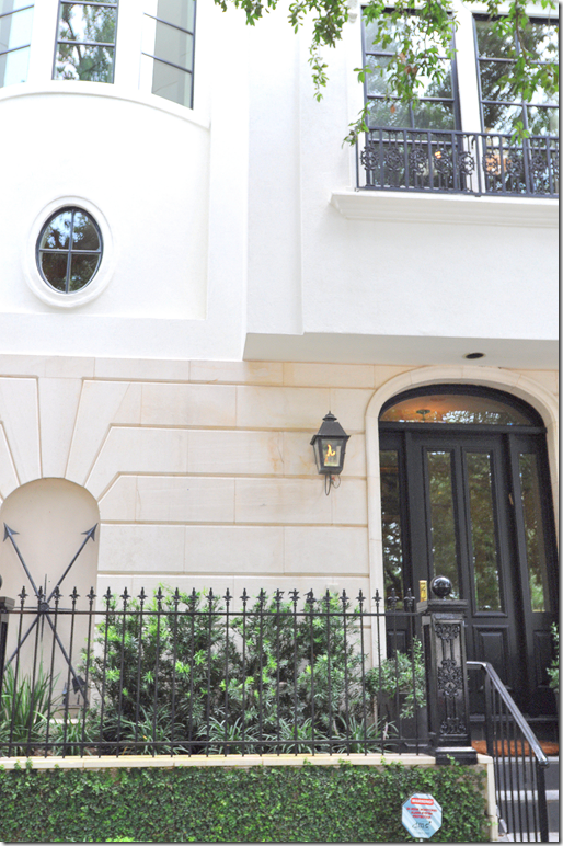
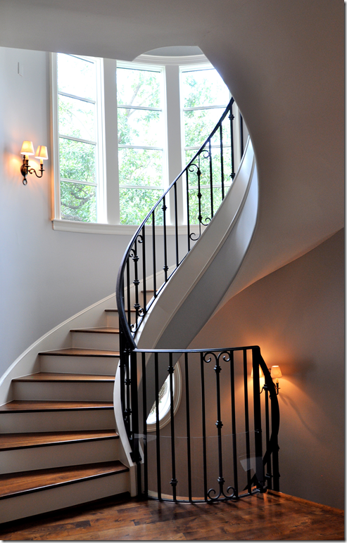
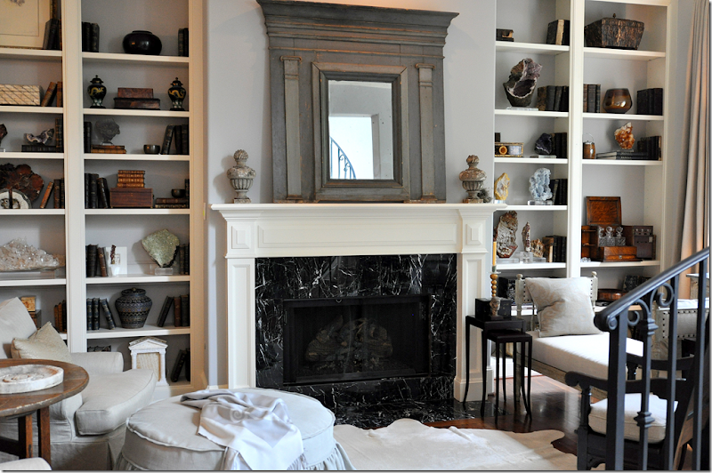
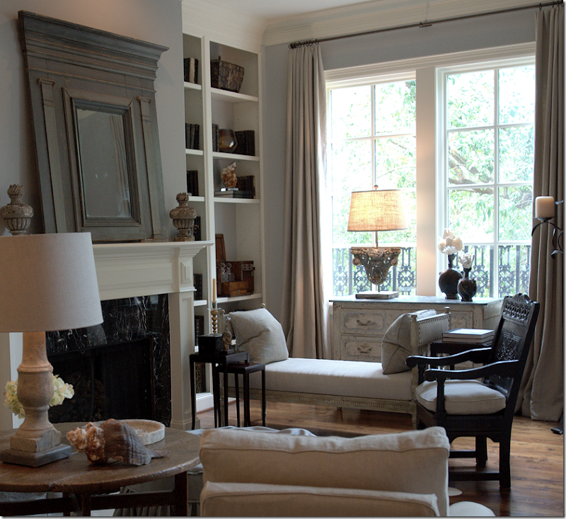
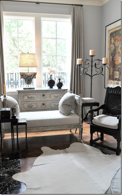
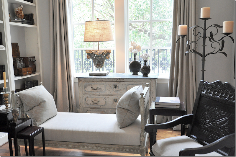
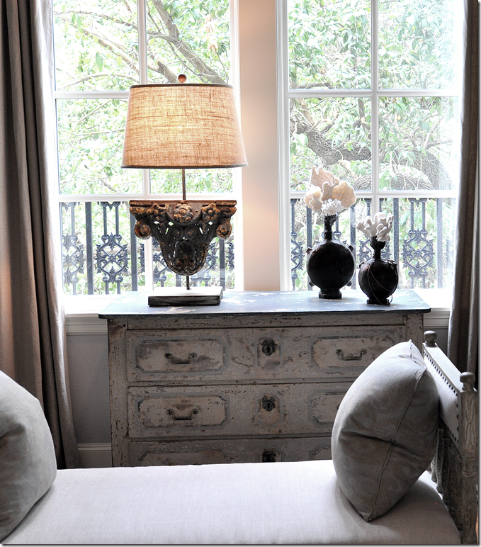
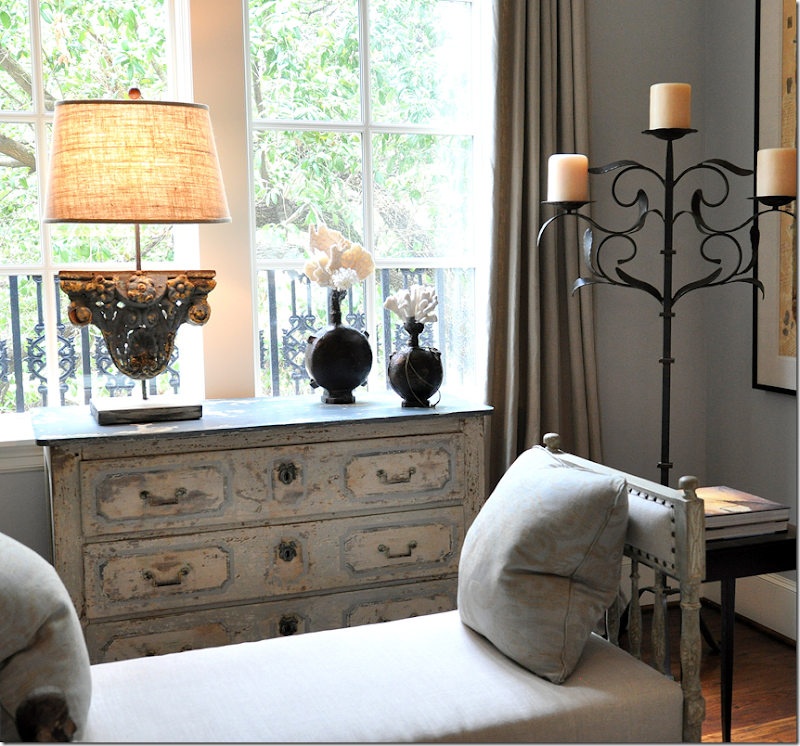
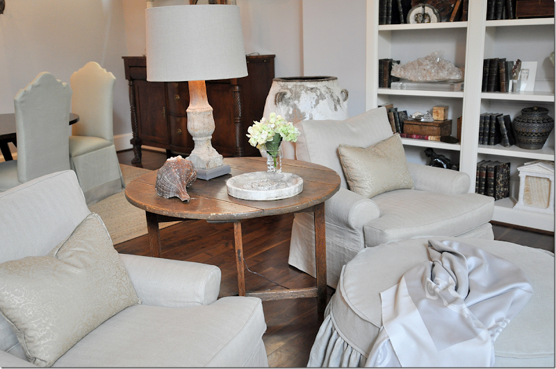
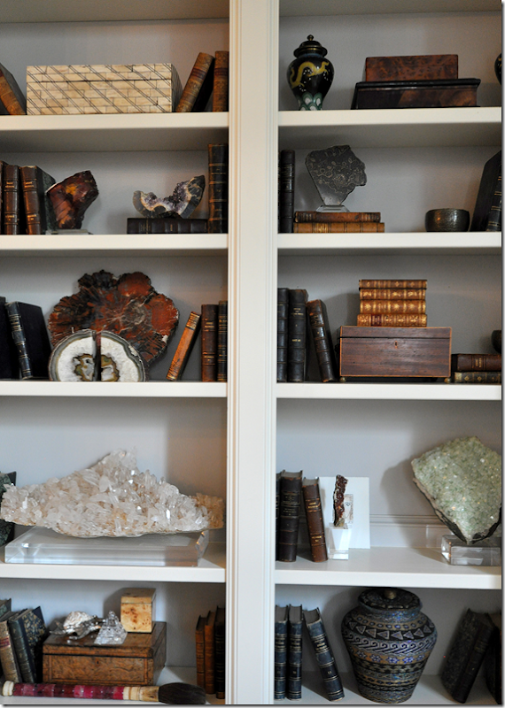
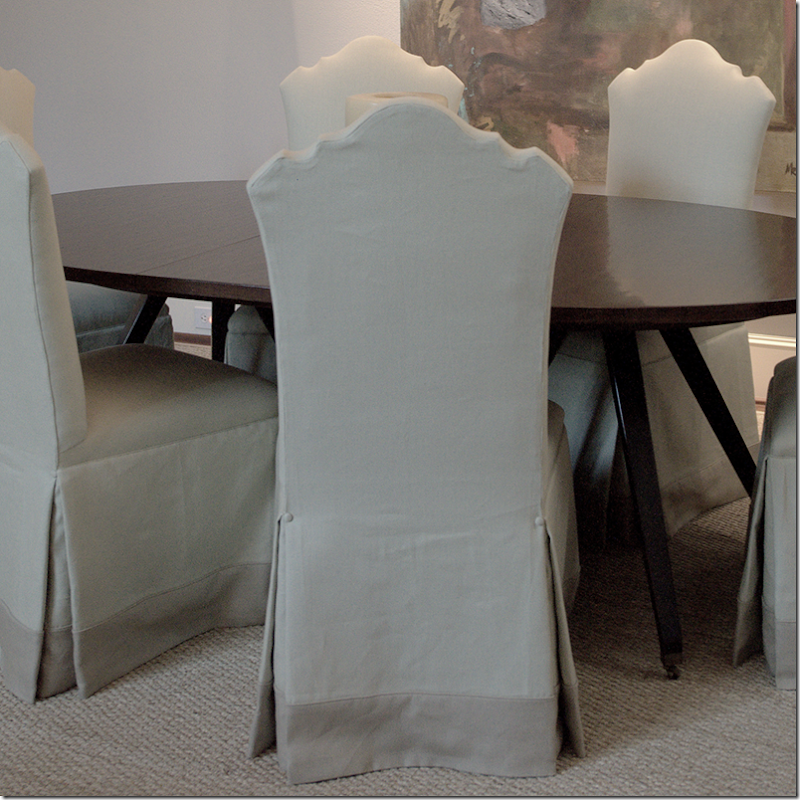
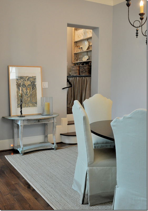
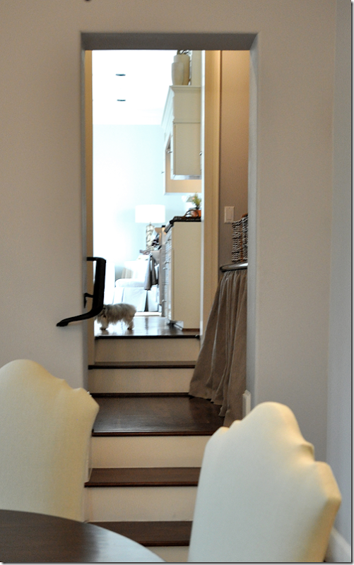
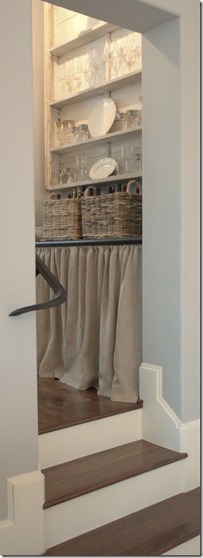
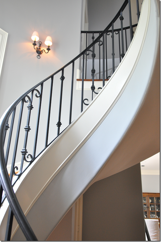
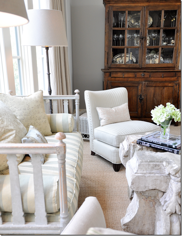
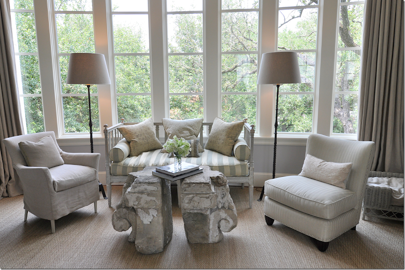
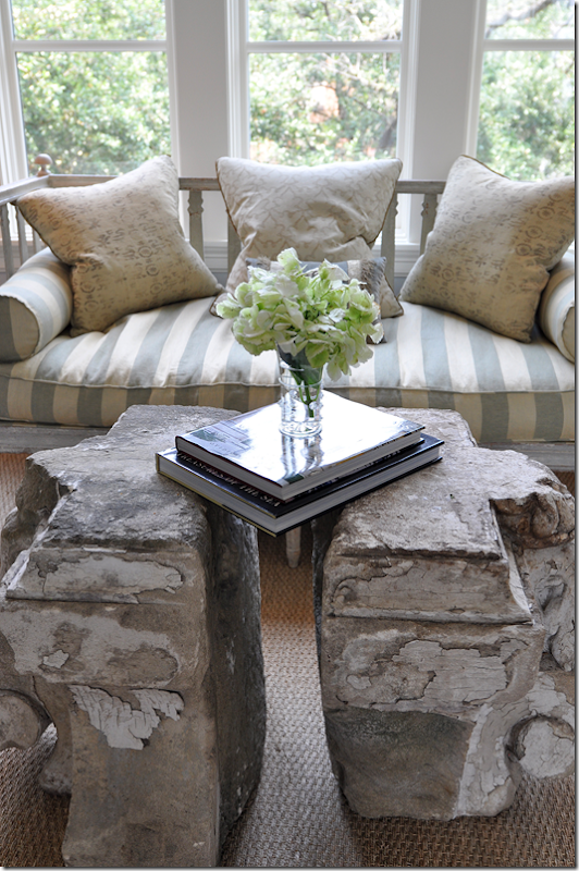
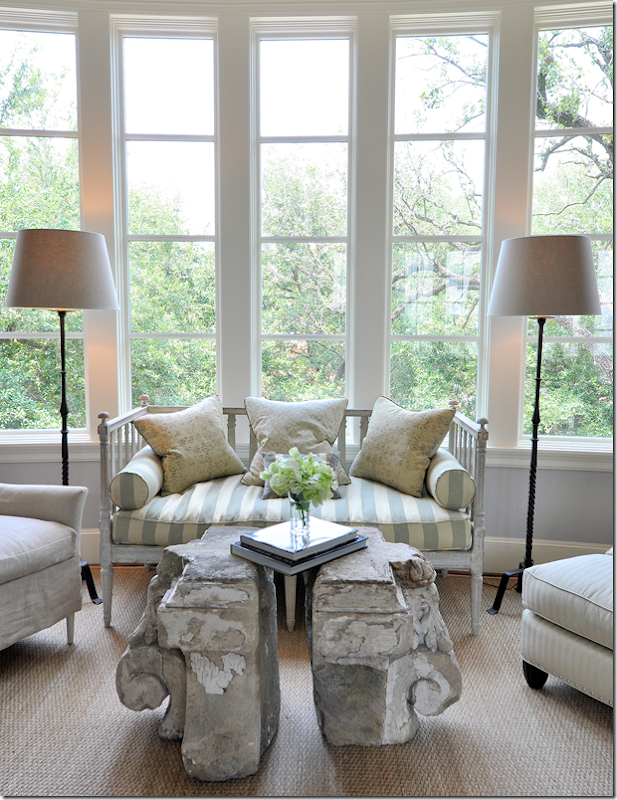
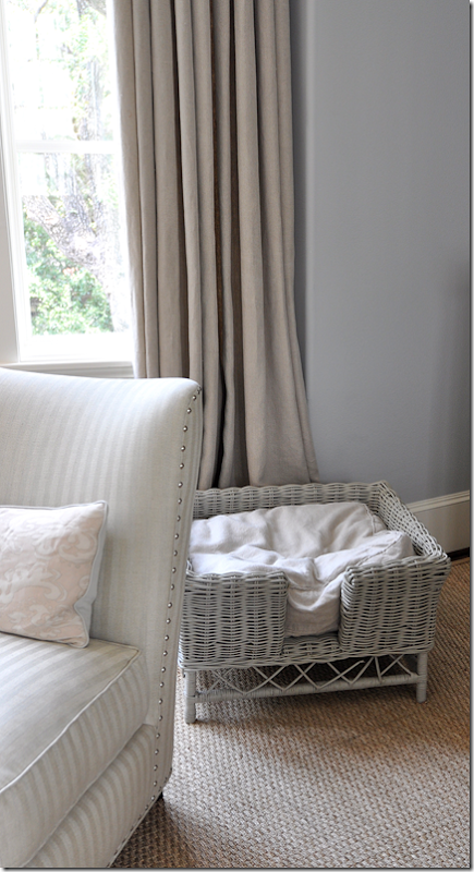
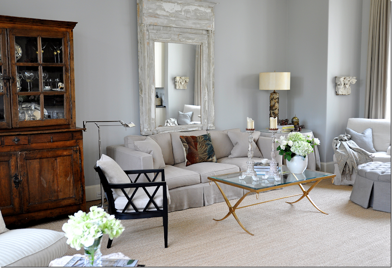
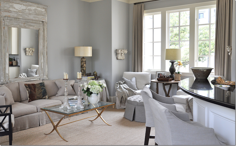
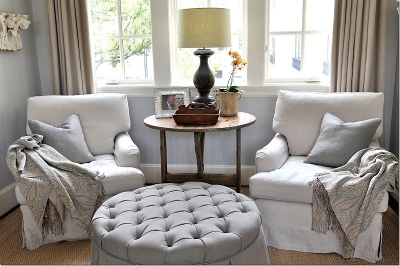
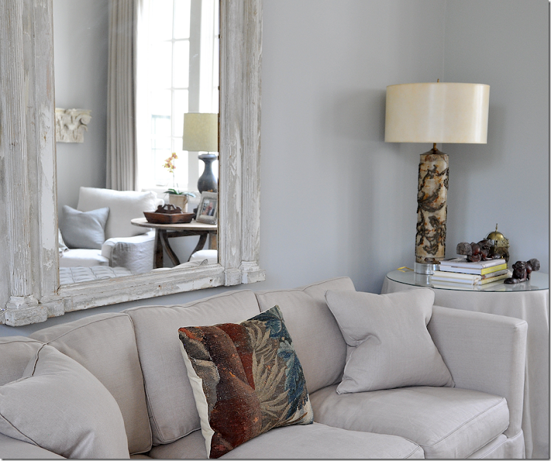
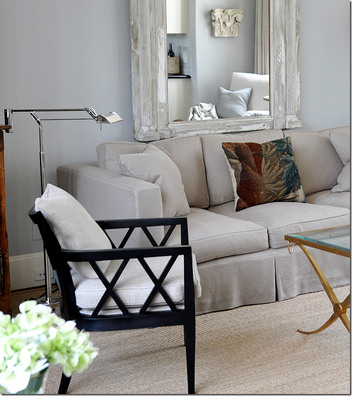
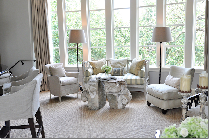
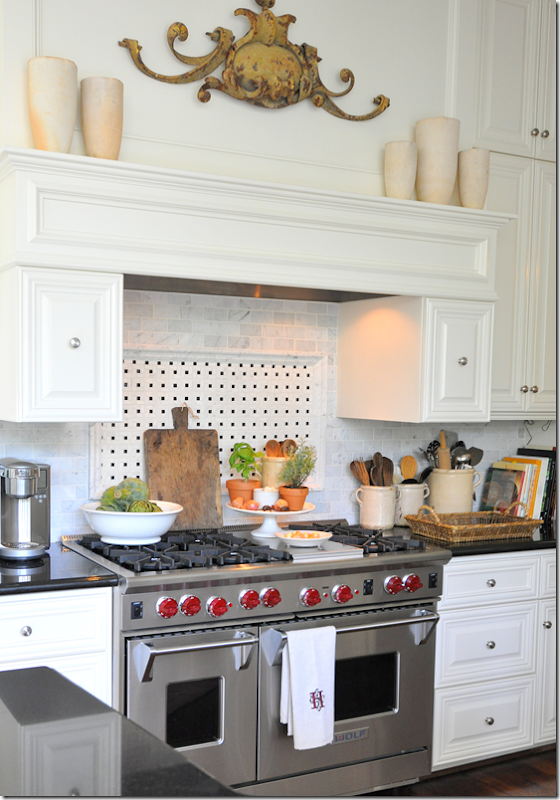
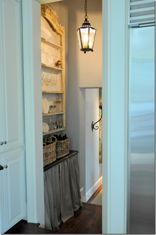
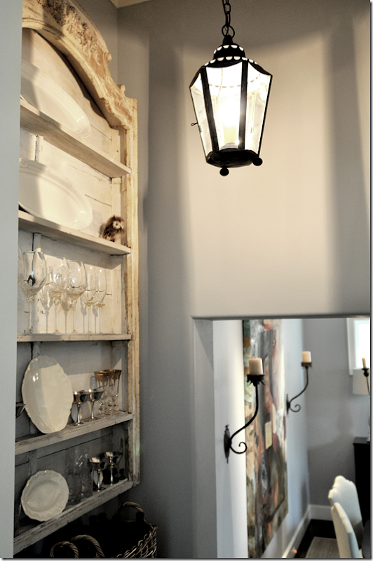
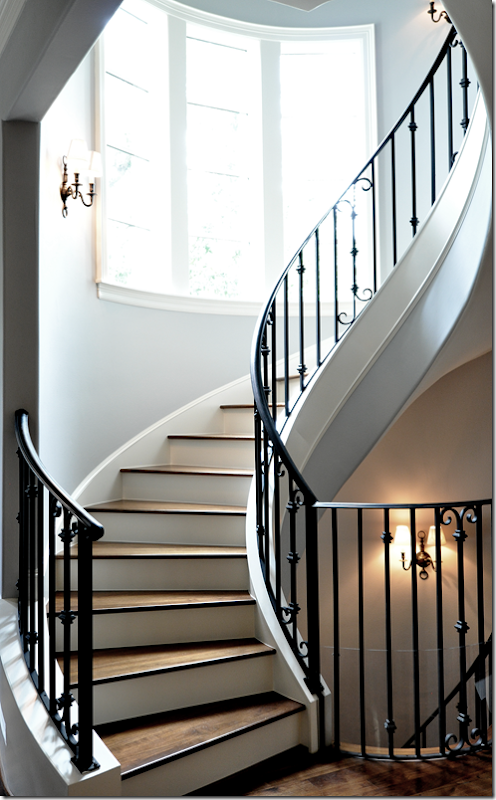
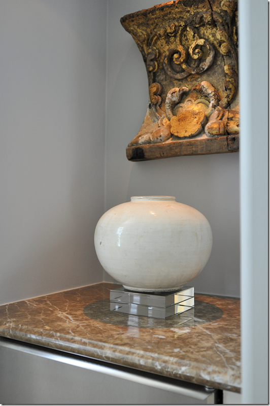
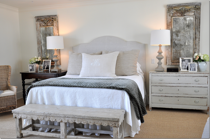
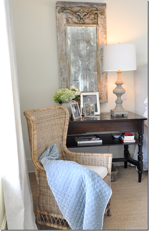
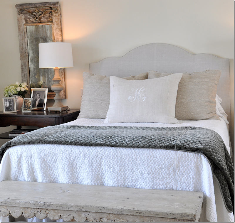
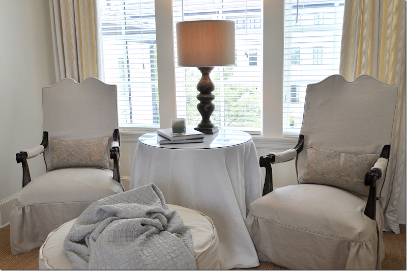
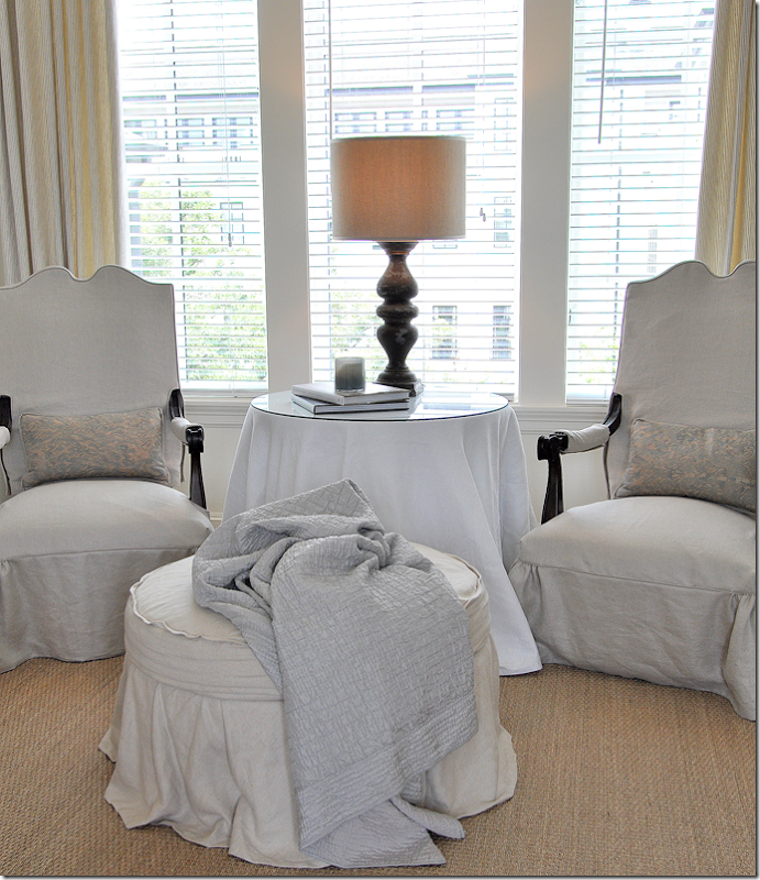
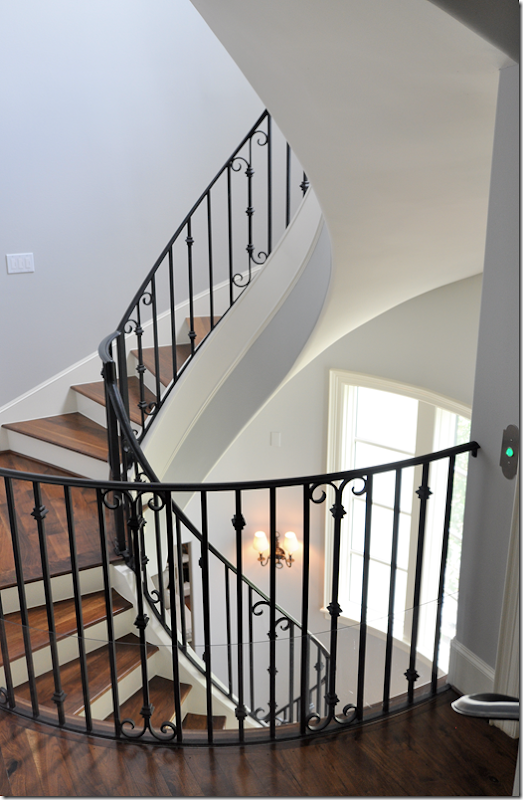
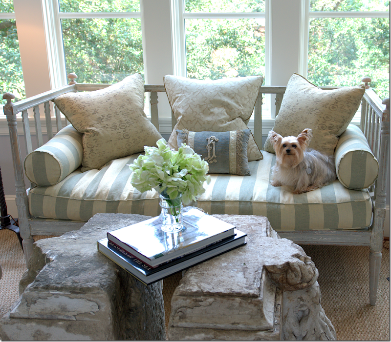
Over the past five years that I have written the blog, I’ve talked about many of the Houston interior designers that I have long admired. There is a group of these designers who are somewhat close in age and each has been significant in developing what I call the Houston Look. Each has her own style and aesthetic, but all have remarkable taste and talent. They have created some of the most beautiful interiors here and in other cities around the country. There isn’t a house that they have had published which I haven’t studied in minute detail, trying to learn from them, emulate them, and just enjoy the beauty they create. One of these designers is, of course, Ginger Barber. I am always thrilled to show a house she’s designed – and last week I got an even bigger thrill when I toured one of her houses – with her!You may recall that a few months ago there was a home tour in Southampton - a classic Houston neighborhood. After the tour I received numerous emails from readers “Did you go to the tour? Did you see the Ginger Barber house? OMG! Will you show it on the blog? I want to look at the pictures of it!” After about the 10th email, I realized that I was going to have to get pictures of this house!! And that’s what happened. Both the homeowner and Ginger were gracious enough to welcome me into the house to take photographs. I had been inside the house before Ginger decorated it – and when I returned, my jaw was on the floor – I couldn’t get over how different it looked – how beautiful and serene and pleasing it all was. It was that classic combination, elusive to so many: casual, yet elegant; inviting and warm; bright and airy.I came home and tweeted “I’m going to burn my house down” because that is how I felt!!! I also wanted to retire, never again to take on another client. If you can’t compete with greatness, why try? Yet, something else happened during my photo tour of the townhouse – Ginger was so nice and so giving and I learned so much from listening to her and observing her work up close. While I thought I was there to just take pictures, I came away with credit for a college course in decorating.The house is located on a beautiful, tree lined street, a few blocks away from the city’s museums. It’s a four story townhouse in a development that more resembles Georgetown than Houston. The white stucco townhouse reveals itself slowly. You enter through the front door into the foyer with a black and white marble floor. A curving staircase which winds up through the four floors takes you to the main one – on the second level. There, the living room and dining room are open on the right, while up a few steps on the left is the family room and kitchen.There’s a lot to see and I’ve tried not to let any details go unnoted. So, grab a cup of coffee, sit back and enjoy!!!We start the tour on the second floor – just off the staircase – where the living room and dining room greets us:The floating stairs are the central element of the house – they are found in the front, middle section and run from the ground floor up to the fourth floor. The railings are elegantly simple, sconces light the way, as does the large bay window. Next to the stairs is an elevator which comes in handy when there is heavy luggage!Directly to the right of the stairs on the second floor is the living room – with the dining room directly behind it. The walls throughout this level are a pale bluish gray. The fabrics are linens, the only muted patterns are found mostly in the pillows.Since this is the living room – it was decided they really didn’t need a traditional sofa – instead there is an antique Swedish daybed on one side of the fireplace and two slipped club chairs and ottoman on the other side. An antique Spanish chair sits in between, acting as an accent. One of the most beautiful objects found throughout are the lamps, some of which Ginger creates herself from relics. Many are antique balustrades that are converted into lamps, while others are architectural fragments that serve as the base of the lamp.A closer look at the living room’s back wall with its fireplace, flanked by book shelves. To the right is the antique daybed, to the left are the two club chairs and an ottoman. A pure white skin reaches across the hardwood floors. Atop the fireplace, the antique trumeau becomes the focal point. Painted in shades of deep gray, it reflects the stairway.Across from the two club chairs is the Swedish day bed. The dark chair pops against all the light painted woods.At the front window sits a painted antique chest, with another beautiful lamp atop it.What is so beautiful throughout the house are the antiques. Each piece was hand chosen by Ginger and the homeowner from a myriad of Houston stores. Here, a beautiful Swedish daybed sits next to an antique Spanish chair which sits in front of a French chest. You eye goes from piece to piece and back again – trying to take it all end, but it’s futile. It’s just all too pretty to pick one thing you like best.The chest has a hint of blue paint. It’s creates a subtle effect along with the painted daybed.In the corner is a wrought iron candelabra that lends height. I really love the lamp on this chest – it is striking looking.Across the room are the two slipped chairs with a round slipped ottoman. Two pillows made of Fortuny provide subtle pattern. An antique French wine table sits between the chairs. I was struck by how exquisite the upholstery was. The chairs were perfect, as were the slips. Everything was top quality – and it shows. Of course Ginger doesn’t do frou-frou, so mostly all is tailored. Welts are teeny-tiny, flanges are 1/4 or 1/2”. Accessories are over scaled but sparse. The look isn’t cluttered, but it’s not minimalistic at all.Here, behind the chairs – you can see into the dining room.Notice the perfectly executed linen shade – so beautiful! On the table, just a stone relic and a shell. The little details, like the lampshade, was what really caught my eye. No detail was too small to overlook.The shelves hold the owners’ collection of minerals and old books.Sources Living Room: Swedish daybed: 2620; Spanish Chair: Watkins Culver; Chest: MNaeve; Trumeau: Skelton St. John; Balustrade lamp: Neal & Co.The dining area opens off the living room. An dark wooden oval table sits underneath a chandelier from BROWN. The homeowner’s artwork was incorporated into this room. Against the side wall, a tall buffet is accented by two matching balustrade lamps. A small antique mirror sits between them.I’ve cropped this picture so you can see the chairs up close. I think these truly represent Ginger’s attention to detail. Notice the beautiful shape, first – the top is a simple arch – yet, a few extra curves make is so much more special. Now, notice the upholstery. It’s a beautiful linen – probably from Belgium. To slightly highlight the fabric, she adds a band to the hem. The band is in a slightly different colorway, just a tiny bit darker so that you notice it. And, notice how wide the band is – probably four or five inches. Now, at the pleat – notice the tiny buttons – just a tiny button that doesn’t scream out EXCESS TRIM! Instead it adds just a touch of luxe and quietly says “custom.” These chairs and the way they are upholstered are gorgeous. I found that most all the upholstered furniture was just this way. There’s a little detail here and there that makes it special without being ostentatious. A HUGE lesson here to be learned from Barber. Who was the upholsterer? Neal & Co., Houston (to the trade, only.)Against this wall in the dining room, a smaller, painted console holds a print and a few candles. To the right – up a few steps is the butler’s pantry/bar and kitchen.Here is another look at the butler’s pantry leading to the kitchen and then the family room. I love how there are steps with railings that lead from area to area. It adds a touch of romance to the townhouse.The butler’s pantry was just a small, boring space – the homeowner loved skirts so Ginger added one, replacing the cabinet doors that were once here. Kooboo baskets hold wine bottles, and above is a beautiful painted shelf that holds all the bar glasses. Suddenly, this tiny room becomes very special. From this space is the kitchen and family room – but let’s walk around back to the front to properly enter the family room!Sources Dining Room: Table: Shabby Slips; Chairs: Neal & Co.; Painted table: MNaeve; Chandelier: BROWNReady to see the family room and kitchen?!!Let’s walk back through the dining room and living room to the stairway.If you turn left off the stairway, up a few more steps is the family room and then the kitchen.Walking up the few steps to the family room – you are greeted by a small seating area to the left – set in front of a large, curved window which overlooks the front of the townhouse. The tall French chest was one of the first pieces bought by Ginger for the house.Overlooking the large, curved windows with a view of the treetops – is this gorgeous seating area. An antique Swedish sofa is covered in one of the rare patterns found in the house – a French blue and cream silk stripe. Two chairs flank the sofa, one is slipped in linen, the other is upholstered in a muted stripe. As gorgeous as the Swedish sofa is, the coffee table is a stunner. Made of two large architectural capital relics – Ginger chose not to have a glass piece put on top – the two pieces stand just slightly apart from each other. Two simple iron lamps flank the grouping. And yes, this vignette is this gorgeous in person!A trio of muted pillows along with a BViz velvet pillow sit on the striped cushions. I can’t tell you how pretty this setting is! I was literally speechless when I walked in this room. The “coffee table” is just breathtaking.Since there isn’t a glass top, Ginger placed a few books that bridge the two capitals.Since the house’s layout is a “piano nobile” – where the second level is the main floor – the view outside the large bay window makes it seem like you are living in a tree house – it’s so green and leafy on the street, which is lined with decades old Live Oaks.Behind this chair tucked away is the dog bed. A darling wicker piece – that Ginger has painted gray. Again, just a little detail that makes all the difference. Ginger sells these at The Sitting Room, but she says they are out of them now – if you want one, get on a waiting list! Also – notice the nail heads on this chair – small and silver.Past the seating area under the large front window is the expansive family room. A custom cut seagrass covers the hardwood floor. A large antique mirror acts as the focal point over the linen covered sofa. To the right, two club chairs and a tufted ottoman sit in front of another large window.A large curved bar divides the kitchen from the family room. At the bar are stools, slipcovered in linen. The brass coffee table was the homeowners. To the right of the sofa is a skirted table also in linen. On the sofa, there are two linen pillows with another made from an antique tapestry. The walls, again, are a soft bluish gray which set off the linen so nicely. The two club chairs sit in an alcove with an architectural relic hanging on each side of the alcove.In the alcove, the two chairs are slipcovered in linen. The round ottoman is tufted in a slightly darker linen. On the chairs – the two pillows are a light gray blue which pulls out the color of the walls. The curtains are yet another shade of linen. Notice how in this one setting – four different shades of linen are used – which creates the interest and texture. An antique wine table sits between them with a balustrade lamp.More about the fabric choices. What I really loved about this space – was the texture that the different linen fabrics create. While at first glance it may all look like linen – on closer look, the linens are different shades. For instance, these pillows are linen – but the texture of the linen is much thicker and heavier than that found on the chair and sofa. Plus, it’s a slightly blue shade – which plays up the wall color. Notice how the linen curtains are also a slightly darker shade which pops against the blue/gray walls. It’s all very masterfully done – the fabric choice is not something that happens in a meeting or two, but it is a thoughtful process that takes a well seasoned and talented interior designer to pull off so beautifully. Even the throws pick out the taupes and linens and blues so perfectly. Again, the fabric choices, their colors and textures were another lesson to be learned – and trust me, I was taking voluminous notes in my head! It’s not everyday I can tour a house designed by a great like Ginger Barber. I really looked at it as if I was taking a master class. I asked questions and she explained things to me; she was very open about her choices and reasoning. I wish you all could have been there to take notes along with me!!Here, I love the way the alcove is reflected in the trumeau.Another lesson was the asymmetry found in this room. On this side of the sofa, there is no end table because of the placement of the adjoining tall chest – instead there is a floor lamp, and a contemporary one, at that. And instead of only matching pairs of chairs – I noticed that there were many single chairs – like this one - accent chairs without a match. Remember, in the living room, there was the lone antique Spanish chair. I really liked the idea of the accent chair – instead of everything being so symmetrical. These chairs kept your eye alive, unsuspecting the usual.And looking back from the alcove – towards the front window and the secondary seating arrangement. You can see on the very left the hand rail that leads the few steps down towards the stair hall and the living room. Notice in this arrangement – at first glance it looks symmetrical – but the chairs are different, not a matching pair. Something to strive for, especially if you rely heavily on symmetrical designs.In the kitchen, Ginger explained that typically she would have removed the granite counters and put in concrete ones and some kind of antique tiles for the backsplash – something she would find at Chateau Domingue. Here though, she said the kitchen was pretty with its black granite and she and the homeowners chose to leave it as is. It has beautiful appliances, like this large range, so Ginger just added her touches – accessorizing the space with confit pots and ironstone, and an architectural element atop the range.And past the range – leading full circle – we are back at the butler’s pantry which leads a few steps down into the dining room.The space is narrow, so it’s hard to get a full picture full of the antique shelf. Ginger filled it with bar glasses and ironstone platters. The wicker baskets and the linen skirt add that unexpected texture and uniqueness to the small space – creating eye candy in what is basically just a pass-through.Sources: Family Room and Butler’s Pantry: Swedish sofa and mirror: The Gray Door; Club chairs: Shabby Slips; Tall cabinet: Skelton St. John; Bar Shelf: Joyce Horn AntiquesReady to go up to the third floor?The stairs lead from the first floor to the top floor – one continuous spiral which is at the heart of the townhouse. The large bay window overlooks the front tree-lined street.Off the stairs, you turn left to the master suite, but before you enter, there was a small breakfast bar with a refrigerator and shelves above. Ginger took out the shelves and added an architectural relic and a vase, making this utilitarian space more like an art filled niche rather than a coffee bar.The master bedroom is a serene space – with large windows on each side. One side overlooks the front street and the other side overlooks the interior courtyard. The space is wall to wall seagrass. One side of the bed is a wooden buffet while the other side has a Swedish chest – both antiques, of course. A set of balustrade lamps with white shades add just a touch of symmetry. Above each side is a matching pair of antique painted mirrors. There is a wicker chair on one side of the bed and a pair of chairs on the other.The left side of the bed – with the dark table and the lighter wicker chair. The curtains are a linen ticking stripe.The right side of the bed – with an antique box, a few pictures and a white ironstone jar. Everything is so pretty and pale and then, the dark antique box pops the setting, making it come alive.At the end of the bed is this wonderful antique scalloped bench! It’s fabulous. I love that she left it bare – without a cushion covering it up. All the pieces in this bedroom are wonderful – from the set of mirrors, to the night tables, to this bench, to the Swedish armoire (that I didn’t get a picture of – I was probably hyperventilating!!) I talked with Ginger about her sources and it was amazing how she goes from store to store to store looking for pieces. Mostly everything was found in Houston – not 1st Dibs – which says something for our antique stores here, they really are great! It used to be that years ago, you would have to go to Dallas, New Orleans, Atlanta or New York to find special pieces – but now, Houston has so many great shopping venues, you don’t need to travel anymore. Ginger told me she loves to support all the stores – they are good to her and she likes to reciprocate by buying from them and by giving them the credit for finding the pieces in Europe to begin with. She was very open with her sources and wanted to be sure everything was credited. I think in the end, almost every antique shop in Houston is mentioned in the sources!And more that I learned from listening to her. It’s obvious how hard Ginger works – furnishing a house this size with all antiques – from the accessories to the mirrors to the fabric choices to the furniture, is quite a job. Yet, she does it and makes it all look effortless. I know better though. Still, this was a huge lesson learned. Keep shopping until you find just the right piece for your client. Don’t settle - it’s out there somewhere. If your city doesn’t have good shops, plan a shopping trip or visit online shops like 1st Dibs. And even more important – make sure each room has some special antique to create a focal point. In the bedroom, for instance, this bench and the armoire created the interest – as did the two matching mirrors. In the family room – the beautiful Swedish sofa created the focal point – as the did large mirror over the sofa. In the living room, the Swedish daybed and Spanish chair added so much to the design. If your client can’t afford an antique in each room – plan long term for one in the future and try to save up for it. You don’t have to furnish a room overnight. Antiques take time to source – use that time to save up for one – or put it on your wish list for a few years down the road. I’m not sure Ginger would approve of this – but I say if antiques are out of your price range, find a reproduction with good lines and a pretty finish. I know we can’t all afford a house filled with antiques – so look for a vintage piece that has the right lines and a bit of patina instead. Or find a newer piece at a garage sale – and paint the dark wood, light. Take a class in faux painting for furniture and create your own antiques.The bedding is a mix of white cotton and linens. Notice the beautifully arched headboard that is reminiscent of the arch of the dining room chairs. Two darker heavier linen pillows add a thick texture that pops, while a special monogrammed linen pillow is in front.The homeowner has a choice of a white duvet or a peacock blue coverlet – mostly used in the winter. Aren’t the pillows beautiful? I loved the sizes – and how there are three, with one being the accent.Against the side wall of windows overlooking the courtyard, Ginger used the homeowners chairs and slipped them in linen – along with creating a round slipcovered ottoman. She added a white linen skirted table with another fabulous balustrade lamp – this time with a darker shade. Fortuny pillows add just a hint of pattern.The chairs are arched – like the headboard. In front is a darling slipcovered ottoman.
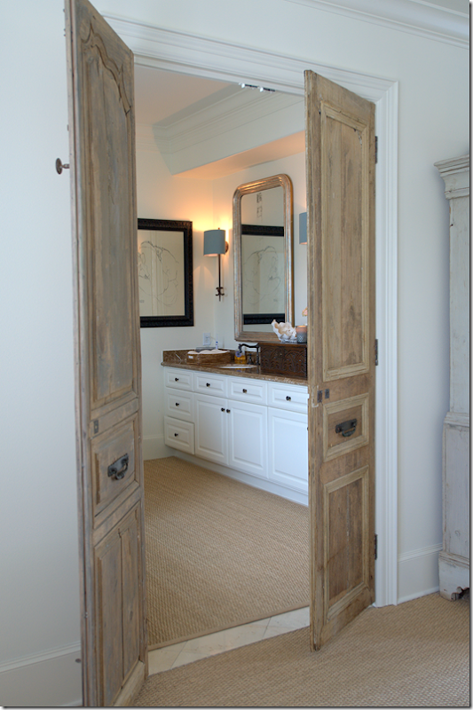
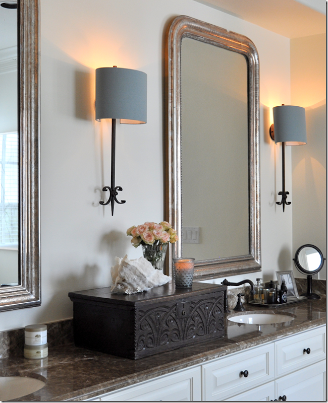
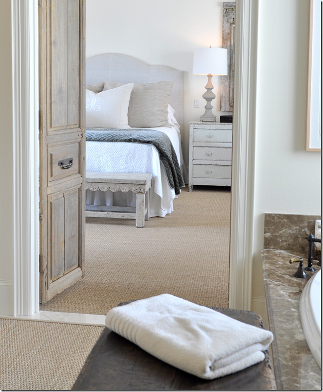
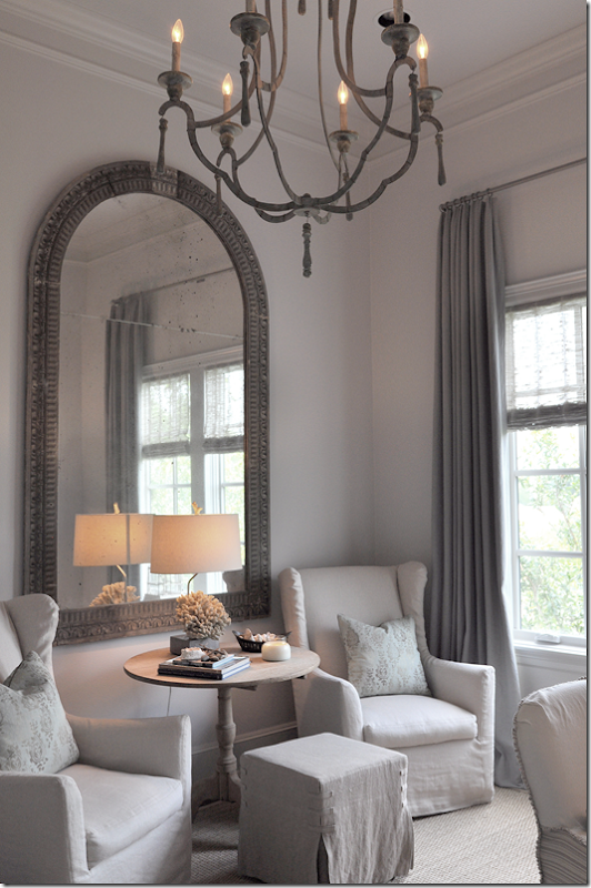
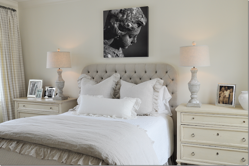
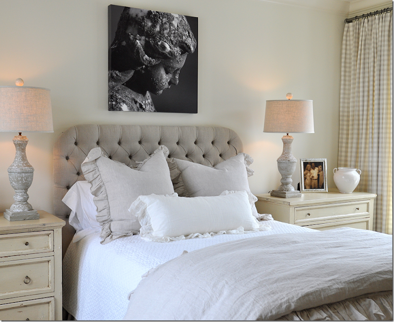
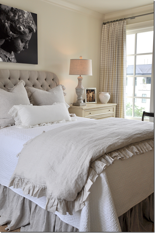
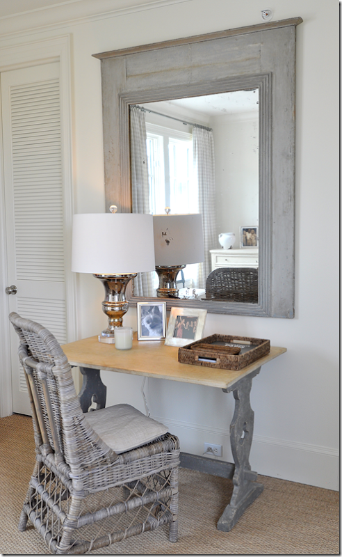
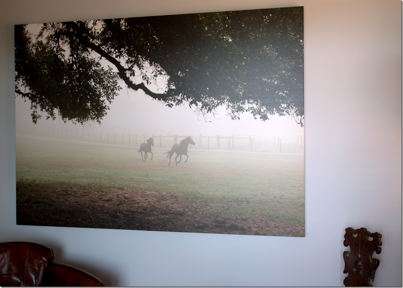
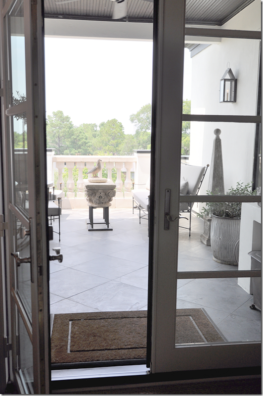
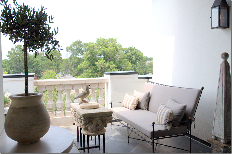
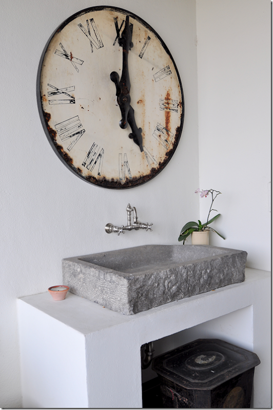
Across from the bed and next to the Swedish armoire are a set of antique doors that lead into the master bath. The doors give a touch of architectural interest to the room – again, they are unexpected and add such a visual treat! No wonder I forgot about the armoire!!Again, as in the kitchen, Ginger told me they decided not to remodel the bathroom, but instead make decorative changes such as add two antique Louis Philippe mirrors and a set of European sconces. She added this beautiful antique bible box – because she told me she doesn’t like wide expanses of countertop. Another lesson learned! What a beautiful idea!She added a custom cut seagrass rug to the bathroom to provide a warm texture against all the shiny marble and tile and placed this beautiful, small antique table to hold towels! Gorgeous!!For the lady’s dressing area – she added a leaning Louis Philippe mirror against the mirror, along with contemporary lamps and an antique bench. Again – another great idea to take home – you don’t have to pull out a mirror – just layer an antique one against it.Or find a pair of interesting doors – to make a space feel more special.Sources: Master Suite: Scalloped Bench, 18th century Spanish table, and Bible Box: Skelton St. John; Coffee bar Relic: MAI – The Two Lucy’sLeaving the master bedroom suite on the second floor – we go to the Lady’s study – located on the other side of the staircase.The lady’s study has a large arched mirror that sits in front of a pair of slipped wing chairs and a square ottoman. Between, is a limed table with a wonderful lamp.The lamp is made of a piece of coral – notice the finial. Another lesson to learn – lamps. Many of Ginger’s lamps were created by her – using old balustrades or architectural relics. They are all so beautiful and add such a luxurious touch. They aren’t dressy, most are very casual, but the workmanship is beautiful. The lampshades are just as special. As I said earlier – nothing is left to chance. Every detail is important and thought out.The owner’s desk is antique Spanish – Ginger created the large idea board for all her clippings.Sources: Lady’s Study: Mirror: Vieux Interiors; Chairs: Mecox GardensAnd, up to the top level – the fourth floor:Leaving the third floor with the master suite and lady’s study, we go up to the fourth level. To the right, you can see the button to the elevator – which comes in handy for lugging up heavy items. On the 4th level is the guest room (or grown daughter’s bedroom), the man’s study, and the outdoor terrace.Here, the guest room has a pair of painted chests with matching balustrade lamps with linen shades. The art work is a photograph by Pulitzer Prize winner, Skeeter Hagler. (More information about him, follows!)On both sides of the room, large windows overlook the front street and the interior courtyard. Notice how wonderful those lamps are – and how pretty the headboard is!!!The headboard is tufted linen and the bedding is white cotton and ruffled linen. The pattern comes from the Chelsea Editions check used for the draperies. As in the master bedroom, this room is soothing and restful.Across from the bed is this darling desk and Kooboo wicker chair, along with an antique trumeau. Isn’t that desk adorable? I love this whole vignette with the mirror, desk and wicker chair.Sources: Guest Bedroom: Bedding: Indulge; Photograph: Skeeter Hagler Photography; Chests: Joyce Horn’Leaving the guest room, walking past the central staircase, is the man’s study and the terrace.A painted trunk stands in the hallway – which looks into the man’s study/TV room. Inside the study, hanging on the wall is another photograph by Skeeter Hagler – this one of galloping horses in a misty field.Ginger didn’t decorate this study/TV room – so I’m not going to show it – but she did place the art work here – the Skeeter Hagler photograph. Another great idea to learn from: instead of buying oils – think about photographs! This piece – of horses in a field - has a masculine vibe to it – so it is appropriate for the owner’s man cave. It adds so much atmosphere to the room – and I love how it is oversized.Off the man’s study is the large terrace that overlooks the trees – and downtown. Up four flights, the view is amazing. There’s a place to cook outdoors here and a place to sit down, thanks to the Janus et Cie furniture, Amalfi Collection, that Ginger placed here.She added stripped pillows and linen colored outdoor fabrics, along with wonderful accessories like the pot and plant on the left and the obelisk and lantern on the right. The coffee table is another wonderful piece – made of architectural capitals put together on an iron frame – sort of like those found downstairs. I love how the décor outside has the same aesthetic as inside – it all flows together.Love the bird! I’d be out here 24/7 if I lived here.Across from the grill is this wonderful stone sink and station clock. A large tin below acts as garbage bin. Notice the darling wall hanging faucet. Like I said – Ginger doesn’t let one detail go by without careful thought and deliberation. Although this is outside on the terrace, I can’t help think this setting would make a perfect powder room inside!
Sources: Terrace: Furniture: Janus et Cie; Sink: Chateau Domingue; Clock: The Gray Door.
And now, we come to the end of the tour! The owners’ sweet dog wanted to say Hi – and of course he is sitting on my favorite corner in the townhouse!!! So I get to show it one more time!!I want to take this time to thank the homeowners for letting me photograph their beautiful house and to write about on the blog.AND I want to give a huge thank you to Ginger Barber for the tour – giving me her precious time meant the world to me. Little did she know how much I was learning from her – things that I will never forget – and ideas that I will try to incorporate into my own designs. Just her work ethic alone was inspiring. Things she shared with me stuck in my head throughout the time we spent together. “That’s why her designs are so great” kept ringing in my ears. “That’s the difference!” I found myself repeating to myself over and over. She doesn’t cut any corners and it shows. Everything was perfect. Perfect. There wasn’t one thing I would change. The house was casual, not dressy by any means, it was comfortable and inviting, cozy and warm – the best kind of interiors there are. Yet – for all its welcoming vibe - it is exquisite and beautifully executed. Nothing was out of place, nothing was wrong. All the proportions were right, all the furniture fit exactly like it should – it was the work of a pure professional and I came away really inspired to kick it up a notch myself. Ginger has always been a huge inspiration and a role model and now, I realize WHY even more.Finally, while I was photographing the house - Ginger told me a story about how a few years ago she rescued a starving and abused Belgian (of course it was Belgian!) horse out in a field near Galveston. What do you do when you rescue an emaciated horse? As Ginger quickly learned from the police – you call Habitat for Horses, a humane not-for-profit organization that rescues abused horses and those horses on their way to the slaughterhouse. After the horses are made healthy, Habitat for Horses then places them for adoption, or if unadoptable, they provide them with life time safety and shelter and feed. Since 1997 when they were founded, Habitat for Horses has saved 5,178 abused and neglected horses. They have adopted out 4,660 of these horses. Yet, there’s still a lot of work to do: in 2011 alone, over 134,000 horses from the US were slaughtered in Mexico and Canada!!!!!With this one rescue, Ginger discovered a new calling – something that she has devoted much of her free time to – by volunteering, raising funds, and just spreading the word about Habitat for Horses. Right now, Habitat for Horses is located on a 27 acre farm near Galveston which was donated to their cause. But, space is limited and they are in desperate need of more land. A massive campaign is underway to raise the funds to purchase additional land for the rescued horses. In a few months, Ginger, along with Jill Brown from BROWN, will be hosting a fund raiser for Habitat for Horses. I’ll let you know the details as the time comes closer. In the meantime, be sure to visit the Habitat for Horses web site to learn more about this organization – and if you are so inclined, how you can help – by volunteering, adopting, or donating. I talked to Ginger tonight and she told me she was going out to the ranch tomorrow to feed the horses and help out in the stables. It’s not glamorous work, but it’s hugely rewarding for her. Hugely. She said it’s the most important thing she has ever done and her face radiates with excitement when she talks about the rescued horses.One interesting note is that for the fund raiser, the photographer Skeeter Hagler whose work was shown in this townhome, has agreed to auction his photographs for Habitat for Horses.And to visit Ginger Barber’s web site – go HERE.And finally, I hope everyone had a wonderful Fourth of July!!!!!
A Ginger Barber Designed Townhouse
Subscribe to:
Post Comments
(
Atom
)


















I have been waiting for this one for a long time! The house is beautiful - so peaceful and serene, so beautifully put together - very collected looking. I can't wait to study every picture. I am coming to Houston this fall, and it sounds like I need to tack on a few days to the trip to visit some of these amazing stores!
ReplyDeleteThank you for this beautiful post.
- Holly
This comment has been removed by the author.
ReplyDeleteI have been mesmerized from your first word to your last. No words can describe the beauty of this piece! Thank you.
ReplyDeletePatty
Yes, beautiful decor and GREAT architecture. "God is in the details" - Mies van der Rohe
ReplyDeleteYou are simply the best! Loved every bit of it! Also, I am a huge horse lover and love that you shared about this amazing program to rescue these majestic animals! Joni and Ginger, you ROCK!
ReplyDeleteIt's beautiful, as usual. Ginger Barber is definitely one of my favorites! I love all the rough/raw with the refined.
ReplyDeleteStunning...I love Ginger Barber's work. Thanks for sharing all the photos and story of everything done in this home.
ReplyDeleteBeautiful! Love the lantern sconce on the terrace off of the man's study! Would you happen to know the manufacturer ?
ReplyDeleteAloha, C Nichols
Hi Joni!
ReplyDeleteI can see why you wanted to ng burn your house down! This townhouse is gorgeous. I love the painted chest in the living room. And the owners mineral collection. As a matter of fact, I love everything about the living room.
Ginger is such a talented designer. Thank you for featuring her work. Also, thank you for listing the sources of the antiques in the main post. This way, you won't have to answer the same questions a dozen times in the comments.
What an outstanding post Joni! Thank you for a wonderful journey through this georgous home.I keep looking at the pictures.x Trish
ReplyDeleteJoni, What a beautiful home! I love all the antique architectural pieces and the lamps Ginger makes. Thank you for sharing this amazing home.
ReplyDeleteWhat an outstanding post Joni! Thank you for a wonderful journey through this georgous home.I keep looking at the pictures.x Trish
ReplyDeleteSuch a serene and peaceful house. It is very subtle and luxurious in a quiet way.
ReplyDeleteIt requires thought and time to reflect on the different elements that Ms Ginger and the homeowner chose.
karen
Great information here for the readers. I found very good contend in your article. We are thankful to your article. The details your given at here is so useful to us and many other people. Keep sharing your in future.
ReplyDeleteproduct Design Course
Gorgeous...love the depth of details. And the serenity. But I think I am most enamored of her cause for rescued horses. Near and dear to my heart! <3
ReplyDeleteIt's wonderful to learn about Habitat for Horses rescuing equines from starvation, neglect and abuse.
ReplyDeleteSince Ginger Barber is an animal lover, she'll want to learn the facts about the extreme misery, environmental destruction and human health costs of turning animal skins into rugs.
Those considering purchasing leather will want to see designer Stella McCartney's exposé of the international leather industry so they can make an informed choice:
https://secure.peta.org/site/Advocacy?cmd=display&page=UserAction&id=3993
Sam Twain
You are either Mark or Shania's brother, right?
DeleteSam - I actually thought of you when I posted this because of the cow skin. I knew you would leave a blurb here about it. I'm sure Ginger never even thought about that, I didn't either, until I was posting the pictures and wrote "skin." I know this subject means a lot to you - and I thank you for being considerate when posting your link without judging or ridicule. I think everyone wishes the world wasn't the way it was and cows weren't used for every body part to clothe and feed us and decorate our houses. I don't know what the answer is. And I know no one here does either, but now they can read your literature and make an informed choice if they want to wear leather shoes or carry leather purses or eat meat or wash with soap - on and on and on. It's not an easy story to tell.
Deletethank you again for being respectful.
Joni
Wonderful; Thank you for sharing it with us :)
ReplyDeleteto.die.for.
ReplyDeleteSooo beautiful- thank you Joni and Ginger for sharing!
-linda,ny
OMG - just everything... What a dream home!
ReplyDeleteJoni-
ReplyDeleteI am thrilled! Can't find your email address, so here is my email address! splendidsass@gmail.com
Thank you SO MUCH!
Teresa
Great - congrats! EVERYONE = Teresa was the winner in the Karen Sugarman Jewelry giveaway!!!!
DeleteI adore this post. Have to come back with coffee, but I know I am in love with the yorkie. I lost my sweet Lady three weeks ago,and have been going through the grueling task of checking out breeders. You have made my day much better!
ReplyDeleteTeresa
xoxo
It is a beautiful home and filled with interesting and gorgeous things, especially the lamps and mirrors. BUT I can't imagine living on a daiily basis in it, it is almost too perfect. I much preferred your design for comfort and livability. I have always admired and clipped Ginger's work when I saw it but hadn't a clue who she was until I became a follower of your blog. I recently learned of her work with Habitat for Horses, a cause dear to me and really became her fan. I get into arguments all the time with my vegan sis-in-law over my cowhide and the fact I want a zebra skin:( I guess it is a complete "dichotomy" to use hides in design versus supporting rescuing abused and neglected animals. Thanks for this bit of loveliness before heading off to my daily grind. Have a great weekend.
ReplyDeleteBeautiful post, as always. I love all the attention to detail and the vibe of the house.
ReplyDeleteYou have done it again, Joni: taught me so much, gave me ideas for my design projects, and lifted my aesthetic up a notch. By the way, I haven't forgotten the before/after pictures of my daughter's home in Bethesda. She gave me the cd of top quality photos from the realtor, but we were displaced for nine months after our house flooded. Now that I am back in, I found the cd. I will be sending both sets of photos in August. Until then, I will keep following your blog!
ReplyDeleteThank you for sharing! Once again beautifully done!
ReplyDeleteLovely post/lovely house....did Ginger give you the brand/name for the paint color for the walls?
ReplyDeleteno - she doesn't know. this is what was painted and the owners - esp. the husband loved the color and didn't want it changed. so ginger didn't paint the walls. I'm sorry!!!!!!!!!!
DeleteThe building where this condo is located is lovely and the stairway which leads to the various floors elegant and beautiful. After that, however, it become boring with every room in the home painted gray, slipcovered chairs and headboards in gray or white. The family room is more elegant than the living room only because Ginger finally broke with the painted furniture and added the large antique mahogany chest and the owner's Baker coffee table. Joni for as much as you love antiques, you seem to have a hard time distinguishing between antiques and flea market finds. Most of the "stuff" in this condo while purchased at antique stores are no more than flea market finds. It is not likely that an antique appraiser would sign off on any of it having verifiable provenance. If the owner doesn't care and is only seeking a particular look, so be it. I simply hate that some of your readers may not know the difference by the way you throw around the word "antique". The owner must have a hard time knowing what room she is in given they all look the same. A nice break came with the study and definitely the lovely terrace porch. Overall, a real let down from the hype.
ReplyDeleteI have to agree with you. Although I cannot comment on the Antiques. Again, not knowing the provenance I can't say. Although this home is quite lovely, it just isn't for me. I doubt the Living Room is used for anything. Just a room with "stuff" in it. Although a chaise looks lovely in pics, it really is just that-lovely. The Lamps in the dining room are too tall. I saw them and my eye instantly went to the window frame. It would bug me every time I looked at them. I understand that the window is a "challenge" but those lamps just don't help. Is it just me or do the balustrades in the sitting area seem to overwhelm the settee? I suppose Ginger was trying to apply contrast but to me the settee is far too fine and delicate to have those stone monoliths in front. I don't have a problem with having some type of stone there, I just feel the scale is off somehow. The Famiy room is very nice as well but is nicer than most peoples formal living rooms. It is quite obvious from the style of furnishings that formal is a way of life for the client. And finally..... the custom seagrass in the Master Bath. All I am going to say is NO RUGS OR CARPET in a bathroom EVER!! If you don't like the tile then wait, save and change it. I can only imagine that is the only reason to "cover it up". Overall it is a lovely house and I am sure that the client is quite happy with her home. This is just a case of differing opinions on what one person would love to have in their home compared to someone else.
DeleteThere is also very little imagination shown in the lighting. Most of the lamps are the same size and style. Joni mentions how wonderful the linen shade is on one of them. What's so unique about a linen shade. You can buy them anywhere, any day of the week.
DeleteI'm not sure some of this stuff is even that old. A lot of what looks "old" is probably newly fabricated to look "ancient" or "rustic." I picture places like the Philippines and Korea churning this "Ye Olde" stuff out by the ton.
DeleteThe "old books" also look synthetic.
The styling, especially in the shelves, looks like what you see in model homes. The accessories were clearly bought in a single day or two, from just one or two sources.
If we could only peek at the underneath side of most of it, we would find "made in China". This is better described as decorating out of the trunk of your car, clearly not collected over time because it is all a part of "the look".
DeleteYes, it's very easy to fake age-distressing (chemicals, bleaches, leaving things in the rain, etc.). For example, the scalloped-edge bench at the end of the bed: I'd bet anything that's a new piece that had been artificially distressed.
DeleteOMG - ARE YOU SERIOUS??????????????????????????? I sourced all the antiques for you. These stores are the most reputable places in houston. there is NO way something was sold as an antique isn't. These are not reproductions people. And I have to say, it's really insulting for the homeowner and designer to come here and insinuate that i am lying. Because that is what you are doing. I saw these pieces, they are antiques. they weren't bought at roundtop from some seller than no one knew. All these sources go to europe and buy these pieces themselves. They are very well aware of what is faked and are experts in their field. Do you think the mNAeve doesn't know what is fake? You have to see a piece in person to understand the difference between and repro and a fake. and the book too? jeez. really, it's just too much. it's just rude. sorry. but it's freaking rude to say what you said. bought in a single day??????????????????????????? ahahahahahah. you really believe that? i named all the sources - all the stores - omg. It's just hard to take sometimes.
DeleteThere are many antique firms that shop the flea markets in Europe. As a result, they often purchase items made of reclaimed wood from demolished buildings, barns, stables, etc. With these materials, it is not hard to fake an antique and despite being in the business, dealers are often duped into buying these pieces. In addition, unless a piece is clearly indicated that it is an antique and is given a provenance, one must consider that the piece was made "in the style of", rather than authentic. If you abide by the 100 year rule, as you often say you do, then it is hard to believe that many of these pieces reach that threshold.
DeleteI've shopped the flea markets of Europe and Houston dealers and can report that there are many kinds of "antiques": original paint (rare and most expensive), scraped paint (layers of paint scraped back to reveal the original), antiques with "new paint" (repainted a color more pleasing than the original), pieces in ill repair that have a morsel or two added on to become whole, and pieces that are wholly created from old or reclaimed wood, to name a few. Each has its own charm and price point -- and all are fine as long as the person selling them is honest about what the object is.
DeleteI've been in a reputable Houston antique shop (not listed above) where the owner was surprised to learn, from someone far more knowledgeable than me, that a couple of the "original painted" pieces in stock were not original paint. I've no doubt it was an honest mistake. I've also taken one of my antique pieces (sold to me honestly as "new paint") to a specialist painter in Houston to be repainted in a different (but still antique-like) way. While there, I perused a book of this painter's work that included pieces "repainted" for two of the shops that were listed above. Not a problem -- as long as these pieces were sold to their buyers as "new paint" at a price point that reflected this. Notwithstanding, I can tell you that if I were to purchase a piece at one of these shops, I would look long and hard at the paint.
I don't think the previous commenters were suggesting that the antique shops listed were trying to pass off fakes. Rather, I think they were taking issue with the word "antique" being bandied about a little too liberally. Some of the furniture in the house is clearly more special than others -- which is perfectly fine (you don't need everything museum quality to have a nice home). Antique, by definition, is more than 100 years old. In the homes most often shown on this blog, they are European, which also has implications (i.e. distinctive periods, styles, and colors). Anything that is not greater than 100 years is merely "old".
For example, take the white chest of drawers in the master bedroom. First clue: painted over drawer pulls. Second clue: distressing done too evenly around all the edges of drawers. Definitely new paint, possibly on "old" chest of drawers (most likely not antique as it doesn't really fit into one the "period styles", unless it's a "country" piece). Next, the two trumeau mirrors in the master bedroom. First concern: there are two of them (more rare to find them in pairs). Second concern: mottled paint job. Third concern: carving on the left one doesn't look as fine as the right one. Fourth concern: really heavy hand on the foxing of the glass (how old would these mirrors have us believe they are?). Next, look carefully at the "Swedish style" stool in the lady's dressing room. It's cute, but a mishmash of styles. The tapered legs look "Gustavian", but such legs are usually found on tables. Swedish stool legs are normally fluted, with decorative carvings, and don't have stretchers (stretchers are the H-shape holding the legs together, which went out of style after Louis XIV). The paint job is also not very convincing.
Please note that my point is not to pick apart the furniture. Also note that I chose to discuss pieces that Joni had not attributed to any particular shop. What I'm trying to say (and what previous posters have pointed out) is that there are items that do not qualify as "antiques" -- no matter what store sold them. And it's perfectly fine, as long as they were priced and marketed correctly. One can have a lovely home, filled with beautiful things that are not necessarily antiques.
yes, and antique stores should always tell you it's new paint. when I go to MNaeve for example, i KNOW that if she says it's antique, it is. she will say - no, that's new paint (though she doesn't buy much of that) - but she is not going to risk her reputation by saying something is old, if its not. now, i will say - some things i might have said - antique without knowing that for sure. i didn't question about every piece. it's possible she bought a pair of mirrors knowing they weren't old, i have no idea. i didn't question like that. but still, you can just tell, i could look at the swedish sofa and see that it is old and not a repro. but of course she bought that from mnaeve who i trust. there is one person in houston who tries to fool people but no one is really fooled but him. ive gotten lots of emails about him and wouldn't trust him about anything. you have to know the dealer and trust him. there are lots things that are fake. when you go to antique stores and suddenly everyone in town has the same kind of item in multiples, then you know it's not old. and i wouldn't pay a lot for anything and not get it appraised. i know for instance when i buy something from tara shaw (who isn't in houston) - you can see that it is really old. she never repaired or painted anything over before selling it. it was all sold as is - and you could see, door would be falling off, paint was chipped in an unattravtive way, the pieces i bought from her - there is no doubt, none at all. it just looks and smells a certain way you can't fake. or like the swedish pieces i bought that are supposedly old or vintage, well, i question that. i can compare what i bought vs. what cindy neal would sell and thee is no doubt that i got what i paid for (not much) but i wanted the look and couldn't afford the real thing. but put my swedish table against one at bill's and an idiot would see the difference and know my is new and newly painted and his is real and old. yes, dealers touch up paint and yes they sell things that have been painted over, but if you ask they should admit this and the reputable ones will tell you this outright. thee's a reason why i walked into certain shops and just drool, because their things are so gorgeous and authentic and what i can afford is so different! As for these companies that make repros, you can tell a mile away. even someone like eloquence who sells both antiques and repro - you can just look at their catalogue and say - that is new, that is old - but they tell you that up front. this is old, this is new. i wonder if we are talking about the same dealer that is passing off new as old - i would love to know. email me? and i doubt that dealer was "shocked" to know, more like he was shocked that you had it appraised and caught him. one other thing - i have bought antiques, not period, for clients and had them repainted in light colors, etc. its still an antique, but the finish is new. or better. like sometimes i buy old gate leg tables that are lighter brown and i like dark brown, so i'll have them restained. you can tell the difference though, the old gate leg tables are so much heavier than the new ones. not sure why, but they weigh so much more when old. good comment. email me. i'm being nosey.
DeleteThis HAS TO BE an all time best. You left me breathless...the beauty, the genius...guess that's why they are who they are. I particularly loved your comment, "but I say if antiques are out of your price range, find a reproduction with good lines and a pretty finish, etc" Joni...that's where YOU are so inspirational...I was thinking..take an antique door frame, cut out part of the middle and add a mirror to place over my mantel (size it of course...) I can hardly wait to start... Thank you for all that you do. franki
ReplyDeleteMerlin, you actually used the word "genius" to describe this project. It's as close to Restoration Hardware as I have ever seen without the horrible lack of scale RH is known for. The owner here bought a look, not a design. There is no design here. GB simply went on a big shopping trip for a high budget client. It doesn't take talent nor imagination to make every room in a house or condo look the same and it's even easier if you have a client who may not have very firm convictions about his or her own style. There is not a magazine in this country that would find this condo worth publishing unless it was some local city publication that GB has close ties with. Sorry, this one is simply boring. Perhaps we can blame it on the picture taker or the lighting, but I don't think so.
DeleteI think this anonymous person is the one who is "boring" with all the negative comments....ok you didn't like it...we got that in the first few lines......so move on!!! You bore me.....
Delete"The owner here bought a look, not a design. There is no design here."
DeleteI sort of agree. This is more about merchandising than it is about designing. (The tchotchkes on the shelves tell the tale: "buying a look" indeed.)
You have brought up a point that I've never understood, and am hoping you'll offer me some insight. If the home is already built, what is it that conveys "design" instead of merchandising or decorating? Obviously, everything has to be purchased somewhere, so going shopping must be a part of it no matter what. How would this home be different if it were "designed" rather than "merchandised" as you put it? I've heard statements like this for years, and I would really love to understand the difference.
DeleteThe difference is time.
DeleteThe owners would have bought the furniture and accessories over years and decades, and the stuff in the house would have had variety, because it would reflect many different sources, the owners' shifting interests, their travels, their budget increasing, etc. The house would have documented the actual lives of the people living there. It wouldn't look like a furniture showroom.
I want to make sure you realize I'm not trying to be snarky here, I'm really wanting to understand this concept that has eluded me. So when I see shelves that contain books bound just alike - one of my pet peeves, it shows they really aren't into books - that would be referred to as decorating rather than designing? And putting a large non-functional box that covers all of the usable counter space in the master bathroom? So a designer would create a home with some intentional imperfections, for lack of a better word, to make it feel more livable?
DeleteIt's not a difference between "decorating" and "designing." Let's just agree to use the word "decorating" for convenience.
DeleteThe difference I'm talking about is the difference between a decorator who turns out a house like this, versus a decorator who is interested in her clients as people, with lives that are unique and interesting.
Okay, that helps some. Over the years, I've heard snobby comments (here and other places) that something was decorated but not designed. I never understood the difference. You are saying there is no difference, that those statements are incorrect. Perhaps to me, I like things that are used in an unpredictable manner, but I think that's just creativity, not design. Merchandising - I understand that term - is non-personal. But how is "buying a look" different than design? Is it that lack of imagination?
Delete"but I think that's just creativity, not design."
DeleteI don't think you can separate "creativity" from "design."
By "merchandising," I mean the shelves, for example, are filled with objects that the decorator gathered up from various stores, solely to serve as filler. The objects bear no relation to the clients' lives, or minds, or sensibilities. They are, as you say, "non-personal."
This might as well be the lobby of a pleasant hotel.
The accessories look like GB drove a U-haul up to the service entrance of World Market and said "load-em up boys"
DeleteThe "olde faded-wood balustrade" lamps are also likely fakes. Probably made last week in the same Indonesian town that has a Nike factory.
DeleteWhere they were purchased has nothing to do with good design.
Deleteyou are wrong- where they are purchased has ALL to do with it. if you know the owner of the shop, where they buy things from you would know the difference. jeez. these are flea markets people. the owners are well seasoned and have been business for decades. The gray door - decades. she knows the difference between a fake and an antique. are you crazy????? I'm sorry. but you sound really dumb. do you think the antique store owners of this caliber don't know their trade?????????????
Deleteand listen - those shelves are filled with things the homeowners collected - the minerals the books the boxes. i was in the house before ginger did it = and it is still filled with things they owned BEFORE - and collected = like art work, like furniture, like accessories. ginger edited their things LIKE THEY WANTED.
there is no difference between decorating and designing. you take a floor plan and you look at what the client owns and what they want to keep. you place it and you edit it and you add to it.
I can't get over the issue with the shelves. the husband collects minerals and she likes old books. REally. think before you just spout off. You know what BAD design is? A decorator who sits in his office and buys everything from furniture catalogues - THAT is what looks like a furniture showroom. Not a decorator who goes and and hand picks over months and months and months every single piece that is purchased. Do you know how EASY it is to design a house using new furniture from a catalagoue? That is what takes days, my friend. When you hand pick lamps and mirrors and chairs and tables and chandeliers and sconces and relics - THAT is what takes time. sometimes you go to all the antique stores and they don't have anything and you have to wait until they go to europe again and get another shipment. and even then you don't know what they are going to have. With a catalogue - boom. you just order it THAT IS GOOD DESIGN??????????? AHAHAHA. please. did you notice the family room - with a mixture of contemporary and antiques? dark and light woods? it's not all the same. I could just scream right now. as if. as if.
You know, I just have to chime in about the mineral collection. There is no way those were gathered up by the decorator. I worked with wonderful clients (originally from Houston, BTW) who also had an extensive collecton of rare mineral crystals and geodes similar to the pieces displayed in the living room of Ginger's clients. My client's husband was a retired oil executive with an extensive background in geology, and he had collected minerals, crystals, and fossils one at a time, from all over the world, throughout his entire life. He had a whole professional rock tumbling setup in a basement workshop... And you would fall over on your little pink tushie if you knew how much those things were worth!
DeleteI have to say, a lot of these negative comments sound like jealousy and sour grapes.
Didn't you recently purchase some lamps from Aidan Gray from a catalog for the client shown in your last post? Didn't you order from a catalog two club chairs fitted with a swivel or casters? So, if memory is correct, there are plenty of instances where you own up to using catalogs in your own designs.
DeleteThere are two identical mirrors above the nightstands in one of the bedrooms and two identical Louis Phillipe mirrors in the master bath. Can you explain this? They cannot both be antiques. Antique pairs of anything, particularly mirrors are very difficult to find. Often when you have one and need a duplicate as in this case, you have a talented artisan make one to match. A designer I know in Atlanta had this done and pointed it out to the editor of Atlanta Homes magazine when his home was on tour. Indeed, there is another silverleaf Louis mirror in the dressing area that looks like the bathroom mirrors. Are we to believe that these are antiques which happen to identical. I am not buying it.
DeleteI was just at Scott's in June looking at Louis Phillipe mirrors since I would love to have one or two in my bathroom, especially now since seeing them in this home. I found two that were remarkably similiar in size and detail that would work together. I spent quite abit of time being educated by the dealer and the dealer themselves network and she was willing to help me locate one if I chose to purchase. The two above the sinks are different. Besides Joni is the most detail oriented person and would have been able to discern a replica. This is a tough economy and the dealers have to be ethical or else noted designers such as Ginger are not going to patronize them. These dealers pay alot in shipping antiques to the States and put up with alot of aggravation with CBP, their reputations are at stake which is their livelihood. Sure many of them sell reproductions but they will tell you what is what. Besides, do you really think Ginger would have allowed her client's house to be scrutinized and dissected on Joni's blog if she felt she would be "found out" for using reproductions that she mislead her clients into thinking were antiques? Thanks Joni for a wonderful post and to the homeowners and Ginger for sharing. Have a great weekend.
Deletethere are lots of louis philippe mirrors on the market that are antique and they do look alike. they are over 100 years old, this is the definition of an antique. they don't have to be "period" to be called antique. and yes, many times a designer will have a copy made. pairs of mirrors are rare but not unheard of. Many large rooms with fireplaces on both ends would have a matching trumeau on each end. Or trumeaus that matched were made for in between windows and over doors. Then again, I didn't ask about each mirror in the house - if it was antique or a new one. It's possible those two aren't old, I have no idea. Dealers from antique stores do sell new things too- but they are labeled new - made of old wood, etc. no reputable dealer would sell something new and pass it off as old. except for one dealer in Houston, unnamed here. He is notorious for doing this and everyone knows it, hence no one buys his things excepts the uninformed. I have gotten scores of emails about his practices. That's why you should know who you buy your antiques from. You have to trust that person and trust your own eye too. But no, there are lots of LP mirrors out there that are antique and look exactly alike. I will say, sometimes the mirror is replaced - it's hard to fake a pretty old mirror. sometimes the old ones age in way that it is really unattractive - blotchy spaces, circles, etc. so i would suspect that some put a faked mirror in instead. i have seen some really ugly mirrors that are antique - like aged in only half the mirror or in only one space - or all the mirror is gone in places and the back is exposed, but the frame is still pretty. i would think some of those are replaced, again, the dealer should tell you all of this.
DeleteYEs I DO buy from Aidan Gray!!! I don't have a lot of clients that can afford expensive antiques. The mirror in the family room i just did was from France, but's brand new. She didn't want to pay for an old one. Trust me, I'm not on Ginger's level. I wish I was, but I'm not. The budgets between this project and my project are very different. That's wny I have to buy new instead of old. Even though sometimes new is more expensive than old. In my daughters room, I used tara Shaw's new mirror, but i also have the antique mirror that looks exactly like it.
AND, upholstered furniture is different than antiques like settees, daybeds, mirrors, etc. Even though none of the upholstery came from a catalogue - it was all custom made or was the homeowners.
Everything everyone just said! This house is beautiful and your loving attention to detail, as always, helps me see what is right in front of my face. It is why I am just devoted to you and your blog. I have to say, though, that by the time I got to the bedroom I had several thoughts:
ReplyDeleteHow and why would a client want to replace every single piece of their own furniture, their history and memories, with new pieces that though beyond beautiful, all look exactly alike? And how could you ever pay for it? Which leads me to my real questions, how long did this project take? And how much did it cost? I am going to guess 18 months and $400,000, but I would love a little insight into that part of the business. We are doing a room a year with our decorator, which fits my budget and my comfort level, and obviously everyone is different (and way more rich than I am LOL!)
My other thought is, as fresh and clean and cool as this grey/blue/tan linen-look looks, how is it going to look in a few years? Classic, or exactly like Alfred Pennyworth's private quarters in Batman's cave? Mysteriously perfect, or cold and uninviting? Or just a hot mess of wrinkled linen and pulled threads (or is that just my house)??
When I think about your house and your "look", I have to say I really prefer it. Ginger Barber is like a master class in decorating, and I love every single detail you pointed out about her style, but like anyone's, it is just a jumping off point to incorporate into your own life, and stuff and memories.
Thank you, as always, for everything you do for us with your blog, and your extraordinary intelligence and attention to detail. Big fan!
Elizabeth
Ditto Elizabeth! I couldn't have said better myself.
DeleteElizabeth, I get where you're coming from. I think your estimate for the cost of this project is probably very low -- think two to three times that amount -- all of that custom upholstery and the antiques, with no compromises whatsoever, gets VERY pricey. However, there are a lot of possible reasons for starting completely from scratch like this. Perhaps the clients are downsizing from a much larger home, and everything they had was completely the wrong scale for the new townhome? Perhaps they hadn't done any decorating at all in 25 years and everything they had was hopelessly dated and/or not in great condition? It's also possible that the clients are affluent enough that they can afford to completely redecorate every few years. Think of the turnaround that Sharon and Ozzy Osbourne made when they decided they'd had enough of the Gothic look and hired Martyn Lawrence Bullard to create a new look for their interiors. Which brings up another point -- the majority of design clients out there are like you, redoing a room or two at a time with a long-term plan, and your designer's job is to judiciously help you to make the most out of your decorating budget by advising you where to spend money on new pieces and how to repurpose and reuse pieces that you already have. Joni is excellent at that, by the way! But if someone hires a "superstar" designer like Ginger Barber, someone whose work is consistently published in the national shelter magazines and who is at the top of their field, that client is usually thinking of the interior designer as an artist who is going to create a space for them that reflects their signature design aesthetic. Think of that designer like an oil painter -- if you could afford to hire Picasso to paint a mural for you (you know, if he was still alive!), wouldn't you want him to paint the whole thing? You wouldn't want to paint part of the mural yourself and just have Picasso paint half of it, because it wouldn't look like a real Picaso when it was done. What's more, someone of Picasso's caliber is not going to be so desperate for work that he has to take every job that comes along. If you told him at the interview that you wanted him to work with the stick figures and lollipop trees you'd painted on the wall yourself, he probably would decline the job, knowing that he would not be able to deliver the Picasso masterpiece you're expecting without starting from scratch. I know it's an awkward analogy.
DeleteHow is this project going to look in a few years? Well, of course it's going to start looking dated if nothing changes. That's the downside of hiring a trailblazing designer like Ginger who is creating a style that is so fresh and of-the-moment that everyone is copying her work. But I suspect that this client's home will never be truly "finished." As the client grows tired of things, or as styles change, she'll be calling on Ginger to work her magic again, transforming the interiors so that they evolve with the changing needs, lifestyle, and taste of the clients.
"...a trailblazing designer like Ginger who is creating a style that is so fresh and of-the-moment..."
DeleteLOL whut???
You gotta love "trailblazing" as if we have not seen this decor a hundred times before on this blog. LOL indeed.
Deletethank you Rebecca. You are exactly right. You said it better than I could. yes, the couple moved here and their furniture didn't fit with the style of the townhouse and they loved ginger's aesthetic, which is why they hired her. they could have hired anybody they wanted. they like her quiet look. and it fits the space beautifullly. i can't tell you pretty it all is when you walk in off the street. it's just so serene = you just go AHHHHH and want to relax. it's sooo welcoming. i love the analogy you made. thanks!!!
DeleteThank you both for such thoughtful replies. Of course it makes sense that if you can afford it, and are tired of everything you've had for 25 years, that you hire Picasso to work magic. I certainly do think there is magic here. And it is a tribute to Ginger that her look, that she pioneered and engineered, is copied all over Texas, and the world. It is impressive that knock-offs are available in Home Goods, and home decorators, who do order from catalogs, and buy sale items, can get a little bit of her look in their house.
DeleteJoni, you and your thoughtful, smart readers really do make your blog posts twice as much fun in the comments. Thanks for taking the time to come back to answer!
You are right - she had has this aesthetic long before RH did. you can see it by looking at her portfolio. While she can do any style, I like the Houston Look style the best. I wish everyone could see this house in person. i learned so much from touring it.
DeleteI have to be very honest, after awhile I found it mute and depressing. It is lovely furniture, accesories and definitely the style that everyone is doing now, but it is not warm at all. I think it would be fun to visit, but not a home I would ever chose to live in. It seems very sterile and cold. Perhaps this is because I am 33 with two young children and at a different point in my life. I like a little pop here and there to make "your" home stand out from others. This just reminds me of everything we see in magazines and stores across the country.
ReplyDeleteI also have to add that I personally liked your family room/living room better because it had some pieces that you could tell for uniquely special to you.
ReplyDeleteJoni!!
ReplyDeleteThe headboards; where does one buy the headboards that were seen in this lovely house?
Love your blog. Always informative and entertaining!
Cyn
Any good upholster can make one.
DeleteHi Cyn,
DeleteYes, if you want EXACTLY what is found in this home, you will need a custom upholster. However, if you only want something similar, or perhaps something more exciting, your options are much greater and perhaps less costly. (This comment is just for those of you out there who do not have unlimited funds.)
Horchow.com - most expensive $1,500 to $3,500 - many designs and fabrics
Savoiachair.com (out of Canada) sells beautiful Reproduction French style wood frames that can be upholstered in any fabric your little heart desires. (Remember the "Love Nest" bed in Joni's post about the movie, Bel Ami?) $1,000 and up
Fabulousandbaroque.com - silk upholstered, French style wood frames. Many colors to choose from. Probably NOT the place for those of you who are strict adherants to the Belgium look. Some of the styles are very low key and classy, others may make you throw things at your computer. However, worth a look! Prices vary. Moderate to moderately expensive.
Pottery Barn.com - Gabriella - light colored linen with a French shaped curve $699 to $799
BerkeyDecor.com in Carrollton, Texas just north of Dallas can do anything you want! Moderate to expensive - depends on the fabric. Also true for Front Door Fabrics in Charlotte, NC.
Calico Corners - moderate to expensive and you know they do quality work.
Ballarddesigns.com - $329 to $800. Several shapes and many fabrics to choose from
Skyline Furniture - sold on line through Target, Wayfair, Bellacor and many others. Inexpensive to moderate - $329 to $580. MANY shapes and colors. Use Polyester velvet which, personally, I do not like because is absorbs oils.
DO IT YOURSELF! If an upholsterer who did not finish high school and probably does not speak English, can do it, so can you! Excellent tutorial from Centsational Girl called "DIY Simple tufted Headboard". There is also a tutorial on YouTube called, duh, "DIY Tufted Headboard".
You are due for a raise Charlotte. Most interns don't work this hard.
DeleteWell, thank you. Joni is very pleased with my work! :)
DeleteWilliams Sonoma Home has great headboards.
DeleteYes, Charlotte if you lived here - i would ask you to work with me!!!! Ballard is a good inexpensive choice. and pb. but really, the quality just doesn't compare a good custom job. the fabrics aren't matched up well with pb - i ordered one and it was terribly executed. when you see really great upholstery that neal and co. does - it just is the difference between chicken soup and chicken shit. pardon my french. neal and co. has the most wonderful craftsman i've seen. i wish i had clients that could afford them!!! but - rh and williams sonoma is better than pb for quality. i was just in the new rh store and the quality is very good. i like the repros that eloquence is now doing. they are so pretty. if you have a designer, have her check them out too. beautiful repros for a lot less money. i've bought from savoiachair - after you pay to have the frames shipped here, then upholstered, it gets expensive. that's why i like eloquence. and i love noir la, and i love artesia for repros. really pretty stuff.
Deletethanks charlotte - where do i send your check?
Since Joni has followers all over the US, Canada,Australia, and even Norway, I wanted to supply a variety of options. Regarding Savoia Chairs, the shippping can add significantly to the price for some locations. However, for those who live in US states or Canadian Provinces near Toronto shipping will not be that much. Perhaps other readers can suggest good sources near where they live.
DeleteSince Williams Sonoma and Pottery Barn are owned by the same company, do you think they use different workrooms for their headboards? Just curious because you said that WS is better quality than PB. Thanks!
DeleteI have no idea, but i would guess they have different workrooms. ws quality seems better to me, but i haven't seen their headboards in person. maybe it's just an illusion or pr.
DeleteA very interesting post, Joni. It is filled to the brim with inspiration, eye candy and great sources. The photographer is fabulous. Please thank Ginger and the homeowner for their generosity and thank you for your thoroughness.
ReplyDeleteBest...Victoria
I was the photographer and thanks so much. i'm so insecure about it. i really don't have a talent for it at all. i try though.
DeleteStop now. Your photography is fine and we love it. You take us to the most beautiful homes, one thàt most of us will never see in person. Karen
DeleteJoni such a stunning yet quietly elegant and luxurious home. Ginger is genius to pull this all together. The antique tables, lamps bases and art amaze me! is that a Tobias in the living room? My doctor is going to wonder why I am late for this am's appt, I could not possibly pull myself away. A fabulous job of capturing the images of this home full of unexpected delights. Bravo to Ginger and the homeowner! I will be back to study...
ReplyDeletexoxo
Karena
Art by Karena
"Ginger is a genius" - another lol moment.
DeleteJoni,
ReplyDeleteMy coffee went cold! I forgot where I was . The home is beautiful. The linen alone sold me but then all the spectacular details put it above and beyond anything I could dream. I learned so much from your mini course( do I receive a half credit? ) the only thing missing was a picture of you with Ginger. I hope that you got one for your own keepsake? I will be pondering this post for years, so many wonderful lessons. Confession , I am a symmetrical aholic
Your coffee goes cold with every post. You have no design philosophy of your own, otherwise.
Deletethanks lizzie - you can have 1/2 credit!! for sure. i didn't get a picture with ginger. i would have been to embarrassed to ask!!! haha!!!
Deleteand troll, get lost. ok? you are so awful.
Lovely. What's name of the blue paint color in the downstairs living?
ReplyDeleteJoni, thank you for the wonderful tour. I so enjoy all of the details you point out. This home is so cool and lovely, but my favorite part is the story of the horse rescue and Ginger's dedication to saving these beautiful animals. Doing the work of angels.
ReplyDeleteLauren
So pretty. I loved that there was evidence of people living there (photos etc). I LOVE LOVE LOVE the small pillow on the striped settee. I could not stop staring at it. Thank you for sharing and thank you to Ginger as well. I am glad you got the opportunity Joni. And you need to give yourself more credit...you are immensely talented too!!!!
ReplyDeleteBViz - they sell them at watkins!! go look = or email Rebecca about them www.bviz. she is wonderful - her pillows are gorgeous.
DeleteAlso try Juliana's antique pillows, can't remember her website, she is a lovely young lady from Colombia, SC and is sometimes at Scotts in Atlanta. I dream of the day I can afford a BViz! Joni, you could do a post on Rebecca, I remember reading about her several years ago in a magazine and like Phoebe Howard, she is someone who gives back.
DeleteI DID feature Rebecca before - I always try to point out her pillows in the stories. On top of her talent, she is a sweetest person. Google Cote e Texas BVIZ to find it.
Deleteooops, I will go look for that post now! Cripes maybe I read about her on your blog and confused it with a magazine article! My design bucket list includes a BViz pillow and a Harrison Howard original. Thanks!
Deletei love harrison - i have 4 of his prints!!!! they aren't really expensive, but framing is. if you can find a cheap framer, that might be an item you can get on your list!! bviz though - those pillows are pricey. but they are gorgeous. not sure how much those little ones are though - maybe that could be a way to get her pillows without the expensive ticket. check her web site for the price www.bviz.com
DeleteAbsolutely gorgeous, thanks so much for sharing with us. You know I just adore Ginger's style so I was salivating through your entire post.
ReplyDeleteHappy Friday Joni!
xo~
T
Okay -- I agree -- what a sensational, special home! Lucky you for getting the tour and inside info, and aren't we readers lucky for the "virtual" tour! I especially love how Ginger manages to keep her custom pieces so tailored and streamlined, yet with enough subtle detailing to convey that it is, in fact, custom. So many clients are fed up with decades of tassel trim upon tassel trim, but still want to incorporate special custom pieces that LOOK custom.
ReplyDeleteAnd I do hope you can find out the brand and color of the blue/gray paint on the walls in the main living area, because it's gorgeous -- just a hint of color without going the least bit pastel.
the paint was there - and the owners kept it. ginger didn't do that. it ws much bluer she said until they put the linen color in and then it turned more gray. i don't know that the owners even know the color? i asked. but look at farrow and ball - they make wonderful blue gray colors, but i know you know that!!!!!
DeleteSo glad you got to take this tour. Her attention to detail is what makes the difference in this home. The varied textures and the subtle color variations play a huge role in making this home as amazing as it is! thank you so much for sharing.. xo marlis
ReplyDeleteAbsolutely BEAUTIFUL and serene! Thanks so much for the tour, Joni. I have been a huge fan of Ginger Barber for over 15 years (since I first saw her work in a published magazine). I am an even bigger fan since I found out she does volunteer work for Habitat for Horses. I just knew she would not only have beautiful taste, but a beautiful, kind heart as well.
ReplyDeleteLeigh
Joni - Now I finally know what piano nobile means! This was a spectacular tour w/all the details - a great read. Love those antique doors and the bluish gray used throughout the house.
ReplyDeleteOn an unrelated note, I think your daughter attends an art college. My son is going to MassArt in Boston and just wanted to let you know when I read that on your blog a two or so years ago it reinforced to me that I should be open to letting Ryan do that vs. going to a college that had an art program within it. A long way to say thank you. Here's the link to his graduation if you're interested. http://mynottinghill.blogspot.com/2012/06/graduation-day-meeting-congressman.html
Hope you're having a great summer. Michele
The staircase is the most magnificent element in the house. I like some of the furniture pieces, the mirrors and the art, but I would find living with such cool colors a real downer day after day. That's just a personal thing as I prefer warmer colors with some accent color pop here and there. And for me, I like to see some change in color from room to room--at least the accent colors--to keep the decor from being flat and monotonous. Then again, I am still stuck on that Pam Pierce decorated house with the red doors and the blue Fortuny pillows. Stunning!
ReplyDeleteMany of the homes Joni shows on her blog have linen curtains with iron rods. Does anyone know a source for all these iron rods shown in home after home? I've tried searching the blog for a source but have found no mention of curtain rod sources. (And our local fabric stores do not carry) Thanks!
ReplyDeleteThese rods and rings are all custom, made by a metal works shop. Contact a local metal works shop and ask them if they can make them for you, and choose a finish paint color. They are not cheap, and since it is custom, you have to get the measurements perfectly and installed correctly. If you really want this look, it costs a lot but is worth it (although your husband may not agree when he gets the bill). I think you would be better off working with a designer or experienced curtain maker who knows what they are doing to get it right.
DeleteDear Anon 11:20 - these rods are NOT necessarily custom made. In her last post, Joni mentioned that she uses antique Drapery Rods http://www.antiquedraperyrod.com/. They are sold at MANY Retail Fabric locations across the country.
DeleteStill VERY pricey. Whether you or your husband (what an antiquated thought) are paying for these, you may not want to spend so much. My little French McMansion has 10 ft and 12 ft ceilings with numerous large windows. Had I bought everything from Antique Drapery Rods, it would have cost me over $5K just for the hardware. I preferred to spend my money on the drapes themselves. For less than $1K, I was able to get exactly what I wanted. If you are interested on how I did it, please let me know. :)
I did not write the post, but I am interested in how you did your drapery. Please share
DeleteKaren
Charlotte, you are working overtime. Not sure Joni can afford it.
DeleteThis comment has been removed by the author.
Deleteyes,i use antique drapery rods.com and they are really inexpensive despite what my asst told you!!!!! but i have go to drapery places or casual corner or cheap fabric places and bought their rods. try to find the skinniest rod your can - in a dark bronze, not shiny - with tiny rings. they will be cheaper and they will look much more expensive. but do look at antique drapery rods - the smallest rod and rings, plain. they are really reasonable.
DeleteAbsolutely beautiful! Any ideas as to the blue/grey color used? I absolutely love it!
ReplyDeleteSort of sad that the homeowner paid hundreds and hundreds of thousands for this decorating and she still doesn't even have a house with a real dining room.
ReplyDeleteShe has a designated space with a funky window. While the windows are lovely in the rest of the condo, I wonder why the dining space window was designed this way.
ReplyDeleteI'd rather have a real dining room than a living room PLUS a family room.
ReplyDeleteShe has a designated space with a funky window.
ReplyDeleteYou're right. It looks like a basement window.
anon - are you through talking to yourself? must drive you crazy.
Deleteit's a townhouse. hence - they houses are connected. got that? she has a lovely dining room - it is past the living room. the dining room is separated by the living room with alcoved walls and a lowered ceiling upon entering it. they aren't really the same room, but they are open to each other. the front windows let in the light which reaches to the dining room. if you don't like the floor plan, good! the house is already sold, so you don't need to fret it.
Thank you so much for sharing your photos with us. The home is very pretty and all of the details you pointed out wonderful. I read several of the comments with much interest. Certainly not every home is for every person but inspiration can be found everywhere throughout this post. While I want my home to be beautiful, I don't feel that every piece has to be an actual antique. As a matter of fact, I like some of my "junk" pieces better than some of my antiques! I think it is how your overall room looks and if it make you happy. I read the comments regarding the color throughout the home with a grin on my face. When we purchased our home 14 years ago, I painted every wall a creamy white and was so happy. That is until one day I wanted color. Now I have had several warmer colors for many years and would die to have the creamy white back again. Things change quickly. Thank you for all of the time it takes to write your posts. They provide so much information and inspiration. I have recently found your blog and am learning so much.
ReplyDeleteI find it really amusing that the man who paid all the bills didn't let her touch his study. At least one space in this sea of boredom is still personal.
ReplyDeleteInteresting point. While I know the owners have paid a lot of money for this project, it comes across as a lot of "stuff" filling the four story condo. Nothing looks personal. Even the accessories seem to have been swooped up in a buying frenzy rather than collected from gifts, travel, special interests, etc. It just amounts to impersonal stuff and I believe that's one of the reason it's so predictable and boring. Not all of the tailoring in the slipcovers are well done either. Yes, the dining chairs are done well, but take a look at the flimsy and uneven skirts on many of the chairs and benches - not good workmanship.
DeleteGet yourself into the 21st Century mate! Only a relic of the last century would assume that a man paid all the bills! Ginger Barber should be proud of the beauty she has created - what have you done today that you are proud of?
DeleteGranted anon. 1:45 made an assumption that perhaps the "little woman" doesn't work outside of her home and therefore from a sheer earnings perspective, her husband paid for it. There are really a lot of women who do not work outside the home despite all the grim reports that two people "must" work to provide for their families. Now I suppose the question remains, What Have you done today that you are proud of?
Delete"what have you done today that you are proud of?"
DeleteNoted that the emperor had no clothes.
Then you really must run out to WalMart and buy some.
Delete"Then you really must run out to WalMart and buy some."
DeleteBuy some what?
Clothes, idiot!
DeleteClothes? What are you prattling on about? This is a design blog.
DeleteThe Cote de Texas troll was really bored tonight. he got off work, tired, and probably got drunk. keep reading troll - i have an announcement for your - further down. go on. don't spill your beer though. wouldn't want to ruin all your gorgeous furniture you keep telling us about.
DeleteWhat is up with the unnecessarily negative comments? Offering a different point of view is fine, but there is no need to be rude. What on earth is wrong with you nasty people? Why are you wasting energy hating on a DECORATING site?? Please find another hobby. Use your Snarky Powers for good instead of evil.
ReplyDelete"Why are you wasting energy hating on a DECORATING site??"
DeleteYou can just as legitimately ask: Why are you wasting energy LOVING things on a decorating site?
WOW. You are super smart. That was just brilliant.
Delete(I know, that was weak.)
Delete"What is so beautiful throughout the house are the antiques. Each piece was hand chosen by Ginger and the homeowner from a myriad of Houston stores."
ReplyDelete"hand chosen"?! For god's sakes, how else would they be chosen--by a robot?
Of COURSE the decorator and owner picked everything. Why is this "special"?
Hilarious! First time I've have heard of "hand chosen". Usually, it is "carefully selected". Sounds like Ginger and the owner got a little touchy/feely with all those "special" one of a multitude elements coming out of Houston.
DeleteJust maybe,in her enthusiastic mood, she wrote "hand chosen" rather than "carefully selected"? Sounds like something I might do when I'm excited. Can't you overlook it and not take it so literally? Of course, Joni can speak for herself. Hard to nail it every time when you're writing, trying to get your point across. Why not give her the benefit of the doubt, let it go?
DeleteYou missed the point. Every decorator "hand selects" the objects for her client. Big deal. It's like bragging that a doctor "always washes his hands" before operating, or that an accountant "always adds and subtracts accurately."
DeleteNo, I didn't miss the point. I think you miss the point of even reading a blog. Are you looking fo a chance to explain things to the rest of us?
DeleteNo, I didn't miss the point. I think you miss the point....of reading a blog like this. Take it or leave it.
Two replies?
DeleteNO you missed the point. Hand chosen means - she went out and picked every piece, went shopping for each piece. she didn't sit in her office and open her catalogues and order everything in a day or two from furniture companies. THAT is the easy way out. Open a book and say i want that and that and that and bam, your house is furnished - just like the troll probably had his house done. Instead, she goes from antique store to shop to antique shop, carefully choosing each chair or table or mirror, measuring it, making sure it is right, calling around to source an antique swedish bench, finding out who in town has one. waiting for a new shipment to come in - standing first in line when the shop opens to be sure to get exactly what she wants. this process takes months and months. a decorator that using only new and repros can furnish the house in a day or two or week at most. she has her secretary place all the orders over the phone. THAT is what a showroom house looks like. plus, everyone else in town will have the same accessories, the same chandeliers, the same lamps, the same chairs, the same tables. for instance, who else is going to have the same the trumeaus that this owner does? no one probably. or the same wonderful coffee table? no one. Or the lamps, no one. Each piece was first hand selected by the dealer in europe, and then picked by ginger or pam or carol or whoever the designer is. what the homeowner will have is something unique to her house - her neighbor wont have the same mirror or coffee table or chest or console. no one will walk in her house and say - i have that table from century or that chair from kravet. that is what hand picked or hand chosen means.
DeleteReading the comments is almost as fun as the blog itself - it reinforces that design is ALWAYS personal! I don't know anyone who walks into a home, or views photographs, and loves every detail. Pinterest is a raging success in large part because people love grabbing an idea here, a color there and planning their own personal space. Thanks for a very entertaining story - the quality of your photographs and the detail in your captions makes your blog so much more successful than most out there today. Kudos!
ReplyDeleteI so agree. Some people complain about the snarky comments -- but I'd argue that many of these are also the best written, and so amusing. It's design and entertainment all rolled into one. Never, ever ban anyone from this blog ... please.
DeleteI dont want to ban anyone. that's not the point. but the constant meanness from this one person is just out of hand. he can leave one or two or even three comments - ok. but 20, 30? and he is so disrespectful. people are kind enough to come on here and be a guest and he is just so mean to them. i don't get it. no more.
Delete"...her face radiates with excitement when she talks about the rescued horses."
ReplyDeleteDoes her face radiate anger when she talks about horses being killed so their hides can be used for rugs and upholstery?
Is this the place for that? You don't know how she feels. Take that up at another time, another place. Judging her on so little informaton?
DeleteYou are very excitable. You would make an excellent small yapping dog.
DeleteYou are very mean. You would make an excellent prison guard.
DeleteYou're saying you want to play "The Naughty Prisoner"?
DeleteAnon, I want to say this - are you listening? I know who you are. I've traced your ip address now and confirmed it more than several times. I know where you live, I know what street you live on, I know what your house looks like, and what you do for a living. I know who you are. I know where you went to school, I know where you went to college. I know where you have worked before and I know where you work now. GOT THAT????
Deletenow listen - i'm going to give you a chance to stew on that information. you have tormented me, my guests, my commentors, my family, my DAUGHTER, my friends - EVERYONE on this blog for over 3 years now and I've let it go by and given you a platform. I've watched when you come on this blog and leave nasty messages one after another after another. You are a pathetic person. You NEVER have anything nice to say to anyone here about anything. EVER. I've tried to reach out to you, I've asked you to email me. I've been nice, I've been rude. Nothing I say or do reaches you. maybe now, this will. You never leave constructive criticism, you just vent and bitch like a little dog in heat. Over and over again. You don't like something or someone, you are free to tell us why, but NICELY and RESPECTFULLY. Two words that are anathema to your moral compass. You have none. If, over 3 years, there had been ONE time you had been nice, I wouldn't be saying this, but you have NEVER EVER been nice or fair or reasonable. You are a troll by definition and the worst kind of troll at that.
But listen to you me now. I KNOW WHO YOU ARE. Got that? I KNOW. The game is up.
Continue your rudeness at your own peril. Because I've had it. EVERYONE is sick of you.
I would love to write an expose of you and your comments over the years - entitled "cyberbullying" and trust me, I could get a huge audience with that topic, it's one topic that newspapers and magazines love to pick up and run. AND, trust me with this. I would do this. And I would include your picture and name and address in the story.
I am not threatening. I am being flat out honest. I'm giving you fair warning here. Continue bullying my guests and i will do this. Just try me. It wouldn't be good for the business you are in to be exposed for a chicken shit bully, now would it? No. I didn't think so. but you have thought NOTHING of ridiculing people here for days on end - my own sister in law, ben's mother for God's sakes, designers, homeowners, people who comment here - people you have personally run off, friends of mine who email me over and over and over again about you. You have had NO respect for anyone and now, the tables are turned. I will have no respect for you or your livelihood. Fair game, don't you think? Why should you be allowed to ridicule everyone but go untouched. Not very fair is it? No. I didn't think so. I'm going to level the playing field. I PROMISE YOU.
This is fair warning.
Joni....I hope you have sent the troll away, permanently. Good for you! It is disturbing to read such rude comments here. They add nothing to any conversation and are inappropriate. I support you. Thanks for standing up to him.
DeleteSo now making observations about one of your posts has become "cyber bullying". Get real, Joni. Stop blowing so much smoke.
DeleteI hope this is you troll, you old drunk, and Joni exposes you for once again being a rude jackass!
DeleteHi Joni!
DeleteIn addition to writing an expose of The Troll, you should also send all of your other commenters his/her/its email address. We can then bombard The Troll with rude, mean, vitriolic emails (not to mention forward all our spam to him/her/it). Several hundred emails for penis extenders would be fitting payback for all the nastiness.
Now, now Denise. it looks like you just let one of your favorite google searches out of the proverbial bag. LOL
DeleteCote de Texas where design meets theater. How absolutely divine, darlings
DeleteI agree with MJ above that the comments are as fun as your post. If this decor floats her boat, I say set sail. However, I agree that what is missing is the story of life lived. How typical of me that I liked the outdoor sink the best...and, of course, the dog. All of these pale and icy interiors are not my cup of tea. But it's 103 here in Kansas and I may have to change my mind...what's not been melted by this blasting furnace.
ReplyDeleteps Think you should do a collection of Cote de Texas dog pictures. You get such great begging eyes from them!
@ home before dark ~ fabulous idea! @ Joni ~ consider a Cote de Texas "dog pictures" post! Hugs.
DeleteJoni, on behalf of all your blogging friends I would like to say thank you for taking the time to put together this lovely post for our enjoyment.....we really do appreciate it!
ReplyDeleteWhat he said...
DeleteThank you. sometimes i wonder when i read the comments from the troll that has left about 20 or 30 comments here today count them. i hate when i am out working and get a call from someone telling me about the comments the troll has left and why don't i ban him? not very nice.
DeleteJoni
ReplyDeleteI was dying to read this post after your little teaser! As always you told the story with grace and attention to detail. I wholeheartedly agree with you about the coffee table...pure genius. Ginger is a master of less is more. I have to say this was not one of my all time favorites of hers...but it was lovely as always!
Great post Joni! I love the pieces GInger and Penny bought from my shop, the swedish daybed looks wonderful in that stripe!
ReplyDeleteThanks Margaret - that one piece with the coffee table is my favorite in her house. it is gorgeous!!!! one day, i want one. one day!!! love you!
DeleteJoni,
ReplyDeleteI liked the house and the furnishings. I can't figure out why there are so many comments that seem so mean spirited. To each his own. That said, I think the home and design is wonderful.
Karen
B E A U T I F U L !
ReplyDelete[already looking for a lighter...]
Have a nice weekend!
I think this is a beautiful home to look at and I think Ginger Barber is a wonderful designer. I agree with Cindy, though, this is not one of my favorites. I know this look is popular but speaking for myself, I couldn't live with everything the same shades and tones of grey. It is so cold. To me there is no personality at all, it looks so designed. Beautiful but bleh. The accessories look like an Aidan Gray catalog. I do appreciate your posting it and I love to read your commentary.
ReplyDeleteWhat a treat. I think my favourite part was the area in the Lady's Study with the oval mirror and that strangely beautiful spindly chandelier - the area looked very haunting and monastic, as did the whole townhouse. I love this sort of understated, low-key luxury, I can imagine coming home to this house and feeling enveloped, serene and calm. Lucky owners and lucky you for meeting the great Ginger Barber. I can still remember a post you did a few years ago about Ginger's evolving home and how you had tracked the various transformations in magazines over the years so it must have been a thrill to meet her and be a pupil for a day. Not only that, she is a charitable person with a good cause.
ReplyDeleteOverjoyed that you finally posted this lovely home!! I think I was the second person in the door when it opened to public tours and LOVED IT. Although the pics are true to the home, they can't come close to the feeling you got upon entering the main floor. It was perfection! I loved the colors and overall calm of this home; a respite from Houston's merciless heat. I would also like to know the colors for the living room, and both bedrooms. And as far as the man's study, I remember lots of leather! BTW I spoke with MR Homeowner and he was very gracious with all the comments a total stranger was making on his personal space! Thank you for a wonderful post.
ReplyDeleteIt is nice to hear from a person who viewed the house. I would love to see the colors that Penny? wears.
Deleteare you the Penny referred to above in m naeve's comments? "I love the pieces GInger and Penny bought from my shop" and are you the owner or Ginger's assitant?
DeleteThere are more than one Penny in the world! jeez.
Deletethe owner has very blond hair and is fair skinned. she looks lovely in the space with the bluish walls and linen upholstery. today i got my hair cut - my lady has reddish brown hair and she showed me pics of her house - with orange walls and bright colors. i could see her in that space exactly - it was 'her' colors.
Although we share an uncommon name, I am just a lover of good design and not the homeowner nor do I work for Ginger (I wish!). On a side note, YAY for your standing up to CyberTroll!!
DeleteAs always, an interesting and inspirational post. Thanks to you and GB and the homeowner for letting us take a tour. Even though I use color and pattern, I'm still intrigued by this interior. It's pretty and serene. Since I like a bit of creative clutter, I loved the board over her desk. Fun to look at.
ReplyDeleteIgnore the .....what was it someone named them in another post....harpies? I'm referring to the mean comments, not those who thoughtfully and politely disagree. Nothing wrong with that,in my opinion. The world is more interesting because we all like different things.
That staircase!!!! Adore. And thank you for working with Valorie on the article for House of Fifty, honored. Janell
ReplyDeleteIt is not my nature to comment, however, why can't the world "live and let live". So, we don't all like the same things. If what Joni chooses to showcase on her blog, doesn't float your boat, who cares?
ReplyDeleteIt's not always my taste or style either, but do we have to be nasty about it? I'm so sick of hurtful/jabbing comments I could scream. I think these "anonymous" commenters need to find something else to do.
Lauren
LMAO!!! What a lively, humorous, and entertaining conversation!!!
ReplyDeleteThe house is completely gorgeous! Major amounts of eye candy going on in that home. :)
The staircase is so pretty!!!
Nice pictures and nice lines! All pictures contain highest quality Egyptian cotton bedding accessories. Thanks for sharing !
ReplyDeleteEgyptian Cotton
I have to say this - my mother, who has the most excellent taste in the world, and is so picky about design, emailed me to say this was a favorite of hers and she could move in with just a toothbrush "and i don't say that about any house!"
ReplyDeletecan i say i agree? i have never known my mom to say that about anyone's house before. i didn't realize she liked swedish antiques so much!!!
That is one reason why the comments from the visitors to the house had more resonance than the others. The house must have a very peaceful feeling.
DeleteJoni, if you wanted to redo your house using this as a guideline, where would you start? Besides the wall colors?
DeleteThanks!
Karen
Well - I wonder,maybe this should be a Dear Miss Cote de Texas question? Let me think about this. email me. mrballbox329@aol.com and i'll talk with you,but ithink I'll make this a question for the blog
DeleteYou know, Joni, all the comments have made me realize something. As gorgeous as your big photos are (without a doubt), there is always something lost in the 2 dimensional world of the computer from the in-person original experience. The textures, while visual on the screen, don't have the same impact kinetically as when being "in" the space. I'm sure that your experience of this home, which I can deliciously imagine, was different than when we viewers see these images on your blog. Variations in color, texture and spatial relationships aren't as easily translated to us readers. I think that looking at your pics one after the next, it feels a bit monotonous. However, I know that if I were actually in that home, I would fall madly in love with it. I don't believe the home itself is monotonous at all! And that has nothing to do with photography skill, rather it is just the nature of the electronic screen vs. the real thing. Understatement doesn't photograph as dramatically as bold decor.
ReplyDeleteI also think that this design style is more popular in our hot climates; we need soothing, cooling environments to get away from the oppressive heat. The use of neutrals and blues are very cooling - I for one would hate to walk from the summer sun into a bright red living room with lots of "busy-ness" everywhere. That would not help me to cool down.
And thank you for finally taking steps to remove the alcoholic troll. Drunken and idiotic comments don't serve anyone.
I agree - it's hard to convey something in pictures. That's why i try to show the biggest images I can - I hate the small photos that you can't see - it really is such a waste!!! I do think that the picture of the Swedish sofa in the window translated though - those pictures are beautiful (if i may say so myself) - but the vignette is drop dead gorgeous. I can't tell you how gorgeous that area is!!! The tall trees in the background, the beautiful Swedish sofa, the striped silk fabric, the capitals coffee table. You just have to experience it. I think that is why I got so many emails from people who were on the tour and who wanted to see more of the house or have a lasting image to take home through the photographs.
DeleteJoni, yes! I did an out-loud omg when I saw that photo of the blue/white striped couch - so similar to my living room fabric! The vignette is so welcoming, and I love that you captured the dog at the end cuddled up in obviously the best place in the home.
DeleteWell, OK. Game on. I hope ANON can't help but bite the bait. And way to go Detective Cote de Texas. I've been waiting for this troll to get tromped.
ReplyDeleteAmen and amen!
DeleteLike someone posted --it's not always my taste or style either, but do we have to be SO nasty about it? I'm totally sick of rude & nasty comments and am so glad that Joni is taking steps to expose the drunken troll. Joni you have been very tolerant of that jackhole for 3 years now so HURRAH-! The old troll will either go away or be outed. Many of us will be thankful. I also agree with getgrounded-nothing beats the in-person experience. The textures, while visual on the screen, don't have the same impact kinetically as when being "in" the space.
ReplyDeleteYep- i knew you would be happy Shell. I'm hoping he will just crawl back into the hole he comes out of to terrorize everyone here. It's been awful.
DeleteSuch a burden, in a world truly troubled by real burdens. It's been really awful, I'm sure. Boo hoo. Grow up, you love the traffic it brings. Own up to it.
DeleteThe traffic to Joni's blog comes because the quality of her posts are consistent, informative and fun. You on the other hand need to get a life.
DeleteKaren
To Anon Drunken Troll: Delusionally, you believe you contribute to this blog. You also believe that your comments are merely an opposing viewpoint, and you fantasize that Joni doesn't like opposing viewpoints. Since you are unaware of the definitions of the words that you have been called here on this site, let me provide this for you:
Delete1.vitriolic - Adj. harsh or corrosive in tone; "an acerbic tone piercing otherwise flowery prose"; "a barrage of acid comments"; " acrid remarks make her many enemies"; "bitter words"; "blistering criticism"
acid, caustic, acerb, acerbic, bitter, virulent,unpleasant - disagreeable to the senses, to the mind, or feelings ; "an unpleasant personality"; venomous, scathing, malicious, bitter, destructive, withering, virulent, sardonic, caustic, bitchy (informal), envenomed
Absolutely beautiful! That coffee table is to die for. My personal favorite space is the butler's pantry!! To me that is "classic" GB. I have admired and studied her work for years- ever since that first magazine feature on her home, what 15 years ago?? I would love to see her own current home published again.
ReplyDeleteGreat post Joni and beautiful photographs. My thanks to Ginger and the homeowner for their gracious hospitality!
joan
Joan - i agree!!!! I am waiting to see her new home published !!! I know she moved recently in the past few years so I'm anxious to see what it looks like. I'm sure you are just like me and have followed her through magazines over the years. I once found a house she had lived in that was for sale - I recognized it from the real estate pictures. It was so interesting to see what the new homeowners had done (not much!) - and the difference that beautiful furniture can make in a house. Elisabeth is home now, she had so much fun - in Boston, Kennebunkport - antiquing. They went to a showhouse in Kennebunk and some place called Anniebelle's - something like that where she bought a bunch of things for her apt. vases, hand towels, a cut shower cap for me!
DeleteYou should write a book and call it Houston Style or roundup of Houston designers. It would be great.
DeleteThank you homeowner for sharing your beautiful home, Ginger Barber for decorating it so beautifully and sharing your hints and tips with Joni and to Joni for sharing the beautiful photos, tips you picked up from Ginger and your time to share this with the folks that enjoy your posts and your decorating style. I know posting these photos and taking time to write about them can be a lot of work. I just wanted you to know that I appreciate your time and effort. I really enjoyed looking at the photos, reading the descriptions and being to directed to the details. Thanks again for another enjoyable post!
ReplyDeleteI heard a news report several weeks or months ago that our elected officials have passed a new law legalizing the consumption of horse meat in the United States. How dreadful. So, there may soon be slaughter houses here in the U.S.A. Can this be stopped?
ReplyDeleteYour blog was the first design blog I discovered on the internet. Love, love, love it!
Thanks a million.
I don't know = but i was so shocked to read on the Habitat for Horses web site how many horses from the US are slaughtered each year in Mex and Canada - so I guess we don't allow it here? over 133,000 a year? wow. some are wild horses. it's so sad. And how can anyone abuse a horse, starve a horse? or a dog or cat? I just don't get it. Hopefully, HfH will raise the funds to purchase more land for the horses that aren't adoptable.
ReplyDeleteNovember 28, 2011
DeleteTechnorati
"In a bipartisan effort, the House of Representatives and the United States Senate approved the Conference Committee report on spending bill H2112, which among other things, funds the United States Department of Agriculture. On November 18th, as the country was celebrating Thanksgiving, President Obama signed a law, allowing Americans to kill and eat horses. Essentially, one turkey was pardoned in the presence of worldwide media while in the shadows, buried under pages of fiscal regulation, millions of horses were sentenced to death.
During these trying times, is the only thing that Democrats and Republicans can agree on is that Americans need to eat horses?"
Full Technorati article:
http://technorati.com/lifestyle/article/obama-legalizes-horse-slaughter-for-human/
Here's a little history of horse slaughter in the U.S. from Snopes:
http://www.snopes.com/critters/edibles/horses.asp
Those concerned about the horse slaughter will also be interested in "101 Reasons Why I'm a Vegetarian"
http://www.vivavegie.org/vvi/pdf/101reas2011.pdf
Regardless of dietary choices, there's worthwhile information for everyone in "101 Reasons ....."
Sam Twain
ugh. i had no idea, none. yuck and more yucks. why O? why?
DeleteMoney.
DeleteAccording to The Christian Science Monitor, there are now plans in over half a dozen states in the South and West to begin horse slaughter processing, a business worth about $65 million a year before Congress defunded the inspection regime. While unpalatable to most Americans, horse meat is eaten in Mexico, Asia, and parts of Europe (France, Italy).
Some believe horses killed in U.S. slaughterhouses and the meat shipped abroad is preferable to shipping the horses abroad to slaughterhouses because they suffer so badly in transit. Ingrid Newkirk explains the position more fully in this Christian Science Monitor article:
http://www.csmonitor.com/USA/2011/1130/Lifting-horse-slaughter-ban-Why-PETA-says-it-s-a-good-idea
“It's hard to call [the end of the horse slaughter ban] a victory, because it's all so unsavory,” Newkirk says. “The [funding] bill didn't mean any horses were spared, but it does mean the amount of suffering is now reduced again.”
Stop Horse Slaughter Blog
http://stophorseslaughter.com/blog/
Sam
I want to curl up on that striped daybed with my laptop and your blog.
ReplyDeletei'll take the day bed in the living room = and let you have the one in the family room and i'll read your blog while you read mine, deal? can we bring our dogs to curl up with us?
Deletelove this house. but for goodness sake, please, a horse, a dog, a cat, a cow, or pig....no need to eat any of these. Please save the animals!
ReplyDelete