It’s been awhile since I’ve had a Readers Kitchen Series, so I reached into the files to pull a few out.
Before I show these, just a few comments about the Readers Kitchen & House Series:
If you have already submitted pictures – I will most likely get to yours at some point soon. AND, I am still looking for new kitchen and house pictures. My back stock is dwindling down. I would love to keep the Readers Kitchen and House Series going – but I do need pictures to do so. If you plan on submitting your kitchen or house I ask two things only:
1) Submit the LARGE size pictures only. Please do not send those teeny phone pictures or the smallest ones from your camera. The bigger, the better!!!! The best way to email me the large files is by downloading http://zoomfoot.com/ This way you can email as many large files as you want at one time. Now, if you don’t want to send the pictures via Zoomfoot, you can always send a few large pictures 3 or 4 at a time via email. Either way, I don’t care – just as long as you send the LARGE pictures!!! No one wants to look at small pictures when they call see all the details in a bigger image.
2) Take the pictures during the day! I never realized what an issue this was until today! Quite a few submissions were taken at night and it is just not the best way to show off your kitchen or house. Also, turn on the lights. I know that in magazines the lights are usually off, but those photographers have lit the room up already! So – lights on and daytime pictures!!!
READER’S KITCHEN #1
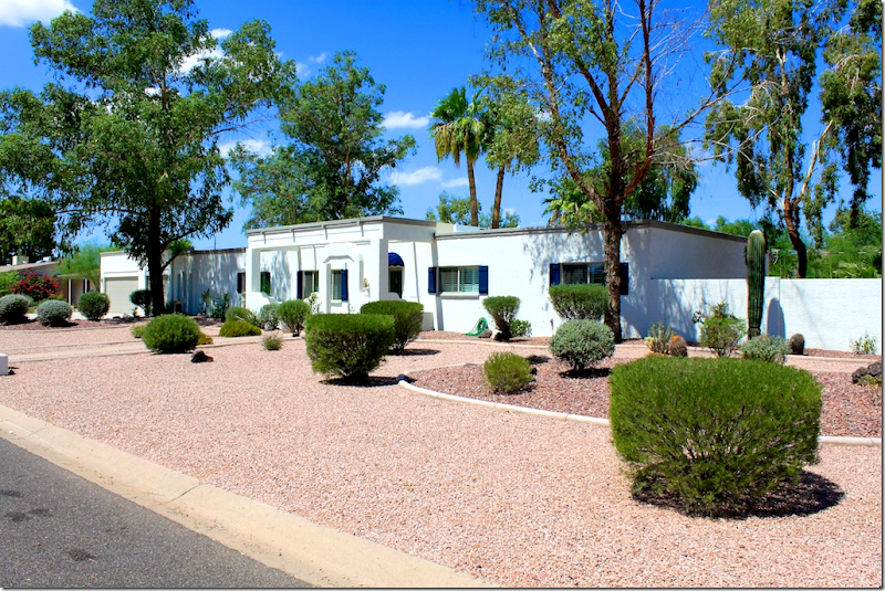
The first kitchen is located in Scottsdale Arizona – a first for us! The husband and wife are both in real estate and the wife also does interior design. Their house is located in an equestrian neighborhood – where horses are ridden on the streets – on their way to the nearby stables. The couple renovated this house planning to sell it – but instead they fell in the love with the area and are going to stay put for awhile. I thought the exterior was interesting – first, the xeriscaping, all gravel and a few evergreen bushes, along with cactus and eucalyptus trees. So different than what you would see in the north! And, the architecture is interesting – the flat ranch that looks remarkably contemporary.
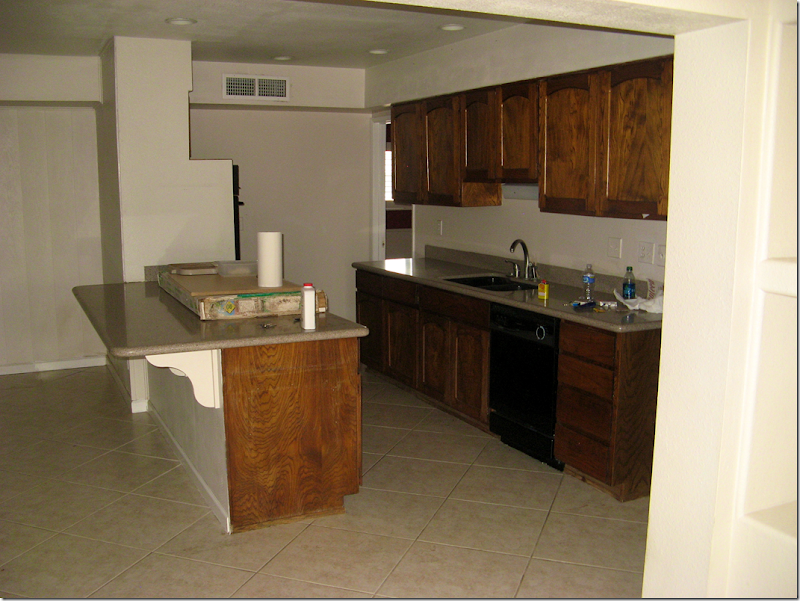
BEFORE: not so bad actually!
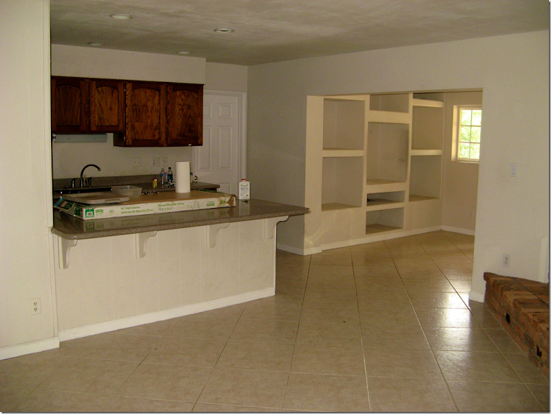
And again – the before picture. In the corner was a fireplace which the couple had wanted to salvage, but it obstructed the beautiful views outside the windows, so it was removed. And they also thought they would save the tile, but instead went with a light travertine.
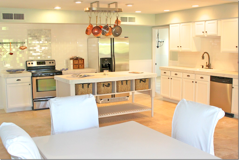
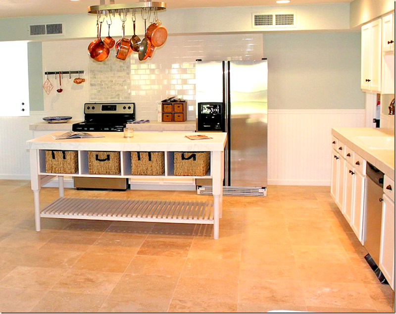
AFTER: The entire kitchen area was gutted – it’s hard to tell where the old kitchen even fit in here! I love the way the walls are painted a soft aqua mixed in with all the white. The backsplash is white subway tile – and notice that the area behind the range – the tile is slightly darker to emphasize that space. The paint is a custom color – the formula came from a friend nice enough to share.
The island was built on site. Notice the beadboard that is on the bottom half of the walls. I love beadboard and I think it warms up a space and makes it so welcoming!
Notice the island is also made of beadboard. And the top of it – is porcelain tile. A savings over white marble. Cute breakfast area with white slipped chairs.
Ideas to take from this kitchen:
1) Use a darker toned subway tile behind the range to highlight that area.
2) Beadboard is an inexpensive material that looks so great and really warms up a space.
3) Consider white porcelain tiles in place of pricey white marble.
KITCHEN #2:
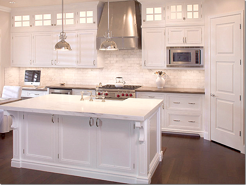
This kitchen is also in Arizona – this time in Tempe. Again, it’s a total redo, but unfortunately there are no “before” pictures! What a beauty!!! The owner is an Ob-Gyn doctor with her own practice. She tells me that she redid the kitchen after studying the internet blogs, looking for inspiration. At the time of the reno, she was also pregnant with her first child!! So many pretty elements – the white marble, the dark countertops, the dark floors, and notice the transom look over the cabinets – those aren’t windows, but when lit – they do look like windows! What a great idea. AND, notice the ceiling treatment – wood was placed there to create interest and give it the look of a beamed ceiling, but it is actually almost completely flat.
The sink is in the island so that she has a view when washing up. She used beautiful polished nickel hardware and faucets. Here you can see the back countertops look like black granite. And she has a gorgeous, dramatic stove hood in stainless, which matches the appliances. The pendants look like Restoration Hardware. Those pendants are the best buy from RH right now. They are so great looking and are so reasonable (especially for RH!)
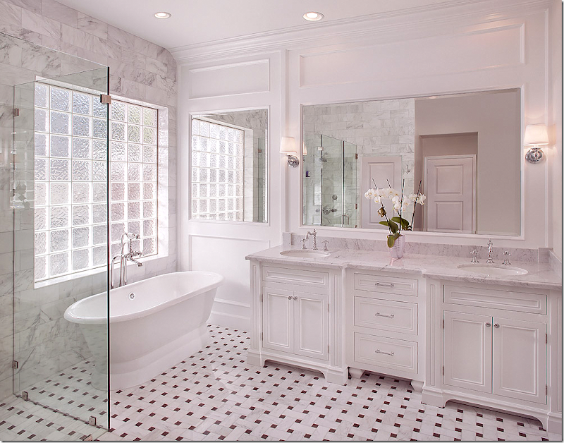
The homeowner also sent in this picture of her new bathroom – which flows with the look of the kitchen. Instead of wood floors, she used a ribbon pattern black and white marble tile. White marble on the counters and a gorgeous tub! Hardware is again polished nickel. Notice how instead of a blank wall, the mirror was extended to the area by the tub. Pretty molding!!
Ideas to take from this kitchen:
1. Dark hardwoods look so rich when mixed with white cabinetry and countertops.
2. Consider mixing white marble with black granite (usually matte finish) in the same kitchen. This creates interest instead of having an all white look.
3. Use paneling to create a faux beamed ceiling.
4. Use lighted glass cabinets in a dark kitchen to fool the eye into thinking there are transom windows where there aren’t any.
Kitchen #3
BEFORE: This shy owner was somewhat reluctant to share her house on the internet, but eventually decided to when she sent me pictures of her house. This kitchen was added onto the house in 1930!!! As you will see, it was a total renovation.
Wow!!! What a huge difference!!!! The owners kept the original four walls and were limited to where appliances could go, but it seems like they are all in a perfect place! They also wanted to retain the vintage feel of their older house, but have all the modcons. She wanted a old timey looking range, but they were too pricey. Instead, she searched and found this range Fratelli Onofri Royal Chiantishire with a vintage appeal.
They chose the lantern tile backsplash because it was different than subway. The owner says she wanted white marble countertops but everyone talked her out of it. I hear you! So many people get talked out of it!!! Instead she used Coast Green granite – and mixed it with walnut on the island. Again, the mix of the dark and light is so nice. And they chose a farm sink with a bridge faucet - again for that vintage look. The stove hood is painted white wood.
Notice how she also has that transom look over her cabinets. Not sure if hers are lighted though. Pretty glass pendants hang over the island. The owner does say that the wood requires oiling and lots of maintenance – probably more than the white marble would have. Maybe. I love her shaker style cabinets. Notice the dishwasher is hiding behind a cabinet door to make it disappear. I think these homeowner achieved their goal – creating a brand new kitchen with a vintage feel for an older home.
Ideas to Take from this Kitchen:
1. Use wood countertops for a vintage feel.
2. Glass panes in the cabinets look like transoms and add to that older look, as does shaker style cabinetry.
3. Nothing beats a farmhouse sink and bridge faucet when looking for a vintage styled kitchen!
A HUGE thank you to our three homeowners – who all used white kitchens but mixed in other décor elements to create visual interest.
Remember – send in your kitchen and house pictures AND send in your Ask Miss Cote de Texas questions.
We have a great giveaway coming up next week. AND, I am working on a top secret contest that if it works out will be the biggest and most interesting of ALL giveaways!!
READERS KITCHEN SERIES
Subscribe to:
Post Comments
(
Atom
)





Cool Kitchen. All are good.
ReplyDeleteThe use of full-inset cabinetry in Kitchen #2 and #3 and in that bath is just beautiful.
ReplyDeleteI really like the ideas from the second home owner's kitchen and bath, just gorgeous. I can't believe the 3rd homeowner was shy about sharing, her kitchen is fabulous! Her backsplash was very cool. I would love to see more of the first home, although the kitchen was lovely it was too "spartan" for me in those pictures but the architecture and zeriscaping intrigue me and I am curious to see how the house looks when it is "lived in." Thanks to the homeowners for sharing and for your posting! I feel spoiled, its been a rough week at work and with school starting and each morning when I get up there is a little pick me up!
ReplyDeleteWell said. I agree with everything you say here. Everything! Cool, hm? Indeed. : )
DeleteOh, thank you so much! A lit transom is just the answer I've been trying to formulate in my mind. I live in the center unit of a townhome with one small kitchen window in the eating area. I have 9' ceilings & tall cabinets. There's no way to style anything up there and it's just a dark hole. I can only imagine how wonderful it will be to have something pretty to look at and light streaming through the windows.
ReplyDeleteI'm not a fan of the first one but love the second. My favorite is the last one. Who would not want windows on three sides of their kitchen? So much natural light is a BIG plus. It appears to be a great workable size. I too love the cabinets and countertops. Not crazy about the island top but it's not my kitchen. Great post! Thanks for sharing.
ReplyDeleteAmen. Amen. Amen.
DeleteSo informative....that transom idea is a "keeper!" Nice job! franki
ReplyDeleteJoni I love elements from each kitchen. For me the 3rd resonated the most. I love the transoms and wood topped island. Great lighting in 2 & 3; the hardwood floors! I love the exterior of house #1! Love this series!
ReplyDeletexoxo
Karena
Art by Karena
2012 Artist Series featuring Harrison Howard
Thanks, Joni! All three are gorgeous!! I just love that lantern tile on the backsplash-- it's beautiful! I also love that all three achieved great beauty with a similar style and different types of budgets. Joni, thanks for the tour!!
ReplyDeleteReally like the lighter green granite in the third kitchen - it's something I wouldn't have thought of! And I love the butcherblock island. I also think it would still look great if it weren't oiled and allowed to get a bit banged up and dull. Give the kitchen a well-worn look.
ReplyDeleteThough I do confess, if I had the money, I would copy the second kitchen in a heartbeat. GORGEOUS
Kitchen #1 although nicely done was too cold for me. The second kitchen has more texture and I loved that the owner added some warmth and interest by using the basket weave patterned tile on the bathroom floor. Kitchen three was my favorite - and accessorized just enough to show some personality without being overly busy.
ReplyDeleteWe just bought a new 'OLD' house, and this is inspiration and detail I've been looking for. I like the trim around the windows on the last kitchen - the sink and taps and the range hood. Think I'll spend some time today and wander back through your posts to help {and maybe confuse me further - ahhh, so many choices}.
ReplyDeleteDefinitely prefer kitchen No. 2 and 3 as well as the gorgeous bathroom. Kitchen No. 1 still does not look finished. There are two many stops and starts with color and material within a small space. In both kitchen No. 1 and 2, I wondered why the owner did not opt for a larger stove/cooktop. The stove looks underscaled for the rooms. I prefer the size of the stove in No. 3.
ReplyDeleteI love all three white kitchens!! They did a great job didn't they? thanks for sharing with all of us.
ReplyDeleteVery nice blog. All of the kitchens and the bath were so very nice. My favorite was the last kitchen. It looks so comfortable to be in while cooking. Everything looks so close and reachable. One thing I have learned from the houses I have lived in over my lifespan is that I do prefer that my sink be to the left or right of my range. I know that most experts , usually want to put the sink across from the stove, or so far away from the range. The problem with the sink being so far from the stove is that one is going back and forth adding water to food or washing up dirty dishes as one cooks as to not have such a load of dirty dishes after the meal is served. The kitchen floor gets so much water drips and if frying food or sauteing food, grease gets on the floor and it is tracked all over the kitchen floor. When the range and sink are close together the grease is kept in this general area. My present kitchen the sink is across the width of the kitchen from the range. Cleaning the hardwood floors is a constant issue. I guess it would not be an issue for someone who does not cook a lot. I too think the homeowner in the last kitchen should have gone with her gut feeling on the island top. Judy W
ReplyDeleteThe 'after' bath is EXACTLY what I'm thinking for mine.
ReplyDeleteNow I have a pic for the contractor vs. only my words.
Hmm, must really get you a client's kitchen. She knows I melt everytime I'm on her jobsite. Will see about permission..
Garden & Be Well, XO T
All three kitchens look wonderful. Perhaps #1 looked a bit under-decorated because, as Joni pointed out, the house had been on the market. The photos had the usual sterility that real esate agents like.
ReplyDeleteThe high ceilings in #2 gave it an elegance the other two could not match with standard ceiling height. Kitchen #3 is definately the cosiest and my overall favorite.
By the way, the Fratelli Onofri range from Italy is fabulous! We have been doing research for a future reno. The fit and finish is excellent, the BTUs incredible and they offer several styles and many colors. Our favorite is the Imperial Model in Sunflower Yellow which looks like a baby Aga. The rep told me they get their paint from Ferrari which is close by their factory! This brand is not yet widely available in the US but is very popular in Europe and Australia. Amazingly, the prices are about 30% less than comparable "designer" ranges.
Another aside, counties in England are called "shires". The Brits jokingly call Italy "Chiantishire" because of all the British who live or overwinter there.
http://www.fratellionofri.it/prodotti.php?id_div=14&sel_lingua=2
Charlotte, you should have stopped after the first two paragraphs. That would have created a nice ,useful comment. The rest is your usual, disconnected thought process...with the very predictable attempt to say "look at me look at me look at me I'm special special special better better than you you and you!"
DeleteLaughable and so predictable.
They are all great! Any ideas on a source for the ceramic tile used in kitchen #1? Would be great low-cost option for my baths...
ReplyDeleteHi Joni, Thanks for sharing these beautiful transformations. I am in love with the bathroom!
ReplyDeleteI always love seeing reader's homes. All quite nice, but I can't believe #3 was hesitant to share! (Guess I kind of can believe it, because if the commenters don't like a house, the feedback is brutal.) Anyway, I LOVED #3! It looks homey, warm and comfy, yet convenient, up-to-date and efficient.
ReplyDeleteThe lighted cabinet/transom is the solution I have been looking for! We have an interior kitchen, meaning it is built in the center of the house and has NO exterior windows of it's own, it gets it's natural light from the adjoining dining and living areas. This will be perfect to add light into it, and I think they can be built above the existing cabinets. I wonder if the glass is slightly opaque in the second kitchen? It appears as if you can't actually see whats on the inside of the cabinets. Thanks for showing these amazing remodels!
ReplyDeleteKitchen No. 1 was disappointing to say the least given the fact that the house looked so interesting from the curb. The space looks like it isn't finished or that the owners don't actually use it often and decided that the bare minimum would do. There appears to be no planning or inspiration only the need to have a stove, fridge and sink. Not much else to define the space. The room looks practically empty. While kitchens Nos. 2 and 3, are not extravagant, they are fresh, functional and have given thought to some lovely details which make them both beautiful and practical. So glad to see white again as it still remains my all time favorite color for kitchens.
ReplyDeleteAll three homeowners did such a wonderful job with their remodels. All three look totally functional, clean and bright. My biggest pet peeve is lack of light and they all got plenty of light in. I have to say I love the transom above the cabinets in house two I wish my ceilings were high enough for something like that. Thank you to all the readers who bravely face us commentors with their kitchens.
ReplyDeleteXX
Debra~
Love white kitchens!!! The white slips are so pretty! And that tile in the second kitchen,wow. Good job to all!!! Thanks Joni, I love this series!!!!
ReplyDeleteCindy
To housedressing: What a coincidence, when I commented earlier today, I wrote about the same issue as you are having with not enough light in my kitchen. I deleted my comment about our kitchen as I was having trouble getting my point across. I believe our kitchen has eight foot ceilings and in the kitchen above the cabinets is I believe what is called a soffit. It is space about the cabinet that has been enclosed . I don't know what is inside the soffitwhere ii is enclosed. I know at times wires are run through some of these. I would love to just put the transoms above the top cabinet just like above French doors or window transoms. It seems like this would bring in some light from the great room that is on the front of the house. We have quiet a few trees in the front and on the side where there is a French door but, beyond the French door is a sun room and this also block lots of the sun. I have seen in magazines where a mirror has been placed over the sink to reflect light. Also one can use mirror as a kind of backsplash. Any ideas out there? Thanks, Judy W
ReplyDeleteI'm in the middle of kitchen remodel. I tore down one wall to make the back of our house one room. By doing this, I was able to get a large window in my kitchen space. It makes a huge difference and the windows look onto my garden (mostly trees). The filtering light through the leaves is a joy. I did a rather unconventional thing, I used fixed panes of low-E glass to replace ugly old windows. Nothing interrupts the view the garden and it is more energy efficient (we never open windows before so I don't miss that). I, too, had to remove the soffits and they were the electrical highway of my house. Having all of that redone has been a huge expense. But now there isn't that annoying ring around the kitchen that truly boxed everything in.
DeleteAt almost 63, I'm at the take no prisoners point of view. Who cares what the next buyer wants. Sooooo, I am covering most of the workspace kitchen area in sheets of mirror. Not just the backsplash~the walls! I'm using chrome Metro shelves in front of the mirror and filling them with my stainless cookware. A real cook's bling-bling.
@home before dark - I'm with you! I plan to stay in my current house for the next 30 years (or until I die - whichever comes first). So I intend to remodel my kitchen the way I want it, not the way some potential buyer might want it. The cupboards will be painted a colour I call "pale Dijon mustard cream sauce" and the countertops will be marble. As much as I love white kitchens, I don't want one for myself.
DeleteThree Cheers! Remember the red kitchen last year? It was so refreshing. I don't want to live and "if" life!
DeleteAll three kitchens are wonderful! But I can really relate to kitchen 3 for my home, and that stove is beautiful. It is still expensive, but so much more reasonable than stoves with a similar look--and I am all about the look. Thank you to all the homeowners who are willing to share their ideas.
ReplyDeleteLove kitchen #2 and their bath as well! Wonderful job. I agree about the RH lanterns they are a good pricepoint! Great post as always!
ReplyDeleteLoved kitchen #3! So glad she went outside her box to share it with us! Love the cabinets, the lantern tile, hood and island! That's my kind of kitchen! Thanks for sharing...always the best part of my day!
ReplyDeleteWow. very pretty kitchens. I absolutely love the redo in #3 - just stunning.
ReplyDeleteJoni, Thank you (and homeowners, too!) for sharing these lovely kitchens. A job well done to all of you!
ReplyDeleteQuestion to Joni, Since you recently repainted and updated your kitchen, would you today paint it some variation of gray or would you go back with white.
ReplyDeleteThese white kitchens look so good in the photos. What do you believe the long term trend (next five years at least) will be in kitchen cabinet finishes and/or colors. I think this would be a good topic for conversation.
i love the gray - i was it was darker on the cabs actually. i love white kitchens, but something about the gray, just love.
DeleteKitchen #2 looks like every single kitchen I've seen in magazines in the last three years.
ReplyDeleteIt's like an entry in a "How Many Cliches Can You Fill Your Kitchen With?" contest.
But isn't this the state of all design now that we have so much design information and trends being touted on the internet through the design blogs. You can look at most of the living rooms, bedrooms, dining rooms on this or any other design site and see one copycat after another. No one is original any more.
DeleteOooh I love this post. I am currently planning a mini makeover for my own kitchen and this has inspired me greatly. Sadly my mum passed away last week but after seeing these kitchens and a glimpse of the chandelier in the dining room I think I might take some of mums old chandeliers and re use them. I have an idea for putting one over my breakfast Island. Possibly to paint it in silver as I have a lot of stainless steel in my little kitchen area.
ReplyDeleteThank you for this great post.
Lee :)
3 VERY interesting kitchens. I'm tempted to compare and trying not to as they are all unique. Kitchen 1 is BIG. The owner managed to create a straight forward space which is great for cooking! I give the owner of kitchen 1 A LOT of credit for not filling the kitchen with wall to wall cabinetry, shelving, pantry, etc. More than adequate surface areas for storage (love the baskets) and prepping The bright and open space appears to be an easy kitchen to clean and I love clean kitchens! Not easy to keep cabinets clean to the eye and touch. Love the space-user friendly! The warmth of the copper pots is a perfect style touch yet very functional. Great kitchen to teach/inspire to cook as people can hang around and not get underfoot. Kitchen breathes. The remaining 2 kitchens are fabulous spaces as well! Number 2 has all the high end items that people desire-what's not to like? I am inspired by a high end kitchen that doesn't have a second sink! The 3rd kitchen's footprint is clearly well thought out. Money was well spent but with restraint. I credit the owners with their style choices as they are in keeping with an older home. I might have opted for a soapstone island (although it may seem cliche-just seems easy to maintain) as opposed to the wood but have a feeling when entering the kitchen the island top is in keeping with the home's style. Also- so often we spend time in our kitchen at night-this kitchen's warm surface of wood and wall color most likely translates to a very cozy kitchen in the evening! ISooooo appreciate seeing REAL PEOPLE's kitchens Joni! Thank you for providing a blog where people share and thank you to the brave owners for sharing-All really great kitchens!
ReplyDeletethanks for your comments - so glad you liked them and appreciate them.
DeleteFun post! Thanks for showing 3 different ones with 3 different styles. I live close to Tempe & Scottsdale and houses and landscaping here are so different than any other part of the country. It was fun to see what they did with their kitchens. sarah
ReplyDeleteThe last one is so adorable. I imagine myself making a salad and sipping whine. (oops....wine) The only thing I would change is the butter walls - in my home would be onyx or soot by BM. All of these spaces are stellar!
ReplyDeleteI would love to see a feature on kitchens that aren't white or shades of white. There have to be beautiful kitchens out there that are other colors!!!
ReplyDeleteYikes, another post and it was only yesterday that I finally finished and absorbed the Library post. Get some breakfast and THEN start the kitchen......
ReplyDeleteQuestion: why are microwaves put up high? It seems so dangerous to take hot food out often without complete control of the item. Even when doing a new big kitchen microwaves are placed in step sister locations.
ReplyDeleteWe are thinking of putting in a microwave-in-a-drawer to solve that problem. Does anyone have experience with this type of installation? Pros and cons?
DeleteWhy does the microwave have to go IN anything. Why not on the counter with some good design applied. My microwave is in a corner turned 90 degrees - only wish there was some panel on the end the way dishwashers have to match the cabinets... or part of a tower of cabinetst but with the microwave having a counter at door level....REALLY what I want is some NEW innovated way to have my FUNCTIONAL and SAFE microwave and good design!
DeleteMicrowave in a drawer???? Do you mean on a pull out shelf perhaps. If the microwave is in a drawer and you pull the drawer out, how do you plan to open the door? Being a dream it and redeem it kind of gal, I am sure you will get it figured out.
DeleteMicrowave in a drawer???? Do you mean on a pull out shelf perhaps. If the microwave is in a drawer and you pull the drawer out, how do you plan to open the door? Being a dream it and redeem it kind of gal, I am sure you will get it figured out.
DeleteSharp, Viking, Wolf (and the list goes on) all make microwave drawer units. The Pink Ribbon House had one on the big island in the kitchen.
DeleteThanks, I will look them up. Mine is mounted flush inside a cabinet next to my wall ovens. I do think lower ones are a bit more convenient, but I really don't use mine except to warm up leftovers or heat water fast. I have never cooked anything in mine.
DeleteI was assuming that it would be hidden behind a cabinet door panel much like many dishwashers/refrigerators, etc. hence my silly question about operation.
DeleteI looked up the Viking drawer model and on the Viking website they show an installation. The unit actually protrudes a lot from the kitchen cabinet. I'm not sure that it would enhance the beauty of a kitchen island, but perhaps it could be installed on a side that gets little visibility.
I think the Sharp model is really flush with the cabinet. I liked the size of the drawer and how easy it would be to lift hot plates up to the counter. The one in the Pink Ribbon House was on the back side of the island so you didn't see it from the dining or living room sides. My microwave is mounted above the stove, fortunately I'm tall enough to reach it. I only reheat things as well so it's not that big of an issue. The one item I use constantly on my counter is my Breville toaster oven.
DeleteI love Breville appliances. I have a juicer and sure wish there was a way to hide it. While a great tool, it takes up a lot of counter space.
DeleteWe have seen a number of models in kitchen showrooms. However, I would like to hear from several people who actually have a microwave-in-a-drawer installed in their homes. The practicality (or lack of practicality) in real life is probably not the same as what the salemen tell you. Would also like to know the durability of the opening and closing mechanism.
DeleteAs one of the Anons suggested, it would be nice to have the microwave actually hidden in a drawer as some of the high end dishwashers have been designed to be. So far, I have not seen a completely hidden microwave in a drawer.
I would also like to know the pros and cons of a microwave drawer, as we are going to do this in our kitchen remodel in January. Ours will be in the island. Our other home's kitchen has all Viking appliances which we love. But believe it or not, didn't come with a microwave. We needed one but didn't want to take up counter space. So I had an outlet put inside an upper cabinet and bought a small narrow microwave to sit inside this cabinet. Of course you have to have the cabinet doors open to use it, but it solved the problem and only takes up one shelf in a cabinet. Plus, it's out of sight and doesn't compromise the look of the kitchen.
DeleteWhat a HUGE difference! Goodbye 1985 - hello future!
ReplyDelete
ReplyDelete"Another aside, counties in England are called "shires". The Brits jokingly call Italy "Chiantishire" because of all the British who live or overwinter there."
Definitely kitchen related and something we all needed to know.
CDF knows how to use google. Woohoo! Next, she learns about a little site called facebook.
ReplyDeleteAnother aside, in 10 minutes, a hurricane releases more energy than all of the world's nuclear weapons combined.
ReplyDeleteNot nearly as much energy as CDF's bloviating.
Deletestop. i am crying laughing.. stop.
Deleteok, charlotte was sweet enough to email and i told her to please keep commenting. and i told her to just laugh off your ugly comments, i do. i asked her to see the humor in the negative comments. and this was pretty funny. you have to admit it - charlotte, if you are reading this. if she ever decides to quit posting, i will really miss her.
This comment has been removed by the author.
DeleteCharlotte.......Haaaaaaaahaaaah.......I am beginning to agree with Joni! Your posts are so...odd, that they are beginning to be funny! I just know that after a beginning that is on point and useful, you will venture off into outer space with "interesting asides" or self-centered bombast. Amusement has taken over annoyance! Yes, please, keep us giggling!
DeleteIn 20009, I found myself driving through one of the worst ice storms in Chicago I have ever experienced! I was on the road home from my children's violin lessons at the David Adler center near Libertyville. Conditions were so harrowing, but I am one determined lady! Since that day, I have felt up to any challenge!
DeleteJoni, I'm on the way out the door to my TKD session ( I am now a second degree black belt!)but I just wanted to take a moment to make your day by letting you know I will continue to comment on your blog! Rest assured, no amount of ridicule will discourage me from sharing the wonder that is ME, with you and your readers!
I love Charlotte Des Les Fleurs Pour Les Morts. She is the Internet's Blanche Dubois: "I don't want realism. I want magic! Yes, yes, magic. I try to give that to people. I do misrepresent things. I don't tell truths. I tell what ought to be truth."
DeleteAnon 7:29, your story was truly an inspiration for so many of us who lack a road map to life. Please keep sharing. Perhaps once a month we could have The Wonder of Me Series here and share more compelling stories like yours.
DeleteI am really loving the bathroom of Owner 2. The floor is beautiful, the cabinetry is beautifully constructed. Great design elements. It would be nice to have a Reader's bathroom series.
ReplyDeleteI am really impressed and enjoy these home series posts. I liked them all but especially loved that beautiful bathroom. I love white kitchens, I'm a white kitchen kind of girl - the more the better.
ReplyDeleteAm I the only one who thinks there is a HUGE disconnect between the exterior of the house in Scottsdale and the kitchen?????
ReplyDeleteHeadboard in Arizona???
I love cottage kitchens, they just don't fit the western architecture.
I do love your blog!
Two Blue Shoes
I was expecting something unique and spectacular. It was a real downer for me. It looks like they bought the house and ran out of money for the kitchen. It may be bad photography, the angle, the particular shots, but overall, the kitchen was shockingly bad with its small stove/oven and free standing fridge that looked totally out of place. Even if not built in, the fridge could have looked like it belonged to the overall scheme, but simply looked like it was put in place rather than in the scheme. If all this kitchen needs to do is function then so be it, but don't put it on a design blog because there really is no design here.
DeleteLove. love , love kitchen 2 and bathroom too. I would be oh so happy with those rooms in my house. Fiona
ReplyDeleteDitto
Deletemrballbox329@aol.com
Deletemail your entries to this email address
joni
I would love to see anonymous' kitchen!
DeleteAs we would yours.
DeleteI'll have to find my befores! Be patient with me Anon!
DeleteTake you time. We will be here.
DeleteI'm sure you will!
DeleteI want to email my non-white kitchen Reno, but can't find your email anywhere on this site! Please post.
ReplyDeletesee above
ReplyDeletePLEASE HELP!! We live in SC and all places say they can't do more than a 13' seagrass. One person has had one seamed together and it looked bad. Please help because I LOVE seagrass and in our new home I need a custom cut rug which is wider than 13'.
ReplyDeleteSo happy to have my laptop back! For some strange reason my boys will NOT let me see Cote de Texas? My sister has the same problem. The script stands still and is soooo frustrating. Any ideas?
ReplyDeleteThat said, I really loved all three kitchens, and the bath. Your work related posts are fab for window shopping, and translating high to low, but are out of my reach. These homes were a peak into the lives of your readers who play on my playground! I am in the minority, but kitchen 1 was my favorite. It does look a tad unfinished, but again, that is something I can relate to. I imagine with time and some family "love", it will grow into it's own skin.
Always a treat.
Hello hello! I finally made it! Last to the party, but I made it! The kitchens are gorgeous and so is your blog.
ReplyDeleteI wrote a post about choosing sea grass over traditional carpet, for my stairs and several readers said you are the sea grass expert! I've finally subscribed, so I'll be "in the know" from now on.
Cheers!,
Barbara
The first kitchen looks like it was designed by the moving men.
ReplyDeleteA scathing insult to Mayflower, but a logical assessment. I think it must be a work in progress or they emailed the wrong pictures.
DeleteNot everyone is a professional! You should give them some credit for trying! Don't you think Joni?
DeleteFor some reason my expectation was elevated after seeing the house. I rather expected a spit shine Euro type kitchen to go with the modern vibe of the house. There is a wonderful amount of space in this kitchen and a built in range and fridge plus a more substantive island and bar plus additional storage would have made this space so wonderful. I don't understand the materials that were used nor breaking them up as the the owner did. There must be a reason for all of this. I wish the owner had stated what she was attempting to achieve so that it made more sense. This is clearly high end property so it must not have been a priority for the family.
DeleteSome people can have lots of money, but don't know anything about design and really don't care!!! If they like it , then it works! End of story.
DeleteJoni, could the second home owner provide some information on her shower, does it have a thresh hold? Also, how long and the cabinet manufacturer of her double vanity? Initially I was disappointed with the first kitchen and had to remind myself the pictures were probably taken when it was a "spec" renovation. However, having lived in NM where there is such amazing art, furniture and "tschotskes" I have really had a change of heart and imagine the infinite possibilites the room and wall space offer. I have no wall space in my current home and would love to be able to hang art and create a banquette area. Thanks again!
ReplyDelete
ReplyDeletecrazyly inzichtelijke bericht. Was het maar zo makkelijk om een aantal van de oplossingen te implementeren zoals het was om te lezen en mijn hoofd knikken op elk van uw punten http://www.inuwtuin.nl/jacuzzi
I like your way of story telling. It's look like smart kitchen. I really want to make this in my home. Thanks for your tips.
ReplyDeletedomy z drewna
Gorgeous, gorgeous kitchen! I love the wood countertop! Wish I had done granite like that instead of my marble!
ReplyDeletebstylewise.blogspot.com
Your blog is very inspiring. Great pictures of clean kitchen. I’m surely going to be a regular visitor to your blog.
ReplyDeleteWe really appreciate the nice posts and great photos of house. The web site style is wonderful, the articles is really great.
ReplyDeleteLoved bathroom #2 - what a beauty!
ReplyDeleteYour blog is so much fun to read and look at Joni. Thank you for all the hard work that you put into it!
Ralph Lauren Outlet
ReplyDeleteKate Spade Outlet
MCM Backpack Outlet,
MCM Backpack
UGG Boot Clearance
Oakley Sunglasses Outlet
North Face Outlet Online
Marc by Marc Jacobs