Over the past five years, I’ve written about my book storage issue more than a few times. The fact is that design books have overtaken my house, like rats in the attic.
AND, speaking of rats in the attic – remember my story about U-Verse??? We had a problem with our connections that U-Verse couldn’t seem to get fixed. WELL…..
After I wrote about our TV/Internet problems, I got an email from the husband of a reader who was worried my computer issues would affect the blog – thus making his wife unhappy. Said husband is an executive with ATT. Last SUNDAY (yes, Sunday) I get a call from U-Verse, asking to come out and fix my issues. WHOA. Since then, they’ve been here a few more times and things are working amazingly perfect so far. The culprit? Hiding deep in the wall was the main electrical line to the modem – all chewed up by some animal, either a rat, squirrel or raccoon!! Take your pick.
So a huge thank you to ATT, the reader and her husband who really went all out to solve my issues. I still can’t get over the excellent service we got. Thank you!!!!
So, back to my design books which have overtaken my house like rats in the attic. Ever since I started watching Hoarders on TV, I’ve felt like they were going to put me on the show, sitting high on top of a pile of books, sleeping on them with an old pillow and a ratty quilt. I love that show. Nothing makes you want to edit and clean your house more than watching an episode of Hoarders. Here’s the problem:
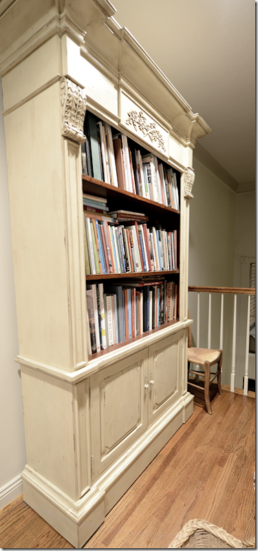
The main bookshelf in my house is here on the landing. When we first moved in, it was more than adequate. But that was around 18 years ago and we have long since outgrown this. In addition, there’s another small bookshelf in the guest room. As you can see, the books that don’t fit in are now standing in three tall stacks with more books in the basket.
At first I put the stacks of extra books against this wall, but when Halo Styles sent me this cabinet by error, I kept it, and filled it up with excess books. By the way, the 2 shelves inside the cabinet doors are also filled with books. And…the stacks continued to grow.
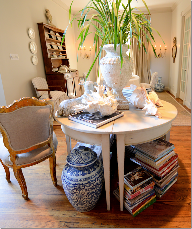
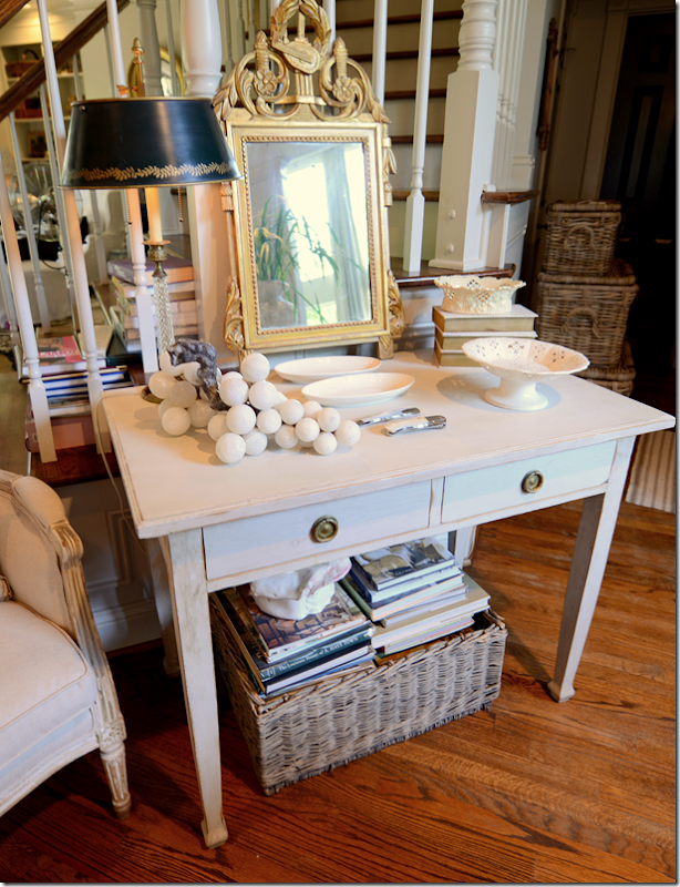
The books are everywhere. The first you thing you see when you come inside my house is this library table with masses of books underneath.
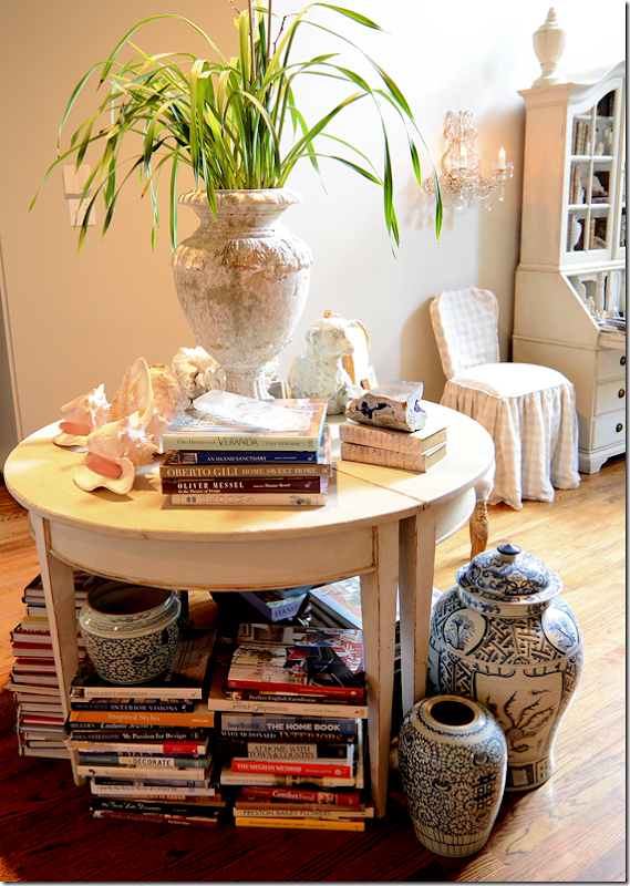
And more on this side of the table.
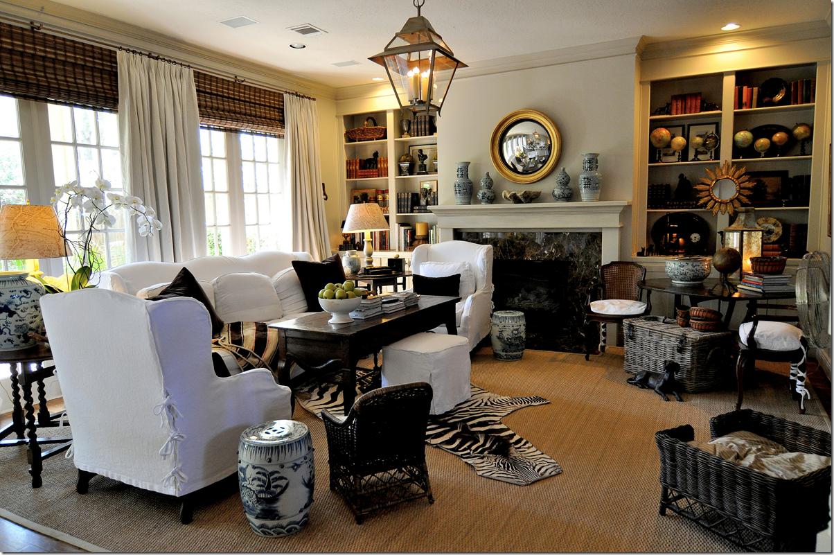
And even more. There are also stacks of books in the living room, under the end tables and coffee table.
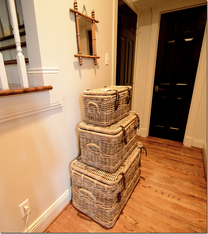
I bought this set of 3 Kooboo baskets to hide more books. Each one is filled to the top. It weighs a ton to move these.
There are more books under this table, and there are even books on the stair steps.
There are more in the family room. This basket is filled with books. So is another basket under the coffee table. And there are more books on the breakfast table just waiting for a home. I don’t even have the nerve to show you the stacks of beautiful design books that are rotting away in the garage. Sinful!! But I literally have no room for them. I also have a large collection of gorgeous Beta-Plus books that are scattered all over the place, here, there, in the guest bathroom even. I want them all together – like they should be.
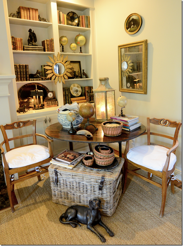
I probably could fill up these shelves with books, but I want this to be filled with antique books not design books. I know. It’s stupid.
So, after years of deliberations…here’s the solution.
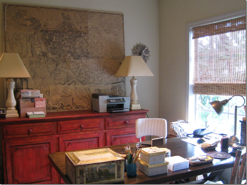
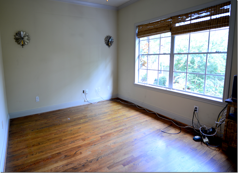
This is my “office” – a teeny, tiny guest room. I took this picture about five years ago, cleaned it all up for the picture.
Because this is how it really looks. But the thing is, I don’t really use this room much, anymore. Elisabeth and I used to spend hours in here together on our computers. But now, I’m always blogging downstairs, outside most of the time to escape the blaring TV, and I certainly never had a client in “my office” before. Plus, all those catalogues and samples that were once so important to the business – it’s all on the internet now – I can’t remember the last time I opened a 20 pound catalogue from a furniture company. And, then, since the blog keeps me so busy, I don’t take on as many clients these days. And please, that red console is enough to scare away any client that walks here! Red? Seriously, what was I thinking? The desk is an x-frame dining room table from Pier One that I bought over 10 years ago. Those chairs are long gone. Actually there are the kooboo wicker chairs in there now, well they were in there…..because….
The office looks like this today! I spent a day this week cleaning it all out – filing client files in the storage closet, getting rid of old catalogues, lugging that red console downstairs (well helper James really lugged it down the stairs) and he’s also taking that antique map home, though he doesn’t really understand what he has! Next week, there are going to be wall to wall bookshelves installed in this room. The shelves will start on the left side of the room, go around to the back wall, and onto the right wall. The shelves will run above the window and down on the right side of it. Underneath the window will be a built in seat with a lid on it for storage. For when the carpenter is finished, I’ve already hired a high school student to help me gather up all the books from all over the house and garage and she’s going to alphabetize them by author! I’m soooo excited! I’ve been dreaming about a library for years now and this has always been the logical place for it.
This room adjoins Elisabeth’s bedroom through their shared bathroom, so I envision she could also use it as a sort of TV room when she has friends over. Or, if ever any of our parents come and lives with us, they could have both Elisabeth’s bedroom and the library and use it as a private living area. My mother is reading is and saying “No way am I EVER moving in with you!!!!” ok, ok, I hear you.
At one point I thought that maybe I should turn the living room into the library – we could extend the house into the front yard and make that room so much bigger. The shelves could be two stories high. But, Ben was really against that idea – too expensive. So, the office is the perfect place. I can still use it as a office, which I will, but it will be more streamlined – all the customer files will go in the closet which is now a sort of filing room. Fabric samples are stored in bins on a huge metal shelving unit in the garage.
So, now I’m looking for some décor inspiration for a new library.
Try googling libraries on the internet and this is what you get. Historically, libraries have been beautiful spaces – especially state owned ones, like our own Library of Congress. I’ve never been there before and had no idea how gorgeous it is!!! Stunning. Built in 1886 it was based on the Paris Opera House.
Admont Abbey’s library is the largest monastic library in the world. It’s interesting to see how different styles of design determine the décor – this Baroque building has been called the Eight Wonder of the World due to it being the largest example of Late Baroque in Europe. It actually looks like Disneyland to me.
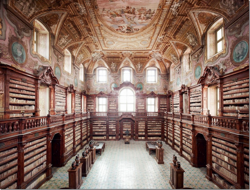
The National Library Of The Girolamini Oratory, Naples, Italy – embroiled in a huge scandal this year when its inexperienced head librarian was charged with stealing over 3000 priceless books and then trying to sell them!!!
The Trinity College Library in Dublin is the largest library in Ireland. Built in 1732 it has seen significant architectural changes – the bottom level was filled in – it was originally an arcade to keep the books dry, and the arched dome was added in the 19th century.
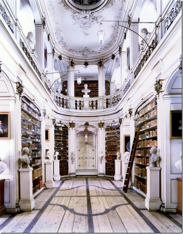
Not all beautiful state libraries are huge. Duchess Anna Amalia Library in Weimar was built in 1562 as Anna’s house and was converted into the library in 1761. The oval Rococo hall is so charming!! This would make a beautiful home library.
The St. Genevieve Library of Paris, built in 1842-50, is the first large building to have used structural iron as an décor element. The ceiling is so gorgeous, it looks like black lace.
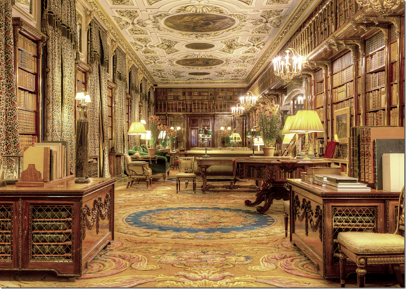
Not all fabulous libraries are owned by the state or the monarchy. Large manor houses often had private libraries. Here, at the celebrated estate Chatsworth, is its main library. Sorry to say – I think they need new curtain fabric – this fabric almost blends in with the books! This library is one of six in the house and is the largest library in private hands in England.
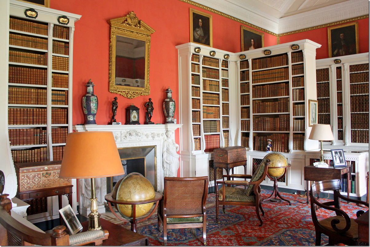
I like this library at Belton House in England. The bright walls are so great against the white bookshelves.
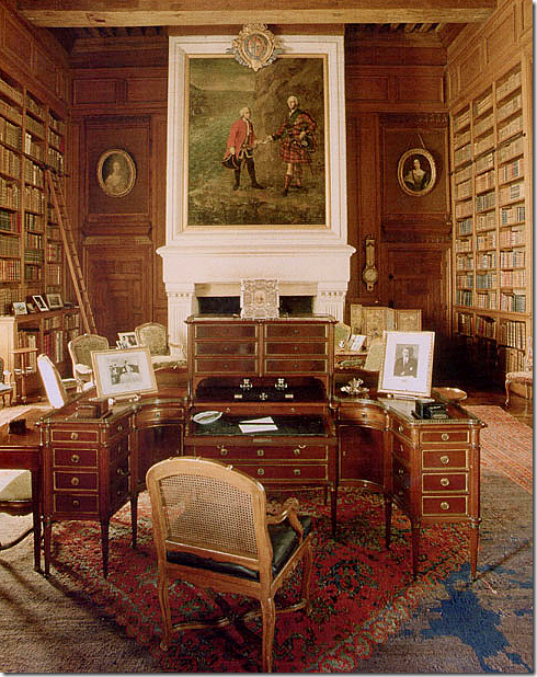
Another grand house library, Chateau de Serrant, in France – the desk is incredible, and I love the round portraits.
This library at Chateau de Groussay was the inspiration for the library in My Fair Lady. There are so many grand home libraries in Europe, it’s hard to pick a favorite. But, I love a two story library – with a balcony, just like this. Add a fireplace, and you could live in here!
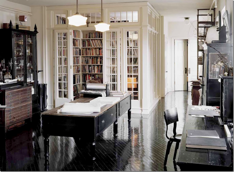
But, let’s get serious. My tiny library is never going to be grand. Still, I keep looking for inspiration. This library was designed inside a NY loft. The architects closed it off by installing paned glass walls and doors.
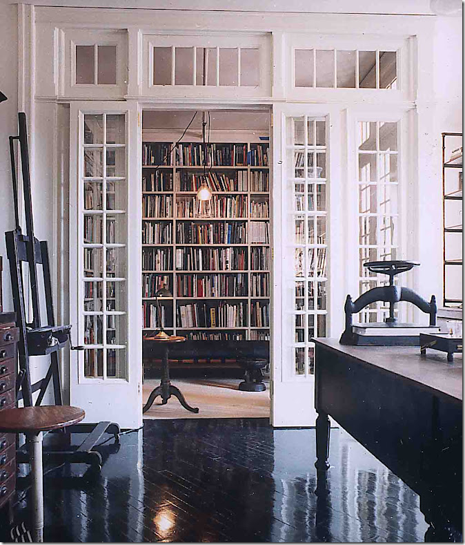
A closer view. Isn’t it incredible? The kitchen is located right past this room. I imagine the designers came up with this solution to have a quiet place to read in an open loft. When I see this, I keep thinking maybe I should remove the doors in my library and replace them with glass paned French doors. It would add a little character to the tiny room. Designed by Roman and Williams.
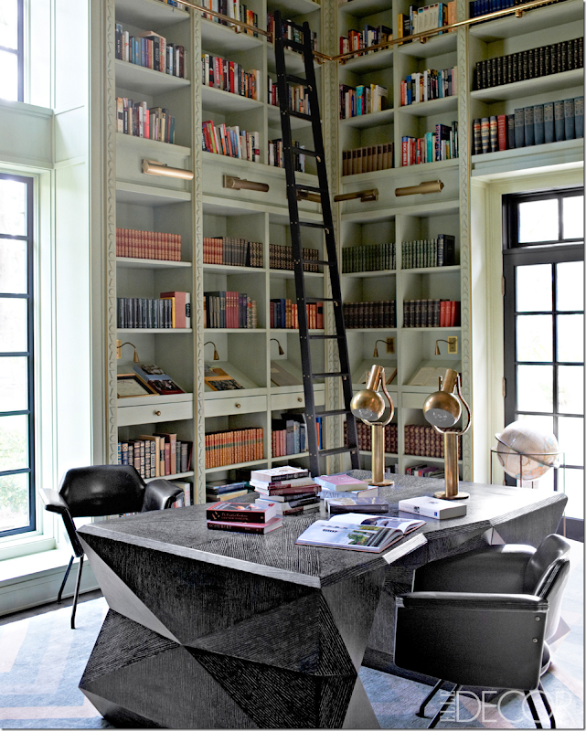
Seen in Elle Décor, this library has to be one of the most incredible ones I’ve seen in years. Of course it was designed by Kelly Wearstler, who else? I have been staring at this for days. Kelly designed that amazing partners desk and the carpet. I love the lights over the shelves – that is something I am considering in my own space.
Look at the wall of marble – only Wearstler would add something like that. I love the color of the painted wood and the carved detailing on it. Look closer – it’s just a triangle, a circle, and an upside down triangle!
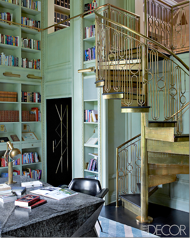
Look at the brass deco styled staircase designed by Wearstler. Amazing. The main staircase in the house has the same railing. To die for!!!!!
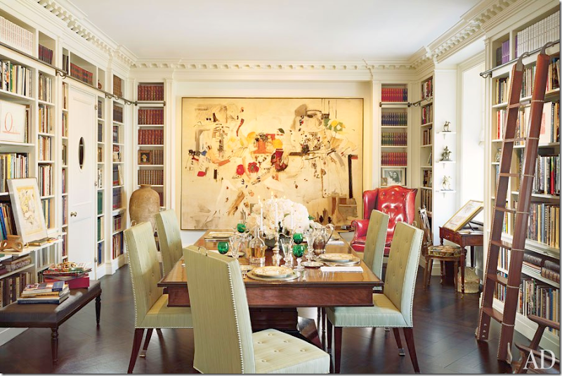
If you can’t have a dedicated library, I’ve always thought a combination dining room/library is a good use of space.
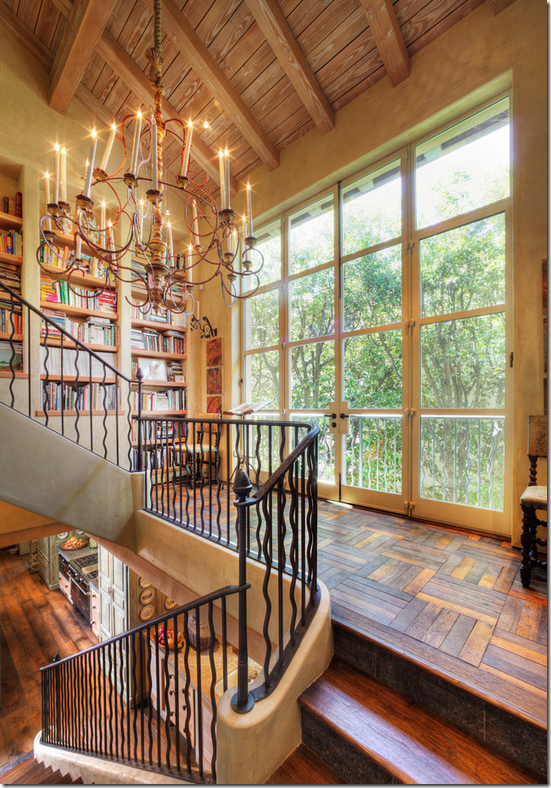
Another place to find extra space for book shelves – on the landing. These shelves go up with the stairs. Beautiful.
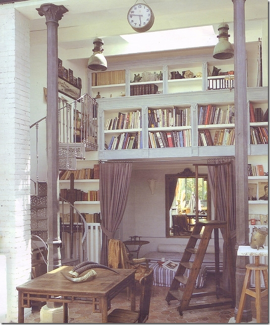
I love this small library – with the loft over the sofa. What a great idea if you are short on space – like me! Too bad my ceilings are just 9 ft in that room – so I can’t build a loft.
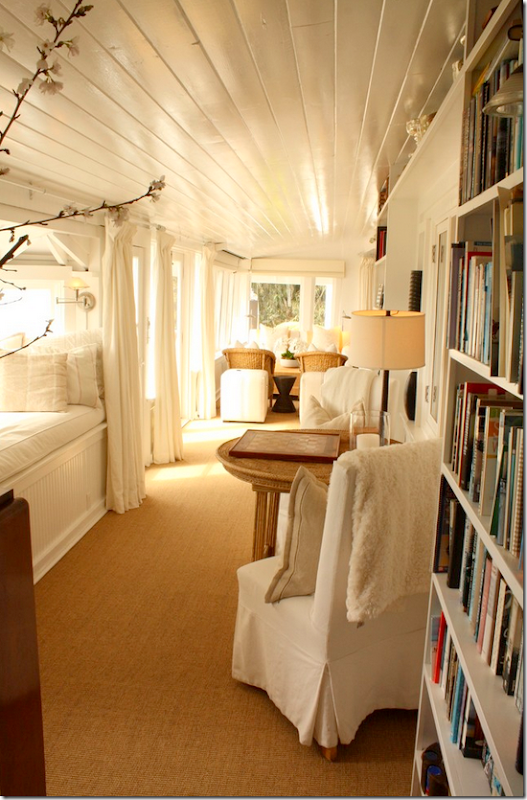
More found space – I love how this narrow room has the library against one side. Love that window seat with the beadboard – maybe I should add beadboard at the bottom of mine.
This is a dream – glass doors over the books. Love those lights too. But this wouldn’t work for my shelves over the window – plus the ones at the side of the window are so narrow.
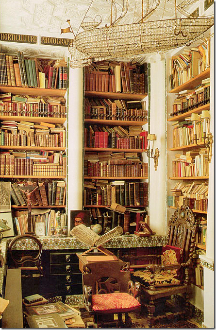
Plus, if you have doors, it keeps the shelves from looking so messy. I am scared mine are going to end up like these!! But, what a great library!!! That chandelier!
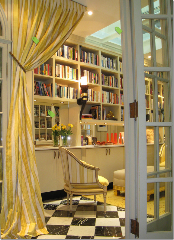
I love the black and white marble floors and the glass French doors – I am really thinking I should do a French door instead of the regular one I have. OR, I could find an antique door and replace the closet door with that one.
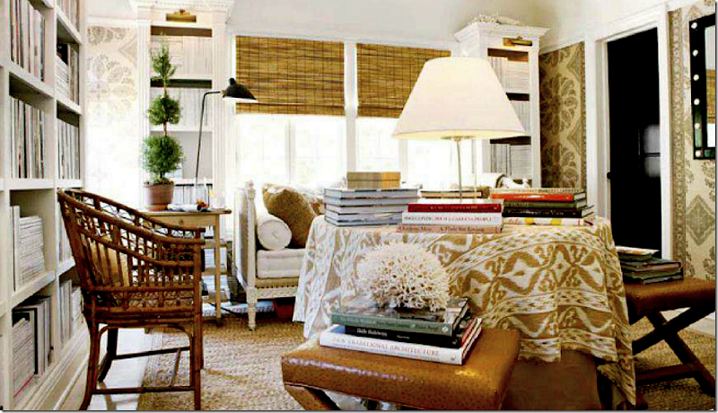
I love Mark Sikes second floor library. He used that wonderful wallcovering by Peter Dunham. How nice! He has the brass lights, like the Wearstler library which I love. And I love his skirted table with the ikat. Nice French day bed too. Apple matting. Black doors. Textured shades. I wonder if I didn’t do the windowseat – would a daybed fit there? And, if I was going to wallpaper – this room would be an inspiration. I completely love it.
This library got me thinking about curtains – again, if there wasn’t a window seat, could I add beautiful curtains? Maybe I shouldn’t do the window seat, but there are going to be shelves above the window, so curtains are probably out either way.
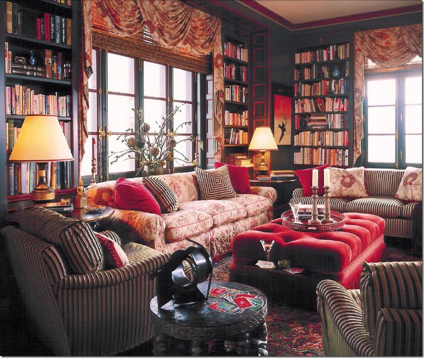
I’m leaning to a white/gray library, but this one always makes me stop. I love the dark painted wood – it’s so cozy and warm and comfortable looking. Plus, I’m a sucker for all the Bennison fabric. Alessandra Branca.
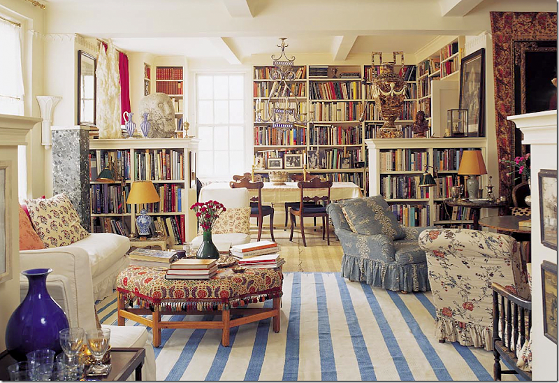
This has always been a huge inspiration – Carolina Irving’s NYC apartment. I love her books everywhere – especially how she turned the dining room into a library. I do have a blue and white striped rug I could use in there. This apartment is just perfect – so well designed, so classic.
Back to reality, this library really influenced me. This house was shown on the blog a few months ago and it had the most amazing library – filled with only design books and travel books. I loved the pull out shelves and the way it is simply furnished with a table and a few antique chairs and a desk. My shelves are similar in that they go over the window like this and down the sides on the left and right. But, her cabinetry is so gorgeous – totally first class. Mine won’t be so bespoke, I’m afraid.
Here’s a closeup of the lights and the pull out shelves. I won’t be having those shelves though. And my room is much smaller than this. But I do like the lights on the shelves like this.
Another Branca library – here I LOVE the lights. Hard to decide should I do these kinds of lights or the horizontal bar lights? No one does red and black like Branca.
Maybe I’ll move all my globes upstairs to the office.
This study by Ashley Goforth reminded me of what mine will look like – the shelves over the window and down the sides, the seagrass, the white slips. Simple and clean. I like the shutter doors too.
Would a fabric shade be better than a bamboo one? Should I do a love seat instead of two chairs???
Another study by Goforth had me thinking – so I do a white cow rug over the seagrass or a striped rug? And what light fixture? Should I do dark gray on the shelves and a lighter gray on the walls or vice versa? Or just white shelves? Decisions!!
Another inspiration – I still love seagrass and checks. For sure I will use checked fabric on the chairs and maybe the window seat – or just a pillow or two. Another inspiration is the linen fabric that softens the bookcase. Such a great idea!! Wish I could do that too – but I’ll have too many shelves. Notice how Pierce added the row of pictures right where the curtains open.
So, in the end, what décor am I going to go with? I love the cluttered, messy look of libraries, especially the ones found in old grand houses, but mine isn’t like that. There’s nothing architecturally interesting to that room at all. I keep looking at two images that appeal to me:
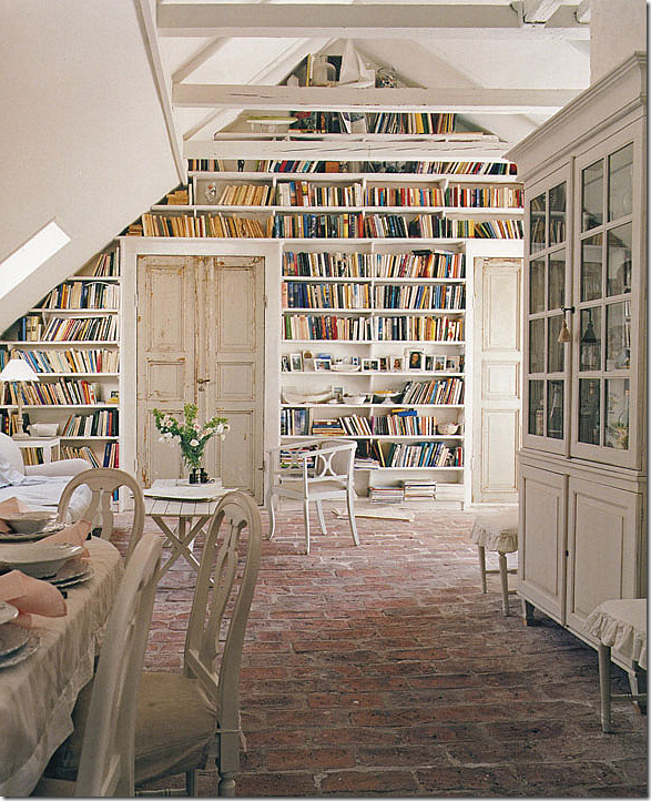
I love the white and cream and gray in this room. I know everyone is doing their houses in bright colors with patterns everywhere – but I just can’t. It’s just not me. And, I love those old doors – maybe I could find a set like that. Plus - I love the brick floors – but that isn’t going to happen.
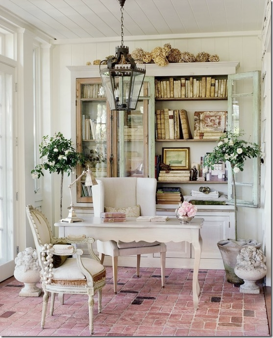
I love Brooke of Velvet and Linen’s office too. I love the Swedish chairs and the grays and creams. And I love her little desk. And the brick floors. If I didn’t need more shelves, I would just do a cabinet, but I need more. And Brooke’s books are antiques, so much prettier than the real thing. My shelves will never look this quiet – the book spines are too colorful. AND…..should I do a real desk or a round table?
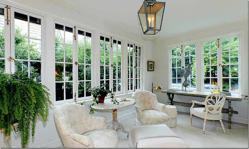
This study decorated by Tone on Tone – who, by the way, has a great new blog, HERE – makes me wonder should I do two chairs and a Swedish table like this instead of a real desk? Love the lantern.
Questions to figure out:
1. What color should I paint the room?
2. Should the shelves be white?
3. Should I leave the seagrass or get a rug or layer a white cowhide or zebra?
4. Chandelier or ceiling fan? hehe Ceiling fan IS leaving – chandy or lantern?
5. Should there be a desk or round table?
6. Two chairs? Or a chair and a ottoman?
Right now I’m thinking about gray walls and ceiling:
Maybe Farrow and Ball: James White – or Skimming Stones on the walls and ceiling and a pure white on the bookshelves? Or should it all be gray?
Should I do horizontal lights or sconces or not do any lighting at all? Big question to figure out quickly. Is the lighting too contemporary looking?
I’m thinking about a small desk like this from The Lone Ranger. Just need to be sure the back is painted, if not, he’ll do that for sure. I love Elisabeth’s faux French desk, but I can’t do the same desk in both rooms. Maybe I can find another desk source.
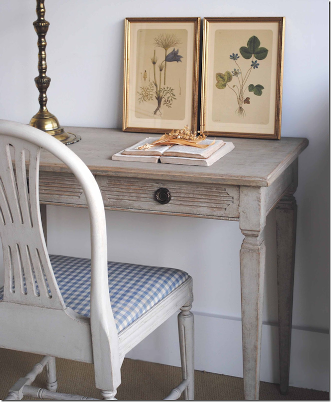
Here’s a gorgeous desk from Tone on Tone. Should I do the blue and white check? Or just a gray and white check?
Or should I just do a round table with two chairs?
Of course M. Naeve has THE most gorgeous Swedish table ever. Period 18th century. Just a tad out of my price range, unfortunately. Maybe she’ll let me borrow it???
Chandelier?
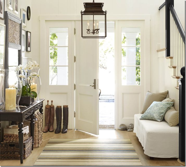
Or this lantern, for instance, from Pottery Barn?
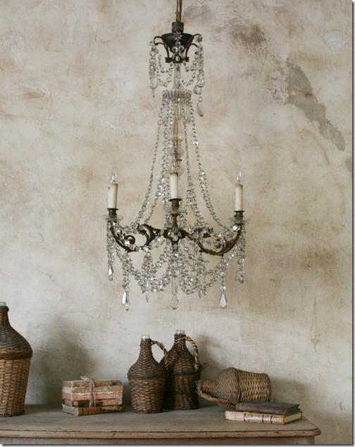
Or go for the real thing from Chateau Domingue?
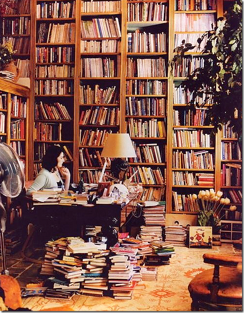
I don’t know why I’m making such a big deal out of this tiny room. In the end, it will probably look like Nigella Lawson’s in a few months. Still – I love her library!!
AND, after the carpenter is done upstairs, we might do this:
You see how those shelves are open?
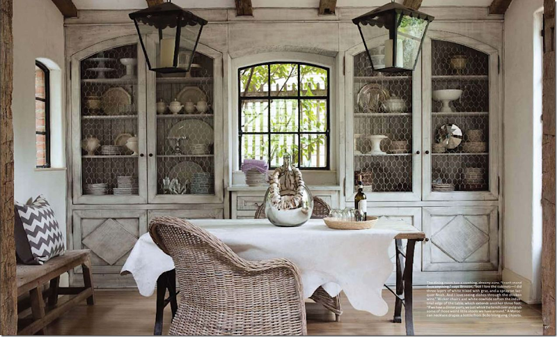
I’m thinking about adding doors like Jill Brinson’s. They won’t be just like hers of course, but I’d be using them as the inspiration. I think it will quiet down the room to have the doors on the shelves, plus, I love the way they look. I could have Leslie with Segreto paint the new doors and the cabinets to look somewhat like Jill’s. Well, it’s still in the talking stage, but the carpenter says he can do it. Ben wants to do this. Huge surprise.
So, what do you think? I’m really anxious to hear your ideas and comments about the library and the maybe new cabinet doors. If you have any suggestions – let me know – I’m all ears. You are the only one I have to bounce this off with. So, give me your thoughts. It’s hard to plan it without any outside advice.
Maybe I should hire a decorator?
















I think you should go with FB Skimming Stone, a small table and two chairs for client, a desk, lantern, blue and white check with a pretty coordinating fabric shade, cowhide over seagrass. Maybe paint the bookshelves a tad darker than walls.
ReplyDeleteCan't wait to see what you do, Joni!! Kelly Wearsler is a design genius. Her work is usually too modern for me, but I LOVE this library too! Just stunning.
ReplyDeleteWhatever your choices, I am certain that the room will be just perfect.
Happy Monday.
Teresa
xoxo
Beautiful post! I love the antique book press in the NY loft. It has inspired me to finally drag mine in from the garage, dust it off and style into my home. Thank you for sharing. Happy Monday!
ReplyDeleteI can not wait to see it all done! Thanks for sharing all the great photos
ReplyDeleteI love the bookshelves in the hallway with the glass doors, and I also love the photo of Jill Brinson's. I have pinned both of these to my boards long ago. I really like the idea of doors on the fronts of bookcases. I have a lot of books that keep growing as well. I did do a clean out of some of my books this summer and had two empty shelves on one bookcase. I felt so good about until I started to put books from piles on the floor on it and ran out of room long before I had put the books off the floor away. I still don't have enough room, and the piles on the floor are still growing. I would love to have a room that I could convert into a library room. I think Leslie would be an excellent choice to paint your cabinets. Can't wait to see what you do.
ReplyDeleteI thought you might like this website - http://www.beautiful-libraries.com/3500-1.html - which I've long listed as a link on my blog of visiting country houses (I was at Belton House just a few weeks ago - the library there is in fact on the first floor and used to be a sitting room so it's actually rather odd - there are also bookcases in the hallway). On Saturday I was at Althrop, which also has an interesting library as it was once the largest collection in England.
ReplyDeleteJoni.......I know you had help but HOW DO YOU fit everything in, you must never sleep! I can only dream of getting my bookshelves made and books catalogued (I have the same problem with design books!). My husband recently drew up fabulous plans for the perfect bookshelves (ala SOMETHINGS GOTTA GIVE house!) but after returning from the timber supplier promptly put it on hold pending more funds!!! I think I have reached that time in my life when I want to streamline/scale down. I did part with a few outdated books (a painful process) but am coming to terms with the reality that I may need to call in back up if I am ever going to get truly decluttered! Awaiting inspiration from you...which you never fail to deliver :-)
ReplyDeleteI love the idea of french entry doors. Maybe the glass should be etched to eliminate the need for curtains if this will ever be a spare bedroom. Antique doors with cremone bolts would be nice too. I like a medium gray for the walls (like F&B's Elephant's Breath; the color in my library) and a darker gray for the back wall of the shelves with cream trim. I like the hinged arm library lights rather than the bar type. I would skip the desk and use a lovely round table with two antique (Louis Seize-style) chairs. A daybed, if you have room would be preferable to a window seat because there is potential to use it as a single guest bed and it would be visually more interesting. I would opt for a lovely fabric roman shade rather than a wood one. Sometimes, removing dust jackets from the books (a sin?) can quiet the look of the books. Alphabetizing them may be helpful, but organizing them in size place within that system may make it look less cluttered. This may be a crime against nature, but maybe you could cull those books you really do not need and donate them to a local library. You have so many books, the danger is you may outgrow this room too. Chandelier or lantern will be determined by the direction you go with the furnishings. All tht said, I cannot wait to see what you choose.
ReplyDeleteAll the best...Victoria
ALL GREAT IDEAS, - THANK YOU !
DeleteEDIT....... seriously, edit some of the books first. Like most of us you likely have volumes that you purchased because you were on a trend kick or working on a specific project. I edited my books when I moved and discovered that reducing wasn't that difficult, and made me wonder why I was hanging on to some of the books.
ReplyDeleteIf you can't see the volumes because they are in baskets or other containers then you cannot enjoy them. So your plan to put them up on the shelf in some order is needed. Have you measured the stacks to ensure that they will fit within the shelves being built? Is that floor able to hold the volume of weight in one small area? The weight of the shelves and books in a small room will equate to the weight of a marble bathroom with a tub full of water. It's a ton of weight.
Added trim & crown molding will make the shelves have a custom look that you desire.
I vote for a tranquil neutral shade on the walls - painted. White shelves - let the colour of the books speak. Comfy chair and ottoman with a side table and a lamp. Round table that can function as a work area or a desk - why not a drop leaf table that can offer both.
I like the look of seagrass and cowhide for the floor and albeit that it is opposite to the flooring - I can't resist a chandelier. If you are sitting in a comfy chair {and feet up on the ottoman} looking around the room ...... and it's all light and airy, the books will sing out. And isn't that the point.
I am so happy to see the "before" office, Joni. I thought mine was the only one in existence that looked exactly like yours. I do love all the books scattered about though, but your new look will be brilliant I think. But, then everything you do is brilliant! xx's
ReplyDeleteFirst, only you could do such a beautiful post on something that most of us don't even think about - libraries. What grand spaces the Europeans have created for their books, and what fun it is to help you decorate your space. Whatever color you use on the walls and ceiling, I would definitley use white on the shelves. Are you sure you don't want to consider doors for the shelves? All I can think about is the poor person who has to dust the shelves and books. Love the idea of the glass paned walls and doors but if you can't do that, I think the antique closet doors would provide an interesting focal point. As for the furniture...shouldn't the use of the room dictate what pieces you will use? I would include the round table next to one comfortable piece that I could curl up in to read. It sounds like you don't need the room for clients and you don't need the desk. And I would just use the seagrass - I am over the cowhide thing. I don't have a strong opinion on the lighting, other than those brass lights with the red shades are so unique. Can't wait to see the end result.
ReplyDeleteI love the idea of a round table with chairs. For some reason, in a smaller room, the round table makes it more fluid to me. You can move your chairs around it, have an ottoman to put your feet up while drinking your coffee and reading...wah, I want a room I can turn into a library!! I think a lantern would be nice and also, the chicken wire doors, SO cute.
ReplyDeleteI am doing a library too although, I am going the English country house route with Chinese red walls. I am a fan of dark and cozy for libraries. I think you could still do curtains with the shelf above and no window seat. If you go with the window seat I would definitely use a fabric shade to up the cozy factor.
ReplyDeleteJoni another post with so many amazing library looks! I would do grey walls and white trim and bookshelves.
ReplyDeleteA lantern instead of a chandy. The lights over the books of sconces good choices. A loveseat ( I mean the idea is to be comfy to curl up and actually browse through some of the many design books you haven't had the time to! ( oh dear I see future posts based on your books with hundreds and hundreds of images) Adore the warmth of your wood floors; I can see an area rug over them.
Just a few of my thoughts!
xoxo
Karena
Art by Karena
2012 Artists Series featuring Harrison Howard
Although I love a round table We had trouble with using a round table as a desk at the shop...just to enough room, things kept falling off. I love skimming stone as the color, love the doors ala Ben in the living area and vote for a chandelier since you have the lantern downstairs. I believe using an antique door on the closet will bring you happiness each time you gaze over from the desk.
ReplyDeleteWhat a timely post! We have turned our old dining room into a home office (and put dining room in old living room!) and just this weekend my husband and I started trying to figure out the nitty gritty of what we want to do with the office. We know that we want wall to wall shelving along the back wall and are debating all the same options that you are! Can't wait to see how yours turns out - I'm sure it will be amazing!!
ReplyDeleteHi, my name is Inga and I'm a book-aholic...
ReplyDeleteI really like the atmosphere in the last picture, so make it look like it is the library of that house I would say!
Love your blog!
A good point was made earlier that you must consider whether or not your floor can sustain the additional weight of the shelves and the books. Before having your student helper organize for you, it would be wise to edit what you have. If you have not used many of these books as reference points in a number of years, you probably will not use them in the future. If they have sentimental value, put them in storage but don't continue to clutter your rooms with them. Leave space for the future.
ReplyDeleteThis room is only an average size bedroom, probably 12 x 14 at the most or close to it. By the time you wrap it in shelving, you are not going to have much wall or floor space to consider. Before making your final decision on loveseat vs. chair and ottoman or perhaps even a chaise that serves both purpose, get the construction out of the way, the shelves filled and see what you have left. You may want to paint the shelves and walls the same color since you will really not have that much wall space once the bookcases wrap the room. Therefore, I would wrap the room in one very soft and neutral color, and let your fabric act like the trim which in your case will most certainly be white.
If you decide on a table, a round one would be the most pleasing shape provided it gives you ample work space. I suppose much depends on whether this is your private space, or you plan to actually bring clients there. It may be hard to make it work for both. I would vote for a chandelier, but a very simple one as opposed to a lantern which is to much on trend. Curry Lighting has some really airy ones with simple crystals that would be beautiful there. By all means do not cover your floor with seagrass as you already have so much. You will not have much floor space left, so allow it to be another texture in the room as well as color. It will give your room a nice anchor. Please no bamboo shades. Use fabric as it will soften the wood structure wrapping the room and give you an opportunity to add a little depth of color. Can't wait to see what you finally decide to do.
One additional thought. The lovely check fabric by Marvic which was used in the Federal House you posted a couple of weeks ago may be beautiful with either of the two F&B colors you are considering. I actually have a memo sample of the fabric and its weight and hand are fabulous. The taupe used in the Federal house was a combination of taupe and cream which may not be as crisp as you are looking for but it comes in other color ways which may be of interest to you.
DeleteI am really agreeing with everything in this comment. It seems the room is going to be so small for furnishings once the bookcases are built in. I would use the window seat as my only seating, with a table in the middle of the room, and possibly a small chair pulled up to the table/desk. I would also let the bookshelves wrap around the inside of the window. You could also do the same with the doorway...let the shelving wrap into the doorway and just not have a door to this room. I would have never considered the weight of the books in one area compromising structure, but certainly an issue to look into. My favorite library you showed was the NY loft. I think yours could look very similar. I love everything about it. I also love the Branca library with the red accents. I would use a chandelier and sconces.....it would really reflect your feminine flair! Flooring.....hardwoods with a rug like Nigella's! Can't wait to see the final results....good luck!
Deletepressure!!!!
Deletei am not concerned about the weight. the house is pretty well built - there is a huge iron beam that runs through it. but so many great ideas. making me veddddddddddy noivous.
Just bought a 1945 cottage near my home. Will use it as a guest house & office. Already know 1 of the little bedrooms will have the windows turned into French doors, it's walls lined with bookshelves & furniture to make it a media/guest room.
ReplyDeleteSusanne Hudson's library inspires me. Will use her dimensions & sconce lighting & color. Now, will keep an eye on your completion. Of course my budget is a cartoon of grand dreams.
I'm a book nerd too. The library in my house will remain stuffed. Alas, it needs painting & sconces. That is a project for 'another day'.
Garden & Be Well, XO Tara
I loved all of this post. We have and continue to add far too many books. My favorite pictures were the white libraries--particularly the dining room/library. We have a study/library in dark red, lined completely with books, a family/media room in white, completely lined with books and an exercise room in the basement, completely lined with books. Even so, we gave thirty banker boxes of books to our tiny local library for their book sale this year. Seeing your house and your pictures of its evolution, I know you will end up with something great!
ReplyDeleteJoni, thank you, I laughed and nodded with you throughout your wonderfully entertaining and enlightening post. This is THE best blog entry I've EVER read, anywhere, anytime... hands down. Perhaps it is because you've touched on something close to my heart here. I have piles of books everywhere; at one time (three homes ago) there were enough books for 40-linear feet of book shelving (at about 7' high). Yes, I edit books before moving. Still, I continue to add to the collection (and during the last move, more books remained in the moving boxes than not - at least they are packed for the next move). Anyway, in a few weeks, we move again there is a small room dedicated as my library. I share your excitement about the possibilities of a "new" library, as well as your pain concerning the choices! And I waffle daily whether to paint the walls a light color (such as F&B Clunch) or a dramatic and dark color (such as F&B Hague Blue). Regardless, already, your photo collection inspires me... I can't wait to see what you do next!
ReplyDeletethank you!!!!!!
DeleteIt may be too late, but I would have little bookcases on each side of the window seat, facing in, to make a cozy reading nook. Love Anonymous' idea of painting the shelves a little darker. A librarian once told me books create a lot of dust, therefore, deleting the fan is a good idea as is a paint color that will hide dust! How nice to have a REAL library!
ReplyDeleteJoni, I love the idea of the gray walls with white bookcases. Of course, you could save a lot of money and just send me all your design books!
ReplyDeleteJoni, wonderfully inspiring post. I loved the red dresser and the map. I'm very excited to see your new library- it's good to rethink our space and change it for how our lives and needs change.
ReplyDeleteSegreto the shelves pale, Chandelier, luxurious rug, round library table with chairs and a chair and ottoman for reading. Whatever you do will be exceptional and beautiful.
Oh and Thanks for sharing the "real" office pic,it makes me love you all the more. I would have taken that red dresser off your hands.
DeleteSince you asked...
ReplyDeleteRound table (skirted), two easy chairs, a round lantern (Louis XVI style in darkened bronze or nickel), as opposed to a square one (btw, the PB lantern is no longer available- I tried) - centered over the skirted table. Medium charcoal walls in dead flat and same color for shelves, but in gloss enamel, to make it a cocoon and hide dirt on shelves; the dark shelves will highlight the books, as dark velvet sets of gems. Ceiling in shades of light gray and white, in concentric squares within squares, the darkest band at the walls and the lightest square in the middle, from where the lantern hangs; this will give visual lift to the ceiling. A medium gray cloth (or mens suiting? flannel?) for the table with a band of charcoal satin trim at the floor. Zebra rug. The chairs could be oyster leather or just have white slipcovers so they can be taken off and washed periodically, Maybe a plaster bust off center on table or an urn. If you go with a lighter cloth, then a dark bronze bust or urn. Urn allows for flowers to give a changeable shot of colo;, all one color/type of flower or greenery for impact.
This would be dynamic and masculine and clean. Best not to hide a small room's dimensions, but work with them for impact and warmth. Aren't you sorry now that you asked...?
Sounds gorgeous but may be over worked a bit depending how it relates to the rooms in the same line of vision. Depending on the decor upstairs, it may be a bit much and actually defeat the purpose of complimenting what is already there. It could also lead to a domino affect whereby the entire upstairs would have to be redecorated. That's how these project all seem to work out. Your ideas sound beautiful, however, and most likely for a far grander room than your average bedroom/office size.
Deletewhoa. can i hire you??????????????? it sounds gorgeous!!!!
Deletedo you have a picture of that ceiling i could see?
DeleteCan this type of ceiling be done if the room is not square? I wonder if it would work with 2 squares in a rectangle room? I love this idea and might incorporate 2 squares in light shades of white and gray in my sun room.
DeleteI would do James White walls, an old, elegantly worn round table with a couple of cushy white upholstered chairs around it. On a cowhide. Center light fixture, large and dramatic, white muslin shade and nothing else. The round desk/table with the light would be the center stage and the books, the charming envelope around it.
ReplyDeleteHi Joni, I am truly envious of your upcoming library as I have the same issue with books. Mine are stacked under every bed in my house and every conceivable corner. I know whatever you choose will be gorgeous but I have only one concern. I know that West U is a very family oriented neighborhood. I worry that if you and Ben ever sell your house that giving up a valuable bedroom with permanent construction will be an issue for resale. Are you in this house for the long haul? I think utilizing that under utilized living room you have is a better option.
ReplyDeletewell, its a 4 bedroom house and that room is tiny. no one would ever use it really. i dont think!
DeleteThree bedroom homes may be hard to sell in your neighborhood. A tiny room can serve as a nursery. What are the actual dimensions?
Deletewell, the shelves will just be nailed in - or whatever, someone could easily have them ripped out if they need to use it as a bedroom. no big deal.
DeleteI, too, think you should be sure that the weight of the books won't be too much for the structure of the house. You could weigh a linear foot of design books as a way to estimate how heavy the finished product will be. And I wouldn't add French doors because you'll be sacrificing wall space.
ReplyDeleteAs far as the furniture goes, how do you envision using this room? If you're going to grab a book and take it downstairs to read, I wouldn't worry so much about comfort. A daybed gives the flexibility of extra sleeping space for company but I've never found them to be that great for just sitting - the seat is too deep for comfort.
And, as someone mentioned above, I wouldn't even think about furniture until all the books are in place.
I can't wait to see how you work all this out! I'm sure it will look great.
Joni, Please share the rest of the process with us as you proceed to make your decisions. I like the blue & white check and it's gorgeous with seagrass. Whatever you do, you'll inspire me. I have a library that I'm going to go and sit in for a change. My shelves are groaning with decorating and gardening books too. Thanks for your thoughtful posts.
ReplyDeleteBYTW, I have stacks of books too. I have found that topping them with an urn, an old, found sculptural piece, etc., turns the stack into a plinth. Clustered the stcks and top a shorter one, set in front of the taller ones, to give the ornament a "backdrop"...
ReplyDeletesend in pics of your house!!!! im dying to see it - you sound so talented!
DeleteDefinitely put in French door so it will open up the room more, open up your landing more, and show off your soon to be beautiful home library! Comfortable chairs with a round table for coffee or tea while you are reading...keep it peaceful and serene. A small desk is nice only if you think you will use it. Can't wait to see the results.
ReplyDeleteMy suggestion is that you hire someone to help you organize your books into categories and establish a card file system... like a real library. You'll never have the time to paw through them all, but they are still precious and you want to keep them. Sooo... why not put the very most loved out but store the rest in a cataloged system so you can get to the exact book when the feeling strikes. Have your carpenter build pull out "pantry style" skinny racks to store them away and out of site. Neat and clean, but taken care of. Just a thought...
ReplyDeleteIt is going to be fun watching this library being born. Every room in my house has bookcases (except for the bathrooms!). I like living with books. I call them "friends with spines." I'm sure whatever you do will be pleasing and practical. I have not done this, but others have: using a database to catagorize/alphabetize their collections. If you are having help with this, might as well develop a record of your "holdings"!
ReplyDeleteSo glad you are not going "color coded." That idea makes me nuts!
Feel exactly the same about color coding. Saw that done last night on a program on HGTV and I felt so sorry for the homeowner - he'd go crazy trying to locate a book (he had a huge wall of them). Also feel the same way about making all white or matching bookcovers. Obviously, those people never read their books!
DeleteLove these pictures. I can so relate! I have bookshelves in every room except the bathrooms. Have always wanted a library. My cottage is not big (2000 sf) and we'll be downsizing in a few years to our cabin which is even smaller and has no room for books, so my first order of agenda is to close in a back porch to make a library. I not only have design books, but novels, biographies, my husband's science and music books, etc. I try to use the public library for novels and to purge every so often. I don't own an e-reader but am contemplating it. However, what is it about design books that make me want to possess them? Is it as if by owning those glorious pictures I can have a bit of that look even if my house doesn't resemble them in the least? Yes, if you're working as a designer, you can say they're for inspiration and reference, but I'm no longer working and I still want them. I'm particularly drawn to photos of old European cottages (not the grand estates) with a time-worn look that's impossible to duplicate over here (unless perhaps you have major buckos to import lots of old weathered and worn stone, timber, doors, tiles, etc.) and I can't seem to get enough of them. I LOVE the look of that Swedish style room with the vaulted ceiling and brick floor, but, like you, I don't have the architecture that gives it its charm. I envy you your dedicated room. I would draw a floor plan to scale, add in the shelving area, then play around with templates to see what would best fit. My guess is there won't be a lot of space left. Hard to judge what arrangement would work from the photo. Would a loveseat work under the window better than a window seat or is that off balance in the corner of the room? Though I love the look of two comfy chairs, an ottoman, and a round table, I think it would be handier to have a small desk in case you needed to work on your laptop, and there's probably not room for all of that. (Do you use some kind of scanner to capture your images from books and old magazines? Where do you keep that?) I don't like the cowhide rug, but that's just me. I'd find a fabric you love for your upholstery and window shade and then pick a paint color. I like the backs of bookcases (the wall) slightly darker than the shelving and trim. Oh, the agony of decisions! Have fun.
ReplyDeleteThank you for the beautiful photos of various libraries, especially our Library of Congress. I do hope to go there someday.
ReplyDeleteI understand we are all at different seasons in our life, but all the joking aside about hoarding, it would be nice if you could donate some of those books to different libraries. They all are hurting big time for money. I am sure you loved each book when you purchased them, but could some not be so important today?
You have a beautiful home, blog and clearly love what you are doing in life. I am sure a library or two would love for you to pass on a few books.
blessings, Rachel
It's going to look great in there, and to have all your books in one place! As much as I love the ipad, there is nothing like holding a real book, and having real books sitting on shelves. I also love the idea of the cabinet doors in the family room. I can't wait to see all of it finished!!
ReplyDeletebooks are one of my great loves...I remember when I learned what a library was about age 4.. I've been in my current house 25 years; now we are getting ready to move on and to move all my books would have proved to be too much ... so I have been able to do what I never thought I would be capable off... cull my vast collection...my rule was to have never displayed a book unless I had read it. I recognize the value of books as decorative objects but dislike this concept as I feel that they are so much more than something to please the eye. For a period of a year I went through all my books and kept only those with great meaning to me..- it was hard at first but I thought of it more in terms of passing the books on for someone else to enjoy.. I still live with books just not the stacks and piles .. of course, I will admit being able to summon something new to read on my I- pad in a matter of seconds is wonderful and these days I am more likely to be found reading an electronic book rather than one on paper. Good luck with your choices I look forward to seeing what you come up with.
ReplyDeleteJoni,
ReplyDeleteOne idea I saw a year or two ago in either TradHome or House Beautiful was to nail those small metal/brass label frames onto the shelves for organizational purposes. This can be just cute, but the way it was done was very sophisticated. Also, I would think very hard about the function of the table. If you are going to sit at it and stack anything on it, you'll want it to be substantial enough where you can place things on it and rest your elbows. As for chairs vs. loveseat-- what would be the most comfortable? Think about what needs to be in there for you to want to be in there! I love the lanterns you have in other places in your house-- it might be nice to do something different, maybe along the lines of your living room chandelier... Those French doors are beautiful! Especially with the transoms above. How wonderful to walk by the room and get to admire it by seeing through the doors! Looking forward to hearing more about your process!! And don't forget to have some empty spaces for future books!
This comment has been removed by the author.
ReplyDeleteHow do you plan to construct and support the weight of that gallery? Some things are easier said than done. This would be major construction. Joni would literally have to move out of the house for this kind of renovation.
DeleteI suppose the question no longer applies as it was directed toward the comment above it which has been deleted. That comment had suggested a second floor gallery over looking the living room of about 4 feet in width to accommodate book cases and a three foot walkway.
DeleteActually, I only took this comment down to correct a spelling error. Then, since I do not live on this blog, had to attend to other matters. However, for anyone (or Joni) who may be interested in the gist of my original comment, here goes:
DeleteI really like the French doors and the idea of the drapes over the books in the Pam Pierce room. I, too, would reduce the number of books. Half-price books is not far away and many of Joni's older, less-used books would benefit others.
Joni commented that she would like to put bookcases in the living room. Since she has told us many times, that no one uses that room, books would give a useful purpose to the space. Since the living room ceiling appears to be 18' to 20' high, there would be plenty of vertical space for a 4 foot wide gallery on two sides of the living room. The gallery could be accessed from the 2nd floor landing.
Admittedly, this would be major construction but it would NOT require that Joni move out of her house. The livingroom is reasonably separate from the rest of the house. A good builder knows how to seal off such a space during contruction. A good builder would also know how to cantilever and support the gallery. Since Joni and Ben built the house, they should have structural plans to guide any renovation. Not only would this book gallery give purpose to the livingroom space, it would protect her books from sun damage because the room faces north. Furthermore, it would preserve her "office" for use as a bedroom, if needed.
Now that is a great idea.....expensive but great. And the West U neighborhood is well worth the investment.
DeleteCharlotte, for you to say that cantilevering to support a gallery above Joni's living room is not major construction is naive to say the least. While I do recall your stating that you have built several houses, this is not hard if it is in the original plans, but to make these kinds of structural adjustments to a home already built would require major construction. Even if Joni considered the idea, I would strongly suggest a structural engineer and an architect to evaluate the potential for a total disaster. This is not your local handyman who does this. This is major construction and no, closing off the living room with plastic is hardly sufficient.
DeletePlease go back and look at older post of Joni's living room. You may be correct that it is "reasonably separate" from the rest of the house, but I seem to remember that Joni has a very transitional open floor plan. Construction debris and dust also gets carried throughout a house through the HVAC system no matter where a room is located.
DeleteChances are the person building the bookcases will do this work off site thus eliminating a lot of construction dust issues. He will bring them in and install them in the room in their designated position. They may even be painted off site, installed and touched up on site. That's light years better than breathing sheet rock dust for weeks.
DeleteDear Anons - I DID say that this would be major construction. And I did NOT recommend a handyman but a Good Builder. (Good Builders know building codes and will consult an engineer when load-bearing questions come up.)
DeleteSheet rock dust? Not necessarily - all the components of a gallery could be made of wood, constructed and finished off site the same as one would do with cabinets and bookcases. Most likely any additional footings (if needed) to support the weight would be constructed on the outside of the house to counterbalnace the weight of the gallery. Think of the hefty, beautiful corbels that could be used to support the gallery!
A kitchen renovation, which Joni did recently, is FAR more disruptive of one's day to day life. Don't think Joni moved out for that one.
I live in the world of "what is possible" and always find a way to accomplish my goals. Nay-sayers NEVER have as much fun as much I do! To all my fellow dreamers, ignore the negative people. Go out and do what YOU want!
Now now Charlotte. With all due respect for your comments and the right you have to speak here, no one is being negative here today. In fact, it's quite possible that Joni has actually decided already what she wants to do but in an attempt to not over look the obvious, threw her question out for all of us to have a bit of mind bending with.
DeleteI have not heard one negative comment, not one! I have heard a response to your comment that a homeowner should be careful to find out about any structure or renovation that requires load bearing. I think that happens to be sound advice. I am certain that Joni already knows this. So you are now trying to tell us that a counterbalance to the weight of a gallery would have to be constructed out side of the house. Hello!!!, what does that do to the existing facade? Do not kid yourself about construction dust whether it be sheet rock or otherwise. It does exists and there is no way around it. So sorry some of our dreams don't measure up to yours, but perhaps our realities do. Could we ask how many hefty corbels you recommend for a gallery that runs around two or three sides of the living room which by your calculation need to be 4 feet wide front to back at minimum?
Charlotte, I doubt that you really know how much fun others are having whether naysayers or not nor whether it compares favorably to all the fun you claim to be having. For as much as I really detested the uncalled for attack on you several days ago, comments like the above don't help make your case. Maybe it's time for some lemonade in the garden.
DeleteIt is amazing that people do not carefully read comments. Why should I not respond to inaccurate comments made about what I said?
DeleteI know Joni has perhaps already decided what she will do. However, she said she would like to have bookcases in her living room. She also said in her last post that she liked nooks and crannies in a house. A gallery would satisfy both those wishes without taking away from existing floorspace. Note that nearly half of the pictures she posted had galleries. Perhaps not something that would work in her home or her budget, but clearly something she likes.
I only suggested using two walls not three. One wall is on the east side of the house. It faces a sideyard and a neighbor. Therefore, that would do nothing to impact the facade. The other wall connecting to the staircase is an interior wall. By the way, I did not say that a counterbalance would HAVE to be constructed outside (I don't know how her home was built or on what type of soil it sits). I said IF additional footings were needed, they could be constructed outside thus reducing contruction dust inside the home. AND, I did not say the gallery would have to be 4 feet at the minimum, I just said there would be space for a 4 foot wide gallery.
Yes, I know about contruction dust because, as you noted, I have been through numerous remodels. However, there are many ways to mitigate this inconvenience.
As far as what Joni knows? She probably knows more about everything relating to design than anyone adding comments on this blog. So, for whom do we really comment?
Charlotte, I'm sorry, this annonymous person is on your case! If I was Joni I'd block this person.What a knob this person is!!!!
DeleteLOL, Knob? Would that be polished brass, pewter, nickle or antique bronze? Sounds like you're looking for a fight today little girl?
DeleteAnd where do those additional footings go,Charlotte. Footings are put in at the beginning of any construction. So now you suggest additional footings. Do you plan on excavating to the original footings and laying additional ones along the side of them which adds zero to the support, do you plan to add them under the originals which would be the only way to add load bearing capacity. Anything on the outside of the house is considered it's facade whether its on the west side looking into a neighbor's fence or facing north, etc. Your gallery inspiration comes from some of the pictures shown here, but remember these are not likely to have been after thoughts. I really want to hear more about how you plan to install wooden corbels or otherwise to support hundreds of books, shelves and make a walk way to get to them. This should be priceless.
Delete"As far as what Joni knows? She probably knows more about everything relating to design than anyone adding comments on this blog. So, for whom do we really comment? "
DeleteWe thought you still held that title, Charlotte. There are quite a few people who comment here that know a lot about design and who are successful interior designers themselves so I would not discount the comments so out of hand. Chances are, however, this post was for conversation purposes only and Joni has probably gotten all her plans completely ironed out as she starts this project.
True. :)
Deleteuh. not really im kind of doing this quickly, without too much thought, but i have gotten great ideas today. i will say though charlotte, the ceiling in my living room is not as tall as the other ceilings so it couldnt connect to the landing - its not really two stories, more like 1 and 1/2 story.
DeleteOh now look at you. You have become a "naysayer". You need to join Charlotte's world of the possible. I am sure she could invent a way to connect that 1/2 story difference with a floating stairway, a lift chair, a hot air balloon, the possibilities are endless. You just have to dream big.
DeleteHi Joni,
DeleteI have never been to your house except through the photos you have posted so do not know the exact dimensions of your rooms. But,for someone with the money and the ceiling height, you have to admit, it would be an interesting look!
It appears you have re-done just about every room in your house in the last 2 or 3 years. What are you going to do for fun after that?
:) anyway!
ive been redoing it since i moved here. nothing new. its a illness.
DeleteI understand. My illness is building, re-building amd renovating.
Delete"I am sure she could invent a way to connect that 1/2 story difference with a floating stairway, a lift chair, a hot air balloon, the possibilities are endless."
DeleteBest comment on the entire post.
LOVED this post! Love libraries (public and private), love small rooms filled to the brim with books. I think that utilizing your former office as a library is a very smart idea. Re lighting/library lamps: YES. Just in the same way that illuminating art makes the piece come alive, illuminating the contents on the shelves does the same. I can't wait to see what you do!
ReplyDelete-Andrea
I loved each photo more and more as they went along! I just gave away a few boxes of books, and I've been hyperventilating over it ever since!!!
ReplyDeleteBreath . . . breath . . . breath . . .
Joni...do not get rid of any of your books. You have a collection most people dream of. The older Elizabeth gets she will one day be walking in your footsteps and love your collection as much as you do. I think you need to go with the same colors you have in your living room...it is perfection. I love the lantern from PB and I love the idea of a round table with 2 chairs. Your choices will no doubt be perfection! BTW I ordered Kathryn Ireland's book after your previous post which led me to order her 2 other books...I feel a sickness coming on...you are going to cause me to get on medication because I copy everything you do!HA! Can't wait to see the end result!
ReplyDelete..."a home without books is like a body without a soul"...cicero i think...in any event... THIS is my favorite post of cote de texas...that brass staircase is to die for...the crystal boat chandelier is amazing...but...the stars of the show are the books themselves...blessings laney
ReplyDelete...ps...another great man said..."the best decoration in the world is a roomful of books"...billy baldwin...as far as hiring a decorator..."decorator...hire thyself"...blessings laney
Delete...ps...another great man said..."the best decoration in the world is a roomful of books"...billy baldwin...as far as hiring a decorator..."decorator...hire thyself"...blessings laney
DeleteFirst...Hooray for getting the internet resolved!!! I think you should have comfortable chairs where you can spend a Sunday reading...with some soft music in the background and a scented candle...what a marvelous escape in your own home.
ReplyDeleteWow! Amazing post and very timely. I am just converting my dining room into a dining/study. Since we use laptops and ipads now, the need for a dedicated office has diminished. My walls and ceiling are Moonlight White and my bookcases are black, with crown molding and brass downlights on top. My table is french oak and my chairs are (of course!) Kooboo with vintage fabric back cushions. One thing I did first was cull the herd; lots of books had to go. I then measured what would be an "average" shelf and determined how much linear shelf space I would need. I then sketched it out with books and accessories to achieve a pleasing look. I will also hang some artwork on the fronts. Check out black bookcases...once I saw one, I created a Pinterest board of just black cases!
ReplyDeleteHi Joni, Super post!! I love the Mark Sikes Library. Understated yet elegant and timeless. Thanks for the inspiration. Mary
ReplyDeleteThree cheers for the husband of the wife that reads your blog!I am relieved to know the u-verse is fixed : )
ReplyDeleteEverything sounds great. You are so fortunate to create a custom home-library.
Suggestion... Cull the books!
I do believe you will be happier with the total results.
Dee
The Duchess Anna Amalia Library is fantastic. Could you replicate the floor?
ReplyDeleteWe also reorganized the house this season. Like you, I kept trying to come up with better storage options. My husband's mantra was, "it's not a storage problem, it's a stuff problem."
ReplyDeleteI think you should do a cull and then a give away. I feel like I can breath again after hauling car loads to the Sally Ann. Your library will be wonderful. But it would be even better if you got rid of every book you haven't looked at in the last 3 years :-)
Laila
How exciting! I am so happy for you! Here is my literal two cents worth :)
ReplyDelete1. I think you would like a warmer color, one or two shades up from Feather grey.
2. White Shelves
3. Seagrass with white cowhide
4. Lantern
5. One long table under your window, like Tone on Tone
6. One "small" sette for laying and reading, on wall left of your window, with one chair and ottomon, a small swedish table in front of sette,and one "desk" chair at the long table under your window.
7.YES! YES! YES! To new doors and cabinets like Jill's - YUM!
8. And no you don't need to hire a decorator :)
9. And please send pics - I am sure whatever you decide will be wonderful.
Love this post and will come back to read it again when I have time. A proper library is the one thing missing from our big house, and they are in every room by various subjects. I'm not a designer, so will love to see what the pros suggest!
ReplyDeleteIMHO
ReplyDelete1. Do not over decorate or cover your books in white paper or colour-coordinate them or do any such horrid thing. Terrible and pretentious. The most lovely of your images (Rowan and Williams, Carolina Irving and even KW!) have a mix of books as anyone would. It looks like the people who live in them actually LIVE in them and actually READ the books. On the other hand, the library of the author of Velvet and Linen ticks all of the "right" boxes trend wise it is soulless and pretentious (sure I will be trashed for this but anyway that's my opinion). I really don't like the books as props look.
2. Round table. If it were me I would do a tilt top Georgian table maybe. Or a wine testing table if you wanted something less formal (do you have one of those)? I would probably skirt it.
3. Day bed if you can. If not, two over stuffed comfy chairs and ottomans. I would put the emphasis on comfort over style here but that's just me.
4. Fill with photos, art, collections you've accumulated over the years, anything that inspires you. It'll be lovely.
5. I would do an old (antique) oriental rug over seagrass if it were me but that's my preference since you have so much seagrass already (and it is nice) but might be overkill? I would stay away from cowhide but I hate those (personal preference).
Anyway, I'm not a designer AT ALL but I know what I like and I have tons of books all over my house and splurged on built-ins in my family room, office, children's play room for all of our books. Dining room is next (when we are no longer broke!)
Can't wait to see what you come up with.
Thanks for your post, brightened a difficult day a bit.
What great fun to create your own library, even if it's a small room! I love the idea of the round table with a couple of chairs.
ReplyDeleteWe put in shelves in our family room, and what did my husband want to put in them? Horribly colored hardbound Tom Clancy and sci-fi/fantasy books. Don't ask me why I felt compelled to give him equal space, but I did. I didn't want to look at those covers though. I bought white parchament paper at the grocery store and created book covers for them. It really smoothes out the visual impact, but you can still read the titles through the cover. I would put the book down, snip where the top was and then eyeball the rest. You could also use a cutting mat and a paper cutter (looks like a pizza cutter) and whiz right around them very quickly (or have the high school student do it) while watching tv (would have been a good project for the Olympics).
ReplyDeleteCris
Love the white rug and beautiful wooden chandelier and overall the colors chosen for this beautiful office!
ReplyDeleteGorgeous photos as always. I agree with the advice to edit your collection, there must be some very dated decorating books that you'll never open again. What really caught my eye was the library with the books stacked horizontally on the pull out shelves - makes so much sense so that you don't have to cock your head to read the titles! No matter what choices you make your new study will be as interesting as the rest of your home.
ReplyDeleteHi Joni!
ReplyDeleteI love the Roman and Williams space! Had to Pin it. Can't wait to see the results. I agree with much of what Anon who is "not a designer" says. I like the idea of an antique rug over the seagrass too. The white cowhide will end up with seagrass patterned wear eventually. (personal experience.) I agree that all of the books in the Roman and Williams space serve to make it interesting and personal. Can't wait to see the results!
I could be happy in any of them, but last one with the china cabinet filled with books really got me thinking "Hey, I could do that!" Can't wait to see how your library turns out!
ReplyDeleteI'm hooked on your site and visit almost daily. The posts are always outstanding and today's was one of my favorites so far, probably because I can SO identify with your love of books.Problem is, I don't just collect home design books but gardening and cookbooks also. Magazines are also a big thing with me and so I have to force myself to purge those ever so often.The internet is a great pleasure with blogs like yours but there is something magical about holding a book in ones hand--the feel and even the smell of it. I wouldn't begin to try and tell you what to do with your room as I know you will make the best and most appealing use of the space. I will say that I am leaning toward the neutrals at this point in life. I especially like the white-gray combinations seen in a lot of your posts. I also like the idea of a real comfy slip-covered chair or love seat and ottoman. These are things that seem timeless to me and color can always be added by the books and accessories. Thanks for the time you take putting your posts together and for all the inspirational photos, etc.--not to mention the candid ideas and advice. Can't wait to see the new room!
ReplyDeleteMimi Lynn
hi, Joni.
ReplyDeleteit's such a blessing to have a dedicated library.
you might look at a Tone on Tone blog post (June 11, 2012) about LT's transformation of a guest room into an office. shelves run above the window in that office and a desktop takes the place you want for a window seat or daybed.
in her book, Katie Ridder offers a list of things to consider for built-in bookshelves: the shelves' depth (1 foot) and the dimension of the exposed edge (1-1/2") are two specific issues.
personally, i think pull-out shelves make a library more useful. it's worth putting off some decorative flourishes in order to afford those resting places for books just pulled off a shelf.
i think doors on the bottom half of your shelves and open upper shelves would be great.
are you up for using sconces on some shelves and picture lights on others?
so happy for you -- and whoever stays in Elizabeth's bedroom.
-Elliot in Minnesota
Beg to differ....12" depth shelves are too deep. 9" is perfect! Isn't it fun to have all of these different opinions?
DeleteYou are right above this. 9" is the right depth.
Deleteyes, we are doing 10 inches - i measured my other shelves and there is so much wasted space behind the books. since the room is so small - the 10 inches will be better. 9? hmmm!!!! i thought i was being skimpy with 10!
DeleteMeasure your books before deciding. Most books only require 9" which is a builders standard. However, design books are often irregular in size so even 10 may not be a comfortable fit. The average book, i.e., novels, etc. will fit comfortably in 9.
DeleteI see all white walls and bookcases,seagrass layered with zebra,round table and 2 chairs, lantern, and a french door, accents black some of your lovely baskets and an orchid. Calm, but striking! Can't wait to see what you do.
ReplyDeleteCindy
That would look like every other room in Joni's house. Give it another try.
DeleteExactly! I like the look of a home to flow and blend! My comment was to answer her questions in her post! My opinion not yours! Get a life with your anonymous comments! Ignorant person you are!
DeletePerhaps a little imagination and a thicker skin would be in order for you, Cynthia dahling!
DeleteWhy don't you sign your name and let us know who you are Anonymous? And my comments are not for you , so don't comment on mine."K"!
Deletecynthia just ignore him. hes being ugly today. i love your ideas of course!!!
DeleteCan't stand a little challenge there Ms. Design Love, a/k/a Cynthia. You sound like a yapping puppy dog whose bark is bigger than his bite.
DeleteThanks Joni! I can't wait to see what you do! Anonymous are you from Johnston, Rhode Island perhaps??
DeleteWonderful post that I will re-visit to absorb it all. You are too young to cull the books, that's for a lady's early 70's.
ReplyDeleteLOL on the ATT, you are blessed to get that service, we've had some long unproductful conversations with their tech guys since they've outsourced.... I am hoping he also saw my comment about adding the Verizon hot-spot haha.
Thanks again for such a thorough helpful post!
where was that comment? i didnt see it?
DeleteJoni: Book Lovers Unite! Thank you for all of the inspiration! Thoughts: Make it classic and neutral because you don't want to move all of those books again soon. I like your light neutral color choices. Remember that Houston is super humid and you need air circulation around the books and in the room...don't enclose the books with glass or it will be a musty mess. Don't close the room off completely because it will prevent air circulation. Be careful that any bookcase lights you use don't harm/bleach the books. While you are handling all of these precious books, why don't you catalogue them with a home libary software system? I'm about to do the same thing - considering Collectorz.com. Looking forward to the in-process and finished photos!
ReplyDeletethis catalogue system scares me to death! i am no where near organized enough for that. thats why if it is alphabetized by author, i think that will be good enough.
Deleteas for culling, yes i probably could cull a lot of bad books i have.
I just painted the walls in my husband's home office/library in Sherwin Williams Ermine (the gray that was used in The Southern Acadian House post) and I painted the bookcases in Sherwin Williams Functional Gray. It's a lovely combination of grays and they contrast nicely. It looks very much like the colors used in the Acadian house that you posted earlier... the inspiration for the colors in our new home.
ReplyDeleteHI Joni, you did a wonderful post featuring a house decorated by Ginger Barber called the Conservatory House. She did a very simple yet functional office with a table for the desk, built in shelves and storage and a beautiful console table behing the desk. The only reason I remembered this was because I was researching slip covers and Ginger always pops up and so did Cote de Texas!!!
ReplyDeleteYou should revsit all of your old posts and I bet you will find your answer
cheers, Kelley
PS As much as I love books, my new motto is when I buy a new one, I must donate an old one to the Goodwill....I do the same with cookbooks!
i loved that house and really wanted to buy it. i loved the breakfast room and the study and the porch. it was too expensive though.
DeleteLove this post so much! My thoughts for your fabulous library: I think a slipped loveseat would work great in the nook you will be creating when you add bookcases all around the windows (window seats are adorable but not very comfortable); I would then add a round table with two chairs for work/research, etc.; seagrass for the floor; a chandelier for lighting; roman/london shade for the window; and french doors. Do you know how much floor space will be consumed by the construction of the bookcases? May have to reconsider furniture based on how much floor space is left. For me the most important consideration would be comfortable seating/lighting for reading. Please keep us updated on the progress of your new library; it will surely be lovely!
ReplyDeleteYou're going to have a beautiful library! It seems so odd that we should be "advising" you. I think you're going to make excellent choices & I can hardly wait to see it come together.
ReplyDeleteIf I were building the room for myself and could spend what I wanted I would ...
~Choose the Skimming Stones as the wall & back of shelf color. Not too gray but would contrast beautifuly with ...
~White Shelves to set off the books ...
~Rug on the floor like Nigella's (seagrass & hide downstairs) ...
~Chandelier to cast pretty fingers of light in the room (lantern downstairs) ...
~Round drop leaf table to minimize space but could be used as desk if necessary ...
~Ghost chairs to allow seating but not visually fill the space ...
~Slipcovered chaise in the window to comfortably read ...
~Vintage lighting over the shelves instead of the more contemporary horizontal lights (loved Jenn & Tay's library sconces)
~Gray & White check with Gray, Yellow & White Ikat slip on the chaise ...
~Glass doors to cover all of the shelves ...
~One pull-out shelf if possible to help with research ...
~Doored lower cabinets in one area to store the desk baskets for easy access ...
~Open display above the shelf moulding like the Ashley Goforth library ...
~Wide shelves like the "Bespoke" library for horizontal book storage (definitely not in alpha order but size)
~French door painted black to set off everything & match the other doors in your house ...
~Antique door for the closet to add visual interest & hide everything that's stashed ...
~Simple floor design from the Duchess Anna Amalia Library painted or moulded or black iron work on the ceiling to balance the ornamental chandelier and since all the pretty libraries have pretty ceilings!
I think it was about 2009 when one of your readers posted about turning a formal living room into her library. She used Ikea bookcases with glass doors and it was a simple, less expensive option but it was gorgeous to look at.
Edit the majority of the books. Use the summer intern to digitally scan the books you're donating or selling so you haven't completely lost them. We have Nooks and I love carrying hundreds of books and magazines with me so I can enjoy them in any waiting room. I also love not having piles of them showing up every month.
Since you're going to be using the closet for office storage, do you have additional shelves in it?
Thank you for the wonderful post. I've loved reading everyone's suggestions too!
This sounds like a wonderful, warm room! The only thing I would change is the glass doors on all of the shelves-- too shiny for this cozy space you've thought of! :)
DeleteThanks, I like the glass doors with the X's on them in Joni's post. I also like doors to keep from dusting a lot. I read another comment about the humidity in Houston so maybe doors wouldn't work as well as they looked.
DeleteThe older post I mentioned had glass doors on her cabinets so it would be interesting to visit with her again and see how she's done these past few years.
wow! thanks !! i remember that post and cant believe that you do too. that was so long ago. great ideas. i am seriously getting nervous because its going to be a huge let down when its done!!!
DeleteThere is no way this room can be a let down!
DeleteI remembered a bed & breakfast I've stayed at in San Antonio a couple of times. They have a small room with floor to ceiling white bookshelves on all four rooms including above the windows and door. The center of the room has four chairs surrounding a round coffee table. The closet has a small refrigerator, microwave and water dispenser for guests. The room is a wonderful space to relax in.
Let down for who, Joni. You are your readers. I think there is a let down after every major decorative change in a home. What the mind can see is often difficult to achieve unless you have the talent required to make it happen. The best thing to do is have a real plan in place and not be in a hurry to make changes without thinking through all of your options. Be sure to have every element decided upon and available before you start. It never fails that something is always discontinued, or out of stock and you have to go back to plan B. That's always a let down.
Deletelet down for the readers because it is not going to look good. face it - its a tiny room in the back of the upstairs, basically a boring box, a closet - if you will. i cant afford the furniture i want - like that table from margaret n. i would love that - with a swedish chair. and a gorgeous macaroni beaded chandy. but....i'll try to make it look good jsut feel like everyone will be.... ho hum. next. hhaahha
DeleteDon't set yourself up for failure. Time is on your side with this. What right do we have to see the result of your library until you are comfortable that you have it the way you like.
DeletePlease consider using your living room as suggested further down in the comment section. It really has potential to accommodate both functions and would give you the opportunity to have something unique and beautiful and a more practical space upstairs that's really designated for work, home office, etc. Every home has a space that is undecorated because it must first and foremost meet the needs of the people living there and be practical. The room upstairs can be just that and truly be attractive. Give the idea of your living room a bit more thought before you jump into this project. Right now you are doing the ground work by cleaning out your inventory. That is not time wasted. Don't be discouraged, but be patient. You will find the right answer.
NEVER get rid of your books. Especially design books. No.
ReplyDeleteI think you should go with a trendy look - not classical. People sometimes go with classical because they don't want to change in 10 years. But you will probably be tired of the look in 10 years and go to the effort of changing it. It's just paint. So don't do white! (Plus I want to see something besides the usual :)
ReplyDeleteI think you can tell a lot about a person by how their books look on their bookcases. Mark Sykes, for example, has a gorgeous house and everything in it is absolutely perfect. Too perfect. Almost like a psychopath lives there. It has an air of trying to hard/OCD control-freak to it. BUT it is gorgeous. Carolina Irving - ahhh, breath of fresh air. You can tell she knows how to have fun. Just by her books. Yup, I swear, I can.
ReplyDeleteHi Joni! Sorry to post as "ANON" but cant figure out how to post otherwise.
ReplyDeleteAnyway...these are my thoughts on your library to be. Don't know the room's dimensions, but looks to be
petite..more so after adding the fab bookcases!
I believe that small rooms need drama, lots of little things ( chotskis, books! ) emphasize its being small.
So choose a few important things, I'd go with 2 wing chairs, how bout Noir LA? looks like Oly or other high end
in slipped off white, or nuetral linen, even with out slips, legs showing. And a distressed round table, can use as a desk or just a place to boutique with some earthy curiosities, or a few equestrian items, and books!
Then theres the bookcases, are you going softish white, or pale grey? Or gloss black with grey in back? Yes to the seagrass, I'd do French doors with panes, in gloss black. A rug on top, love zebra still. Room needs some jewelry, gilded chandy and sconces on/over the bookcases.
The only thing its missing is layers of fabric, remember Pam Pierce' shelves with curtains of it? How about installing a ceiling mounted rod, in thinest oil bronze, that skims around the room? So much drama! Have natural linen curtains that you can tie back to find a book, or leave closed flowing on the floor, enveloping the room in a cozy cacoon.Have a few gilded frames that peek out from the bookcases where you tie back the swags of linen. Think Belgium with a tad of black and gilding. And fresh white flowers are a must on the table, I'd go peonies or lilies!
Love your new retreat!! Always, Mela
A few thoughts...
ReplyDelete~paint the hardwood floor...a distressed harlequin pattern of black and muted white over well loved and naturally distressed wood floors is beautiful. A white cowhide rug over for softening and visual interest.
~glossy black french doors with glass panes
~light gray paint on walls with dark gray shelves to really set off the books
~I loved the traditional/vintage sconces vs. the horizontal lights--much more interest
~I agree with the two chairs comments and a distressed round table
~large lantern light
--ashley
Paint the shelves to match your interior trim. Paint the little bit of wall a light gray. Paint the back of the shelves a dark gray. Add a ladder and rail. Three layers of light: general purpose, lights that can shine on the book spines, and reading light. I think you should go with cloth, because libraries get dusty and cloth shade would be easier to clean than bamboo. This will be a great backdrop for whatever else you wish to add in terms of color.
ReplyDelete~Pam in Austin
Another thought (just what you don't need), what about a ladder and rail and yes definitely do the Seagrass thing. :) HAVE FUN! -Brenda-
ReplyDeleteJoni,
ReplyDeleteI skimmed the comments and saw some really great feedback. I don't think I will have much to add to what has already been posted. But I did want to say that I think a round table is better than a desk (or two demilunes like you have in your entry). And two chairs, no ottoman. I would consider a adding chaise if you have the space for it. As far as what color to paint the room, I would go with a color you've always coveted but have never had the right space for. For example, I have loved the pink Brooke G. did in her master bath a couple of years ago. I'm not suggesting you do pink but, if it were my library, I might consider it. My husband is not tolerant enough to share a pink bathroom with me, so a pink library would be my only option. Alas, I would go with a color you've always coveted. Should the shelves be white? It depends. If you want some drama and you choose a non-white wall color, then white is a good contrast. But, if you want that seamless backdrop for your books, the wall color would be my choice. Lastly, chandelier or lantern...gosh, hard to say. Both would be beautiful. I would choose that last, after you see how the room feels once the other pieces are in. Can't wait to see the final outcome. Jenny C.
A color you've always coveted in your own space to bring you joy ~ great idea!
Deleteactually i thought about pink,thats so weird. i love pink. weird you would pull out that one color.
DeleteI wrote about this book a while ago, I think it would be great inspiration for this project. It has a few that you've included in this post and much more. I love it as a fun rainy day read, not that you need more books ;) http://www.amazon.com/The-Most-Beautiful-Libraries-World/dp/0810946343
ReplyDeleteJoni,
ReplyDeleteThis is a favorite topic of mine...I love libraries in all shapes and sizes,
I can relate to your dilemma! Your library should be fabulous!
Xo,
Karen
I think having one dark walled room in your house would be a neat contrast, especially in a cozy space with lots of books. The dark walls would contrast nicely with your white slips (2 comfy armchairs with velvet and Fortuny pillows for winter, an ikat print for summer?) and seagrass. Please no zebra. That is everywhere these days. Dark wall colors: Hague blue, maybe bring up some of your blue and white, London Clay if you like brown, or Down Pipe, so you get your grey in, and keep some flow going from the downstairs. White bookshelves, not a bright white, and definitely a chandelier. The two slipped chairs give plenty of mass, so a nice leggy table between them, with a Spitzmiller lamp in an unexpected color. Think of how pretty the French doors would be at night looking in on the chandelier. Oh, and one monster ficus in the corner in a dark bronze or blue and white planter. Just my two cents! I'm sure whatever you do, it will be lovely!
ReplyDeleteJoni, you're a NUT! The salty kind. No wonder everyone in bloggoland loves you! Only you could take us around the world to the most amazing libraries and then flip back to your library, ruminating on what you can or can't use from the umpteen different inspirational photos, talking a mile a minute (how many coffees did you have?), all the while making us feel like you're sitting right there next to us.
ReplyDeleteLady, you've got talent and you need to get yourself an agent!
You've been given some great ideas and lots of comments (96 thus far)so the only suggestion I will make is to leave your living room shelves alone (despite the fact that you got Ben's blessing); typically I love chicken wire doors, but I just really like what you've done with them as they are, balanced and unstuffy. THe doors might make it all too busy.
Love you!
Bianca
wow, that is so sweet. i do always try to make the story interesting on a different level than just my library, for instance. how boring. im glad you noticed that.
Deletethanks for your sweet comments - makes me feel really good because the next one is mean I see.
Joni, do you ever consider NOT buying everything you want? I mean that in the nicest possible way. About a year ago, I just decided I had to stop bringing in so much stuff. It was becoming a drag on my soul. It has not been wildly successful and I know that design books, for reference and pleasure, are hard to fit into this category. Like you, I love them, but only buy the top 10% I really want. I am feeling a lot better about not having so much junk and clutter - it is like when you manage to lose a few pounds and you start feeling so much better. I feel lighter without all the stuff. It is work, as I feel validated and happy when I shop, but I am trying to overcome my addiction to stuff. At some point, I don't think one can appreciate if one has EVERYTHING. I am sure this is a topic for a blog post all its own and again, I really have no intention to offend you or judge - I just wonder if sometimes buying so much stuff becomes its own problem, has its own weight. love you and your blog, xo T.
ReplyDeletePlease remember that Joni receives many books in the mail from other designers.
Deleteactually, i dont recieve that many books free and when i do i usually have already bought the book so i give my sister or mother the extra ones. hmmm i dont have any real vices. i dont buy a lot of clothes at all or shoes. a new purse once a year maybe. dont really travel that much, dont eat out much. such a boring life! i have few vices and the design books may be one of them. plus i need them for my work and the blog. another vice? laptops. i buy laptops more than anyone else. thats my biggest vice. but the computer is the most important part of my life. if it breaks i dont fix it. i buy a new one. a huge excess. but i cant afford to be without my computer for a few days or weeks.
DeleteHi Joni,
DeleteLove the library chatter. I'm planning on having cabinets built for my library, now I'll just wait for your reveal!! Thanks for sharing your "vices". I think I go through more cameras and laptops.... Every time I turn around, there's some new piece of software I need also. Last week it was a photosharpening add-in for Photoshop.
How do you feel about ebooks? I'm struggling, I tend to like the old fashioned books, I'll have a hundred pages open spread out all over the dining table! My husband says I don't need to build a library, that 10 years from now, books will be a thing of the past. I'm not feeling it. Simone
Joni, I loved all your ideas! I am sure whatever you do will be beautiful and I look forward to seeing the finished product.
ReplyDeleteI started following your blog for the design tips and ideas. However now, I am sorry to say, I get some enjoyment reading the comments. Some of your readers leave such antagonistic remarks!
I KNOW right?? Whats up with some people!!
DeleteWow! Wonderful
DeleteArt Zone Wholesale Glass, Glassware, Gifts, Giftware and Fine Art Wholesaler Exquisite Glassware, Gifts and Fine Art Wholesaler We Wholesale over 1000 Glass Vases, Gifts, Mouth blown Glasware, Candle Holders, Rock Planters, candles, Glass Fish, Glass Flowers, Trunks, Chests, marbles, gems, beads, Wood Sculptures, wedding center pieces, bombonieres Toronto, Canada, corporate gifts, executive gifts, unique ideas, collectible
Art Zone Wholesale Glass
i know, people say - edit the anon, delete them, but i do enjoy it all. i find a lot of them really funny.
DeleteI have the opposite situation - I have so many book shelves, and not nearly enough books to fill them. My family room has an entire wall with floor to ceiling shelves (with a door in the middle), my library has book shelves on two walls, my office has another book shelf. In my family room, I have quite a few books that would definitely not be selected by any designer or stylist, but they are books I have enjoyed through the years, and I like looking at them, remembering when I read them, and even occasionally re-reading them. In my library, I have my design books, and even though I had amassed over 100 lovely decorating/architecture/art/landscape design books over the past few years, they barely made a dent in the room. I would love to have antique leather books in my library, but as a big reader, it seems somewhat disingenuous to fill my library with books written in Swedish as so many of the antique leather books here in Atlanta seem to be.
ReplyDeleteAs far as lighting is concerned, in my family room we have a Circa brass library light over each shelf (4 in total). In the library, I adore the lights we used - they are also brass, made by a London based lighting company. They are the same ones my designer used in her library, which unfortunately was not pictured in the AD article on her house (although it is such an exquisite room).
Perhaps you could share your London based lighting company's name. We so enjoy your references to your designer and her pedigree as evidenced by the AD article. Agree that books not intended for reading are disingenuous unless of course they are written in a language one is actually fluent in.
DeleteI prefer to display all of my books, but I take the shiny covers off of them. You can still see the titles and appreciate them as books (as opposed to props), but it is slightly more muted. Even the loudest covers have a nice book underneath with gold lettering on the spine.
ReplyDeletei always do that with clients and ill probably do that with mine too but there are some covers that i love!
DeleteReally I must stop reading right now and comment....... there are no ratty quilts says the quilter in me...just people who treat quilts ratty.....
ReplyDeleteMuch as wish for you to get your books controlled, I know that that room is not big enough to hold the books wall shelves.... you would need shelves down the middle of the room....think public library..... and even then it may not be enough..... I know this because I have a book problem myself and have tried to solve it with more shelves... 4-6 cases at a time and still there is not enough....... but I do have some nice shelves as well as some utilitarian shelves. Looking forward to seeing the shelves both empty and with authors A-D.
very funny. i hope you are WRONG!!! omg, i will die if they dont fit!
DeleteMany interesting suggestions for you to ponder. The room is ideal for a library and a excellent choice. One poster suggested a major renovation which is totally uncalled for especially concerning the cost and stress involved. Bigger is not better.
ReplyDeleteI SO relate to this post and to all the great comments!! I struggle with the number of books that I have and refuse to part with...I did finally edit out a COUPLE of volumes from the seventies that I felt were really speaking to my MUCH younger self, lol. I think the idea of the window seat is perfect along with one LARGE round table and one other chair...love the bookcase lighting and I think both versions are traditional and not TOO contemporary. love continuing all the shades of grey that you tend to, but I do think you have the opportunity to do a dark color to balance all the strong coloring of the books....maybe the back of the bookshelves similar to the post you wrote about the media/large tv suggestions. definitely like the idea of a chandelier...oh yes, I am SURE that in those volumes you have the excellent book "Living With Books" terrific ideas and inspiration there along with all the others you posted. Oh yes, and to address the problem of weight....my husband has been warning me for years that the house is going to collapse from the weight of all my books, but so far we are still standing!! I think that I am going to balance the weight by converting the dining Room into a library/dining space AND another library room upstairs to spread out the weight on the structure. that way I can do two different design schemes to I don't have to decide whether I want light or dark...I can have one of both! As everyone else has mentioned, we know that you are going to create a stunning room, and we can't wait to see!
ReplyDeleteCheers,
Meredith
Joni, I'm of the opinion that one room in the house should look different that the rest of the house. Not clash, but different. Most of my home is soothing beach tones/aqua/white. But in my office, I wanted more energy. My color scheme in here is bright coral with turquoise, not aqua. Everyone loves it that comes in and loves the surprise. When it was a guest room, everyone wanted to stay in it. And it solved my need to have the other side of me expressed in my home. Perhaps your library could express your "other self" - do whatever you've always wanted to do. And I have to say - you mention in the post that you've always liked the idea of a dining room/library combo (me, too. Love the idea of eating with books surrounding, and the dining table is a great place to look at design books). Why not use your dining room instead?
ReplyDeleteI thought of that too!Dining room would make a great library! mela
Deletetheres really no room there -there is only 1 short wall. i wish though - i love dining room /librarys
DeleteHi Joni,
ReplyDeleteI'm a book junkie too. Can't have too many books, especially design books. I love that you are converting your office into a library. I've been dreaming of the same thing as well. I like the idea of it being clean and white or gray. Especially since books can look cluttered if not arranged well. Plus, the books are the feature--they will stand out.
A lantern for sure. Just ordered the lantern from PB for my entry. Nice and big and very reasonable, but don't look too close as it's a little cheap looking. Still....a good buy.
Seagrass rug with a cowhide layered over and white slipped loveseat would look great. A desk too. Maybe Leslie can paint the cabinets a weathered gray. Love those doors that Jill Brinson has on her cabinets. Oh, and love the sconces too on the shelves. I know this room will be a knockout and I can't wait to see it finished. ~Delores
oh my gosh, you're a real person -- LOL! seriously, i love how you are exposing your own foibles to inspire the rest of us, and your solution is wonderful. I've always wanted a library in my house! although i also love the look of bookshelves in the dining room. Great collection of ideas.
ReplyDeleteYou definitely do not need a decorator your home is amazing.. and all your pics are fabulous!! You only have to decide how big of a work space you realy need... with your taste that room will be great just like the rest of your home. I have books everywhere even with a library wall to wall with shelving.. it's like I collect the darn things!! I cannot wait to see the results, whether the Farrow and Ball lovely hues or gray with segreto finished shelving..it will be great! Its really all about function at this point.. your taste will fill in the blanks after you decide how those shelves and desk should function for you! Good luck!
ReplyDeleteIt's not that she need ones, it's that often we need someone else to see what we cannot even when we are professionals. Perhaps Joni will use another professional on this project just to be certain that she has covered all her design desires, but met all the criteria required to make it happen.
DeleteJoni, do the non-fun stuff first. Edit, as Katherine suggested. Maybe very little, maybe lots. Then measure the linear feet you need for all of the books you want to put in there. Measure the general height of your books (we do have a few tall shelves for miscelaneous tall books). Then figure out how many feet of shelving and then how many bookcases or other options you actually need.
ReplyDeleteI know you'd be disappointed to design a darling library that would not accomodate all of the books you want to put in there.
I feel your pain. We (okay, it was me- my husband NEVER goes in there) took the front "living room" of our house and installed a 12 foot long bookshelf based on Alessandra Branca's black office bookshelves. I use the room almost daily, especially in winter. I never miss the formal "living room", especially because when we have family events I set up a third dining table in the library. It is the first room visitors see when they come in the front door. We did install some bookshelf lighting by Vaughan, and though the fixtures do little for reading light, they add so much in ambiance that I never regret them. My room is about 12X12, or was before the bookshelf installation, so we have similar spacial situations. I wish I had gone around more walls with the shelves, which leads me to your lighting/furniture questions. I can only answer from personal experience. The furniture: If you put in a window seat, put storage underneath. When you settle in with a good book, you will want to be sitting in an actual chair that cradles your back, and you will want your feet up. I'd skip the loveseat only because if you want your daughter to come visit you and read together she will want her own reading chair. Temporarily steal her chaise to test it out. And you need a table for your tea or other beverage, either the surface of whatever is under the window or something to the side of the chair(s) big enough for a cup and an open book. I have a round coffee table surrounded by random chairs in the "library" now, but it just doesn't work having to lean forward and bend over the book to get to my tea. (The coffee table is great for the family room, but annoying for the library.) Do you actually use a desk? Once a week I wish I'd given up the wall space for my grandmother's desk and added more built ins instead. My desk is a holding area for papers, tape measures, and office supplies. Lighting: Again, personal experience and opinion. When you are in the library reading, you'll want light focused on the book. I'd ditch the overhead lighting and put something next to the chair(s). I had a great floor lamp from visual comfort in the library and it was perfect, but it's since been put into service in the family room. Flooring surface I can't comment on, because in 4 years I still haven't made a decision. Good luck, you won't regret it!
ReplyDeleteTwo things
ReplyDelete1. Farrow and Ball have the loveliest colours and so I painted my entire house in pointing and though it's lovely it is not a durable paint. I would imagine with books you want something which does not smudge/scratch just from looking at it. Anyone else have this problem? I seriously could not afford this paint - it was a stretch. Next time I will get BM to colour match it in their low VOC line. I know it won't be the same but I can't afford to keep repainting (small children).
2. I really like the red chest in your office - what do you not like about it? I'm wondering why it's a faux pas (from a designer's POV)?
Question: Some of the photos have little green tags on them. Can anyone tell me what those signify?
ReplyDeleteThanks!
That means the photo was taken from a website called "Houzz"...you can subscribe to it. When the green tag is on a product, you can click on it for identification of the source, maker, etc.
DeleteThanks! Always looking for good sources for good things!
DeletePerfect post for me. Thanks! I am now planning a library cum dining room in my mid century southwest Houston home. Budget is an issue... but the bookcases and the library ladder (with rail) I purchased at Boarders (when they went out of business) will help.
ReplyDeleteThanks for linking to Loi's blog -- I think you should buy one of his tables for your library! I wouldn't do a round table since you already have one in your foyer. I like a pair of chairs and a long table or desk.
ReplyDeleteSusan
LOVE the library pix...thanks for all that eye candy! I remember as a child figuring out that the local library didn't charge money for us to take books home-it was quite an epiphany to me as a six year old!
ReplyDeleteQuestions to figure out:
1. What color should I paint the room? White...the shelves will look best in crisp white light IMHO.
2. Should the shelves be white? YES YES YES ( you could do the backs in palest grey or darker white/cream)
3. Should I leave the seagrass or get a rug or layer a white cowhide or zebra? White cow over seagrass
4. Chandy or lantern? Lantern
5. Should there be a desk or round table? Desk
6. Two chairs? Or a chair and a ottoman? Loveseat or chair w/ottoman-if you want to read in comfort, you have to have a place to curl up on, with a table/side stool for tea and cake!
That's my 2cnets worth, anyway. First off you should think about donating some of those books to a local charity; its great to have a library but excess of any one thing usually means an unfulfilled part of one's life.
In the case of books, however, it could indicate that one is a student/scholar of a particular subject. Excessive buying and what one might term a shopoholic might be indicative of an unfulfilled life.
DeleteOMGosh, Joni, so many comments! Thank you for the mentions and links :-) I am envious of all your books. You've got an amazing collection: Patina Style, Oberto Gili, Saladino Villa, etc!! You might want to consider reinforcing the floors (if that is an option). Books are really heavy as you mentioned. I had that done in our library during the renovation. Might involve opening up the ceiling below......could be messy. Also, be careful of too much sunlight through those windows....will bleach out your lovely books.
ReplyDeletexoxo,
Loi
You crack me up, Dahling. You're soliciting hundreds of comments' worth of advice, but in the end you know you will come up with something on your own that will be absolutely perfect. But since you asked...
ReplyDelete1. First of all, your dream library sounds exactly like George Vanderbilt's library at the Biltmore in Asheville, NC. Have you ever seen it? Google "Biltmore library" and swoon.
2. A common thread I'm noticing in all the libraries that you love is that they incorporate pattern on the ceiling and/or floor. The one library where the drapes blended into the background, you mentioned that you didn't like that. SO... If you were my client, I would encourage you to do something fun with the ceiling and window treatment. I know you're not into wild color schemes and crazy patterns like some of us crazy gypsies, but please don't do plain old grasscloth shades on your windows. I'd love to see a fabric Roman shade on your window, and maybe even something fun on the ceiling. There are some great high end wallcoverings out now from Schumacher and Lee Jofa that could add bring some drama to your ceiling, and you'd need much less of them than if you were doing walls. Just a thought.
3. Yes, I like the idea of French doors -- I also love the portiere drapery in that one photo you shared, but it might be a pain in real life if it was constantly getting stuck in the door.
Last but not least -- what fun!!! I hope I get to do a dedicated library someday. Lucky you!
After seeing Joni's grand pictures, my first thought was of the Biltmore House, too. It's in my neck of the woods, so I go there quite often. It is a dream library for sure. Check it out, Joni.
DeleteJoni, This was an inspiring blog as so many of us have the same issue with space for books. I loved so many of the pictures. I loved Mark Sikes second floor library. I loved his color choice, but I think it would be more relaxing to have smaller patterns like the check you mentioned. I could imagine you using the fabric that was on the sofa in the picture of the Alexa Hampton blog in your library somewhere. I believe it was the first picture of the blog. It was a tone on tone with some grey and it kind of looked like a paisley. This fabric made me pause for some time, and I got out my magnifying glass and looked at it real close. It was so beautiful and great for that room.
ReplyDeleteAnother library I liked was the one where you stated "back to reality, this library really influenced me." The bookcases had pullout shelves. I think the arrangement of the books looks relaxed and invites one to pick up a book more easily. I also love the deep wide molding around the ceiling that goes down to the bookshelves. If you choose this style room, I thought of another design element that would be very pretty. I remembered a blog you did some months ago called "A Tale of Two Houses (by the same designer & architect) by Carol Glasser. In this blog I counted picture 29. In the picture is a most gorgeous window seat that looks low enough to sit comfortable or to lay down and read. The seat looks so inviting to curl up with a book.
The third library is the narrow room that has the library against one side. The colors are so fresh in this room also. It also has a table that looks like it might be oval or half-round like your table in your entrance with the two French chairs. I like the table so much that you have there. You could use a table and chairs like in the picture of this library. I also love the idea of two slip covered mouton chairs with the table or two French chairs. I also like the idea of the French doors and transom.
Whatever you decide, it must be comfortable and true to your liking. I will be anxious to see the library when it is finished. Thanks again for giving us so much inspiration and we love your blogs and can't wait for the nest one.
Judy W.
You definitely don't need a decorator Joni! Cant wait to see how you do up the space.
ReplyDeleteHi Joni GREAT post. I should have been working, but oh no, I read your post front start to finish (worth it though:)). What abput Dark Grey walls and white shelves? That would add impact and would look fabulous. Can't wait to see what you decide.
ReplyDelete...ooops "about"
ReplyDeleteOh forgot to mention, I do feel your pain. Literally yesterday afternoon, I had two cupboards decked out with shelves. There was only hanging space in there before. You guessed it, to house more of my books. I have found things alot easier though since I buy most of my books on my ipad kindle. A bit hard though with design books I know.
ReplyDeleteI am glad you haven't given any thought to this project! What advice could we possibly give you...you have thought of every possible option! Unless you might want to use the library of congress as inspiration...wait...did you already think of that! Can't wait to see it...it will be lovely I know!
ReplyDeleteA huge thank you to everyone! I waited to read all of these at one sitting - there are so many great ideas!!! So many things I hadnt even thought of!!
ReplyDeleteA million thanks!!
Joni
Several comments have suggested that you use your living room as a combination living room/library. If you do not entertain there or otherwise use this room often, I think with the additional height of the ceiling, your living room has great potential to becoming a beautiful library/sitting room combination. This may be something you might want to explore before stealing a bedroom. The original office space could continue as a home office, but your collection of design books especially the more beautiful ones could be a part of the library. You could still have modest bookcases built for your office with shelving for fabrics, etc., and for some books that you are more likely to go to on a daily basis for reference. Perhaps more space could then be given to a daybed and sitting area. You could also accessorize the library with a beautiful ladder and rail given that you would actually need it and have the required height for one.
ReplyDeleteI like this advice.
DeleteI have a serious book problem, too and I am considering turning my living room into a library, too. This morning, I was just contemplating my cookbook problem. Of course all of this is a process similar to another favorite of mine, contemplating greige. I have been pinning library pics on Pinterest, like mad, I am itching to do something dramatic! At least I have made one decision, I have the gray, rather greige, actually, on the walls, Benjamin Moore's Ashwood, though Collingwood is nice and Revere Pewter is also my fave, maybe I should change!
ReplyDeleteCan't believe I missed this post for two whole days! It looks like I have got to stop Pinning and keep up with my Google Reader.
Oh and regarding the Mark Sikes, library, I love the Sanderson paper and the Hermes ashtray on the table! I think I remember blogging it, sent me on an ashtray hunting frenzy on ebay, though, around our house, they are used as CCD's, that is, Calling Card Dishes.
Paula ~ Mise en scène
greige is not a colour. you will have to fill your busy days contemplaing something else.
DeleteNice try, anon. She never used the word "colour". Regardless, her paint color manufacturer and respected designers use the word greige.
Deletehttp://www.benjaminmoore.com/en-us/for-your-home/darryl-carter-colors-greige
You will have to fill your lonely days with a more fulfilling hobby.
Anyone who has an interest in color, their undertones, etc., understands the word "greige". It is indeed a color of various depths and hues.
DeleteAnd by what authority do you speak, anon. 3:20?
http://www.thefreedictionary.com/greige
DeleteDefinition of "greige". If they use it as a colour, they use it incorrectly. No authority at all, I don't believe one can be an authority on "greige"? Perhaps I'm wrong and one will be right along.
Joanie, if you decide while you are arranging books that you want to thin the herd, your county library will no doubt accept donations and provide you with a receipt for the IRS for your donation. Every several years I weed through my books and donate those to which I am no longer attached. Then I feel as though they've gone to a good home and I'm not just throwing them away, which I could never do!
ReplyDeleteLove the library idea. Like the floor to ceiling white ones with the glass doors the best.
ReplyDeleteAbout the actuals rats: I live in Dallas and found out there is such a thing as roof rats. You may need to have your house rat & squirrel proofed, if you haven't done so already. A company came and found every hole where siding met brick or trim met brick that was the size of a quarter or bigger. They cut metal to fit and painted the same color as my Siding and trim. Then they set traps in all the attics and the crawl space. After the first month no more rats were caught. They all ended up in the crawl space, btw. The guys said they go through the walls trying to find a way out. Ewwwwww!!!
Joni, since you are going to go through your books anyway, how about, after this is all finished, doing a post on your favorite 10 or 20 books (or whatever number) through the years and why you feel that way. You could even divide it into several posts. I know you've already done a series on favorite designers, but I'd love to see your favorite books out of that collection of yours! (And find out what my own collection is missing!)
ReplyDeleteThanks for all your work!
Another great idea!
DeleteLovely post with all those incredible libraries and yours is top notch! I would be lost in your stash of books forever! Jealous!
ReplyDeleteFantastic post about books and articles. Truly loved it!! Thanks for sharing.
ReplyDeleteI LOVED this post! I am so thrilled for you! Your books will finally have a home all together and not spread throughout the house and garage where you can forget about them! I know you will do a fabulous job and I cannot wait to see the finished project! Best of luck - although you don't need it.
ReplyDeleteI'm a little late to the party! I AM SO PUMPED for you!!! And I cannot wait to see what you do. You have fabulous taste - it will be beautiful! I vote for a crystal chandy! And a round table.
ReplyDelete