This is an old story that I had to put back on the blog. From 2012. Wow. Ten years ago!
Here’s a new family room project I just completed. First, the before pictures:
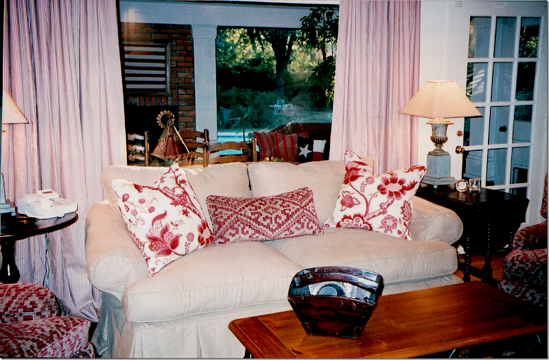
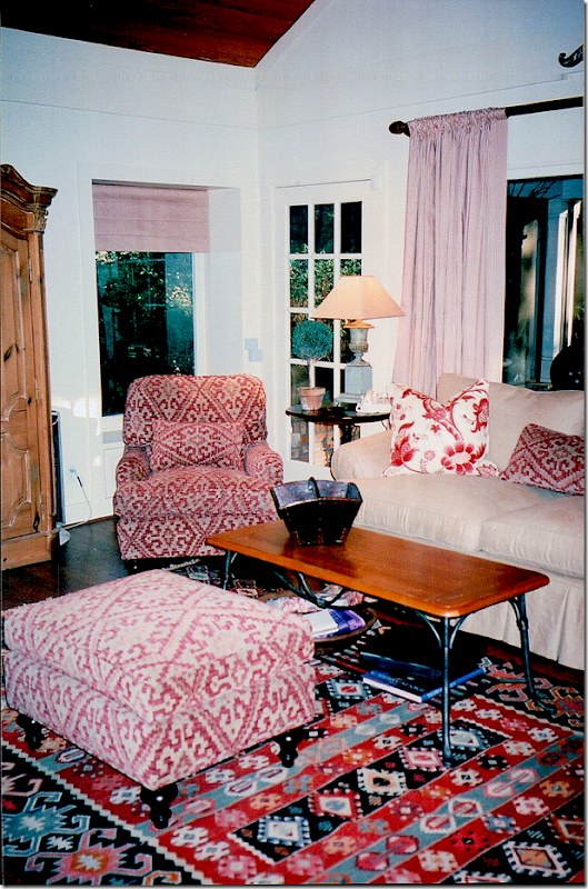
BEFORE: These pictures are really old – they aren’t even digital!! My associate Monica, of Custom Creations by Monica took these and scanned them to me today. About 12 years ago, I designed this room – with a linen slipcover and an English printed fabric. The sofa was the clients and the coffee table was theirs, too. I added the gate leg table and the English arm chairs, along with those great urn lamps that James Farmer made for me. The curtains were a red and white ticking. Behind this room – was a large screened in porch – with its own brick fireplace. Out in the porch – we did wicker furniture with Ralph Lauren fabrics and a Spanish styled breakfast table that the owner had had growing up.
I added a kilim rug and those chairs covered in a soft chenille. The pine armoire was another piece that the owner had had since he was young. Looking at these pictures really brings back memories from so many years ago! Monica and I were laughing tonight – because, to find these pictures, she had to go throw ten photo albums of old design work we have done together. Monica has worked with me on every single job I have ever done – since my first one! We got the giggles because she said all my 0ld work was always toiles. She used to call me the Toile Lady. All the pictures were of rooms done in either red toile, or blue and white toile, or yellow and red toile. So, seeing this really takes me back.
About five years after I had completed this room - the owners tore down the wall between the family room and the screened in porch and made it into one large room. At that time, they also gutted their kitchen and installed a new one and added on a large master suite – across the courtyard from this room. The master suite is the same size as this space for symmetry. I did their bedroom suite at that time – seven years ago. When the time came to furnish the new family room, the owners didn’t have much enthusiasm to really redecorate it. So, we did a quick fix:
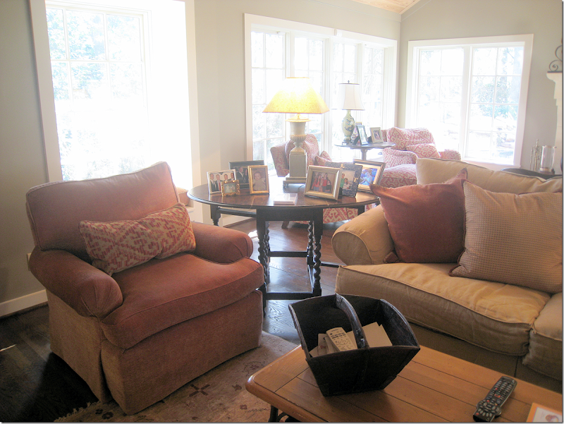
BEFORE: We got rid of all the red because the walls were now a green that matched the adjoining kitchen walls. I added two new chairs in a rust colored chenille, along with a few new pillows, and a new darker slip on the couch. We also added a muted rug on this side of the room.
I moved the other chairs into the new section and that was about all we did. The owners didn’t want any curtains and they loved having only a few small rugs that showed off their new wood floors.
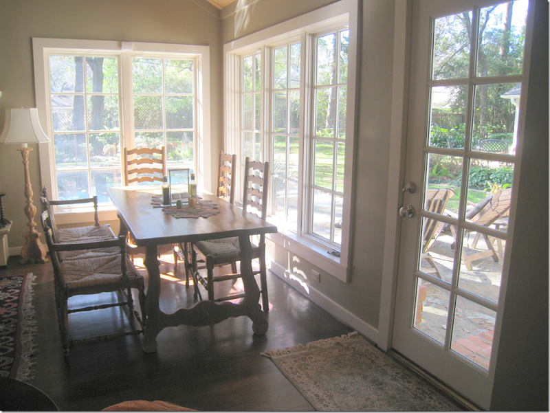
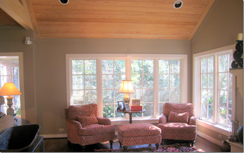
The table, from the owner’s childhood that was in the screen porch area, was moved here in a space near the windows that was designed for it.
And, on the other side of the former screened in porch are these chairs and the kilim that were moved over here.
Seven Years Later:
I was thrilled to get a call from the owners telling me that they were now ready to do a complete update in the family room. I was excited to get a chance to design the room from the start instead of having to piggy-back off an old design. This time the owners were much more amenable to redoing the entire room – and replacing some of the furniture that had come from his childhood home. They also were more open to things they weren’t too keen on before – such as shades and curtains and one rug instead of two. In fact, they were very easy to work with. The best kind of clients!!!
So, this is what I came up with:
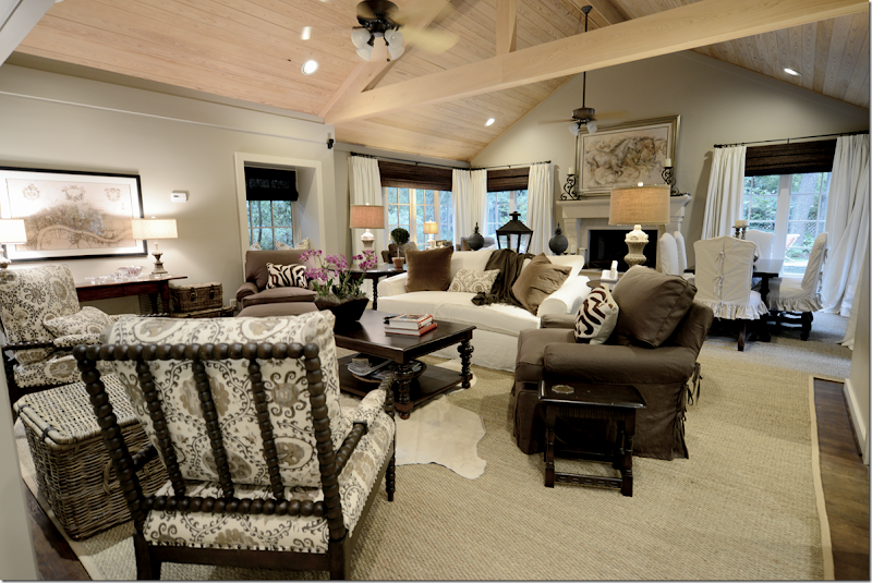
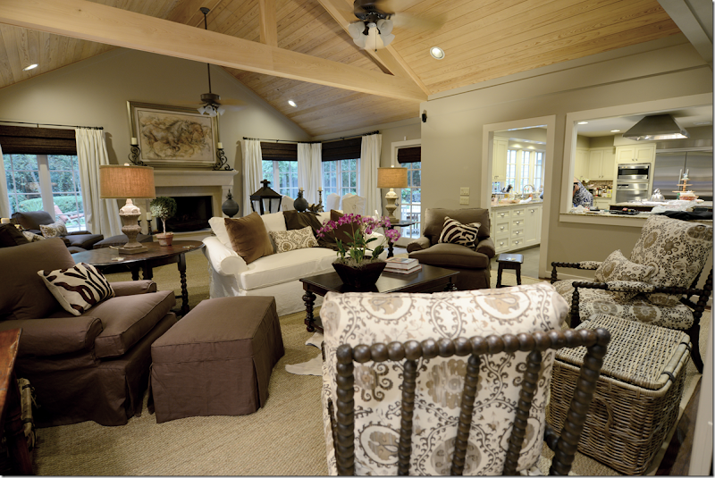
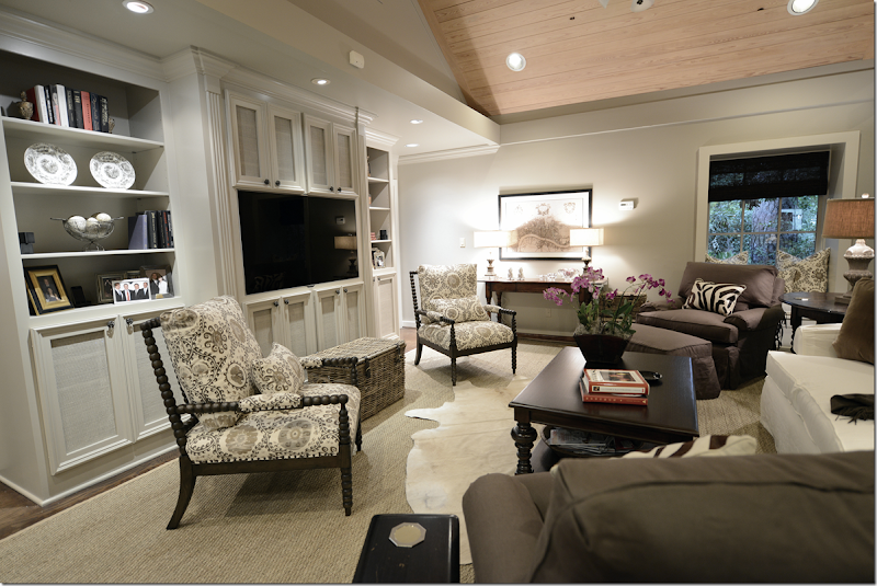
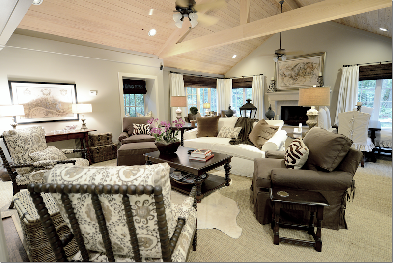
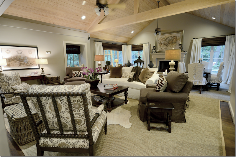
First, we lightened the walls – taking the green to a more grayish side (Sherwin Williams #7037.) Then, I added the large seagrass that extends throughout the two areas – making it seem more like one space instead of two. We kept all four club chairs and sofa, just updated them with linen slipcovers. And we added curtains and shades which really made the large room much more cozy and warm. Since the room was so large, I wanted a lot of contrast, a ying and yang energy so that the room would be more lively than sedate and quiet.
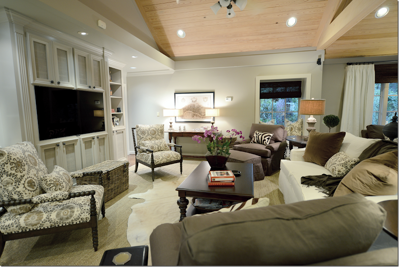
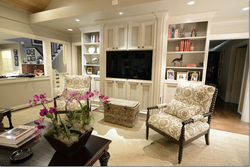
We bought two new Bobbin chairs – from CFC and covered them in Oxus, the Carlton V fabric – in the gray colorway. This fabric was our starting off point and everything else came after this fabric was chosen. Since the background of the Carlton V is rather creamy and not white, the sofa and curtain fabrics are more ivory than stark white to blend with the print. We ordered a new coffee table from Noir. And against the back wall, we got rid of the repro pine armoire and added a wood console instead, which really made that area come alive. Before, it was a dead spot with the dullish armoire. I also had the shelving unit repainted – soon Leslie from Segreto will faux it, along with the ceiling. More about that later in the story.
From this view, you can see into the kitchen – which was totally gutted and redone when this room was enlarged 7 years ago. I can see Monica’s behind in there! (She is going to be so furious with me!) And here you can see the beautiful fireplace mantel that was added during the renovation. The painting is of running horses – from the owner’s collection - and is in tones of browns and beiges and grays which determined the color scheme for the room.
When flatscreens first came out, I designed this bookshelf for the owners. Originally this wall was the back of the fireplace that is in the living room, which is on the other side of the family room. This wall was brick and it stuck far out in the middle with sheetrock on both sides of it. There wasn’t a fireplace – it was just the back of it. The house is rather old, an original ranch from the late 40s, and I think that this family room was probably built as an addition a long time ago – therefore, the back of the fireplace was once on the outside of the house. So, we built the bookcase to hide that – the middle section is really very shallow. The speakers and equipment are hidden inside the cabinets – which are screened instead of solid to let the air and sound come through. At the time we thought they had the biggest flatscreen they would ever want, but you know how that goes, and recently they bought a new one. We reworked the middle section to make it fit in perfectly. Well, Raul reworked it!
I added the creamy cow skin rug to break up the large expanse of seagrass. And I bought them the set of 3 baskets from Artesia Collections to hide all the flotsam and jetsam that was previously hidden in the armoire. Plus, now the largest basket serves as a drinks table for the two Bobbin chairs. I am so in love with Bobbin chairs ! They are light enough that if someone wants to watch tv, they can just pick it up and turn around, but that probably will rarely happen. I put the orchid in the Chinese rice bucket, but this will usually house all the clickers. Not sure why I didn’t turn on the living room lights or clear off Monica’s things on the counter, but I was a little tired at the time I took these pictures. The installation lasted from 8:30 – 4:00 pm, mostly because they fabricated the rug on site.
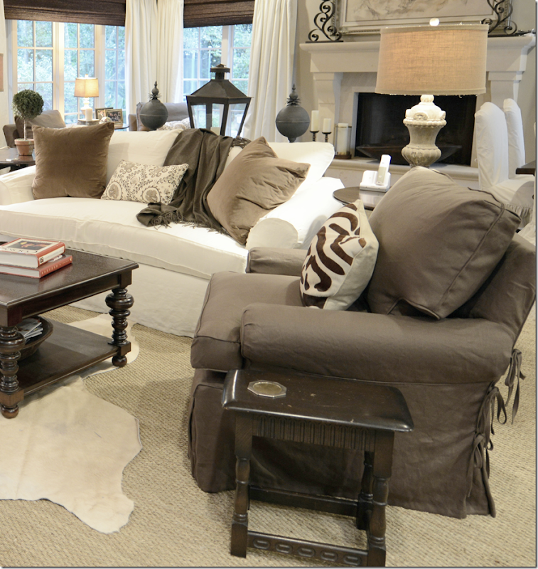
All the lamps are new and all came from Aidan Gray. I added the two zebra lumbars from Mecox Gardens and the two pillows on the sofa are velvet. All fabric besides the Carlton V is from Pindler. We needed bolts and bolts of fabric, so Pindler’s friendly price points were very welcomed.
Hien Lam reworked the sofa – updating it with one bottom cushion and two back cushions only. Plus, they made all the slipcovers.
I didn’t get a good shot of the fireplace – but here you can sort of see it. I’m not sure where they got the painting from – who the artist is – but it fits the mood of the room perfectly. The candlesticks on the mantel are theirs too.
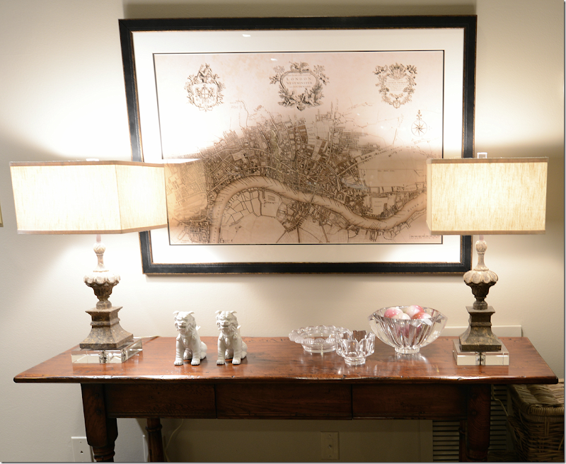
I replaced the pine armoire with this console table from Hien Lam Home. And I bought this reproduction of the antique map of London from All Posters. I also bought the one of Paris and wanted to stack them, but there was this beam in the way, and everyone vetoed the second print! Everyone included Monica, James – my helper, and the seagrass installers = all design mavens.
Here’s a close up of the Aidan Gray lamps – these are really pretty with the acrylic bases and finials. And the box shaped shades lend a slight contemporary touch. BTW, the Aidan Gray house search continues. We will probably be announcing the winner in about two weeks or so. We are going over all the entrants now. So – you still have a few days to enter – but hurry!!!!
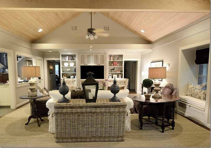
And looking from the back of the sofa. I added a new console which is actually a huge basket from Artesia. On the right, is a small window seat. I love these lamp shades made of burlap which brings out the color of the seagrass. And, I added the lantern and the zinc balls on the console.
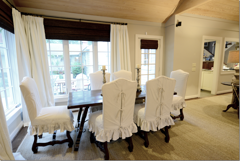
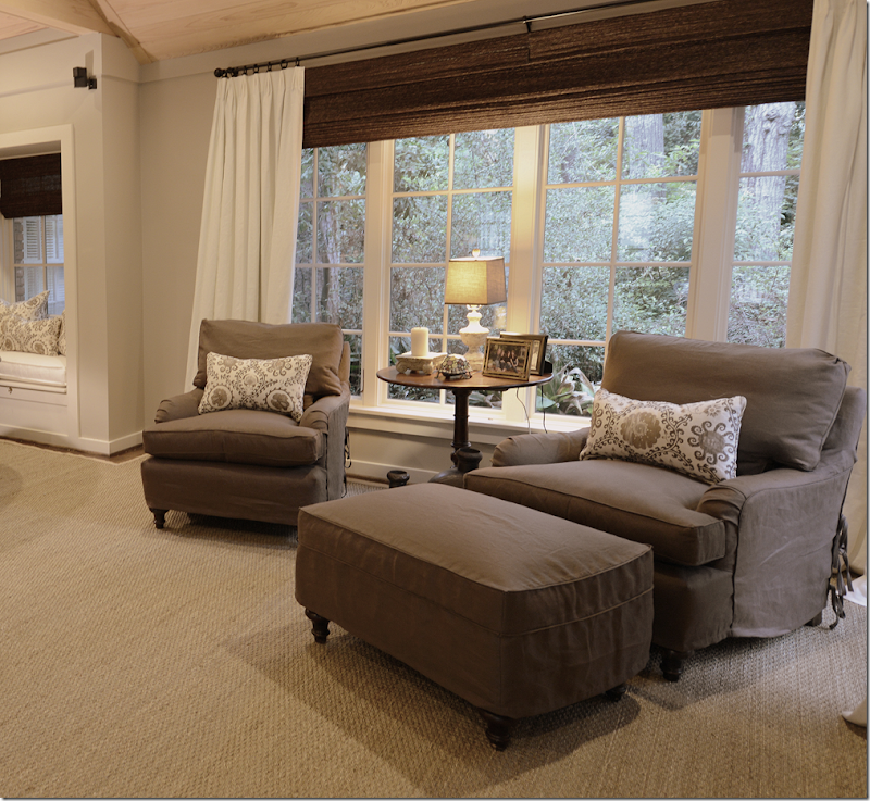
The owners childhood dining table had Spanish styling and was actually quite pretty. So, I had it restained a dark, rich brown. Before it was a light color that looked faded from years in the sun. The old chairs had seen better days, so we bought these French chairs from Hien Lam and stained them dark – and slipped them in a ticking stripe. I chose the dark window shades to go with all the brown linen and dark woods and the curtains really pop against them. They will probably never be lowered, so not much light or view is blocked – since the shades are actually only covering the dead space between the window and the rods.
There was only one hitch in the project when the lady of the house called to say she didn’t want or need the shades. I was stunned. “No, no, you have to have them. The whole room was designed around the shades. No. I insist. Please!!!” I was literally begging her. I think she was surprised since I usually don’t insist on anything that strongly. But, thankfully she changed her mind and I quickly ordered them.
And looking from the main seating area to the breakfast area. I added the candlesticks from Aidan Gray and the large clam shell.
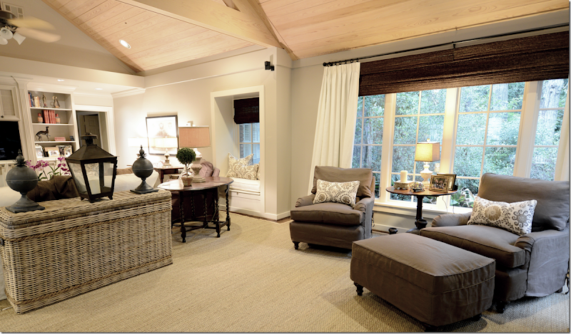
Across from the breakfast area, are the two club chairs with an English arm and carved legs. I discussed doing a back to back sofa here, but with the dining area, there just wasn’t enough room. Then we discussed moving the breakfast table in the middle in front of the fireplace, but that would leave two big holes on each side. Then I thought that maybe I would add an antique chaise or bench along each side, or even a Mies chaise with the dining table in the middle. At this point, the owner looked at me like I was crazy. I also thought about four chairs instead of two, in a circle, but in the end – it was just too much and I left it the way the architect intended it with the breakfast table in the right bay and the chairs in the left.
Their backyard is really large and beautiful – the house is in wooded Memorial – and it was once considered way out west Houston, but now it’s rather close in. There is even an old stables in the back. Now, they have a beautiful pool with a fountain – so the views out these windows are fabulous. Of course, I didn’t take any pictures of it! I forgot! What can I say – I’m not a professional photographer! But, – did you notice this is the debut of my new camera – the Nikon D800 that I was on the wait list for six months for? The camera takes extra wide shots which is great for interior photographs. So - an improvement? Or is it back to school, pronto?
OK, back to design. One thing I like in this room is the contrast between the dark brown linen and the ivory curtains and the dark shades. The print is just enough pattern without overwhelming the room or dating it too quickly. IMO! Which is why I was really so dead set on ordering the blinds. I think they made a big difference in the room.
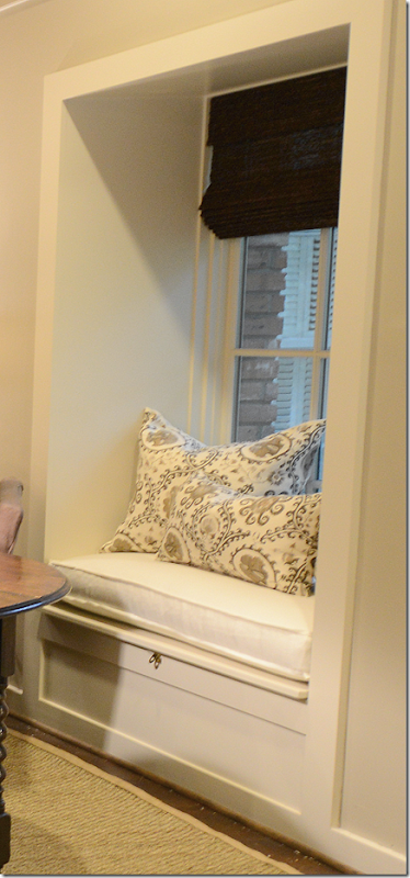
And this is the window seat that remains from the when the room used to end right here. Monica facilitated the down cushion and pillows, of course. And all the curtains, too.
In the end – there is only the ceiling left. While at first I did love that the seagrass balanced out the light wood ceiling, I saw something that Leslie of Segreto had down on the ceiling at her new office. After we met with Leslie, she agreed that the ceiling would look fabulous treated the same way.
Leslie has just remodeled a tear down into her new beautiful offices. You HAVE to see how cute it is HERE. And, here is a picture of her new office’s ceiling which is the treatment we want to do on this ceiling.
Here is the treatment for the ceiling, it looks like rustic barn wood and has a grayish tone. We are set to do it in a few months. The ceiling is so gorgeous! It will really tone down the yellow color of the wood and will be much softer looking!
So, that’s it! Thanks for looking at all the pictures.
WEBB DESIGN: A Redesigned Family Room
Subscribe to:
Post Comments
(
Atom
)






You are a genious!! The family room is beautiful! To die for! Congrats!!
ReplyDeletexx
Greet
Oh thou dost effervesce!
DeleteI KNOW! really.
DeleteInsincere praise is always a winner. Perhaps we can attribute this one to a lack of language fluency.
DeleteJoni you did such an amazing transformation on the whole room it really is beautiful. I’m so glad the owners went with the shades because they add just the right finish to the window, love the dark blinds for contrast. I’m so going to order some new lamps for my dining room from Aidan Gray the ones you used are wonderful. Really great update just wish you lived closer to me to help me with my living room.
ReplyDeleteXXX
Debra~
Good morning, Joni!
ReplyDeleteWow! I always say this, but you really inspire me with your designs.
This is fresh, warm and comfortable. Well done!
xo
Luciane at HomeBunch.com
Sigh......wish you could come do my house in Knoxville. I LOVE your designs.
ReplyDeleteSublime transformation! I wish you were here in Philadelphia! The room is so soothing. Updated, but still traditional and warm. Bravo!
ReplyDeleteOmgoodness Joni!! So fun to see it from the fabric swatches to install!! You are so talented!!!!!!!!!!--love seeing your work!!! I can't wait to get in there and do the finishing touches for you!! The clients should be so happy!!!! xo Leslie
ReplyDeleteI literally said "holy cow" when I saw the after photo! The room was very pretty and cozy before, just dated, but now it is magnificant!! You did a wonderful job!! The room is incredible!!
ReplyDeleteFabulous, Joni! You just continue to amaze me with your wonderful talent.
ReplyDeleteDoes it really take talent to use the same fabrics and style over and over again? She knows every Pindlar linen by heart, she uses the same style Aidan Gray lamps in almost every design she does, and those hideous bamboo shades she insists on hanging in her so-called "dead space" will show up in every design she does in Houston. This is as rote as it gets. This is not design, this is replication.
DeleteEven with shades, there is still "dead space" noticeable. It's just thin now, like the awkward gap between top of a sock and the hem of a trouser leg.
DeleteHATER!
DeleteWell, at least it's not that huge 2, 3 ft. gap i see in Architectural Digest. i hate that. it's a pet peeve. And no, I don't always use Pindler linens, but they do make nice ones in pretty colors for not much money.
DeleteThen fill it with something soft and pretty - not those butt ugly things you continuously hang. There really is a bigger world out here, Joni. Have you left the city limits of Houston lately???
DeleteI would prefer the gap to those ugly dark dogs that are hanging here. Why not fabric shades constructed in the same fabric as the curtains. Take a look at Phoebe Howard's work, particularly at some of her showrooms. She is a master at this where applicable. In your case, it seems to always be applicable.
Deleteso. phoebe likes fabric shades and i like textured shades. am i wrong and she is right? i happen to like the extra texture you get when mixing them with fabric. I like that kind of texture - that's what i like. i suppose in a bedroom or living room i could do a fabric shade, but why do i have to just because phoebe does?
Deleteseriously. i was thinking about this. why do i have to change what i like? when i see a room in a magazine with textured shades mixed with curtains- - it speaks to me. just like some like chocolate, some vanilla. that is what appeals to me = and to call shades ugly. please.
DeleteHi Joni,
ReplyDeleteI love this room. The unit that holds the TV is amazing. We are going to rework and paint our 80's oak built in to accommodate a wide screen TV. I really like the look of the cabinet doors with the screen to hide the components and speakers but still let air circulate. I also love the huge basket you are using for the console table. What a great way to store (hide) a bunch of magazines and books that don't fit on my shelves. The ceiling is going to look wonderful once it gets finished by Leslie. I really like how she finished the ceiling in her new office. I wish I had high enough ceilings to do a treatment like that. You did a great job on this room. I have pinned some of these to my reno inspiration pin board.
Thank you for sharing! I absolutely love this room! It's beautiful, but so warm, welcoming and family friendly. Just gorgeous!!!!
ReplyDeleteToo bland .... sorry.
ReplyDelete"Too bland .... sorry."
DeleteWrong. It's the perfect degree of blandness.
Looks amazing! I love the color scheme. I think that is a great call of finishing the ceiling. It is going to look fabulous! I really hope you post pictures once it is finished. Also, can you share where the shades came from. I really need to order some. Thanks!
ReplyDeleteYou did the movie, GIANT, transformation.
ReplyDeleteReata was dark then to light at the end of the movie.
I would have to have the pair of chairs, in front of the window, able to turn to the view. What is that called, using the same chairs they have but they can turn 360?
Your camera picked up the vinyl grill cover beautifully. But I'm used to gorgeous rooms looking into landscapes with 'issues'.
Adore the rug change. You nailed that!
Gorgeous rooms Joni.
Garden & Be Well, XO Tara
Tara, I noticed the evolution of the phones! Joni as always such a beautiful space, I know your clients must love it, thanks to you and them for letting us share.
DeleteTara - they are called swivel, right? that is what you are trying to say?
DeleteNothing new - seagrass, white slipcovers for chairs .. nothing exciting same old same old
ReplyDeleteA typical Joni redux. Nothing new here albeit an improvement in the overall room. Joni is now able to do this design in her sleep. The dark brown blinds are very jarring in the overall scheme. At least she used Bobbin chairs to mix it up a bit and not just another Ikea club chair. A bit more variety in the lamps would not have hurt either nor finding a taller basket/trunk to serve as a drinks table. The one shown here is too short.
DeleteAlso not wide enough to serve both chairs.
DeleteWell, that's why I come here-- the seagrass and slipcovers! I love Joni's taste. If I didn't, or if I grew tired of her style, I'd just stop visiting the blog!
DeleteAgree w/Anon @ 1.59 -- I come here to get inspired. Joni is so talented..
DeleteAnon @ 8.09; Anon @ 10.27 @ Anon @ 12.15 - if you don't like Joni's designs, why read her blog? Attention whores!
Anon.6:19, we actually come here to help educate you poor souls who don't seem to have a clue what goes on in the design world except in Joni's world. Attention whores? Really? It seems that prostitutes would be a better term when describing the little "groupie" lap dogs who get their design cues from someone who has never had an original thought in her head other than the first one years ago to become a one show wonder. If you did your own design homework, you would see how rudimentary and elementary this design really is. Get out of your shell and learn something. If this inspires you, you have set your design sites really low.
DeleteOh, they love to come here to tear me down. what they don't understand is if i wanted to - i could do mixes of patterns in colors all day long. i just don't right now because i don't like that look. if someone hires me, they hire me because they know what i personally like. i can do chenilles and tweeds and silks in all colors. i just don't WANT to. that's what they dont understand. the people who have asked me to do their homes are happy. they got what they wanted. truthfully, you know what i hate, an overdesigned space with wall treatments and color coordinated everything in bright colors where the rugs are custom and if you move an ashtray you throw off the entire design. how boring. if the background is neutral - you can add to it over the years and let the space be a living breathing thing instead of staying one way for 20 years. it looks so dated after a while. whatever. the anons hate me and they love to say 'boring' - same thing. Yeah - it IS similar. I get that, I know that. but that is what i like. This client told me to do whatever i wanted basically. they liked what i proposed and it came out nice. in person, it's really pretty. would it be more original if i had gotten a Starke rug that you see over and over again? Or how about a Weinrib one? uggh. whatever. The anons amuse me. They know it. I don't care - they don't hurt my feelings at all. It's all a game to them. I never claimed to be talented. I never claimed to be a genius, ha! I can design a room in any style. My portfolio shows that - it's just right now, in 2012, this is the look that I like. I'm not going to start doing something just to show it on here that hey - I can mix prints!!! wow!! That's not going to happen, anons. So, just move along. Go take your complaints somewhere else. Or stay. I dont' care either way. You are good comic relief for me.
DeleteIt's a good lesson for me, Joni, to consider your attitude toward the anonymous ones - you're a generous, resilient, confident person doing your thing, and I like how you presented yourself in the previous post. I'd have a hard time not deleting any anonymous post.
DeleteActually, they give me a lot to think about. They think they hurt my feelings - maybe they did 3 or 4 years ago, but not now- i always expect it. But, honestly, they do give me food for thought. sometimes it works the opposite though and strengthens my commitment to my own preferences.
DeleteExcept you're contradicting yourself: You USED to justify your narrowness by saying: "well, I could do better but the clients hold me back!!" or "I could do better, but the budget is too small!" You always had an excuse. Now you're saying "This is pretty much all I think is good. Everything else is lost on me."
DeleteI don't think your work is boring. But you seem so very very frightened of being creative.
DeleteYou're like someone who comes home and has a peanut butter & jelly sandwich and a glass of skim milk for dinner every single night of her life.
Hmmm. interesting. I did used to eat the Wendy's salad every single night for dinner until they changed it up and I had to quit. you might have a point. I'm not very adventurous at all. Just happy with the way things are. I am NOT scared of being creative, I am just not really attracted to really creative interiors - or maybe I don't know how to step outside the box. i have never claimed to be talented or something that I am not. I do know my limitiations. That is why your criticism doesn't really bother me because you aren't telling me anything I don't know myself. I am not dumb. I can see when other people do things that I just couldn't. or wouldn't. or couldn't. both at the same time.
DeleteAnd anon above - those aren't excuses! mostly it's the truth. I have clients that come to my house and say, this is exactly what i want. these colors, this look, exactly. I just finished working on a house and the client wanted white slips, seagrass, - you know the drill. she wanted the aidan chandy. I suppose I could have talked her out of it and told her no and refused to the job, but why should i not give her what she asked for? And for years I did work that wasn't really my heart. Because only some many people heard of me = they didnt' want slips or curtains, so i did what they wanted and i hated it. Now, people ask me to do what I love doing, or the look that i love.
And yes, budget is a big factor. I'm sure you know how much money it takes to do a room with just the bare necessities. I usually don't have clients that can get gorgeous antique chandeliers or light fixtures. Or old furniture or antiques. Anyway - there is some truth to what you say - everything iS lost to me. I look at magazines and most doesn't catch my eye. The things that do are things that are similar to what I do. Or, it's a cluttered mansion in England or an old Provence farmhouse. So much i see doesn't inspire me at all. While I think Miles Redd is a genius, I don't particular like his work at lot of time. I shouldn't single him out = but more, people like him. but then I AM inspired by David Easton a lot of the time.
This whole thing is really weird anyway. Having a blog and putting your work up to see and then have people critique it because it's similar to waht you did before. Can't you tell most times when you see a designer - who did it. For instance, Peter Dunham. I can pick his work out in a second. It all tends to look alike, but no judges him for being in a rut. They just accept that that is his look. Or Mario. Or Windsor. Or Faudree. So many of them have a similar look and they are all at the top of the business but no one judges them for doing the same thing over and over again. Even Bilhuber has a certain look and he is very versatile. Saladino - his work is immediately recognizable. And so is McAlpine. You can tell it's a McAlpine house immediately, and both of them are uber talented in spades. Even locally, put a Pierce interior next to a Barber one and I can tell you which was which. Ginger told me - people say all I do is linen, but I LIKE this look. I get that.
So, i'm not sure if it's a lack of creativity or just doing what you personally like. or using sources you are used to or know. I don't use a plethora of sources. i tend to go to the same places. In the end, I don't think it's an excuse, it's just doing what I personally like or what appeals to me. If the client doesn't like that or want that, they will go somewhere else. For instance someone who loves Tobi Fairley would NEVER hire me because I'm not going to design a room like she does. And vice versa. Now, could I do what she does? Use bright colors and lots of patterns, yes. Would it look as good as hers? No, probably not. Anyway, food for thought.
Joni, you have a point of view. That's what people pay for and that's why people (in droves) visit your blog. You really put yourself out there by showing pictures of your work and while I guess that invites criticism, I do not understand why anyone who looks at it and doesn't like it would waste time leaving a comment about it. I have visited several of the blogs you have on your blog roll just out of curiosity. There are a few I return to every once in a while, but for the most part, they don't interest me very much or I didn't like the looks they were showing, so... I glance over them and then move on to something else (or just come back here). I don't think you lack creativity. I think you design for real people (whose budget, no matter how small, is still not tiny!) who use the rooms. I agree with you-- some of the designers you see in magazines create gorgeous spaces, but how do those really translate to real people who have children and a life and live without a daily housekeeper? I like that you offer so many practical tips and solutions that I can use in my own home. The black doors, seagrass with white curtains and slipcovers, these are all things I have learned from you and copied in my own home, but at less of an expense (for instance, no way can I afford a custom cut seagrass rug). I don't think you have ever said that using an Ikea sofa is the height of good design. You have given those of us who cannot afford a George Smith sofa something within our reach, that we can go do next Saturday, to make our family room a little nicer without pining for something so out of our reach we can't even think about it right now. I appreciate your honesty, your candor, and I think part of what attracted me to your blog in the first place is that you are so clear about your likes and dislikes. You aren't afraid to say what you don't like, regardless of who the designer is, but you are never nasty about it. You've developed a style that people want and I do not think of that as limited!
DeleteI assume that your clients are friends, neighbors, friends of friends and from generally a wide circle of people who might have some connection to each other via referral. When they walk into each others homes, do they not see that they have the same "stuff" that everyone else has and does it not bother them that their look is not uniquely theirs? Houston must be a city of clones. Most designers will not replicate a look for a client if he or she knows that it is a copy of someone the client knows for whom the designer has worked. That you do this so frequently and without any concern is beyond comprehension. Now go back to Wendy's. Perhaps you don't have the desire to go to that 5 star dining experience outside of your neighborhood. Be content with the reputation you have which is probably wholly propped up by the blog rather than your work. It's sad to see someone who loves design so much be so stuck in one mold. Your excuse that it's your look doesn't hold water. Yes to some extent, many of the designers you mentioned above have a look, but having a "look" is entirely different than "replication" and "duplication". None of their work is exactly alike. That can't be said for yours.
Deleteto anon - 5:07
Deletethank you so much! I think you do "get it." I'm glad I was able to help you design your own house. That's what kills me - that people think it takes a lot of money to have something cute - it really doesn't. Which is why I love the Ikea sofa for instance. And I love Ikea in general and places like that. btw - custom cut seagrass isn't that expensive, if you get it from someone like Anthony for instance. He is very reasonable. Still, a seagrass from PB is a great alternative to a cheap fake Oriental rug. Or, if you have a nice one even and want to update your look - trade it out for a while with a PB seagrass. Or just painting - will update a room. And editing is a great way to update. Anyway - thank you so much.
One thing - on The Skirted Roundtable, we interviewed a big name designer and she uses all very very light upholstery and i asked her how do they keep it clean if it's not a slipcover. I see how dirty my slipcover gets just from Ben sitting on it in his clothes! And she said they "treat it" - well whatever. I just can't believe that it will stay clean just by treating it - esp. more than a year or two. She didn't really care about that. I could tell from listening. That's why I use slips, esp. with people that have children or pets. It jsut makes life so much easier. The anon said i should have upholstered the breakfast room chairs, but i wanted to do them light - i can't imagine how filthy they would be in a few months or years.
Anyway - thanks a lot. You made me feel a little better!
"The anon said i should have upholstered the breakfast room chairs"
DeleteNo one said that. The comment was that you should have left the chairs un-slipcovered. The original chairs were prettier, had more interesting lines, and were more graceful. What problem did you solve by replacing the originals with these much less graceful, chunkier ones.
And why do you get so much stuff from "Hien Lam"? After enough of these references, it starts looking like one-stop shopping for you. I'm surprised, since you lavished so much praise on that decorator for "hand selecting" all her pieces from many different sources.
Hi Joni,
DeleteSix montha ago I was new to the Blosphere, especially to Interior Design Blogs. Call me innocent, but I had never before heard the words snarky, butterpat pleats, wall to wall seagrass rugs or known that there were AT LEAST 50 Shades of Gray. I had not known that one should cover the space between the top of the window and the ceiling with drapes (not curtains) and with some sort of blinds. The names Bobby McAlpine, Phoebe Howard and Tara Dillard were new to me. What a hoot to learn that the old, faded farm furniture that my Swedish relatives were happy to unload on unsuspecting Americans would be so "hot". In Sweden, those same people are happy to take their money to buy something new and shiney at IKEA. And, I had never realized that a simple, gray painted wood and metal chandy would be considered a "reasonable" price at just $1,000.
Truly, this is not meant to be snarky. It just that is has been a series of revelations! I LOVE that YOU love your design aesthetic. People always do their best when they do what they love to do! Just because some of us do not love everything you show us, doesn't mean it is not a valuable and enlightening experience. In spite of the grays and whites (which are not MY colors), I always find something edifying in every photo you show us.
I know you will not bend to the opinions of others and change your ways just to suit them. You shouldn't! Residential design is about comfort. If cool neutral colors, slip covers and gray accessories make your clients happy, that is a wonderful thing! Thank you for spicing things up occasionally with interesting alternatives such as Alexa Hampton, Kathryn Ireland, and the colorful island homes in South Carolina. My favorite post was the one on car mats. It was so much fun to see the decorator who had slip covers on her car seats!
Keep up the good work. The fact that you have a vast and dedicated readership shows that your work has meaning and value.
Best wishes, Charlotte
thank you so much charlotte. very very much appreciated!
Deleteas for those chairs, again, i wanted them to be light - and worried about them getting dirty if they were upholstered. shoot me for caring.
hien. well - they sell great chairs there. what can i say? they order the frames for you. i could have gone somewhere else to order the same damn thing, but why? and the hien lam store is different than than the warehouse. it's a furniture store where they sell mitchell gold and all the furniture from the places where i order things wholesale, like noir for instance. so if i need something quick and don't want to pay huge delivery fees from them to the shipper to the warehouse to the house - 4 x shipping fees, i will just get it from lam decor store. again, shoot me. i could go to another store, like mecox, but why? anymore questions about my motives?
" I'm not going to start doing something just to show it on here that hey - I can mix prints!!! wow!!"
DeleteDo you really consider using two different prints in one large room "mixing"?
btw, my portfolio was up on decorati, but its now closed. so - i'm getting an update of my web site and i'll up my portfolio and you can see that i have done other things besides slipcovers.
DeleteI love the new family room colours and fabrics. The brown slipcovers are a soft shade which makes it much more inviting than stark dark brown. It all looks so welcoming.
ReplyDeleteI bet the homeowners are over the moon happy. Pretty, calming, and uncluttered. Thanks for sharing before and after pics. Love to see new points of view.
ReplyDeleteHave a great week,
Tikaa
green acres brenham.blogspot.com
Tara Dillard - you are one strange person. Only you would notice the vinyl grill on the outside! I can imagine how difficult you would be to work with... perfection at all costs. Instead of noticing & commenting on something you see as "not right", just keep your mouth shut.
ReplyDeleteoh, wait, Tara is a landscape designer. so, yes - of course she would mention that!! she was just teasing me - we are great email friends. don't take it to heart. she has always been very supportive of me. she didnt mean anything by that comment.
Delete"Garden and Be Drunk"
DeleteAnonymous 8:29 - you are one strange person. Instead of noticing and commenting on someone you see as "not right", just keep your mouth shut.
DeleteSorry, everybody.
DeleteTara's thresholds are always vanishing.
DeleteI know first hand that Tara is NOT difficult to work with, she is funny and like Joni, takes her client's lifestyles, budget and desires into consideraton. She also uses perfectly imperfect styling and materials. I have an ugly charcoal grill with a vinyl cover and she just worked it into the plan.
DeleteJoni, this is a beautiful home and I think your signature look is great. I love the client's dining table, the blinds and that basket behind the couch instead of a console table and those Aidan Gray lamps. I can't wait to see whose space they pick. How funny to read the comments about Phoebe Howard, she is fantastic but I thought the other day that she definitely has a "look" and many of the before/afters were becoming predictable. You are always generous with your sources and loyal to them and Monica which is a most admirable trait. I think we forget these photos are taken after the install and much like a real estate photo, the personal items are out. I am sure when all of blogland is not looking, there is lots of happy life in these rooms.
Another beautiful room...love everything you did...it always seems that whichever project I'm currently working on will show up on your blog...yay for me..I am currently contemplating recovering two chairs, ordering two Aidan Gray chairs and in general finishing my family room..and just seeing this post pushes me to finish my update! I really love your designs..everything just flows so beautifully. Great job with the new camera!
ReplyDeleteHave a wonderful day,
Sharon
Joni - Amazing job! Love the transformation. You're right, the shades really add a lot to the design.
ReplyDeleteGreat job, Joni! I noticed right away the wider shots and wondered if you had gotten your full frame camera. Lucky you! I'm just wondering how they'll dismantle everything to paint the ceilings. Won't all the shades and drapes have to come down and the furniture moved out? Or do they just put giant drop cloths over everything? Sounds like a headache, but should be beautiful when done. More pictures then, please. I know your clients are pleased - everything looks fantastic. I love the gray/brown/cream combination and the fact that you re-used various pieces where you could by re-covering and re-staining. I also love the bobbin chairs and fabric. I've been pining for Hickory Chair's version for five or six years now since I first saw it at furniture market, but no room!
ReplyDeleteMe neither! That's why I used them here - I got them out of my system a little bit. Actually i showed them to the homeowner and he really responded to them. On Friday he said he was really glad we went with them. me too. I think they add a lot to the room.
DeleteI am pretty much amazed of the article content. I learned a lot from the interesting topics that are being discussed.
ReplyDeleteLove it!
ReplyDeleteARE YOU KIDDING ME? DO YOU EVER STOP? I AM DYING OVER THIS ONE! I WANT TO COPY EVERY LAST LITTLE DETAIL! YOU ARE SERIOUSLY A INTERIOR GENIUS! MELAINE
ReplyDeleteWhere can we find that fabulous fabric?? Just wonderful Joni!!
ReplyDeleteBefore I finished reading I thought the ceiling looks a bit odd compared to everything else. The finish you recommended is going to be perfect! LOVE the new colors. Everything looks so fresh. Congratulations on a whirlwind project. (really, one day?!!) Nice camera shots... :)
ReplyDeleteI am kind of torn about it. Because the color balances out the seagrass. So, either way, I think it will be great. I love the treatment and think it will look beautiful - but if not - the ceiling doesnt really bother me as much as it did before.
DeleteIt is beautiful Joni! For all the annony. comments that felt it was nothing new let me say that "IMMITATION IS THE NICEST FORM OF FLATTERY" !!!! and it is what the client wanted.
ReplyDeleteWonderful work, Joni. Hats off to you and your team. Sandy
ReplyDeleteJoni,
ReplyDeleteYou are so talented! I just love this room. You also answered two questions by the end of the blog. First, are you changing the color of the ceiling, and second what color should my new club chairs be? I just fell in love with that chocolate color slip covers and the fabic on the spindle chairs.
Love it, Joni!
ReplyDeleteWOW 'O WOW!!! Beautiful transformation AND "thank goodness" the dark shades stayed...they are like a lovely frame!! franki
ReplyDeleteI love Noir...and CFC...didn't know they had a bobbin chair with a stationary bottom cushion (was that custom?). You did such a remarkable job! I love Carlton V, too...have the blue version in the mountains. The colors are season-less...so I can imagine pumpkins in the fall and pink tulips in the spring. Love the flat welt on the cosy window seat.
ReplyDeleteJoni! Such a beautiful room, and I love the colors.
ReplyDeleteJackie
I got some great resources from this post + Keep up the good work,Joni! xxpeggybraswelldesign.com
ReplyDeleteVery pretty room. Love all the textures and contrasts in colors. The baskets are fabulous. Wonderful transformation.
ReplyDeleteBeautiful! I'm loving the idea for the ceiling.....
ReplyDeleteI would have used a few yellows and greens here and there.
ReplyDeleteI worry that your plan for the ceiling will make the room too gray and ashen. The ceiling gives off warmth, which is badly needed, with all those sere tones.
Agree, I like the tone of the beams and ceiling which plays to the warm tones in the brown colors and yet is not heavy or dark. I suppose the time to have done something to the ceiling is before you redo a room, not afterward.
DeleteI would leave the ceiling as is and let it age, and let the color mature. A dingy, greyish "fauxed" ceiling could be one of those mistakes that you can't reverse.
DeleteI, too, like at least a few touches of the "colors of life". All these rooms filled with the colors of dead and dying things makes me feel like we living in an episode of "Twilight". Hopefully, the greens from the gardens read as part of the room.
DeleteI would even use some oranges and rusts.
DeleteJoni, I am always struck with how generous you are in sharing your sources. That is VERY rare in your business. Thanks everso! You
ReplyDeletedid a fabulous job on this room. Congratulations!
Actually, in most magazine stories they always tell their sources. Maybe it's the lower tier of designers like me who aren't good enough to be published that don't share their sources?
DeleteWould like to see a picture of the room with those very very dark blinds down.
ReplyDeleteI'm thinking Halloween is around the corner. That would be a great time to go for it. They look spooky now, but be patient.
DeleteGorgeous design; I love those Bobbin chairs!
ReplyDeleteHi Joni,
ReplyDeleteI LIKE the dark shades. They pull the dark colors of the furniture into the upper parts of the room. AND, I agree with you that the map of London needs something else above it. If your decorating crew did not like the print you suggested, perhaps 3 smaller prints or 3 small decorative items to draw the eye up higher on that wall. That particular assemblage seemed a bit bottom heavy.
I love this room!! And you are absolutely dead on about the blinds. They really do finish the windows and the room! I love that gate leg table ad seeing how you used it in both decors makes me want to go out and get one. What a genius you are!
ReplyDeleteI live on Sunset. Please come help me burn my house down.
ReplyDeletethat's hysterical. if you live on sunset, i don't think so! come to my street and we'll burn mine down. I love sunset!
DeleteWell Done You!
ReplyDeleteA brilliant transformation!
xo,
p
I am pretty sure I heard angels sing when I scrolled down to your first "after" photo. Simply stunning!! Well done Ms. Cote de Texas, well done.
ReplyDeleteOh wow, now some of the minions are having out of body experiences.
DeleteThe white chair slipcovers in the breakfast room don't read well against the nearby white curtains. It becomes a big mass of white.
ReplyDeleteThe chairs should have been left uncovered for variety and depth of color.
DeleteI think I agree; all those frilly pleats and bows and what-not don't seem appropriate for a dining chair anyway. Maybe for a bedroom vanity... And nothing else on the floor has all that intense girlishness to it, so the upholstery seems jarringly inconsistent.
Deletein person you can see the ticking stripe - it's much darker, but for some reason you can't see it. i slipped the chairs instead of upholstering them because they are breakfast chairs and this way they came be cleaned easily. i didn't want a dark fabric against the dark table and the dark frame of the chair and i worried about a light fabric getting really dirty if it wasn't slipped. I could have done a tailored slip. But sometimes I like the extra detailing on the slips. I think it looks luxurious that way.
DeleteEverything about this room is stunning. I.love.it.all!!!! You are so talented. I will be using this as inspiration on my newly remodeled kitchen/den/dining area. Thank you for sharing. I guess everyone has a right to their own opinion, but this is amazing! I just ordered an oxford stripe for slipcovers just like the brown ones you did. It is a light brown/tan/white. And I love the ruffles!! So fun.
Delete"I think it looks luxurious that way."
DeleteIt doesn't look "luxurious"--just overdone and cheesy, like a "Marie Osmond for QVC" fake-china doll.
It's kind of embarrassing.
oh please. wtf? seriously. marie osmond? i would love to see her house and compare it to this room.
DeleteNot much chance of that as Marie tries to keep her under-aged children out of the spotlight as much as possible. However, based on this recent clip from Oprah, Marie has a very comfortable, family-centered home filled with family pictures and things she has crafted herself. Much more All-American than Veranda. However, look closely and you will see some grayish urns in the family room. Maybe there is hope for her, yet?
Deletehttp://www.oprah.com/oprahshow/Marie-Osmond-at-Home-Video
http://www.lasvegassun.com/news/2008/dec/24/marie-osmond-makes-herself-home-green-valley/
In addition to selling the Marie Osmond Dolls, she has a strong connection to the Tai Pan Trading Compandy, a large wharehouse store chock full of very attractive decorative items priced for the average consumer. Yes, almost everything is from China, and may not the pinnacle of fashion. However, it gives many people the opportunity to bring beauty into their lives. Somewhat like Home Goods on steroids.
While the Osmonds should be outrageously rich, they are not. A financial advisor put them into serious debt about 20 years ago. Rather than declare bankruptcy and cheat their debtors out of the money, they did the honorable thing. They put a plan together to be frugal, work hard and pay back their debts. THAT is why they work so hard but live like most of the rest of us. Brava, Marie!
"marie osmond? i would love to see her house and compare it to this room."
DeleteReread the comment. The comparison was between your too-frilly slipcovers and Marie Osmond's cheesy fake-antique DOLLS. Not her house.
That's a beautiful job Joni! It's got your signature style written all over which is that WOW!factor. I'm sure that is what most say when they see the room.
ReplyDeleteI liked the chenille chairs before as well.
Thanks for sharing your work.
Hi Joni,
ReplyDeleteI love the before room you did as well as the new redo.
Well done Joni! The room is stunning, warm, functional and has so many great textures! Beautiful!
ReplyDeleteI really like it. In fact I liked this room in all three of its stages. What did they end up doing with the muted rug? I need one for our formal living room. I do love the recent version of the room that you did. It has some funk to it.
ReplyDeleteactually, we are moving that rug into the living room to take the place of the one in there now.
DeleteJoni,
ReplyDeletelove your blog. you are a great writer. seriously. as for this room, i'm partial to your design of 7 years ago. it was classic and really would have stood the test of time if it hadn't been changed. i'm all for a little updating, but i can't get my head around the new design. but, that's me and clearly i will never be able to afford the services of a designer such as yourself so i guess shouldn't really talk. your work is clearly in demand and you're so lucky to do this for a living!
Sukhi
I prefer more color and more personal style. These look almost like sepia toned photographs. I understand, if the intent is to replicate your "style" with the same elements (seagrass, hide, zebra pillow, white or neutral slips) but, doesn't the client want ANY color or livliness in the space? I miss the beautiful rug from the first design. And the color. You do this one look really well. If that is what the client wants. It is sad that you have to beg a client to do something, like the blinds. Maybe her personal taste and style was to go less on the windows to enjoy the view. Not trying to be snarky. You have this style down. But, it needs updating now, in my opinion, since it is becoming a bit overdone. Just my opinion.
ReplyDeleteI'm a curtain fan, but I have to say: The windows were beautiful unadorned, especially in the breakfast room.
DeleteThe husband wanted the shades lined to watch movies without the sun. She then thought they wouldn't watch any movies, so forget that shades. i should have said that. to her they were functional, to me there were a part of the design scheme. once i explained it, she understood and let me order them. while this particular client let me do what i wanted to - most come to me and ask for that look. so what should i say - no? because i have done it before so no - i don't want to show it on the blog again. i want to show something different. that's kind of silly. i guess i shouldn't just put any of my design work on here anymore. that might be the solution?
Deleteas for the unadorned windows, gosh, what i can say i couldnt disagree more. i thought the room was cold and bare looking without the curtains and blinds. its just a difference of opinion. it looks so much warmer and welcoming now to me.
"it looks so much warmer and welcoming"
DeleteThe way just about any wool or cotton rug looks so much warmer and more welcoming than seagrass.
Very Very Pretty!!!!! I love the way you redid all the old pieces making them look fresh and new. I like the curtains with the matchsticks, I just like that look.....And ths was nice to identify all the sources, I did not know about The Poster Place and I am looking for a map of London for an all British room I am doing for a boys room.Nice job! I bet the owners are thrilled..........Maryanne xo (no one would have noticed Monica in the picture, I am so jealous of your new camera.........)
ReplyDeleteLOVE, LOVE, LOVE!!!! Everything is just exquisite, classic and fresh!!!! Only A few little nit picks...1) I love the one cushion seat on the sofa, but the back cushions are a bit awkward looking...an "L" shape cushion that partially covers the arm would be better IMHO; and 2)I think the big wicker console behind the sofa seems a little incongruent in the room....and makes for a LOT of basketry, especially with the seagrass, which I do love. Not sure what would work better....maybe a console in iron and glass, introducing elements that tie to the curtain rods, ceiling fan and iron detail on the Spanish-style table; and finally 3)the brushed nickle door hardware sticks out like a sore thumb, IMHO...something darker would be better. Totally agree about the shades, too...the room is so lovely...I really enjoy seeing your design work with clients. Thanks!
ReplyDeleteabout the sofa - hmm. i didn't think about that - they are the professionals, so i dont' question that. maybe i should have? i need to go back and look. well, there was a bronze and glass contemporary one there - but i saw that basket console and fell in love with it. plus it's great storage for stacking up old magazines. it might be too much - but it looked good imo. i had nothing to do with the hardware, the ceiling fans, etc. that was all done by someone else.
Deletethanks!!!
Nice work Joni.
ReplyDeleteNeighborhood question - what the heck are they doing to that amazing house on Rice Blvd at the corner of Kent and Ashby? I believe it was recently listed for $5 mil and I can't imagine it needed a complete gut, which is what is looks like they are doing, at least upstairs. There has been a LARGE construction crew over there for months! Get us the scoop! The house was gorgeous before!
Featured here: http://www.indulgedecorblog.com/blog/2010/03/house-beyond-beautiful-march-2010.html
Oh look, you posted a comment!
what? ahaha. it was a total redo just about five years ago!!! wow. i haven't driven by there lately. Kurt aichler did it back then and it's stunning. I'll drive by. I am really wondering where the owners moved to. They used to live in the Aichler's old house on albans that is my dream home.
DeleteOh...my....god. The comments! It's like watching an episode of Big Rich Texas. I'm mortified by it all but I just can't look away. I'll bet you need a stiff drink and big hug. Hang in there, baby.
ReplyDeleteXO
Steve
ahah! i love it! really, i'm not upset at all. I know what I can do and what I can't do and what I want to do and what I don't want to do. that's all.
Delete" I know what I can do and what I can't do and what I want to do and what I don't want to do."
DeleteThis complacency--it makes you look like you have no curiosity or creativity at all.
answered above.
DeleteYes: "I'd rather stay shut off."
DeleteI know what I know and what I know is all I will ever need to know in my mini-hemisphere. That sounds like some sort of intellectual shutdown to me, but who knows. It could be that you dig your heels in and refuse to learn or take risks - you decide?
Delete"ahah! i love it! really, i'm not upset at all. I know what I can do and what I can't do and what I want to do and what I don't want to do. that's all.
DeleteAnd you aren't willing to step outside your limited box to try anything else because each and every time you post this redux decor you little minions who don't have decorators come out of the wood work and tell you how awesome you are and you thrive on the accolades. Joni, you know it's a prop and you know based on your study and your inherent interest that you know better. The sad fact is, that you think the rest of us are stupid. Wake up, we are not!
In addition, with so many of your post from which we have all enjoyed and learned something, it is clear that you have a wonderful eye for detail. What you might deem to be unkind (and yes they are at times no doubt) remarks, some of us see your potential because there is no one in blogland who can look at the design of others and point out such minute details with such clarity. This truly is your strong suit. The discussion of elements of design is also a strong suit provided you don't cloud it with your own design aesthetic. Some of us, really want to see you take some professional leaps. While straight forward, no holds barred comments may hurt (they are really not meant to), it would be fabulous to see you take some risk. Some of us sense that you don't have the confidence yet. Go for it. You will never be the designer you really want to be in your heart of hearts if you do not expand your portfolio. It's out there and you have the perfect showcase to present it.
Delete"it is clear that you have a wonderful eye for detail."
DeleteShe admits she paid no attention to what shape the back pillows on the sofa were made in.
She admits she didn't bother changing out the door or built-in cabinetry hardware, or suggest a better ceiling fan.
I don't see this "wonderful eye for detail."
11:54 - it was not the back pillow, but the bottom cushion - right? i thought that was what she was complaining about. and yes, I didn't notice there was anything wrong with it. - the hardware? all that was done by the architect and their designer. I was just called in to change it up a little bit when they remodeled. I would never tell them to change the hardware the fans - they would kill me. And i think she was saying I had a good eye for detail when I talk about interior design on the blog. you must disagree. fine.
DeleteAnd to the anon from 5"31 - can I just say when you are using people's money - it's very scary to task risks. It scares me. It obviously doesn't scare a lot of other decorators, but it does me. I"m not that way in my own house but using other's money - I do tend to be conservative I guess and do what I know. Even just putting that print on the bobbin chairs worried me a little that it might be too much pattern. i had considered putting it also on the back chairs, but the owner called me and asked that i don't. I think he was worried about too much pattern too. i guess.
and - this house - the kitchen is green and brown and they had that huge painting in browns so it's not like i could start bringing in another color. I guess i could have added some green, but truthfully, there is so much green outside the windows - it's all green out there. lately, the only colors i really love are browns/whites/grays/lilacs/blues/aquas. not red, rust, orange - so. ok! enough!!! so boring.
You worried about the bobbin chairs having too much pattern. Unless I'm missing something, it is the only pattern in the room.
Deleteok, i just snorted. i know. that is really funny. i hate pattern these days. oh wait - no! there are the zebra pillows!!!!!!! don't forget those. and truthfully i was worried they were too much pattern.
DeleteSuch a gorgeous room!!! I love the color palette and the contrast of the dark woods against the light fabrics - SIMPLY GORGEOUS!!! The more I see in your decor, the more I am loving velvet throw pillows with a linen sofa. It looks so simple, but yet elegant.
ReplyDeleteI'm sure the homeowners are loving their space and what a fabulous kitchen too!
xo
Tracy
That is a gorgeous room Joni!
ReplyDeleteYou did good, real good!!!
Liked the windows unadorned in the "before" photos. If the view outside are beautiful, why try to "hide" or obstruct them? Also miss the gorgeous red/pink pillows! Why not throw another color into the mix in small amounts to give the rooms "life".
ReplyDeleteoh joni i love what you've done. it's warm, inviting, and hushed which is just how i want my own home to feel. and the ceiling treatment is going to be incredible with leslie's help--that greyish aged look will be fabulous.
ReplyDeletesmiles to you.
michele
Joni, do you offer e-designs? You are totally worth my $$!
ReplyDeleteYes, Joni, is this something you offer? I know a long time ago you made reference to doing this and it didn't sound like it had worked out, but do you do this kind of thing or do you not have time for it? I'd love if you'd do a post on your workload-- how many jobs you normally work on, etc.
DeleteOn another note, these rude anions keep coming back for more, so they must enjoy looking at your pictures in one way or another! You've got a great attitude to go with your great style! And you do not have to put yourself down-- we DO want your opinions and expertise!
I really don't do e designs = for money that is. if you email me a picture i will look at it and give my opinion, but i dont have anyone that works for me, i do this alone and so i just am not equipped to put in all the work for edesign. but email me and i'll be glad to give you my opinion.
DeleteJust another example of your generosity! These Anons with their rudeness and their snark really pisses me off. I keep saying that Karma can be a slow moving bitch, but moves, she does!
DeleteAlways nice to have clients who keep coming back for more. Loved that you and Monica have fun with your work. We look forward to Monica posting your behind in future posts!
she came over tonight to measure my library for the shades and window seat and we were laughing about her behind. she was just glad i didn't get her face - don't know why, she is really pretty. thanks for your kind comment - much appreciated.
DeleteBEAUTIFUL!!!!! So, warm, cozy and inviting. I LOVE IT!!!! I want you to come to my house!!!! :D
ReplyDeleteSo beautiful and comfortable....great job, natch! All that room is missing is a dog ! ( My dog, Izzie, will pose for food, anytime, anywhere!) hope to see you soon...just came home last week from NC so back in the Hood.
ReplyDeleteYou need to look again.
DeleteYOU need to get a life and quit being so NEGATIVE. Jerk!
DeleteThat "!" really showed them who's boss, shell.
DeleteShell's "mini" just got "maxipaused".
DeleteSuch a lovely space. You did a great job! While looking, my only critique was....oh...the ceiling isn't right. But then at the end of the post...I see you are on your way to fixing that as of course I should have known you would. I think the flat screen tv spot is really quite nice. What a great built in. I love it that you kept the dining table as I loved it's shape and it is better darker. Love the bobbin chairs too....for anyone looking for bobbin chairs and a table much like that dining table...you can find them at Pier 1. I work there. Most people don't think of Pier 1 as having high end style but they really do carry some very nice pieces for little money. Totally worth a look for anyone budget shopping. Anyway...you outdid yourself on this room. So lovely. Yes, next time take pictures of the back garden too....I'd love to see that. I thought it funny that someone got upset at Tara....I love her blog and her manner of speaking. She talks like no one else on her blog and sometimes I'm not quite sure what she is saying but she knows what she is talking about. I think she is just too smart for me. She's a favorite though.
ReplyDeleteI know!!! Tara is the best!!
DeleteI need to come to pier one - i used to shop there all the time, but haven't been there in a while. thanks!
It looks wonderful - your client must be thrilled!
ReplyDeleteJoni--fabulous--so many things to love about the room. Thanks for sharing your expertise with us.
ReplyDeleteAs usual the negative NASTY comments are all by anonymous posters-- bunch of hateful whiners. I mean damn. Jealous much.
I love all your design work and this home is not exception!!
ReplyDeleteI was just in Lewis and Sheron last week - great fabric store! We just do not have a great one here in Tulsa. I really miss High Fashion in Houston!!
Just one question: How on earth do you do all that you do?
ReplyDeleteIt's not that much. I do wish i had an assistant though, i could do a lot more design work if i did!!!
Deletesurprised anon didn't pick this up and say- thank god she can't do more terrible work! you missed a golden opportunity here. i had to laugh when i reread this.
DeleteYour work isn't terrible. It's just very, very limited, and aesthetically lazy.
DeleteYou have tons and tons and tons of books, and yet none of them seem to give you any courage or interest or curiosity to try something you haven't tried before.
You're like an assembly line worker who refuses to leave her job, even when offered a better one.
Coal miner also comes to mind.
Delete"
DeleteYou have tons and tons and tons of books, and yet none of them seem to give you any courage or interest or curiosity to try something you haven't tried before. "
And why create a library when she only uses one of those books? Design by Numbers
It's like someone who has hundreds of cookbooks, but only ever makes grilled cheese sandwiches.
Deleteand you are like a boring old dried up nasty jerk who has nothing better to do than make obnoxious remarks on a blog that you hate. why are you here if it bothers you so much ? isn't it beneath you to even look on here if you are so wonderful as you think you are?
Deleteshell, calm down, go to your kitchen, heat up the griddle and make a grilled cheese sandwich. Somehow, I see that's gourmet to you. After dinner, take your meds, go to bed and if you need me, call in the morning. Medical advice paid by your commander in chief. BHO.
Deleteoh wow--you are so hilarious! how do you stand yourself ? of course i will do whatever you say-you are a fabulous genius!
Deletehahaha ha hahhh - drop dead twice you old goat you. barf!
Shell - menopause in high torque.
Deleteyou are a DOLL. i adore you you wonderful genius you.
Deletebless your kind caring heart. now go shoot yourself.
xoxo
"you old goat you....a boring old dried up..."
DeleteGee shell, you're really fixated on the horrors of old age, you "semi-retired" gal, you.
I'm the old dried up goat. Looking at 60. uggh. scary. when did that happen???? it's so weird to feel like you are in your 20s and you are looking at 60. so, yeah, this old goat needs to experiment with other people's money and paint the walls hot pink! ok, they want me to redo their living room soon, so there is no way i could do slips in there at all - - certainly not white ones. they have a dated china cabinet filled with lalique and are thinking about getting a new one. any ideas? I saw a pretty one artesia i think. ok - what do you do when a client has a collection of lalique? let's discuss that issue. btw, did you see Reese is selling the ranch - that's why it wsa in Elle and half the stuff wasn't even hers. so phony. i hate that!
DeleteShell -- don't worry about them. Just ignore them. They will always get the last word. They are usually funny, but the grilled cheese sandwich was lame.
DeleteTwo goats were last seen tied to Shell's front porch. They looked suspiciously a lot like Shell.
DeleteLoved the new design! Excellent work on bringing the two spaces together with the single seagrass rug, and I LOVED the baskets as the console table and drinks table.
ReplyDeleteLiz
Thanks everyone sooo much!!! I loved reading all your comments - and everyone was so sweet and nice, it makes me feel so good, you have no idea. Even the mean anons, you know i love you! Just be glad i'm not your drecorator.
ReplyDeleteGood work, Joni. I really like the Bobbin chairs and the Oxus fabric choice. This is a nice starting point for the homeowner - now, she can add layers, colors, accessories as she sees fit. I would leave the ceiling as is. For some of the anons - most good designers, after a while, are known for a signature style. This style is what attracts their clients - they want that look. If a client wants something really different (say, mid-century Danish modern) then they would go to a different designer known for that look. And all designers evolve and grow, things ebb and flow, some things (trendy stuff) fall away, etc.. It is also, sometimes, not so easy to work with clients - sometimes it is great. So, it is a fine line to walk and Joni does what she does quite well.
ReplyDeleteJoni~ The house looks really really REALLY outstanding! Great job girl! You are so talented~
ReplyDeleteJoni - Which company do you use for the seagrass in Houston?
ReplyDeleteit on the side of my blog - m. anthony - find the picture of seagrass, it has his number on it!!!!
DeleteWow, it looks great Joni! Awesome job. :)
ReplyDeleteAny advice on where to find a good pair of englishnstyle armchairs outside of Texas? I notice they are featured in a number of your rooms and I have decided I need them for my living room but I am having trouble finding a classic slip chair - tips on a lee model or Ethan Allen lookalike i can zero in on?
ReplyDeleteyes Lee makes them and so does Mitchell Gold. I would start there. Probably Quatraine too.
DeleteOh lands, now I want to sell my house, move to Houston and become your assistant! As always,I love the room. Thanks for showing it. MD
ReplyDeleteJust amazing and looking so gorgeous home. You've done really excellent work. I'll visit your blog again.
ReplyDeleteYou are such an inspiration!!! I love your taste Joni :)
ReplyDeleteBeautiful job Joni - love your work! Tracey xx
ReplyDeleteNice information really helpful share i also try it and amazingly its start work I am very happy to create my own
ReplyDeleteThe room in its new iteration is lovely and welcoming. I don't know how you endure some of these anon comments that are meant to wound not to offer constructive ideas. I think the curtains and blinds work to frame the view, not to obstruct it. After all, the curtains are hung, for the most part, on the walls and the blinds are above the window, just kissing the window frame, not at all covering the window. It enhances the garden view while adding warmth to the room. A lovely job, as usual, Joni.
ReplyDeleteAll the best...Victoria
Actually they look like flatscreens lined up across the room.
Deleteomg, no they don't! they look like brown shades. not black flatscreens. maybe in the pictures you think that, but in person, they are actually quite pretty. asswipe.
DeleteYou were so right about the shades! The room would not have been as beautiful and kind of lost without them. Nice job Joni!
ReplyDeletelove this room. nice pattern!
ReplyDeleteEven though I prefer more color and pattern, this room is beautiful and the shades are great. Nice job!
ReplyDeleteWay to go Joni!!! I love seeing your work! As a matter of fact, I was trying to track down your last client project on here and I could not find it. Any key words I should type in? It was where you had the sofa against the wall and I think a bachelor chest on one end mixed with a round table on the other?
ReplyDeleteIN LOVE with those baskets from Artesia. So going to use those. And the maps from all posters. The ceiling will be KILLER!
xx
Jennifer
5 stars!
ReplyDeleteHi Joni, The transformation of this room is beautiful! I could move right in.
ReplyDeleteJoni, LOVE the bobbin chairs and fabric choice! The redo is really beautiful and very livable! Gorgeous!
ReplyDeleteMonica
gorgeous, gorgeous, beautiful job
ReplyDeleteJoni
ReplyDeleteLovely transformation...I just used that artesia console in a job as well. Love the texture it brings to the room. Love that Cartlton Varney fabric, and the Aidan Gray lamps. You are totally right about insisting on the shades and the ceiling! GREAT JOB!!
Absolutely gorgeous!!! PLEASE! I would love to know the color on the walls...beautiful grayish/green I've been looking for!
ReplyDeleteYou are very talented!
Thank you:)
GORGEOUS!!!!
ReplyDelete-linda,ny
This is really, really gorgeous! I love it! Can I ask which London and Paris maps you chose? Looking for some like those for our den and we have the same paint color in there. There are sooo many of them on the poser site.
ReplyDeleteTracy
i know! it took me hours. well, hmm. it was one that would be ready in 1 day, i remember that. and it was large. like 50 x30 maybe. I wish i knew the details. just figure out the size your want and gone from there. there weren't a lot that were big adn would didn't take 2 weeks to get. i actually had a mirror for over there, but decdied at the last minute to the maps. i wanted to do two, but they were too tall because of this beam.
DeleteJoni, I have a question for you. When a client requests a redesign such as this, are you trying to accomplish certain goals for them or do you have an idea in mind from the start? The reason I ask that is to find out how you approach the project? Are you looking for a certain level of comfort for their rooms or just a certain look? Thank you!
ReplyDeletewell, certain things you take for granted - a family room, they will be watching tv, sleepin on the sofa, eating in there, etc. in a living room you know you can go nicer because no one will be using it as much. so some things you just know off hand. and they might tell you. if they have dogs or kids, you will want to do family friendly fabrics for sure. but i do like to do slips because you can wash them. sometimes the client will know what they want. or have specific likes or dislikes - say - i hate green! or i love blue! if a client doesn't know what they want, i'll give them a book - say from HB, a compliation of a lot of looks - and ask them to mark which look speaks to them. but say, these clients, they have no clue, they don't have a certain style they like, they just wnat it to look good and be functional. they told me to do what i wanted. so i did. after i showed them the fabric and funiture samples. i put together a set of pictures of chairs and tables and fabrics and let them choose between a few - to see what they responded too. i was shocked they liked the bobbin chairs though. but he really loved them right off the bat and i think they add so much to the room. i didn't even attempt to show them any limed wood or bleached woods. they are almost 60 too, and it just seemed like it would have been pushing their limits to suddenly go all limed woods. plus, they like dark woods.
Deleteand yes, i do think about comfort in a family room . of course. i wanted them to get a new sofa, but she didn't want to, so i just added new cushions instead. but i would have loved to put a new sofa with more interesting lines. especially one with a higher back. but, that was a no go. the baskets were added for texture but also for storage because they tend to clutter it up. so, this way, they can hide a lot of stuff.
and i think that age can be a factor. there was a house that i did where she wanted it a little more young, so i added a trellis like pattern instead of a more traditional print. so you have to think about their age too. younger people want more color and vibrancy now - a lot do. so you need to think about that of course.
hmm. i guess that's it? i can just hear the anons cracking up at what i said. i'm gettin a lottle paranoid !!! need a new story to put up!!!
Hi Joni,
ReplyDeleteTwice in this post alone, you have mentioned that you could do more if you had an assistant. I'm not applying because I already have a job AND I live in California. However, it would be interesting to know what an assistant could do for you that would make you more efficient.
Is it clerical? Setting appointments? Keeping track of orders from suppliers? Sourcing suppliers? Making Starbucks runs?
You have often shared with us your suppliers and your finished rooms, but what really happens in the day of a designer? This is somewhat piggybacking on the question from Anon 10:27. I think this would make a very interesting post.
yes. clerical. ordering things. billing, billing, billing. no starbucks, i quit drinking coffee. but yeah - they could do the dec center and pull fabrics. thinks like that. but mainly billing and ordering. that would be a huge help. i am not the most organized i guess you could say. they could files. work with the fabric samples. etc.
DeleteFantastic home design and decoration looking so gorgeous. Thanks a lot for sharing. I'll visit your blog again.
ReplyDelete