Today, we have questions from two different readers – both concerning windows:
FIRST READER:
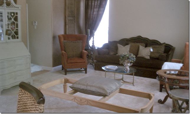
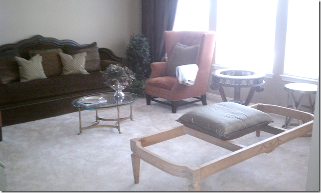
As you can see from the attached pictures, the builder placed a window on the back wall, but no matching window on the other side. I know this is a common problem most of us with "cookie cutter" homes run into. How do we fix this problem? I cannot afford to add a window because it is NOT approved by our Nazi HOA (I've already tried). My second problem is that I only have two walls in this living room and one is covered by 3 windows. Please excuse the messy pictures, but my living room is going through a decorating transformation right now. Should I place the sofa on the wall that has the 3 windows or should I leave it where it is at and move the chair side by side to the one already by the window? I found the bench at a local consignment store and could not pass it up...I'm having a cushion made with linen fabric and ballerina ties...Please give me ideas on how to address the one window wall. It is driving me crazy!!!
The first issue: should the reader move her sofa in front of her windows like this – or should she keep the sofa on the back wall, below:
Sorry these pictures are not the best!
Second issue – if she moves her sofa against the back wall – there is only one window, shown here on the left side of the wall.
And here you can see there is no window on the right side of the sofa along the back wall.
Solution: without having more pictures of the room, it’s hard to say which wall the sofa would look better on. Typically, the wall that faces you when you enter a room should be the wall where the sofa is, or the bed is. I am guessing that this back wall is the one that you face when you walk into the room. So – this would typically be the best wall for the sofa. BUT, the issue of the asymmetrical one window is something to consider.
Sometimes, when people have only one window and want to balance it out – they create a faux window. They hang curtains and “pretend” there is a window there. The more labor put into the faux window, the more believable looking it could be. Case in point:
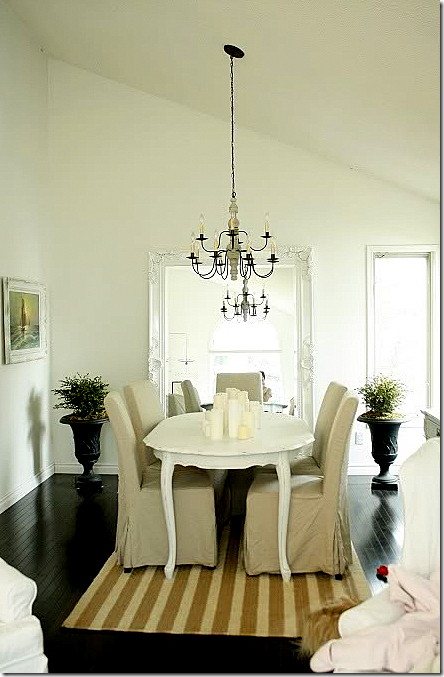
Blogger In the Fun Lane had a similar problem with one window where she wanted two. Here you can see her before picture with just the window on the right side of the mirror.
And here you can see how she “fixed” it with just a curtain rod and panel. She added the matching urn and plant to hide the wall space.
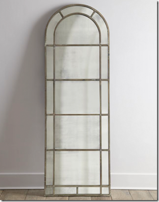
Now, this is a really easy and inexpensive fix you could do. Or, you could add a mirror behind the curtain to really make it more realistic, like this:
This mirror is from Horchow and it truly looks like a window. But check around and find a size that matches your window the best – check Ballard Designs, Restoration Hardware, Pottery Barn, and IKEA for floor length mirrors.
Here’s another idea for a faux window:
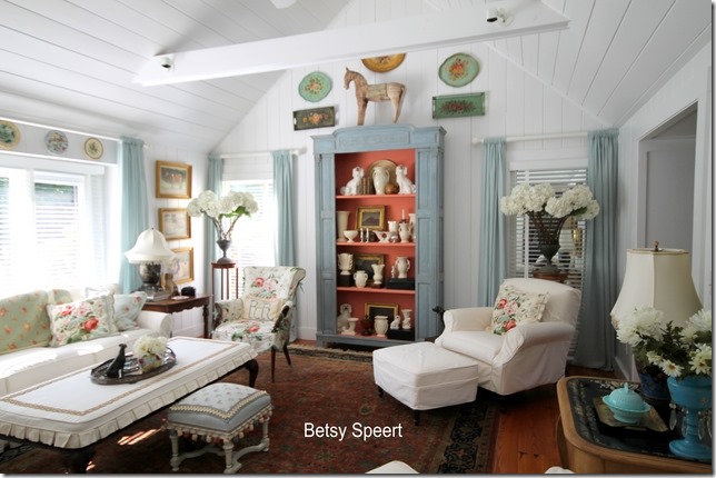
Can you find the faux window?
Interior designer and blogger Betsy Speert created a faux window by using some manual labor and it really looks real. Since this is your living room, you might want to splurge a little and do it right – it will look this good if you do. First, she had a carpenter frame the fake window, just as he would a real one. Then he installed a piece of mirror, after which Betsy covered it with a blind. You would use the same blinds that are in your front window to cover the mirror.
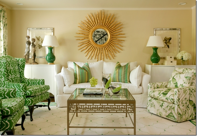
With a faux window you could center the sofa on the back wall. Since the sofa and curtains are dark, try lightening it up with a gold sunburst mirror like this:
From Tobi Fairley HERE.
Or a mirror like this.
Now, if you don’t want to make a fake window, you could also find a screen that is almost as tall as your window and use that to balance the wall. Or you could get a tall plant to balance out the window.
Another thing I would suggest, even though you said it was against the Home Owners Association – I would recheck that just to be sure. It’s hard to believe they could stop you from installing a window that would improve your house! Adding a window sounds expensive, but it usually can be done for not much more than you would spend “faking” a window. Call around to get a few bids first before you totally discount that idea.
Finally, your sofa looks pretty as it is in front of the windows. If you do keep it there, I would consider moving the secretary against that back wall to balance out the window. Hope this helps!!
SECOND READER:
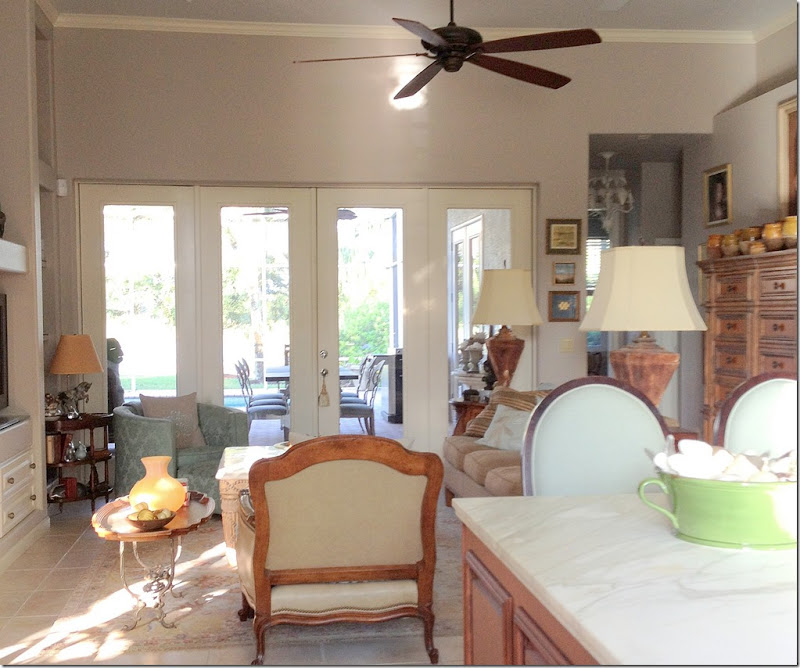
Dear Miss Cote de Texas: I have a twelve foot wall of French doors in my family room that have been undressed since I built this home 13 years ago. The view is lovely -- the pool and a lake beyond -- so I was one of those who thought the view did not need dressing. Lately I have been thinking it might enhance the view and the room. Here is my problem: there is very little room to the left and right of the doors (about 12" before the curtains would touch the glass. The doors are 8ft high and the ceiling is 12ft. You can see on the right that the ceiling drops down to 9'4" for the hallway.
My question is would you hang a rod at the 9'4" height or just under the crown molding? Second, I like the roman shades hung just below the rod, and have done that in my bedroom, but is it possible to have a 12' wide roman shade or would I have to have two sixes or some other configuration? If the latter is the case, I don't have the opportunity for additional drapes to cover the space/s where the shades meet. The reason is my doors are hinged so that the center ones fold onto the outer ones and then the folded pairs can also open again and the entire 12' area is open. So I cannot have curtains hanging in the opening, but only on the sides. What would you do?
Actually, the solution is a very easy one! Here you can see the row of doors and windows – the problem is two fold:
First – the expanse above the window to the crown molding is so wide, AND the top of the windows don’t match the top of the opening to the right.
Answer: put the drapery rod at the same height as the door opening, which you say is at 9 feet, 4 inches.
Second – the windows and doors are all hinged so that the entire wall opens. Since you can only have panels on the left and right side, you need to have only one shade that spans the entire 12 feet.
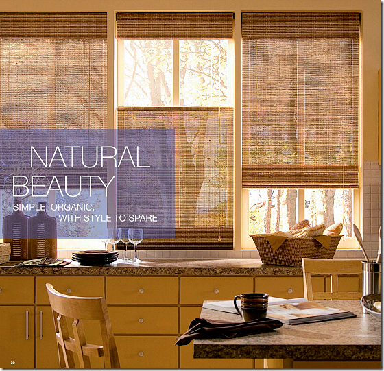
Answer: you are in luck! The expanse is 12’ – Hunter Douglas sells textured blinds that are 144” inches long – or 12’ - so you would only need one shade.
See Hunter Douglas’ textured shades in 144” length HERE.
Solution: place the iron curtain rod at the 9’4” height – so that it is even with the door opening. Place one long shade – 12’ - just under the iron rod. Position it so that it just clears the top of the doors so they can be opened. The shade will hide the “dead space” of drywall between the rod and the windows.

The look you want to AVOID is hanging the rod above the windows, but putting the shades on top of the windows – this creates the foot or two of “dead space.” The better way to hang shades without the ‘dead space” is this:
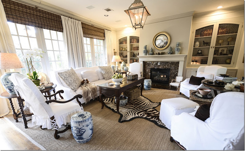
By hanging the shades above the windows, you hide the drywall between the rod and the top of the windows, like this in my family room.
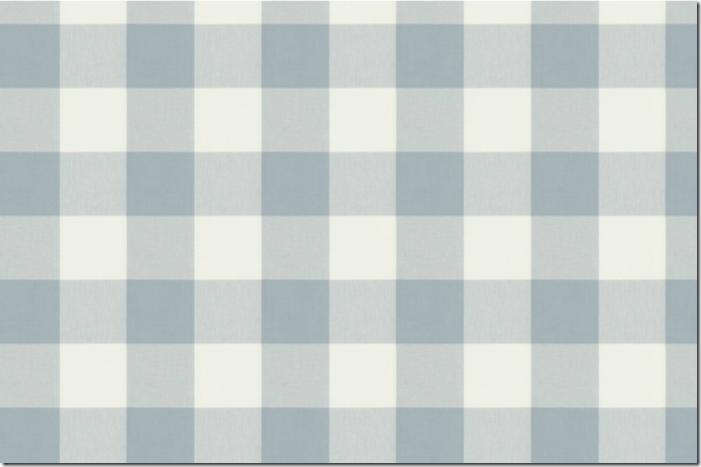
Also, by hanging the iron rod higher than the door and windows, you raise your eye upwards and you fill in some of that large gap between the tall ceiling and the lower windows. Next, hang drapery panels on the left and right side. I would use 2 widths of fabric on each side. Yes, it will cover some of the glass, but you can push the fabric close together. The extra width will look fuller and more luxurious and custom. Be sure to line the panels with black out lining so that the sun doesn’t shine through – that way, you can see the fabric instead of seeing through the fabric. Think of the black out lining like wearing a slip under a slightly see through dress! Since your room is so neutral, I would chose a patterned fabric for the curtains – something like this:
I picked out four different patterned fabrics at Calico Corners which look like they would blend in with your blue chair and taupe sofa.
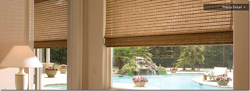
Whichever fabric you choose, I would also buy an extra yard or two and make pillows for your sofa – 2 - 24” pillows and one lumbar sized pillow for your chair – to tie it all together! As for the shade – I would choose one in a color close to your sofa in tone, don’t go too dark or too light:
Perhaps something like this.
I hope this answers your question!!
If you have a decorating question – send it into Dear Miss Cote de Texas at mrballbox329@aol.com








Again you are spot on. Please continue this series. It's great! I'm saving each one of them.
ReplyDeleteSam
1st Reader: The window arrangement of any room only becomes a problem if you are locating items against the walls, if there is enough space to centre the furniture the perimeter ceases to be a problem or a focus. Also no window EVER looks right if it is blocked completely, you want to be able to go right up to it and look out (plus close the curtain/blinds easily and escape in a fire!). 2nd Reader: The imbalance doesn't have to be framed by curtains or blinds if you don't need insulation or privacy, it could attractively be framed by art work, relevant decorative items or even a shelf for the confit pots at the curtain pole level - a box shelf would look particularly nice :-) I am learning so much from you Joni and enjoying the process immensely!
ReplyDeleteVery sensible and easily implemented solutions.
ReplyDeleteFor the first reader, I have a suggestion that builds on your mirror solution. The single panel on the small window is making the room dark and the window itself, all alone over there, is boring. If you have the money, I would implement Joni's mirror idea to balance it but with this twist, have two frames built, one for the real window and one for the faux window, in a style that replicates the fretwork of your pretty secretary. Paint to match and then hang the frames over each "window" (Maybe even hinging the fretwork frames on one side to open for access and maintenance.) You could line the back with sheers if sun is a problem at certain points of the day, though the room looks pretty dark in the pix. This would give instant architecture and enliven that long dead wall. The large bank of windows should be left alone, and not treated in the same way.
If this doesn't work for you, how about a minimally framed tall landscape painting, sized to the exact size of the window so they balance, and you get a "view"on the other side?
Best of luck.
great ideas - i really like the idea of the painting too!
DeleteWow! Love the Thrift Shop bench the first reader found. Not only is the frame pretty, but the size and shape will make it a versatile piece for years and years to come. Can't imagine why the former owner let it go.
ReplyDeleteJoni, we your 70,000+ readers need to form a coalition called "People for Liveable Homes" or something like that. It seems that 90% of the decorating problems are caused by improperly designed homes. Think how much more money could be spent on making homes truly comfortable and beautiful if we did not first have to correct the obnoxious situations created by the people who design and build the shells. Think how much less decorating junk would end up in landfills and finally how much less it would cost to heat and cool or our homes.
By the way, the most recent issue of This Old House has an article about how to install a very realistic looking back-lit faux window in an interior bathroom. Very clear instructions and a very professional looking job.
thanks! i ll go look up that article.
DeleteHi Joni, Great advise and I always enjoy reading this series. We have been looking at new homes and I am amazed at the ghastly placement of windows. We have seen so many homes with a row of small square windows right below the ceiling, horizontal windows over a fireplace, and two windows on each side of a smaller window stuck right in the middle of the wall. I can't tell you how many homes I have walked into and my first thought was "those windows have to go". xx, Sherry
ReplyDeleteDespite the workable solutions you suggested for Reader No. 1, the obvious outcome is that the faux window looks exactly that and makes
ReplyDeletelittle sense outside of the purpose it serves. It was very easy to tell which window was fake in the picture with the window framed out with
a mirror inside the molding. Unless the problem is fixed the right way by installing a matching window, another reader has suggested floating the furniture if possible and basically ignoring the problem. It's difficult to do this in many rooms because of the need to have electrical outlets in the floor for table lamps, but that is an easier solution most likely than anything else.
Love the fabrics you suggested. I am getting a pair of bobbin chairs for a keeping room and several of these fabrics look like perfect options.
Great post!
I agree that real is always preferable to faux. However, sometimes faux is the best solution. Trompe l'oeil is a time-honored artistic device used in interior design as well as landscape design. As long as you don't carry it too far so that there are no windows for escape during a fire, most people would forgive a faux window or two.
DeleteOn the other hand, the Disney Theme Parks are totaly faux and people love them!
IMO - don't fighti it. Go with the faux!
Disney Theme Parks serve an entirely different purpose than one's home. Faux anything is over done in decor and currently seems to be out of favor in the design world except in very moderate and well executed instances. Making windows out of mirrors is simply stupid. It is crystal clear for anyone with eyes to see that a window made our of molding a mirror is simply not a window. The solution makes the homeowner look stupid or better still, they need to try out for the magicians job with the circus. I believe that when one has a flaw in their home, the best thing to do is simply own it. After owning it, other options become more acceptable, including matching it or ignoring it.
DeleteHOA's like to blow a lot of smoke especially when you go to them begging. If the owner had simply created another window on the opposite side of the wall, it isn't likely she would have heard a word. Power is the worst thing you can give these organizations.
I agree that ideally, you want to put in a real window rather than faux -- but sometimes that just isn't practical. Especially if someone was renting, a faux window can be a good alternative.
DeleteThere is more to Faux than you know! The Roman Empire could not acquire enough good, solid limestone to build everything they wanted to build, so they used concrete which, chemically is the same as limestone. Almost all the famous Roman buildings, including the Colosseum, were made from concrete. Is a reproduction Armoire that was made 100 years ago a venerable antique or faux? Joni often recommends (as she did in this post) that we cover the "dead space" between the top of the window and the ceiling with blinds Is THIS faux to imply that there is more window when there really is not?
DeleteInterior design is all about fantasy and tricking the eye. We use colors to psychologically warm or cool a room. We liberally use rayon which is a synthetic fibre created to replace silk. (In Sweden rayon is called faux silk.) We use acid washes on stone, concrete and metal to give those materials "patina". Is it faux to stain or bleach woods to give them another color? We use real or fake animal skins to imply that someone in our family actually caught and skinned that prized animal. We use cast concrete mixed with marble dust to create fountains and fireplace surrounds. All these are very acceptible.
As you can tell, I am no purist when it comes to antiques or faux finishes. However, the key to almost anything of value is to do a very good job. A sloppily carved piece of furniture made from real walnut is, in my mind, much less desirable than the same piece well executed in a less expensive wood stained to look like walnut.
"Le bon Dieu est dan le detail" - Gustave Flaubert (French, author of Madame Bovary)
I like the Q&A feature you have introduced. It is generous coming from a style savvy professional like you.Eell researched, explained and documented. Brava!
ReplyDeleteBrilliant suggestions! You are truly gifted.
ReplyDeleteThanks, Joni. I have house guests and didn't get to read your blog yesterday and was so excited this morning when I saw you featured my question. I appreciate all the good ideas you gave me for my family room French doors. I love the fabric choices from Calico Corners (the first is my favorite) and thanks for the research on the Hunter Douglas 144" wide shades. I am going to get on this right away and send you pictures when I finish.
ReplyDeleteXO, Victoria (aka the Second Reader)
I liked the first fabric swatch too, and I hope you send Joni some pix when you finish your project.
DeleteWould it be possible for Reader No. 1 to eliminate the narrow window in the corner altogether? It seems that the room gets plenty of
ReplyDeletelight already. That may be an easier solution than adding another window. If the window adds some element of height to the outside of the
house, that could be rectified by planting a tall shrub in front of the space where the window was located. My experience with HOAs would
leave me to suggest that "forgiveness is easier to get from these people than permission" most of the time.
I should have gone the "forgiveness" route...wonder if I can still try and pull it off?!? Probably not.
DeleteGo for it. Plan it well with a contractor so that whatever work is required on the outside can be done in a day. Make certain he has all the materials on the job site and don't forget the tall shrub which will immediately be planted in front of where the window use to be and no one will be the wiser. The interior work can be done last. Sounds like a plan to me.
DeleteHi Sandra, I, too, live in an area with a Nazi HOA so I feel your pain. We have very extensive list of plants we cannot plant - among them English Ivy, French Broom and Mediterrean Olive trees. Gutsy girl that I am, heck if I am going to request permission from the Archtectural Committee every time I pick up a Color Pak at Home Depot.
DeleteHowever, to your problem. If I interprete your layout correctly, you approach the livingroom from an entry hall so that the large bank of 3 windows is on your right. The offending wall with one skinny window is in front of you while your dining area is to your left. May I suggest another layout? Try placing your couch as a divider between your living room and your dining room. Then place your two wingback chairs in front of the triple windows with a cloth-covered table between. Right now you have lots of "leggy" furniture in that room. Putting the couch on the wall with the one window seems too heavy. Putting your chairs and a table with legs looks too light near the window.
It appears that you have some sort of armoire in that room as well. Perhaps you could position the armoire on the big blank wall so that it is centered between the couches and the chairs. This would draw attention away from the lonely window. Your new bench could go between the couch and the chairs for a coffe table or in front of the armoire for additional seating.
Since I don't really know your exact layout this is all conjecture. However, it might work for you, then no construction or hassles with the HOA would be needed. :)
BTW, Joni, I really enjoy the creativity you use when selectng your paintings of women writing letters. That last one with the girl at her laptop was a hoot! In a few generations, that image will become as evocative of a bygone era as was the first painting you used.
ReplyDeleteFrom my slice of Provence in Southern California, Charlotte
Joni, thank you so much for addressing my issue with the window. Your time, efforts, research are truly appreciated. I know you put alot of heart into your posts. I really like the ideas, especially the mirror idea. I love the Horchow mirror too. We have an outlet in Austin that I visit regularly and find the most amazing deals so I'll be on the lookout for this mirror.
ReplyDeleteI hope the readers read this comment and vote for your blog at Apartment Therapy. I already submitted my vote. Here's the link!
http://www.apartmenttherapy.com/best-home-design-inspiration-blog-the-homies-2013-183531
Thanks again for your time and keep inspiring us. You are truly gifted. God bless you.
I went to the apartmenttherapy site to vote too, and I saw that delicious looking list of other blogs. I went to about 10 of them and realized just how good Joni is. Cote de Texas is much meatier and goes into so much depth to explore issues. My sister Helen in Ft. Worth turned me on to Joni a couple of years ago, and I'm so glad. She has also emailed Joni for advice on - you guessed it - windows and window treatment, and Joni emailed her back.
DeleteJoni is the BEST!
Hope more people vote for Joni. Hands down, best blog.
Deletethanks yall so much!!! i saw my name was on the blog and i debated about asking for votes but decided not to becuase it's so embarrassing. well, it's embarrassing both ways - if you don't ask for votes from the readers, no one votes for you and your blog looks like a loser! ahah!!! but if you ask for votes people think you are full of yourself. so i just ignore it. truthfully, i would never win against some of those blogs that have huge readerships. thanks though for voting so very very much!
DeleteThanks for all of the research Professor Webb. I have a similar problem with too much space between ceiling and window and had thought of using shades under side panels. Additional questions: Do you actually lower your shades, or are they kept in this position? When the shades, particularly long lengths are kept unopened and function as an interior valence if you will, is the depth of the stack easily covered by standard poles (especially when there is a return) so that the shade does not poke through the curtains? I realize this comment may not make sense...!!!!!
ReplyDeleteRobin, You are in for a special treat. I am fairly new too and get so excited when Joni's blogs appear in my Emails !
ReplyDeleteNo faux windows. Worse than carpeting wood floors.
ReplyDeletei just wish she would add a real window. it's not that expensive if your windows aren't custom and i doubt hers are judging by the other three on the opposite wall. i would do it in a heartbeat. in fact, we have done that here - we put in french doors in our dining room a few months after we moved in - there was once a horrible window there!! now we have a beautiful french door. plus i replaced the cheap window in my kitchen with a gorgeous casement one. now that was expensive! omg! i was shocked! but it makes my whole kitchen. well worth saving up for it.
Deleteyes = i keep my shades up all the time. there is no problem with the shades over the curtains - but my curtains are thick = they have the thick black out lining, which i highly recommend for several reason. first it blocks the sun bleeding through the fabric so you can actually see the fabric plus it makes the curtains very lush and ful. if you look at the picture of my room, you can see you don't see the shades underneath the curtains but that is mostly because of the blackout - if they were thin, you might see them? not sure though. you could always buy one shade and try it out and then return it if you don't like it, but i'm sure you will.
ReplyDeleteDifficult problem Joni and one which you have solved very well...
ReplyDeleteThe answer is there is no easy solution... I have blocked windows up (where I can ) to solve this dilemma! I have also learned to live with them...
in France there are always different sized windows throughout the old farmhouses or village houses and this drives me crazy... One might be small and the pair might be door size... very hard to curtain...
Have a great weekend... xv
Hi, I just found your blog through one of your readers coming over to check me out.
ReplyDeleteI'm going to put you on my blog roll list. Nice to "meet" you!
Betsy
Hi,
ReplyDeleteI don't see a problem with the one window. I think you can add balance to a room by just adding a picture or a tall piece of furniture. I also think it can add interest to a room, this is a better solution than any faux treatment.
Great job, Joni! I like what you suggested in each instance. I have a freaky window situation in a family room, and I had considered a fake window, too. I hate the fact that it isn't balanced and have tried to ignore it by putting a wall of dog paintings on the other side of the mantle to balance it. I might go ahead and do the fake window. I can't do a real one due to the fact that the exterior won't be balanced if I do. I even considered covering the window with bookcases, putting them on either side of the fireplace, but I thought they would look too narrow. Love the fabrics you selected from Calico Corners.
ReplyDeleteHi -- I read your response to the reader who had the very wide patio doors/windows and you suggested she look at Hunter Douglas' products. Their wovens do go up to 144", but their website says that verticals might be better for such a large expanse due to the weight of the blinds, which I guess makes raising and lowering them a challenge.
ReplyDeleteI also have about 120" to cover (2 X 18" SIDELIGHTS + 69" SLIDER + MOLDINGS) and I'm hesitant to spend the $$$ on the wovens (which I like), only to find they're too heavy to be functional. I also have a large crown over the door which I feel might also impede the proper functioning of the blinds. Any thoughts/suggestions?
Thanks.
Laura J.
Joni, I have always loved your family room (pic on this post). What is our wall color?
ReplyDeleteThanks for sharing this great content, I really enjoyed the insign you bring to the topic, awesome stuff!
ReplyDeleteWall beds fort smith