The real estate market in Houston right now is crazy! It’s a total seller’s market. The inventory is low and the demand is high – so if you want to sell your house, now is the time. I know people who didn’t even list their house and sold it within days, by word of mouth. Houses on HAR that are reasonably priced are going “sale pending” in just days and weeks. Statistically, it hasn’t been like this since 1999. And to top it off, interest rates, though a little higher, are still historically low.
Recently, a real estate agent contacted me about a house that hasn’t yet been listed, which she asked me to show here. So, if you’re lucky, you might get a chance to bid on it before the general public knows about it. The house is located in the Pine Shadows area of Tanglewood.
It was built in 1953 and was added onto in the late 50’s and again in 2007. It is 4 bedrooms, 4,500 sq. ft. set on a large, beautiful 15,000 sq. ft. lot. The original owners had visited Colonial Williamsburg and fell in love with the Brush-Everard House and the Raleigh Tavern and wanted the home they built to reflect authentic Colonial Williamsburg architecture. They chose architect Ed Maddox who had worked with the illustrious John Staub to design their dream home.
The historic Brush Everard House in Williamsburg, Virginia served as an inspiration for the house.
Originally the house had a living room, dining room, kitchen, breakfast room and only 2 bedrooms which were both upstairs. In the late 50s, the original owners added a paneled family room and another upstairs bedroom on top of the family room, also designed by Ed Maddox.
The current owners added a large master suite and another bedroom suite upstairs in 2007. They also extended the family room and the kitchen.
The Raleigh Tavern in Williamsburg, Virginia – another inspiration for the house.
In designing the original house, Ed Maddox put his Staub experience to good use. Staub loved moldings and thought of them as the frame on a painting. Maddox added extensive woodwork throughout the house and around the front door. He even put dentil molding under the exterior eaves! There are corner cabinets and nooks and five fireplaces.
The house was originally made of redwood and during the latest addition, extra care was made to ensure the new siding exactly matched the original. This attention to detail, along with matching the moldings, caused the renovation to go quite a bit over budget.
The current owner was born in England and is an interior designer. She fell in love with the house at first sight because it reminded her of her home country. She is a great lover of flowers and the landscaping reflects this. Even in the dead of winter, there are some type of flowers blooming in the front yard.
If you love English architecture, you are in for real treat!
Enjoy!!
Photography by TK Images HERE.
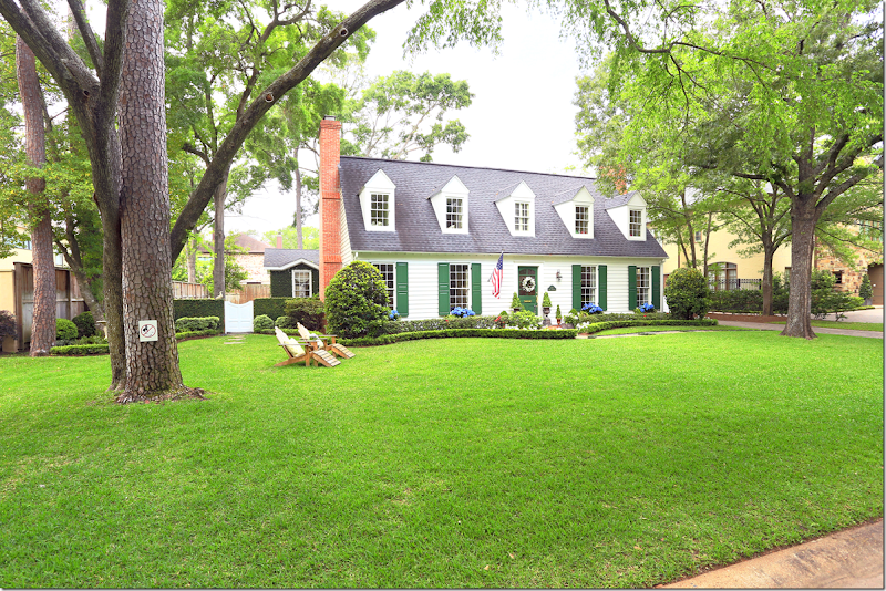
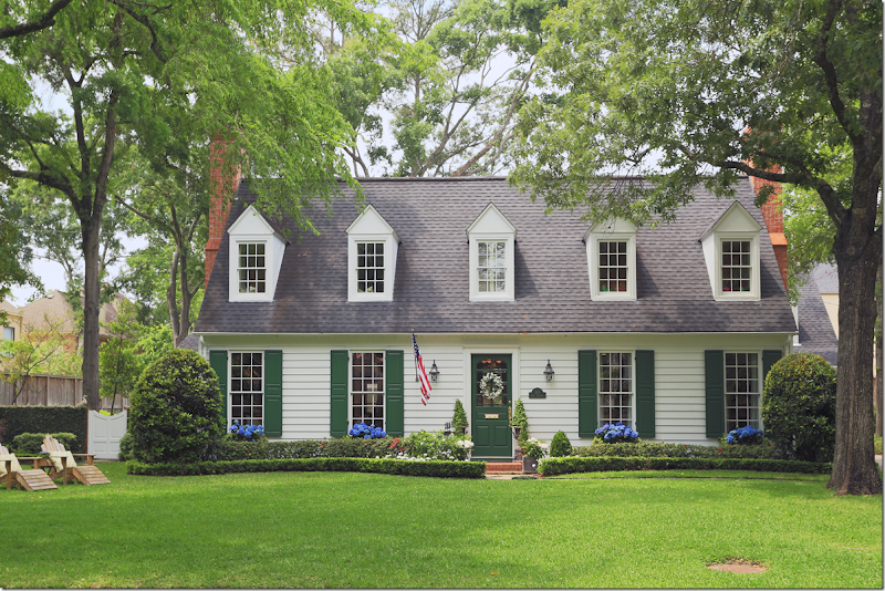
Located on a large lot in Pine Shadows, Tanglewood, the house is charming with its dormer windows and green shutters.
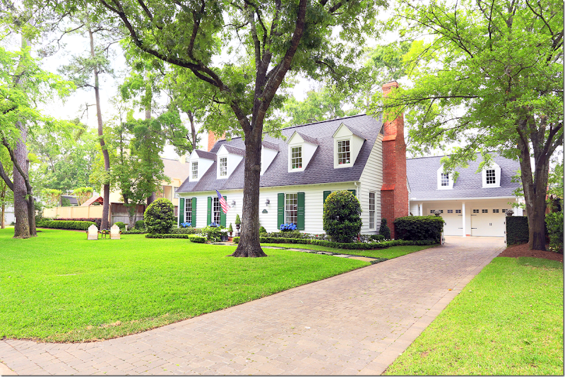
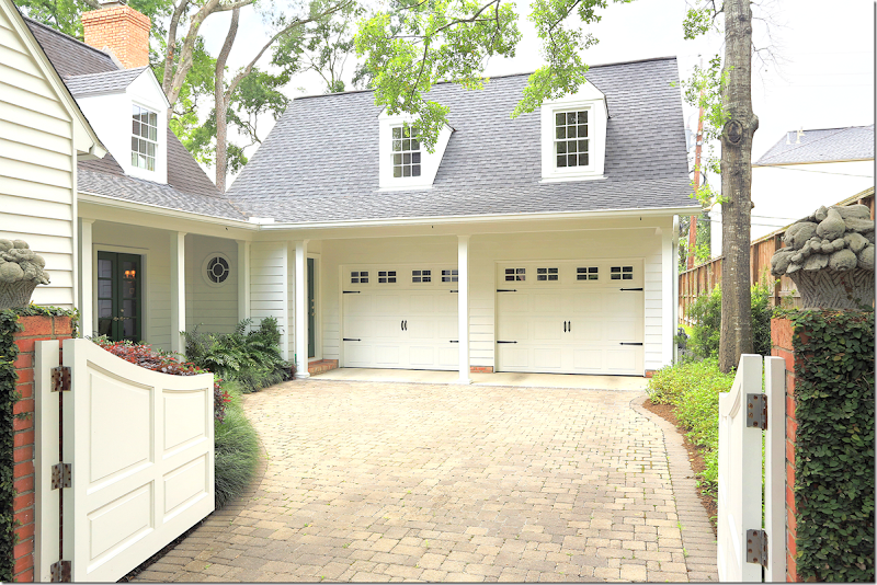
Even the garage is charming with its carriage style doors and dormers. The drive is paved instead of concrete.
To the side is an ivy covered fence with a wood gate that opens to the large yard.
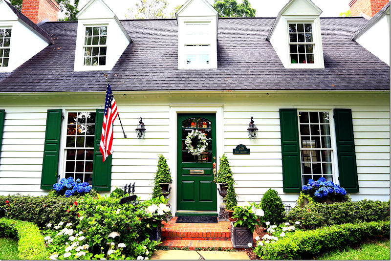
Close up of the front door with its original surrounding molding. Notice the dentil molding under the eaves of the house.
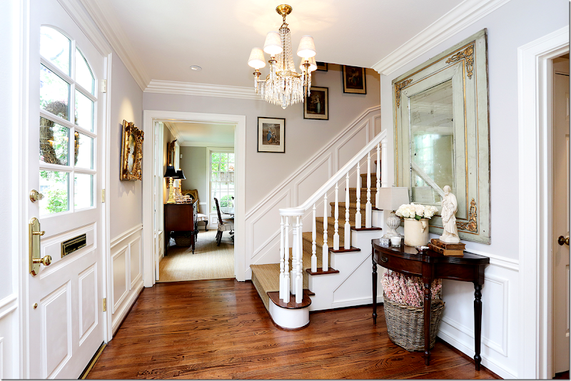
The entry hall has a staircase leading up to the children’s bedrooms. Love the seagrass runner. Notice the moldings in this room. Beautiful mirror and chandelier! To the left is the dining room and to the right is the living room.
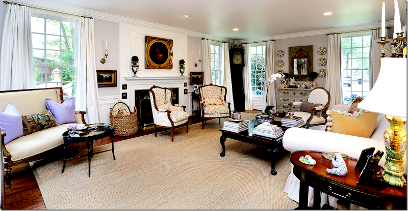
The living room has classic moldings and wood windows, along with dark hardwoods. It is painted a fashionable light gray. I love her décor - a mix of French antiques and English accessories. So pretty!!!
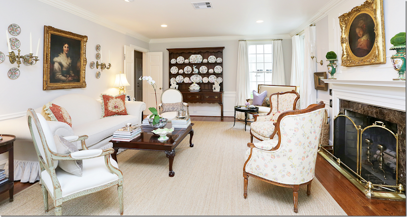
And looking the other direction. Such pretty painted French chairs! Beautiful porcelains.
I love this corner with the painted chest and antique mirror.
The dining room has seagrass underfoot and a corner fireplace with marble surround. Beautiful dentil molding on the mantel. Love the slips on the dining room chairs – it makes them not quite as dressy!!
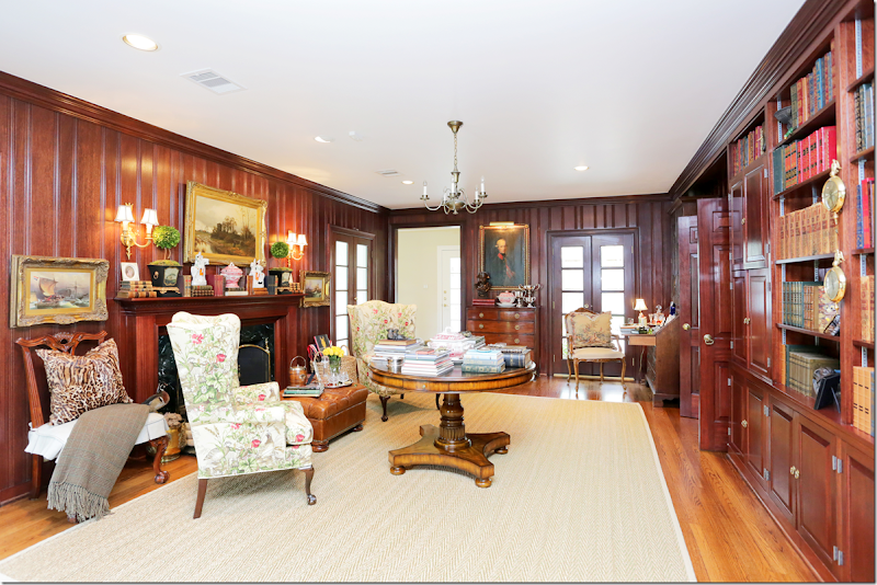
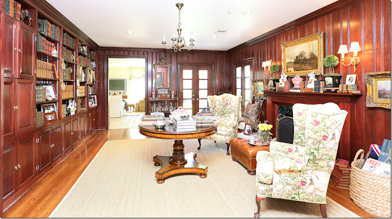
The library is incredible – with gorgeous wood paneling. This room was added on to the house in the late 1950’s – along with a bedroom above it. I love all her accessories – and that center table piled with books!! LOVE! If you don’t prefer dark wood, remember you can always paint the paneling. Just don’t ask your husband – he will NEVER let you!! Here is fireplace #3. The master bedroom is through the open door.
You could make this into an office by adding a desk, or turn it into another family room by adding a sofa. Or, just leave it as a fabulous library. Through the back door, is the family room and kitchen.
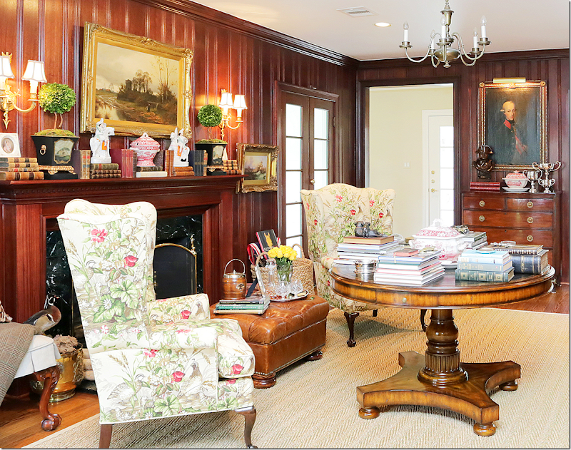
Close up of the center table and fireplace. Love all the books and transferware! And I love that portrait along the back wall.
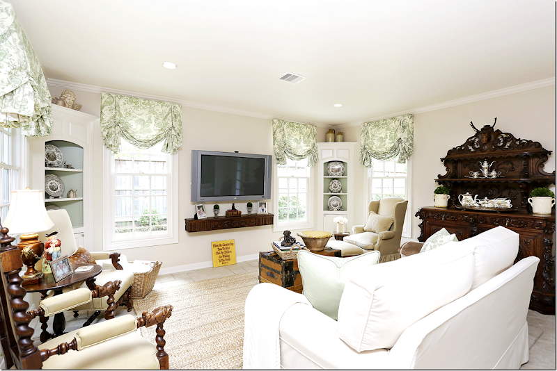
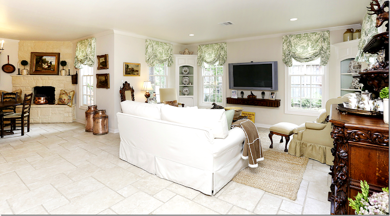
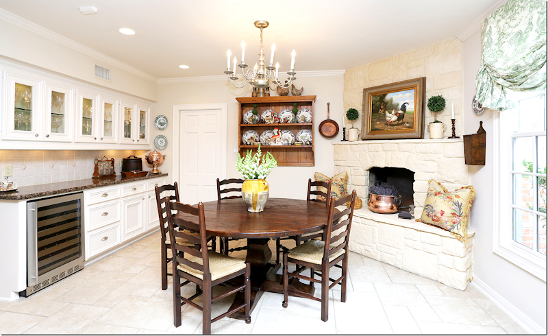
Off the kitchen is the breakfast room with a fireplace and the family room. There is stone flooring in this room. Notice the corner cabinets. This space was added onto the kitchen and breakfast area by the present owners.
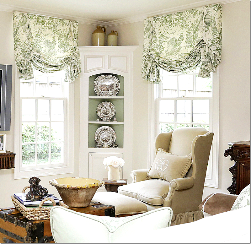
Love this corner – with the transferware and green painted cabinets and toile.
The family room connects to the kitchen and breakfast room.
The breakfast room – the dining room is through the door. Pretty stone mantel.
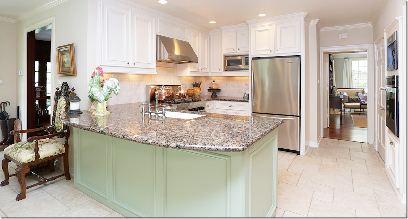
The updated kitchen with stainless appliances and new hardware. Granite countertops.
The kitchen – you can see how it connects to the other parts of the house – the living room, the library.
A view from the breakfast area to the back French doors which open to the porch off the library.
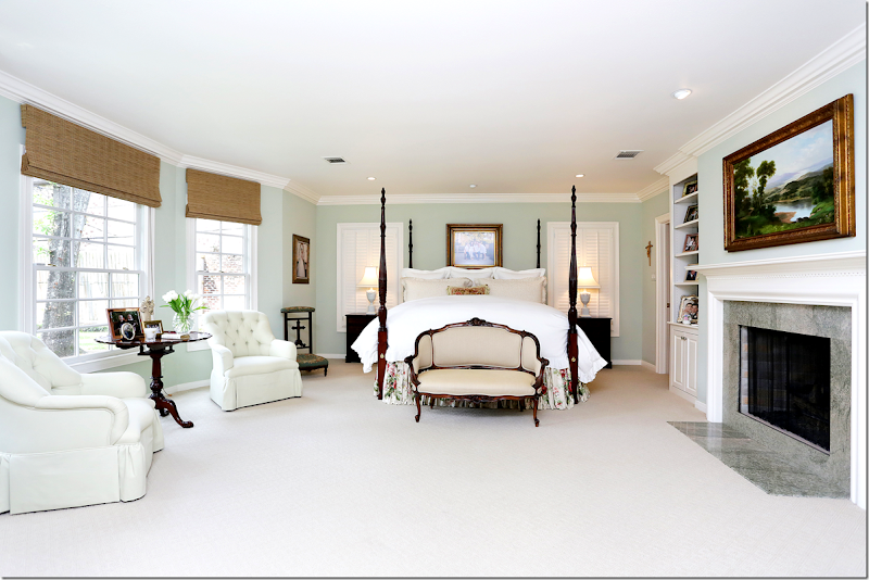
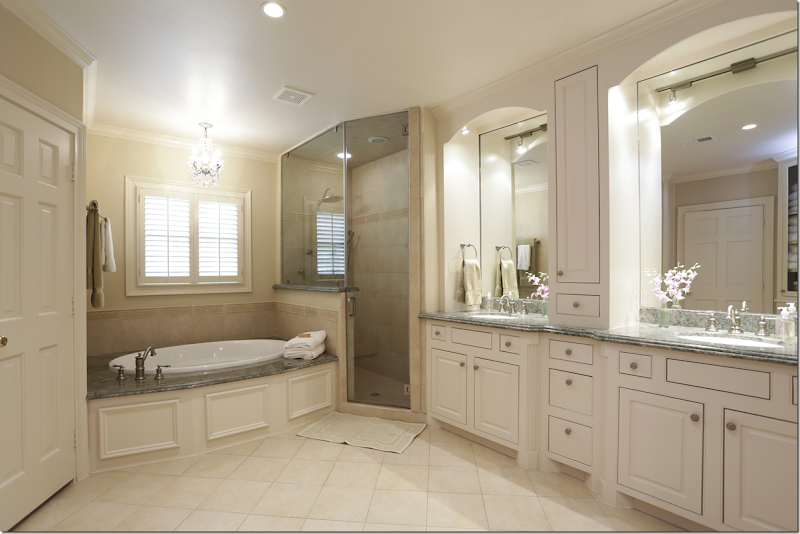
The master suite was added on to the house in 2007 - it is located on the first floor. and it has a fireplace. What a dream!!
The new master bath with double vanities, tub and shower.
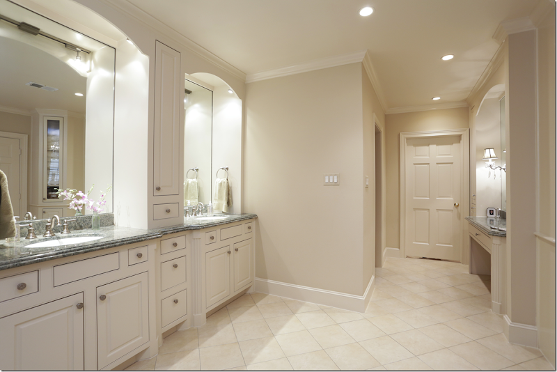
And looking the other direction towards the closet and vanity area.
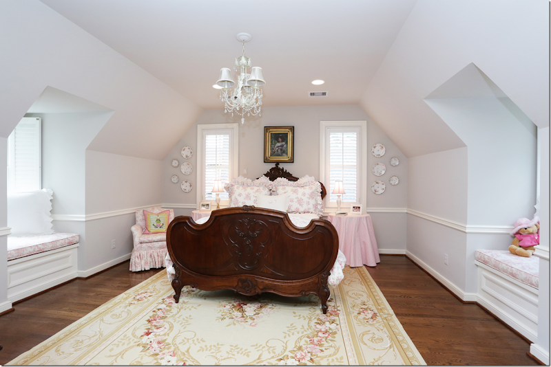
Upstairs, are the original two bedrooms with dormers, plus this one that was added on top of the library in the late 50s. Love the window seats. Perfect for little girls – and great hardwoods upstairs!
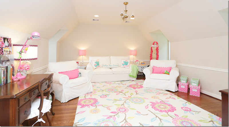
This room is used as a playroom.
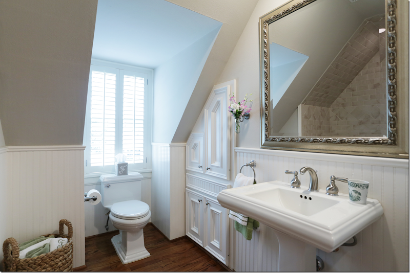
Remodeled bathroom upstairs – lovely beadboard and great dormer window.
The third bedroom, again with dormers and hardwoods.
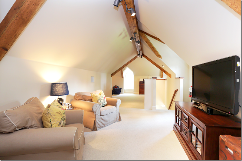
In 2007, the current owners added this suite for their son – a large area with its own staircase and sitting room. Notice the wonderful beamed ceiling.
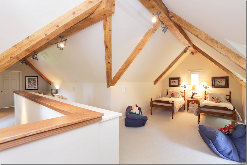
The bedroom area of the suite. I love those antique beds!! This suite was added over the garage and partly over the new master suite.
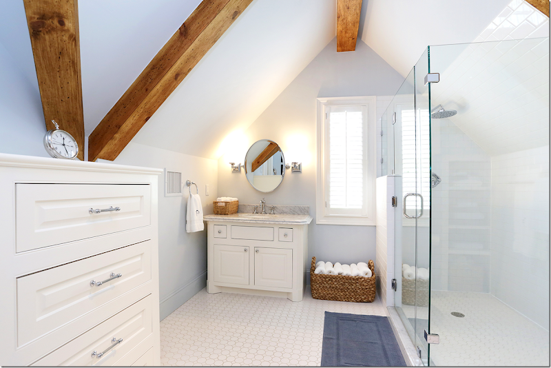
And his beautiful bathroom with large shower, marble counters and tiled floor. It fits right into the classic feel of the house.
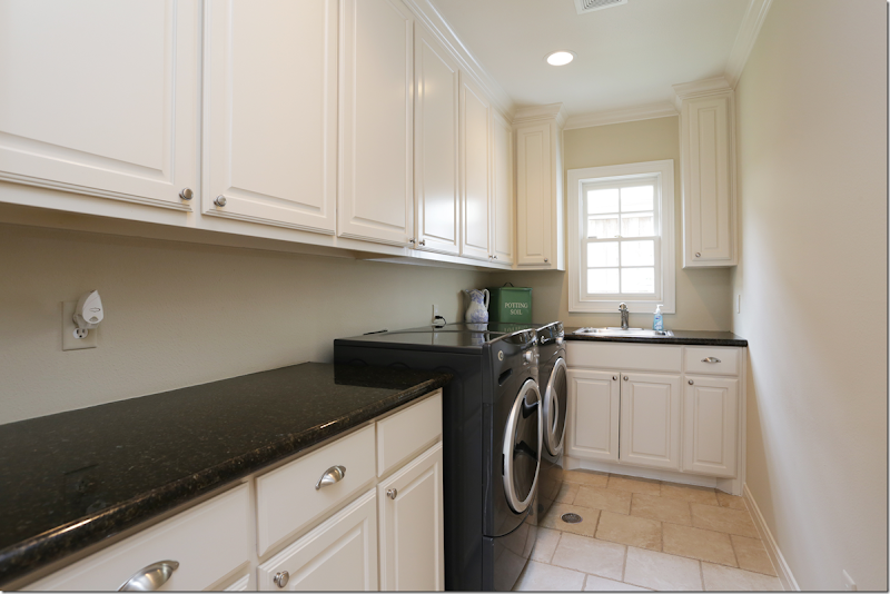
A glimpse at the large laundry room with granite counters and its own sink.
Notice the driveway! Through double wood gates is the charming garage with its carriage doors. Love the round window. The French door opens to the paneled library.
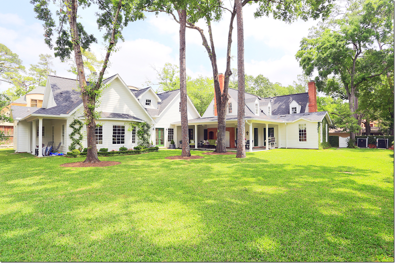
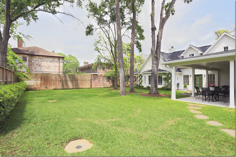
The huge back yard. At the right is the gate that is off to the left side of the house. You can see the original house where the two red brick fireplaces are. At the very left is the new master suite with its large bay window. Above is the son’s suite.
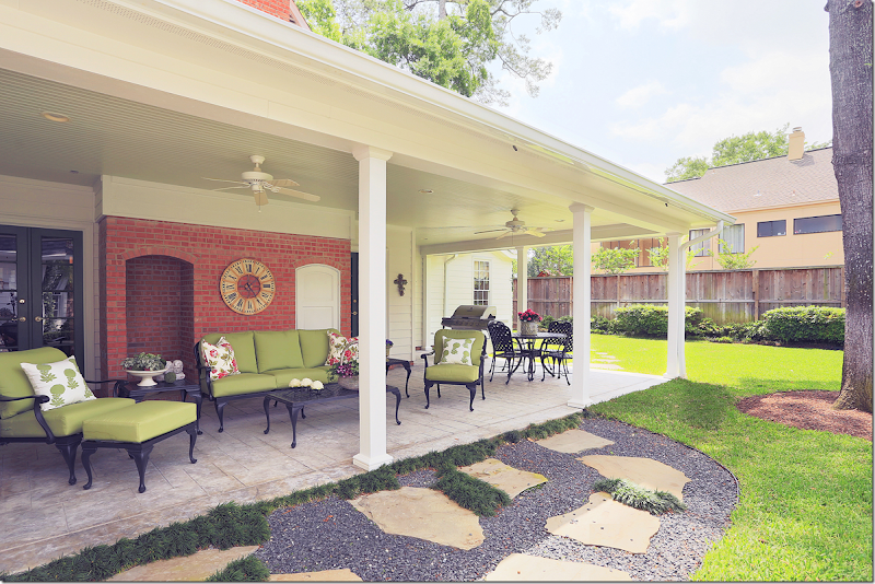
Off the paneled library is this covered porch.
You can see there is plenty room to add a pool here if you want.
If you are interested in touring this house, you can contact the real estate agent, Sissy Lappin HERE or by email, sissy@lappinproperties.com or by telephone at 713.922.0602 .
The house is located at 510 Pine Shadows in Tanglewood/Pine Shadows, if you want to drive by!
Oh, and by the way, the price for all this? $1,699,000.
To purchase this book on architect John Staub’s houses, click on the image below:
A SPECIAL TREAT: NEW HOUSE ON THE MARKET, BUT SSSH.
Subscribe to:
Post Comments
(
Atom
)









Would love this home...if it were in Seattle! ;-)
ReplyDeleteI love the area. The lots are HUGE by any standard. I like the low slung ranch styles in the area but always sad to see them torn down to make way for even larger two story homes. This is a beauty. Thanks for sharing!
ReplyDeleteMove it to TN. and I will buy it now! Love it!
ReplyDeleteBeautiful home! This area of Houston is so lovely!
ReplyDeleteLight fixtures at the front entry. Seriously? Fabulous home and those lights?
ReplyDeleteExterior lighting is jewelry in the landscape.
I use a gentleman in Atlanta who makes lighting from century old gas lighting pieces. Every light is unique, enhancing every home.
Lectured in Williamsburg, VA last weekend. 1st time visit and will go back!
Garden & Be Well, XO Tara
I'm sure the new owners will beat a path to your door, Tara. Sarcasm alert!!
DeleteI thought you were back. Seems i am right! it was nice without for a long time. Now, play nice, ok?
Delete"I thought you were back" - I don't know what this means. I read and comment here all the time. This time, however, someone needed to put "Miss Vanishing Threshold" in her place.
DeleteTara, how right you are regarding the pitiful lights by the front door of a lovely house! We have a place in the French Quarter on 521 Conti St. called Belovo Gas & Electric Lights that make and sell gorgeous gas or electric laterns that would do wonders for the front of that home!! When my two daughters and their husbands built homes,they made sure to visit Mr. Bevolo for their front door gas lanters. They have lifetime guarantees and are beautiful ... some of the best designers know about Bevolo's. They also have a website if you are interested in seeing more.
DeleteBarbie, are the so-called "pitiful lights" by the front door the only fault you find with this house? If so, the owner should be very pleased. If you look more carefully, the lights are not necessarily out of scale with the single door. Perhaps you can pass along Mr. Bevolo's telephone number to this poor, erring homeowner.
DeleteIt is a gorgeous home, Joni! I wish the real estate market was this good in Richmond. Our home has been on the market for two years and priced thousands below the current appraised value....uugghh. Have a great weekend!
ReplyDeletexx,
Sherry
This house is so charming- I especially love the breakfast room. I would love to tour the Tanglewood area- so many beautiful houses!
ReplyDeleteSuch a beautiful and quaint house, Joni. I am sure it will sell quickly. We put our Memorial area home in the market and got an offer at asking price within 24 hours, with a backup offer to boot. Closing on our new place tomorrow. We had looked and looked for over year and finally found The One. Although I am not looking forward to all the work involved with moving, I am excited to decorate our new home.
ReplyDeleteI adore this home, rambling, cozy, bright. I cannot believe anyone would think of painting the library paneled walls. We are not talking pine here, but beautiful, looks like cherry walls. It would be criminal. There is enough light in the rest of the house, and it is nice to go into a room such as this on cold or rainy days. I hope the new owners leave it alone! I am such a fan of this home......the neighborhood seems lovely as well. Thanks for sharing.
ReplyDeleteI agree with you totally about not painting fine wood and these do in fact look like cherry. I have a large cherry library and it would never occur to me to paint it. It is rich, inviting and refined and you are right on a cold, rainy day there is nothing like spending time in this room. Only people who have never had this luxury would think of ruining it with paint. The only alternative would be a room built originally with lighter wood glazed a soft shade of gray. You can't take cherry there and not make it look cheap.
DeleteAnd yes Joni, beautiful wood is not just a "husband" thing.
I think the wood is gorgeous too. I was trying to sound like a real estate broker. because a lot of people don't like dark wood paneling. after i posted this story - i found the pictures from before the remodeling. so different. the fireplace in the library had blue and white tiles - not marble and no mantel. the kitchen was horrid - dark cabinets, tiny. no connection between the garage and the house - that was all open because they added on there. just looked so different! didn't she have the most beautiful English smalls?
DeleteI think the interiors are awful. Can't believe you kept calling it so pretty.
DeleteAnon. 1:53, the interiors look collected, not trendy. The owners clearly are anglophiles and if you know anything about English
Deleteinteriors, trendy is the last word you would use to describe it. I suspect you will find no trends in the private quarters of Buckingham Palace or Windsor Castle, but well researched and collected antiques, art and porcelain. It is clear that this owner has her own taste and it isn't what we usually see on the blog when Joni features local homes for sale. If you read here frequently, you will note that most of the homes have been essentially predictable. The bones of this house are really good and would be quite adaptable to any number of styles. The potential in the lot size alone makes this home special.
really. this is a house filled with beauitful accessories and pretty furniture. what more do you want? everyone complains that all it show is just white and beige - well, here is more color and pattern! my favorite parts of the hosue are the front parts - the entry, living room, library. the kitchen - if i bought this house- i would take out the windows and put in french doors and create a side garden right there, also i would put down hardwoods instead of tile. but that's me. the master bedroom is timeless and classic - you cuold decorate it any way and it would be pretty. and the upstair bedrooms have so much charm withe the hipped roof line and window seats. i showed the hosue to ben and he loved it. was ready to move!! out of our price range though.
Deleteoh ok - there was an anon here who used to really put tara down all the time and then left. thought it was you! sorry!! why am i apologizing to somenoe who was mean? haha. i love tara. don't understand the issue you have. but, don't tell me, just keep it yourself.
DeleteYou didn't ask, but I will tell you any way. Tara sees everything through the limited vision of her training as a landscape designer.It matters not what kind of house you show, Tara finds issues with the out door sconces, the improper foundation planting, the downspouts,and the fact that downspouts are painted on most of the houses rather than copper. Several people took her to task a few months ago for her petty observation that a downspout could be seen from the inside through a living room window and what a faux pas the owner had committed. I doubt that she has an abundance of knowledge about construction other than hardscapes and bed lines nor much about architecture. She is as free to speak her mind here as anyone else. It is the terse, know it all, attitude that comes through her posts. P.S. I didn't think the comment was mean, just sarcastic as I meant it to be.
DeleteLovely place. Such big pretty trees in the yard too!
ReplyDeleteLooking at all of the images I thought how gorgeous..... and then the image of the back of the house and the yard - stunning!
ReplyDeleteI am trying to study and learn the Houston look, and this post illuminated to me that I am failing. Can someone please help me understand why I love the second photo of the living room; but the first photo seems somewhat cluttered and much less appealing to me? (--And they are the same room!) I have looked back and forth dozens of times; and I don't understand what factors are making such a difference.
ReplyDeleteI'm totally confused and intimidated now. I thought I could accomplish the Houston look; but now I'm totally thrown off kilter. I need to understand why my perception of the first photo is so different than the second photo. Is there anyone out there who can articulate the variables for me?
for some reason everything looks really darker in the 1st photo - look at the vases on the fireplace. plus there's a chair missing and those chairs look like they are stained brown, not painted! weird! the second picture is just prettier for some reason, i agree.
DeleteHello Anon,
DeleteJust my observations:
1. Monochromatic - typically gray and white - sometimes light gold and white or greige and white
2. Seagrass on the floors wherever and as much as possible. For a "pop" of color, add a zebra rug or cheetah runner.
3. White slip covers, of course, usually with butterpat pleats
4. Hanging lanterns rather than chandeliers in the less dressy spaces such as familyrooms, kitchens or patios
4. Swedish style, white or gray painted wood chandeliers with wooden drops - either Aidan Grey or the "Persian style" in the more formal rooms
5. Sconces - either wooden Aidan Gray or Italian, gold coated bronze (bronze d'or) with spagetti beads on the arms and lots of crystal drops
6. Swedish Mora clocks
6. Light painted French Louis XVI or Louis XV chairs and casegoods. A Louis XV armoire, buffet or enfilade in walnut or dark oak is also acceptable.
7. Barley twist occasional table or chairs stained dark or painted black.
8. Very full, black out lined floor-to-ceiling drapes on thin metal rods with small ball finials mounted directly below the molding with matchstick blinds to "fill in" the infamous empty space between the molding and the top of the window. Drapes are white or a light tone on tone pattern to match the walls.
9. Preferred fabrics - white linen, mohair velvet, Ikat printed linen, or Fortuny print, wide cabana type stripes, ticking and large buffalo checks - all light tone on tone
10. Cavalier Spaniel flopped on dark wood floor, upholstery or somewhere on a human body.
No doubt other regular readers can add to this check list to help reduce your confusion!
Smiles from Charlotte
Joni, love this house! But it has the same problwm my house has. How to create a walking space through a room? The living room and library particularly have this problem in the above photos. How would you arrange the furniture? Would you do anything differently? (Sorry for typos. Typing from mobile.)
ReplyDeleteP.s. thanks for sharing this example after the last post. You can have opulence even if you don't live in Weather stone. :-)
not sure what you mean about walking space? there is a hall in the front entry that leads to the library and kitchen, i think. to me, it looks like there is lots of walking space!! not sure what you mean?
DeleteThanks for the response. Yeah, that's what I don't like.. The obvious big hole between the couch and the fireplace chairs. They had to put that space there to make a walkway but to me, it looks 'off' and unappealing like the furniture ran away from from some invisible line in the floor. But maybe that's just me and maybe I am super sensitive to it because my house has the same effect going on.
Deletei think it might just look exaggerated in the picture - you can see in one, they move the chairs over. besides, i like chairs next to the sofa and flanking the fireplace. i don't think this room would look balanced if the chairs were across from the fireplace. it think the arrangement here is perfect. another way to do it would be two small settee on each side of the fireplace and then the large cabinet on the sofa wall. but honestly, i think they arrangement in the living room is good.
DeleteWell, Joni - do you think it's time you put your house on the market? I love your house - but I'd love even more seeing you redo something new! You're probably spitting your starbucks at me right now - sorry - but really!
ReplyDeletelook who's talking!! u move first.
DeleteOh trust me, if I would, I could. Unfortunately, not the same market up here. My house would sit on the MLS for years at the price we want and we'd be lucky to get an offer, even if rediculously low. I tried that already. So I'm stuck here. I so wish I was back in Texas though, I'd snatch up one of those Houston bungalows in a heart beat, then have you come over and whip it into shape! :)
DeleteP.S., I wasn't trying to be an ass - I just see you post sometimes about "starting over" when you see some of these other houses, and I wondered if it was ever something you and Ben might entertain. If I lived where you live, I wouldn't. I'd just keep opening the doors for the magazines, but if you were aching to have your own Patina Farm ... well, get your gracious profit while you can! :)
Hi Joni, I really enjoy your Real Estate posts. What I love about this house is it knows what it wants to be! Everything is consistent. I bet the owner of this house goes antiquing and knows exactly where a new item will go when she buys it and brings it home. It seems cozy and lived in too. Oh and the price....unbelievable. No wonder things are selling so quickly. Houston seems to have it all going on right now!
ReplyDeleteCheers, Kelley
Beautiful home! Thanks for sharing, Joni. The moldings and millwork, especially in the original part of the home, are exquisite.
ReplyDeleteAfter tearing down the ugly wooden fence on the left of the property, I would paint the red brick chimneys and tone down the color of the outdoor shutters.
ReplyDeletethere used to be a white picket fence! and yes and yes, totally agree.
DeleteThe homeowner did a great job adapting the Colonial Williamsburg look yet made it very livable for today's standards. I was into decorating with the Georgian style for years but after visiting TX many times, I'm now in love with the Spanish and Hacienda style. Quite a difference I know! I haven't explored Houston much and seeing a home in the Colonial Williamsburg style is such a surprise to me. Homes in my area on east coast used to fetch these prices and I would sell my home in a heartbeat and move to TX if our market would improve. I love your posts on real estate - thanks for posting!
ReplyDeleteToo far away for me Joni... :) xv
ReplyDeleteAdorable and nicely styled! :)
ReplyDeleteI love this house! Since I live 45 minutes away from Colonial Williamsburg, this house is a real treat to see inside. The owner has wonderful taste and the additions are perfectly decorated and well done.
ReplyDeleteThe Green shutters are a perfect reflection of Colonial colors, and I would leave them. Isn't green the color of the year? ;)
Thanks for a wonderful post.
Mary
From Virginia
I love this house! It is charming, cozy and pretty.
ReplyDeleteI live close by and this house is admired by so many. It really is beautiful, much prettier than the pictures show. No doubt this homeowner has this house sold! Did anyone notice the adorable ducks along the outside wall? Charming!
DeleteOh I am DYING Joni! My cousin will be moving from the D.C. area to Houston next year so I'll be sending this post to her via email.
ReplyDeleteI was given a private tour of the Thomas Everard house at Williamsburg last year. Here is the post if you would like to read about it:
http://decortoadore.blogspot.com/2012/11/colonial-style-interiors.html
Beautiful house!
ReplyDeleteI love how you used the scraps for this beautiful quilt!
Modular Kitchen Collection
Interesting house and decor, but I would have a hard time paying $1.7 million for a house whose entire second floor has a slanting rooftop. There must be plenty of other homes on the market where you can stand upright throughout the second floor, and don't have the wasted space and decorating dilemma of under-the-eaves architecture.
ReplyDelete"I would have a hard time paying $1.7 million for a house whose entire second floor has a slanting rooftop"
DeleteIt is the slanting rooftop as you refer to it that gives this house its architectural style. You cannot have dormers without angles in the roof line and that is also true of French homes. You obviously do not understand architecture or have never been in a 1.5 story home or a 2 story home with dormers and angles. You can indeed stand up. This is not an attic space which has been converted into a bedroom.
Thank you for your lesson in architecture. I have actually lived with dormer windows, as well as various sloping rooflines in a number of European countries (with space at a premium, Europeans make the most of what they can carve out of an attic). I can see that one can be upright in a good proportion of the second floor of the main house, although the son's suite still looks like an attic. In both cases, however, you still have a sloping roof line to deal with, and the resulting decorating dilemmas (furniture placement, where to site a closet, less light with dormers, window treatments, how not to have a tunnel effect). It's an architectural style you either love or hate, and since it is atypical for Houston, I hope the homeowners find that special buyer who will buck the trends and love it. At $1.7 million they will be competing against new construction in West U and Bellaire (upscale Houston neighborhoods, but with much smaller lot sizes - i.e. 6,500-7,500 square feet).
DeleteIronic that you should mention French homes, some of which do make use of dormers. In 1996 the French passed the Loi Carrez, which precisely defines what can and cannot be counted as square footage when selling a home. The French are only permitted to count "livable" space, which is defined as any part of the dwelling at least 1.8 meters high (5 foot 11 inches). Thus, if this house were in France, the owners would not be able to count the dormer windows and any slanting portion less than 5'11''. The French are also not allowed to count things like closets and stairwells, etc.
Buyers compete with new construction every day of the week no matter where they are located. The lots in W. University are pathetic as are the cheap Home Depot wooden fences that the owners put up for privacy walls. Many of the newer homes there of the past decade have front entry garages that open onto the street. They are not set back from the street as this home is. This house has a lot more character than many of the contrived newer homes. As to dormers creating less light - it depends on how large the windows are and how they are dressed. Even at the lowest point in the son's suite, a person of average height could stand straight. You clearly prefer pseudo European styles that have been strewn across the landscape of Houston and that's fine. I hope that after this home is sold we might have a chance to see how the new owners address some of your angst. I think this house will lend itself to many different tastes and design styles.
DeleteAs to the French, I don't know whether this was some consumer protection effort or not, but it would seem that any buyer would have the common sense to determine whether or not a home has sufficient square footage to meet their needs. I suspect the French when counting square footage for taxation purposes will rediscover those closets, dormers and slanting walls. And by the way, I too have actually lived with French dormers as well. Size is everything, right???
I would have bought this beautiful home....way over my tiny budget...if it wasn't for those exterior lanterns by the front door. For heaven sakes its a gorgeous home, much nicer than the average person will ever have. I just can't get over someone adds a wing on for their son. My observations with beautiful homes like this rarely look as nice when the next person moves in. Each room of this home has been decorating with what is perfect for that room. Unless a person has the same taste in decor it never has the right feel.
ReplyDeletePeople add wings for parents, why not a son who may be attending college and living at home. Get out a little.
ReplyDeleteThis is a great posting I have read. Thanks lot for this useful article, nice post
ReplyDeleteThis is a lovely home. I live in S. Illinois and a home like this would probably sell for no more than 350,000.00 - I'm not kidding. And this includes most of S Illinois! Most of the towns in S IL are very quaint - small town USA. I am amazed that people can afford such a huge mortgage - for any middle class budget that is a huge mortgage. Then when I look at the cost of Apts and Townhouses in the major cities - wow - millions for a small place and then the monthly maint, fees of thousands (per month!!!) - blows my mind.
ReplyDeleteYep, I would definitely paint the Library. I love painted library panelling. I can't believe how tiny the house looks from the front when the back of it is so large. I'm telling you, real estate in Texas is cheap by Australian standards. I can't begin to imagine what this house and land would cost in Sydney. I think at least $3 million.
ReplyDeleteLovely house but did anyone else see what looks like an old apartment building for neighbors in the backyard? Maybe my eyesight is bad and that is just a house with ugly brick.
ReplyDeleteG
I noticed that house/apt as well. I could not tell if it was an apartment building or an early American 18th century style house like one would see in Charleston. In any event, before buying I would need to know exactly what the building was. If multi family, I would not buy the house.
DeleteMy first impression of that house was "flop house", but then of course I looked at the neighborhood and assumed that could not possibly be the case. It is a curious looking house.
DeleteGreat Eye- It is actually an original John Staub house that you are seeing that sits behind this home. It recently sold and is going to be restored!!
DeleteLOVE this house great post! Its much bigger than I thought from the front view - hubby and I could live in the original footprint just fine. Love the homeowners taste- this is right up my alley will save these pics for my Charleston home! Kris in Seattl
ReplyDeleteWow - Reading the comments is almost as entertaining as looking at the home! I am a fan of the classic Cape Cod style house and I think
ReplyDeletethis is a beautiful home. Why can't people keep their nasty comments to themselves - who cares about the lanterns? Change them when "YOU" move in.
My favorite part of your blog is seeing "real people" homes. Keep them coming! Have a great weekend.
Lauren
Great post Joni! I agree with the post from Lauren - my favorite part of your blog is also seeing "real people" homes. I always learn something new when I'm on your blog. And though some of these comments are mean-spirited, at least they make for an entertaining read, right? Haha! Never a dull moment here. Keep up the great work!!
ReplyDeleteAnybody know where to get sconces like the ones flanking the fireplace in the living room? LOVE them!
ReplyDeleteHi Laura, Not certain what elements of the candle sconces you liked, but here are some similar sconces:
DeleteHouse of Antique Hardware: Virginian single sconce RS-0314K-5120PB $89.90 Will need to add a Hurricane Glass cover (see below)
Lighting Universe: Hinkly Lighting 4410-OB "Cambridge" $179.00 Same fixture with glass cover #4640-BB "Cambridge" $199.00
Lighting Universe: Livex Lighting #4491 "Heritage" $69.90 Will need to add a Hurricane Glass shade.
Lighting Universe: Livex Lighting #5141-67 "Cranford" $59.90 Will need to add a Hurricane Glass shade.
Lighting Universe: Livex Lighting #6421-48 "Pennington l light sconce" $99.90 Will need to add a Hurricane Glass shade.
Lighting Universe: JVI Designs #820 "Wall Sconce with Hurricane Glass" $180.00
Hurricane Glass shades: Specialtylampshades.com and MyLampParts.com
If none of these fixtures work for you, try a Google search using words like: Colonial, Early American, English, Williamsburg, Revere + single wall sconce with Hurricane glass.
Smiles from My Slice of Provence, Charlotte Des Fleurs
Thank you so much, Charlotte. I am looking at them now...
DeleteI just love checking in to see the pics of Micki you put on Snapwidget! She is just sooo cute!!! Keep em coming! Now, as for the house, I love the cape cod style. One of my previous homes was a cape cod & it had so much charm. It is a bit trickier to decorate with the dormer windows, but I loved the challenge. The comment by Tara is just so typical (as another ANON mentioned). She never ceases to find something negative. I would like to know how much interior design training she has. I'm betting it's close to none. The lanterns on the outside of the house are very typical for houses in the north. You seem them everywhere. I think they are just fine.
ReplyDeleteKat
Cheap Hotel in DelhiAre you looking for Hotels in Delhi? Call cheap hotel in Delhi Today @+91-9810104774 or Hotels in Delhi at affordable rates.
ReplyDeleteI imagine this home is already sold... What a fabulous treat it was to see it!
ReplyDeletexo
I recently sold my home in West U, Houston and have some suggestions for anyone else doing the same:
ReplyDelete1) Before putting my house on the market, my real estate agent took me on a tour of several houses for sale in my area that were similar in style, age, etc. I saw what we were competing against, what kind of expectations I could have regarding price point, and their timeline on the market (how long they'd been listed, if they'd had to offer a price reduction, etc.). She also explained the difference in price point between new construction and old (around a $300,000 gap for high end homes in my area. In Houston anything from the 1990s is "old" compared to the newer spec homes and people are willing to pay a premium for the latest). "New construction" includes the obvious (new roof, new HVAC and appliances, more energy efficient and meeting the latest code), as well as the less obvious (cupboard moldings and hinges have changed, doorknobs/plumbing fixtures, corian/granite/travertine/marble trends, etc.). Even if buyers are not savvy, their real estate agents usually are and may advise clients that something is "dated'.
2) Then she had a couple of agents from her firm give their evaluation of my property, followed by an open house for other real estate agents (in general) before my house ever went on the market. This was very useful for getting feedback from other market experts, many of whom would bring their clients through later. Clearly, every seller wants to get the best price they can, but too far from reality means a house will sit on the market, leading future buyers to question "What's wrong with this house? Why has it been sitting this long on the market?"
3) Finally, whenever there was a viewing my agent had a system set up (I think it was through HAR, the Houston real estate listing website) where the buyer's agent could leave feedback on the buyer's response to the house. The buyer's agent might comment on what the buyer thought of the price/value, whether they liked the style of house, how it had compared to others they'd seen, etc. This feedback -- brutally honest -- is an excellent tool for homeowners.
I think a lot of the above would work in any market, not just Houston. It's also very useful to visit open houses, etc. to really get a feel for current trends. A few small changes here and there to "update" can mean a better price, or at the very least, your house moving faster than the competition.l
You make good points about "average" houses even in the nicest neighborhoods and their competition. What about homes with slate or tile roofs, copper gutters, large lots, etc. So hinges have changed, the old ones still work, right? Most of what you have mentioned can be changed or altered by a new owner for a relatively low investment. The one thing I have noticed about real estate agents is that they don't mind spending money to bring a home up to date but they also don't care whether this money gets a return on the owners' investment. Agents are eager to sell at any price and chances are your agent didn't take long before he or she began discussing lowering your price.
ReplyDeleteYour photos are gorgeous! I almost felt like I was there with you.
ReplyDeleteHi Joni! This post raised a lot of hackles...! I agree with Anonymous, Lauren...most entertaining! This is a gorgeous home and property. Not perfect but what home is? Everyone of us would update/decorate it with a different vision. A new owner, updated interior and exterior cosmetics...and ok, new entry lighting, and it will be stunning. Won't please all of us, though...it is so easy to criticize.
ReplyDeleteIf this property was in a good area in Southern California, it would be triple the price.
Thank you, Joni for showing the diversity of the Houston area. Keep it coming!
xoxo, Chris
Hi Joni,
ReplyDeleteLove this house,I just wanted to add the price is great compared to Toronto Canada at least for that price its move in ready .At least this house knows what it wants to be,Lovely antiques noticed the cricket bat.
Nice house! I've been looking around for decently big solar homes in Tennessee. I feel like I need to do my part to help protect the environment, and buying a home like this is step one.
ReplyDeleteJoni, these rooms look better/worse depending on your monitor! I am using a big, high resolution screen rather than the tablet screen I used on first viewing. ALL the rooms look 100X better but the library wood, particularly, really soars on my larger, better monitor. The wood doesn't look so red or shiny. In the living room, you can better see the quality and depth of space, too. I think that might account for some of the varying opinions about the interiors on this site.
ReplyDeleteWhat an incredibly beautiful house . . . and what an amazing price. Here in the UK something like that would probably cost around £4 million (something over $6 million). That's what comes of living on a small island!
ReplyDeleteAll these rooms are very attractive and wonderful for living. Almost people wants to buy that kind of house for their living. I also purchased this type of house in Magnolia Texas Real Estate.
ReplyDeleteNice post its so informative for me thanks for sharing this post!
ReplyDeleteWilliamsburg VA real estate
Wow this is really a nice post i really like it. But i also want to say some thing that is why you don't try to sell your house online and if you want to then there is an option for you that is quick house sale because they comprehend your requirements and can lift the huge weight off your shoulders by locating the customer for you personally. Read More
ReplyDeleteGreat !!! Such a nice house.Well if you want to sell your house with no time and good offers dont waste your time.Grab it soon
ReplyDeleteClick Here
Your photos are gorgeous! I almost felt like I was there with you.
ReplyDeletemortgage san jose & home selling
If you want to get best deals on several holiday destinations across India, then North India Tour Packages is the right place for you to look for.
ReplyDeleteGet the list of Tour Packages To Gujarat with contact details and addresses. Find detail information on 2 star, 3 star, 4 star, 5 star, budget, cheap and heritage hotels in Gujarat.
ReplyDeleteThis comment has been removed by the author.
ReplyDeleteI like the description you gave for the property, and I like how you highlighted the surrounding area as well. Location is a very important part of property, and you certainly showed this.
ReplyDeletewe buy houses fast in any condition
I am amazed at the house photos! This is how you sell your property.
ReplyDeleteThanks for giving me an idea how to sell my future house investment. Check this out for other real state related topics: https://www.ticfinance.co.uk
This house is amazing. I want to get one for myself.
ReplyDeleteBeautiful property and well furnished! I wish there were more homes like this in the United Kingdom.
ReplyDelete