Like I said last week, the Houston market is a true Seller’s Dream. Houses that are reasonably priced go option-pending so quickly, especially the cuter ones and especially those in my zip code 77005. So many of these 77005 houses that are listed for sale actually have contracts already. I found four houses in my neighborhood that I like – and all but one were already spoken for. But, it’s obvious why. They are all furnished nicely and all have great curb appeal.
And also, the houses I chose to show today are obviously owned by younger couples.
Rather than sophisticated houses filled with fine accessories and rare furnishings collected over many long years – these houses are obviously owned by younger couples with décor that is fresh and up to date. They don’t have that cluttered look that comes from living in a house for 20 or more years. These houses make me want to edit and then go back and edit so more. There’s something refreshing about rooms that aren’t filled with books and knick knacks, paintings and chairs in every single corner!
See if these four houses don’t motivate you, like me, to clean up and clear out. OR, instead, they may make you realize that you really appreciate all you’ve accrued over the years and look forward to adding even more!
Enjoy!
House #1
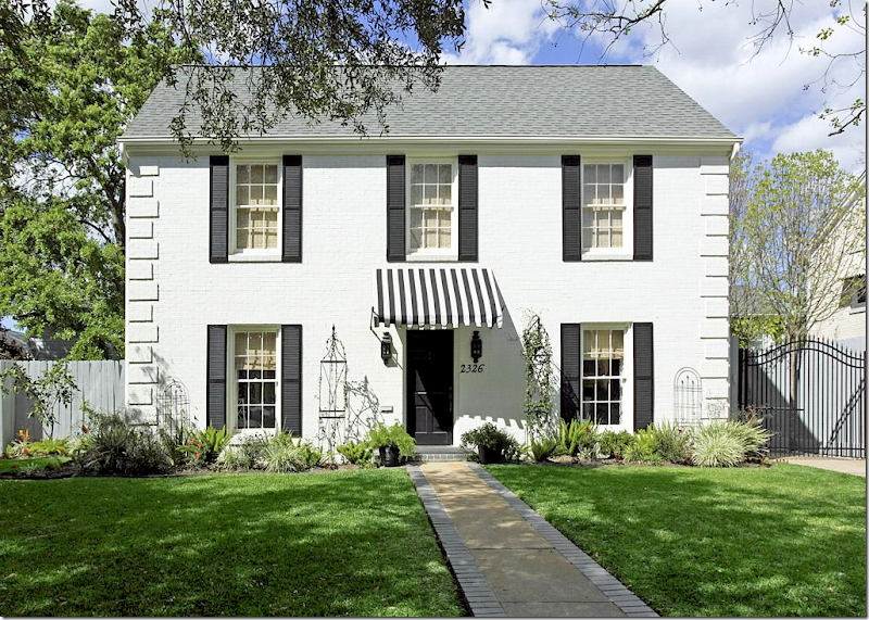
Located in the University area, close to the Medical Center, this house was built in 1939, it has 2 bedrooms and 2.5 baths and is just under 1,590 sq. feet. The asking price is $739,000 – and it’s a sale pending after being listed for barely a month. I can see why. The listing states that Chandos Interiors did the design work for this totally renovated house. Well, no wonder it’s so pretty! Chandos is known for their beautiful interiors. It’s not often that a house on HAR is professionally decorated by someone of this caliber – so when they show up, it’s a thrill.
The façade is the definition of “curb appeal” – with its black and white color scheme. The stripe awning adds so much charm!
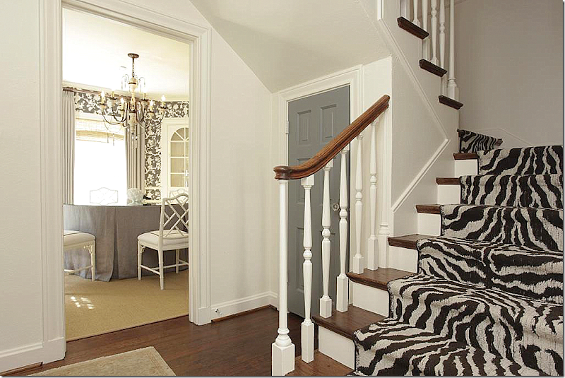
The front door opens to the foyer with the zebra print staircase runner. I love the gray door – I usually advise to paint builder’s grade doors in black, but if your house is painted white or light gray – a darker gray door can be just as effective, if not more so. Especially with a crystal doorknob that acts like a piece of jewelry. Beautiful! Dining room to the left and living room to the right.
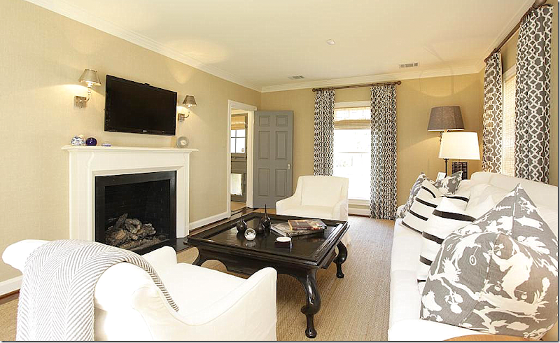
The living room – from Chandros’ web site. White slip covers with beige walls and custom cut seagrass. Typical “Houston Look” – but with a more youthful and contemporary twist – there’s high contrast with patterned curtains and pillows in both a reverse toile and stripes. Modern end tables and lamps and mirror.
And looking the other direction, there’s a fireplace with the flatscreen over it flanked by contemporary lights. No doubt this is a young couple who lives here – albeit one with great taste and style. Again, gray painted door that leads to the kitchen.
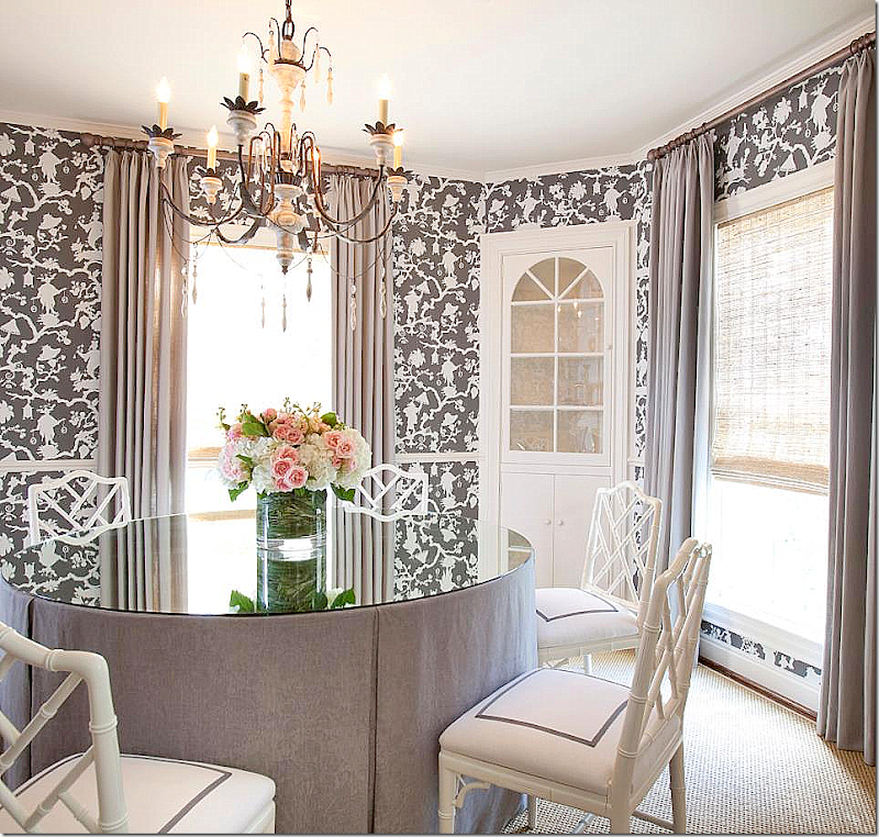
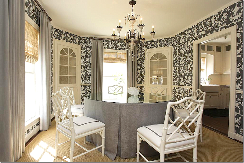
The dining room is so pretty – wallpapered in the same reverse toile with a skirted table. Love the painted chairs with the gray trim added to the white. The shades are high quality, and it shows. Pretty light fixture. Just a great, well designed room – love it! From Chandros web site.
And, another view – showing how large the room really is. The kitchen leads off to the right behind pocket doors. The wallpaper really makes a difference! In an older house, with well defined, separate rooms, wallpaper makes sense. In most new houses today – the rooms are so open to each other, it’s hard to use a paper like this.
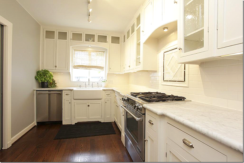
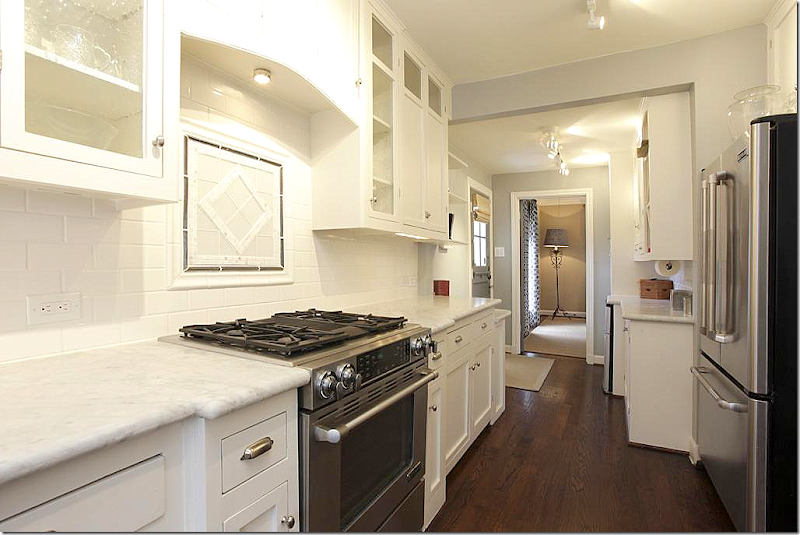
Totally renovated – white marble, farm sink, range, subway tile, with stainless appliances. Classic elements make up a classic kitchen. This design will be good for years to come.
And looking the other direction towards the living room.
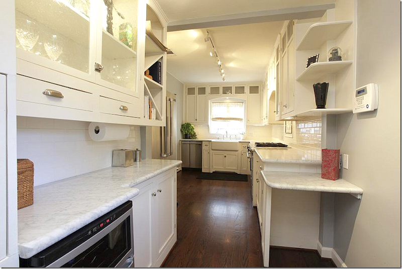
A butler’s pantry off the kitchen. I might have forgone the desk on the right and left the space open for a small table. But, they didn’t ask me!
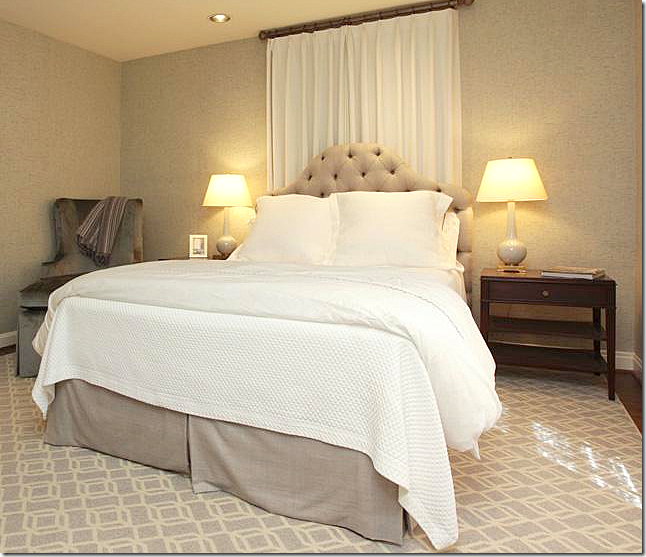
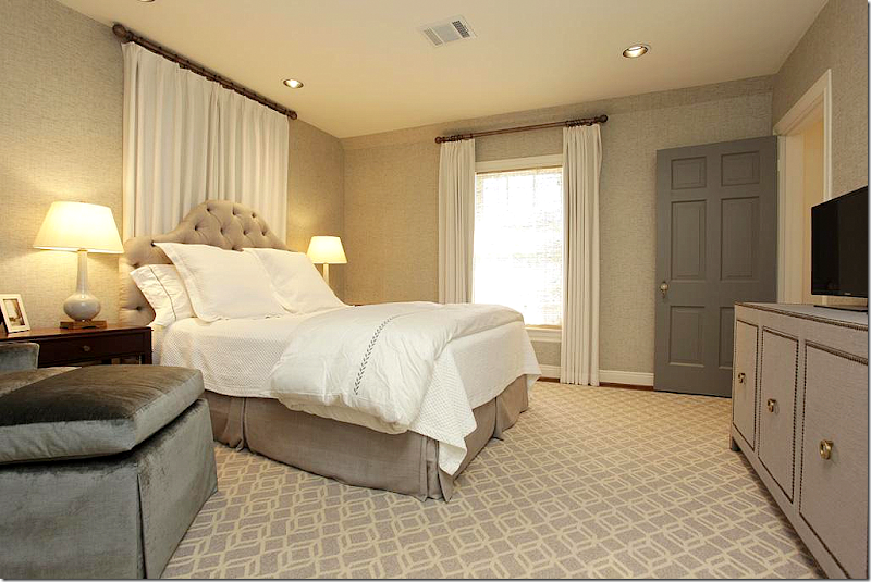
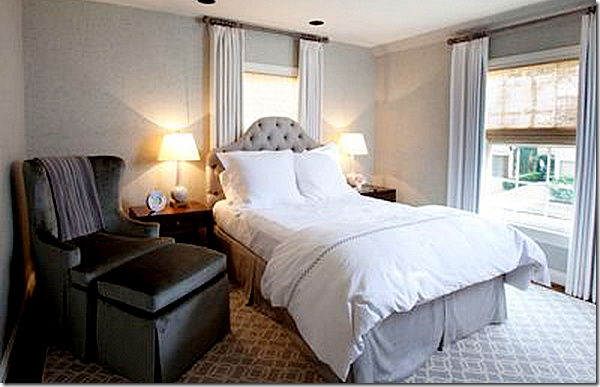
Upstairs, the master is done in beige – it looks like the walls are wallpapered, but its hard to tell. Pretty tufted headboard.
Love the flat, patterned carpet. Contemporary chest with nailheads. Putting a bed in front of a window is always awkward. I might have just closed off the window or made the curtains a little wider to extend past the bed.
Off the web site, here’s how it looks with the curtains open. Pretty.
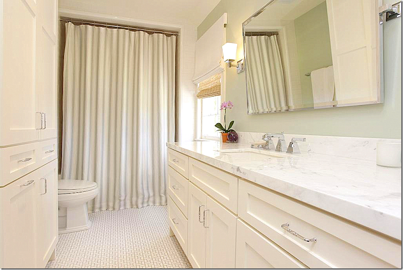
The master bath is updated with tile floors and marble countertops. Just perfect and again, timeless classic!
The guest room has two upholstered beds with matching shades and paneled walls (or wallpaper) and a textured rug. Love those beds!
Off the closet is a small office area.
And the second bath with it’s classic charm. Very well done!!!
The back yard needs a little landscaping, but it’s so big – you can easily add on to the house and make it bigger and still have room for a swimming pool. Whoever put the winning bid down on this house is very lucky!! To see the listing, go HERE.
$739,000. Option Pending
House #2
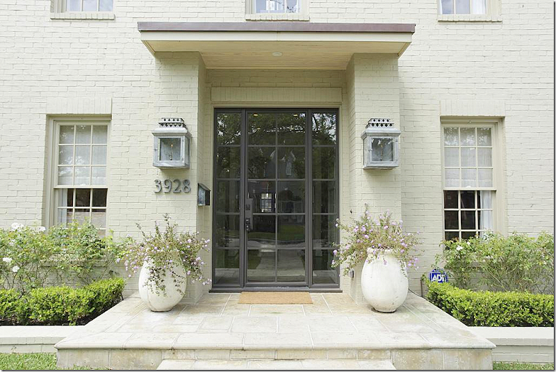
This house was built in 1992 – a rather typical West University house – but, when interior designer Margaret Ann McEver and husband bought it, they totally erased all the builder grade choices – turning it into a sophisticated house with a décor to match. McEver owns MALI, a well known design firm HERE. The house is 4 bedrooms, 4 baths, with quarters over the garage. It is just over 3200 sq. ft.
The front façade was totally updated by MALI – with a new steel front door, lanterns, a stone porch and walkway, and landscaping. The brick was painted beige. Love the new look – it’s slightly contemporary and lets you know that big changes have happened inside.
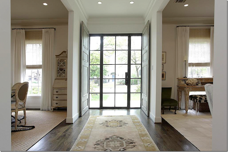
Inside, antique wood doors stand ready to be closed, if privacy is needed. Upon entering, on the left is the living room, while the dining room is to the right.
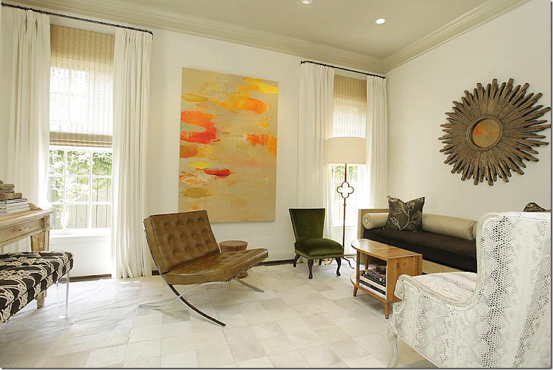
The living room is a blend of mid century modern mixed with antiques.
The focal point is a large contemporary oil painting.
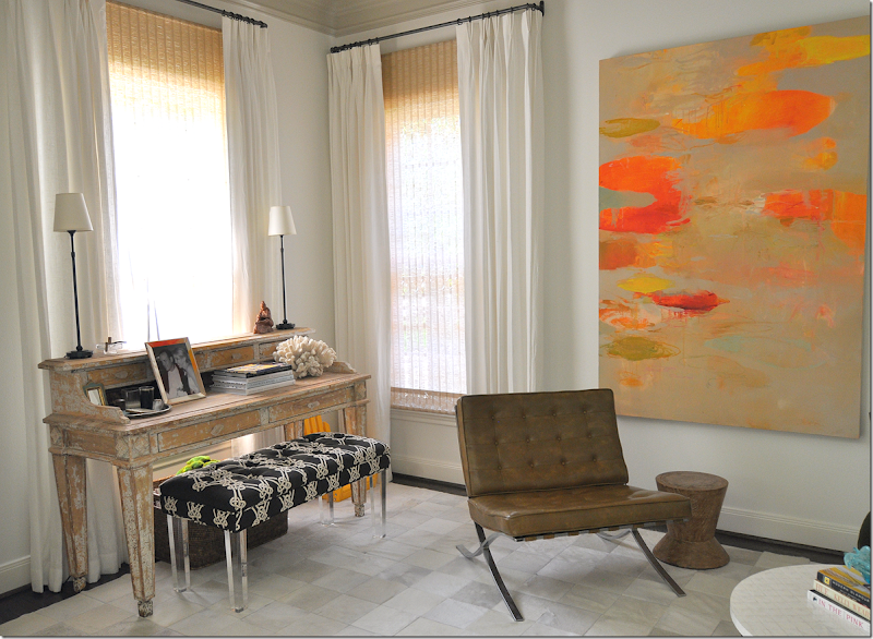
And in the front window is a painted desk with a modern bench.
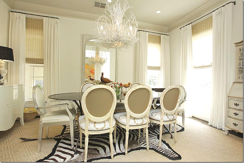
The dining room is an eclectic mix of French chairs with a zinc table.
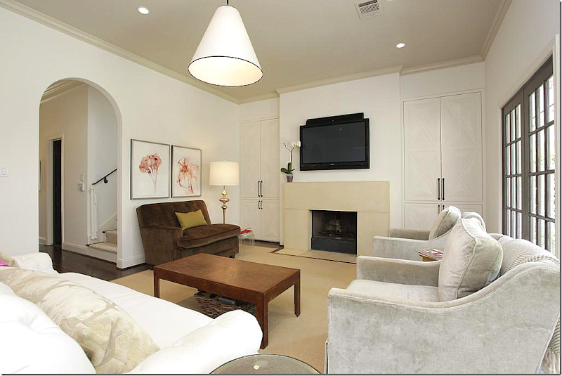
In the family room, MALI installed a new contemporary styled stone mantel. The shelves were closed off behind doors trimmed in an X pattern.
Here is another view of the family room. Through the arch is the staircase and library.
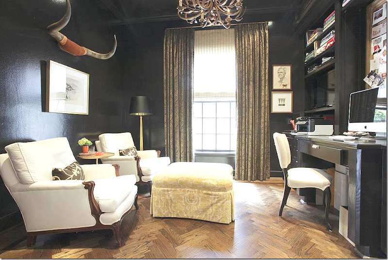
The library was painted a stunning black! Love it! Longhorns play up the masculine side of the room.
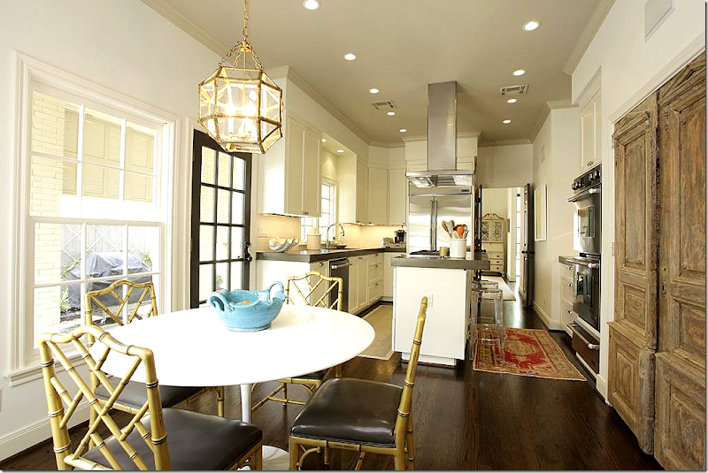
The kitchen was totally updated with new concrete countertops and appliances.
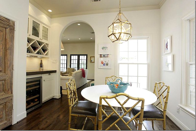
Antique doors hide the pantry. Love the Saariren table. I grew up with a table like this – wish I still had it!
View into the family room.
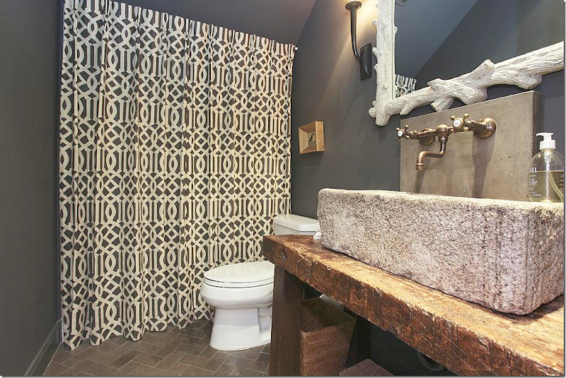
The powder room – great stone sink on rustic console. Love the floors. And hiding behind the fabric is a shower, a rarity on first floors in West U houses. Love the wall mounted faucets and love the dark gray paint!!
Upstairs, one of the bedrooms was turned into a playroom – with brown and white stripes. Love the orange contrast.
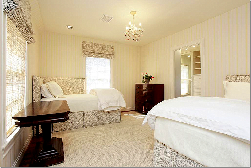
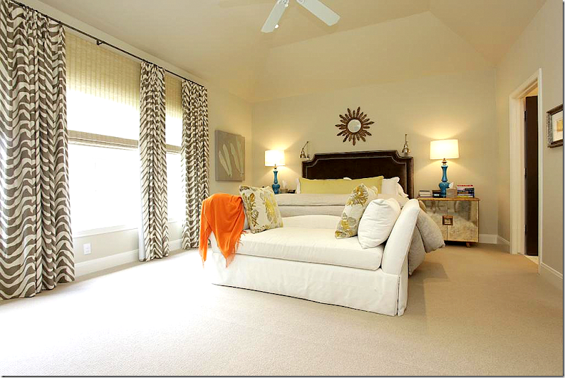
The master bedroom has a velvet headboard with nailheads and contemporary nightstands. The patterned curtains add a youthful touch to the decor.
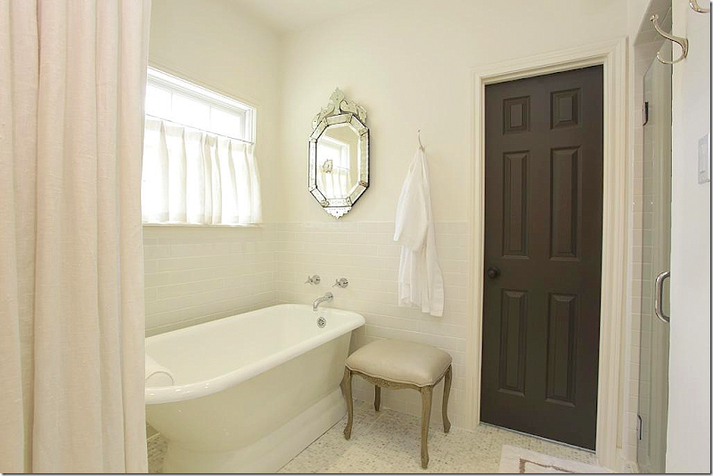
The master bathroom was redone with marble countertops and tiny mosaic floors. Again, love the dark gray doors.
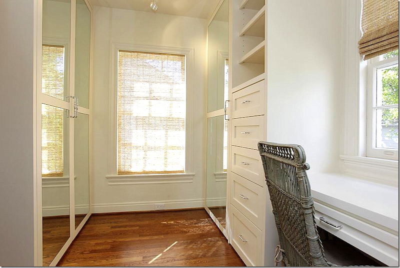
My favorite! She added a portiere of white linen to close off the bath area for privacy, if needed. Plus it just softens the area. Great idea.
The boy’s room is taupe with touches of blue and orange.
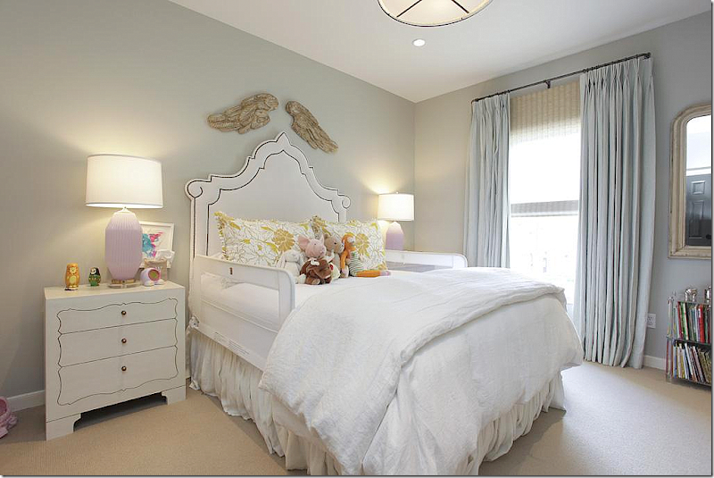
And the little girl has an icy blue bedroom with hints of lilac. Love the whimsical headboard!
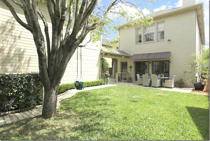
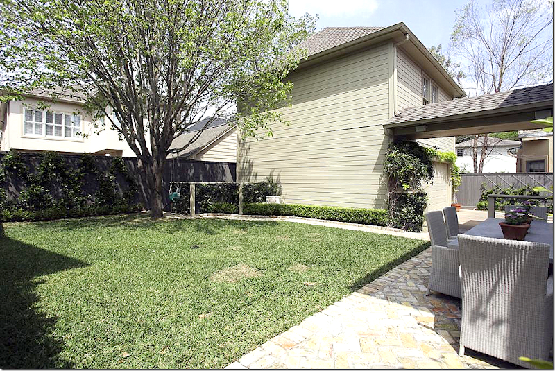
Metal awnings were added to the back French doors.
There is an apartment above the garage.
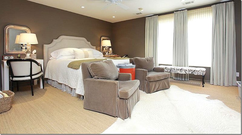
Brown walls and taupe velvet chairs. Love the matching small Louis Philippe mirrors. There is also a small kitchen in the apartment. Wall to wall seagrass.
I really like the ideas that MALI added to this house to make it more contemporary, and more special.
$1,225,000 – again, Option Pending
To see the listing, go HERE.
HOUSE #3
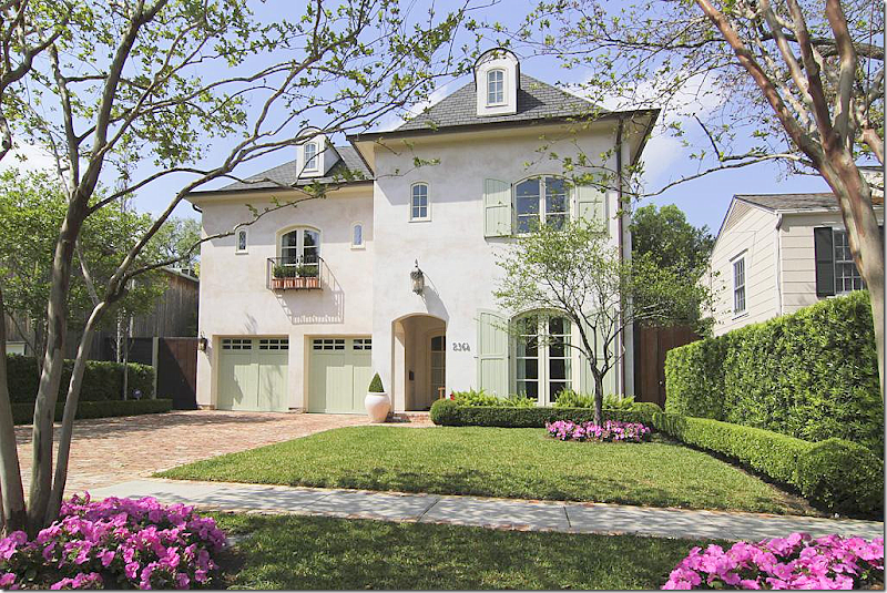
A few months ago, I showed a house for sale by Southampton Builders HERE and today is another one. I love the houses they build. They are all so charming! Great façade on this house with its painted garage doors and shutters and dormers and balcony and tiny windows and brick drive. What curb appeal!
Built in 2007, it has 5 bedrooms, 4.5 bathrooms, and is 5,584 sq. ft. And here is a daytime view of the house, so, so pretty.
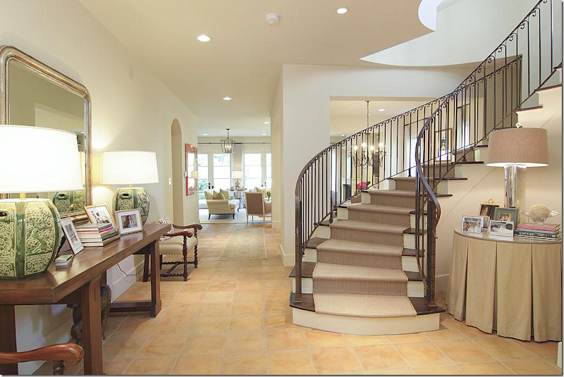
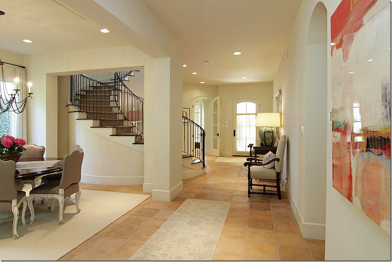
The floors are terra cotta tiles – which is unusual for this neighborhood. It’s very open with a winding staircase in the foyer. Love the skirted table with pleats and the console table with mirror and lamps.
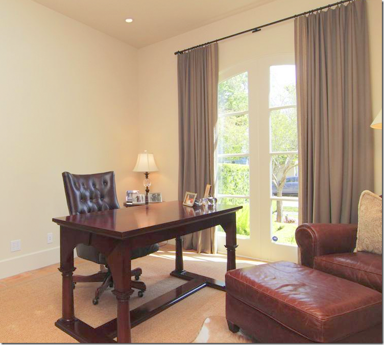
And looking back towards the front door, at the left of it is the study with its arched French door. There is no formal living room, which I do miss.
The study, at the front of the house. You could use this a sitting room instead if you prefer a living room.
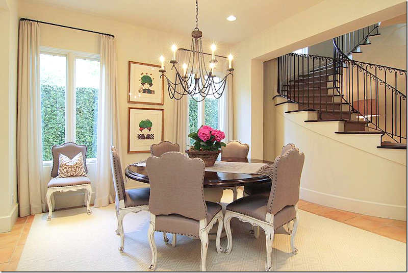
The dining room has a round wooden table with a painted base and painted, nailhead chairs.
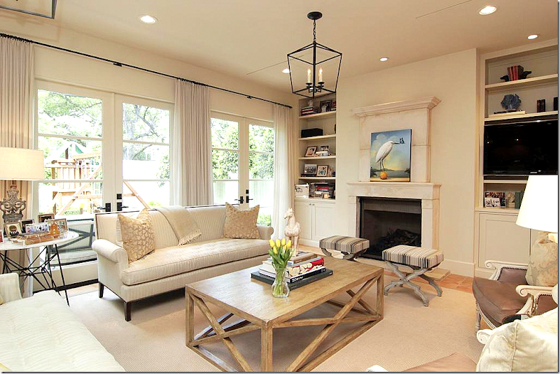
Past the dining room is the large family room and kitchen. Love the painted French chairs and the more Belgian styled coffee table.
The family room over looks the backyard. Notice the wonderful stone over mantel.
Two lanterns light the area. White linen curtains soften the French doors. Past the family room is the kitchen.
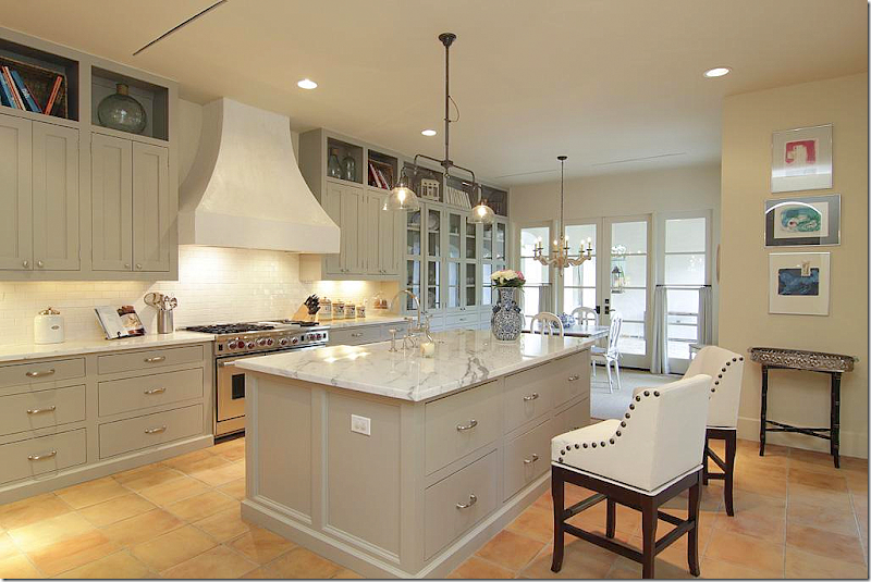
The kitchen has beautiful cabinetry with marble counters and a subway tile backsplash. Love the range and its stucco hood.
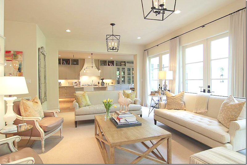
Looking the other direction to the wet bar and family room. Love the gray color on the cabinets. Farm sink.
A view into the bar.
Past the kitchen is the large breakfast room.
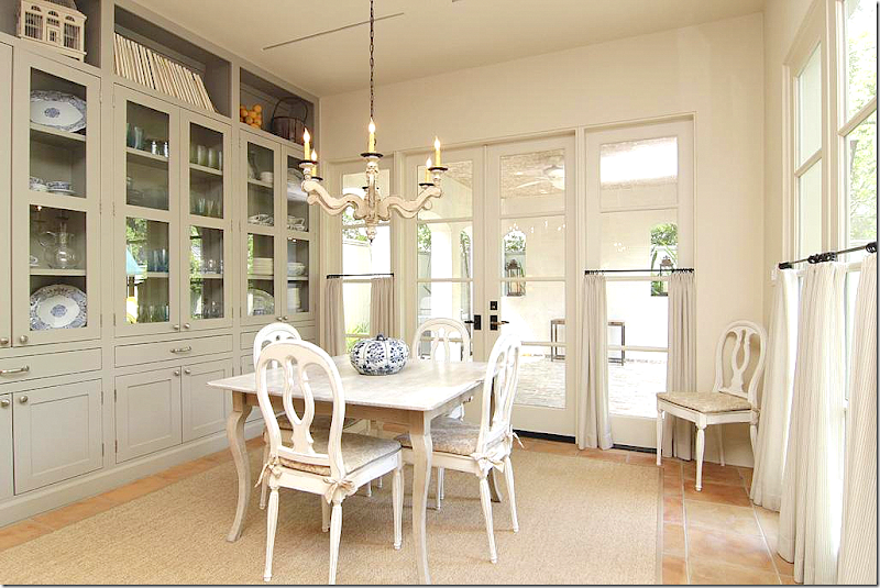
Great built ins. Past the breakfast room is a covered terrace. I like the café styled curtains that are on the bottom half of the windows.
Upstairs, there is a large master suite that overlooks the back yard. Hardwoods and raised roof.
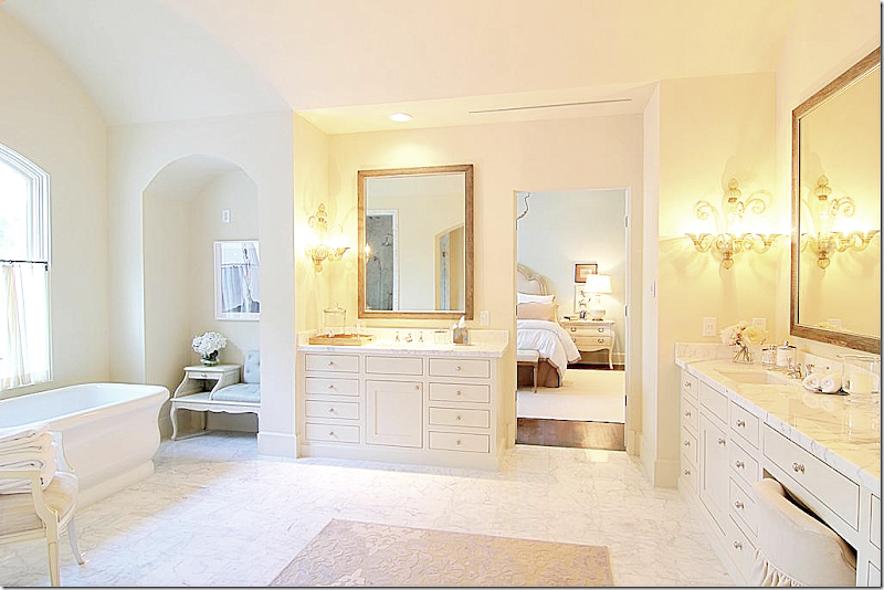
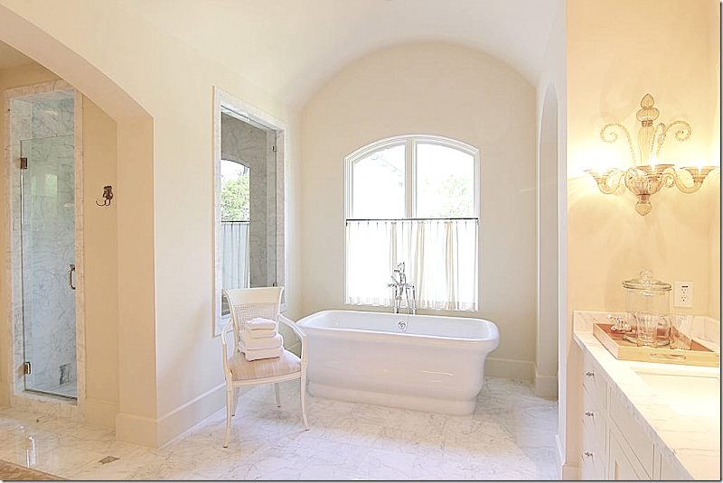
The bathroom is gorgeous with marble floors and venetian sconces.
So pretty!!
OK. This closet is to die for!!!!!!!!!!!!!!!!!! Can you imagine??!!! Looks like a boutique. Wow.
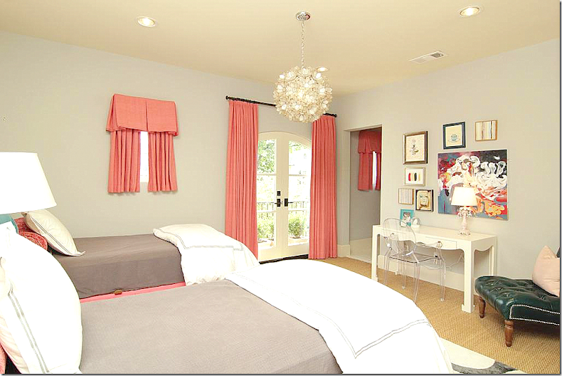
The little girls room is cute in coral and taupe. It’s balcony overlooks the front yard.
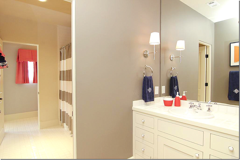
The Hollywood bath matches both bedrooms.
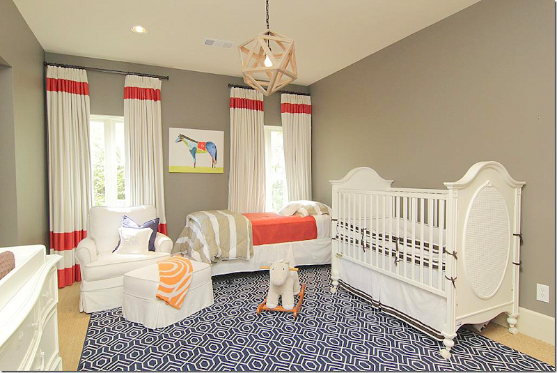
The baby’s room. Love the bright colors.
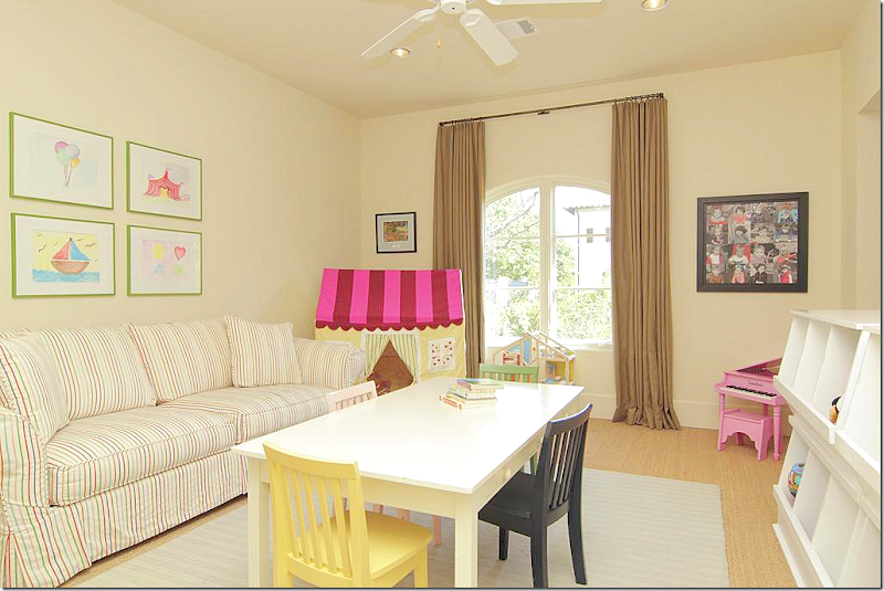
The playroom is set up in the extra bedroom.
On the third floor is a separate apartment with a small kitchen.
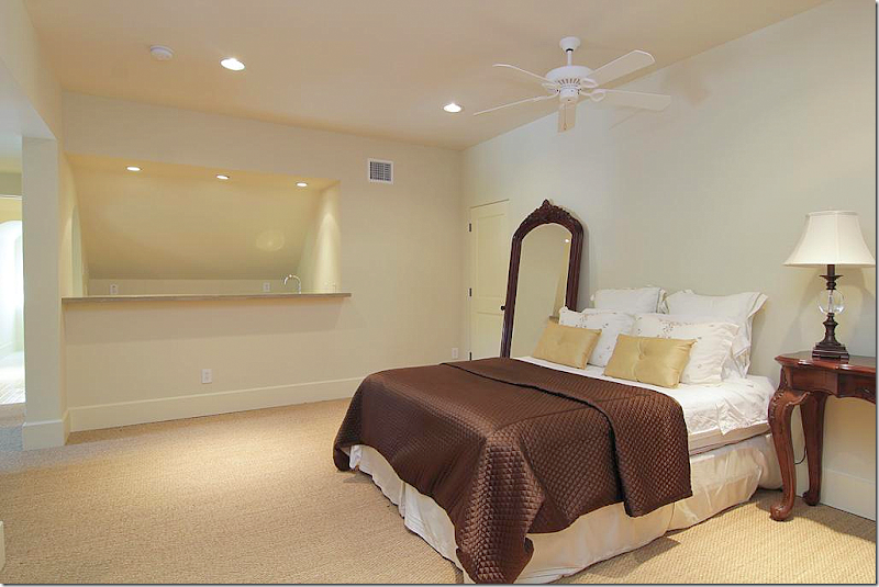
And two bedrooms.
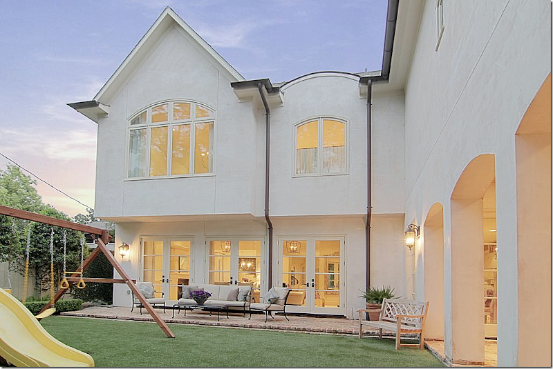
Outside, there is a brick terrace and a covered porch.
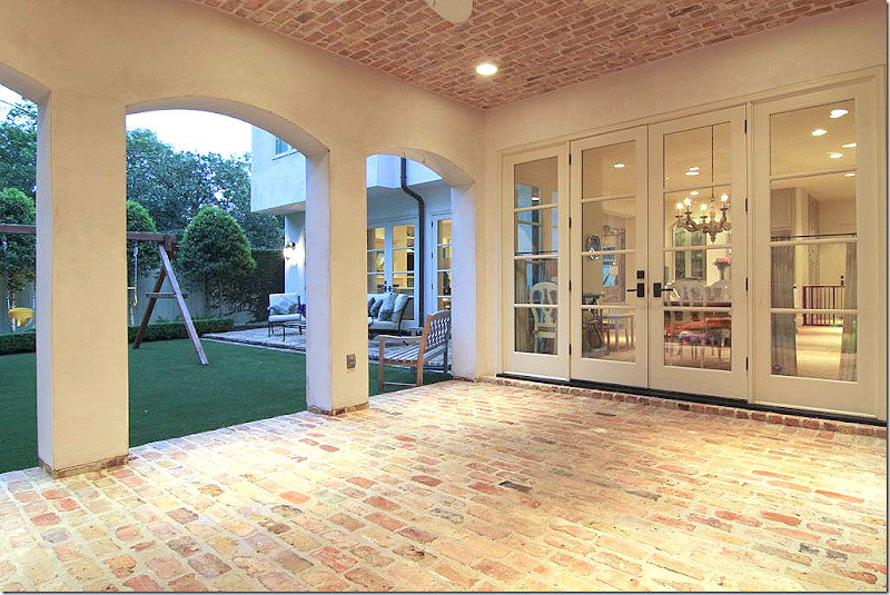
The covered porch – notice the brick ceiling. This is off the breakfast room.
And the terrace is off the family room.
At $2,250,000. it is the most expensive house shown today and the only one that is not a sale pending!
To see the listing, go HERE.
HOUSE #4
This house was a real surprise to me. It’s right down the street from me! I had no idea how cute it was inside. I’ve never even seen the owners and wonder who decorated the house – if they hired someone or if they did it themselves. The homeowner might be a decorator because the house has great décor. Again, a young couple lives here.
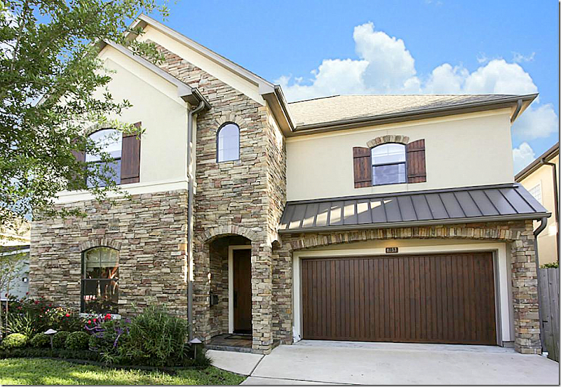
Stone façade is mixed with stucco and shutters. It was built in 2005 and is 3,600 sq. ft with 4 bedrooms and 3.5 bathrooms.
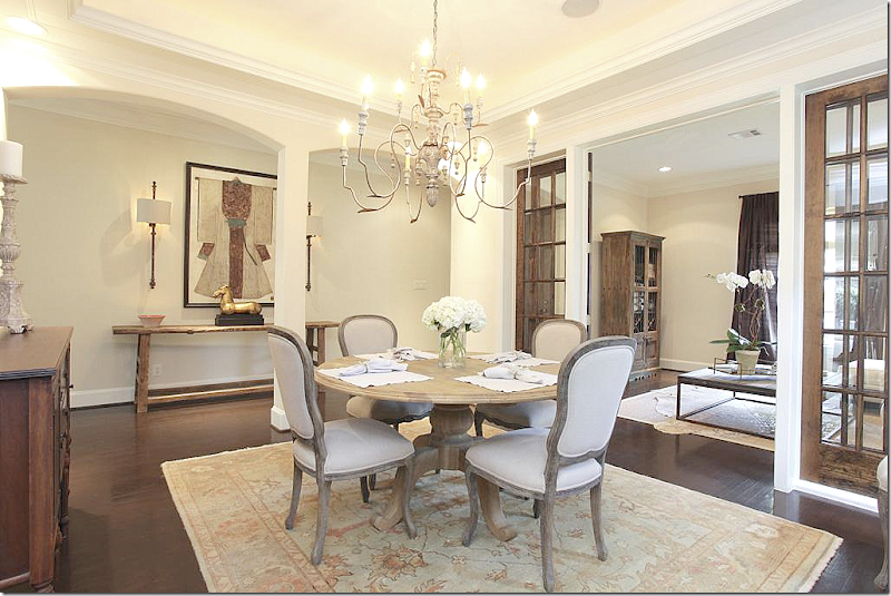
The front door opens to a long hall with the living room and dining room at the left. Love the sconces in the entry – and notice the homeowner framed some type of ceremonial clothing, which is a great idea.
I love the dark hardwoods mixed with light walls. Brown linen curtains at the windows are found throughout the downstairs rooms. A simple contemporary white sofa mixes with a rustic bricklayers coffee table and cowskin rug.
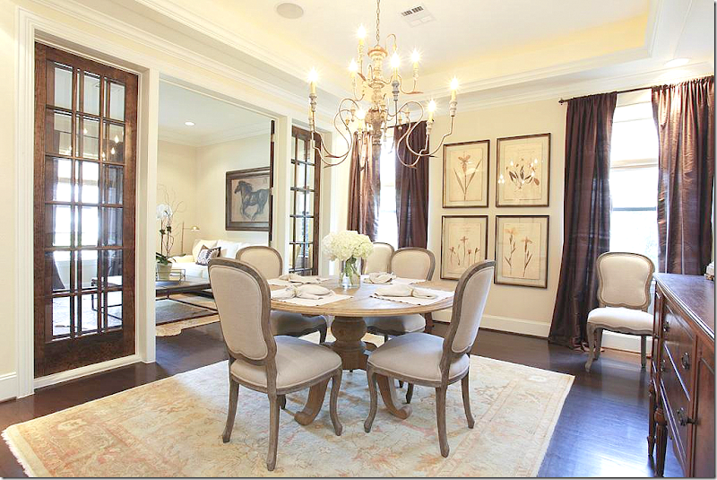
I love the wall of French doors between the living room and dining room. Love the dining room- with its botanicals and Italian wood chandelier. Pretty Oushak rug.
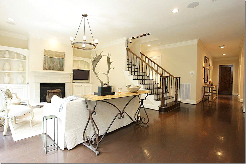
Past the spacious, long entry hall is the staircase with iron rails and the family room. Love the iron based console that divides the room – it’s great looking. Love the horns too.
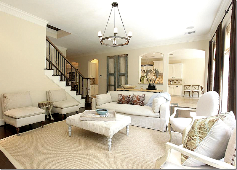
A mix of slipcovered furniture and French styled chairs. Antique doors rest along the back wall.
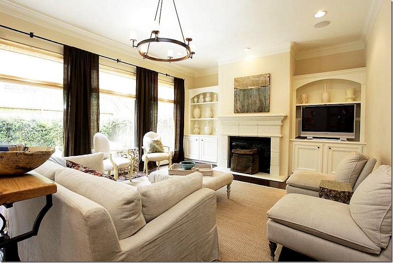
Pretty stone mantel. The same brown linen curtains hang in the back windows too – making all the rooms blend , now’s the time to sell your house!
To see the listing, go HERE.
Four houses – from moderately priced to expensive. All owned by young families – and all houses showed a mix of contemporary furniture with antique pieces. The décor was edited and uncluttered, fresh and youthful. Seeing these houses makes me want to clean out my shelves and table tops and get rid of “stuff!!”
That is until I see a house I like that is filled with that “stuff” and books and accessories. It’s a vicious cycle.
Did these houses motivate you to edit? Did they motivate you to bring in more cotemporary pieces into your home? Did they make you want to bring in fresh fabrics and modern prints?
Or did it instead make you appreciate what you have all the more??? Perhaps motivate you to collect even more?
Do you prefer the edited look or the more collected look?
FINALLY:
Coming soon – another fabulous linens giveaway by Vero!!!
FOUR HOUSES IN MY HOOD!
Subscribe to:
Post Comments
(
Atom
)


















Those houses are amazing! Obviously made for pictures (they don't look lived in to me).
ReplyDeleteThey all look like that though. Totally unrealistic
ReplyDeleteTotally realistic if you are trying to sell your house. No one wants to see items of personal use, clothing, doggie beds, etc. when viewing real estate pictures or for that matter when seeing a home in person. The less clutter the better so that a potential buyer can imagine their own possessions occupying the space.
DeleteAnother grill in the window views. With such attention to interior details, why? As if the garden is trash? "...Men come to build sooner than to garden finely as if gardening were the greater art....." Pope, 16th century and proved again here.
ReplyDeleteAt a dinner party, I went to help my dad at the grill. Everything was charred. He said, "don't tell anyone." I didn't.
Garden & Be Well, XO Tara
Another totally ignorant comment. You really need therapy, Tara.
DeleteThe grill can be seen through a breakfast room window - big deal Tara. As a potential buyer that little noxious detail would not derail my interest whatsoever. Let me guess, in addition to vanishing thresholds, you are working on vanishing grills. I love the comic relief you bring to this site.
DeleteWe all have our own view of the world based on our interests, education and life experiences. Tara always has intelligent and insightful comments about the landscaping. Yes, her comments are cryptic and often require several readings to understand. However, in my mind, I envision Tara circling the part she likes (or dislikes) then jotting down a short note to explain why.
DeleteJoni's blog is an excellent forum for us all to discuss interior design and architecture. And, yes, landscaping and curb appeal should always be part of the package.
Smiles from My Slice of Provence, Charlotte Des Fleurs
Chill out ladies!!! This is a decorating blog for goodness sake!!!! People just died in Boston and tragedies continue across our nation!!! Get a grip on what is important!! This is an entertaining decorating blog, not your life's blood!!!
DeleteNancy
Of course they are staged ( uncluttered) for the Real Estate photos. I LOVE the contemporary art in several of the homes. The painted interior doors are a great touch.
ReplyDeletexoxo
Karena
Art by Karena
Holy Molie! They are "move in ready"...I'm packing my bags! I'll think about it...tomorrow... franki
ReplyDeleteI like the edited look. Although we don't have much stuff, it seems to be everywhere. Like it grows out of the wood work. Love the steel doors on the first house!
ReplyDeleteIn response to the first two comments...come on seriously, they are being photographed!
ReplyDeleteIf someone were to come to your home to take photos you would clean it up and edit it out....
especially if you are shooting for real estate. These days they want them to look this way.
That said I like the more eclectic look. House number two has the most unique look to me with it feeling more comfortable and original.
But they are all lovely!
Homes here in Indy for the middle class are setting forever. : - (( Love you showing us the TX homes!
ReplyDeleteGorgeous homes!! Love all of them. We are building right now, so this is exciting to see. Thanks for taking us on another wonderful tour. I have to say, I've put a ton of stuff away to sell our current house, and I really am loving the edited look, so I may be getting rid of much more than I already have. Great inspirations here!!
ReplyDeleteJoni-
ReplyDeleteDo you know by chance the names of the designers for each home?
I have been doing the Mary McDonald/David Hicks thing in my home but these photos make me want to do a clean out and rewind!!!
Nancy
PS-Surely that was not you know who in that car???!!!! Hope not!!!
I've been eyeing the first house for a while now. I absolutely love it! I haven't noticed the third house before and I was so excited to see the living room. I've been thinking about buying that coffee table and two side chair (with different fabric) so it was interesting to see them paired together. I feel like I have this conversation with my mom about our houses. I tell her she needs to pare down and she tells me I need more "stuff." I'm constantly editing my house and she will go through my garage and say,"I can't believe you're getting rid of this!" She takes it home to keep even though she doesn't want it because she says one day I will regret giving it away one day.
ReplyDeleteDid I miss something? The least expensive home was $739,000. For 2 bedrooms. Where was the "moderately" priced home Joni mentioned? Surely three quarters of a million dollars is not "moderately" priced?
ReplyDeleteI was thinking the exact same thing! She said, "reasonably priced" in her initial paragraph. I don't consider over $700K "reasonable" for a two-bedroom home. Albeit, that home is gorgeous and my favorite of the four. It's not Fairfield Co.,CT., Westchester, NY, or LA for that matter. It's Houston! I used to live there. I would take my money to the suburbs where you can get much more for your money. Although, I absolutely enjoying viewing how the 1% of Americans live and can get some inspiration from these homes.
DeleteIt's West University Houston...that makes a HUGE difference! 700K is reasonable for that area, even with just 2 bedrooms. That is why it has a sale pending so soon.
DeleteWest U is upscale: centrally-located within the loop (i.e. 610 Ring Road), close to the medical centers (lots of doctors, lawyers live there), mostly residential, has its own little "village" of shops, own police force, very family-oriented, etc. $700,000 is a great price for a starter (older) home in this location.
DeleteIn this community it's very common for builders to buy homes like House #1 (in much worse condition, of course) for their land value ($80-$90/square foot), knock them down for around $10,000, and put up a two-story house like #2, #3, or #4. Builders maximize their profit by building as much house as permitted on the property; hence West U garden sizes tend to be small. But the houses can be amazing: high ceilings, beautifully proportioned rooms, and the latest bells and whistles.
I don't care where a property is located, over $700,000 is not "moderately priced." Perhaps it's on the low end for that neighborhood (or Paris, or Manhattan, or West Hollywood), but the moniker still doesn't apply.
DeleteCould we, at least once, see some homes (houses, not 1-2 bedroom condos, apartments, or townhomes) on this blog that cost under 500K? I love getting inspiration, and I'm not on a shoestring budget, but it sure is hard to figure out how to get these looks on an average budget when I realize every home I'm seeing is 2-10X the price of mine.
If houses #1, 2, or 4 were located outside of central Houston, in a Houston suburb like Sugarland or Woodlands, they would be less than 500K. If they were in middle America, they would also be less than 500K. Same houses, just different locations -- changes the price. The contents that make up the "look" (furniture, etc.) are probably similarly priced throughout the U.S. That is, a particular sofa probably costs the same in Texas, as it would in Seattle or Florida. Therefore, don't let the prices on these houses make you think that the decor is out of your reach. It's the ground that's inflating the price, not the house or the decor itself.
DeleteNow having said that, someone who can afford to pay $700,000 for a house which might cost $200,000 elsewhere, probably has a higher budget at her disposal for decorating the interiors. So the furniture inside may be pricier than what a similar homeowner would spend in middle America. However, there are substitutes/look alikes one can turn to, not to mention the fact that these are very "pared down" looks (minimal furniture and accessories). I think one can get inspiration from these homes, even on a budget.
I appreciate having the opportunity to see such beautiful homes and furnishings, even if I can't afford to buy them right now. Joni was kind enough to devote an entire article on ways to get the look you want without spending a fortune. I really appreciated that and took her advice on slipcovers.
DeleteFascinated by the steel door design. being from the Northeast storm doors have always been an eyesore to me. This concept of the steel door as well as keeping the inside door works!
ReplyDeleteAs always, what a treat, Joni! Thank you for showcasing such beautiful homes. I prefer the edited look myself - and seeing these homes so beautifully put together motivates me to continue saving to replace those "college" pieces we acquired early on in marriage and to keep working to do each "update" well. Thanks for always inspiring!-And I LOVED the idea of the steel front door with antique doors just inside for added privacy when needed. Super idea!
ReplyDeleteLots of things to love in these properties...every time I view a Houston home I'm amazed at the similarity in style. Houston definitely has their own particular look. Not so much here in Arkansas. Lot's of great design, but pretty much all over the map. You could never say that one particular look dominates. I just find that interesting. It's probably because we are the last in on everything. Ha!
ReplyDeleteIt's always fun to see homes for sale. I think the idea of moderately priced depends on city and location. In the area of Houston Joni is showing us, the first house is moderately priced for the area. I don't think anyone is misunderstanding that. These are all high end homes to the general population. We know that.
ReplyDeleteAlso, these homes are obviously staged. Other items are probably being stored in a storage unit somewhere. Personally, I enjoyed seeing the homes, but would enjoy seeing a few books on bookcases and a few other things that would make them more personal. We recently embarked on updating our 20 year old home (which we built). And yes, even those of us who are older can get this look, but with just a bit more charming objects that make it more interesting.
Great post Joni! I so appreciate the work you put into bringing us posts like this one.
Joni, where do these nice people get their curtain rods? The ones that work with rings? Great post! Very fresh and light!
ReplyDeleteThe homes look lovely. However they remind me of all the impersonal hotels I stay in. It is just too edited. However it does have the desired effect, it allows you to see yourself living there, rather than recognizing that someone else does....
ReplyDeleteYes. Exactly what I was going to say.
DeleteJoni can you please remove the comments about Tara? They were very personal and very nasty. I love Tara's blog and her view of the world. You welcomed comments, and she gave one. She does not deserve vitriol or personal attacks. Please scold your readers and tell them not to be nasty.
ReplyDeleteI do like House 2 and 3 because they have more personality... I love a collected look within reason and I do think it's great to have an edit from time to time... I am doing that right now as I move from an apartment in London that I have lived in for ten years... It is really a home away from home because all of our 'collectables' are in France... but as I prepare to move I am shocked at the amount of 'stuff' we have accumulated over the years! I cannot wait to streamline our bits and make a more modern place next time...
ReplyDeleteI guess I like a compromise between the styles... :) xv
I like the first home (built in 1930's) the best. It is a small, older home very tasefully redone with a respect for the original architecture.
ReplyDeleteAlso, Joni, I am happy you followed Betsy Speert's advice about NOT spilling your entire post into an email. Viewing your posts ON your blog is faster, allows me to view the comments right away AND doesn't swamp my email with a huge file. Merci!
The problem here is that the houses look decorated not lived in. They lack personality. Sort of upscale hotel-like. They are pretty, clean, tasteful but not interesting. A lot of money and a lot of thought went into putting together the appearance but that is all there is, there is no one home.
ReplyDeleteI adore the steel door with shutters for privacy-stunning! Joni, you do a great job, keep up the good work. xxpeggybraswelldesign.com
ReplyDeleteJoni, these homes are all lovely. I'm a bit afraid of the zebra print I have to say but in all they are stunning.
ReplyDeleteYou teach us so much.
hee hee
Lisa
Leeshideaway
Another great post! Beautiful homes and I love the bones of each and some of the decor of number 1,3, and 4. The decor in number 2 is too confusing. There are some nice pieces in it, but most of it looks thrown together and off balance on the mixing of different eras and styles. It can be done with a lot more effort in the coordination.
ReplyDeleteWe recently bought a older townhouse here in Austin and moving in it now has created a dozen boxes of stuff to donate. I refuse to have clutter going forward and will only put in items that will make our home absolutely beautiful!
Joni, I enjoyed seeing all of these houses. I especially enjoyed the home owned by Margaret Ann Mcever. I have wanted to see the rest of this house ever since you posted about it being on the Houston Home tour back in 2011. Did you notice she painted the crown and ceilings a darker shade than the walls on the first floor. I thought that was a great detail. Another home I came across recently for sale in Houston is at 6158 Inwood Dr. Something about it really spoke to me. They lacquered the entry in gray and it was just lovely. I guess it's already sold because when I went back to look at it again it was gone. Thanks for the tour!
ReplyDeleteI'm a middle of the road type when it comes to knick knacks and such. All of these homes are beautiful and have great "bones" but the first two are too stark for my taste. I much prefer how #3 and #4 show. They're decluttered but shows some personality that makes them feel like you can really live in them. #1 and #2's minimalistic decor makes them look like no one lives there to me.
ReplyDeleteBelieve me, I live in LA and any one of those houses looks beautiful to me at $700,000 to $1,000,000.
ReplyDeleteThat said. All of them have good bones, lovely bones, in fact. A great canvas for personalization.
Uhmmm, clutter? My books? My collected art? Wouldn't take me long even though I like the clean look.
I also like having my personality showing in my home.
Thank you for sharing, Joni
Collected!!!!!! Most definitely! I love taking the time to look at all the "smalls" in a collected home. Even if those homes are staged for selling I bet in reality they don't have a lot of collected clutter. There weren't many antiques either which I think adds to the charm of a collected home. But hey, if I could afford one of those home and live in "your hood" I would be there in a continental second! Thanks for another fabulous post Joni!
DeleteJoni, another wonderful post. I enjoyed every house, but totally fell in love with #1. Nearly forty years ago I lived in a house in West U on Wroxton Street that was not unlike #1--two stories and three bedrooms, but just one and half baths. I absolutely love the living room in house #1--and I am very curious as to whether it is paint or wallpaper that provides that great rich caramel background. Perhaps you or your readers will hazard a guess. Your posts bring such pleasure.
ReplyDeleteJoni, you Houstonians have the BEST taste. Period.
ReplyDeleteHouse No. 3 is my over all favorite although for the asking price, I would expect more crown molding. The cabinetry is beautifully done, however. While the listing indicates stucco, from the back of the house one can see seams which would indicate to me that the building material might actually be either stucco slabs rather than hand applied hard coat stucco or drivit (synthetic stucco).
ReplyDeleteAll beautiful homes with tasteful interior design, but, though I know they're severely edited for real estate staging, they seem too empty and perfect to me. I agree about the hotel look, as Linenqueen and others have commented. Though the exterior is my least favorite, I like the interior design of #4 with its stained French doors and antique rustic woods. I like #1 for its classic vibe, nicely renovated. I think #3 has the most interesting layout and design, and I love its front facade. Real estate is all about location, but I have a hard time thinking $739,000 for less than 1600 square feet is 'moderately priced.' Where I live in the southeast, real estate is still depressed. In our city (obviously not a metropolis like Houston) in the most desirable historic neighborhood, a gorgeous significant 1930 Colonial Revival in good condition with inlaid wood floors and plaster mouldings with over 6000 square feet, not counting a garage apartment, recently sold for $300,000.
ReplyDeleteThis comment has been removed by the author.
ReplyDeleteThey're all above average beautiful homes. You brought up the question if we would like to live in homes this stark? I have to say if I was looking for a home I would want to see very stark homes with just enough furniture so it give you the idea how my furniture would work in the rooms. To live in a home that stark I say no. To really check myself I went to my Pinterest boards and there isn't one stark room in the bunch. I also live in a cold climate. When I lived in Florida I definitely preferred less stuff. I think that's why when the time came and we could relocate to a warmer climate I decided it really wasn't for me. I like warm, cozy rooms.
ReplyDeleteI am a Realtor and would LOVE to have these beautifully staged listings. The Sellers all did a wonderful job! They all make me want to de-clutter and freshen things up a bit. Lovely.... all of them! Fun post Joni!
ReplyDeleteJoni, Thank you again for all the effort you put into your blog. I love house number two from the lanterns on either side of the steel doors to the fabulous kitchen (although I'm not a fan of cement countertops). The whole house showcases the homeowner/designer's talent. by the way, I love this kind of post with a variety of homes, where you get such good ideas! I don't live in Houston, but I love the look! Blessings on you! p.s. If I were you, I would just chalk the rude comments left on your blog up to jealousy!
ReplyDeleteI think its safe to say the homeowners in Texas have excellent taste! I love something about each but 1 and 3 are my personal faves...they are misleading in that they look so much bigger inside, and seem to have such a great flow. They are all beautiful, and have a lot of appeal, nothing fussy or overly cluttered, which to me is key when selling a home. They have done a fabulous job!! Thanks for sharing, this was a fun post!
ReplyDeleteI love how House #1 is decorated. Actually, I like all the homes. From my neck of the woods, they are all priced well. House #1 would be at least 1.5 million dollars in the SF Bay Area. I love to see how the homes are staged. It is an art, allowing the buyer to imagine moving right in.
ReplyDeleteI think I just fell in love with pleated skirts for tables.
ReplyDeleteI was very excited to see House #1 because we just bought something almost identical for 300K in the best part of our city. But, no, I don't like their decor at all, I'm afraid. I like the british colonial, Indiana Jones kind of clutter.
Dear Joni,
ReplyDeleteThe interior of these houses look all beautiful, however quiet similar for an European eye. I deem house no. 2 the one with the most personal touch. I like the black painted library or office room and it's living room, the one with the brown Barcelona chair and the green velvet upholstered chairs. And I like the Saarinen table too! The very French style bathroom with the black tile border is very pretty. And the one with the Venetian mirror over the bathtub, but that was a different house.
Two houses have the same geometric carpet. Has anyone noted?
Therefore, I have a question, if anyone knows, please reply: When staging houses for sales photos, do they bring in furniture and deco, or are all furniture seen above personal and will be gone when the owner moves? Would American people buy an empty house, or would you need to decorate the house before selling (just for selling)? Is it possible for a potential buyer to visit the house inside, or do you have to rely on the photos?
Thanks for the sneak peek guided tour through these interesting homes.
When staging houses for sales photos, do they bring in furniture and deco, or are all furniture seen above personal and will be gone when the owner moves?
Delete\Not sure. I've never had a house staged before but I *think* the sellers purchase the furniture for staging and take it with them when they sell the house. I think.
Would American people buy an empty house, or would you need to decorate the house before selling (just for selling)?
Oh yeah, lots of people buy empty houses. LOTS.
Is it possible for a potential buyer to visit the house inside, or do you have to rely on the photos?
\Buyers see the house (inside and out) in person and then they hire someone to do an inspection to make sure the house doesn't have any unforeseen maintenance problems. :)
There must be something special about Houston. I look at real estate all the time in my area and NEVER come across one home any where near as beautifully decorated as the many you have shown over the years. Not at any budget level. Wow. These are all beautiful.
ReplyDeleteI think I love House #3 best, especially the beautiful bathroom and Sally What-inspired kitchen - that really looked like Sally Wheat's kitchen didn't it?
ReplyDeleteI think I like a mix of edited with some rooms more collected. I just can't live minimally because I love my stuff too much but I recently had my apartment painted and had to remove all of my wall art and clutter and I must say that I loved my apartment absolutely bare before I put everything back.
I wonder if Houston homes are so well decorated because of oil money and people working in the oil industry? Anyway, thank you for introducing me to the Houston look through the years, it is definitely me and I'm now going to be stuck, dated and defined by this style in 20 years time.
Also, you couldn't get a tiny box-sized 2 bedroom apartment in central Sydney for $700K. The cost of real estate in Houston is unbelievably cheap and blows my mind. I always think I'm hallucinating when I read the prices of these beautiful home.
ReplyDeleteYou certainly have gorgeous houses over there. Got lots of great ideas from them. Fiona
ReplyDeleteRight You are sister it is a another nice post .so talent works i really wish similar post will coming soon
ReplyDelete.................
Mayweather vs Guerrero Live Stream Free
Love #1! The difference between that home and the next two? Kids! Kids=clutter. And I disagree that the homes were completely staged/decluttered for photos. If so wouldn't homeowner #2 have taken the metal rails off the side of her daughter's bed, for example? That makes it look very REAL to me and reinforces how next-to-impossible it is to have that "ready for a magazine shoot at any moment" look when there are kids living in a home!
ReplyDeleteLoved this post!
last house...megan megas?
ReplyDeleteBeautiful interiors. Love the first home, but I had some sticker shock for a 2 bedroom. I lived in West U my entire life and recently sold a beautiful home there, but I never imagined anyone would pay $700K for 2 bedrooms. At least they are getting a great remodel without the headaches! And is it just me, or have the prices gone up significantly in the last year in West U? We sold a year ago, and I didn't see comps like this. Nice for sellers that things are going so well!
ReplyDeleteThese homes have nothing to do with the younger set living with less. These homes have been edited within an inch of it's foundation for the real estate photos! If living with less means having my home void of any personality and books then no thank you! However, a few years ago, I went through a divorce and left a large home and most of its contents behind. It is extremely liberating to live with just what you need and not have all of that collected baggage. I live with a few beautiful pieces and my books and photos of family. What more do you need?
ReplyDeleteWow! Didn't have as a young couple, don't have as an older couple but boy I'm hoping maybe in the life to come?...yes! ;)
ReplyDeletep.s Joni don't you dare edit....I absolutely adore admiring the pics of your home!
Joni -
ReplyDeleteI love these posts - So inspiring! I live in Atlanta and truly am inspired by the homes in Houston.
Your blog is inspirational and encouraging to young homeowners. It also give me a sharp eye when I find really great items at a great price which is important to me!
I have a young toddler, 22 months old and I don't have toys everywhere on a daily basis. We encourage him to pick them up after he's done playing and put them in the playroom that's attached by french doors to the large open family room. A good lesson to teach at a young age!
I love your blog and the obvious time you put into your posts. Keep up the great work, you are amazing!
Hope you are enjoying that beautiful library of yours. How about a picture of you in it ? Hope you are still using the library app I recommended. PLEASE back it up - I lost ALL of my scans of a few hundred books recently and didn't back up the software!
Take care,
Betsy C. Gordon
Thank you for the lovely post! Can anyone identify the reverse toile wallpaper in House #1's dining room photos? I'd like to add it to my next-house wish list ;)
ReplyDeleteI haven't been on this site for a while. Love the eye candy. So inspiring.
ReplyDeleteI really like that house it was really great interior and exterior design. And Also I really like the location where this house are present. So if you wanted to sell that house please suggest me. I want to buy house like this.
ReplyDeleteHi Guyz,
ReplyDeleteYou created a nice blog.
I want to share some news to you. Horizon Concept is the Real Estate builder which spreads their legs all over India. Horizon Concept had completed many projects and also have many Upcoming projects. Orizzonte is one of them.
Nice post its so informative for me thanks for sharing this post!
ReplyDeleteLake County Real Estate
House #3 is my favorite of the four homes.
ReplyDeleteYou always do such a great job Joni with the great photos and descriptions! They were all staged very well, smart to do when someone wants to sell.
The prices most certainly ARE reasonable compared to California along the coast! And larger than we would get as well for those prices and quality.
I love your blog, and how you focus on the high end and the lovely. It is refreshing to come cyber visit here.
I get so sick of middle-of-the-road and home depot designing, It's fabulous that you cater to those of us who like luxury! We shouldn't have to be afraid of having wealth and taste, bravo to you!
Wow!!!! what a luxurious house and what an interior i love this and my dream is to buy this type of house but for many years i was searching this type of houses but the help of fast property seller services my dream come true.......Read More
ReplyDeleteNice Interior design.
ReplyDeleteWhen listing your home for sale, you'll be able to provide a bevy of information to potential buyers. Essentially, you'll get to provide everything you would in a typical MLS listing such as bedrooms, bathrooms, garages, appliances, price, square footage, contact information and so on. Get more info at home for sale mn.
ReplyDeleteAwesome article Joni! It is very interesting to see all of the White Carrara, Statuario, and Arabescato (different marbles out of Carrara, Italy) being used in the bathrooms, kitchens, etc. Especially not just on the floors, but for counter tops as well. I know that here in the south, and in the U.S. in general everything is granite. Not that it is a bad thing, I just like to see something different. That is why I love reading your blogs and seeing your pictures. And of course I love your work! :-) Good stuff!
ReplyDeleteClarence Thomas, Houston, TX
Nice post.
ReplyDeletehere valuable information.
Thanks for sharing with us.
homes for sale liberty hill tx
Nice post Thanks for the sharing. Keep it up.
ReplyDeletehomes for sale liberty hill tx
I found your blog when I was looking for a different sort of information wonderful Information about Property & I was very happy and glad to read through your blog.
ReplyDeletebuilders Regina & free quotes
No matter which side of the equation you are on when it comes to real estate, you should make sure that you work with the best service providers. Learn more about the different homes for sale listing services and their builders. Visit Here to know more about !!!
ReplyDeleteHi, this one is great and is really a good post. I think it will help me a lot in the related stuff and is very much useful for me. Very well written I appreciate & must say good job. .....
ReplyDeleteuniversity of tennessee collectibles
I really appreciate your blog and have gained so much neede information. A sincere thanks to you.
ReplyDeleteSell Property
This is one of the most wonderful blog, this is work is tremendous. Thanks
ReplyDeleteSell My House Fast Houston
Amazing Blog created by you.It is really informative and helpful for me.
ReplyDeleteI would be grateful if you continue with the quality of what we are doing now with your blog ... I really enjoyed it
ReplyDeleteShutters Sydney
Thanks for the good posting this information.I have read your article briefly.
ReplyDeleteGarage Door repair Austin
You explained the topic very well. The contents have provided meaningful information thanks for sharing info.
ReplyDeleteblinds and shutters houston
houston shutters
Very beautiful home and even price is reasonable. I just loved all the houses. One of my friend who also wanted to sell his house asked "how much is my house worth?" I simply replied to contact a renowned and experienced property investor.
ReplyDeleteGreat article! you have written very well on this.All the rooms are bright and beautiful.
ReplyDeleteNow i am writing on pattaya villa
Profitable blog.
ReplyDeleteI am so glad to get this blog.
Lots of thanx for sharing this with us.
dubai luxury villas for sale
Very nice blog. its very interesting and informative blog. Thank you for your sharing.
ReplyDeleteWallpaper in Chennai
I can tell by the looks the houses are not that big but inside it's a palace. I might try some of the decoration for my Condo in Canada and maybe i can give them more elegant look.
ReplyDeleteNice Blog. It is very interesting and more information.
ReplyDeleteWallpaper in Chennai
Vinyl flooring in Chennai
Best wallpaper design in Chennai
Wallpaper dealers in Chennai