Today, we have a new letter sent into the Dear Miss Cote de Texas series:
The Issue:
Dear Joni, I have tried to decorate the way you have suggested over the years and now I am stumped with a few problem areas! First of all the TV is awful. I don't know how to improve this area and the lighting is all wrong. The room gets very dark in the middle of the day even though we have the French doors. There is not enough seating for the shape of the room and I know there is a better way. Please help a forever friend of your blog! The walls are painted Linen White with the ceiling painted 1/2 strength
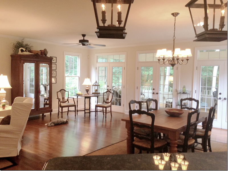
Any suggestion for anything will be sooooo helpful!Here are the pictures of my living area. We had a small family room that ended where the wing back chairs are and a kitchen nook. We felt so closed in especially when we had guests over so we pushed out the back of the house and added a screen porch
Now I need help with the arrangement of the furniture....TV....and lighting in my new space. Help!!
Here are the pictures of the space:
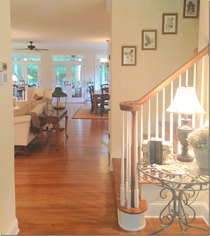
When you walk in the front door, the living room is on the left and the dining room is on the right. Then, past the staircase, the family room and kitchen is at the back of the house.
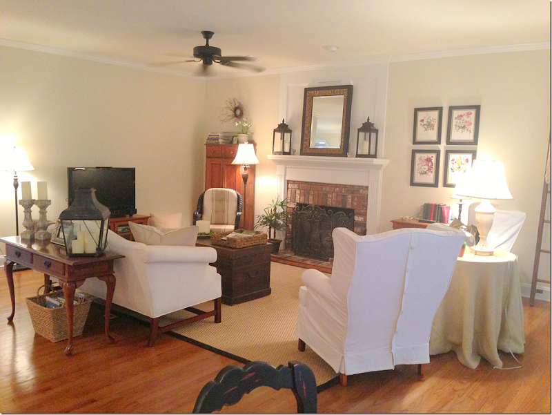
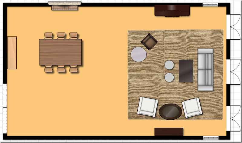
The family room is arranged with a sofa that faces the fireplace and two wing chairs that divide the space from the breakfast area.
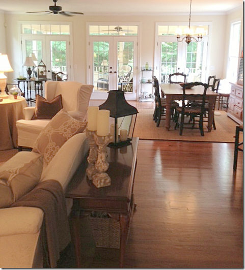
Here you can see the breakfast room area that was added on past the family room. It’s now all one big space. The kitchen is to the right.
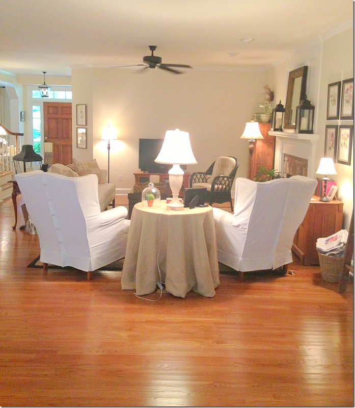
Looking from the breakfast room area to the family room.
Here you can see the area that was added on – a large breakfast room, along with a screen porch.
The kitchen’s bar is angled out into the breakfast room area.
The kitchen behind the family room.
The Solution:
First, I would like to thank you so much for submitting this design question. I’m going to address this as if you were a client. No holds barred!
I think you have a great look going, love the slipcovers and all your accessories. Love the lanterns too! It just needs some tweaking!
The first thing I would address is the floorplan. What struck me immediately is how unbalanced the room seems – everything is weighted towards the living area – while the dining area looks so empty. Additionally, the living area seems cramped and with the sofa floating in the room – it makes that area look even smaller.
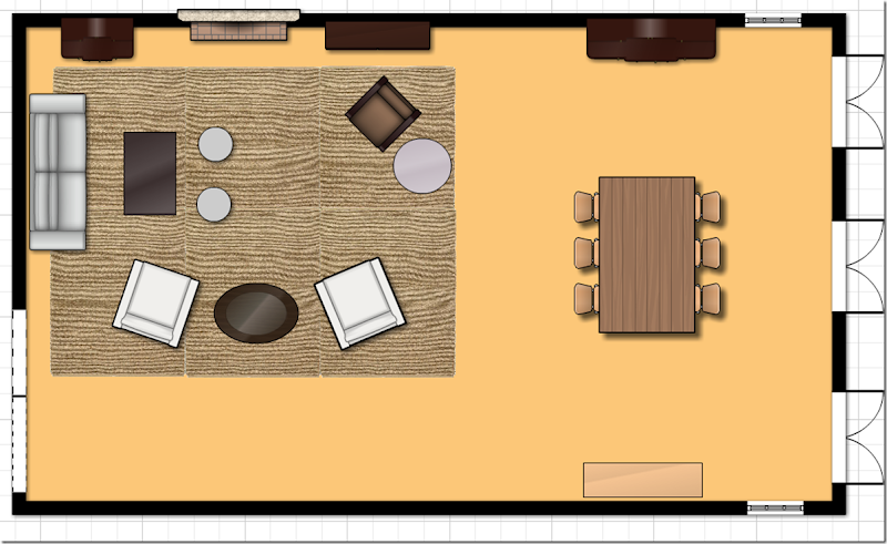
Probably the best solution would be to flip the rooms – put the dining room table in front of the fireplace (which an be lovely in the winter) and use the back room as the living area. Have you thought of this before?
I would move the furniture around like this:
I would float the sofa in front of the French door and use the armoire as the place to house the flatscreen. The white chairs would sit across from the armoire. You could always add two Kooboo chairs for more seating, instead of just your one wicker chair and, then add a few round ottomans. If the armoire isn’t a solution, you could put the flatscreen on the console and just move the white chairs across the room to flank the armoire. I would get two matching chandeliers for both the dining and living areas. This layout would solve the lighting issue – as you would be sitting near the windows. You could then add wall sconces on either side of the dresser in the dining area, along with a second pair that would flank the fireplace. Additionally you would have the chandelier for even more lighting.
While I know this is somewhat drastic, this might be something you want to play around with one weekend – move the furniture to get a feel for the layout. Try to live with it this way for at least 48 hours – that’s the minimum you should live with something new in order for your eyes to get used to the change!
Now, if that layout is too drastic, I came up with a second solution below:
1. The dining table should face the other way and be centered in front of the French doors.
2. Have an electrician come out and move your hanging fixture over the table. This really doesn’t cost a lot at all and you can easily patch up the area where the chandelier is moved from.
3. By moving the table, you fill out the back area and it won’t look unbalanced and empty. You can leave the buffet and armoire where they are, just flank the extra chairs around one of those two pieces.
4. Next move the sofa to the back wall. Then move the two armchairs where the sofa was, using the gateleg table, now in the back area, between them.
5. Move the accent chair to flank the fireplace.
6. Move the console table to the right of the fireplace and put your TV there.
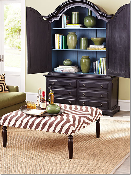
7. I like your trunk as a coffee table – but to gain more seating, you could always add an ottoman that doubles as a coffee table. If not, then add two small ottomans in front of the trunk to get a little bit more seating. I’m just not seeing any other way to get a lot more seating in here with the size of the space.

Restoration Hardware has a nice coffee table/ottoman.
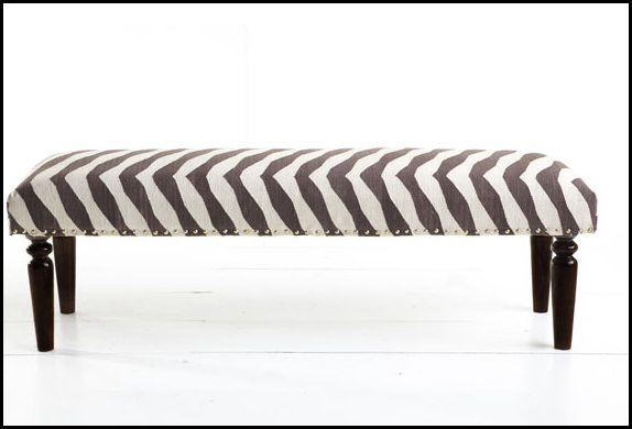
From Wisteria – I love this one because it adds a pop to the room like a zebra rug.
From Wisteria – this one is smaller.
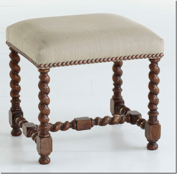
From Aidan Gray – you could use two of these in front of your trunk for extra seating and also as a footstool for your white chairs.
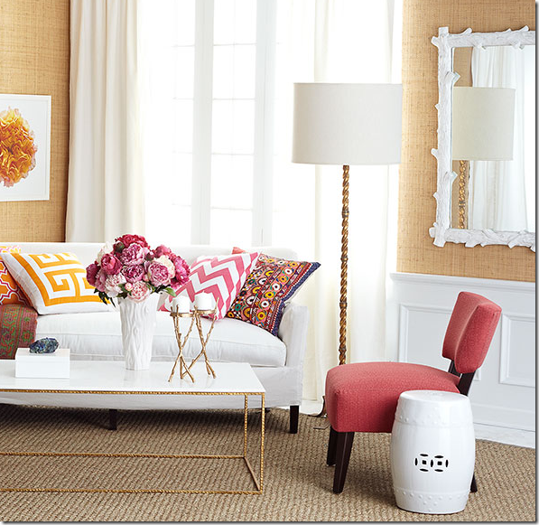
From Wisteria – you could place these around your trunk easily – plus they add texture.
From Wisteria – these are great looking for extra seating or footstools.
I would probably not use the skirted table, it looks a little dated – a small garden stool would be a nice alternative. Then, the lamp now on the skirted table could be moved to the gate leg table between the two white chairs.
One point - in the dining area, if your table is not long enough, I would consider saving up and buying a very long one that would fill out the space. There really is a lot of wasted space now and a nice, long table could make a huge statement. I’m not sure if your table is long enough or not without seeing it in person – but if you could use a longer table, I would try it out.
I found this extra long table at Restoration Hardware on sale at a great price.
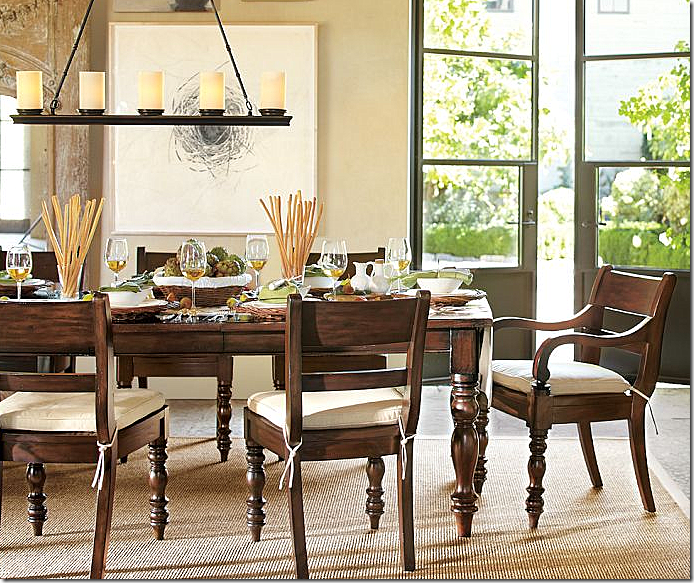
And this one at Pottery Barn.
As for décor – I would highly suggest getting curtains in a printed linen fabric. You would place the rod above the transom and stretched out past the window so the curtains cover the walls, not the windows, therefore not affecting the light. Then I would make two 22” inch pillows out of the curtain fabric for your sofa and two lumbar pillows for your chairs. Additionally, I would make chair slips out of a check or striped fabric that coordinates with the curtain fabric.
All this fabric will add so much to the décor of your room and make it look more thought out and designed.
Here are a few fabric ideas from our sponsor Lewis & Sheron HERE.
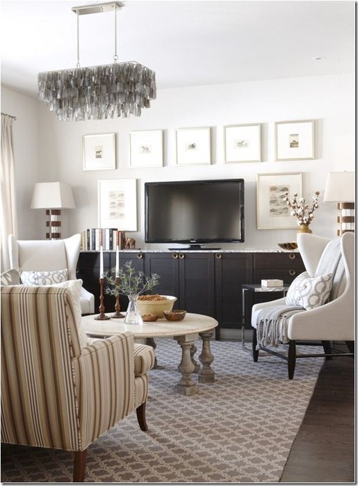
As for the TV – the best way to disguise a flatscreen is to surround it with art, prints or photographs. I tried hard to find the perfect picture to show you, but couldn’t.
The arrangement is perfect – and one I would emulate with the two pictures on each side and the ones above the TV – BUT, if these had dark frames and dark mats – the flatscreen would be more disguised. Instead, go for dark when surrounding the flatscreen. But – remember this arrangement, the proportions are wonderful.
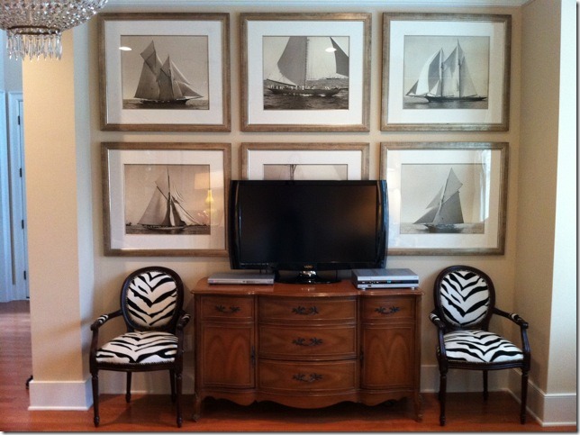
These prints COULD have been great – they are darker – BUT – the flatscreen has to BECOME a piece of the artwork, not be used to stand in front of the art work!! These prints are too big for the space. With smaller prints they could have FRAMED the flatscreen properly – but instead, it just doesn’t look good. The flatscreen should have replaced the print behind it and the other prints would have been centered around the flatscreen, but there isn’t enough room. AVOID.
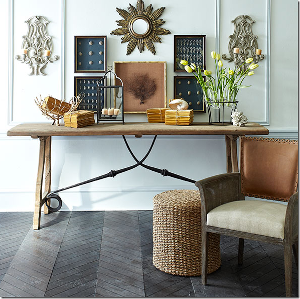
Now, imagine the seafan is the flatscreen – see how these prints surround the seafan on both sides evenly? And notice the dark mats – these would blend in with the flatscreen and make it disappear. Also – you could use a small mirror like this above the flatscreen for interest.
If you use your longer console for the flatscreen – you could also flank two lamps on it – adding more light.
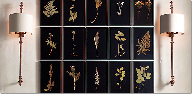
This series of botanicals from Restoration Hardware would be fabulous to hang around a flatscreen. Two on each side and five on top. The flatscreen would totally disappear.
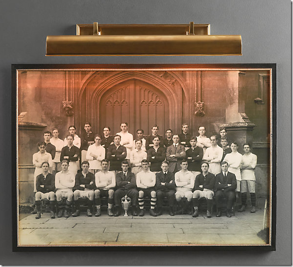
Lastly, I know you said more light is the issue – but without adding a window, I’m not sure how you can brighten the space without adding a chandelier over the space. If you do move your sofa, you could add a picture light over a painting on the back wall in addition to the two standing lamps.
Restoration Hardware
You could always add four recessed lights in a square about the living area to get more light. It looks like you already have two there.
Or, you could get a ceiling fan with a light kit.
I’m not a huge fan of really well lit rooms and only use low watt bulbs in my lamps and chandeliers. In my chandeliers and lanterns, I only use 7 watts! But that’s personal, I suppose! I keep all my sconces and chandeliers and lamps lit during the day – and then at night, as the room gets darker, it gets more romantic. Brightly lit rooms are such a personal choice. To me – your room looks light enough.
Still, you can get more light by adding two lamps to the console table against the wall and by moving the lamp from the skirted table to the gateleg table, you may gain enough light.
If you do consider adding a chandelier over this area – I would probably get two that match – one for over the dining table and one for the living area.
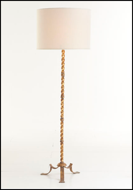
For your floor lamps that flank the sofa, I would be sure to get two matching ones that make a statement. These are from Wisteria.
And from Ballard Designs.
I hope I have given you some things to think about and help you out.
If anyone has any suggestions – please leave a comment!!
And don’t forget – the French antique giveaway ends this Saturday night at 11:59 pm!
Go HERE for all the details.






My first thought was flip flop the rooms also. I think Joni is right about that. A long table would look lovely in front of the fireplace. It's more natural to walk straight from the kitchen to the dining area too. Actually all of her ideas are great. I would paint some of the small wood cabinets and tables to limit the number of wood tones in the room. Please let us know what you decide and send photos. You have a beautiful room to work with. Good luck and have fun.
ReplyDeleteFirst, you have a very lovely place! Very warm. I agree with the above suggestions. I don't think I like the tv by the fireplace though. Very limited visibility from other areas of the room. I think your tv needs an armoire. I just don't personally like consoles. I like to be able to hide the tv if I want. I love all of the furniture pieces that were suggested to you. BEST of luck!
ReplyDeleteLove the first and the second idea. Yes, Please send updated pictures... your home is already beautiful but I can't wait to see how it turns out.
ReplyDeleteI think this is one of my all time favorite posts! I love your suggestion for hiding the flat screen, especially. :)
ReplyDeleteJoni...this is pure inspiration! Fantastic solutions and workable. I luv "Wisteria." franki
ReplyDeleteThis homeowner has a great beginning and your suggestions will help pull it together for her. I love the fabric suggestions you made and especially love the RH botanicals for hiding the flat screen!
ReplyDeletexo
Mimi
Your blog inspired me once again....love your idea of disguising the TV with surrounding art!
ReplyDeleteI can't wait to see what the homeowner decides based on so many great suggestions. Please send pics to Joni for a follow-up post.
ReplyDeleteA big screen TV and a fireplace coexisting in a room can be a real challenge. I'd like to be able to see the screen from the kitchen and or breakfast area but not possible with my floor layout. Great suggestion to swap areas. I've considered it myself. It's a great room as is so I can't wait to see the follow up. Be sure and keep us updated Joni.
ReplyDeleteAs many stated in a prior post, there are many challenges that a homeowner gets confronted with in open floor plans. This is a prime illustration. I think you have offered two thoughtful solutions. The only thing that seems problematic about them is the multiples of chandeliers and/or lanterns hanging down from the ceiling all of which occupy the same visual space. The homeowner has to be careful that it doesn't take on a retail lighting store look. I like the idea of flanking the tv with interesting prints. I think the owner needs to find a taller table for the tv, however.
ReplyDeleteyeah, i agree about the chandeliers. but - you need light ever both areas. not sure how to handle that - that's why i said get matching fixtures.
DeleteWhy not hang the tv (you could get a larger flat screen) and go ahead and hang it over the fireplace...it could be done. Find two matching pretty painted chests for either side of the fireplace with matching lamps on the chests.
ReplyDeleteTV's are not going away...and you could then see it from the kitchen and from all over the living room.
And then do move the dining room parallel to the back wall as per Joni's suggestion.
I love the idea and look of switching the room locations. ThWe spent so much more time in "living Spaces" then dining spaces, so I like to locate living spaces by the outdoors. I love lanterns, however I would consider less lanterns used for decor purposes in one space. What a great space to work with. Have fun reagganging if thats what you choose to do!
ReplyDeleteGreat tips, as usual, Joni! I agree about flipping the two rooms, and I love your ideas for disguising the TV.
ReplyDeleteMy first thought when I saw the french doors in the back was that they need panels, just like you described, so they would not block any of the light.
I really like both of Joni's floor plans --- but I know how people like to have a fireplace in the sitting area. I would choose the second floor plan with the fireplace in the sitting area especially since you already have the large armoire to balance out the other area -- you could leave it where it is and use that area for the table and place it like Joni suggested. The sitting area would be more enjoyable and cozy if it included the fireplace. Very nice addition -- thanks for sharing your home with us.
ReplyDeleteSusan in Charlotte N.C.
Agree about flipping the spaces and about using the TV as a "black op" for art. I think the dark botanicals would be fantastic. I think having bookcases on either side of the fireplace and filled with books, not stuff, would add a library/dining area that is warm and welcoming. Joni's fabric choices fit in with the garden feeling of the room. The color of the flooring dominates the space and too much of the furniture is the same color so that it all gets a bit lost. The lamps from Wisteria would be a handsome addition. Will love seeing what you do with your lovely space.
ReplyDeleteNice potential in this space and Joni gave two interesting solutions. I would probably go with the second. Regarding the way to put art around flat screens. I agree with what you said regarding the first grouping, but do not object at all to the one with the larger scale sailboats and I will tell you why. When I first looked at it, I immediately was drawn to the art/prints, not the TV. It was only after I started reading your comment about it being too large that I really noticed the TV. It had the effect of minimizing the scale of the TV. I am particularly aware of scale and balance when I design a room and an art wall, so I was surprised about my initial reaction. I loved the fabric choices you gave her, and especially hanging curtains on the back wall. I believe I would also change out the fans for ones that would coordinate better with her light fixtures. They have some lovely ones now, where she can add a light kit, since she mentioned it being dark. hope she will show us some after photos. Nice post!
ReplyDeleteGreat suggestions, Joni, and I agree about switching the layout. I particularly like the idea of using dark framed/matted artwork to surround a flat screen. What a terrific idea - wished I'd thought of it.
ReplyDeleteme too!!! i didn't! i saw a picture of it once but couldn't find it again. it's a great idea though.
DeleteI love the idea of switching the two rooms. Joni has given some wonderful advice. About the only other problem I see is your furniture. No, your furniture is perfect but it’s all the same size and height you need to have some highs and lows but if you switch rooms and leave the armoire you’re off to a great start. I personally am going to try Joni’s idea for masking the TV. Great advice Joni!
ReplyDeleteXXX
Debra~
HI Joni, Flipping the rooms is perfect !
ReplyDeleteAlthough we did not talk about the porch;the family room and porch could be visually pleasing with matching/ coordinating fabrics , panels, pillows etc!
xoxo
Karena
2013 Artists Series!
Love the first idea. And how nice to eat in front of a fireplace....what a setting! The TV still competes with the fireplace on the second arrangement. Brilliant Joni!
ReplyDeleteGreat ideas! I actually used two of the small AG ottomans as my coffee table/foot stools/seating. My living room space is small. When entertaining in there I put trays on them for drinks. Can't wait to see the transformation.
ReplyDeletereally? they are soo nice, love those!
DeleteBoth are great suggestions, Joni. My only thoughts about the first one is the placement of the sofa in front of the French Doors. It seems to me that the homeowners use the middle one to access their sun room. Blocking it with a sofa may therefore be impractical. I mention this only because we had a similar situation in our previous home. Bebett
ReplyDeleteJoni, I always look forward to this series! Great ideas and flipping the rooms is a wonderful solution. Have a great weekend.
ReplyDeletexx,
Sherry
What a wonderful space. The homeowner has definitely picked out some wonderful pieces. Joni always has great advice, but I would like to propose one more layout. The first thing I noticed was a proportion/scale and leg problem. I see too many furniture legs that are all different, thick, thin, curved, straight, different color and types of woods. I think the three areas seem a little disjointed, a little too separate from each other. Also, several pieces are out of proportion with others, i.e. the lantern and candlesticks behind the sofa are too large for that table. The area that works best for me is the small table and two chairs by the window with the armoire. I love that. My suggested layout is two sofa's back to back where the two large chairs are. (It is a little hard to tell from pictures, but I think that there is enough space for this.) Keep the small table and chairs by the window and you now have a seating area for conversation or reading that is more connected to the space. Possibly move the large armoire and put the tv in it where the tv is now, and add two chairs, Kooboo would be nice, where the sofa is now. Now one of the sofa's if facing the tv for more comfortable viewing. I would switch out some of the other pieces as Joni suggested, coffee table, skirted table, dining table, to make the woods and table/chair legs a little more cohesive, along with fabric on the windows and matching ceiling fixtures. Can't wait to see what the homeowner does, she already has such a great start, just a few changes and it will be fabulous......Julie Richards
ReplyDeletei, too, really like the 2 chairs and gateleg table corner. back to back sofas would be wonderful, solve the extra seating needed and the cook could have more interaction with guests. plus there is that floor plug to be considered and this solution would cover that too. suzi
Deletegood idea - but back to back sofas - wouldn't that hang over too much into the dining area? need to check that out. but it's a good idea.
DeleteAn actual "back to back" sofa like this one from Old Hickory Tannery might take up a little less space than two back to back sofas:
Deletehttp://www.gilt.com/brand/old-hickory-tannery/product/165224453-old-hickory-tannery-chamberlin-tufted-double-sofa
Validation !
ReplyDeleteHave a Japanese book, over a century old, with over 50 hand coloured ikebana plates. Still virgin. The bookseller, now dead, asked me if I was going to sell the pages, "No." Said I was going to break it and hang them in my bedroom like Monet's dining room.
TV wall. Had thought of finally framing 20 or so of them and hanging massed.
Thank you Joni.
Looking forward to choosing the black frames...
Garden & Be Well, XO T
send pictures - that sounds fabulous!!!!!!!!!!!!!!!!!
DeleteFirst of all, your home is very pretty... very fresh and clean looking. I don't care for the idea of "flipping" the two rooms personally because from the photo angles it appears when you enter the house you would be walking into your dining room from the front door and your fireplace would get substantially less use. Artwork around the TV is an excellent idea. Perhaps you should consider a larger less formal sofa with an oversized ottoman and move your chippendale sofa and trunk coffee table for an additional seating area in the armoire area.
ReplyDeleteWhatever you do. Please do not put the flat panel in the antique armoire! Not only would you ruin the piece by having to drill a hole in the back for cords, I highly doubt it would fit the TV and all of the TV components.
ReplyDeletewell, i have an 18th century armoire that we put our flatscreen in. we added one shelf and put a small hole in the back for the cords. i don't feel like we diminished the value at all - instead, someone would one day want to buy it because it's already outfitted for a flatscreen.
DeleteI use mirrors to reflect light. The wall with the TV is a dead space, but a perfect spot for mirrors because it would reflect light coming from the french doors. A wall of curated antique mirrors from flea markets, ebay, antique stores would be brilliant there like these:
ReplyDeletemirroshttp://greigedesign.blogspot.com/2012/04/euro-trash-at-home.html
Try this link instead. Third picture down from House Beautiful
Deletehttp://hellolovelydecor.blogspot.com/2012/04/house-beautiful.html
that house is so gorgeous. the blog - http://ahouseromance.blogspot.com/ interviewed the owner/designer - wonderful article.
DeleteThanks to the reader for sharing her beautiful home with us. I feel like it would be a warm and cozy place if I had the opportunity to visit in person. First, it looks absolutely wonderful just as it is and my guess is that it took some time, effort and energy to get it this way.
ReplyDeleteHere are a few of my initial ideas.
First, I think curtains would absolutely make the room. I LOVE the fabrics Joni suggested.
Second, I like the layout of the rooms and feel that maybe the space in between the eating table and the two chair setting by the windows may not be as far apart as they may seem after looking at them in several of the photos. While you can't see it very well in the photo, I believe there is a buffet running parallel to the table. If so, I love the placement of the table. One thing that hit me was that the two chair setting in the window corner has a lot of legs. Maybe two wings or the Kaboos that Joni suggested would create more of a balance with the heavier table side of that area. Maybe you would even have room for four chairs and place them facing each other. Again, the Kaboos would be fantastic.
Third, I do like the family room, but might suggest a few things. As much as I want to HIDE all the TV's in my home, it really is not practical. It is what makes many comfortable. (Note: We just bought a new house and I am fighting to the death NOT to put the TV's above the fireplaces) At any rate, the first thing that popped into my head when I saw the TV in this house was that it needed a larger piece of furniture under it. I would put the TV on the wall and feel the suggestions about art surrounding it are fantastic. (Again, Joni makes the best suggestions) It seems that that wall is the biggest in that room and could use something larger. With his suggestion, the tall wood piece in the corner would need to be moved to another location even though it is a really nice piece.
Fourth, I love the black (?) wicker chair, but my first thought was to paint it a lighter color. Perhaps something to coordinate with the curtains. I am not certain this is the right thing to do...just a gut thing.
Fifth, I think the sofa table painted a creamy color could be really pretty. While I love the lantern on it, it seems a little large...maybe it is just the picture. I might try some beautiful greenery (ivy,fern etc)in a cool container.
Sixth, Perhaps a wooden table instead of the skirted table would provide a nice contrast between the two white slipped chairs.
Seventh, My first thought about the two tall lamps was that they just did not seem to go with everything else. I am not sure why I think this...maybe the shape, maybe the shades. I just feel there are some really great ones that would put this room over the top!
WOW, I have never put my thoughts down on another persons home before. I hope I did not say anything to upset the reader. It takes a lot of guts to put your home out there for review. I realize if I did this to mine, there would be lots of suggestions too. I just hope one of these ideas helps. Also, I just love home decor and these are just my thoughts.
love this!!!!!!!! so many great ideas!!!!!!!!!!!!!!!!!!!! thank you for submitting this comment. i hope she reads all of these!
DeleteThis is such a wonderful post Joni! I didn't even have to ask the question that I too needed answered! Thank you for the wonderful tips for making the dreaded flat screen sort of "go-away". Brilliant ideas that I plan to implement myself! XOXOXOXO!!! Carmie
ReplyDeleteWhat a lucky person to have such great suggestions. And the house really has so much going for it. If he/she takes a poll of what commenters thought, put me square in the camp of the first Joni-suggested layout. There is nothing more fabulous than a dining room by a fireplace. Oh the dinners. Oh the games. So much goes on at a dining table. Love the casualness and heft of the one Joni showed from RH that is currently on sale.
ReplyDeletegreat advice and LOVE the floorplan :-)
ReplyDeleteOverall, a very good looking room already. As several others have commented, the drapes will "make" the room. I like Joni's suggestion to flip the spaces. We rarely use our fireplace except in the evening so having it near the eating table is very cozy. I agree that the room is very "leggy" right now. However, once the drapes are in place it may not look quite so stark.
ReplyDeleteTwo suggestions:
1. Do not add any more hanging lanterns. There are plenty in the room already. Add a large fixture in a dark metal to match the metal in the lanterns. If the table is still in the window area, hanging lanterns will be too busy. A very large solid, single fisture like the one with the faux candles would look very nice.
2. Consider having the slip covered chairs opposite the couch. Better, yet. Split up the slip covered chairs so that there are not too many of the same look so close together. Perhaps one or both of those chairs could be slipped in a fabric to harmonize with the drapes.
Over all, a beautiful home. I know we are all looking forward to seeing it when it is finishd.
(I have to laugh because I have about 1/2 of the same pieces in MY home but not necessarily in the same colors!) BTW - I have the Bird of Paradise fabric (called "Olana" when Waverly produced it) as drapes in my family room. The pattern is so pretty that I wish I had used it for chairs and/or pillows instead. One of the geometrics will looks better as drapes.
Smiles from My Slice of Provence,
Charlotte Des Fleurs
The homeowner requested advise for 1) additional seating 2) darkness in the middle of the day 3) TV area
DeleteI don't think the room looks stark and I love all of the lanterns.
We can read! You may love All of the lanterns, but there are too many hanging fixtures as it is and the lantern shape has been repeated too often in the design already.
DeleteCharlotte Des Fleurs is that you posting as Anonymous once again to defend herself? You're just too much!!!
DeleteActually no. Just another anon that finds your reply arrogant and condescending. Any more Questions?
DeleteI love the space already and I think with Joni's suggestions, it will be even more beautiful and livable for the family. I love the idea of the dining area by the fireplace-- I wouldn't have thought of that. And thanks, Joni, for sharing such detailed thoughts with us! I really like the suggestions about pictures around the TV, but thing big huge armoires are kind of silly because when they have a TV in them, they just end up sitting there opened all the time, taking up more space. I, too, used to be completely against the TV above the fireplace (and in this case agree that the fireplace would be great for dining), but most people want to enjoy their fireplace and TV, so which do you face unless everyone has swiveling chairs? We All use TVs and while I hate to treat them as altars, they certainly are an important part of most American homes (for better or worse!) so we might as well incorporate them instead of pretending they will go away. Love the black matted prints you showed and will think about copying that idea!
ReplyDeleteSo difficult to do what you do, decorators, from pictures. My 2 cents, I have found that a well lit room with windows opposite a TV makes it nearly impossible to watch until the sun goes down. To be avoided if possible. Even with draperies, the brightness reflects onto the screen. We have this problem, even if we have dark draperies the reflection means TV can only be seen from some angles.
DeleteI also don't think the rug is large enough, and I personally prefer a faded Persian, Oriental, or even a tribal rug of some kind to avoid a too homogeneous and catalog type look. The armoire is so lovely, and drilling the back would destroy it, if it' s valuable.
The large lantern seems too large for a tabletop, since the lanterns flanking the mantel are smaller, unless it was part of a more eclectic, or even cluttered table scape.
Draperies and patterned pillows would personalize the space more.
I love a "collected" look...but all the pieces are nice. Adding warmth through textures and patterns, especially under some of the leg giver prices may take care of the stark look mentioned by others. The white walls look a bit too bright because of the lighting? Lovely home.
The walls are linen white which is a creamy off-white with a yellow undertone for added warmth. It's perfect not too bright.
DeleteRight on target Joni.
ReplyDeleteEnjoyed this post!!
Leviheart@aol.com
This post reminded me of one of your posts I bookmarked December 3, 2012 "Family Room Updates!" It was about the placement of your own flatscreen. Did you ever make any updates to your staircase wall with the flastscreen? Your art idea would be perfect for you too since your TV was hung off center on the wall but centered for couch viewing.
ReplyDeleteno. my problem is my tv is huge and there is not equal space around it- the stairs are on the right and the left side is empty. so i can't surround my tv. but now that it has the wine table underneat it- it seems much more grounded and not as huge. i thought i showed a pic of that.?
DeleteJoni, great ideas, however I am just wondering about TV viewing. In our home we all like to sit on the sofa and have that face the TV. In your plans you have to turn your head if you are sitting on the sofa. Not very comfortable. What do you think?
ReplyDeleteit looks like they sit on the those two white chairs. i figured they could pull the tv off the wall if they do plan #2
DeleteI would suggest moving the armoire to another room as the style, including having mirrors, makes it look more appropriate for a bedroom. Perhaps then you could spread your seating area back into the space that's left so that it doesn't look cramped. You could have dual seating. One that encompasses the fireplace and one that accommodates the tv which you could put on the wall where the armoire now stands. I would also eliminate some of the lantern shapes. You have five within eye sight of each other and the theme looks a bit over done.
ReplyDeleteIts really nice to see your blog. All of your creations are awesome. your color selection is very nice. and you have a innovative thought. I like it so much.
ReplyDeletechennai modular kitchens | chennai interiors
Another great post! Seeing how your process of design works is fascinating.
ReplyDeleteRuth
I honestly like this layout, it's so cozy, I seriously like modern design. We already have several designs like this in my household.
ReplyDeleteAnny from painters san jose
Hi, great house and good job. I did not spend a huge amount of time studying these two rooms but the first few things that popped out at me is a lack of color and pattern and scale issues. I agree that some draperies will do wonders to these rooms and the choices Joni picked out are gorgeous. Maybe even a large striped rug in one of the rooms will work as well. I also agree that the dining room table needs to be flipped the way Joni suggested. As far as the living room goes, an easy fix is getting a larger scaled console for the TV. You have a very large, blank wall with a very small console supporting the TV. I would get a large console, remove both pieces on either side of the fireplace and add two large scale chairs in their place and add something symmetrical in terms of art for both walls above the chairs, add an ottoman in front of the fireplace and add a ceiling fan that has lights in it to address the lack of lighting. In addition, if you get a much larger console to fill up that wall you could add two lamps on either side of the tv. Beautiful home. I hope this helps.
ReplyDeleteYou definitely have talent and you are very professional. I am amazed how much attention you give to small details and the result is impressive. I read your blog for a few months but after this post I`ll be your no 1 reader
ReplyDeletethanks! you are sweet!
DeleteEveryone needs to get off the whole lantern thing!!! Why are they bothering you? Just chill out!! The homeowner didn't ask for your opinion about them. Go back and read what she asked for advice on. They look adorable
ReplyDeletei thought so too!
DeleteShe may not have asked out of ignorance to what they look like hanging in the pictures. You cannot really evaluate this home without addressing the lantern shape everywhere. Not good design!!!
Deleteso nice
ReplyDeleteLove this home, and her pieces are beautiful. I love the sofa, but I am big on comfort and it doesn't look that comfortable to me. I love the ideas Joni has presented and I've loved reading the other comments. But I have a question I hope some of you can answer. I have a sofa we are going to reupholster and re-do the cushions (it's a Henredon, and I've been told I can buy replacement cushions from them.) Everywhere I look, I see light, neutral upholstery. While I love the look, how practical is it? This sofa is in our den and we live on it. I am so worried it will look dirty and worn. We have a brown leather recliner (really a pretty chair, it is not you typical Lazy Boy recliner) and I am getting another chair for the reading nook in this room, that will also be neutral. We will bring in color with pillows, accessories, lots of blue and white. So again, my question is this, how practical is light color upholstery? Please be honest, our kids are grown, it's only the 2 of us at home.
ReplyDeleteThanks!
I have white slipcovered furniture all over my house and haven't even had to wash it in many years of use, but I could--even bleach it if needed when I get a wonderful grandchild some day! I love it and would highly recommend it. It's also great because Lee Industries keeps its patterns forever and I can reorder slips anytime out of any of their fabrics. Nell Hill in KC is the best place on pricing in the midwest.
Deletein all honesty you do have to be more careful with light upholstery. slipvovers are a different story. i like my slipcovers fresh, so they get washed often and it is a chore. if you're not doing slipcovers and you see your husband on your newly upholstered light sofa in new blue jeans, reading the newspaper with coffee and his feet up you'll go crazy.
DeleteLight furniture was easy for me and my husband. Then my father-in-law came to live with us and the sofa now has coffee stains and other stains that I suspect are from his eating there even though we've asked him not to. (I had a gentleman standard poodle and the couch concomitantly for three years and as long as I kept his seat covered, no problems from him.) We moved, and now have a TV/FIL zone. Guess where the favorite couch went? I haven't bought one for the living room yet, as I am still juggling the look I like versus the practical side-- stained is NOT what I like. I do want the peace of not having to be all precious in that room. It is not enjoyable to be irritated with people you love for choices that they don't remember are not appropriate. Who knows what will happen when we have kids? Anyway, feels like a failure of housekeeping to me to be unable to remove the stains. I had cleaners come out, but they wouldn't touch it for fear the linen would shrink. Slipcovers would have been a better idea... but still, more work? Good luck with your choice!
DeleteElizabeth
I have two young children at home with a cream colored upholstered sofa. We do not let them eat on it and have had it professionally cleaned once in 5 years and besides a wine stain I cover with a pillow (my fault), it is fine. However, I think when it gets more worn looking I will get a slipcover made because I like the shape. Highly recommend slip covers!! I had a set of white ones made (copying a picture shown by Joni) three years ago. I was them with bleach every 1-2 weeks or more of necessary. These things have seen it ALL-- spaghetti, red wine, Cheeto fingers, blueberries, chocolate, etc and once washed and ironed, they are great between the bleach and spray and wash with resolve. I imagine sofa slipcovers are not as easy to deal with the on/off, but you'd have to do it a lot less often.
DeleteLove all the ideas and suggestion! I WOULD put the TV in the Armoire and know from experience that shelving can be added and a few drill holes are just fine! I would advise editing a lantern or two. Can't wait to see the drapes which will soften the room
ReplyDeleteJoni, great post! Many people do not understand how important scale and balance is! The home above can be lovely with like you said just a little tweaking. This post helps me understand why I do what I do instinctively and I love learning from your experience. I am trying to be better about commenting!
ReplyDeleteHomeowner: I love what you've done with the place. LOL!! It really does feel homey. LOVE, LOVE, LOVE the screened in porch. Here's a suggestion...maybe you could swap that iron table from the entry way with the skirted table in the living room setting. You have several wood elements in the living room space, including the floor so perhaps try the iron. Also, and I know, I know...this one's a doozie; but, the ceiling fans...oh the ceiling fans. So, if you are in Texas...didn't notice the location...or anywhere in the South, the fans are a necessity. But something is off on these pictured. Maybe the scale...maybe just the design. Some matching iron chandies may look better.
ReplyDeleteDISCLAIMER: I have horrendous fans in my family room and I have lost the battle of the sexes. The cieling fan stays....ugh. *hangs head in shame*
~texassky
I love your pantry door painted black (I'm guessing it's the pantry), and I think you should paint the other two doors black too (one going out of the kitchen and one to probably a coat closet behind the sofa. Maybe even paint the french doors black too?
ReplyDeletehttp://www.myfavoriteandmybest.com/storage/black_door_highstreetmarket.jpg?__SQUARESPACE_CACHEVERSION=1298208967157
Hi Joni-
ReplyDeleteI have a question for you. I just had a Pottery Barn sectional that i have had for 8 year reupholstered in a linen color. I had pillows made in one of the fabrics that you suggested (second row far right). I also had 2 solid pillows made in the darker brown color found in that fabric. In the room i have a big leather ottoman that sits in front of the couch. It to came from PB (i hope people don't go off on me for having PB stuff. I actually worked there for a while. Who can pass up the 40% discount, especially when you have kids using the furniture on the daily) Anyway, back to my question... I want to have a a slip cover made for a smaller ottoman that i have that can be used for extra seating in the room or as a end table for one side of the couch. I was wondering if you would put one of the other fabrics that you listed do go with that ikat fabric pillows...if so, which one? i was thinking maybe one of the stripes?
I would so appreciate your expert advice:)
Thank you to Joni and the homeowner for sharing. What a beautiful space and you have some great looking furniture. I really love those wing-back chairs. Okay so here's what I think:
ReplyDeleteWhen you look at the lounge area, it seems to be the two wing backed chairs are taller than the couch and I was thinking maybe that's the reason why the owner put an over-scaled lantern on the table behind the couch to compensate for the height difference between the chairs and couch. I also agree with the above comments about the size of the t.v. console, there needs to be a piece of furniture with more presence bought in and I also think the mirrored armoire would look better in a bedroom. The two chairs with the gateleg table in the corner, one of those chairs would look better as the occasional chair as it has better lines, not crazy about the one there now. I was also thinking if the owner wanted to keep the lounge area where it is now to maybe thinking about a wall cabinet of sorts with the centre for the t.v. and doors underneath for storing things and nice trim to finish it off. I'm thinking the furniture before was fine for the space but now that they have added on it completely changes the whole look.
I as many others have stated would love to see what you do. Again great bones to start with Love those wb chairs!!! Just sayin'
Joni hope you and your family are well.
Take care
Janine
XXOO
Your space is very lovely and has great elements. As an interior designer myself I would love to see the dining room near the fireplace, this could open up for two seating areas due to the amount of space near the back of the home. I would also suggest a muted pattern rug. Please post results in future.
ReplyDeleteAlso, you must live with it for a few days as was suggested, then try something else.
Pam
Hi there and thanks for this interesting and important post.I really enjoy your post Really its amazing.
ReplyDeletecarefree estates
There is a blight of neutrals. Thank heavens she didn't decorate with Gustavian white distressed furnature, or else I'd scream. Even a recent article in World of Interiors mentioned the overload of this tone on tone. Houzz is full of white/neutral rooms. Can we think of something else????
ReplyDeleteReally great work. Thanks a lot for sharing this information with us. London Escort Busty London escort 24/7 with beautiful london escorts at PalaceVIP. We are the leading escorts London agency, providing world class booking services. Call:0750 8580 736.
ReplyDeleteLots of great ideas from Joni and commenters (before the thread got hijacked at the end). In favor of the TV as part of a picture wall -- we've done this and are very pleased, functionally and visually, with the outcome. Because we moved french doors from the center of the wall to the end (primarily to free up space for a flat screen in the living room and built-in bookcases in the entry hall) we were able to build a recessed niche to accommodate the TV. This makes it flush with the profile of the surrounding framed pictures and other artwork, further playing down the "tv is the center of everything" appearance. We carried the picture theme around to other walls too for balance. Frames are either black or medium to dark colors and metallics (I prefer a collected over a designed look). Now the TV has an equal, but not greater, visual weight relative to other displayed pictures and objects. The niche is a little larger than a 55" TV screen, which is the largest size that is practical for our not-so-big room.
ReplyDeleteI also agree with several commenters that the TV on the wall would look better anchored by a longer piece of furniture below it.
Thanks, owner and Joni for sharing this!
I still like the look of seagrass, etc which you wrote a great piece about once. Do you think it is still "au courant" or are you moving away from it. Also, I don't find that the tape binding lasts well because of foot traffic stains. Any thoughts on the look without the binding? Thirdly, I have a large living room and am thinking of getting custom cut diamond pattern seagrass, jute, etc. or a wool carpet with the same look. Do you have a rule of thumb on how much wood floor you like to feel modern? My mother's generation usually did a 12 in. reveal but I don't want it to look dated. Lastly, if you use wool that looks like a jute/seagrass feel do you have a go-to rug and color?
ReplyDeleteAccommodation Brisbane Compare Brisbane hotels and save up to 70% with accommodation in hotel rooms, apartments, resorts and hostels.
ReplyDeleteThanks for Posting ! first time I have found a genuine post related to Family Accommodation Brisbane
ReplyDeleteI just want to share a recommended place to have a family vacation: --- > all inclusive travel deals
ReplyDeleteevery little bit of it and I've you bookmarked to take a lo Hotel Di Jakarta Pusat Cream Pemutih Produk Pemutih Muka online shop baju korea tas import Rumah Dijual Alam Sutera Rumah Bintaro Apartemen Alam Sutera Apartemen Tangerang Rumah Alam Sutera Rumah Tangerang
ReplyDeletecated this board and I discover It genui Krim Pemutih Pemutih Kulit Krim Pemutih Muka baju gamis pusat grosir baju Rumah Dijual Bintaro Rumah BSD Rumah Dijual BSD Rumah Gading Serpong Rumah Dijual Gading Serpong
ReplyDeleteot at all seem to get one thing done. Grosir Baju Korea Rumah di Jakarta Utara Jual Apartemen Apartemen di Jakarta Utara Jual Rumah Apartemen Murah di Jakarta Barat Produk Pemutih cream pemutih muka Tas Branded Murah Jual Rumah Rumah Di Alam Sutera Jual Apartemen
ReplyDeleteI truly appreciate this post. I have bee bintaro sektor 9 bintaro tangerang cari rumah cari rumah bintaro cari rumah di jakarta timur cari rumah di jual cari rumah disewakan cari rumah murah di bintaro cari sewa rumah cluster darwin cluster flamboyan alam sutera cluster murah di bintaro daerah bintaro Jual Rumah Rumah Di Alam Sutera Rumah Alam Sutera Rumah Dijual Bsd Jasa Bangun Rumah Tentang JRB Multipro Indonesia Arsip JRB Multipro Indonesia
ReplyDeleteabilities has encour grosir pakaian wanita grosi baju korea tas import branded butik tas online tas branded grosir tas branded grosir baju korea importir tas branded supplier busana muslim supplier baju korea baju anak import baju atasan wanita baju atasan wanita terbaru baju baju murah baju branded baju branded murah baju dress murah baju dress online baju dress terbaru jual baju wanita
ReplyDeletelog and look forwardjual pasir jual paving tips merawat rumah contac jrb multipro jasa bangun rumah jasa desain supplier busana muslim supplier baju korea baju anak import baju atasan wanita baju atasan wanita terbaru baju baju murah baju branded baju branded murah baju dress murah baju dress online baju dress terbaru jual baju wanita jual baju import grosir pakaian wanita
ReplyDeleteHey very good information there..
ReplyDeletecould you help me out with by comparing the prices on different websites
Treasure Box
Catering Jakarta
ReplyDeleteCatering Jakarta
Catering Jakarta
Catering Jakarta
Thank you so much for writing this great prasmanan post. Those prasmanan explanation given is really comprehensive and prasmanan information are very useful for me. I've learned so many prasmanan things from here. I'll bookmark your prasmanan website and come back soon. Appreciate your work and thanks for providing such a nice prasmanan sharing.
ReplyDelete