BEFORE:
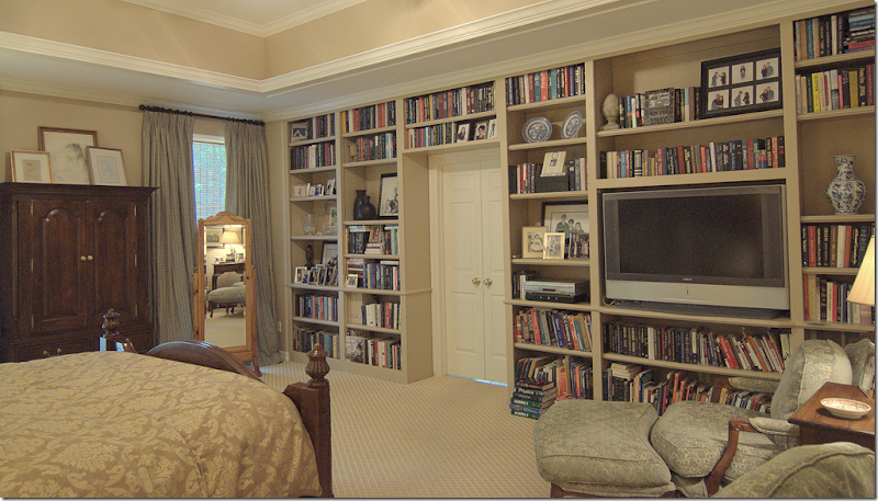
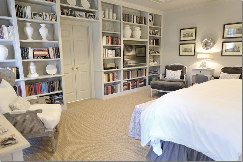
About twelve years ago, a client asked me to update her bedroom. It was very large and it seemed cold and empty. To warm it up - I designed this large bookcase along the wall that leads to the bathroom and closet. She had run out of shelf space, and need a place to put her TV and extra books – so it was a welcomed addition. At the same time, we also added more shelves like this in the study and on the large upstairs landing.
As for the décor, my client had all her gold bedding and a skirted table from her previous interior designer, so I just added some blue and cream check curtains and had her pine armoire stained dark. I also had her replace the beige carpet with this flat gold and cream trellis. A decade later, it was all in need of an upgrade. The Tuscany gold was definitely dated and everything looked worn and shabby, especially the carpet where there was a path that had worn in it to the bathroom door.
For her new look – my client wanted something calm and soothing without bright colors or patterns. Certainly no Tuscany gold! And while we needed to make a lot of changes, we tried to keep the expense down. When my upholsterer proved too expensive for her – she found her own to save some money. Other clients – don’t get any ideas!!! This client is a criminal judge and I dare YOU to win an argument with her!!!!
OK - Here’s what I came up with:
AFTER:
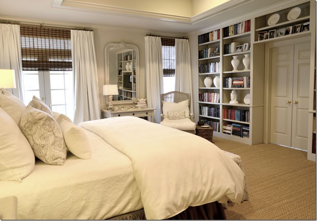
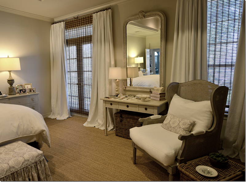
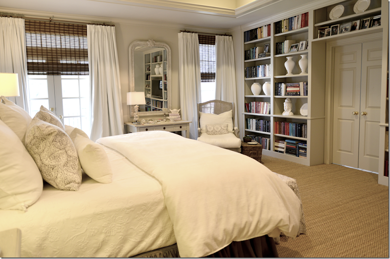
The biggest change was we painted the entire room in Pratt & Lambert Feathered Gray – all the white molding from the 90s was painted gray – as was the ceiling and tray ceilings (oy! – more 90s architecture!) Another big change was we installed wall to wall seagrass.
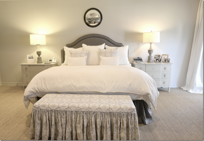
The bedding is white – the duvet is actually white velvet. I had Monica (Custom Creations by Monica) make the Matelasse blanket cover which came out great! Thanks Monica! Many arguments later over that custom blanket cover!
AND: Did you know you can wash cotton velvet in the washing machine and dry it??? What??? My housekeeper told me she was going to wash the velvet pillows in my family room and I thought she was insane. My last set of velvet pillows were ruined at the dry cleaners. She told me she washes her own velvet pillows (an old set of mine ) all the time – and darn, if she isn’t right!!! In an hour – I had freshly washed pillow covers! Do NOT try this with silk velvet – but for cotton and poly velvet – wash away! So – this client can actually wash her white velvet duvet in the washing machine instead of having it dry cleaned. Her housekeeper was not too happy when I told her this. She said – do I have to iron it too?
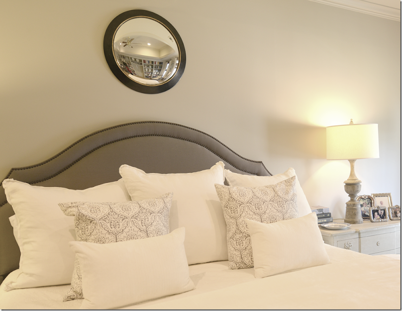
We bought two new nightstands from Wisteria – to replace her skirted table and pine nightstand, along with two new lamps from Aidan Gray. The headboard and dust skirt are a heavy, dark gray linen. The ottoman fabric is Les Indiennes – com fabric – this is the only pattern we used. Above the bed is a convex mirror from Ballards (I think!) She didn’t want a sunburst – so what do you put over a headboard that shape?
Another architectural flaw is that her windows are not even – one is a French door and one is a short window. Why???? Crazy!!! I tried to disguise the flaw by treating the windows the same – and the dark brown blinds hide the size difference. The curtains are double width white linen.
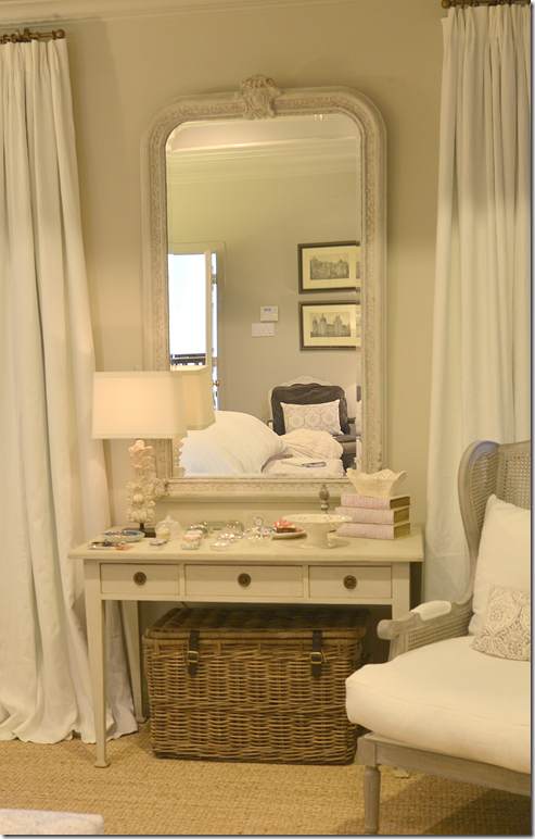
The Swedish desk is from my favorite – The Lone Ranger! HERE. I love that guy! He has to be the NICEST person in the business. There is NOTHING he wouldn’t do for me and I’m not a big client either. Above the desk we placed a huge mirror that my client found at my other favorite store Olivine! WAIT! Helen and Kathy at Olivine might be the nicest people in the business!! OK, I haven’t even mentioned Leslie at Segreto Finishes!!
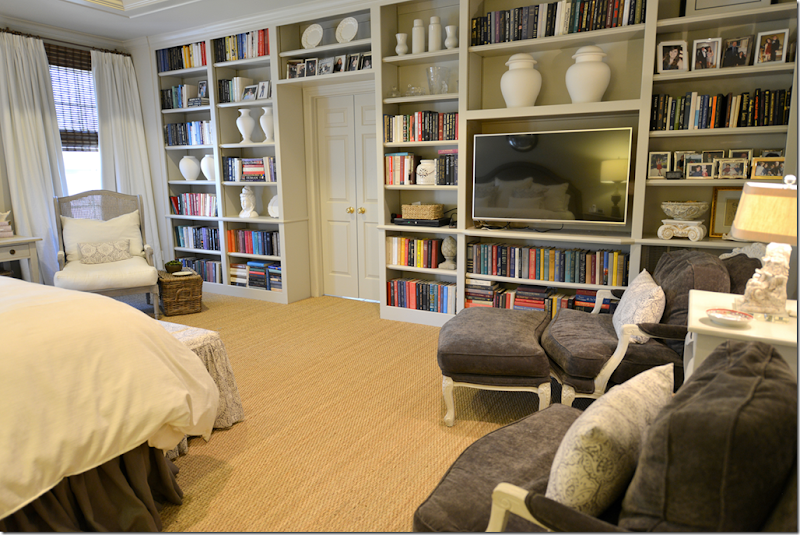
I tried to redo her shelves somewhat by adding white vases and jars mostly by Suzanne Kasler at Ballard Designs. I had not ordered her pieces from the bisque line but was surprised at the size. I couldn’t even use the largest sizes. It’s very substantial and a great price too and I would def order from there again.
The cane chair was from Aidan Gray – we recovered it in the white linen.
And from this side of the room. I love how it looks without molding painted white, it looks updated to me to be all one color – from the ceiling to the base molding. And I really like the Feathered Gray because it’s a khaki gray, not a blue gray, so it’s warmer.
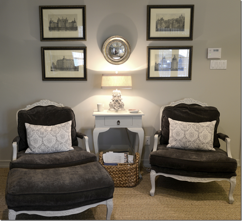
I had her dark brown stained chairs painted gray and upholstered in gray velvet. We also painted the wood table gray. The prints were hers – and I just added the convex mirror in silver, along with the lamp from Aidan Gray.
In case you ever make an upholstered headboard – I usually make mine 60” tall. I know some people like them taller, but I think this is a good height. Not too crazy or trendy.
And that’s that.
Thank you everyone for sending in your “Ask Miss Cote de Texas” decorating questions! I plan to go through them and answer them here in the near future. You can still send in your questions to - Cotedetexas@aol.com.



Gorgeous, as always! I can't wait to redecorate my master bedroom. This is wonderful inspiration!!
ReplyDeleteLooks awesome! Looks like our house, lol.
ReplyDeletevery funny.
DeleteI was thinking the same thing . I love it !!
DeleteHow long ago was this project done. The "after" photos look like ones you have posted on your blog before.
DeleteVery chic. Both warm and cool, which is quite an achievement.
ReplyDeleteI love your look! Fresh, current, and very very chic!
ReplyDeleteSharon
very very pretty! A total update!
ReplyDeleteWhat a wonderful transformation! Love the colors, very soothing and oh my, every detail is just awesome!
ReplyDeleteamazing!
ReplyDeleteJoni,
ReplyDeleteAgain another beautiful room! Where are the blinds from? Thank you for sharing your beautiful work.
Leslie
Monica buys them for me. We usually use Hunter Douglas.
DeleteWhat a great update- so clean and fresh! great inspiration for my ideas file
ReplyDeleteWonderful inspiration for my master which needs help! Love the bookshelves with TV. Thanks again Joni for sharing! Debbie
ReplyDeleteReally came out nice...what a beautiful retreat....LOVE a nice mirror
ReplyDeleteJust replacing the dark piece between the windows with the desk and mirror opens up the entire room--- lovely!
ReplyDeleteGlad a criminal judge has a calm, beautiful, comfortable nest. Their home 'should' leverage their work life.
ReplyDeleteFeel this way about many of my clients and their professional life.
Lovely, Joni.
Garden & Be Well, XO Tara
I like both bedrooms a lot! I love the shelves and I love the white vases on them! I have been trying to figure out what to do with my shelves, I have a difficult time not making them look sloppy!
ReplyDeleteThis is gorgeous! I am inspired to redo my own bedroom now. How pretty!
ReplyDeleteWhat a happy treat to come up with my coffee and find this new post from you! Joni--it's breathtaking. Adore the duvet and white linen curtains. Beautiful, as always!
ReplyDeleteSo lovely, calm and soft. Heaven.
ReplyDeleteJudy Brown
Beautiful transformation. I could tell you other ways to treat a wall over a curved bed......but this is YOUR blog......i love the little desk too.
ReplyDeleteEveryone is allowed to share ideas and opinions on this blog. That's one of the reasons it's so popular. So, go ahead and suggest away ... I'd love to hear your ideas.
Deleteyes - for sure! I always have issues with a curved headboard. so please!!!! share some ideas Betsy!! I would love to hear them!
DeleteI'd love to hear your ideas too Betsy. I have a very curvy headboard without anything over it because I just can't figure out what to put there. The only thing I can come up with is plates but not sure how that would look with the style of the room.
DeleteJoni, I love what you did! Especially painting all the same color. To me, this is just so much more sleek & serene. And, I love the window coverings with the puddled side drapery treatments.
ReplyDeleteBut, of course, I love everything you do...so. Big hug, my friend. We must have lunch one day soon.
thanks so much!!! come over!!!
DeleteCould you speak about having the large basket under the desk? To my eye it just looks like clutter, but maybe it is done for balance, for extra storage? I think I am always looking at functionality, so with no seating and the large basket there, the design aesthetic is lost on me, and all I can think is why a desk and not another piece there? I love your blog and find inspiration from it every time!
ReplyDeleteactually - we had the mirror hung and were waiting on the desk to be delivered - so I put two baskets there to fill in the space and she kept them. i dont mind baskets under tables, though I recently removed mine and it does look less cluttered. I didnt' think it looked bad there so i just left it.
DeleteJoni, thank you for the beautiful post, as always! Where oh where do you find the beautiful kuboo wicker trunk under the desk and the one by the chair? I need those for my bedroom!
ReplyDeletethose come in a set of three - i get mine from Artesia in florida - google them. but i think they may be out. I know that I saw some a Lam Bespoke in Houston - google them - they would mail you are a set I'm sure. they are fabulous.
DeleteI really like everything painted the same gray color, especially the moldings. I want to repaint in my house and I think that would update everything.
ReplyDeleteJoni,
ReplyDeleteLove this project! How beautiful the redo of the bedroom turned out! Love seeing the paint done in all one color, too.
Thank you for sharing! Have been missing you so please post more if you have time!!!!!!
Joni, just beautiful. I love the color of the bedroom. Will have to check it out, because it is a warm gray ( I always think gray is too cool, modern) but I love this shade. The style of the room is so restful. You have done it again! You can come over to my house and help me redecorate my 80's bedroom anytime!
ReplyDeleteWell Miss Cote de Texas, you have done a wonderful job! Exquisite! The bedroom turned out more than beautiful! I really love the window treatment!
ReplyDeleteHave a nice weekend!
xx
Greet
Joni, I am ready to move into this room! It is lovely! And what an eye-opener that you can wash cotton and poly velvet. Thanks much for that tip! Oh, and before I forget, I like the color you chose for the walls. Pratt and Lambert is probably my favorite paint next to Benjamin Moore.
ReplyDeleteI need to add a wall of shelves to the family room here. I love those!
May I ask, did you use the same go-to white linen you use for your slipcovers for the curtains?
xo
Sheila
Hi Sheila! I use Pindler usually always for linen. They have expensive and not inexpensive linen. I don't know which one in particular I used here - but all of them are really nice. Hope you are doing good!
DeleteThank you, Joni! I love them dearly. You, too! xoxoxo
DeleteI recently had a dressing table skirt made of Pindler linen and the quality is wonderful. The lovely lady who made it for me was from England and was an expert in "smocking". Just below the flat edge of the skirt that rests on the flat surface of the table, she did the most beautiful smocking that gave the skirt a great deal of definition and detail. I love the weight of the fabric especially with the double inter-lining. She had suggested sewing in pearls throughout the smocking, but I was concerned about the damage which might occur during dry leaning.
DeleteWow, so cute, I could stay in that bedroom forever! Check out my blog if you like :)
ReplyDeleteWith every new post, I also enjoy looking at your family pictures. Indeed, I can see so much of your brother in you. Thanks for sharing it.
ReplyDeleteMy headboard is the same shape and you are so right... what do you hang over it? I have a long rectangle oil painting and I'm not sure about it! But living in earthquake country, I can't have glass or mirror over my head.. otherwise I LOVE that mirror over that headboard!
ReplyDeleteI'm with you, AntiqueChase...I live in the SF Bay Area right over the San Andreas fault line, and every time I see a pic of some huge heavy mirror over a bed I think, "oh no, not here!!"
DeleteY'all - that mirror is very very light! not heavy at all. !!! You'd be safe with it. I think!!!
DeleteI love how restful this room feels -- and you know I am in love as soon as I see book shelves with actual BOOKS on them. So, question about upholstered headboards. The last time I proposed one to a client, she wanted to know about how you would clean it if it got stained. I didn't have the nerve to ask what it might get stained with (?!!!) and we ended up going a different direction because unless I upholstered it in vinyl or leather, I couldn't guarantee any fabric would respond well to spot-cleaning. What would your response have been in that situation? I really love the look of upholstered headboards and would like to use them more often.
ReplyDeleteWell - that's why this one was done in dark gray. I like to do slipcovered ones. The head on the headboard leaves a huge oil spot after awhile. ugh. Mine is upholstered = and my husband is NOT allwoed to put his head on it. He has to put a pillow on it first before he can put his head on it. This way mine has remained clean after about five years. How about a raffia type fabric? Listen - I have this issue with ALL upholstered fabrics since i like slipcovers so much. Upholstered fabric gives me the willies now. Even with the best of care - your clothes have dirt on them and that dust and dirt transfers to upholstery. I can see that with my white slips. I wash mine about once a month - if I go longer, I can tell it needs washing. I can't imagine having a sofa and not being able to wash it.
DeleteSuch a stunning update Joni. It doesn't look like the same room. You've taken it from functional but dated to chic and soothing without spending a fortune (but it looks like you did!). Well done. I wish you were closer and I'd hire you to update my house. My style just feels lost these days and I don't know where to begin, considering we are already thinking about the next house but this one needs help before we sell it. Ugh.
ReplyDeleteMy favorite thing is that you used the paint colour all over - brilliant. I have a guest room with the same shelving and I'm going to do just that! :)
xo Terri
I love seeing "Joni" rooms!
ReplyDeletexo
What a soothing, yet luxurious retreat! Bravo Joni!
ReplyDeleteWhat a fabulous honor! Thank you so much. I loved reading through these quotes and starting my day with a big bouquet of inspiration. You're delightful! Modern Bedroom Designs
ReplyDeleteMy favorite type of blog post! I love seeing your work! I recently painted my bedroom a similar color and have similar bedding. Love the inspiration!
ReplyDeleteHow pretty! I've drifted away from that particular style and palette, but I could still stare at it all day. It's no mystery why it's so popular, and you're the Master, Joni.
ReplyDeleteIt's certainly an improvement, but I think the room desperately needs some plants and fresh flowers to give it some life.
ReplyDeleteI should have brought flowers to style it with. Honestly, I didn't think about that and I usually always do it. I did remove a lot of real stuff from it for the pictures - magazines and books piled on tables and chairs, waiting to be read. Quilts on the chairs, etc.
DeleteSo GOOD. I love it. I like some color but not in the master bedroom. I agree about the 60" headboard...just right. The room is so tasteful and comfortable and personal. So nice of your client to let us see it. Thanks, Joni and bravo!!!
ReplyDeleteThe room looks wonderful and so serene. One change I would have made is skipping the mirror over the headboard altogether and putting a large black and white print/photo over each bedside nightstand. That side of the room looks so bare in comparison to the opposite side with the book shelves and all its contents. It could just be the picturet!!! Really I love everything you do; such a calm and relaxing room. Just what you want for a master bedroom.
ReplyDeleteHi! This room does look so much prettier. Love that you used grey velvet - also the ottoman at foot of bed style & fabric. I always like using the a couple" warm" baskets (seeing this coming back now) - seemed to wain for a while - metal everywhere instead which can be a little cold and hard I think. Joni, I do have a question....I notice you use the dark brown blinds a lot - you did write that the wall space showing between the window and curtain rod bothered you. I can see using the blinds in some applications - privacy at night, etc..., I'm not against them by any means. When would you consider not using these blinds? If you used something else - what would it be? Can you think of a room you like that just has the curtains/rod with the wall space showing? This is by no means at all an insult - no way - it is just something I am curious about and would like your thoughts on. Thanks!
ReplyDeleteOh - I love the bed and bedding here, too!
ReplyDeleteIt looks beautiful Joni! Another wonderful job! And I would LOVE to hear anything Betsy has to share *winks* Vanna
ReplyDeleteLooks great. One thing I noticed but didn't see mentioned is that the shelves were staggered in the "before" pic and now they are aligned. I think it's a huge improvement. Along with the trim being painted the same color as the walls, this makes for a much more calm, peaceful look. Regarding trim color...I'm currently redoing my husband's office and since we're repainting I added a crown. When I bought the paint and asked for the trim paint in the same color as the wall paint I was told I was doing it all wrong. The paint store is a commercial shop that deals with mostly designers and contractors and the guy who took my order questioned me over and over it I really wanted to paint the trim the same color. I started second guessing myself. Is a lighter colored trim horribly dated or still being used by lots of designers? Will same colored trim seem dated quickly? Any thoughts on this? I've been stalling for almost two weeks, driving myself crazy over this! ;-)
ReplyDeleteHi here's my 2 cents for whatever its worth - I do design work and I worked in a paint store years ago. For trim, we always recommended a eggshell, pearl type of paint because its more durable and has a little sheen. I personally never suggested a gloss or semi-gloss - too shiny. If you choose a flat paint (what we usually directed a client to) , even it its the same color as the trim, it will look slightly different because of the difference in sheen. However, from a design standpoint, if your doing a room in all "whites" - hundreds and hundreds to pick from! - I personally think it is better to pick one for the trim and another for the walls, and even another for the ceiling (flat of course) - the reason for this is that it adds dimension - otherwise the room will look dead. At a glance, the whole room will still read as all white - the hues are so similar - barely different to the eye - but the difference is astounding.
DeleteOne more thing - normally, most clients still like the trim a shade lighter -but - there is nothing at all wrong with the reverse - it really depends on the room and personal taste/style. European countries aren't afraid to paint wood work/trim any color. Colonial, Shaker, Georgian, - are know to do subtle greens, grays, tans, - but usually the most applicable is a white or ivory or light cream, linen etc...
DeleteMarket Decor, with respect to your advice re all white rooms, it is important that all of the whites used in the same room have the same undertone or else one or more of them will look dirty. I prefer satin or semi-gloss for trim because of the ease of washing off finger prints when necessary. The glossy finish will mellow after about six months, but looks far richer than putting a flat paint on trim. The worst place of all for flat trim is on the exterior of the house where sun damage makes it look chalky very quickly.
DeleteYes, I agree with all - and yes, I meant to say - satin - don't know why I wrote "pearl"??? Not all semi - gloss is the same formula - some are less shiny - they do clean better and for bath/kitchen - yes. Again, in an old house, one might not want too shiny trim - imperfections just pop then - satin is my preference for trim there. Flat for walls if they are less than perfect. Yes, all the white must be of the same undertone - absolutely. Flat for exterior will chalk and dull - was not even thinking outdoors when I wrote the comment. Thanks!
DeleteAlso, satin is not flat - it has a distinct sheen - I would never in a million years suggest or put flat on trim - woodwork!
DeleteYou are correct. So glad you clarified your earlier post.
DeleteGosh, this is beautiful!
ReplyDeleteIts marvelous Joni! I love all the changes~the grey wall color is beautiful with all of the white additions. Windows look fab too!
ReplyDeleteJoni, lovely work! I have an interior-design philosophical question, or maybe it is economic. I understand about fashion and trends, and the economics of it all, but what is wrong with designing a room that is timeless and still fresh? To be considered fresh, do we all need to paint and upholster everything in shades of gray because it's the In color? Is the market driving taste? Where is the individuality and the time-honored classic beauty in today's rooms? Will we not regret in ten years that all our natural and dark woods have been painted? Are we sacrificing personal taste in order to be socially accepted and au courant? Are we designing rooms for ourselves or for those who visit our homes? Further, why do we need a "theme" as it was Tuscan years ago, and now it's the "open concept." If families built their homes for the way they live, there would be a larger variety of styles and colors. So many of the rooms you feature look alike, and that is not to say that they are not very pretty, for they are. Please reply. Charlotte
ReplyDeleteI don't know how Joni would answer your questions, but I would suggest that people are happier when surrounded by things, including colors, that they love. It takes a confident person to find their comfort zone in design and stick with it. Joni has a comfort zone and it's Feather Gray, Aidan Gray lamps, seagrass, white and/or gray linen and wooden blinds. That is not to say that these elements used individually cannot be attractive, but this look is now one she can do while sleep walking. I laugh out loud at the number of readers on various design blogs who beg to know what shade of gray is on the walls of the featured room. There are two kinds of people - leaders and followers.
DeleteHi Charlotte,
DeleteI'm in my late 50's now, but when I was in my 20's and 30's, I had no idea what my taste was in terms of home decor. I made several costly (and dozens of not-so-costly) mistakes before I figured out what I truly love. My home now contains pieces that have never been "in style", items that were in style twenty-five years ago and pieces that are current trends. But the one thing they all have in common is that I love them. I will never get rid of them. Whenever I buy something for my home, whether its a sofa or a seashell, I ask myself whether I can picture myself living with it twenty years from now even though it will probably be "out of style" by then. If my answer is yes, then I buy it.
Many people are as unsure of their own taste as I was in my 20's and lack the confidence to create something that is uniquely theirs. Stores like Restoration Hardware, Pottery Barn and others that specialize in a specific look capitalize on this fear and create short term (five-to-ten year) trends that serve two purposes: (1) they allow people to feel more comfortable in their decorating choices and (2) they guarantee themselves repeat customers in a few years time when the current trend fades. It takes someone very secure in their own taste to buck the trend and design rooms with furnishings that can't be purchased at every second store. It also takes someone with a great deal of time and energy to shop, because they have to look beyond the stores that are offering only the current trend.
Joni, can you please do an in-depth post on painting trim & moulding the same color as the walls. I've tried researching on this & nothing substantial is out there. Do you use flat paint on walls & oil-based on trims & moulding? Do you use the next shade darker on trims & moulding if they are to be oil-based? How to deal with window casements that are generic white? What do you paint the doors with? How do you transition the door & door trim if you want to use a different color outside/hallway?
ReplyDeleteAs an interesting titbit, I noticed that Mrs. Crawley's (of Downton Abbey) home is painted this way. Was this already a trend at that time?
I agree, I would love a in-depth post on paint. There are so many schools of thought on this subject - it can be overwhelming to figure it all out! Also, talk about the "5th" wall - the ceiling. I think in certain applications a room can be helped by doing the ceiling a very pale color other than white. I have used BM "glass slipper" on a ceiling in a all ivory room and it was beautiful. There are so many new paint formulas now - some very good - some not so good - there are many questions! Also, the natural light in a room affects color drastically - even a very seasoned professional can make mistakes here (with a color never used before) and have to re-paint...ugh.
DeleteOh - and color changes at night when we turn on the lights! I once painted a room a beautiful blue color - at night with the lamps - chandelier - on , it turned a horrible hospital blue/green and became much brighter - had to repaint in less than 2 weeks - I couldn't stand it! I learned way back then - paint a huge test area first! Or even a poster board - something to test it in all lights.
DeleteAnon. 12:41, I can't answer all of your questions, but I have observed in design magazines that where trim is painted in the same hue as the walls the homes generally have strong enough architectural details that the monochromatic look is not boring. One needs deep crowns, high ceilings, tall windows with wide casings to make this look work best. This is why you noticed it in the set of Downton Abbey. As to paint finishes, if your walls are in great shape, you don't necessarily have to use a flat or matte paint, but an eggshell finish which reflects light and gives a soft luster. The only downside to oil-based trim is that over time it yellows assuming you may be using white trim) so you must take that into consideration. It will become more difficult over time to get good quality oil-based paints because of industry changes. One paint which you may want to consider is Advance by Ben. Moore. It is a combination of latex and oil (or some form thereof), but works like a latex paint. I recently used it on trim in a satin finish and if I did not tell you, you would assume that it was an oil based paint. The finish in the satin is rich and beautiful. If you already have oil based paint on your trim and want to go to a latex paint, you will need to prime with an oil based primer first to get the proper adhesion. In this instance, the primer acts as a sealer between the old and new paint. Hope this helps.
ReplyDeleteOh my! You really have provided me with a wealth of information here. Yes, we do have high ceilings, deep crown mouldings, tall windows with wide casements, and substantial architectural details in the family/great room and masters' bedroom to make this work. We moved in to our 1990's brick Georgian home 10 months ago. Now need to focus on those 2 areas. Thank you so much for all your help!
DeleteJoni, I just love your taste and style.... This master bedroom re do came out fantastic, IMHO . Serene and elegant. Love it!!!!
ReplyDelete- Linda, ny
I really do like to dressing table and mirror between the windows. That is a very elegant look. However, wonder what she did for storage space after you removed the tall dresser? Did the two large bedside tables compensate?
ReplyDeleteCharlotte Des Fleurs
European
The bedroom is beautiful and calm and well put together. I am only sorry to see her blue & white vase not make the cut!! IMO most rooms look a little classier with at least one blue & white chinese vase or ginger jar. Even saw them in that huge, old Vanderbilt house in Asheville, can't think of the name right now. I know you love them too. They are timeless, never trendy. I've had mine for 25 years and never tire of them. I notice that Ralph Lauren uses them in many ads. Love your work…
ReplyDeleteI agree. Instead of white vases and jars from Ballard, why not encourage the client to start a collection of antique porcelain. If a designer showed up with bags of Ballard and Wisteria at my home, I would say "no thanks".
DeleteAre you thinking of the Biltmore Estate?
DeleteOmgosh, yes I was thinking of the Biltmore! Thank you :)
DeleteJoni, so dreamy and beautiful. Love your blog, love your talent!
ReplyDeletea propos the other comments, you can't get people who don't collect to collect. THanks for the post. I enjoyed it. While I really like prints, this room would be great to come home to.
ReplyDeleteBeautiful Joni! I love the idea of keeping the trim and walls the same color!
ReplyDeleteI enjoyed this post. I still have not had my upholsterer make the headboard for my older daughter since the white linen we used on the curtains was discontinued (will have to check a pindler and see what they have - I want very white (Duralee snow not white enough)). And, I am toying with the idea of using white leather since my daughter is so messy. I had pretty much decided in a shape, with a double row of nail heads, but I love this shape even more - it's beautiful. I might use it for inspiration and do tufting on the large area. Thanks for the tip on 60" high, I did not want the headboard too tall, and not too short, so this gives me a good benchmark.
ReplyDeleteSo pretty and soothing! Thanks for sharing your work Joni!
ReplyDeleteCara Joni,
ReplyDeleteda quando ho visto il tuo blog, la mia vita è completamente cambiata.
Anche i colori sono diversi !!!per non parlare dell'estetica.
Un saluto da Lucia di Tuscan glam
Gorgeous transformation! So light, charming and elegant! And thanks for mentioning that the client had a budget in mind! Makes those changes almost possible for here!
ReplyDeleteJan at Rosemary Cottage
I love the room. It is calm. The comments are helpful and informative too. I would just like to add that most designers are know for a style and this is why I keep coming back to Joni's blog--I love her style.
ReplyDeleteI like your taste and look generally. Lots of charm and appeal. But I really dislike the newly arranged book shelves. What did she do with the books? I dislike bookshelves with lots of junk as much as I dislike all the books wrapped in white. Fake. I have LOTS of shelves with hundreds of books and shelves with large collections of American Art Pottery. The odd thing is tucked in with the books but never a mixture. A home is not a store to be "merchandized."
ReplyDeleteI think of the real estate agent who wanted my friend to tear out the really nice built in book cases because "no one has books anymore"! I have a Kindle and Ipad too, but the books are staying. What will people do if the power all goes out and their batteries die? PS: the new owners loved the bookshelves.
Anon. 10:18, if a real estate agent ever tells me to tear out bookshelves, I will know I am working with the wrong person. I agree that styled bookcases look like merchandising. One would assume that a "judge" would have plenty of books to fill book cases instead of having Ballard "stuff" fill them.
DeleteA different stager came in and did a ASTONISHINGLY brilliant job. My friend had the house for many years and the stager turned it into a 30-something's house...keeping the bookcases. Particularly impressive because the house "just growed" and had an odd floor plan. It sold fast.
DeleteLovely update, Joni. The gray velvet chairs are so inviting.
ReplyDeleteMy husband and I are renovating....a total gut down to the studs. We will soon be putting up sheetrock and trim work. What is interesting to me is how much I like the moldings painted the same color as the walls. For some reason, the white trim in the before pictures looks.....dated. I may try painting the trim the same color as the walls. I truly enjoy seeing your work, Joni. Your aesthetic appeals to many. The only thing that bothers me about the update is the shiny brass door knobs on the double doors to the bathroom and closet. I think I would have suggested changing the door knobs, or painting them to coordinate with the rest of the hardware in the room.
ReplyDeleteLove the transformation! The bedroom appears so serene. I have a question regarding drapery. I notice you always hang drapery on thin iron rods with rings. Are those curtains functional? Can they be opened and closed on a daily basis, or would they need a more substantial rod for daiy wear? Also, do you hang a stick (for lack of the correct word) to pull the drapes closed? Would a zip rod be better for a window that needs to be closed daily? Would appreciate any feedback you could offer. Thanks!
ReplyDeleteAnon 2:05, if your drapery needs to be closed daily I would recommend a traversing rod. The thin rods with rings do require a "stick" or rod by which to pull the rings together. It's not a good system especially when the window treatments are heavy. jmo
DeleteIt can add up to the business and also you can win your customer’s confidence.
ReplyDeleteBudget Host seating
The updates are beautiful! I love, love the new paint color - very soothing and serene. And that's what a bedroom should be. Xo Loi
ReplyDeletePS - Thanks for sharing the tip on washing / drying cotton velvet. I didn't know!
ReplyDeleteI love the updates you did to the bedroom. The bookshelves look so much better the way you styled them and I love the wall to wall seagrass instead of the previous carpet. Love the white drapes and just the overall serene feel you created here. Bravo! Now I am inspired to redo my master. It needs help! ~Delores
ReplyDeleteThat is a huge bedroom! After your updates looks amazing - love the bookshelves!
ReplyDeleteSouth Bank carpet cleaning
No individuality. Another gray room which looks like any you can see in a Pottery Barn or Restoration Hardware catalogue. '90s architecture? What are you going to say a few years from now about all these white slipcovers and gray rooms?
ReplyDeleteNice Blog...Thanks for sharing it...
ReplyDeleteBudget Host seating