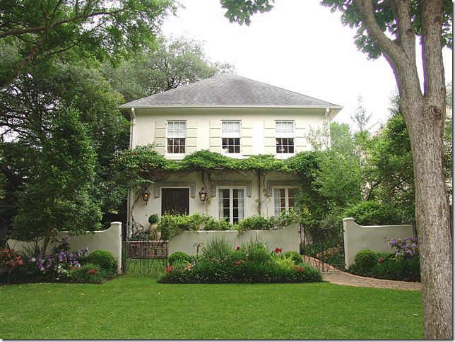
Remember this house? The Kurt Aichler design is located in my neighborhood and I’ve wanted to own it for forever. I first noticed it in a local magazine years ago and then, later, toured it. I totally fell in love with the décor of its designer owner.
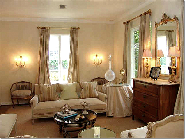
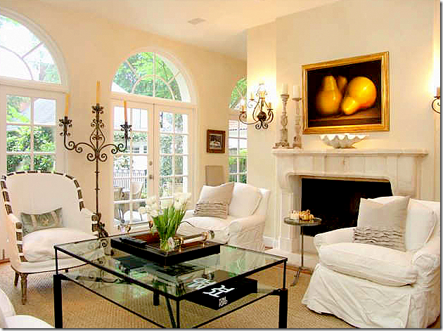
The French styled décor in the living room.
The house was featured in several magazines when this designer owned it. After the home tour – I went home and changed out my linen slips for white ones. She completely influenced me back then.
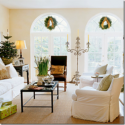
After all these years, I still think that this is the prettiest candelabra I’ve ever seen. I only wish I could find one like it!
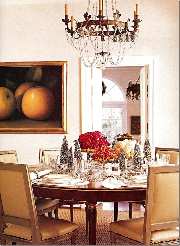
The dining room decorated for Christmas with its crystal chandelier.
The guest room. I still love this room as much now, as then.
I wrote about my redecoration after the house tour HERE. After that tour, I couldn’t get the house out of my mind and was convinced it was really supposed to be mine. Slightly obsessed, but I wasn’t the only one. On the tour, everyone was talking about how much they loved the décor and the designer’s aesthetic.
When the homeowners sold it shortly after the tour, I was heartbroken we couldn’t buy it. “The one the got away” – is how I will always think of it.
After the homeowners moved to their new house, they left the French style behind and embraced a more sophisticated, sleeker look with Deco influences. It was a natural transition for a designer who wanted a more streamlined look and, more importantly, a more original look. Much of the furnishings in her new house were designed and commissioned by the owner.
Cynthia, from the store Indulge, blogged about the homeowner’s new house in a three part story HERE and HERE.
Over the years, the memories of that house tour have faded. It wasn’t until I looked at HAR and noticed a house for sale that I realized the new house that Cynthia had written about had also been sold and that another house was now for sale too. Wow. Four new houses in a decade. That really makes me green with envy!!! I’ve been here in my house for two decades now and am desperate to move on, if only I had the energy and the support from Mr. Slippersocksman. Hmmm….forget that!
This newest house is so beautiful that it impressed at first glance. It wasn’t until I noticed a photograph of the original magazine story that told me who the house belonged to. But seeing the pictures of the house before it was renovated really piqued my interest in it even more.
The designer homeowner had really done a fabulous job on the house. To appreciate it you have to see the Before pictures.
There might have been a time that I might have preferred the house before it was renovated, but not now. I’m wondering what you will think of the changes too – agree or not?
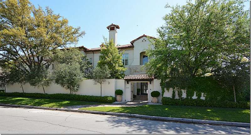
TODAY: The house is relatively new – built in 2009, but when the current owner bought it – it was more rustic – a Spanish Colonial. All traces of Spanish are now gone. The homeowner did an extensive remodeling of the surfaces – turning it into a very sophisticated, slightly contemporary house. It is sited on a very wide lot behind stucco walls which provide wonderful privacy for the front yard.
The house is now under contract – see the listing HERE.
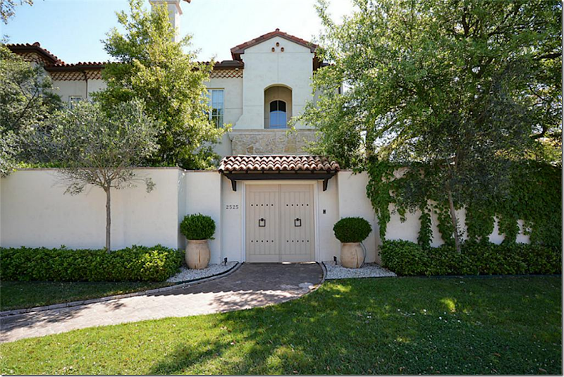
Today: There is now a wood door where before there was an iron gate. The landscape is manicured with trendy boxwood and vines.
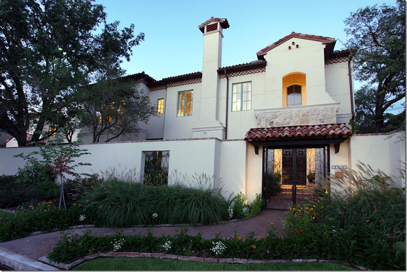
BEFORE: The house had a more informal landscaping design. Today – it’s all been scaled back to the boxwood only look. Before, the windows were painted turquoise. And notice the front gates, which were Spanish inspired, including one that was totally removed to the left of the main gate.
I have a feeling most of you will miss the more informal landscaping that was removed – I feel the same way. But the new, more edited landscape design matches the style of the renovated house – as you will see.
BEFORE: There isn’t a picture of this area of the pool from today. The main difference is all the iron Spanish inspired lighting is now gone – and the French doors are painted white instead of black.
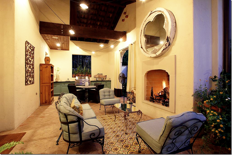
BEFORE: There was a “rug” of Spanish tiles in the outdoor room. The cabinets are painted green – as they are in the kitchen.
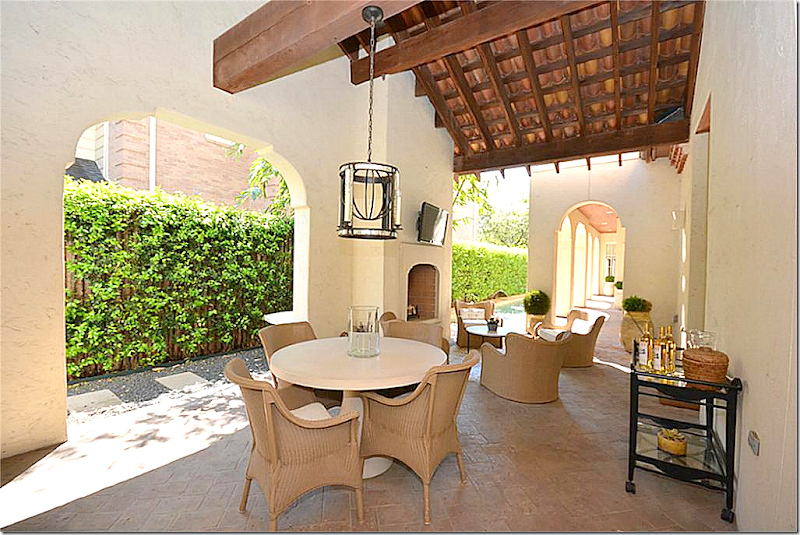
TODAY: The furnishings are much more streamlined and contemporary. It’s all edited and cleaned up. And the tile “rug” is now gone. Thank you!
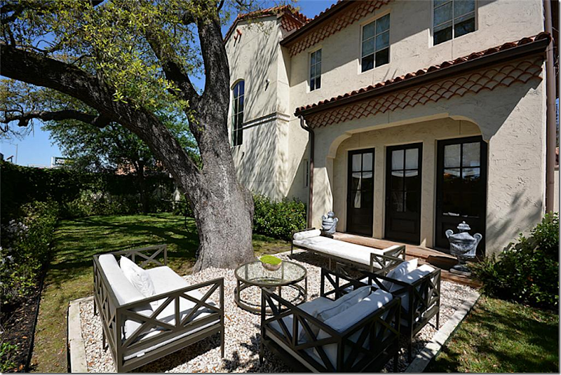
TODAY: The side yard. Pretty collection of contemporary styled furniture on a rug of gravel.
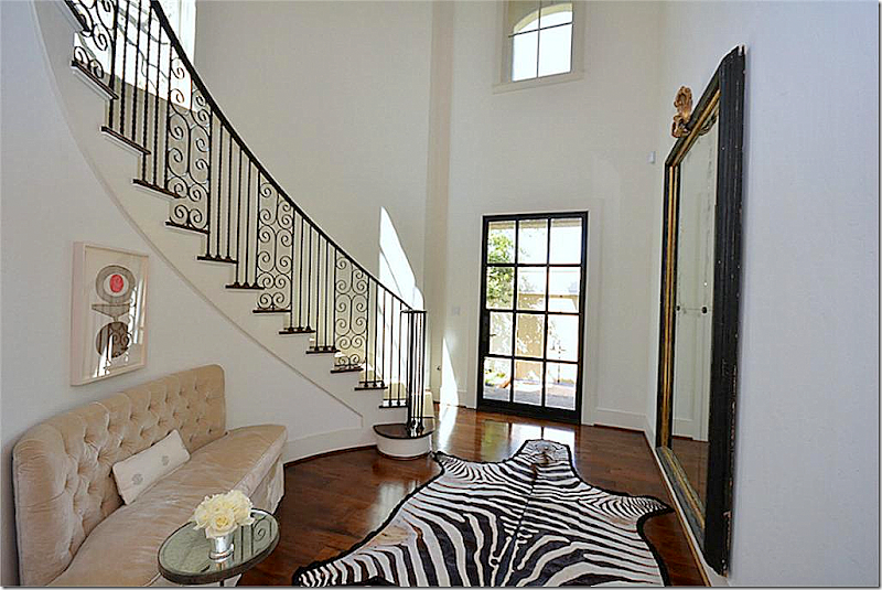
Today: This is the photograph that caught my eye and caused me to stop and look at the rest of the house. The owner put in a new steel front door, which I love. The stair railing is beautiful. Love the tufted settee. This room sets the mood for the rest of the house – it’s fabulous.
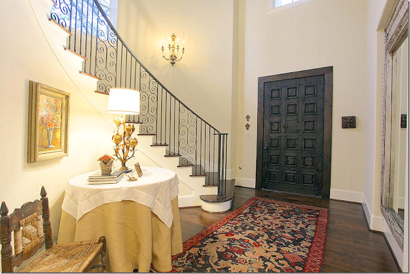
BEFORE: The heavy carved door is so different than the steel one that is there now. It also looks like the niche holding the mirror was filled in – and the sconces were removed. It’s amazing how different this one small room is now from what it was back then. I do like this Before look – but I am preferring today’s more sleek and contemporary style.
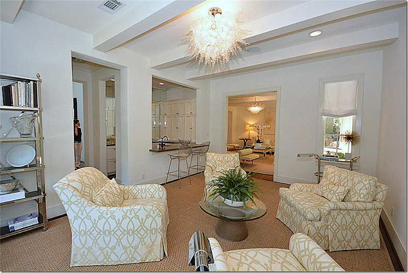
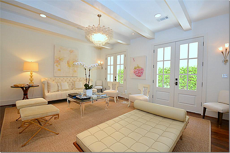
TODAY: The major changes the current homeowner made is that the doors and beams are now painted white – this makes a huge difference in the space. She added a contemporary light fixture too. I love the mix of the tufted sofa with the modern leather Barcelona chaise. It’s all very Deco inspired – and I love the mix of whites and pale golds. And what a change she’s made in décor from the Kurt Aichler house! Where the Kurt Aichler house was the Houston look with French antiques, her aesthetic today is so different, so chic and sophisticated.
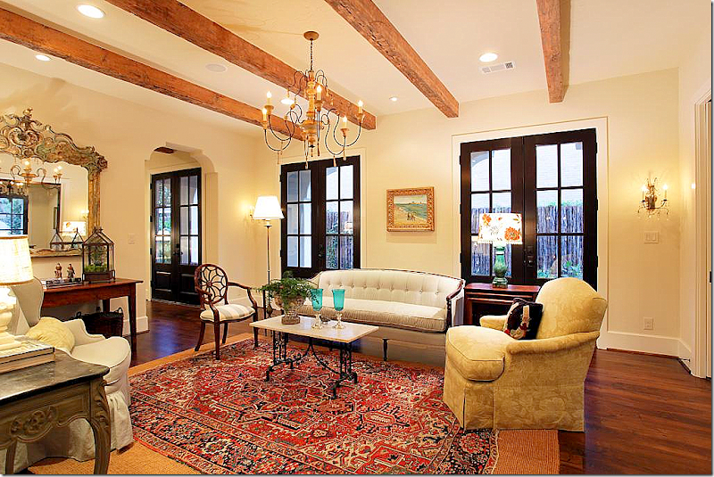
BEFORE: And here is the same living room – so different! The beams are dark, the doors are painted black. The rugs don’t really fit the room. It looks like there might have been an opening on the left that the current owner closed up. I have to say that I love the way it looks now compared to the BEFORE look. I’m kind of surprised that the house wasn’t more decorated than this. It’s such a beautiful house I would think it would have been decorated to the nines – even if it was rustic.
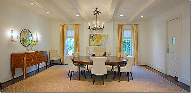
TODAY: A beautiful chandelier and round wood table with tufted velvet chairs and a Deco inspired console. Again, the beams are painted white, and it all looks much more sophisticated. Much of the furniture was custom made for the homeowner designer. It does look like the same chandelier and table from the Aichler house – which is nice. Notice the swinging door that leads to the butler’s pantry. I love the window in the door!
TODAY: The butler’s pantry. The tile floors are original and the present homeowner kept them. Love that swinging door. Such a pretty butler’s pantry!
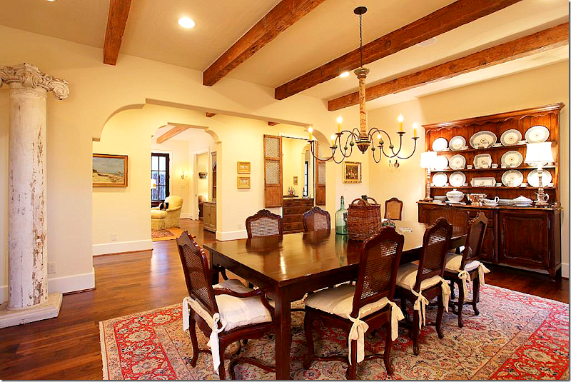
BEFORE: The dining room before with the dark beams. Notice that the current homeowner took out the arches in the entryways and squared them off, which is another good choice for turning the house into more of a Deco inspired house than a Spanish inspired one. Well – I do like the look of the room here, it’s very cozy and warm.
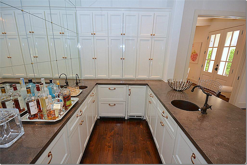
TODAY: The library with the wet bar across from the living room. Instead of a library – the homeowner made it into a room for entertaining, where drinks might be served to guests. Another interesting light fixture.
TODAY: The wet bar with brass hardware. The homeowner added the mirror with the brass inserts, again Deco-ing it all up.
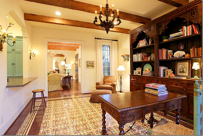
BEFORE: The study looks soooo different! The floor is tiled here and it has the Spanish influenced arch to the bar which was removed and squared off. Hardwoods were installed here to replace the Spanish tiles. I’m sorry to the former owners, but this is really not attractive to me! (hides!)
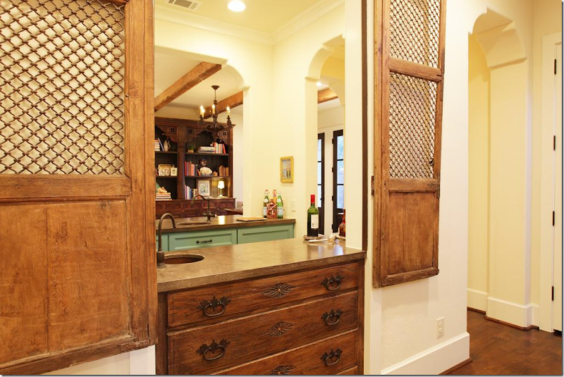
BEFORE: The wet bar. It looks like it was open on both sides – which was closed off by the current homeowner. There were western/Spanish styled shutters and drawers before. I do like the bar being open like this – it makes it great for entertaining with a bartender. But, I can see why the new owner closed it up to the library only – it is much more streamlined looking today. It’s just a bit too busy looking compared to today.
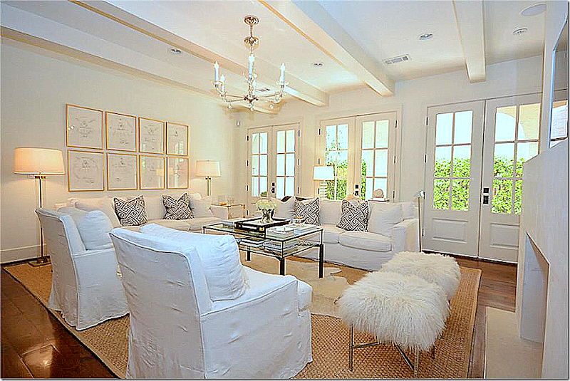
The family room – with the pretty wide planked hardwoods. Again, repainted doors, beams and new mantel. I love the back wall with the gilt framed prints and standing lamps. I don’t care – I still like white slipcovers!!
TODAY: View of the family room and kitchen – the two rooms that were really changed in the renovation. Newly squared off openings between rooms removes the Spanish influence.
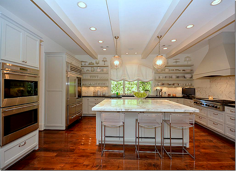
The kitchen looks so new – all traces of the Spanish influences are now gone. New island with white marble and new backsplash, along with upper cabinets that were removed to make room for open shelving.
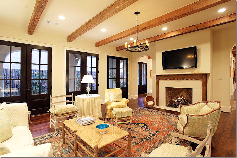
BEFORE: The family room is so different looking from here! Again, the décor doesn’t seem to match the beauty of the house. The mantel was changed along with the beams and the doors. Another big difference is the opening between the family room and living room to the left of the fireplace was closed off. I’m sure this is an improvement for noise levels that come with an active family. Removing the passageway gives the adults a quiet place to sit in privacy away from their children’s friends (something I wish we had!)
BEFORE: The kitchen has really changed as you can see here – today the island is twice the size making the space seem larger. The turquoise cabinets were painted gray, which make a huge difference. Again, I don’t really care for the furnishings, especially compared to today’s.
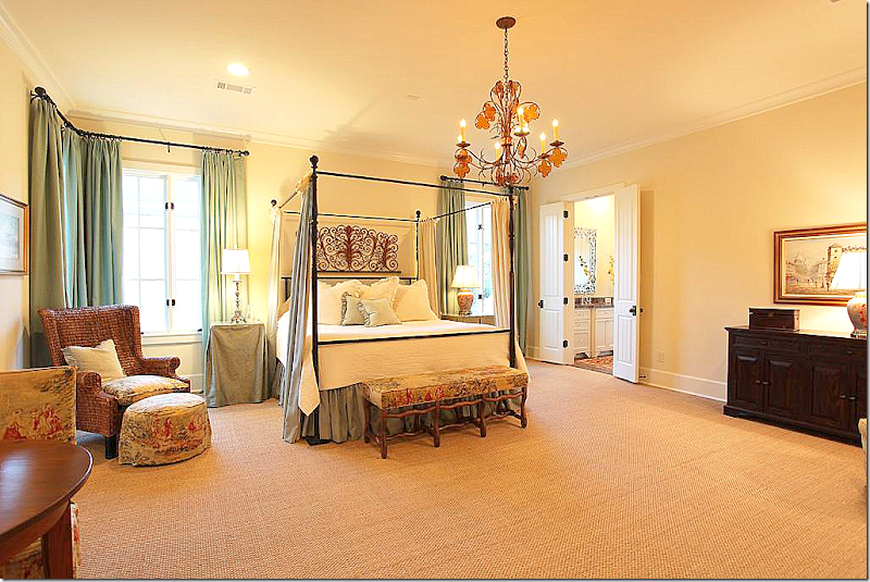
TODAY: The master bedroom with velvet tufted headboard and chairs – with matching standing lamps. Crystal chandelier continues the look of the lighting found throughout the house. Very serene!
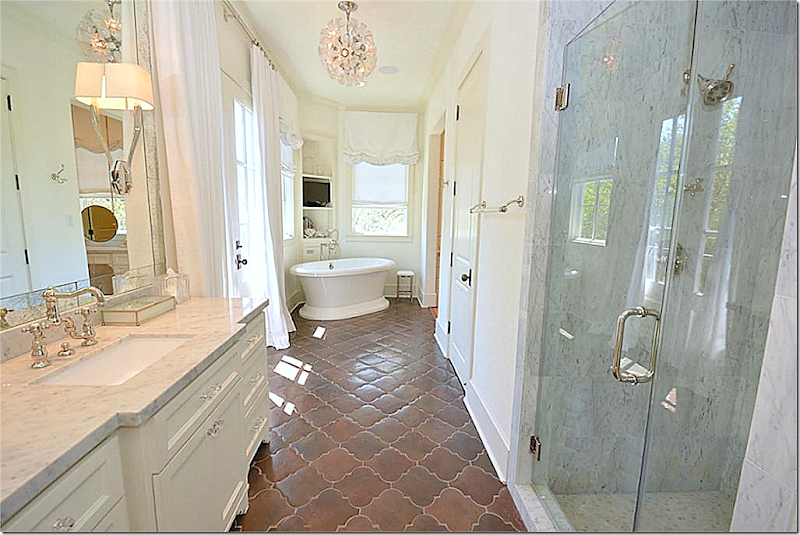
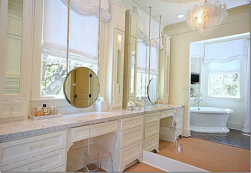
TODAY: The homeowner kept the tile floor, but put in white marble and sleek lighting. Love this bathroom!
There is a vanity off the bathroom.
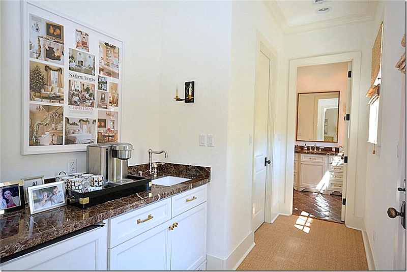
Coffee bar leading to the man’s bathroom. The framed collage led me to figure out the house belonged to the same homeowner of the Aichler house!
BEFORE: The master bedroom was very nice.
BEFORE: And here – you can see the brown marble and dark French doors before – along with the mirror that was replaced.
TODAY: Upstairs playroom. Love the velvet tiger pillows and love the Deco console.
I wish this house had been published!! I would love to have seen it professionally photographed. Maybe it was and I just missed it? Still, real estate photos don’t show a house to best advantage. I can only imagine what a beautiful photoshoot this house would make!!
BEFORE: The back stair before. No picture from today but you can guess how different this area probably looks today!
Design is so interesting – to me at least! I love to look at the before and after photographs, see the changes that houses go through from one owner to the next and study the changes that one designer goes through – from decade to decade.
This house was especially intriguing to me because it’s a glimpse at how one homeowner changed her aesthetic from the classic Houston look with French antiques and slipcovers and silk curtains – to a much more sleek, Deco inspired look. The designer is especially beautiful and I can imagine how elegant she looks in her interiors. Somehow, someone who prefers a more country look in their fashion style might look a bit out of place in these sophisticated rooms. I really had never thought of that before – how the elegance and beauty of a house might match its owner?
The story of this house reminds me of another homeowner I have shown several times before who started out with the Houston look and then she also went more contemporary with less French antiques. It’s totally different than my previous story about Furlow Gatewood who in his 92th year still decorates the same way he has for decades.
I suppose the moral is – there isn’t a right way or a wrong way to design. You can keep your same look or change if you want. It’s your house, go with your heart!
A Designer Who Chose To Change
Subscribe to:
Post Comments
(
Atom
)










Gorgeous house, either way! Personally, I would have redone to about half of what was done. I would like it more if the family room, the old library, the kitchen (which is FABULOUS), the playroom and the living room kept a little bit of the Spanish "flavor" of the home. The steel door is to die for! I do like most of the changes to the entry. Mostly getting rid of the niche.
ReplyDeleteMy ideal redo would have been to keep a little more of the original house but to have some more sophisticated furnishings and rugs. A lot of the redo could look like any (fabulous) house, and I have had a long standing aversion to picking a "type" of home and decorating against it.
What was done, was done well. I do see a bit of an identity crisis, and more so, I think in 10-20 years when they decide to sell it, I think people will see it from the outside and go in and wonder what they do on virtually all old, classic homes. "Why did they change the look of this home?" Thankfully, they didn't do anything "undoable". The beams can be stripped. The colors can be warmed back up in the common areas.
BRAVO!!! Your LAST statement says it ALL!! p.s. I LOVED the transformation....but....that is my aesthetic. franki
ReplyDeletecouldn't agree more about the" beauty in the eye of the beholder" -I like design and enjoy seeing everybody's take on what constitutes beauty. I personally like more of the before affects in the last house than the more recent décor. Wrinkled slipcovers- lots of no color and few curves seems to be the "pretty" of this era, wonder what will be the next evolution? Love it all and your Blog is one of the best.
ReplyDeleteBeing a lover of Spanish homes, I was expecting not to like the changes, however, she kept the original features in places (bathroom tile for instance) and got rid of what seemed like mock Spanish features (the tiled rugs and stair tiles did not look original to the house). The result is quite lovely. And inspiring to me who is decorating a Spanish house myself.
ReplyDelete"The house is relatively new – built in 2009," ... so I'm fine with the changes made. The original house looked as though trying too hard to be Spanish Colonial. It's current look seems more 'honest' and the exterior/interior seem more in-sync than not. IMHO.
ReplyDeleteJoni this is truly an equisite transformation! Beginning with the foyer I am enchanted!
ReplyDeletexoxo
Karena
The Arts by Karena
I liked it both ways, but preferred the Befores.
ReplyDeleteLove the 'trendy' remark about boxwoods. Trendy with boxwoods already means lasting centuries.
ReplyDeleteYou make me think of the movie, Giant. Went from dark to light and too much to streamlined.
Pure Giant.
Garden & Be Well, XO Tara
Though I didn't love everything about the 'befores', the 'afters' left me cold. It may be cool and serene, but looks bland and sterile in my book. In the new changes I like the steel door and the white marble in the bathroom the best. Every time I see a Spanish house I think what Kathryn Ireland could do with it. Each to his/her own!
ReplyDeleteInteresting. The painted beams made me sad. While the "befores" certainly didn't have the panache of the "afters"- they did have a lot more warmth.
ReplyDeleteJoni,
ReplyDeleteBeautifully written article. I love the house so much better now. Light, bright and simple understated elegance. Gorgeous. I love the way you study images and explain your findings to all of us out in blogland, Thank you for your extensive research and sharing your findings with us.
Kathysue
Great images to learn from Joni! It's interesting to see how design evolves and what seems really different or not on trend today will probably, in a few years, be the new "normal".
ReplyDeleteFun post
xo kelley
I tend to agree with others that perhaps a bit too much of the soul of the house was abandoned. The make-over is appealing and well done, but it seems to fight the architectural exterior of the house. Obviously, the designer is very talented--and I loved the French-style home she did. One of my all time favorite magazine spreads.
ReplyDeleteI’m not fond of the total new look either, the before was warmer and more inviting; now, though very sophisticated and elegant it just looks like so many other highly designed spaces, with no soul..
ReplyDeleteYour house, Joni, is much more appealing to me!
Love how the new furnishings and how they lightened up the doors but can't help but think it would have all looked even better contrasted against the wood beams. Great post, as usual!
ReplyDeleteCome on. "The Emperor has no clothes!" The "Before" was a funky mix of colors that were about 20 years out of date. I do not understand "mint" green in a Spanish style house. Maria Killam would have a fit! However, the "After" does not work for me either. Why take a "new" Spanish style house that was trying to be Spanish and change it to a modernistic French wanna be? I would have preferred that the front door be changed to a wood door with some glass in it rather than that metal and glass contraption.
ReplyDeleteThe whole thing looks to me like she just changed things for the sake of change.
However, no doubt I am not as classy looking as the svelte, and sophisticated own-designer.
And since when do you need to be touting Maria Killam and what business does she have in deciding paint colors when she is not asked and of course, neither have you. If someone wants Mint Green in a Spanish house so be it, Charlotte. Indeed, you are neither classy looking or svelte nor a sophisticated designer.
DeleteSome of the changes I like but overall I don't understand why someone would want to drastically change the style of a house. Why not buy one more to your liking? But then , again this isn't an old Spanish style house so the features that were removed could be replicated if need be. I do have to wonder why the Spanish tiles were kept. They absolutely do not speak to anything in the newly designed spaces. In my opinion that don't add a thing and clash actually. As always a lovely blog post and attention to detail. Thanks Jonie
ReplyDeleteJoni, It makes it so much easier to follow when you put the before and after photos directly in sequence. It's really hard to go back and forth with two or three other photos in between. That said, I do like most of the "after" design; but I think it was a huge mistake to take out the decorative arches in the doorways. The rooms look like bland boxes. The curves of those arches were actually in keeping with lines used in art deco.
ReplyDeleteThe house looked much better before. It was dated, but still better. The after looks like the new owner spent a few thousand dollars at Home Goods and Z Gallerie. It is not "sophisticated" at all. Frankly, it looks silly in a Spanish style home.
ReplyDeleteNeither the before or after is anything to write home about. The exterior is clearly better, but the owners attempted too many changes for change sake and outside of the kitchen, most of the changes are mediocre.
ReplyDeleteThe house needed some updates - I could do without the tile rugs, the busy looking pass through, it needed some better furnishings, etc.. But for my taste the remodel is actually rather sad. This was designed and built as a Spanish influenced home - the dark wood,tile, beams, iron...this all fits. If someone wants a Deco type look then buy a different house or build one, but don't completely rip the soul out of house and try to turn it into something else, something it is not...this is why this home just doesn't work at all for me. Getting rid of the huge wooden entry door - that is OK I think, a good update to lighten things a bit. Painting all the beams white - no - too much, too far. The kitchen needed some sprucing up but still fit the house so much better than the new one. Same for the landscaping. Once again, it seems someone has more money than taste and we get a "weird" (for lack of a better word) result. The poor house... I feel sorry for it!
ReplyDeleteEach person is entitled to their own opinion and own style of decor, but to comment on anything other than the style of the house (comparing money to taste) is what is truly distasteful. Homes are unique to the families and individuals that live in them, that is what gives a house soul!
ReplyDeleteWell then, let us hope the next owners will appreciate this house (and their good fortune for being able to afford such a home) and live there for a long, long time.
DeleteAnd perhaps restore it to some of its earlier grandeur. This designer did not change. She totally lost her way based upon earlier designs. Perhaps a graduate degree would do her well.
DeleteJoni-
ReplyDeleteYour post always inspire. Once again, thanks for the beauty!
Teresa
xoxo
Yes, agree with the other comments. You do not buy a Spanish style house -- that still looks Spanish to anyone coming up the front walk -- and try to make it something else. Doesn't work, no matter how "nice" you try to make it inside. I don't understand what the designer was thinking, especially since she had experience (fourth home in 10 years), is talented enough to be published, and apparently had enough money after purchase to effect renovations. Did her husband buy the house when she was out of town? The house will never be quite right as long as the exterior doesn't match the interior (no link whatsoever), and the interior -- even after renovation -- does not support the new decor (i.e bathroom tiles, low chunky ceiling beams, unattractive fireplace). A big fail. If one has a certain furniture style and the opportunity to buy a new home: buy the house that fits your furniture. It's not a question of whether one prefers the before or after photos. Both have issues. Someone should have taken the Spanish style and made it a better Spanish style house. Someone should have taken the deco furniture and installed it in a more clean-lined house. Both can be beautiful styles. It simply comes down to a question of understanding and respecting the architecture of a home, and making appropriate choices.
ReplyDeleteYes, I agree completely. And she does all of this damage (my personal opinion) and just moves on to the next in very short order...I cannot understand that mentality. I think this woman could care less at this point about the "soul" or integrity of any house. Reminds me of something I saw about Kim Kardashian changing her bathroom tile 3 times - just boom, boom, boom - because she just was not satisfied. I know I will get flack - its their choice, their money, leave them alone, to each their own. But this seems so self indulgent, so incredibly spoiled, and also very fragmented, unsound, unstable...what does "home" really mean to these people - do they even begin to appreciate what they have? Sorry for venting but it is too much at times...I would hate to be like that, I can't imagine.
DeleteCompletely disagree, I love the after! I feel Joni simply asked your opinion on the before and after not the designers character. To even assume you know how the owners feel about their home is ridiculous. I think you have the right to your own opinion on the designers design choices but to make personal comments about them is absolutely crazy! It seems to me you are very jealous and you need to really think before you type. I would really love it if Joni would put your home on here so we can see what a Soul of a home looks like.
DeleteAnother great post by the incomparable Joni. Although the "after" style is more to my taste all things being equal, they are not equal here and I agree with those who object to installling an interior that fights the exterior and the basic architectural gestalt of the house. Why the designer chose to do that to this house instead of starting with a house more accomodating to that style is a mystery but the result is sort of sad----all that crystal and those gorgeous, gleaming white features placed in an environment somehwat inhospital to them. BTW, I hope Joni accepts the advice of the commenter who mentioned how hard it is to keep flipping back and forth between photos because the Before and After pictures are not in sequence. It detracts from an otherwise terrifically engrossing post. Finally, the last thing I think fun, active comment sections like the ones on this blog need is a Hall Monitor like the anonymous at 12.04. What I find "truly distasteful" is that commenter trying to control what others write.
ReplyDeleteGreat post, Joni!!!
One more thing than I'll hopefully contain myself. Joni's post - One Man's Folly...OK, this elderly gentleman is truly inspiring, absolutely glorious what he has designed, built, decorated, beautiful! Did he probably spend a lot of money -well, of course! But its fine because one can see the care, love even, the thoughtfulness this man put into his homes, his property. I don't care if someone spends millions as long as they are considerate, passionate, involved heart and soul...look at some of the beautiful architecture all over the world. On the flip side, I enjoy seeing people work wonders on a very small budget ( more my speed!), with the same heart and soul, being proud of their home whatever it may be, a castle or a cabin.
ReplyDeleteMy problem with this post - this designer/homeowner - I don't see any of that. Obviously, I don't know her, I don't know where she is coming from, I don't know why all the moving from house to house - and surely that is her prerogative. But in this instance, her carelessness shows and it is puzzling to me. It could be as simple as she just always wants a "project"in the form of a major house remodel, she likes the experience of living in different homes every few years...or it could be something else...I don't know. But I don't see any heart and soul in the work she has done to this particular house
I mostly liked the second one better and love the slight art decor style but I don't understand why they would do that in a Spanish revival home?
ReplyDeleteI love white slipcovers too - can't get enough.
Who was the designer?
Market Decor. Clearly this designer is very talented because of the various publishings and posts about her homes. Your persistent post are coming off as rude and jealous. I would like to see a blog post with pictures of every room in your home so we can see what a house with "soul" looks like. I for one love the interior decor of this house, sure the outside is Spanish style and they don't necessarily match, but who really cares?? I think this blog was created to show off different houses and styles of decorating to inspire fellow designers, not to be negative and bash on the decorator. If you dont like the house thats fine your entitled to your own opinion, but just like my mother always said "if you don't have anything nice to say don't say it at all".
ReplyDeleteYour mother was a genius. Never heard that one before. And nothing wrong with Market Decor's comments, which are spot on.
DeleteMarket Decor is clearly jealous of both the designer's impeccable taste and resources.
ReplyDeleteHaha. At first I read this literally, and then got the irony.
DeleteI absolutely love this blog!!! I also love both of these houses and I only wish I had the creativity and vision it takes to create such beautiful spaces. Being from Houston myself, I have seen many houses that have different personalities on the inside despite the outside design. It is so difficult to find real estate in Houston and I know many people that have changes houses in this way. I adore all the white that this house has in it and only wish I could be brave enough to do the same to my own. The master bathroom is my favorite with all the beautiful fixtures and mirrors! I see that the kitchen was mostly just painted and redone to match what the owner seems to like, which is open shelving. The butler's pantry and wet bar are something I crave to have in my own house and I find her taste and decor absolutely devine. This house and the one before are what make Houston so spectacular with all the different styles. This is of course why I and so many others read this blog. I can't believe some of the previous remarks I read about the homeowner. Isn't design and decor all about the owner's taste and how comfortable they are in their own home? I would be totally appalled to think that I had opened my home for all to see to have so many rude and degrading remarks made. I wonder what all of your houses look like? I know mine wouldnt compare in a million years, although I have paid considerable money to have it decorated by a professional. I would dare to say that the person posing as Market Decor is the "distasteful" one with all her nasty comments!
ReplyDeleteJoni, for some reason I am no longer receiving your blog posts through email. I have tried to reenter my email address only to receive the message that I am already subscribed. Any idea why the emails stopped coming? Love your blog.
ReplyDeleteChristy
Barisone@sbcglobal.net
Clearly the designer is "flipping" houses (buy/renovate/reside for at least 2 years to avoid capital gains tax/then sell). Not a bad way to make a living, and a Cinderella service to the houses. Many designers do this (how often have we seen our favourites move?) and prospective buyers are as bowled over by the refreshed houses as they are by the designers' furniture. Pity to the buyers whose own stuff never quite looks as good in the space. This house, however, was not a good renovation because of the disconnect between original architecture and new fittings. Further troubling is the fact that this was clearly an avoidable error (who can't tell the difference between Spanish and modern?), by somebody with the credentials and experience to know better. Since it would not be cost effective to rip out and restore the home's original character, it has probably been forever ruined. This, I believe, is behind the dismay expressed by some of the commenters, not jealousy. Let's hope that this is the only stinker this designer has produced, and she is not a repeat offender.
ReplyDeleteYou got a really useful blog I have been here reading for about an hour. I am a newbie and your success is very much an inspiration for me.
ReplyDeleteCheap Shoreline Restoration in FL & Rip Rap Installation in FL