Looking for something to do this weekend? There is an open house for a new Showcase home just completed in Memorial.
The house is the work of Maria Tracy & Tracy Design Studio – we’ve featured their designs before HERE and HERE.
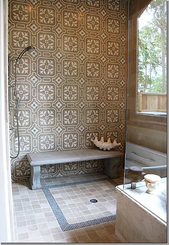
In Tracy’s “Tile House,” this picture of the master shower made quite a splash – pun intended! Actually, I’ve wanted to show this picture again because I see it on the internet and on other blogs – it obviously made quite an impression on a lot of readers. Maria had the idea to install a concrete garden bench in the shower instead of building in a tiled bench. And what a great idea it was! A simple idea – that no one had really thought of – and one that adds so much to a space where there usually isn’t much excitement. And I remember loving her added touch of the large clam shell for soaps and razors. Taking a simple idea that looks so luxe – and anyone with a shower stall can incorporate it.
This is the reason to tour Showcase Homes, to get ideas and use them in your own house, now or future.
Maria Tracy of Tracy Design Studio designs some of the most luxurious houses, as you can see by her portfolio HERE. What sets her designs apart from others is that she fills her houses with antique architectural elements which she finds at places like Chateau Domingue. This house – open this weekend fully furnished – is no different. It is an architectural wonder, with a two story living area filled with antique elements. The walls are plaster and stone, with handmade steel windows and doors, limestone and reclaimed wood flooring, stone stairs, and on and on!
Dubbed “The Bastide,” it is inspired by the French country mas found in Provence – houses made of stone and stucco with wide facades and wood shutters.
The Bastide is open today – Saturday, the 31st from 12 to 5 pm and Sunday, June 1, from 12 to 5 pm.
It is located at 206 Millbrook Street, off Memorial in Houston.
Details: 6 bedrooms/7.3 baths/10,361 sq. ft.
To see the listing, go HERE.
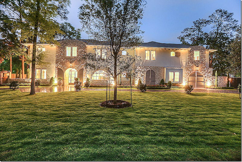
The Bastide: Its stucco and stone façade is a preview of what is found inside this beautiful French Manor styled, two story house. Notice the arched doors at the right – that lead to a Porte Cochere.
At dusk: On the left, matching arched doors open to reveal the glass steel front door. The wide façade resembles a French country mas found in Provence.
Night view
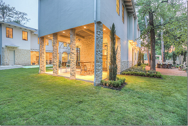
Two wings lead off the wide façade. In between these wings is a swimming pool. On the left is an outdoor kitchen and on the right is a covered patio. At the very right is a sitting area on a rug of gravel.
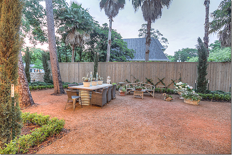
Off the front behind the stone wall and through a wooden gate is this outdoors sitting area. This area is off the wine bar – which is entered through a steel glass door.
Looking into the wine bar.
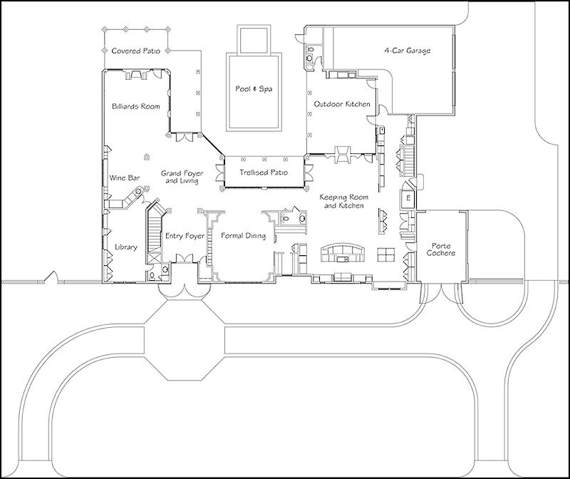
Floor plans for the first floor.
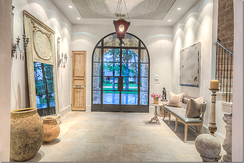
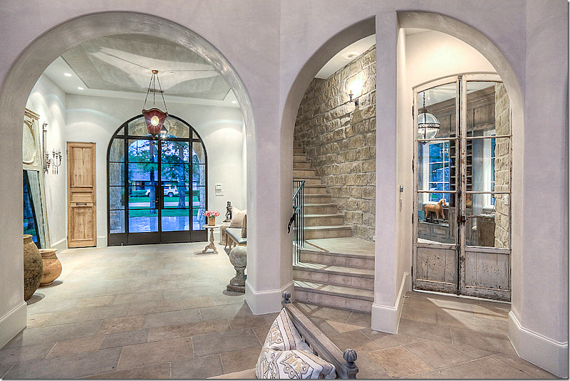
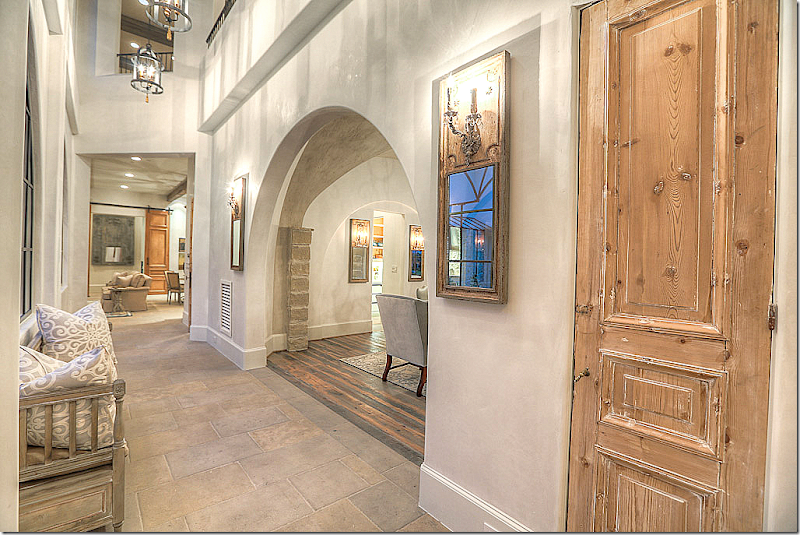
Through the arched shutters is the glass steel front door. The large foyer has a limestone floor. Maria Tracy has furnished the house with beautiful French antiques. Notice the closet door – antique pine. The stairs are located to the right.
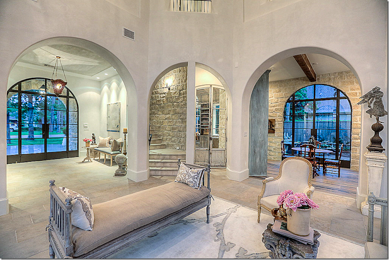
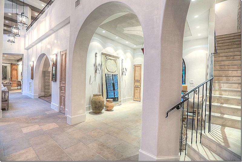
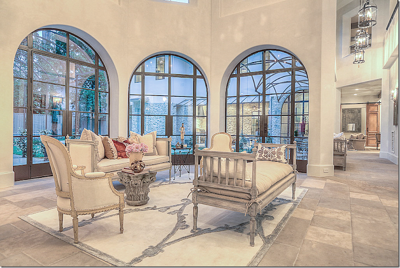
Past the large foyer is the open, 2 story living room. The wine room is through the arch on the right. Through the center arch are the stairs and the library.
I love this concept of the open living room. Instead of a fancy room hidden off that no one ever goes into – this room is a pass through to the stairs and the game room.
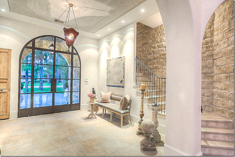
Here you can see the stairs are open to the foyer.
Looking from the living room to the stairs and library on the right.
And the view towards the dining room and kitchen/family room.
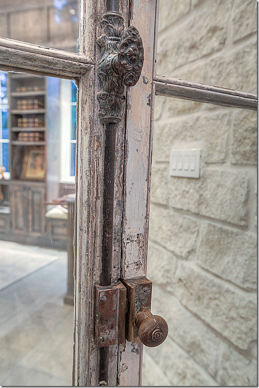
Antique glass doors open to the library.
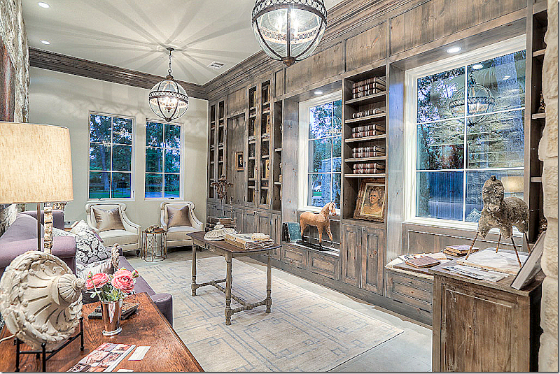
Stone, plaster and paneled walls are found in the library. The lanterns are antique – from Belgium.
View of the stone walls in the library. It’s powder room is to the right.
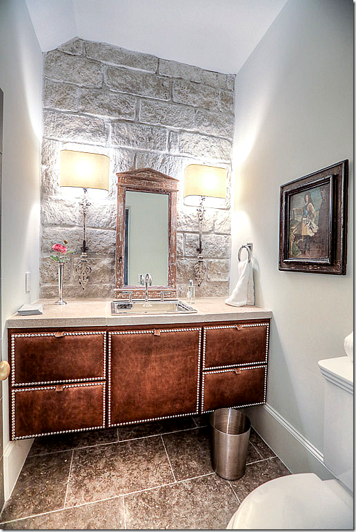
The powder room for the Library was inspired by John Saladino. The vanity is leather, the walls are stone.
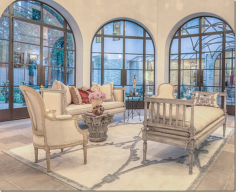
The living room – with its handmade steel windows, historic old world distressed limestone floors, and plaster walls. It overlooks the swimming pool. To the left is the wine bar and game room. To the right is the dining room and kitchen/family room. Across the pool – you can see the outdoor kitchen.
I love how this is decorated, with just a few French pieces, some from Aidan Gray, allowing for the flow of people to easily walk through the space.
Showing the architecture of the house – from the second floor.
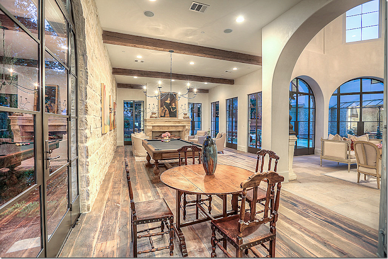
The wine bar and game room has a reclaimed wood floor. It sits off the living room. To the left, through the glass door, is the outdoor sitting room on the gravel rug.
The wine bar with two cabinets hidden behind antique shutters. One holds a found vessel sink and shelves on a stone counter, the other – a wine chiller.
Closeup of the bar’s shutters.
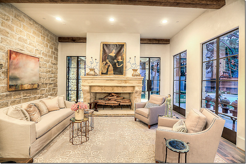
The game room with the pool table and fireplace.
The sitting area in the game room.
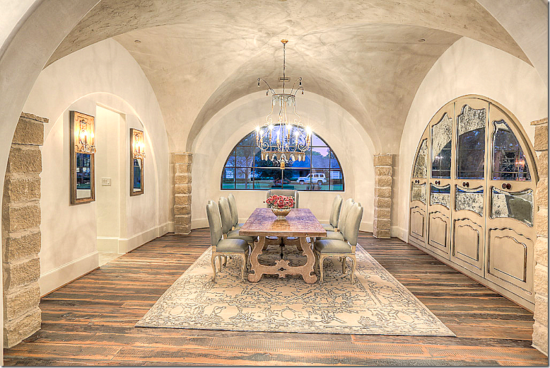
Leading to the kitchen/family room is the dining room behind the arch.
The dining room has a groin ceiling. The unusual china cabinet is behind antiqued mirrored glass.
The dining room – looking towards the hall. Pretty chandelier. Shades of lilac flow through the house – here the host chairs are in that color, in velvet.
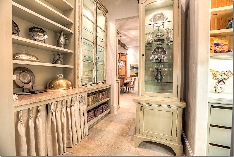
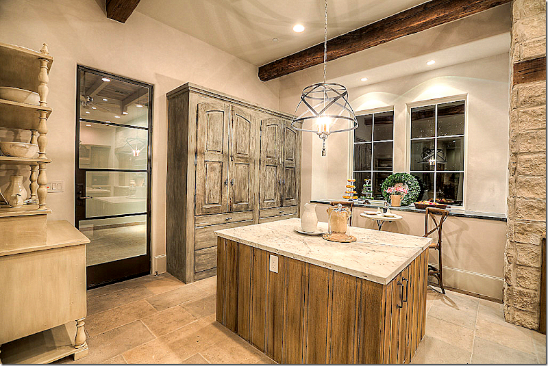
The butler’s panty has a wonderful shelf with linen curtain. Antique glass doors. The kitchen is through the door.
The beautiful powder room’s antique doors and hardware. Fabulous!
Antique vessel sink and vanity, sconces, and mirror.
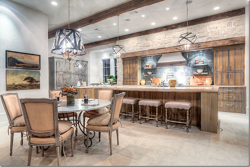
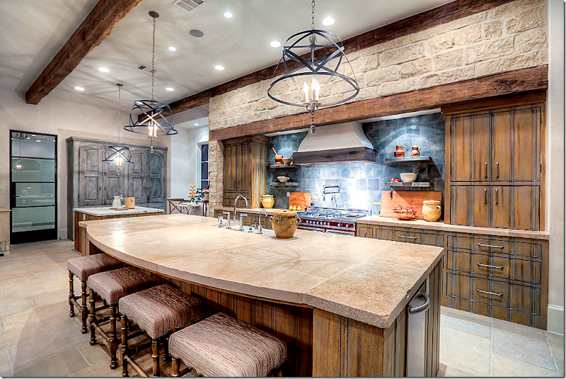
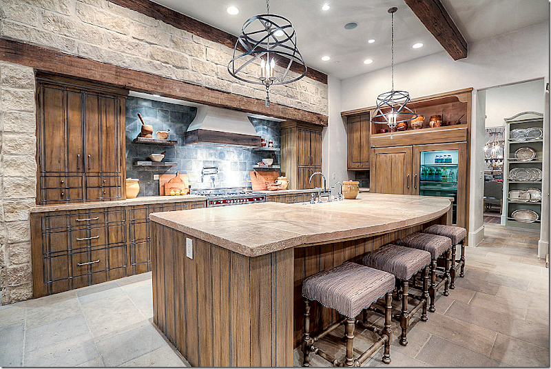
The kitchen – on one end, the breakfast room, and then the family room – all in one open space.
Through the glass door is the porte cochere. The kitchen is a unique mix of wood, stone and marble, with zinc.
Italian Bertazzoni range with Ferrari paint. Chateau Domingue antique backsplash concrete tiles from a French maison.
At this end of the kitchen, near the porte cochere is the baking center.
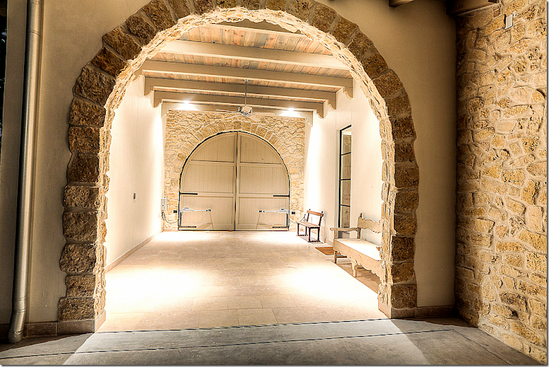
A view of the unique porte cochere off the kitchen. The arched wood doors open to the front of the house.
View of this side of the kitchen – looking into the butler’s pantry. Notice the refrigerator!
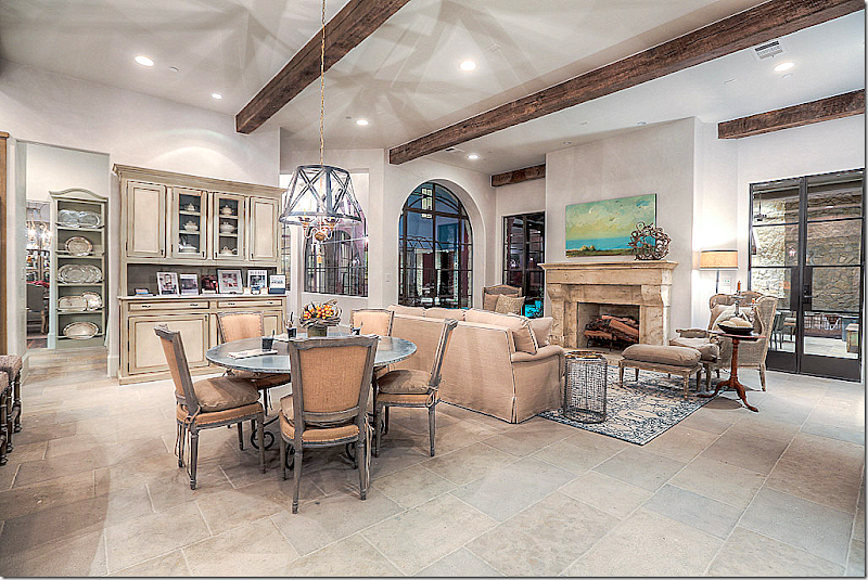
The family room open to the kitchen and breakfast room, looks onto the outside kitchen.
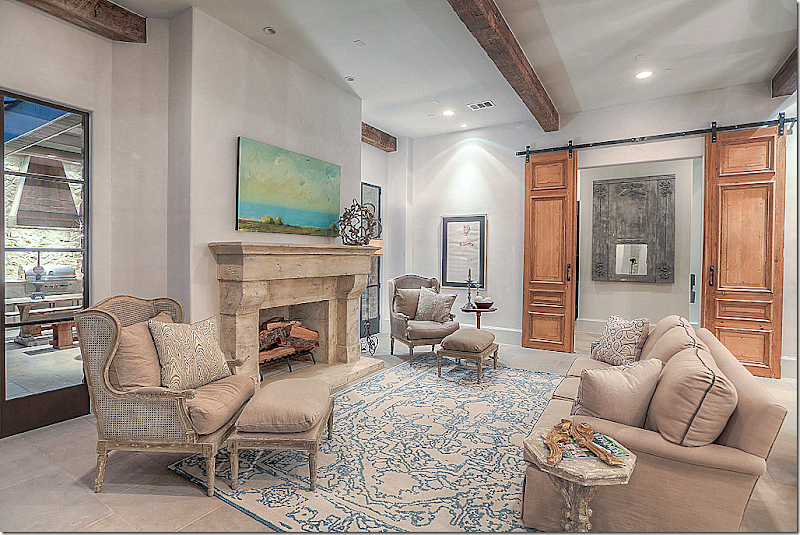
The barn doors lead to the catering kitchen and back stairs.
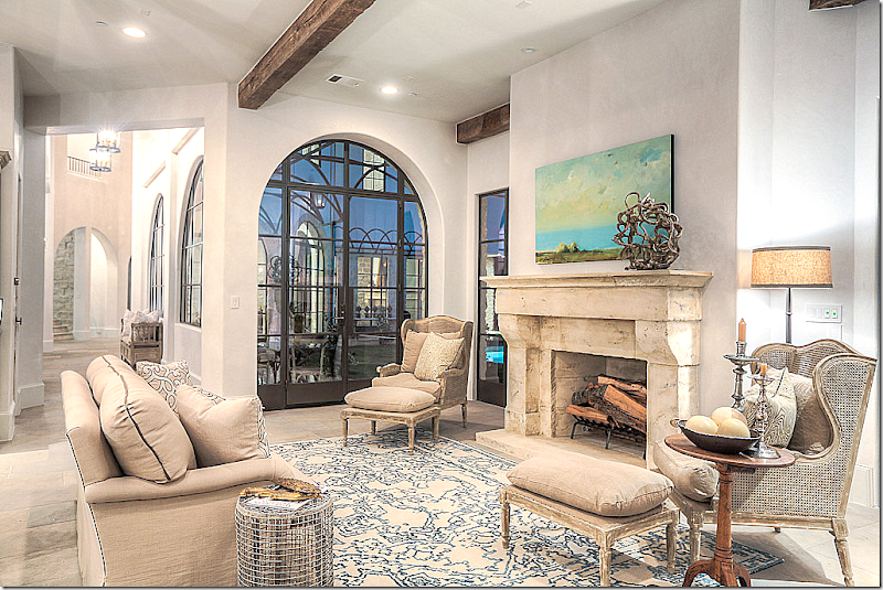
And looking toward the front hall from the family room. These chairs are from Aidan Gray.
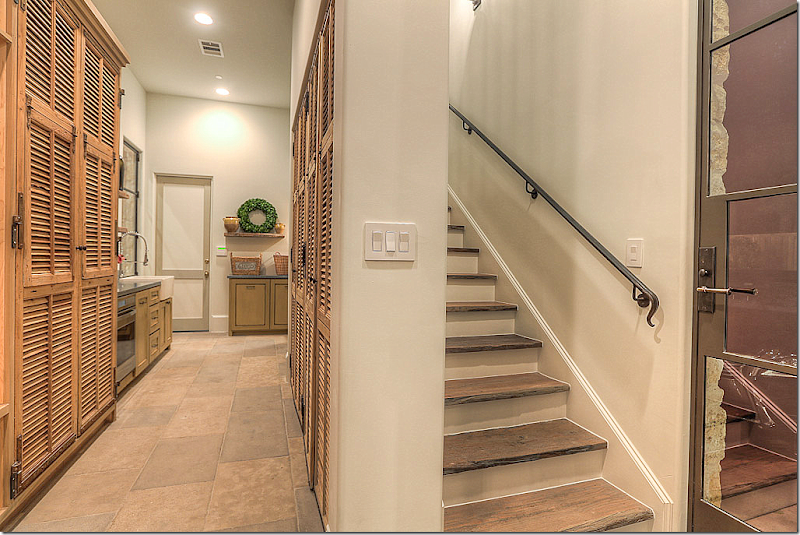
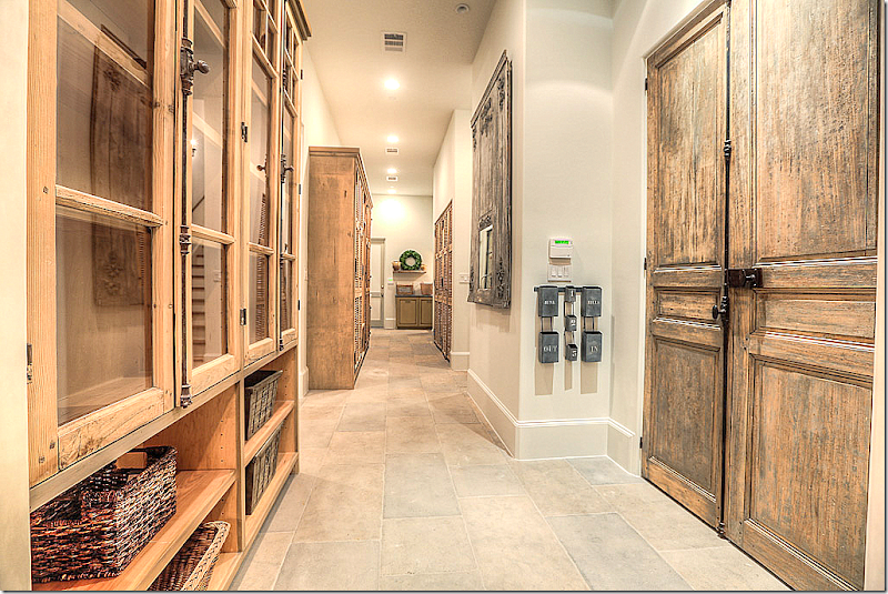
Off the baking center is a catering kitchen, fully furnished. Behind the shutters is mud room storage space. The hanging shelves are antique.
The laundry machines in the catering kitchen. There is another large laundry room upstairs. Naturally!
The back stairs near the catering kitchen.
Looking at the catering kitchen from further back.
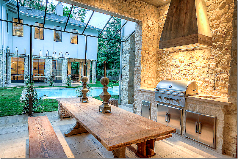
Off the kitchen/family room is the outdoor kitchen with its unique steel trellis – soon to be covered in wisteria. Stone walls and floors.
And looking the other direction at the grill and sink.
Looking in at the living room and the game room. Again, the wisteria will bloom over the arched trellis – creating a covered walkway.
SECOND STORY:
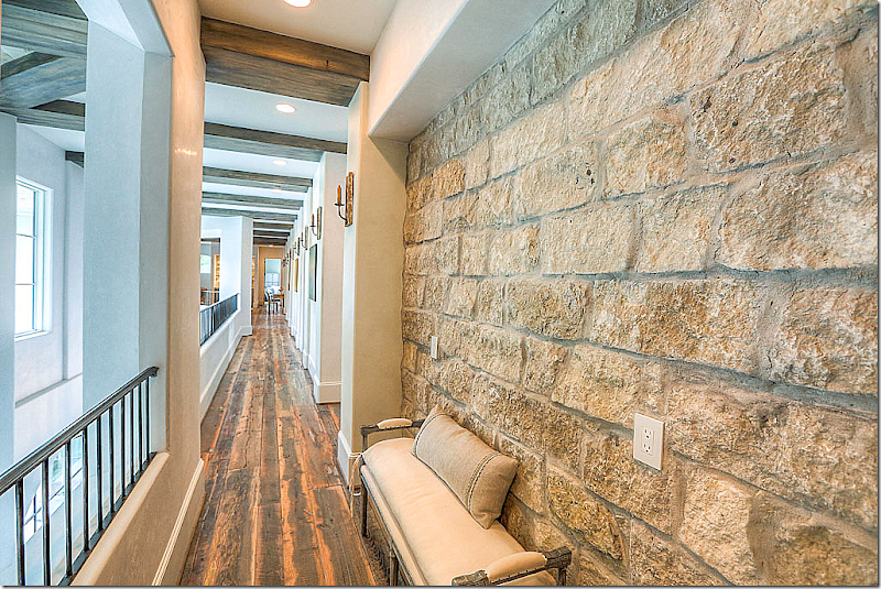
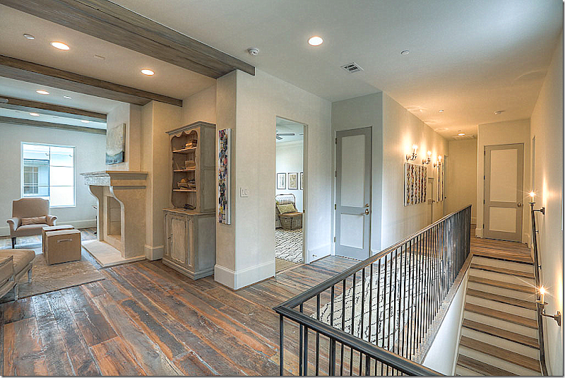
The upstairs hall overlooking the living room. Stone walls, wood floors.
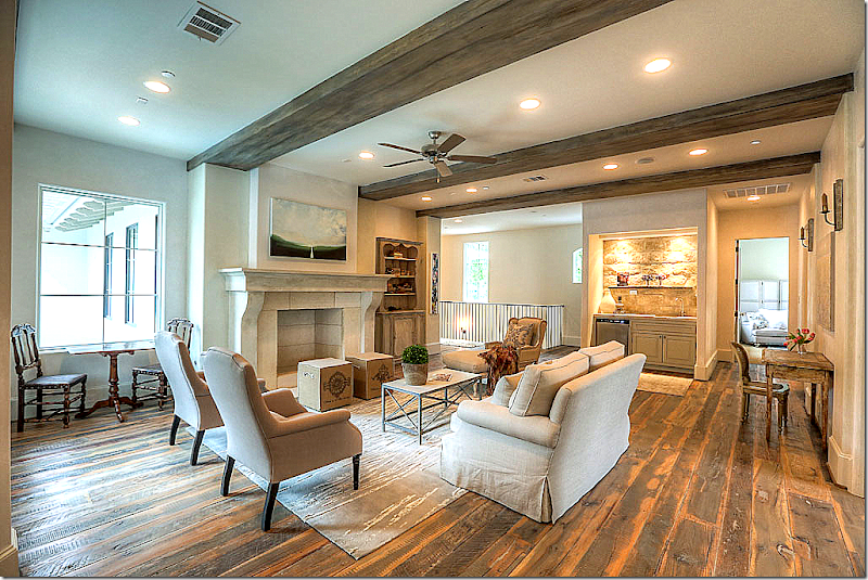
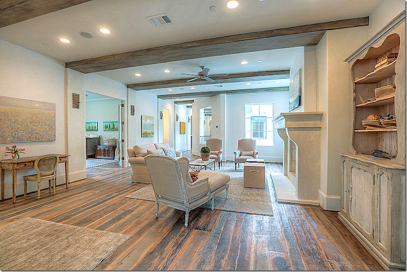
At the top of the stairs is the sitting room with its reclaimed wood floors and stone mantel.
Another view of the upstairs sitting room. The bedroom off the sitting room has double doors and could double as a study room for the kids.
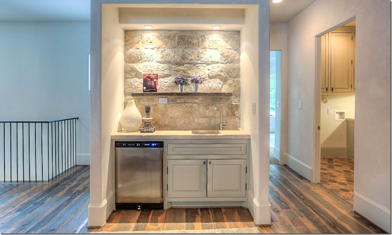
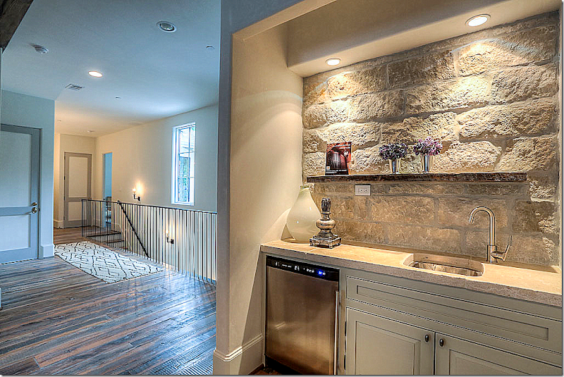
A small bar for the sitting room. To the right is the laundry room.
The back stairs. Love how all the upstairs doors are painted two shades of gray.
The sitting area and the back stairs where the elevator also is.
Antique tiled floor in the laundry room – along with stone walls. Nice laundry room!
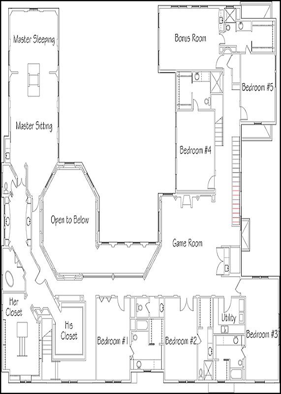
Unlike many Showcase houses, Tracy decorated the bedrooms – all six of them. This bedroom has wood floors. This is the bedroom off the sitting room with the double doors.
This bathroom has a vessel sink and French sconces.
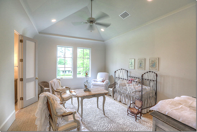
Love this nursery. I love the table and chairs, so cute. Rug layered over seagrass.
This cute bedroom has wood floors.
The room is set up as a flex room. This house is perfect for a large family. So much space!!
It’s bathroom has an found antique vanity.
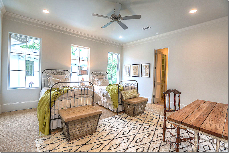
Moroccan rug over seagrass. Love the iron beds and green blankets – simply decorated but so chic! Love the colors.
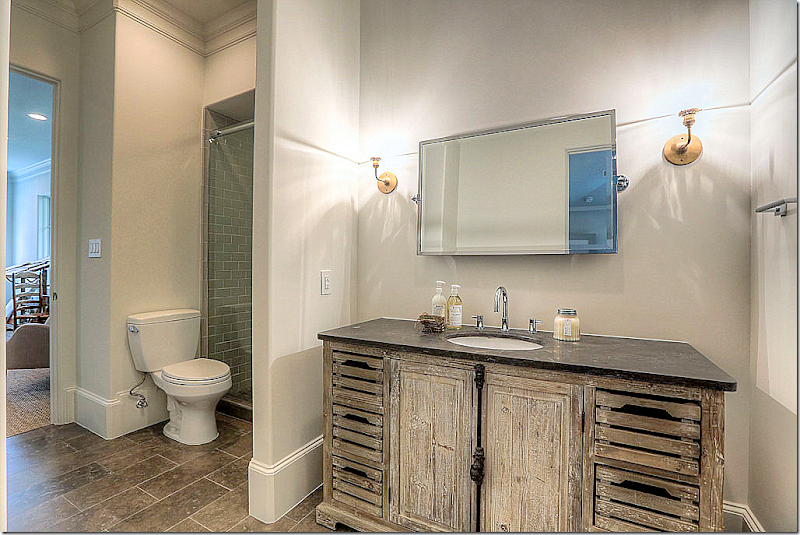
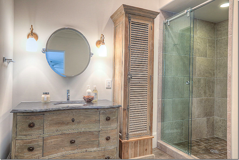
Another wood vanity with shutter cupboard.
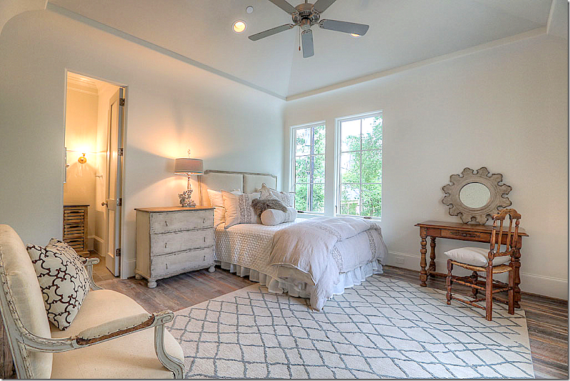
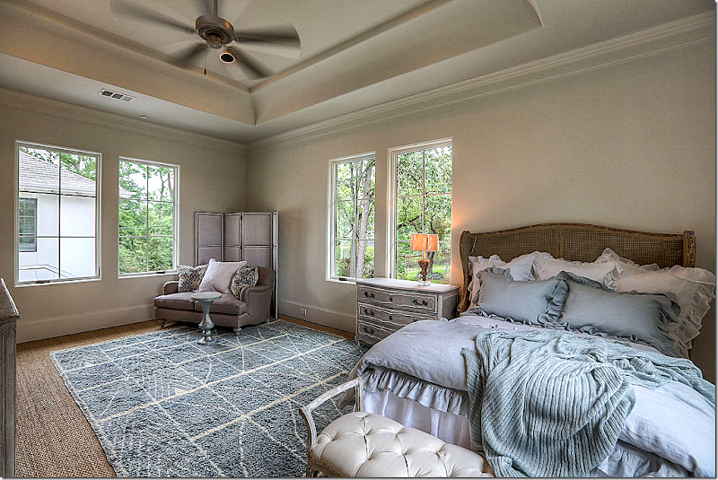
This bedroom is set up as a guest room. Pretty headboard.
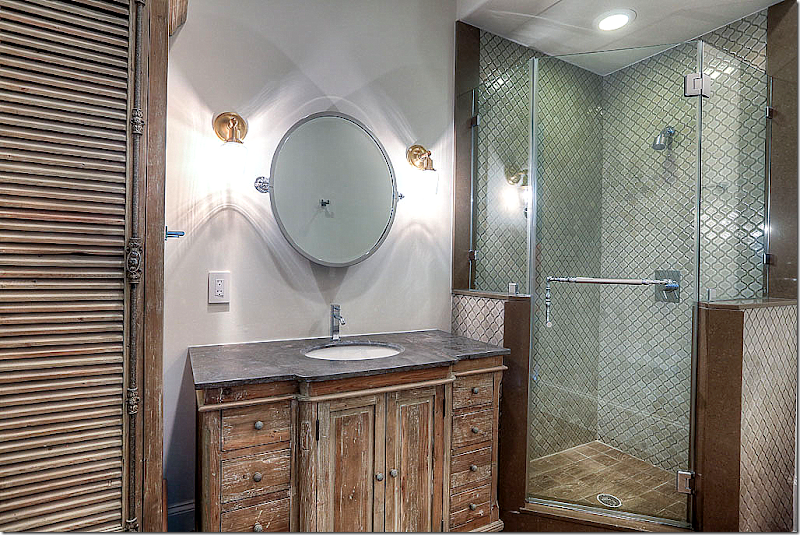
And this bath. All the baths are different – yet they look similar enough so that they present a cohesive design, another detail to experiment with.
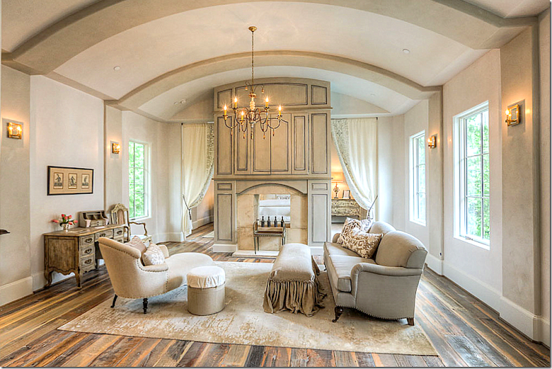
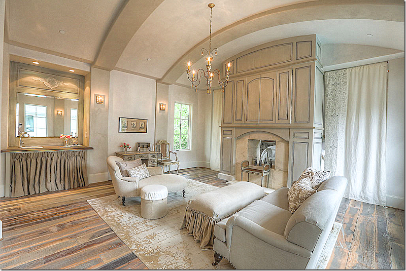
The master suite is on its own wing close enough to the children, but still removed. There is a sitting room that shares a fireplace with the bedroom. Portieres separate the two rooms. Love the way this is decorated.
The sitting area showing the coffee bar with linen skirt. Portieres close for privacy.
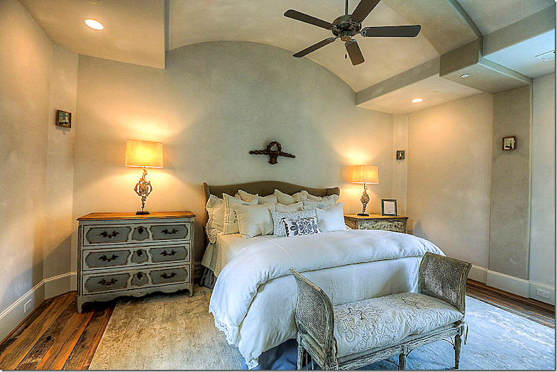
And the bedroom – pretty in French!
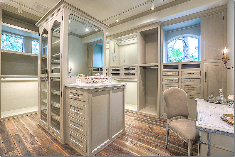
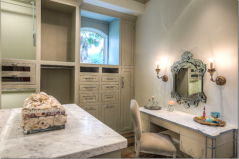
The woman’s closet with windows and a marble topped vanity. Love this!!!
The marble topped vanity.
The man’s gray closet.
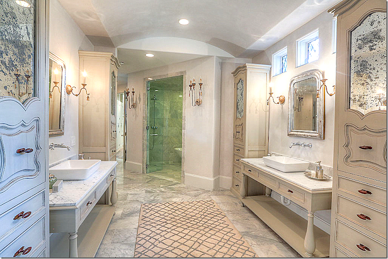
And the master bath – with beautiful custom designed cabinets with antiqued mirrors. LOVE!!!!
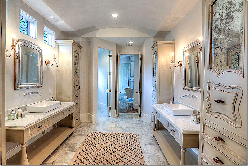
Looking towards the bedroom. The windows above are leaded glass.
To visit this beautiful house designed by Tracy Design Studio, it will be open today – Saturday, the 31st from 12 to 5 pm and Sunday, June 1, from 12 to 5 pm.
It is located at 206 Millbrook Street, off Memorial in Houston.
To see the listing, go HERE.
And for more information on Maria Tracy and Tracy Design Studio – go HERE.





















wow..errr..what a place!
ReplyDelete...i love the arches...i love the doors...i love the windows...and there my love ends...blessings laney
ReplyDeleteBeautiful space, floors, windows. Nice Château!
ReplyDeleteSeriously??? This is one of the most heinous houses you have featured. It looks like a junk museum.
ReplyDeleteThere's no accounting for taste I suppose. Welcome to the new, "classy" McMansion for the cultured Texan.
ReplyDeleteThe furnishings look like they were bought at a literal fire sale and with respect to the floors, well there are just so many words to describe ugly.
DeleteSeriously? Stop. Please don't be rude. If you don't like it - fine. But no need to be insulting.
DeleteSeriously? Please don't misconstrue honesty for rudeness. Did you really expect the usual groveling over this house, really??? Again, how many ways can one say "ugly"?
DeleteSeems too cavernous and "cold". Nice natural light, wood and muted colors but not a warm welcoming place at all.
ReplyDeleteThere are many beautiful elements here but I would not be able to live in this house. I like something smaller and more cozy. I mean, who would ever sit down and curl up in that "living room"? The extreme distressing of the wood cabinets would appeal to a small percentage of people, I think. That said, Joni, I have pinned quite a few pictures (including the awesome closets and the details in the bathrooms)! Thank you so much for sharing this with us. I am always amazed at the amount of work and attention you put into your posts.
ReplyDeleteHEY! Joni, I put a garden chair in my beach house shower! 25 years ago!!! That house was published in Decorating Magazine.
ReplyDeleteSEE??? i have always been sooooo schmart!
sure you did!!! no, I"m kidding. I know she wasn't the first. But that picture was reblogged a lot. It got a lot of attention. I kNOW you are schmart!
DeleteWow! Incredibly beautiful...
ReplyDeleteA "Bastide" is a fortified town build in the middle ages - one of the low points in French architecture. Nothing beautiful or elegant is suggested when the word Bastide is used. Certainly the house is aptly named.
ReplyDeleteI like your new profile photo!
DeleteI simply cannot believe some of the anonymous comments. So rude.
ReplyDeleteThank you for the time and patience to show us this wonderful home. It's just down the street for us and I'm always interested in what's happening in the 'hood.
Stunning palette, some very lucky woman will make this her own and the home will literally come to life when she does. Why don't those people see this?
xx's Joni...
May we suggest you purchase this dog and make something of it since it's in your "hood".
DeleteWell - I see the rude duo are back. They've been missing for a while. Whenever I post a house they don't like, all hell breaks loose. I understand that this house is not for everyone!! It's very large. Also - there are no window treatments which makes it a little exposed or cold looking. It's a showcasse house, not furnished like it would be for a family. Still - I don't understand why these two guys can't be nicer. I think they even answer their own comments.
DeleteI would be nice if people were less rude here. Constructive criticism doesn't have to be rude.
VISION!!! franki
ReplyDeleteJoni - Thank you for the time and effort you've put into this post. For those of us who do not live in the Houston area, it's always very interesting to see what's happening there in the design field. Although this home is not everyone's "ideal" design we can respect the enormous amount of work that it takes to put one of these homes together within budget and timeline. Keep up the good work - I always look forward to your next post!
ReplyDeleteWhew - what would Alex V say?
ReplyDeleteCharlotte des Fleurs has said it best, with wit and proper reserve.
ReplyDeleteI find this house, for all its size and openness, oppressive. As to the execution of the facade, the thin stone face veneered onto the cheap stucco, and those ludicrously thin stone pillars out back would be laughable if they were not insulting. Some of the furniture is nice but the pieces actually seem "scared" in the cold and soulless space, and that is not an anonymous opinion...
Don't insult hard coat stucco. This house was built with panels of synthetic stucco. Look closely and you can see the seams. This is one of the worst executions of home building I have seen on this blog and I have seen others here that would be in strong contention.
DeleteThe exterior walls look like they could be punched through by a couple of big drunk guys.
DeleteHi Joni, As always--appreciate your posts. I'm a 'house hound' and if in Houston, would be visiting this one--just for the fun of it. Speaking of fun, I saw choices in this house that made me laugh a bit--such as the portieres in the MBR--drawn for privacy, next to the double-sided fireplace. We'll need a curtain for that too, I suppose. Then there is the tiny, antiqued mirror over a bathroom sink. When I mentioned the garden bench in the shower to my husband (as a clever idea)--his response was, "Yuck! Just think what you'd find under the feet--think of moving it to clean!" Well, he's right. Not that I told him so. Btw, I have a Living Room that is under-utilized and like it like that; no apologies. Space to waste on a room I love that holds things I treasure is my idea of luxury.
ReplyDeleteI completely agree with the "classy" McMansion for the cultured Texan. What a perfect comment to describe this house. The layout seems to reflect few/if any architectural princiiples. Some of the features are well-thought, including the trellises outside the home. The steel doors are beautiful as well, but beyond that, there is nothing that strikes me as timeless.
ReplyDeleteIt is always so much fun to go on these virtual home tours! I also find it interesting to view the comments, pro and con, and compare my impressions with others. I had some very specific thoughts as I viewed the post and it is so interesting to see that others plucked these right out of my head!
ReplyDeleteI rarely comment . The houses are always beautiful and interesting. But I have to say I hate the outside of this house. BUT I found this home fascinating to look at. There are many many wonderful things about the layout and the interior design. There are many great ideas to think about and apply to other homes . But the interior design was too much of the same thing over and over . Clearly it would benefit from a little more color variation. The rooms are too hard. There needs to be more comfort and softness to balance all these hard surfaces . IT makes sense that the house is for sale. The seller probably wants things neutral so not to limit the attraction of a wide range of buyers ...but it is just too much. I personally like to vary the color values from room to room , so some rooms are darker and cozy and other rooms are open, airy and light. It is best to do this according to function of course. And we have all seen or used those pale grey colors that would have worked here and there. BUT please just give me one amazing spot to curl up on a cozy sofa with an incredible view ...
ReplyDeleteBut it needs to be said; the outside façade is not a pretty ...I cant even suggest how I would fix it . I think I would have to hire someone and I never hire anyone to help me fix design problems:)
BUT I am still happy you posted this, as there are many great interior design ideas here
thank you
Jeanne
P.S. I think some people post anonymous because they don't have a blog or anything other way to post. I have a linkedin profile but no other way to identify myself . But I am happy to say my name is Jeanne Holbrook and I work in store design :)
I like the idea of using the concrete garden bench in the shower. Wondering about the practicality of having concrete that is exposed to water. Are the benches sealed in some way?
ReplyDeleteThis comment has been removed by the author.
ReplyDeleteI can't get past that first picture---the master bath in the "Tile House"! That wall!!! Joni, do you know where those tiles can be purchased? Gorgeous!
ReplyDeleteChateau Domingue has those kinds of tiles. You might try rereading that story - I think I sourced the tiles in it - ? not sure though!!!
DeleteAwesome photography and post Joni. Thanks for sharing!
ReplyDeleteWell, I was so excited that you had a new post. I was in a hurry and did not have time to read , just looked at the pictures. I thought this was a public building.... It is so wrong on so many levels. I came back to read the post just now, but did not make it , not that you are boring, LOVE YOU ! I just had no interest in spending any time on this house. After I read enough to know what it was, I came to looked at the comments to see if I was missing something. I am so over this look ! It has no life, no soul, all the rooms tend to look the same to me. I understand that there is not a family living there and that will make a huge difference once this home has a family to call it's own. I did like all the texture and if the house was smaller it could really be something special. It is just too large and the exterior is lacking .
ReplyDeleteThank you for bringing this home to us! I love the doors, shutters, floors, walls and many other design elements. It is simplistic yet elegant. I find some of the quirkiness to be very appealing, very European. The details with elements of surprise in the choices certainly make me sigh and love. I can find the beauty and the relaxed comfort in this home...I get it! Thank you Joni, love your blog!
ReplyDelete~Tammy
Joni, I am curious to know if you actually saw the house in person? If you were decorating it, what would you do differently? Clearly, it is not a favorite of your Saturday morning readers. The other two houses designed by Maria Tracy that you showed received much more favorable comments and readers were certainly more polite. It occurs to me that many people respond to a house on a very personal level, envisioning themselves living there. While the Bastide isn't necessarily "me," I could live there very easily. What may seem cold in May, will feel luxuriously cool in August when the temperature is 96 and the humidity is 98.
ReplyDeleteGuess a lot of you have not sent much time in Europe.
ReplyDeleteshe meant "spent" and I completely agree! Europe would have helped all the designers of this house! (or maybe not!!) I love Texas; and Texans!!! This house is confounding to me!
DeleteI lived several years in Europe which is one reason I don't care for the house. It seems like a poor attempt to be "European". Various elements were used but, in my opinion, not in an authentic way.
ReplyDeleteAlso, is it rude to state one's opinion on various homes posted here or elsewhere? It seems natural to me to want to share impressions and opinions. I find it really interesting to hear what others think. Maybe it is how one's opinion is stated rather than the fact that it isn't favorable?
I read this the other day and really liked it. "If you are not nice on the internet, you are not nice." I don't think there is anything wrong about expressing one's opinion about a house, even if it is negative, on the comments section. Just be kind and considerate of others' feelings. I agree with you. It's how one's opinion is stated.
DeletePlease know that my comment is not intended to insult anyone. However, this home isn't remotely related to any realistic representation of European architecture that I have personally seen. It reads as oppressive and odd to me. That's just my opinion and everyone has their own idea of grandeur and beauty. Thank you for your post.
DeleteEuropeans laugh at American interpretations. This house is a full belly laugh!
DeleteGorgeous home, and I love what the designer has done with it... But why no draperies or ANY window treatments? I think that would have made a huge difference in the lack of warmth previous commenters have mentioned. It's amazing what a difference window treatments can make.
ReplyDeleteAt least where I come from Show Houses are decorated completely, including window treatments, fully furnished, etc. It is not meant to be sold fully furnished, but to show what several local designers envisioned for the home. This home seems to be the construct of one limited designer and it looks like it was done on a limited budget. Yes, the money spent for the stone accoutrements is expensive, but then the furnishings and window treatments fall way short of the mark. Perhaps more than one designer should have showcased this project in a way that would truly give a potential buyer a vision for the home. Outside of that observation, there is not much to be said for the architectural design. It is so off the mark that a near tear down is needed to fix it. Perhaps this is the house that illegals built.
DeleteWow - thanks for a great Sunday morning (where I am) post. I love steel windows and doors now although I didn't when they first came into vogue. I think that If I ever built a home from scratch I would build one with stone floors and walls like this one. I also loved the Saladino inspired powder rooms, so rustic and intimate.
ReplyDeleteErr ... trying not to be rude, but what the hell was that? French (not) meets motel (exterior) meets resort hotel (flow through lobbies) meets Texas loghouse (rustic floors) meets psychedelic, baby (dining and master bath cabinets). I do not understand this architecture. Sprawling, disjointed -- so much space (10,361 ft.) but poorly planned (powder room access through the library, narrow hallways and master suite, small master bed area, awkward-shaped bedrooms). There may be some ideas somewhere, but they have been assembled poorly. Sorry, but it's just too weird.
ReplyDeleteThere's another toilet between dining room and kitchen.
DeletePlease, do you know where I can get the rugs?
ReplyDeleteSheila
Wow, two posts in quick succession. You're spoiling us. Don't miss Joni's post from two days ago (May 29), which also has some interesting discussion.
ReplyDeleteI like this house despite it's size. With the addition of personal and decor items, it would be even better. I live in a very private area, so I have very few window treatment…..nothing to block my beautiful views into my woodland and gardens. I like it when you don't need them, although in this home a few rooms might be better with them. Thanks Joanie for a lovely post.
ReplyDeleteDid anyone else like the living room? Or, is it just me? I didn't care for the rest of the house; but I did like something about the living room.
ReplyDeleteAmazing of course, but I wonder what you do if you need to go to the toilet in the middle of the night? Put your hiking boots on???
ReplyDeleteWhat that house needs is a pair of La Z boy recliners, some Waverly wallpaper and lots of mini globes!
ReplyDeleteDear Joni, okay it is not my FAVORITE home; however I ALWAYS find elements I love and want to refer back to. I pinned several images for future reference. The rude comments are so, so , so uncalled for!
ReplyDeletexoxo
Karena
The Arts by Karena
Karena,
DeleteI couldn't agree more! The rude comments are so, so, so, so uncalled for!
I love your website. You post such beautiful, large and clear pictures. Your detailed yet concise comments point out the items that you might overlook if you are like me, blown away by the beautiful photos. You have the very best decorator blog site on the web. It is very apparent you work really hard to give your readers lots of good information, wonderful photos and details that show how much you work to provide the best. Thanks for putting out a top shelf blog site.
ReplyDeleteSigh. Everytime people don't like the house in the post and comment honestly, others (including Joni) attack them for being rude. It's depressing to experience all this thought control. Tastes vary, and it would be nice if people could state their preferences with some gusto---not water everything down to a politically correct blandness. What makes a comment section fun to read is the diversity of opinion---sometimes stated colorfully---and not an ocean of sameness. Let us all look at that living room. It looks less comfortable than a doctor's waiting room. And yet we are supposed to respectfully point out its good features? Where do you put down a drink? And stone walls in a library? But we can't say anything because someone's feathers will be ruffled? Joni writes sensational posts--she appears to put more into them than almost anyone with a design blog---and we all love her posts---BUT----that doesn't mean we love each and every design and its irksome to see people who are just expressing their opinion be called rude.
ReplyDeleteI think the point is not that you must fawn over every house, but just that you don't need to be snarky, rude and generally horrible even if you are pointing out features you don't like. It's fine to dislike a property but there are better ways to say it without always being an a**hat.
DeleteSheila
And by "you" I don't mean you; I mean those to whom it applies and they know who they are.
DeleteThey will be reading this momentarily, no doubt, and commenting immediately as they seem to live for this.
Sheila
Anon. 10:51, your comment is well stated and makes perfect sense. Call it rude, but I for one will not fawn over a design posted here that is as seriously flawed as this featured home appears to be from the photographs. This is literally one of the worst, if not the worst example of incompetent design, both architecturally and decoratively that I have seen on this blog. Were it not so sad, it would be almost laughable.
DeleteAnon 3:25PM
DeleteExample:
You could have left out the word "incompetent" and the entire last sentence of this comment and then you would have been saying the exact same thing you are now saying but better.
Sheila
Sheila, how can we thank you for your extraordinary lessons is journalistic accuracy. The fact is that the execution of this project is INCOMPETENT both in the exterior and interior layout and in the work performed by the interior designer. Isn't it bedtime?
DeleteAnon 8:10 PM
DeleteI wasn't attempting to give you a lesson in journalistic accuracy. That would be a futile exercise.
I was only trying to say that instead of saying things the way that you do, you could say the exact same things in a more civil fashion.
Of course, I just realized that this is also futile.
Sheila
P.S. By the way Anon 8:10PM, I think you meant "in journalistic accuracy" rather than "is". Hee!
DeletePriceless.
Sheila
Sheila, if the only thing that makes you laugh in the world is typos in the comment section of blogs, you are either extremely immature or perhaps impaired. You or I could scour these comments and find typos all day long as could anyone who reads here. Only an IDIOT would point them out and type "Hee! Priceless. I never knew there were so many ways to show one's ass, but you have added a new one to the list. PRICELESS!!
DeleteAnon 7:03AM
DeleteNo, not everyone's typo's are funny. That one was though, as you did it when you were trying to be a jerk once again as per usual. Any of the number of people who have come under your wrath here could probably see the humor in it.
Is this the only blog that you terrorize?
Sheila
Sheila, it's a good thing you don't rely on your humor to make a living because you would certainly wind up on a street corner with a monkey and a tin cup.
DeleteI think if you blog; you are open to any sort of comment!! I have a small blog; I approve or disapprove every comment! The ones I don't allow are "spam"! virtually all of them are selling "ugg boots"; or "Cialis"!!
DeleteI love blogs! I do , however notice, that Joni has a really cruel and kinda sick person or persons who lurk and strike really sick and destructive comments toward other commenters.
Too bad.
Penelope
The above person is the main culprit! He is pathetic!
This post is very educational. Not my type; but lots of useful information!!
ReplyDeleteI have been captivated by the other posts you referred to! I have some questions!! Where is your Venetian secretary? I love it! (I love the Swedish one too!!)
If you get rid of the urn and the lamb; I am signing up to buy them!!
And I love the house you love the most of all!!! (I guess Michelle's first house!) That was a great post comparing her two houses!
The decorator bought 11 crates of crap furniture from China and went around spraying it all with Krylon "Ye Olde Belgian Grey."
ReplyDeleteThe best comment of the thread bar none!
DeleteI never thought I would see anything that made Restoration Hardware look chic.
DeleteIt looks like the Shanghai Special with a few cabinets and vanities thrown in for good measure. The saddest part is that Joni believes these are antiques and even refers to them as such. How pathetic!!
DeleteJoni, I love your blog posts. They're long, lovely, well-researched and informed distractions and I adore them. But, holy moly, this house is an expensive, expansive architectural hot mess!
ReplyDeleteI agree. It's totally overwrought with bad taste and fake Euro stereotypes.
ReplyDeleteBe careful what you say here lest Sheila the word police bad ass shows up with a lecture. Otherwise, I totally agree, fake, Euro stereotypes and poor taste. It's hard to be believe this passes for design these days.
DeleteJoni, I save your posts for a time when I can examine each picture and pay attention to the details. I was out of town this weekend and wouldn't have been able to get to the show house, so thank you for the virtual tour. While this house is not to my taste, I loved seeing it. I can't get over the snarky comments, but I enjoyed them as well! (Kind of like a train wreck--I couldn't look away.) Thank you for providing so much entertainment.
ReplyDeleteI have seen this home in person and it is stunning with simple elegance. The outside is unusual for our country but has a beauty in its simplicity. Love the builders use of stone.
ReplyDeleteThis house...I don't really care for the exterior that much, and not really liking the downstairs, but then the upstairs - wow - some beautiful things happening up there, pretty bathrooms & bedrooms - well done and nicely decorated upstairs. Love some of the cabinetry in the closets and bathrooms and lovely tiles. I don't think the downstairs photographed very well. Something tells me this house might be much better in person. I do wish the staircase in the foyer was grander. Although this is not my taste at all, I think this home could be very nice - the downstairs needs attention and some exterior things might need tweaking - I despise the stone pillars, etc... I'm shocked I kind of like it...I guess the upstairs sold me on this house
ReplyDeletegood graphics and great info on your site
ReplyDeleteProperties for sale in Houston
Took me time to read all the comments, but I really enjoyed the article.Thanks for sharing.
ReplyDeleteConcrete Driveways Indiana & Acid stained Concrete Indiana
i am really appreciate this blog.
ReplyDeleteRemodeling Contractor Marietta, Kennesaw & Roofing Contractor Kennesaw
Useful information like this one must be kept and maintained.
ReplyDeleteCrushed Concrete For Sale & Rip Rap Rock in FL
I have no other way but to post anon. But…. I really think the house is bad. I looks like a house that a 2nd or 3rd year architectural student would submit for a grade - just immature. The floor plan is n to though out very well. I looks like they had a footprint of a house they found and make the interiors fit. The panels on the outside look cheap - can't really tell if it is not Hardiplank from the photographs. There is just too much going on in the inside. Its like each room is trying to have its on identity with no cohesive feel. The kitchen is way under what you would expect in a house of this size and cost.
ReplyDeleteI do agree with an earlier comment that the look is really getting old. I thought Houston designers have moved on from the painted grey furniture, wall and cabinetry. I don't believe any of the furniture is truly antiques, you can find the same pieces over and over at most stores you go to in Houston. Some of the base cabinetry can be found at Restoration Hardware.
Pleas don't think I am being "mean"…… I am just being honest. Thank you.
Thanks for posting this informative article thanks for sharing your great post,wish you have a nice day,happy every day.
ReplyDeleteSiding Contractors Solon & Roof Cleaning Garfield Heights
Wonderful article, thanks for putting this together! This is obviously one great post. Thanks for the valuable information and insights you have so provided here.
ReplyDeleteRemodeling Contractor Fairfax & Bathroom Remodeling Fairfax VA
Ralph Lauren Outlet
ReplyDeleteKate Spade Outlet
MCM Backpack Outlet,
MCM Backpack
UGG Boot Clearance
Oakley Sunglasses Outlet
North Face Outlet Online
Marc by Marc Jacobs
I don't agree with everything in this post, but you do make some very good points. I'm very interested in this topic and I myself do alot of research as well. Either way it was a well thought out and nice read so I figured I would leave you a comment. Feel free to check out my website sometime and let me know what you think......
ReplyDeleteGlaziers in NW1 - Central London & Glaziers in NW2 - Cricklewood