
If you are from Houston – it’s that time again for the West University Festival of New Homes. It started last weekend, but you still have this weekend to tour some of the prettiest new houses that have gone up this year in West U. Even if you aren’t in the market for a new house, it’s still fun to see how they are furnished – since some great interior designers have taken part this year:
Bradford Collier of BwCollier Interior Design, Inc., Sheryl Stringer Designs, Segretto, Chateau
Dominique, Christine Ho with Cho Interiors, Spaces and Tami Owen.
OK – I see exactly which houses I want to visit. The tour is this Saturday and Sunday – 11 am – 5 pm!

One house in particular caught my eye – it was the house of a young builder – David James.
David James (DJ) Palmore has a degree in building – a BS in Construction from LSU. After graduation, he started out working with a local custom homebuilder – completing over 30 houses in West University and other fine neighborhoods in Houston before he went out on his own.
The house that David James built for the showcase is actually a custom house that has been sold – but the owners were gracious enough to let him enter it. Spaces For Home – a décor shop recently featured on Cote de Texas – provided all the interior design, headed by owner Susan Gay and designer Dewayne Formby. Dewayne was so sweet to share the photos of the house with me so that those who aren’t in Houston can see it!
I love looking at new custom homes – it really is a great outlet for seeing what is new in building and really, there are so many new ideas here.
All the photography shown is by Connie Anderson HERE.

The exterior tells you right away this is a custom house – I love how the white painted brick is mixed with the stucco. And I love the metal awning. The front door mimics the stunning metal French doors. And I’m loving the new shutterless trend I’m noticing around town. It just looks so clean to go sans shutters – especially when mixed with white brick or stucco.

You enter the front door to a main hall. To the left is the living room, to the right is the dining room. Spaces For Home furnished the house in soothing tones of grays, taupes, and white – with lots of light caramel colored wood and iron. In the living room – a grid-like bookcase was painted dark gray against the white walls. An antique map framed in sections acts as the focal point over the sofa.

The pattern comes in the pillows – I like the way the two main pillows are such a nice size – probably 24x24, which I think is usually the right size. I really don’t like pillows that are too small to make a point – and these two show how important the proper size of pillows is. Dewayne added the small lumbar for the added comfort of the third person.

The main hall is limestone, while the public rooms are a dark hardwood. The builder prides himself in his execution. Notice he needs no quarter-round molding to hide flaws in the hardwood floor placement. Instead, he has a clean look of an over-tall piece of molding rising directly from the wood. Between the kitchen and the dining room is the butlers pantry and wine room, which is seen behind the steel glass windows.

Here is a closeup of the molding, without the usual quarter round hiding the space between the wall and the floor. So perfectly executed, there is no need for the quarter round. Much more sophisticated looking.

Here’s a view of the wine room – in the service section between the dining room and kitchen. So unique!

Here’s a close up of the wine room.

And looking on from the front hall to the dining room. Love the solid gray linen curtains against the wood table with cream chairs. I love that table base – it mixes contemporary styling with traditional. All furniture comes from Spaces For Home.

Walking down the main hall towards the back – the kitchen is to the right and the family room is to the left, overlooking the back yard. An archway of rough limestone divides the two rooms.

And looking from the family room to the kitchen, you can see more clearly the stone arch. The wood table is a contemporary take on an antique butcher block – while the chairs resemble the dining room table, continuing the design theme throughout with the caramel wood and iron.

The steel door leads the back yard and garage. Quiet and calm finishes – small tile backsplash, honed stone countertops – are so much more sophisticated choices.

And hiding behind the island – a French Le Cornue stove. To die for! Pick out your own dream favorite at Williams and Sonoma HERE.

And looking from the kitchen island to the family room with its dark beamed ceiling and wall of steel French doors.

The family room continues the décor scheme – with dark gray and taupe mixed with iron and light caramel wood on the coffee table. The steel French doors are gorgeous – just gorgeous.

A pretty large oil hangs over the sofa. I like the symmetry of the matching mirrors and two pairs of chairs. If this look is too contemporary – you could tweak it very easily – using antique mirrors, or sunburst mirrors and a more traditional coffee table and lamps. Again, large pillows – one solid, one matching the curtains – add a focal point to the sofa.

Youthful damask curtains in gray and white are repeated on the sofa’s pillows.

The powder room shows the reason why Places For Home went with the light wood tones – the cabinetry here. Love the tiny pendant lights.

The stairwell has a limestone wall – the same as in the kitchen.

The guest room upstairs has a wonderful graphic rug, matched by the curtains and pillows. Love this room!

This guest room has an interesting headboard and a contemporary styled Moroccan rug.

Love the slipcovered chairs. Now, you know the wall hanging is too contemporary for me – but by replacing it with a few antique prints, it would totally change the feel of this vignette. The chairs lend themselves to either contemporary or traditional, which is good if you want to take décor either direction.

This sitting room upstairs continues with the grays and taupes found downstairs. As always, great sized pillows serve as accents. I hope you are noticing all the rugs – not any textured seagrass type rugs at all, which is a nice change.

The master bedroom is another study in symmetry. Rather than all the grays, this room is more of the taupes, along with the metals. Pretty rug and headboard.

The master bathroom is a blend of brown honed marble and white marble. As found throughout the house, dark wood plays an important part here.

The shower is behind the tub and it is gorgeous. I love the blend of the brown and white marble.
All of the furniture and accessories seen in this house are available at Spaces For Home.
Remember – this house, along with all the others is open this Saturday and Sunday from 11 am to 5 pm. Be sure to check out the Tami Owen house and the Segretto/Chateau Domingue house!! Those two really look great.
Thanks Dewayne for sharing the beautiful photographs!
And finally,

One of my favorite gift/décor stores in Houston is Olivine – located in the Rice Village. I bought my Madonna there for my daughter’s bedroom and everyone just loves it. Olivine always has the best merchandise – from home décor to candles to jewelry to baby clothes to – you name it!

The owner Helen is a huge animal lover – I’ve lost count of how many dogs and cats she has!

She started carrying this line of men’s bow-ties named after the owner’s rescue dog, Mr. Kippers. Mr. Kippers had been abused when he was rescued and his neck was scarred from the chains that were around him 24/7.

His owner started making bow-ties to hide his scars and through that – started a bow-tie business for humans! Helen saw this line and it was a perfect fit for her business. Most of the profits from Mr. Kippers goes to animal rescue charities.
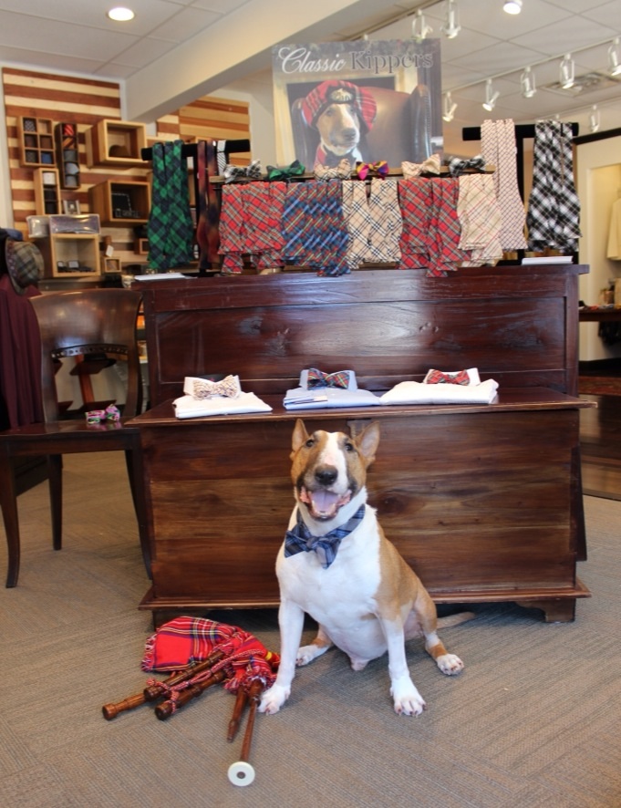
Mr. Kippers even has his own blog HERE. Here his owner posed him in front of the Mr. Kippers display. So cute!
In honor of Mr. Kippers – Olivine is extending this offer to Cote de Texas readers.


With a $30 donation to either one of Olivine’s two favorite pet charities: Corridor Rescue or Paws Houston – all Cote de Texas readers will receive a 20 percent discount, storewide!! Offer good through the end of October. Twenty Per Cent discount – store wide!!! A huge thanks to Helen for her generous offer!!
For more information contact Olivine, below:

I so wish I lived in your area, Joni- the houses there are just so extraordinarily beautiful. And Mr. Kippers is just adorable- that smile!!!
ReplyDeleteBest,
Mimi
Beautiful home!! I will have to go see it in person!
ReplyDeleteJoni, the AIA here in Houston is having home tours this weekend as well.
ReplyDeleteBeautiful home and post. May we stop by your home and take a peek as well? lol
Thanks for sharing.
I love seeing the huge windows and all of the light infusing these spaces! Thanks Joni!
ReplyDeletexoxo,
Karena
The Arts by Karena
Your blog is my favorite movie!!! franki
ReplyDeleteIronically, of all the lovely things in that show house, there are a couple of details that bother me. The first is the twin headboards, which I'd prefer reach down to the floor (or at least the baseboards). The second is the curtain rods. Whether or not the owners ever bother to close the curtains, I think it'd look much better if the rods extended all the way over the windows (not just sit between them).
ReplyDeleteThe dining room rods also look too short, causing the curtains to block the windows. For those in the know, what is the right length that a curtain rod should extend past a window on each side (so the curtains, when open, hang over the walls not window)? There must be some common practice/formula.
this is a showhouse the Spaces furnished. The house is sold and will be furnished by their interior decorator. So - I don't think Spaces could spend the money to have custom curtains made - so just ignore them if they are too short - it's the effect of the look they are going for. i always put rods at least a foot to the sides of the window if space allows so that the curtains cover the walls and not the windows, except for a tiny bit. some people do it less, but if you have the space, go for more than usual which i think is around 6 inches. it just depends on the window and the size of the wall and the space between the windows. there are a lot of factors involved. actually - i personally think the dining room rods look good. there is a quality to them being tall and not too wide - which carries the eye upward. if this was my house though - i would have added a textured shade, or even a fabric shade under the curtains that hangs right where the rod is - thus hiding that dead zone of drywall between the rod and the window. that makes the windows look even taller.
DeleteI think the light makes these pictures beautiful and the house really warm. But of course, I agree that some shades would bring more life into it !
DeleteJoni, Thanks SO much for sharing with your fabulous followers! Spaces for home wants to say a special "Thank You" to Madison Lily Rugs! Edgar, Kelly and their whole team helped us tremendously by furnishing every rug in this home. Many thanks to Boxwood Interiors, Circa Lighting, Design House, and Found for their contributions as well! DeWayne
ReplyDeleteOne word: Delighful!
ReplyDeleteThanks for sharing this! I love the sketched artwork collage above the sofa, I've been wanting to do something like this for a while by sketching my own pictures. I pinned it so I dont loose this page!
ReplyDeleteSuzy
http://www.betterhousekeeper.com
Love seeing this new house. Very pretty! Love all of it!
ReplyDeleteThere is a lot to learn in every single one of your posts! I tell young people.....your blog is "graduate school for free"!
ReplyDeleteYou research; you explain.....thank you for the huge amount of effort you put into each blog!
Brava! That is what I say!! Bravo!!!
ps (the space between the window and the "drywall"? I don't get that.....please explain!!)
This comment inspires me to ask you to please monitor and look at your comments....before they are published. This is completely horrifying!
ReplyDeleteOh dear. Mr. "I hate American Women"! (far worse than the person who calls me an "old biddy"!!)
consider "approving" the comments??
We LOVE YOUR BLOG!!!!!
Go for it! But please leave America! Go find your dream woman.....just get the hell out of our country while you pursue your misogynist dreams! We don't need creeps like you!
ReplyDeleteI love the sink that looks like a hollowed out tree stump.
ReplyDeleteDo you by any chance know where they found the rough limestone? I'd love to buy from the same quarry/provider.
ReplyDelete