Since it seemed like so many of you enjoyed the last Before & After, I have one more.
The reason why I really like these kinds of stories is that it shows how you can update your house for today and for the next decade. It shows what others are doing to update their houses, and it’s also a lesson in what looks good and what doesn’t look quite as good when remodeling.
These renovations in Houston (and everywhere, I suppose) are happening because the massive age group – The Baby Boomer Generation - is now older and are becoming grandparents.They are moving out of their family homes into empty nest townhouses and condos.
And taking their place are the Generations X, Y, and the Millennials who are just marrying and starting families and moving into the old Baby Boomers family homes.
The Millennials have a different idea of decorating. They want color and glamour, pattern and sophistication and Baby Boomer’s houses are a bit bland and rather boring for them. They didn’t grow up with Mid Century design, so to Millennials, it looks new and fresh. To those over 50 – it’s more of a “been there, done that.”
And while Baby Boomers may look on these new design trends with skepticism and even disdain, the Millennials have fresh and exciting ideas and the energy to try them out.
So, here is a Before & After – a house bridging these two distinct generations:
Located in Southampton, an older, very leafy and pretty section of Houston, the house was built in 1984, at the start of the gentification of these mature neighborhoods. Babyboomers flooded near town, tearing down the cottages and building massive two story brick houses that were much too large for the typically small town lots. At 6,150, this lot is a bit bigger than the typical 50 x 100, which allows for an extra room or two in the house. And even more unique, there is an alley that runs behind the house! The garage faces the alley and thus the street is mercifully free of driveways!! Why did we ever abandon this wonderful design?
The brick isn’t the typical red, rather it is a warm orange. The light upstairs gives off an eerie yellow glow through the plantation shutters. Regardless, the house is not typical Georgian, with its arched door and round window above it, and these differences set it off from the neighbors.
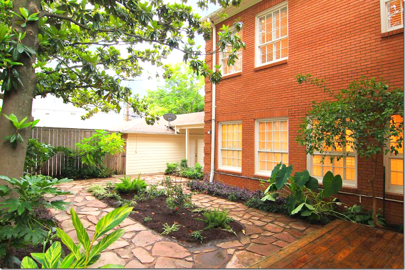
At back, plant beds are set off by irregular stones. There is no grass, making it easy to maintain.
The back door connects to the garage through a covered walkway.
A view from the house of the backyard. Looks strange to not see a garage door! The door faces the back alleyway instead of the front.
The 1984 house was sold in 2012. It was listed as a 4 bedroom, 3 bath house. The new owners undertook a massive renovation, by the construction firm headed by Kurt Hahnfeld HERE.
2016: The house today! Painted Houston White, the orange is long gone and the house looks so much more contemporary and “today.” Someone commented that all the houses in Houston are white. No, they aren’t. But it is definitely a trend with the younger Generation, and I love it - so I tend to show more white houses. Trust me, most Houston houses are either boring beige or red brick.
The landscaping was edited and a fresh row of box was added, while a back row was removed. Ferns flank the entry and an arch of evergreen wisteria was added.
2016: The glass was removed from the door and sidelights for privacy, but the top windows were left to let in some light. Love the large lantern that was added. In short, the facade is much prettier today!
2016: Painted white, the trim is a warm gray. Pairs of contemporary lanterns were added besides the French doors. The biggest change is all the free form pavers were removed, along with beds. There is now grass, with square pavers and beds along the fence.
2016: The view of the new grass yard looking towards the garage.
The square stones are set in gray gravel and look very sophisticated now.
2012: Looking from the front door – the living room is on the left and the dining room is at the right. The end of the hall has unique curved walls with niches. What is strange though is how the wall at the end of the hall blocks the view and stops the sight line.
2012: And looking back towards the front door, with a close up of the lighted curved walls and niches. The ceiling is vaulted in the foyer. The hardwoods are orange, to match the brick color, and the walls are a beige.
2016: The front door, with the wood instead of glass. By keeping the high windows, it still has an airy feel. An antique chest and trumeau with contemporary lamps, gives a hint of what is to come.
2016: The foyer looks completely different with the white walls and the dark hardwoods. To the right you can see the stairs, but the biggest change is the wall at the end of the hall is now gone! Perfection!!! The lighted niches are also now gone and contemporary sconces light the hall. What a huge difference. Without the dead end hall, it looks more open and inviting and warm. Also, notice the high wainscot which was added, it adds so much to the hall!
2012: At the very right of the front door is the paneled study.
And against the back wall is a fireplace, which is nice, I guess, in an office. Under the stair is a bar.
2016: And now the room is painted the trendy Farrow & Ball cobalt blue! Again – the paint gives the room a huge youthful vibe. Notice the Marilyn Monroe book (looks like the last house!) Love the Chiang Mai Dragon fabric mixed with the blue. The contemporary crystal chandelier from Visual Comfort is the final touch. I only wish we could see what the fireplace looks like now. I’m sure it’s a huge improvement over how it was.
2012: To the left of the hall is the large living room – here with the view towards the back yard.
2012: With the black fireplace.
2012: And the two windows facing the front door.
2012: Here’s a view of the backyard how it was with the large bed surrounded by the free form pavers.
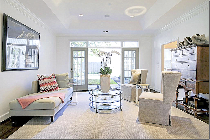
2016: And here is the living room updated for today with the white walls. The fireplace was an eyesore the way it jutted out from the wall with black marble, but now, in all white it blends into the walls and doesn’t seem nearly as large.
White marble on the hearth along with wood trim above the mantel, which hides the flatscreen. The large room is divided into two conversation areas.
2016: The quietly patterned rug in gray and white warms up the space. Near the back French door, two modern chairs and a chaise are mixed with an antique chest which adds warmth and weight.
2016: At the front windows, a slipcovered white sectional wraps around the corner. David Hicks hot pink fabric on a bench, gilt coffee table – all perfect for a young family looking for a bit of contemporary and glamour.
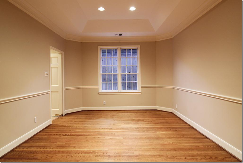
2012: The dining room is to the right of the entry hall, across from the living room. With its beige walls and orange wood, it looks more like the 90s.
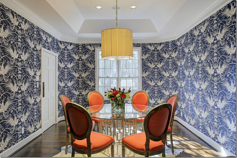
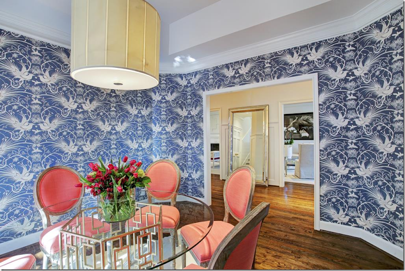
2016: Today, the dining room is ultra chic with its fabulous Mokum wallpaper. I love the orange against the cobalt blue.
2016: And a view towards the living room.
2012: The entry hall leads straight back to the kitchen – with the wall so you can’t see into the kitchen from the hall. This was removed by the new owners.
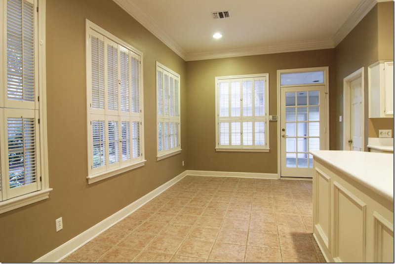
2012: Past the wall is the long breakfast room. This area saw the biggest change – it was totally gutted. Here you can see it was a boring dark beige, with tile floor. The door leads to the garage.
2012: At the right of the breakfast area is the kitchen with Corian countertops.
2012: Looking from the kitchen to the breakfast area and out to the backyard.
2012: Finally – the door at the back leads to the dining room.
2016: And, past the curved end of the hall, with the wall removed, you can now see into the breakfast area.
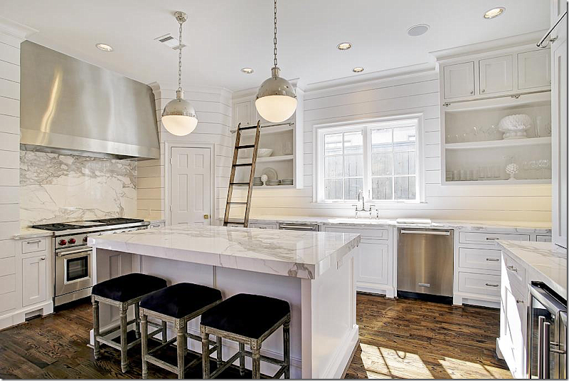
2016: The new breakfast area, opened to the kitchen, is much wider. The walls are shiplap, which gives a warm cozy look to mix with the modern furnishings. Here’s a link the iconic Ingo Maurer Zellel’z 5 chandelier. HERE.
2016: The island is covered in stunning marble, as is backsplash. It’s gorgeous. Love the library ladder for the upper cabinets.
2016: Another view – double wine refrigerator. All the appliances are top of the line.
2016: Looking towards the back yard. Gorgeous Calacutta marble.
2016: Between the dining room and kitchen, the butler’s pantry has interesting grills on the doors – love the marble shelf. A small detail – that looks so luxe.
2012: Sea of carpet upstairs – the playroom.
2016: Upstairs, no carpet – warm hardwoods instead. The playroom has China Seas wallpaper, a cute Sputnik, and Kelly Wearstler fabrics all mixed together for a young, modern look.
2012: Upstairs, the master bedroom with more gold carpet and dark beige walls with plantation shutters.
2012: The master bedroom with marble tile. Nice, but a bit dated and in need of an update.
2016: The large master bedroom has beautiful windows – and the new hardwoods make a HUGE difference! The walls are covered in Farrow & Ball wallpaper in Ocelot. Visual Comfort chandelier. I love the curtains – they are perfect!
Another view – be sure to notice how they added trim on the walls – which frames panels of the wallpaper, instead of just putting the paper throughout. This is a different way to hang paper – which I love.
2016: Hard to believe it’s the same bathroom! New vanity with marble and marble herringbone tile floor. Sheer white linen shade at the window. Crystal chandelier. Stunning, just stunning. This bathroom and the kitchen are beyond fabulous!!!
2016: The Maax bathtub was turned and placed in front of a mirror to become a focal point when you walk into the room. Remember to think of sight lines – they are so important. Just as the sight line from the front door was blocked by the wall and it was removed, the bathtub was turned to create a better sight line. So beautiful.
2016: The laundry is near the master bedroom, with mosaic tile floors and shiplap walls like the kitchen.
2012: Guest bedroom before.
2016: And after with white paint and hardwoods and a capiz light.
2012: Before bedroom #3.
2016: After, a study with hardwoods, white paint, and new gilt doorknobs.
2012: Beige walls, tile, Corian makes for a 1980s bathroom.
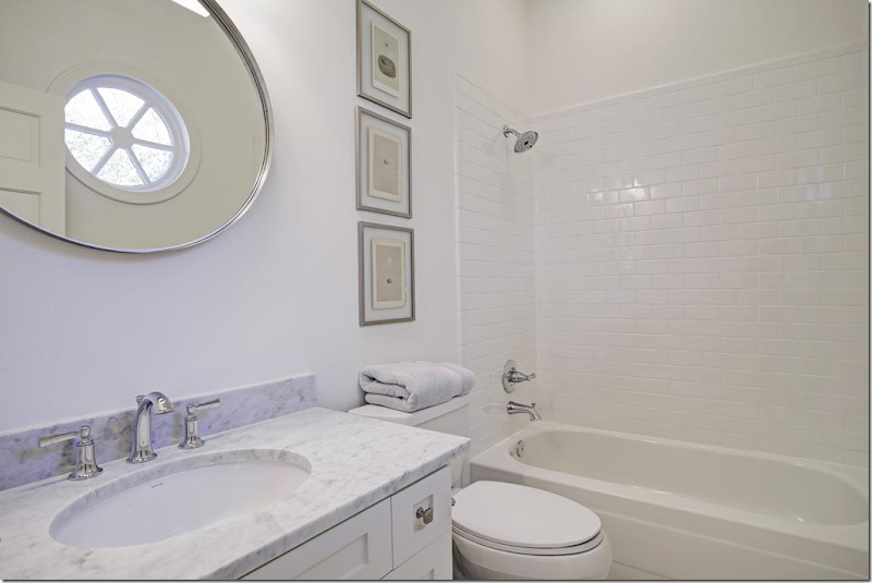
2016: Marble, nickel, new cabinet faces, and subway tiles – turns the bathroom into a classic that will look good for years.
2016: And another marble and subway tile bath with new cabinet faces on the vanity.
To tour or see more about this house for sale, go HERE.
Coming Up: Two new giveaways!!! Be sure to check back soon!!!












Beautifully done renovations outside and inside!
ReplyDeleteWow, what a transformation! So much better! Love it.
ReplyDeleteJoni, what a chic and fresh transformation! While more contemporary this home still has a lot of warmth with the gorgeous hardwood floors!
ReplyDeletexoxo
Karena
The Arts by Karena
I am a big fan of white but not dark wood floors. I could not help but notice that much of the furniture was not in the proper scale for the rooms. Maybe if they knew they were selling they just made do. Will be interesting to see what the next owners do with it.
ReplyDeleteLove these before & afters...so great! You have the best posts!
ReplyDeleteThe 2016 version of this home is fabulous! The changes made such a difference and were smart and tasteful. I love the new hip vibe even though I am a Baby Boomer. Another very fun post. Thanks for sharing.
ReplyDeleteBeautiful transformation except for the front door and the study. I am not particularly fond of the door, either before or after, but why is it that the choice is always to paint over solid wood? I think both on the exterior, and especially on the inside, the foyer would have looked richer if they had stained the original door a dark walnut or ebony with a gloss finish. What they have done is boring.
ReplyDeleteIs there an actual paint known as Houston white and also the soft gray used on the exterior trim? I would love to know the actual paint used for both!!
ReplyDeleteLove your before and after posts! We are planning a remodel to update our bathrooms and take us "out of the 90's" hopefully and these posts are very helpful, thanks!
ReplyDeleteI loved your recent post about how important curtains are. I'm wondering what you think about the lack of them in the living and dining rooms in this house?
ReplyDeleteStupidly trendy at best, much too flashy. There are SOME things they've done that will stand, but a lot of this garishness will fade fast and be labeled as shallow. It's a short term showpiece and nothing else.
ReplyDeleteI don't see anything really trendy, flashy, garish or shallow in this redo. It all feels quite traditional to me, in a new clean type of way.
DeleteIt almost feels like you're pulling our leg.
Sheila
I agree Sheila. Not all of it is my taste but I think the updates are quite lovely and fresh. For me, painting the brick white was the best single change for this house. Also really liked the kitchen.
DeleteThis is an example of white done right for me. It's beautiful. The outside paint is so pretty on this house. The interior is lovely also. Nothing too weird. It's all quite traditional really.
ReplyDeleteI could do without the "shiplap." Shiplap girl on HGTV has just run it in the ground. I just can't bear to hear the word one more time.
Sheila
Totally agree. Shiplap is as tired as Hicks pendants and capiz lights.
DeleteI've never commented on your blog before,but I want to thank you for the time and effort you put into it. I can't imagine how much work it takes. I also appreciate that you have a professional outlook that allows you to show what other people choose and that you don't make it about only what you would choose. It takes stretching ones mind and spirit to allow others to make choices and not judge it in a negative way. Just because I wouldn't choose something, does not make it a moral issue as to whether someone else would choose it. Life is so much more pleasant when you can find positive aspects about other peoples choices. I can be happy for other people and that they were able to make choices that made them happy. I am glad you can step back and show us babyboomers fresh and contemporary options that we can start to use and update our perspectives. I found your post to be enjoyable and enlightening. Thank you again for your generous spirit and grace. And I am sorry when others don't recognize that generousity. I sign as anonymous because I am not technie enough to know how else to do it, Dolores
ReplyDeleteThank you so much !!! Much appreciated.
DeleteThis is the most wonderful comment I have ever read on a blog. My favorite line you wrote is "I can be happy for other people and that they were able to make choices that made them happy." I'm so tired of of so much negativity about design in the blogworld . I've been guilty of comments on things I don't care for myself, and I think it's okay to express your opinion without being snarky. I appreciate all design (even it is not my style). And my problem is I both love and hate too much of all the trends out there!!! Ha, I need five homes so I can decorate them all five different ways. Love that Joni can be professional and open minded. I've really seen her do more and more of this lately. Thank you anon and thank you Joni!
DeleteDelores,
DeleteI have to agree with you. What I love about Joni's posts is how deep she goes into the subject. She really researches everything - I'm sure it takes a ton of time!
I am really enjoying the before and after posts. You are always so thorough and point out details that I might overlook. Thanks for providing content that I always look forward to!
ReplyDeleteThis comment has been removed by the author.
ReplyDeleteWonderful post! This is such a good education about the new trends in design. I like that these new looks in interiors that you are sharing save some of the best trends from the recent past--white kitchens and baths with beautiful marble--while adding color elsewhere.
ReplyDeleteI like the changes to the interior quite a bit and while I like the new exterior paint color, I'm sad to see some of the changes they made to the landscaping. The fact that the new lawn looks anemic at best tells you why the previous owner didn't have a lawn there. The sea of square pavers is so boring compared to the beautiful beds that were there before. I will say, the marble in that house is to die for.
ReplyDeleteReally love the before and after posts. Great work as usual Joni!
ReplyDeleteJoni, email me...splenderosa@gmail.com...Tish Jett is coming to Houston April 5th for a book-signing. I would love for you to come. It's going to be in the River Oaks Shopping Center at our new shop, Nina McLemore Boutique. Love, Marsha
ReplyDeleteHarris Scott
Brava, Joni! Thank you for yet another excellent post. Someday I'd love to do a wholesale transformation at once but for now, I do bits and pieces here and there. This is very educational and inspirational - as far as I'm concerned, you could do one every day and I'd pore over it. Thanks again!
ReplyDeleteWhere is the last brick painted white house, the one with the black trim. I can't find it.
ReplyDeleteYeah, well. I'm having difficulties posting and have to repost each story about five times, while deleting them first, then reposting, etc. And I accidently deleted that one. YOu might can find it if you google each and the look at the cache copy?
Delete30 years designing gardens it is interesting noting the huge difference in today's 30-40 year old vs. boomers. Today, young couples do all of their home, then all of their landscape. Boomers chose, at the same ages, a small element of the garden to do, then waited a few years for another layer etc. More exciting, today's young couples make conscious choices about how they want to live, work, entertain, vacation, interact with family/friends/pets within a framework of aesthetics. They literally tap into the energies of form/function for themselves, not for show.
ReplyDeleteBoomers now. Especially the boomer woman. Love these women as clients. They've raised their children, helped their husband, paid their dues, now it's their turn. No input from anyone, they do their garden. And sign the check. Husband has had his toy cars, hunting, fishing boat, guy trips etc, my boomer women are taking their full due, with interest. Of course many of my boomer women are widowed or divorced, and I strongly sense how incredibly happy they are in this phase.
Enjoying this phase of my career, the young couples and boomer women. Both groups easily articulating what they want, and making it happen.
Garden & Be Well, XO T
I remember your other post on this home.....love the garden now, with a few tweeks...of course.
I love the new transformation of this home...the new fireplace looks so much better and the wood floors in the bedrooms really up-date it!
ReplyDeleteI really like everything about the updated white exterior.
ReplyDeleteI think they did an amazing job! I actually really love the LR - the only thing I'd say is it's perhaps a little empty (for me) but I do like how they've decorated it. I also adore the master bath, it is really stunning! And love the upstairs now having the hardwoods - it looks sooo much better! And the marble in the kitchen is just gorgeous. Great house, great post!
ReplyDeleteSheila
www.maisondecinq.blogspot.com
This looks fabulous. They took the house from boring tract house to a true custom home with their renovations, and while they have given it a very "today" look, I can see how the house could very easily adapt to changing styles without having to do a gut job on it. While a few of the pictures feel a little "empty", I actually like that they've left themselves some gaps to fill over time.
ReplyDeleteSheilaWell, it's probably just staging and not real owner's furniture, don't you think?
DeleteHate to agree with you, because I love the changes, but it does look a little un-lived in :(
DeleteFabulous!! Wow ... thank you for this inspiration, Joni.
ReplyDeleteHi Joni,
ReplyDeleteI absolutely love your post...you have such a keen eye to detail and impeccable taste. I would so LOVE to see the deleted post of the white brick house with the black trim. I've tried google which just takes me back to your blog and I tried searching har.com with no luck. Do you plan to repost? Could you possibly post the link to har.com if it is still available? Thanks so much!
Lori F.
There are many aspects of the renovation that I like a lot. I'd rather overdose on white than beige, for one thing. The hall is a huge improvement. I like the blue/orange dining room. Not so sure about the little stools by the fireplace trend (seen in the other reno as well). I can't imagine anybody wanting to sit on them.
ReplyDeleteIs grass an environmentally sustainable choice in Houston? Seems like a lot of watering and mowing.
I grew up with alleys, and they really are great. The garbage cans would be put there, as well.
Joni, you do such a great job with your blog and I always look forward to reading it. This is a kinder and gentler redo than the last post of the painted brick with the glossy black trim. The kitchen is so good, yes we have seen shiplap, hicks pendants, marble etc., but guess what....We still LOVE IT!! The master bath is just great and I think wise but updated choices were made. This house looks fresh and depending how it was furnished, it would suit a young family or a more mature couple. I'm 53 and love it. I might not of picked all their choices but I could move in and enjoy all of them just fine. Sometimes we need to break away from what we know we like and feel comfortable with to experience something new and exciting.
ReplyDeleteJoni, lovely home and post. Question: the kitchen barstools, who is the manufacturer?
ReplyDeleteWonderful post. I forwarded it to my 30 something daughter. They bought an older brick home and are updating it little by little. I think this post has good ideas for her. Sheila
ReplyDeleteFabulous post! I am 45 and love everything about the design. I appreciate the fresh, clean look and the mix of modern with traditional. I have been reading your blog since 2008 and it always inspires me!
ReplyDeleteOnce again, I appreciate how you point out the details of your photos. It helps to educate me.
ReplyDeleteOne thing I do not like is the ladder in the kitchen. It blocks the drawers and counter space and I know I would trip over it constantly!
Love the exterior updates and while I love many of the interior updates it just doesn't seem comfortable. It seems a bit staged like no one lives there. Maybe it is my age. Love these posts you do Joni they are always full of fun.
ReplyDeleteIt probably is a staged house.
DeleteThe buyer can furnish it however it pleases them and it will have a completely different personality. If you like the house, just overlook how it's furnished.
Sheila
OK, whew! I love the kitchen and bathrooms and all the white. I commented on a newer post that had lots of black and white that I was worried about my new bathroom remodel, which has lots of white and gray with marble and quartz, not too unlike the baths shown here--though we have white quartz (with silver, gray, and clear flecks) for large surfaces (for ease of cleaning) with decorative marble tiles (hex and subway), light gray porcelain tile floors, and white shaker cabinets. Light gray paint with slight blue cast on the walls with white trim. It's a small bath but a breath of fresh air when I go in there now. I'm not a designer and we were doing this on a budget, so I would do some of the details differently if I could (learned a lot from the process)... but it's not that different from these bathrooms, so I feel better now. :-)
ReplyDeleteI should rephrase that... it's nothing close to the beauty of the master bath here with the marble floors, etc. But the feel is very similar with the white and gray, but on a budget with quartz on large surfaces and just a little bit of marble!
DeleteAnother thing I noticed was the interesting woodwork above the fireplace. Is that just paneling of some sort, or could it be doors that perhaps hide a TV?
ReplyDeleteAlso, I thought it an odd choice of placement for the drawer knobs in the second small bath?
ReplyDeleteI much prefer the before, particularly the exterior and landscaping. Now it's just another 2016 trend. Before it had personality.
ReplyDeleteExcellent post! New reader here. I keep on coming back to this article with my farrow and ball color card to figure out which paint color matches the exterior window trim and brick. So far my guess is this could be FB Light Gray. Any suggestions on the color? Thanks.
ReplyDeleteNovember 27, 2017 at 11:37 AM
Great details about here-is-another-before-after.
ReplyDeletethanks for sharing this really the contant is amazing
informative,interesting , motivative also which was i am looking for . please keep updating step by step .
Best Seller American simple Twisted Metal Bohemian necklace
Love these shutters. I've got some waiting in the garage that I've been hoarding even though my husband and son want to get rid of them. Pinned to repurpose board. Best wishes, Linda @crafts a la mode wood flooring Houston
ReplyDelete