When my daughter Elisabeth was in middle school, we hired a tutor that who would come to our house every afternoon to help her with her studies. Jenny continued to come until Elisabeth left for college and by then, Jenny was getting married and having her own children. Needless to say, we spent a lot of time with her and she became a part of the family. Smart as a whip, beautiful, soft spoken – Jenny was a life saver.
Over the years, Jenny and her husband have moved a few times – each time, buying a house that is a better investment than the last, because she and her husband are both very business savvy. Her latest house is located in one of the best neighborhoods in town where young families with 2.5 are all hoping to move in. They completely remodeled their house and now they are moving on – leaving this house for another young family to love.
Jenny showed me the photos of her reno and I thought you would be interested in seeing them. It’s a textbook example of how to take a 60s ranch house and turn it into a comfortable, updated, and modernized house for the millennium.

BEFORE: The house was a very pretty ranch – very much Houston from circa 1960s.

AFTER: The biggest change made was Plantation Shutters were installed inside – they create a unified look along the front facade. Another change is the beautiful gas lanterns and new address plate. The trim was painted a soft gray. A new sprinkler system and French drains were installed! Nice!!
INSPIRATION: Unified window treatments dress up a ranch.
TIP: Although Jenny chose not to do this, many people are painting their brick houses – white, gray or taupe. Painting the brick can really update the house.

AFTER: The house is on a corner. The owners added a new garage and in the space of the former garage, they added a much used playroom and a workout room.

AFTER: The new gas lanterns add so much, as does the new address plate and the gray paint.
The house was built in 1959 and is 3570 sq. ft.
The biggest change was made this year when a brand, spanking, completely new HVAC system was put in, including new duct work.
For Houston, this will mean a very cool summer – think 68 degrees inside.
Chill.
INSPIRATION: Gas lanterns add masses of curb appeal.

BEFORE: The layout is a typical ranch in Houston – living room and dining room on the left and family room, straight back from the foyer. The biggest change to the interior decor were the installation of new hardwoods – most of the house had carpet which needed to be removed. The new floors are fabulous and were a great change!!

TODAY: Here you can see the new wide plank hardwoods in the gray stain that is so popular today. The lantern was removed in place of recessed lights.
TIP: The floors are: MASTER CRAFT PALLADIO ANTIQUE OAK

BEFORE: Off the front foyer is the living room – with the dining room behind it.

BEFORE: Today, most people in Houston with this floor plant turn the living room into the dining room and the dining room into an office or playroom, which is exactly what these owners did. Most of us never use a formal living room – but we do need larger dining rooms than what was standard in the 1950s and 1960s, when this house was built.

TODAY: The living room is now the dining room – which allows the family to seat 10-12 people at the dining table. Double brass lanterns highlight the room. The walls and ceiling and molding are all painted one color which updates the house and gives it a bit of a contemporary look. In the former dining room, there is now a study.
INSPIRATION: To update a house with non-descript trim, paint the walls, trim and ceiling the same color. Use 1/2 strength formula on the ceiling.
TIP: Paint Sherwin Williams Repose Gray

AFTER: The view towards the foyer show the host chairs.
TIP: To keep chandeliers from creating light streaks as seen here – use frosted bulbs! Also, I use the silicone tipped bulbs in low wattages which creates a very soft look. Below is the link to the bulbs I use, if you are interested. I buy a box of them, which lasts longer.

I use this for chandeliers – click on photo for info.

For sconces – I use this silicone tipped bulb. I also use these in a lot of lamps where I don’t want a bright light. I’m not a fan of really bright rooms, but that’s a personal preference.
Click on the bulb for info.

For modern chandeliers – check out the vintage Edison bulbs. There are different varieties for every type of fixture.
Click on bulb for more info.

BEFORE: The dining room. You can see how small this room was – with seating for only 8 at most. The kitchen is reached through this room.

AFTER: Today – the former dining room is now the library. The mirrored wall was removed and shelves and cabinets were built to create an office/study/library. Perfect!

AFTER: They added a new light – and notice the cabinets’ feet! This small detail added much luxe.

I really like how Jenny styled the shelves! She used a series of prints along one section of shelves and above and below them, she added antique books. The sunburst mirror is a focal point you can see from the dining room.

BEFORE: The foyer leads to the family room that overlooks the back yard. The corner fireplace is another typical feature of this Houston floorplan.

BEFORE: The view towards the bar that looks into the kitchen.

TODAY: The family room has been totally renovated. New French doors replace the sliders. The fireplace was updated with a coat of white paint.

AFTER: a beautiful built in media center against the back wall adds so much to the room! Plus it creates a home for the flatscreen. This is a great idea.

Closeup of the newly built-ins which is perfect for the flatscreen. It prevents the flatscreen from becoming a focal point when it is surrounded by shelves filled with books and art objects.
TIP: Flatscreens over fireplaces tend to become focal points. Try to find another place for the TV if possible.

AFTER: And here – you can see the kitchen was opened up – the small pass-through was enlarged by taking out the cabinets and walls surrounding it.

BEFORE: The pass-through to the kitchen with the breakfast room to the right. While the area has charm with the brick wall – the area was ripe for updating and making it more up-to-date.

AFTER: The same area is now clean-lined and more effective as a bar. The small pass-through was enlarged by removing the side cabinets and opening up the wall to the ceiling and enlarging the counter – now, a more useful and much larger bar has been created.

BEFORE: Carpeted breakfast room – hmmm. An outdated slider and old fashioned paneling, along with that 60s style chandelier. How many of you grew up or owned a chandelier like this? These were so popular!!!

AFTER: Past the bar is the breakfast room that overlooks the back yard. New French doors open the area up to the terrace. The carpet was removed and replaced with the wide planked wood floor. The wallpaper was removed and the paneling was painted which makes it disappear. Love the chairs in gray fabric and love the two round convex mirrors that flank the French doors.

AFTER: The breakfast room – through the door is the new playroom and workout room and further on, the garage.

BEFORE: The kitchen had been updated along the way with tiled floors and white Formica. The former dining room and dry bar is through the door on the left.
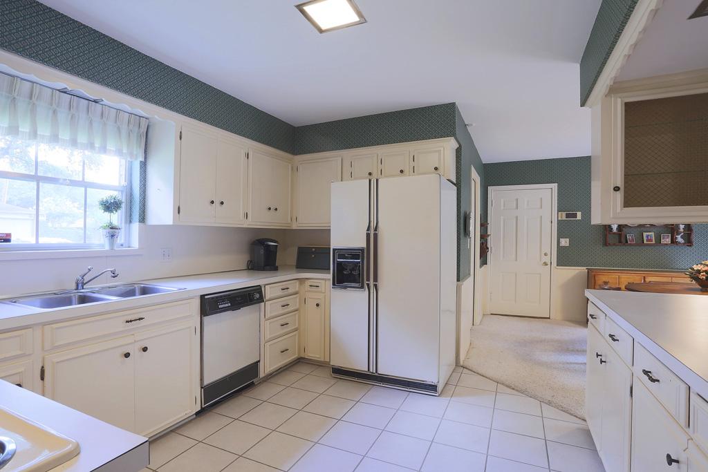
BEFORE: The kitchen with the view towards the breakfast room. Where the door is – leads to the garage. Today, the garage is now a playroom and workout room.

BEFORE: The footprints of the kitchen remained, but it’s all new appliances, subway tile, farm sink, and shaker cabinets with quartz countertops.

View towards the playroom and workout room.
The area between the study/old dining room and kitchen is now a dry bar with built in shelves for glasses.

AFTER: Two years ago, the playroom was added in the former garage space. This is such a wonderful space for a family with young children and teenagers!! French doors overlook the backyard.

AFTER: On the other side of the playroom in the former garage is this fabulous workout room!!

BEFORE: Off the family room leading to the bedrooms is the study which is also the 4th bedroom. Carpeted.

TODAY: The study has new wood floors and new French doors that lead to the terrace. The doors close off and this is a flex 4th bedroom. The new owners can easily close off this doorway to create a more private bedroom if needed.

AFTER: The powder Room with new vanity sink.

BEFORE: The front bedroom. Laura Ashley bedding! Remember this?!?! And the white wicker. How many bedrooms looked just like this?!?! Memories!!!

BEFORE: The bathroom that connects to the front bedroom.

AFTER: The front bedroom has two windows with plantation shutters and new wood floors.
INSPIRATION: These two elements – new hardwoods and plantation shutters really make such a huge difference.
TIP: The bedroom walls are a different paint color: Sherwin Williams: Mindful Gray

AFTER: The bathroom that connects to the front bedroom.

BEFORE: The second bedroom.

AFTER: The second bedroom with new wood floors and plantation shutters.
NOTE: Jenny told me she regrets painting the closet doors white, but I don’t necessarily agree. I kind of like them painted a bright white. What do you think?

Another view.

BEFORE: The second bathroom with 60s styled tile counters and walls.

AFTER: New quartz counters, extra sink, and wood floors totally update the bathroom. The wall of tiles was removed and replaced with sheetrock.
INSPIRATION: New counters and floors make the bathroom new with a minimum of expense.

AFTER: From the entry, this hall leads to the bedrooms. Love the seagrass runner – it adds texture and a neutral color that looks good against the gray. At the end of the hall is the master bedroom.

BEFORE: The master bedroom with the bay window that overlooks the back terrace.

BEFORE: Another view of the master bedroom.

TODAY: The master bedroom with wood floors, seagrass and plantation shutters.

Another view of the master bedroom.

BEFORE: The bathroom with carpet. Is this England?!?! Just kidding!

AFTER: The bathroom is now marble tile with a large walk in shower.

Two vanities with double sconces. There are three closets in the master bedroom, one which is reached here.

TODAY: Large backyard with pergola.

There is a large lawn with a swing set and gym.
For all the details about this house, visit the listing HERE.
If you are interested in this house - HURRY! It won’t last long!!
This is a very much in-demand neighborhood and the house is a total redo!!
Wow. The before pictures made me wince as if I had bitten into a lemon.
ReplyDeleteLots of good work on renovating this place. I admit it isn't exactly my taste (which is decidedly off-beat), but it is 1,000% better than the before.
I tutored high school students in math while I was in college. It's very true that you become part of the family!
Best of luck to Jenny and her husband and here's to hoping that they may continue to upcycle.
hi! the before is so typical of a house from that era in houston! even the decor is so familiar to what i knew grewing up. we can't all grow up in france! hahah! lucky you!!!!!
ReplyDeleteI grew up in the Midwest, in a house built in 1959 (and where my parents lived until 2015). So it's very familiar!
DeleteI forgot to ask about those "flame" lightbulbs--are they LED? The EU has banned incandescent bulbs. My husband was outraged, but has come to admit that our light bill has diminished quite a big thanks to LEDs, and that LED light isn't as ugly as he had thought. But I haven't seen any bulbs as pretty as these.
You are so right about England - not sure what the obsession is with carpet in bathrooms!
DeleteWere there original old hardwood floors under that carpet?
ReplyDeleteI don't like the new wood floors at all. It looks like old weathered gray barn wood which I guess is the look but it's just not for me. Weathered wood and the color gray are two fads right now but they will both be over soon and wood floors are no small expense. But if you enjoyed it for a little while and then it sells your house, I guess the goal has been achieved.
Sheila
Very nice! Love the clean look. I would love to know what color paint was used on the wall unit bookshelves and the kitchen cabinets. And where are the couches from? Are they PB or even IKEA with custom slipcover?
ReplyDeleteThis is a beautiful renovation, and I agree with you that the white doors in that bedroom look lovely. All that grey began to feel a little claustrophobic and the white paint and lighter neutral tones throughout the home (sea-grass mats) counteract that. Even though I like the grey walls, I would prefer white trim, but perhaps the greys don't look as melancholy when the sun is shining in.
ReplyDeleteFlog your goods somewhere else. This isn't a forum for free advertising.
ReplyDeleteIf your post doesn't sell this beauty, nothing will. I'm sure it will move quickly!
ReplyDeleteI love everything about this redo! I'd love to move right on in if only I could afford it. Sigh...
ReplyDeleteCould you please tell me who the designer was who renovated the home? Did they have to use an architect or did the designer do it all?
Everything was on point as far as I'm concerned, and I was glad she left the doors in that bedroom white, it made the room more interesting.
Thanks so much for sharing this marvelous redo! I'm sure it will sell at warp speed.
The designer for this house??????? The floors and the kitchen with the soffits? I assume the owner went to Lowes and had them replace the kitchen cabinets keeping the layout exactly as was. I doubt there was any participation by a designer given those kitchen soffits and who would own up to the floors?
DeleteWOW!! I, too, really like how Jenny styled the shelves!! All kinds of "copying" to do here... franki
ReplyDeleteThe shelf styling in the library is perfection, and each room flows to the next beautifully. It could not have been easy to coordinate the décor of so many rooms, but they pulled it off. The only fault I personally have with the interiors are the soffits in the kitchen and one of the bathrooms. Why did they keep those? Upper cabinets fitted into soffits are completely outdated, so why didn't they knock those out when they renovated the kitchen? It's an easy enough fix. I think it makes the upper kitchen cabinets look too short, and the bathroom soffit over the double vanity just looks weird. Oh well, in a house that needs so much renovating I guess you have to pick your battles.
ReplyDeleteWhen I saw the soffits still there I looked again and thought that maybe they had kept the old cabinets and just had new doors installed.
DeleteSheila
That is a really great question - maybe they just replaced the cabinet doors, why else would they keep the soffits and all exactly as it was.
DeleteCan you tell me the source for the reading lamps behind the master bedroom bed? I must say, I was sad to see the wallpaper and the lantern in the entry go, but I know they were going for a more contemporary look. Thanks for sharing.
ReplyDeleteI thought the powder room before was cute too. and I like the entry hall paper too but it's not today's style.
DeleteWow this Is almost Seattle pricing! Not a fan of the gray and gray washed floors but I appreciate the updates
ReplyDeleteThis comment has been removed by the author.
ReplyDeleteA can light in front entry hall? No, just no.
ReplyDeleteSheila
Yes, the lights are another feature not put up by a designer. What is going on with the dining room lights? And why can lights here there and everywhere? No class no taste here.
DeleteWow, surprised at some anonymous comments on here. The renovation was completed by a young family, if you had cared to read the article before the pictures. Instead of scowling at the lighting and soffits, why not acknowledge the improvements that they accomplished on their own, without the help of a designer? Perhaps your comments have no class and no taste.....Great job Jenny and family! Best of luck on your next project!
DeleteI agree with 'Unknown'. Additionally, I think the downlights (can lights) are quite clever and effective in many of the locations they've been used because they don't draw attention to the lowish ceilings.
DeleteThank you anon.
DeleteThank you Anon for supporting the excellent work on this lovely home this young couple created. I am impressed with their work on updating. There are always things that can be improved in any remodel and each designer has their own taste, so If you can't say something nice don't say anything. You are not helpful in your criticism.
DeleteMy age is showing........I liked the before....
ReplyDeleteWhat a great post! They've done a great job and I'm sure a young family will love it. Just not really my taste, but who cares!! As for comments as to how dated the house is, well, yes it's from the 60's, of course it's dated. But what struck me is what a gorgeous, classic and well built home it is. Also, how meticulously well maintained. (I don't like carpet at all, but it looked to be excellent quality and spotless!) Must have been quite the house back in its day. Cathy Temple
ReplyDeleteThey did a great job but way too much gray for my taste.
ReplyDeleteThe price for this house seems astronomical, but that must be the way it is where it is. In my humble opinion a house so priced needs the classics that stand the test of time, such as a new designer kitchen and classic wood floors. .
ReplyDeleteWow, it looks gorgeous. She did a really great job!!
ReplyDeleteCan't believe that someone would have pictures taken without cleaning the fronts of the appliances!!
ReplyDeleteJoni, I have been a reader for a long time but have never commented before. What I like about Cote de Texas is that you put a lot of time and effort into every post you do. Additionally, the range of topics -- from a history lesson on an Irish castle, to showing a lovely local home renovation, like this one. I have never once felt that you thought you were above anyone else. While you share your opinions, you are able to do it nicely. I find it so telling that all the negative comments on here are posted by "Anonymous" people... who seem to think they are so superior to the "lower classes". However, they are the ones who lack one of the most basic teachings on grace -- "If you can't say something nice, don't say it at all". It bothered me all day yesterday and I felt the need to comment! Thank you so much for providing some wonderful reading and eye candy.
ReplyDeletethank you. Since I did say that Jenny was like a member of the family - I did hope that anons would be respecctful. That said - I think most people were very respectful! There were a few snarky comments, but you must remember - she has two little kids and running a household with two babies means the appliances might not be perfectly clean all the time. I went back to see what anon was talking about and honestly, I'm not really sure???? oh well. I thought most people were very nice.
ReplyDeleteThe reason why I have NEVER - not once - erased a comment is that I want this blog to be a place where anyone can come and leave their opinion, even if it's not so nice.
While there are many times I want to erase a comment, I won't. I think it has created a great forum and I hope everyone agrees.
So, thanks for YOUR comment and don't worry. I would love to move into her house if I could afford it!!! She did a great job on the reno. And I'm sure they will sell it very soon!!!
Great renovation. I am struck by the artwork throughout. Could you tell us the name of the artist/s?
DeleteJenny!!!!! She did all the art work!!!! And the decorating. She is so smart. Really, a genius. And an artist!!! she told me she created some new pieces before the photos were taken - to make the house look realy great.
DeleteA bit too boho for me but I can see others like it so the line should do well.
ReplyDeleteI like the closet doors painted white, too! Wow, viewing the before pics was like taking a tour through my childhood 70s home. I am actually really impressed by how well the prior owners maintained the house. Everything looked pristine! Funny how carpet everywhere used to be the thing. I spent last weekend at a friend's parents' second home, a beautiful white brick home from the 1920s. They bought the home 29 years ago when we were in college and, other than updating the bathroom fixtures and kitchen, haven't touched the decor in 29 years. There is green carpet running up the beautiful curved front staircase and throughout the upstairs bedrooms and baths -- and the carpet is in perfect shape 29 years later. If only I could maintain my home so well!
ReplyDeleteIt looked better before. The floors in particular are horrible and were much nicer in the before pictures. It saddens me to see these renovations.
ReplyDeleteThey did a great job, but the price about knocked me over. This is why we're in the suburbs of Houston!
ReplyDeletegreat post Foshan Dabbl Sanitary Ware is offering top class products for shower enclosures, neo angle shower doors, frameless sliding glass doors, sliding glass shower doors, custom glass shower doors, shower cubicles, shower door, corner shower enclosures, quadrant shower enclosures , Shower Cabins, Shower Stalls, Walk in Shower Enclosures, shower cubicles kindly visit to the website quadrant shower enclosures, custom, frameless sliding glass shower doors , shower cubicles call us +86-18928507693 email now export2@dabbl.de
ReplyDeleteAlthough many people might say that it's boring that the layouts are the same. To each their own I guess. renovate bathroom
ReplyDelete2015 Home Builder of the Year in Pensacola - We are proud to be the home of the World Famous Blue Angels, Pensacola's Naval Flight Demonstration team New home construction in pensacola
ReplyDeleteWow, it looks gorgeous.
ReplyDeleteWindows And Doors Phoenix
Writing a blog is a bit of craftsmanship and the essayist has without a doubt aced this aptitude.thehoustonforum
ReplyDeleteWe're specialists in solving all types of real estate problems around San Antonio, TX. Want to "sell my house fast"? Great! We buy houses fast for cash sell your house San Antonio TX
ReplyDeleteشركة تنظيف ببريدة
ReplyDeleteI have perused your article. it is exceptionally educational and accommodating for me.I respect the profitable data you offer in your articles. A debt of gratitude is in order for posting it..
ReplyDeleteHoustonframework
Great blog..Thank-you so much for sharing with us.
ReplyDeleteHome Remodeling Houston
Hi, You did an amazing job! I love how the floor came out, and the vanity!! The paint colors and details like the hardware make such a difference! Thanks for the sharing this master bathroom renovation idea. found a few interesting topics on this site too. Houston Remodeling Contractors Specializes in Custom Kitchen Cabinetry, Kitchen remodeling, bathroom remodeling, full room addition, whole house remodeling and has been serving The Greater Houston Area for more than 30 years with A+ BBB ratings. Call Now (713-461-4434)
ReplyDeletehttps://www.everhartconstruction.com