I started this story weeks before I heard about the new Milieu issue with the photoshoot of Carol Glasser’s Californian home. This story today is an unexpected companion piece to the magazine, although I do plan to write about the Montecito house soon.
Long time readers of Cote de Texas know that a Houston designer named Carol Glasser was a large influence on me and many, many others. She is a very talented interior designer, and has always been so gracious with my endless stories of her, which as a pesky blogger, I am so grateful. I can’t help myself. I truly admire her style and her aesthetic.

Glasser has been published in many local magazines and later, major national magazines which brought her talent to the world. I’ve written about her many times – and many times I’ve talked about a house she once owned.
That house, which I nicknamed “One Perfect House,” really was that to me and other fans of hers. She was so ahead of her time – by being behind the times. Carol brought a certain look to Houston, a true English Country Manor look, laden with hand picked antiques and hand printed fabrics. She decorated in this special way when most people did not know what an antique was, nor did they care. Glasser changed all that for devotees of design. She introduced old things like paisleys, transferware, Flemish tapestry pillows, dark, dark Spanish furniture, putti, gilt, candlesticks, and dhurries – blue and white striped ones long before Something’s Gotta Give – and she made it all seem “new.”
She brought rattan chairs into the dining room along with threadbare antique rugs. She introduced us to Bennison fabrics and elevated plain linen’s status. Who knew about George Smith and his English saddle arm upholstery before Glasser? Everywhere in her house, there were antique accessories such as black chinoiserie and artifacts culled from churches. She introduced us to Kenneth Turner wicker basket candles which were displayed on tabletops. Instead of art, there were water gilded mirrors and old Delft.

It was a look. A cozy, warm, cluttered, English look that was only seen in the most blueblood houses in Houston owned by the elderly. Glasser brought that look to the younger set who were just buying their dream houses. She made it look trendy. People like me who grew up with mid century modern soaked it all in and were tremendously influenced by her style.

Glasser and her partner Becky Cooper continue to influence. Their aesthetic today is not as cluttered or as maximalist as it was back then. Instead, now it’s a leaner look, a more edited look, but still as wonderful as ever, if not more so. Glasser Cooper Interiors doesn’t take on a lot of clients a year because their method of decorating is different. It’s not about looking at a catalogue filled with brand new things and saying “I want this and that. Order it.” Instead it’s countless months spent waiting to find the exact right chandelier or chair or urn to turn up in England or Sweden or now, on a curated website.
If you follow me, you know I don’t think Glasser and Cooper can put a wrong foot forward. Ever. I’ve never seen anything I would say – no. That’s not right. Everything they do is just “right.” And beautiful.

Glasser’s One Perfect House started it all for me. It was my introduction to Carol and I made up that title for the home she lived in, published, restyled, and published again. It was The One Perfect House that influenced scores of followers. And each time her house or her work showed up in a new magazine – it was nirvana! It still is.
In the end, Glasser sold the One Perfect House and moved to a larger house:

Above is the house that Glasser moved to (HERE)after she sold the “One Perfect House” and before she finally downsized to a Houston highrise apartment, along with a vacation home in Montecito, California.
I loved that new house she moved to, filled with velvets and linens. It came with more room to spread out and decorate, but the smaller One Perfect House version remained a sentimental favorite of mine and probably always will.
The One Perfect House located in Houston’s River Oaks neighborhood, has sold more than a few times since 2005 when Glasser moved out. The second owner decorated with more of the neutral “Houston Look” using white slipcovers and seagrass - everywhere. That owner made changes in the paint color, the kitchen, the guest house, and more.
The next two or three owners did not have the house professionally decorated. Most changes involved the exterior.
Which brings us up to date.
Earlier this year, The One Perfect House sold, yet again, and that owner wrote to me, thinking I would like to see it and write about how it looks today.
Is the sky blue?
I actually do think it’s worth looking at because it shows how a younger, probably a Millennial couple, took a once perfect house and remodeled it and made it more modern. In fact, a LOT of remodeling took place – this time on the interior.
To read the original Cote de Texas stories about this house and Carol Glasser go HERE and HERE and HERE and HERE.
But first, let’s look at the house back when it was perfect and later, as it looks today for the Millennials.
Ready????

In 2005, when Glasser sold the house, it looked like this. There was no front walkway. There was a small overhang at the front door and she had painted the brick was a sage color. White trim. And notice, there was only one tree in the front. Very symmetrical façade despite the one tree, with symmetrical box landscape.

In 2009 – the next “Houston Look” owner made significant changes to the 1935s era house. There is a new copper roof over the front door and new lanterns. There’s a beautiful new brick walkway that matches Glasser’s antique brick driveway and back patios. There are now two new trees that grew remarkably in just three years. The facade’s brick is now a soft cream color and the trim matches it, making it much less noticeable. It looks like there is a new roof.

2012: Major change in the brick color. It’s very white now. And wow, the trees have really grown! The front door looks like the same one from when Carol Glasser lived here.

A romantic view at dusk.
And now, we get to the newest owners, the Millennials. I don’t know if they truly are millennials, but I am saying they are – they are probably more like Gen X or Y. But they are definitely not Baby Boomers, I would bet my life on it.
THE MILLENIAL HOUSE:

The Millennials sold the house in 2022. I think the couple had rented the house out before they actually lived there. There is a lot of furniture that shows up in previous HAR rental photos which are also seen in today’s HAR listing. The Millennial couple made huge changes, inside and out. There is a new front door and new modern lanterns, along with new windows up and down. The copper roof over the door has been replaced with a modern light fixture/roof. And the shutters have been removed from the house, along with the balcony railings from the first floor. Even the fence has been updated – and painted white. I have to say, I like the façade the more I see it.

A side view shows the new more modern façade with its lighted front door roof. The ornate driveway iron gate was placed by Glasser – you can see more of it on Google:

Two gates. A typical black iron gate on the neighboring left side, compared to Glasser’s fab French inspired gate on the right. I wish the picture was clearer, but this gate is a real beauty.
THE ENTRY:

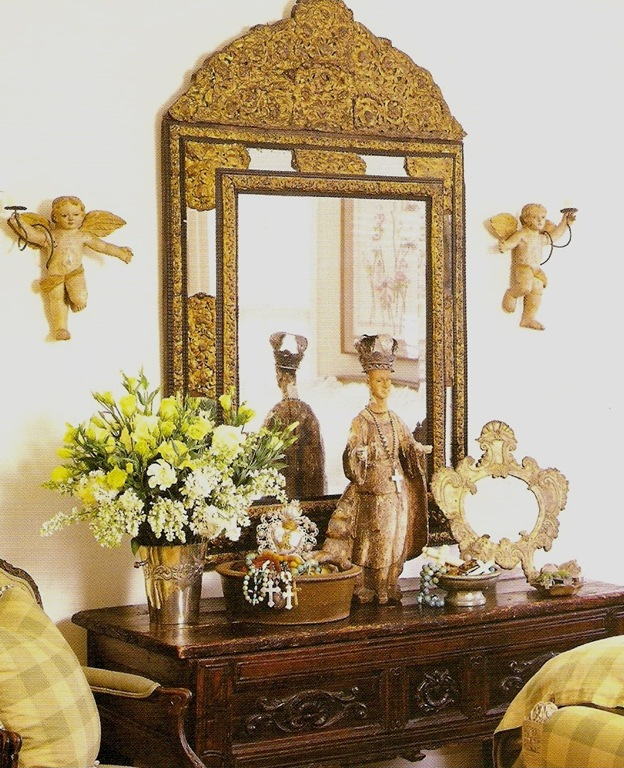
2005: Originally when Carol lived here, the magazines never showed much of the entry. The small space was just off the front door with the living room at the left, and dining room on the right. In the mirror, you can see the arched opening to Glasser’s red painted dining room/library.

That vase!!
Throughout the years, every time the house sold yet again, there were new HAR photos which showed more and more of the house.

2011: This decorative version of the house was my least favorite. But, at least you can finally see the foyer for the first time. I never understood what that black balloon/lighting fixture was?

2022: The Millennials: Welcome to the front foyer. This is the first time we see the powder room door – I assume. I saw a photo of Glasser’s powder room once – a long time ago. IIRC, there was a sink with a skirt and wallpaper.

2022: The entry with blue walls. Not sure if this paper or paint or fabric? Regardless, it shows what a huge change from Glasser’s foyer it now is. The blue foyer walls are carried into the dining room/library’s ceiling.
THE LIVING ROOM:

2005: One of my favorite versions of Carol Glasser’s living room. Note the half stair at the right rear. I loved that architectural detail which, along with the stucco walls and wood beams, brought a Spanish vibe to the Georgian house. The newest owner obviously didn’t love that stair detail. It is now gone.
Completely.
Gone!
Stew on that.

2005: OK – this might be another favorite Glasser living room design for The One Perfect House! Carol stands on the half stairs that leads both to the back foyer and upstairs. My love of gate leg tables started here, too, along with seagrass and curtains layered with rattan shades. Did I ever have an original design idea in my mind?????
What an absolutely gorgeous photograph! Just wonderful. I know décor changes with trends. But honestly – with just a new coat of lighter cream or white – I would move in, as is. Grand Millennial. Coastal Granny Chic. Take your pick of the moniker. But this photo shows you that good design using antiques and quality fabrics will stand the test of time. Always.

2005: One of Glasser’s last versions of her living room. Can I say that this was a favorite version too???
Along the back wall was the one French door that led to the swimming pool. That one door is also now gone.
Gone.
Instead, due to the new owners, there are now two arched windows and one arched French door there, completely opening the living room to the backyard.

2005: Another view of the final Glasser living room décor. The back foyer stairs hide behind a screen. New striped silk curtains. White paint on the walls.

2005: One more view of Carol’s new living room décor with the lighter walls. Beautiful chair fabric. An area rug replaced the seagrass in this room. There’s that same vase that starred in the earlier entry photo.

2005: One of my favorite areas of Carol’s house. The charming back foyer, off the back stairs that lead from the living room. The windows and French door with their arches give the tiny area even more aesthetic delight. Notice the antique Victorian wire plant stand – yet another idea I copied from Carol! Also notice all the topiary plants which are so in vogue today. Attention: Loi Thai – the current king of topiary art.
This back foyer is now GONE – again, due to the new owners.
Stew on that thought.
GONE!

2009: The owner after Glasser was far more minimalist but completely embraced the Houston Look: seagrass and slipcovers. Of all the subsequent owners, this is the one I most related to. No curtains fully exposed the lone French door. Walls went white. And also notice the small space between the open doorway to the sunroom and the back wall of the living room. The Millennials enlarged the living room and this area is much wider today.

2011: These next owners brought the décor down a notch. But finally, you can see the original layout of the room and all its architectural charm – the foyer with the two steps down, the dining room across from the foyer, and on the left side – the back stairs, stucco walls and painted out beams.
THE MILLENNIAL’S LIVING ROOM:

OK. Here is the first clue to a MAJOR change. Originally, there was only one French door along the back wall. Now, there is a French door and two windows – all arched. This caused the change in the back stairs and the darling back foyer which is now gone!!!! Notice the area where the armoire is. You can see here how the back wall was pushed out making the living room larger, allowing for the stairs to be straight causing the foyer to be removed.
Perhaps they wanted to open the living room to the backyard, providing more visual access. Carol’s antique fireplace mantel that she installed is still here. Originally, there was a white Colonial style mantel:

This photo shows the original mantel that Glasser replaced with the antique stone version a few years later.

2022: Here you can see the revised back stairs and the new windows.
The couple are obviously collectors of photographs. Or are they the artists themselves?? I wish we could see the photos better! They are the perfect choice of art for the décor. Notice that new beams were added to the area of the room that was made larger.

A rare view towards the front of the house.
Let’s take a look at the back façade to see all the changes there:
THE BACK FACADE:

2005: Glasser’s back façade. The two doors on the left are the kitchen/family room. Past this is the back foyer with its half stair case leading to the living room, its angled walls and arched windows/door. At the far right is the living room’s lone French door.

The 2009 “Houston Look” owner painted the house and trim a light cream. But mostly – this gives a great view of the back foyer with its newly installed awning over the French door. You can clearly see the back foyer sits in the corner between the family room and the living room. The lone living room French door is seen as is the French door to the sunroom at the far right.
One thought I’ve always wondered: At some point was the 1930s house extended at the back left, enlarging the kitchen – adding the family area to it, along with the back entry, and above this enlargement was a new master suite added too? Was a fireplace added to the family room and up to the master suite? If so, the charming back entrance area was probably added to allow traffic access from the living room to the family room/kitchen after the renovation – probably done in the 1950s or 1960s. I wonder if I’m correct about this? Most of the River Oaks Georgian houses were added on to over the years giving them much needed square footage.

Another view that clearly shows the charming back foyer sitting in the corner of the living room and family room.
Also, here you can see the beautiful antique brick driveway and patio that Glasser installed during her time in the house. What a wonderful addition to the house – one that has remained throughout all the subsequent owners, including the Millennials.

The 2011 owners painted the house white.

2022 Millennials: And here, you can see the drastic changes made to the living room. First, notice, the charming back foyer with its arched windows and one French door is completely gone!
Gone!
Instead, there is a new straight lined wall running the length of the living room. And, note, there is a standing seam metal roof over this addition! Compare this view to the photos above it – you can plainly see how much larger the back façade extension is.
Today the living room is 34 x 14.
Before the renovation it was 27x15.

A closer view of the new living room. Where the back foyer once was, there is now a window. The French door was replaced with a new arched French door with an awning above and a metal roof. And finally, for symmetry, a new window was added to the right of the French door.

As the years go on, no one will even remember the once charming back entrance. It will be completely forgotten. Notice too, the sunroom’s French doors were replaced with a window.

The back yard, with the landscaping, brick patio, and pool with fountain all installed by Glasser has remained as it was, untouched. How many people have had to remodel their older pools with their fantastical shapes and slides. Again, this shows the level of Glasser’s taste. A simple rectangular pool remains the best choice, by far.
THE SUNROOM:

2005: Glasser’s sunroom. I copied her map lampshade. In fact, I still have two small lamps with map shades. Of course, my shades were never as fabulous as these! I also copied her bird cage. LOL. I finally had Sally Wheat sell it in her then-booth at MAI.
A few years ago when my sister wanted her identical wicker sofa and chair recovered, I actually took this photo to Hong Lam and showed her the way the inside of the arms were upholstered so she could copy Carol. Yes, her too!

Another Glasser photoshoot of the sunroom with its seagrass floor and brick walls.

2022: The Millennial sunroom has a new light fixture and marble floors. It’s always been an odd room, but I don’t understand why it’s never used as a cozy TV nook. But that’s just me. Most likely, this was once an open air porch that was enclosed when the family room and master bedroom were added.
THE DINING ROOM/LIBRARY

2005: One version of the infamous Glasser dining room/library. Carol added the red painted cabinets and shutters. She decorated it with an accumulation of antiques, wicker, blue & white porcelain, and paisleys. This room may be one of her most popular designs. The layers! The antique books! The shawls!

2005: Another photoshoot, another look in the dining room.

A rarely seen photograph. Decorated for a magazine’s Christmas issue. This was at the height of Glasser’s maximalism. As the years progressed, Glasser’s décor has become progressively more minimalism.

For instance, in Glasser’s next house, her library was painted in a muted blue and it is decidedly less filled with objet d’art. This new direction continued to her high-rise apartment, below:

Today, in her highrise, Glasser went quite minimal in the dining room. Those chairs!!! Absolutely love those!!! The major décor is a set of herbiers and an antique console.

2009: The second “Houston Look” owner painted the dining room off white and it looked completely different, but in a way that Glasser might have designed it herself with the white slips and antique dark gate leg table.

2022 The Millennials: A view into the dining room from the living room.

This room remains the same, half library, half dining room. The back of the cabinets and the ceiling are blue, blending with the next door foyer. More of their photography collection completes the look.
THE FAMILY ROOM/BREAKFAST ROOM/KITCHEN

2005: Glasser’s family room/breakfast room/kitchen was another huge inspiration for many of us. The Welsh dresser filled with blue and white transferware was incredibly beautiful. Carol had remodeled this room, putting in this antique mantel and the floor’s antique Provence pavers, along with the antique beams.
Another trendsetter: those burlap chairs. Did Restoration Hardware copy her? Must have! I’m glad I’m not the only one copying Carol!!!

A very early decorative scheme with a chintz fabric and the Welsh dresser. At this time, Glasser used a trunk for a coffee table.

Another rarely seen Christmas dressed family room. The dog bed!!

An early view of the infamous Welsh dresser.

Sigh. Another decorative item I tried to copy. LOL. Again, not an original thought in my head.

Glasser: A later view with a new set of rattan furniture. When this photo was taken, she had moved the transferware around, mixing in other antiques.

Today, in Glasser’s Houston highrise apartment – she has pared down her ironstone collection and mixed it in with her everyday set of plates for ease of use. Again, antiques never go out of style. They might be used differently or painted, or put in an surprising room – but it will look just as beautiful as it first did, used hundreds of years ago.
Need I comment on the Pure Butter and Margarine slabs and say – yep! Those too!! This copying is really getting embarrassing.

Glasser’s breakfast area with the Bennison covered chairs.

The kitchen as it was. Wood cabinets and blue and white tiles and Glasser’s collection of white ironstone shown with lots of the kitchen styling popular in the 90s and early 2000s.

2009: The next “Houston Look” owner painted the walls and cabinets white and replaced the blue and white tile. Her rattan furniture resembles Glasser’s. This owner kept Glasser’s tile floors, the beams and plaster walls, as have all the subsequent owners. Through the door is the dining room up a few steps.

2012: This photo shows the contemporary, mantel which the 2009 owner installed replacing Glasser’s antique stone one.
Note: This area of the kitchen is what I think was probably added onto the house in the 50s or 60s.

2022: The Millennials family room with a set of ultra contemporary furniture mixed with atmospheric art work whose darkness offsets the light furniture.

2022: The Millennials changed the kitchen significantly. New caliche tiled hood. White marble. Cabinet doors were replaced with glass. Modern light fixture.

Close up of the beautiful marble and tile. This is really a beautiful upgrade.

Millennial breakfast room. Nothing much changed in this area. Glasser’s window seat and floors and beams have remained.
MASTER BEDROOM

Upstairs: Glasser’s iconic bedroom done all in Bennison’s Roses fabric. Interestingly, Carol Glasser and Becky Cooper still utilize this type of décor using one main fabric in many of their newer designs, such as these:

One Main Fabric: Love. Words fail me. One main fabric, along with a plain velvet.

And another beautiful Glasser Cooper family room with one main fabric along with the grounding white linen. I really love this family room. Duh!!!

And another room, also found on Instagram. This is a great lesson – if you have a client who doesn’t like white slips or white linen, use a darker velvet. Cotton velvet upholstery or slips – which can be cleaned - is a great choice – and so pretty.

The other side of the master bedroom.
After the house was first sold by Glasser, the new owner used the Houston Look to furnish the large master bedroom:

2009: Seagrass and white linens mixed with Rose Tarlow curtains. These curtains remained in the house for the next few owners but were eventually replaced. She also added a contemporary mantel, not using Carol’s antique one.
This room, above the family room/kitchen is the area that was probably added onto the original smaller house back in the 50s or 60s.

Glasser and the next owner: The master bathroom. For years, these cream counters remained until the Millennials remodeled the house.

2022: The Millennials master suite. Changes: The Rose Tarlow drapes are now gone as is the seagrass.

More big changes: in the master bathroom, black counters and new marble floor. New windows and mirrors and faucets. Again – very nicely done.
And the bathroom with a wall of tile and freestanding tub. Very pretty.

Another view.

Guest room, decorated by Millennials. This room has an adjoining study. Probably this was the original master suite.

The guest room’s study. Probably once a second bedroom.

2022 Millennials – aerial view of backyard with the fountain and pool.

The guest house was built over the garage. It was completely redesigned by the “Houston Look” owners who bought it after Glasser.

2009: The “Houston Look” owner completely renovated the guest house including the first floor and the upper floor with new windows.

2022: The Millennials. Today the guest room is used as a studio. Now, I’m wondering if the Millennial owner is a photographer and all the photos are theirs?

And, finally. A portion of the Millennials collection of photographs AND a closeup of the new stairs leading straight down in the enlarged living room, rather than curved around that same area.
So…what do you think of the new changes? Some I like I must say. I love the new kitchen and bathrooms. I think they are wonderful! And I like the new changes in the sunporch and I do like the front façade, for a modern look. But I have to be honest and say I really miss the back foyer.
Remember be nice in comments even if you hate the changes. You can always find something nice to say about something. Please!!
Want a bit more of Carol Glasser? I recently came across what was one of my favorite design books, written by Mary Emmerling in 1997.

Called Quick Decorating, there is a large section that shows a house in Santa Fe that Mary was moving into which she was going to sometimes share with Glasser. Carol sent a large moving van from Houston to Santa Fe filled with furniture and accessories for the house. The installation became the basis for this book – showcasing how quickly the two got the house settled and decorated, in just one week.
That year Veranda also showcased Mary’s house in Santa Fe in a favorite Veranda story.

The cover shows the porch with Glasser’s blue and white striped rugs and a mix of hers and Emmerling’s things.

The façade with an antique shutter.

The front entrance opens directly to what is being used as the dining room.

Moving day. Not sure anyone else looks quite so pretty when moving! I know I didn’t. LOL

The main living room. More blue and white striped dhurris and white slipcovered furniture which is an Emmerling trademark. This house had been renovated – you can see the original fireplace with gilded moldings surrounding it which were added, along with the mantel. At the left door is one of the bedrooms. The dining room/entry is at the right. Through the closed door at the back is the kitchen.

Another view of the beautiful living room. I just LOVE this room with the French accents and white slips and striped rugs, wicker and santos.

Another view with the magnificent French antique armoire, along with Carol’s French antique chairs covered in Fortuny. At the left is the dining room. Flanking the door are prints that have followed Carol from home to home to home.

And another view of the armoire and Fortuny chairs. LOVE!

In the book, it states that the inside of the armoire should be beautiful for when it was opened. Today – the TV would probably be hung on the wall.

Church artifacts on the fireplace mantel.

Flanking the kitchen door is the makeshift bar and desk. Notice the wicker coffee table. Love!

The desk – a trademark of Glasser’s, antique, dark and Spanish.

Another view.

The view to the entry/dining room. I remember thinking these chairs were the most wonderful ones I had ever seen! I really wanted chairs exactly like this! Gilt frames, white slips – what could be better?

The view leading into the foyer/dining room with its white shelves.

The front door that leads to the front patio. The dining room table was chosen because it was not too wide in order to fit in this small space.

A view towards the opposite side. Different styling for Veranda photoshoot. Mary’s Navajo rugs mixed with the blue and white striped rugs.

Through the door is the red guest bedroom. Carol and Mary filled the shelves with their favorite blue and whites and ironstones, along with books and baskets.

The guest room on view features Carol’s red beds.

More views of the shelves.

The kitchen.

A traditional Santa Fe corner fireplace. The patio is seen through the window.


This seating area is filled with more iconic pieces like slipcovers and wicker chairs and Navajo rugs.

A different view of the same area with its corner fireplace. LOVE!

The master bedroom has black chinoiserie accents and fluffy white bedding.

The bathroom with the same design elements as seen throughout the house.

The charming guest room with Glasser’s red beds and Emmerling’s Beacon blankets. Mary’s old curtains were used as bedspreads.

When this book came out, it remained my favorite for years. Even today, I still love the décor – the white slips, the blue and white striped dhurris, the wicker, the French furniture, the Fortuny, the baskets.
Good design doesn’t date – it remains good through the decades, as this house is proof.
The book is no longer published but you can order used copies on Amazon and other stores, below. Click on the photo.
Another favorite that has a chapter on Carol Glasser:
Thank you for finding Mary Emmerling! I bought her first book and spent the next few years collecting watermelons. She was my introduction into styling a room. Your Blog is amazing. If you ever published a book, I would be first in line.
ReplyDeleteWhat a great post, Joni! Seeing how time and taste evolves in one beautiful home. Ultimately it seems the house really is an example of different levels of vision and creativity. Personally, as a fan of the sadly recently passed Robert Kime, I favor Ms Glasser’s style. Thanks for great read!
ReplyDeleteJoni, how you captured the moods and trends through the years.
ReplyDeleteLoved this article. Read it twice. Yes, Ms. Glasser helped develop
the feeling and appreciation for antiques and accessories to Houston.
Thank you!! Carolyn Schneider
Thank you! I don’t think I realized until now who had influenced me so much throughout the years and it’s Carol Glasser! Through many moves and downsizing, I’ve always held on to “Quick Decorating”. You aren’t the only one who has copied her!
ReplyDeleteAs always, love your treatise on decorating!! Carol Glasser's design aesthetic is still so beautiful--my favorite iteration is the early English cluttered look. I agree that the new work by the present owners has many beautiful elements. Thanks to them for sharing photos and info with you so you could share with us!! Always a happy day when I see on Instagram that you have a new blog post, Joni!! AnneHH
ReplyDeleteFantastic post Joni! If I dug deep I could probably find some of these rooms in my old magazines. Carol's style is great and I've copied her too! We ALL wanted that Welsh dresser. I once bought a paisley sofa, probably influenced by Carol. As I'm typing this I'm thinking I've got a few wicker chairs on the lower deck I could bring into the basement.....
ReplyDeleteI love the house, to this day as decorated by Carol Glasser. Outside, the 2009 owners improved the exterior . The latest owners, in my opinion, destroyed the vibe of the house. The way that house was originally decorated was timeless and cozy. And still beautiful. As always, you do such a beautiful job of telling and showing the story.
ReplyDeleteWhat a fantastic post. I like some of the changes, but I’m with you on missing that back foyer. I’m also not crazy about the new exterior. They took a classically beautiful house and turned it into another white box. No matter how well done, it still feels dated and will not endure.
ReplyDeleteParticularly on the front, it has lost its connection to the 1930s when it was constructed — which was part of the appeal, to me.
DeleteThe 2022 renovation is what I call "contractor aesthetic." Unfortunately, it's becoming ubiquitous, like painting everything gray. In my neighborhood, a leafy street with 1920s brick houses, the contractors paint beautiful brick houses either white or gray, remove the historic divided light windows and paint the front door a "modern" color. The massive black windows look out of place. Architecturally, this style will date; it already looks tired.
ReplyDeleteThis was a wonderful post as I am such a fan of Carol Glasser. Fun to see Mary Emmerling's house too as she had great style also. Years ago, way before blogs and the internet, I, being young and innocent about such things, wrote to Carol to ask where I could find a mirror that was pictured in one of her rooms in a magazine. She very kindly responded with a lovely handwritten note saying it was a one-of-a-kind piece. She's a class act. Thanks for the post Joni.
ReplyDeleteShe is without a doubt. Truly a class act.
DeleteI've never understood why someone would want to take a beautiful old classically designed house and make it into a modern. It makes about as much sense as turning a mid-century modern into a colonial. You can probably tell by now, that I am not a fan of uber-modern design, but many people are. It is just not my personal preference. I love the house as Carol decorated it.
ReplyDeleteSuch a fabulous post Joni! Your research is always amazing….Mary Emmerling and Carol Glasser…two of my all time favorites! Sigh!
ReplyDeleteI really enjoyed this post! I remember having that decorating book.... Going to order it again! timeless
ReplyDeleteYour thorough reviews of the past and present of a hone and its gardens/landscaping is always a treat. Also thoroughly enjoyed the blending of Emmerling and Glasser's styles. I personally find myself drawn more and more towards that combination of comfort mixed with refined and rustic elements.
ReplyDeleteThanks for the fabulous post Joni! I am a big fan of Carol so much so that I hired Glasser/Cooper interiors to decorate my townhome. I was gobsmacked to see my living room as one the examples you used to show her style in other homes (2nd example)!! I am writing to you happily curled up on the white linen sofa reading your always interesting and fun, fabulous blog. Not loving the newest rendition of Carol's former home, but hey antiques and the classic architectural style really speaks to me!
ReplyDeleteLucky you!!! I love your house!
DeleteI wish I could join in with your typical Cote de Texas enthusiasm, Joni, but I can't celebrate properly when I find too much stuff jammed into such small spaces. I picture myself having no room to navigate without tripping over table legs and lightweight rugs. I love looking at antiques but I can't appreciate them when they're all crammed together like Glasser tends to do. But as always I can't help but admire and be overwhelmed by the work you put in. And you have the absolutely best sponsors of any blogger. Marrah M
ReplyDeleteAs always, what a fantastic post! Hands down for me for the Glasser version of this house. All the charm and warmth is gone in the newer renovations.
ReplyDeleteIt's sad to say, but the latest iteration already looks so dated to me. And disjointed. There are a few things I like, the new rear exterior is pretty, if it were a new build, but I still prefer the quirky little rear foyer. It added so much character. Now, the character has been stripped. The furnishings seem particularly uninspired, and the contemporary chandeliers don't seem to relate to anything. It feels like the house has lost its soul. That's what happens when people ignore the original architecture of a house. They lose the house's essence and it feels like an awkward shell of its former self.
ReplyDeleteThank you Joni for another researched and informative post. The Santa Fe house is forever imprinted in my mind. I have long desired similar chairs upholstered in Fortuny as seen in the living room. I love every room in that home. Likewise, Carol Glasser's early Houston home, as seen in Southern Accents I believe, is a timeless interior that has inspired. As a designer, I appreciate unique interiors that reflect the personality of the homeowner.
ReplyDeleteAnother thorough post filled with gorgeous decor, your wise commentary and so much to take in, thank you! I am with a few others who preferred the painted brick with shutters and charm. What it is now is trendy and sad. That type of house is so overdone and I cringe when I see new builds that look like that and worse, classic houses that are forced this change. But c'est la! Thank you for being a classy lady who continues to share her knowledge.
ReplyDeleteThanks for this great content sir. I will share with my friends and once again thanks a lot extnded producer responsibility
ReplyDeleteThanks for this great content sir. I will share with my friends and once again thanks a lot Website designers in Mumbai
ReplyDeleteThanks for this great content sir. I will share with my friends and once again thanks a lot Latest Gaming Phone
ReplyDeleteI am not a designer but have always loved what I call the Carol Glasser look. I too have moved through iterations of her design style in my own homes. I've been fortunate to look at homes for purchase where Carol was the designer...my husband had to remind me I needed to look at how the floor plans worked for our family vs how in love I was with the aesthetic. One house was in El Lago - waterfront. I cannot think of Carol without seeing large french buffalo check! The other place (we didn't win the bidding war) was the 4 C ranch (the Cockerell's) - I can't remember if it was Ginger Barber or Carol Glasser...Either way...drool Thank you for such an amazing post!
ReplyDeleteLoved this post! I will have to dig out that Mary Emmerling book!
ReplyDeleteIf you are planning to travel or have desire to travel the world, visit our website Cities2Explore to see beautiful places around the world.
ReplyDeleteNice article! Can anyone please rate the article I have written and suggest for improvement.
ReplyDeleteInteresting Facts about Golghar Patna
Interesting Facts about Patna Museum
Thanks for great content and informative article. I love to share with my friends as well.
ReplyDeleteThanks for Great Content.I will also share with my friends & once again thanks a lot.
ReplyDeleteInstant Dosa Recipe
ReplyDeleteTook me time to read all the feedback, however I really loved the article. It proved to be very useful to me.
Best uk visa consultant
This comment has been removed by the author.
ReplyDeleteThis comment has been removed by the author.
ReplyDeleteThis comment has been removed by the author.
ReplyDeleteThis comment has been removed by the author.
ReplyDeleteHey nice post. Good work. Please visit.
ReplyDeletecassidy hutchinson net worth article also.
Its useful for you too.
Hey nice post. Good work. Please visit.
ReplyDeletemario net worth 2022 article also.
Its useful for you too.
nice post, dont forget to visit our blog :)
ReplyDeleteDownload Free Premium APK & Games