
Today, many newly built or remodeled houses look like this: white with black accents. The percentage of white versus black varies with each design, but this is primarily what many new houses look like. Add in the light colored wood floors.

There is the large, open kitchen with the pendant lights and island and, of course, the black windows. Black & white is definitely a “look” – a trend that will forever scream 2015-2025. It will be interesting to see where the next decade takes us in design.
This purely black/white decor can bore, even if you do like it. Go on your local real estate web site and you’ll find this same house over and over again. And again.
But then, sometimes, there is a house that stops you in your tracks. This happened to me a few months ago when I saw this house on the real estate rolls. What attracted me might be a trend from an earlier decade but when it’s this beautiful, it makes you yearn to turn back the clock to when we all loved antiques and decorated with them.

Do you remember this house? It was in Houston and starred in a House Beautiful 2010 issue that focused on the color blue.

The house was a swan song for designer Babs Watkins. The credits on the story stated that she and her daughter Julie Baker and a third Houston great, Eleanor Cummings, all worked on the house.
This I don’t know, but I’ve often wondered if Watkins’ illness first struck during this job.
Sigh.
But who wouldn’t want a house designed by Watkins, Baker & Cummings?
Did you see this house when it was first published?
For me, it was a favorite story from Houston. A dreamy, romantic, feminine, sexy house. AND it was warm and inviting too - those adjectives that make a house a home.
A few months ago, I noticed that this same house from the magazine was up for sale and thoroughly enjoyed looking at it some 12 years later with fresh eyes. I have the real estate photos AND I have a few photos from BEFORE it was remolded by Watkins/Baker/Cummings.
So while you enjoy perusing these photos – think about this style of decor, I wonder if you miss it like I do.
Thankfully, Grandmillennials are bringing this style back, just not fast enough in my opinion.
The house was built in 1997 which surprised me. I always thought it was an older house for some reason.
And here is how it looks today:

Today: The owners added French styled shutters. Vines soften the arches along the front. New paned windows were added to the first and second floor front windows. Will the new owners paint the brick white with black accents?
Probably.

Before: Without the vines and large shutters, the house looks a bit boring.

Today: The back. To the very left is the outdoor kitchen. The wing on the right is the master bedroom, including a hallway with windows that leads into the bedroom.

Before: Subtle changes. The half wall on the very right was removed by the new owners. The patio’s gray stone was replaced with a lighter limestone and a new square hot tub was added. The house was originally owned by its builder.
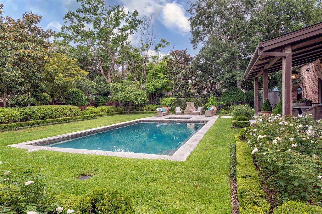
Today. One difference is the sidewalk between the house and the pool was removed and replaced by grass.
Will the new owner remove the grass and put in artificial turf?
Probably.

The new hot tub and patio along with French fountain.

New French lanterns and limestone patio, along with stone table.

The opening leads to the outdoor kitchen, along with antique doors.

Inside the kitchen with the stone sink. The antique doors open to the garage.

Beautiful iron gates lead to the garage area.

The back door and garage. Is that a chicken coop? Does Tanglewood allow chickens!?!


Off to the left is the powder room and dining room. Here is how it once looked:

Before: the port window looks out to the front porch. Handpainted Italian mural and Victorian painted vanity.


Real Estate: The two large antique apothecary jars were a favorite accessory of Babs, something we rarely see today.

To the right is the powder room and dining room and to the left is the library. Notice the staircase is off the entry hall.

The stairs with the antique 150 year old planks. At the left you can see into the living room.

From the magazine. I loved this room with the hydrangea flowers. The floors are 150 year old white oak planks. Notice the wood and glass interior French doors. There are several sets of these doors that separate each room from the central living area.
All walls are plaster. Wall colors by @jayiarussi – a favorite of Babs.
Most rugs found in the house are from: WWW.MATTCAMRON.COM


A close up of the boxes. Many are Baccarat crystal and the rest are blue and turquoise opaline.

The real estate photos revealed things never seen in the magazine photos – such as there were two hydrangea arrangements. Vintage doors lead from the living room to the adjoining sitting room. Also, the beams were placed in the room by the new owners.


The before is nice for sure! But, it just lacks that certain element that the antiques give the house.


Before: No beams. Former plate glass windows. The door leads to the entry hall and powder room.


Magazine. The photographer pushed the furniture in to make the room look smaller.
As always, the professional photographer is more artistic than the real estate photographer who has a different purpose – he wants to show the room to look as large as possible. The real estate photos can even look distorted, such as the dining room photos.
Before: The antique mantel makes such a difference. The shelves on the window wall were removed for some reason. Not sure why. Maybe for the curtains.
Not shown in the magazine is the TV room, right off the living room. This room also overlooks the backyard pool and the outside kitchen. You can see the living room through the open door.


Along the back wall is a large armoire unit. Through the window the outside kitchen with its porthole window.
The ceiling is planked, another surprise.
Through the dining area is the entrance to the bar and breakfast room.

Through the bar/butlers area is the breakfast room with another beautiful antique mantel.

Close up of the beautiful mantel.

Before: The original fireplace. Quite a difference. This is perfectly nice and I like it, but it’s hard not to prefer the antique mantel!

Off the breakfast room is the kitchen. The hood was made from an aviary found by the owner.

Off the porte cochere is the entrance to the kitchen with its collection of Texas hats and more painted antiques.

Magazine: The entrance hall to the master bedroom, lined with ballgown curtains and an antique French settee.

Real Estate: A larger view. The rooms that lead off the living room all have the same set of antique doors with glass that allows the light to travel inside the house.
Notice the beautiful enfilade, from the double doors into the bedroom through another set of double doors and ending at the French door, perfectly placed.

Magazine: The bedroom with blue ballgown curtains and a pitched roof with antique beams.

Magazine: The antique doors leading into the bedroom off the hallway.

Real Estate: Of course the photographer did not close the armoire doors!

Magazine: Another dreamy photo of the bedroom with the armoire doors closed!

Real Estate: A view of the antique double doors that lead into the hallway. It’s hard to see, but the flooring here is the Versailles Parquet pattern.

Before: The roof was not arched but was vaulted instead. The arched ceiling is much more aesthetically pleasing.

The master bathroom.

And another view.

Upstairs is a large playroom and many bedrooms. More antique beams and chandeliers.

Before: without the antique beams.

Today: The upstairs guest room with the silk ballgown curtains and French furniture, along with the new window.

Before: original, with the more contemporary windows.

Real Estate Photo: The office with French biblioteque. Not seen in the magazine.

The bathroom is part coffee bar.

Marble tile walls.

I do wonder what items came with the house – the antique, painted interior doors? What of all the special lighting fixtures and sconces? Did those stay or go with the owner? Will the new owners paint everything over – using white with black accents?
Will this house return back to its soft contemporary roots?
Regardless of whether the antique elements were conveyed with the house – do the new owners even want them? I’m afraid we will never know ----- until they sell the house, again.
I hope you have enjoyed this look back at this collaboration between Babs Watkins, Julie Watkins Baker, and Eleanor Cummings. I know I did!
The feminine decor with its generous use of painted antiques and painted surfaces is a gentle reminder of how beautiful antiques and patternless fabrics together can create a timeless atmosphere that is not easily forgotten.
I'd like to send you a copy of the magazine my studio was recently featured in. Please send me an address to my email zoeoct10@aol.com. Merci. Eowana Jordan Manassas, VA
ReplyDeleteCOTEDETEXAS@AOL.COM
DeleteI hate the black and white look and it is SO overdone in Dallas. Thanks for sharing another home that is just my style.
DeleteGive me antiques, beautiful rich colors over black and white anyday!
ReplyDeleteThanks Joni, I loved a look back at this. I too miss seeing the “Houston” look. The black and white trend cannot compare.
ReplyDeleteThank you for this wonderful article. It’s always so much fun to see a new message from you, grab my coffee and settle in for a marvellous tour. Love reading your opinion on architecture and decorating styles and all the pics you include.
ReplyDeleteI devour your posts like a starving person in the desert. And I agree…no more black and white. Blah.
ReplyDelete.LOL Go EAT!! Haha I do like black and white but it's all they show in new construction.
DeleteLove Love Love seeing this post as I have so much enjoyed so many from you. THANK you for finding so much for your readers to enjoy!
ReplyDeleteI remember this blue issue well. It was Tobi Fairley of Little Rock's big break with the cover. I notice the use of very large oriental rugs which were not in favor for so many years are now slowly coming back out of storage. I loved everything Babs did especially the Veranda issues. She had that special eye in knowing just what was perfect for a room and when to stop adding accessories. And, of course I loved all the Italian, Swedish and French antiques. Your house comparisons are always great.
ReplyDeleteThe master bedroom was always a favorite, and I have various photos of it saved in my decorating album. Thank you for resurrecting these images. I cringe at the thought of this gorgeous warm and inviting house being turned to boring cold black and white. I pray not!
ReplyDeleteAs ever your posts delight and educate. There are elements in both renditions of this house to appreciate. Wood floors and beams were especially attractive. As is the new furniture. The older version of the house just looked tired. Keep up the good work. Ann
ReplyDeleteI acquired my grandparent's farmstead, and the old siding on the house was replaced with new. In yes, white with black trim. I listened to a decorator instead of my gut, which would have chosen white body, taupe trim, and red door. The interior is all warmth and coziness with hummus colored walls and a whipped butter ceiling, and rich, deep, earthy colors and patterns upon patterns. Kind of a Pierce and Ward look. I never have desired grey walls and the stark black and white trend. I need a hug when I walk in the front door, not an icy, cold stare. This home is gorgeous, and I remember it from other posts of yours. I pray the new owners retain the French Country interior and charming brick and shutters. Thank you for another lovely post. Cheers!
ReplyDeleteiT SOUNDS WONDERFUL - I WOULD LOVE TO SEE IT!!
DeleteThank you so much for this wonderful post. The beautiful yet usable antiques represent all that I love. Although we have downsized, I still aim to get this feel.
ReplyDeleteBeautiful house! I’m hoping the new owners think so too. Although I like the black and white look, I think there is getting to be too much of it.
ReplyDeleteThank you so much for sharing this again! I absolutely love this home and everything about it. It reminds me of how the home I grew up in was decorated with touches of antique, plush furnishings, and lush gardens. Sigh!
ReplyDeleteI think the unusual light fixture in the power room is a bed crown that was made into a light fixture.
ReplyDeleteINTERESTING.
DeleteThank you. I still have the article clipped from that issue of HB. Stephen Drucker was a brilliant editor, the best that magazine has ever had in my opinion. Unfortunately, the magazine has had a series of editors since him that increasingly disappoint.
ReplyDeleteIT IS NOT THE SAME AT ALL.
DeleteWhy would anyone ever sell that perfect house!?
ReplyDeleteThis house seemed dated…already. Sorry….
ReplyDeleteJoni, have you read the November 2022 AD? Amazing.
ReplyDeleteLovely. Interestingly, HB on the website describes the house as from the 1980s...
ReplyDeleteLove your Throwback Story -- because I love antiques. We had limestone mantels and range hood shipped from TX to RI for our Anglo-Normal Cottage up north, and the copper chimney pots came from Jack Arnold in Tulsa. We included distressed beams and coffered ceilings, and most of the walls were plastered in appropriate soft hues. Bath vanities were "antiqued" by a faux painter to look like those in Charles Faudree's many books. Every bit of wall and trim was hand-painted by brush. NEW OWNERS: spray painted the entire interior of the 4,200 sf house white & grey -- a quick-sale broker pushed them to do that -- and my husband was really shaken when he saw the real estate photos. So much artistry wiped away with spray paint!
ReplyDeleteLove this as I do every single post you've ever shared! The upsized san serif font is a nice change. Thank you, Joni!
ReplyDelete