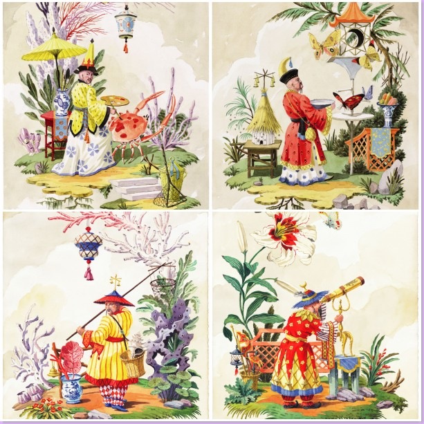
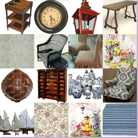
A mosaic of four watercolors from Harrison Howard's Chinoiserie series.
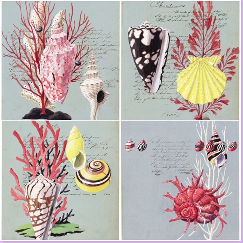
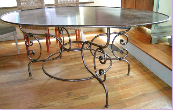
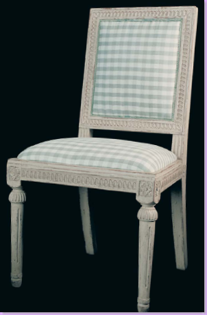
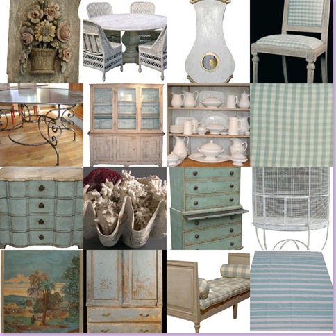
Remember this? In August, after a long series of dreamy beach houses, I planned a virtual beach house for myself - with two different decorative schemes - because as everyone knows - I'm terribly conflicted between the two: the first scheme, "The Cluttered Beach House" was perfect for the Hamptons or perhaps Nantucket in a gray shingled house. The second virtual scheme "The Uncluttered Beach House" was more restrained, slightly Swedish in feel and perfect for a house in Seaside, Florida. In both houses, I featured a series of watercolors from the uber talented artist Harrison Howard. The Chinoiserie series, above, was for the Hamptons beach house while, the Shell series below would be wonderful in the aqua-colored beach house in Seaside. Ah, to dream!
A mosaic of four water colors from Howard's Shell series.
In truth, Mr. Howard and I are email buddies, who like to champion each other's careers, when we aren't talking about our children. Harrison's only child is a son who is the same age as my only child, Elisabeth. When I was designing the virtual beach houses, I was thrilled to finally have a chance to showcase my friend's wonderful art. The first time I ever heard of Harrison was when the blogger The Peak of Chic featured him here, and then, the artist Annechovie followed up with an interview of Harrison on her blog. Ever since my initial visit to Harrison's web site, I've been lusting after his Chinoiserie series and wishing they were mine. Many visits to the web site later, I knew that at some point, I was going to buy a watercolor, or two, or maybe even four!! After much discussion back and forth, it was settled that I would get the four from the Chinoiserie series that I so loved. While I initially wanted the original work of art, Harrison assured me that I would never be able to tell the difference between the original and the print, except, that is, in my bank statement - and true to his word, I can't. So, he packed up the four prints I chose, with extra special care I might add, and home to Houston they came. When the prints arrived I was taken aback by how much more beautiful they were in real life as opposed to the computer screen! They were so vibrant and colorful - the details so perfectly executed by an artist with exceptional skills. In short, they were amazing. What I adore the most about the paintings is the subtle humor found within each image. Imagine a crab portrayed as an artist's canvas, or a beekeeper living a Sponge Bob Square Pants underwater existence!! After a couple of days of just enjoying the prints, they went to the framers (which can actually get quite expensive if you aren't careful) and a few weeks later, I have them back - where they are now hanging in my bedroom. The corals and pinks from the watercolors blend perfectly with my pink Fortuny print fabric, while the deep oranges and Chinese yellows are matched to the suzani on my bed. The various greens meld in with my very seafoam room. As I told Harrison last night, I couldn't wait to share his watercolors with you! Enjoy!
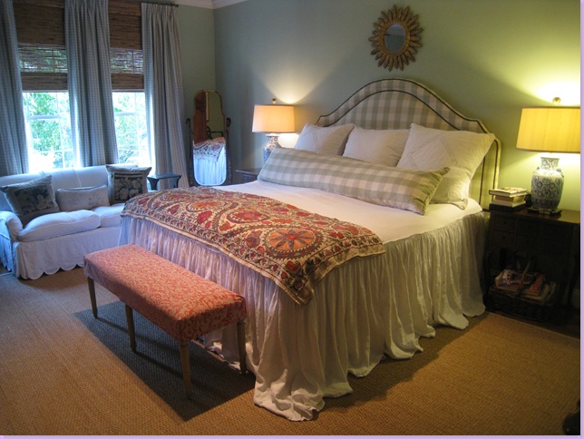
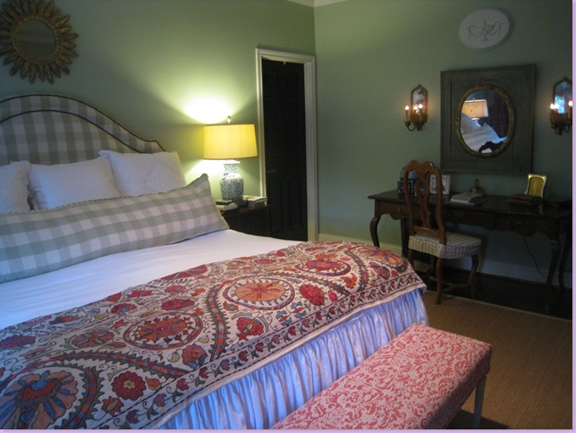
Walking into my bedroom, the first thing you see is the bed against the back wall. A white linen bedspread and an antique suzani cover the bed. Blue and white porcelain vases were made into lamps. The sunburst mirror plays into the symmetry of the vignette. Seagrass, of course, covers the hardwoods, and while linen slipcovers are on the love seat.
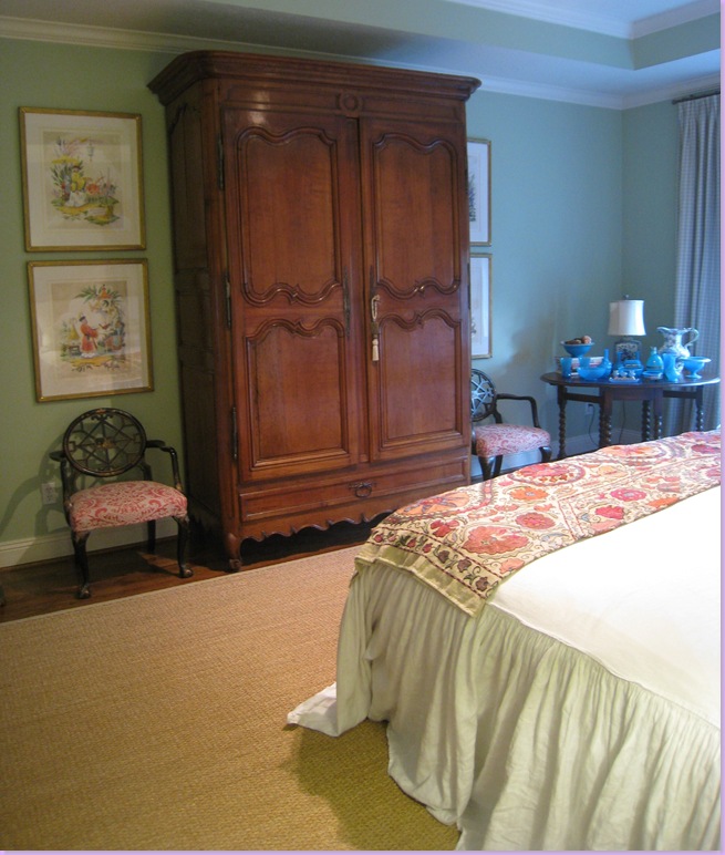
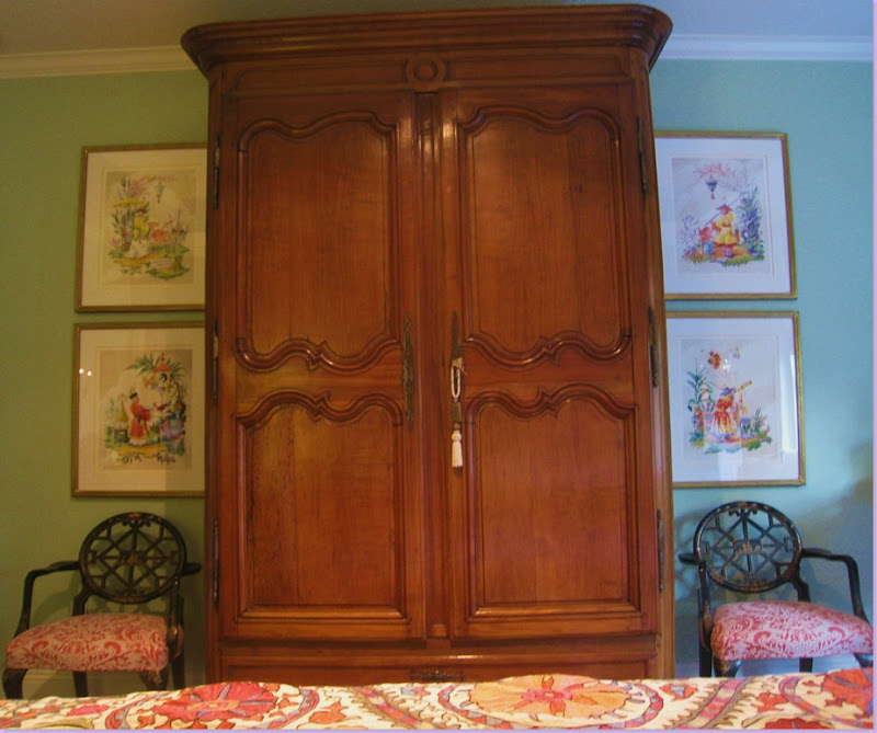
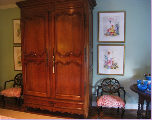
Turning to the left, is the large antique armoire which hides our T.V. On each side, I placed two of the watercolors. The colors in the my suzani at the end of my bed and the fabric on the chairs and bench are all found in the watercolors. Because the room is not very deep, it's difficult to get a shot of all four watercolors at the same time, but I tried! Also, unfortunately, the camera is picking up the glare in the frames' glass. You'll just have to come to Houston to see how good they look in person!
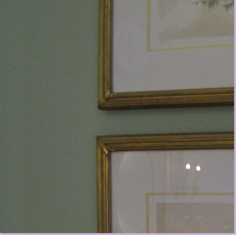
A close up of the frames I chose. They are reeded gold in a matte finish, not shiny in the least. Harrison suggests a bamboo frame for his Chinoiserie series, but I couldn't resist these! The mat is creamy white with an inner mat in Chinese yellow. The lighting in these pictures is terrible - the yellow mat is actually quite vibrant.
The view from the bed - all four together! The chairs underneath the paintings are lacquered chinoiseries, upholstered in the pink Fortuny fabric. I thought the black oriental styled chairs were a perfect foil for Howard's Chinoiserie series.
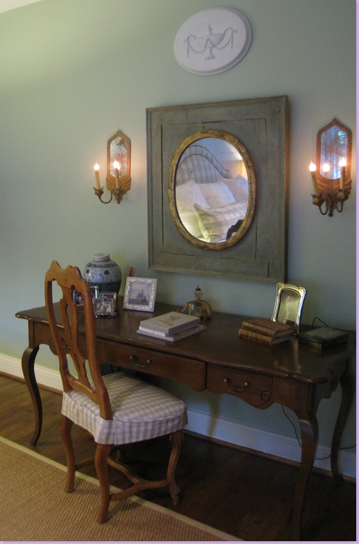
On the other side of the room is my desk with a mirror and sconces. Notice that my bathroom door is painted black - actually all the doors in my house are painted black. I think its a great look and a very inexpensive way to make a cheap, builder grade, hollow-core, paneled door look impressive, if that is at all possible.
A close up of the desk and chair which are hand-me-downs from my mother, Betty Rae. If you haven't read her tribute, please do so here! It's a portrait of my design mentor and the story of how I came to be a lover of French antiques.
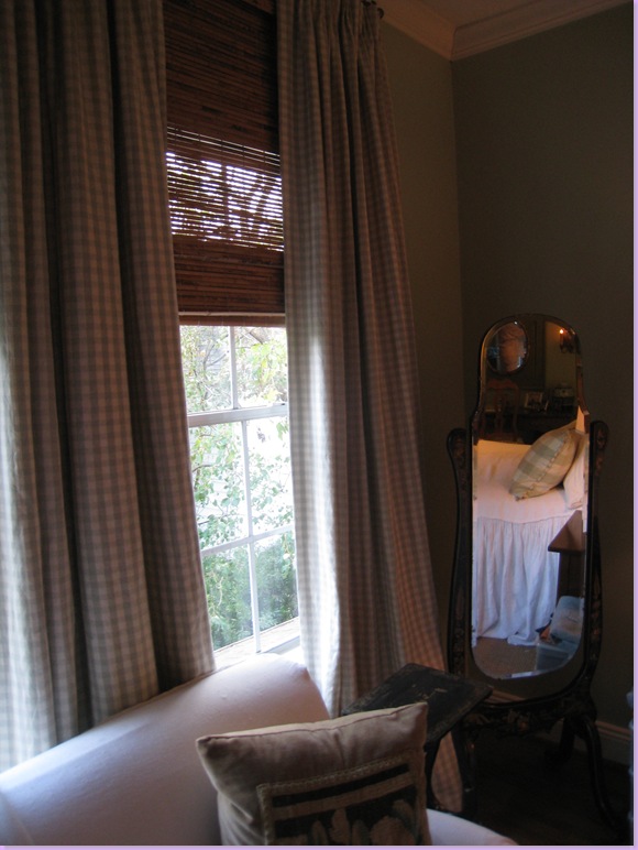
Next to the sofa is a chinoiserie mirror that came with the pair of black chairs. The set is actually my sister-in-law's. She has visiting rights, only. The curtain and headboard fabrics are two different sized checks from Chelsea Editions.
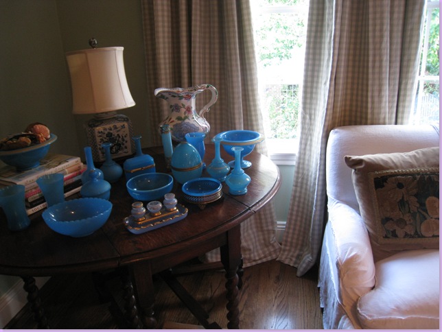
My collection of blue opaline. To learn more about this French glass, go here.
One last glimpse of the four as you leave the room, out the door to the left.
Thanks Harrison! The three of us love them - and they look fabulous!
Be sure to visit Harrison Howard's web site at www.harrisonhoward.com to learn more about the artist and to peruse his portfolio.

