Everyone knows that one of my favorite designers is Houstonian Pamela Pierce. A few years ago, her own house was once a cover story in Veranda and it remains one of my favorites. This picture above of her own bedrooms is rarely seen on the internet, but I think it is so pretty. Understated, yet beautiful, it highlights Pierce’s aesthetic: a love of antiques, a quiet monochromatic look, no easily defined period, and the use of quality in the elements that separates her work from the more average designer. Her house is such a beauty, although I’ve heard rumors it’s been redone. Unfortunately for us, Pierce’s work isn’t often seen. Her clients prefer anonymity and while this is understandable, it’s such a shame that we aren’t able to see everything she designs. There’s a lot to learn from her and I so respect her choices; I would be forever indebted if one day she would publish a book filled with all her projects. Pierce once said that while she admires international star designers such as John Saladino and Axel Vervoordt, she has been most influenced by Houston designer Babs Watkins. I love that. Watkins helped start the current “Houston” look and her eye is in a class of its own. Simply, Watkins is one of the best designers this town has had. Pamela Pierce certainly is at the top of the list of contenders to that title.
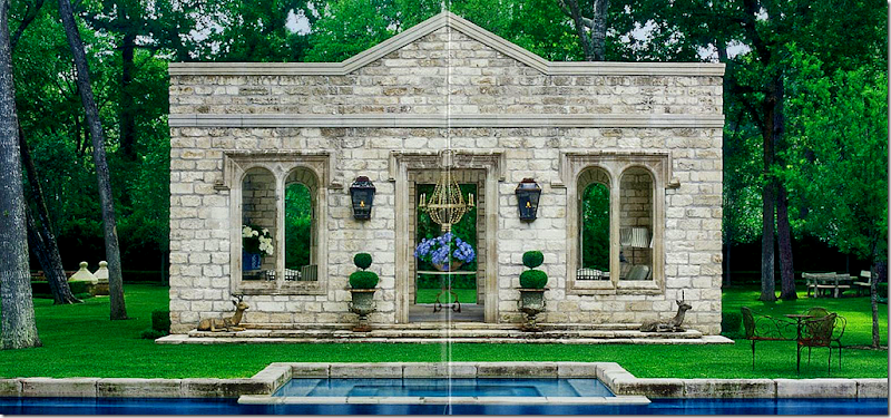
A few weeks ago I posted this picture of pool house she designed that is without a doubt one of the prettiest backyard structures I’ve seen. I’ll use any excuse to post it again and again! To describe it as a pool house is actually sacrilege. Veranda calls it a garden pavilion, but I think of it as a folly – defined as: a whimsical structure built to serve as a conversation piece or lend interest to a view, found especially in England in the 18th century. The pavilion was built around a collection of 18th century stone doors and windows that Pierce found at Chateau Domingue, the premier importer of architectural elements. Very few designers would have had the vision to create such a structure out of a pile of bricks and stones, but Pierce had no problems at all. The pavilion is exceptional, a one of a kind structure that stands in testament to her talent. Notice the beautiful site line from the front of the pavilion out through to the back of the yard. Gorgeous.
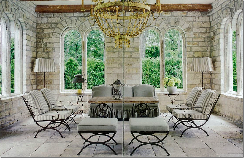
Inside the open air pavilion, Pierce used a collection of iron furniture, linen and striped fabrics and antique tables and accessories. Notice that lantern sitting next to the settee. And notice the fabric lampshades. Love!!!
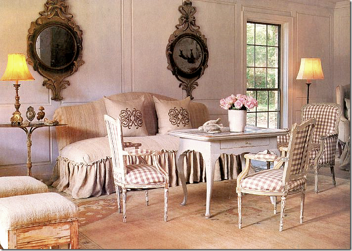
For Chateau Domingue’s Ruth Gay, Pierce designed the living room using Swedish and French antiques with a checked fabric.
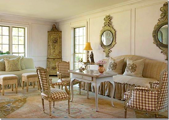
The same room from another view. The tea table is so wonderful! Notice the corner cabinet.
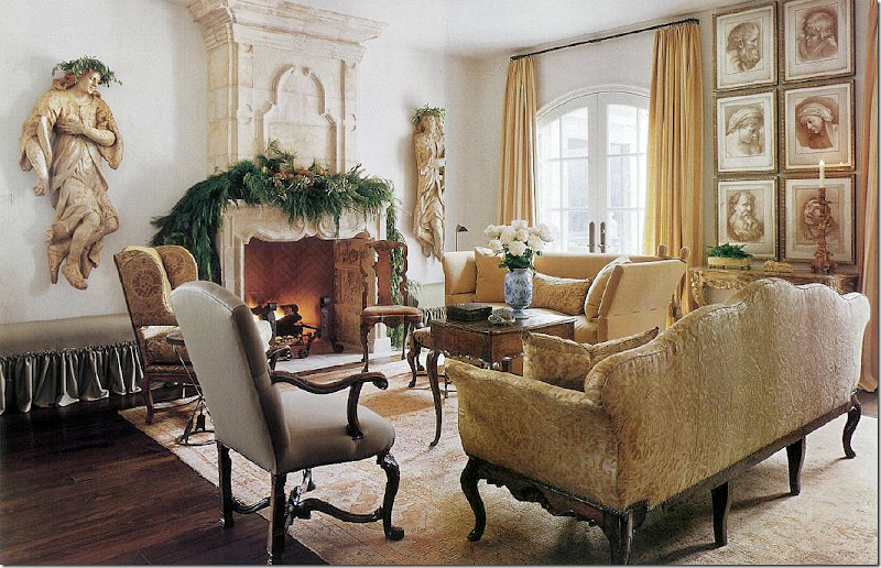
For this client, Pierce used antique sofas and chairs upholstered in damasks and linens. Again, notice the tea table instead of a coffee table. Antique fireplace is flanked by large putti.
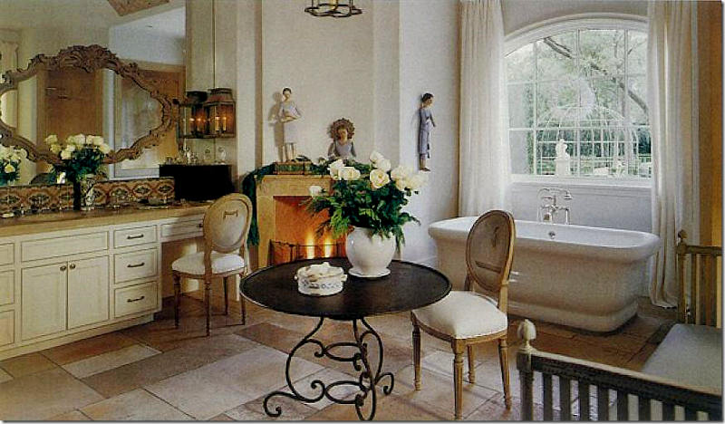
I love this bathroom with the fireplace in it. I’ve always wanted one in my dining room and bedroom, but now I am thinking the bathroom is the perfect place for a roaring fire on a cold day. Love the iron table and notice the Swedish day bed on the right side of the picture. Instead of sconces, Pierce put lanterns on each side of the sinks.
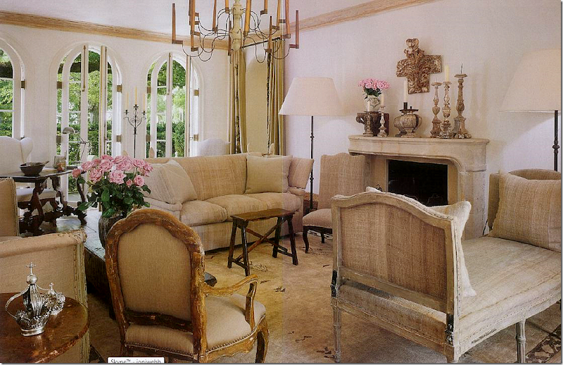
Pamela Pierce’s living room. I am dying to see the house if it truly has been updated! Can’t imagine messing with this perfection!!! I’ve always loved the Spanish style desk at the very left of the picture. Pretty mantlescape with the assortment of candles and roses.
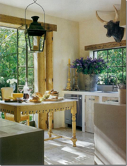
Pierce’s own kitchen with the beautiful steel windows and doors and the great antique lantern. I love how its styled with the antique gilt candlesticks next to a large tin bucket filled with flowers.
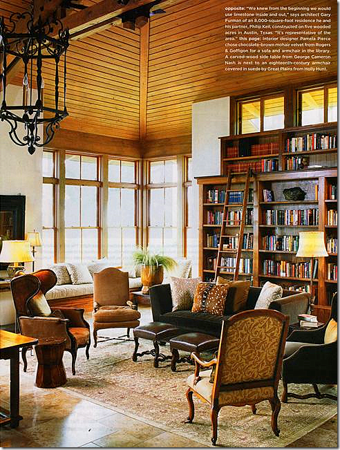
A rare contemporary house with interiors by Pierce. Even though this Austin house is modern, she still uses her antique chairs and stools and tables, which look absolutely correct in this space!
Being a devoted follower of Pam Pierce’s work, I was thrilled when realtor Sharon Ballas of Greenwood King emailed me that she had just listed a house designed by Pierce! The house has been listed before, but the photographs were so small, I was unable to show it on the blog. When Sharon informed me that she had the original images, full sized, I screamed – bring them on!! A few minutes later, image after image from this beautiful house downloaded into my computer. Nirvana. The listing goes online later this week, so for all the pertinent information – email Sharon directly at ballas@greenwoodking.com
Enjoy!!!!
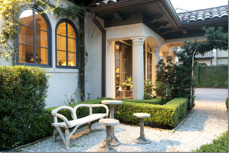
The large two story house is located in Tanglewood. White stucco with arched windows throughout – notice the clipped boxed parterre garden.
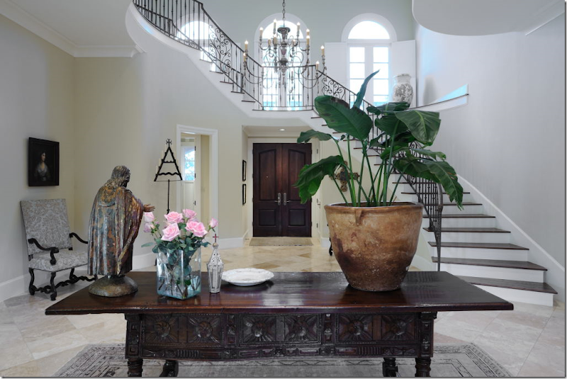
The front door opens to an expansive two story entry. Here, an antique console stands in the center where a typical designer would use a round library time. The rectangular table is the first clue that Pam Pierce is the designer. The house was built, then bought by its owners in 2003. The interiors were designed eight years ago, which amazes me because the house still looks current and fresh. A decade old design can look dated and out of style, but this interior doesn’t because of the liberal use of classic antiques, which don’t age.
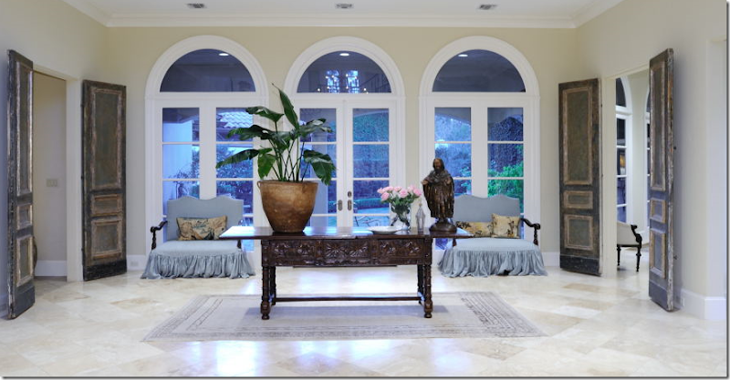
The view of the foyer, opposite. Two antique settees are slipped in light blue linen. Notice the two sets of antique painted blue 18th century doors that open to the hallways. The soft blue found here in the foyer runs throughout the house, upstairs and down.
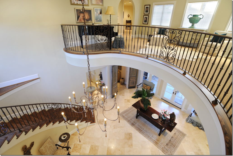
The view from upstairs looking onto the foyer. Hanging from the ceiling is an Italian styled light fixture.
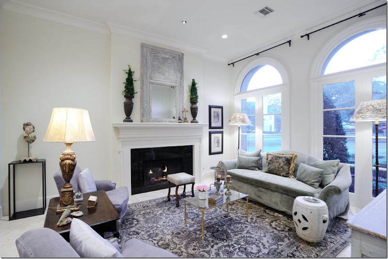
The living room is bathed in soft blue linens. I love the printed lampshades on the standing lamps! Even the trumeau has a soft blue tint to it. Unfortunately, the curtains were out being cleaned when this picture was taken. For lampshades similar to these, contact Watkins Culver.
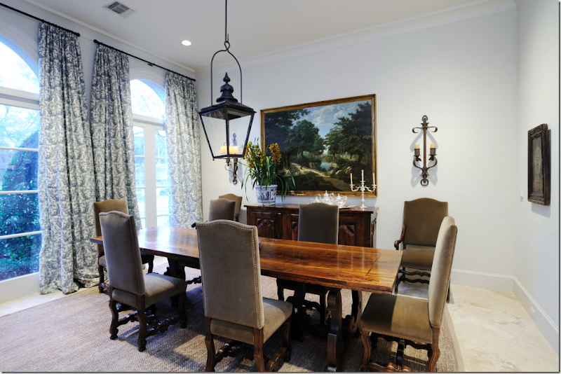
I adore this dining room with its Spanish styled table and velvet covered chairs. I LOVE the lantern instead of a fancy chandelier!!! The blues found in the curtains run through the house. Not sure what this fabric is, but I really like it.
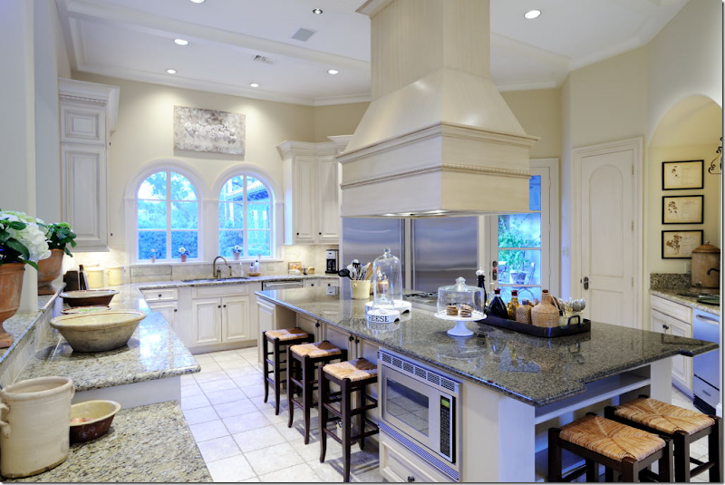
The kitchen – large and very functional for a big family.
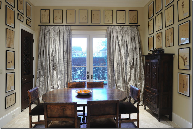
The breakfast room – my favorite room in the house! The curtains are a blue silk check – so luscious and full! Antique leather chairs and armoire. I love the way the walls are filled with the large collection of herbiers. Watkins Culver also sells similar herbiers.
The master bedroom overlooks the back yard. Of course I love the darling tufted settee with the double ruffled skirt that is Pam’s trademark.
Another view. Beautiful armoire and desk.
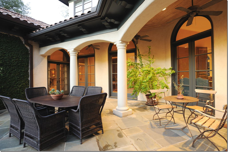
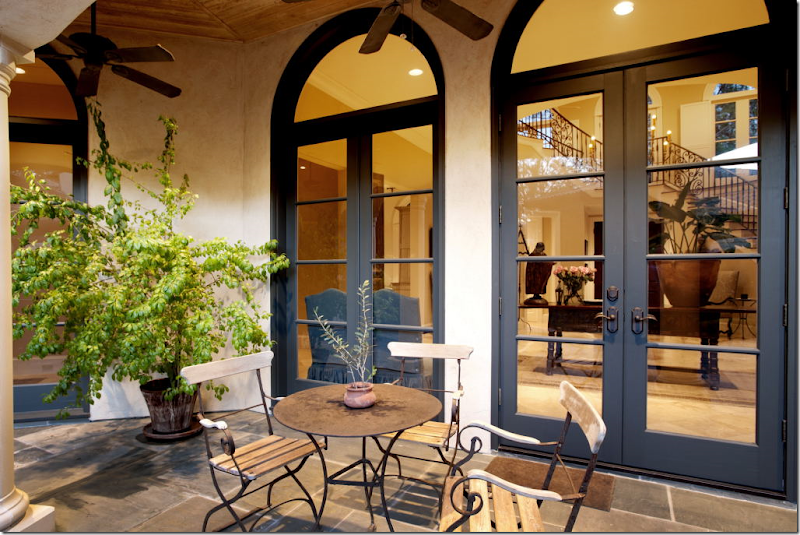
The entry hall and the bedroom overlook this terrace.
Off the foyer, an antique French table and garden chairs.
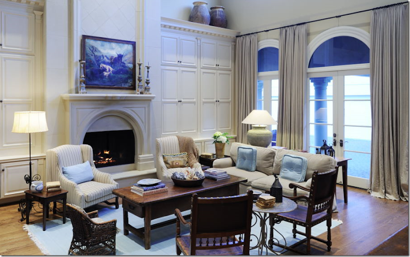
The family room has more touches of blue mixed with antiques and slipcovered sofa. I’m partial to the child sized wicker chair because I have the same one! The Gray Door carries these. I love the taller coffee table and the iron table between the two antique Spanish chairs.
Gorgeous French armoire anchors the room. Remember – when starting out, try to buy one antique to anchor each room. You’ll have it the rest of your life!
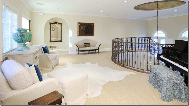
The upstairs landing is done in white linens with touches of blues. Notice the cute piano bench!
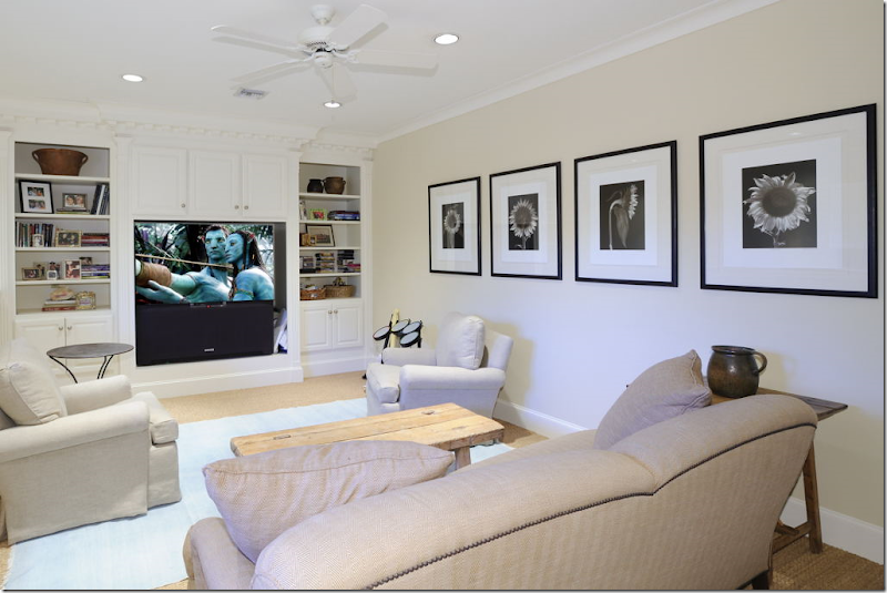
Upstairs, the children’s media room has comfy furniture.
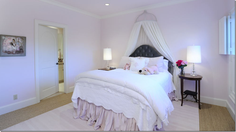
Too cute – a gray velvet tufted headboard is mixed with lilac and white linens.
This room has matching French beds upholstered in linen. Again, there are touches of blue. Love the shutters and the wall to wall seagrass found throughout the upstairs.
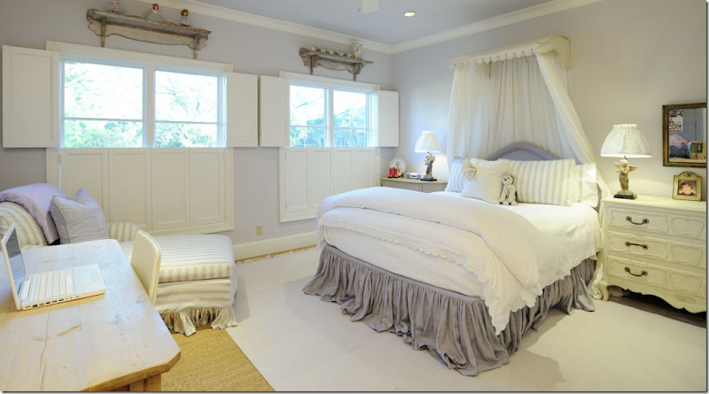
Another darling bedroom with gray and white linens.
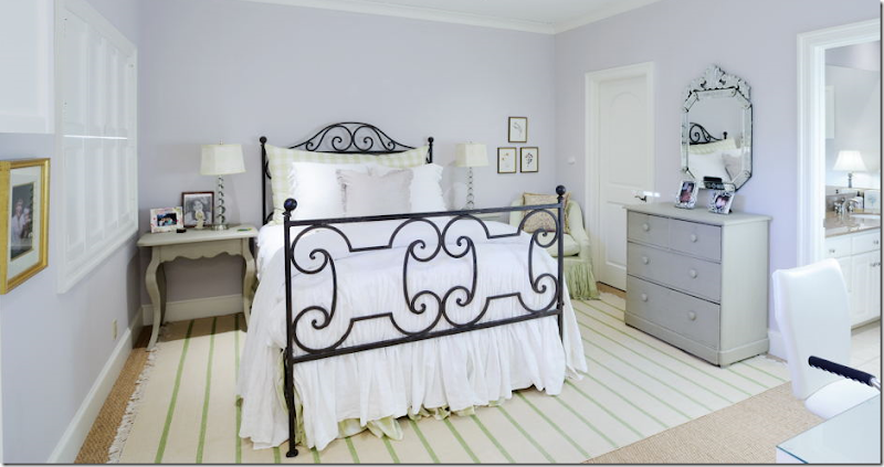
And one more cute girl’s room with touches of green mixed with the white. As you can tell, the homeowners have lots of daughters!
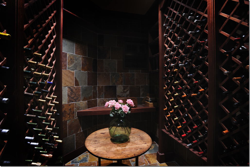
And, of course there is a wine tasting room, with slate walls!!!
The view off the kitchen and family room with a collection of faux bois furniture.
I hope you enjoyed looking at this house with interiors by Pamela Pierce. To contact the realtor, email Sharon Ballas at ballas@greenwoodking.com
And to contact the interior designer Pamela Pierce, call 713-961-7540.
Be sure to look at the Cote de Texas sponsors listed on the upper left hand side of the blog. Today, we are welcoming several new sponsors: J Covington Home and Karen Sugarman Designs. For each sponsor, just click on their picture and you will be taken directly to their website. Thanks for your support!
And another Cote de Texas sponsor, The Urban Market, is having their next show on February 12-13, Saturday – Sunday. NOTE: There is a new location!!!! The Urban Market will be held at 3101 Smith Street @ Elgin. Located in Mid Town, the new arena is SO much better! Closer for everyone except those who live near the airport. Thanks for moving, guys!!!
A Pamela Pierce Designed House
Dining Rooms Serve up Eye Candy

This dining room by John Saladino is located in a New York highrise. It's a personal favorite of mine and has been for years. There's not one special piece of furniture in it, in fact, there isn't even a dining table, just a couple of linen tablecloths thrown over a nondescript piece of plywood. The chairs, though, are beautiful - but there are only four. The other four are probably scattered around the apartment, awaiting a dinner party. What sets this dining room above other more furnished ones, is the gorgeous mural painted on the back wall. It's a garden scene and a trellis can just be seen arching in the middle and along the bottom. The sparse display of flowering branches on the table sets off the mural perfectly. In his book, Style by Saladino, this entire apartment is featured and Saladino goes into great detail of how the mural came to be. The artist did further work for Saladino, but never, in my opinion, did he achieve the perfection he did in this dining room.
 This dining room, by Cathy Kincaid, is another favorite of mine. It's a complete opposite of Saladino's in that the room is loaded with antiques, furniture, chairs, and accessories. Yet, somehow, the room remains light and airy looking, almost like icing on a white cake. The room just sparkles, helped along by the crystal lamps and Vaughan chandelier. The open back Patina chairs with short slip cover skirts exposing delicate thin chair legs add to the overall lightness of the room. Though the table is a dark stained over-sized antique, it is barely noticeable in the room. The french doors leading to the next room have mirrors instead of glass in the panes, further adding to the ambiance. Notably, the room's only color comes from the blue and white porcelain and the hydrangeas.
Wow, I love this dining room. Fiona Newell Weeks designed it for her own home and it's stunning. The walls are covered in a blue and white Farrow and Ball damask and the wallpaper is the focal point of the room. Without it, the room would not be half as striking. It takes guts to use a paper like this in a dining room, but Fiona is known for her bold strokes. The whimsical boat chandelier plays up the room's youthful feeling. Is there any doubt that the owners are fun loving people? I love how the khaki color plays against the blue and white and how skillfully Weeks repeats the color - in the chair's wood stain, the leather upholstery, the frames' mats. The unusual oval shape of the mirror further sets off the young, adventurous feel of the room.
This dining room features Swedish antique furniture and elegant Niermann Weeks chairs. Simple seagrass keeps the quiet, simple tone going. That is, until you look up at the lighting fixture. An absolute stunner, it was commissioned by the designer, Jacqueline Segura, especially for this family's beachside home. The artist who makes the fixture was challenged to expand on the size of the glass blown ball. Little bits of round crystal attached to the iron, gives it subtle sparkle. Again, the chandelier gives off hints that this family is young and full of life.
 This dining room's draperies become it's focal point. The designer, in dealing with tricky arched windows, uses square top valances to solve that problem. The quiet two toned stripe is matched by the softness of the linen material. Large blue and white porcelain vases on the mantel play up the room's height. The chandelier all curvy, matches the round table.
Fabulous French detail makes this room a stunner. The gorgeous antique gilt and wood chandelier matches the rustic feel of the table and the buffet. Simple, oversized white plates rest on the wood shelves. Dreamy blue and white toile slipcovers - what could be more French?
 Young, hot designer Windsor Smith showcases her own dining room. I love the wallpaper, an aqua handpainted design. Gorgeous. Simple sisal matting on the floor and mismatched chairs and benches lend more informality to the room. Silver pitchers filled with leaves are an unusual centerpiece. Domino's current issue showcases this room if you want to see more of it.
 Ah, I know this room well. The house was on the cover of House Beautiful this year and it belongs to a good friend of mine! Houston designer Carol Glasser and the famous English designer and author Katrin Cargill turned a traditional English house into an authentic Swedish home. Each piece in this room, and the entire house for that matter, was bought especially for it. The chairs are reproductions, but it's hard to tell that. The chandelier is a Swedish period antique. The walls are soft pink with traditional Swedish handpainted flowers not visible in the picture. There's no rug to cover the difficult to achieve limed floors. Once inside the house, it's hard to believe you are in Houston, not Sweden, so faithful to the design were Glasser and Cargill.

Symmetry and silk drapes become the focal point in this room designed by Birmingham designer Mary McKee. Luscious silk drapes paired with bamboo blinds is a favorite of many designers today. Choosing short skirts instead of upholstered seats brings the formality down a notch. Impossible to overlook, highlighted in the middle of all the symmetry, is the drop dead gorgeous double, crystal chandelier.

I've saved this picture for years and have no idea who the designer was, but I've always loved the romantic French screen on the wall. It's an unusual place for a screen, but somehow it works here.

Pam Pierce, Houston great, uses linen as her focal point. The tailoring of the skirted table is unusual, but so effective! A few bold antiques - a large trumeau with attached sconces, a French chandelier, period arm chairs, oversized bowl - is all that is needed to make a simple dining room special.

Here the shades become the focal point, along with the large, gorgeous French chairs. The only color - a purple hydrangea.

The room is beautiful, the walls are lacquer perfection, but I show it to highlight a design that puzzles me. I absolutely never understand two tables, the same size, in one dining room. Here, the designer, Markham Roberts, tackles the issue by using two different tablecloths. Somehow, he pulls a quirky design off.
French Design in Houston: Pam Pierce
 The living room: note the thickness of the doorway arches. Mirrors, iron tables, linen fabrics, down cushions - all add to Pierce's style.
This is the home of Pam Pierce, a well-known Houston designer who does French, Houston style. These photos come from the cover story of the May 2006 issue of Veranda. Pierce uses gorgeous period pieces along with non-period pieces, but, certainly, you will find no cheap reproductions here. Authenticity is the key. The look is spare, the accessories are highly edited, the mood is calm. Pierce uses lots of gold mirrors, peeling painted pieces, Santos, limestone, Swedish antiques sprinkled here and there along with an Italian piece or two, iron tables, down cushions, seagrass, stucco, and other details that when mixed together produce a visual that is breathtaking. She eschews any pattern in her fabrics and favors linens and checks.
The house is a gorgeous old Mediterranean in a very fashionable area of town within walking distance of all the great museums and the heady Rice University. Huge live oak trees, ancient hedges, and overgrown ivy all add to the Southern mystique and beauty of her circular street that lies behind an original, stately entrance. Pierce completely remodeled the house, using architectural antiques imported from France and Europe, mostly purchased by Chateau Domingue which is owned by her friend and client Ruth Gay. (Watch here for a future entry on her home to note Gay's version of French, Houston style.)
.jpg) More living room: french day bed, the popular, must-have crowns on the side table.
More living room: french day bed, the popular, must-have crowns on the side table.
Pierce and a small number of other interior designers from Houston have carved a niche out for themselves with this style. Their clients tend to be younger couples with enormous wealth who can afford this look. It doesn't come cheap. Several stores (mostly owned by these same said designers) provide the french antiques to fill the mansions (some are Mac-mansions) these young people inhabit. The oil & gas business which is headquartered here in Houston has been very good to us and these upper level designers have ridden the waves of this industry's ups and down. When the price of oil is low, they are scratching for clients. When oil is high, these designers are living in gorgeous Mediterrean villas themselves.
This indulgence does not stop in the house, it continues outside, of course. Pierce's yard is small by any one's standards, yet every square inch is manicured and furnished with centuries old pots and statues and with a small army of faux bois and curly iron work. Danny McNair is her landscape architect, and there are several other companies who do this look just as well: Thompson+Hansen for one. Truth be told, Gardens in Austin, led the way for these others to follow. Pierce is at the top of her game; these photos are the proof.
.jpg) Chelsea Edition checks on slipcovers. That touch of pink. Layers of linen frame the bookcases.
Chelsea Edition checks on slipcovers. That touch of pink. Layers of linen frame the bookcases.
.jpg) Original large Santos greet visitors. Truly antique limestone fireplace from France. The photostylist is moving the pink flowers around.
Original large Santos greet visitors. Truly antique limestone fireplace from France. The photostylist is moving the pink flowers around.
.jpg) The breakfast room: note how she thickly she framed out the shelves. Large, vintage apothecary jars - the real thing.
The breakfast room: note how she thickly she framed out the shelves. Large, vintage apothecary jars - the real thing.
 The charming newly remodeled kitchen.
.jpg) Outside with old faux bois, french fountain and gravel (probably imported from France?)
Outside with old faux bois, french fountain and gravel (probably imported from France?)









.jpg)