This week, Cote de Texas names Atlanta designer Suzanne Kasler to the #8 spot in its Top Ten Designers list. Extremely prolific, Kasler has blazed her a trail through the Interior Design world. Her houses  are published at a rate that must make other designers extremely envious. It seems that almost every other month, another Kasler designed home shows up in one prestigious magazine or another. Young and vibrant, Kasler's designs are as colorful and full of life as she is. Even with a "look" that leans towards eclectic, Kasler always seems to add a French antique to each room. She says she can do "high" or "low" design, but prefers to mix up the two spectrums despite the budget. And indeed, a typical Kasler room will have at least one priceless antique and at least one item sourced from a catalogue. Not one to design strictly neutral interiors, she loves to use blues and pinks and often mixes the two colors together. Even a predominantly monochromatic room will usually have a few pops of color to give it a spark.
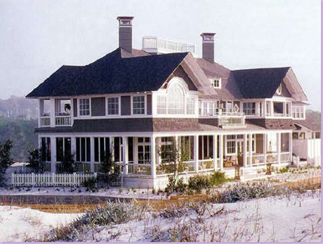
Kasler's popularity stems from the accessibility of her designs. Her rooms are fun, not stuffy, inviting and always warm. And, her designs especially appeal to woman. Kasler brings a definite touch of femininity to her work. Her career took off after she, her husband and daughter moved to Atlanta in the early 90s. Veranda and Atlanta Homes were early to recognize her talent. But it was the Southern Accents Showhouse, Water Mark in Santa Rita Beach that catapulted Kasler to national stardom. The project was immense: a beach house mac mansion located in the trendy Florida panhandle. Kasler chose blues and aquas as the building blocks of the showhouse and it proved t0 be an instant boost for her career.
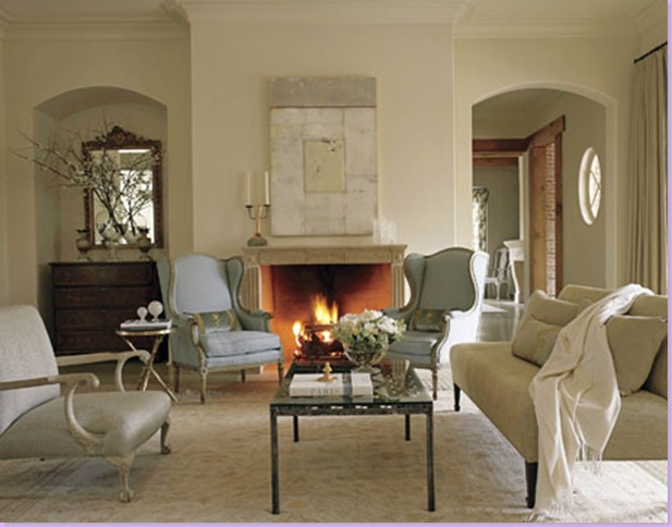
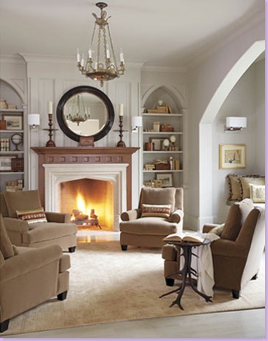
Kasler likes to paint her rooms in creamy or white tones and she brings the color in with accessories and fabrics. She advises painting the walls, trim and ceiling in the same color and says she never paints a ceiling builder-white. She strives to make her rooms comfortable and user friendly. She enjoys using her client's own possessions and encourages client participation in the project. Kasler likes to mix "beauty with comfort" and her rooms certainly reflect this.
This year, Kasler's star reaches it's pinnacle with the debut of a line of furniture that she designed for Hickory Chair. Also in the works are a line of fabrics and lighting fixtures. She cites John Saladino as an inspiration and her favorite books include ones written by Rose Tarlow, Bunny Williams, Sillis and Huniford, and a personal favorite of mine: the Belgian based Beta-Plus library, which she keeps at her office for daily referencing. Thanks to Kasler's youth, her stamp on interior design will be long lived.
The Southern Accents Showcase home, Water Mark, in Florida, which brought Kasler to national attention.
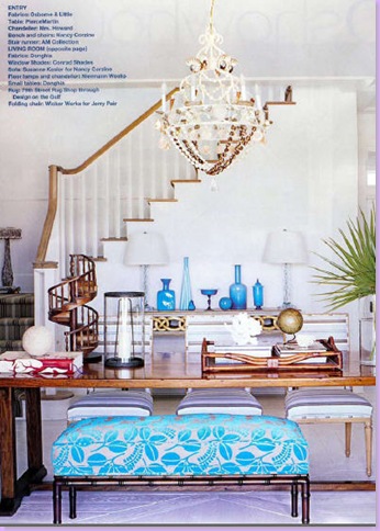
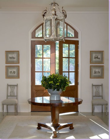
In the entry hall, Kasler set up the room as a combination dining area, reading area, and stair hall. The walls are bathed in white, yet pops of blue from fabrics and accessories bring in the color.
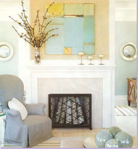
This picture from Water Mark made the cover of Southern Accents. The beautiful slip covered chair with its dressmaker details, the tranquil abstract painting, the striped dhurri rugs - all added together to give the house its fresh, updated look. This isn't your mother's beach house.
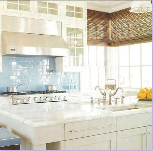
The showstopper of the house: the kitchen. The wall of aqua blue glass tiles on the back splash brought blue into the room. Note the gorgeous white carrara marble, the double sink, the beautiful, oversized hardware. And, also notice how Kasler put woven shades on the windows to add texture in order to tone down all the room's slickness.
Another view of the gorgeous beach kitchen with the soothing blue glass tiled back splash.
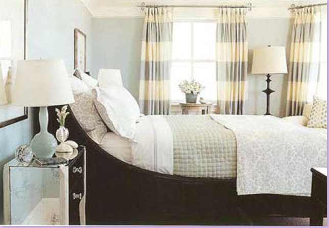
For one of the bedrooms, Kasler mixed a black sleigh bed with mirrored furniture and cool blues. Overscaled stripes and checks are favorite fabrics for Kasler window treatments.
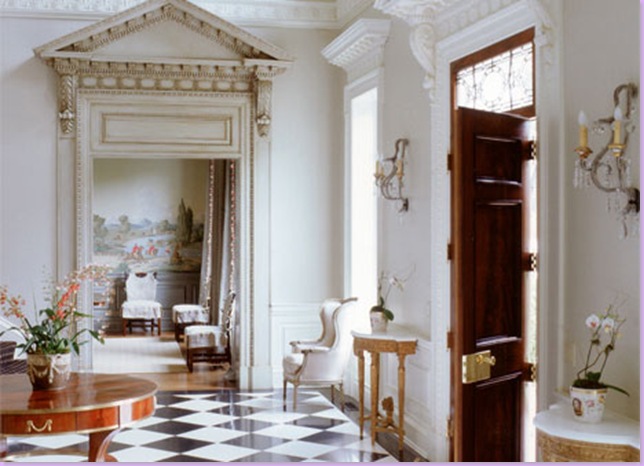
Another important project for Kasler, this time a Georgian home. The stately entrance with the black and white marble floor and impressive moldings.
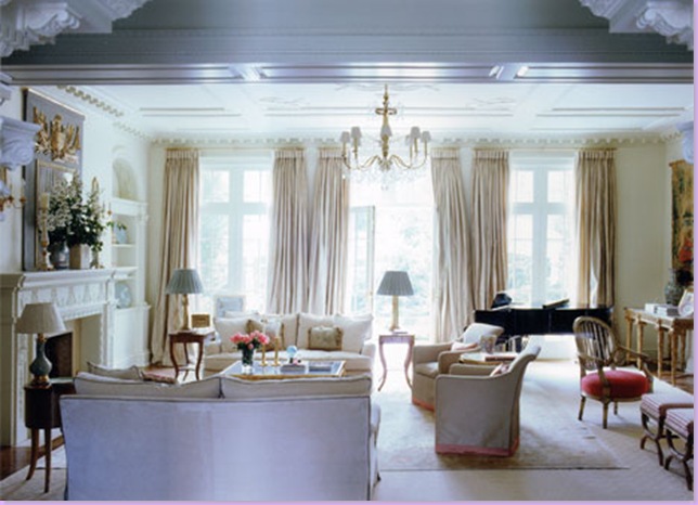
The living room: all neutral with pops of blues and pinks. Note how Kasler brings pink in with the trim on the chair skirts and the velvet on a french chair. The blues come from the lampshades, the trumeau mirror, and the porcelain dishes.
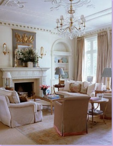
A closer view. Kasler layered an antique rug over sisal: highs and lows, a Kasler trademark.
And in this corner of the same room above, Kasler used a Saladino shelter sofa paired with a large, dark antique screen. I particularly love this vignette. Just beautiful.
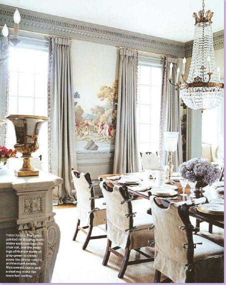
Classic Kasler: hand painted de Gournay wallpaper is matched with slip covers on the English antique chairs. The slips keep the formal furniture from seeming stuffy. As a result, this room appears fresh and young enough for a lively family with children.
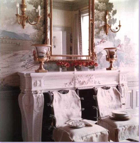
Another view of the dining room, showing the fireplace and more of the slip covered chairs.
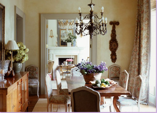
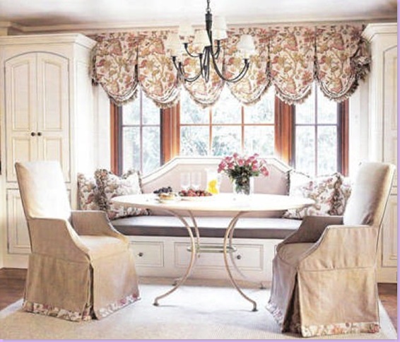
The breakfast room in the Georgian home. Printed linen fabric used for the french chairs and curtains.
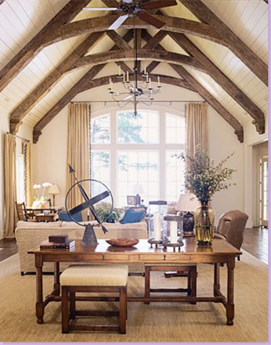
For a lake house, Kasler used overscaled furniture and accessories to fill this cavernous room. Note the stools she pulled up to the library table instead of chairs. As usual, seagrass was used. Large, custom cut seagrass layered over hardwood floors is a great and inexpensive way to warm up a room and provide texture and color at the same time. Additionally, layering antique rugs over a larger seagrass rug allows the use of a smaller antique rug - economical especially in oversized rooms.
The dining room at the lake house. Kasler paired two tables in this large room. Casual chairs and a striped dhurri rug keep the room informal.
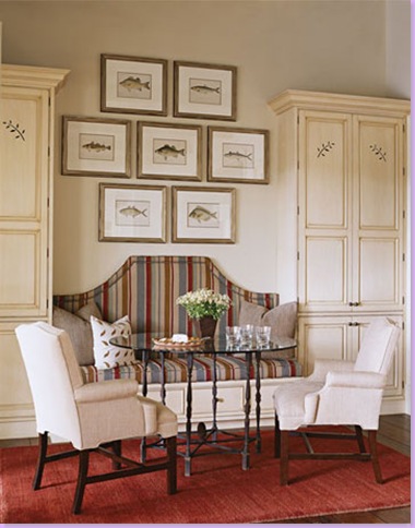
At the second table in the lake dining room - Kasler installed a banquette between the built-ins for casual dining.
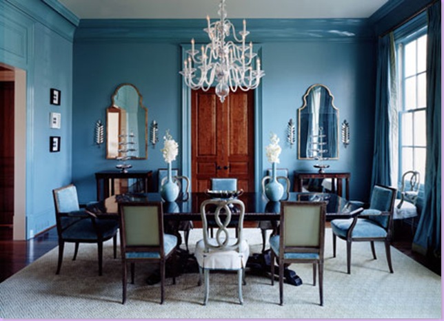
The public rooms from an Atlanta home: here, the blue dining room. The blue walls are a departure for Kasler who usually paints rooms a neutral white.
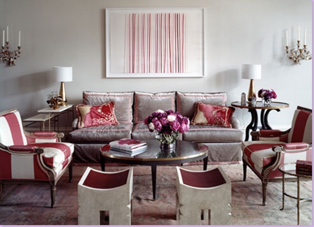
The living room of the same home. Done in raspberry and cream with the famous Kasler silk striped fabric. Both rooms are exercises in symmetry.
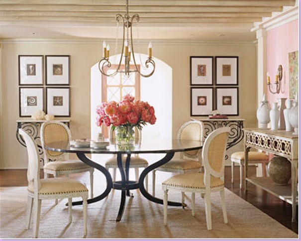
In another home, this dining room proved extremely popular with bloggers - showing up in everyone's pictures. Again, heavily symmetrical, Kasler mixes the highs and lows: Antique tables versus Oly Studio raffia chairs. This picture made the cover, one of Kasler's many.
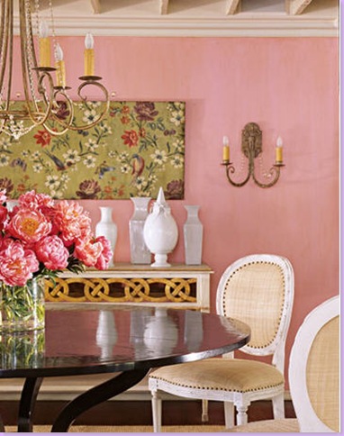
Another view of the above dining room. The back wall was painted an accent pink.
In this same house, the breakfast room: again a banquette is placed between built-ins.
And in the same home, an upstairs playroom: striped fabrics, trendy coral pillows, and a leather chair to juxtapose against all the lightness of the room.
A recent home in Atlanta designed by Kasler. The entry hall.
The living room: neutral walls, pops of blue color comes from fabrics.
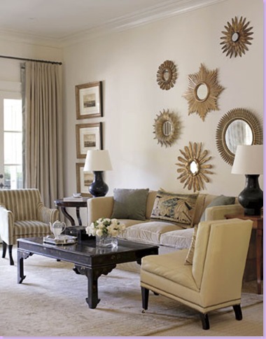
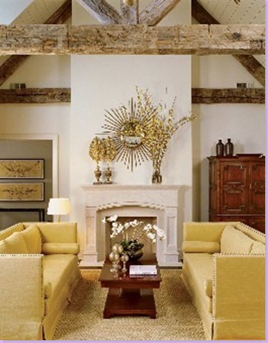
The other side of the living room. Antique rug layered over seagrass. The collection of sunburst mirrors above the sofa is, to me, a rare misstep by Kasler. I don't think the mirrors are properly balanced. The top right mirror is not connected to the group and appears to be floating up and away from the group. In my opinion, a large single sunburst would have been much more effective and pleasing.
In the library, four chairs take the place of a sofa.
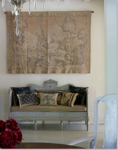
In the hallway, an antique painted Swedish sofa sits beneath an antique tapestry.
In the dining room, two different chair styles encircle the table. Fabric on chairs is the same as on the curtains.
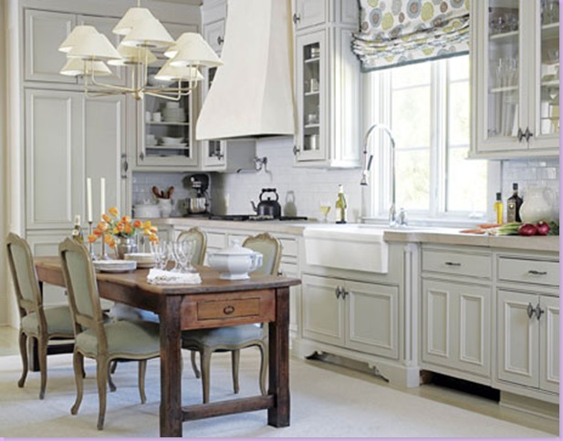
I love this kitchen with the eat in breakfast table. Dressy French chairs juxtaposed with farm table.
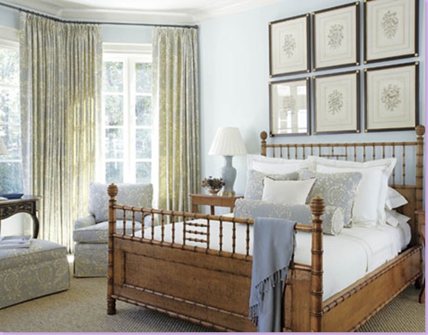
In the master bedroom, a Michael S. Smith bamboo bed takes center stage. Color comes from the curtain and chair fabric. Wall to wall seagrass flooring.
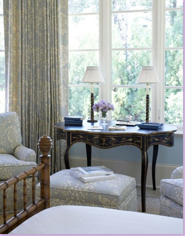
Beautiful desk serves as a table between chairs in the bedroom.
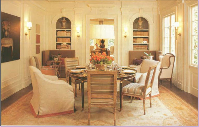 In this Showhouse, Kasler decorated the dining room using two different chair styles. Saladino shelter sofas sit beneath the bookcase built-ins.
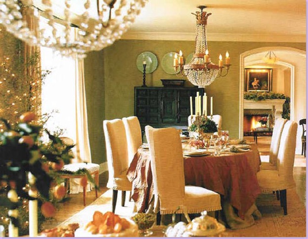
In another house - a dining room with a Niermann Weeks chandelier and skirted table. I love the slips on these chairs with their small mini pleat hems.
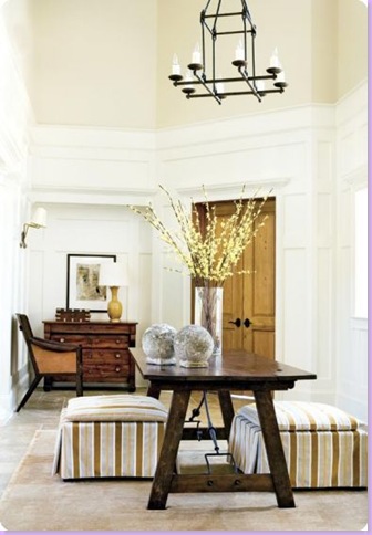
A picture of the entry hall in another Showhouse designed by Kasler. Here, again, she used oversized stools under a library table.
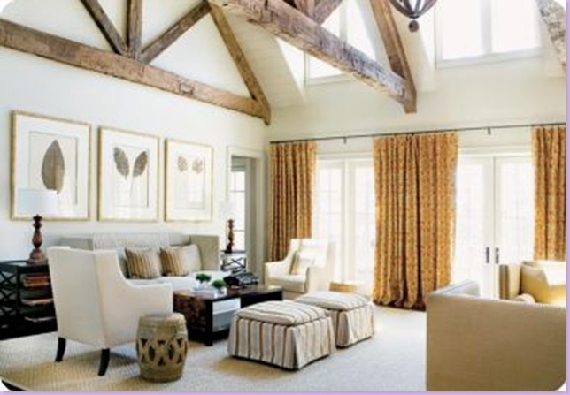
Here, Kasker used two seating arrangements in the living area.
The other side of the living room. These interiors are more contemporary than Kalser usually does.
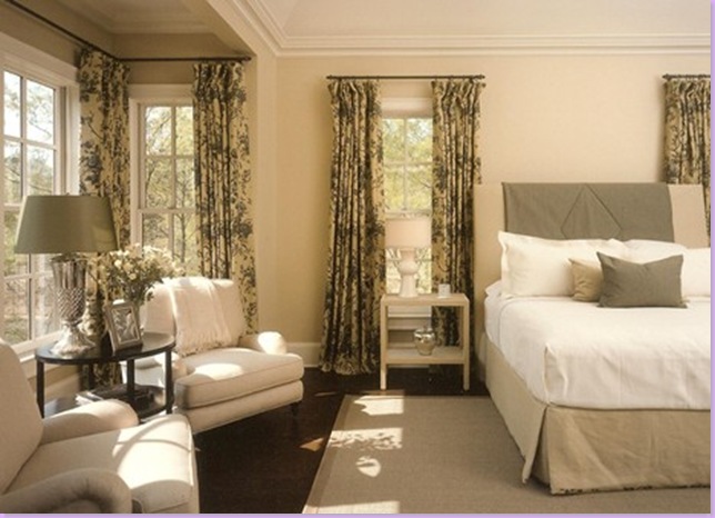
The bedroom in the Showhouse. Plain linens and printed linens, seagrass, and comfortable seating work together to make this a serene room.
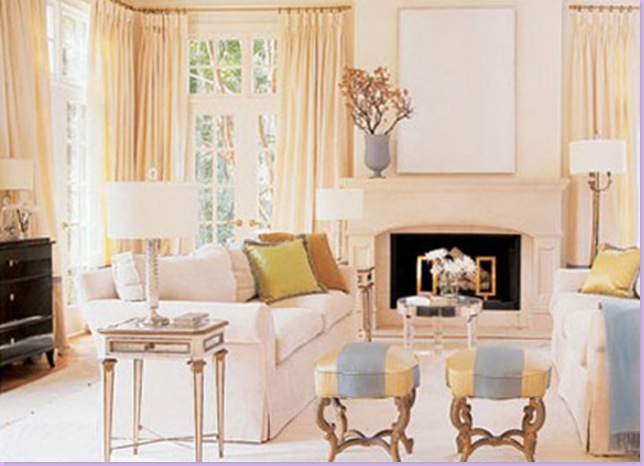
Suzanne's personal home: her living room, bathed in neutrals, again color comes from pops of fabrics and accessories. At this time, this home has been sold and Kasler is completely renovating an older home in Atlanta to move into.
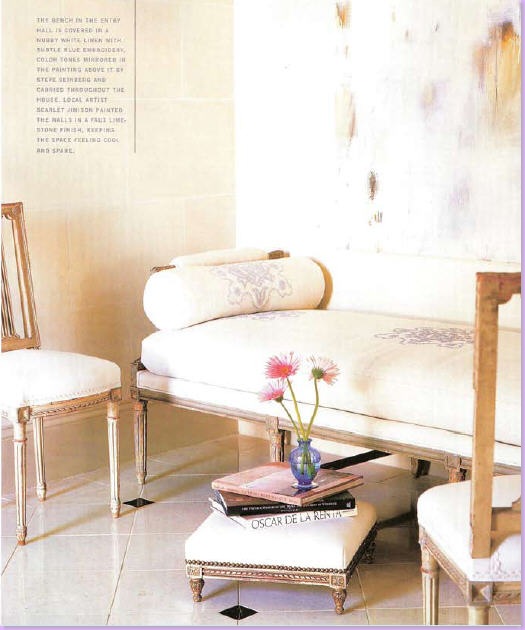
Kasler's entry way: french day beds and chairs mixed with abstract art. Typically Kasler.
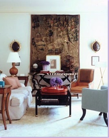
The Kasler family room: horned table with zebra top placed in front of an antique tapestry - echoes of John Saladino. Eclectic mix of antiques and contemporary pieces.
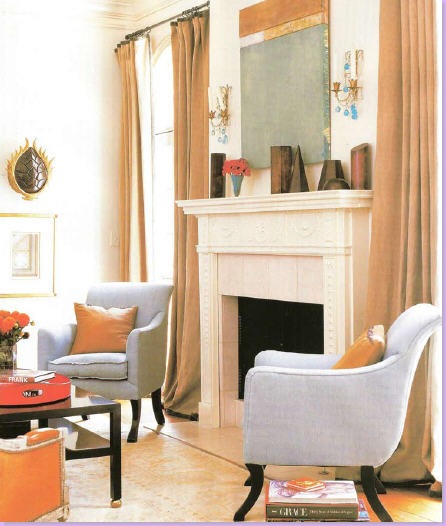
The other side of the family room, showing the fireplace and Rose Tarlow chairs.
The adorable Kasler in her msater bedroom with it's Rose Tarlow four poster bed. Suzanne is dressed as usual in her favorite tailored white shirt and long skirt.

A vignette in the Kasler home: antique French mirror and console. Beautiful.
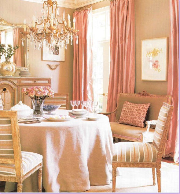
Kasler's dining room: linen skirted table. French chairs, french settee, pink taffeta curtains. Simply gorgeous.

A preview of the furniture line Kasler has designed for Hickory Chair due out this spring.
I hope you enjoyed the #8 pick for Cote de Texas' Top Ten Designers!!! Be sure to check in for #7 - the excitement is rising, it's building, it's palatable!


