Nancy Meyers new movie “It’s Complicated” stars Meryl Streep, Steve Martin, and Alec Baldwin
I almost had a heart attack late last night, racing like madwoman to buy the December issue of Traditional Home magazine. A reader had emailed me, casually asking if I knew that Nancy Meyer’s latest movie, due to arrive in theatres this Christmas Eve, was featured in the magazine?
“No, I didn’t know. Are you sure – have you seen it?” Oh yes, the reader informed me, she had not only seen it, but the issue had been out for a week already. That was news to me since I subscribe to Traditional Home – where is my copy??!!? At the store, I had to pay more for this one issue than a two year subscription, but who cares? There was no way I was going to wait patiently for my own magazine to arrive - I wanted to see those pictures NOW!
In case you are new to Cote de Texas, I am slightly obsessed with Nancy Meyers, the film writer/director behind classics such as Something’s Gotta Give, The Holiday, The Parent Trap, and Father of the Bride to name a few. Meyers is something of a design aficionado and in her last two movies, Something’s Gotta Give and The Holiday, the movies houses were almost more of the star of the show than the actors. The promise of a new Nancy Meyers movie has kept design lovers anxiously waiting with this question: will her new movie’s house be as great as the one in Something’s Gotta Give? That one – the beach house in the Hamptons - started a national trend of white kitchens with subway tile backsplashes, black countertops, and dark wood floors. The Something’s Gotta Give house is probably the most favorite movie house ever – overtaking Tara for the top spot.
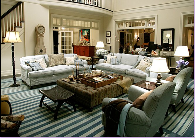
Something’s Gotta Give’s famous living room with it’s slipcovered furniture, blue and white striped dhurri, Mora clock, white walls, dark hardwoods and Hamptons style architecture is probably the most loved movie house of all time. Despite the movie now being over six years old, magazines still feature houses that are designed in what they describe as a “Something’s Gotta Give” style.
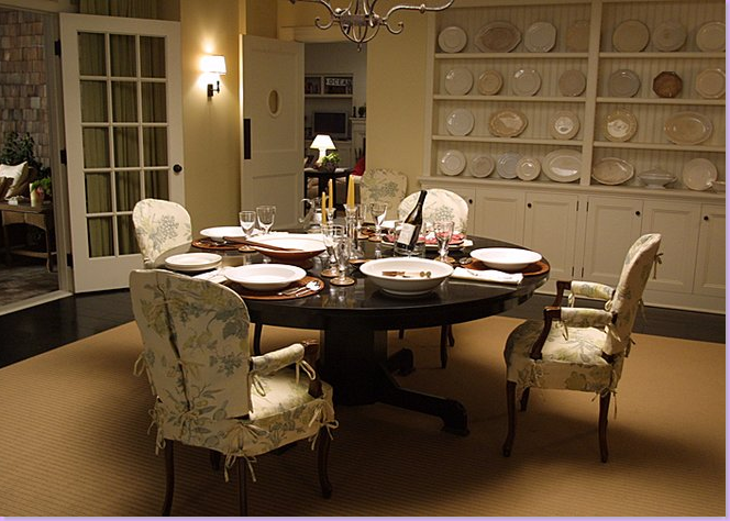
The dining room – with the linen floral slipcovered chairs, sisal rug, and white ironstone filled shelves was a particularly attractive room.
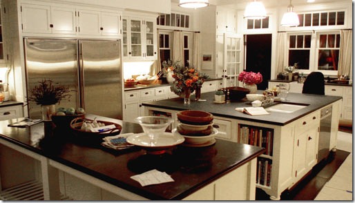 A rarely seen shot of the famous SGG kitchen. The countertops were not really slate, but were just painted wood – in this picture you can see evidence of that movie trick for the first time.
The new movie from Nancy Meyers: It’s Complicated – stars Meryl Streep, Steve Martin and Alec Baldwin. For Meyers fans - the most important credit is the pairing of Production Designer Jon Hutman with Set Decorator Beth Rubino. This is their first movie together since Something’s Gotta Give. Rubino was absent during the The Holiday shoot.

The famous bedroom scene from Something’s Gotta Give with Diane Keaton and Jack Nicholson. Director Nancy Meyers is shown working her magic.
The star of It’s Complicated: a 1920’s Mediterreanean house in Santa Barbara that Meryl Streep remodels with the help of her architect turned lover Steve Martin.
 It’s Complicated – the main living room
Film writer Nancy Meyers says that since so much of the movie is filmed inside the house, she wanted Streep to look good in it. Thus, the interiors were done in creams with punches of orange – to play up Streep’s peaches and cream complexion. Meyers was heavily influenced by the trendy Belgian style and that was the starting point for the interiors. Certainly, the oversized, comfortable slipcovered furniture shown in the living room above reflects the Belgian look, as does the large x-motif coffee table with its slate top. I love the pillows on the sofa, but the blue ones don’t do much for me, I’m afraid. The rug looks interesting – a textured style with a stripe running through it. I love the window seat and the steel windows and I particularly like the furniture arrangement with the four chairs – two pairs, two odd ones, circling the coffee table.
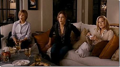 In this picture of the living room, taken from the movie’s trailer – you can see the large slipcovered sofa with the assortment of orange pillows – solid and patterned. Behind the sofa just out view is a bleached wood console with lamps – further reflecting the Belgian vibe. This scene is when Streep announces to her shocked friends that she is having an affair!
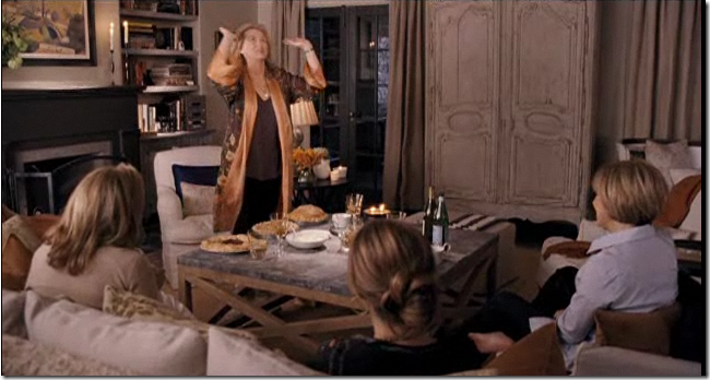 And across from the sofa is this large limed wood French armoire. In this scene Streep wears an outfit done in browns and oranges that perfectly coordinates with the interiors. The colors of the walls and pillows look much more muted in the trailer than in the Traditional Home pictures.
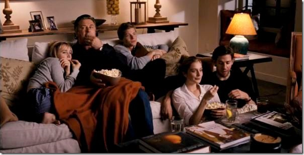 Here you can see thst behind the sofa is a long, Belgian styled console table topped with two lamps.
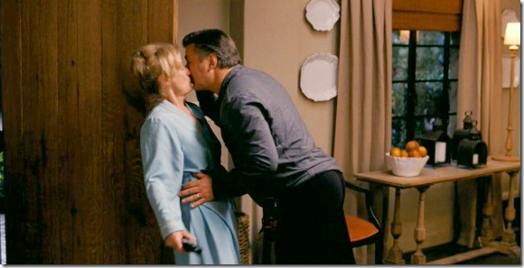 Off the entry hall is another bleached wood console – surrounded by white plates hanging on the wall. Those lanterns look like the ones from Vintage Vagabond. In this scene - who knows what is going on????
The kitchen and dining room.
This kitchen plays an important role in the movie as it is remodeled by Streep and her architect. I love the island – it looks like it is made of a vintage steel piece with a thick slab of Carrara marble on top of it. There is a double range to the right of the sink, and to the left are exposed shelves. Underneath, is a linen skirt instead of cabinet doors. I love the zinc pendant lights and the large dining room table. The dining room is separated from the kitchen by a thick arched wall – and the flooring is different in both rooms. Again, these rooms are bathed in creamy tones with orange accents. It all looks so charming and authentic – no word yet if the house was constructed for the movie – or if the interiors were built on a sound stage. All those details will probably come out after the movie. This picture comes from Traditional Home’s December issue.
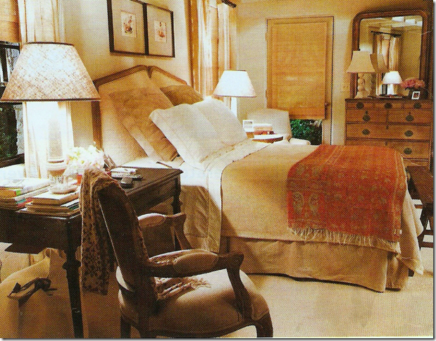
The bedroom is a cozy and warm space – filled with an assortment of antique furniture from different styles. An English chest is paired with a French Louis Philippe gilt mirror, while a large wood desk serves as a night stand. The headboard is upholstered and the bed is made up with khaki and white linens and an orange shawl is used as a coverlet. At the end of the bed is an antique bench. Linen curtains are hung along with textured blinds. One of the movies funniest scenes takes place in this bedroom.
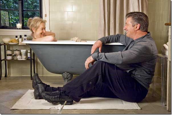
The Master Bathroom.
The bathroom also looks charming with its cast iron tub and limestone floors mixed with the house’s original steel windows. It appears that a Ghost chair is holding an assortment of towels. The shower curtain seems to made out of the same linen as the bedroom curtains. This is a publicity still issued by the studio.
In this scene – there is a party, maybe to celebrate the remodeling. Inside the building, it looks like it was once a garage that has been turned into a family room – with high ceilings and rafters. This scene looks so funny in the trailer. I can’t WAIT to see the movie, it looks so good, plus I want to check out all the interiors up close. But, I have to say – judging from what I have seen so far, the Something’s Gotta Give house’s crown appears to be safe – it looks like it will remain the favorite movie house of all time.
To read how to get the Something’s Gotta Give look for your own home – what design elements of that house are important to incorporate if you want the same look – go HERE. To read all about the house in It’s Complicated – pick up the December issue of Traditional Home.







![[New_size_125_tall.jpg]](https://blogger.googleusercontent.com/img/b/R29vZ2xl/AVvXsEgsFG-ezD6o8LxlpNpAHeLFkRUyWDrYi1iDf7J_kdS2-vPpKOsXTdqIVuf9T9BZt7BasXjXt1EvUeeNOA-8FVOSaj0kJS6y6J6xivT71Evz-gcE643nEe4WuL3u16ib0r-CEhSRSZXUYeNY/s1600/New_size_125_tall.jpg)