I got a call from my friend, the client who lives in the Tanglewood House, telling me all about this house she had just been to in West University, my stomping grounds. She was raving on and on about the landscaping - “you have to go see this house, you’ll just love it!!!” When I asked her about the interiors, she said “you’ll like them I’m sure, but truthfully, I was so busy looking at the landscaping I didn’t concentrate on the inside.” After getting the address, I thought I would do a quick stalkerish drive by, just to do some preliminary reconnaissance - you know, all legal and on the up and up, of course. Driving by the house, I could see exactly why my friend was hyperventilating over the landscaping – it was just so Texas French, for lack of a better term. I recognized the house immediately. I have passed by it a million times probably – well, maybe just a 1/2 million times, and I was itching to photograph it. I quickly texted my friend – “Can you really get me inside that house?”
And so, there I was, just a week or two later, with my camera – taking pictures all over this poor woman’s house. She had been thrust into this voyeuristic endeavor without a clue of how many people would now be peering at her house, her landscaping, her furniture, and judging all the design choices she and her husband had lovingly made together. Standing at the front door, I was a little apprehensive myself. I was flying blind – what if I didn’t like the decor, what would I say? Once the door opened, I let out a huge whoosh of air – with one quick glance, I knew I was going to absolutely love it. She had after all, that most wonderful combination: S&S aka Seagrass and Slipcovers – which of course only made me love her house all that more. What is it about those two S’s that causes me to lust after a house? I’m beginning to think that even a shack in the dreariest part of town, with a Pottery Barn seagrass rug and white slipped sofa from Ikea would send me into rapture. But I digress.
After a quick tour of the inside, the three of us walked out into her backyard – and I my jaw dropped. It was so green and lush, divided into “rooms” by paths of gravel. There was even an outside living area, and an open to the sky stone fireplace. I immediately thought that if I lived here, I would be in the back yard most of the day and night – reading, eating, and sitting by the fire. The owner assured me that her husband does spend most of every evening out back, nursing a cigar. I thought I probably would even take up cigar smoking if I lived there! Of course, by the time the tour was all over, I was begging her to sell me her house. It has all the charm of an older house, yet it is so open and bright, the rooms all graciously flow into one another. Most likely to get rid of the camera wielding idiot, the owner promised she would give me first dibs if they ever do decide to sell. I’m not waiting by the phone.
The Tour:

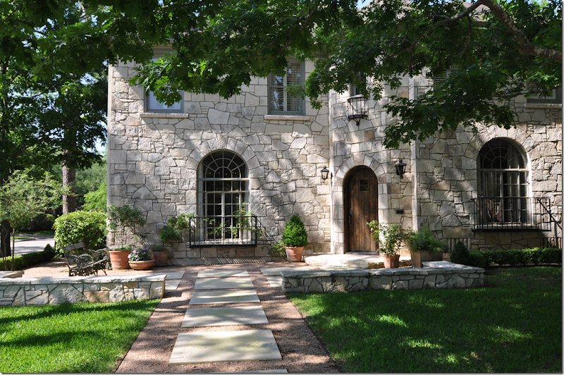
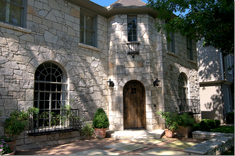
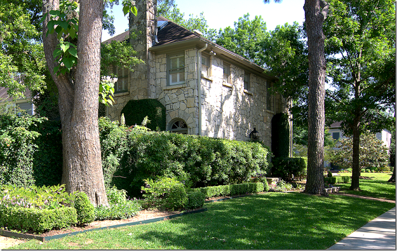
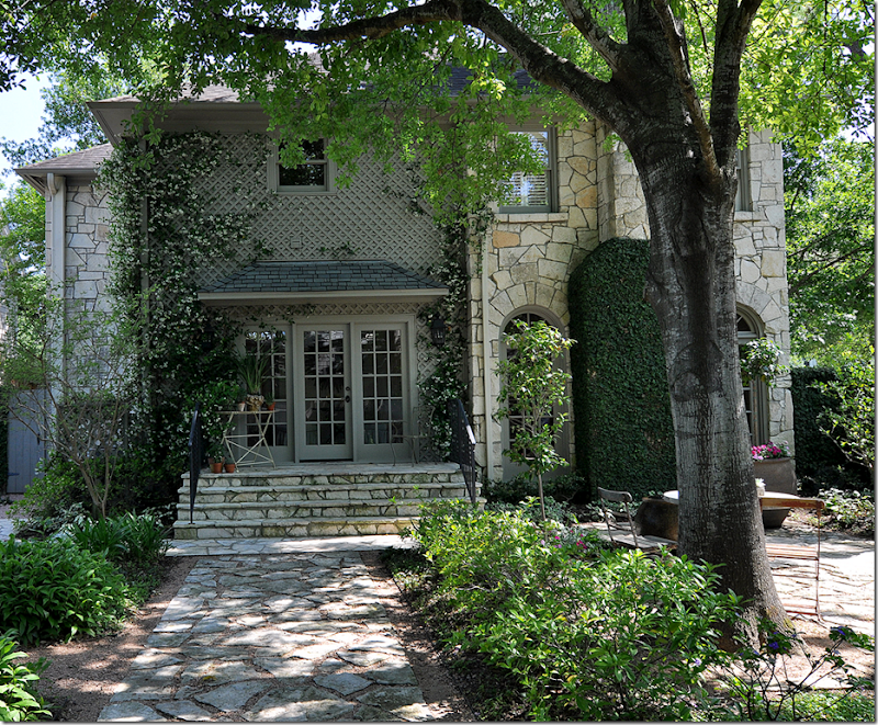
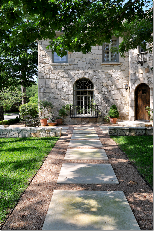
The Stone Turret House: The front walk is made up of gravel and large pavers.

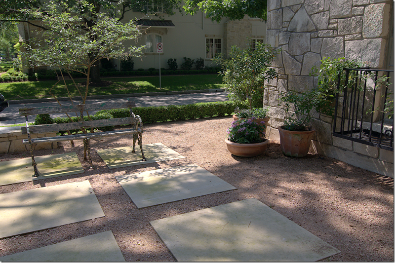
The front walkway leads to a large terrace set behind a low stone wall.

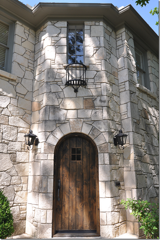
The front door is charming – with its small window and arch. Notice the iron balconies on the windows and above the front door.
 The house is located on a corner – here the front terrace leads off to a gravel path that goes down to the side of the house and onto the back yard and garage.

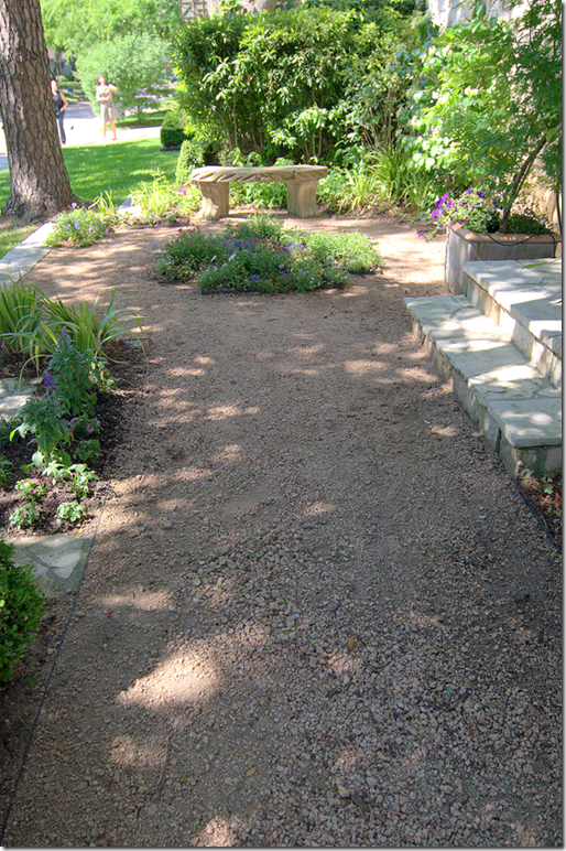
The path that leads from the front terrace to the side of the house. On the right is a side door where more familiar visitors enter the house.

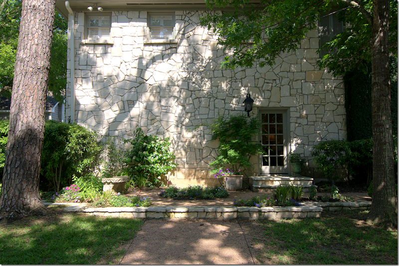
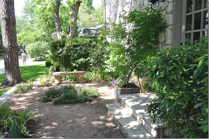
The side of the house – showing the entry way into the family room. The second, smaller terrace is planted with mostly perennials.

The backyard is behind the hedge. The garage is to the left – out of view.

The back yard. This view shows the rear of the house. The breakfast room is behind the French doors, while the family room is to the right.

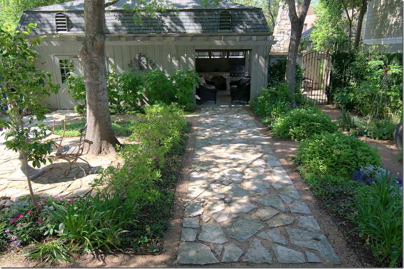
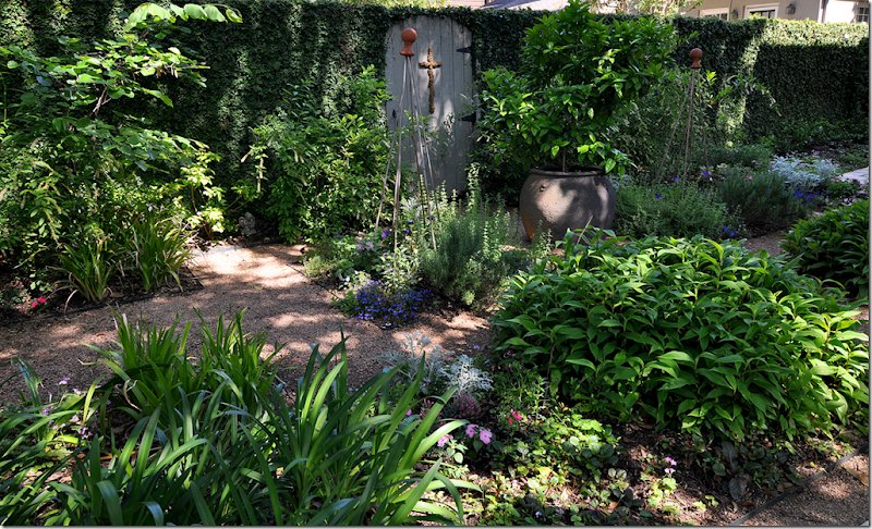
Standing on the back porch, facing the back yard. The garage is to the left, the open room/summer kitchen is to the right. Behind the gate on the far right is the open air fireplace. The large stone path divides the backyard into two “rooms” – a fountain and table and chairs are to the left. To the right is a series of flower beds reached by gravel pathways. Until just recently, this backyard was just a sea of grass.

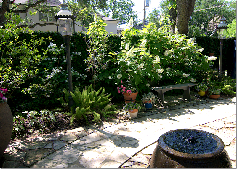
Along the left side of the back yard is a fountain lit by two gas lanterns. The street is behind the hedge.
 On the right side of the yard are a series of flowerbeds, reached by gravel pathways.
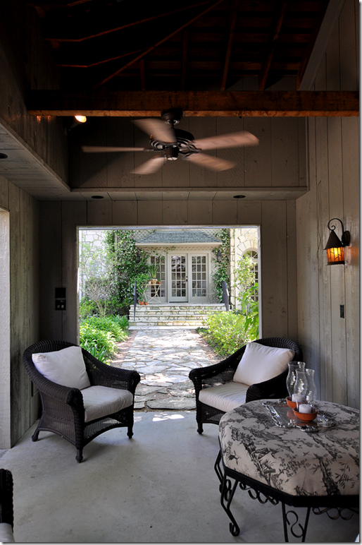
 Inside the newly converted summer kitchen. This was once an enclosed room that adjoined the garage. Now, it is open to the elements. You can see the house at the end of the stone walkway.
 Another view of the summer kitchen room – there is a refrigerator out here and a flatscreen! No wonder the husband spends all his time out here.
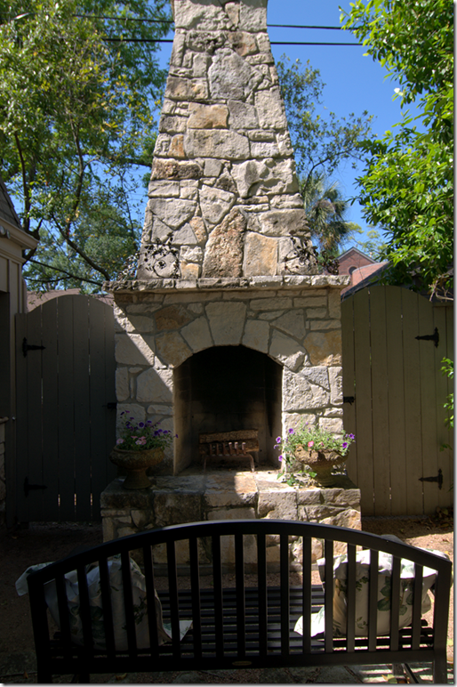
 Sitting next to the summer kitchen – is the outdoor fireplace made of the same limestone that is on the house. Behind the gates is a dog run.
 Ready to go inside the Stone Turret House? Inside the turret is a small entry hall that leads to the living room.
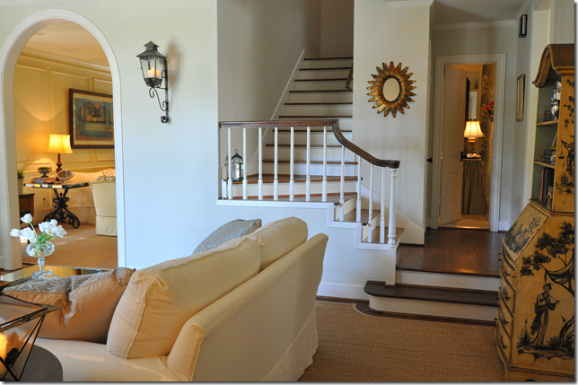
 The first view, once you pass the entry room, of the living room. Beyond the arch is the family room. The dining room is the right of the living room and the kitchen is to the right of the stairway.
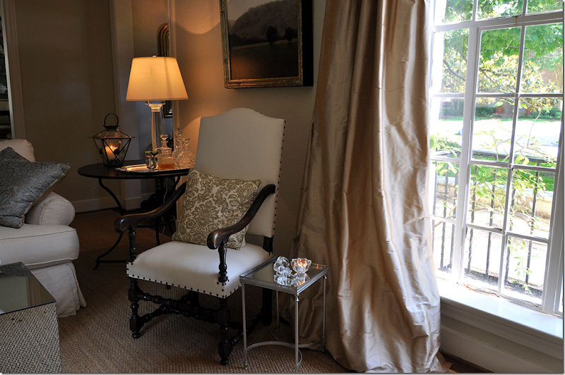
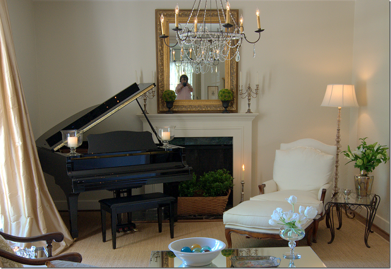
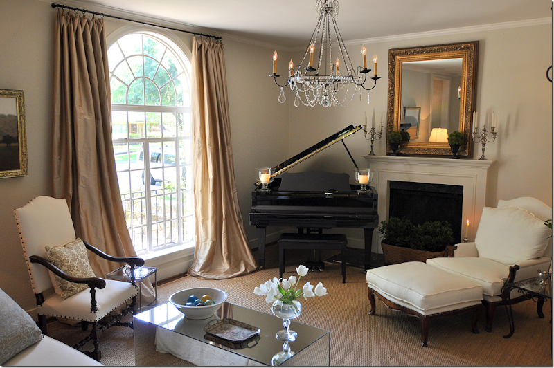
 The living room is so beautiful! There is a custom cut seagrass rug, along with a really pretty and feminine crystal chandelier. The large arched window is covered in champagne colored silk. The coffee table is a large mirrored rectangular that the owner recently purchased from Kay O’Toole. The mantel is original to the house.

I love this chair with its large nail heads. Behind the metal table you can just see into the turret entry hall with its Louis Philippe antique mirror.

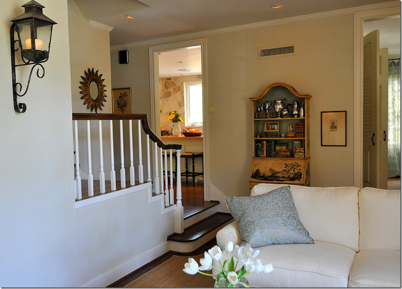
The sofa is a creamy white slipcover. Behind the sofa, is a chinoiserie styled desk. You can see into the kitchen at the left of the desk and the dining room at its right. I absolutely adore that lantern! The owner burns real candles in it – so atmospheric!!!

Hello there! What I love about the mirror is that it perfectly reflects the gorgeous chandelier. The chandelier is really the focal point of the room – you see it twice!!
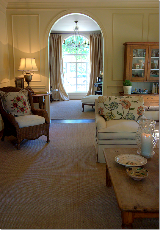
 Through the arch is the family room. The front walkway lines up with the window in the living room, and straight through this archway into the family room, creating an visual axis.

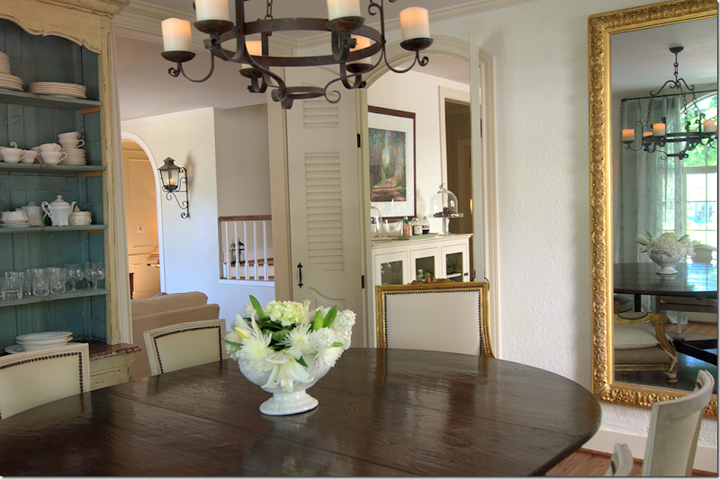
The dining room is to the right of the front door and the living room. You can see the living room here, through the open doorway. Through the shutters, you can see the kitchen. In the dining room there are two matching china cabinets purchased at Joyce Horn Antiques. The iron chandelier, powered by electric candles that look SO real, is from BROWN.
 The large oval table from Carl Moore has chairs from BROWN and two mismatched antique host and hostess chairs. Two large Moroccan lanterns flank the front window. The curtains are celadon colored sheers with a fleur de lis pattern.
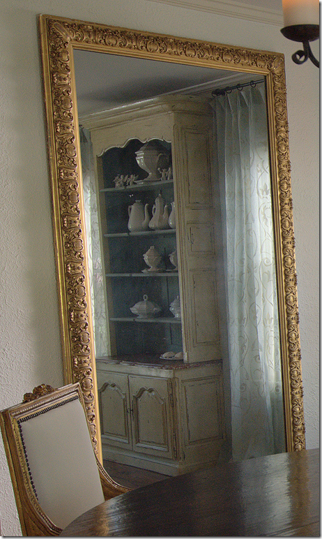
 Both matching china cabinets are filled with gorgeous white ironstone. The large gilt mirror reflects everything.
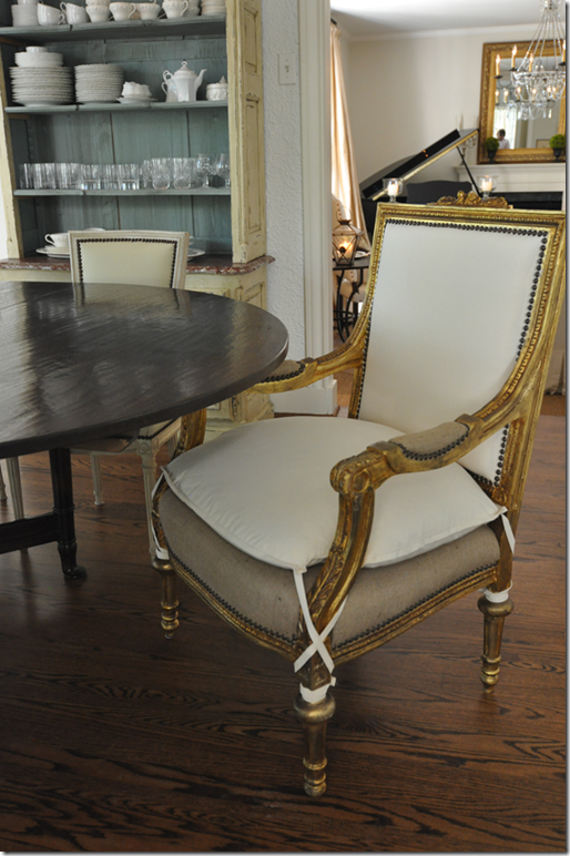
 I love this host chair with its gilt finish and the burlap upholstery with nail heads mixed with white linen on its back and seat cushion. Too cute!!! You can see the second china cabinet filled with dishes and glasses.

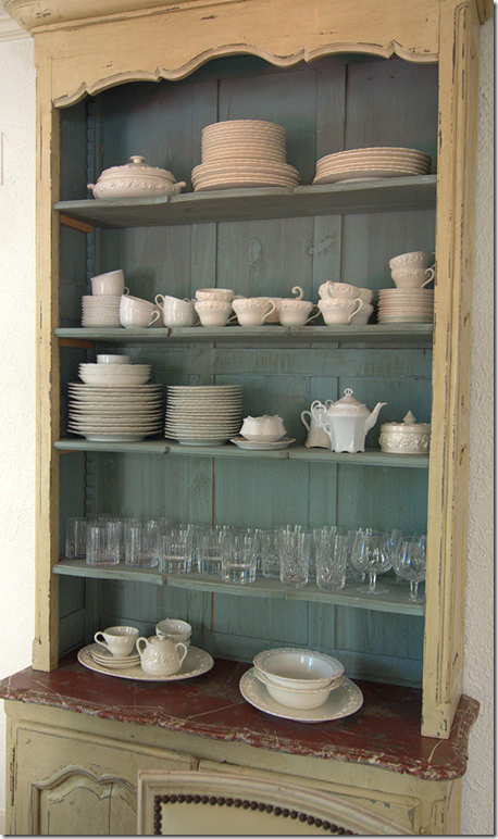
Here’s a closeup of the second china cabinet. Notice how the back of the cabinets are painted the same color of the sheers. I love china that is openly displayed like this.
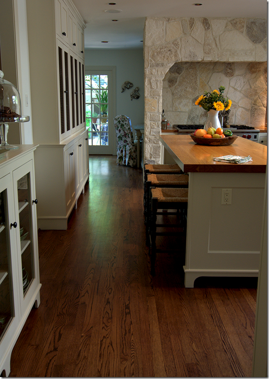
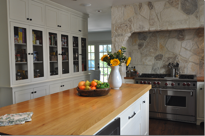
 Connecting to the dining room is the kitchen. This room was completely remodeled several years ago. Along the left wall is a short china cabinet, next is the door that leads to the stairwell and then is another taller cabinet that acts as the pantry. Past the kitchen is the breakfast room which looks out the backyard through French Doors.

The walls in the kitchen are stone, like the outside of the house. The large Wolf range is set inside the stone walls. Along the left is the pantry with its doors inset with brass grills.
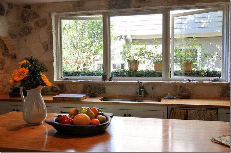
 The stone wall wraps around from the range to the sink area. On the right is open cabinetry to hold the dishes. To the right of the refrigerator is the dining room.

I love how there are no upper cabinets – instead there is a row of large windows. So pretty!!!
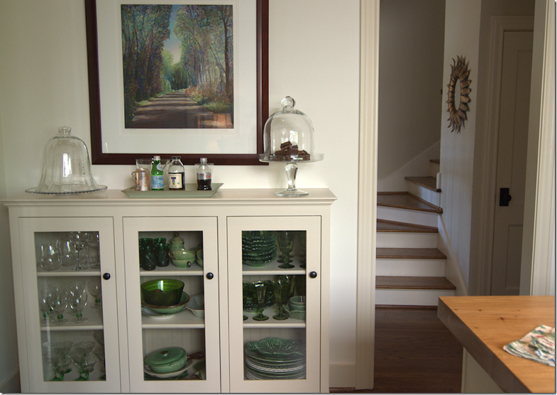
 This glass doored cabinet is filled with green glassware – it doubles as a buffet. Through the door are the stairs off the living room.
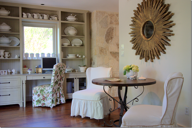
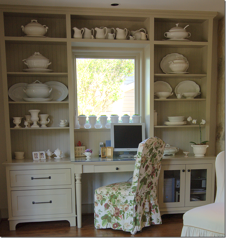
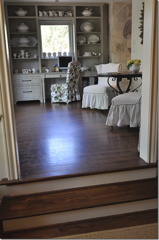
 The breakfast room off the kitchen runs along the back wall of the house. A large built in holds even more ironstone. The owner told us she has been collecting it for years! The large sunburst mirror hangs over the small breakfast table that seats two.

A close up of the cabinetry. I love the legs on the center desk section and the beadboard back on the shelves.

We now leave the breakfast room for the family room, down a few steps. Throughout the first floor there is a series of steps that add so much charm to the house. The floor plan really flows – all the rooms are open to each other, which is unusual in many older homes.
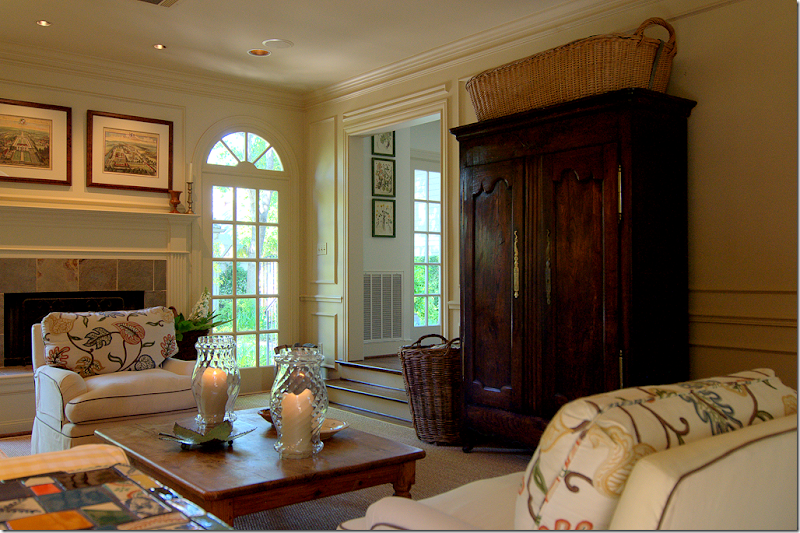
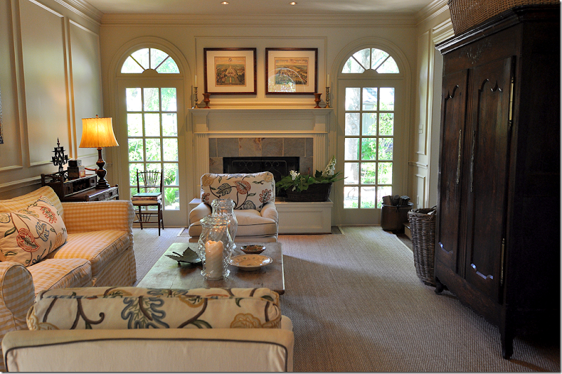
 Past the breakfast room door is the family room. This large room has a custom cut seagrass rug. Through two arched French doors, you can see into the back yard There is a gorgeous antique armoire that hides the TV. This room connects directly to the living room.
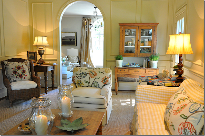
 In the family room, there is a cute yellow and white checked slipped sofa with club chairs that have a Lee Jofa crewel fabric used on the the back cushions and pillows.
 The family room connects directly to the front living room.
 This side door is where family and friends come into the house after parking on the side street. It leads directly to the gravel terrace with the perennials.

Another picture of the side terrace off the family room. So pretty!!!
 The view of the family room leading into the living room. The front sidewall was moved to create an axis from the front yard all the way through the living room past the family room, out to the backyard.

The gravel and stone walkway that creates the axis from the front living room through the family room.

Unfortunately, there are no pictures of the upstairs. I didn’t even GET to see the upstairs! But, I was so grateful to see the downstairs that I didn’t even care. Apparently, there is some redecorating going on up there.
Giving a special thank you to the homeowner for all her gracious hospitality!!! I hope you all enjoyed seeing pictures of the Stone Turret House. As usual, I am always looking for houses to show on the blog – in Houston or else where. If you are interested or know someone who might be – please email me at mrballbox329@aol.com
Credits:
Interior designer: Diana Martin at Habicon@comcast.net. Diana assisted with paint colors, living room furniture and designing the kitchen cabinets.
Landscape Architect: Suzy Fischer with Fischer Schalles Inc. and Mike Gibson who does ongoing installations, advice and upkeep: 713-520-1395
Reminder: We have a giveaway on the Skirted Roundtable – hurry!!!!! www.skirtedroundtable.blogspot.com
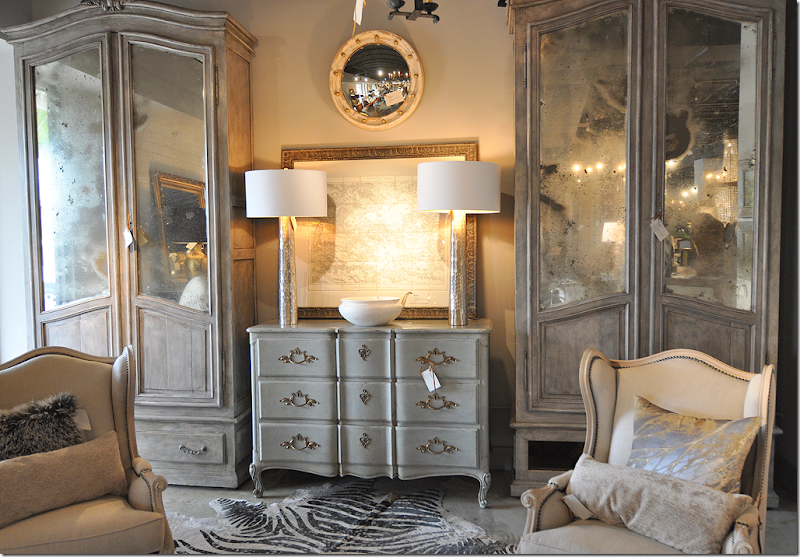 A rare pair of painted gray armoires. I loved the map and the gray chest.
 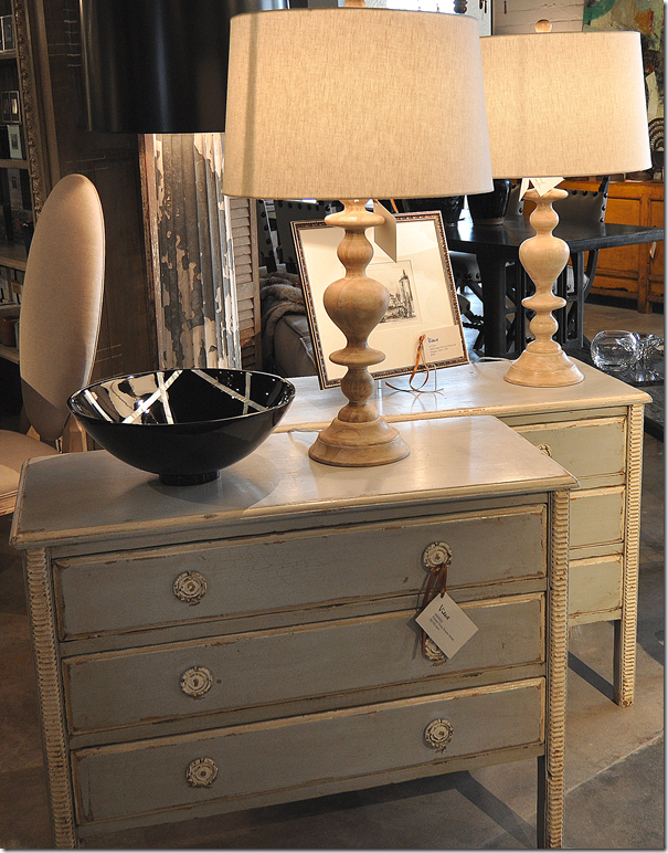 These painted chests would make great nightstands!!
 Favorites: aqua and green covered books. These would look so great in bookshelves.
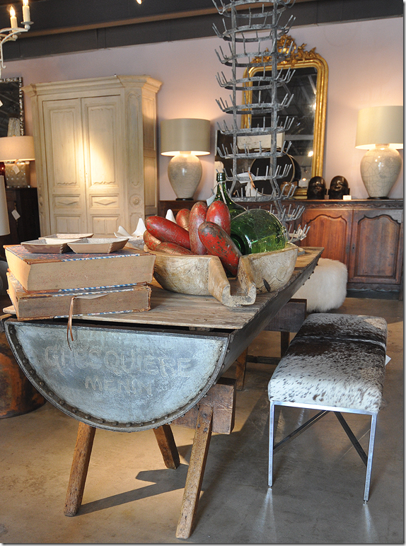 So unusual – a rustic dough table. It would make a wonderful island in a country home’s kitchen.
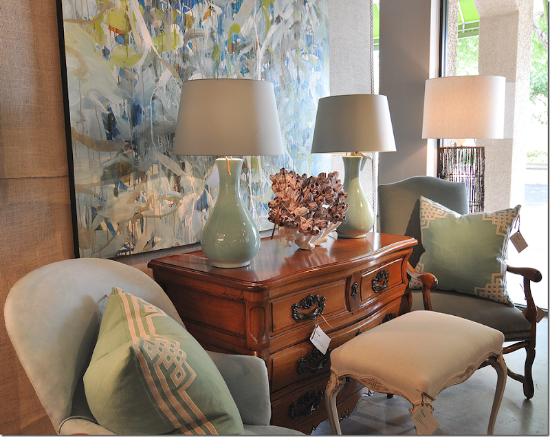 More gorgeous lamps!!! There is also a large assortment of contemporary art work.
