[
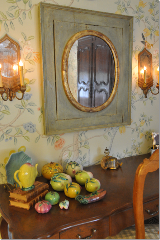
In late October, 2009, I wrote about my friend’s house in Dallas that had been decorated by Ray*Weitman HERE. On one side of her fireplace, the designers had placed an old piece of Zuber wallpaper over a Swedish chest – probably my favorite vignette in the large room. Several months later, I was very surprised to get an email from Simon P. Scott, owner of the to-the-trade décor company Jardins en Fleur HERE. Simon shocked me by saying that this picture above had inspired him to create an entire new line of framed paintings, resembling this Zuber relic. He wanted to do a giveaway to celebrate his new line – and together, we chose this painting, below, for the contest. It was a charming pink and gray chinoiserie that was perfect for a living room or a nursery HERE. Surprisingly, another blogger who lives about 1/2 mile from me was the winner!
Jardins en Fleur – part of a collection of framed chinoiserie paintings
After the giveaway, Simon and I talked about the wallpaper he carries and custom makes for his clients. The wallpaper, like the paintings, are handpainted in the manner of de Gournay and Gracie. Several times Simon offered to wallpaper a room for me, at no cost (!) At the time, I was decorating my daughter’s bedroom and seriously gave thought to papering her room in a beautiful blue and white design.
One choice was this design of Simon’s – here the blue and white paper is placed on a screen and is sold this way.
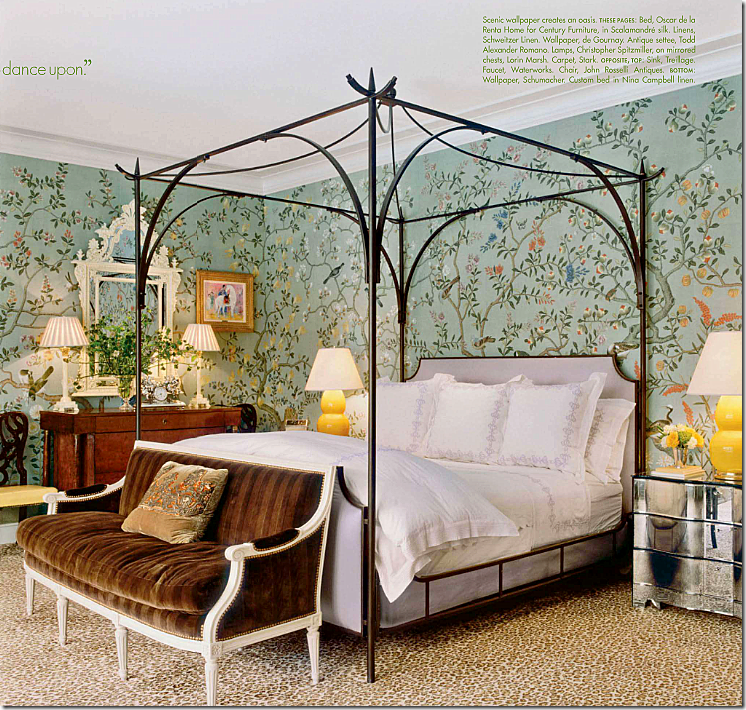
Another choice for Elisabeth’s room was this design of Simon’s – a traditional green chinoiserie paper shown here in an article in Elle Décor.
And there was this choice, the metallic paper which gives the paper a dressier feel.
In the end, I politely declined his nice offer and just painted Elisabeth’s bedroom instead. The subject was apparently not dead, though. About six months, Simon again raised the idea of my wallpapering a room – or a client’s room - using his paper. For advertising purposes, he needed a photograph of a room with his paper in it. Well, who am I to refuse a plea to help someone out, especially when free wallpaper is involved!?? Poor Simon. When the casual talks started getting more serious, he mentioned my powder room as a possible place for the paper. Except, my powder room was already wallpapered and I was happy with it. Instead, I offered up my bedroom to be wallpapered and then photographed for his catalogue. What else could a friend do? Simon readily agreed, without knowing quite how large my bedroom was and how many rolls it would take! After more than a few emails back and forth, we reached an agreement. He would provide the paper, I would provide my bedroom, and he would get professional photographs of the newly wallpapered room for his portfolio.
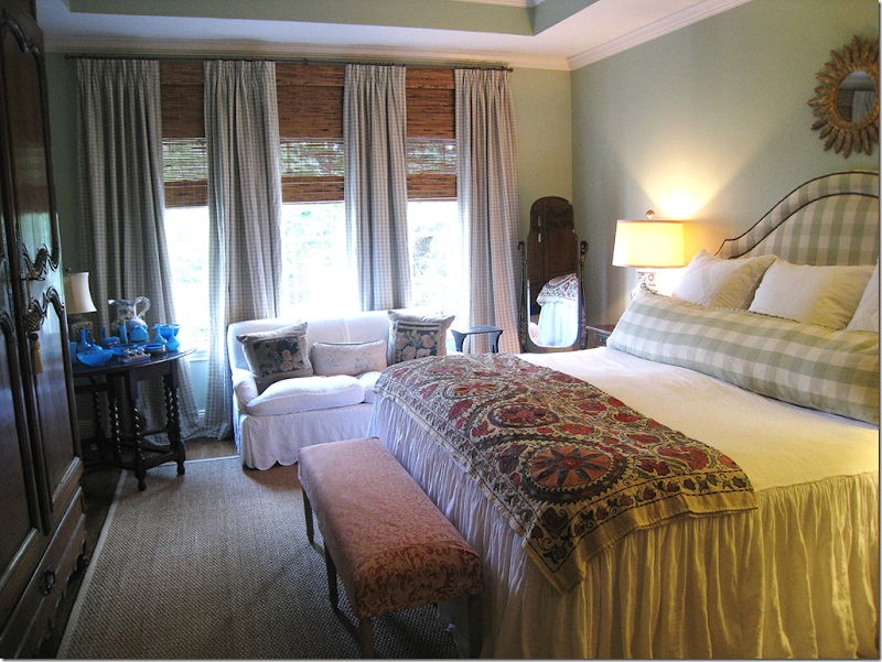
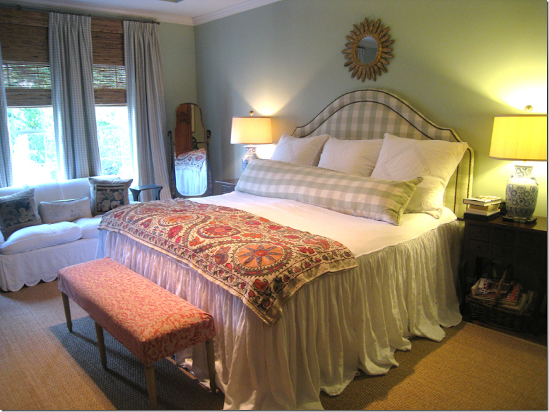
My bedroom - the room Simon and I chose to put the wallpaper in. My fabrics are mostly Chelsea Editions sage green with pink Fortuny.
LOOKING FOR INSPIRATION – NOT SO EASY A TASK!
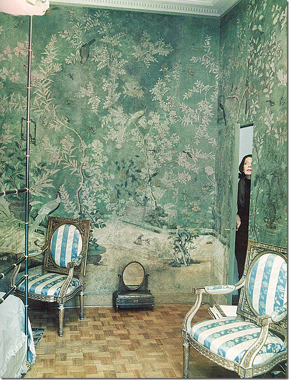
Pauline de Rothschild’s Paris apartment
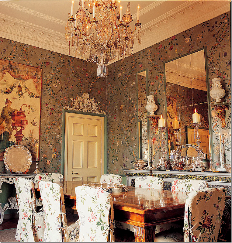
So, the question became what paper, what color, and what pattern should I choose? Simon was no help at all. He said he could make anything I wanted – the papers were handpainted in the orient somewhere – and the artists could reproduce any style I wanted. But what should I choose???? It was a lot like being let loose in Bloomingdales with a $100,000 gift certificate. The choices were endless. The above Pauline de Rothschild paper was a starting inspiration. I’ve always loved this pattern – it is utterly gorgeous - but I knew it was probably asking way too much to duplicate. Next.
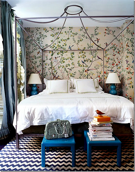
There are a lot of iconic pictures such as this one with de Gournay and Gracie wallpapers. Miles Redd uses them a lot, especially in bedrooms. So, I turned to his web sight for inspiration. This kind of light, open pattern was a consideration.
Another Miles Redd bedroom, that everyone has seen a million times before, looks almost like the same pattern above, except in blues and whites this time. I do love the simplicity of just two colors, with a few accents, but unfortunately, my fabrics are in greens!
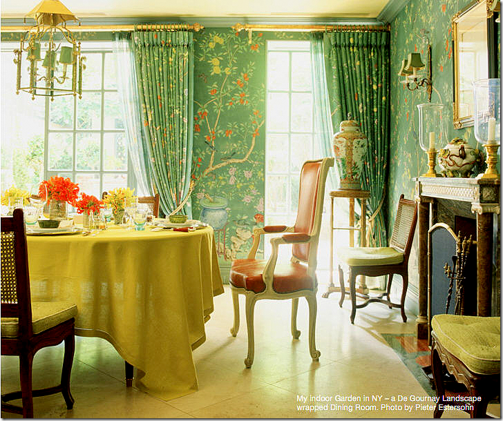
Charlotte Moss’ dining room is the right color, green, but I didn’t want flowerpots in my design.
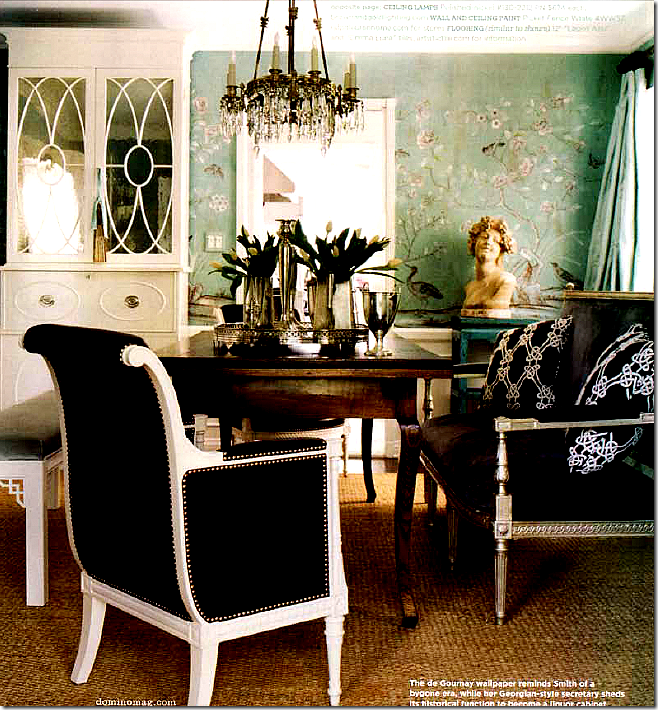
Another room seen a bizillion times is Windsor Smith’s former dining room in de Gournay paper. Even though this room is so old, I still love it as much today as when I first saw it. Windsor has been using a lot of these papers in light and icy blues, which I love. Again, my room has greens in it – so blues are out of the question. Maybe I should have just changed my fabrics?? Ugggh – I always second guess myself over and over again.
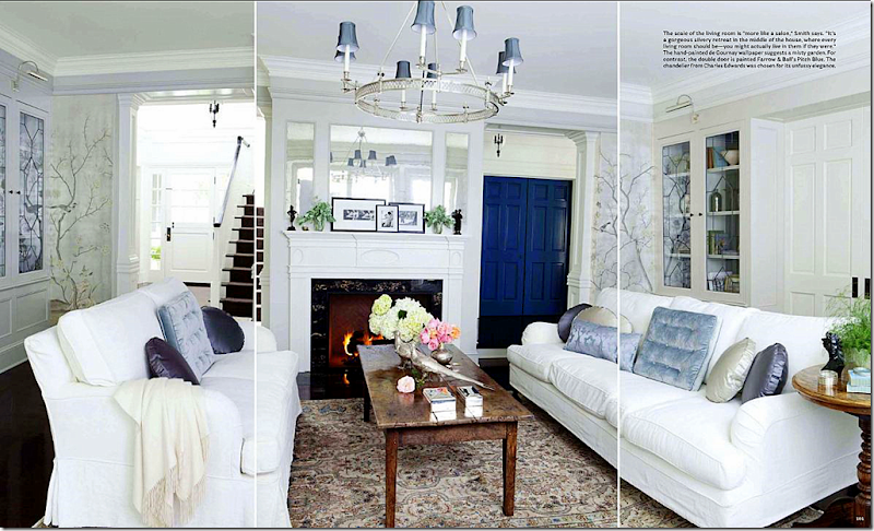
A very recent living room by Windsor Smith – soooooo gorgeous! If I had a room like this, I would die and go to heaven happy! Here she used de Gournay in the shiny, icy blues. Using the metallic instead of the matte paper was another decision to be made, but the metallic just seemed to dressy for my bedroom. Such a gorgeous room and paper!!! Blame House Beautiful for the awful lines in the photograph.
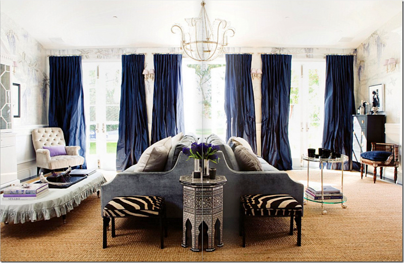
In this Windsor Smith room, the wallpaper pattern looks stylized, almost contemporary. But again, it’s metallic, reflective, and blue.
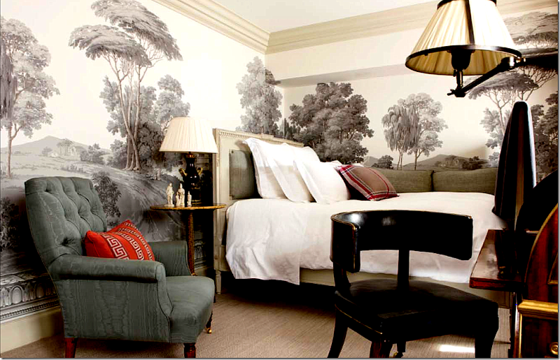
Michael Smith is another designer who loves chinoiserie wallpaper. He uses a lot from Gracie Studios. Here, though, he used a mural from Zuber. What a gorgeous room. My mind kept going back to this picture wondering if I wanted a Zuber type mural in my bedroom. Of course I did! Who wouldn’t want a bedroom that looks like this?
Or, how about a mural with some color, like this de Gournay? Finally though, I thought it would be too difficult to decide on what scene to pick for a mural wallpaper and decided to forget that idea.
Another type of pattern really confused me in my decision making process. I am in love with the famous Swedish wallpaper found in Drottningholm Palace, seen above. A copy of this paper was given to Nancy Lancaster by the King of Sweden and it has since been duplicated by many designers over the years. The pattern is inspired by the chinoiserie papers, but the design is much more simple and plain. It has a very vertically linear quality to it with thick branches, painted dark that sensually curve from the floor to the ceiling.
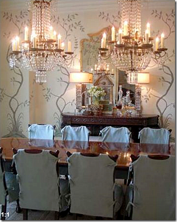
Peter Dunham used the Swedish paper as inspiration in this dining room. I sent this picture to Simon, but he felt I should go with the more traditional chinoiserie paper.
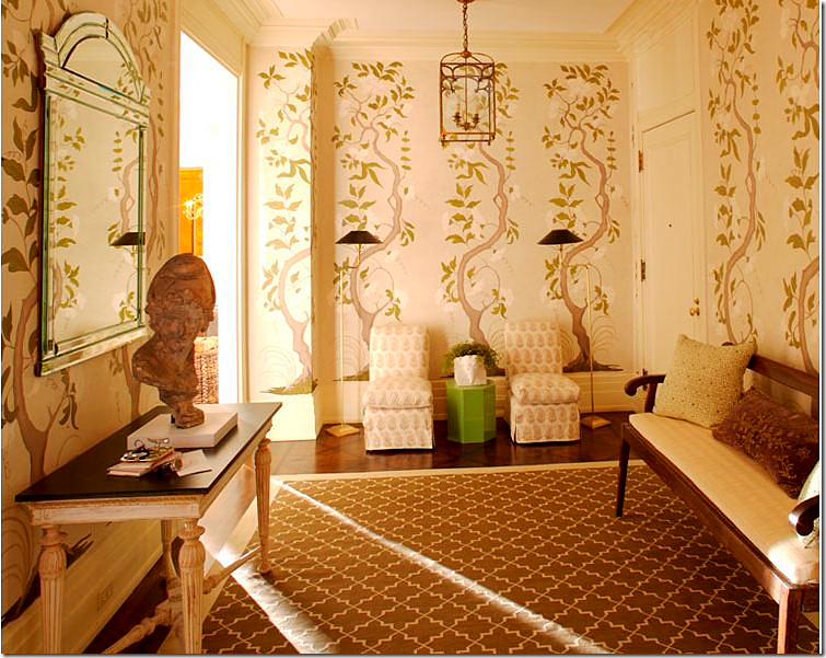
Timothy Whealon decorated this entry hall with the Swedish inspired wallpaper.
When I saw this dining room with yet another Swedish inspired paper in a room by Lisa Luby Ryan, I thought it was a sign that I should go with this pattern! But Simon discouraged this one too. Recently, he emailed me to say on second thought, how much he loved this type of pattern and would start producing it himself!! I think it would be a huge seller.
So with the Swedish paper out and the murals out, it came down to the traditional chinoiserie type of wallpaper.
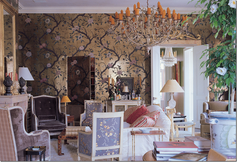
Did I want the shiny or matte finish? And did I want it on teapaper with obvious sections showing or not? While I love this wallpaper in a living room in New Orleans by Nicholas Haslam – it is just too dressy and shiny for me.
And the color was another major decision. Could it be blue with the green fabrics or just green? Or should I go with a pinkish color to pick up the pink Fortuny fabric in the room?
In the end, it was this picture that got the ball rolling. This bedroom was in Veranda late last year. Surprisingly, it is from a house in Houston, decorated by NY great Miles Redd. I’d wager a million dollars that this is the first Houston house ever done by Redd. The décor is fabulous – totally different than the typical Houston slipcover and seagrass design. But, pedigree aside, the more I looked at this picture, the more I thought this kind of pattern and color would be perfect in my bedroom.
With a pattern chosen, I had to first measure my bedroom – including the elevations and spaces above doors, under windows, etc. Then, I had to give Simon the background color I wanted – which I picked from Benjamin Moore. A few months went by and I got several samples to choose from – whether it was going to be on the tea paper or not. I decided to not go the tea paper route. It added a lot of money to the job, and I didn’t want Simon to go broke doing my bedroom!!! About two months later, the completed wallpaper arrived and my stomach fell to my feet. I don’t know why I was so nervous, but I truly was. What if I hated it after all this expense had been incurred on my behalf? What if I had measured wrong? I really should have had the wallpaper hangers measure, but I did it myself – something that I was worried about now that the paper was here. But, when I opened the box and looked at the paper, I knew it was going to be fine. It looked so beautiful all neatly rolled up in the box, with a diagram for the hangers to follow. I called Alan at Cannon Craft Wallcoverings - (713) 468-5491 - to come out and hang it – a job which took every bit of six full days to complete!!! And finally, here is what it looks like:
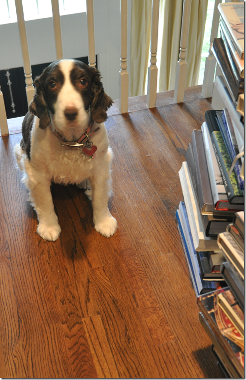
Oh wait, no, that’s Georgie, my nervous nelly dog who went nuts during the six days the crew was here! Ok, here’s the bedroom:
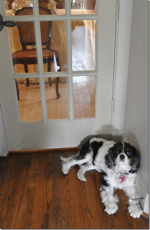
Well, I can’t really show Georgie without showing Sammie Jo too, that really wouldn’t be fair! Hi Sammie! She’s so cute. OK, do you think I’m nervous about showing you the bedroom or something????? ha! I guess I am. I hope you like it as much as I do:
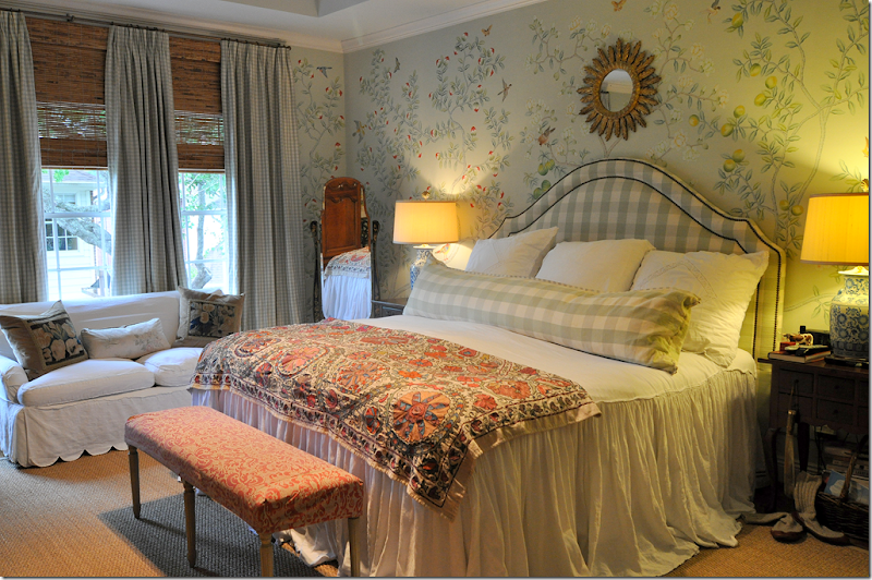
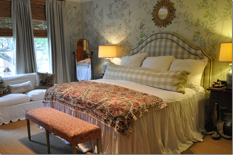
Ta-da! Here it is with the matte chinoiserie paper. Each panel is different from the other. To the right of the bed, you can see lemon trees. To the left of the bed are those half red things, which are supposedly peaches, I think!
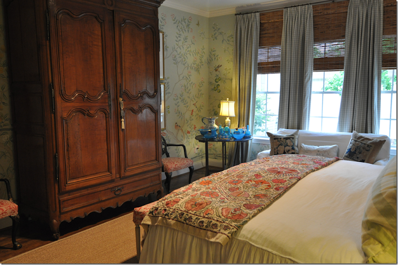
Looking towards the armoire where the TV is hidden.
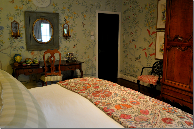
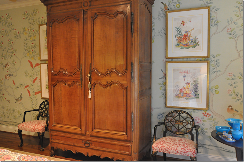
Looking towards my desk and the door to my bedroom. The panel that is directly to the left of the armoire is Ben’s favorite – it has these large orange flowers.
I rehung my four Harrison Howard pictures – amazing how I bought those chinoiserie prints a few years ago and how well they go with the paper!
Behind the bed is one of my favorite panels – with melons. Unfortunately you can’t see it all – but there’s another panel with melons in the corner behind the blue opaline glass.
I put my Chinese altar fruit on my desk – moving it from my living room. It really matches the paper.
The paper in this corner is especially pretty – the melons are left of the curtains.
It’s impossible to get a picture showing all four Harrison Howard prints. You have to stand on the bed to get that shot.
The wall behind the desk is really pretty too. It’s all pretty!!
Did you notice Ben’s slipper socks next to his night stand? Just waiting for him to come home and put them on. Sexy!!!
That’s it! I can’t show any more pictures of the same four walls. I will say that if you buy a good wallpaper – be sure you get a good installer. Cannon took three days just getting the walls ready for the liner. The liner took a day to install, and the paper took two days to hang. They could have put it on in such a way that I could remove the paper whenever we move, but I decided against that step. I’m hoping the paper will only increase the value of the house????
Do I like it? I love it! It’s a subtle change, the pattern and color is very quiet so it doesn’t scream out at you when you walk in the room. But that’s perfect, I wouldn’t want it any other way. The craftsmanship is perfect – the artists who painted it are top rate. I didn’t see any errors or mistakes in the drawings. If you have ever thought about getting a chinoiserie wallpaper like this, be sure to contact Simon Scott and let him bid on for the job.
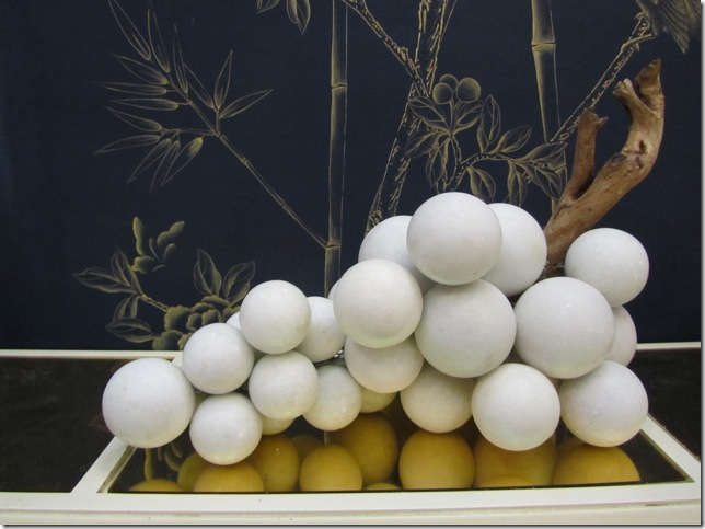
Simon’s company Jardins en Fleur is always changing, he designs new items when he gets an idea. Here, his large collection of marble grapes was a recent inspiration. And I thought I had a large collection of grapes!
Here are his newest item – the alabaster grapes which come in three sizes. They are so gorgeous! Bergdorf’s s sells them.
Simon recently got a big thrill when at the Kips Bay Showhouse 2011, Celerie Kemble used his grapes in the library. See them hiding under the table on the left? Another set was used on the fireplace hearth. After the showhouse closed, Kemble sold them on Gilt.com.
To peruse Simon’s web site, go HERE. If you are interested in the wallpaper, you can contact Simon through his web site.
A huge huge huge thank you to Simon Scott for the wallpaper! I hope you are happy with how the room turned out. I can never thank you enough for everything!!
My New Bedroom
A Tale of Two Houses (by the same designer and architect)
Bingo. Looking at HAR this week I got a lucky hit. A lucky hit is where everything just comes together – wonderful architecture, beautiful interior design, lots of French antiques, and just a bit of a mystery to drive me INSANE!!! A lucky hit like this is very rare and hardly ever happens which makes it all the more special. So…here’s the story. Get your coffee, pull up a chair, and sit back. It’s a little wonderful and a little bit crazy. Here goes:
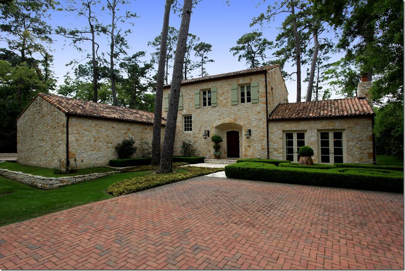
Wow. This gorgeous house caught me eye. I had been surfing HAR for a few days looking for anything interesting, and of course, nothing for sale right now is interesting, at all – just a bunch of oversized, poorly designed houses filled with poufy leather sofas and, well….shivers. What a waste of time. Just as I was about to give up, this beauty pops up. Whoa. Is this Houston??? Of course it is, the towering pine trees give it away, but take those pine trees out and insert plane trees, and it could be Provence or Majorca. I’m loving the exterior with the authentic green shutters, tile roof, limestone walls. Just gorgeous. There is just no way the inside is going to be great, right? I couldn’t be that lucky, could I?
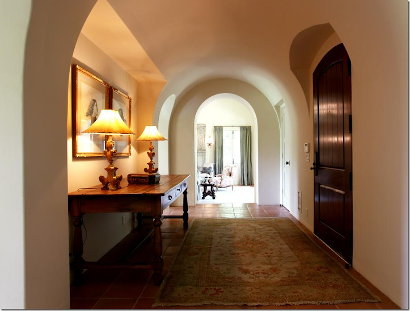
Wrong. Inside, things are starting to look very good. Great lamps and prints are in the entrance hall, with its beautiful ceiling and arched doorways.
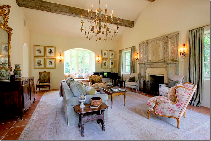
The living room is filled with French antiques, a large muted rug, and an unusual trumeau – dating from the 1700s. The chandelier is divine. Something about this room seems familiar and I just can’t place it. I know I’ve never seen this house before…but still, it seems like I have. I notice the Kenneth Turner candle on the side table – the one in the terra cotta bowl with its wicker sleeve that’s been discontinued. It makes me smile and think of Carol Glasser for a brief moment. And then…those prints on the back wall remind me of her too, for some reason.
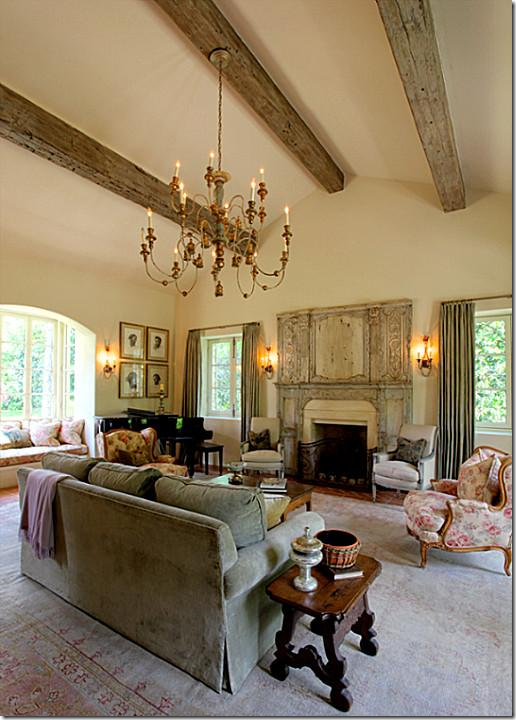
Another view of the fireplace with the antique trumeau.
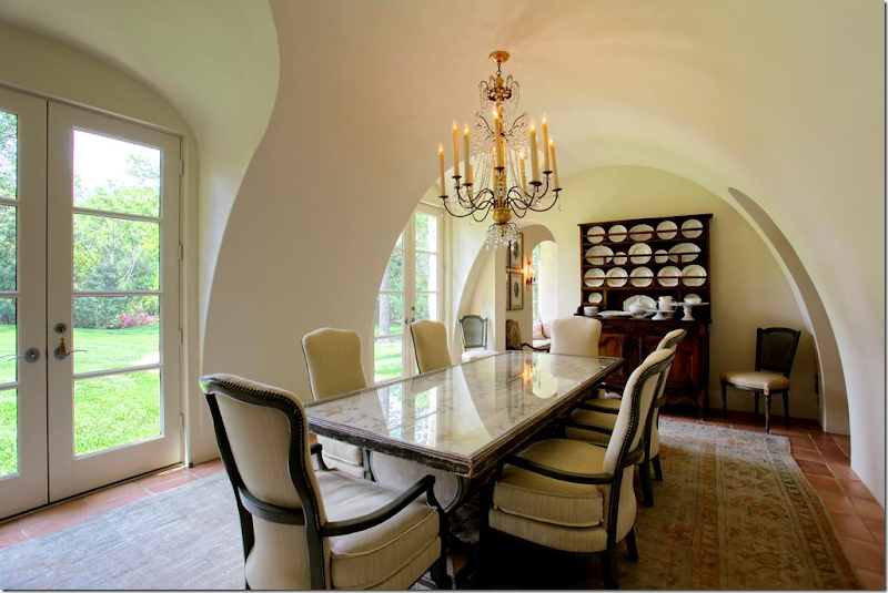
The dining room is beautiful – the walls and ceiling are a work of art. The chairs and table are so pretty and unique. And no seagrass – instead another faded antique Oushak rug sits underfoot. My eye goes to the large collection of creamware and the utterly gorgeous chandelier. Someone has exquisite taste, very, very exquisite taste.
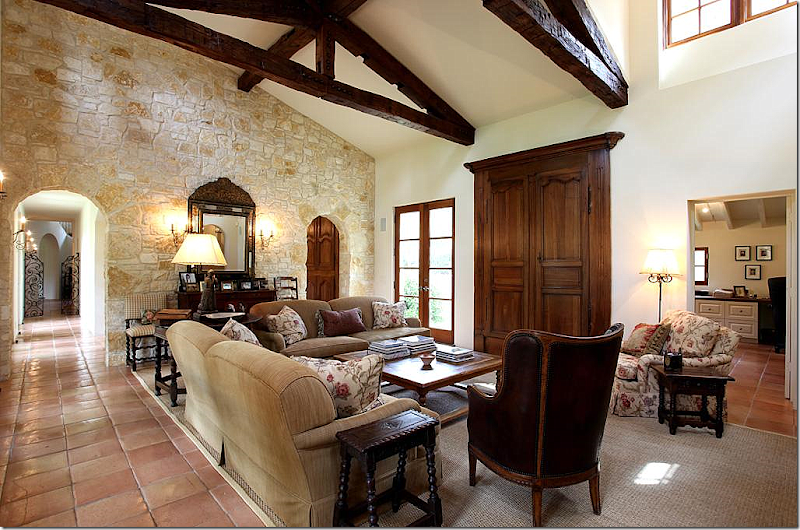
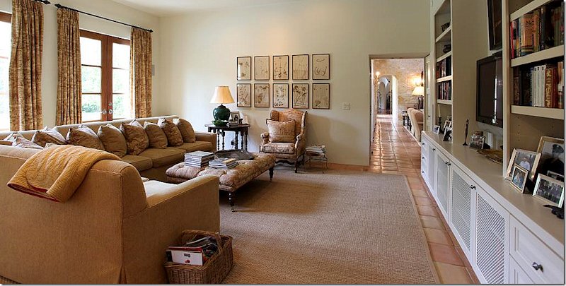
The family room is comfortably furnished, with Bennison printed fabric. I love that pattern and even once used it for my dining room skirted table. The TV is hidden behind 18th century Armoire doors that are mounted on the walls. The mirror on the stone wall is incredible. I’m loving all the small, Spanish style side tables and that chair! Notice on the left, down the hall, the gates with the staircase behind it. To the right through the arch is the kitchen/breakfast room. And at the right of this picture is the study/office.
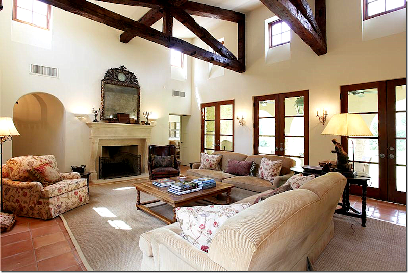
And looking the other direction, towards the fireplace with its limestone mantle. Another stunning mirror. In this room, seagrass makes an appearance. This is Houston, after all. The master bedroom is off to the left of the fireplace and the playroom is to the right.
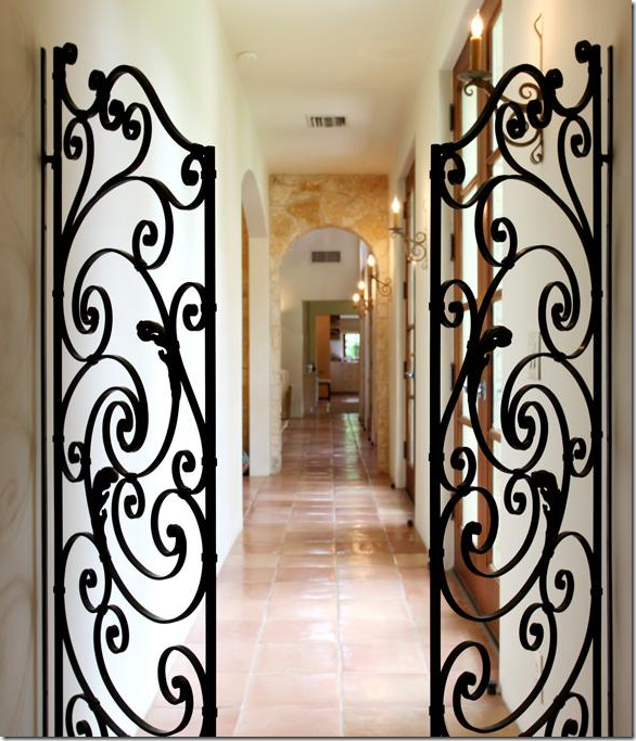
From the entry hall and the staircase, these iron gates lead to the family room and through to the playroom. The arch on the left is the breakfast room and the kitchen.
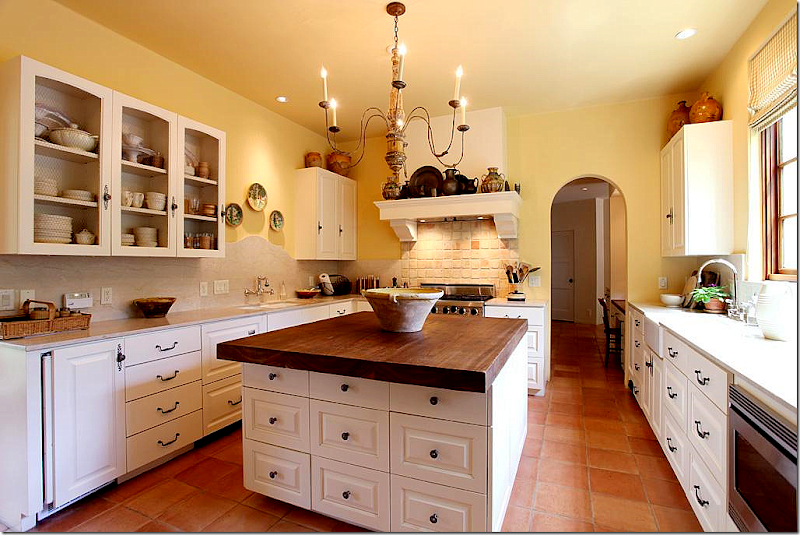
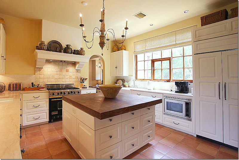
The kitchen has wire fronted cabinets. Notice the curved travertine backsplash behind the sink on the left side. A farm sink is on the right side. The island top is cypress wood. Through the arch is a kitchen desk area which leads to both the foyer and stair hall and to the mud room and garage.
Another view of the kitchen with its charming range hood that resembles a fireplace mantel. The chandelier is perfect for the space.
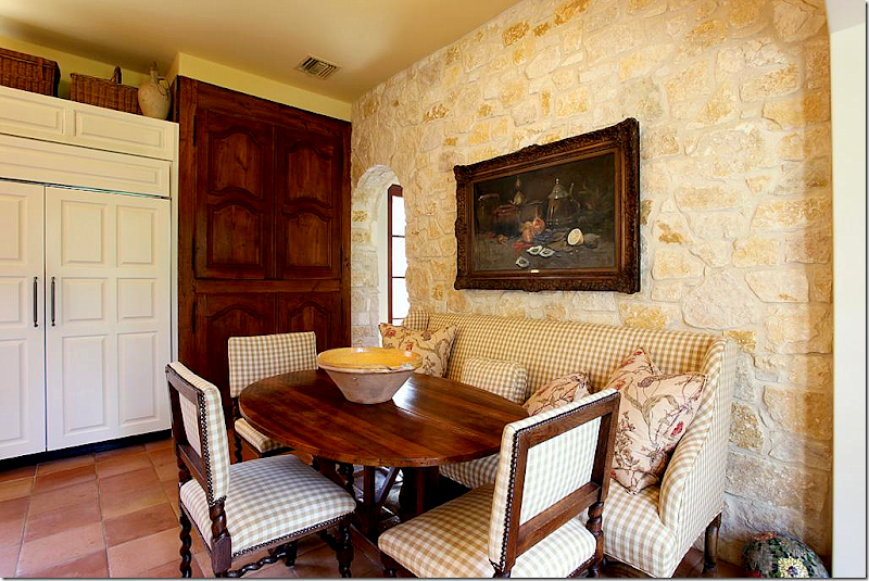
At the end of the kitchen is the breakfast area with its Austin limestone wall. The pantry is hidden behind 18th century Armoire doors that are fitted into the wall. I love the check fabric with more of the Bennison fabric that is found in the adjoining family room. Beautiful antique chairs, sofa, and French wine tasting table.
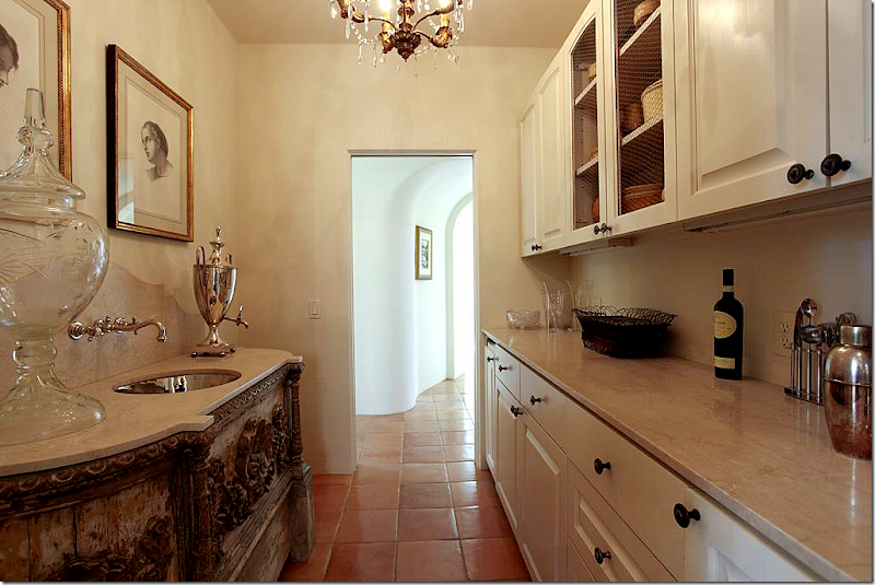
Between the foyer and the kitchen office is the wet bar. Just look at the antique cabinet with its inset polished nickel sink and curved travertine backsplash. Beyond gorgeous! The arched hallway leads to the front dining room and living room.
The playroom, off the family room has a large sectional. The antique styled ottoman and French chair, along with the gate leg table add warmth to the room, as do the curtains and the collection of botanicals.
Up this stairs, on the landing, this vignette sends off signals to me. Where have I seen this before? I KNOW I have, but where? The house is starting to get under my skin.
It’s this picture that starts the bells really ringing loudly. Call me crazy, but I KNOW that mirror! I could swear on my child’s life that this mirror was on the cover of a Veranda years and years ago. It was over a bed in a house that was once my favorite house ever. I know this isn’t the same house, but it seems so similar. It’s all coming together. That chaise with its distinctive arms – it’s familiar too. At this point, I have to go do research, which means digging through piles of old Veranda’s to find the magazine with that mirror on its cover. It doesn’t take me long before I have it in my hands. And yes, it’s the same mirror – exactly. So is the chaise. So are a lot of things that have seemed familiar. Does anyone remember that cover, that story?
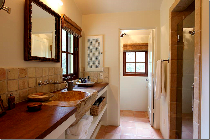
That sink! This is the man’s side of the master bathroom.
The woman’s side. Love the tub and the mirror – gorgeous!! And notice the triple vanity mirror – sooo great.
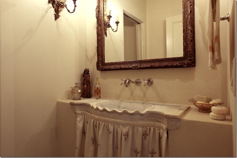
Charming powder room – just charming.
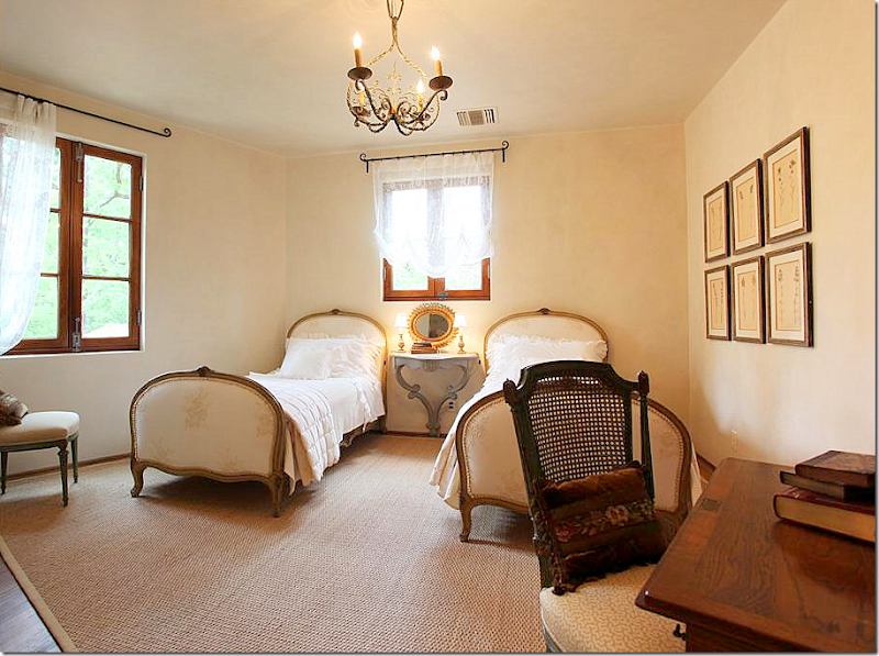
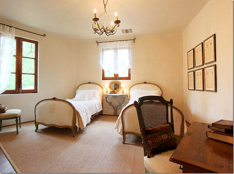
The guest room – I could move right in. Those beds are wonderful. And notice the hanging console between them. All the windows and the hardware are incredible = mahogany wood throughout.
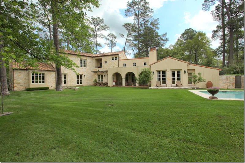
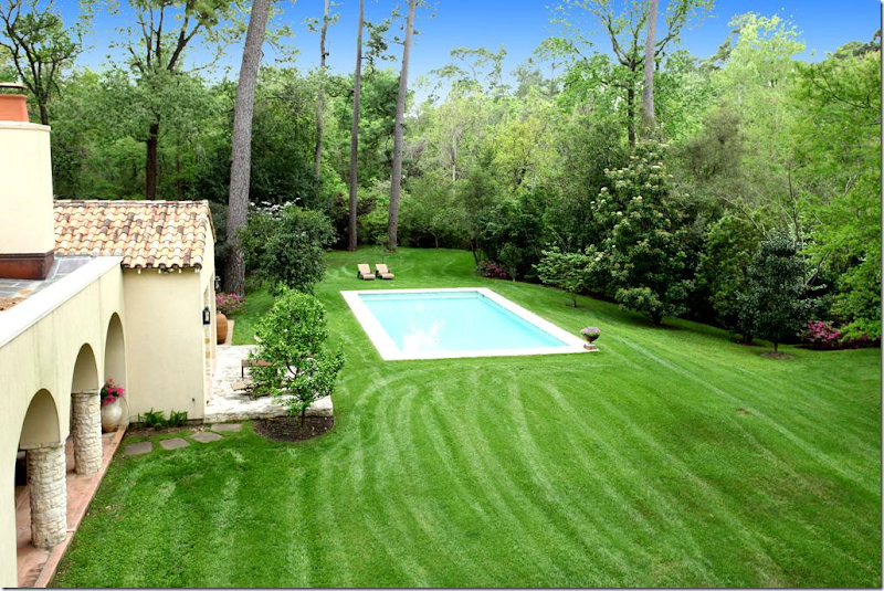
The back of the house – to the left is is the living room, then the dining room, then the kitchen and family room, which is behind the covered terrace, then the playroom, with the master bedroom in front of it. I like how they sited the pool off to the right of the house, away from it. It’s more European that way.
A view from behind the pool.
And here, you can see how isolated the pool is and just how utterly beautiful the property is. It’s located on one of the most isolated streets in a very small but terribly exclusive neighborhood more country living than city living.
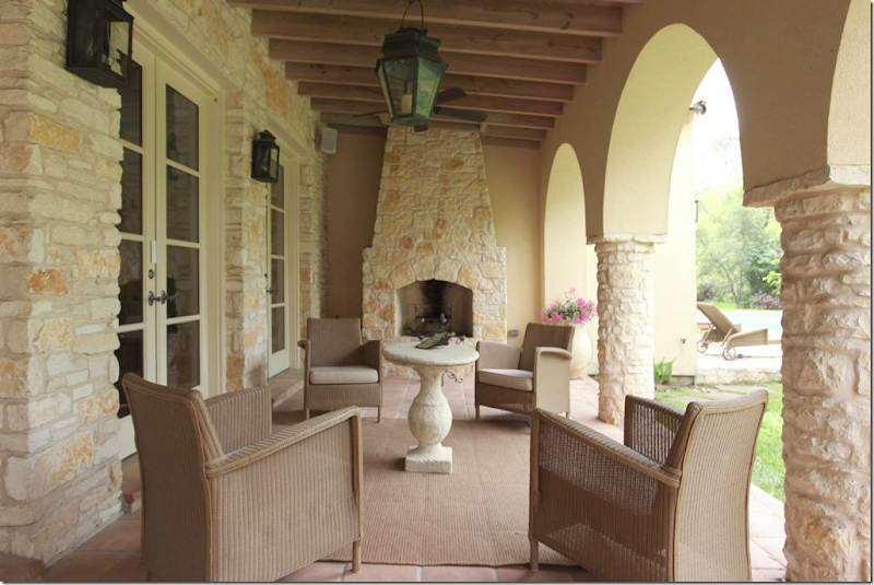
The porch off the family room. There is a floor plan and an itemized account of each room with the HAR listing.
After I saw the HAR listing and thoroughly confused myself, I looked up this story in the old Veranda, from February 2001. Now, the HAR house was built in 2004, so it can’t be the same house. After looking again at the captions of the HAR listing pictures, I noticed something I had missed before: Architect Kirby Mears of Murphy Mears and Interior Designer Carol Glasser. This is the same exact team who were responsible for the Veranda house. What gives? Two similar houses with the same team and mostly the same furniture?
Above, in the 2001 story, is the same mirror found above the bed in the HAR house. The HAR house has matching Swedish styled nightstands, while the Veranda house has smaller, French styled ones, as seen above.
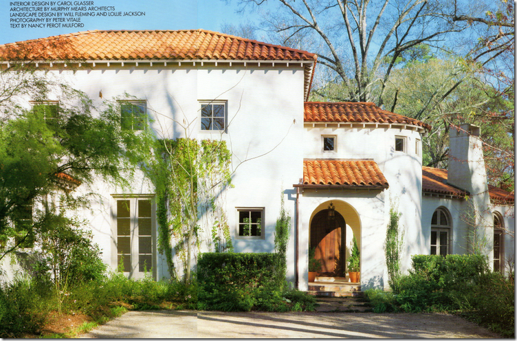
Here is the Veranda house, also located in the same general area as the HAR house, but not the same neighborhood. If you notice, the layout is very similar, with the living room to the right of the front door, looking like it was added on to the house – with its lower roofline. The HAR house has a similar elevation – see below.
Notice the HAR house again – the living room is off to the right of the front door, looking like an addition, with a lower roof line. But, while this house looks Provencal with its stone walls and tiled roof, the Veranda house of 2001 looks more Mediterranean or Spanish with its white stucco façade.
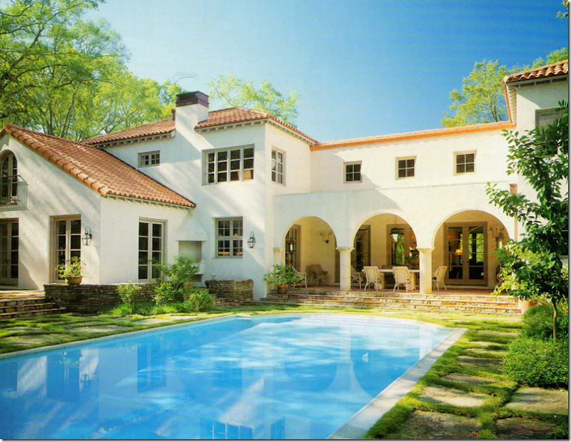
The back of the Veranda house has a similar back covered dining terrace. The swimming pool is sited up against the house as opposed to the HAR house.
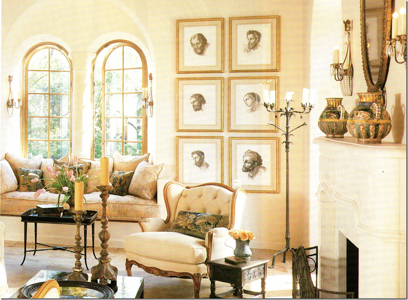
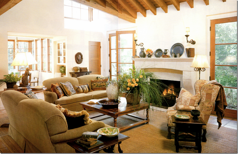
The living room in the Veranda house. Now, here I must confess. For years and years I absolutely loved this house. It was one of my favorites – ever. Now, ten years later, I still feel very attracted to it. It amazes me how current this house looks today – it really could have been designed this year. What a testament to the classic style of Mears and Glasser. Do you notice any similarities in this room to the HAR house? This room is seems smaller and cozier, more romantic I think with its arched windows and creamy fabrics. Notice the framed prints – they are one thing that immediately seemed familiar to me. The window seat is another.
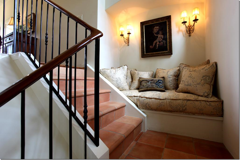
Here’s a close up of the window seat. For years, this seat served as a personal inspiration to me. I loved the thickness of the cushion – something that you usually don’t see that often. Whenever I make a cushion for a client, I always have this exact one in my mind to emulate. I’ve always admired the Niermann Weeks sconces found here and next to the fireplace. And I’ve always loved the pillows Glasser had made out of old Dutch tapestries. I still love to use those today.
And from the landing in the newer HAR house – this has to be the same exact cushion. When I saw this, I was like, huh???? Where have I seen this cushion before?
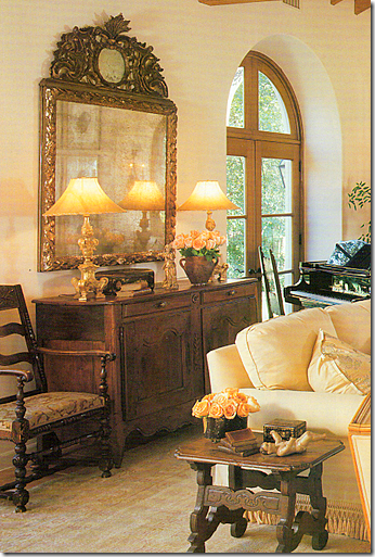
A close up of the Veranda house – I love Carol’s taste – the way she accessorizes, the furniture she picks out for her clients. Notice those lamps – they seem to be same ones as found in the entry hall of the HAR house. And that mirror – it’s the same one over the family room fireplace in the HAR house.
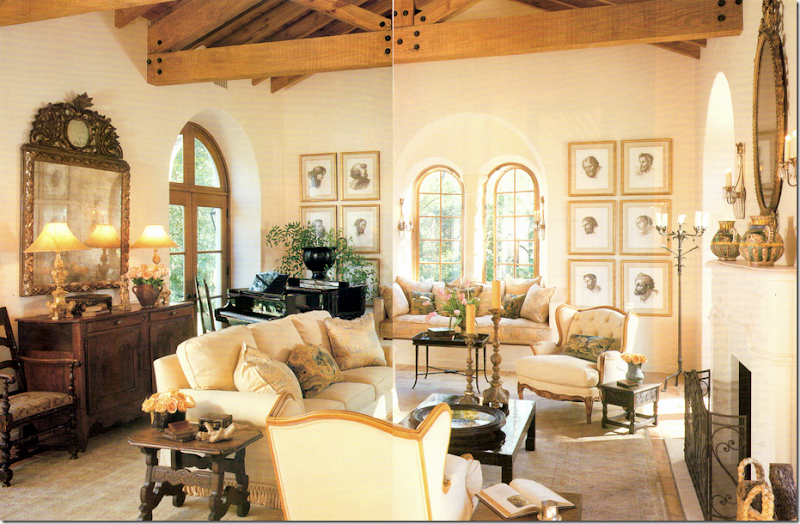
(Forgive the terrible scan!) And to compare the living room – here the Veranda house with the…
The newer HAR house. It might be the same rug, hard to tell. The sofa has different fabric, as do the two French chairs. The chairs next to the fireplace are a new addition. The coffee table is different, but the side table is the same. The same framed prints are here, as are the same four sconces. The chandelier is an beautiful addition. The piano returns, but the French buffet and the mirror are newer and grander. The room seems larger and dressier. Which one do you prefer? The newer HAR or the older Veranda house?
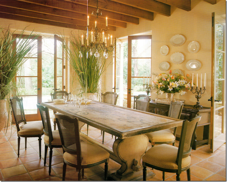
I used to think this was the prettiest dining room I had ever seen! I still love it to this day. At that time, 10 years ago, the painted table was so fresh looking - not many people were using painted pieces like this. Nor were they using biots in the house like this. I adored these chairs. I just loved everything about this room when this Veranda came out.
Compare it with the HAR dining room, which is really hard to beat – the architecture is stunning with the arching walls and ceiling. Notice though the table is the same, although a glass top was added. The chairs were changed, but I do see two of the old cane backed chairs in the back of the room. The rug is an addition. Notice that both houses have Saltillo tile. The stunning chandelier is a new addition. Which dining room do you prefer? I have to go with this one!
The Veranda family room. This reminds me of the HAR room, just smaller and less expansive. When I saw the HAR house, I noticed the similarity here too. The French chair looks like it ended up in the HAR house playroom.
The furnishings in HAR family room are almost exactly the same with the exception of the two chairs. The pillows were changed out, as were the fabrics, but the beautiful lamps remains. The mirror above the fireplace is the one from the Veranda living room (not seen in this photo.) The gateleg lamp table is different – in the Veranda house it’s a wine tasting table. These colors look cooler here, and warmer in the Veranda house. Again, the HAR house seems larger and more expansive, but I believe the Veranda house is actually a little bit bigger square footage wise.
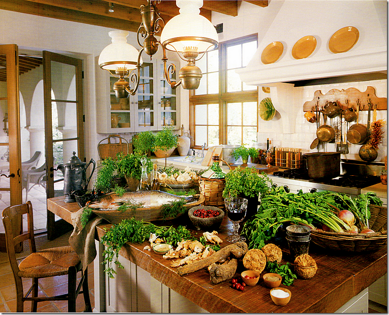
The kitchen in the Veranda house. I will say this – styling has changed in the past ten years. This seems overkill – if styled today, the island would remain clean. The fixture over the island is gone from the HAR house – and good riddance! I just don’t care for it as much as the one in the HAR house.
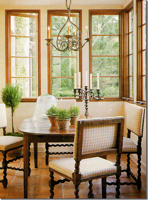
The breakfast room in the Veranda house. Same chairs, different table. This sweet light fixture seems to have ended up in the HAR guest room, along with a few of the caned dining room chairs.
The HAR house: this is so much better with the sofa and the Bennison pillows added. I love this table too. So beautiful
The HAR house with the light fixture from the Veranda breakfast room and a few of the Veranda house dining room chairs.
The upstairs landing in the Veranda house. I used to think this was so gorgeous. Gorgeous! I still love this picture with the trio of round portraits, the ancient bench, the candlesticks. I’ve said it before and I’ll say it again, Carol Glasser has THE most fabulous taste.
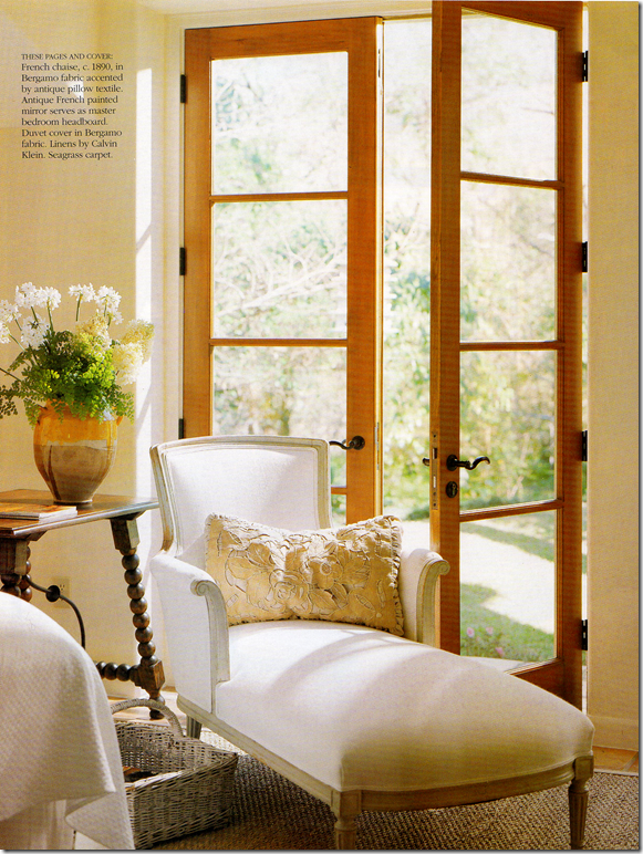
The master bedroom in the Veranda house wasn’t really shown, except for this chaise and the mirror, both found in the HAR house.
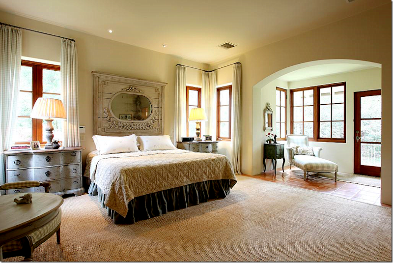
The HAR house: the chaise was pretty in white, but Glasser used all Chelsea Edition fabrics for the HAR house. She added the Swedish styled end tables with wood lamps. And the headboard mirror – the one on the Veranda cover - remains the same. The mirror first caught my attention that something about the HAR house was very familiar.
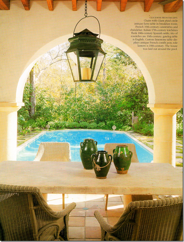
And finally, the Veranda house – terrace. It looks like the same chairs were used.
Now, I have NO idea who owns the HAR or the Veranda house. I have a feeling it’s the same couple. And I have a hunch why they might have moved and built a somewhat similar house, using the same team. The property in the HAR is stunning – it’s huge and secluded and quiet. The Veranda house is also very secluded and wooden, but hiding nearby behind all the trees on the Veranda property – is a very nearby freeway. It’s just a total guess that the couple was seeking quiet and more seclusion when they moved. I don’t know this for sure, but I’ll wager many in Houston do know and someone will probably email me or leave a comment explaining it all. I really don’t care to know the specifics. What does interest me is I think it’s fascinating to see how two houses designed by the same architect and interior designer resemble each other – and how different they are, at the same time! I love seeing how the furnishings were changed with new fabrics and accessories – like new chandeliers and rugs – to make it all look different, yet retain its original beauty. I loved comparing each house and each room – to see what was kept, what was changed, what was added. Kirby Mears, the architect, is becoming a real favorite of mine. It seems that every time there’s a great house – it has his stamp on it. And I don’t have to say how much I admire Carol Glasser. She’s a master – each piece is hand picked for the client, slowly and over time. There isn’t a rush to buy everything at once – she waits for the perfect piece for the perfect spot, and it shows.
I hope you enjoyed this look at these two houses, as much as I did!!!
To see the HAR house listing, go HERE.
To visit Murphy Mears web site, go HERE.
Remember Houstonians, the Urban Market is today and tomorrow – Saturday and Sunday! Courtney Barton, will be there at Sally Wheat’s booth with goodies and a line of fabrics she bought in India that are sold exclusively in France!!! It sounds fabulous.


![[image16[1].png]](http://lh6.ggpht.com/_t8-Y4w1UKrc/S8WHf6gtOcI/AAAAAAAAv-I/XLveBi5ClTw/s1600/image16%5B1%5D.png)
![[image25[3].png]](https://blogger.googleusercontent.com/img/b/R29vZ2xl/AVvXsEitZ1o10VY4ZMjD3yhRNjqBozOX4UogcIExy_Gd8W8C3H5l3YQQ522KF5hg5RFTHPJBvlLVVghkNB53UczDIaGoeLDjMCYDCnoD_ZJNAZXnNAjiKLVWZHGHZwIWm6B1u1UwnFyOFaK5gg4/s1600/image25%5B3%5D.png)

![[image28[2].png]](https://blogger.googleusercontent.com/img/b/R29vZ2xl/AVvXsEgeYcZfL3uvCnU0RS_QXWjeAErv6fqK9Vuej_g8nxDTjCiLR-BtgMYp_jKeBMyLnTnaU8Fo_GYKnr9VmmkELNNsmOOksew_h6gMmM4WOc2LUEmK_zzcMLGdGuxGM4SI0zz18jW7UM_CHF_w/s1600/image28%5B2%5D.png)
