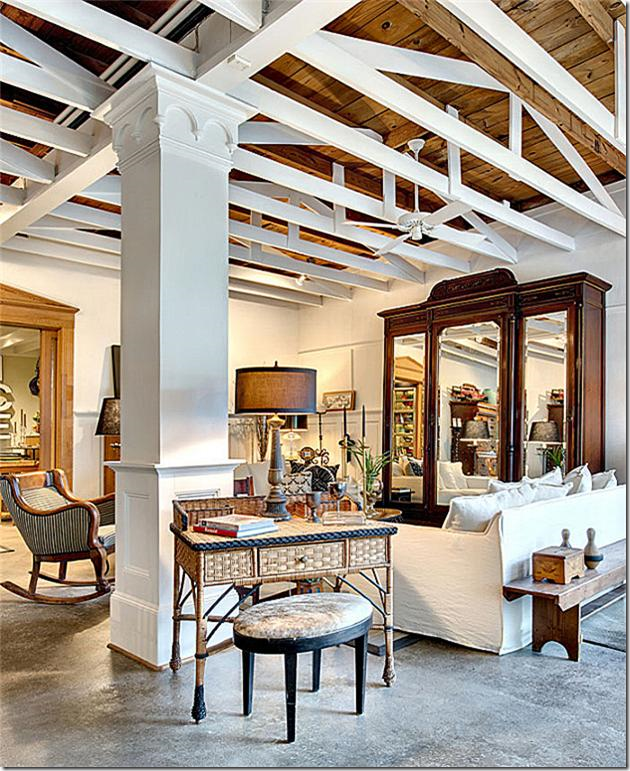
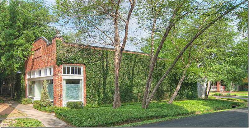
A kind reader sent me this listing. Is it a store or a home? It looks like a store, kind of… Actually it started out as Morton’s Grocery. I can sort of relate to living in a grocery store. My family was in the grocery business, my father was a partner in one of Houston’s first grocery chains – a chain that came about when two families combined their three stores each. My first year of life was spent in the industrial town of Galena Park, in a small house on cinder blocks, right behind our store #3. By my first birthday, we had moved into town to Memorial, leaving behind the house behind the store! Unfortunately, neither that house, nor that store in Galena Park possessed any of the charm that this old Morton’s possesses. For example: Built in 1928, the front façade has two bay windows with a center double front door. Above all this is a row of transom windows that probably once opened to let in the cool gulf breezes that were needed before the days of air conditioning. The ivy covered building is all brick and boosts two corner finials adding even more importance to the façade – although these are probably new. Right in the center above the front doors is a design in the brick work, again a charming detail. The store/house is located in the hip, quasi Heights area between Katy Freeway and the Loop.
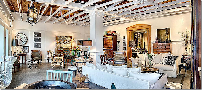
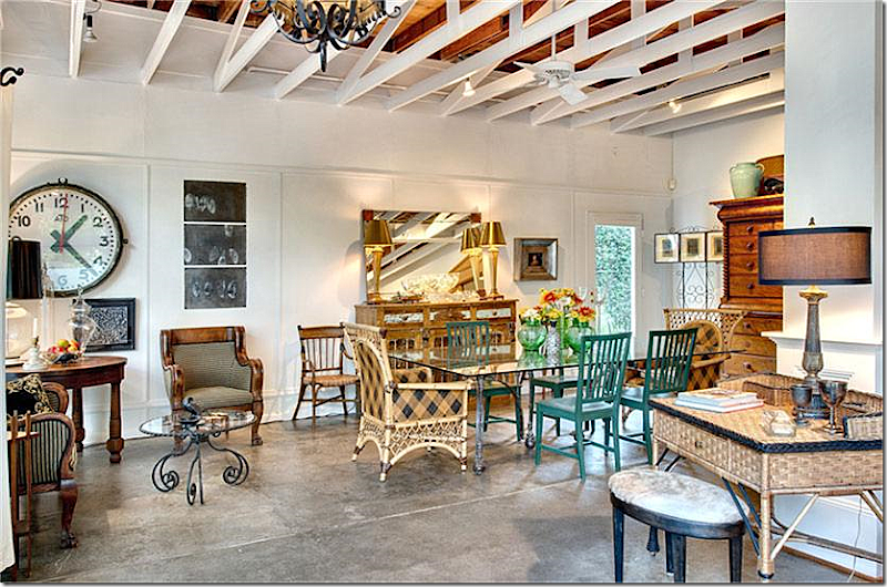
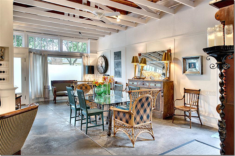
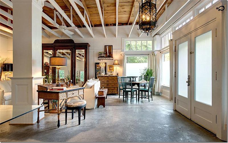
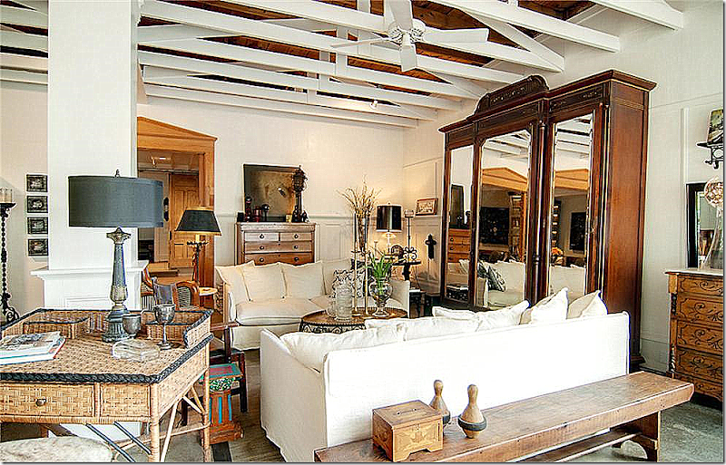
Whoa. This is so fabulous! Inside, there is a main living dining area with 14’ ceilings and exposed beams. Through the large architectural doors is the kitchen and breakfast room. There are two bedrooms and one bathroom.
Walking in the double front doors – the dining area is to the left. The door seen here leads outside to the garden.
The same dining area – looking towards the front doors. The floors are concrete.
From the double front doors, to the right is the living area with a smaller games table.
A huge armoire hides the TV, I’m sure! The small desk attempts to hide the load bearing column. Notice its molding.
A close up of the living area – through the doors on the back wall is the kitchen and bedrooms.
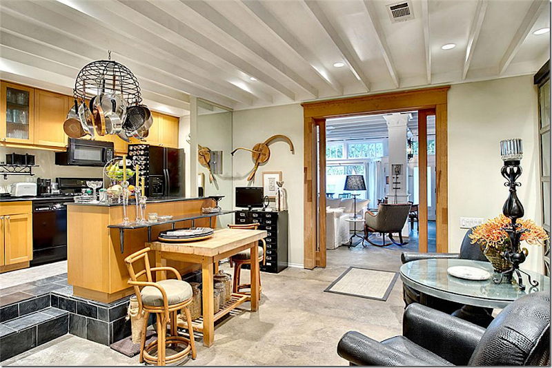
Through the double doors is the kitchen and the breakfast room sitting room.
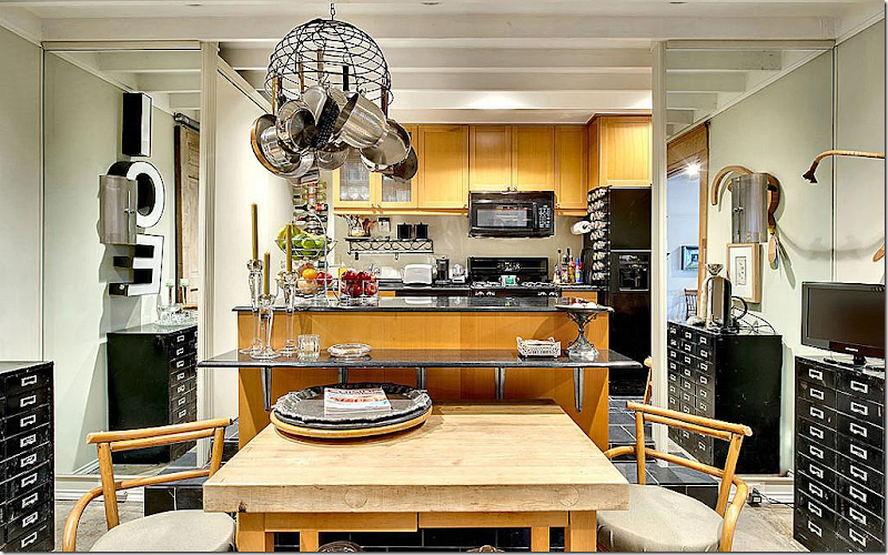
The kitchen is elevated up a few steps and mirrors flank the opening to it on both sides. There is an eating bar and a table and chairs.
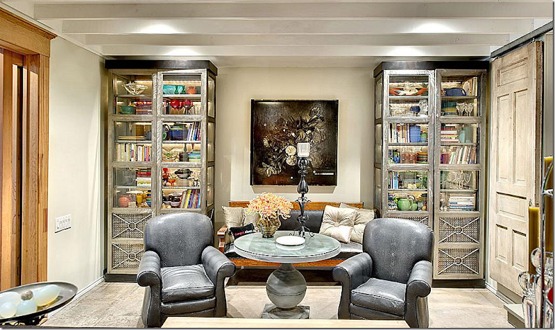
Across from the kitchen is a small sitting area – filled with an antique settee and industrial style bookshelves.
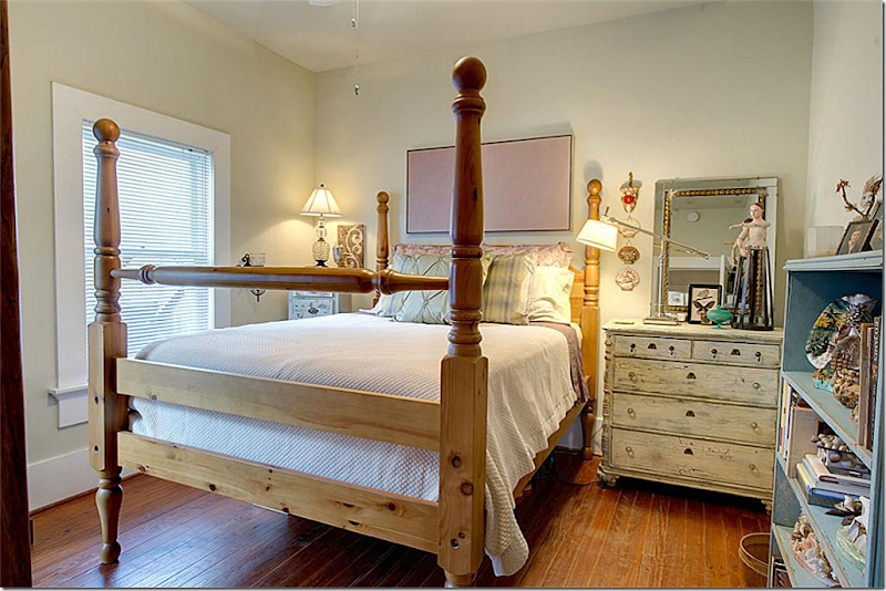
This bedroom, one of two, is most serene room in the house! You can tell a woman with feminine tastes lives here.
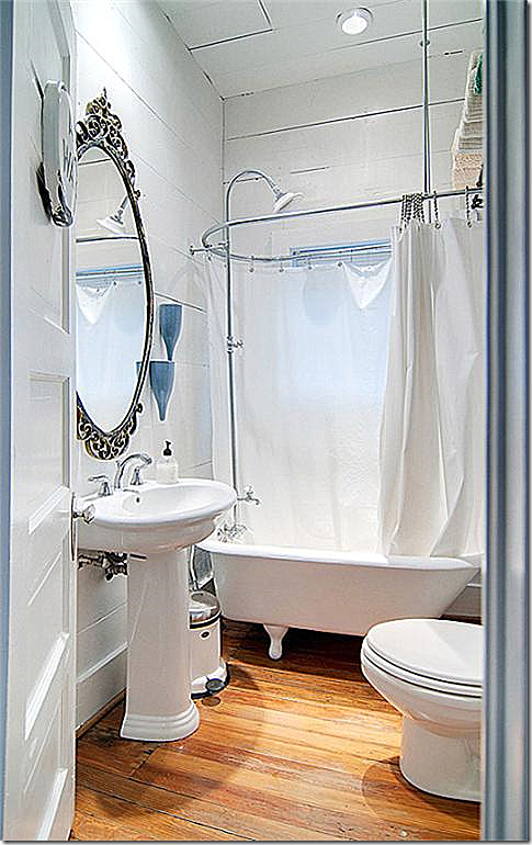
The bathroom fits in with the age of the house/store with a clawfoot tub and pedestal sink.
Looking back in the main room out the front windows – you can really see the ceiling beams and rafters in this picture. I just LOVE this space!!!! Do you see that black wire coming out of the column – what is that?????!!!???
A side view of the building shows it is located on a corner, just like any corner grocery store would have been!
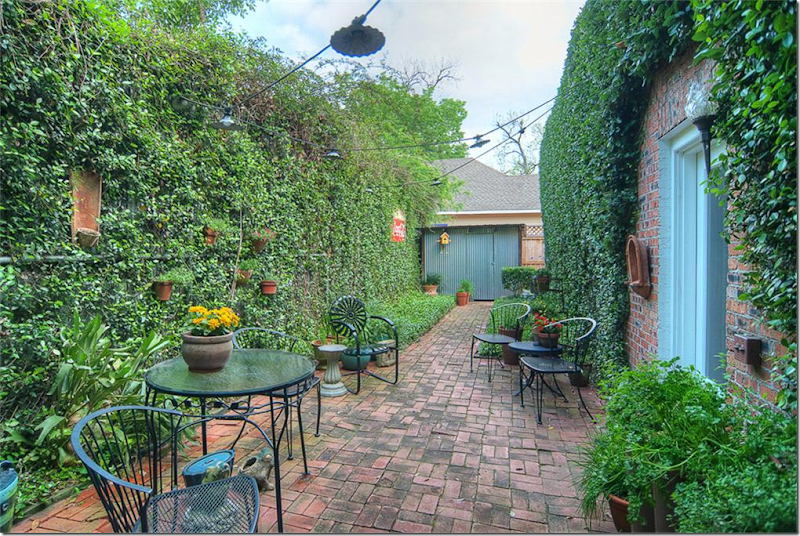
A brick paved courtyard runs from the front to the back off the side of the house.
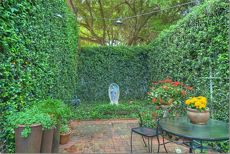
Another look at the courtyard, facing the other way. What would you pay for this piece of history?? It is 1780 sq. ft. and is listed on the National Registry of Historical Places & is a Houston Landmark Property. Would $375,000 be too much to pay for this unique home? I think it’s a steal! Unreal. If I were single or didn’t have children, I would love to live here. BTW, someone agrees, the house is now sale pending. HERE.
FAUX:
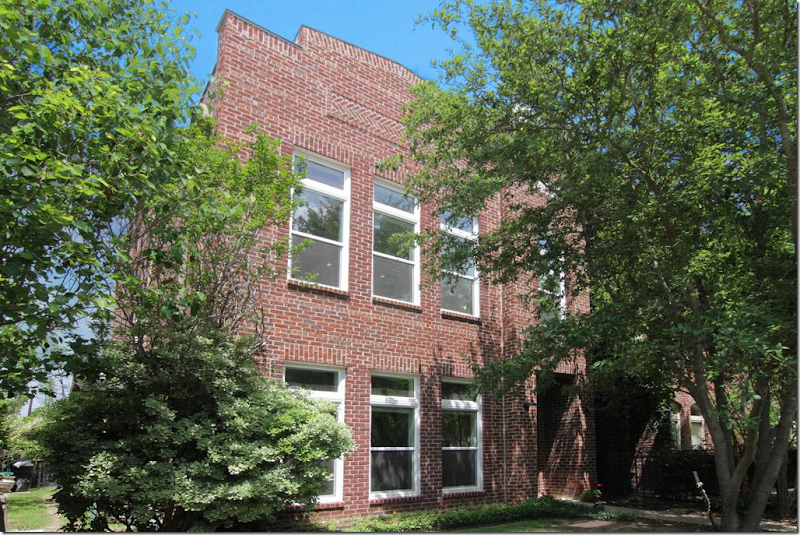
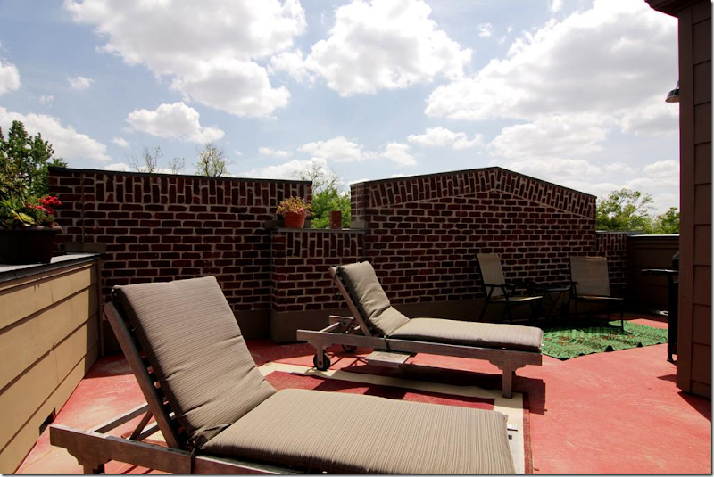
What if you like the look of a store, but don’t want to live in an old house? This brick house is new construction, but looks a lot like converted commercial property.
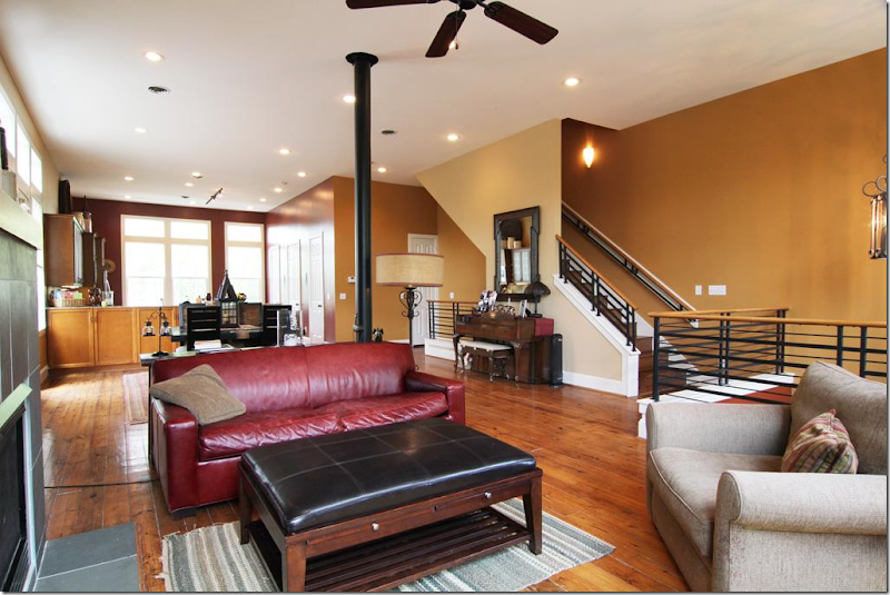
Inside the house is modern with an open, loft feel.But the best part for me - I love this third story sunbathing deck! I’ll bet the views are fabulous from up here. Built in 2001, at $494,000 and over 3,000 sq.ft. - the price seems very reasonable and even quite low! HERE.
REAL:
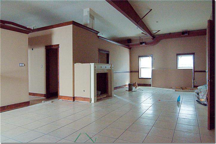
This commercial building in the Heights was built in 1971 and is waiting for some TLC to convert it. Its square feet is 3,680 – three times the size of the grocery store, but the price is also high, almost $6K. Steep.
Judging from the pictures, it needs a lot of work. HERE.
Real:
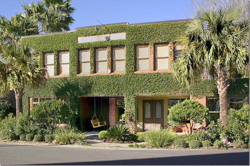
This house on East 27th was built in 1925 and was a drug store/post office. Later it was divided into 8 apartments. The current owners gutted it in 2005 once the neighborhood had undergone it’s own transformation first. Today, the ivy covered brick building has more than 50 windows, concrete floors downstairs, antique light fixtures and a great terrace and bricked courtyard. Unfortunately, not for sale and no interior pictures!
Real:
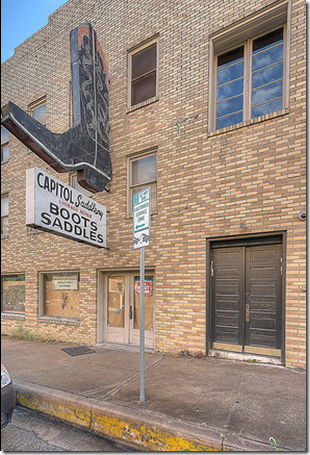
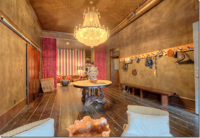
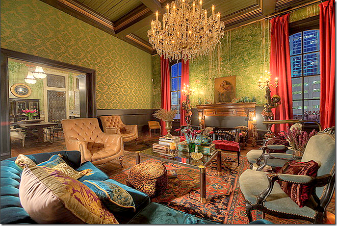
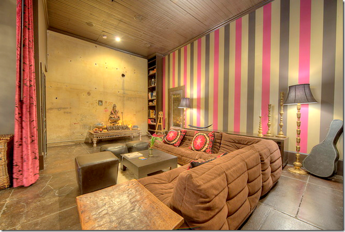
Anyone who’s lived in Austin is familiar with this sign! Today, the old boot and saddle shop is a gothic loft – now for sale at $4 million. Yikes!
Even the entry hall has a huge crystal chandelier from a Las Vegas casino.
The owner says she was inspired by Fortuny when decorating this loft.
She says she never thought she would ever move, but….if she can’t sell it, she will rent it out for events.
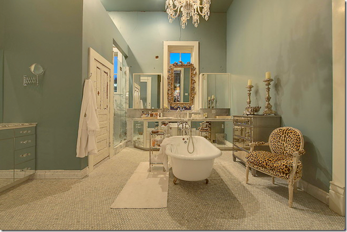
The bathroom is my favorite room. I love this room!
Even the old Otis elevator was restored.
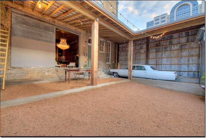
Only in Austin – vintage Cadillac and cowboy boot store! The home now has three bedrooms and measures 5,476 square feet.
Around the U.S.:
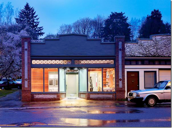
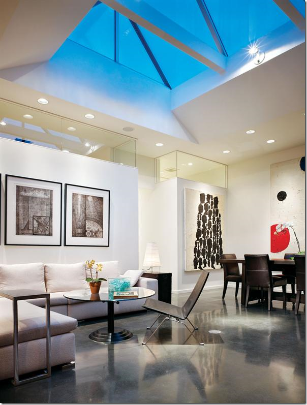
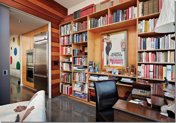
Looking at these local commercial buildings converted into homes started me thinking and ending up with me google searching for days and days, seeking out other revitalized buildings. This beautiful storefronteeeeeeeeeeeeeeeeeeeeeeeeeeeeeeee is located in Portland, Oregon. Amazing how the front looking almost the same as the Houston grocery store house with the transom above!The storefront is from the early 1900s. A large skylight was placed over the living/dining room. Again, the floor is concrete. The bedroom is located behind the sofa wall.
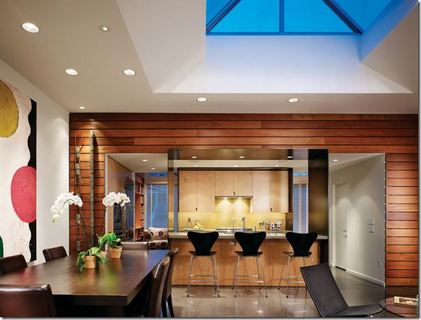
Looking at the dining room side – the kitchen is placed between the study which overlooks the front store windows.
The study which overlooks the front windows. This couple are art collectors, but that poster is found in every teenaged girl’s room that I know!
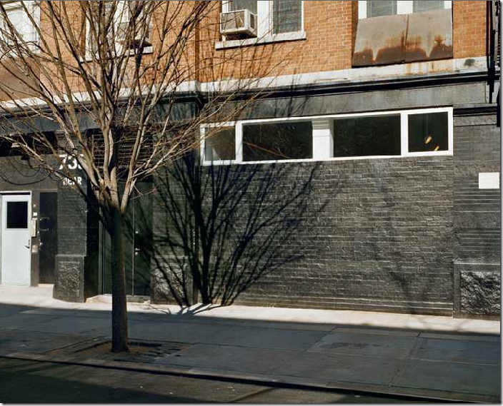
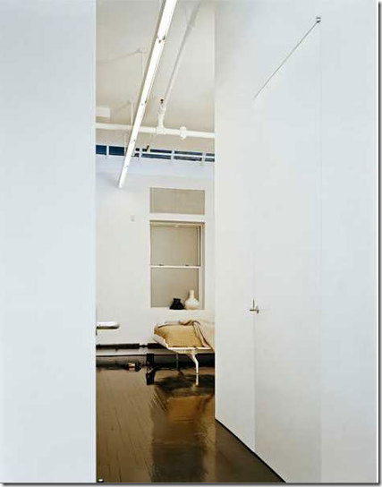
This storefront is on the lower east side, NYC. Minimalistic - it is so beautiful. Love how the brick and sidewalk was painted black but the concrete nearest the house is painted white.
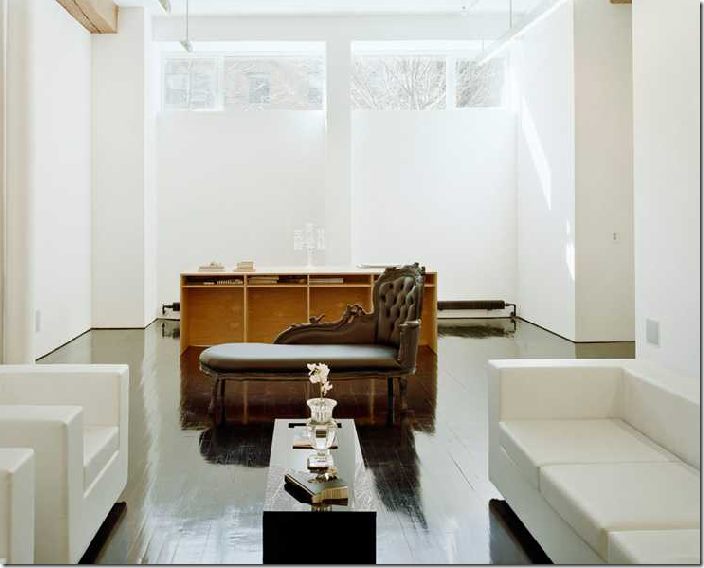
Architects were Messana O’Rorke HERE. Hard to believe this was once a storefront. The tiny front windows are disguised behind what appears to be floor to ceiling shades. That’s a desk in front of the windows. I love the décor.
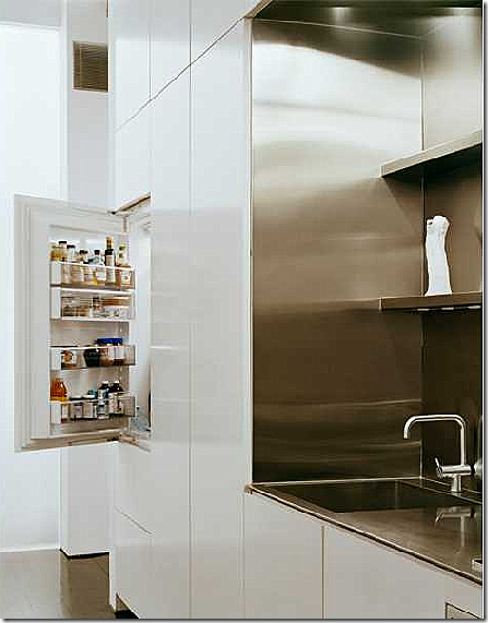
Gorgeous kitchen and table set – who really needs more???? Notice the light fixtures over the table, they disappear almost.
Surprise!
The bedroom. Notice how the black floors are like mirrors. Beautiful! Found HERE.
The bathroom.
Real:
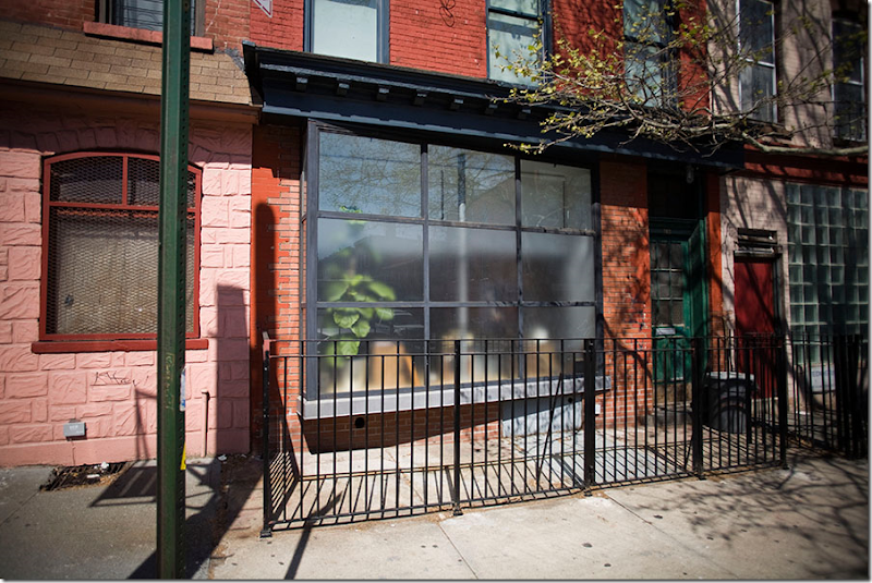
In New York, there are many store fronts that are converted into spaces. Not many are as sophisticated as the one above with the white walls and black floors. This one certainly seems more user friendly.
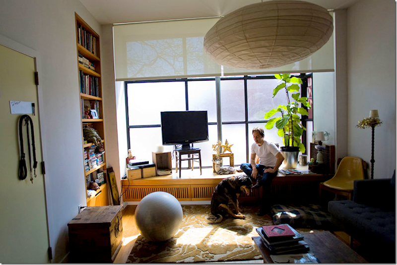
This was once a barbershop in Brooklyn. The front façade is made up of nine large pane of glass. Notice the asymmetry of the large light fixture, the ball and the TV – all perfectly balanced with each other.
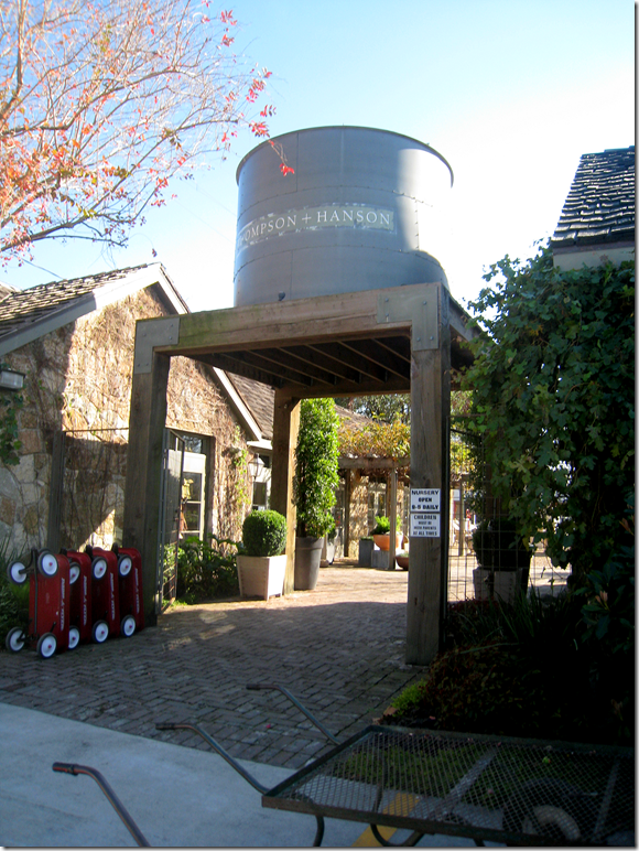
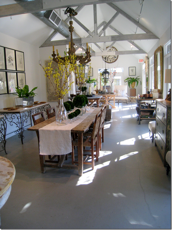
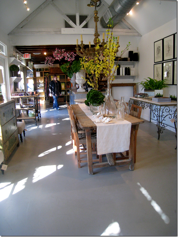
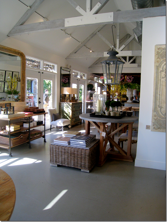
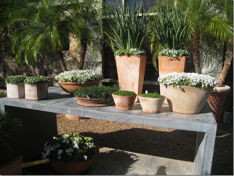
So…..is there a building in your city or town that you have once thought of living in? I have several that I dream of making my home whenever I am shopping there. My all time favorite to move into would be Thompson Hanson, the nursery/décor shop. Living there would be like living in Belgium! HERE.
OK, I’d take down the water tank first. I guess. But, to live on this property, with its two stone buildings, would be nirvana.
Gah…kill me! Could I keep the furniture, too????
Looking at the other end. I’d probably put the kitchen back in the storage area and put the bedrooms in the other building – then connect them with a screened alleyway. Done! Didn’t even need to call Kirby. hehe
Remember when this building used to be Mom’s Kitchen, which is now 2620, the fabulous antique store just up the street?
At least my landscaping would be fabulous.
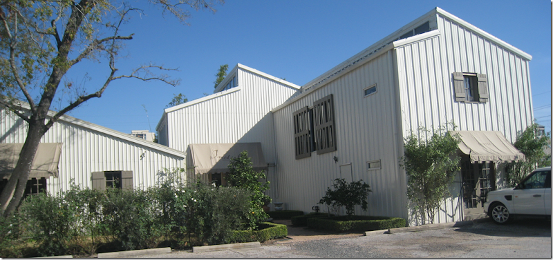
Another building I would love to live in is Indulge Decor. HERE. This large barn like, metal covered building was redone and added on by Cynthia’s talented architect husband. The building is beyond fabulous.
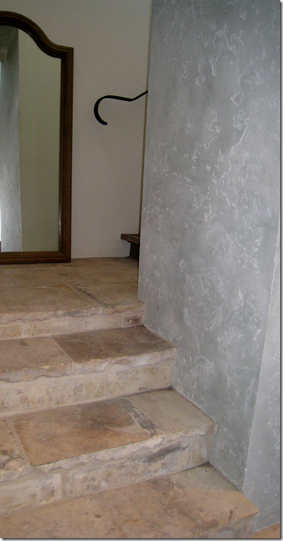
Just look at the staircase with its terra cotta stairs, iron rail, wonderful wall treatment. Cynthia, when can I move in????
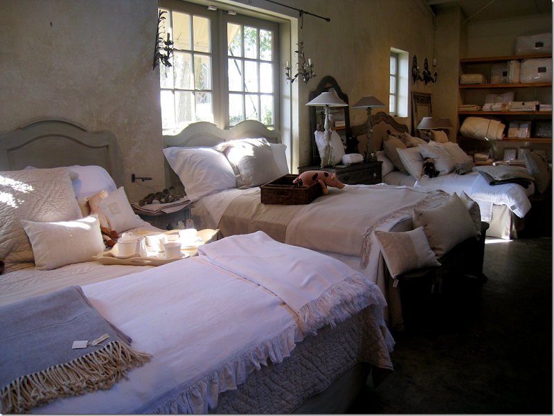
The building is almost as cute as the décor! btw – Cynthia just got in a huge shipment of Blanc d’ivoire.
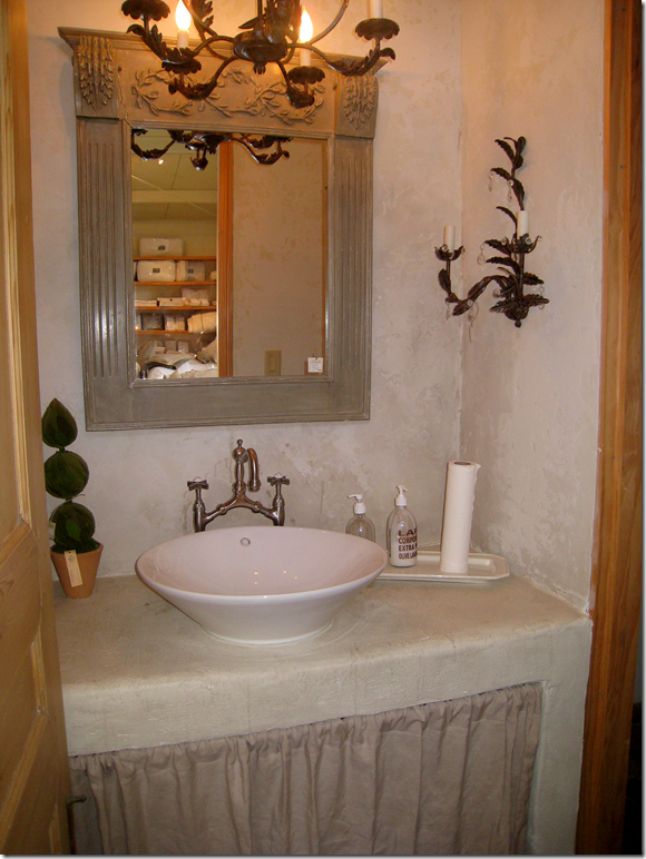
I wouldn’t even have to put in a bathroom! Is this too cute?!!
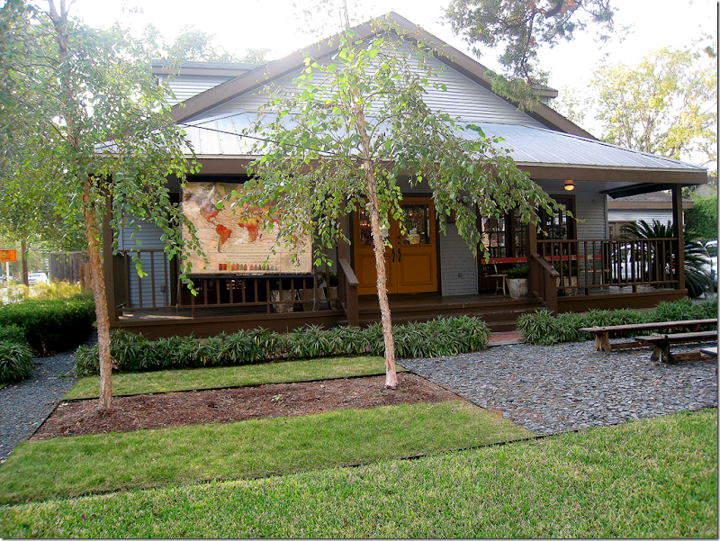
OK, ok. I am just noticing something. Most of my favorite antique stores are places I would like to live in. That’s a pretty sick statement in and of itself. Calling Dr. Freud! I mean, who wouldn’t want to live in BROWN???? HERE.
And then there is Kay O’Toole’s. I could live in her charming, decades old brick shop. But, then – just to aggravate me - she had to go build this fabulous house out back, designed by Murphy Mears HERE. I take either the shop or the enfilade or both. No questions asked.
The list could go on and on – I would love to live in the little house behind Shabby Slips, another great one would be the old laundry turned into antique store Neal and Co., or how about the cute shop Watkins & Culver?
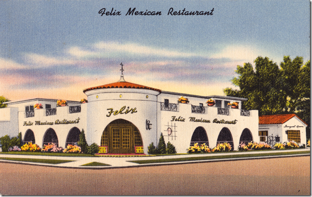
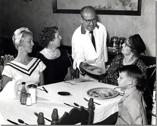
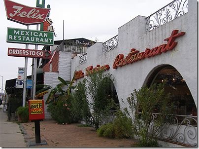
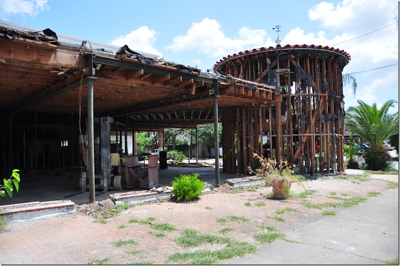
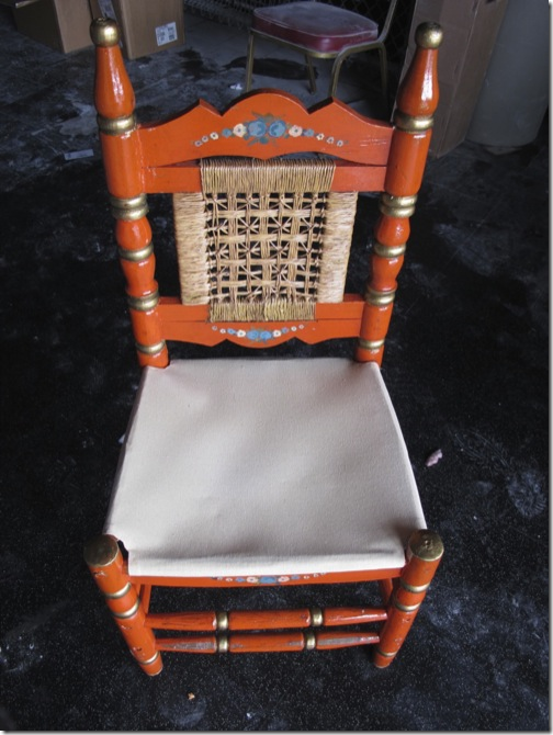
But, one of the my all time favorite buildings that I used to think would make a great house is the old Felix Mexican Restaurant on Westheimer. Everyone used to eat here – we would go with the Webbs several times a month for dinner and then there were the lunches. The best times were the ring side seats to the annual Gay Rights Parade. The chain was opened in 1948 by Felix Tijerina, one of Houston original Hispanic stars. There were once 5 or 6 Felix’s around Houston, all in their signature Mexican Villa style, but one by one they all closed except for the Westheimer location. Whenever I would go, after walking through the double height entry way rotunda, I would think – this would make such a cool house. No one else must have felt that way. After it closed, it languished on the market for 3 years, becoming a home to the homeless. When it finally sold, it was shadow of its former self. Pieces of the restaurant were sold off – menus and paintings. The distinctive chairs were to El Real Restaurant along with some of the fixtures and photos. Their signature recipes for chili con queso and guacamole were sold to El Patio, another veteran Tex-Mex Houston landmark.
The saddest thing is that a chic Austin sushi restaurant bought Felix.
It was once so clean and well kept. After it closed, it all went downhill, fast.
Its getting ready to reopen as a chic sushi hotspot. Here, it was cleaned out. The fabulous rotunda is so sad looking. The color tile floor is now gone.
It’s all gone, except for the shape of the rotunda which I suppose the new owners kept. And to think I once wanted to live here!
The original Felix chairs, sold to another Mexican restaurant. Life moves on.
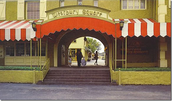
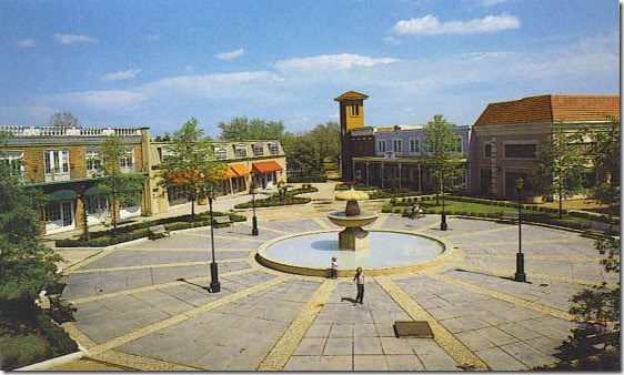
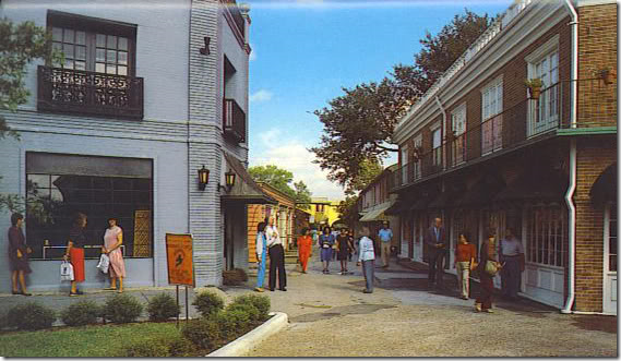
And finally, one last favorite commercial/residential Houston memory. Westbury Square was a one of its kind – a romantic, quasi Disney inspired shopping mall, built in the 60s before there were shopping malls. It was a magical European village, stuck in the middle of the barren prairie of southwest Houston. There were candle making shops, a chemist shop, an ice cream shop, a Dutch shop? - all kinds of small merchant stores and a few restaurants. But most remarkable to me were the apartments that were built over the shops.
When we would haunt the small walking streets going from shop to shop, I would peek up to look at the apartments through the French doors and Juliet balconies and dream. I thought it would be the most perfect place to live, above the stores in this charming little bit of France and Germany.
Here you can clearly see the apartments over the shops – the French doors, the iron work balconies. Then came the Galleria and that was the death knell of Westbury Square. It took a while to kill it completely, but in the end, Westbury Square ended up a pathetic place surrounded by big box stores. No one knew what to do with it. It was a money pit. IMO, they should have turned the entire square into apartments and houses instead. I know I would have been interested in living there as a young single!
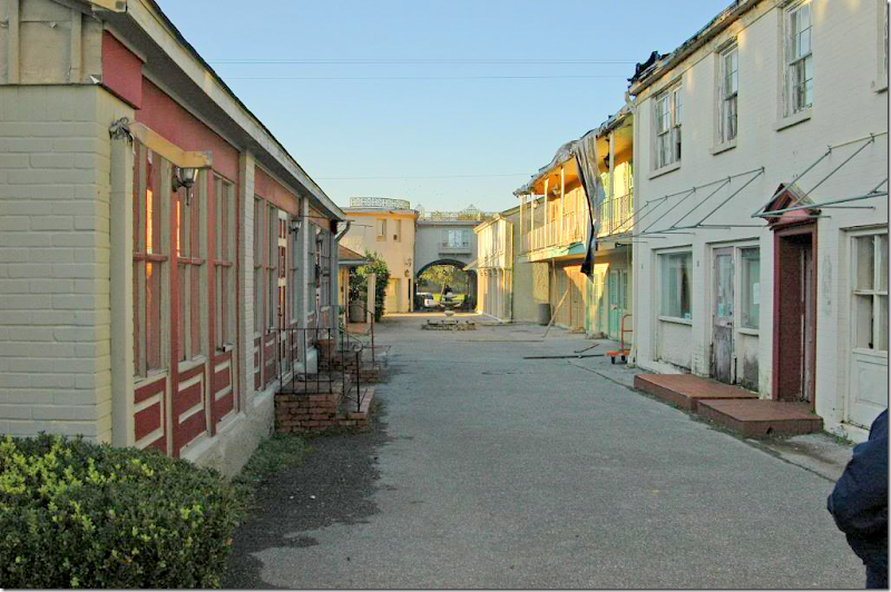
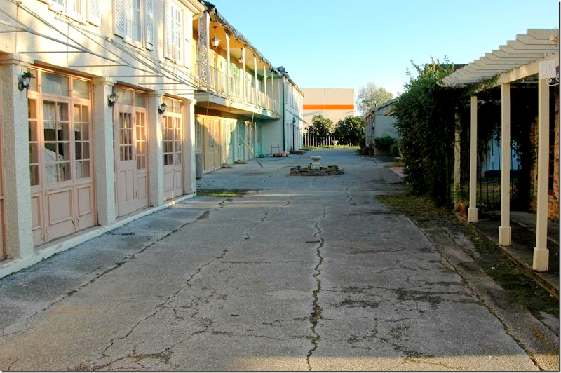
The same view as above, how it was in the end. A wasteland. But still, you can still see evidence of its once charming façades. The awning frames are still hanging on for dear life.
Another view, with the big box store behind it. Makes me want to cry just looking at these pictures!
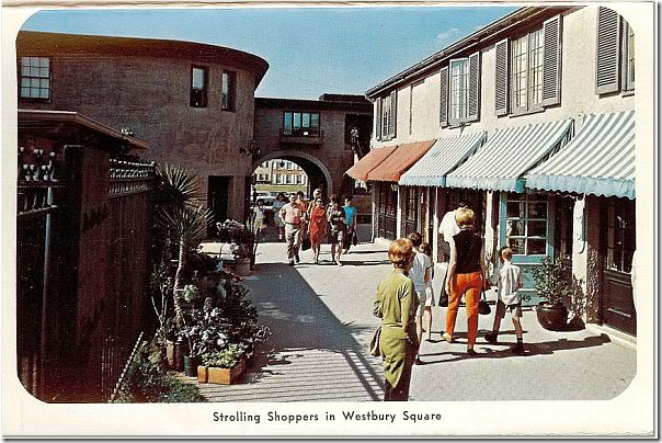
This view shows all the cute stripped awnings – off the side entrance.
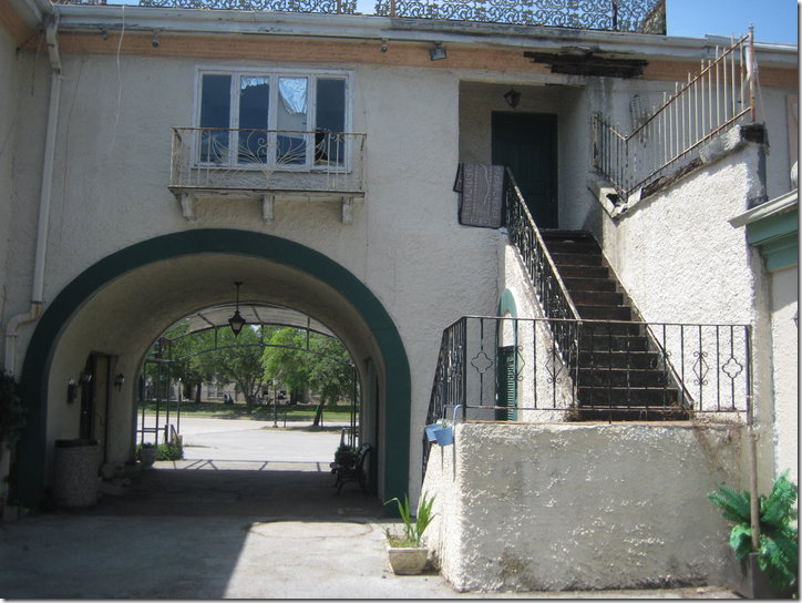
That same entrance – with the upstairs apartment that intrigued me each time I came in through that arch! Even though it’s all falling apart, you can still see the romance of it all, the stucco walls, the iron railings, the outside staircase, the Juliet balcony – why???????
A special treat to Houston baby boomers – we all ate our fair share of ice cream here.
So, can you think of any wonderful old commercial building or shop in your city or town that you could live in? Do you live in a former store or commercial building? If so, we would love to see your photos!!!
And finally…..
Mary Kay Andrews’ newest book, Summer Rental, is now out! Here, Andrews writes about her beach house rental – her other books have been about buying the house on Tybee Island, renovating it, and all the mishaps and laughs that went with it! She’ll be Houston for a book signing this coming week. So, be sure to join her – I’m betting it will be a fun event.
Mary Kay’s beach house on Tybee Island, available for rent!
To see Mary Kay Andrews – come to the Blue Willow Bookstore at 14532 Memorial Drive – this Saturday, June 11 at 4:00 pm.
To read all about Mary Kay’s ADORABLE beach house for rent, go HERE.
And to purchase Summer Rental and all her other books, go HERE.
Residential or Commercial???
Coveritis Wannabe
My first cover shot 2007: Georgie and Sammi Jo. Actually they wouldn’t sit for a picture together so two pictures of each dog were spliced together to make it look like they really love each other. They don’t. Now four years later, almost everything in this picture has changed except for the sofa and chair and lamp.
When I first started blogging, another blogger friend, Melissa from The Inspired Room HERE coined the word – coveritis – to describe the affliction of constantly fluffing one’s home to make it worthy of being on a magazine cover – at a moment’s notice. If you suffer from coveritis you have an irrational fear of your house not always looking good enough to make it into a design book. Symptoms of coveritis include keeping your house in a state of non-clutter: all papers, mail, toys, clothes and crafts are always put away immediately - just in case a stalking photostylist stops by unannounced. Remember, this is an irrational fear. To understand coveritis - imagine it like this – your house always looks like President Obama is on his way for dinner.
Now, the opposite of coveritis is being a coveritis-wannabe. You are a coveritis wannabe if you WANT your house to be photo ready at any given time, but it’s not and never will be. You never file away your bills fast enough and your children’s school work is always spread out over the dining room table. Your husband takes command of the coffee table and his random magazines and catalogues are center stage instead of your carefully arranged design books. Your bed is never made before 3:00 pm and more often than not, your bathrooms are littered with wet, used towels. Usually for a coveritis wannabe, the only room ever photo ready are the never used living room. As hard as you try and despite how much you wish it was, your house is just never quite ready for that photoshoot.
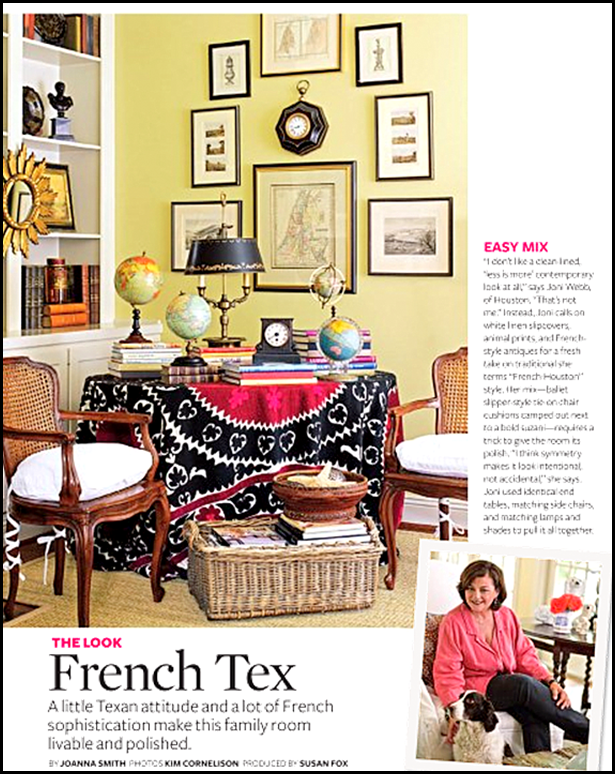
Three years ago, this story appeared in Better Homes and Gardens. Again, that corner of my family room has completely changed! (Thank God!!)
I am without a doubt a total coveritis wannabe. I’m always futzing around in my house, moving furniture, accessories, and books – trying to get it to look camera ready, but it never really is. The endless catalogues accumulate, packages are opened but linger around waiting for their final home, shoes never quite make it to the closet, and stuff just grows and multiplies like the octomom’s stomach. I have endured two actual photoshoots in the past few years, so I know what it means to have my house look camera ready – but, of course a professional stylist accomplished that feat for me. For both magazine stories, the stress level of whipping my house into cover-ready state was almost unbearable. In fact, I said, “never again” to another photoshoot. That was until Bonnie Broten, Regional Editor for Meredith Corporation, came to town this week and brought a film crew with her. The last few days were like college hellweek for me while the crew cheerfully took a few pictures of my kitchen for this magazine:
BHG’s Specialty Magazine – Kitchen and Bath Makeovers – done on a small budget. My kitchen certainly fits that criteria! The story won’t be in this magazine until Summer of 2012 – such a long wait.
Since I am a coveritis wannabe, I swore I would never again let a photographer into this house. It’s just too much – too much angst, too much cleaning up, way too much insecurity, just too, too much. Coveritis sufferers live for their house to be photographed, but for someone with clutter issues, it’s just not fun. This time, the pictures were taken only of my kitchen for the BHG specialty magazine – Kitchen and Bath Makeovers. Forget for a moment that I have no clue why they would even want to put my kitchen in the magazine, but why it’s on the cover is truly a mystery. My kitchen is no big deal. It’s got so many flaws and it’s so ordinary, I am at a loss as to why they were even here. I can name a million other kitchens right off the bat that are so much better and more deserving than mine. Like this one:
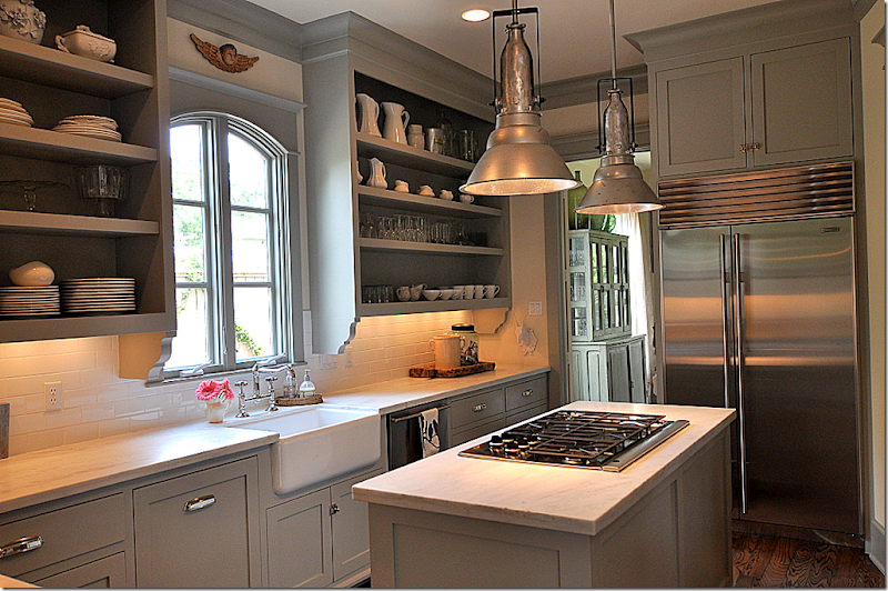
Sally Wheat’s kitchen has spawned dozens of copycats. I can’t tell you how many people have emailed me pictures of their own “Sally Wheat” kitchen.
Like this one, which was inspired by Sally Wheat. Homeowner Sara did such a great job – read the story HERE and HERE.
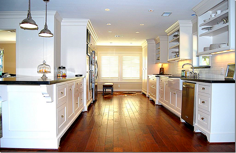
This kitchen in Houston was also inspired by Sally Wheat. Surely this remodeling deserves a magazine story. Read about it HERE.
This Houston kitchen, NOT inspired by Sally Wheat (finally!), is very magazine worthy! A beauty in gray and white marble and black granite, it was designed by Julie Dodson – read the story HERE.
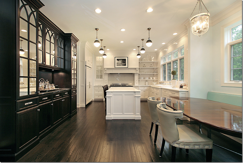
Remember this stunning kitchen in black and white? The homeowner designer in Deerfield, Illinois sent in her pictures. Surely this is more magazine worthy! Read the story, HERE
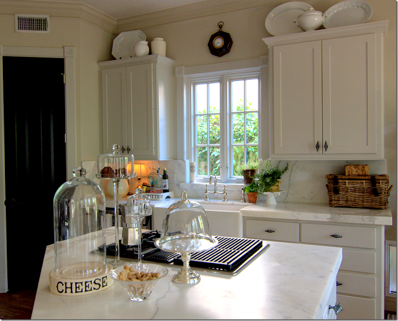
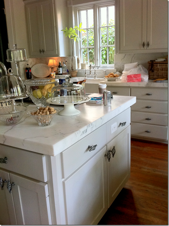
And then there’s this. It’s almost embarrassing to show, but here is my kitchen. Now, keep in mind that since I am a coveritis wannabe, my kitchen is usually not this neat. I edited it for these pictures.
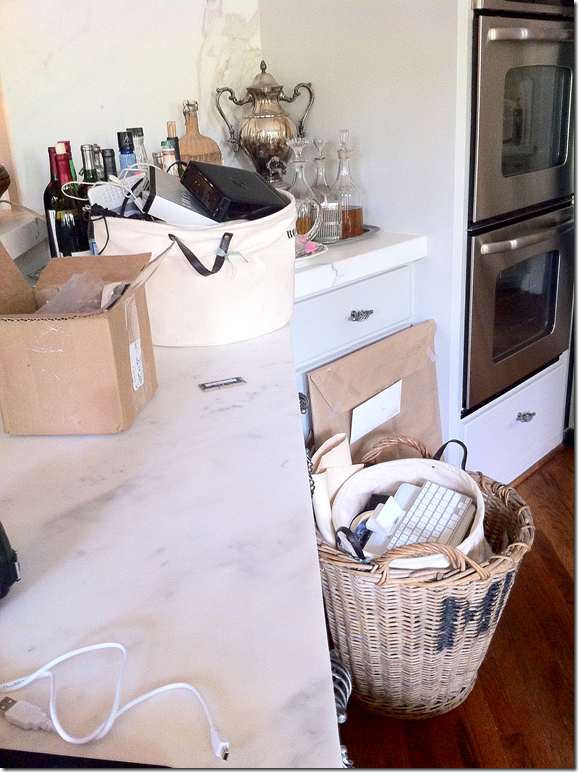
Here’s how it actually looked the day before the photographers arrived.
Edited picture that I took. Veddy neat, but so not reality.
And in this little corner, I certainly edited the space to take these pictures.
Here’s what it looked like the day before the photoshoot.
Cleaned up for pictures.
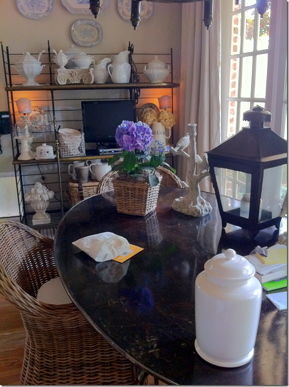
Not so tidy in real life. Before the crew arrived, I had to move the TV, the water cooler, the boxes, the files, the baskets, the lantern, the cloches – all went into the garage.
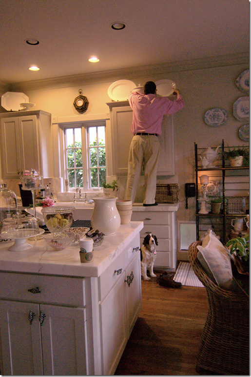
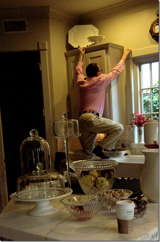
The day before the shoot – the crew came by and we started editing even more. Ben was enlisted to move the ironstone around.
He wasn’t too happy about the photoshoot to begin with, much less helping out, but almost falling off the counter was the last straw for him.
The day of the photoshoot was extremely long for me and the dogs. We are used to extreme quiet during in the day. It took three hours just to shoot one picture – the cover shot. The mess was terrible. Everything from my kitchen ended up in the family room.
Photoshoots are so high tech. The cover shot was approved via internet. Digital photography is amazing – each shot was extensively studied on the computer to ensure its perfection before going on to the next one. The talented Bill Bolin from Bill Bolin Photography HERE was super nice and helpful.
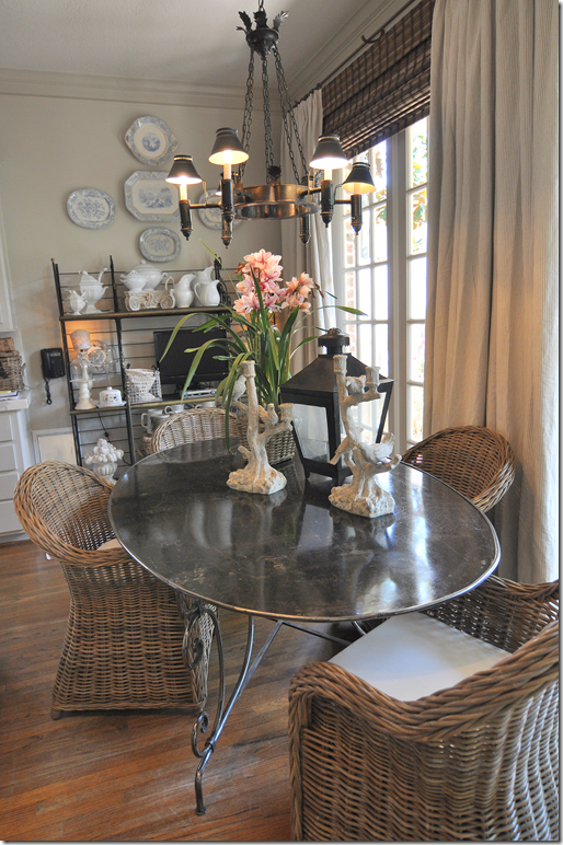
A huge surprise for me was that the art director wanted the old chairs resurrected from the garage – a mixture of both the new Kooboo chairs and the French chairs were used at the breakfast table. I wish I could show you how good the pictures looked! It was amazing how much better the experts made this small space look.
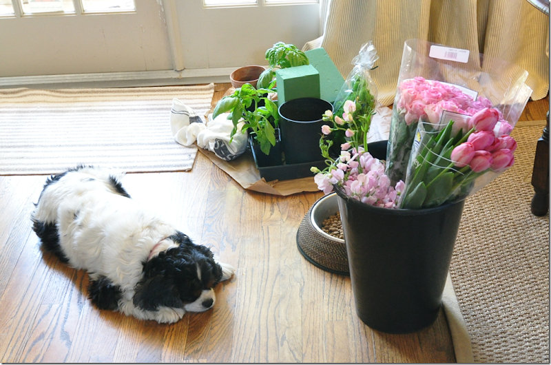
The best part were all the flowers and herbs. Sammie Jo couldn’t be bothered. She’s sooo cute! Stone deaf, but adorable.
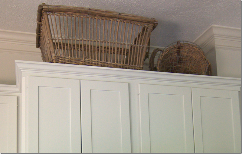
You have to have thick skin when you invite a team of photostylists into your home. The head honcho directed that my baskets come down from above a bank of cabinets. Well…how DARE he??!!!! The large chicken coop basket?? was bought at Joyce Horn Antiques HERE about 15 years ago. Each year my parents gift Ben and I with a check for our anniversary and that year I took the check and bought the only thing at Joyce’s that I could afford – that basket! The other basket is a small antique pet carrier which I love. After the baskets were taken down, I had to admit I liked it better without them, so into the garage they both went – I’m not putting them back out. My garage is such a wasteland.
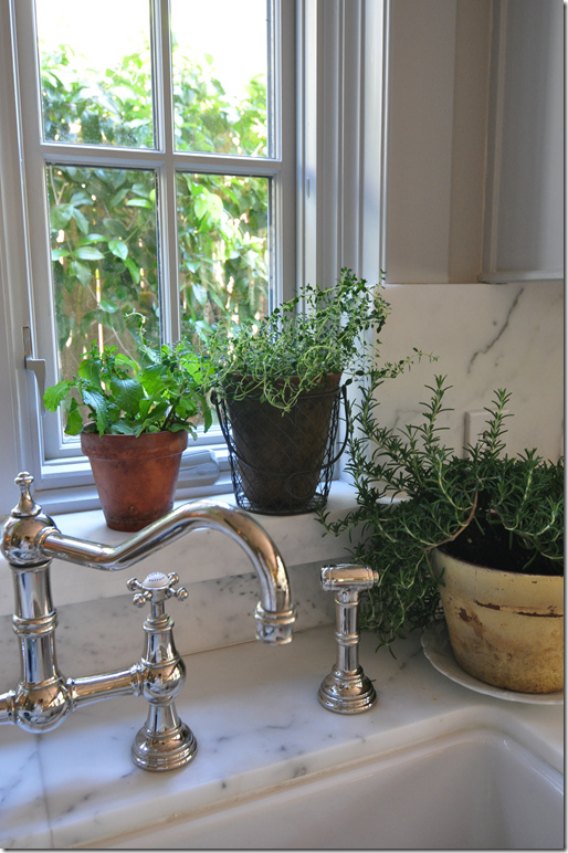
When it was all over and my kitchen was put back together, I got to keep all the herbs. I love them – they are so fragrant.
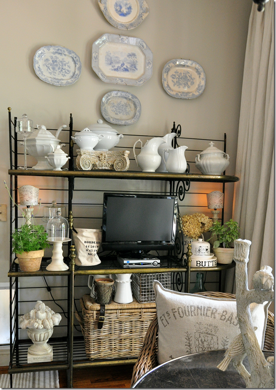
The TV came back out from the garage (which I hate, but my family insists we have one in that room.) The herbs add a nice touch of greenery to the bakers rack. One change that I made for the photoshoot was the pillows from Restoration Hardware which were added to the wicker chairs.
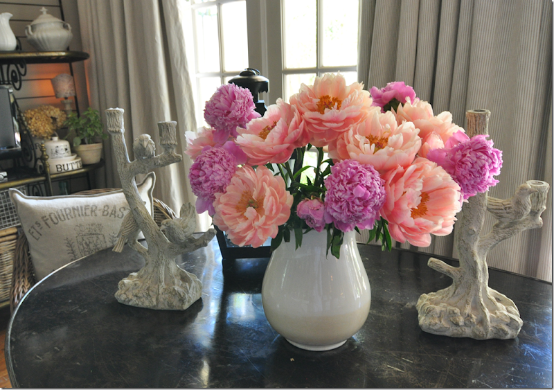
But, the best item left over were the glorious peonies! Aren’t they gorgeous? All in all, despite all the hard work, the photoshoot was a great experience. The photographer couldn’t have been nicer and the stylist Bonnie, one of the best in the business, was very helpful – making me see my kitchen through different eyes. Since I am a die hard coveritis wannabe, a few days later the kitchen was back to looking cluttered and messy, as usual. The story won’t be out until the summer of 2012! Such a long time to wait.
I would love to do a survey – are you a coveritis sufferer or a coveritis wannabe? I wonder which affliction would win???? AND, if you think you have a house or kitchen that is magazine worthy, send me the pictures and I’ll forward them to Bonnie. She’s always looking for new stories to pitch.
A huge thank you to Bonnie, Blaire, and Bill!!!!
AND, NOW FINALLY:
I’ve been so fortunate to host a large amount of giveaways. The gifts have been wonderful – vendors have donated jewelry, antiques, custom paintings, hotel rooms, and even very pricey chandeliers. It’s been great fun to run these contests and I’ve loved that so many of you have won something great. While I usually am on the giving side, I was shocked to hear that I had won a giveaway from another blogger -
.
And no, that’s not me. Snort. That’s a model from from Manito’s web site.
I won this beautiful silk robe made by Manito Luxury Silk & Linen HERE. The giveaway was hosted by Brillante Interiors blog, written by Renaissance woman, Albarosa Simonetti. If you have never visited her blog, do so HERE – she writes about interior design and travel – all with an Italian beat! Thanks a million Albarosa!!!


