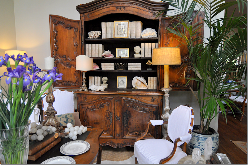
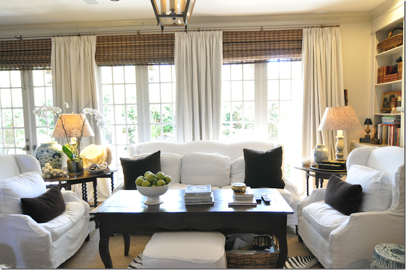
My so-called attempt at less clutter – no colorful Masonware in favor of white books and white shells.
I wrote about this a few years ago HERE, but it doesn’t seem to get any better. Design Schizophrenia. Last time out, I fretted over clutter versus no clutter. What do you do when you love the cluttered look of an old English manor, but you also love the uncluttered look of a Belgian estate? Unless you can afford two houses, you’re out of luck. So, here, several years later, nothing is solved, nothing has changed. Which look do I prefer – lots of accessories or no accessories? When I started slowly redecorating my house last year, I really tried to unclutter. I wanted to get rid of all my accessories and just go bare. It didn’t happen. Yes, I got rid of some things – I put away my blue and white, red and white, black and white, and purple and white transferware – but replaced it with a collection of plain creamware. Not as cluttered looking, but still – a collection. I put away my colorful Masonware and replaced it with white books and white shells. Hmm – still anxious over that one.
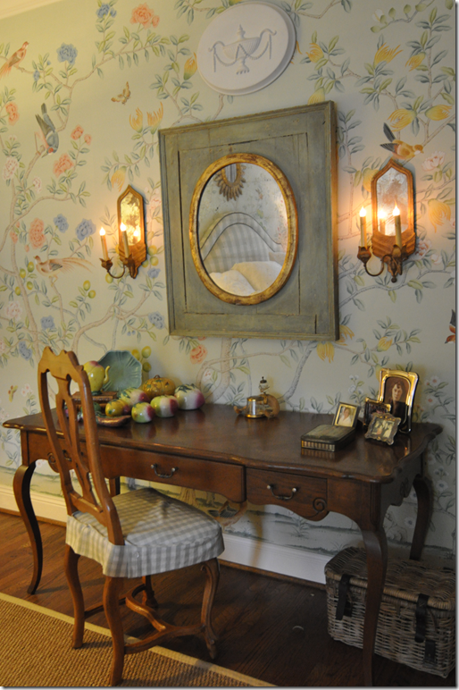
Chinese altar fruit collection came out of storage, despite my attempts at de-cluttering.
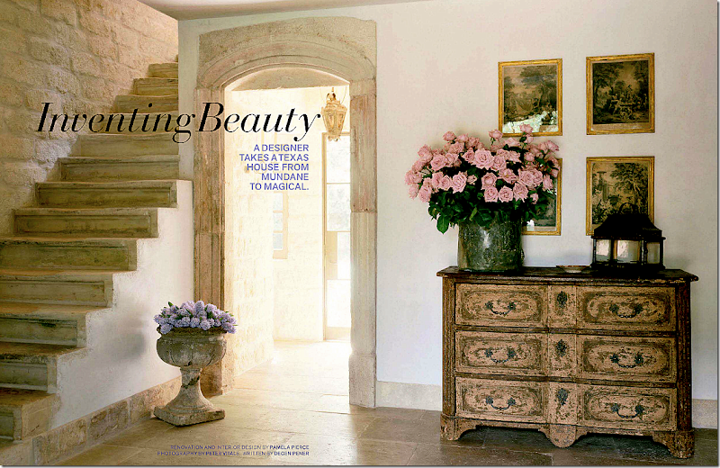
I put away my beautiful collection of Asian altar fruit, but then pulled it out again and moved it to my bedroom to go with my new Oriental hand painted wallpaper. Oh, and my blue opaline is there too, hiding in the bedroom. Shoot me now. I want to go bare, naked as a jaybird (are jaybirds more naked than bluebirds?) but I can’t do it. Why????? I look to my guru, Pamela Pierce, and she has it down, cold. No collections. No little accessories everywhere. Just one or two antiques or a confit pot filled with white roses. Of course her French pots are all gloriously rustic white, while mine are yellow – at least I’ve sold most of them. Whenever I move something around in my house, I hear this little voice, what would Pam Pierce do? Yes, what WOULD Pam Pierce do if she came to my house? HORRORS! A nightmare! Stay away!!! Too embarrassing! Nasty anons who post comments about my house say it’s so boring with just white slipcovers. I take it as a compliment, boring. I want it to be quiet and flowing and restful. It’s not. I’m working on it, though. I wish I were Pam Pierce, the queen of editing. The queen of gorgeous slipcovers. The queen of fabulous antiques that you never see in a shop. Yes, what would PP do?
I love a glorious English garden with roses and flox and wildflowers all in a mess. But….
But then I look at Pam Pierce’s garden. Just box and French jardinières and more box and a few gorgeous antique lanterns. And a simple French iron table. Sometimes simple is much, much prettier. How would you love to walk into this front door each day????
I adore this entry from Lynn Von Kersting – such a beautiful railing with sensuous lines. But….
But…then I see this entry from Pam Pierce – no railing at all. A simple outdoor concrete pot filled with flowers. There are only 2 accessories, plus two pots of flowers. Heavenly.
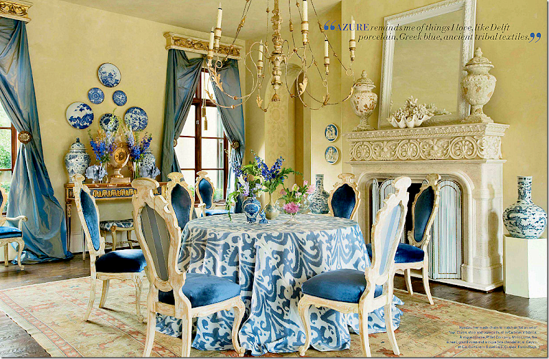
I did a backflip over this dining room by Michelle Nussbaumer. We must be alike, she also likes skirted tables, and I have those same pots flanking the fireplace and a clam shell is on my mantel too. Laughing – we are SO alike! not! I wish though. This dining room is so vibrant and happy. It makes me smile. It’s cluttered in an orderly fashion. It’s soo Michelle.
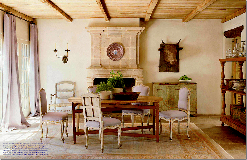
And then I see this dining room by Pierce. Quiet with touches of pale lavender linen. Such a subtle hint of color. Very few accessories. The trolley is actually used to hold dishes and glasses – which become a decorative statement. No accessories that aren’t really used. Lesson to be learned.
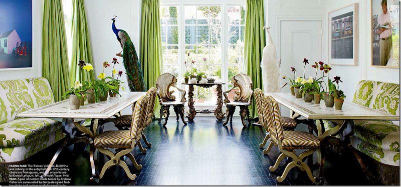
I liked this dining room recently seen in Elle Décor. It’s youthful and fun and creative. Friendly and vivacious.
But would it ever replace this quietly elegant dining room by Jane Moore, another Houston great? One accessory, well two if you count the ironstone pot’s top. The clock and chandelier become the decorative elements – they speak so much louder than a mass of transferware. You appreciate their beauty without having to fight to see it. Lesson learned.
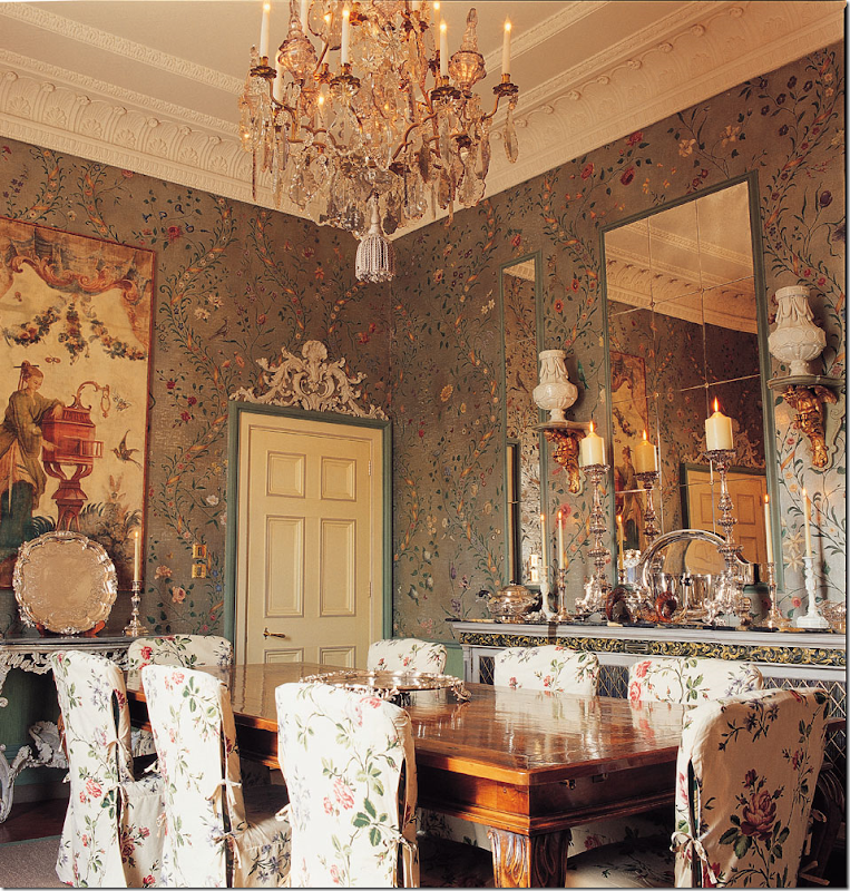
Such a beautiful, classic dining room by Nicholas Haslam. All the chinoiserie elements work together instead of fighting each other. So perfect really – this would be hard to emulate. I love this look until….
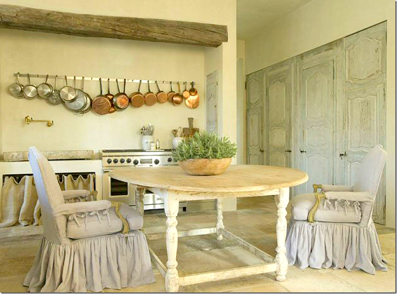
Until, I see this breakfast room by Pam Pierce – and drool. A light –is that lilac or gray linen? colored slipcover becomes the star, along with a set of painted antique doors. The table is a knockout too. No one does slips as pretty as Pierce. I’ve tried to copy them, but it’s hard to copy perfection. Notice how they just slightly drape the floor and how they are gathered in double pleats – or are those triple pleats? Notice the sink on the back wall. And the pots – something utilitarian - becomes a decorative element.
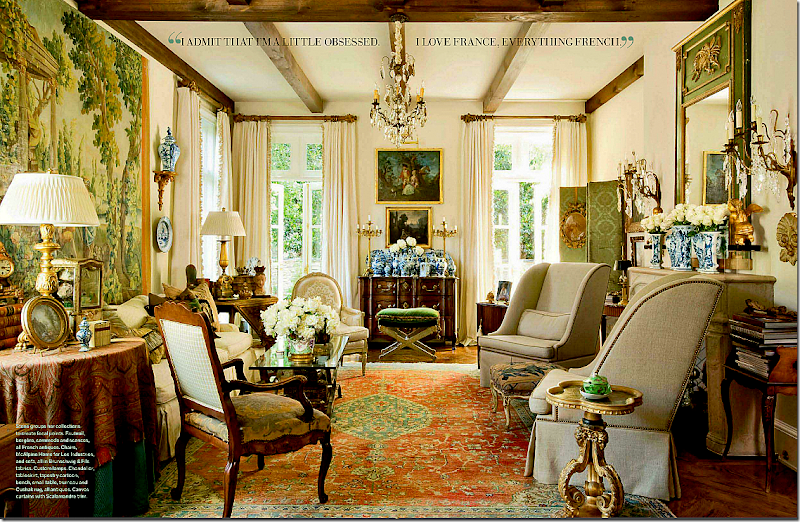
A beautiful French living room, seen recently in Veranda. Makes your heart flutter. That mass of blue and white vases, the collection of English smalls on every table top. Elegant – a collection gathered over a lifetime.
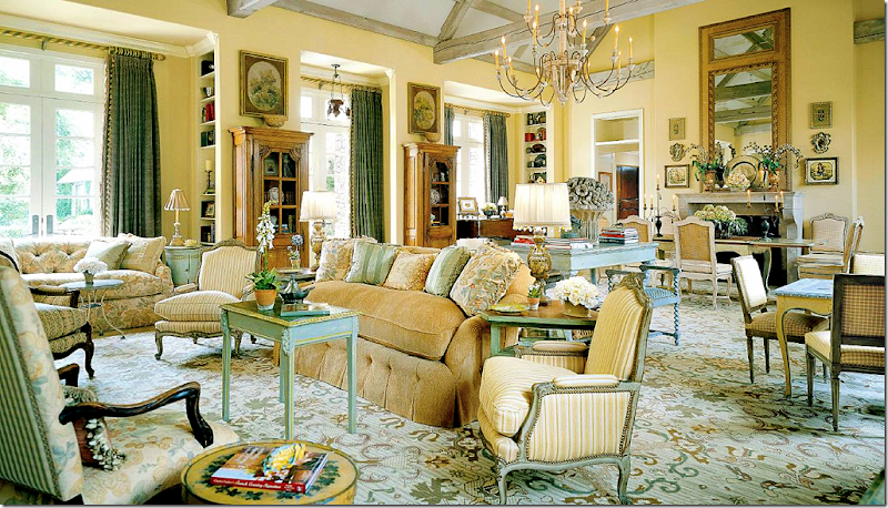
Or this living room by Charles Faudree – the interior designer who invented American French design with his layers of accessories and tables and chairs. so beautiful! Who can resist this? I can’t.
Or this living room, with its mixture of contemporary and antique. Well balanced and interesting, subtle yet cluttered. Loving the mix of the Barcelona chaise with the French antiques. I love this look…
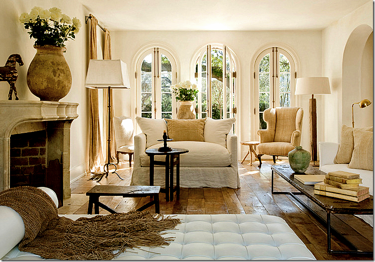
But then I see this living room from Pierce, with its own version of a mix of contemporary and antique. The Barcelona chaise looks perfectly at home with the white linen slipped sofas. There’s even a trendy bricklayer table mixed in with rustic antique tables. The accessories are so subtle, you don’t even notice them – except for the confits filled with white roses. The rough, wide planked floor is left uncovered – adding another subtle decorative element.
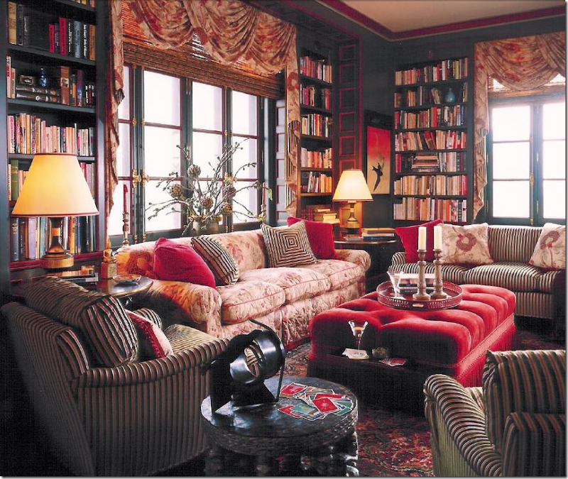
I adore Alessandra Branca’s style. She is one of a kind. Born in Rome she brings a unique European sensibility to her U.S. designs. She loves the cluttered look – enough is never enough. Here she mixes fabrics upon fabrics to create interest and texture. Je’adore!
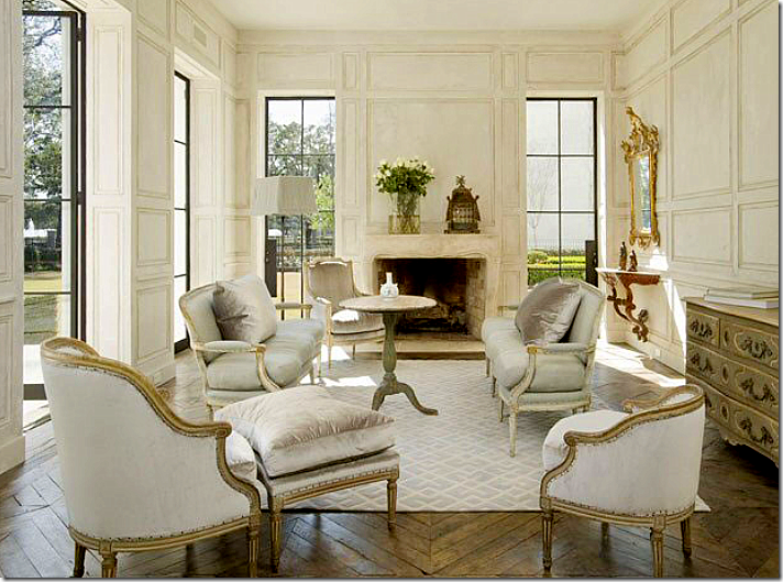
But then, talking of European sensibility. Whoa. Gorgeous. Is this Houston? Looks like France to me. Love how Pierce separated the French Duchesse en Brisee into two areas. Notice how high and deep her down cushions are! Love the tall Swedish table in the middle of it all and the subtle gray and white rug. The architecture – the walls, the windows, and the floors add to the perfection.
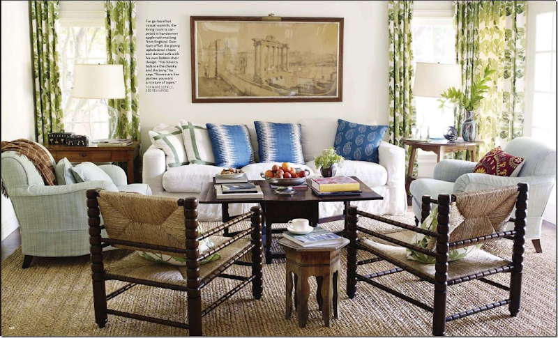
I love this busy family room by Peter Dunham. Love his fabrics, his mix of patterns, his apple matting – love it all. Cluttered, yet interesting, comfy and warm.
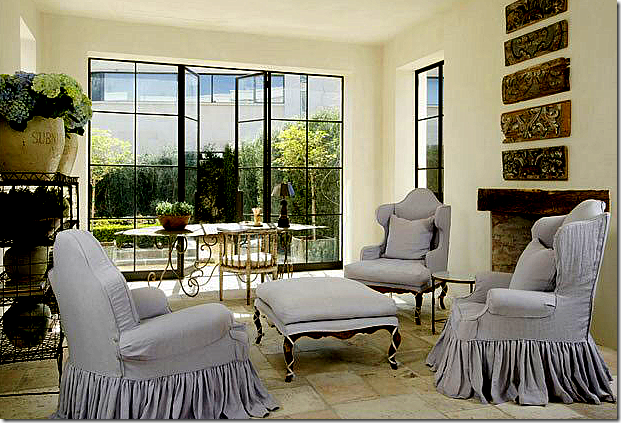
But, then I see this sitting room by Pierce – with more beautiful slipcovers – again, double pleated, slightly draping on the floor. She takes four different pieces and creates a set with the matching slips. The steel windows are left uncovered, as are the floors – each adding important texture. Her bakers rack is filled with confits and flowers – that’s all. I love how Pierce never uses patterned fabrics. Just linens and sometimes a touch of silk velvet. Love that.
I mean, I try. This is my coffee table EDITED. Too funny!!! The more I edit, the more things grow and multiply. I can’t seem to give anything up. The more I put away, the more I seem to have. I need Pierce’s touch. WWPPD?
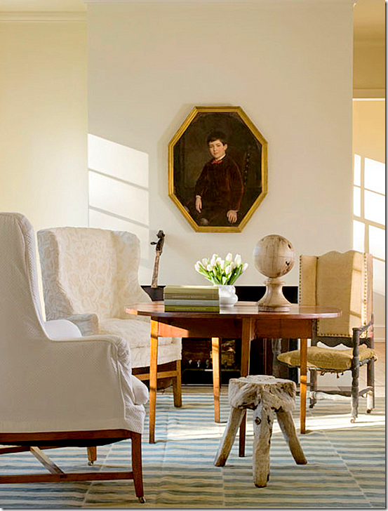
Here’s how Pierce does a coffee table, interesting, simple. This room has a masculine vibe – as if it’s a man’s study perhaps.
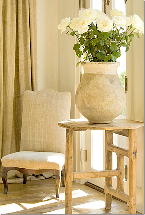
Or a side table, with just one perfect pot and twelve white roses.
Or here, with one sconce and a few pots. I’ve never seen a sconce this beautiful in my neighborhood antique stores. Where does Pierce find such perfect things? Such a perfect vignette.
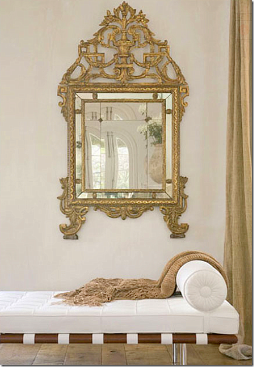
Makes me want to go get the Barcelona chaise in white. And that mirror too, if I could find it. All photos of Pierce’s work are by Peter Vitale, author of that great book The Divine Home, HERE. Vitale also does interior design, very similar in feel to Pierce’s work – uncluttered and peaceful with a mix of beautiful antiques. Vitale’s web site is HERE. Pam Pierce’s new web site is HERE where you can see many more pictures of her work. I could stare at her web site for hours on end and sometimes do, just hoping to soak up some of her talent.
Well, I am thoroughly depressed now. I get that way when I see pictures of a designer whose work I greatly admire! I want to be that talented! I guess I should be thankful I’m not competitive by nature or I would have an ulcer by now. What is your design schizophrenia? Are there two looks you love that contradict themselves? Or do you just like one style and stick with it (much better if you are like that.) Is there a designer you really admire? Would you be embarrassed to have them to your house? I have a whole long list of Houston designers that aren’t allowed anywhere near my house! Not even counting the national ones like Buatta, Easton, Moss, et al. Forget them! If they want to come over for tea, we’ll just have to meet at the Four Seasons. Period. No exceptions.
The last blog story featured a barn door in the foyer. Here I wanted to show you this barn door by Martyn Lawrence Bullard that he put in the family room leading into the kitchen in Ozzy Osbourne’s house. Isn’t it great? Love it!! Featured in Architectural Digest.
And finally…..
Houstonian Leslie Sinclair, of Segreto Finishes, has recently completed her first book! Probably most of the better houses in Houston that I've featured had walls done by Leslie’s company. Segreto specializes in gorgeous plasters and fauxs on wood. Their work is all very subtle – adding a layer of texture and a sophistication to the house. The book is filled with page after page of some of the most beautiful houses. To preorder, go HERE. Be sure to look at the schedule of book signings. Congratulations Leslie! You’re the best!!!
Design Schizophrenia: WWPPD?
MORE Ikea Tales, Part Three
Continuing on the theme with tales from IKEA, I want to show you a kitchen that was completely updated, all in IKEA appliances! Did you even know that IKEA sold appliances? I didn’t. But apparently, they are Whirlpool product, which is quite a reputable firm, plus they have a 5 year warranty. The homeowner Christy writes a blog Beach Brights HERE where she detailed the remodeling of her entire house. The couple and their child moved to Houston just one year ago when they bought this older home in need of much cosmetic updating. Beside all the surface renovations, the kitchen and one bathroom needed major updating. I was going to only show her kitchen for the Readers Kitchen Series, but I really thought you would love to see her decorating. She obviously loves black and white as you will soon see. Enjoy!
Here is how the owners found the house, hiding behind overgrown bushes!
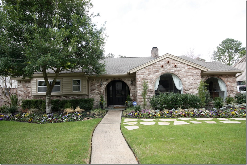
And today – the house looks completely different with the windows and front porch exposed. All new landscaping was installed, as was the stone walkway.
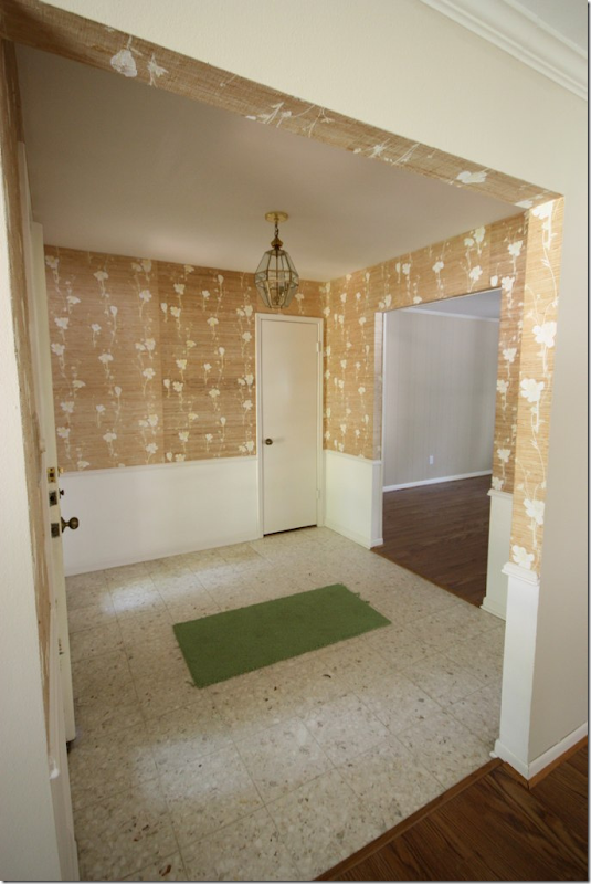
BEFORE: The entry hall was pretty dreary with the wallpaper, chandelier, and dated flooring.
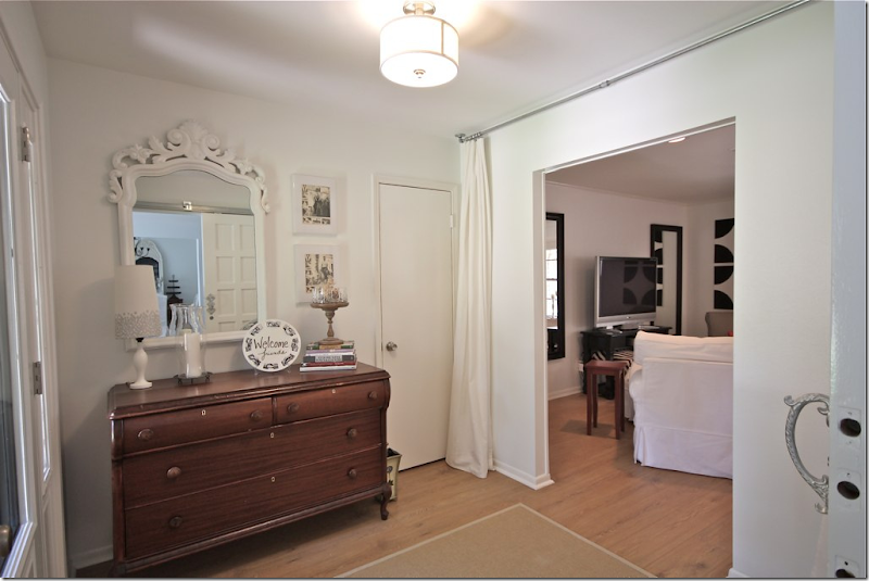
AFTER: The wallpaper is now gone and so is the tile floor – hardwoods now lead into the adjacent rooms. I love the curtain – it softens the room and is a great inexpensive way to add drama. The light fixture was also updated.
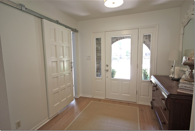
Looking the other way, the owner added new front doors and a barn style door to close off the hobby room.
What I love about Christy’s blog is she gives you her inspiration pictures. Here is one of her pictures of a dream entry. It really does look like what she ended up with! With the Pinterest craze – there are so many images on the web that can give you a direction to go on. With a little imagination, you can take those dreamy pictures and change your own house!
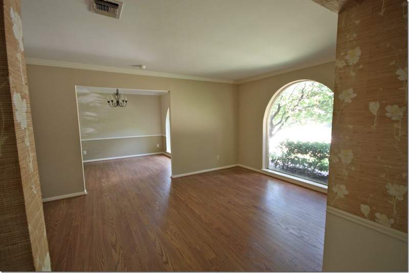
BEFORE: There was a living room/dining room combination which is a typical floor plan for Houston houses built in the 50s –70s. I’ll bet 90% of houses built in Houston during this time frame have this same exact layout. Today, many people are turning the unused living room into the dining room – and turning the smaller dining room into a library/study. This homeowner did something different:
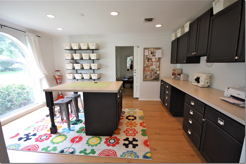
AFTER: Instead of a wasted living room, the owner opted to make this her craft room/office.
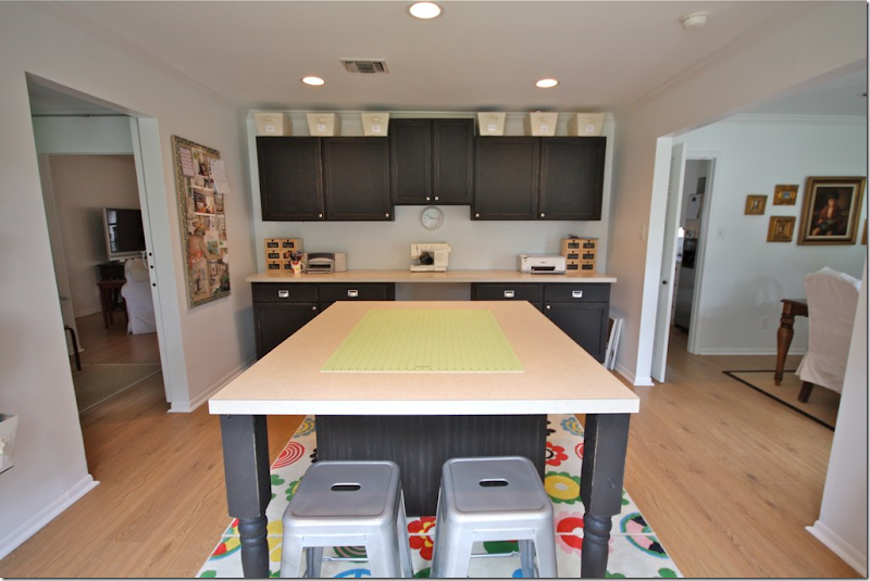
Here’s another view of the craft room. What a great space to spread out and sew in. It’s all so organized and neat with the built in cabinetry. I would love a space like this for my design office!
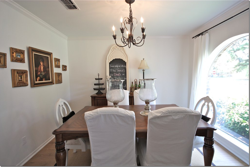
AFTER: The dining room is off the craft room and the kitchen.
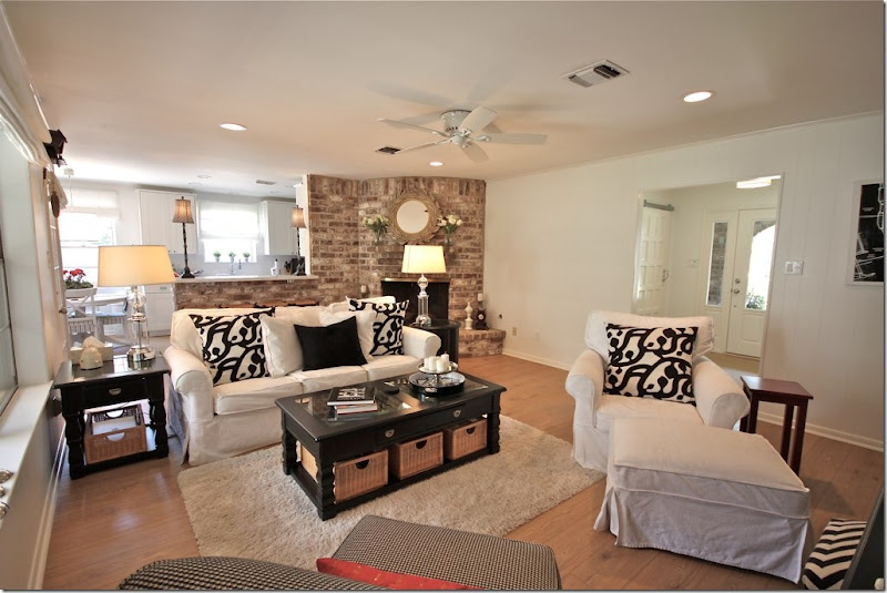
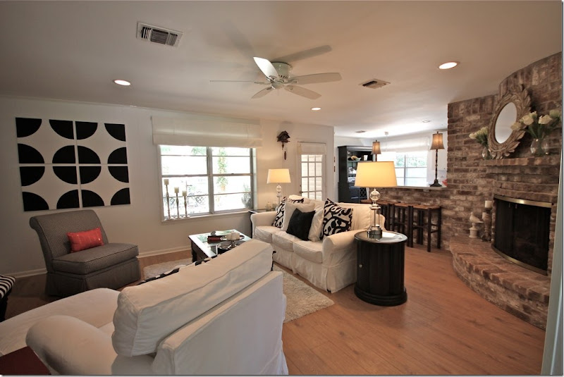
The family room is off the entry way. The kitchen is past the fireplace. I’ll show the kitchen last. As you can see, the homeowner really loves black and white and she used these two colors throughout the house with helps to unify the rooms and create a strong design theme.
Curved fireplaces like this are dated and hard to work with. The homeowner chose to ignore it rather than place her furniture around it. This helps to make it disappear. Notice the art work on the wall.
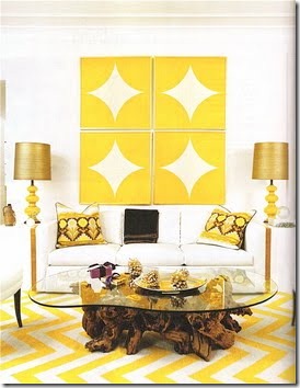
The homeowner created the art work herself after seeing this picture – again, a great way to get real inspiration from a magazine – and use that inspiration!
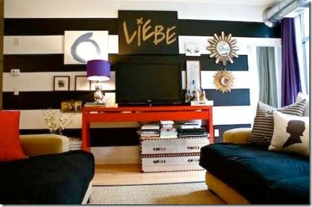
Another inspiration picture. The homeowner loves stripes and wanted to incorporate them into her new home.
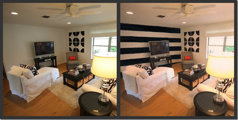
First, she considered painting an accent wall with stripes. She created a mockup image on her computer and asked her readers for their opinion. In the end, she used the striped walls in another area of her house, see below:
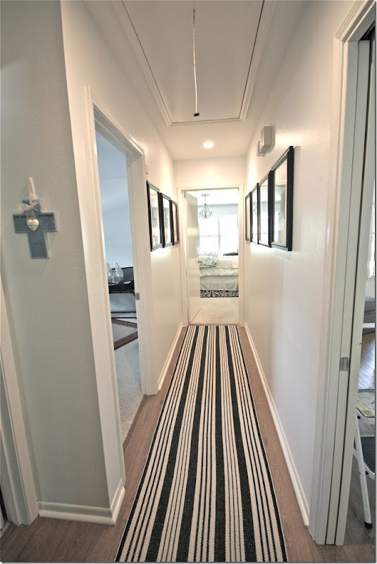
BEFORE: The hall leading off the bedrooms looks fresh with the striped black and white rug.
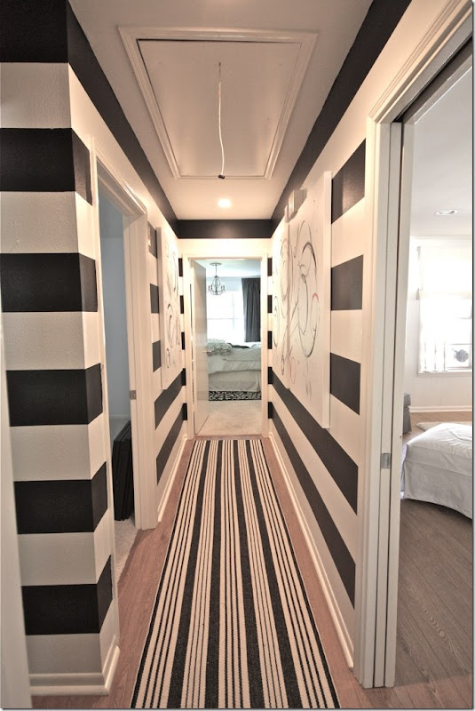
AFTER: But, after painting the hall with the black and white stripes, it becomes a fabulous decorative space. The family room – through the door on the right – looks out on the striped walls.
And looking the other direction. Large contemporary canvases line the walls and break up the stripes. The homeowner created the canvases herself – I think she did such a great job. This looks like a house that could be in domino or Lonny!!
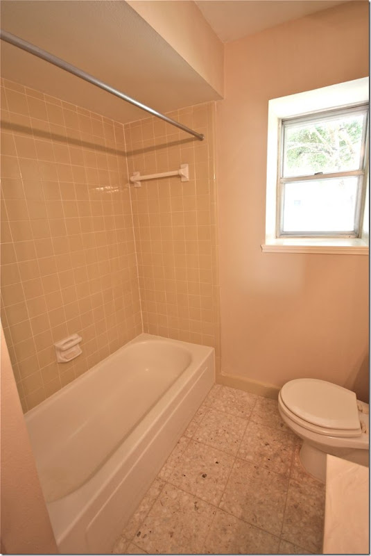
BEFORE: The children’s bathroom needed total gutting to update it.
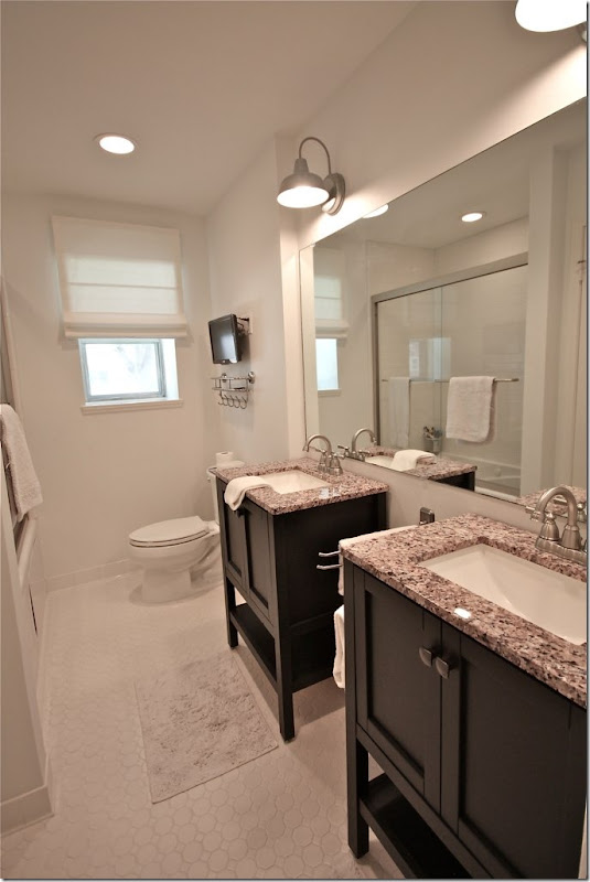
AFTER: Look how cute!!! I love those light fixtures and the sink consoles. Christy doesn’t say where she got the sinks but they really make the room! Before there was just one sink – now they have two which is so much better. Love the tile floor and the small flat screen too.
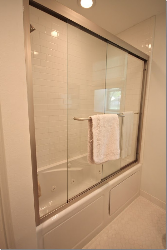
Here is the new tub. Great door.
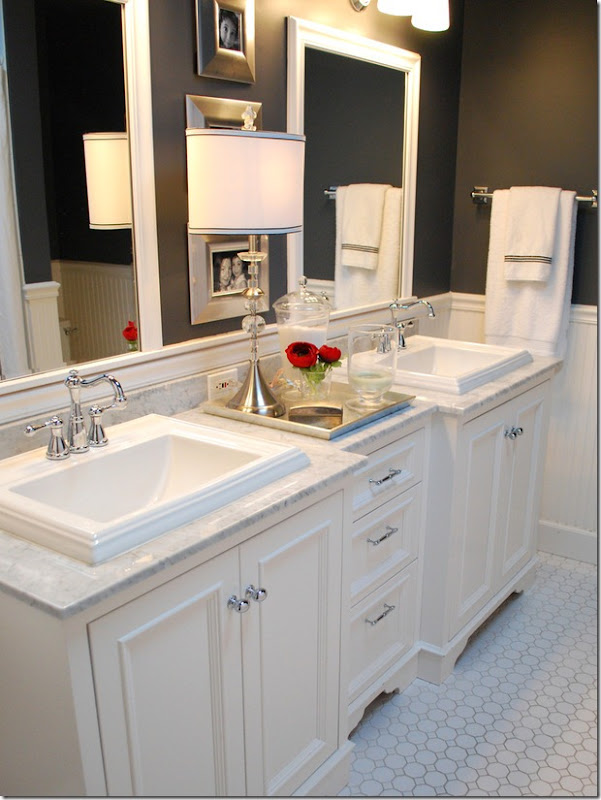
The inspiration picture. While the homeowner went light, not dark, the tile floor is the same.
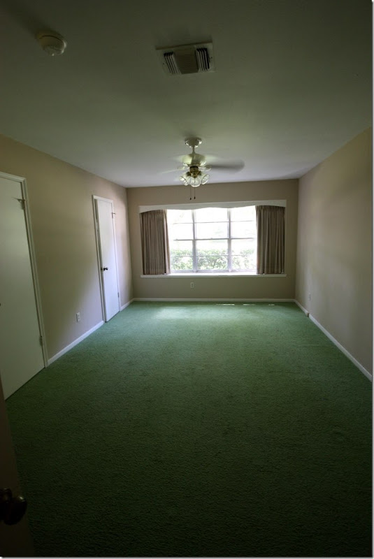
BEFORE: The master bedroom was a sea of green carpet.
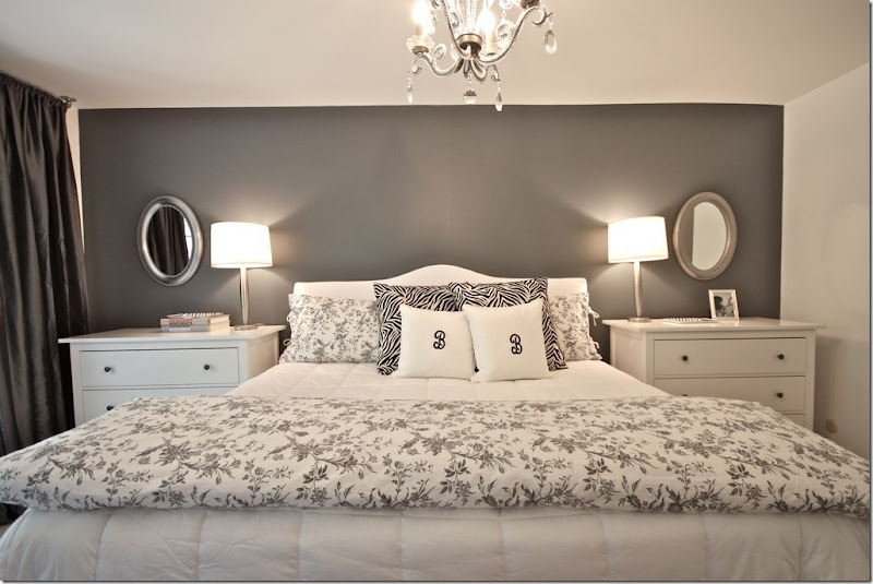
AFTER: Now, the master bedroom is sophisticated with a dark gray accent wall. Love that. The chests and bedding came from IKEA. I think that using chests is a great idea instead of small nightstands, plus they are so practical. But, besides that, they just look better – nice and big and tall like that!
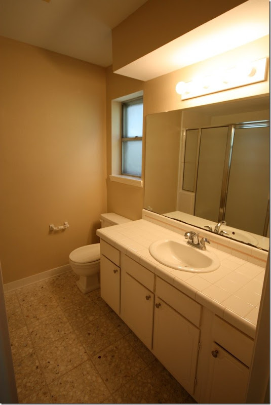
BEFORE: The master bathroom.
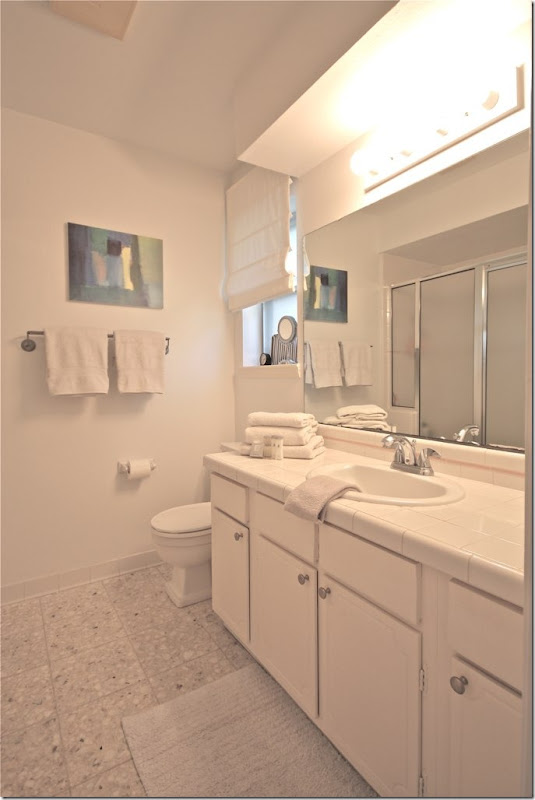
AFTER: The homeowners didn’t do much more than paint and add white shades – but doesn’t it look different?! Amazing what paint will do to a room. At first glance, I had thought this was completely updated.
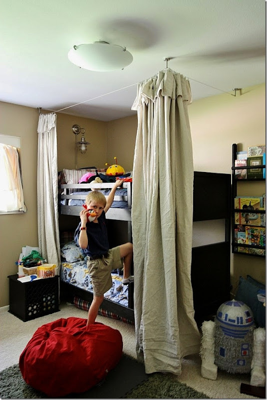
The son’s room is so cute – IKEA bunk beds and drop cloth canopy or “fort” as he says. Love the light over the top bunk.
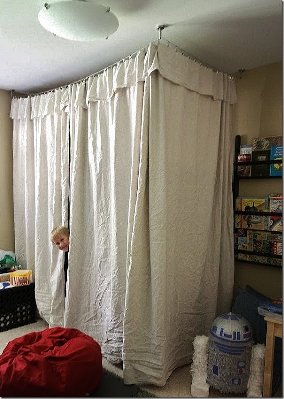
Look how cute it is closed! No hemming or sewing was done – just hanging!
THE IKEA KITCHEN:
ok, ok, I know this is what you really want to see:
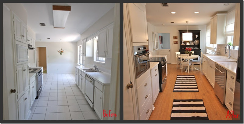
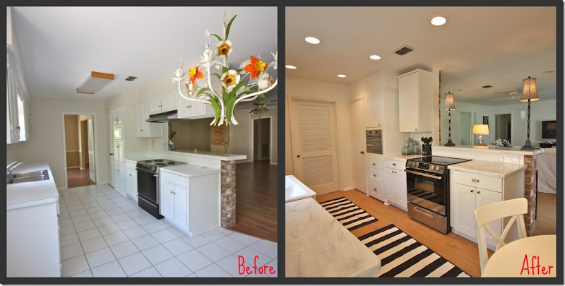
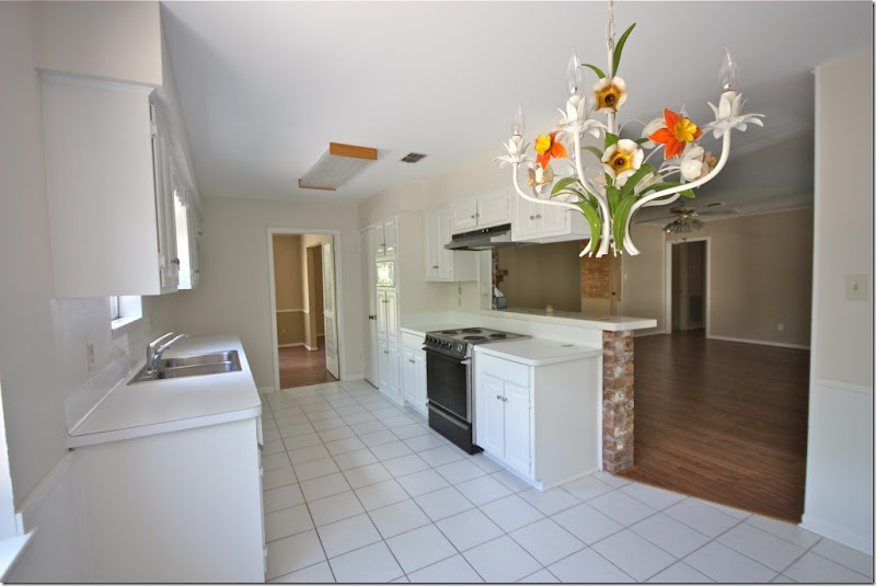
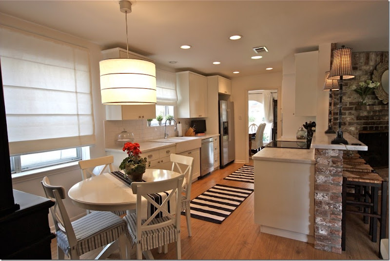
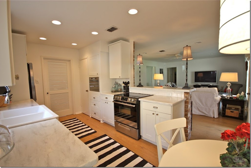
Here is the kitchen that IKEA built. Before and after. The entire kitchen was gutted. New floors, new cabinets, new lighting, new appliances. The owners did most of the work, the installing, etc. Here is the cost breakdown per the homeowner: The cabinets & appliances cost $6,200 (tax & delivery). The counter top was around $62 linear ft. The flooring was around $4-5 sq. ft.
The black hutch and striped rug continue the design scheme.
Before and After
Here is how the homeowner ended up at IKEA in her own words No one wanted to take her money:
It started with my appointment with Lowes. I told Ben, my kitchen designer, that I was not crazy about Kraftmaid cabinets. The price is a little high and the finish for what I want is not great. So, what does Ben price out for me? Kraftmaid. When I ask him to re-do the quote, I received a lame attempt of re-working my design and quote. He also would not help me with appliances. So, I left frustrated, rushed and without a firm quote.
So next up is Home Depot. I call my nearest Home Depot to make an appointment with a kitchen designer and I am told by the person answering the phone that they can't make me an appointment. I was like, "What?" I just want to make an appointment...for you know, a future date, to design my kitchen and spend my money. He told me that the kitchen designer was not in today and he did not know when he would return or how to make an appointment. Really? So, I tweeted Home Depot, got a response to the effect that they were sorry and would make the appointment for me. I never heard another word.
Ok, 0-2. Next up is Best Buy. I thought that surely with all the advertising dollars being spent by Best Buy to describe their stellar appliance knowledge and customer service, that I would at least be able to get my appliances ordered. That was a huge debacle. Let's just say that the kid working in cameras who covers appliances doesn't know squat.
This leaves me with Ikea. Not because I want to save money but because I am better off just doing this myself.
BEFORE: The view towards the family room and the dining room.
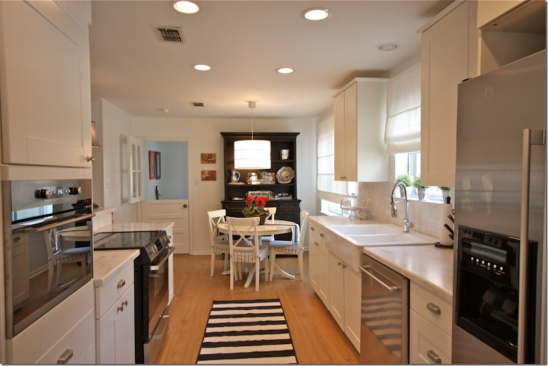
AFTER: I love the light fixture and the white shades! The light fixture, table and chairs and rugs all came from IKEA. The shades throughout the house are from Payless Décor.
AFTER: The view overlooking the family room.
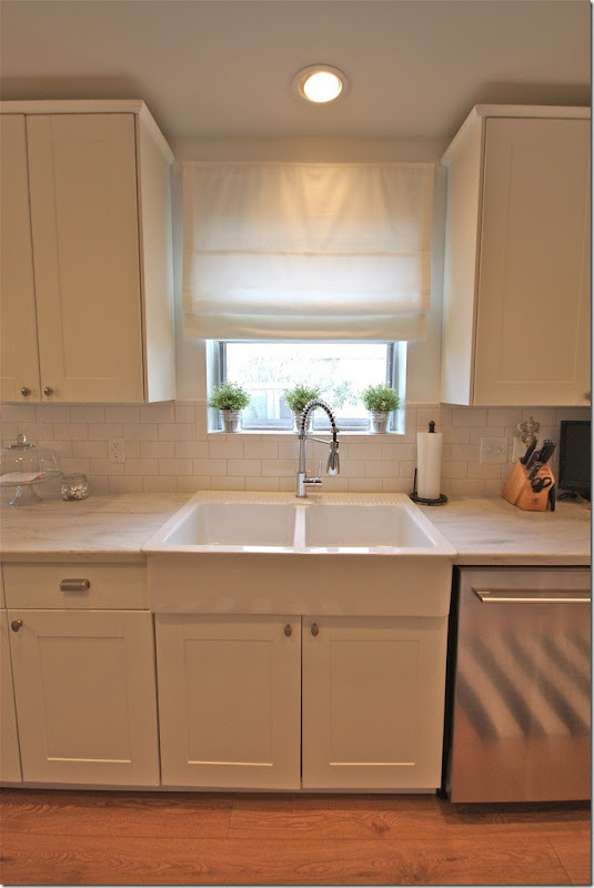
I really love the sink and faucet! The faucet is from Overstock and the sink is from IKEA: (not on internet, it's called DOMSJO) @ $299.
DETAILS – in the homeowner’s own words:
When I was appliance shopping I went to Home Depot, Lowes, Sears & Best Buy. Home Depot & Lowes sometimes have great prices on appliances that have been returned or when a special order goes wrong etc. So, I was shopping the bargains. I found several great deals but then it was always a hassle. They would not load or deliver etc. etc. So I gave up and ventured over to Sears. I felt that the prices were high and delivery was going to cost me around $500. Really. Also, several of the appliances I was interested in had to be special ordered. The salesmen work on commission and one day "my guy" would be there, the other day he would not. It was just a pain. This led me to Best Buy. WHAT. A. JOKE. I don't know how these places stay in business. I waited around for a full hour for someone to help me. Then the manager sent the kid from cameras to help me. Yes, you guessed it. I walked out of there vowing to never return.
Enter IKEA. It was easy. It was fast. Everything is in stock. Delivery was $30 (including all the cabinets). It was priced right. After about a 15 minute wait, I had the BEST sales person in the world helping me pick my appliances. (Note from Joni: so glad her experience at IKEA was easier than mine! Don’t judge IKEA by me!!)
(And one other NOTE from Joni: I ordered all my appliances from Best Buy – but online. No hassle. Except that they didn’t tell me that in Texas they don’t install, just deliver. So, that night I had an oven, a dishwasher and a refrigerator just sitting in my kitchen. I wanted to cry! I had to find an installer fast – which I did, online, – and thankfully he came out that night and did the deed.)
More IKEA details from the homeowner, in her own words:
1. What's online is in the stores. In-stock. Can you say "same day!!!"?
2. Ikea appliance are made by Whirlpool.
3. Ikea appliances come with a 5 year warranty.
4. I did have an issue with my stove. The clock was not keeping time correctly. I called the 800 number that came with my paperwork (it was actually Whirlpool). They sent A&E appliance repair to my house within 2 days. The repair man had to order a part that arrived at my house within 2 days and he came back on the third day and replaced the clock. It cost me nada.
5. It has been six months and my refrigerator water filter needs to be replaced (at least that is what the indicator light tells me). I am not sure where to buy one. I will have to research it but I am not worried.
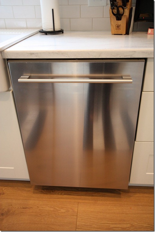
“Dishwasher $649: I am telling you, you can fit anything and everything in this baby. I have never owned a dishwasher that can take this many dishes. My only complaints for the money, I would expect it to be quieter and the silverware basket could be taller.”
NOTE from Joni: I love the handle on this dishwasher, along with the hidden dials. I am attracted to the handles on appliances and use that as a reason to buy one appliance over another. Stupid, I know! But this is really a pretty dishwasher, IMHO.
“Refrigerator $1399: This is counter depth. I dare you to find a refrigerator that is counter depth for this price.”
Another Note from Joni: Great handles again! I would have ordered one without the water dispenser to keep a cleaner line. But then of course, you have to have that awful looking water dispenser from Ozarka like we do!!
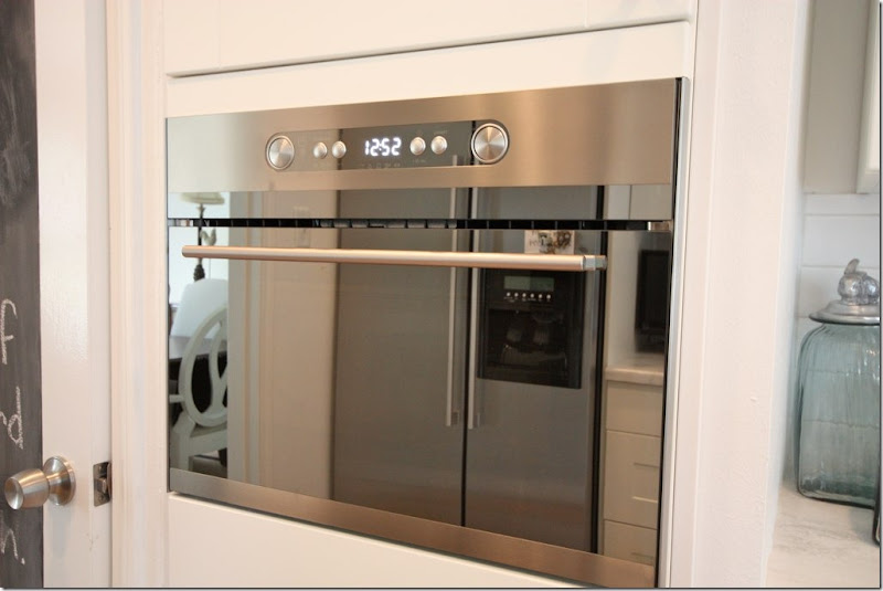
“Built in microwave: $649: I love the look of this little beauty. It's a little complicated to use. I have to post a cheat sheet inside the cabinet door above.”
Note from Joni – another pretty handle. And notice, recently the pantry door got a coat of blackboard paint. Great idea, plus it adds just one more touch of black and white.
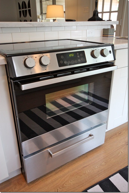
“Ceramic Glass Top Slide-in Range $799: I think the oven cooks a little high. But then again I tend to over cook everything anyway. But this is my story & I am sticking to it ;)”
Note from Joni: I’m not even going to mention the good looking handle.
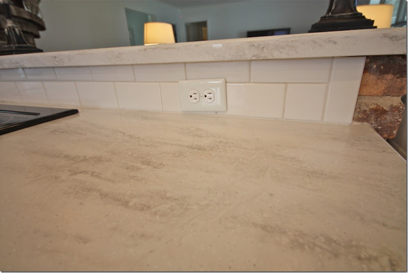
“Countertop: Corian (Home Depot, includes installation)”
Note from Joni: I love the countertop – this is a great alternative to white marble – especially for those scared of marble!
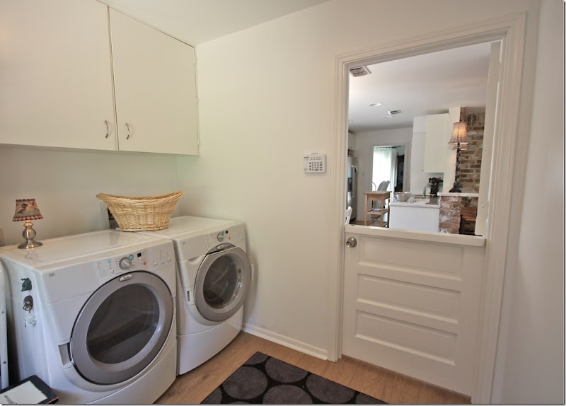
The laundry room, behind the cute Dutch doors.
MORE Sources:
Cabinet Hardware: Ikea, ANTIK & GREJ
Flooring: Armstrong
Breakfast Light Fixture: Ikea
Breakfast Table: Ikea, Table, Chairs, Chair Pads
Rugs: Ikea (older, not available)
Cordless Roman Shades: Payless Decor
Appliances: Ikea (Micro, Fridge, Dish, Stove)
Cabinets: Ikea
WOW! I love what they did with their kitchen and house. A huge thank you to Christy for sharing this story of their renovation. It’s amazing to realize they have only lived in this house for one year!
If you live in Houston and surrounding areas, be sure to visit her blog HERE to see all the tradesmen who worked on the house – the landscaper, the painters, the electricians, the plumbers and more! It’s a great list to have if you are getting ready to remodel in this area. To see more pictures of her house, be sure to visit Christy’s blog Beach Brights.

