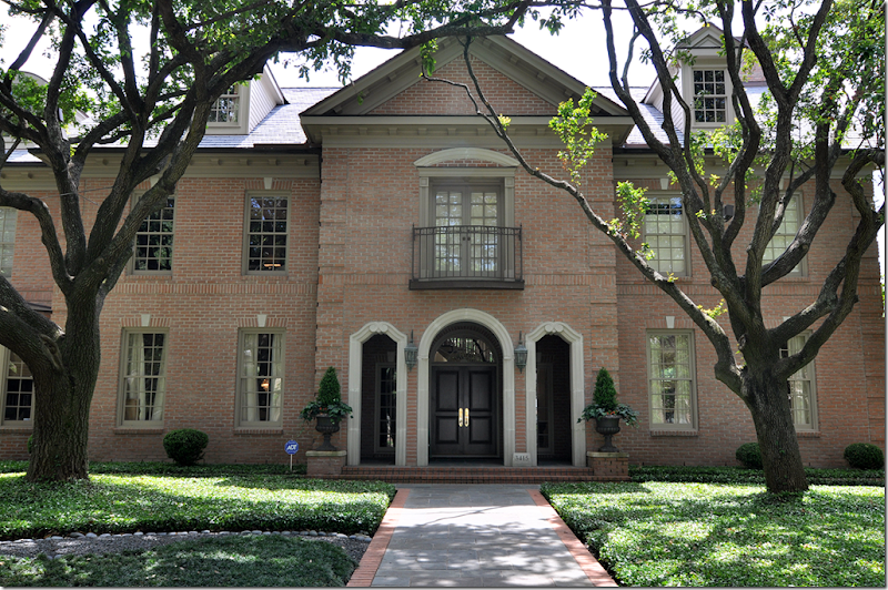
After previously showing a few of the homes on this year’s West University Home Tour – I am so excited to show you one more! I had to wait a while on this one because the house was published in a magazine. But, I have more photographs than they do – maybe not as GOOD as their photographs, but I have MORE!!! As you can see, this is a large house – especially so for West University. The L shaped house sits on a double lot therefore, it is wide and very spacious, another rarity in this neighborhood. The owners moved here from New Orleans after Katrina devastated their town. Their first house in Houston was on a much smaller lot, but even then, it wasn’t a typical West U floor plan – it was very original and also very beautiful. After a few years there, the family wanted more room to spread out – so they moved here, just a few blocks away. The homeowner, Laurie Pearson, is an interior designer and she remodeled many areas – the kitchen was completely redone under her hand. The Georgian house is very sophisticated, yet warm and family friendly. Contemporary art work is found throughout, providing a nice mix to all the French antiques. I hope you enjoy this latest installment from the W.U. Homes Tour!
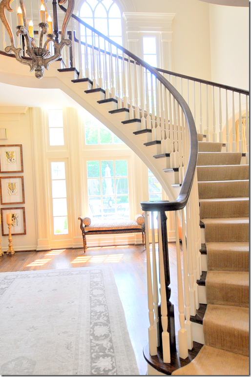
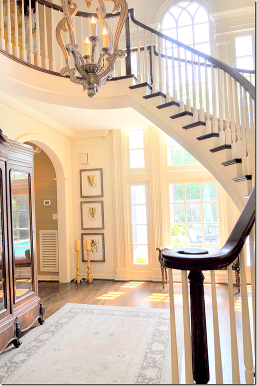
The striking double height entry hall with its floating staircase sets the tone of the house, filled with antiques mixed with contemporary art, it overlooks the backyard pool.
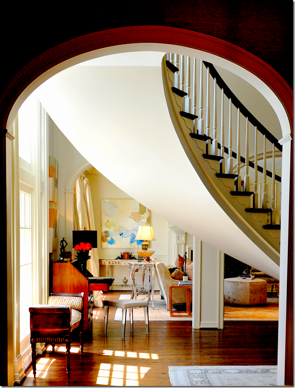
Through graceful arches, the living room is to the right, while the dining room and the family room are to the left.
This picture, taken from the family room’s hall, looks into the living room. You can partly see the dividing wall between the entry and the living room with its three graceful arches. I love the way the curve of the stairway looks from this angle. The stairs are so gorgeous, they are truly the focal point of the entire house.
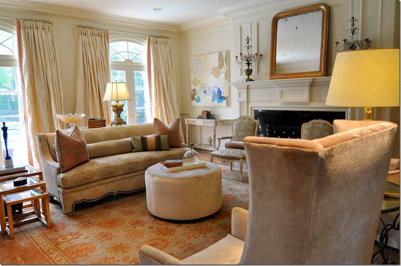
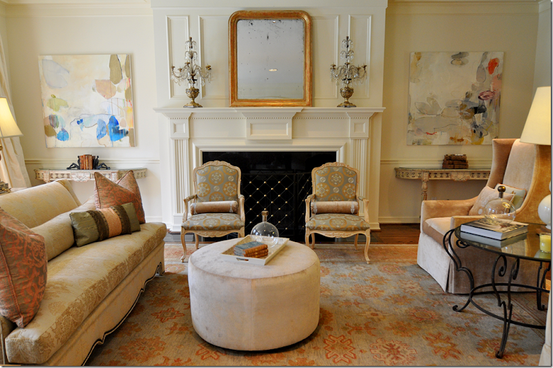
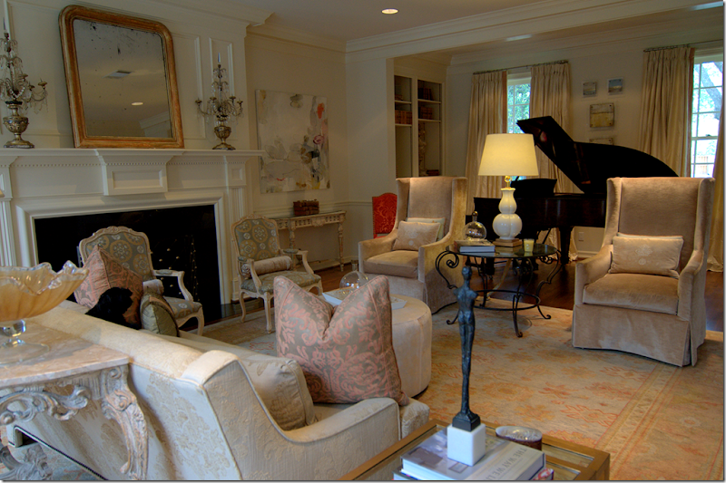
The living room is filled with soft colors taken from the Oushak rug. Fortuny pillows mix with luscious silk curtains and velvet clad chairs.
Flanking the gracious mantel are painted antique consoles topped by contemporary artwork. A velvet ottoman takes the place of a coffee table.
There is an alcove, with a piano and bookshelves, that faces the front street.
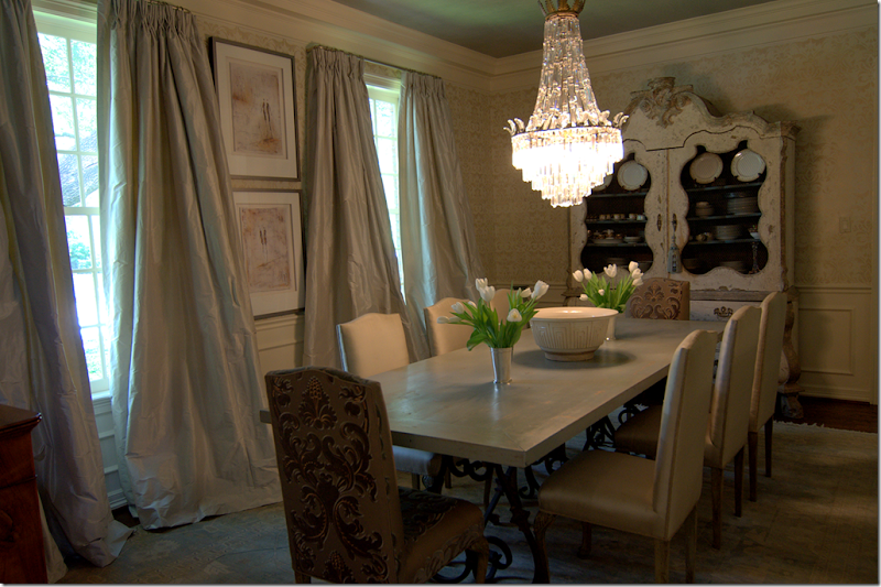
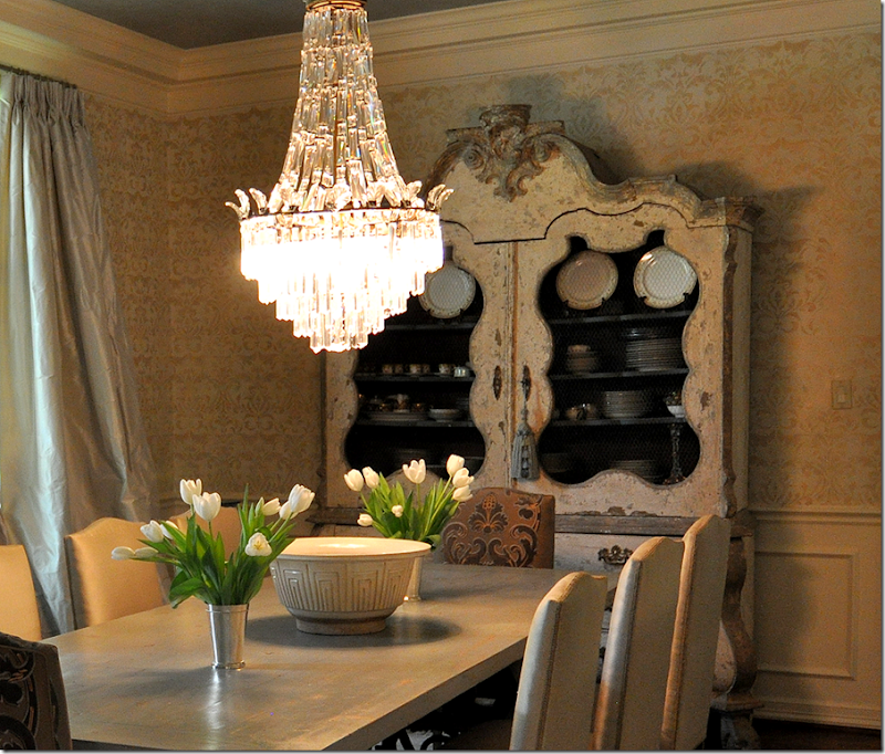
Across the entry hall is the large dining room. This is one of my favorite rooms in the house. The silk curtains are fabulous – I love the way they drape and fall, just slightly, very slightly in a short puddle on the floor. The wood topped table has a French scrolled iron base. Again, there is a muted rug underfoot.
Here’s a closeup of the most gorgeous painted armoire! I absolutely LOVE this piece with its screened doors and curvy lines and just a hint of blue paint. I want to steal it!
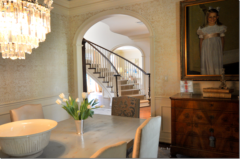
The view back towards the entry hall and into the living room. A daughter’s portrait sits over the chest.
Another view showing the icy blue curtains.
Here is a close up of the wall treatment. Not wallpaper, the walls were handpainted in a damask pattern by Segreto Finishes HERE, the ceiling was done by Imago Dei, HERE.
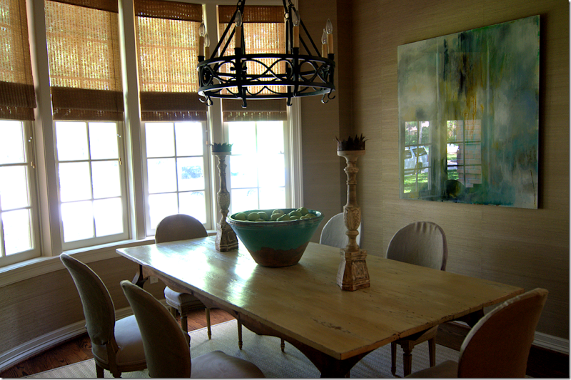
Past the dining room is another eating area off the kitchen. This room faces the front street, you can actually see my car in the glare of the painting! Sorry there is such a glare (I guess that’s why you need a professional photographer!)
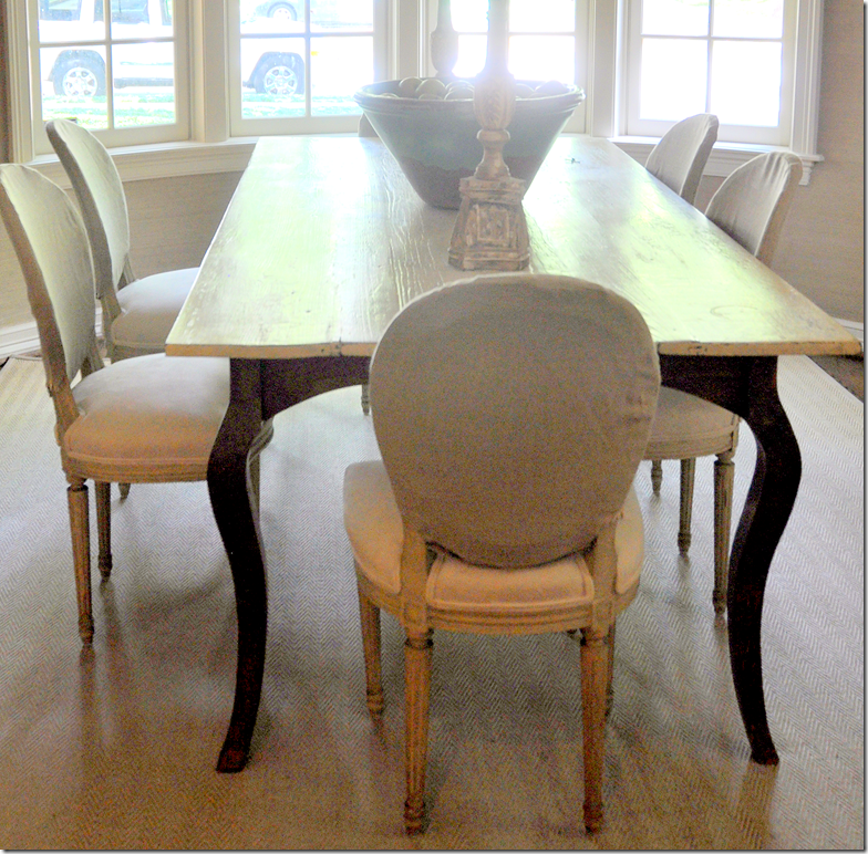
Notice the way Laurie slipcovered her chairs, just the back is covered in a linen. It’s subtle, soft, and pretty! The walls are a grasscloth paper and underneath is a textured, herringbone patterned rug.
The kitchen was completely redone by Laurie. The cabinets are stained a light color and the glass in the upper cabinets opens the kitchen to the family room.
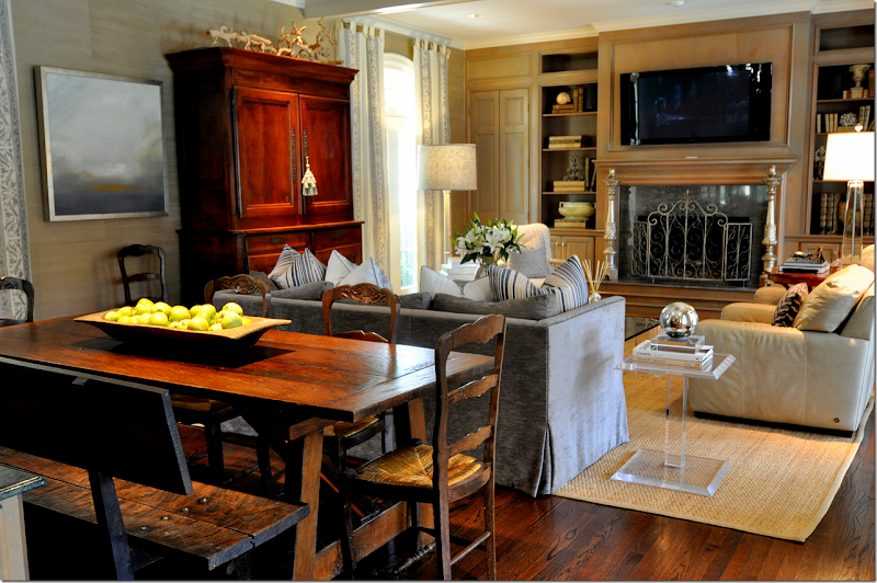
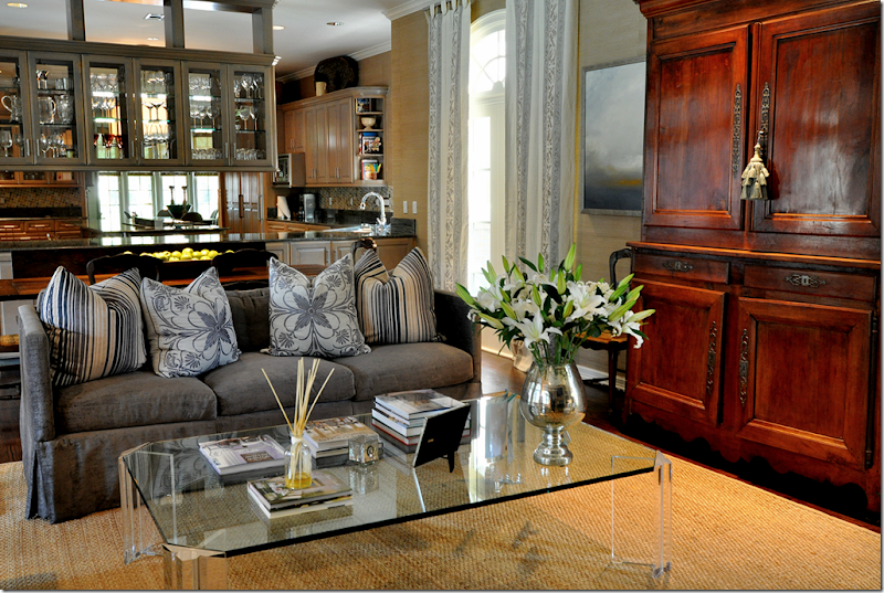
The family room is done in a soft gray blue with touches of cream, a color scheme that flows throughout the house. There’s another eating area behind the sofa. The focal point is the gorgeous antique Buffet a deux corps.
The sofa is filled with a mass of patterned pillows.
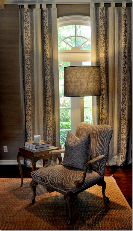
Here is a closeup of the linen curtain fabric.
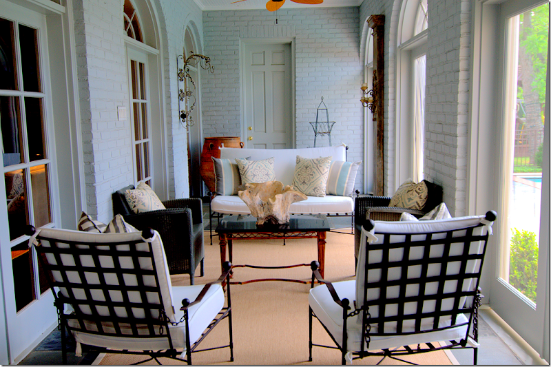
Off the family room is this large screened porch which overlooks the pool.
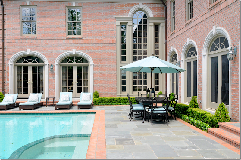
The back yard has a slate terrace along with a large swimming pool. Box surrounds the windows. In this picture, you can see the distinct L shape of the house. The living room is at the far left, then the two story entry hall is at the corner. To the right is the screened in porch which is parallel to the family room. All main bedrooms are upstairs.
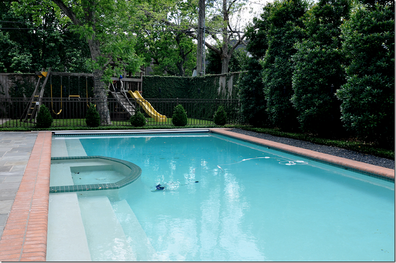
Behind the swimming pool is a large play area, nice!
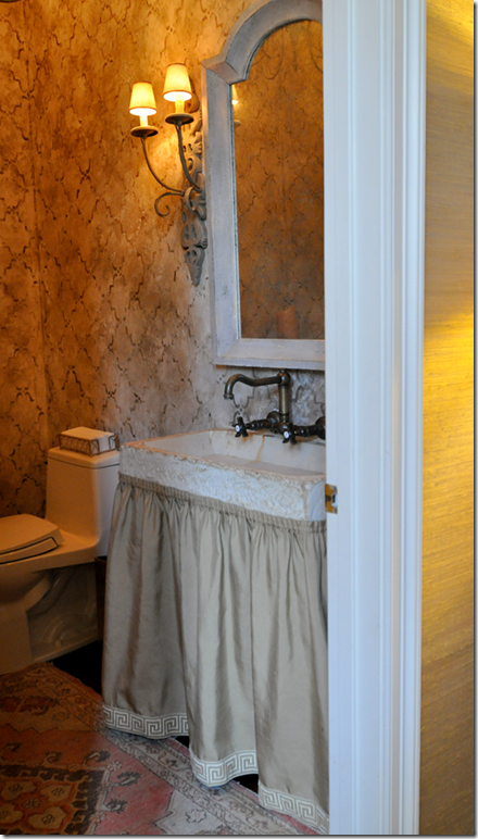
Off the family room wing is the powder room with its concrete sink. The skirt is trimmed with a Greek trim pattern.
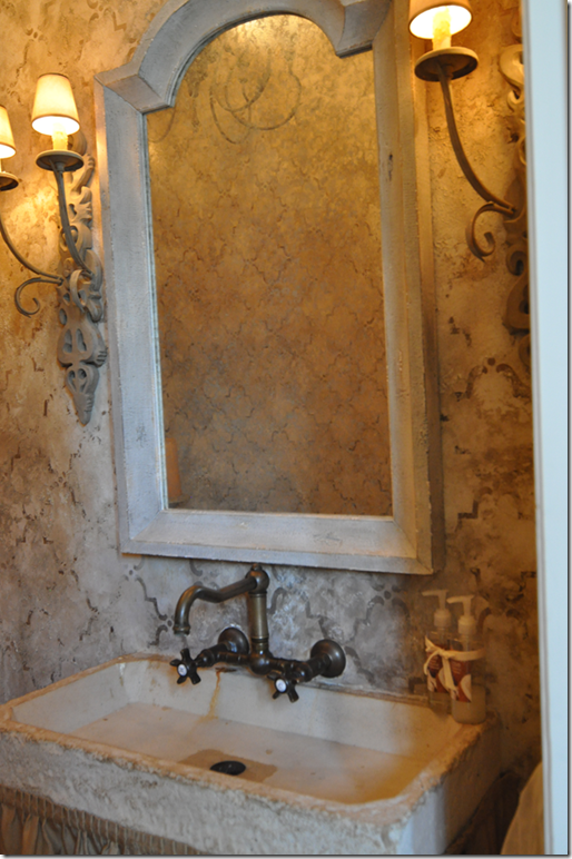
Close up of the hand painted wall treatment by Imago Dei. Love the wall hung fixtures.
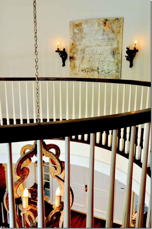
Going up the stairs, you can see part of the wall to the living room with its three graceful arches.
The curved landing overlooks both the back and front yard.
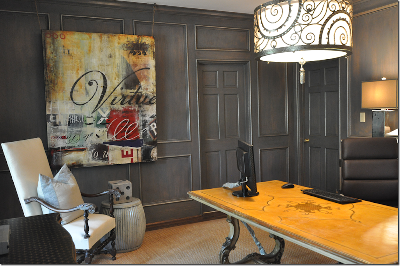
Upstairs, the man’s office is done in the same gray blue found throughout the house, but the shade is much deeper here. The Italian styled desk mixes with the contemporary art work and light fixture.
The art work, Virtue, is perfect for a man’s office. Now, if only all executives had those words in their office! Love the oversized die on the garden stool.
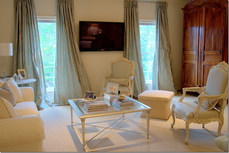
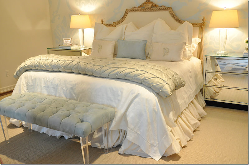
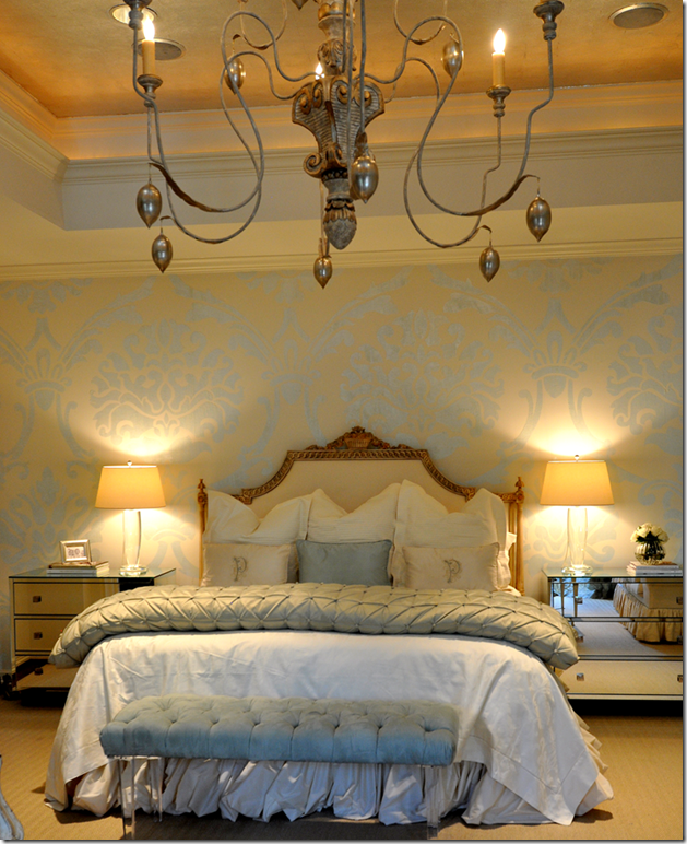
The master bedroom with its sitting area is another favorite space of mine. The antique French armoire mixes with contemporary furniture – a marble topped Saarinen table, mirrored nightstands and an acrylic bench. The light blues and creams are so soft and restful – perfect for a bedroom. The cream sofa is trimmed in the same blue as the silk curtains.
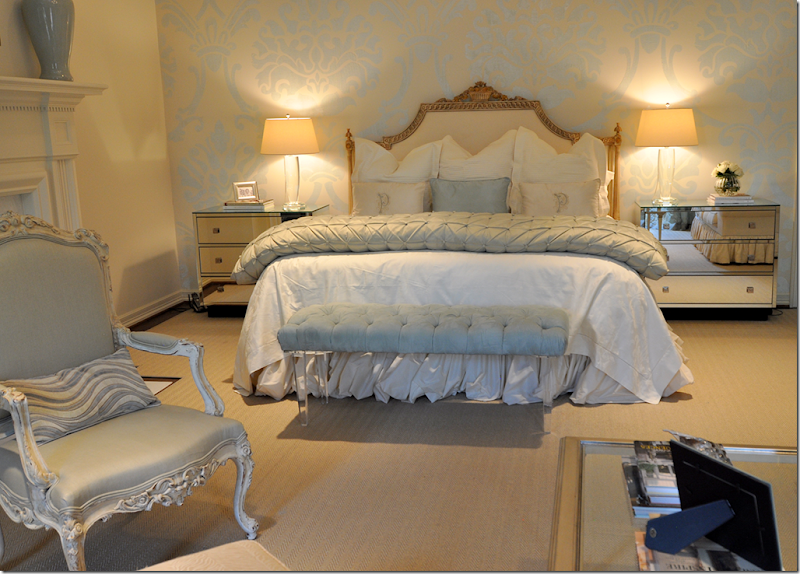
Beautiful! The walls are hand painted in a large damask pattern by Imago Dei. Love the bench!
Closeup of the gilt headboard and linens. The headboard is so gorgeous. Just gorgeous!!!
A glimpse of the Italian wood chandelier hanging from the vaulted ceiling.
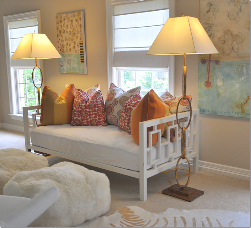
Off the children’s rooms is their playroom – with its day bed filled with colorful pillows. Great lamps!
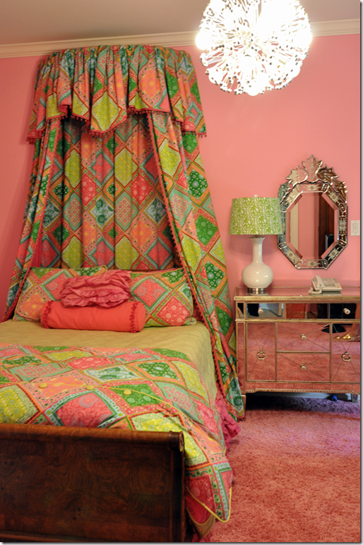
This deep pink bedroom with shag carpet mixes an antique bed with mirrored chests.
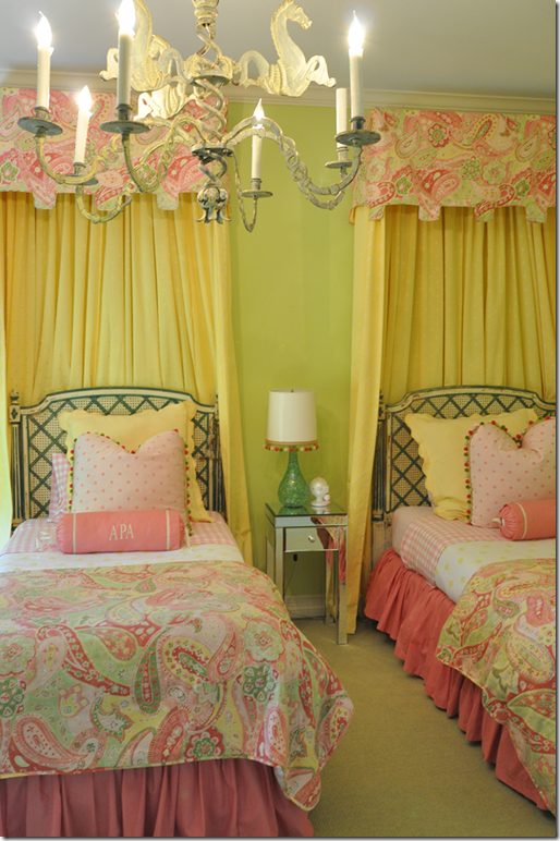
This bedroom has a matching color scheme, with the lime green on the walls.
Classic caned beds are mixed with bright contemporary colors. Cute bobble trim.
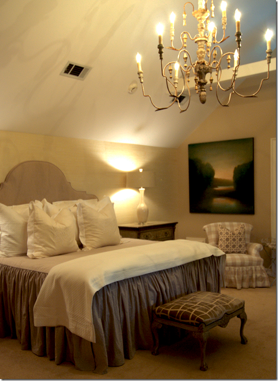
Of course there’s a guest room with a wood chandelier hanging from the vaulted ceiling over a slipped covered headboard and bedspread.
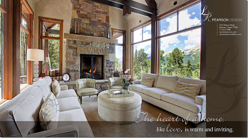
Finally, an ad featuring a mountain house designed by L. Pearson Design, Laurie’s company. To see her web site, go HERE.I hope you enjoyed touring this beautiful house in West University, a tiny town inside the city of Houston. Laurie’s house is certainly different than the typical slipcovered/seagrass look of many Houston houses. Hers is gracious and sophisticated and shows how beautifully antiques mix with contemporary art and furniture. Notice how almost each room has one large antique piece, an armoire, a console, a buffet a deux corps – showing that a lifetime of slowly collecting antiques will provide a great backdrop that will move from house to house. I thoroughly enjoyed visiting with Laurie in her house. She is a friendly host and a warm personality, with an obvious love of family. Thanks again so much Laurie!
AND….The new book by Leslie Sinclair – arrived today at my house, brought by an elf!
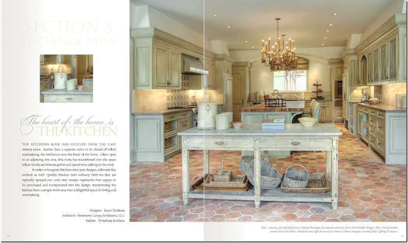
A page from Sinclair’s new book, here featuring a kitchen by Cara Childress. Gorgeous!!!!!!OMG, OMG – Leslie Sinclair surprised me today with a copy of her new book and I was floored. It is without a doubt the prettiest design book I’ve seen in ages!!! Prettier than any other design book I could name. I HIGHLY, HIGHLY recommend it. Get a small taste of the book to whet your appetite HERE. To order the book, go HERE. Check out the preview for yourself, you will love this!
West U Home Tour–One More!
Design Schizophrenia: WWPPD?
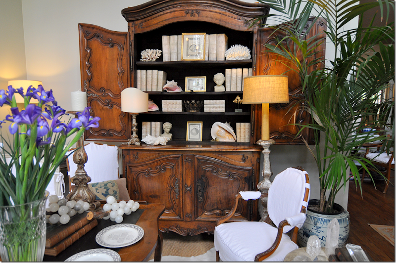
My so-called attempt at less clutter – no colorful Masonware in favor of white books and white shells.
I wrote about this a few years ago HERE, but it doesn’t seem to get any better. Design Schizophrenia. Last time out, I fretted over clutter versus no clutter. What do you do when you love the cluttered look of an old English manor, but you also love the uncluttered look of a Belgian estate? Unless you can afford two houses, you’re out of luck. So, here, several years later, nothing is solved, nothing has changed. Which look do I prefer – lots of accessories or no accessories? When I started slowly redecorating my house last year, I really tried to unclutter. I wanted to get rid of all my accessories and just go bare. It didn’t happen. Yes, I got rid of some things – I put away my blue and white, red and white, black and white, and purple and white transferware – but replaced it with a collection of plain creamware. Not as cluttered looking, but still – a collection. I put away my colorful Masonware and replaced it with white books and white shells. Hmm – still anxious over that one.
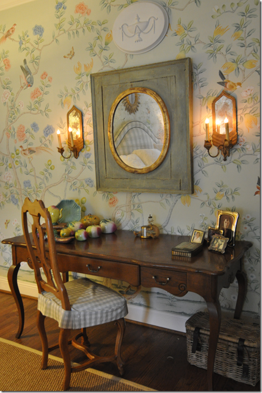
Chinese altar fruit collection came out of storage, despite my attempts at de-cluttering.
I put away my beautiful collection of Asian altar fruit, but then pulled it out again and moved it to my bedroom to go with my new Oriental hand painted wallpaper. Oh, and my blue opaline is there too, hiding in the bedroom. Shoot me now. I want to go bare, naked as a jaybird (are jaybirds more naked than bluebirds?) but I can’t do it. Why????? I look to my guru, Pamela Pierce, and she has it down, cold. No collections. No little accessories everywhere. Just one or two antiques or a confit pot filled with white roses. Of course her French pots are all gloriously rustic white, while mine are yellow – at least I’ve sold most of them. Whenever I move something around in my house, I hear this little voice, what would Pam Pierce do? Yes, what WOULD Pam Pierce do if she came to my house? HORRORS! A nightmare! Stay away!!! Too embarrassing! Nasty anons who post comments about my house say it’s so boring with just white slipcovers. I take it as a compliment, boring. I want it to be quiet and flowing and restful. It’s not. I’m working on it, though. I wish I were Pam Pierce, the queen of editing. The queen of gorgeous slipcovers. The queen of fabulous antiques that you never see in a shop. Yes, what would PP do?
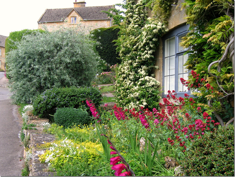
I love a glorious English garden with roses and flox and wildflowers all in a mess. But….
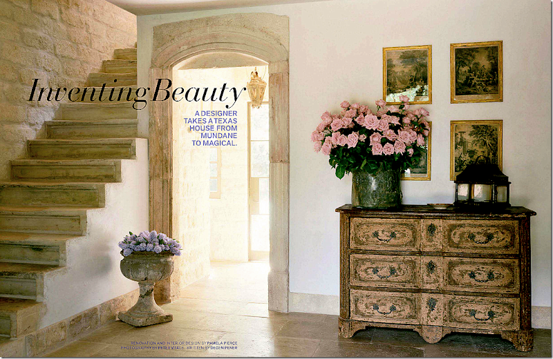
But then I look at Pam Pierce’s garden. Just box and French jardinières and more box and a few gorgeous antique lanterns. And a simple French iron table. Sometimes simple is much, much prettier. How would you love to walk into this front door each day????
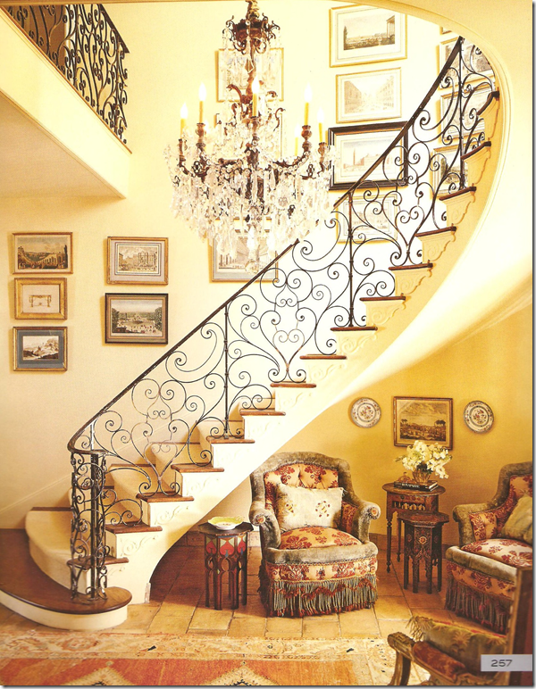
I adore this entry from Lynn Von Kersting – such a beautiful railing with sensuous lines. But….
But…then I see this entry from Pam Pierce – no railing at all. A simple outdoor concrete pot filled with flowers. There are only 2 accessories, plus two pots of flowers. Heavenly.
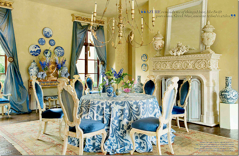
I did a backflip over this dining room by Michelle Nussbaumer. We must be alike, she also likes skirted tables, and I have those same pots flanking the fireplace and a clam shell is on my mantel too. Laughing – we are SO alike! not! I wish though. This dining room is so vibrant and happy. It makes me smile. It’s cluttered in an orderly fashion. It’s soo Michelle.
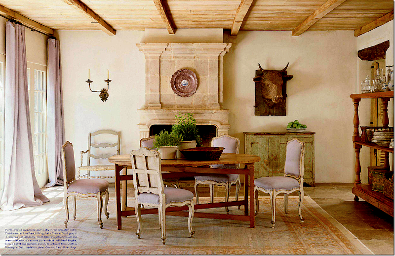
And then I see this dining room by Pierce. Quiet with touches of pale lavender linen. Such a subtle hint of color. Very few accessories. The trolley is actually used to hold dishes and glasses – which become a decorative statement. No accessories that aren’t really used. Lesson to be learned.
I liked this dining room recently seen in Elle Décor. It’s youthful and fun and creative. Friendly and vivacious.
But would it ever replace this quietly elegant dining room by Jane Moore, another Houston great? One accessory, well two if you count the ironstone pot’s top. The clock and chandelier become the decorative elements – they speak so much louder than a mass of transferware. You appreciate their beauty without having to fight to see it. Lesson learned.
Such a beautiful, classic dining room by Nicholas Haslam. All the chinoiserie elements work together instead of fighting each other. So perfect really – this would be hard to emulate. I love this look until….
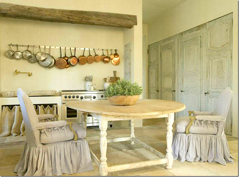
Until, I see this breakfast room by Pam Pierce – and drool. A light –is that lilac or gray linen? colored slipcover becomes the star, along with a set of painted antique doors. The table is a knockout too. No one does slips as pretty as Pierce. I’ve tried to copy them, but it’s hard to copy perfection. Notice how they just slightly drape the floor and how they are gathered in double pleats – or are those triple pleats? Notice the sink on the back wall. And the pots – something utilitarian - becomes a decorative element.
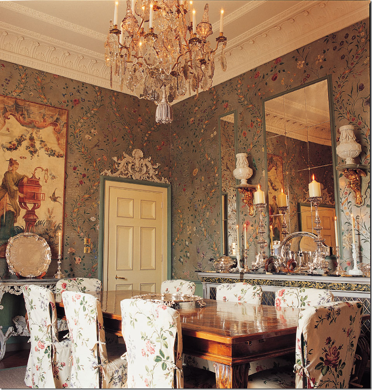
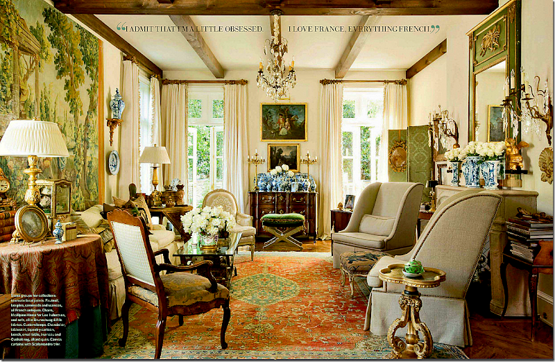
A beautiful French living room, seen recently in Veranda. Makes your heart flutter. That mass of blue and white vases, the collection of English smalls on every table top. Elegant – a collection gathered over a lifetime.
Or this living room by Charles Faudree – the interior designer who invented American French design with his layers of accessories and tables and chairs. so beautiful! Who can resist this? I can’t.
Or this living room, with its mixture of contemporary and antique. Well balanced and interesting, subtle yet cluttered. Loving the mix of the Barcelona chaise with the French antiques. I love this look…
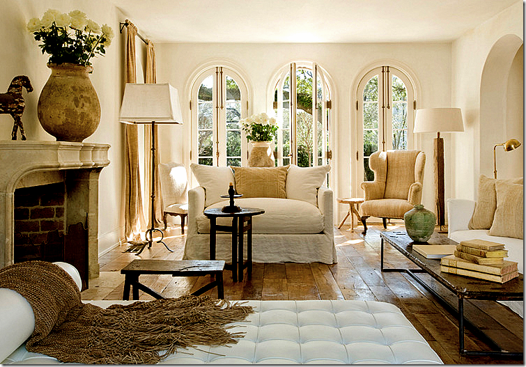
But then I see this living room from Pierce, with its own version of a mix of contemporary and antique. The Barcelona chaise looks perfectly at home with the white linen slipped sofas. There’s even a trendy bricklayer table mixed in with rustic antique tables. The accessories are so subtle, you don’t even notice them – except for the confits filled with white roses. The rough, wide planked floor is left uncovered – adding another subtle decorative element.
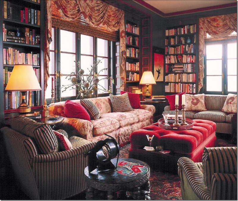
I adore Alessandra Branca’s style. She is one of a kind. Born in Rome she brings a unique European sensibility to her U.S. designs. She loves the cluttered look – enough is never enough. Here she mixes fabrics upon fabrics to create interest and texture. Je’adore!
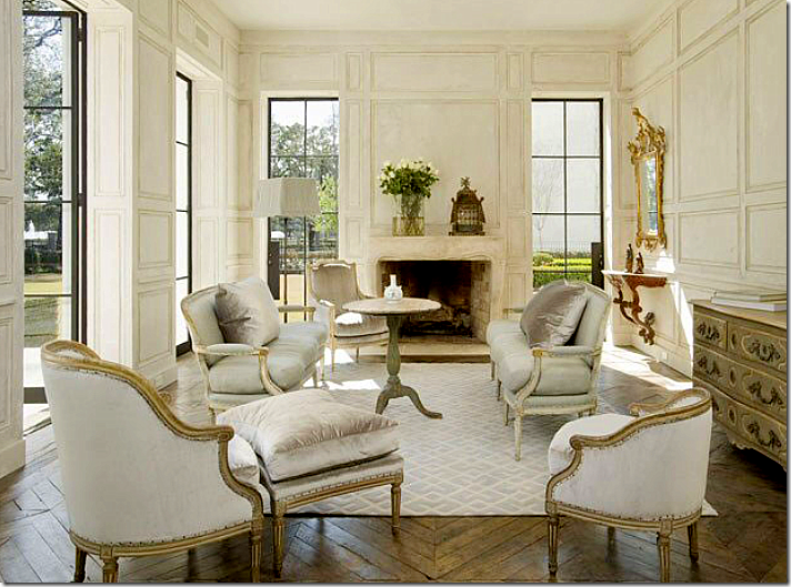
But then, talking of European sensibility. Whoa. Gorgeous. Is this Houston? Looks like France to me. Love how Pierce separated the French Duchesse en Brisee into two areas. Notice how high and deep her down cushions are! Love the tall Swedish table in the middle of it all and the subtle gray and white rug. The architecture – the walls, the windows, and the floors add to the perfection.
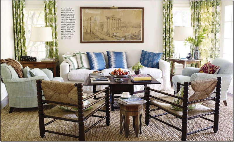
I love this busy family room by Peter Dunham. Love his fabrics, his mix of patterns, his apple matting – love it all. Cluttered, yet interesting, comfy and warm.
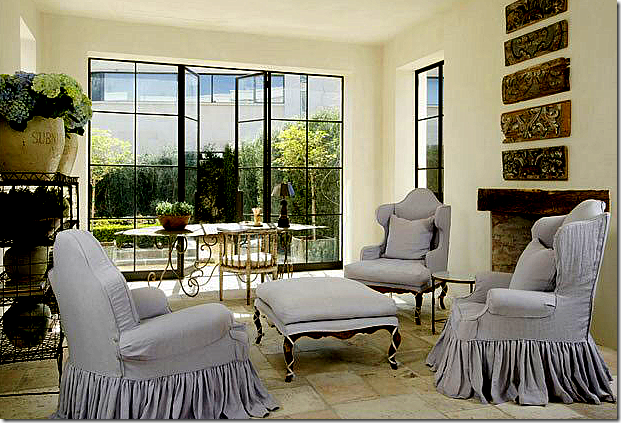
But, then I see this sitting room by Pierce – with more beautiful slipcovers – again, double pleated, slightly draping on the floor. She takes four different pieces and creates a set with the matching slips. The steel windows are left uncovered, as are the floors – each adding important texture. Her bakers rack is filled with confits and flowers – that’s all. I love how Pierce never uses patterned fabrics. Just linens and sometimes a touch of silk velvet. Love that.
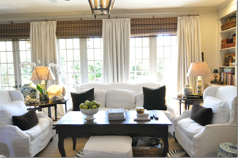
I mean, I try. This is my coffee table EDITED. Too funny!!! The more I edit, the more things grow and multiply. I can’t seem to give anything up. The more I put away, the more I seem to have. I need Pierce’s touch. WWPPD?
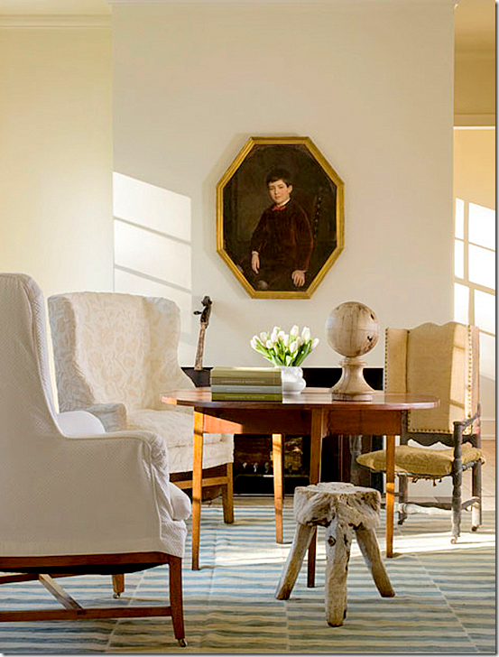
Here’s how Pierce does a coffee table, interesting, simple. This room has a masculine vibe – as if it’s a man’s study perhaps.
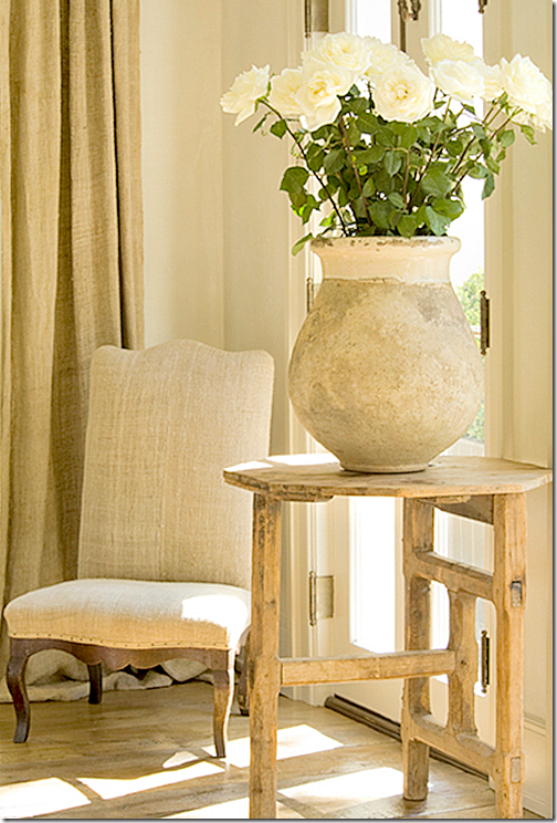
Or a side table, with just one perfect pot and twelve white roses.
Or here, with one sconce and a few pots. I’ve never seen a sconce this beautiful in my neighborhood antique stores. Where does Pierce find such perfect things? Such a perfect vignette.
Makes me want to go get the Barcelona chaise in white. And that mirror too, if I could find it. All photos of Pierce’s work are by Peter Vitale, author of that great book The Divine Home, HERE. Vitale also does interior design, very similar in feel to Pierce’s work – uncluttered and peaceful with a mix of beautiful antiques. Vitale’s web site is HERE. Pam Pierce’s new web site is HERE where you can see many more pictures of her work. I could stare at her web site for hours on end and sometimes do, just hoping to soak up some of her talent.
Well, I am thoroughly depressed now. I get that way when I see pictures of a designer whose work I greatly admire! I want to be that talented! I guess I should be thankful I’m not competitive by nature or I would have an ulcer by now. What is your design schizophrenia? Are there two looks you love that contradict themselves? Or do you just like one style and stick with it (much better if you are like that.) Is there a designer you really admire? Would you be embarrassed to have them to your house? I have a whole long list of Houston designers that aren’t allowed anywhere near my house! Not even counting the national ones like Buatta, Easton, Moss, et al. Forget them! If they want to come over for tea, we’ll just have to meet at the Four Seasons. Period. No exceptions.
The last blog story featured a barn door in the foyer. Here I wanted to show you this barn door by Martyn Lawrence Bullard that he put in the family room leading into the kitchen in Ozzy Osbourne’s house. Isn’t it great? Love it!! Featured in Architectural Digest.
And finally…..
Houstonian Leslie Sinclair, of Segreto Finishes, has recently completed her first book! Probably most of the better houses in Houston that I've featured had walls done by Leslie’s company. Segreto specializes in gorgeous plasters and fauxs on wood. Their work is all very subtle – adding a layer of texture and a sophistication to the house. The book is filled with page after page of some of the most beautiful houses. To preorder, go HERE. Be sure to look at the schedule of book signings. Congratulations Leslie! You’re the best!!!

