COTE DE TEXAS
31,May2014

The Bastide House–Open This Weekend!

88 comments


Looking for something to do this weekend?  There is an open house for a new Showcase home just completed in Memorial.

The house is the work of Maria Tracy & Tracy Design Studio – we’ve featured their designs before HERE and HERE.


image

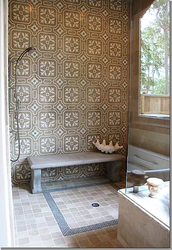
In Tracy’s “Tile House,” this picture of the master shower made quite a splash – pun intended!  Actually, I’ve wanted to show this picture again because I see it on the internet and on other blogs – it obviously made quite an  impression on a lot of readers.  Maria had the idea to install a concrete garden bench in the shower instead of building in a tiled bench.  And what a great idea it was!  A simple idea – that no one had really thought of – and one that adds so much to a space where there usually isn’t much excitement.  And I remember loving her added touch of the large clam shell for soaps and razors.   Taking a simple idea that looks so luxe – and anyone with a shower stall can incorporate it.

This is the reason to tour Showcase Homes, to get ideas and use them in your own house, now or future.

Maria Tracy of Tracy Design Studio designs some of the most luxurious houses, as you can see by her portfolio HERE. What sets her designs apart from others is that she fills her houses with antique architectural elements which she finds at places like Chateau Domingue.  This house – open this weekend fully furnished – is no different.  It is an architectural wonder, with a two story living area filled with antique elements.  The walls are plaster and stone, with handmade steel windows and doors, limestone and reclaimed wood flooring, stone stairs, and on and on!

Dubbed “The Bastide,” it is inspired by the French country mas found in Provence – houses made of stone and stucco with wide facades and wood shutters.

The Bastide is open today – Saturday, the 31st from 12 to 5 pm and Sunday, June 1, from 12 to 5 pm.

It is located at 206 Millbrook Street, off Memorial in Houston.

Details:  6 bedrooms/7.3 baths/10,361 sq. ft.

To see the listing, go HERE.


image

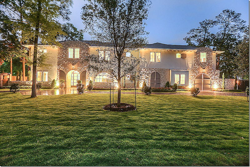
The Bastide:  Its stucco and stone façade is a preview of what is found inside this beautiful French Manor styled, two story house.  Notice the arched doors at the right – that lead to a Porte Cochere. 


image

At dusk:  On the left, matching arched doors open to reveal the glass steel front door.  The wide façade resembles a French country mas found in Provence.


image

Night view


image

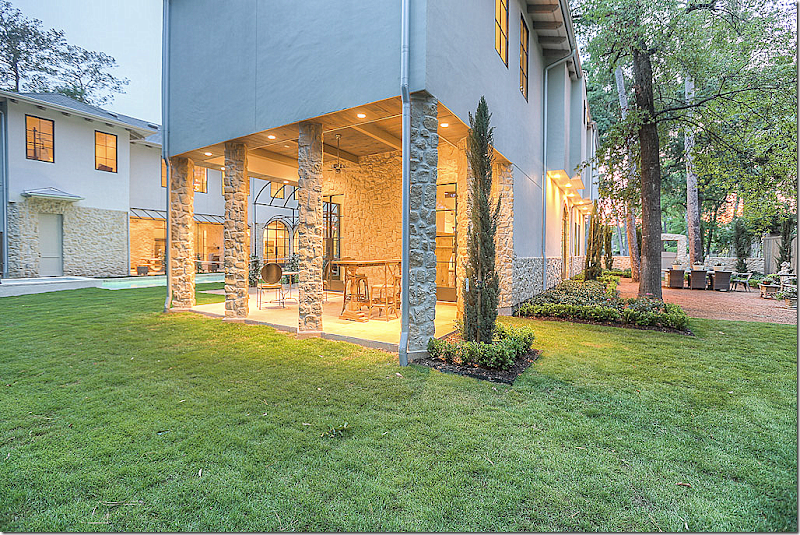
Two wings lead off the wide façade.  In between these wings is a swimming pool.  On the left is an outdoor kitchen and on the right is a covered patio.  At the very right is a sitting area on a rug of gravel.


image

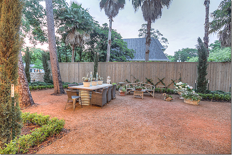
Off the front behind the stone wall and through a wooden gate is this outdoors sitting area.  This area is off the wine bar – which is entered through a steel glass door.


image

Looking into the wine bar.


image

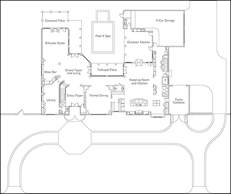
Floor plans for the first floor. 


image

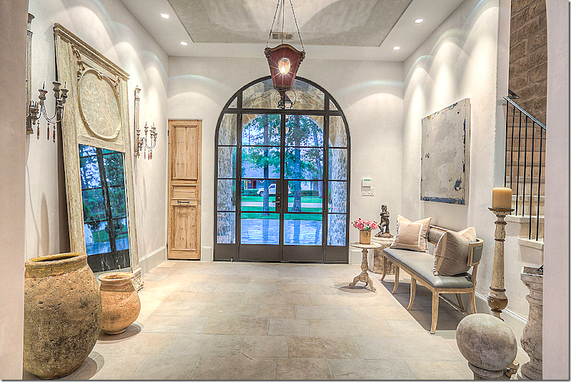
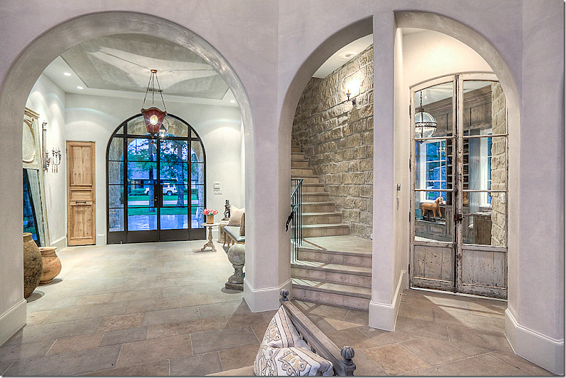
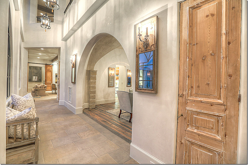
Through the arched shutters is the glass steel front door.  The large foyer has a limestone floor.   Maria Tracy has furnished the house with beautiful French antiques.  Notice the closet door – antique pine.  The stairs are located to the right.


image

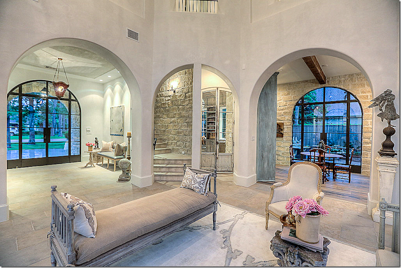
Past the large foyer is the open, 2 story living room.  The wine room is through the arch on the right.  Through the center arch are the stairs and the library.  

I love this concept of the open living room.  Instead of a fancy room hidden off that no one ever goes into – this room is a pass through to the stairs and the game room.


image

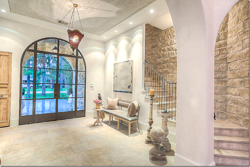
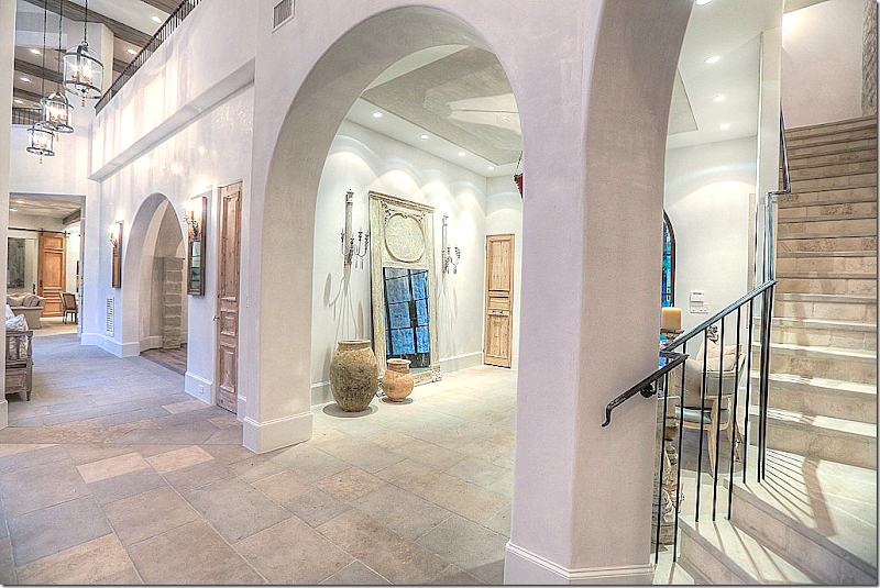
Here you can see the stairs are open to the foyer. 


image

Looking from the living room to the stairs and library on the right.


image

And the view towards the dining room and kitchen/family room.


image

Antique glass doors open to the library.


image

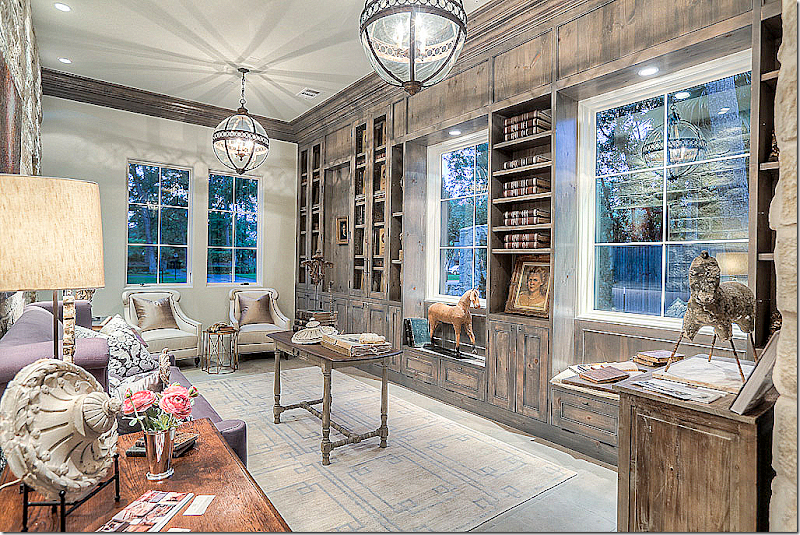
Stone, plaster and paneled walls are found in the library.  The lanterns are antique – from Belgium.


image

View of the stone walls in the library.  It’s powder room is to the right.


image

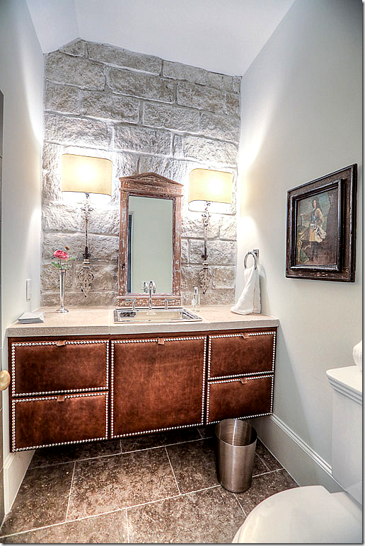
The powder room for the Library was inspired by John Saladino.  The vanity is leather, the walls are stone.


image

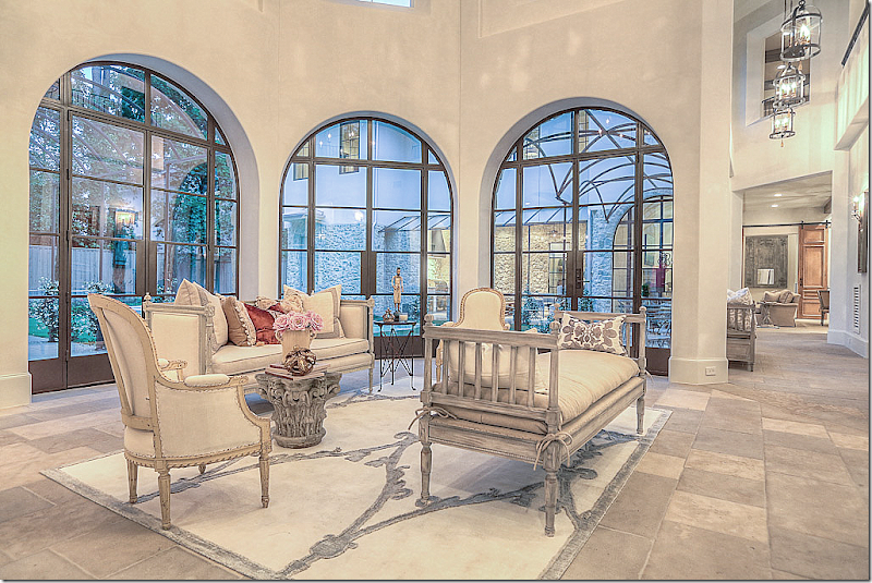
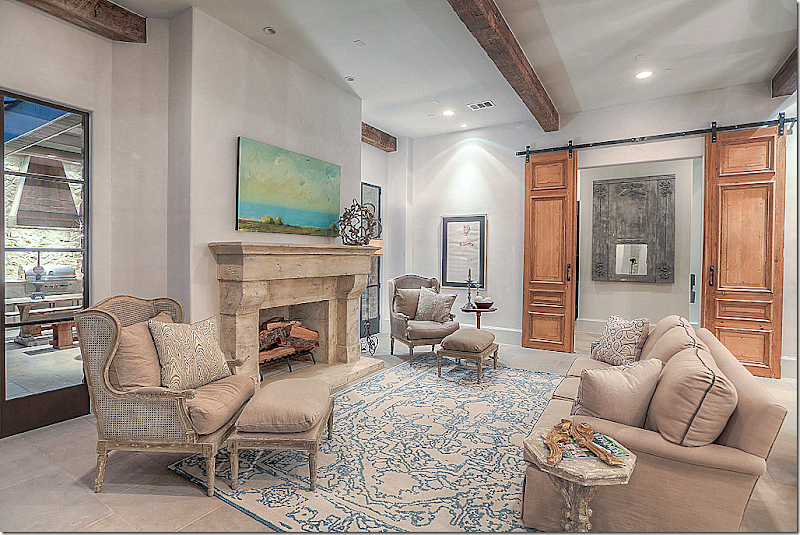
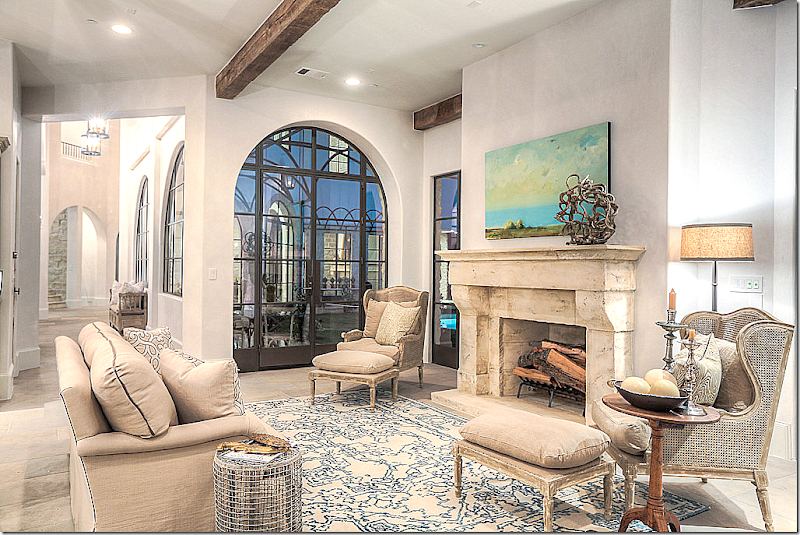
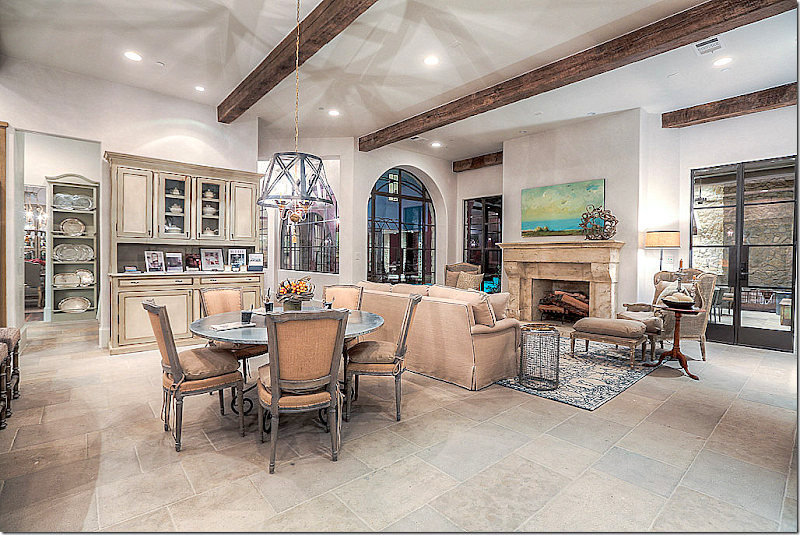
The living room – with its handmade steel windows, historic old world distressed limestone floors, and plaster walls.  It overlooks the swimming pool.   To the left is the wine bar and game room.  To the right is the dining room and kitchen/family room.  Across the pool – you can see the outdoor kitchen. 


image

I love how this is decorated, with just a few French pieces, some from Aidan Gray, allowing for the flow of people to easily walk through the space.


image

Showing the architecture of the house – from the second floor.


image

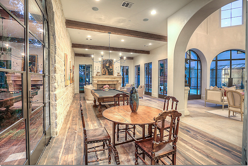
The wine bar and game room has a reclaimed wood floor.  It sits off the living room.  To the left, through the glass door, is the outdoor sitting room on the gravel rug.


image

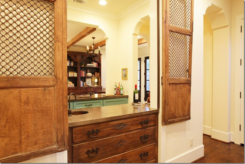
The wine bar with two cabinets hidden behind antique shutters.  One holds a found vessel sink and shelves on a stone counter, the other – a wine chiller.


image

Closeup of the bar’s shutters.


image

The game room with the pool table and fireplace.


image

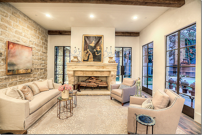
The sitting area in the game room.


image

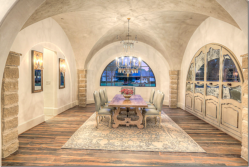
Leading to the kitchen/family room is the dining room behind the arch. 


image

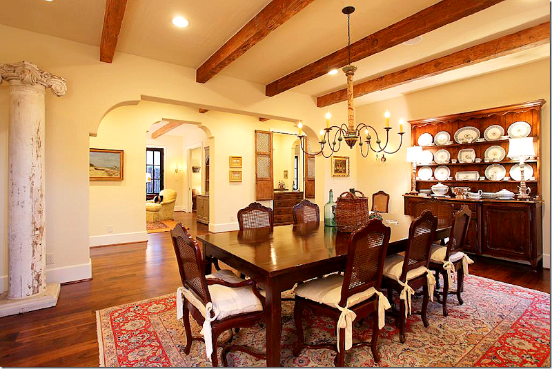
The dining room has a groin ceiling.  The unusual china cabinet is behind antiqued mirrored glass.


image

The dining room – looking towards the hall.  Pretty chandelier.   Shades of lilac flow through the house – here the host chairs are in that color, in velvet.


image

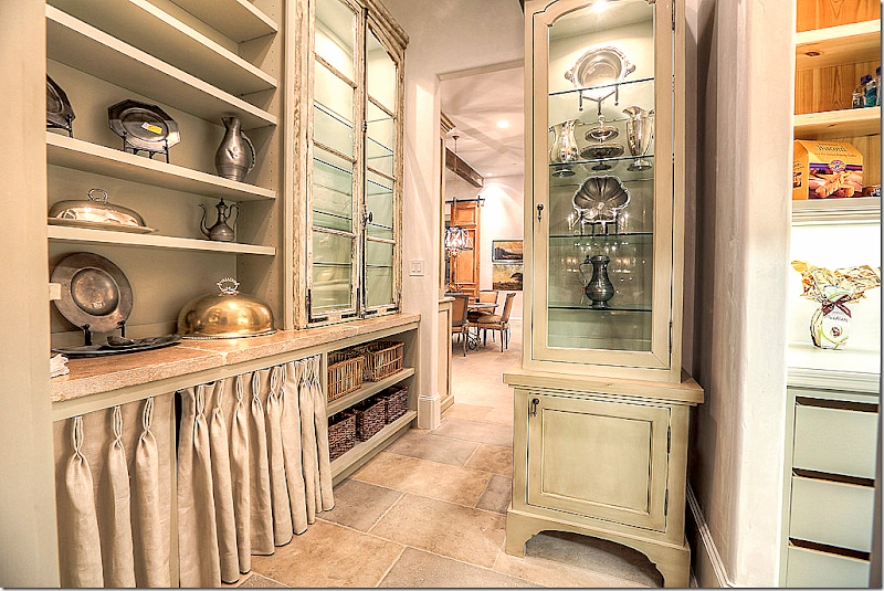
The butler’s panty has a wonderful shelf with linen curtain.  Antique glass doors.  The kitchen is through the door.


image

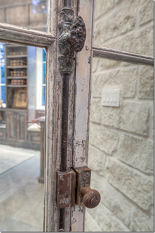
The beautiful powder room’s antique doors and hardware.  Fabulous!


image

Antique vessel sink and vanity, sconces, and mirror.


image

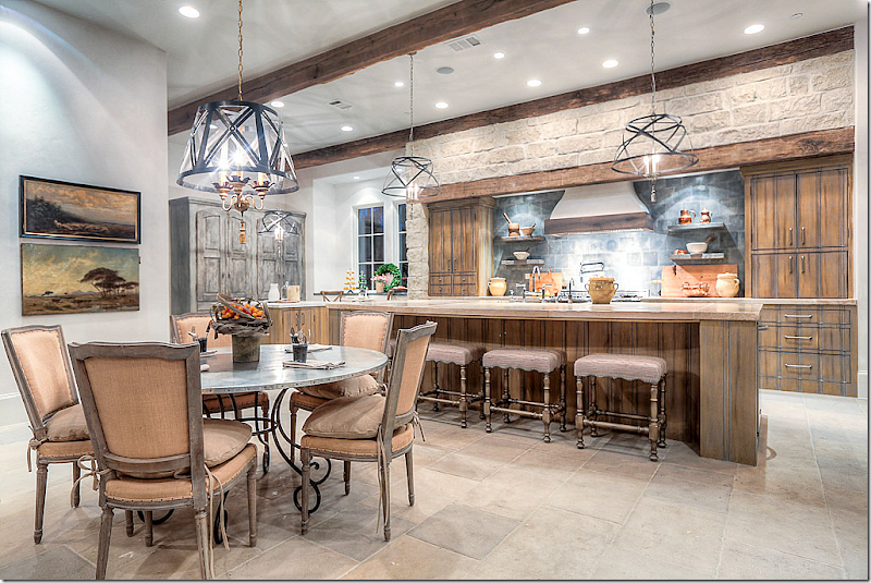
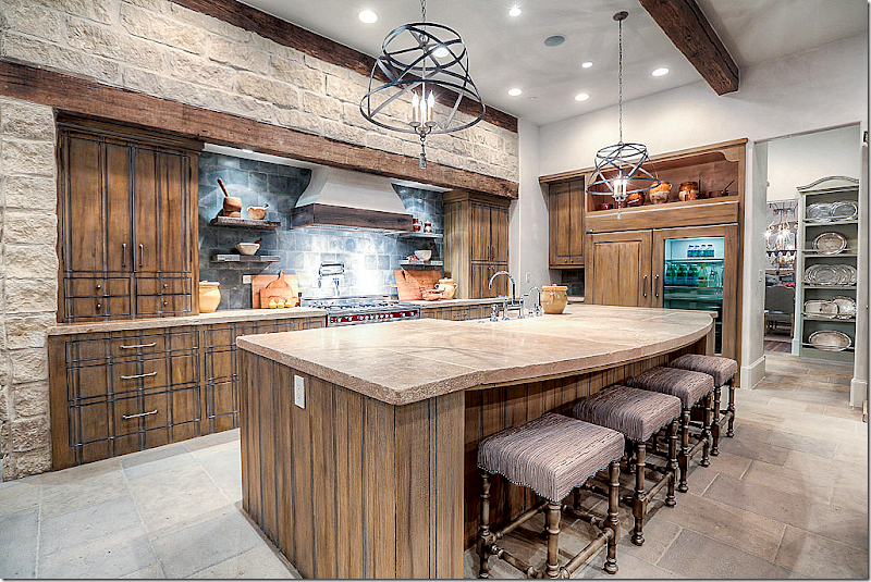
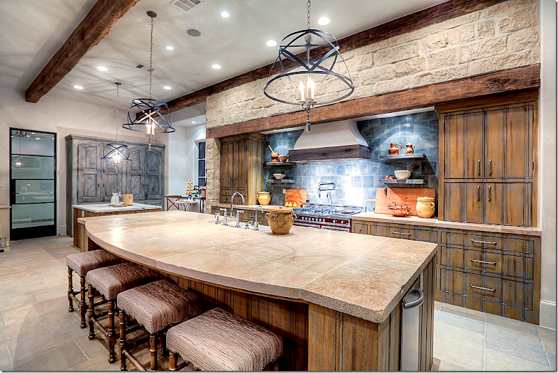
The kitchen – on one end, the breakfast room, and then the family room – all in one open space.


image

Through the glass door is the porte cochere.   The kitchen is a unique mix of wood, stone and marble, with zinc.


image

Italian Bertazzoni range with Ferrari paint.  Chateau Domingue antique backsplash concrete tiles from a French maison.


image

At this end of the kitchen, near the porte cochere is the baking center.


image

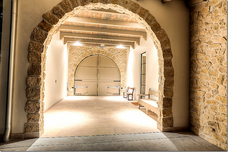
A view of the unique porte cochere off the kitchen.  The arched wood doors open to the front of the house.


image

View of this side of the kitchen – looking into the butler’s pantry.  Notice the refrigerator!


image

The family room open to the kitchen and breakfast room, looks onto the outside kitchen. 


image

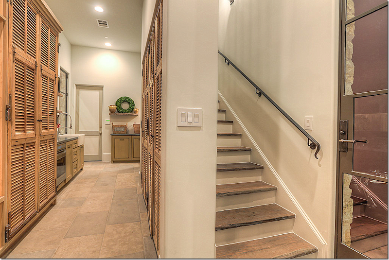
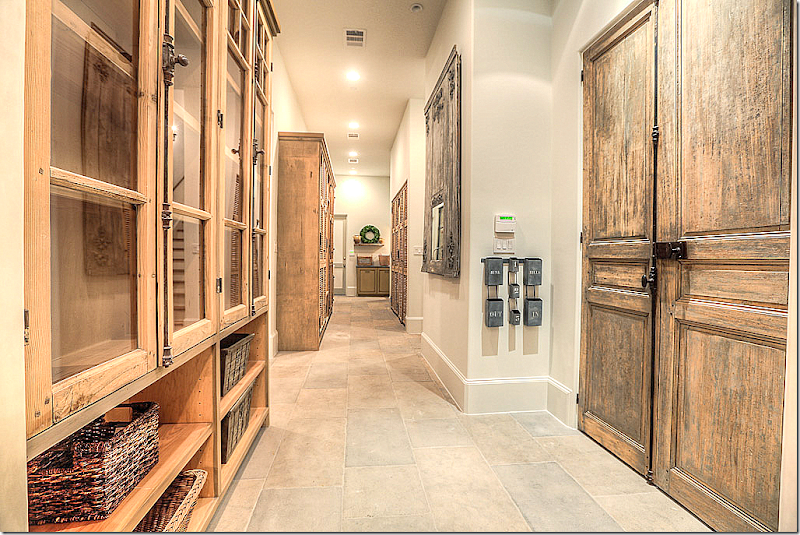
The barn doors lead to the catering kitchen and back stairs.


image

And looking toward the front hall from the family room.  These chairs are from Aidan Gray.


image

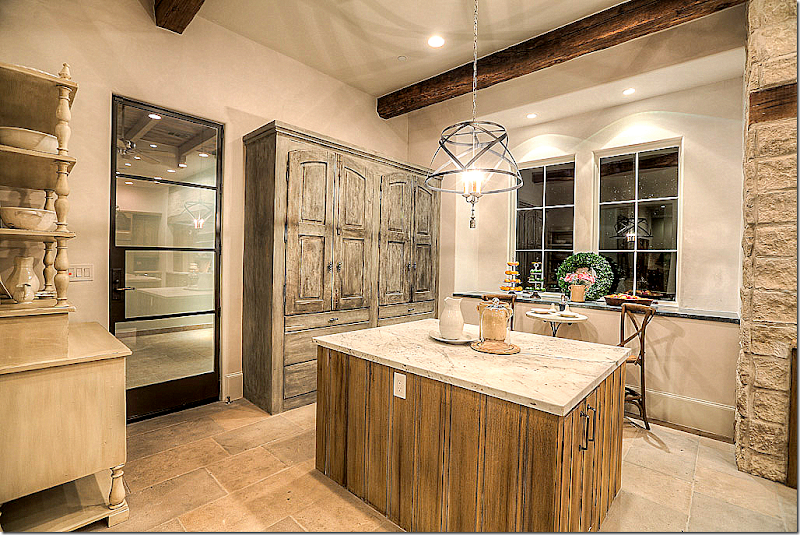
Off the baking center is a catering kitchen, fully furnished.   Behind the shutters is mud room storage space.  The hanging shelves are antique.


image

The laundry machines in the catering kitchen.  There is another large laundry room upstairs.  Naturally!


image

The back stairs near the catering kitchen.


image

Looking at the catering kitchen from further back. 


image

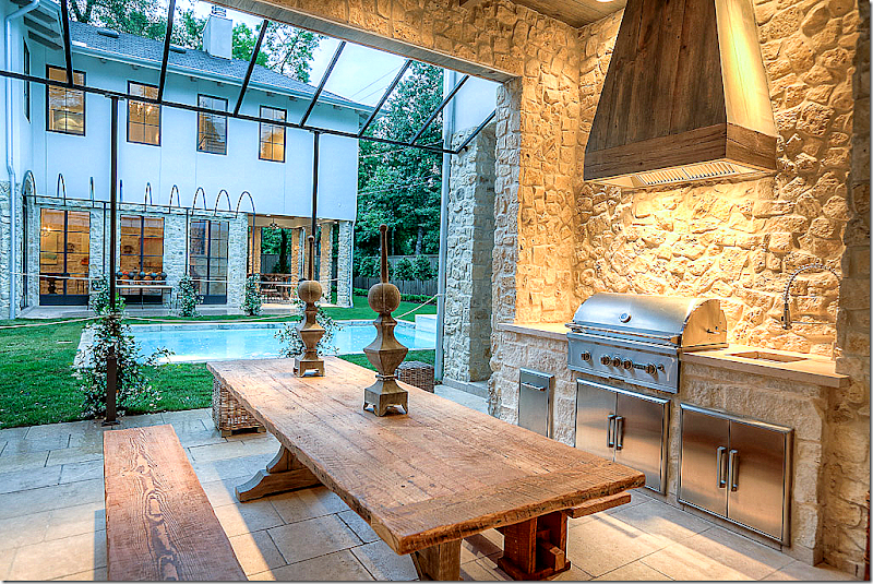
Off the kitchen/family room is the outdoor kitchen with its unique steel trellis – soon to be covered in wisteria.  Stone walls and floors. 


image

And looking the other direction at the grill and sink.


image

Looking in at the living room and the game room.  Again, the wisteria will bloom over the arched trellis – creating a covered walkway. 


SECOND STORY:

image


image

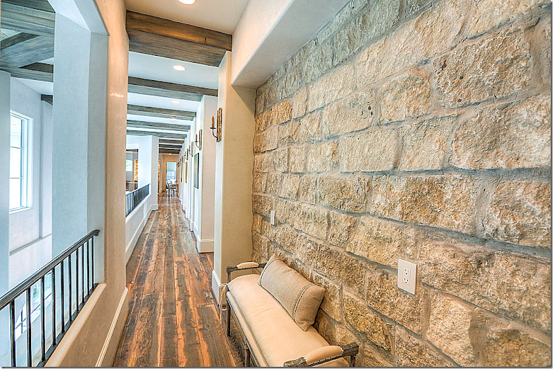
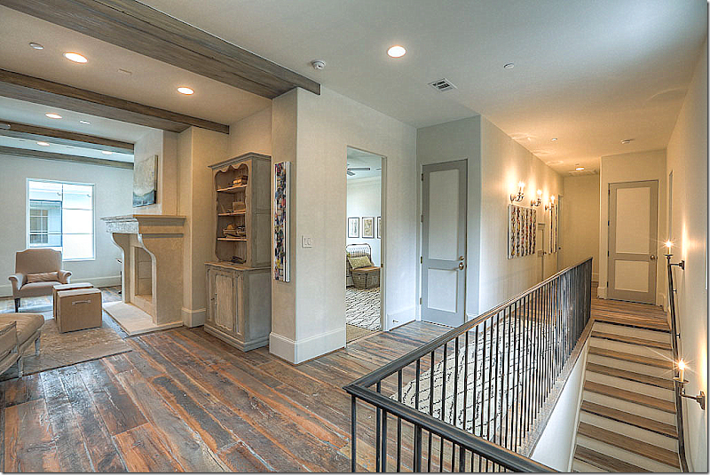
The upstairs hall overlooking the living room.  Stone walls, wood floors. 


image

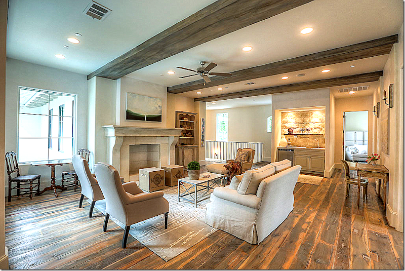
At the top of the stairs is the sitting room with its reclaimed wood floors and stone mantel.


image

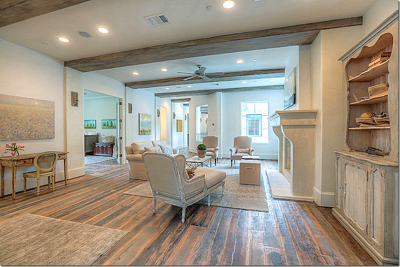
Another view of the upstairs sitting room.   The bedroom off the sitting room has double doors and could double as a study room for the kids.


image

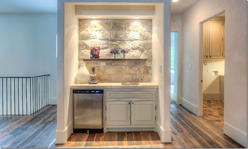
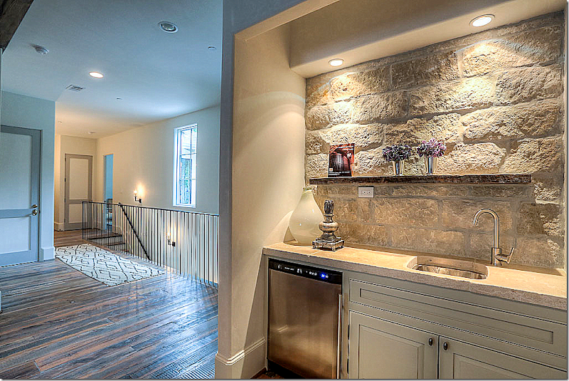
A small bar for the sitting room.  To the right is the laundry room.


image

The back stairs.  Love how all the upstairs doors are painted two shades of gray.


image

The sitting area and the back stairs where the elevator also is.


image

Antique tiled floor in the laundry room – along with stone walls.  Nice laundry room!


image

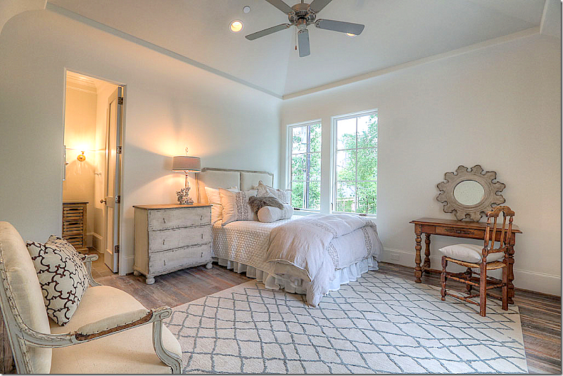
Unlike many Showcase houses, Tracy decorated the bedrooms – all six of them.  This bedroom has wood floors.  This is the bedroom off the sitting room with the double doors.


image

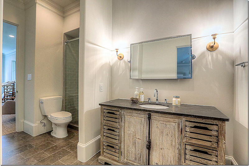
This bathroom has a vessel sink and French sconces.


image

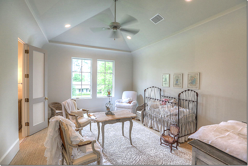
Love this nursery.  I love the table and chairs, so cute.    Rug layered over seagrass.


image

This cute bedroom has wood floors.


image

The room is set up as a flex room.  This house is perfect for a large family.  So much space!!


image

It’s bathroom has an found antique vanity. 


image

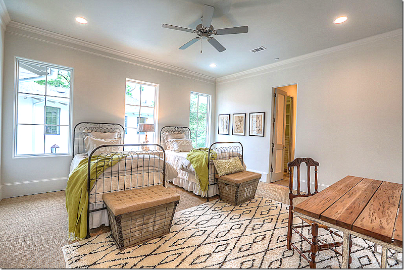
Moroccan rug over seagrass.  Love the iron beds and green blankets – simply decorated but so chic!  Love the colors.


image

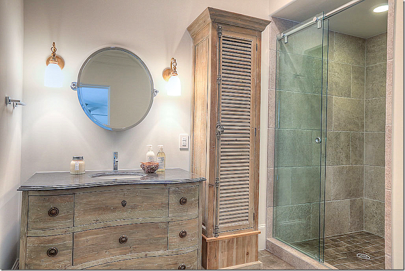
Another wood vanity with shutter cupboard.


image

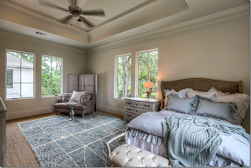
This bedroom is set up as a guest room.  Pretty headboard.


image

And this bath.  All the baths are different – yet they look  similar enough so that they present a cohesive design, another detail to experiment with.


image

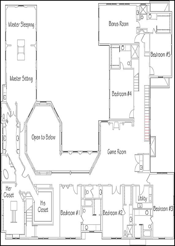
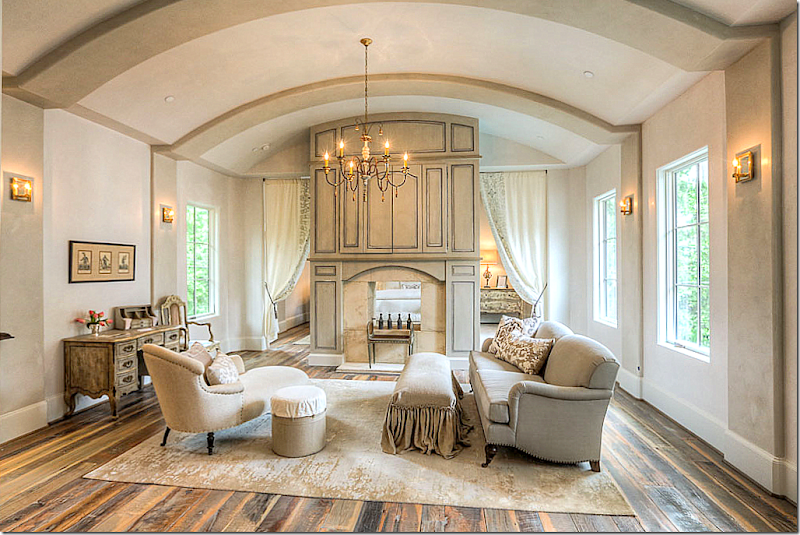
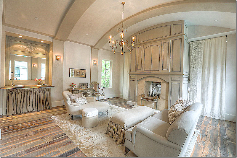
The master suite is on its own wing close enough to the children, but still removed.  There is a sitting room that shares a fireplace with the bedroom.  Portieres separate the two rooms.    Love the way this is decorated.


image

The sitting area showing the coffee bar with linen skirt.  Portieres close for privacy.


image

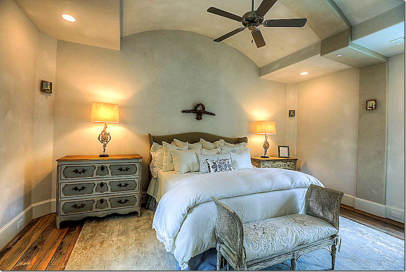
And the bedroom – pretty in French!


image

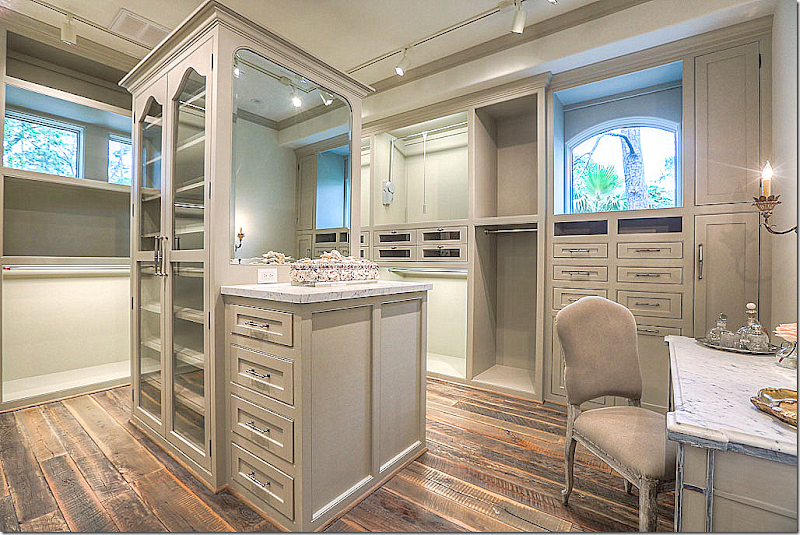
The woman’s closet with windows and a marble topped vanity. Love this!!!


image

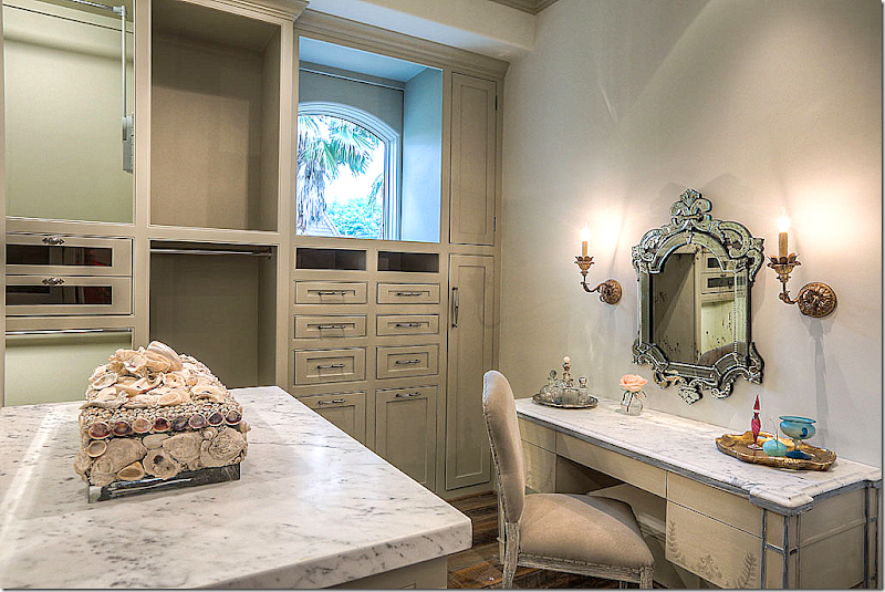
The marble topped vanity.


image

The man’s gray closet. 


image

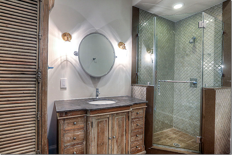
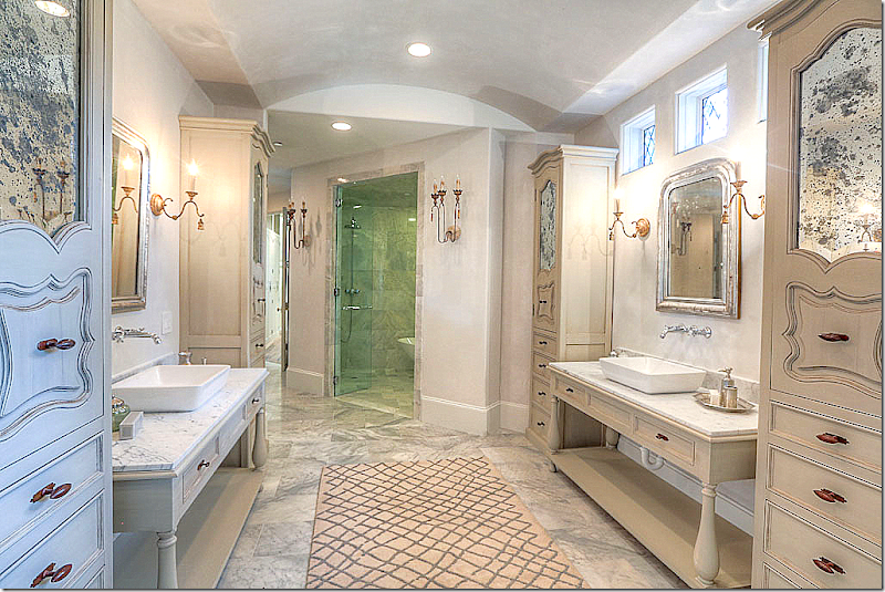
And the master bath – with beautiful custom designed cabinets with antiqued mirrors.  LOVE!!!!


image

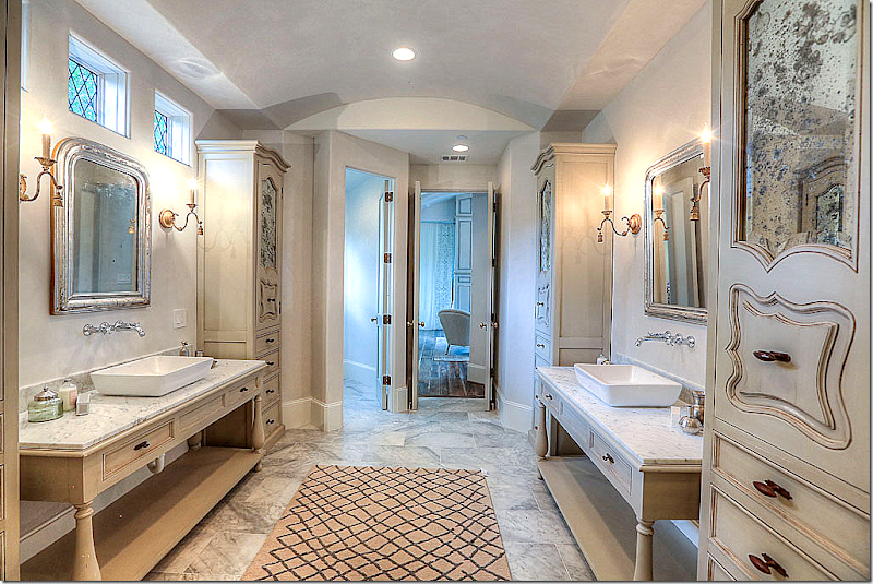
Looking towards the bedroom.  The windows above are leaded glass.


image

To visit this beautiful house designed by Tracy Design Studio, it will be open today – Saturday, the 31st from 12 to 5 pm and Sunday, June 1, from 12 to 5 pm.

It is located at 206 Millbrook Street, off Memorial in Houston.


To see the listing, go HERE.

And for more information on Maria Tracy and Tracy Design Studio – go HERE.


29,May2014

A Designer Who Chose To Change

40 comments


image

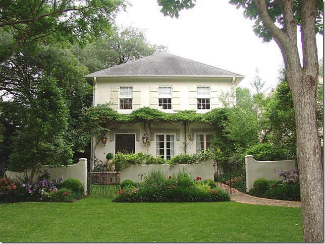
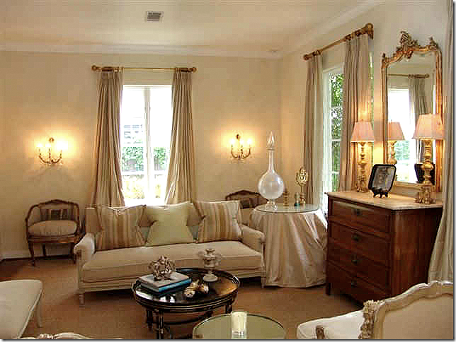
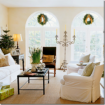
Remember this house?  The Kurt Aichler design is located in my neighborhood and I’ve wanted to own it for forever.  I first noticed it in a local magazine years ago and then, later, toured it.  I totally fell in love with the décor of its designer owner.


image

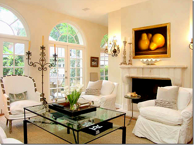
The French styled décor in the living room.


image

The house was featured in several magazines when this designer owned it.  After the home tour – I went home and changed out my linen slips for white ones.  She completely influenced me back then. 


image

After all these years, I still think that this is the prettiest candelabra I’ve ever seen.  I only wish I could find one like it!


image

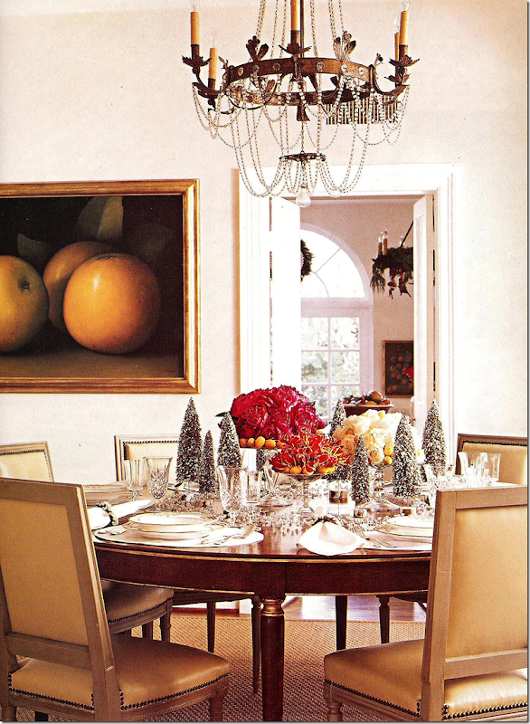
The dining room decorated for Christmas with its crystal chandelier.


image

The guest room.  I still love this room as much now, as then.

I wrote about my redecoration after the house tour HERE.   After that tour, I couldn’t get the house out of my mind and was convinced it was really supposed to be mine.  Slightly obsessed, but I wasn’t the only one.  On the tour, everyone was talking about how much they loved the décor and the designer’s aesthetic.
When the homeowners sold it shortly after the tour, I was heartbroken we couldn’t buy it.  “The one the got away” – is how I will always think of it.

After the homeowners moved to their new house, they left the French style behind and embraced a more sophisticated, sleeker look with Deco influences.  It was a natural transition for a designer who wanted a more streamlined look and, more importantly, a more original look.  Much of the furnishings in her new house were designed and commissioned by the owner.

  Cynthia, from the store Indulge, blogged about the homeowner’s new house in a three part story HERE and HERE.

Over the years, the memories of that house tour have faded.   It wasn’t until I looked at HAR and noticed a house for sale that I realized the new house that Cynthia had written about had also been sold and that another house was now for sale too.    Wow.  Four new houses in a decade.  That really makes me green with envy!!!   I’ve been here in my house for two decades now and am desperate to move on, if only I had the energy and the support from Mr. Slippersocksman.  Hmmm….forget that!

This newest house is so beautiful that it impressed at first glance.  It wasn’t until I noticed a photograph of the original magazine story that told me who the house belonged to.   But seeing the pictures of the house before it was renovated really piqued my interest in it even more.

The designer homeowner had really done a fabulous job on the house.  To appreciate it you have to see the Before pictures.

There might have been a time that I might have preferred the house before it was renovated, but not now.  I’m wondering what you will think of the changes too – agree or not?


image

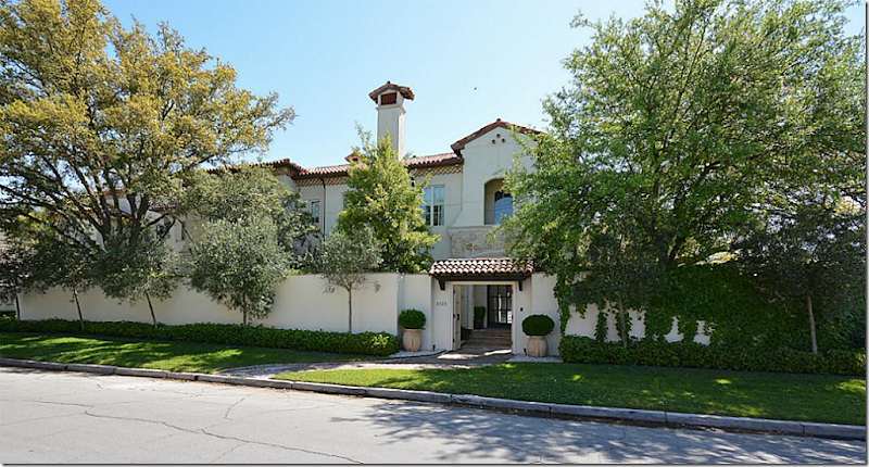
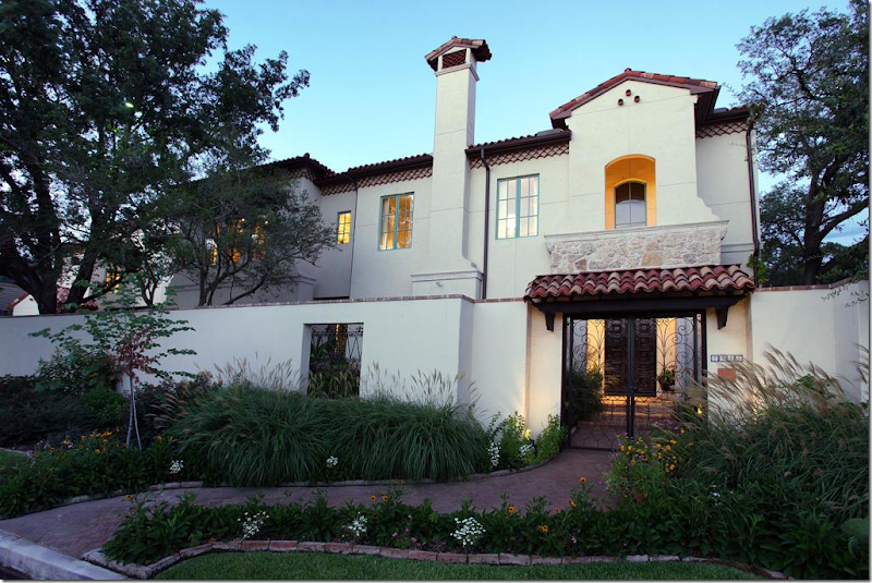
TODAY:  The house is relatively new – built in 2009, but when the current owner bought it – it was more rustic – a Spanish Colonial.  All traces of Spanish are now gone.   The homeowner did an extensive remodeling of the surfaces – turning it into a very sophisticated, slightly contemporary house.  It is sited on a very wide lot behind stucco walls which provide wonderful privacy for the front yard. 

The house is now under contract – see the listing HERE.
image

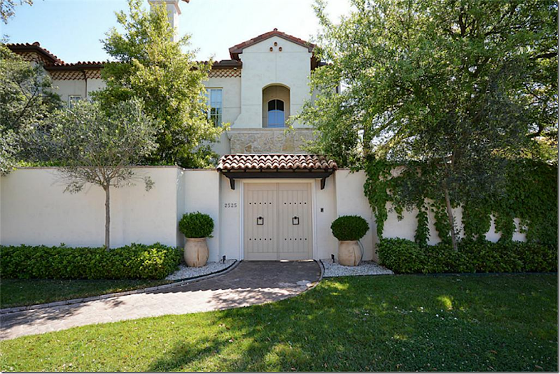
Today:  There is now a wood door where before there was an iron gate.  The landscape is manicured with trendy boxwood and vines.  
 

image

BEFORE:  The house had a more informal landscaping design.  Today – it’s all been scaled back to the boxwood only look.   Before, the windows were painted turquoise.  And notice the front gates, which were Spanish inspired, including one that was totally removed to the left of the main gate.

I have a feeling most of you will miss the more informal landscaping that was removed – I feel the same way.  But the new, more edited landscape design matches the style of the renovated house – as you will see.


image

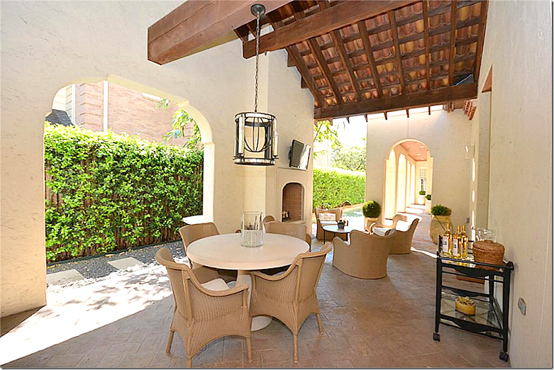
BEFORE:  There isn’t a picture of this area of the pool from today.  The main difference is all the iron Spanish inspired lighting is now gone – and the French doors are painted white instead of black.


image

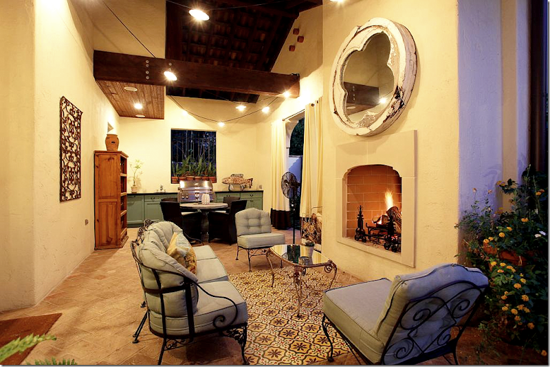
BEFORE:  There was a “rug” of Spanish tiles in the outdoor room.   The cabinets are painted green – as they are in the kitchen.


image

TODAY:  The furnishings are much more streamlined and contemporary.  It’s all edited and cleaned up.  And the tile “rug” is now gone.  Thank you! 


image

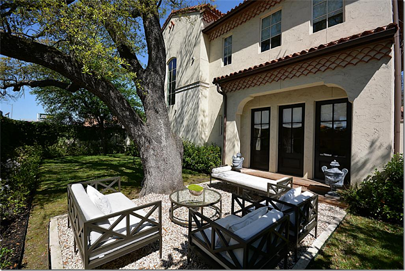
TODAY:  The side yard.  Pretty collection of contemporary styled furniture on a rug of gravel.


image

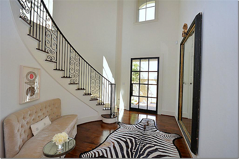
Today:  This is the photograph that caught my eye and caused me to stop and look at the rest of the house.   The owner put in a new steel front door, which I love.  The stair railing is beautiful.  Love the tufted settee.  This room sets the mood for the rest of the house – it’s fabulous. 


image

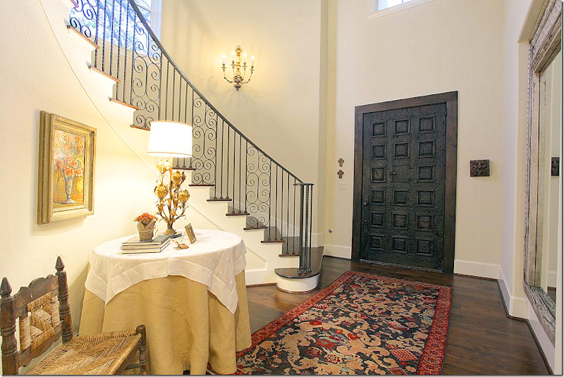
BEFORE:  The heavy carved door is so different than the steel one that is there now.  It also looks like the niche holding the mirror was filled in – and the sconces were removed.  It’s amazing how different this one small room is now from what it was back then.  I do like this Before look – but I am preferring today’s more sleek and contemporary style.


image

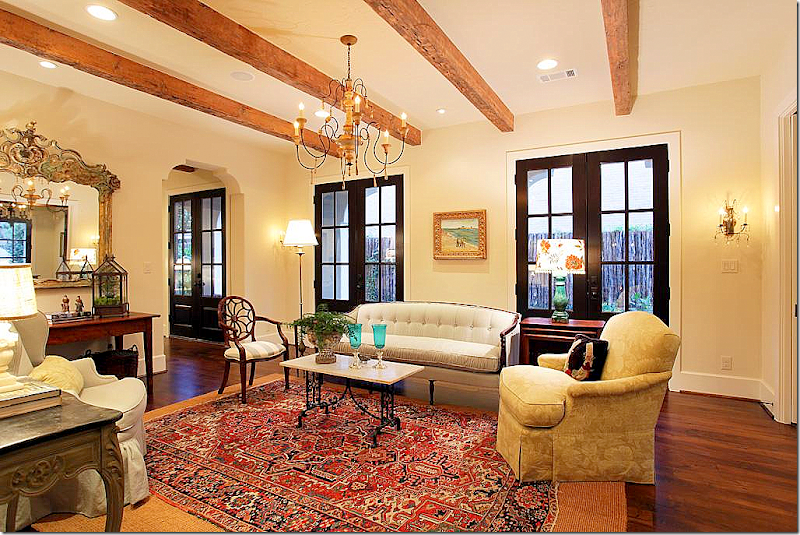
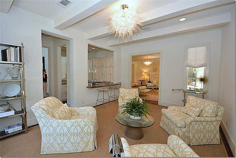
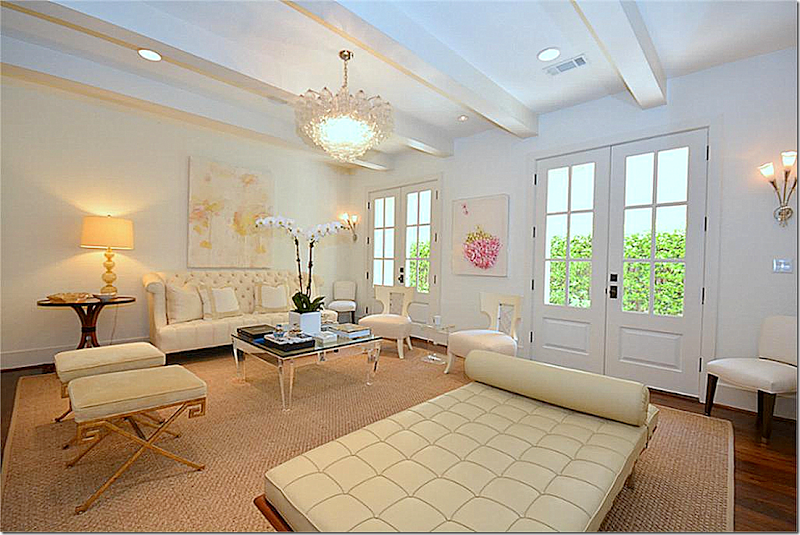
TODAY:  The major changes the current homeowner made is that the doors and beams are now painted white – this makes a huge difference in the space.   She added a contemporary light fixture too.  I love the mix of the tufted sofa with the modern leather Barcelona chaise.   It’s all very Deco inspired – and I love the mix of whites and pale golds.  And what a change she’s made in décor from the Kurt Aichler house!  Where the Kurt Aichler house was the Houston look with French antiques, her aesthetic today is so different, so chic and sophisticated. 


image

BEFORE:  And here is the same living room – so different!  The beams are dark, the doors are painted black.  The rugs don’t really fit the room.  It looks like there might have been an opening on the left that the current owner closed up.  I have to say that I love the way it looks now compared to the BEFORE look.    I’m kind of surprised that the house wasn’t more decorated than this.  It’s such a beautiful house I would think it would have been decorated to the nines – even if it was rustic. 


image

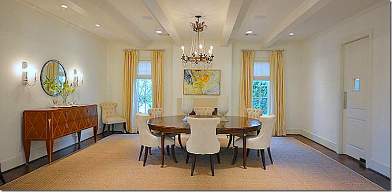
TODAY:  A beautiful chandelier and round wood table with tufted velvet chairs and a Deco inspired console.  Again, the beams are painted white,  and it all looks much more sophisticated.  Much of the furniture was custom made for the homeowner designer.  It does look like the same chandelier and table from the Aichler house – which is nice.    Notice the swinging door that leads to the butler’s pantry.  I love the window in the door!


image

TODAY:  The butler’s pantry.  The tile floors are original and the present homeowner kept them.  Love that swinging door.  Such a pretty butler’s pantry!


image

BEFORE:  The dining room before with the dark beams.  Notice that the current homeowner took out the arches in the entryways and squared them off, which is another good choice for turning the house into more of a Deco inspired house than a Spanish inspired one.  Well – I do like the look of the room here, it’s very cozy and warm. 


image

TODAY:  The library with the wet bar across from the living room.  Instead of a library – the homeowner made it into a room for entertaining, where drinks might be served to guests.  Another interesting light fixture. 


image

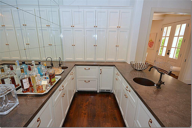
TODAY:  The wet bar with brass hardware.  The homeowner added the mirror with the brass inserts, again Deco-ing it all up.


image

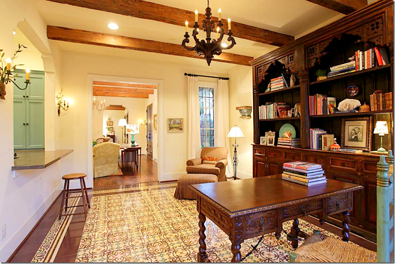
BEFORE:  The study looks soooo different!  The floor is tiled here and it has the Spanish influenced arch to the bar which was removed and squared off.  Hardwoods were installed here to replace the Spanish tiles.  I’m sorry to the former owners, but this is really not attractive to me!  (hides!) 


image

BEFORE:  The wet bar.  It looks like it was open on both sides – which was closed off by the current homeowner.  There were western/Spanish styled shutters and drawers before.  I do like the bar being open like this – it makes it great for entertaining with a bartender.   But, I can see why the new owner closed it up to the library only – it is much more streamlined looking today.    It’s just a bit too busy looking compared to today.


image

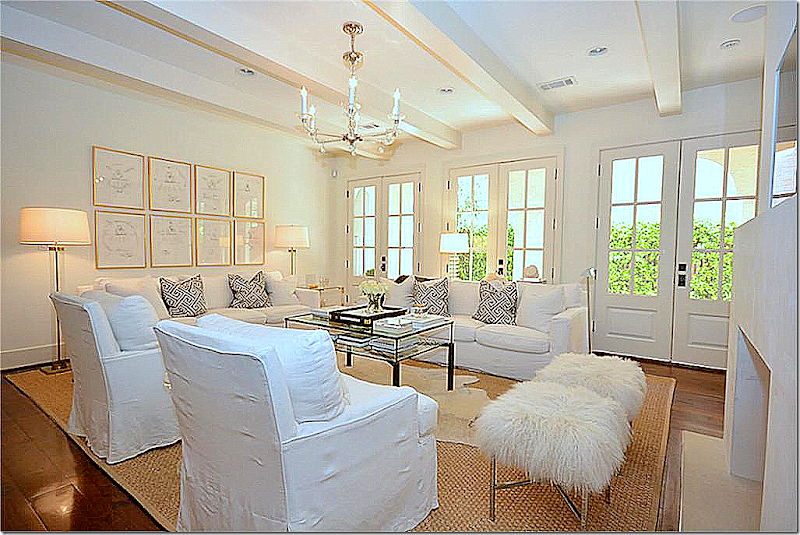
The family room – with the pretty wide planked hardwoods.  Again, repainted doors, beams and new mantel.  I love the back wall with the gilt framed prints and standing lamps. I don’t care – I still like white slipcovers!!


image

TODAY:   View of the family room and kitchen – the two rooms that were really changed in the renovation.  Newly squared off openings between rooms removes the Spanish influence. 


image

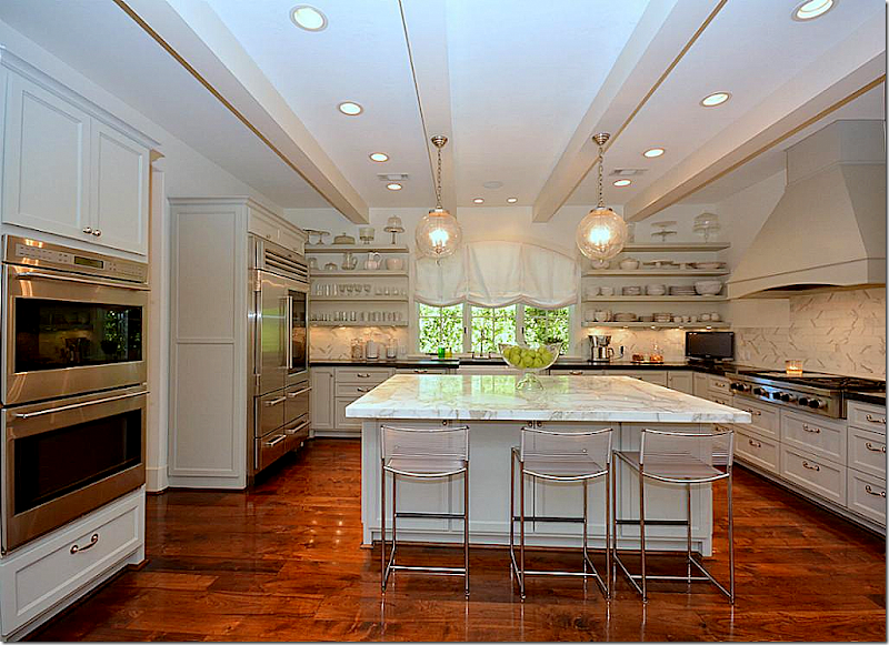
The kitchen looks so new – all traces of the Spanish influences are now gone.  New island with white marble and new backsplash, along with upper cabinets that were removed to make room for open shelving.


image

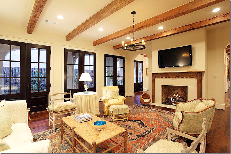
BEFORE:  The family room is so different looking from here!  Again, the décor doesn’t seem to match the beauty of the house.  The mantel was changed along with the beams and the doors.  Another big difference is the opening between the family room and living room to the left of the fireplace was closed off.  I’m sure this is an improvement for noise levels that come with an active family.   Removing the passageway gives the adults a quiet place to sit in privacy away from their children’s friends (something I wish we had!)


image

BEFORE:  The kitchen has really changed as you can see here – today the island is twice the size making the space seem larger.   The turquoise cabinets were painted gray, which make a huge difference.  Again, I don’t really care for the furnishings, especially compared to today’s. 


image

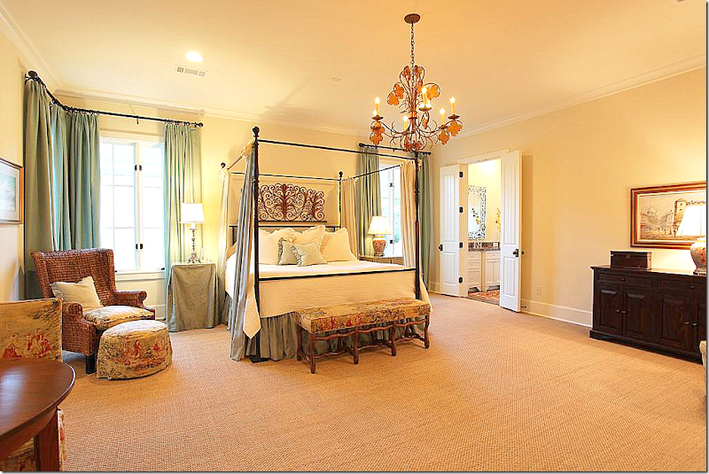
TODAY:  The master bedroom with velvet tufted headboard and chairs – with matching standing lamps.  Crystal chandelier continues the look of the lighting found throughout the house.   Very serene!


image

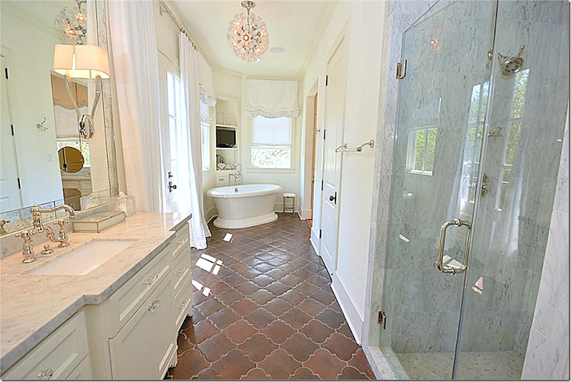
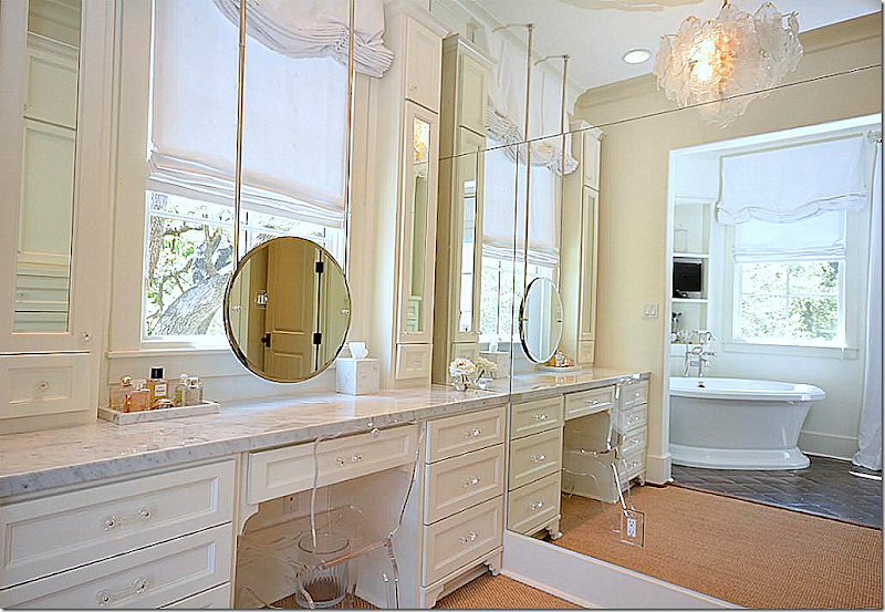
TODAY:  The homeowner kept the tile floor, but put in white marble and sleek lighting.  Love this bathroom!

image

There is a vanity off the bathroom.


image

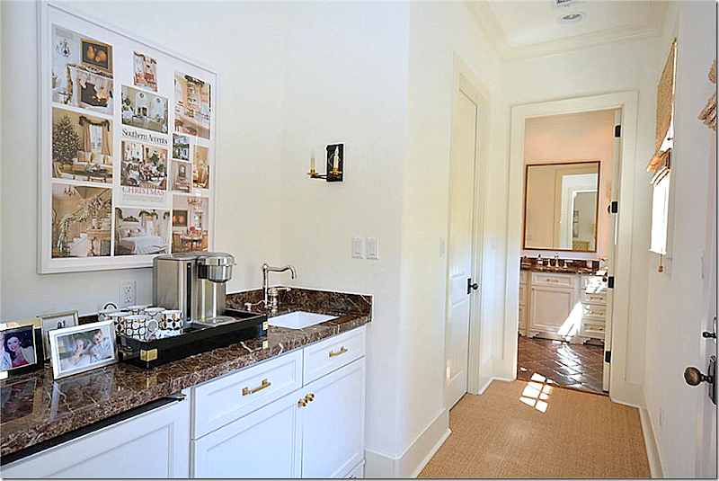
Coffee bar leading to the man’s bathroom.  The framed collage led me to figure out the house belonged to the same homeowner of the Aichler house!


image

BEFORE:  The master bedroom was very nice.


image

BEFORE:  And here – you can see the brown marble and dark French doors before – along with the mirror that was replaced.


image

TODAY:  Upstairs playroom.  Love the velvet tiger pillows and love the Deco console. 

I wish this house had been published!!  I would love to have seen it professionally photographed.  Maybe it was and I just missed it?  Still, real estate photos don’t show a house to best advantage.  I can only imagine what a beautiful photoshoot this house would make!! 


image

BEFORE:  The back stair before.  No picture from today but you can guess how different this area probably looks today!


image

Design is so interesting – to me at least!   I love to look at the before and after photographs, see the changes that houses go through from one owner to the next and study the changes that one designer goes through – from decade to decade.

This house was especially intriguing to me because it’s a glimpse at how one homeowner changed her aesthetic from the classic Houston look with French antiques and slipcovers and silk curtains – to a much more sleek, Deco inspired look.  The designer is especially beautiful and I can imagine how elegant she looks in her interiors.  Somehow, someone who prefers a more country look in their fashion style might look a bit out of place in these sophisticated rooms.  I really had never thought of that before – how the elegance and beauty of a house might match its owner?

The story of this house reminds me of another homeowner I have shown several times before who started out with the Houston look and then she also went more contemporary with less French antiques.  It’s totally different than my previous story about Furlow Gatewood who in his 92th year still decorates the same way he has for decades.

I suppose the moral is – there isn’t a right way or a wrong way to design.  You can keep your same look or change if you want.  It’s your house, go with your heart!